
Inside This Week’s Bull Bear Report
- Market Review & Update
- A Sector Rotation May Be Underway
- How We Are Trading It
- Research Report – Earnings Review – Beware Of Trojan Horses
- Youtube – Before The Bell
- Stock Of The Week
- Daily Commentary Bits
- Market Statistics
- Stock Screens
- Portfolio Trades This Week
Market Review & Update
Last week, we touched on the current bifurcation of this rather lopsided market and suggested sector rotations are likely. The chase for anything “artificial intelligence” related has heated up recently, and deviations from moving averages are now more extreme. Nonetheless, the market approached our target for this rally that we discussed previously:
“The S&P 500 has scored seven weekly closes above its 40-week moving average, which is a positive sign. In addition, the market has cleared the 40-week DMA downtrend line from January and December 2022, suggesting a potential bullish turn in the trend. Assuming supports hold, the next major resistance beyond the post-FOMC peak at 4195 is the August 2022 peak at 4325 (orange dashed line).” – March 7th
Here is the updated version through Friday’s close.
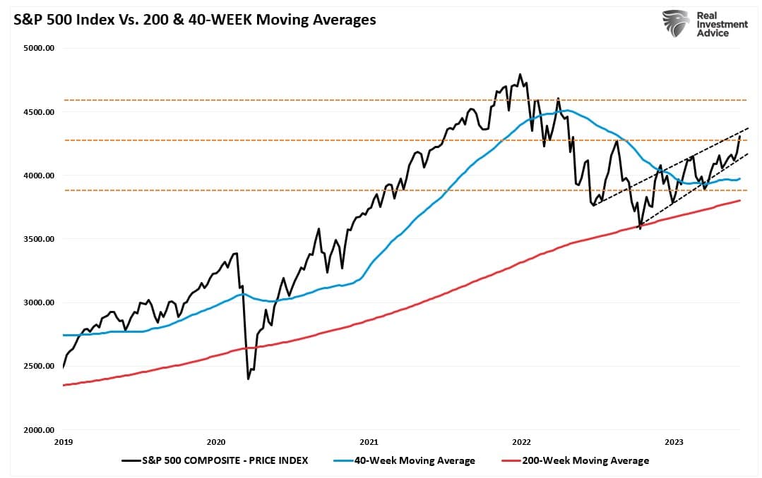
With the market pushing into that resistance at 4300 and the top of the rising trend channel from the October lows, a pause in the advance would be unsurprising. However, the rally has finally convinced the bears to come off the sidelines, with professional and retail investors getting substantially more “bullish” over the last two weeks.
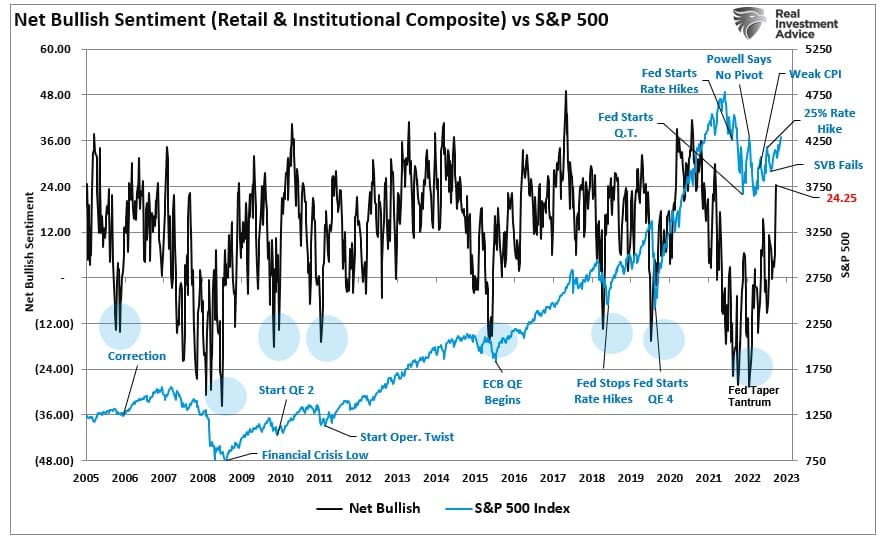
Such a jump in sentiment is unsurprising, given the sharp decline in volatility over the same period.
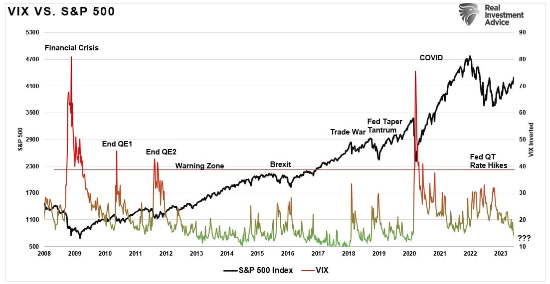
The consequence is a market pushing more extreme overbought levels than we have witnessed recently. While these extremes can last longer than logic would predict, it does suggest that without a correction to “reset” the markets, the upside will likely be limited near term.
This need for corrective action will likely be the basis for market sector rotations, which is the subject of this week’s missive.
Need Help With Your Investing Strategy?
Are you looking for complete financial, insurance, and estate planning? Need a risk-managed portfolio management strategy to grow and protect your savings? Whatever your needs are, we are here to help.

A Bit Ahead Of Itself
Over the last few weeks, we have discussed the more extreme deviation between the market-capitalization-weighted and the equal-weighted index.
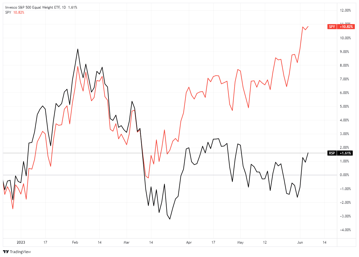
However, it is more exacerbated with the Nasdaq, which is more heavily weighted toward Technology-related companies.
The following chart underscores the remarkable year-to-date outperformance of the unweighted Nasdaq versus the equal-weighted Index. This NDX > NDXE spread is now +15% on the year, by far the widest spread over any 5 month period in the last 18 years.” – Breadth Not As Strong As Suggested

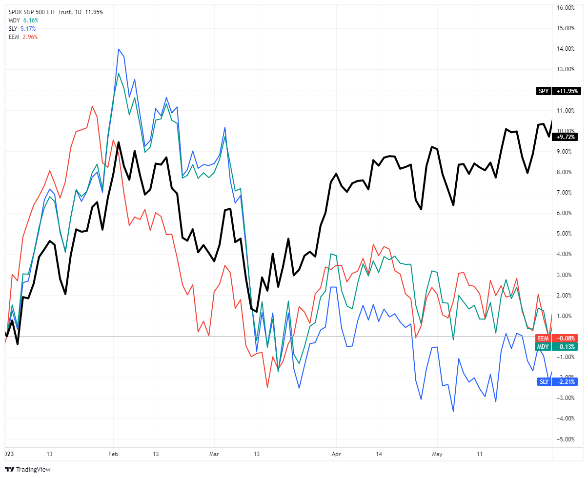
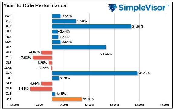
Looking at the year-to-performance between large, mid, small, and emerging market indices, we can see the narrowness of the advance through the end of May more clearly. In other words, if you were invested in anything other than the S&P 500 or Nasdaq index this year, your returns are likely close to zero.
The move is unsurprising given the “Fear Of Missing Out” or F.O.M.O. evident in the chase of technology stocks higher regardless of valuations. However, these mania phases are not uncommon. As we noted in last weekend’s newsletter:
“Of course, during a “mania,” markets do correct. This is why technical analysis becomes more helpful in determining entry and exit points. Over the last 6-years, the Nasdaq repeatedly deviated above its underlying moving average. In every case, a reversion occurred given enough time.
Most importantly, when QQQ trades more than two standard deviations above the 50-DMA and the Relative Strength Index (R.S.I.) is above 70, as it is currently, such typically denotes a short-term top. What will cause that correction is unknown, but a correction is expected.”
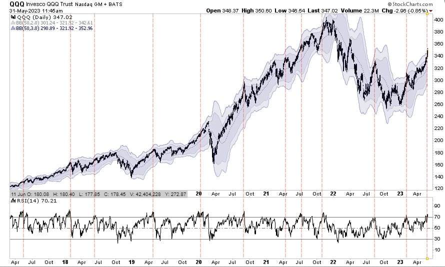
Correcting that more extreme overbought condition is probable, but those “corrections should be contained to the 50-DMA for now. Such would suggest a correction toward 330 on the QQQs is likely.”
Seen This Before
As noted, these more severe market bifurcations tend not to last long. Eventually, something changes the direction of monetary flows from leading sectors to lagging. There is no better example of this than to look at the market performance from January through October 2022. As shown, while Technology, Communications, and Discretionary were down -31%, -41%, and -35%, respectively, Energy was up +60%. In fact, performance in the Technology sector was so bad FANG stocks were declared dead.
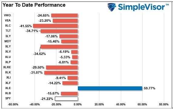
However, this year, that story is vastly different. Sector rotations have led to the outperformance of the most hated sectors of the market. Technology, Communications, and Discretionary are up +35%, 32%, and 22%, respectively, while Energy is down -9%.
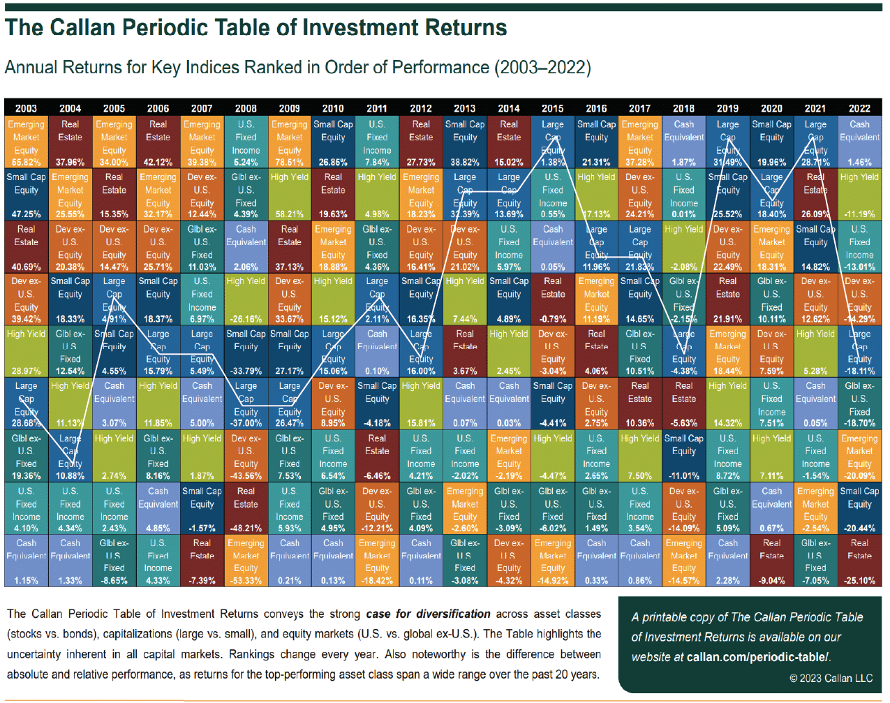
Such is not surprising and shows how markets tend to work over time. The table below is the Callan Periodic Table Of Returns through the end of 2022. If you pick any asset class, you will see that none stay in the top or bottom positions for long. Generally, a good guide has been to buy what everyone hates and sell what everyone loves.
The issue with sector rotations is recognizing market extremes and watching for those sector rotations to begin.
Understanding Rotations
Michael Lebowitz published Part 1 of an article discussing sector rotations and absolute and relative performance. He provides an example of performance shifts in the following chart.
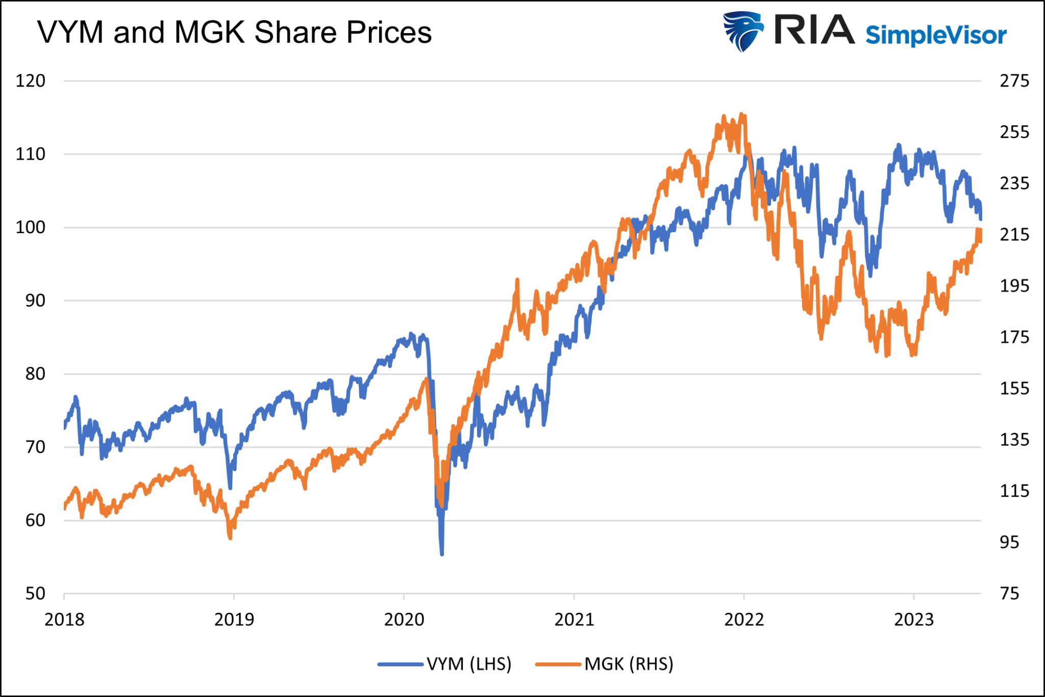
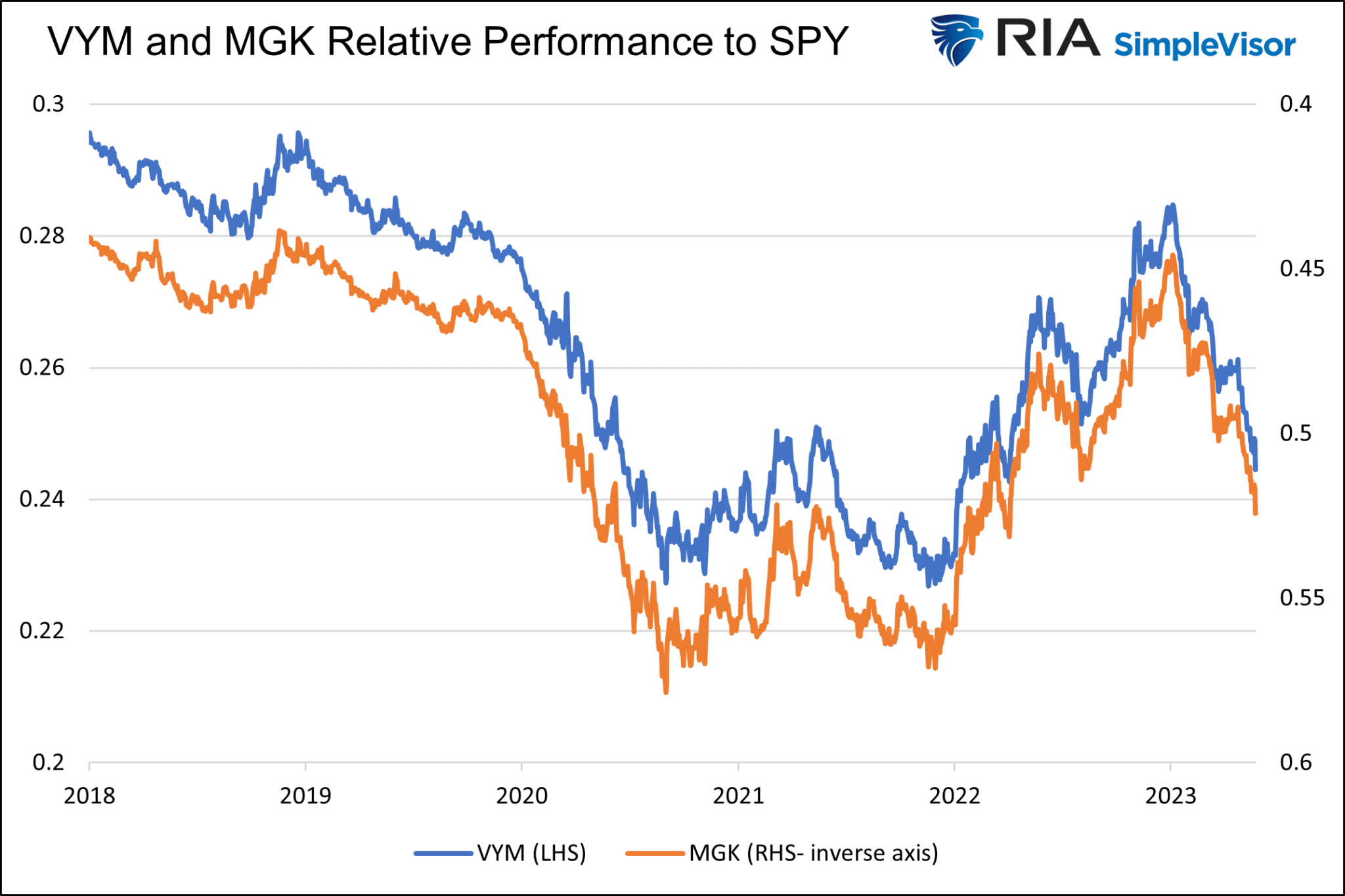
“The graph below charts the mega-cap growth ETF MGK prices and the high dividend yield ETF VYM. Besides the last few months and other short instances, their prices correlate well.”
“The following graph confirms what our eyes see. The scatter plot compares daily price changes for the two ETFs since 2018. The R-squared is statistically robust at .6073. Further, the 45-degree slope of the trend line indicates that we should expect daily percentage changes for the ETFs to be similar.”

As he notes:
“Despite the visual and statistical correlation between VYM and MGK, there are vast differences in performance. Since 2018, VYM has been up 39%, while MGK has risen by 100%. The S&P 500 is up about 68% over the period. The returns do not include dividends.”
This is ABSOLUTE performance. The graphs above fail to show the stark RELATIVE performance differences between the two ETFs. The following chart highlights the value of relative rotation, which is stunning. It compares the relative prices of VYM and MGK. To make them relative, we calculate the ratio of the price of each ETF to the S&P 500 (SPY).
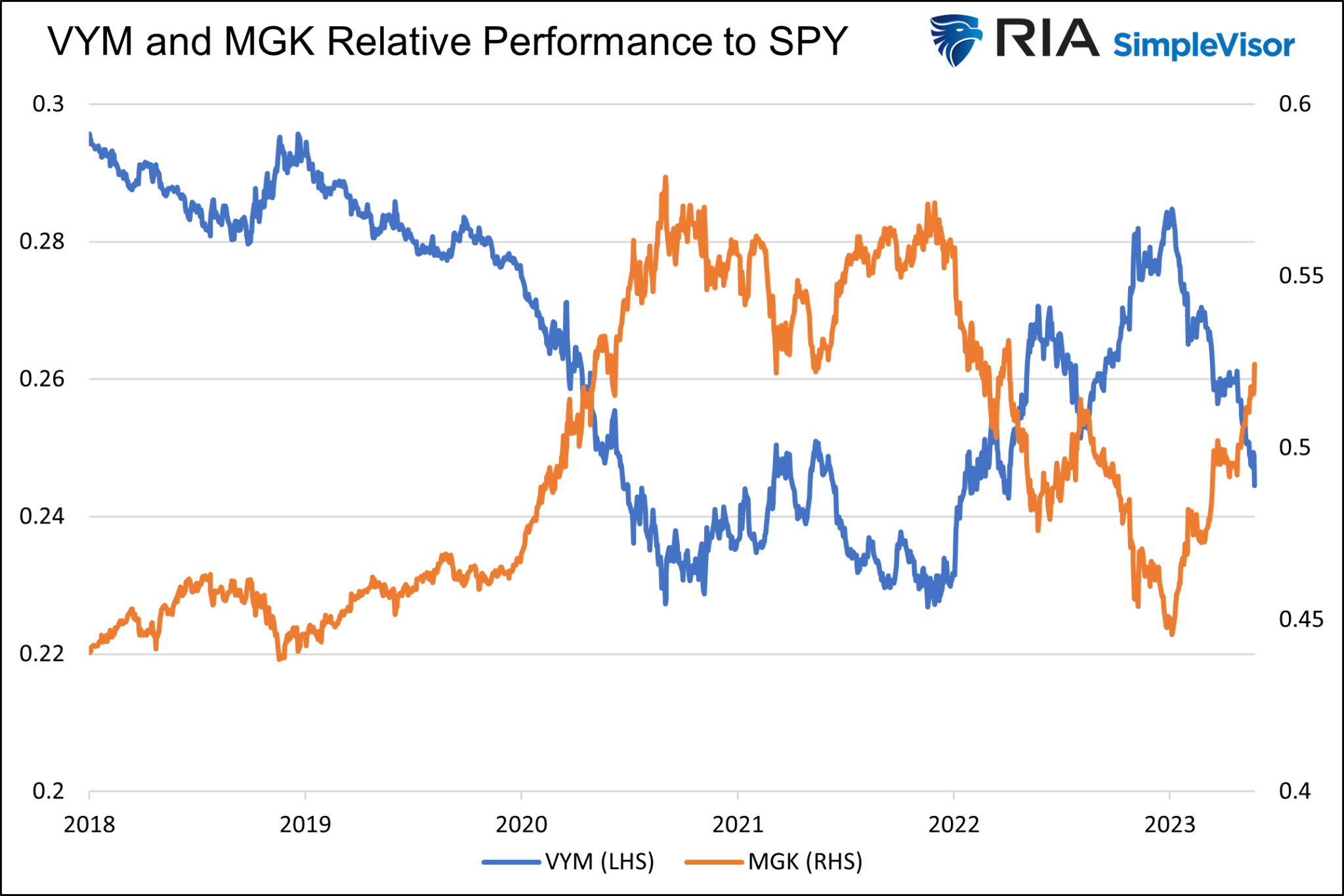
“The two lines are mirror images of each other. Below we present the same data but with the MGK axis on the right-side inverse. Again, the correlation is spectacular. Two ETFs that travel on similar paths have entirely different performances compared to the broader market.“
As Michael concludes:
“Understanding that relative relationships can look vastly different than price trends is the critical first step in allowing investors to take advantage of pairs of stocks, sectors, and factors that exhibit strong inverse relationships. In this case, and with the benefit of hindsight, an investor could easily have outperformed each ETF and the S&P 500 by switching between MGK and VYM at various points.
To help appreciate the potential outperformance, the graph below assumes we only held MGK during the periods shaded blue and VYM during the beige-toned period.”
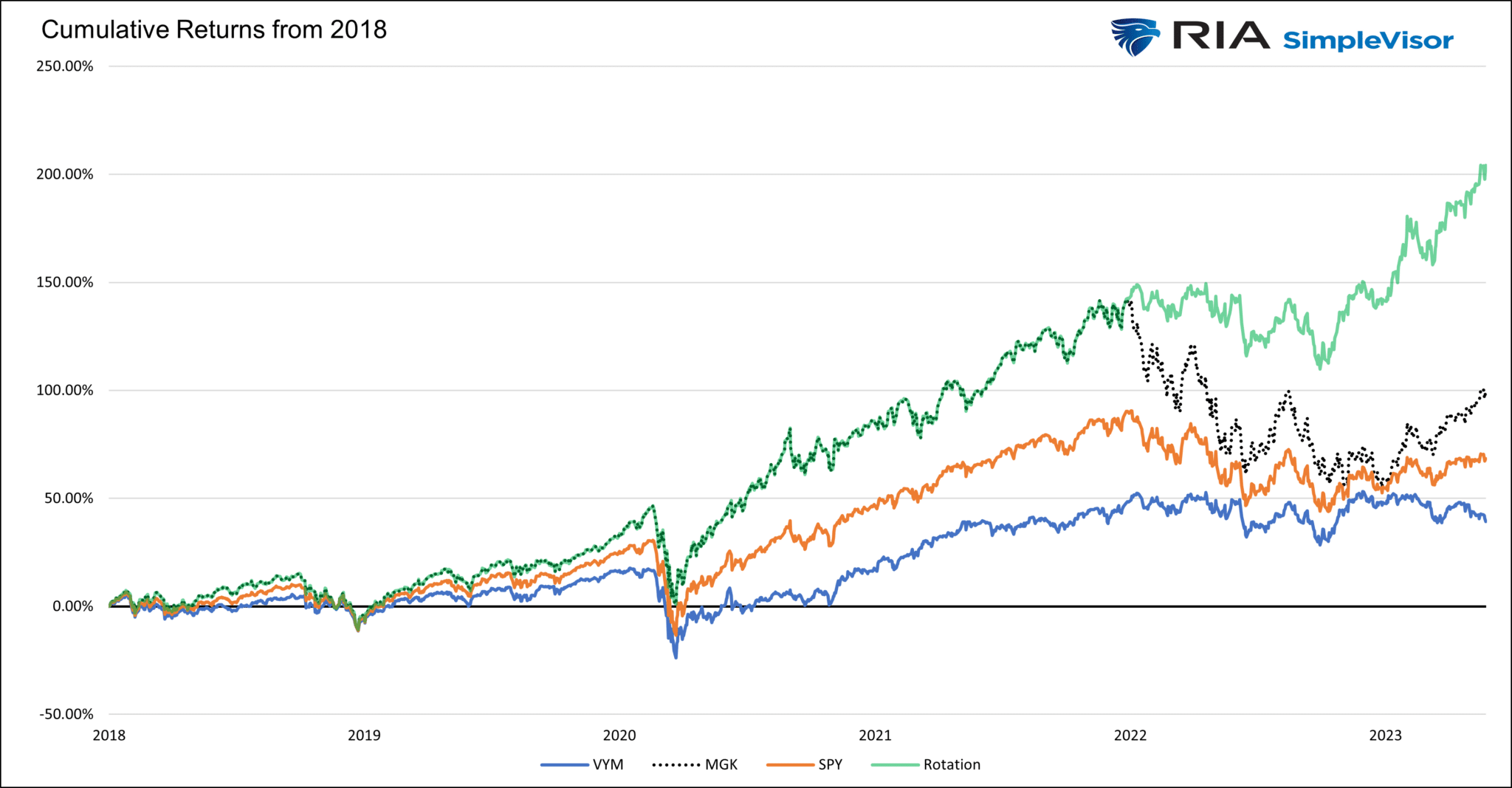
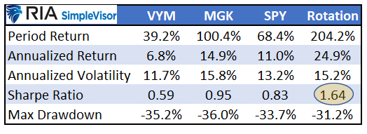
Relative stock, sector, and factor rotation can be significant sources of returns. It allows an investor to run with the bulls and protect from the bears more efficiently. The question is, when will the next sector rotations occur?
Sector Rotations – Where Are We Now?
We can look at the year-to-date performance chart above with this basic understanding of rotations. It should be evident that such huge gains in Technology, Discretionary, and Communications in the first half of this year are unsustainable. As such, it is logical that market participants will eventually seek out investments with more potential upside in the short term. Such was a point we made last week:
“Furthermore, while the market has been chasing technology stocks lately, the market remains bifurcated between the cyclical and defensive sectors. As such, the rotation to Energy, Financials, Materials, and Staples on Friday was not surprising. The question is whether more of those sector rotations will come near term. Such extreme deviations in performance from the overall index tend not to last indefinitely.”
Note: This analysis is available daily at SimpleVisor.com
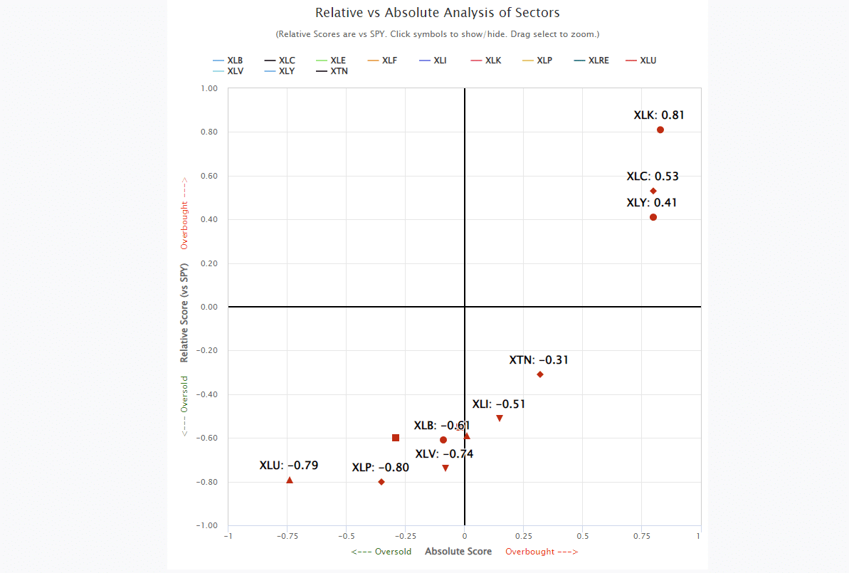
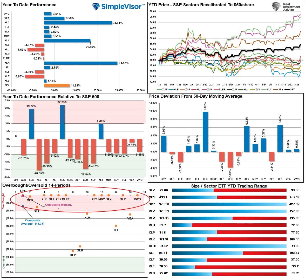
Here is that same analysis through Friday. I have zoomed in a bit to show the shift more clearly. As shown, many out-of-favor sectors have moved positively on both a relative and absolute basis, except for staples. Notably, the economically sensitive sectors of Transportation and Industrials have moved higher, suggesting more robust economic growth.
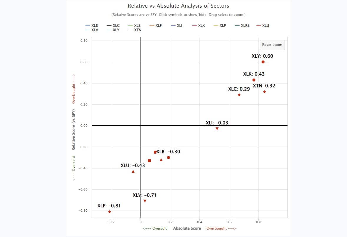
If we dig deeper, we find the same “breadth” problem is more apparent when considering factor participation. This analysis used the Vanguard Mega-Cap Growth ETF (MGK) as a proxy for the top-10 stocks compared to Small and Mid-Cap stocks (IWM) and the Equal Weighted index (RSP). We even included the Vanguard High-Dividend Yield ETF (VYM).
At the end of May, MGK was highly overbought, while everything else was extremely oversold.
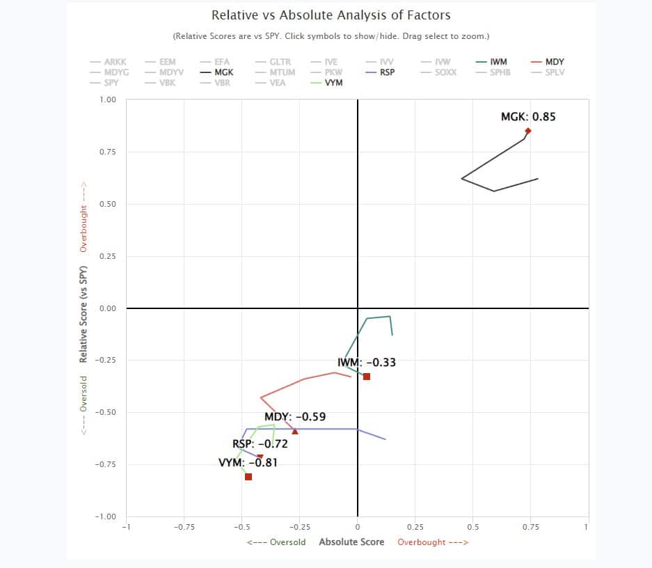
Again, I have zoomed in a bit to provide better clarity. As of Friday, IWM and MDY have moved sharply higher into overbought territory on both a relative and absolute basis, while MGK slipped a bit. Even VYM and RSP have performed better as of late as monetary flows rotated to other market areas.
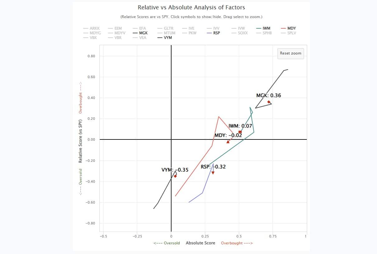
The question, of course, is whether the current rotation is sustainable.
A Temporary Thing
While small and mid-capitalization stocks are grossly overbought after the recent short-covering frenzy, likely, a rotation from the Mega-capitalization stocks is underway. How long that rotation will last is unknown.
However, while the leaders this year will likely remain the leaders, the sector rotations can provide good opportunities to build positions in Technology, Discretionary, and Communications on pullbacks. Using the sector rotations to add positions in defensive names to create returns during the rotation can also help shield the portfolio from broader market declines. For ideas, go to SimpleVisor.com and check out the Sector Rotation Analysis we provide under the IDEAS tab.
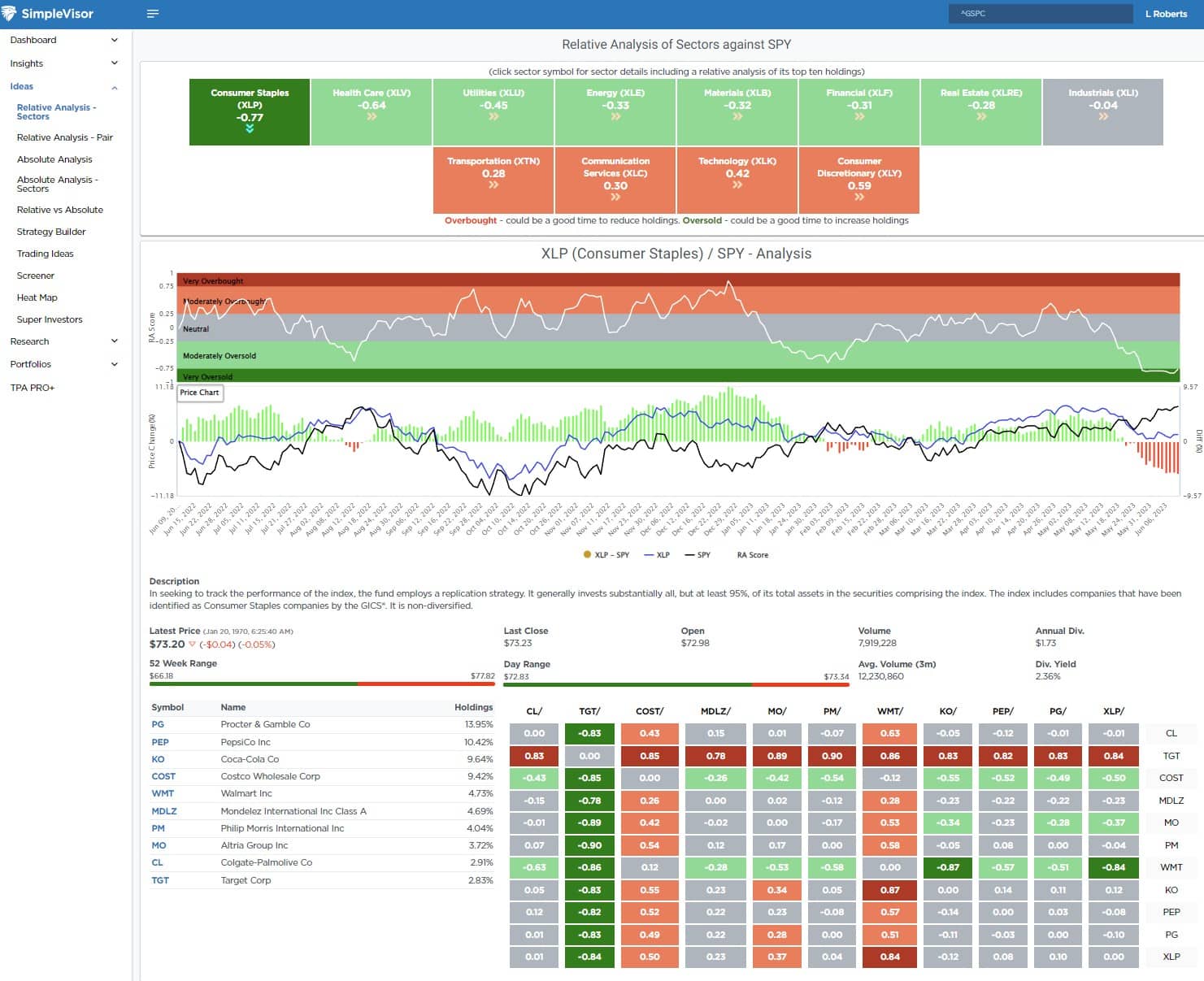
This analysis shows that not only are Staples deeply oversold relative to the overall market, but Coca-Cola (KO) is oversold relative to the market as well. Such conditions often provide an opportunity to capitalize on rotations when they occur. We added shares to portfolios on Friday to complement our other holdings in the Staples sector.
The market action over the last two weeks suggests a rotation is underway. However, the sustainability of the rotation, and the market in general, remains subject to both economic growth and interest rates.
With the Federal Reserve on deck next week, the potential for higher interest rates is not zero. More importantly, as discussed on Friday, economic growth continues to show a risk of a recession. These factors are headwinds for small and mid-capitalization stocks and emerging markets.
It will be essential to remain alert to where money flows are heading and which sectors and markets will be the next winners and losers.
How We Are Trading It
As we stated last week:
“Overall, we continue to make tiny moves to align the risk profile of portfolios to the market. Given the recent buy signals from our indicators, we cautiously added needed exposure. However, we remain underweight in equities and overweight cash currently. The improvement in the overall price action confirms that downside risk is somewhat limited in the current environment.”
This week, such was again the case, with small moves to rebalance our energy exposure in our portfolios. We have been more heavily weighted toward defensive stocks, which finally got some attention this past week. However, we will use pullbacks in the cyclical stocks to add further weight to our portfolios.
While this has been a tough market to navigate this year, the risks remain prevalent despite the broader market seemingly ignoring them. Next week, The Federal Reserve meeting could hurt markets if they take a more “hawkish” stand on inflation and rates, given the recent employment data. Regardless, the bull market remains intact for now.
Therefore, continue to take profits in extremely overbought market sectors, and look to add exposure to oversold areas. If you don’t know what to do, do nothing for now.
Sometimes taking no action is better than taking action without understanding the consequences.
Have a great week.
Research Report
Subscribe To “Before The Bell” For Daily Trading Updates (Formerly 3-Minutes)
We have set up a separate channel JUST for our short daily market updates. Please subscribe to THIS CHANNEL to receive daily notifications before the market opens.
Click Here And Then Click The SUBSCRIBE Button
Subscribe To Our Youtube Channel To Get Notified Of All Our Videos
Stock Of The Week In Review
Peter Lynch is one of the most well-known and respected stock investors. Lynch’s mutual fund performance while working for Fidelity, is immaculate. Per Wikipedia:
Peter Lynch is an American investor, mutual fund manager, and philanthropist. As the manager of the Magellan Fund at Fidelity Investments between 1977 and 1990, Lynch averaged a 29.2% annual return, consistently more than double the S&P 500 stock market index and making it the best-performing mutual fund in the world.
Login to Simplevisor.com to read the full 5-For-Friday report.
Daily Commentary Tidbits
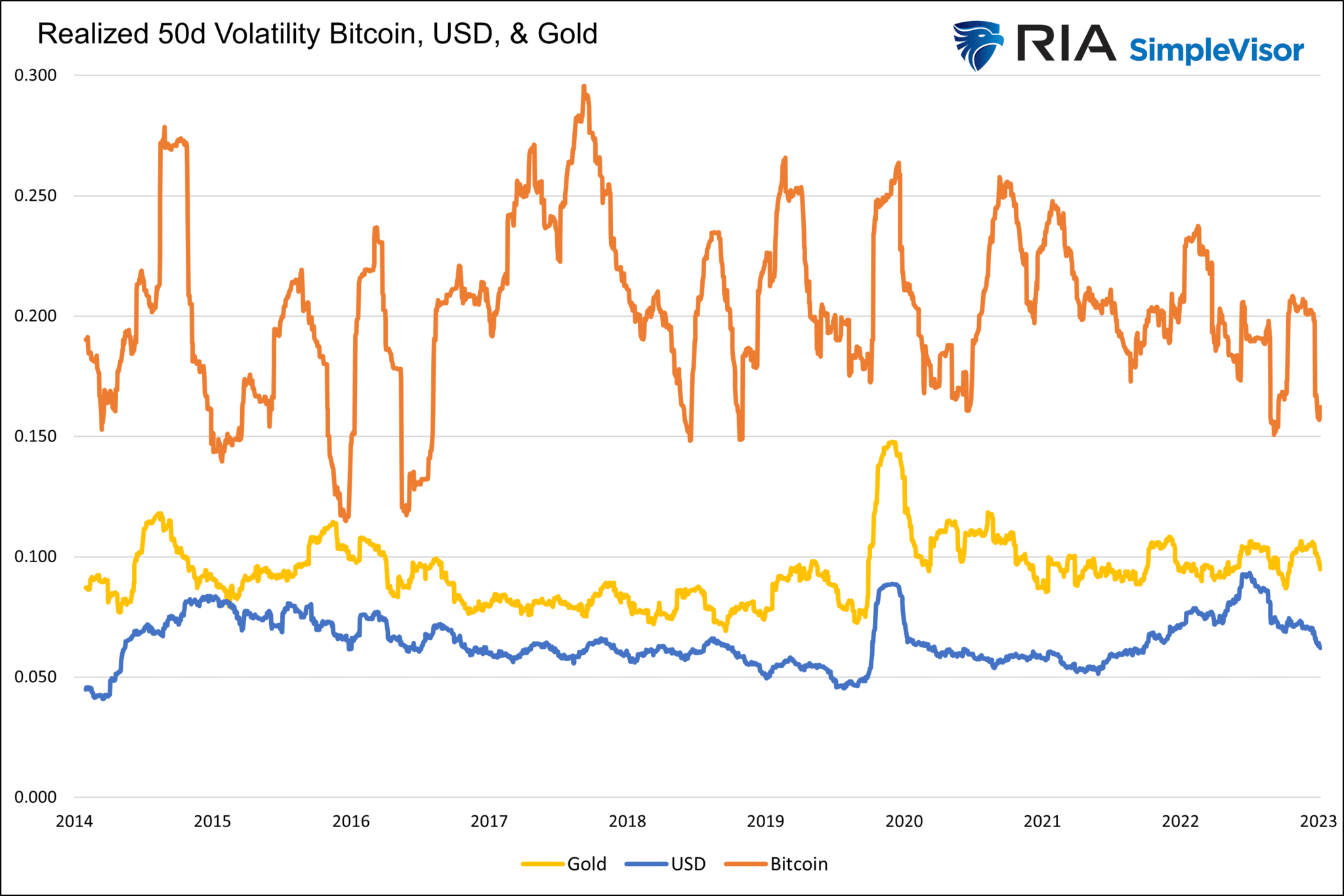
Bitcoin Trading Isn’t Boring Enough
Trading Bitcoin since its inception has been like riding a roller coaster. In January 2015, Bitcoin was trading at $164. By May 2021, Bitcoin traded near $65,000 but then fell sharply to $30,000 in just a few months. It rebounded to a new high of $70,000 in six months, only to fall below $20,000 earlier this year. Since then, its price has been relatively stable, leading its supporters to claim it’s starting to behave more like a currency. For a currency to have value as a transaction unit, its price must remain fairly constant. For instance, if you are selling widgets and accept Bitcoin in exchange, you are risking not only your profit but could quickly run a loss if the price of Bitcoin follows its regular trading patterns.
So, is Bitcoin maturing? Might the recent “boring” trading in Bitcoin make it stable enough to rely on it as a currency? The answer to both is a resounding NO! As evidence, the graph below shows the running 50-day annualized volatility of Bitcoin alongside the U.S. dollar index and gold. Since 2014, the average annualized volatility of Bitcoin was 20, which is more than double the volatility of gold and triple that of the dollar. While it is now a little lower at 16, it remains much more volatile than the dollar and gold. It would take a prolonged period of sub-10 volatility to start having a usable currency discussion. Of course, transacting with Bitcoin has other hitches as well.
(Subscribe To The Daily Market Commentary For A FREE Pre-Market Email)
Bull Bear Report Market Statistics & Screens

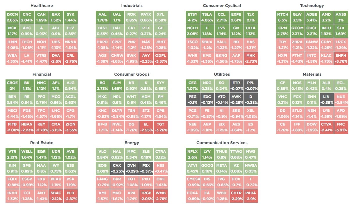
SimpleVisor Top & Bottom Performers By Sector
S&P 500 Weekly Tear Sheet
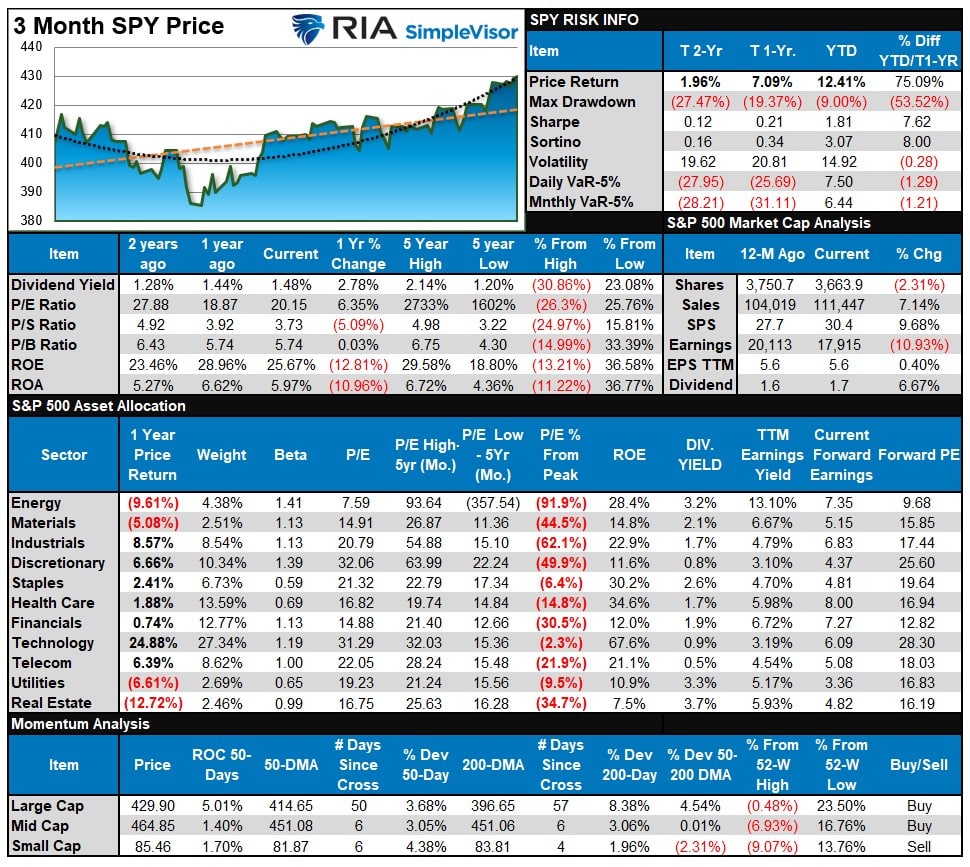
Relative Performance Analysis
As noted last week
“The market is broadly overbought and needs a pullback after last week’s surge, and most sectors are now stretched above their moving averages. Performance is still highly bifurcated between Technology, Communications, Discretionary, and everything else.”
That remains the case this week, and large swaths of the market are very overbought after last week’s push higher. What will cause the market to correct is unknown, but there are several catalysts over the next couple of weeks from the next Federal Reserve meeting, the inflation report, and end-of-quarter rebalancing.
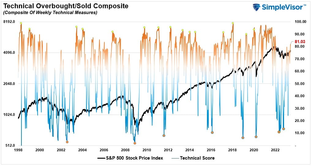
Technical Composite
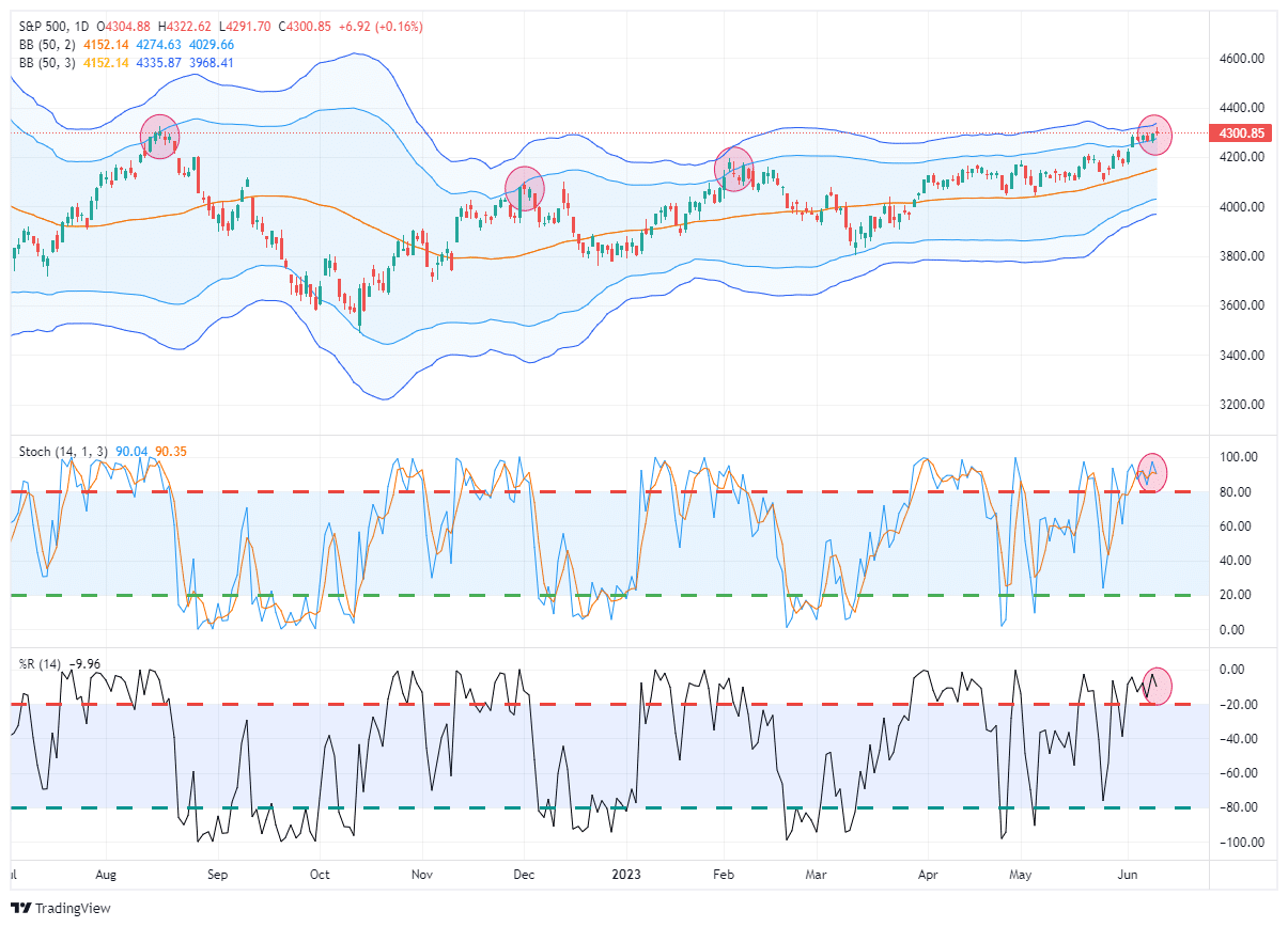
The technical overbought/sold gauge comprises several price indicators (R.S.I., Williams %R, etc.), measured using “weekly” closing price data. Readings above “80” are considered overbought, and below “20” are oversold. The market peaks when those readings are 80 or above, suggesting prudent profit-taking and risk management. The best buying opportunities exist when those readings are 20 or below.
The current reading is 81.03 out of a possible 100.
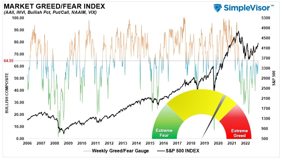
Portfolio Positioning “Fear / Greed” Gauge
The “Fear/Greed” gauge is how individual and professional investors are “positioning” themselves in the market based on their equity exposure. From a contrarian position, the higher the allocation to equities, the more likely the market is closer to a correction than not. The gauge uses weekly closing data.
NOTE: The Fear/Greed Index measures risk from 0 to 100. It is a rarity that it reaches levels above 90. The current reading is 64.55 out of a possible 100.
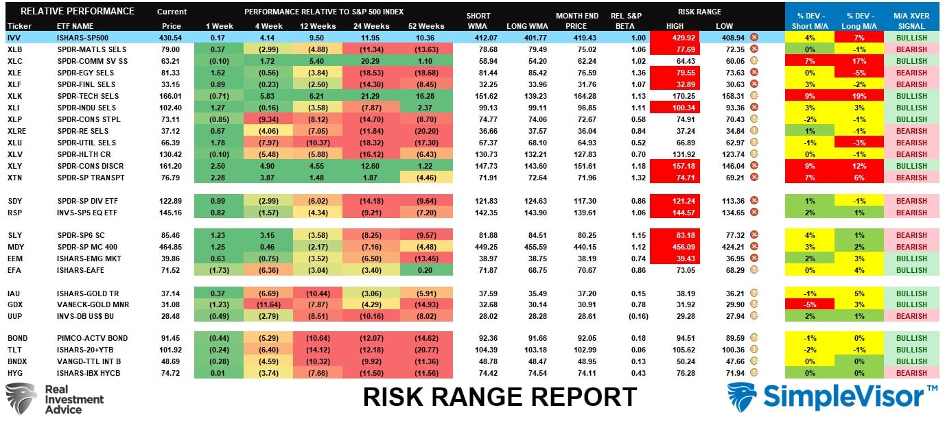
Sector Model Analysis & Risk Ranges
How To Read This Table
- The table compares the relative performance of each sector and market to the S&P 500 index.
- “MA XVER” (Moving Average Cross Over) is determined by the short-term weekly moving average crossing positively or negatively with the long-term weekly moving average.
- The risk range is a function of the month-end closing price and the “beta” of the sector or market. (Ranges reset on the 1st of each month)
- The table shows the price deviation above and below the weekly moving averages.
As noted last week, more sectors are triggering “bearish” crossovers, which isn’t a sign of a healthy market. However, due to last week’s push to 4300, many sectors are now overbought and are due for a pullback. This looks like a more panicked move to gain allocation to a market by managers, which may be short-lived. We continue to expect to see a bit of a rotation from cyclical to defensive sectors during a corrective pullback.
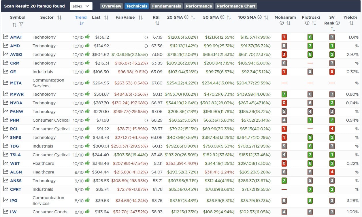
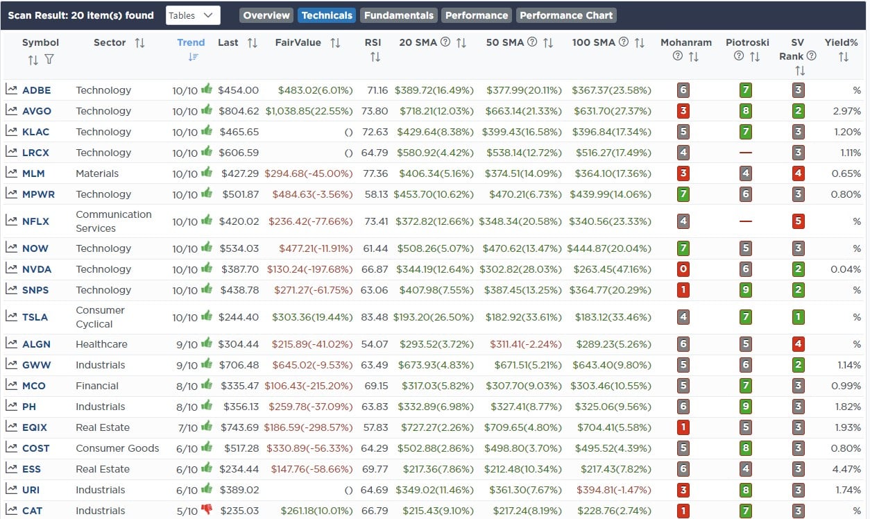
Weekly SimpleVisor Stock Screens
We provide three stock screens each week from SimpleVisor.
This week we are searching for the Top 20:
- Relative Strength Stocks
- Momentum Stocks
- Technically Strong Stocks With Dividends
(Click Images To Enlarge)
R.S.I. Screen
Momentum Screen
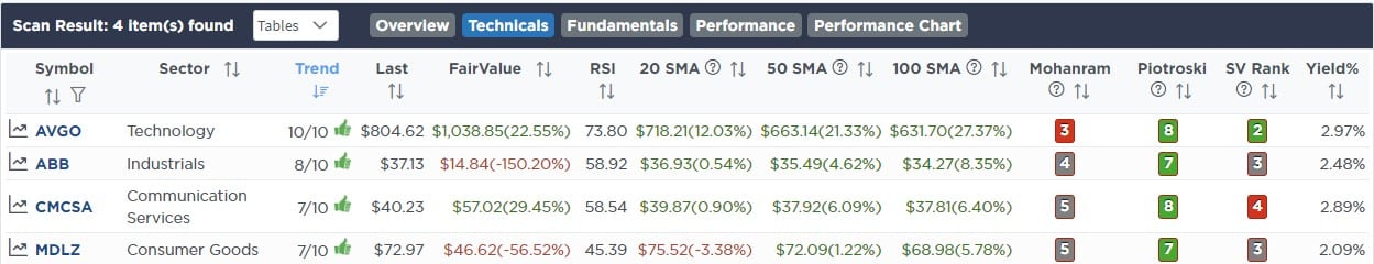
Technically Strong With Dividends
SimpleVisor Portfolio Changes
We post all of our portfolio changes as they occur at SimpleVisor:
June 5th
One of our goals for the portfolio over the next few months is to consolidate and reduce the number of equity holdings to 20 with a maximum position size of 5% each. Today, we are taking action to start that process by selling Valero Energy (VLO) which is underperforming the energy sector, and consolidating that holding into Exxon Mobil (XOM), which has triggered a buy signal from a decently oversold level. This process will be used on the rest of the portfolio in the coming weeks and months to rebalance holdings between cyclical and defensive to align our portfolios with the risk levels we want in the current environment.
Equity Model Only
- Sell 100% of Valero Energy (VLO)
- Add 1% of the portfolio to Exxon Mobil (XOM)
June 9th
The Staples sector is getting grossly oversold versus the market. Over the past few weeks, we have seen other sectors, like materials, industrials, and transportation, get deeply oversold and then outperform. Staples is likely next in line. We added KO as it is slightly oversold versus the staples sector, near good support, and turning up on multiple buy signals.
Equity Model
- Initiate of 2% position of the portfolio into Coca-Cola Co. (KO)
ETF Model
- Add 2% of the portfolio to the existing position in the iShares Staples ETF (XLP)

Lance Roberts, C.I.O.
Have a great week!