Peak Inflation? Is The Fed Is Behind The Curve?


In this 02-11-22 issue of “Peak Inflation? Is The Fed Behind The Curve?”
- Market Is Going Nowhere Fast
- Peak Inflation? Is The Fed Behind The Curve?
- Portfolio Positioning
- Sector & Market Analysis
Follow Us On: Twitter, Facebook, Linked-In, Sound Cloud, Seeking Alpha
Is It Time To Get Help With Your Investing Strategy?
Are you looking for complete financial, insurance, and estate planning? Need a risk-managed portfolio management strategy to grow and protect your savings? Whatever your needs are, we are here to help.
Schedule your “FREE” portfolio review today.

Market Review & Update
Another nauseating week in the market as a hotter than expected inflation print and rumors of a Russian invasion of Ukraine sent stocks tumbling backward. The bad news is that support at the 200-dma failed.

That break aligned with our discussion two weeks ago. At that time, we suggested using any rally to reduce risk and rebalance portfolios.
“This analysis continues to suggest any rally that occurs will likely:
- Fail at a lower high / resistance level; and,
- The subsequent decline will potentially retest or break recent lows.
With the market sliding on Friday and breaking the 200-dma and our money flow indicator starting to turn negative, such suggests a retest of January lows is a rising probability.
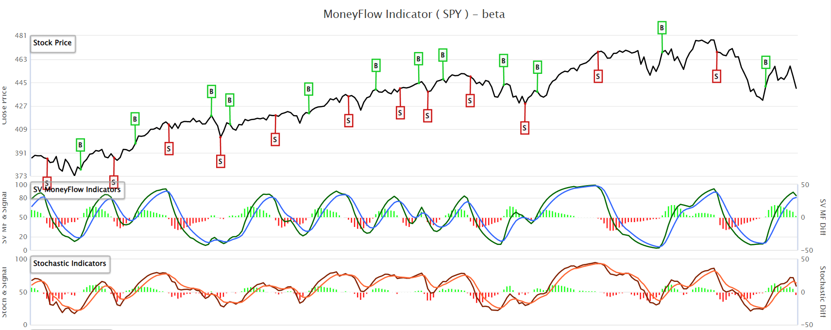
While I suspect we will see a reflexive bounce early next week, we will continue to use opportunities to hedge further and reduce risk.
Substantial risks are mounting from peak inflation to geopolitical, monetary, and credit that could quickly derail markets without warning. However, while there are plenty of reasons to be concerned, it is essential not to allow emotions to dictate portfolio management.
Despite all the angst, the market is still trading above the October lows. If we look at a longer-term chart, the current correction becomes a little less worrisome.
Perspective is always critical. However, that doesn’t mean we aren’t watching those risks closely.

Credit Spreads Sending A Warning
While rising yields in the Treasury bond market certainly have everyone’s attention, those aren’t the yields we should worry about. Junk bonds are a proxy for risk-taking. Currently, those yields are near record lows which suggest complacency about market risks. Those yields are starting to turn rise.
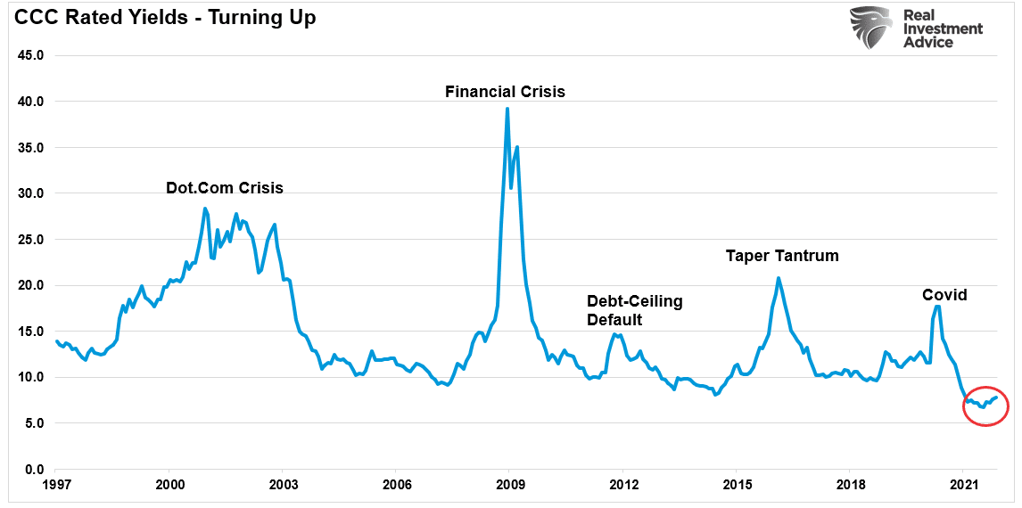
At the moment, the increase is negligible and doesn’t warrant alarm. However, when these yields rise sharply, it is a function of something breaking in the equity markets. The same goes with the spread between A-rated and junk bonds.
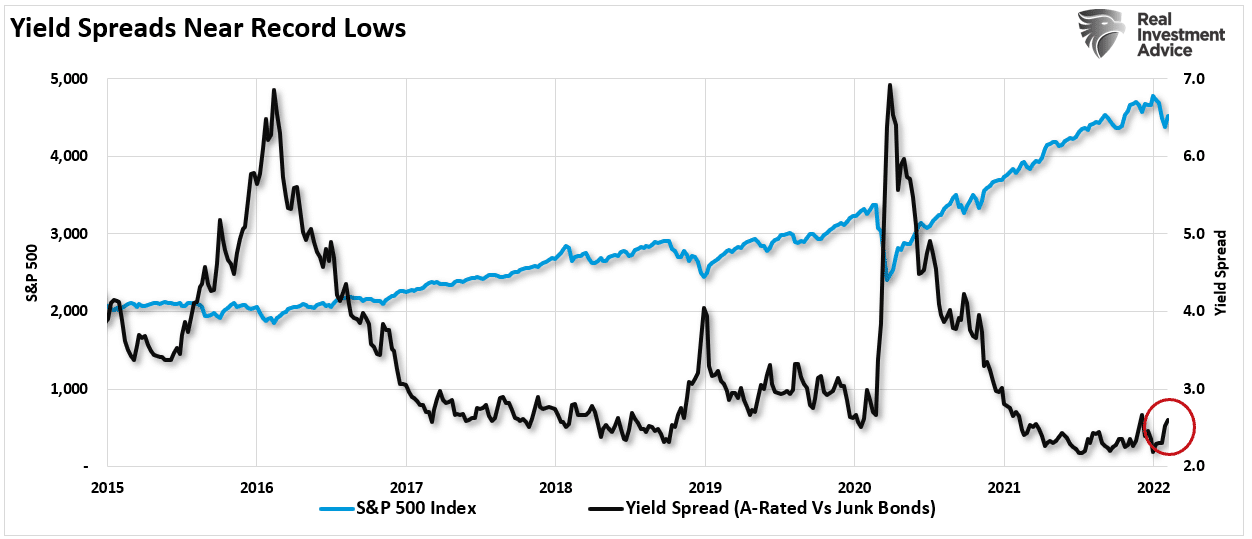
This spread tends to fluctuate very narrowly in periods of normal economic activity. However, during periods of economic stress or unusual financial market conditions, this spread can grow rapidly. Because the stock market hates uncertainty, rapid growth in this spread is often a warning sign for stock market investors. – Sentiment Trader
The problem is that by the time junk bond yields start to rise sharply, the “market event” is already in process. Therefore, with yields already rising, it is likely time to start being a bit more defensive in portfolios until risk subsides. Over the last several weeks, we repeatedly suggested using rallies to reduce equity exposure and hedge risk.
However, it is essential not to extrapolate one signal into significant portfolio changes. As noted:
So, does this mean that an economic recession and/or a stock bear market is inevitable? Not at all. But it does count as an important entry on the negative side of the ledger. And the longer this condition persists, the greater the danger. – Sentiment Trader
Right now, the most critical risk to the market remains the Fed.
This Week’s MacroView

Peak Inflation?
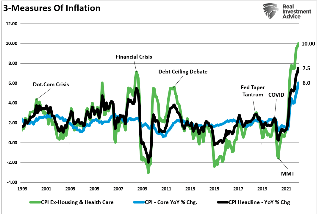
Over the last few weeks, we have discussed the reality that “disinflation” is more likely than continuing “inflation.” There are several reasons for this, from the reversal of liquidity to slowing economic activity, but the most significant factor is math.
On Thursday, we saw the monthly change in inflation come in at 0.6%, which was indeed higher than last month’s 0.5% reading. However, that reading is significantly lower than the 0.87% reading in October. However, let’s assume that inflation increases by 0.5% every month for the rest of this year.

From a consumer perspective, such an increase in inflation would be detrimental to sustaining a standard of living. However, from a mathematical perspective, as shown, a “disinflationary” trend will reassert itself, suggesting that we will witness “peak inflation within the next two months.”

Here is the problem. For the average American family, prices didn’t get any cheaper. They got more expensive, particularly in the areas that impact them the most, from energy to food. As we noted previously, for most, housing and healthcare costs get contractually fixed for a set period. Therefore, if we look at the inflation households deal with every month, the rate is closer to 10%.
With real wages not adjusting for rising prices, the ability to consume gets reduced, and economic growth slows.
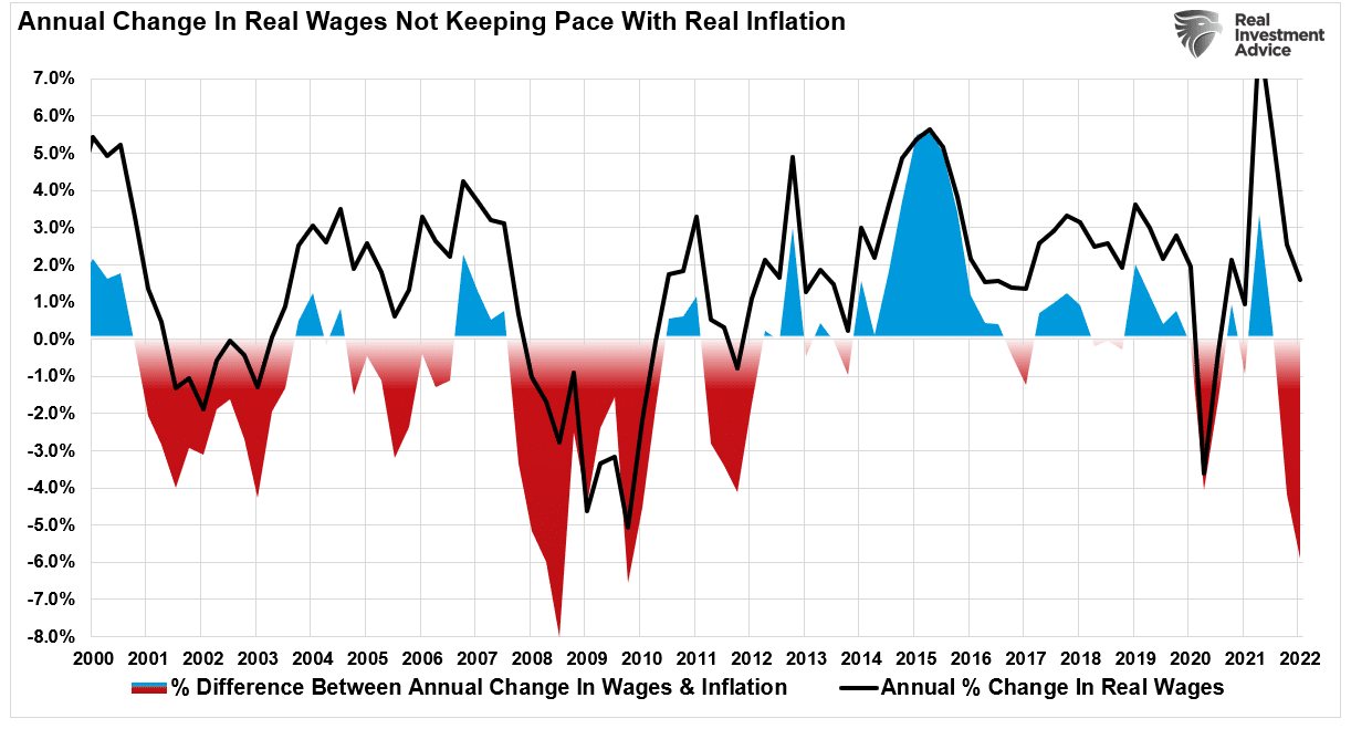
While mathematically, we are witnessing “peak inflation,” the cost of living will likely remain more expensive for quite some time.
Such will weigh on consumption, the economy, and ultimately profit margins.
Is The Fed Behind The Curve?
The Fed remains set to tighten monetary policy in March. Expectations run the gamut from a 25-50bps increase in rates to a rapid winddown of quantitative easing.
However, if we are correct that inflation and economic growth will slow in the months ahead, such an aggressive policy tightening will likely create unwanted financial instability. The last time the Fed hiked by 50bps was in March of 2000. While that more aggressive hike didn’t immediately break the market, it signaled the end of the bull market advance.

Recently, the market seems to be frontrunning the Fed’s policy action by selling off in advance. Such was a point from Marketwatch, noting that the recent market turmoil resulted from an already tighter monetary policy. To wit:
“Their shadow rate, a model first introduced in 2019 that maps the signals from the yield curve into a fed funds equivalent rate, rose 85 basis points over the past three months. That would rank in the top 5% of historical moves, say the Deutsche Bank economists.
‘The recent rise moved the shadow rate into positive territory for the first time since the onset of the pandemic. This movement can be interpreted as the yield curve’s signal about how the monetary policy stance has adjusted in recent months,’ say economists led by Matthew Luzzetti, chief U.S. economist.”

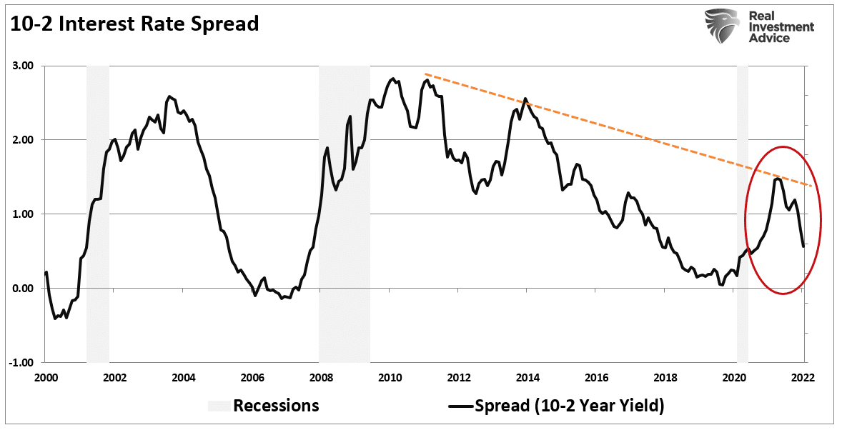
Notably, the yield curve is rapidly declining, suggesting peak inflation and slowing economic growth. If the Fed tightens aggressively, such will exacerbate the slowdown of activity.
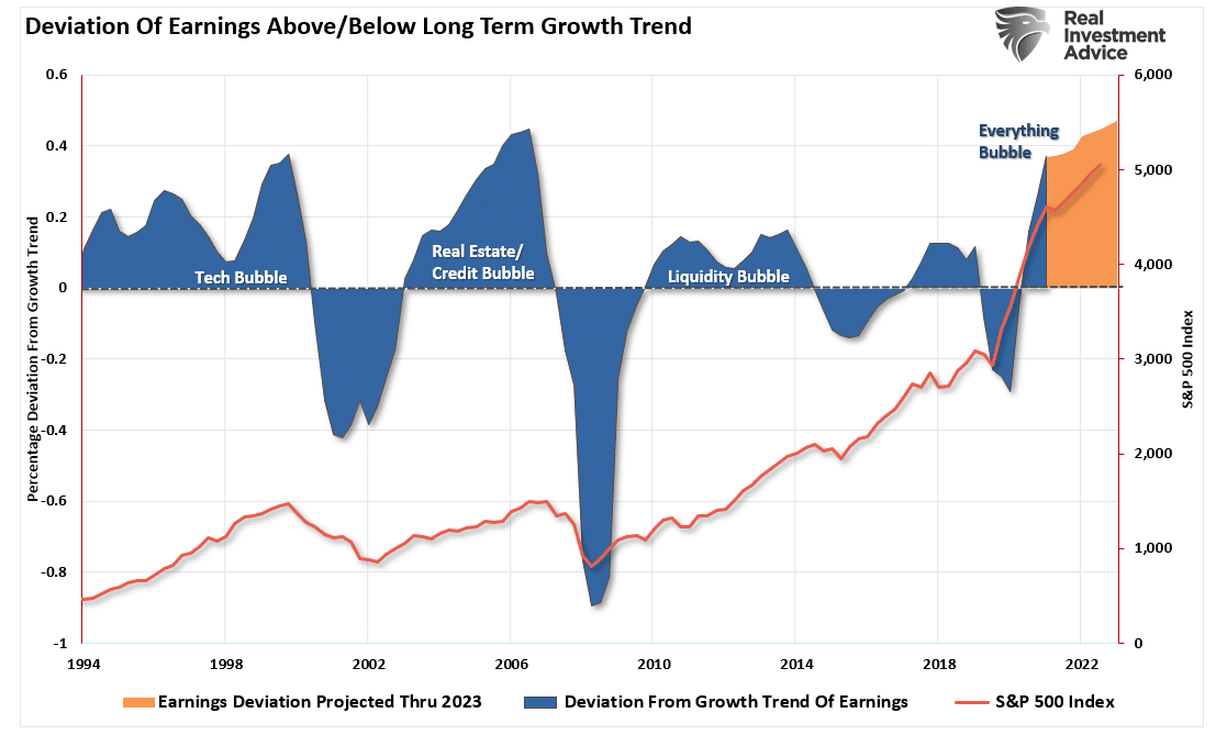
For investors, the considerations are essential because earnings expectations are currently at a record deviation from long-term growth trends. Reversions of those estimates to intersect with economic realities do not support overly bullish expectations.

Portfolio Update
There is more than a reasonable probability the Fed is about to make a policy mistake that could disrupt financial markets. Such certainly would not be the first time.
As noted in the market update heading into the Fed’s March meeting, there is undoubtedly a downside risk to equities as traders position a more aggressive rate-hiking policy to combat peak inflation. Such is why we have been starting to position portfolios more defensively by raising cash, lengthening the duration of our bond portfolio, and adding short-market hedges.
Last week we stated that it remains too early to say with certainty the recent lows were “the bottom.” Such remains the case this week. The failed retest of the 50-dma increase that overhead resistance and makes the retest of the January lows more likely. A break of those lows will be something far more problematic.
Importantly, history, as noted, suggests that rate hike cycles are not particularly kind to bull markets.
As such, a more cautious stance towards equity risk is prudent for the time being.

The market is currently in a very vulnerable position. Unfortunately, we can’t say with any confidence whether the next leg of the market is up or down.
As such, all we can do is manage risk to the best of our ability until the market declares itself one way or the other. Guessing and aggressively positioning on that guess has a propensity to leave you on the wrong side of the trade. Sometimes, while it may cost you a little initially, it is often better to wait and let the market tell you what to do.
I suspect we could have our answer by next week.
Stay tuned.
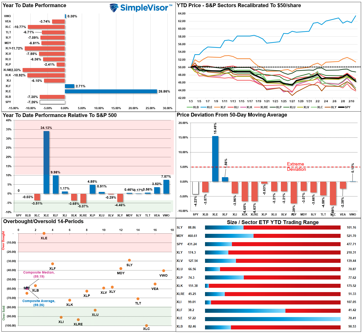
Market & Sector Analysis
S&P 500 Tear Sheet
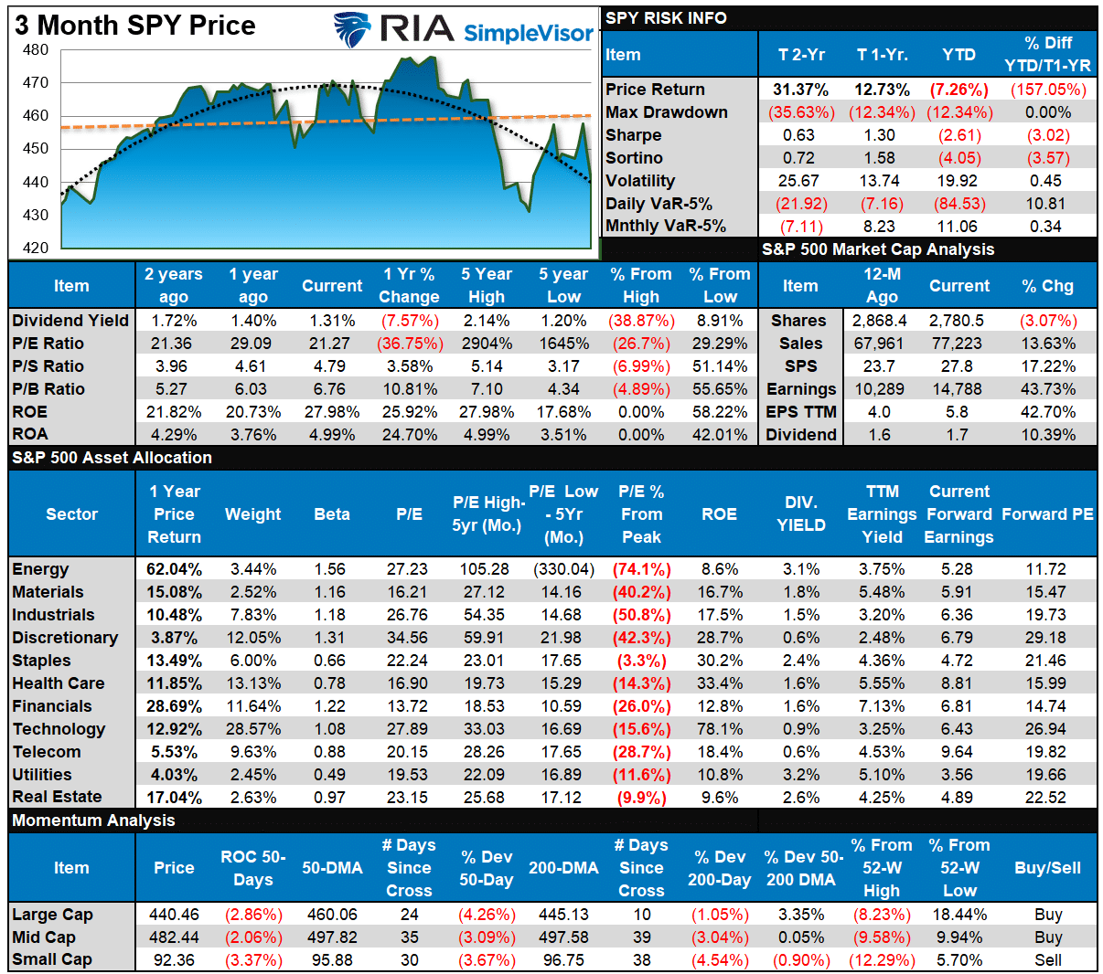
Relative Performance Analysis
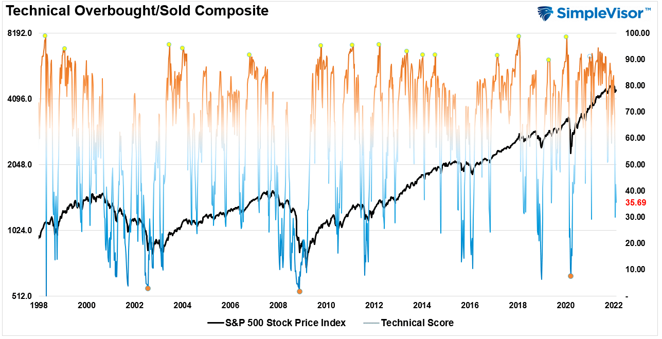
Technical Composite
The technical overbought/sold gauge comprises several price indicators (RSI, Williams %R, etc.), measured using “weekly” closing price data. Readings above “80” are considered overbought, and below “20” are oversold. The current reading is 35.69 out of a possible 100.
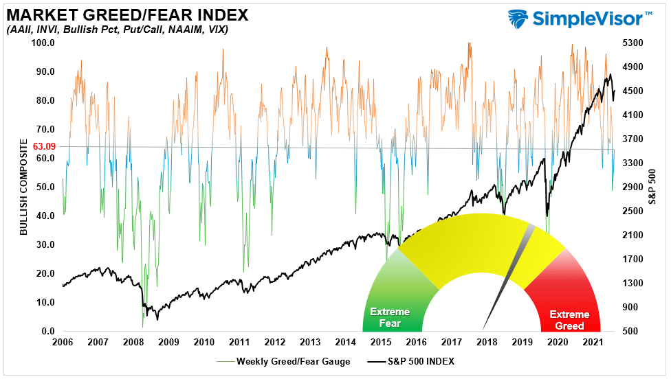
Portfolio Positioning “Fear / Greed” Gauge
Our “Fear/Greed” gauge is how individual and professional investors are “positioning” themselves in the market based on their equity exposure. From a contrarian position, the higher the allocation to equities, to more likely the market is closer to a correction than not. The gauge uses weekly closing data.
NOTE: The Fear/Greed Index measures risk from 0-100. It is a rarity that it reaches levels above 90. The current reading is 63.09 out of a possible 100.
Sector Model Analysis & Risk Ranges
How To Read This Table
- The table compares each sector and market to the S&P 500 index on relative performance.
- “MA XVER” is determined by whether the short-term weekly moving average crosses positively or negatively with the long-term weekly moving average.
- The risk range is a function of the month-end closing price and the “beta” of the sector or market. (Ranges reset on the 1st of each month)
- Table shows the price deviation above and below the weekly moving averages.
- The complete history of all sentiment indicators is on under the Dashboard/Sentiment tab at SimpleVisor

Weekly Stock Screens
Each week we will provide three different stock screens generated from SimpleVisor: (RIAPro.net subscribers use your current credentials to log in.)
This week we are scanning for the Top 20:
- Relative Strength Stocks
- Momentum Stocks
- Technically Strong With Strong Fundamentals
These screens generate portfolio ideas and serve as the starting point for further research.
(Click Images To Enlarge)
RSI Screen
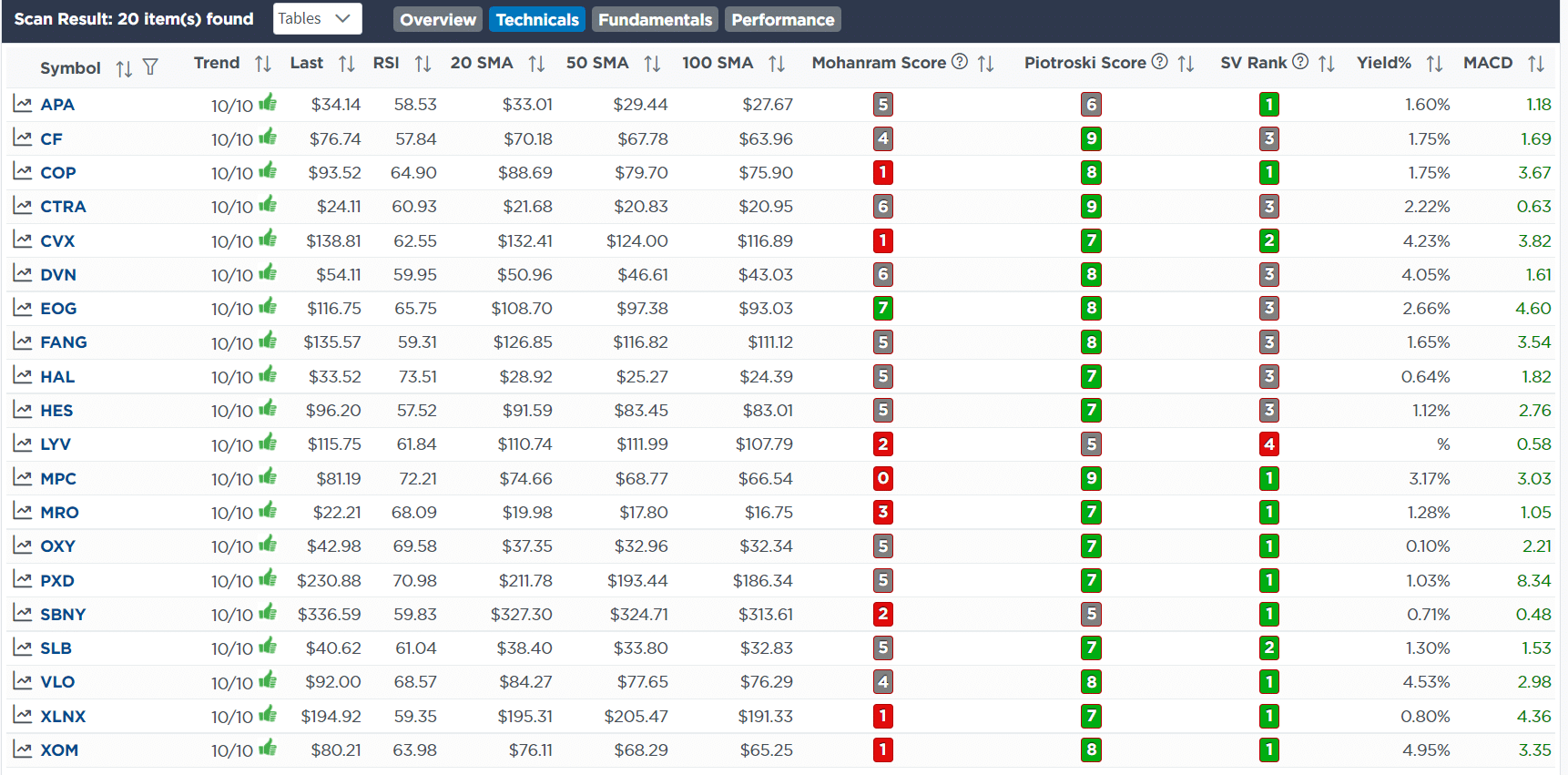
Momentum Screen

Technical & Fundamental Strength Screen

SimpleVisor Portfolio Changes
We post all of our portfolio changes as they occur at SimpleVisor:
There were two sets of trades this week.
February 10th
We added 1% of TLT to both models this morning. It is trading off this morning on the CPI number. As we noted long bonds are grossly oversold and may catch a nice bid at today’s auction. Also, as the Fed begins to hike rates and tighten policy, long-bonds perform well as a “risk-off” trade. With bonds trading at the top end of their long-term downtrend, the risk/reward as a hedge to equity risk is opportunistic. We will keep adding to our duration as rates rise towards the expected peak of 2.25%.
- Add 1% of the portfolio to TLT bringing total weight to 9% of the portfolio.
February 11th
This morning we are reducing our holdings in Google (GOOG) and SPDR Communications (XLC). Over the last couple of weeks, we have discussed using rallies in the market to reduce portfolio risk and hedge portfolios. We continue to follow that advice by reducing equity weight and adding hedges in both short-S&P ETF and increasing bond duration.
We are not fully reduced in terms of our equity exposure just yet but will continue to use counter-trend rallies to get portfolio weights down to roughly 75% of the target weighting. As noted previously, risk management is about small steps and we keep inching our way into defense.
Equity Model
- Reduce GOOG to 2% of the portfolio model.
ETF Model
- Reduce XLC from 5% to 4% of the portfolio.
Macro Momentum Model
- Sell 100% of QQQ in preparation to start buying individual equities.

Lance Roberts, CIO
Have a great week!