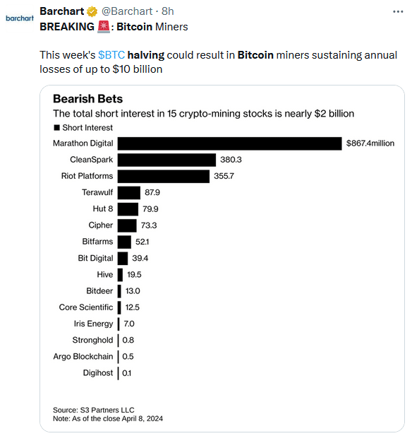
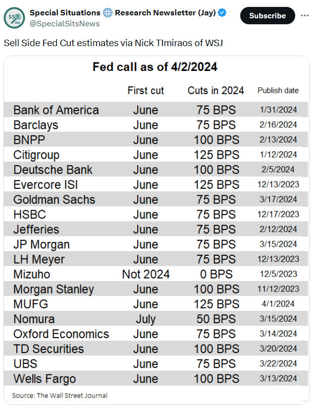
Meta And Tesla Show Technicals Trump Narratives
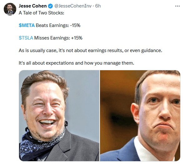
Meta shares fell almost 20% following a better-than-expected earnings report. The day before, Tesla shares rose 15% despite missing earnings and sales estimates and reporting a massive decline in its free cash flows. The sections below provide more specifics on Meta and Tesla earnings. Their earnings are important for investors, but it is equally critical to appreciate how the intersection of technicals and narratives plays into their confusing stock performance.
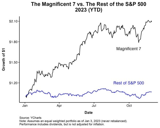
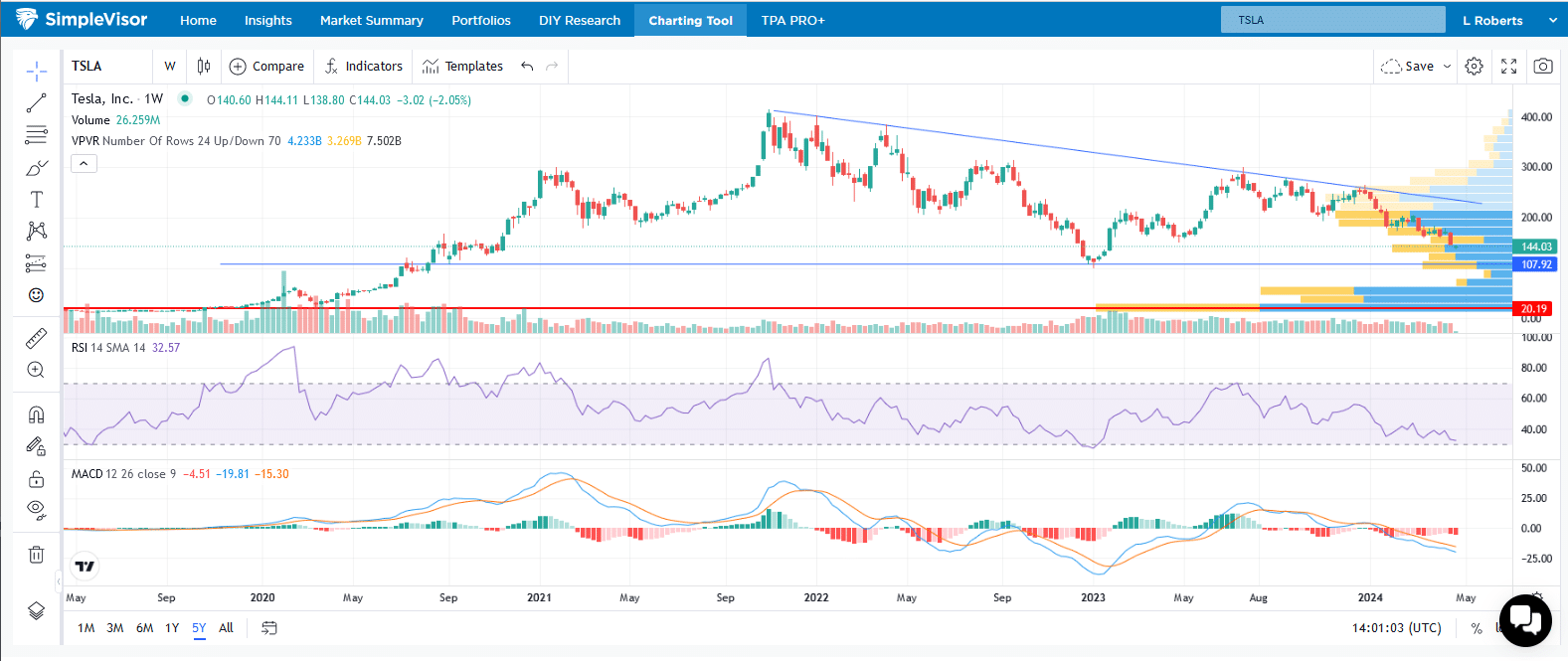
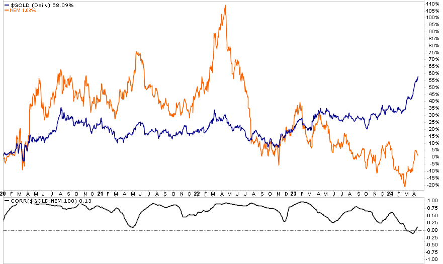
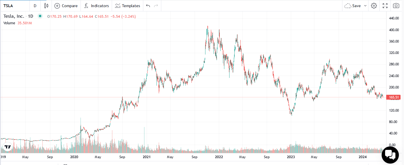
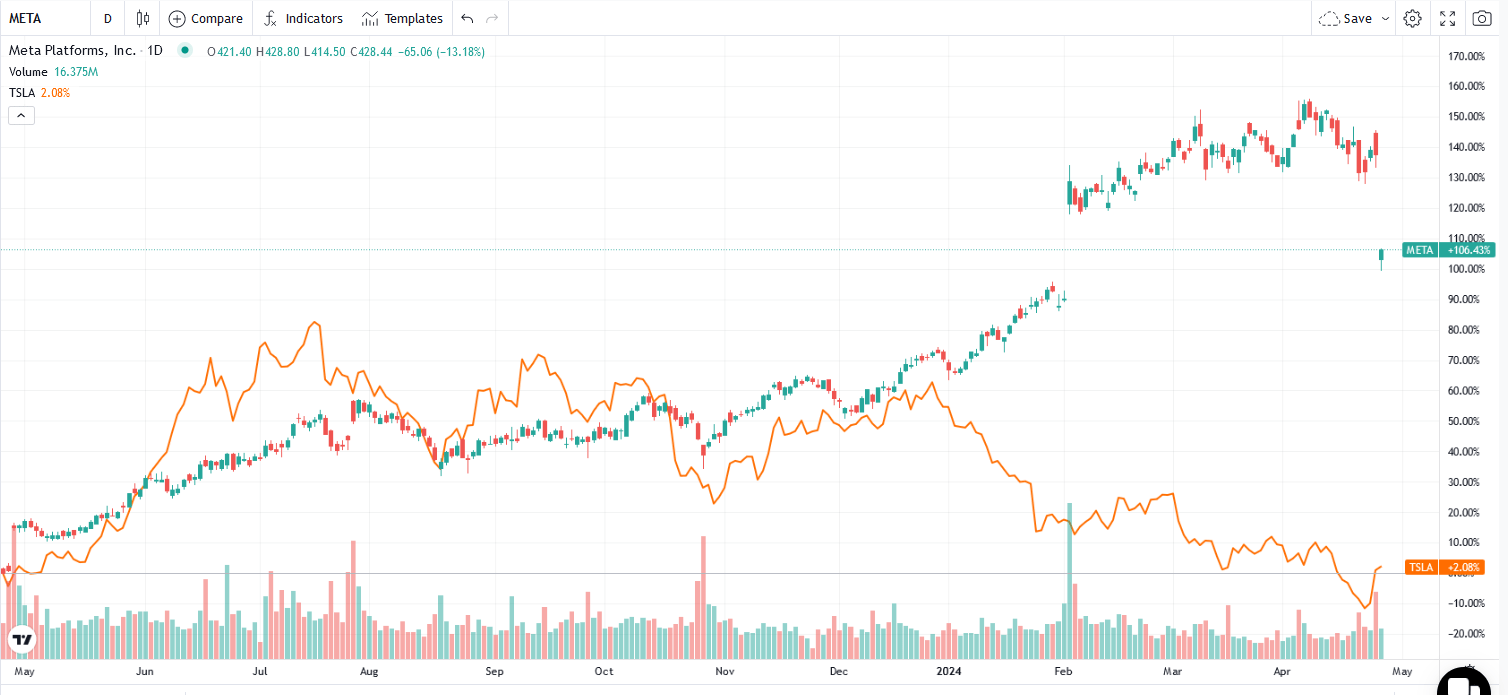
Tesla shares are down 33% year to date, including the 15% increase on Wednesday. The narrative pushing the stock lower was that the EV industry is losing ground to hybrid models. Significant EV competition is further hurting Tesla. While the narrative was dour, the fact of the matter is that the stock was grossly oversold. Even if you think Tesla is still significantly overvalued, the stock fell too far too fast. Elon Musk’s hopeful comments pushed the stock higher, forcing shorts to cover. Meta is the opposite story. It is up 110% over the last year, including yesterday’s decline. The benefits of AI pushed this relatively cheap stock much higher in a very short period. While we can debate Meta valuations, it’s hard to argue that its stock wasn’t grossly overbought.
Narratives can drive a stock much higher or lower than many think possible. However, it doesn’t take much to reverse a trend when a narrative pushes a stock to grossly overbought or oversold levels. Further, part of the reason ascribed for the Meta selloff is their investment in AI. Months ago, any company mentioning AI would surge higher. Might the AI narrative be fading or at least taking a pause?
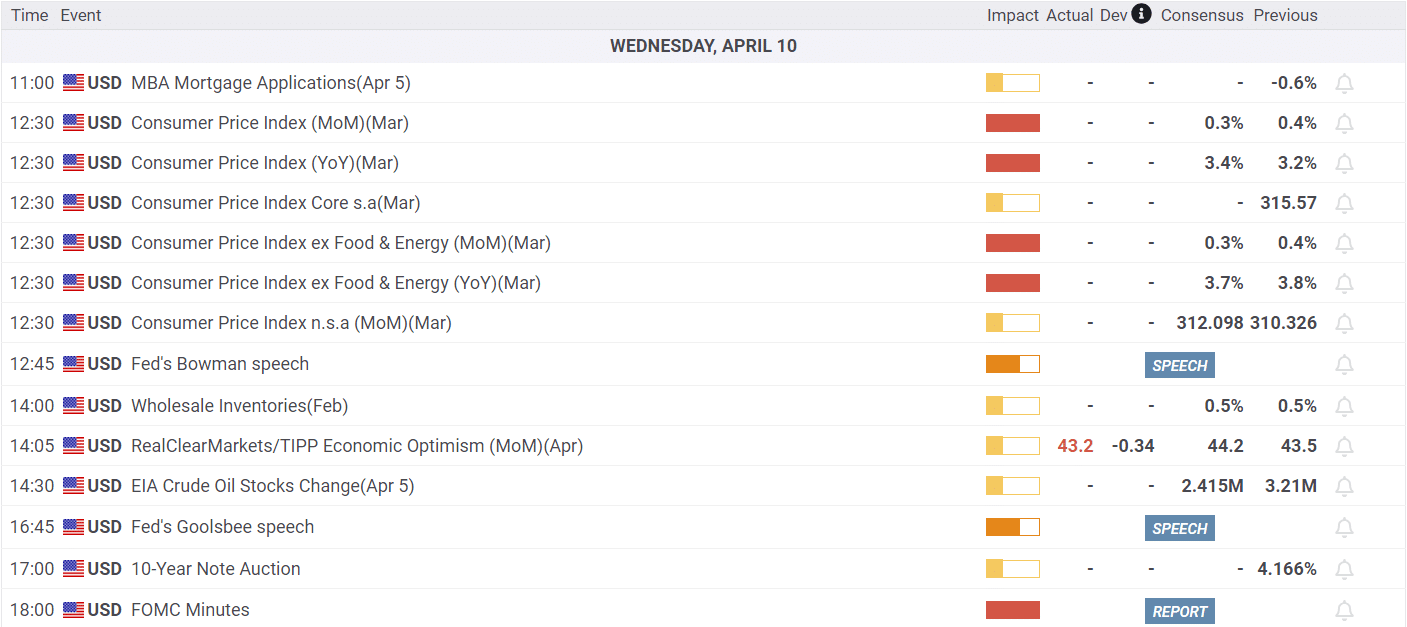
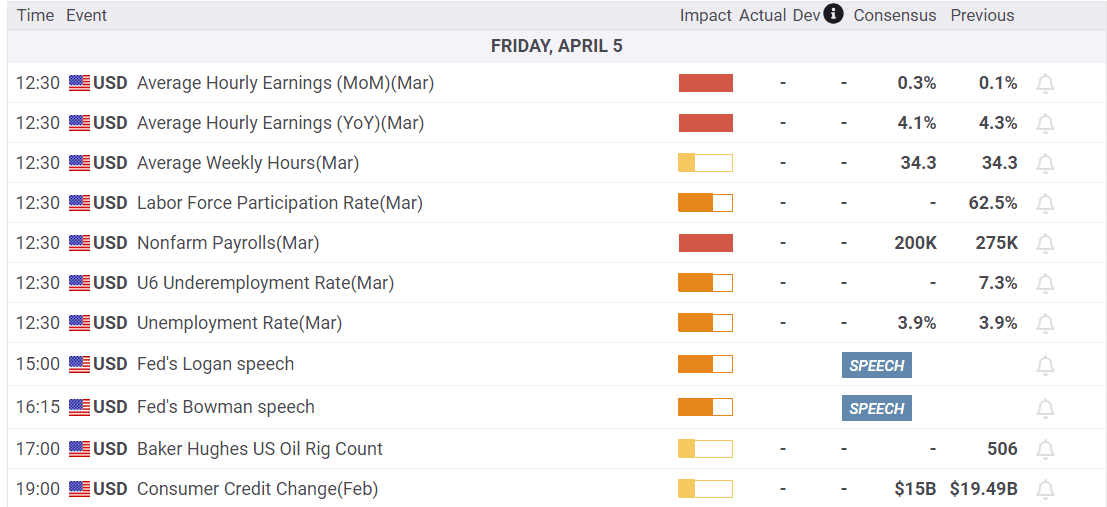
What To Watch Today
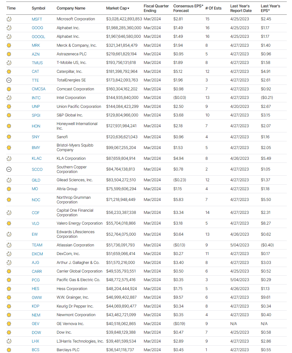
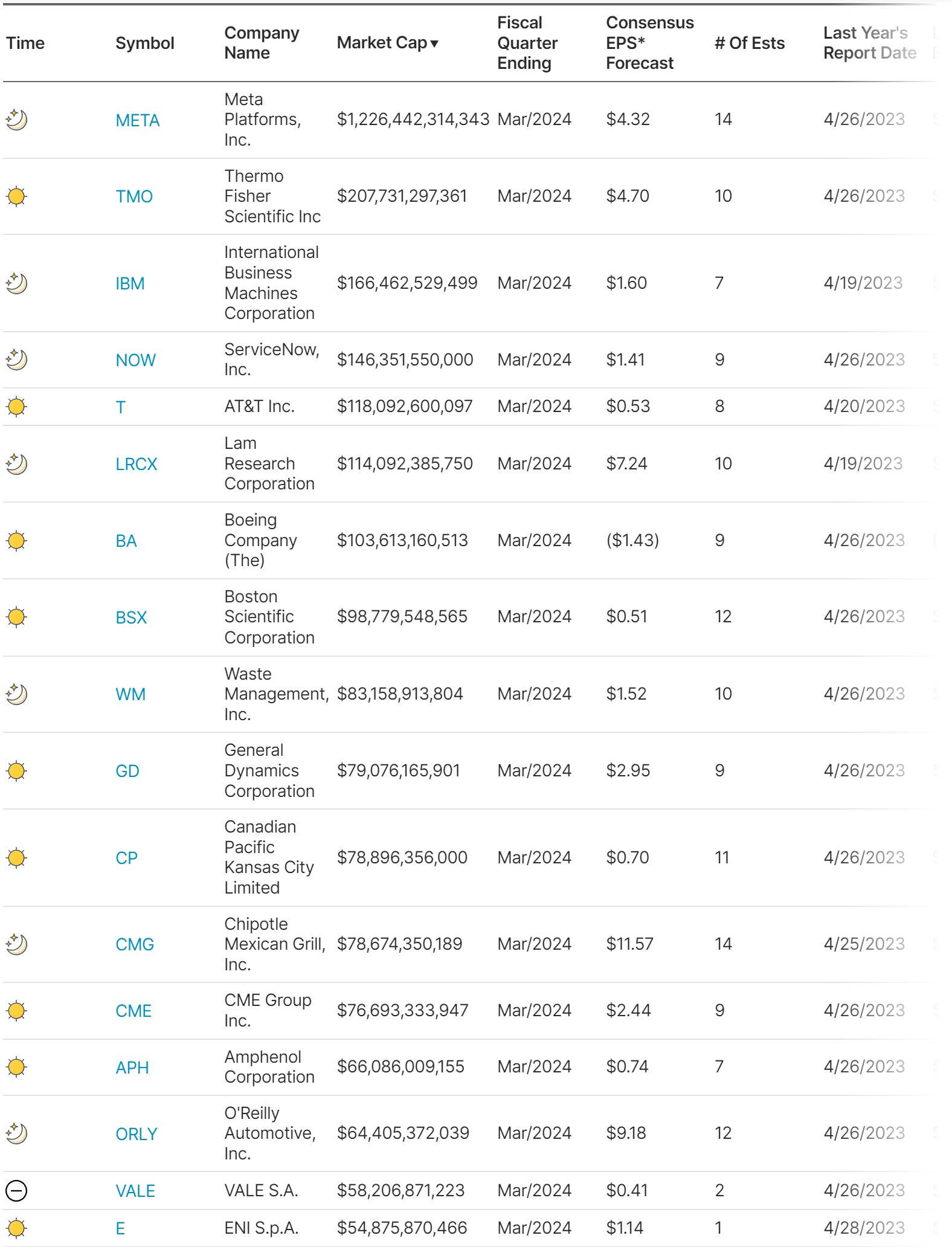
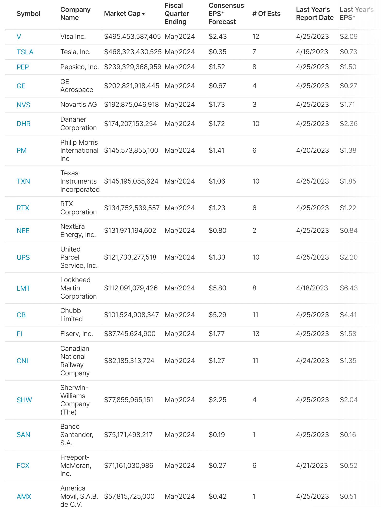
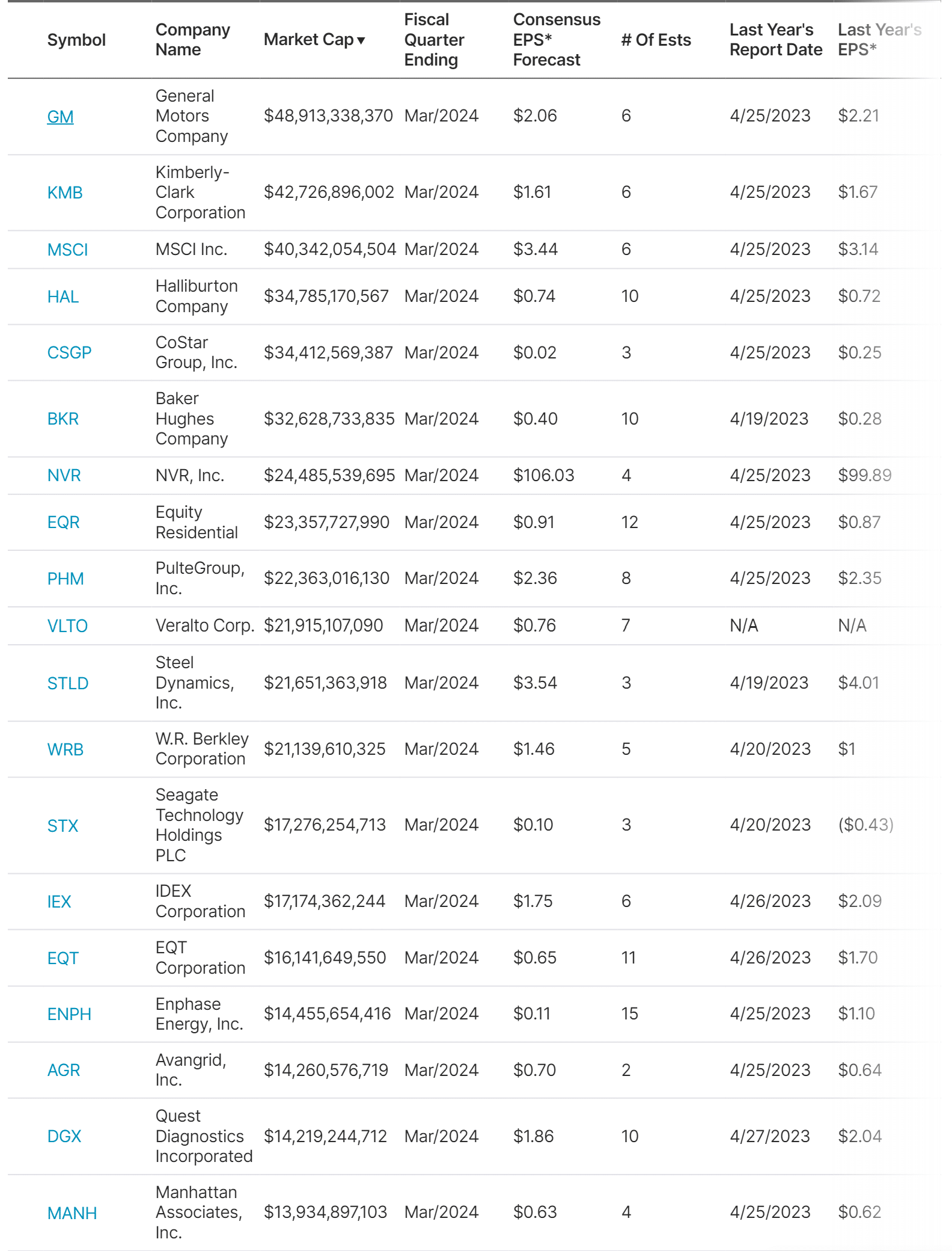
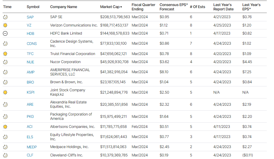
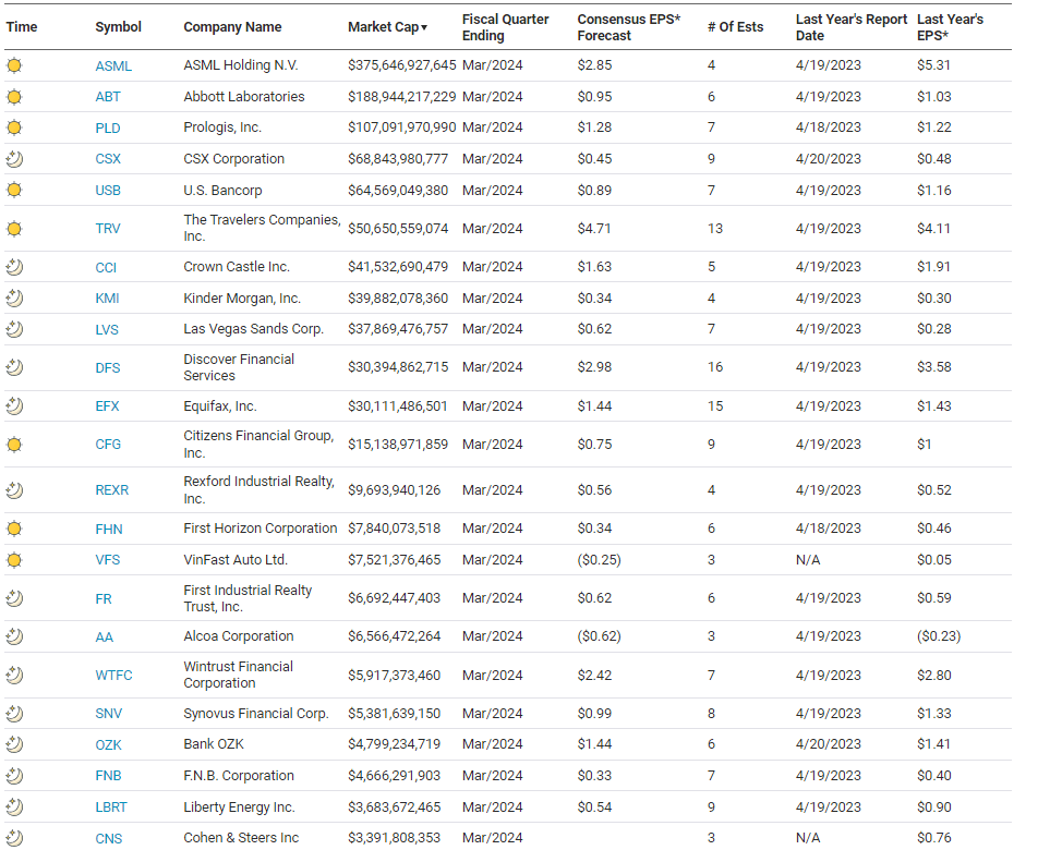
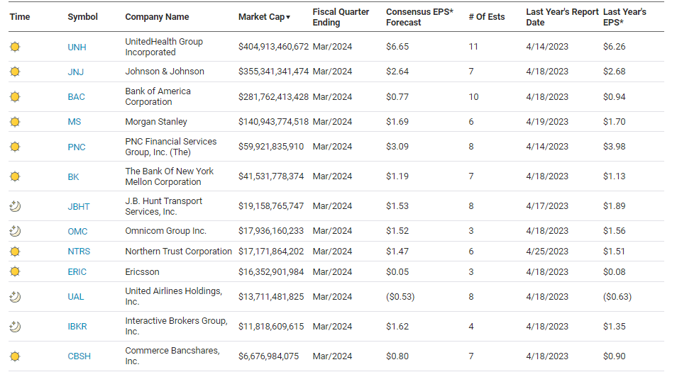
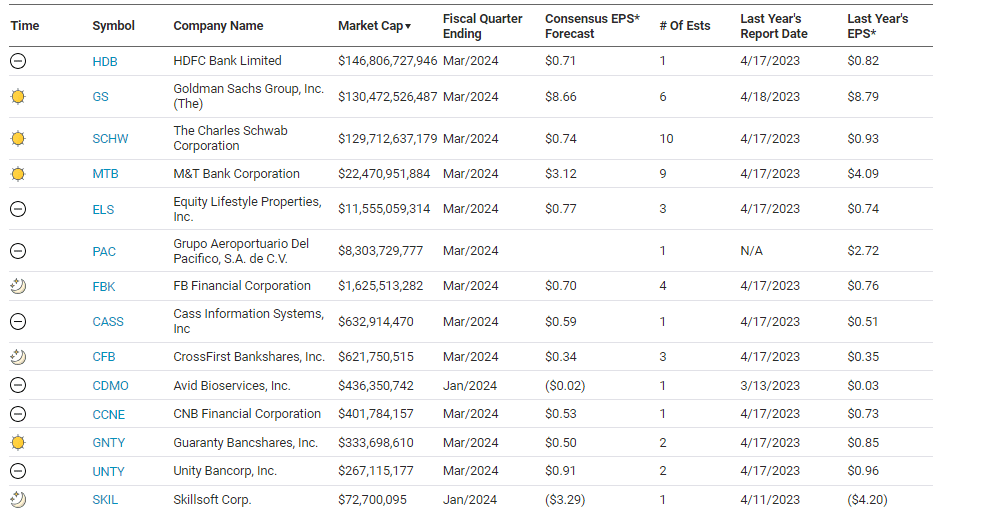
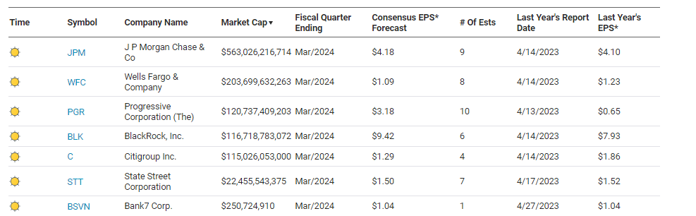
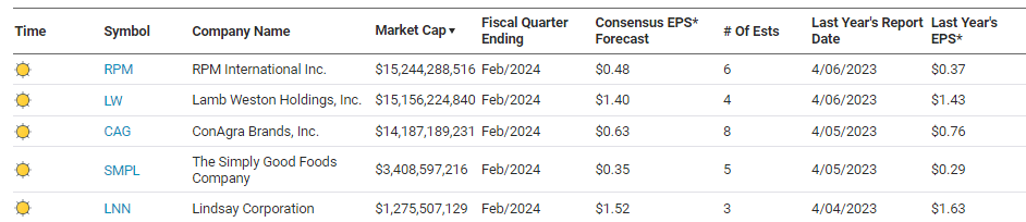
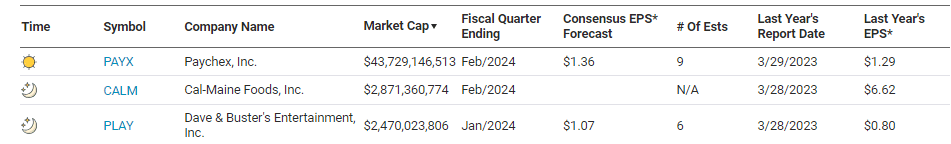
Earnings
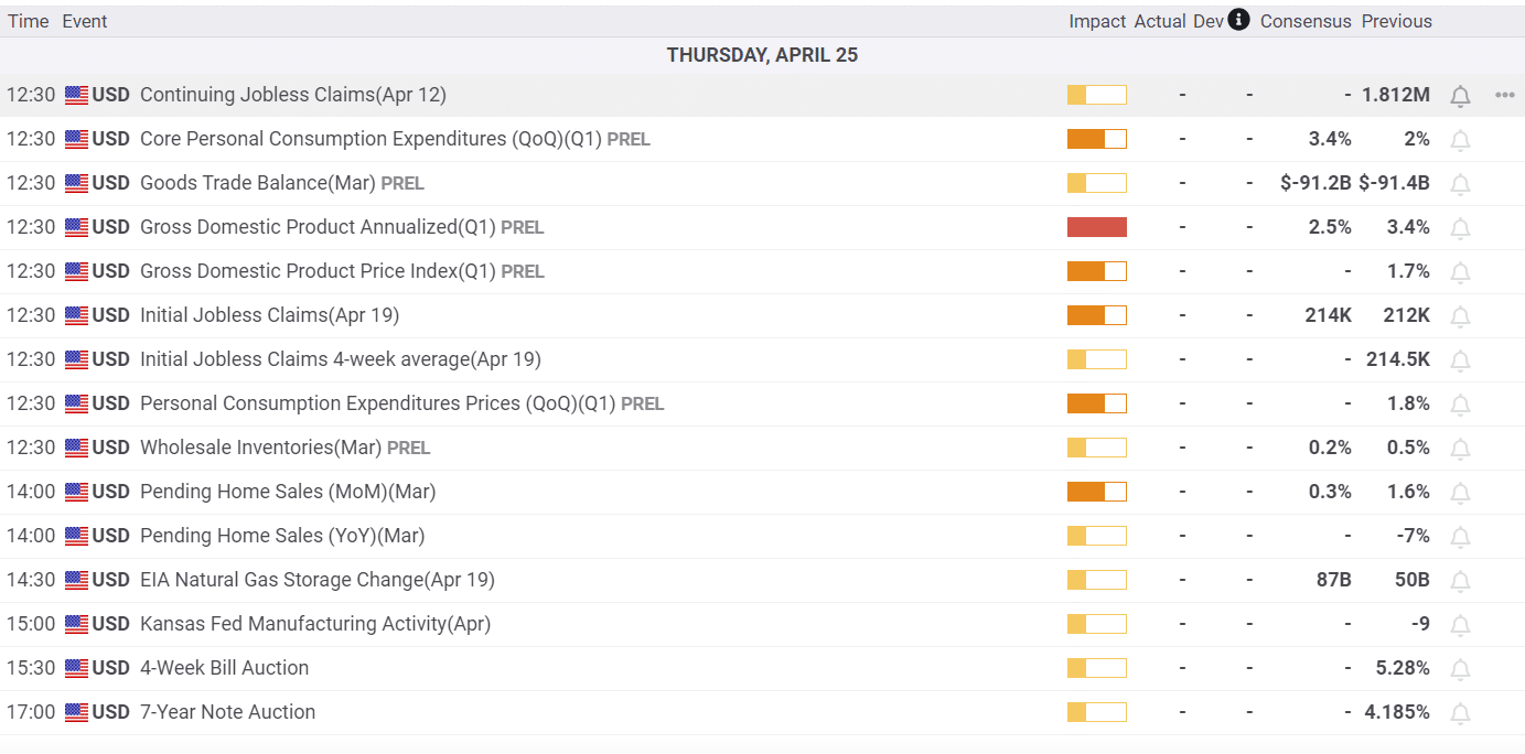
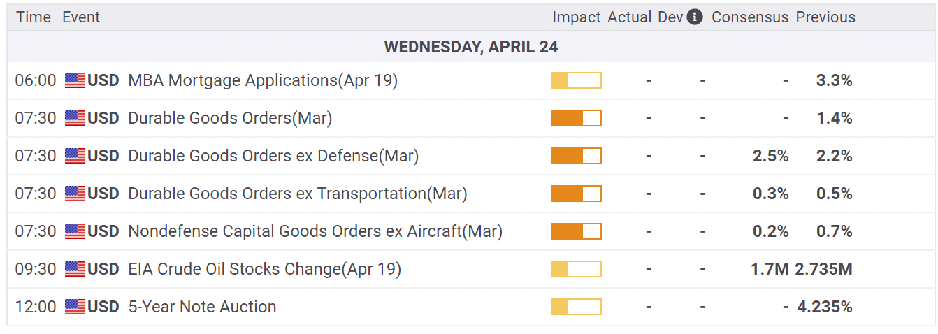
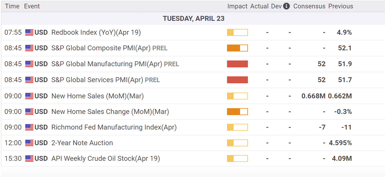
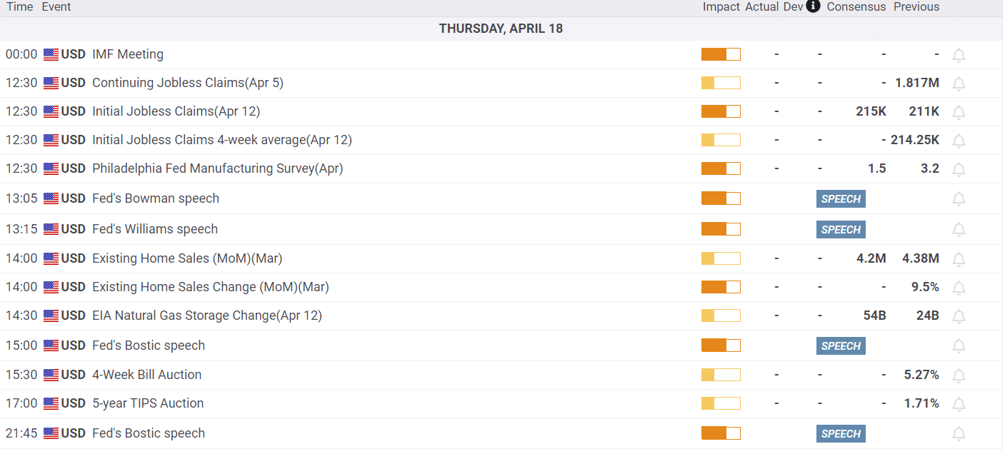
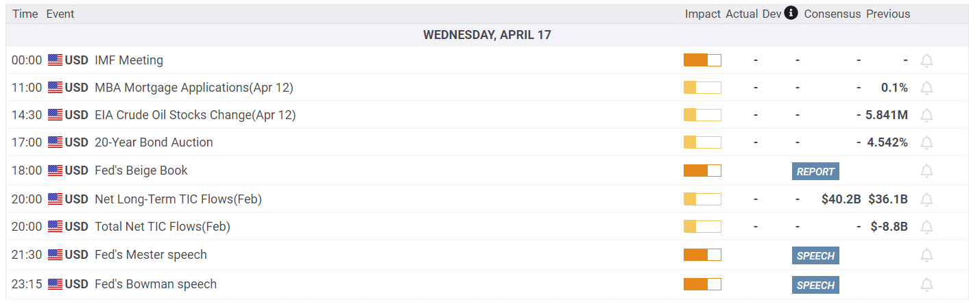
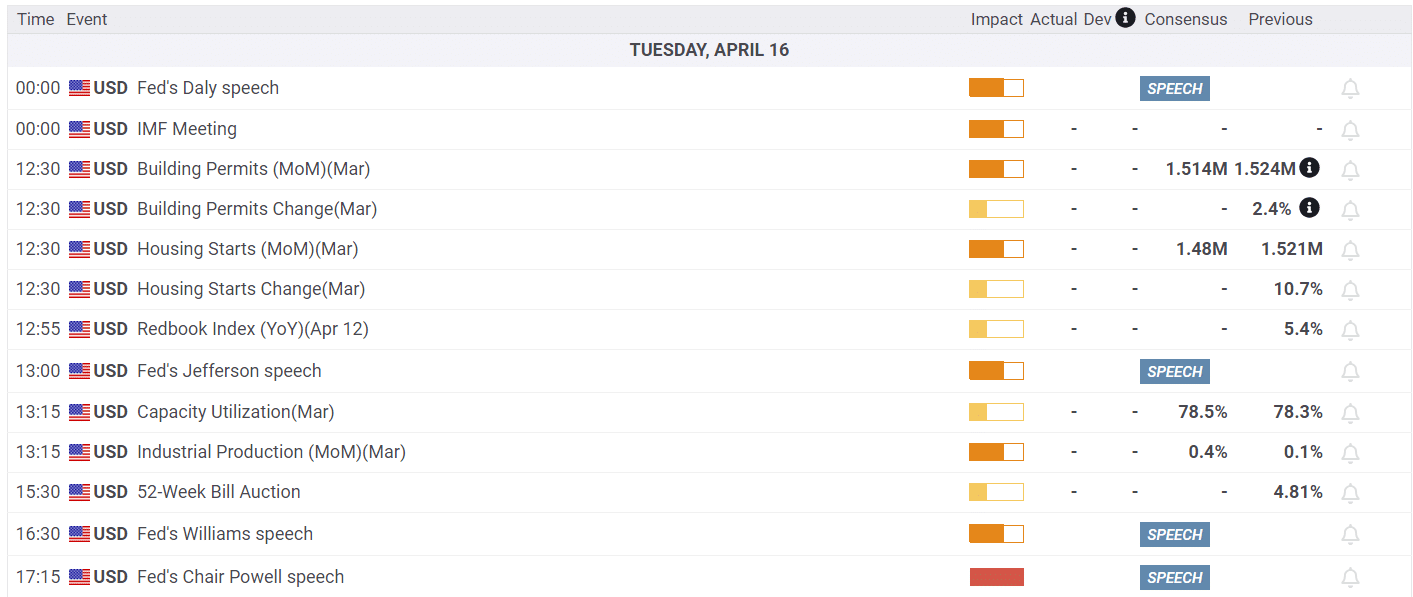
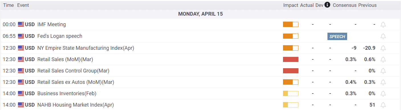
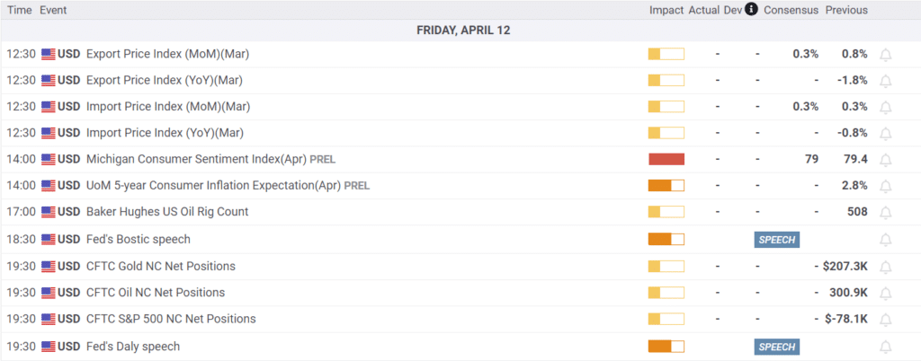
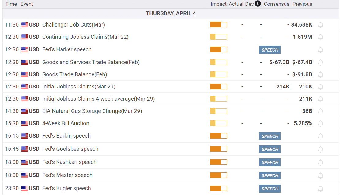
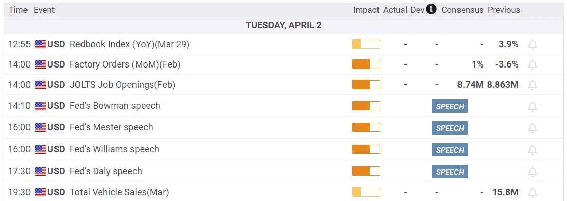
Economy
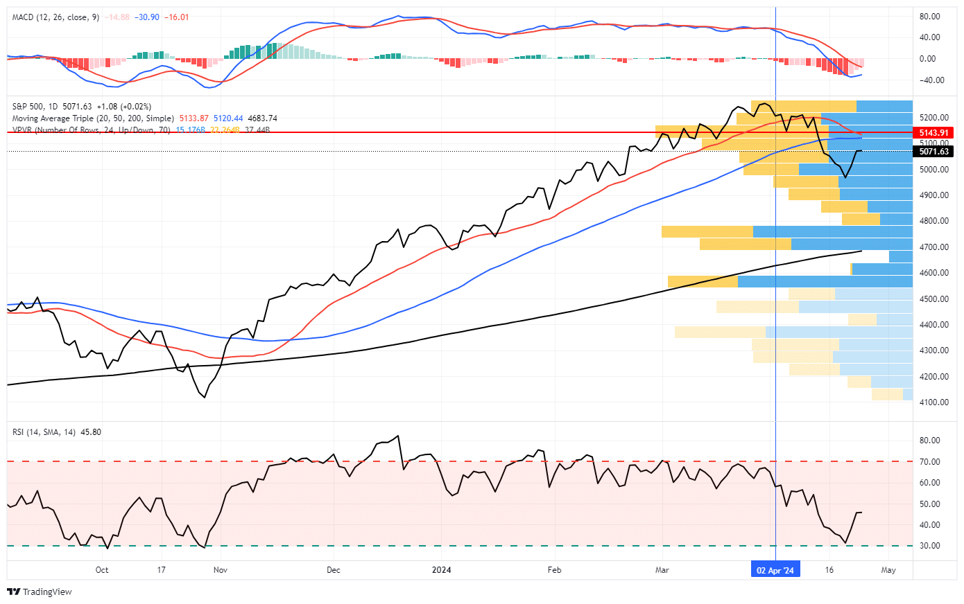
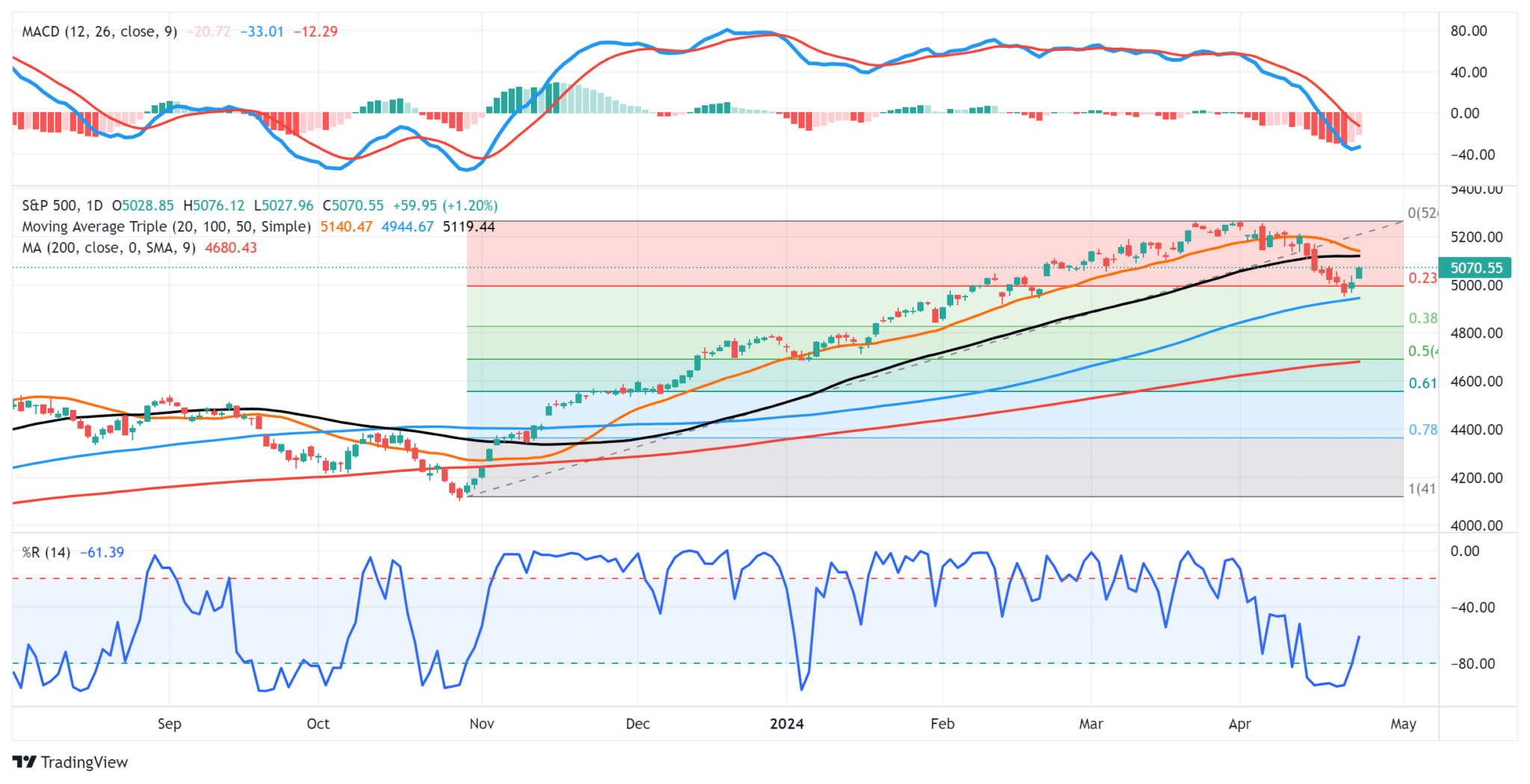
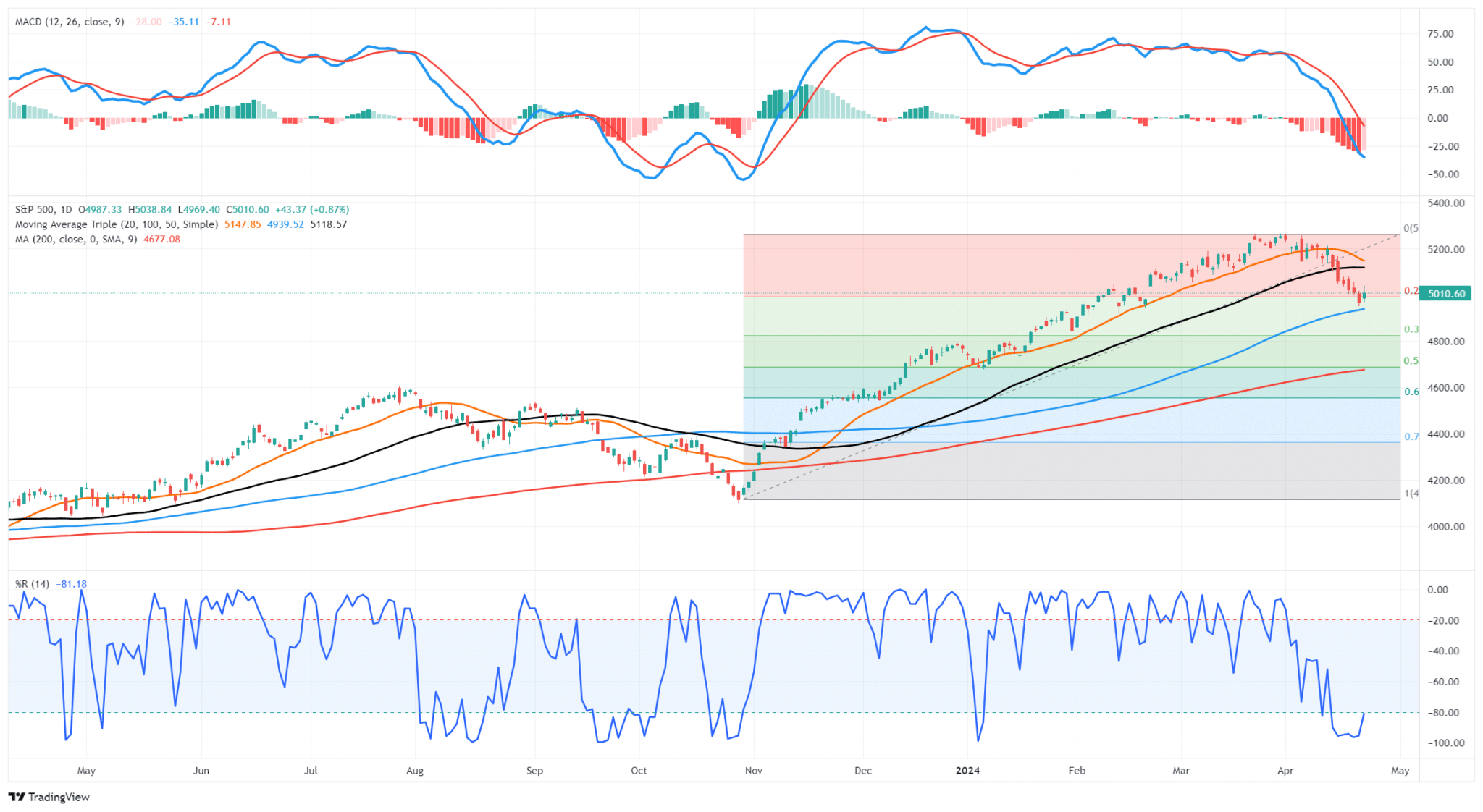
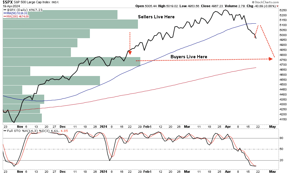
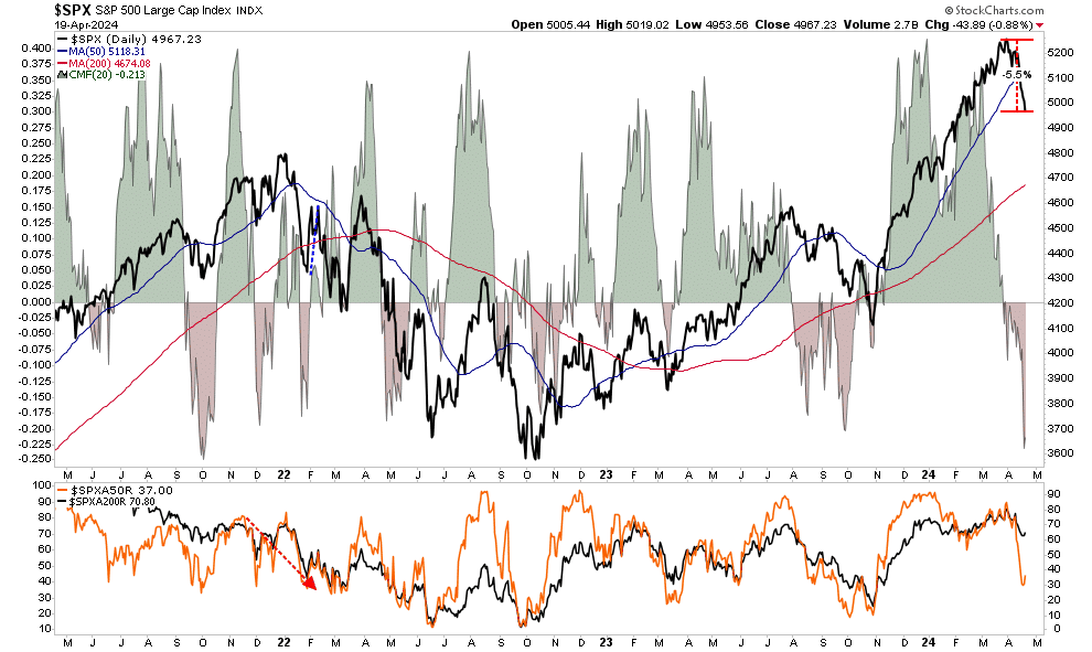
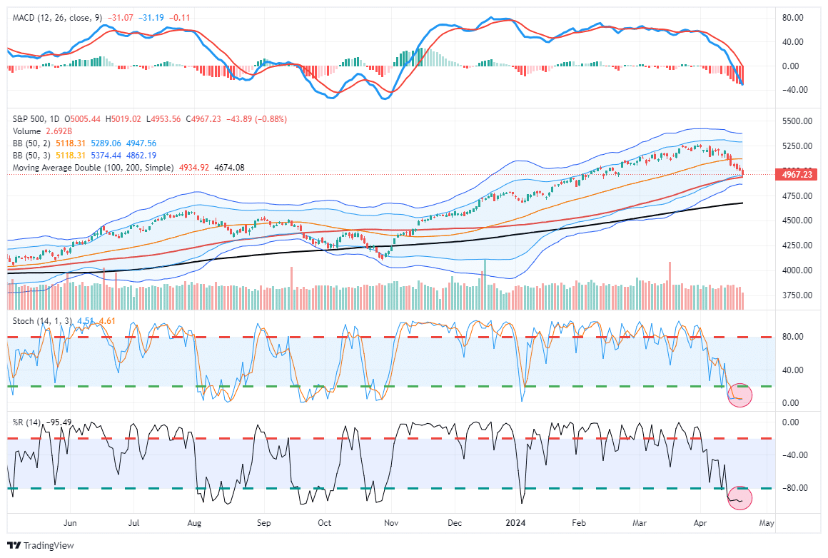
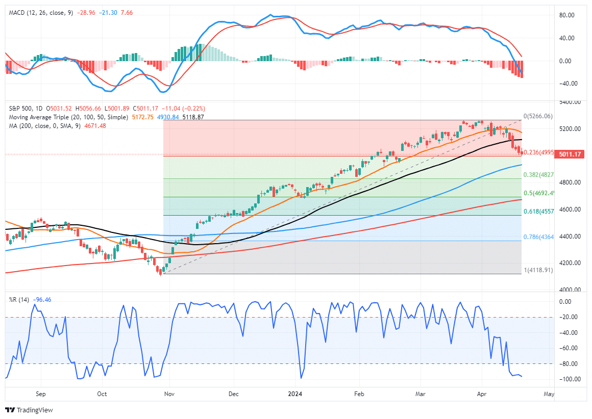
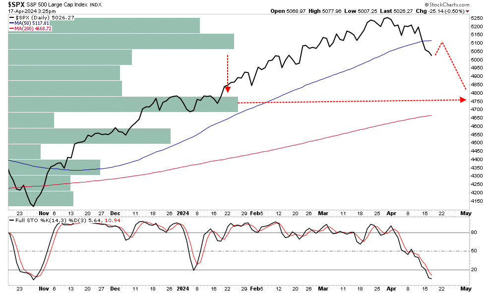
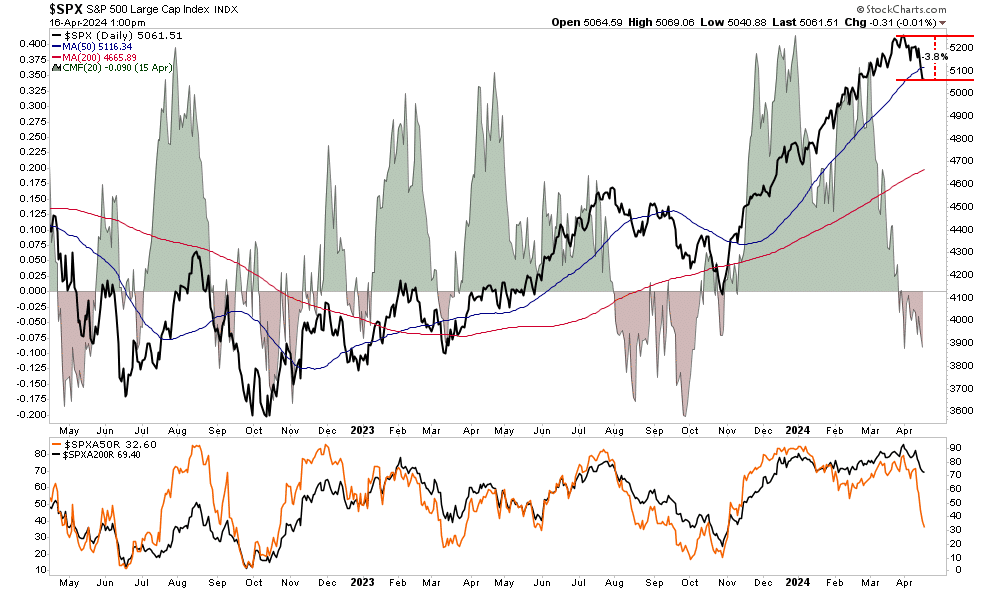
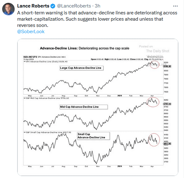
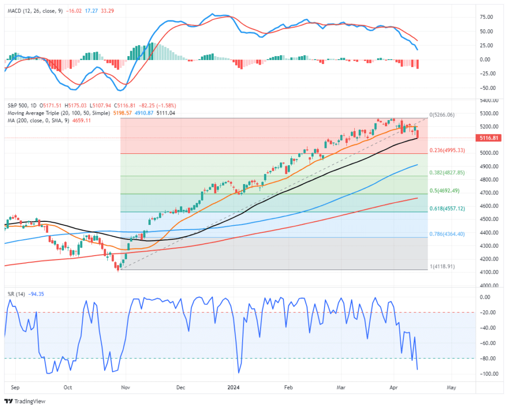
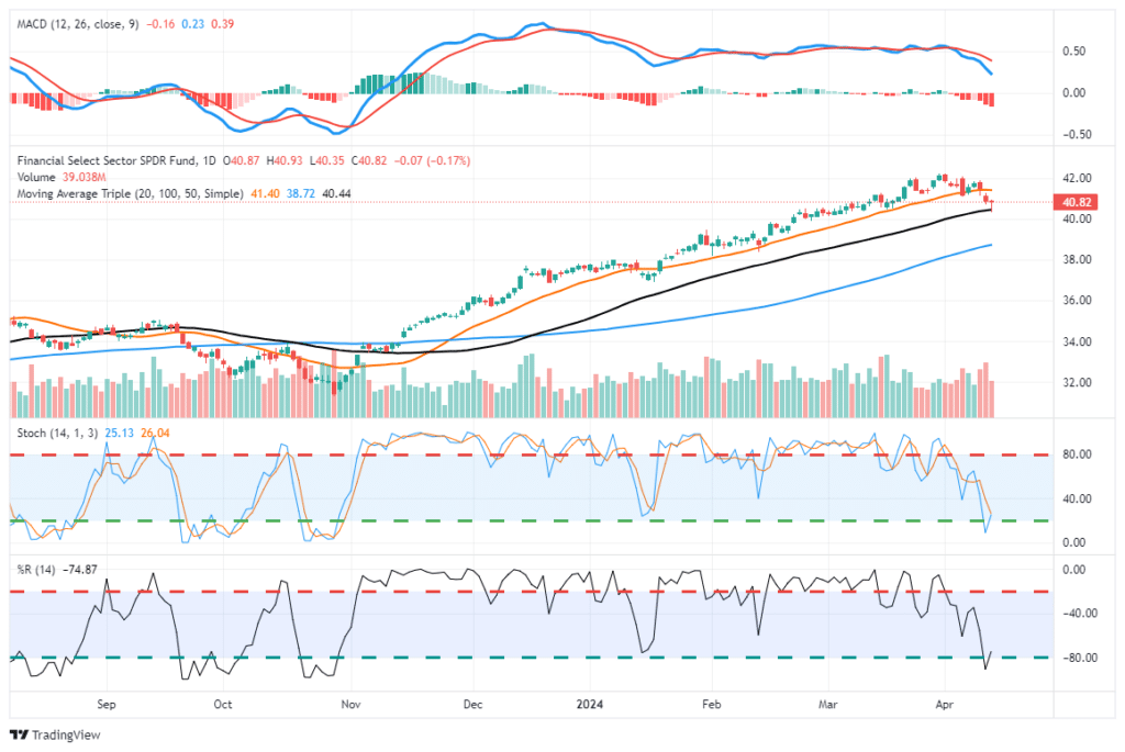
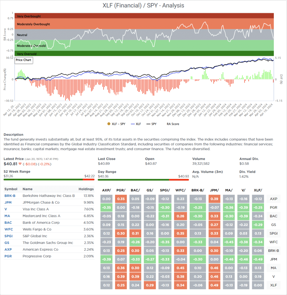
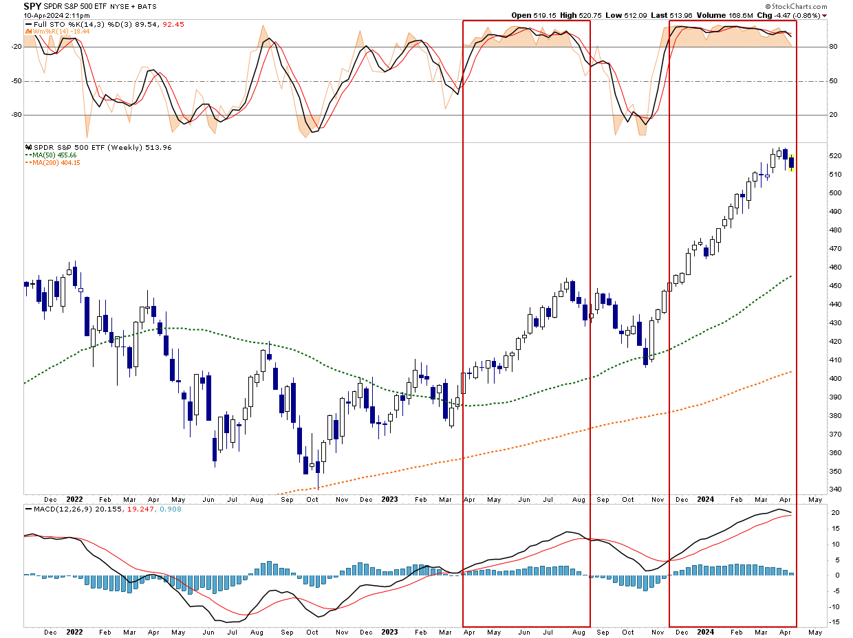
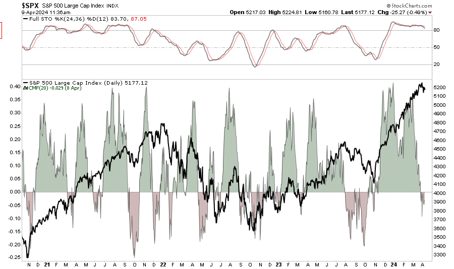
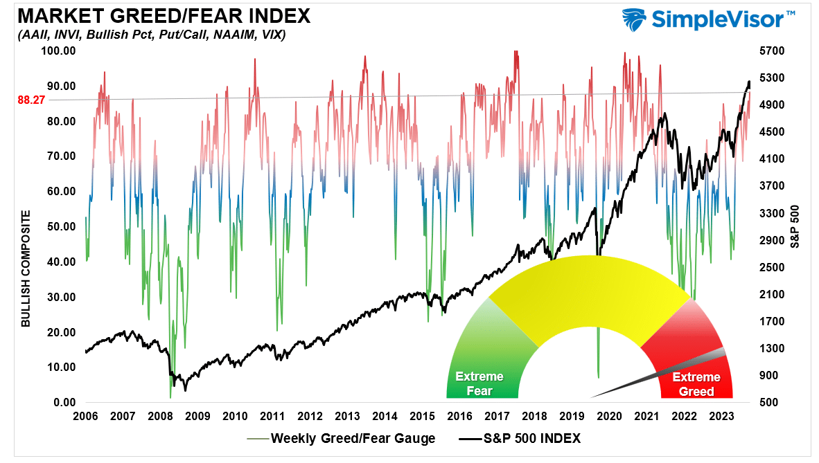
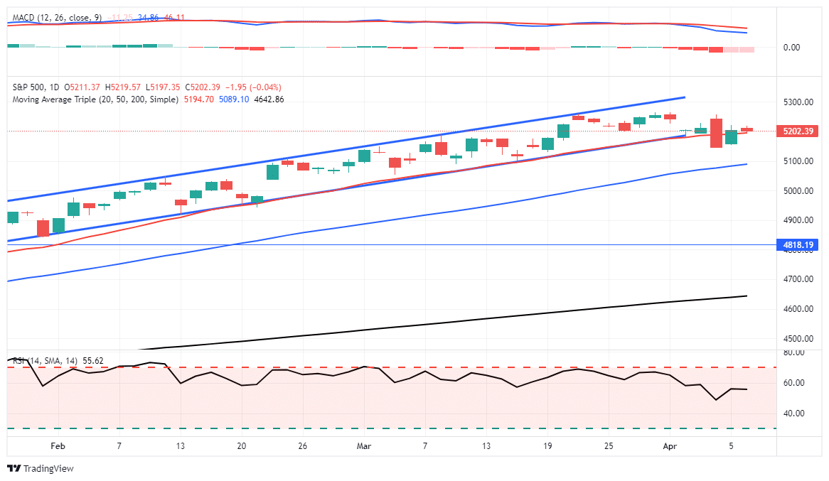
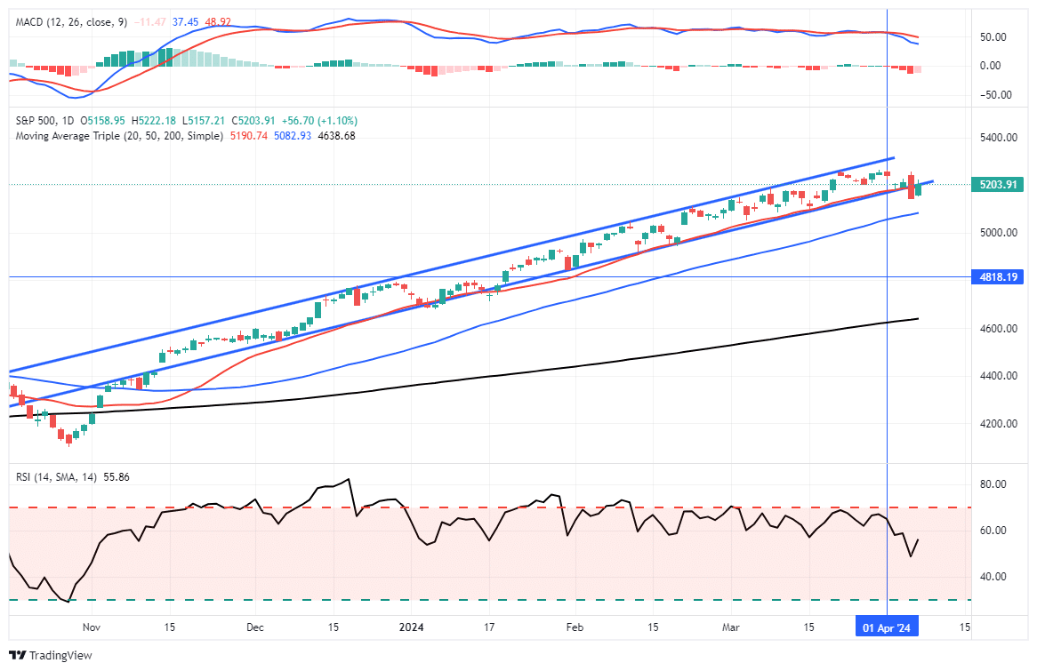
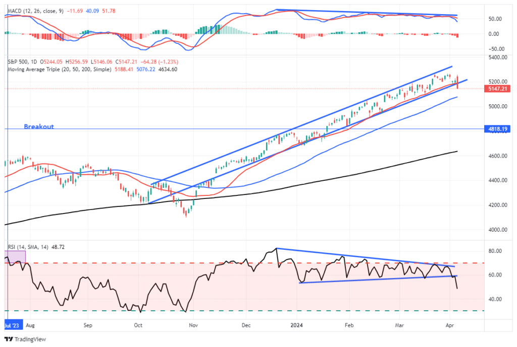
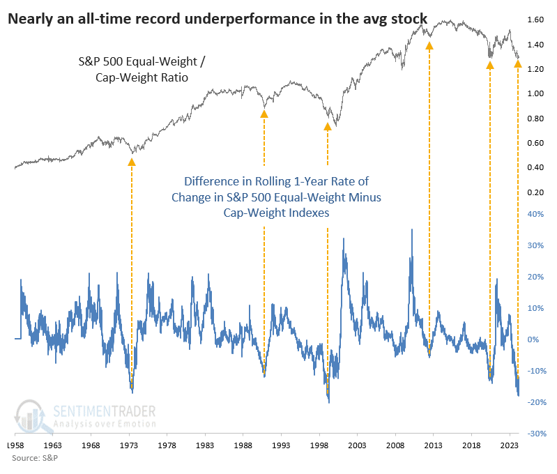
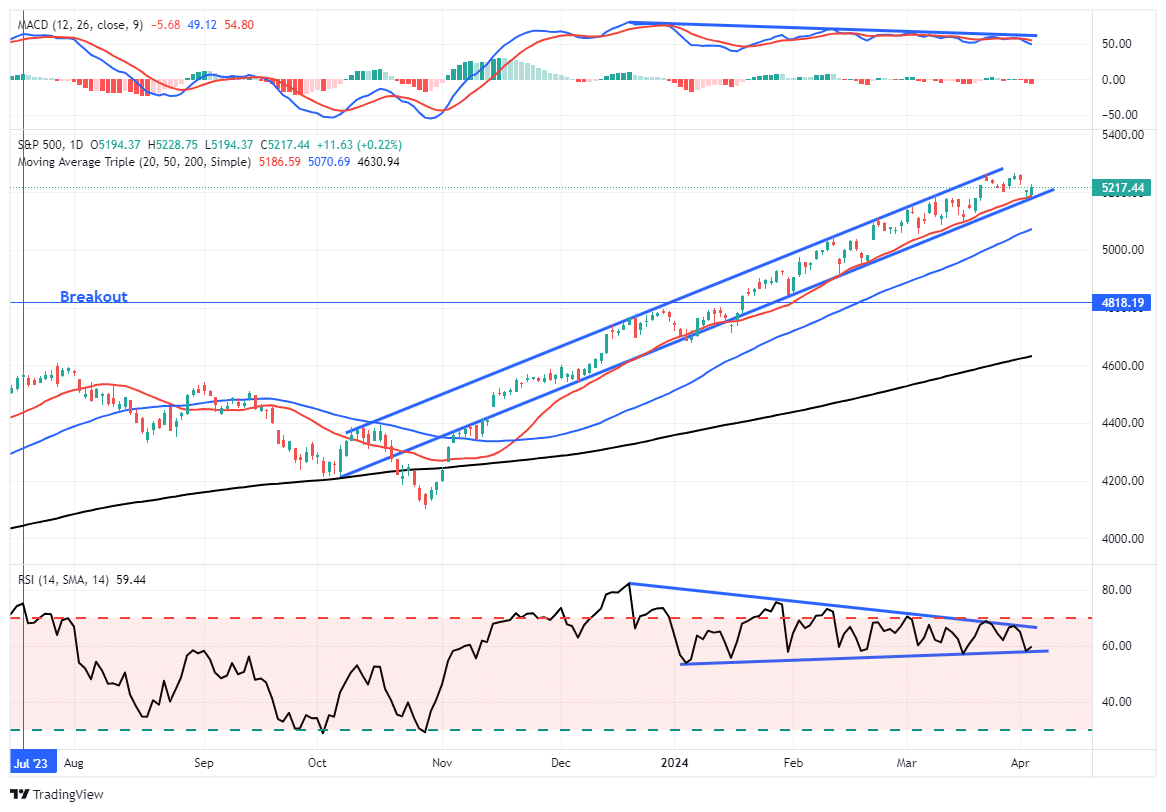
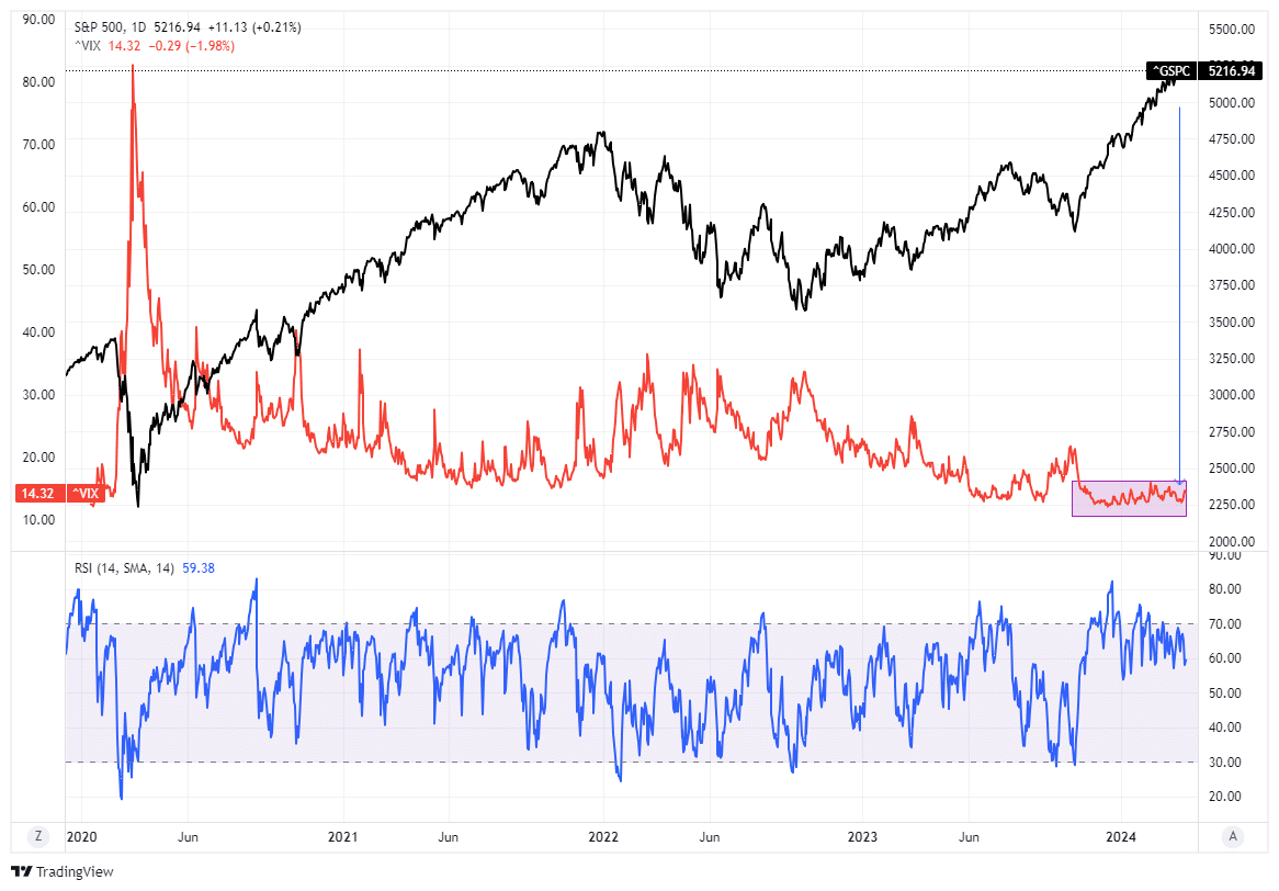
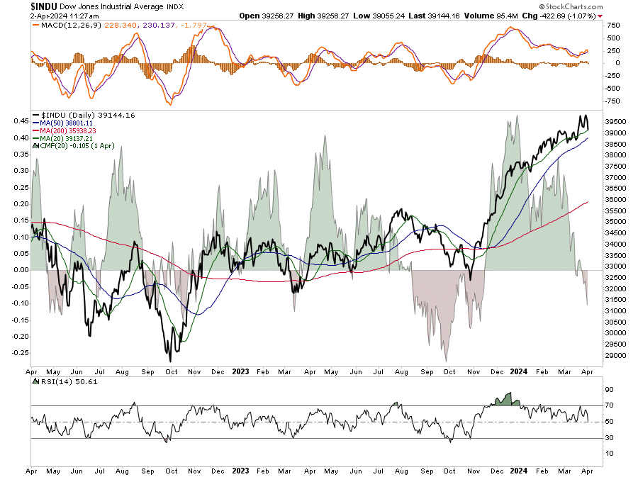
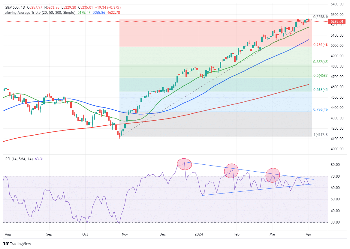
Market Trading Update
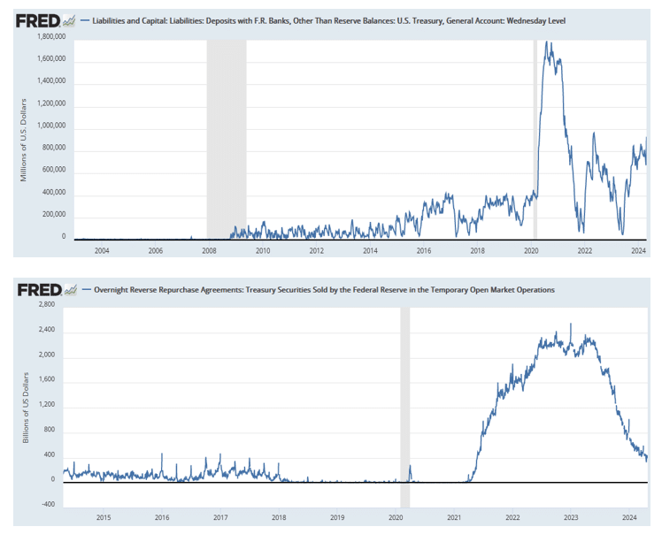
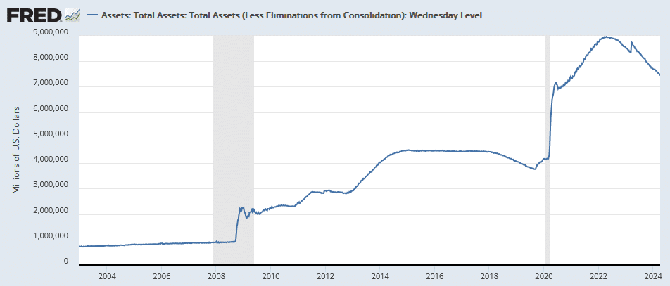
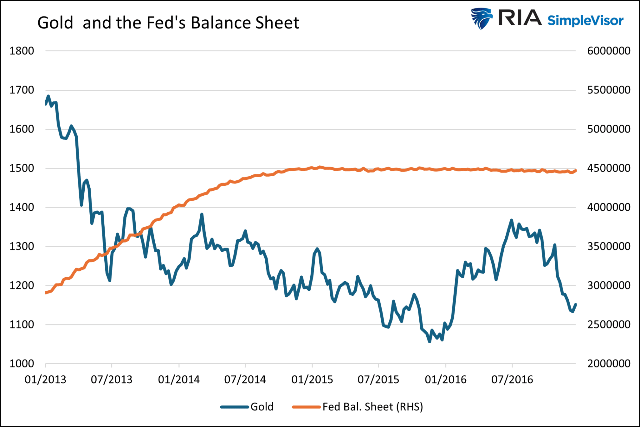
One of the factors contributing to the recent selloff, besides just the reversal of ebullient investor sentiment, was a sharp contraction in liquidity. As shown in the Liquidity Index chart below, while liquidity tends to ebb and flow from one week to the next, the trend has supported recent market gains. However, last week, there was a sharp contraction in liquidity coinciding with the contraction in asset prices.
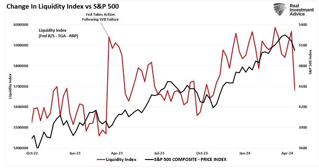
The key factor in that liquidity change was a sharp increase in the Treasury General Account (TGA). While the Fed’s balance sheet declined from $7.43 trillion to $7.40 trillion, the TGA surged from $675 billion to $930 billion last week. This was due to the rather large auctions by the Treasury to fund current expenditures.
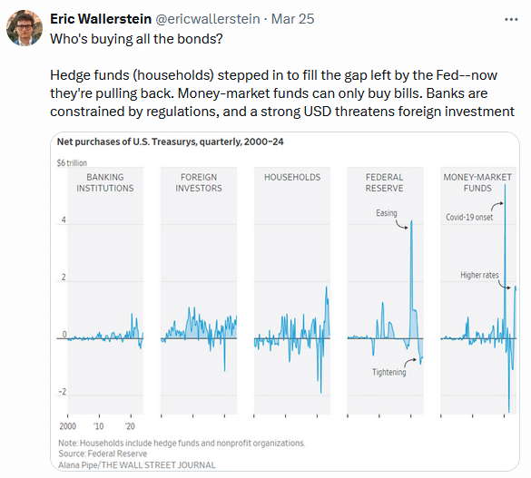
As Alfonso Peccatiello recent noted:
“Over the next 6 months, we might experience (another) huge liquidity injection in markets and the economy! How. By having Yellen drain the Treasury General Account (TGA).
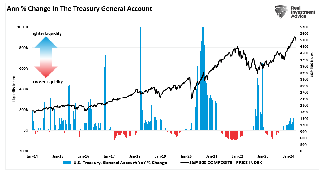
You can think of the Treasury General Account (TGA) as the checking account the US Government holds at its bank – which is the Federal Reserve. Every time the US government has accumulated excess money through taxes or bond issuance that it doesn’t intend to immediately channel into spending, they will park it at the TGA account at the Fed.
As you can see from the chart above, the TGA generally sits around 250-350 USD billions and it occasionally increases towards USD 1 trillion only to be subsequently drained back to its standard size.
After the ongoing tax season, Yellen will soon have around USD 1 trillion in the TGA – that’s quite high, and hence we should expect a drainage to follow.On top of it, the US debt ceiling suspension only lasts until the end of 2024 and at some point the US will ”run out of room” to issue new bonds which means the only way to facilitate spending will be through using the money sitting in the TGA – great political cover to move ahead with a TGA drainage.
But why does draining the TGA matter that much for markets and the US economy?
That’s because draining the TGA is akin to throwing fresh money at the economy (similar to deficit spending) and also adding new liquidity to the interbank system (similar to QE).”
Of course, as that money finds its way into the economy, it also supports company earnings growth, leading to higher asset prices.
As such, the potential liquidity boost will likely contain the recent correction, keeping it from becoming a “sucker’s rally” to a larger decline. At least for the next few months, anyway.
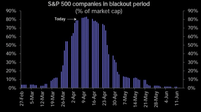
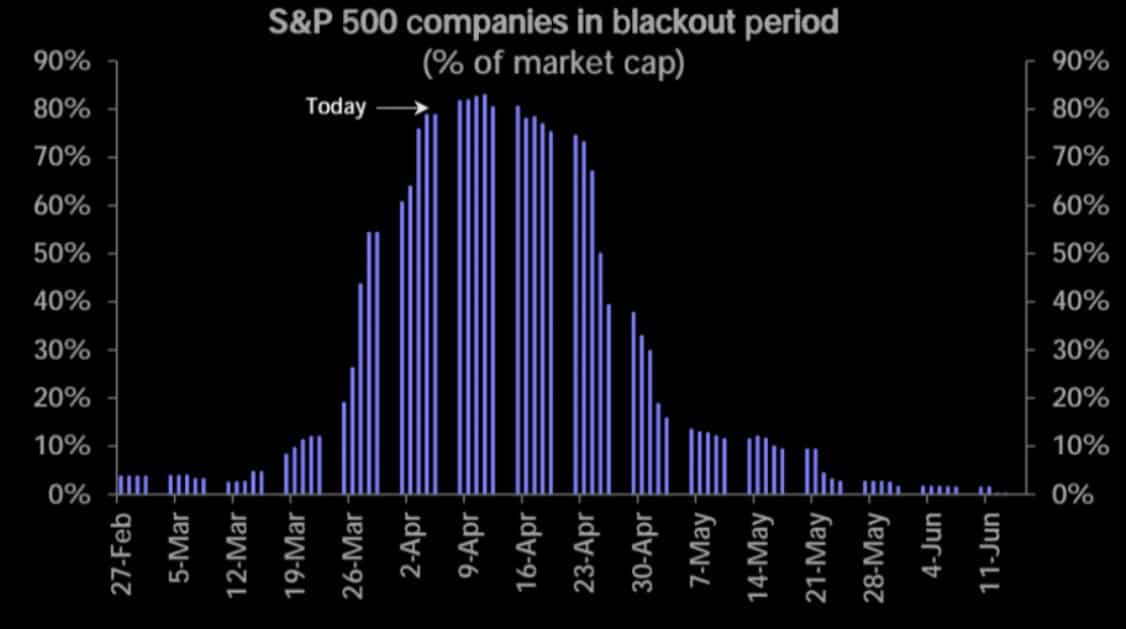
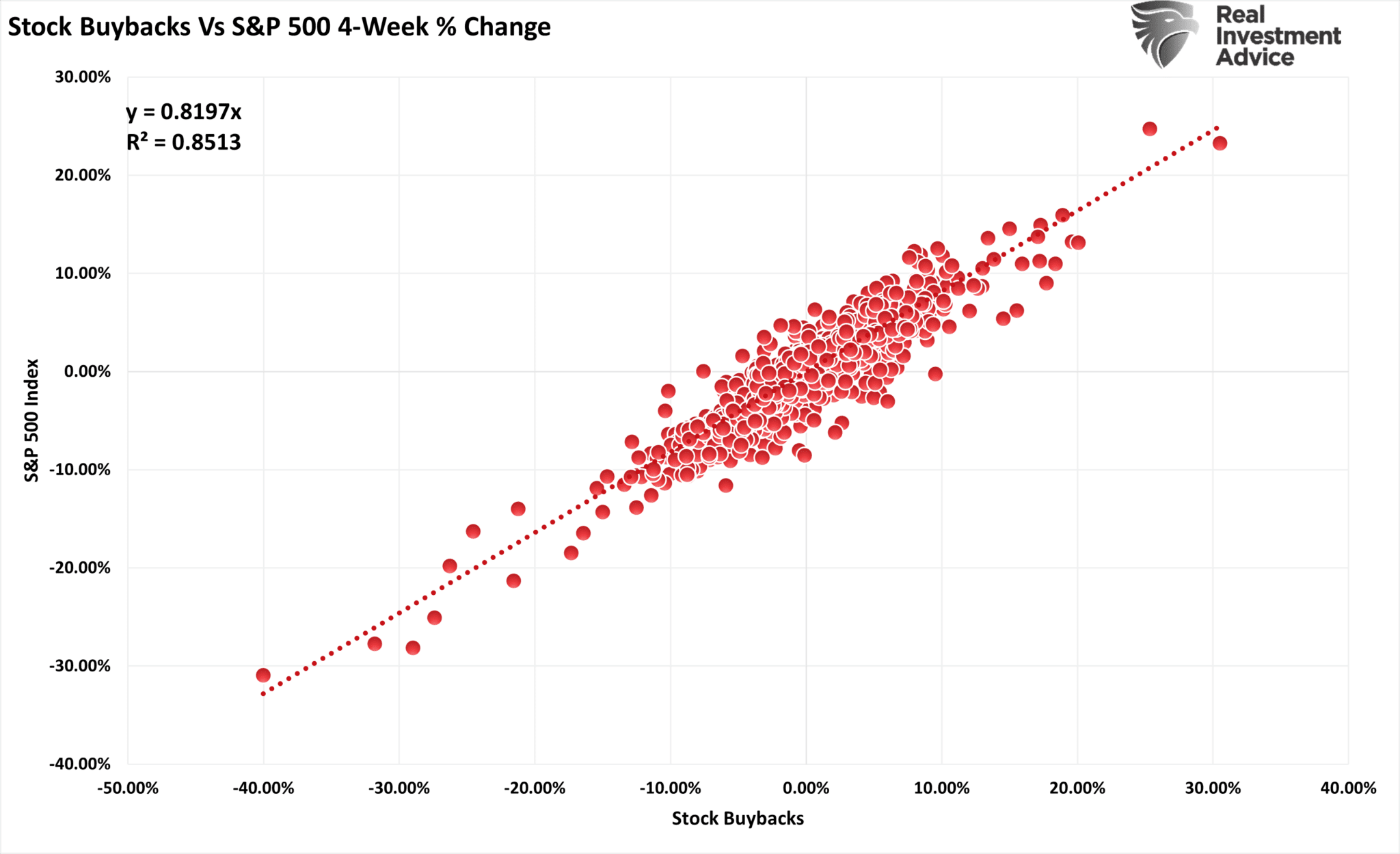
The second reason why this is likely not a “sucker’s rally” to a larger correction is that the blackout window for corporate share buybacks is close to ending.
Before the current correction, we wrote:
“As we have discussed for the last month, the market is exceptionally bullish, extended, and deviated from long-term means. With the beginning of the “buyback blackout,” removing an essential buyer of equities is a risk worth watching.” – Buyback Blackout – March 19th
Unsurprisingly, that blackout window coincided with a sharp contraction of more than $367 billion in buybacks over the last 4-weeks.
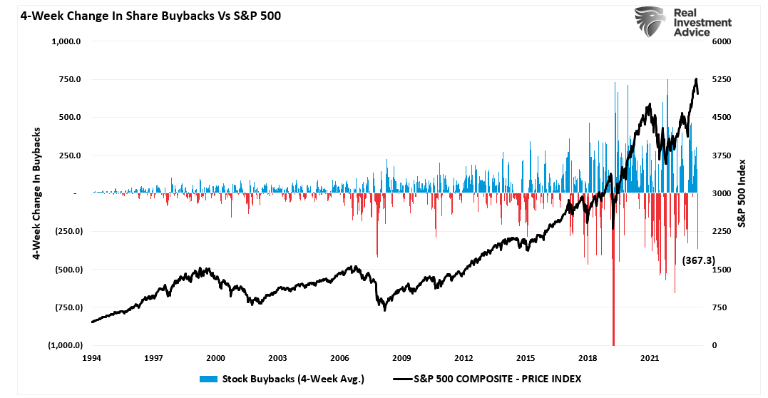
However, corporate share buybacks will resume in the next couple of weeks, and with more than $1 trillion slated for 2024, there remain many buybacks to complete.

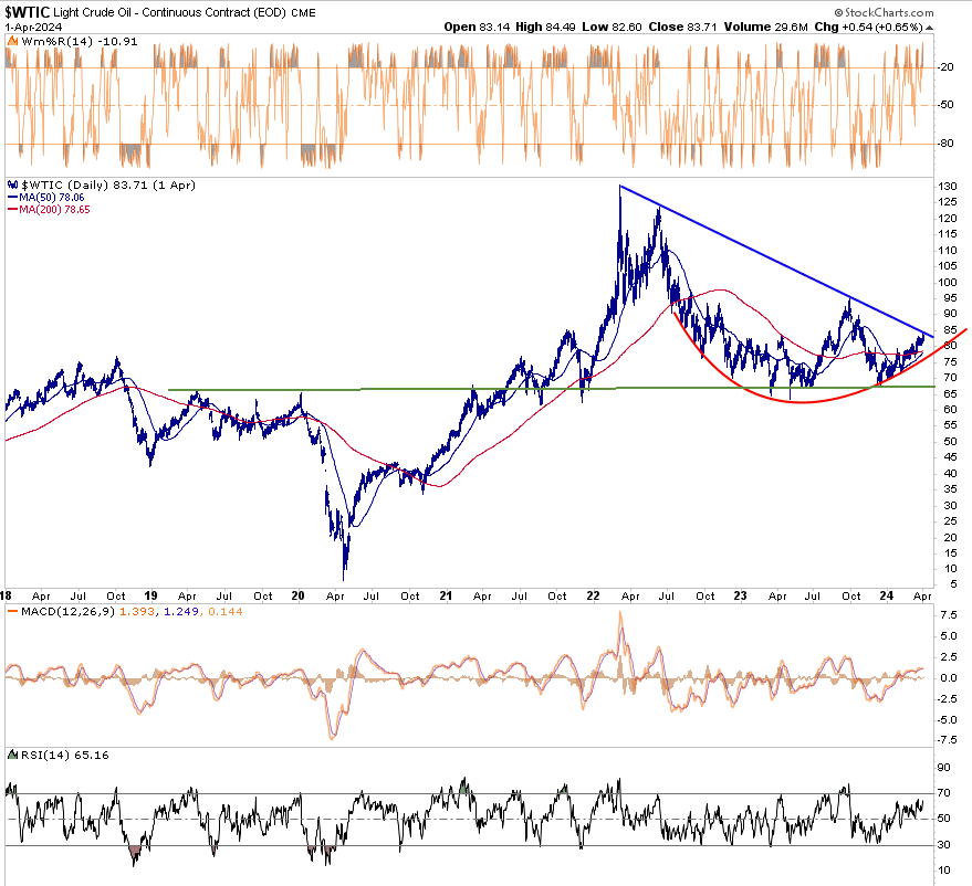
Tesla Rallies On Bad Earnings
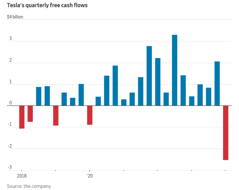
Tesla reported weaker than expected EPS (.45 vs .52) and revenues falling short of estimates by $1 billion. Further troubling, the Wall Street Journal graph below shows its quarterly free cash flow plummeted by $2.5 billion. So why did the stock rally over 15% on the earnings announcement? The answer is hope. Per Tesla:
“We have updated our future vehicle line-up to accelerate the launch of new models ahead of our previously communicated start of production in the second half of 2025.”
The company is committing to mass-producing more affordable cards. In theory, cheaper cars will attract a wider audience of potential buyers. Tesla will reduce costs by using existing factories to produce the new models. The Wall Street Journal sums it up nicely:
“In other words, Tesla is trading radicalism for speed of delivery and capital efficiency, at least in the medium term. It is a sensible decision from a company that has historically preferred to take the heroic road. Institutional investors will likely love it; the Tesla fan base perhaps less so.”
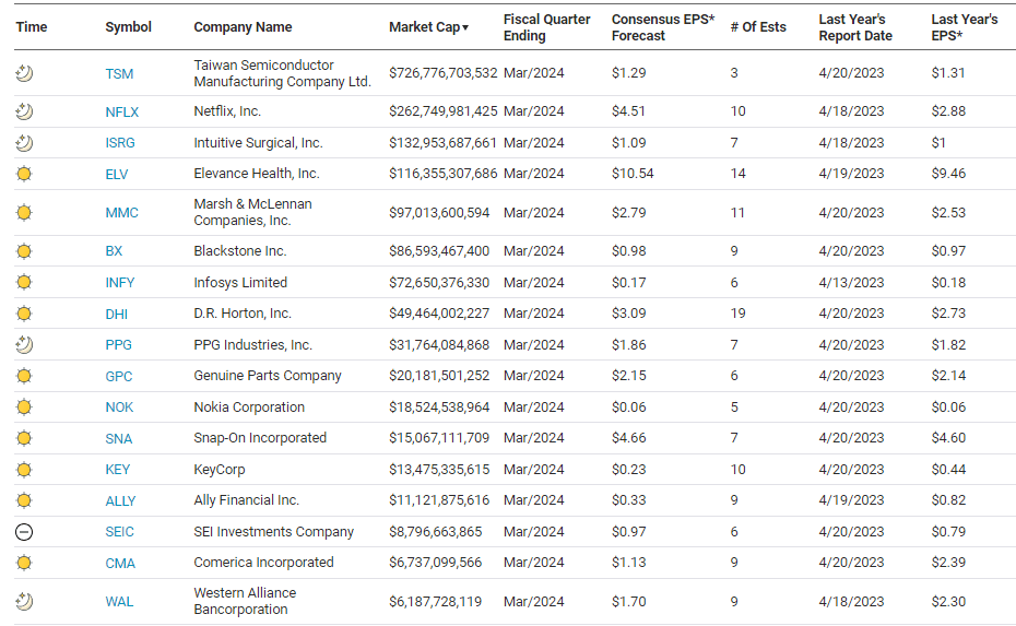
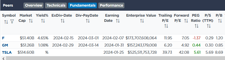
Elon Musk’s renewed commitment to self-driving cars is further fueling the stock price. He states, “If somebody doesn’t believe Tesla is going to solve autonomy, I think they should not be an investor in the company.” Tesla has a forward P/E of 42 and other valuations that are much more expensive than those of its competitors, as shown in the table below. Investors are clearly betting that TSLA has a significant advantage in this new technology.
META Falls On Good Earnings
META shares were 20% lower on Wednesday night, erasing over $240 billion of market cap. Meta’s revenue and earnings beat estimates. Further, their monthly active users (MAU), an important website metric, beat estimates by 5%.
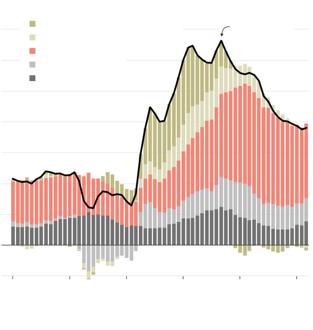
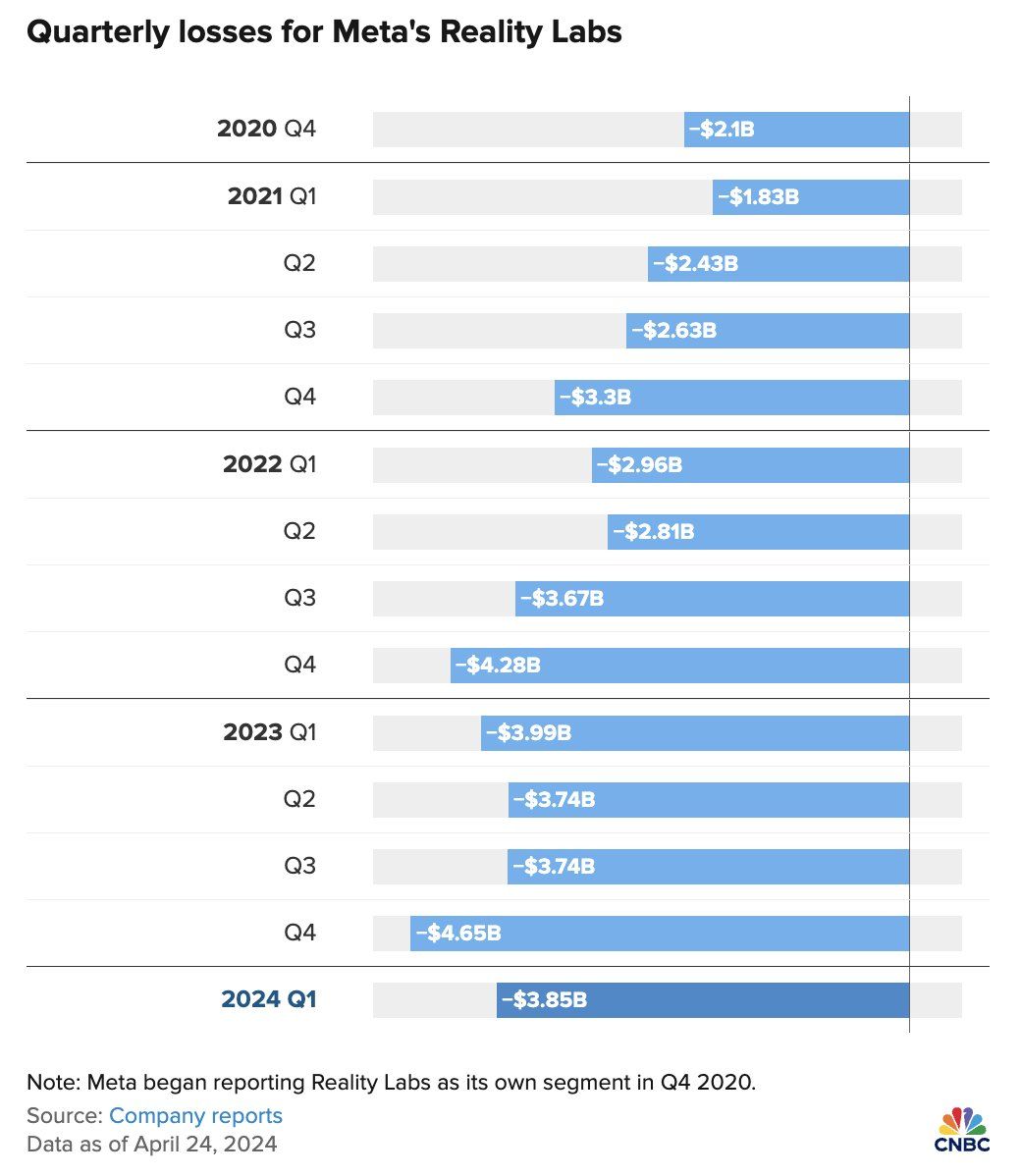
The earnings call is the rationale for the largest one-day drop in META/FB history. CEO Mark Zuckerberg told its investors that AI is the future. While this is the same message he has been conveying, investors are suddenly concerned they do not have a clear path to profit from AI. Meta is also linking AI capabilities to its Metaverse product. The problem with that is the company’s Meta Reality Labs has had a net loss of $46 billion since its inception in 2020, as shown below.
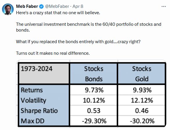
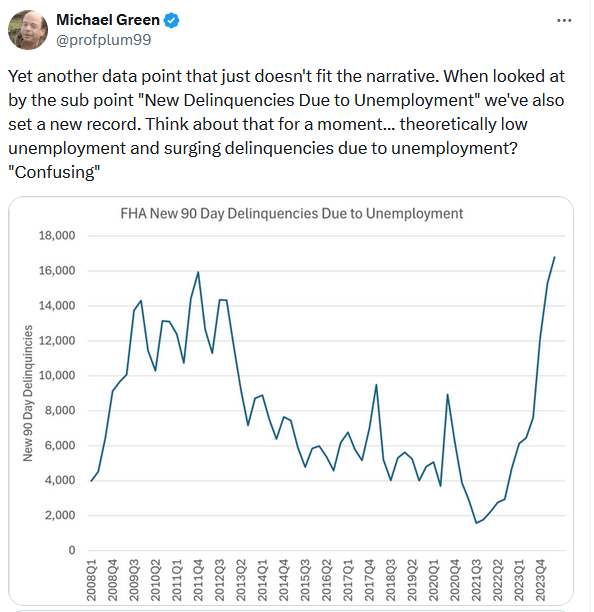
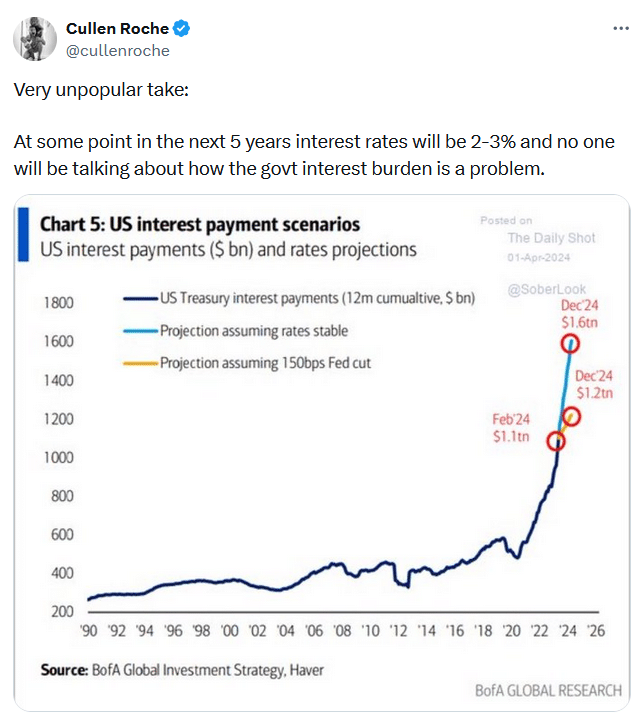
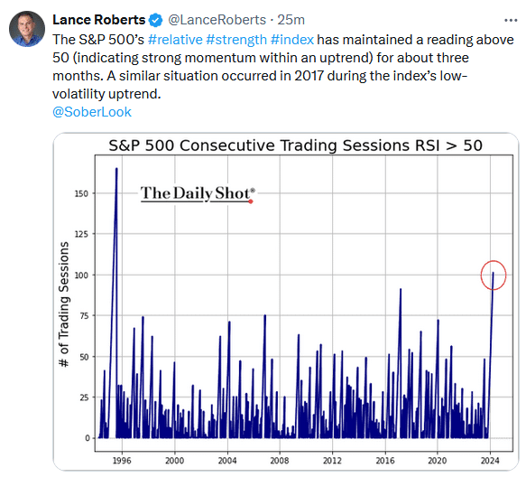
Tweet of the Day
“Want to achieve better long-term success in managing your portfolio? Here are our 15-trading rules for managing market risks.”
Please subscribe to the daily commentary to receive these updates every morning before the opening bell.
If you found this blog useful, please send it to someone else, share it on social media, or contact us to set up a meeting.