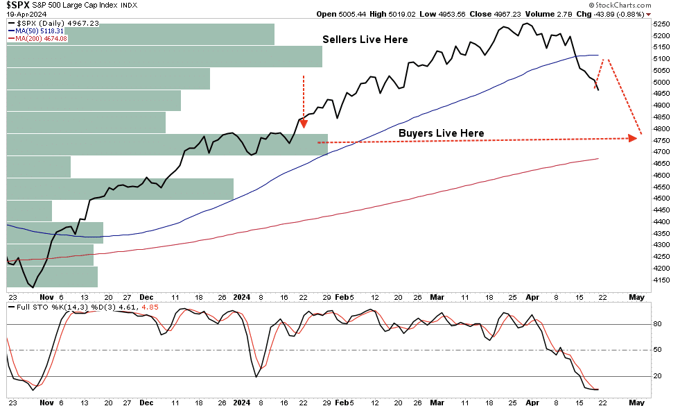
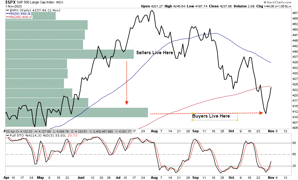
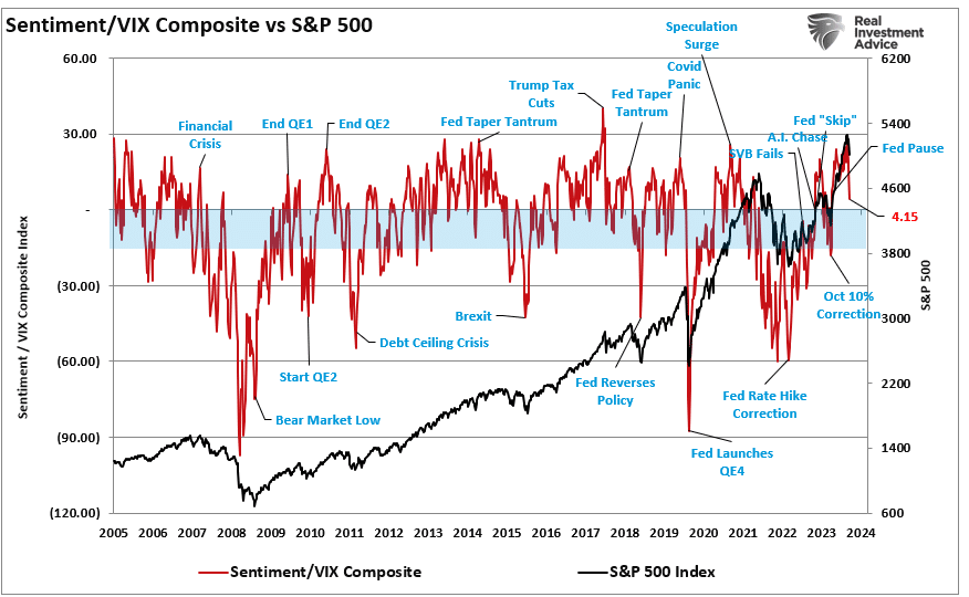
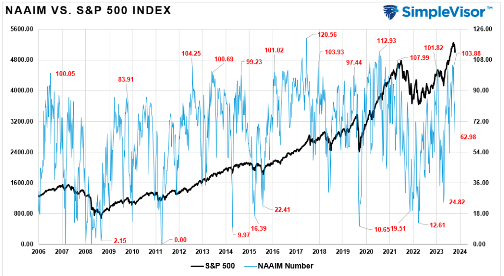
Monthly Archives: April 2020

Trump Or Harris: Corporate Tax Winners And Losers

Not surprisingly, Donald Trump and Kamala Harris are taking opposite approaches to modifying the corporate tax code. If enacted, both proposals would significantly impact corporate profits and, thus, share prices. Currently, the plans are only campaign promises. History repeatedly reminds us that many political promises are meant to drum up votes.

Read my lips, no new taxes” – George H.W. Bush 1988.

Predicting whether Trump or Harris will be the next president is challenging. Moreover, even if you know who will win, it’s even trickier to assess which legislation they will focus on and which bills can get through Congress.

Markets handicap unknown scenarios all the time. In some cases, stock prices can move violently as the odds of an event occurring change. Since corporate taxes may be the most significant short-term political factor affecting stock prices, it’s worth understanding what both candidates propose, allowing us to try and stay a step ahead of the market handicappers.

Furthermore, with the recent history of Donald Trump’s 2017 corporate tax cuts, we quantify which companies are best suited to take advantage of or be penalized by a change to the tax code.

Current Corporate Tax Code And History

The following graph charts the Federal corporate tax rate and the effective tax rate companies have actually paid since World War II. Trump’s 2017 Tax Cuts and Jobs Act (TCJA) reduced tax rates from 35% to 21%. The only other significant cut in America’s history of corporate taxes was in 1986, when President Reagan reduced them from 46% to 34%.

official and effective corporate tax rate

Like personal taxes, corporations have many loopholes. Thus, the effective tax rate can vary widely by company. Evaluating how tax rates affect corporate bottom lines in the aggregate is important but can be critical at a company level.

This article only addresses the proposals from the point of view of corporate profits. We do not opine on how they could impact the deficit or economy.

Ad for RIA Advisors portfolio management services. Conservative and disciplined approach for individuals nearing retirement.

Donald Trump’s Tax Proposals

Trump’s current tax proposal calls for a tax reduction for corporations from 21% to 15%. However, the reduction would solely be for companies that make their products in America. Companies that “outsource, offshore or replace American workers” will not be eligible.

What’s unclear is whether companies can divide their revenue for tax purposes based on where goods are manufactured. Furthermore, how will companies providing services be taxed?

Also for consideration is the “Bonus Depreciation” tax break from the 2017 TCJA. The legislation allowed companies to depreciate 100% of equipment purchases in the year it was acquired. Previously, they could only write down the value of equipment over time according to its useful life.

The Institute of Taxation and Economic Policy (ITEP) analyzed the impact of the accelerated depreciation rule on 25 of the biggest beneficiaries (LINK). They write:

The federal statutory corporate income tax rate is 21 percent, which means that if corporations enjoyed no special breaks or loopholes at all, they would pay 21 percent of their profits in taxes. As a group these corporations used many kinds of tax breaks to drive their effective federal income tax rate down to 12.2 percent. For the whole group of companies, accelerated depreciation accounts for 86 percent of those tax breaks.

Some corporations have used accelerated depreciation to drive their effective tax rates down to single digits during this five-year period. These include Verizon, Amazon, Walt Disney, Con Edison, General Motors, Dish Network, and others.

While the accelerated depreciation has been a boon to some companies, the amount a company can depreciate declines over time. In 2024, a company can only depreciate 60% of equipment costs versus 100% from 2018 to 2022. Each year forward, the amount drops by 20%. In 2027 and beyond, it will be phased out unless it’s extended.

Kamala Harris’s Tax Proposals

Harris’s proposal is more straightforward to analyze. She supports raising the corporate tax rate to 28% for all companies. In addition, she would like to increase the corporate stock buyback tax from 1% to 4%.

Under her plan, companies would see a 7% increase in tax rates which essentially claws back half of Trump’s 2017 TCJA tax legislation.

Congress ultimately has the power to change tax rates. Ergo, whether it is Trump or Harris, it will be hard to change the tax code if one of the two houses of Congress is the opposing political party. The chart below from Gavekal Research shows the possibilities.

corprorate tax proposals trump vs harris
Ad for The Bull/Bear Report by SimpleVisor. The most important things you need to know about the markets. Click to subscribe.

Analyzing The S&P 500 Companies

With some background on the candidate’s proposals, we now evaluate the constituents of the S&P 500 to assess the impact of the Trump tax cut. The analysis helps gauge which stocks are most at risk of tax hikes or could benefit from further tax reductions.

Our analysis is based on corporate tax data from 2010 to current for the 503 current S&P 500 stocks. To help improve the quality of the analysis, we only assessed companies with at least four years of earnings data before the Trump tax cuts and six years afterward. Further, we avoided companies with volatile earnings. That criteria narrowed the list to 306 companies.

Of this subset of the S&P 500, the average tax rate before the tax cut was 26.74%. Since then, it has been 17.37%. Almost 90% of the companies saw their effective tax rates decline. On average, the 306 companies’ earnings were 9.36% greater than they would have been.

We summarize the data for you because there are over three hundred companies.

The following table organizes the data by sector. Utilities were the apparent biggest beneficiary of tax cuts. This was partly from the bonus depreciation and recent tax incentives to promote green energy.  

On the other side of the coin is real estate. The cut was not meaningful because these companies tend to pay very little taxes. As shown, the rest of the sectors tended to gravitate around the average. 

tax cuts by sector

The following table shows the largest stocks by market cap. We left out five stocks due to earnings volatility.

tax cuts largest stocks

Who Pays If The Harris Plan Is Law

The following table lists the companies that saw an improvement of at least 20% to their bottom lines due to the 2017 change in the tax code. Some of these stocks may be at most risk if Harris’s tax plan to boost rates to 28% passes. Those with effective tax rates closer to 28% may be the least affected.

biggest boost from 2017 tax cuts

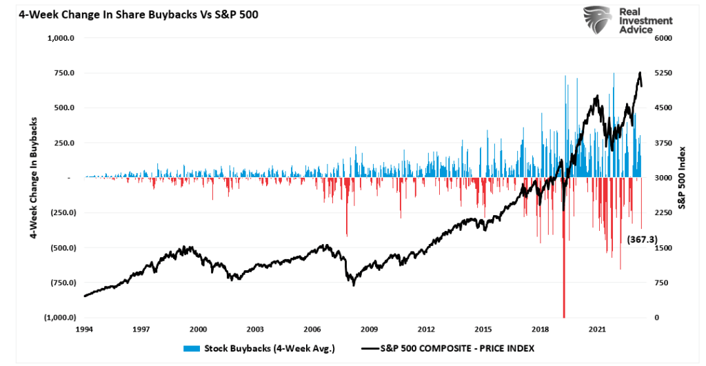
Part of the Harris plan is to raise the buyback tax rate from 1% to 4%. Doing so will weigh on the bottom lines of those perpetually buying back significant amounts of shares. Furthermore, some of these companies may find it more advantageous to increase their dividends instead of buybacks.

The following graph from Uptrends shows the top ten buyback programs of 2024. Clearly, Apple, META, and Google may have the most to lose from the potential tax increase.

largest stock buyback companies apple

Who Wins If Trump’s Plan Is Enacted

Conversely, those with the highest effective taxes and domestic production capabilities may benefit the most. Given that we do not have data on production facilities, we can only share the companies with the highest effective post-2018 tax rates.

highest tax payers

In addition to the potential tax cut, we must consider any changes to the bonus depreciation roll-off schedule. Trump could try to bring back the 100% depreciation in year one or stop the bonus depreciation percentage from declining.  

To help us in this endeavor, we share the following table from ITEP with the biggest beneficiaries of the bonus deprecation.

itep tax beneficiaries
Ad for SimpleVisor. Get the latest trades, analysis, and insights from the RIA SimpleVisor team. Click to sign up now.

Summary

s&P 500 taxes

As we sit here today and assess the stock market and individual stocks from a political perspective, it appears a Trump victory may provide investors with more potential upside. We are solely basing the argument on their respective tax cut proposals.  

The graph above shows that the S&P 500 rocketed by 35% in the two months following the passage of the legislation. Furthermore, the market rose before the legislation as investors gained confidence the legislation would pass Congress.

One can argue the gains were short-lived, as the market gave up its gains shortly after. Contrarily, higher corporate profits due to lower tax rates are an important factor driving the market significantly higher since 2017.

The VIX Index Is Not Confirming Record Highs

The VIX Index, often called the “fear gauge,” measures implied market volatility based on S&P 500 put and call options. Most often, the VIX rises when the stock market declines as investors tend to be willing to pay a higher premium for option hedges. Conversely, the VIX falls or hovers at very low levels as markets rise, and the aggregate market needs to hedge is minimal. However, there are times when the VIX Index rises alongside a rising stock market. This is occurring today, and it can be a sign that investors are suspicious of the viability of the recent stock market gains.

The current instance of an elevated VIX during alongside a record high suggests that investors are hedging more than is typical at market highs. Despite the positive momentum, investors are uneasy about the rally’s sustainability. Likely, the combination of the Fed starting to cut rates and the coming election are putting investors at unease. Furthermore, investors could be concerned that recent market gains are driven by short-term speculative trades rather than long-term fundamentals. Such a condition would leave the market vulnerable to corrections. The positive correlation between the VIX Index and the market should keep us alert for sudden changes in market conditions. Still, it doesn’t preclude the bull market from marching higher over the coming months.

s&P 500 and the VIX index

What To Watch Today

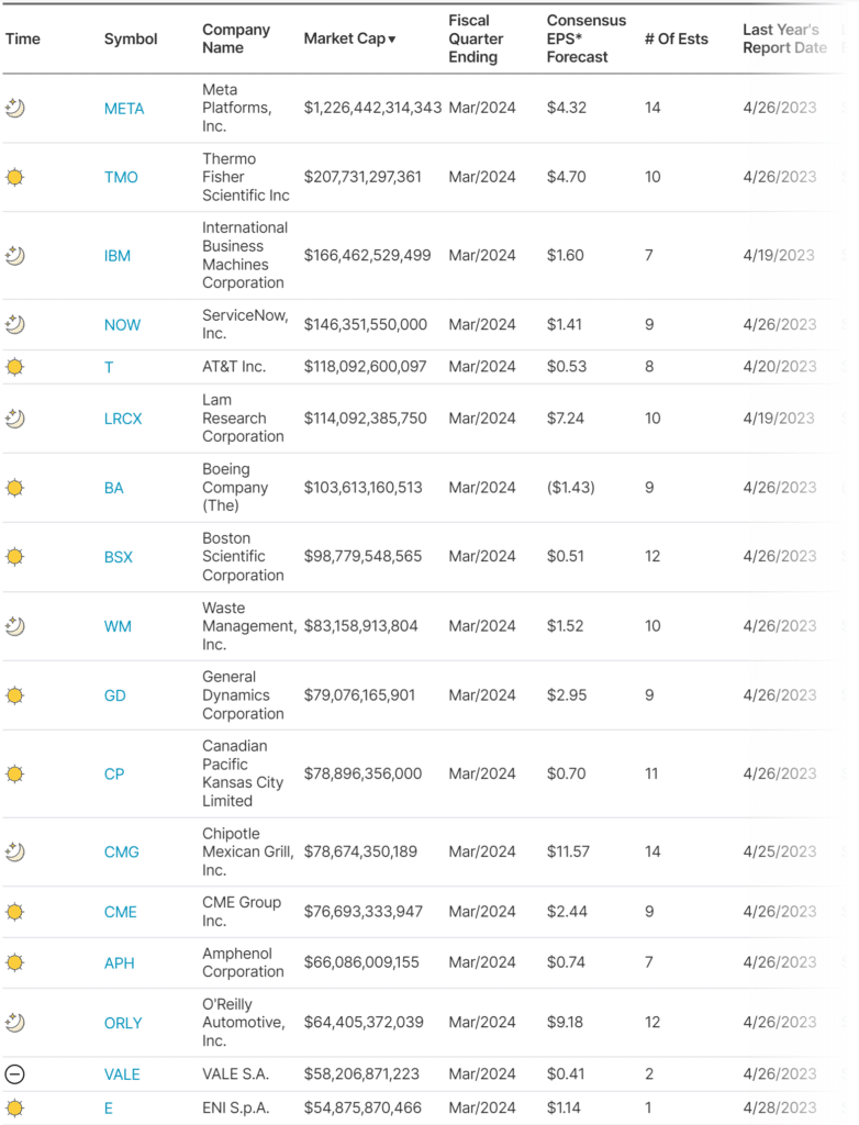
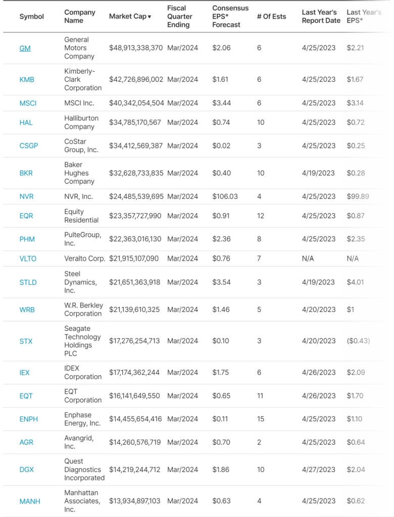
Earnings

Earnings Calendar

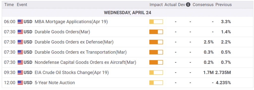
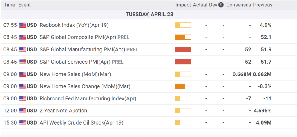
Economy

Economic Calendar

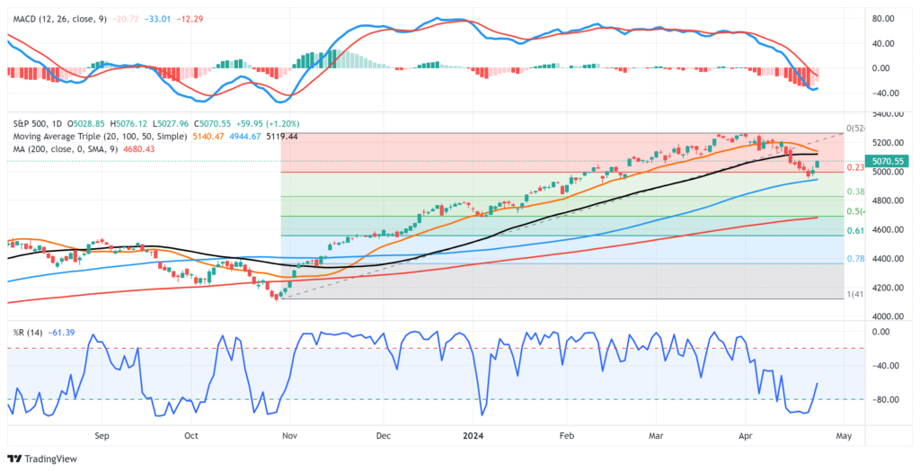
Market Trading Update

If you missed it, yesterday’s discussion focused on a question I have received several times about buying bonds. As I stated, short-term bonds are overbought heading into today’s Fed meeting, and a disappointment could lower bond prices. However, the same can be said for the equity market, which has also pushed into resistance at recent highs. As stated yesterday, the rally in stocks and bonds could be a “buy the rumor, sell the news” type event, so a bit of caution ahead of the Fed announcement is prudent.

As noted, the market is struggling with recent highs and is back in its previous consolidation range. From a bullish perspective, moving averages are trending higher, and the market is not egregiously overbought. With the market trading above the 20—and 50-day moving averages, the downside is somewhat limited. After today’s FOMC announcement, we should be better able to assess the next entry point to increase exposure. Furthermore, given the rather significant outperformance of defensive stocks as of late, a rotation to more cyclical growth stocks may be likely if the Fed signals lower rates are coming.

Market Trading Update

Regret Management

It’s easy to argue that the Fed should cut by 25bps, but the case for 50bps is more challenging. Given economic growth remains resilient and inflation is still 1%+ above the Fed’s inflation target, there is a reasonable case for lowering rates in 25bps increments. The risks of moving by 50bps are the market and political responses. Taking such a big first step may spark concern that the Fed is worried economic growth will slow rapidly. There is also politics the Fed must grapple with. Indeed, with any rate cut, but more so with 50bps, Donald Trump will blame the Fed for picking sides. If Trump wins, the Fed’s aggressiveness may move Trump to try to fire Powell. This potentially has big implications further down the road.

That said, Nick Timiraos, aka the Fed Whisperer, published a WSJ article Fed Prepares To Lower Rates, indicating the Fed could likely cut rates by 50bps this afternoon. The rationale appears to be regret management. Per the article:

If officials think about which mistake they are less likely to regret at this week’s meeting, the case for starting their rate-cutting cycle with a half-point move makes sense, said Robert Kaplan, who served as Dallas Fed president from 2015 to 2021.

“If I were in my old seat, I’d say, ‘I could live with 25, but I’d prefer 50,’ ” said Kaplan, now vice chairman at Goldman Sachs. Given where inflation and unemployment sit, the Fed’s benchmark rate should be about 1 percentage point lower than it is, he said. “If I started with a clean sheet of paper, I’d say rates should be at 4.5%-ish.”

The article raises an important consideration. The quarterly economic projections will be released at today’s meeting. The projections cover the rest of 2024, as well as 2025, 2026, and the “longer term.” Because only two meetings are left this year, the board’s Fed Funds projections for the remainder of 2024 will provide a road map for the market.

If more officials project a total of 1 percentage point of cuts this year, that would imply at least one move of 50 basis points this year. Withholding that larger cut until later this year could raise awkward questions over why that is the best approach. Another option is to cut by 25 basis points now and project cuts of a similar magnitude at the last two meetings of the year, reserving the option to accelerate the pace if the economy worsens.

Lastly, Timiraos brings up the possibility of a dissent from one or more Fed members. There has not been a dissent in two years. Per the article, that is the longest streak in the “past half century.”

The graph below shows the rate increases of the past two years have been much more aggressive than the previous five rate-cutting cycles. Might aggressively removing said rate increase also involve an aggressive stance?

fed rate hikes

Momentum Investing Gives You An Edge, Until It Doesn’t

Do you buy a “momentum” fund and forget about it?

Well, not so fast, says Brett. However, while I agree with Brett, it is for a different reason. The issue with “Momentum investing” is that it is not a passive strategy. For example, if we look at the top 10 holdings of MTUM, we can see the changes being made to the ETF as momentum changes in the market.

READ MORE…

momentum versus growth

Tweet of the Day

bofa survey soft or hard landing

“Want to achieve better long-term success in managing your portfolio? Here are our 15-trading rules for managing market risks.


Please subscribe to the daily commentary to receive these updates every morning before the opening bell.

If you found this blog useful, please send it to someone else, share it on social media, or contact us to set up a meeting.

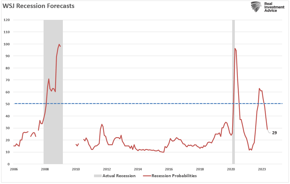
A 50 bps Fed Cut Is Now Expected

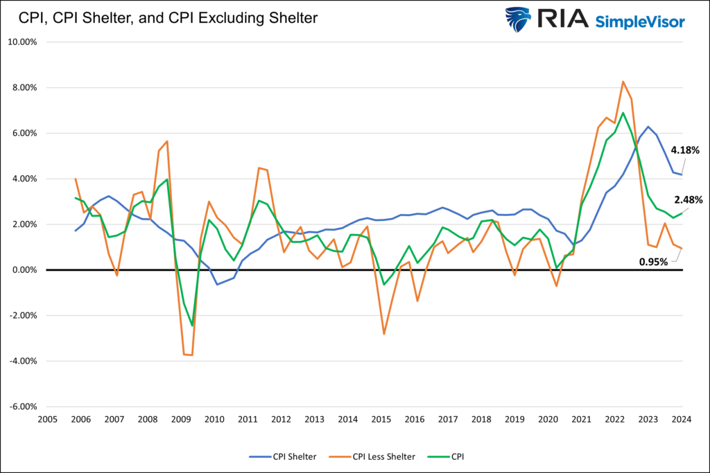
As we share below, the market is betting on a 50 bps Fed rate cut at tomorrow’s FOMC meeting. Given tame inflation and labor data, the question is why there is a sudden change in expectations. Might the Fed think the labor market is weakening more substantially than the market? Moreover, deflation could be a more significant threat than many appreciate. Remember that CPI, less lagging shelter prices, has been lower since March 2024.

While the Fed may want to move the ball faster with a 50 bps rate cut, doing so potentially poses risks. In our mind, the market’s perception is the most considerable risk of the Fed cutting 50 bps. Might such a move elicit concerns that the Fed is behind the curve? If so, investors may lower their growth and inflation forecasts. Both factors have driven outsized corporate profits. Therefore, a 50 bps cut by the Fed risks an equity market re-pricing. Or will the market rally because the market perceives lower interest rates as bullish?

There are many questions to be answered with bullish and bearish potential outcomes. Jerome Powell can soothe the markets in his press conference or spark concern. Buckle up; the next few days will undoubtedly be interesting, especially if the Fed cuts by 50bps.

fed rate cut probabilities

What To Watch Today

Earnings

  • No notable earnings releases today.

Economy

Economic Calendar

Market Trading Update

Yesterday, we discussed the market’s strong rally from the recent lows. However, the bond market has rallied just as strongly ahead of this week’s highly anticipated Federal Reserve meeting and the expected rate cut. As shown, Treasury bonds (as represented by TLT) are quite deviated from the 50-DMA and overbought on multiple levels. While we remain bullish on bonds in the longer term, particularly as the economy slows, the current overbought conditions and “exuberance” into the bond trade over the last few months is a bit overdone.

With the Fed meeting this week, the current setup suggests that even if the Fed cuts rates as expected, this could be a “buy the rumor, sell the news” setup for bonds. Of course, as is always the case, overbought conditions can remain overbought longer than most imagine, so trade accordingly.

Treasury Bond Trading Update

Apple iPhone 16s Post Disappointing Sales

The good news for Apple is that they sold an estimated 37 million new iPhone 16s in the first weekend of pre-orders. The bad news is that figure is down over 10% from last year’s iPhone 15 launch. It appears many potential buyers are waiting for Apple to introduce Apple Intelligence, its version of AI. It is currently expected that the first Apple Intelligence features may not be released until after Thanksgiving. While the delay is longer than initially expected, Apple could see a rush of sales with the new features. Such would coincide with increased holiday sales.

As shown, the stock opened on Monday morning lower by 4%. If sales are merely delayed and a big rush of orders comes after it releases AI features, Apple shares, down about 10% from recent highs, may be worth keeping an eye on.

aapl  apple shares

Market Breadth Normalizes With Record Highs In Reach

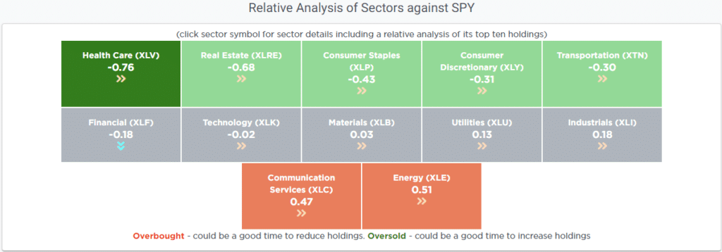
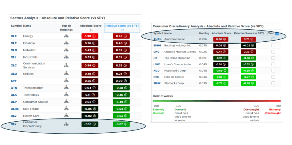
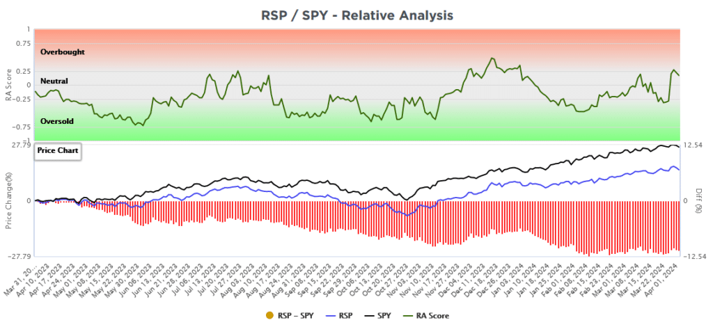
The SimpleVisor sector analysis below shows that many sectors have relative scores near zero. Therefore, these sectors are neither overbought nor oversold compared to the S&P 500. On its own, good market breadth is what we want to see in a bull market. However, the safety sectors continue to lead the way, and the energy sector is grossly lagging. Therefore, while breadth is decent, it appears there are some recession concerns creeping into investors’ minds.

simplevisor sector analysis

Tweet of the Day

number of ETFs

“Want to achieve better long-term success in managing your portfolio? Here are our 15-trading rules for managing market risks.


Please subscribe to the daily commentary to receive these updates every morning before the opening bell.

If you found this blog useful, please send it to someone else, share it on social media, or contact us to set up a meeting.
Momentum Investing Gives You An Edge, Until It Doesn’t

Since 2020, momentum investing has generated significantly better returns than other strategies. Such is not surprising, given the massive amounts of stimulus injected into the financial system. However, Brett Arends for Marketwatch noted in 2021 that momentum investing can give you an edge. To wit:

“Its success ‘is a well-established empirical fact,’ and can be demonstrated across multiple assets and over 212 years of stock market data, argues money manager Cliff Asness and his colleagues. It is ‘the premier market anomaly,’ writes analyst Gary Antonacci. It trounces a simple ‘buy and hold’ stock market strategy going back almost 100 hundred years, estimates money manager Meb Faber.”

While momentum investing is appealing in a liquidity-driven bull market, is it always the best strategy? As noted in the “Best Way To Invest:”

The last decade has been a boon for the index ETF industry, financial applications, and media websites promoting ‘buy and hold’ investing and diversification strategies. But is the ‘best way to invest’ during a bull market also the best way to invest during a bear market? Or, do different times call for different strategies?

That is the question we will explore further.

RIA Advertisement for conservative, investment and portfolio management services for high net worth investors

Momentum Investing Isn’t Passive

Brett compares several ETF funds over the past five years in his discussion. To simplify our analysis, we will use the following three ETFs from 2014 to the present. (2014 is the earliest date that all three ETFs have performance data.)

  • SPDR S&P 500 ETF (SPY) as the “buy and hold” proxy,
  • IShares Momentum ETF (MTUM) as the “momentum” proxy; and,
  • IShares Value ETF (IVE) as the “value” proxy.

For our analysis, we calculated the growth of $1 invested in each ETF from January 2014 on a nominal capital appreciation basis only.

At first blush, the obvious choice for investors was momentum when compared to the S&P 500 or value.

Growth of $1 in 3 market based ETFs

So, is that all there is to it?

Do you buy a “momentum” fund and forget about it?

Well, not so fast, says Brett. However, while I agree with Brett, it is for a different reason. The issue with “Momentum investing” is that it is not a passive strategy. For example, if we look at the top 10 holdings of MTUM, we can see the changes being made to the ETF as momentum changes in the market.

Snapshot of top-10 holdings of MTUM.

At the end of 2020, Danaher Corp (DHR) and Thermo Fisher (TMO) were among the top 10 holdings as the market chased healthcare-related stocks due to the pandemic. By September 2021, with the steepening yield curve and developments related to vaccines and bitcoin, Paypal (PYPL), Moderna (MRNA), and major banks dominated the top 10. By the end of 2021, PayPal was replaced by Nvidia (NVDA), Costco (COST), and accounting stocks.

Looking at the present, following the 2022 correction and subsequent rebound, the holdings have once again shifted. After a strong run in 2024, Costco has returned to the top 10, replacing Netflix (NFLX) and Microsoft (MSFT).

Snapshot of Momentum ETF holds in 2022

The outperformance in Momentum is due to the changes in holdings to capture price trends. However, if you hold SPY, the only changes over the last few years are due to the weighting in the top-10 holdings.

Snapshot of top-10 holdings of S&P 500 Market ETF 2021
Snapshot of top-10 holdings of S&P 500 Market ETF 2024

Again, momentum seems to be the obvious choice.

But it isn’t.

Ad for The Bull/Bear Report by SimpleVisor. The most important things you need to know about the markets. Click to subscribe today.

Momentum Investing Doesn’t Always Win

Brett makes a very important point about momentum investing.

Researchers say investing in so-called “momentum” stocks, is the best documented and most durable “edge” in the market.

Critically, that applies to owning individual equities in a portfolio. Not passively holding an ETF.

There is a difference.

Yes, on a passive basis since 2014, momentum has outperformed the benchmark and value indices. However, passively holding an ETF negates the value of momentum investing.

“And there is an inbuilt cautious bias to this portfolio as well, because it only holds stocks that have positive trailing returns. In a bear market you may be invested in nothing whatsoever. As Meb Faber and others have pointed out, momentum strategies can help you avoid the worst market turmoil.”Brett Arends

Read that again.

As a strategy, momentum investing raises cash when the momentum of holdings turns negative. Such is not the case for an ETF that must always remain invested. If we break the comparative performance down into specific periods, the value of the momentum strategy gets lost.

In 2105 and 2016, momentum provided no hedge against the Fed’s “taper” and Brexit.

Chart showing "Growth of $1 - S&P 500 vs. Momentum vs. Growth" with data from August 2015 to June 2016.

Similarly, in 2018, relative performance was worse than the benchmark during the Fed’s “taper tantrum.”

Chart showing "Growth of $1 - S&P 500 vs. Momentum vs. Growth" with data from January 2018 to December 2018.

Holding a momentum ETF in early 2020 did little to shield you from the downturn. However, momentum benefited from the recovery fueled by trillions in monetary and fiscal policies.

Chart showing "Growth of $1 - S&P 500 vs. Momentum vs. Growth" with data from January 2020 to December 2020.

During 2022, holding a momentum ETF significantly underperformed the value index.

Chart showing "Growth of $1 - S&P 500 vs. Momentum vs. Growth" with data from January 2022 to December 2022

As Brett noted, momentum investing’s value, when applied to a portfolio of individual equities, is that it can help avoid significant capital destruction during market downturns.

However, the value of the momentum strategy gets lost when applying an active strategy to a passive holding.

Ad for SimpleVisor. Get the latest trades, analysis, and insights from the RIA SimpleVisor team. Click to sign up now.

Choosing The Right Strategy At The Right Time

As a strategy, momentum investing works well when properly applied to a portfolio of individual securities.

One of the most interesting aspects of this portfolio though is not only that it has a lot of hard numbers backing it up, but that it is in theory accessible to any ordinary investor who can screen stocks by monthly performance.

He is correct, and it is something that we provide at SimpleVisor daily, as shown:

Simplevisor momentum based stock market screen

Momentum investing works exceptionally well during a strongly trending bull market. However, it is critical to remember that strategies change during a bear market. As shown below, market cycles tend to precede economic cycles, so investment strategies should change with both economic and market cycles.

Photo showing "Investing Cycles Rotate With Market Cycles."

Such will be critically important when the next bear market begins.

The Return Of Value

As Brett aptly concludes:

My biggest problem with “momentum” as an investment strategy is that you are basically abandoning any attempt to do your own fundamental analysis whatsoever. It feels to me like the stock market equivalent of “social” media, jumping on the latest crowd mania regardless of any merits. 

But maybe that’s why I should do it. If Rome is falling, and the Dark Ages are coming, shouldn’t I just give up and bet on the Vandals?”

I wouldn’t give up just yet.

The chart shows the difference in the performance of the “value vs. growth” index. (Fidelity Value Fund vs S&P 500 Index)

Value vs Growth relative market analysis

Notable are the periods when “value investing” outperforms.

While it may seem like the current bull market will never end, abandoning decades of investment history would be unwise. As Howard Marks once stated:

“Rule No. 1: Most things will prove to be cyclical.

Rule No. 2: Some of the most exceptional opportunities for gain and loss come when other people forget Rule No. 1.”

The realization that nothing lasts forever is crucial to long-term investing. To “buy low,” one must first “sell high.” Understanding that all things are cyclical suggests that investment strategies must also change.

The rotation from “momentum” to “value” is inevitable. It will occur against a backdrop of economic weakness and price discovery for investors quietly lulled into complacency following years of monetary interventions.

“Relative valuations are in the far tail of the historical distribution. If, as history suggests, there is any tendency for mean reversion, the expected future returns for value are elevated by almost any definition.”Research Affiliates

The only question is whether you will be the buyer of “value” when everyone else is selling “momentum?”

The Yen And Fed Funds Futures Warn Against Complacency

Despite improving investor sentiment as the markets approach all-time highs, recent price action in the yen and Fed Funds futures warns that it may be too early to think the recent volatility is over.

Let’s start with the yen and what it has done since wreaking havoc on the markets in early August. The graph on the left shows the yen started rallying against the dollar in early July as the BOJ raised rates while prospects of a Fed rate cut were increasing. Few paid attention to the yen until August 5th, when it spiked and created havoc in the asset markets. The volatility resulted from some investors quickly unwinding the yen carry trade. The BOJ verbally responded, easing market concerns; with it, the yen gave up some ground versus the dollar. However, the yen has slowly been appreciating compared to the dollar and is now trading above the August 5th levels. There should be some concern that further appreciation will force more yen carry unwinds, resulting in downward pressure on U.S. equities.

Following the CPI and BLS employment reports, the Fed Funds futures market reduced the odds the Fed would cut rates by 50bps to a mere 5% chance. On Thursday, it spiked back to nearly 50%, as shown in the graph on the right. With no real economic data to sway the Fed’s decision, the quick change in odds is curious. It may not mean much, but it certainly bears paying attention to. Both the appreciation of the yen and the quick change in Fed expectations may prove to be nothing. But given the recent spate of volatility, up and down, complacency is ill-advised.

the yen and fed funds expectations

What To Watch Today

Earnings

  • No notable earnings releases today.

Economy

Economic Calendar

Market Trading Update

As noted last week, the market broke the 50-DMA and closed the week at the 100-DMA. Things did not look good heading into this week. However, the market rallied off the 100-DMA and retraced to the 50-DMA. Then, on Wednesday morning, a hotter-than-expected CPI report led to a sharp 1.5% selloff that retested the 100-DMA a second time. Things looked a bit dire, but strong words from Nvidia’s (NVDA) CEO sent stocks surging higher to a 1% gain by the close. That reversal cleared resistance at the 50-DMA, confirming the retest of the previous support. That bullish action continued through Friday, clearing the 20-DMA as well.

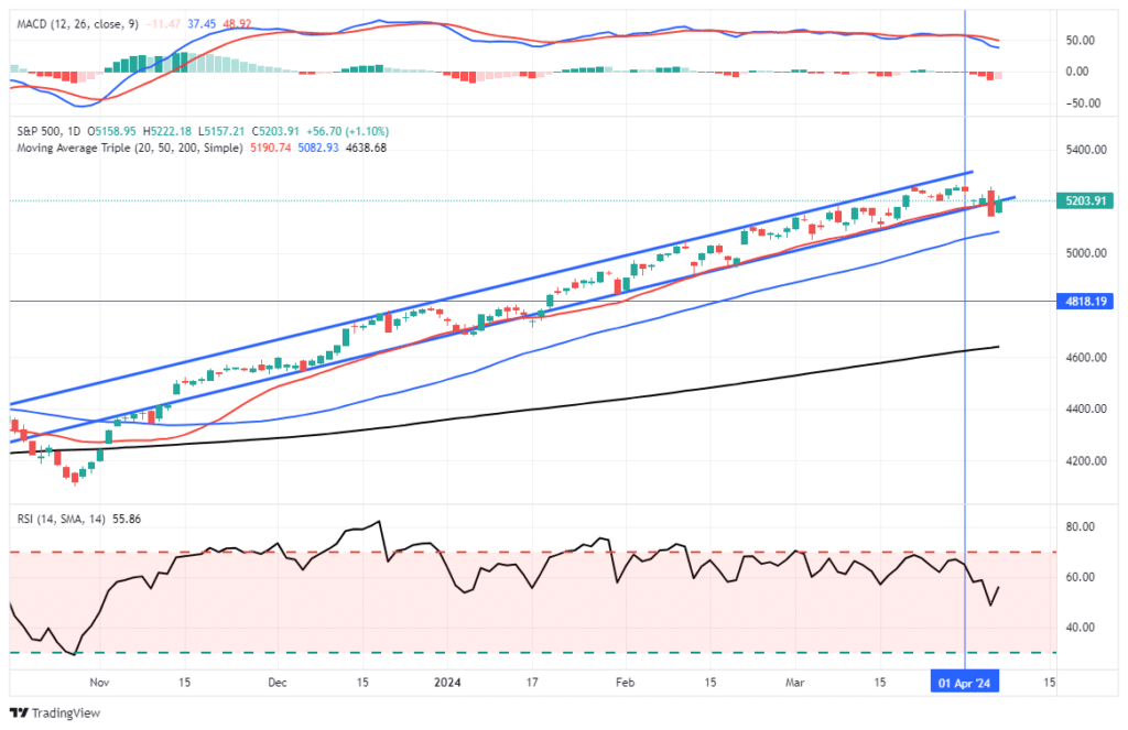
The market will challenge the recent highs next week. The trend of higher lows and the triggering of the MACD “buy signal” all suggest the recent correction phase is over for now. While the backdrop to the market is bullish, there is still some risk over the next month as we head into the beginning of earnings season and the November election.

Market Trading Update

We continue to suggest remaining somewhat hedged against potential market volatility by taking profits, rebalancing risk, increasing cash levels, and raising stop loss levels. Outside of those “defensive” actions, the market remains bullishly biased, and there is little reason for more negative positioning at this time.

Does that mean there is “no” risk to the markets? Of course not. This past weekend’s newsletter discussed three market risks, including one from Friday, which we are watching closely heading into year-end.

The Week Ahead

The Wednesday Fed FOMC will be the highlight of the week. As we noted above, the odds have moved to 50/50 of whether they cut by 25bps or 50bps. A 50bps rate cut may concern investors as the economic data doesn’t warrant such an aggressive move. If they cut by 50bps, investors may wonder- what does the Fed know that the market doesn’t? We will look for indications of how many more rate cuts will likely follow in the months ahead. Moreover, we think there is the possibility they further reduce the monthly amount of QT.

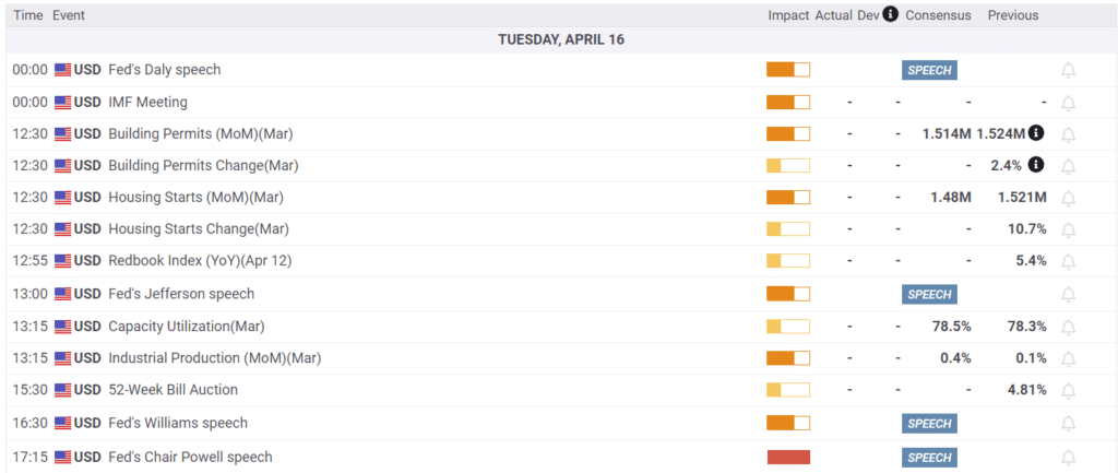
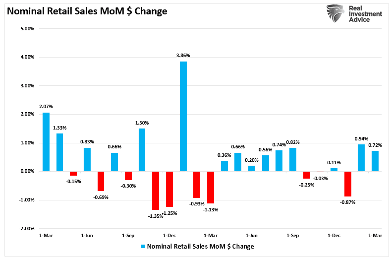
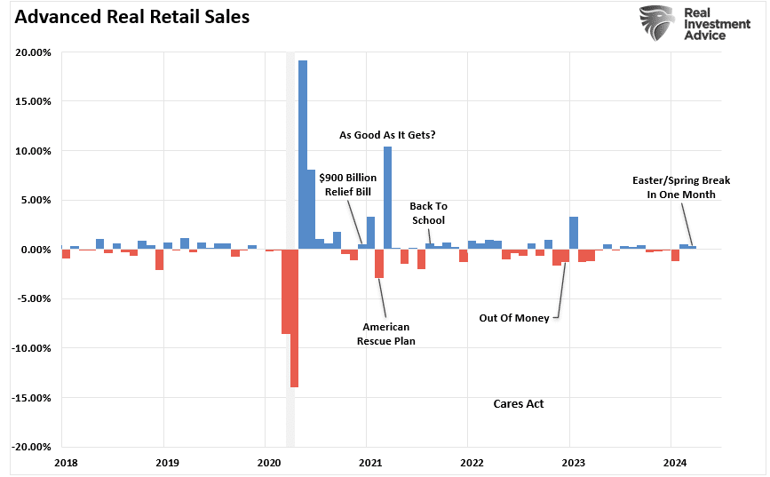
Retail Sales will come out on Tuesday before the Fed meeting. The current estimate is for a gain of 0.3%, which would be well below the 1% from the prior month but in line with the majority of 2024.

retail sales

Labor Market Impact On The Stock Market

The August jobs report highlighted a critical reality: the labor market is cooling off. While the headline figures seemed decent, the underlying data reveals clear warning signs that worker demand is slowing. Investors should pay attention because the link between employment and its impact on the economy and the market is undeniable. While often overlooked, as we will discuss, there is an undeniable link between economic activity and corporate earnings.

READ MORE…

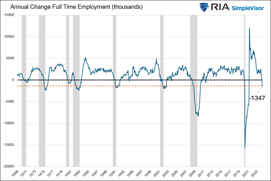
labor market  full time employment changes

Tweet of the Day

michigan consumer sentiment

“Want to achieve better long-term success in managing your portfolio? Here are our 15-trading rules for managing market risks.


Please subscribe to the daily commentary to receive these updates every morning before the opening bell.

If you found this blog useful, please send it to someone else, share it on social media, or contact us to set up a meeting.
Oil Prices Fall As China Slows

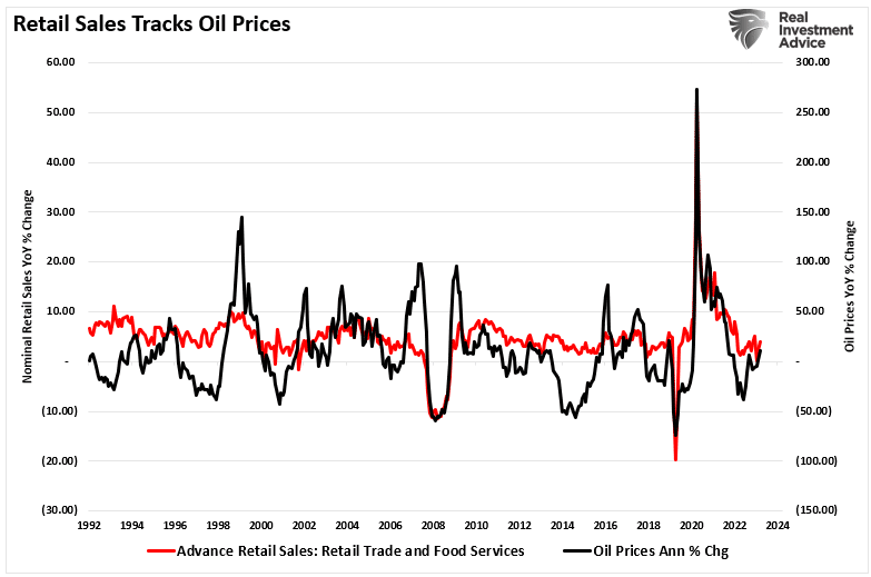
As we share in the graph below, crude oil prices peaked at $95 a barrel a year ago. More recently, in July, they were as high as $85. Today, they are below $70 and threatening to take out long-term support. So, why are oil prices falling so rapidly? We lean on the International Energy Agency (IEA) to answer the question. In their monthly Oil Market Report released on Wednesday, they place much of the blame on China. Per the article:

The rapid decline in global oil demand growth in recent months, led by China, has fuelled a sharp sell-off in oil markets. Brent crude oil futures have plunged from a high of more than $82/bbl in early August to a near three-year low at just below $70/bbl on 11 September, despite hefty supply losses in Libya and continued crude oil inventory draws.

Furthermore, they introduce some eye-opening statistics. For example, global oil demand in the first half of 2024 was the lowest since 2020, when the pandemic crippled the global economy. Also, they note that China’s consumption has contracted for four months in a row. It’s not just China.

Outside of China, oil demand growth is tepid at best. Latest data for the United States show a sharp decline in gasoline deliveries in June, following unexpected strength in May.

Falling oil prices and demand are good predictors of economic activity and inflation. Consequently, oil is warning of an economic slowdown and likely lower inflation.

crude oil prices

What To Watch Today

Earnings

  • No notable earnings releases today.

Economy

Earnings Calendar

Market Trading Update

Yesterday, we discussed the strong reflexive rally that took the S&P 500 from retesting support at the 100-DMA to crossing above the 50-DMA resistance. Interestingly, Bitcoin, an effective S&P 500 proxy, did not participate in that rally. Notably, as shown, Bitcoin has been consolidating within a trading range since April, which has reversed the previous overbought conditions from the runup since October 2022.

Technically, bitcoin trades below important moving averages, limiting near-term upside. However, another rally becomes more probable if this consolidation can continue without breaking down. Given the correlation to the S&P 500 index, I suspect that whatever happens next will hinge on how the market does from here.

Market Trading update

One concern with the S&P 500 index and Bitcoin remains the expectation for Fed rate cuts. As noted this week, if bitcoin is a proxy for the S&P 500 index, it is also a proxy for Fed rate cuts. Historically, when the Fed cuts rates, speculative risk assets get repriced for slower economic activity. Could this time be different? Sure. However, given the correlation to the S&P 500, I would be reticent to completely disregard the potential risk.

The ECB Cuts Rates Again

As we led, falling oil prices and demand suggest that economic growth is slowing worldwide. The ECB provides another similar indication. At yesterday’s ECB meeting, they cut interest rates by 25bps to 3.50%, partly because they cut their economic growth forecast through 2026. Further, they remain very confident that inflation will fall to 2% through the course of 2025. The graph below shows the ECB deposit rate (Fed Funds equivalent) was cut for the second time this year. Also, note that the deposit rate is still well above inflation. Such has been a rarity in the last 25 years and it argues they still have plenty of room for rate cuts.

With the rate cut, Europe’s benchmark lending rate stands at 3.5%, down from 4%. Central banks typically prefer to keep their monetary policies aligned so as not to upset the currency markets. Therefore, it’s highly likely the ECB cut rates yesterday and will continue to do so with confidence and probably assurances from Jerome Powell that the Fed will follow with a rate cut next week and more in the following months.

ecb deposit rates

PPI Retail Markups

Like the CPI report, the PPI data was pretty much as expected. Year-over-year, it fell to 1.70% from a downwardly revised 2.10% and below expectations of 1.8%. The monthly headline figure was +0.2%, with the monthly core rising 0.3%. PPI is now at its lowest level since February. There was some slight concern that PPI, which tends to lead CPI, was creeping higher in recent months. Yesterday’s report should extinguish some of those fears.

The following comment and graph are courtesy of Ernie Tedeschi.

One of the most interesting things the PPI tracks that the CPI doesn’t is retail markups. Retail markup growth has slowed considerably & this has been a contributor to disinflation. In August in particular, growth in grocery markups fell to 0.7% YY, the slowest in 3 years.

ppi mark up growth

Tweet of the Day

ecb rate cuts

“Want to achieve better long-term success in managing your portfolio? Here are our 15-trading rules for managing market risks.


Please subscribe to the daily commentary to receive these updates every morning before the opening bell.

If you found this blog useful, please send it to someone else, share it on social media, or contact us to set up a meeting.

Labor Market Impact On The Stock Market

The August jobs report highlighted a critical reality: the labor market is cooling off. While the headline figures seemed decent, the underlying data reveals clear warning signs that worker demand is slowing. Investors should pay attention because the link between employment and its impact on the economy and the market is undeniable. While often overlooked, as we will discuss, there is an undeniable link between economic activity and corporate earnings. Employment is the driver of a consumption-based economy. Consumers must produce first before consuming, so employment is critical to corporate earnings and market valuations. We will discuss these in order.

Consumer Demand Cycle

Slowing Labor Market: The First Red Flag

The August jobs report indicated that job creation has slowed dramatically, particularly in crucial manufacturing, retail, and services sectors. For months, we’ve relied on the narrative that a strong labor market could buoy the economy through rough patches. But that narrative quickly falls apart as hiring freezes and job cuts become more common. The data trend is always more critical than the actual employment number. The message is simple: employment is weakening.

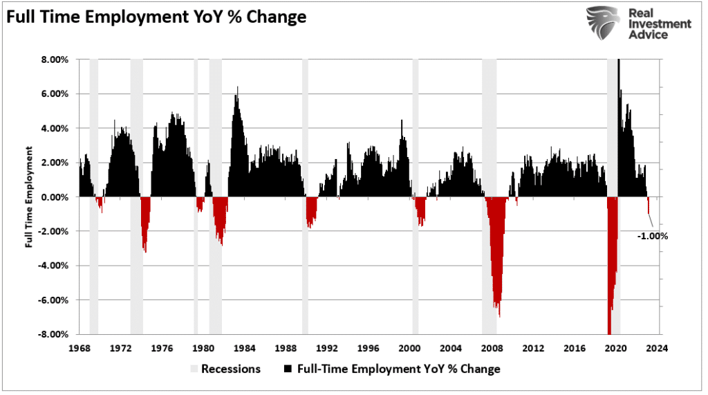
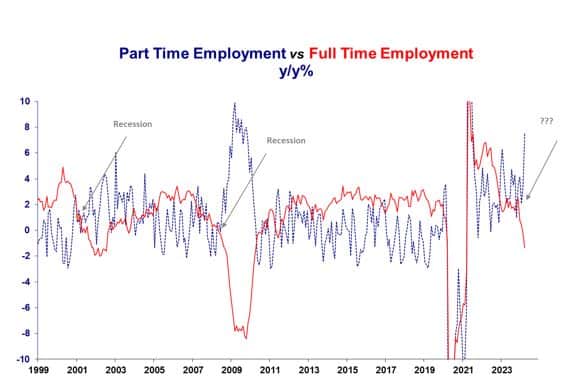
However, as discussed in the “Sahm Rule,” full-time employment is a far better measure of the economy than total employment. As noted, the U.S. is a consumption-based economy. Critically, consumers can not consume without producing something first. As such, full-time employment is required for a household to consume at an economically sustainable rate. These jobs provide higher wages, benefits, and health insurance to support a family, whereas part-time jobs do not. It is unsurprising that, historically, when full-time employment declines, a recession typically follows.

Full Time Employment Annual Percent change

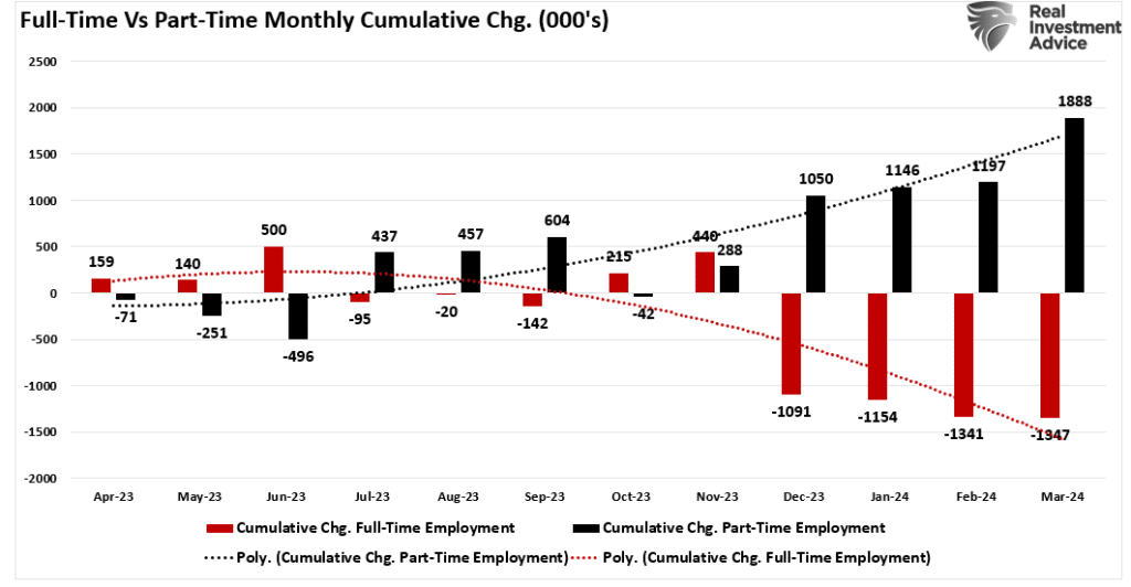
If full-time employment drives economic growth, it is logical that more robust trends in full-time employment are required. However, since 2023, the economy lost more than 1 million full-time jobs versus gaining 1.5 million part-time jobs. That does not scream economic strength.

Full-Time vs Part Time Employment

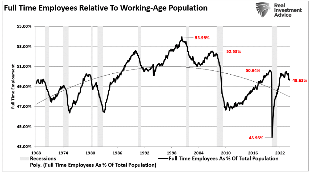
Furthermore, a comparison of full-time employment to the working-age population shows why the U.S. can not sustain annual economic growth rates above 2%.

Full Time Employment vs Working Age Population

Since the turn of the century, as the U.S. has increasingly integrated technology and outsourcing to reduce the need for domestic labor, full-time employment has continued to wane. If fewer Americans work full-time, as a percentage of the labor force, the ability to consume at higher rates diminishes as disposable income decreases.

Since corporate earnings depend on economic activity, companies continue to adopt technology and other productivity-enhancing tools to reduce the need for labor. If slower economic demand begins to weigh on corporate profit margins, earnings forecasts will be revised downward in the coming months.

Corporate Earnings Are in Jeopardy

Understanding how a weakening labor market translates into weaker earnings is essential. When companies are uncertain about future demand, they stop hiring and look to cut costs. These cost-cutting measures appear in numerous ways, such as layoffs, automation, outsourcing, or increasing temporary hires. Such measures can buy companies some time but don’t solve declining revenues. When fewer people have jobs or wage growth stalls, consumer spending slows down, and that hits the top line for many companies, particularly in consumer-driven sectors. Unsurprisingly, there is a relatively high correlation between the annual change in GDP and corporate earnings.

GDP vs Forward Earnings

As such, given that market participants bid up stock prices in anticipation of higher earnings and vice versa, the correlation between the annual change in earnings and market prices is also high.

Annual Change in earnings vs stock prices

In past economic cycles, we’ve seen how quickly earnings can disappoint when the labor market weakens. Analysts have been overly optimistic about earnings growth, and now the reality of slower consumer demand will force them to adjust their projections. As earnings expectations come down, investors will need to rethink current valuations. This is a straightforward equation—lower earnings lead to lower stock prices as markets reprice current valuations.

Market Valuations reflect in stock prices

Investors should prepare for a slowing labor market’s impact on stock prices. The market is a forward-looking mechanism, and it’s already starting to price in the effects of weaker job growth. Sectors most exposed to consumer spending, such as retail and travel, are likely to see the sharpest declines in stock prices as investors adjust to the reality of softer earnings.

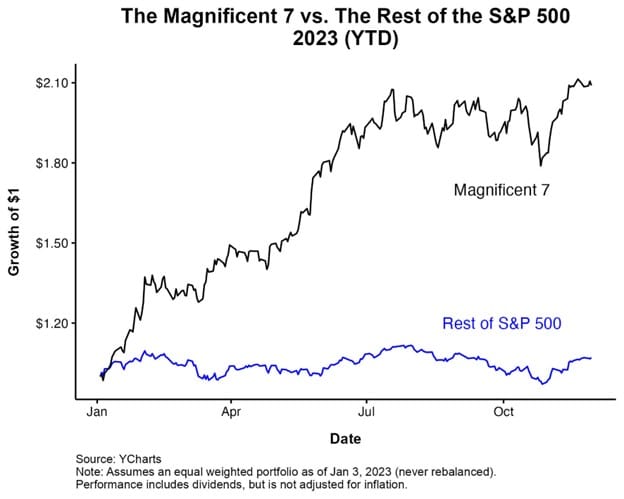
Technology companies, which have driven much of the stock market’s performance this year, will also be vulnerable. These companies rely on high growth expectations to justify their lofty valuations. If the labor market weakens, consumer demand for tech products and services will also fall, leading to earnings misses and stock price declines.

Magnificent 7 valuations vs rest of market.
Ad for SimpleVisor. Get the latest trades, analysis, and insights from the RIA SimpleVisor team. Click to sign up now.

Investor Implications

The broader financial markets are potentially at risk of a “bumpier ride” as the effects of the weakening labor market ripple through the economy. As we’ve seen in previous cycles, investors will begin to move away from riskier assets like stocks and into safer investments such as Treasury bonds. Such a shift could exacerbate market volatility if earnings get revised lower to reflect slower economic activity.

There’s also the question of how the Federal Reserve will respond. A slowing labor market often leads to lower inflation, which might allow the Fed to cut interest rates more aggressively and reverse the current reduction in its balance sheet. However, if inflation remains well above the Fed’s 2% target, despite weaker job growth, the Fed could find its hands tied. A potential market risk is when the Fed gets forced to keep rates elevated while the economy slows. Such would prolong the economic downturn and increase stock price pressure.

Recent employment reports show a clear trend: the labor market is losing momentum. That spells trouble for the economy and the stock market. The slowdown in job creation, coupled with weaker corporate earnings, is setting the stage for increased market volatility.

As noted, with markets still near all-time highs, it is an excellent time to reassess portfolio risk exposures. Rebalancing positions in overvalued growth stocks and shifting toward more defensive assets could be prudent. As we have often said, capital preservation should be the priority in times of uncertainty. The labor market indicates that uncertain times are ahead, and investors should prepare accordingly.

Online Prices Point To Deflation

The Adobe Digital Price Index claims to use data from over one trillion online consumer transactions comprising over 100 million unique product SKUs. While those are massive numbers, Statista estimates only 16% of retail sales will come from online transactions in 2024. Despite the relatively small percentage, over 75% of adults shop online, and over half shop online at least once a week. Therefore, in-store prices must stay somewhat competitive with online prices. As such, Adobe’s price index provides a decent price gauge for consumer goods and may even prove to be a leading indicator of consumer price trends. With that, we present a few interesting data points and graphs from the latest Adobe data.

  • Monthly grocery prices fell 3.7% in August and are running +.48% year over year. That is the lowest monthly figure since the index started in 2014.
  • The graph below shows that of the 18 price categories they track, 11 have been declining on average over the last three months.
  • Adobe claims prices fell .24% in aggregate last month, bringing the year-over-year rate to -4.37%.

Austan Goolsbee and Pete Klenow created the Adobe model. Goolsbee was recently appointed as the President of the Chicago Federal Reserve. The data we present may help explain why he seems more confident than other Fed members that inflation will return to the Fed’s 2% target.

adobe online prices

What To Watch Today

Earnings

Earnings Calendar

Economy

Economic Calendar

Market Trading Update

Yesterday, we discussed how bonds were overbought short-term and needed a bit of a correction. Yesterday’s CPI print, with core inflation rising, may have started that correction. However, today’s PPI print will also be important. The inflation print was cool enough at the headline to spark a stock market rally as investors settle in on a 25 basis point cut at the Fed meeting next week.

Notably, yesterday’s rally was a return of the “Magnificent 7,” which has been under pressure lately. However, these companies, in particular, generate a vast portion of the overall earnings growth in the index. With inflation coming down and personal consumption remaining steady, the earnings for these companies will likely continue to drive the markets for now.

Market Heat Map

Technically speaking, yesterday’s rally was extremely bullish. In the morning, the market initially sold off following the CPI report. However, as the markets digested the data, buyers entered at the 100-DMA and drove the market above the 50-DMA by the end of the day. That successful test of support and break of overhead resistance sets the market up to retest recent highs. With the market not overbought and the MACD beginning to turn higher, we should see some follow-through buying today if the Producer Price Index confirms the trend of weakening inflationary pressure.

Market Trading Update

Continue to manage exposures. While the market does not have an “all clear” just yet, yesterday’s action was very encouraging.

The CPI Report

Headline CPI came in as expected, rising 0.2% monthly and 2.5% annually. Core CPI was a tenth higher than expectations at 0.3%, but on a year-over-year basis, met expectations of 3.2%. Notably, the annual inflation rate fell from 2.9% to 2.5%. The decline was due to a monthly annualized inflation reading of 4.3% from 13 months ago dropping out of the calculation. This is the lowest inflation reading since March 2021.

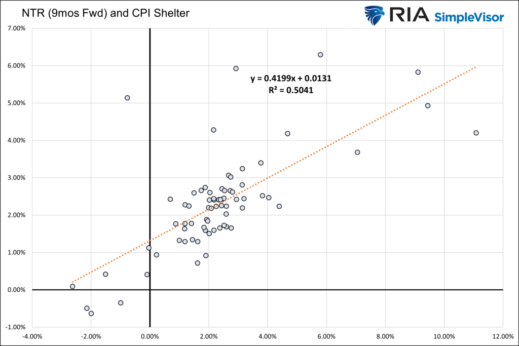
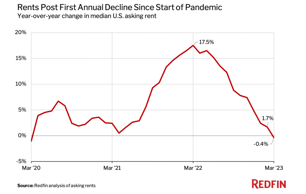
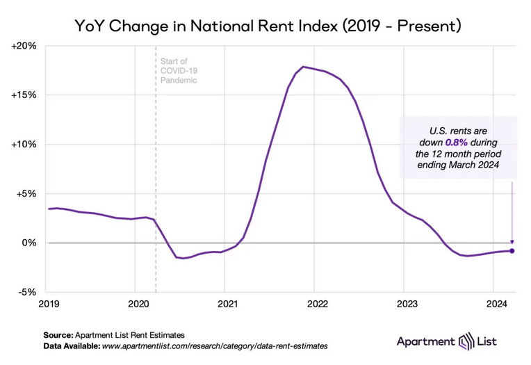
Once again, shelter prices account for nearly all of the monthly gains. Shelter prices were up 0.5%. As shown below, CPI less shelter has been at zero for the last two months and is slightly negative for the previous three months. As we continually harp on, when CPI shelter prices catch up with real-time price indicators of rents, CPI will take another leg lower, possibly into deflationary territory.

The data further confirms that the Fed will likely cut rates by 25 bps next week. As implied by Fed Funds futures, the odds of a 50bps cut is 12%, down from over 50% a week ago.

cpi less shelter

Cash Cows Inform Us On Yields

We have written many articles and commentaries forecasting interest rates. The analysis has used prior and current inflation and economic activity. Additionally, we have looked at market data on inflation expectations, Fed Funds futures, and other factors that influence interest rates. Today, we add an unorthodox factor to the list: cash cows.

This article introduces a unique way to imply where dividend investors think interest rates will be in the future.

READ MORE…

cash cows dividend yields

Tweet of the Day

cpi shelter

“Want to achieve better long-term success in managing your portfolio? Here are our 15-trading rules for managing market risks.


Please subscribe to the daily commentary to receive these updates every morning before the opening bell.

If you found this blog useful, please send it to someone else, share it on social media, or contact us to set up a meeting.
Is Bitcoin A Valuable Asset To Own During Fed Rate Cuts?

Yesterday’s commentary answered a question from a reader about our thoughts on owning gold or gold miners during a bull steepening period. Hours after publishing the commentary, we got a similar question asking how bitcoin might do when the Fed cuts rates. If bitcoin trades as a proxy of monetary policy and the dollar’s viability, then the question and answer are very important to grasp as the Fed embarks on a rate-cutting period. Bear in mind that we only have ten years of bitcoin data, so take the following analysis with some skepticism.

We separated the graph below charting Fed Funds and Bitcoin into the three Fed policy cycles: rate cutting, easing, and doing nothing. The two blue-shaded areas show mixed results when the Fed raises rates. In 2017-2018, bitcoin rose sharply but then gave up most of its gains. More recently, bitcoin fell as the Fed raised rates. The green bar shows one experience with rate cuts that was not friendly for Bitcoin holders. Its price was nearly cut in half during the period. However, what stands out most are the yellow circles highlighting periods when the Fed was doing nothing. Bitcoin surged in the three instances.

If bitcoin is indeed a proxy for rate policy, a rate cut should be good for it. However, our limited history argues otherwise.

bitcoin and fed funds

What To Watch Today

Earnings

  • No notable earnings releases today.

Economy

Economic Calendar

Market Trading Update

Yesterday, we discussed the initial test of the 100-DMA, which was held yesterday, but the 50-DMA currently provides decent overhead resistance for equities. However, Treasury bonds continue to extend their rally as anticipation for rate cuts builds and economic growth weakens. In August 2023, I discussed how I doubled down on my bond positions in anticipation of the coming bond rally despite arguments to the contrary from many mainstream analysts.

While our thesis was proven correct, bonds are now extremely overbought in the near term, with declining volume and deviating above the 50-DMA. For investors looking to add Treasury bond exposure at current levels, such will likely be painful as yields should retrace somewhat from current levels towards 4%. What causes such a retracement is unknown, but traders who were previously very short on Treasury bonds are now very long. Such positioning shifts often precede short-term retracements to previous support levels.

Using the 20-Year Duration Treasury Bond ETF (TLT) as a proxy for bond prices, I will become much more interested in increasing current exposure between 95 and 96. While prices could increase in the near term, waiting for an eventual correction to build positions will likely yield better long-term results.

Treasury Bond UPdate

NFIB Disappoints Again

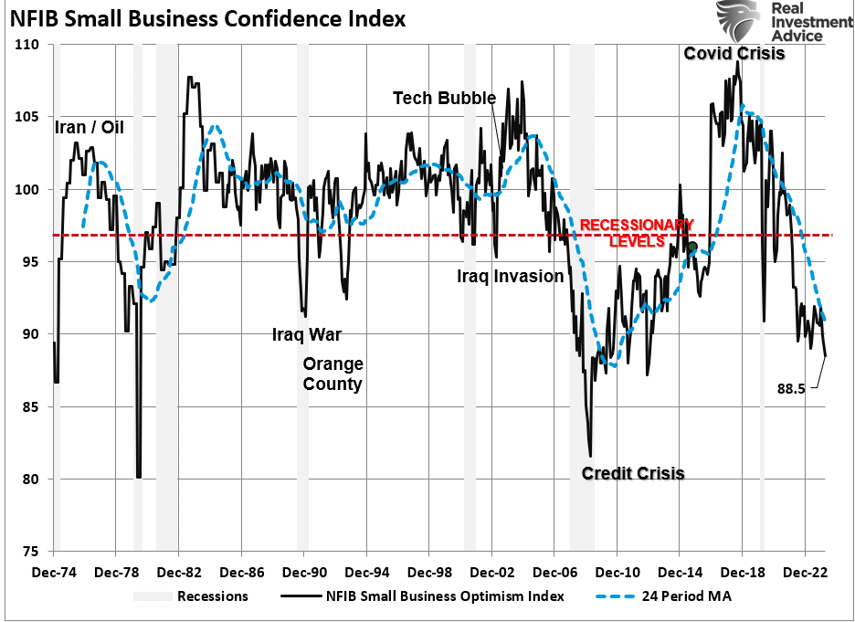
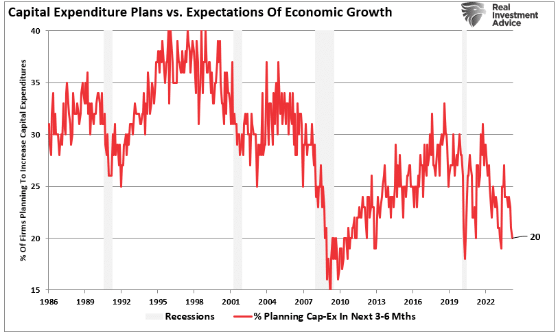
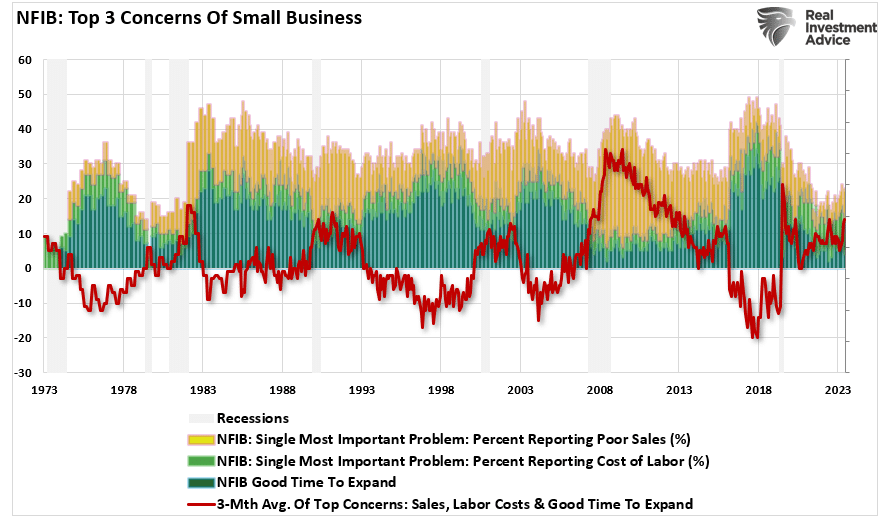
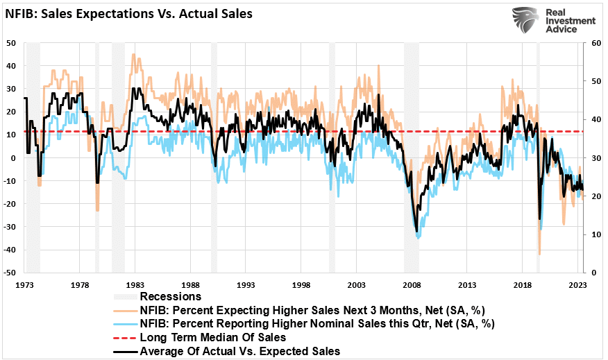
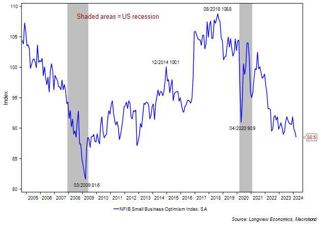
The NFIB – Small Business Optimism Index continues to show small business owners are under a lot of strain and have a dim outlook on the future. The optimism index fell to 91.2 from 93.6. Hiring plans decreased. Only 4% of those surveyed said it was a good time to expand. In addition, the uncertainty Index, at 92, is the highest since October 2020. Moreover, positive profit trends are down a seasonally adjusted net -37%, -7% lower than last month, and now lower than the early months of the pandemic, as shown below.

So, the question is, what might help improve the outlook of small business owners and ultimately boost their businesses? The election is clearly hampering the outlook for many. The election in November will likely improve the outlook for some and worsen it for others. That said, policies by the new president to help small businesses could improve the outlook for business owners of both political parties.

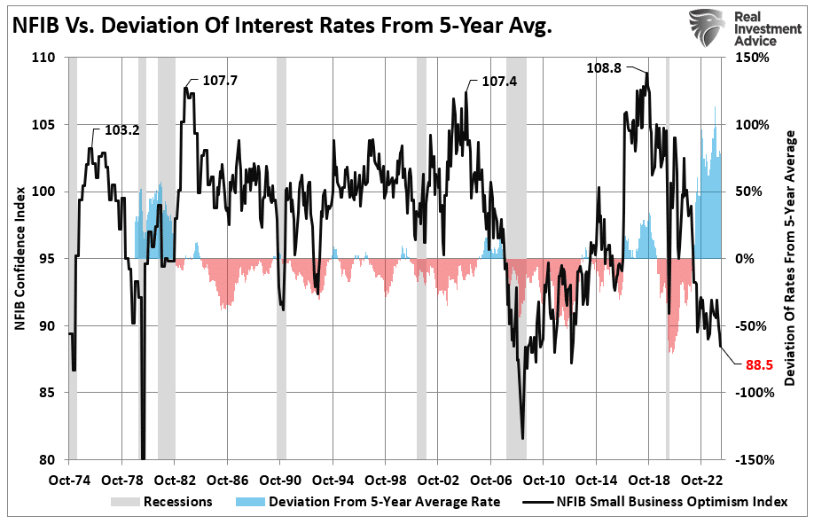
The Fed may have the most sway regarding profit concerns. Small businesses are typically heavy users of debt. Furthermore, their interest rates tend to be much higher than those of larger companies. Therefore, lower interest rates will reduce their interest expenses and potentially lift their pessimism.

nfib small business earnings

S&P 500 – A Bullish and Bearish Analysis

The S&P 500’s technical landscape presents both opportunities and challenges. Bullish indicators such as support at the 200-day moving average and oversold RSI levels suggest a “buy the dip” opportunity could be on the horizon. However, bearish patterns like lower highs and weakening volume during rallies warn of further downside risks.

We don’t know what will happen next, nor does anyone else. Therefore, we suggest a regular diet of risk management and portfolio rebalancing to navigate periods of elevated uncertainty.

READ MORE…

S&P 500 risk management

Tweet of the Day

September 11th

“Want to achieve better long-term success in managing your portfolio? Here are our 15-trading rules for managing market risks.


Please subscribe to the daily commentary to receive these updates every morning before the opening bell.

If you found this blog useful, please send it to someone else, share it on social media, or contact us to set up a meeting.
Cash Cow Clues: Can Dividend Yields Forecast Interest Rates?

We have written many articles and commentaries forecasting interest rates. The analysis has used prior and current inflation and economic activity. Additionally, we have looked at market data on inflation expectations, Fed Funds futures, and other factors that influence interest rates. Today, we add an unorthodox factor to the list: cash cows.

This article introduces a unique way to imply where dividend investors think interest rates will be in the future. The impetus for this article came from a recent SimpleVisor Friday Favorites article in which we reviewed the Campbell Soup Company (CPB). Friday Favorites typically analyzes a company’s fundamental and technical conditions and valuations.

This time, however, because the company was a cash cow, we took it further and studied its dividend yield. In the process, we arrived at an implied ten-year U.S. Treasury yield based on the current and historical spread between Campbell’s dividend yield and the ten-year U.S. Treasury yield.    

Implying future interest rates based on CPB is somewhat laughable. However, implying future interest rates on a larger population of cash cows may be more telling.

Ad for financial planning services. Need a plan to protect your hard earned savings from the next bear market? Click to schedule your consultation today.

What Is A Cash Cow?

Cash cow is a term dairy farmers use to describe mature cows that generate milk regularly with minimum maintenance.

Wall Street adopted the term cash cow to label companies that deliver reliable cash flows (milk), require little investment (maintenance), and have little to no sales and earnings growth (mature).

CPB is a good example of a cash cow. Not surprisingly, the soup business is a low-growth venture; therefore, it has negligible earnings and sales growth. Moreover, it has consistently paid dividends since 1989 and produces plenty of excess cash flow that should ensure future dividend payments.

While CPB lives up to the definition of a cash cow, we do not analyze it in this article as its dividend yield is below our threshold dividend yield. However, we did find fifteen other cash cows, which we will share.

Screening For Cows

In this analysis, we used the following screening criteria:

  • Market Cap > $10 billion
  • Five-Year EPS Growth < 5%
  • Five-Year Sales Growth < 5%
  • Dividend Yield > 2.50%
  • Ten Years of Consecutive Dividend Payments

The table below shows the fifteen stocks that met the screening criteria.

cash cow screen results
Ad for The Bull/Bear Report by SimpleVisor. The most important things you need to know about the markets. Click to subscribe.

What Can We Imply With Dividend Yields?

The following table shares our analysis of the fifteen companies.

After the ticker and name of each respective stock, we show the current dividend yield and the average dividend yield over the last five years. The next column, “Price Return to Avg. Div. Yield”, quantifies how much the stock price would have to change to bring the current dividend yield in line with the five-year average. Obviously, a company can increase its dividend or cut it, which would change the return.

The first set of analyses, which we just described, helps us compare the current dividend yield to recent yield history on an absolute basis.

Since some investors consider bonds a substitute for dividend stocks, we must also do a relative analysis of dividend yields. In other words, has the dividend yield risen accordingly with interest rates? To do this, we calculate the current dividend yield minus the current ten-year yield (“Spread to Tsy”). We also compute the average Spread to Tsy. for the last five years. With this data, we can calculate how much the stock price would have to change to make the dividend yield equal to its five-year average spread to Treasury yields.

Lastly, assuming the dividend yield reasonably predicts where rates are headed, we can imply where the ten-year U.S. Treasury yield may be in the near future. We share this in the column furthest to the right.

cash cow dividend yields
Ad for SimpleVisor. Get the latest trades, analysis, and insights from the RIA SimpleVisor team. Click to sign up now.

Cash Cow Conclusions

While there are many stories within the table, we focus on the averages of the fifteen stocks in this article. The current dividend yields are slightly higher than average. This is primarily a function of investors shunning dividend stocks in favor of higher-yielding bonds or stocks with better performance. Declining stock prices push the dividend yield higher, helping them stay competitive with bonds. Dividend yield is only one of many factors determining the price; however, it is a much more critical price determinant for cash cows than other stocks.

While the dividend yield may be higher than its norm for the last five years, it has not kept up with Treasury yields. Based solely on the yield spread, prices, on average, would need to fall by about 15% to bring the meager .41% spread over the 10-year UST back to normal.

But might stock investors be locking in higher dividend yields, anticipating a lower interest rate/yield environment? If so, our cash cows imply the 10-year UST yield would need to fall to 3.05%. Doing so will bring the average dividend yield spread versus Treasury yields back to its average.

Coincident or not, the market also thinks that the Fed Funds rate will trough at 2.87% when the coming rate-cutting cycle ends.  

Fed funds futures rates

Summary

Between our article Fed Funds Futures Offer Bond Market Insights and the cash cows we highlight, the Fed Funds futures market and stock market appear to be on the same page regarding future interest rates.

Some may find comfort in their similar predictions. However, caution is warranted. The bond market often underappreciates how much the Fed will cut interest rates. Furthermore, it has been proven to be a poor judge of where long-term Treasury bond yields will fall. Quite often, yields fall much more than anticipated. If this is again the case, some of our cash cows may see decent price appreciation if their dividend yield declines with lower bond yields.

Are Gold Miners Better Than Gold?

This past weekend, we received this question from a reader. The question is in reference to our recent article, Bull Steepener is Bearish. Specifically, the article points out that historically, stocks tend to do poorly when the yield curve exhibits a bullish steepening. However, gold miners and gold have both averaged positive returns during such yield curve shifts. Moreover, during these periods, gold miners produced a better return than gold. Therefore, the question from our reader is, are gold miners better than gold if the yield curve continues to steepen bullishly?

While our data on the last five bull steepenings argues the answer is yes, historically, gold miners have been a poor substitute for gold. As shown in the graph below, since 1994, the NYSE Gold BUGS Index (HUI), which tracks gold miner stocks, has been up a mere 38%. At the same time, gold has risen over 10x that amount (540%). Miners should provide better returns during gold bull markets as they are leveraged to the price of gold. However, time and time again, we find that faulty management decisions more than offset the benefits of leverage. This is not to say all gold miners underperform or will underperform gold. But choose wisely if you decide to invest in a gold miner over gold.

gold and gold miners

What To Watch Today

Earnings

Earnings Calendar

Economy

  • No notable economic reports today.

Market Trading Update

As noted yesterday, the market broke through the 50-DMA on Friday testing initial support at the 100-DMA. The good news is that the market bounced off the initial test of support. The bad news is that the bounce was rather weak, with sellers showing up repeatedly throughout the day knocking down the gains. During a correctional period, as we are in now, bounces tend to be very short-lived as sellers look for an exit.

The good news is that the markets are decently oversold, and a rally to the 50-DMA remains a likely first test. However, there is no guarantee this market will not go lower first, so manage risk accordingly. As is always the case, markets can and do remain overbought or sold for longer than many imagine. Therefore, use rallies opportunistically and take nothing for granted until this correctional process is complete.

Market Trading Update

Private Jobs Don’t Signal A Recession Yet

There are many ways to slice and dice the BLS employment report. Most analyses point to a steady weakening of the labor market but not a net loss of jobs and certainly not a recession. One of our clients closely follows economic data and shared with us a unique way to use the BLS report as a potential recession indicator. To wit, he says that every time the year-over-year change in employment was negative for consecutive months, a recession was soon to follow, or the economy was already in a recession.

Currently, as he shows below, the year-over-year rate is still positive. But he warns:

The point being is the recent YoY% change in Private Employment has been decreasing for some time now as shown in the chart below. Currently that annual growth rate is a positive +140 bps. However, this could turn negative in the next couple of months and just something to keep an eye out.  

private jobs growth BLS

SimpleVisor Weekly Sector And Factor Analysis

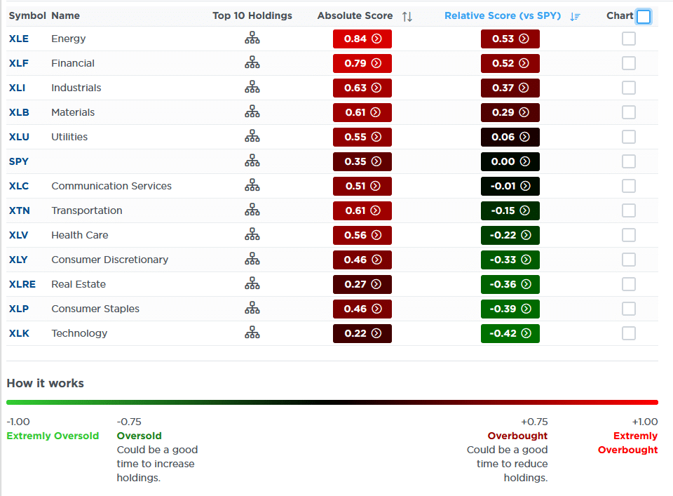
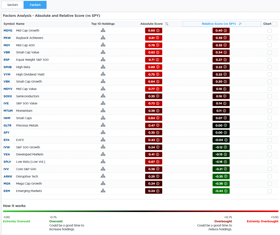
The two SimpleVisor tables below show investors are gravitating toward sectors and factors with the least risk and higher dividends. Conversely, higher beta, technology, and growth have been lagging. This shift to safety occurs as the yield curve un-inverts and the Fed is set to embark on a rate-cutting campaign. The market seems to appreciate the slowing economy and is paying attention to some warnings.

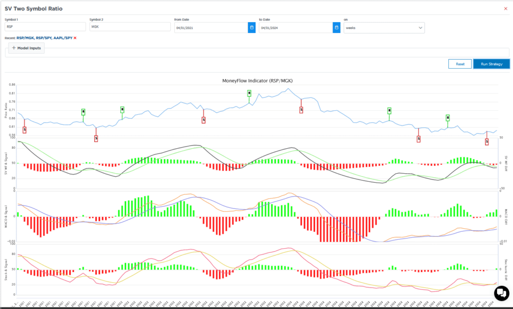
Another warning comes from our weekly SV Money Flow Weekly. This analysis uses weekly data and three indicators to help spot longer-term bullish and bearish trends. To produce a buy or sell signal, all three indicators must confirm a trend change. The green arrows show that the three indicators turned bullish in late 2022 and early 2023. Moreover, the “strong buy” alert was added to the graph when the third indicator flipped bullishly.

Currently, the shorter-term MACD has had a bearish crossing, as shown by the red arrow. However, the other two are still in bullish trends. but the longer-term MACD is very close to turning bearish. The top indicator shows the converging 13- and 34-week moving averages but it could still be weeks or even a month or two from crossing bearishly. It’s important to wait for all three to cross. For example, in late 2023, the lower two indicators crossed, but the 13- and 34-week moving averages didn’t. Thus a sell signal was not generated and after a slight pause the market continued upward.

sector analysis
factor analysis
simplevisor weekly moving averages

Tweet of the Day

commodities recession

“Want to achieve better long-term success in managing your portfolio? Here are our 15-trading rules for managing market risks.


Please subscribe to the daily commentary to receive these updates every morning before the opening bell.

If you found this blog useful, please send it to someone else, share it on social media, or contact us to set up a meeting.

S&P 500 – A Bullish And Bearish Analysis

The S&P 500 index is a critical benchmark for the U.S. equity market, and its performance often dictates investor sentiment and decision-making. Between November 1, 2022, and September 6, 2024, the S&P 500 experienced a significant rally but not without volatility. Currently, investors have very mixed views about where markets are heading next as concerns of a recession linger or what changes to monetary policy will cause.

However, as investors, we must trade the market we have today. Therefore, using technical analysis, we can explore bullish and bearish market dynamics to assist us in managing risk more effectively. This blog will outline three bullish and bearish perspectives using momentum, relative strength, and other key technical indicators. Finally, we will conclude with five actionable steps investors can take today to mitigate risk.

(Note: All data is as of the Friday, September 6 close.)

Bullish Outlook

1. Strong Support at Key Moving Averages

One of the primary bullish signals for the S&P 500 is its tendency to find support at critical moving averages. Throughout the analyzed period, the 50, 100, and 200-day moving averages supported the index significantly, particularly in late 2023 and early 2024. Even though the index faced downward pressure in August, its ability to bounce from the 150-day moving average indicates that buyers continue to find levels to increase equity exposure. Given the market has remained steadily above the 200-DMA and that average is trending higher, it signals that the longer-term bullish trend remains intact.

S&P 500 Market vs Moving Averages

2. Momentum Indicators Point to Potential Reversal

Momentum indicators such as the Moving Average Convergence Divergence (MACD) have recently triggered a short-term “sell signal,” which coincides with the recent price correction. However, while these signals have coincided with lower prices in the near term, they have consistently bottomed between -25 and -50. Such has provided investors with repeated opportunities to increase equity exposure over the last two years. When the MACD begins to register readings below -50, such has historically indicated when markets are turning from upward trending to lower trending prices.

S&P 500 Market vs MACD

3. Relative Strength Index (RSI) Near Oversold Levels

The Relative Strength Index (RSI) measures the magnitude of recent price changes. As of Friday’s close, the RSI is approaching more oversold levels near 30. While not there yet, which suggests markets could see additional weakness in the near term, low readings historically signal short-term market bottoms. Readings of 30 or below indicate that the selling pressure is likely overextended, and buyers tend to regain market control. In April and August 2024, the RSI hovered around these oversold levels, providing a strong signal for bullish traders to take advantage of a bounce. While the recent correction likely has further to go, the current low RSI readings suggest a bounce is likely. Investors should use any rally to rebalance portfolio risk.

S&P 500 Market vs RSI

However, investors should also consider the bearish warnings.

Bearish Outlook

1. A Lower High

From a bearish perspective, the recent lower high of the market is concerning. If the market declines and sets a lower low, that is one of the more telling technical signals indicating a new potential bearish trend. Lower highs suggest buyers are losing conviction, and each new rally is weaker than the previous one. Simultaneously, lower lows suggest that selling pressure is increasing. This pattern, if sustained, could indicate a deeper corrective phase, possibly targeting lower support zones between 4600 and 5200. While the recent lower high is very early, a recent pattern to review is 2022.

S&P 500 Market Lower Highs

If the market rallies in the weeks ahead, setting a new high, that price action will negate the warning from lower highs.

2. Decreasing Volume of Rallies

Another bearish indicator is the declining trading volume during recent rallies. According to technical analysis principles, strong price moves should be accompanied by increasing volume, signaling widespread market participation. However, rallies in the S&P 500 over the last two months coincided with lower volume levels. As discussed previously, these negative divergences warned investors that the upward move lacks conviction. The divergence between price and volume forewarned of this recent correction.

S&P 500 Market vs Volume

3. Longer-Term MACD Signals Turn Bearish

We regularly publish our longer-term technical analysis and statistics in the weekly Bull Bear Report (Subscribe for FREE). One of those charts is the Weekly Risk Management Analysis. The chart below matches an intermediate and longer-term weekly MACD signal to the markets. When both signals are on “buy signals,” such has coincided with a trending bull market advance. When both signals confirm a “sell,” as in early 2022, the market has gone through correctional phases.

Currently, while early, both the intermediate and longer-term MACD “sell” signals are registered. There are several crucial points to note:

  1. The market is trading at the top of its long-term trend channel from the 2009 lows. While it previously traded above that channel in 2021 due to artificial stimulus, the current advance may be near its current cycle peak.
  2. These are weekly signals and, therefore, very slow to move. Signals can whip back and forth for a month or so before becoming confirmed by a breakdown in the market.
  3. As noted, the market’s price action needs to confirm the “buy” and “sell” signals. If the market enters a deeper corrective phase, a break of the 200-DMA will confirm the end of the bullish advance that started in 2022.

Notably, while bullish and bearish signals exist, the market can remain in flux for quite some time. For example, the market is approaching oversold territory based on RSI, which typically suggests a reversal. However, the bearish price action and weak volume indicate that caution is warranted. Therefore, while some technical indicators provide conflicting signals, investors must manage near-term risk while waiting for markets to confirm their next direction.

Ad for SimpleVisor. Get the latest trades, analysis, and insights from the RIA SimpleVisor team. Click to sign up now.

5-Actions Investors Can Take Today to Minimize Risk

Given the mixed technical outlook for the S&P 500, investors should focus on managing risk while positioning themselves for potential market swings. Here are five actions to consider:

1. Trim Winning Positions Back to Their Original Portfolio Weightings

This strategy involves reducing your exposure to positions that have grown beyond their initial allocation due to price appreciation. When a particular asset or stock performs well, its weight in the portfolio increases, potentially leading to overexposure and imbalance. Trimming these positions back to their original weight helps lock in profits while maintaining your intended risk profile. It’s a way to ensure that no single asset dominates the portfolio, which could lead to increased risk if that asset faces a downturn.

2. Sell Those Positions That Aren’t Working

Selling underperforming assets is essential for managing risk and avoiding unnecessary losses. Suppose a stock or asset consistently underperforms relative to its peers or the market. In that case, it may be a sign that the investment thesis has failed or external factors negatively affect the position. Selling these positions frees up capital investors can reallocate to better-performing or more stable assets. It’s a proactive step to cut losses and prevent further erosion of your portfolio value.

3. Move Trailing Stop Losses Up to New Levels

A trailing stop loss is a risk management tool that automatically adjusts as a stock price rises, locking in profits and protecting against downside risk. Moving these stop-loss levels up as the price of an asset increases ensures that if the market reverses, you can capture gains without manually monitoring and selling the position. This strategy helps protect profits while allowing for further upside potential. It’s advantageous in volatile markets where prices can fluctuate significantly.

4. Review Your Portfolio Allocation Relative to Your Risk Tolerance

You should always align your investment portfolio with your risk tolerance, which may change over time due to market conditions or personal factors such as age, income, or financial goals. Reviewing your portfolio allocation means assessing how much your portfolio is invested in different asset classes (e.g., stocks, bonds, cash) and ensuring the risk level matches your current comfort level. For instance, if your portfolio has become more aggressive (higher exposure to stocks or growth assets), you may need to rebalance to reflect a more conservative risk profile, particularly as market conditions change.

5. Raise Cash Levels And Add Treasury Bonds to Reduce Portfolio Volatility

Increasing your cash allocation is a simple but effective way to reduce portfolio volatility. In times of uncertainty or market downturns, holding more cash can help minimize losses and provide liquidity for future opportunities. Cash is a low-risk asset that doesn’t fluctuate with the market, so increasing your cash position can help stabilize the overall portfolio and provide peace of mind during volatile periods.

Furthermore, investors consider Treasury bonds safer investments than stocks, providing stability and predictable income through interest payments. Adding bonds to a portfolio can help reduce volatility, particularly during economic uncertainty or stock market corrections. Bonds tend to have an inverse relationship with stocks, meaning they can perform well when equities struggle, particularly during Fed rate-cutting cycles.

Conclusion

The S&P 500’s technical landscape presents both opportunities and challenges. Bullish indicators such as support at the 200-day moving average and oversold RSI levels suggest a “buy the dip” opportunity could be on the horizon. However, bearish patterns like lower highs and weakening volume during rallies warn of further downside risks.

We don’t know what will happen next, nor does anyone else. Therefore, we suggest a regular diet of risk management and portfolio rebalancing to navigate periods of elevated uncertainty.

Could I be wrong? Absolutely.

But what is worse:

  1. Missing out temporarily on some additional short-term gains or
  2. Spending time getting back to even, which is not the same as making money.

Opportunities are made up far easier than lost capital.” – Todd Harrison

Trade accordingly.

50 bps or 25 bps? The BLS Report Leaves The Market In Limbo

Heading into last Friday’s BLS employment report, the Fed Funds futures market put equal odds of the Fed cutting by 25 bps or 50 bps. Most economists thought the employment report would answer the question of whether they will cut by 25 bps or 50 bps at the September 18th FOMC meeting.

The BLS employment report was weak but not awful. As a result, as shown below, the market remains in limbo. Accordingly, this Wednesday’s CPI report may persuade the market toward 50 bps or 25 bps.

Per the BLS report, payrolls increased by 142k, below expectations of 165k. However, the prior two months were revised lower by 86k. The unemployment rate fell to 4.2% from 4.3% as expected. Important to the Fed, hourly earnings rose by 0.4%, a tenth more than expectations. However, the prior month was revised downward by 0.3% to -0.1%. The latest BLS and ADP data, taken in stride with the monthly and outsized annual -880k revisions a few weeks ago, clearly shows the labor market is weakening. But is it weakening enough for the Fed to justify cutting rates by 50 bps?

fomc rate cut odds of 50 bps vs 25 bps

What To Watch Today

Earnings

Earnings Calendar

Economy

  • No notable economic releases today.

Market Trading Update

As noted last week,

“This past week, the market struggled to make gains, and as shown, its momentum has slowed. While such does not mean a significant correction is imminent, it does suggest that the upside is likely limited. Investors should expect a continued consolidation or pullback to previous support levels. Notably, a negative divergence is developing between momentum, strength indications, and market performance. We last mentioned such a negative divergence was in late July before the August correction.”

Market Trading Update

This past week, slowing economic data and a weak payroll report weighed on market sentiment, pushing the market below initial support levels at the 20—and 50-DMA. That suggests that the current correction process that began in early August is continuing ahead of the upcoming November election.

As discussed this past Tuesday in “Risks Facing Bullish Investors,” an essential “buyer” for the market is fading with the corporate buyback window closing. Such increases the risk of a pickup in volatility over the next two months, which coincides with a potentially contentious election that will likely keep major investors sidelined.

In the short term, the weekly technical gauge shows the recent correction resolved much of the previous overbought conditions. That sets the market up for a reflexive rally early next week.

Technical Gauge

We suggest using any rally that fails to regain the 50-DMA to reduce risks, rebalance portfolios, and raise cash levels. While the potential downside is not significant, the goal is not to sacrifice a substantial amount of recent gains or put yourself in a position of being forced to sell for any reason.

Remain cautious for now. Following the election, we will likely have significantly more clarity about where the market is heading next.

The Week Ahead

With employment data behind us, we turn to inflation to help us assess whether the Fed will cut by 25 bps or 50 bps. This week’s data features CPI on Wednesday, PPI on Thursday, and Import/Export prices and University of Michigan inflation expectations on Friday. The current market expectation for CPI is an increase of 0.2%. The graph below shows that monthly inflation rates have been slightly higher than in the three years before the pandemic. However, the average change over the last six months aligns more with pre-pandemic levels.

Also on the calendar are the 10- and 30-year UST auctions. With bonds trading much better over the last few months, demand should be decent; thus, volatility related to the auctions will likely be less than we have witnessed over the past few years.

cpi monthly change

Technological Advances Make Things Better – Or Does It?

While technological advances seem to produce an enormous benefit, a dark side gets hidden from public discourse.

One primary concern is job displacement. Automation and artificial intelligence, while improving efficiency, often replace jobs traditionally performed by humans. This displacement mainly affects low-skilled workers in industries like manufacturing and retail, leading to unemployment and underemployment. As machines take over routine tasks, the workforce faces the challenge of reskilling to meet the demands of a more technologically advanced economy. That transition period can lead to economic slowdowns and increased inequality, as not all workers have the means or opportunity to adapt quickly.

READ MORE…

profits to wages ratio technology

Tweet of the Day

job openings construction

“Want to achieve better long-term success in managing your portfolio? Here are our 15-trading rules for managing market risks.


Please subscribe to the daily commentary to receive these updates every morning before the opening bell.

If you found this blog useful, please send it to someone else, share it on social media, or contact us to set up a meeting.
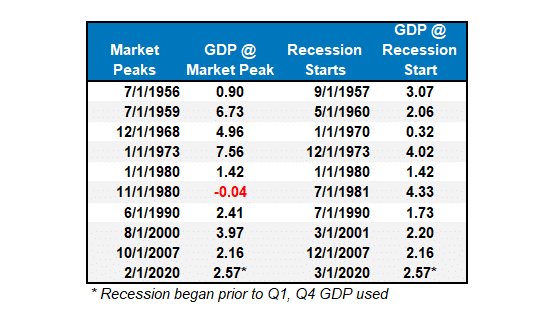
Is GDP Overstated Like Job Growth?

A week ago, the BLS revised lower the number of employed persons by nearly 900,000. Given that revision and a slew of recent revisions in other economic statistics, we must ask if GDP is also overstated. GDP, like other data, has a history of sharp revisions. For instance, consider the following research from the San Francisco Fed:

The figure shows that the decline in real GDP growth initially seemed far less serious than it turned out to be. In fact, for the first half of 2008, the data would have been consistent with only a relatively mild recession. But by the fourth quarter of 2008, the quarterly contraction was initially listed at –3.8% annual rate. With the passing of time, the data were revised down another whopping –4.6 percentage points, thus bringing the decline in GDP to an eye-watering –8.4% annual rate.

To help us appreciate if it is overstated and potentially by how much we turn to GDI. Gross Domestic Product (GDP) and Gross Domestic Income (GDI) are two very similar measures of economic activity. The difference is that GDP measures output, while GDI assesses income. These measures should tell the same economic story. However, GDI has proven to be more reliable and often leads GDP.

Hence, if the relationship normalizes, a downward revision is likely. Currently, the difference between GDP and GDI is $615 billion. Therefore, if a revision or even a normalization were to occur, GDP would decrease by 2.7%. We have more on the GDP-GDI relationship in a section below.

gdp gdi

What To Watch Today

Earnings

  • No notable earnings releases today

Economy

Economic Calendar

Market Trading Update

Yesterday, we discussed that the market was testing initial support at the 50-DMA. The market flirted with breaking that initial level of support as the sell signal deepened. However, there are two important points to consider before taking action. First, when the market moves down to previous support levels, it generally coincides with short-term oversold conditions. Secondly, the initial break isn’t validated until a failed retest of that broken support.

While the market is not deeply oversold, the selling pressure has generated enough stress to elicit a short-term bounce. Such could be the case if the employment report this morning keeps Fed rate cut expectations on the table. Secondly, look for a bounce before reducing risk. As is often the case, investors tend to make knee-jerk reactions that lead to poor outcomes when markets sell-off.

This morning’s employment report will likely decide the market’s fate over the next few trading days. A too-strong report will send interest rates higher and stocks lower as expectations for Fed rate cuts get pushed out. The opposite will likely be the case if the report is exceptionally weak. After the employment report, we should know better where the market goes next.

Market Trading Update

ADP Jobs Report

We share the commentary below from ADP to help us set expectations for today’s BLS jobs report.

Private businesses in the US added 99K workers to their payrolls in August 2024, the least since January 2021, following a downwardly revised 111K in July and well below forecasts of 145K. Figures showed the labor market continued to cool for the fifth straight month while wage growth was stable.”The job market’s downward drift brought us to slower-than-normal hiring after two years of outsized growth,” said Nela Richardson, chief economist, ADP. “The next indicator to watch is wage growth, which is stabilizing after a dramatic post-pandemic slowdown”. Year-over-year, pay gains were flat in August, remaining at 4.8 percent for job-stayers and 7.3 percent for job-changers.

It is important to note that the ADP and the BLS employment reports have not been in sync since the pandemic. Therefore, take the data below and the commentary above with a grain of salt.

adp

More On GDP GDI And Labor Market Revisions

The following is from Anna Wong, Chief Economist Bloomberg.

There is this myth that GDI always get revised toward GDP. It is a myth, because turns out that GDI leads GDP in turning points of the economy (per BEA and Fed research). And GDP tends to get revised toward GDI in lead up to and during recessions…though obvious only several years later. The discrepancy is GDP and GDI also turns out to be predictive of unemployment rate in the lead up to cyclical peaks.

Bottomline: why do I have to spend my Friday night writing about this rather reading a nice book? I’d rather not. But people on this app put too much signal on GDP, particularly in today’s economic environment. Research would say to put more weight on GDI in turning points.

The chart below accompanies a Fed article by Jeremy Newaik. As shown, the initial 2008 GDP readings were revised sharply lower over the following few years.

gdp revisions fed

Tweet of the Day

S&p 500 seasonality

“Want to achieve better long-term success in managing your portfolio? Here are our 15-trading rules for managing market risks.


Please subscribe to the daily commentary to receive these updates every morning before the opening bell.

If you found this blog useful, please send it to someone else, share it on social media, or contact us to set up a meeting.
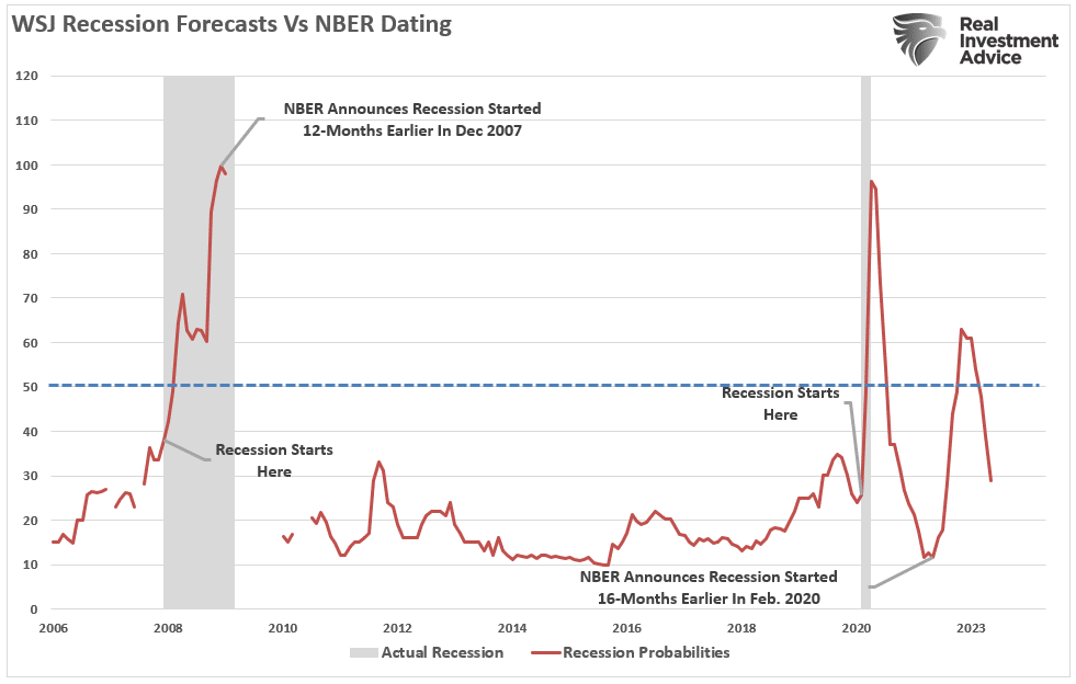
Technological Advances Make Things Better – Or Does It?

It certainly seems that technological advances make our lives better. Instead of writing a letter, stamping it, and mailing it (which was vastly more personal), we now send emails. Rather than driving to a local retailer or manufacturer, we order it online. Of course, we mustn’t dismiss the rise of social media, which connects us to everyone and everything more than ever.

Economists and experts have long argued that technological advances drive U.S. economic growth and productivity. As innovations emerge, they play a crucial role in shaping the economy, improving efficiency, and enhancing productivity across various sectors. From artificial intelligence to automation, the benefits of technological progress are widespread and profound.

For example, automation and artificial intelligence have streamlined manufacturing processes, reducing the need for manual labor and minimizing human error. This efficiency boost leads to faster production times and reduced costs, lowering prices while improving profit margins. Higher productivity levels contribute to overall economic growth, as businesses can produce more goods and services with the same resources.

Another significant benefit is the creation of new industries and job opportunities. As technology evolves, it creates demand for new skills and expertise, leading to the development of entirely new sectors. For example, the rise of the technology industry gave birth to jobs in software, data analysis, and cybersecurity, among others. These high-paying jobs contribute to economic growth by increasing consumer spending and driving innovation.

Ray Kurzweil’s 1999 book, “The Age of Spiritual Machines,” introduced the concept of “The Law of Accelerating Returns. Ray predicted that the rate of technological advances is exponential rather than linear. That means that technology builds on itself in a positive feedback loop, allowing each generation to advance at an increasing rate.

Accelerating pace of technology

Kurzweil’s predictions related to this theory have proven remarkably accurate. He predicted technologies such as the internet and the growth in mobile computing power years before they emerged. Out of 147 predictions he made in the 1990s about the future up to 2009, 115 (78%) were correct.

However, were economists’ predictions about the benefit of technology as accurate as Kurzweil’s?

The Dark Side Of Technological Advancement

While technological advances seem to produce an enormous benefit, a dark side gets hidden from public discourse.

One primary concern is job displacement. Automation and artificial intelligence, while improving efficiency, often replace jobs traditionally performed by humans. This displacement mainly affects low-skilled workers in industries like manufacturing and retail, leading to unemployment and underemployment. As machines take over routine tasks, the workforce faces the challenge of reskilling to meet the demands of a more technologically advanced economy. That transition period can lead to economic slowdowns and increased inequality, as not all workers have the means or opportunity to adapt quickly.

The chart below shows the trend of employment versus actual employment. Since 1947, employment has grown with the economy, as expected. However, employment changed in the late 90s as employment fell below the previous growth trend, coinciding with the Internet adoption. The need for employees eroded as the internet fostered technological advances in everything from manufacturing automation to online sales, social media, advertising, and business management. Today, the deviation in employment from the long-term growth trend is the largest in history outside of the pandemic-driven economic shutdown.

Employment "real situation" report

Another issue is the increasing concentration of wealth and market power in the hands of a few technology giants. Companies like Amazon, Google, and Apple dominate their respective markets, creating barriers to entry for smaller firms. As shown, as technological advances increased, there has been a clear shift in corporate earnings and concentration. Again, starting in the late 90s, increased technological advances reduced the number of employees required to produce goods and services. At the same time, the market became increasingly concentrated in a smaller group of companies.

Employment to population ratio

Monopolistic behavior stifles competition, reduces innovation, and limits consumer choice. Furthermore, corporate profitability soared by reducing labor, which is the most costly expense for any business.

Corporate profits to wages

The vast wealth accumulation by these companies contributes to economic inequality. That inequality can hamper overall economic growth by reducing the average consumer’s purchasing power. Since 1990, wealth inequality has soared, with those in the top 10% owning a vast majority of economic wealth. The bottom 50%, which comprises a significant portion of employee labor in the manufacturing and services industries, have barely benefitted.

Household net worth by quintile.

Lastly, the rapid pace of technological change can lead to productivity paradoxes, where the expected gains in productivity from new technologies do not materialize as anticipated. That happens due to the significant time and investment required to integrate new technologies effectively into existing business processes. Additionally, cybersecurity threats, data privacy concerns, and technology-driven stress can undermine productivity and lead to economic inefficiencies.

But there is even a darker side that no one is talking about.

banner ad for SimpleVisor, our do it yourself investing tool. sign up for your free trial now

Social Loneliness

While social media and the internet have revolutionized the way we connect and communicate, they have also contributed to several severe societal issues, including increased loneliness, social and political division, and a troubling rise in teenage suicides. Understanding these negative impacts is crucial for addressing the challenges of the digital age.

One significant consequence of social media is the rise in loneliness. Despite the promise of connecting people, social media often leads to superficial interactions, which lack the depth and intimacy of face-to-face communication. As users compare their lives to the seemingly perfect lives of others online, feelings of inadequacy and isolation can increase. That can be particularly damaging for teenagers, as they are at a critical stage of developing their self-identity and sense of belonging. The constant need for validation through likes and comments can lead to feelings of loneliness and anxiety.

Gen Z is lonely

Social media also contributes to social and political division. The algorithms that power these platforms often promote content aligning with users’ beliefs, creating echo chambers reinforcing biases. This polarization can deepen societal divisions, making constructive dialogue and mutual understanding more difficult. The spread of misinformation and fake news further exacerbates these divisions, exposing people to misleading content that can shape their perceptions and opinions. With a growing inability to logically and rationally discuss our differences, passing laws and policies that benefit everyone has become impossible.

Political Divide in America

Lastly, and most unfortunately, the impact of social media on teenage mental health is alarming. Studies have shown a link between heavy social media use and increased rates of depression, anxiety, and suicidal thoughts among teenagers. The pressure to fit in, the prevalence of cyberbullying, and the exposure to unrealistic standards of beauty and success can create a toxic environment that negatively affects teens’ mental well-being. Tragically, this can lead to an increase in teenage suicides (as shown by the CDC) as vulnerable individuals struggle to cope with the pressures of the digital world.

Teenage suicide rates

In conclusion, while technology is a powerful driver of economic growth, it also presents challenges that can negatively impact productivity, equality, mental health, and societal cohesion. Addressing these issues ensures that technological advancements promote sustainable and inclusive economic growth.

After all, that was the promise of technology, to begin with.

Nvidia Legal Woes May Benefit AMD And Others

Nvidia faces legal woes as the Justice Department subpoenaed the company over antitrust concerns. This should not be too surprising, as it was recently reported that Nvidia dominates the GPU chip market and continues to increase its market share. GPU, or graphics processing unit, is a cornerstone of AI technology. As shown below, as of the end of the first quarter, Nvidia increased its market share of AIB chips to 88% from 80% at the end of the year. The names AIB and GPU are often used interchangeably to represent graphic cards. In Nivida’s wake is AMD, with approximately 12% of the market share, and Intel, with a negligible share.

While a significant market share of an immensely profitable and in-demand product is a godsend for shareholders, it is not durable over the long term. Foremost, as we led, Nvidia now faces legal challenges to its market share. The Justice Department is concerned Nvidia is making it difficult for its customers to use other chips. Furthermore, Bloomberg reports they penalize buyers who do not exclusively buy their chips. Consequently, Nvidia’s legal issues may benefit AMD and other chip makers.

Also, beyond Nvidia’s legal issues, it faces intense competition. Given the outsized profit margins on GPU chips, competition will become fierce. It may take some time for AMD, Intel, and others to make a competitive chip, but when they do, prices and profit margins of GPUs are likely to fall. In the words of Jeff Bezos: “Your margin is my opportunity.

nvidia gpu share

What To Watch Today

Earnings

Earnings Calendar

Economy

Economic Calendar

Market Trading Update

Yesterday, we discussed the sharp market sell-off and noted that it was critical that buyers step in to defend the 20- and 50-DMA support levels just below Tuesday’s close. Such was the case on Wednesday, and while the market flirted with a break of support in the late afternoon, it held that level into the close. However, the not-so-bullish development is that the MACD “buy signal” triggered in early August, supporting the rally from the lows, has reversed. With the market not deeply oversold yet, such does imply that any rallies will likely be limited by the rather substantial build of overhead resistance during the last half of August.

Market Trading Update

The first half of September is typically better than the last half of the month. If we get a couple of economic reports that support the coming Fed rate-cutting cycle, it could lift stocks by the end of the week or next. However, as we cautioned heading into this recent downturn, reducing risk and raising cash levels make a lot of sense heading into the election.

JOLTS

The BLS JOLTs report was weaker than expected. Job openings fell to 7.67 million from 7.91 million last month amid expectations of an increase to 8.10 million. Furthermore, the prior month’s number was revised lower from 8.18 million. The number of job openings is at levels last seen in January 2021. Moreover, it’s quickly closing in on the 7.0-7.5 million range in the two years before the pandemic.

Also, within the data below, total job separations increased while hires rose. However, netting the two figures points to a loss of 63k jobs. A figure important to the Fed is the number of unemployed persons per job opening. The second graph shows that it is now fully back to pre-pandemic run rates. The probability of the Fed increasing rates by 50bps versus 25bps is now 50/50. ADP and the BLS employment report will likely push the odds toward one or the other.

jolts jobs table
unemployed per job opening

A Bull Steepening Is Bearish

Stocks spend a lot more time trending upward than downward. However, in those relatively brief periods where longer-term bearish trends endure, investors are advised to take steps to reduce their risks and limit their losses. An active approach puts you on higher ground than you otherwise might have been. Moreover, when the market resumes its upward trend, you have ample funds to purchase stocks at lower prices and better risk-return profiles.

You may wonder why an article about bond yield curves leads off with a discussion of bear market strategies for stocks. Some yield curve shifts correlate well with positive stock market returns and others with negative returns. Prior bull steepening environments have not been friendly to buy and hold stock investors. Therefore, we hope this analysis guides you in preparing to reduce risk if needed.

READ MORE…

bull steepening yield curve

Tweet of the Day

S&P 500

“Want to achieve better long-term success in managing your portfolio? Here are our 15-trading rules for managing market risks.


Please subscribe to the daily commentary to receive these updates every morning before the opening bell.

If you found this blog useful, please send it to someone else, share it on social media, or contact us to set up a meeting.
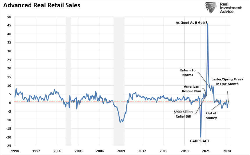
The Treasury Yield Curve Sets Off A Recession Warning

“The level of U.S. Treasury yields and the changing shape of the Treasury yield curve provide investors with critical feedback regarding the market’s expectations for economic growth, inflation, and monetary policy.” That sentence led off our article last week: Yield Curve Shifts Offer Signals For Stockholders. The Treasury yield curve has proven an accurate predictor of economic weakness and, ultimately, recessions. As fall is starting to show signs of emerging, the yield curve also warns of a new economic season. On Monday night, the 2-year note yield fell slightly below the 10-year yield. Thus, the yield curve inversion, which has lasted over two years, is over, ending one of the longest yield curve inversions on record.

The graph below charts the difference between ten and two-year Treasury yields, commonly called the yield curve. The shaded circles highlight the last four times the yield curve inverted and uninverted. Each time the yield curve inverted and uninverted, a recession followed. Next to the shaded circles, you will find the number of days between the uninversion and the start of the recession as deemed by the NBER. Bear in mind they always call the recession well after each recession started and backdate it.

If, and we stress “if,” the economy is heading for a recession and the S&P 500 is ultimately setting up for a drawdown as is typical in a recession, we best appreciate this warning. However, we have time to prepare. The table below shows that the stock market doesn’t always heed the yield curve warning mainly because the economic data at the time of the uninversion did not give the impression that a recession was imminent.

ten -two year yield curve

What To Watch Today

Earnings

Earnings Calendar

Economy

Economic Calendar

Market Trading Update

In yesterday’s commentary, we discussed the market’s negative divergences and slowing momentum. As we stated:

“While markets can make all-time highs soon, the momentum and relative strength decline is certainly a cautionary tale. Just as a reminder, September and October tend to be weak performance months for the market, and the addition of a leadership or policy change could add to that risk.”

While we suspected a decline was likely, we didn’t expect it to occur in just one day. There are a couple of important points to yesterday’s action. First, the sell-off yesterday broke through the bottom of the recent trading range after failing resistance at all-time highs. Secondly, the reversal brought the market very close to triggering a “sell signal,” which would likely lead to lower prices over the coming days.

The good news is that the 20 and 50-DMA have converged to provide a significant level of price support for the market. Theoretically, the market should hold this level and bounce toward the bottom of the previous trading range. A failure of that support will lead to lower prices, but there are several support levels below yesterday’s close down to the 100-DMA. Unless something is brewing behind the scenes, the market should remain above the recent downtrend channel. Of course, there is always a risk that doesn’t occur, and the 200-DMA becomes a viable target.

As noted yesterday, investors got a decent reminder of the consequences of their complacency. We suggest managing risk until a better entry point presents itself. Today is not that point.

market trading update

ISM Manufacturing

The ISM Manufacturing Index was a little weaker than expected, at 47.2, compared to expectations of 47.5. However, it was better than last month’s 46.8. Manufacturing Employment is still contracting at 46.0, but the latest is slightly better than last month’s 43.4. Of concern for the Fed, the price index rose to 54.0. The price index was below 50 from September 2022 through December 2023. This year, each monthly reading was above 50. It will be more critical to the Fed if tomorrow’s Services Price Index is higher than expected.

The graph below shows the ISM New Orders Index. This past month, it fell to 44.6, well below the previous reading of 47.4 and the optimistic consensus of 47.7. This index tends to be a good leading indicator for the manufacturing sector. Yields fell sharply on the release as it further cemented the market thinking that the Fed could cut rates by 50bps at the next meeting. The odds of a 50bps decrease are now up to 40%.

ism manufacturing index new orders

Risks Facing Bullish Investors

Since the end of the Yen Carry Trade” correction in August, bullish positioning has returned with a vengeance, yet two key risks face investors as September begins. While bullish positioning and optimism are ingredients for a rising market, there is more to this story.

It is true that “a rising tide lifts all boats,” meaning that as the market rises, investors begin to chase higher stock prices, leading to a virtual buying spiral. Such leads to an improvement in market breadth and participation, which supports further price increases. Following the August decline, the chart below shows the improvement in the NYSE advance-decline line and the number of stocks trading above their respective 50-day moving averages (DMA).

READ MORE….

market greed fear index

Tweet of the Day

money markets fed funds

“Want to achieve better long-term success in managing your portfolio? Here are our 15-trading rules for managing market risks.


Please subscribe to the daily commentary to receive these updates every morning before the opening bell.

If you found this blog useful, please send it to someone else, share it on social media, or contact us to set up a meeting.
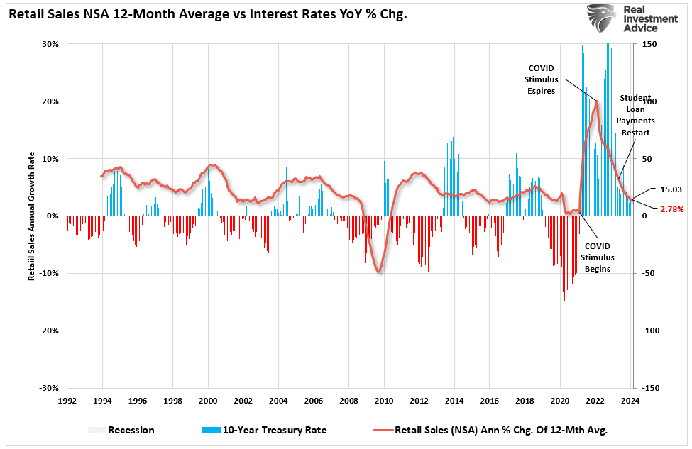
Bull Steepening Is Bearish For Stocks – Part Two

Part One of this article described the burgeoning bull steepening yield curve environment and what it implies about economic growth and Fed policy. It also discussed the three other predominant types of yield curve shifts and what they suggest for the economy and Fed policy.

Persistent yield curve shifts tend to correlate with different stock performances. With the odds growing that a long bull steepening may be upon us, it’s incumbent upon us to quantify how various stock indices, sectors, and factors have done during similar yield curve movements.

Limiting Losses With Yield Curve Analysis

Stocks spend a lot more time trending upward than downward. However, in those relatively brief periods where longer-term bearish trends endure, investors are advised to take steps to reduce their risks and limit their losses. An active approach puts you on higher ground than you otherwise might have been. Moreover, when the market resumes its upward trend, you have ample funds to purchase stocks at lower prices and better risk-return profiles.

We discussed this topic at length in Bear Market Wealth Management. Per the article:

Growing wealth happens over decades. Within these decades are many bullish and bearish cycles. While investors tend to focus on making the most of the bullish cycles, it is equally important to avoid letting bear markets reverse your progress. The amount of time spent in bear markets is minimal, but the time lost recovering your wealth can be substantial

You may wonder why an article about bond yield curves leads off with a discussion of bear market strategies for stocks. Simply, some yield curve shifts correlate well with positive stock market returns and others with negative returns. Prior bull steepening environments have not been friendly to buy and hold stock investors. Therefore, we hope this analysis guides you in preparing to reduce risk if needed.

Ad for financial planning services. Need a plan to protect your hard earned savings from the next bear market? Click to schedule your consultation today.

The Recent Bull Steepening History

The graph below charts the 2- and 10-year yields and the 2-year/10-year yield curve. Additionally, shaded in gray are periods we deem persistent bull steepening. We defined the bull steepening periods by the curve’s movement and the trend’s consistency. To qualify, the yield curve had to be increasing, with 2-year and 10-year yields moving lower for 20 weeks or longer. Furthermore, we required at least 80% of the weeks to be in the bullish steepening trend.

As shown, there have been five such periods since 1995. The most recent stretched from May 2019 to March 2020. The current bull steepening has not been occurring long enough to meet our standards defined above.

bull steepening periods

Bull Steepening Cycles Are Bearish For Most Stocks

Having defined the periods, we then studied various stock indices, sectors, and factors to assess their performance during the timeframes. To remind you, bull steepening trades typically occur when the economy is slowing, and anticipation of Fed rate cuts grows. Those traits adequately describe the current period.

Furthermore, and of importance, the current steepening is occurring from a yield curve that has been inverted for two years. Inverted means the yield on the 10-year is less than the 2-year. An inversion reduces the incentives for banks to lend, thus further increasing the odds of economic weakness.

As noted in Part One, the yield curve inversion is a recession warning but is not usually timely. Contrarily, the yield curve un-inversion typically portends a recession is coming within a year or less.

The yield curve briefly returned to positive territory as we put the final edits on this article. Therefore, we now have a much more explicit recession warning.

The graph below shows that even though we have a firmer warning, a recession can take more than a year to enter.

yield curve uninversions

Bond Returns

By definition, all Treasury bonds provide positive returns in a bull steepening. While two-year yields will fall more than ten-year yields, the duration on ten-year notes is much greater. Thus, from a total return perspective, longer-duration bonds often provide better returns than shorter-duration bonds.

The table below shows the total return (coupons and price) for two- and ten-year notes during the five bull steepening periods.

bond returns bull steepening
Ad for The Bull/Bear Report by SimpleVisor. The most important things you need to know about the markets. Click to subscribe.

Stock Returns

The first graph below charts the average returns of 19 assets, stock indices, factors, and sectors during the five bull steepening periods. The second graph compounds their returns over the five periods. 

bull steepening average returns
total compounded returns

Next, we break out the returns by similar classes of stocks. We added gold and gold miners to the factor returns graph. The graphs show the average return and the average of the maximum drawdowns during the five periods.

index returns and drawdowns
sector returns and drawdowns
factors returns and drawdowns

There are a few important takeaways:

  • Gold and gold miners are the best performers during bull steepening periods by a long shot.
  • Besides gold and gold miners, staples were the only other category with a positive compounded and average return.
  • Every index, sector, asset, and factor, including gold and gold miners, had a negative average return at some point during the steepening period.
  • The differences between S&P value and growth were not as significant as we suspected they would be.
  • Similarly, the differences between the S&P 500 and the S&P small and mid-cap indexes were minimal.
  • The lower beta, more value-oriented sectors clearly outperformed the higher beta sectors and factors during the steepening shift.
Ad for SimpleVisor. Get the latest trades, analysis, and insights from the RIA SimpleVisor team. Click to sign up now.

A Disclaimer About Expectations

It’s easy to extrapolate the past to the future. However, each of the five periods above was different. There is no doubt that the next persistent bull steepening, whether we are in it now or in the future, will have different characteristics. Past performance may not be a reliable indicator of the future.

We are currently 12 weeks into a bull steepening cycle. If it persists for another eight weeks, it will meet the threshold we used to calculate the results above. However, if that is the case, the data to calculate the expected returns and drawdowns will start from late May. The early start date could skew our expectations.

For instance, gold is up about 10% from the start date. If this is a persistent bull steepening cycle and gold ultimately matches the average 13% return over the prior five periods, it has limited upside. However, its average drawdown during the previous periods is about 6%.

Therefore, if this instance matches the average return and drawdown, we should expect gold to fall by 15% before rebounding to about 3% more than current levels.

Similarly, the sectors with prices higher than their late May levels could decline by more than the average return from current levels to match the average return.

Summary

The results of our study are relatively consistent across the five time frames. Therefore, if the current bull steepening continues, the likelihood that gold, gold miners, and the more conservative, lower beta sectors outperform the broader market is good.

The recent performance of the utility and staples sectors, along with gold and gold miners, might hint that investors are betting on a bull steepening.

We leave you with two graphs showing the importance of risk management during a bull steepening cycle that leads to a recession.

stocks and bonds through economic cycles
stock and bond returns when the Fed cuts rates

Share Buybacks Will Start Weakening The Markets Tailwind

Like the meteorological seasons, share buybacks also follow predictable patterns. Accordingly, as shown below, we are past the peak share buyback season. Following the peak, share buybacks will decline rapidly until early November. Declining share buybacks is not a bearish indicator per se. However, as the number of buybacks declines, the market, and specifically the stocks conducting buybacks, will have less demand for their stock. Think of share buybacks as a tailwind.

The pattern is predictable because it directly relates to corporate earnings reports. For three reasons, most companies impose a ban on share buybacks about a month before their quarterly earnings report.

  • Insider Trading Concerns– Employees have access to non-public information regarding their earnings. Therefore, the ban helps eliminate the perception the company might be trading its stock on such information.
  • Investor Perception– Similarly, investors might be suspicious if the company was actively buying its stock right before the earnings announcements. If the investors were mimicking the company’s purchases, this could create heightened volatility in the stock.
  • Regulatory Concerns– While there is no SEC regulation against share buybacks before earnings, most companies want to avoid an SEC investigation if the SEC suspects those buying back the shares have inside information.
buyback windows

What To Watch Today

Earnings

Earnings Calendar

Economy

Economic Calendar

Market Trading Update

As noted last week, the rapid rally from the lows of three weeks ago had some good and bad elements.

“The positive is that the rally reversed the MACD “sell signal,” suggesting the bullish bias has returned. Furthermore, the rally cleared all-important resistance levels with ease. The market quickly crossed the 100, 50, and 20 DMAs, leaving only recent all-time highs as significant next resistance. The only negative to the advance is the nearly complete reversal of the previous oversold conditions. Such isn’t a critical issue, but it suggests we will likely see a minor pullback to retest support at the 50-DMA. Such will provide a better entry point to add exposure as needed.”

This past week, the market struggled to make gains, and as shown, its momentum has slowed. While such does not mean a major correction is imminent, it does suggest that the upside is likely limited, and a continued consolidation or pullback to previous support levels should be expected. Notably, a negative divergence is developing between momentum, strength indications, and market performance. We last mentioned such a negative divergence was in late July before the August correction.

Market Trading Update

Over the next month, two potential catalysts may lead to a short-term correction to the 100-DMA or recent lows, where most buyers were previously found. The first is that corporate buybacks, which supported the rally from the recent lows, will begin to fade starting September 5th. The second is the upcoming election in November, when managers may de-risk portfolios ahead of that event.

While markets can make all-time highs soon, the decline in momentum and relative strength is certainly a cautionary tale. Just as a reminder, September and October tend to be weak performance months for the market, and the addition of a leadership or policy change could add to that risk.

Continue to manage risk as needed.

PCE Prices & The Week Ahead

The Fed’s favored inflation indicator, PCE Prices, was exactly as the market expected. Both headline and core PCE rose 0.2% for the month. As shown below, the headline and core year-over-year rates were 2.5% and 2.6%, respectively. The market reaction was muted as the numbers were as expected.

pce and pce core

The headline economic data this week will be unemployment. Given the Fed now seems to be heavily focused on the weakening employment market, this week’s figures will provide the market with better clarity on whether the Fed cut rates by 25bps or 50bps. Leading off on Wednesday is JOLTs. The various statistics within JOLTs have been more real-time than the BLS report in alerting the Fed and economists of the softening jobs market. In particular, pay attention to the hires and quits rate. ADP on Thursday has also been a leading employment indicator compared to the BLS report. Expectations for ADP is an increase of 150k jobs.

Lastly is the BLS report on Friday. A consensus of economists expects the total number of jobs to increase by 163k and the unemployment rate to slip by a tenth of a percent from 4.3% to 4.2%. If the labor reports come in or around consensus, we suspect the Fed will cut by 25bps.

In addition to employment data, the ISM will release its manufacturing and service sector surveys on Tuesday and Thursday, respectively. Pay attention to the labor and price components of both releases. Similarly to JOLTs and ADP, ISM employment has also led the BLS.

Japanese Style Policies And The Future Of America

With the current economic recovery already pushing the long end of the economic cycle, the risk is rising that the next economic downturn is closer than not. The danger is that the Federal Reserve is now potentially trapped with an inability to use monetary policy tools to offset the subsequent economic decline when it occurs.

That is the same problem Japan has wrestled with for the last 25 years. While Japan has entered into an unprecedented stimulus program (on a relative basis twice as large as the U.S. on an economy 1/3 the size), there is no guarantee that such a program will result in the desired effect of pulling the Japanese economy out of its 40-year deflationary cycle. The problems that face Japan are similar to what we are currently witnessing in the U.S.:

  • A decline in savings rates to extremely low levels which depletes productive investments
  • An aging demographic that is top-heavy and drawing on social benefits at an advancing rate.
  • A heavily indebted economy with debt/GDP ratios above 100%.
  • A decline in exports due to a weak global economic environment.
  • Slowing domestic economic growth rates.
  • An underemployed younger demographic.
  • An inelastic supply-demand curve
  • Weak industrial production
  • Dependence on productivity increases to offset reduced employment

READ MORE…

japan vs us interest rates

Tweet of the Day

fed rate cuts and interest payments

“Want to achieve better long-term success in managing your portfolio? Here are our 15-trading rules for managing market risks.


Please subscribe to the daily commentary to receive these updates every morning before the opening bell.

If you found this blog useful, please send it to someone else, share it on social media, or contact us to set up a meeting.
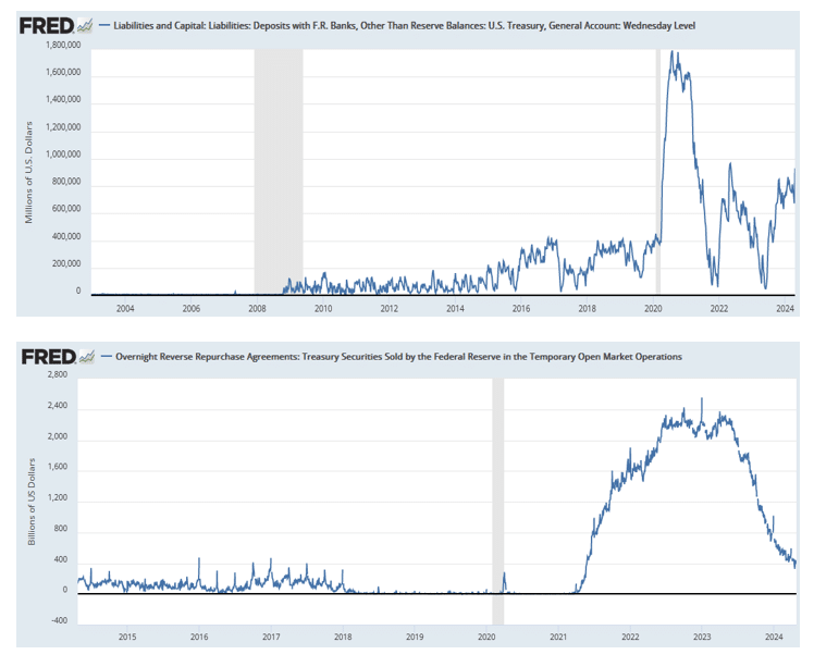
Risks Facing Bullish Investors As September Begins

Since the end of the Yen Carry Trade” correction in August, bullish positioning has returned with a vengeance, yet two key risks face investors as September begins. While bullish positioning and optimism are ingredients for a rising market, there is more to this story.

It is true that “a rising tide lifts all boats,” meaning that as the market rises, investors begin to chase higher stock prices, leading to a virtual buying spiral. Such leads to an improvement in market breadth and participation, which supports further price increases. Following the August decline, the chart below shows the improvement in the NYSE advance-decline line and the number of stocks trading above their respective 50-day moving averages (DMA).

Market breadth vs the market

Given that “for every buyer, there must be a seller,” this data confirms that buyers are increasingly willing to pay higher prices to bring sellers to market. That cycle continues until buyers willing to pay higher prices decline. While prices are rising, we are seeing a dwindling of buyers at current prices, as shown in the chart of trading volume at various price levels. As shown, buyers currently “live lower” between 5440-5480 and the recent correctional lows.

Volume at price vs the market.

However, despite the diminishing pool of buyers at current levels, investors are becoming increasingly bullish as prices rise. As shown in our composite fear/greed gauge, based on “how investors are positioned” in the market, we are back to more “greed” based levels. While not at extreme levels, investors are becoming increasingly optimistic about higher future prices. Of course, such readings only confirm what market prices are already telling us.

Fear Greed gauge

However, two primary risks to the bullish advance are developing as we enter September.

Share Buyback Window Begins To Close

Over the next two months, a primary risk to bullish investors is removing a critical buyer in the market – corporations. For more on the importance of corporate share purchases on the financial markets, read the following:

Those articles support that corporations have comprised roughly 100% of net equity purchases since 2000. In other words, the market would be trading closer to 3000 rather than 5600 without corporate share buybacks.

However, these share buybacks also pose risks to the market in the short-term as well. As Michael Lebowitz noted this morning:

“Like the meteorological seasons, share buybacks also follow predictable patterns. Accordingly, as shown below, we are past the peak share buyback season. Following the peak, share buybacks will decline rapidly until early November. Declining share buybacks is not a bearish indicator per se. However, as the number of buybacks declines, the market, specifically the stocks conducting buybacks, will have less demand for their stock. Think of share buybacks as a tailwind.

The pattern is predictable because it directly relates to corporate earnings reports. For three reasons, most companies ban share buybacks about a month before their quarterly earnings report.

  • Insider Trading Concerns—Employees have access to non-public information regarding their earnings. Therefore, the ban helps eliminate the perception that the company might be trading its stock on such information.
  • Investor Perception– Similarly, investors might be suspicious if the company was actively buying its stock right before the earnings announcements. If the investors were mimicking the company’s purchases, this could create heightened volatility in the stock.
  • Regulatory Concerns—While the SEC does not regulate share buybacks before earnings, most companies want to avoid an investigation if the SEC suspects those buying back the shares have inside information.
buyback windows

As shown on Thursday, September 5th, the window for buybacks will begin to close. Corporate buying support will be non-existent by the beginning of October and through the end of the month. In other words, the primary buyer of equities will not be available to bid prices.

If you don’t believe that share buybacks are as crucial as we state, the following chart should answer any questions.

Annual buybacks vs market

Unfortunately, removing that primary buyer will coincide with a secondary market risk.

banner ad for SimpleVisor, our do it yourself investing tool. sign up for your free trial now

Presidential Election Concerns

As we enter September and October, a secondary risk increases. Historically, these months have seen stock market declines, especially in years with a Presidential election. There are three primary reasons for this trend.

1. Uncertainty Surrounding Election Outcomes

Markets dislike uncertainty, and the outcome of a Presidential election is a significant unknown. Investors become cautious during election years, especially when the race is tight. They worry about potential policy changes impacting taxes, regulations, and government spending. That heightened uncertainty increases market volatility and often results in stock market declines as investors move to safer assets.

2. Policy Change Concerns

Depending on the election outcome, significant policy changes can occur. For instance, Harris and Trump have very different approaches to fiscal policy, regulation, and international trade this year. With the polls very tight, Wall Street may look to lock in gains before the election, fearing that new policies might negatively affect corporate profits via higher tax rates and, potentially, changes to capital gains rates.

3. Economic Data Releases

September and October are critical months for economic data releases, particularly since the Federal Reserve expects to cut rates in September. Key indicators from employment, inflation, and housing will potentially move markets over the next two months. Given the approaching election, the markets will scrutinize those releases closely as candidates try to leverage the data. Any negative surprises could result in a sharp pickup in volatility.

Conclusion

As we head into September, which already has a weak performance record, understanding these two risks can help investors navigate a potential pickup in volatility, particularly during election years.

S&P 500 Market Returns By Month

However, the timing of such a consolidation or correction is always tricky. 

We suggest maintaining risk controls, taking profits as needed, rebalancing portfolios, and holding slightly higher cash levels.

While these actions won’t entirely shield portfolios from a near-term decline, they will buffer increased volatility, allowing for more rational and controlled portfolio management decisions.

Quarter End Window Dressing Will Become Monthly

At many quarter ends, the markets often exhibit unusual behavior. Moreover, the oddities leading up to quarter ends are frequently partially or fully reversed in the days following the quarter. The irregular activity is in part due to window dressing. Mutual funds are only required to share their holdings with investors quarterly. As such, they can buy and sell securities at quarter end to change the appearance of their portfolio. For example, they may want to add a hot stock or reduce a poorly performing sector at the quarter end but not hold the hot stock throughout the quarter. Ergo, window dressing trades can be very misleading.

The SEC is changing its rules to increase mutual funds and ETF transparency. From now on, mutual funds and ETFs must report their holdings at least monthly. This new rule will reduce some volatility and odd trading at quarter ends and distribute it to month ends. The rule change will not take effect until November 2025 for larger funds and May 2026 for funds with assets of less than $1 billion.

The graph below from Statista shows approximately $25 trillion of assets under management invested in mutual funds. Furthermore, although not shown, the Investment Company Institute estimates roughly $8.1 trillion in ETFs.

mutual fund aum

What To Watch Today

Earnings

  • No notable earnings releases.

Economy

Economic Calendar

Market Trading Update

Yesterday’s release of Nvidia’s earnings, while strong, failed to impress and did not impact the market as widely expected. For the quarter, Nvidia reported:

  • Q2 Rev. $30.04B, up 122% YoY, beating estimates of $28.86B, and beating not only the upper end of the guidance ($27.44BN-$28.56BN) but also above the JPM whisper number of $29.85BN.
  • Q2 Data Center Revenue $26.3B, beating exp. $25.08B
  • Q2 EPS is $0.68, up 152% YoY and beating the exp. $0.64
  • Q2 Gross Margin 75.7%, up 4.5% YoY from 71.2, beating exp. 75.5%, but down from 78.9% in Q1.

The biggest worry seems to be gross margins, which slowed down and suggest Nvidia may have reached pricing limits for now. However, there is a lot of demand for Nvidia’s new Blackwell chip, which will be coming to market later this year. If sales go as expected versus expected supply, we could see margins expand once again.

Technically, the stock price is stretched with declining momentum (top panel). Notably, there is not much price support until the stock retraces to the recent lows, where buyers stepped in during the “Yen Carry Trade” correction. We have reduced our position twice since July (July 19th and August 26th) to mitigate the risk of a disappointing report. In the long term, we still like our holding in Nvidia, but we suspect we could see a more extended period of volatility until the next buying opportunity presents itself.

Nvidia Trading Chart

PCE Expectations

The table below, courtesy of the Wall Street Journal, shows major bank forecasts for today’s PCE price index. The current consensus for both monthly core and headline PCE is +0.2%. As shown below, the median forecast for the big banks is slightly below that at +0.15%. Assuming the PCE data is aligned with the median estimates below or the consensus, the Fed will most likely cut rates in September. The only thing that could stop them is a very strong employment number next week. Nothing in the weekly claims data or regional surveys leads us to believe the state of the jobs market has changed materially in the last month.

bank consensus pce inflation

Corporate Tax Rates Rest On The Election Results

The graph below, courtesy of Gavekal Research and ISABELNET.com, shows the differences in corporate tax proposals for the two Presidential candidates.

As shown below, the Tax Cuts and Jobs Act slashed the corporate tax rate from 35% to 21% in 2017. There were also tax cuts for individuals. Both personal and corporate tax cuts stimulated the economy at the expense of less government revenue. The debate for another day is whether the extra economic growth made up for the lost tax revenue. However, at this time, we must assess whether the candidates will continue with the current rates or let them expire and revert to higher rates. Therefore, the political composition of Congress and the next President will potentially be impactful to tax policy and, ultimately, the economy and markets.

us corporate tax rates

Tweet of the Day

confidence big business

“Want to achieve better long-term success in managing your portfolio? Here are our 15-trading rules for managing market risks.


Please subscribe to the daily commentary to receive these updates every morning before the opening bell.

If you found this blog useful, please send it to someone else, share it on social media, or contact us to set up a meeting.
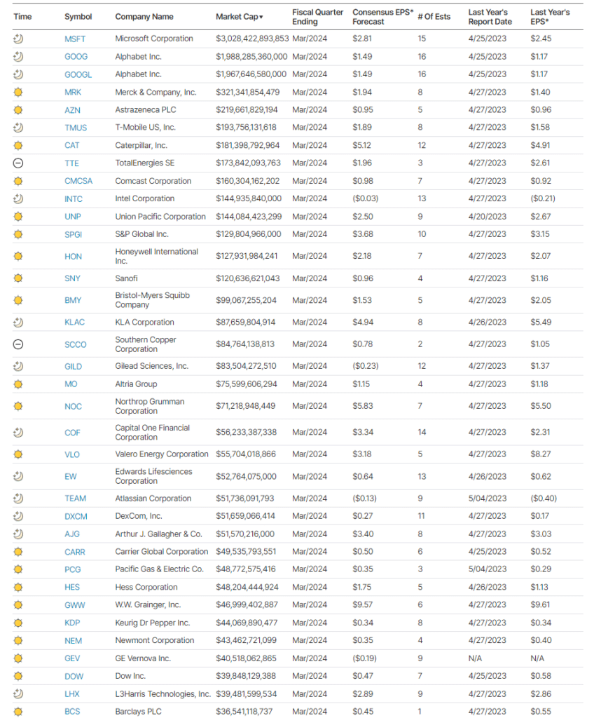
Japanese Style Policies And The Future Of America

In a recent discussion with Adam Taggart via Thoughtful Money, we quickly touched on the similarities between the U.S. and Japanese monetary policies around the 11-minute mark. However, that discussion warrants a deeper dive. As we will review, Japan has much to tell us about the future of the U.S. economically.

Let’s start with the deficit. Much angst exists over the rise in interest rates. The concern is whether the government can continue to fund itself, given the post-pandemic surge in fiscal deficits. From a purely “personal finance” perspective, the concern is valid. “Living well beyond one’s means” has always been a recipe for financial disaster.

US Government debt and debt service payments

Notably, excess spending is not just a function of recent events but has been 45 years in the making. The government started spending more in the late 1970s than it brought in tax receipts. However, since the economy recovered through “financial deregulation,” economists deemed excess spending beneficial. Unfortunately, each Administration continued to use increasing debt levels to fund every conceivable pet political project. From increased welfare to pandemic-related” bailouts to climate change agendas, it was all fair game.

Mind the Gap - Deficts

However, while excess spending appeared to provide short-term benefits, primarily the benefit of getting re-elected to office, the impact on economic prosperity has been negative. To economists’ surprise, Increasing debts and deficits have not created more robust economic growth rates.

Deficits vs GDP

I am not saying there is no benefit. Yes, “spending like drunken sailors” to create economic growth can work short-term, as we saw post-pandemic. However, once that surge in spending is exhausted, economic growth returns to previous levels. What those programs do is “pull forward” future consumption, leaving a void that detracts from economic growth in the future. That is why economic prosperity continues to decline after decades of deficit spending.

GDP - the new new normal

We agree that rising debts and deficits are certainly concerning. However, the argument that the U.S. is about to become bankrupt and fall into economic oblivion is untrue.

For a case study of where the U.S. is headed, a look at Japanese-style monetary policy is beneficial.

The Failure Of Central Banks

“Bad debt is the root of the crisis. Fiscal stimulus may help economies for a couple of years but once the ‘painkilling’ effect wears off, U.S. and European economies will plunge back into crisis. The crisis won’t be over until the nonperforming assets are off the balance sheets of US and European banks.” – Keiichiro Kobayashi, 2010

Kobayashi will ultimately be proved correct. However, even he never envisioned the extent to which Central Banks globally would be willing to go. As my partner, Michael Lebowitz pointed out previously:

“Global central banks’ post-financial crisis monetary policies have collectively been more aggressive than anything witnessed in modern financial history. Over the last ten years, the six largest central banks have printed unprecedented amounts of money to purchase approximately $24 trillion of financial assets as shown below. Before the financial crisis of 2008, the only central bank printing money of any consequence was the Peoples Bank of China (PBoC).”

Global Central Bank Balance Sheets

The belief was that driving asset prices higher would lead to economic growth. Unfortunately, this has not been the case, as debt has exploded globally, specifically in the U.S.

“QE has forced interest rates downward and lowered interest expenses for all debtors. Simultaneously, it boosted the amount of outstanding debt. The net effect is that the global debt burden has grown on a nominal basis and as a percentage of economic growth since 2008. The debt burden has become even more burdensome.”

Total Debt vs GDP

Not surprisingly, the massive surge in debt has led to an explosion in the financial markets as cheap debt and leverage fueled a speculative frenzy in virtually every asset class.

Total Debt vs GDP

Soaring U.S. debt, rising deficits, and demographics are the culprits behind the economy’s disinflationary push. The complexity of the current environment implies years of sub-par economic growth ahead. The Federal Reserve’s long-term economic projections remain at 2% or less.

GDP Projections

The U.S. is not the only country facing such a gloomy public finance outlook. The current economic overlay displays compelling similarities with the Japanese economy.

Many believe that more spending will fix the problem of lackluster wage growth, create more jobs, and boost economic prosperity. However, one should at least question the logic given that more spending, as represented in the debt chart above, had ZERO lasting impact on economic growth. As I have written previously, debt is a retardant to organic economic development as it diverts dollars from productive investment to debt service.

banner ad for SimpleVisor, our do it yourself investing tool. sign up for your free trial now

Japanese Policy And Economic Outcomes

One only needs to look at the Japanese economy to understand that Q.E., low-interest rate policies, and debt expansion have done little economically. The chart below shows the expansion of BOJ assets versus the growth of GDP and interest rate levels.

Japan GDP, BOJ and Interest Rates

Notice that since 1998, Japan has been unable to sustain a 2% economic growth rate. While massive bank interventions by the Japanese Central Bank have absorbed most of the ETF and Government Bond market, spurts of economic activity repeatedly fall into recession. Even with interest rates near zero, economic growth remains weak, and attempts to create inflation or increase interest rates have immediate negative impacts. Japan’s 40-year experiment provides little support for the idea that inflating asset prices by buying assets leads to more substantial economic outcomes.

However, the current Administration believes our outcome will be different.

With the current economic recovery already pushing the long end of the economic cycle, the risk is rising that the next economic downturn is closer than not. The danger is that the Federal Reserve is now potentially trapped with an inability to use monetary policy tools to offset the subsequent economic decline when it occurs.

That is the same problem Japan has wrestled with for the last 25 years. While Japan has entered into an unprecedented stimulus program (on a relative basis twice as large as the U.S. on an economy 1/3 the size), there is no guarantee that such a program will result in the desired effect of pulling the Japanese economy out of its 40-year deflationary cycle. The problems that face Japan are similar to what we are currently witnessing in the U.S.:

  • A decline in savings rates to extremely low levels which depletes productive investments
  • An aging demographic that is top-heavy and drawing on social benefits at an advancing rate.
  • A heavily indebted economy with debt/GDP ratios above 100%.
  • A decline in exports due to a weak global economic environment.
  • Slowing domestic economic growth rates.
  • An underemployed younger demographic.
  • An inelastic supply-demand curve
  • Weak industrial production
  • Dependence on productivity increases to offset reduced employment

The lynchpin to Japan and the U.S. remains demographics and interest rates. As the aging population grows and becomes a net drag on “savings,” dependency on the “social welfare net” will continue to expand. The “pension problem” is only the tip of the iceberg.

Conclusion

Like the U.S., Japan is caught in an ongoing “liquidity trap” where maintaining ultra-low interest rates is the key to sustaining an economic pulse. The unintended consequence of such actions, as we are witnessing in the U.S. currently, is the ongoing battle with deflationary pressures. The lower interest rates go, the less economic return that is generated. Contrary to mainstream thought, an ultra-low interest rate environment has a negative impact on making productive investments, and risk begins to outweigh the potential return.

More importantly, while interest rates did rise in the U.S. due to the massive surge in stimulus-induced inflation, rates will return to the long-term downtrend of deflationary pressures. While many expect rates to increase due to the rise in debt and deficits, such is unlikely for two reasons.

  1. Interest rates are relative globally. Rates can’t rise in one country, while most global economies push toward lower rates. As has been the case over the last 30 years, so goes Japan, and the U.S. will follow.
  2. Increases in rates also kill economic growth, dragging rates lower. Like Japan, every time rates begin to rise, the economy rolls into a recession. The U.S. will face the same challenges. 
All rates are relative

Unfortunately, for the next Administration, attempts to stimulate growth through more spending are unlikely to change the outcome in the U.S. The reason is that monetary interventions and government spending do not create organic, sustainable economic growth. Simply pulling forward future consumption through monetary policy continues to leave an ever-growing void. Eventually, the void will be too great to fill.

But hey, let’s keep doing the same thing over and over again. While it hasn’t worked for anyone yet, we can always hope for a different result. 

What’s the worst that could happen?  

Mortgage Rates Are Falling But Remain Too High

The graph below shows the MBA average 30-year mortgage rate, with its year-over-year change below. The good news is that mortgage rates have recently fallen rapidly. However, they remain well above rates seen since 2008. This creates a problem for the Fed. Over the last twenty years, there has been a strong correlation between mortgage refinancing and mortgage rates.

Can the Fed stimulate the economy with mortgage refinancings if most mortgage holders have interest rates below 4%? Yes, but to do so, they need to drop Fed Funds by much more than the market expects.


What To Watch Today

Earnings

Earnings Calendar

Economy

Economic Calendar

Market Trading Update

In yesterday’s commentary, we discussed the long-term overbought and deviated conditions of the market. The issue with that analysis is the missing catalyst for a broader correction. One such catalyst could be a strengthening in the U.S. dollar. As shown, when the dollar weakens, it supports increased asset prices. Previous reversals in the dollar coincided with corrections in the market. While the dollar is not extremely oversold and is on a current sell signal, we should be watching for the dollar to bottom and then begin to turn higher. Such will likely precede a more corrective event in the market.

Market Trading Update

First, let’s dispel the myth of “de-dollarization.” Both Michael and I have written several articles on this, but the reality is summed up as follows:

“The pundits will be right someday. The dollar’s death as the reserve currency will come, and some other nation’s currency, cryptocurrency, gold, shells, or something else will take its place. However, that day is not coming anytime soon. The four reasons we describe in the article leave the world with no alternative.”

Secondly, what event causes the dollar to strengthen is always unknown. However, several factors contribute to the dollar’s strength. The most important is basic supply and demand. The demand for the dollar increases when international parties, such as foreign citizens, foreign central banks, or foreign financial institutions, demand more dollars. Generally, that demand is driven by the need to stable currency values between trading partners. Other factors influencing whether or not the dollar rises in value include the currency reserve status, inflation, political stability, interest rates, speculation, trade deficits and surpluses, and public debt.

Keep a watch on the dollar. It could be a key indicator as we head into 2025.

SMCI Was A Poor Addition To The S&P 500

On March 18, 2024, Super Micro Computer Inc. (SMCI) was added to the S&P 500. At the start of the year, SMCI was one of the hottest AI stocks. When the S&P included the stock, it traded at 1,018, up over threefold from January 1, 2024. The stock hit its peak on the day it was included. SMCI was down 24% on Wednesday as they announced a delay to their annual report filling. Despite falling about 60% since March, the stock is still up 45% this year.

To make room for SMCI and DECK, they removed Whirlpool (WHR) and Zions Bancorp (ZION). WHR has been flat since the announcement, and ZION is up about 20%. Furthermore, DECK, the other inclusion, has fared better than SMCI but, like WHR, has been unchanged since the announcement.

Yield Curve Shifts

Yield curves are essential indicators that bond investors closely follow. However, many stock investors do not track yield curves despite the importance of bond yields on stock returns. Therefore, in this two-part series, we start with an introductory discussion of the four primary types of yield curve shifts and what they often entail from an economic and inflation perspective.

In Part Two, we provide a quantitative perspective on what a continued bull steepening trade may mean for returns of the major stock indices, along with various sectors and factors.

READ MORE…


Tweet of the Day

“Want to achieve better long-term success in managing your portfolio? Here are our 15-trading rules for managing market risks.


Please subscribe to the daily commentary to receive these updates every morning before the opening bell.

If you found this blog useful, please send it to someone else, share it on social media, or contact us to set up a meeting.
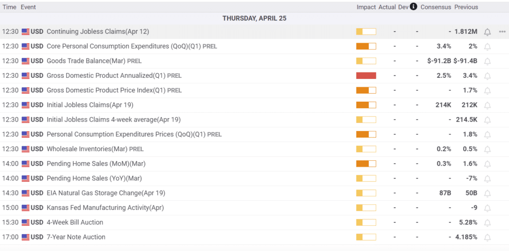
Labor Sentiment Is Becoming Worrisome

Recent surveys of labor sentiment point to potential problems. For instance, last week, we shared the New York Fed consumer expectations survey, which showed that more people fear being unemployed in the next four months than at any time since 2014. Furthermore, the University of Michigan survey section regarding expected changes in household income is nose-diving. Yesterday, the consumer confidence survey by the Conference Board showed an improvement in overall sentiment, but its labor differential gauge continues to deteriorate. As shown in the Tweet of the Day section below, downward trends in this indicator have been associated with recessions.

According to the BLS, 132 million workers are in the services sector, accounting for about 80% of private employment. Therefore, labor sentiment in the services sector is vital to track to help us forecast how the Fed might manage monetary policy going forward. To that end, the graph below, is a composite of the various Fed regional service sector employment indicators. Unlike those noted above, the regional Fed surveys are from hiring managers, not employees. Therefore, it sheds a slightly different light on the topic. As shown, the composite has fallen into negative territory. Over the last 20 years, the only times it has been negative have been leading up to recessions and during them.

regional fed employment composite

What To Watch Today

Earnings

Earnings Calendar

Economy

Economic Calendar

Market Trading Update

Yesterday, we discussed the more extreme overbought conditions in Gold. Interestingly, on that same “monthly” chart, the stock market is exhibiting many of the same signals. While the monthly Relative Strength Index is not at extremes just yet, it is beginning to approach levels that have previously preceded larger market corrections.

However, there is an important caveat. Again, this is a monthly chart, which means things move much more slowly. Therefore, while the overbought conditions and deviations from longer-term means are present, they can remain the case for several months to a couple of years. As such, you can not use such a chart to make short-term portfolio decisions. However, it does suggest that investors should be aware of a risk on the horizon. Eventually, these more extreme conditions will matter, but as we have stated, an unexpected, exogenous catalyst will be needed to begin the reversion.

Market Trading Update

This afternoon, the markets will receive earnings from Nvidia (NVDA), which will arguably set the tone for tomorrow’s trading. If earnings meet or beat expectations, we could see the markets break out to new highs. However, a larger risk is that earnings “disappoint” rather lofty expectations, which could put downward pressure on an already overbought and extended market. Such is why we reduced our holdings in NVDA yesterday to hedge that potential risk.

More On Gold Fever

Yesterday’s Commentary touched on the risk of gold, given its recent high correlation with many other speculative assets. Furthermore, we cautioned you based on its technical situation. Per the Commentary:

In the last 50 years, there have only been three (3) other occasions when Gold was this extended, overbought, and deviated from long-term moving averages. As shown, Gold is currently trading four (4) standard deviations above its four-year moving average. Each time Gold has previously achieved such conditions, the eventual reversion was quite large.

The graph below serves as another warning that something is awry. It shows how the inflows and outflows of gold ETFs tend to track the price of gold closely. However, recently, the two have sharply diverged. One rationale is that retail is not participating in the rally. Another states that institutions or central banks are buying gold via the gold ETFs. They convert ETF shares into physical gold via the ETF managers. It could also be an arbitrage opportunity or something else entirely. However, what matters most to gold investors is how might the “alligator jaws” resolve themselves.

gold etf inflows and outflows

Overbought Conditions Set Up Short-Term Correction

That leaves the market vulnerable to a correction. When an event occurs, there are “willing buyers” for every transaction—just at much lower prices.

While the “Yen Carry Trade” quickly resolved itself, that risk has not been removed. The Bank of Japan is still intent on hiking interest rates, while the Federal Reserve is lowering them. At the same time, the Dollar has been declining, and the Yen Has Been increasing. So far, this has not triggered another “margin call” for hedge funds. However, should the underlying dynamics continue, the risk of another “event” clearly increases.

With markets overbought and sentiment bullish, such is a good time to rebalance portfolios and reduce excess risk.

Trade accordingly.

READ MORE…

gold prices

Tweet of the Day

labor differential consumer confidence sentiment

“Want to achieve better long-term success in managing your portfolio? Here are our 15-trading rules for managing market risks.


Please subscribe to the daily commentary to receive these updates every morning before the opening bell.

If you found this blog useful, please send it to someone else, share it on social media, or contact us to set up a meeting.
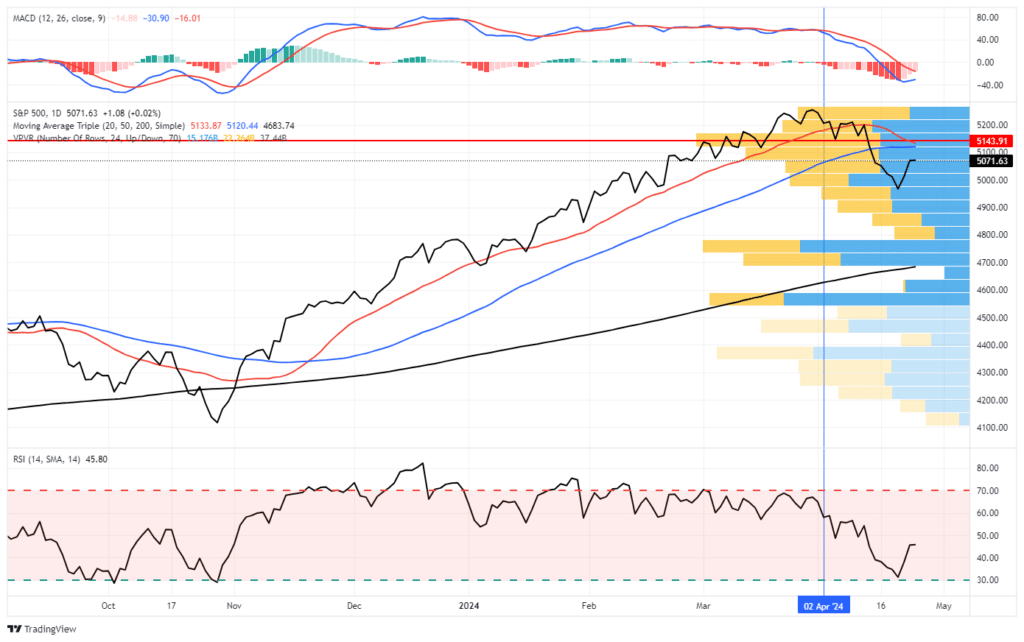
Yield Curve Shifts Offer Signals For Stockholders

The level of U.S. Treasury yields and the changing shape of the Treasury yield curve provide investors with critical feedback regarding the market’s expectations for economic growth, inflation, and monetary policy. Short- and long-term yields have recently fallen, with short-term maturities leading the charge. The changes result in what bond traders call a bull steepening yield curve shift. The shift is due to weakening economic conditions, moderating inflation, and the increasing likelihood that the Fed will lower rates.

Yield curves are essential indicators that bond investors closely follow. However, many stock investors do not track yield curves despite the importance of bond yields on stock returns. Therefore, in this two-part series, we start with an introductory discussion of the four primary types of yield curve shifts and what they often entail from an economic and inflation perspective.

In Part Two, we provide a quantitative perspective on what a continued bull steepening trade may mean for returns of the major stock indices, along with various sectors and factors.

Treasury Yield Curve History

The graph below charts ten- and two-year Treasury yields and the difference between the two securities. The difference is called the 10-year/2-year yield curve. As you may have noticed, the yield curve has a recurring pattern that is well correlated with the economic cycle.

Generally, the yield curve steepens (the difference between the 10-year and 2-year yields increase) rapidly following a recession. Then, throughout most typical economic expansions, the curve flattens (the difference declines). The yield curve often inverts (the ten-year yield is less than the two-year yield) toward the end of the expansion.

One of the most accurate recession indicators occurs when an inverted yield curve steepens, returning it to positive territory. Lastly, the yield curve rises rapidly as the Fed lowers rates to boost economic activity and fight off a recession. Rinse, wash, repeat.

us treasury yield curve
Ad for financial planning services. Need a plan to protect your hard earned savings from the next bear market? Click to schedule your consultation today.

The Baby Bull Steepening

The recent spate of weakening labor data and broader economic activity, alongside moderating inflation, has the markets convinced the Fed will embark on a series of rate cuts starting in September. Furthermore, Jerome Powell has all but given them the green light. Per his Jackson Hole speech:

The time has come for policy to adjust. The direction of travel is clear, and the timing and pace of rate cuts will depend on incoming data, the evolving outlook, and the balance of risks.

Bond yields have been falling, with the shorter-term bond yields falling the most. It’s hard to see on the graph above, but the recent bond market rally has caused the yield curve (light blue) to increase from negative 46 basis points in mid-June to negative single digits today. It is now on the verge of uninverting and consequently close to sending a recession warning.

This type of move in long and short-term bond yields is commonly referred to as a bullish steepening. The words bull or bullish relate to the fact that bond yields are falling, and subsequently, bond prices are rising. Steepening refers to the shape of the yield curve, which has increased, albeit the current yield curve is still negative.

In Part Two of this article, we will evaluate prior bull steepening cycles and quantify what it has meant for stock returns. But, to better acquaint you with yield curves, it’s worth discussing the four principal types of yield curve shifts and what they often portend.

Bull Steepening

As we just noted, a bull or bullish steepening occurs when all Treasury yields decline, but shorter maturities fall more than longer maturities. In our hypothetical example below, the two-year note falls from 3.35% to 1.50%, while ten-year notes decline from 3.80% to 2.80%. As a result, the yield curve steepens by .85%

bull steepening

Most often, a bull steepening trade results from traders anticipating easier monetary policy due to pronounced economic weakness and a growing likelihood of recession. Given that shorter-maturity bonds are more correlated to Fed Funds than longer-maturity bonds, it makes sense that they would fall quicker when such expectations arise.

The recent bull steepening has been textbook. The unemployment rate has risen from 3.7% to 4.3% this year, and in general, many economic indicators point to slower growth. Furthermore, inflation appears to be trending lower again, giving the Fed more comfort in lowering rates. Per Powell’s Jackson Hole speech:

My confidence has grown that inflation is on a sustainable path back to 2%.

Ad for The Bull/Bear Report by SimpleVisor. The most important things you need to know about the markets. Click to subscribe.

Bear Steepening

As the name bear steepening suggests, yields for short and long-term maturities increase, with longer-term yields rising more than shorter-term yields. In the graph below, the two-year yield increases from 3.35% to 4.10%, and the ten-year yield rises from 3.80% to 5.10%. The result is an upward shift in the yield curve from .45% to 1.00%

bear steepening

In 2020 and 2021, the yield curve shifted this way. At the time, the Fed lowered rates to zero and did massive amounts of QE. Bond yields started to rise in anticipation of a rebound in economic activity and growing inflation concerns due to massive fiscal and monetary stimulus. Short-term yields didn’t move nearly as much as long-term yields. This occurred because the Fed pledged to keep Fed Funds very low to combat the pandemic.

In late 2023, the bear steepening reoccurred as the economy continued to run above its natural rate despite 5% Fed Funds. Higher interest rates were not impacting the economy meaningfully, and inflation stopped falling. The market thought the Fed may need to raise rates more. However, demand for money market investments was insatiable due to significant cash and money market balances, which helped keep a lid on short-term rates. At the long end of the curve, investors were forced to absorb substantial Treasury debt issuance. Accordingly, they demanded extra yield. This is referred to as an increasing term premium. 

Bull Flattener

A bull flattener trade involves short and long-term-maturity bond yields declining with longer-end yields falling more. The graph below shows two-year yields declining by 0.70% and ten-year yields declining by 1.00%. The net result is a curve flattening of .30%

bull flattening

Bull flattening shifts tend to be the result of relative economic optimism. The market is encouraged because inflation is likely to fall, but it is not overly concerned that lower inflation is due to waning demand. Therefore, investors are not expecting much regarding Fed rate cuts.

Conversely, the market may be concerned about the economy, but if Fed Funds are at or near zero, there is no room for the short end of the yield curve to fall. 2016 is a good example. Fed Funds were already at zero, and the economy was weakening, with inflation remaining below the Fed’s target. Longer-term bonds moved lower with inflation and economic prospects, but short-term bonds were stuck with the Fed not wanting to lower rates below zero.

The graph below, courtesy of Deutsche Bank, shows that the dollar value of negative-yielding global bonds rose sharply in 2016. Despite the international trends, U.S. yields largely remained above zero percent.

negative yield debt international
Ad for SimpleVisor. Get the latest trades, analysis, and insights from the RIA SimpleVisor team. Click to sign up now.

Bear Flattening

In a bear-flattening trade, yields rise across the curve, with shorter maturities rising the most. The two-year note increases from 3.35% to 4.40% in the graph below. The ten-year note rises from 3.80% to 4.20%. In the process, the curve flattens and inverts from .45% to -.20%.

bear flattening

Summary

With an appreciation for yield curves, it is time to focus on the yield curve shift du jour.  

What might a bullish steepening trade mean for various stock indices, sectors, and factors?

Here’s a hint. The stock market seems to love the idea of the Fed lowering rates before they do so. But, when the Fed lowers rates, the result is not often friendly for stock investors.

Overbought Conditions Set Up Short-Term Correction

As noted in this past weekend’s newsletter, following the “Yen Carry Trade” blowup just three weeks ago, the market has quickly reverted to more extreme short-term overbought conditions.

Note: We wrote this article on Saturday, so all data and analysis is as of Friday’s market close.

For example, three weeks ago, the growth sectors of the market were highly oversold, while the previous lagging defensive sectors were overbought. That was not surprising, as the growth sectors of the market were the most exposed to the “Yen Carry Trade. “

Risk Range Report Early August

We saw much the same in the Risk Range Analysis (Note: both sets of analysis presented are published weekly in the Bull Bear Report).

As explained in the weekly report:

How to read the risk range report

Two critical points. First, three weeks ago, many sectors and markets were well below their historical risk ranges. The second is that all but three sectors or markets are on long-term bullish “buy signals.” When most markets are on bullish signals, as they are currently, markets have never suffered severe bear markets. As such, corrective market actions, as witnessed three weeks ago, tend to be buying opportunities. When the number of “bearish signals” increases, the risk of a more significant drawdown increases.

Risk Range Report Early August

How Things Have Changed

Flash forward three weeks to Friday’s close, and a very different picture emerges.

Every major market and sector has fully reversed to more extreme overbought conditions, which historically have been a precursor to short-term corrections to reverse such conditions.

Market Sector Performance Conditions current

However, as noted above, only ONE sector remains on a “bearish” signal. While many sectors and markets, particularly Gold Miners, Real Estate, and Utilities, are pushing double-digit deviations from their respective long-term means, a correction to reverse those extremes will not likely devolve into a deeper bear market.

Risk range report current

In other words, investors should consider taking profits in areas that are highly deviated from their long-term means, as these areas will suffer more significant corrective reversals than those that are not.

But how significant could a correction be?

Technical Levels Of A Correction

While the recent rally from the lows has been impressive, it has also been bullish by triggering several signals that historically precede further market gains. As noted this past weekend:

“As shown below, rapid V-shaped recoveries tend to be bullish indications of both the end of the corrective period and the resumption of the bullish trend. Since 2014, periods that saw a sharp price decline, as measured by the 10-day rate of change, followed by a sharp advance, were bullish indications. However, as seen in 2015 and 2022, such a reversal does not preclude a secondary correction from occurring.”

S&P 500 ROC

The last sentence is the most important.

While weekly bullish buy signals and improving market breadth certainly portend further market gains, this does not preclude a short-term correction from occurring. On a very short-term basis, some nearby retracement levels would relieve some of the short-term overbought conditions without triggering larger market concerns. Those levels are as follows:

  1. The 50-day moving average (DMA) which currently resides at 5491
  2. The 20-DMA, which has turned up, providing another bullish signal, is just below that at 5445.
  3. If the market fails those two supports, the top of the downtrend line and the 100-DMA are close by at 5377 and 5347, respectively.
  4. Lastly, the recent market low at 5154 and the 200-DMA at 5100 remain critical support levels.
Daily Technical Chart Short Term Support Levels

Between today and the election, these primary levels have the highest probability of containing any near-term market correction that would reverse most overbought conditions. Such would provide a much better entry opportunity to increase exposure for a potential year-end rally.

What About A Bigger Correction?

What about the potential for a more extensive correction? Yes, such a risk is possible, and we should not ignore it. If we look at a monthly chart, two warnings are immediately noticeable. First, the market’s deviation from the 20, 50, and 100-month moving averages (MMA) is substantial. Historically, the markets correct such large deviations. However, such a correction, while possible, would require a more severe credit-related event, a deep recession, or a financial crisis of some magnitude. While such events are possible, these events are ALWAYS exogenous and unanticipated. The technicals tell us that the market is susceptible to an exogenous shock that would lead to a more profound corrective event.

Secondly, the monthly overbought conditions are also at levels (as shown in the bottom chart) that have preceded more extensive corrections, such as in 2022, 2008, and 2000. Notably, every time the market has been as overbought as it is currently, it has suffered short—to intermediate-term corrective events.

S&P 500 market monthly chart

Looking at the longer-term daily chart, should such a more significant correction occur, we can use a Fibonacci sequence to determine the depth of the retracement.

  1. When the market reaches those levels, a pullback to the 200-DMA would also align with a 23.6% retracement level.
  2. A retest of the April correction lows becomes the next logical support. The 38.2% retracement level is just below that level.
  3. Any correction not coinciding with a more significant event will likely remain contained to those levels. However, a failure at the 38.2% retracement will bring the 50% retracement and the January 2022 peaks into focus. Such a correction would encompass a nearly 20% decline from current levels.
  4. If some event triggers a break of the more extreme correction levels, there is a risk of the 2022 lows. However, we will significantly reduce portfolio exposures before the market reaches those levels.
S&P 500 Market with Fibonacci Retracement Levels

The market’s overbought condition is apparent, and a correction is likely. The only questions are the trigger and the magnitude. However, investors must keep such corrections in perspective. Given the current technical backdrop, most probabilities are weighted to corrections within 5-10% of current levels. However, we can’t dismiss the smaller possibility of a larger correction.

banner ad for SimpleVisor, our do it yourself investing tool. sign up for your free trial now

Buyers Live Lower

So, what will cause this correction? As discussed previously, “sellers live higher, buyers live lower.”

“As noted above, the stock market is always a function of buyers and sellers, each negotiating to make a transaction. While there is a buyer for every seller, the question is always at “what price?” 

In the current bull market, few people are willing to sell, so buyers must keep bidding up prices to attract a seller to make a transaction. As long as this remains the case and exuberance exceeds logic, buyers will continue to pay higher prices to get into the positions they want to own.

Such is the very definition of the “greater fool” theory.

However, at some point, for whatever reason, this dynamic will change. Buyers will become more scarce as they refuse to pay a higher price. When sellers realize the change, they will rush to sell to a diminishing pool of buyers. Eventually, sellers will begin to “panic sell” as buyers evaporate and prices plunge.”

In other words, Sellers live higher. Buyers live lower. “

We can see where the buyers and sellers “live.” The following chart shows where the highest volume occurred. As shown, there are few buyers at current levels. As the old Wall Street axiom states, “If everyone has bought, who is left to buy.”

S&P 500 Volume at Price

That leaves the market vulnerable to a correction. When an event occurs, there are “willing buyers” for every transaction—just at much lower prices.

While the “Yen Carry Trade” quickly resolved itself, that risk has not been removed. The Bank of Japan is still intent on hiking interest rates, while the Federal Reserve is lowering them. At the same time, the Dollar has been declining, and the Yen Has Been increasing. So far, this has not triggered another “margin call” for hedge funds. However, should the underlying dynamics continue, the risk of another “event” clearly increases.

With markets overbought and sentiment bullish, such is a good time to rebalance portfolios and reduce excess risk.

Trade accordingly.

Amazon Benefits From AI But Some Doubt Its Productivity

Amazon CEO Andy Jassy has been touting the benefits his company receives from AI. In particular, he recently discussed Amazon Q, their “GenAI assistant for software development.” GenAI updates its foundational software. Per Jassey, this task is essential but dreaded by its employees. GenAI takes some of the onus off developers, allowing them to use their skills better for more financially rewarding projects for Amazon. The benefits Amazon receives from GenAI are tremendous. Per Andy Jassy:

– The average time to upgrade an application to Java 17 plummeted from what’s typically 50 developer-days to just a few hours. We estimate this has saved us the equivalent of 4,500 developer-years of work (yes, that number is crazy but, real).

– In under six months, we’ve been able to upgrade more than 50% of our production Java systems to modernized Java versions at a fraction of the usual time and effort. And, our developers shipped 79% of the auto-generated code reviews without any additional changes.

While Amazon’s benefits seem substantial, not everyone agrees AI is all it’s cracked up to be. For example, a study by the Upwork Research Institute, based on interviews with 2500 C-suite executives, finds a disconnect between increased productivity expectations of AI and actual employee experiences.

Despite 96% of C-suite executives expecting AI to boost productivity, the study reveals that, 77% of employees using AI say it has added to their workload and created challenges in achieving the expected productivity gains. Not only is AI increasing the workloads of full-time employees, it’s hampering productivity and contributing to employee burnout.

The jury is out on AI’s actual productivity benefits. However, the potential productivity gains will certainly keep corporate spending on AI immense for the time being. With that, we look forward to Nvidia’s earnings tomorrow.

nvda nvidia stock

What To Watch Today

Earnings

Earnings Calendar

Economy

Economic Calendar

Market Trading Update

As we discussed yesterday, the market’s bullish backdrop remains, suggesting that the volatile sell-off of a few weeks ago is over, at least for now. However, two charts jumped out as I researched for the newsletter this weekend.

The first is the monthly chart of Gold prices. Precious metals have risen over the last two years as speculative fervor increases in the marketplace. As is always the case, too much money chasing too few assets is both a blessing and a curse. The “blessing” is rising asset prices. The “curse” is that when assets become highly correlated, there is no safe place to hide when something eventually breaks.

The first chart shows that gold has not risen due to debts, deficits, or inflation but rather speculative action. In fact, 2022 gold fell as inflation rose to 9%. With inflation falling and expectations of increased liquidity from the Federal Reserve, all assets have risen simultaneously over the last two years.

S&P 500 vs Gold, Small Caps, Midcaps, and russell 2000 index.

As noted, when something eventually breaks the S&P 500 and selling begins in earnest, all asset classes will likely revert from extended and overbought conditions. Such is the nature of highly correlated markets. Which brings us to the second chart.

In the last 50 years, there have only been three (3) other occasions when Gold was this extended, overbought, and deviated from long-term moving averages. As shown, Gold is currently trading four (4) standard deviations above its four-year moving average. Each time Gold has previously achieved such conditions, the eventual reversion was quite large.

Montly Gold Chart

While gold and stocks have put in a terrific performance this year, as is always the case, don’t forget to take profits.

Nvidia Implied Move

According to @unusual_whales, the options market implies that NVDA is likely to move by 10.09% on Wednesday when they announce their earnings. They claim this is the largest implied change going into earnings over the last ten quarters. It’s important to note that the implied move relates to volatility, not direction. Therefore, it implies the market thinks NVDA can rise or fall by 10% tomorrow. The first graph below highlights the potential move in red and green. Furthermore, the implied volatility is shown below the price graph.

For context, the last two earnings reports generated gains of 16% and 9% on the day after the earnings release. In both cases, the stock continued higher for two to three more weeks before forming a short-term peak. The second graph below from Unusual_Whales charts the recent action in NVDA versus its average performance over the last ten earnings reports in the 20 days leading up to earnings and 20 days post earnings. Currently, it sits about 10% above the average. Moreover, it’s about 10% below the average for the entire 40-day period.

nvda implied volatility
nvda earnings average price change

SimpleVisor Sector Analysis

The first graph below, courtesy of SimpleVisor, shows that over the last month, the market breadth has been much more aligned than it had been. Real Estate and Utilities are the top performers, but their incremental gains over most other sectors is not large. Furthermore, Technology, which has been this year’s star sector, is underperforming. Clearly, breadth is much better today than at the market peak in mid-July.

The second table shows many sectors continue to have relative scores near zero. This tells us that the price ratio of each sector to the S&P 500 is near fair value on a technical basis. However, while the relative analysis does not offer much guidance, the absolute scores are concerning. As we highlight below, over half of the sectors have overbought absolute scores. Real estate and Healthcare are the most extreme. Likely we will see these sectors take a break from the recent steady rise. While the relative scores do not argue for a performance rotation, the absolute scores do.

monthly simplevisor sector performance
simplevisor absolute analysis

Tweet of the Day

technology vs china stocks total returns

“Want to achieve better long-term success in managing your portfolio? Here are our 15-trading rules for managing market risks.


Please subscribe to the daily commentary to receive these updates every morning before the opening bell.

If you found this blog useful, please send it to someone else, share it on social media, or contact us to set up a meeting.
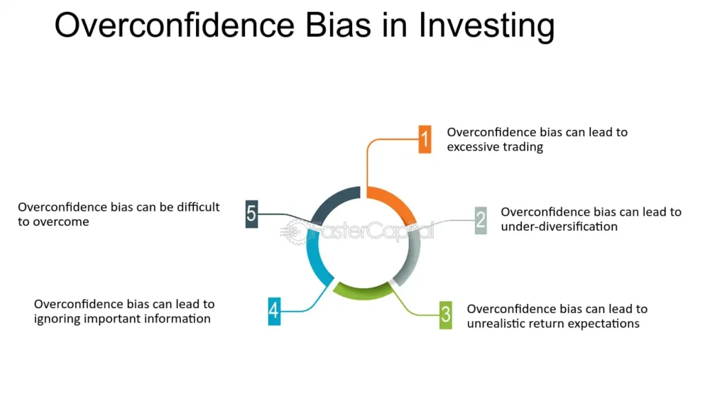
Powell Signaled Rate Cuts Are Coming

On Friday, Jerome Powell signaled that a September rate cut is highly likely, and the stock and bond markets applauded.

“The time has come for policy to adjust. The direction of travel is clear, and the timing and pace of rate cuts will depend on incoming data, the evolving outlook, and the balance of risks.”

As if the statement above wasn’t a clear enough signal for a September cut, he said, “My confidence has grown that inflation is on the path to 2%.” Moreover, he expressed heightened concern for the labor market. To wit are the following statements:

We don’t seek or welcome further labor market cooling.

The cooling in the labor market is unmistakable.

Jerome Powell alluded that additional rate cuts will follow in the coming months. However, he did not provide a timetable or amounts of what we should expect. The Fed has been transparent that it is data-dependent. Accordingly, market expectations for Fed cuts will be volatile with incoming data. To that end, the BLS employment report on August 6 and CPI on the 11th will impact whether they cut by 25bps or 50bps in September. The graph, courtesy of the CME, shows the market slightly increased the odds of a 50bps rate cut to 30% after his speech.

fed rate cut odds

What To Watch Today

Earnings

Earnings Calendar

Economy

Economic Calendar

Market Trading Update

As noted last week, the rapid rally from the lows of three weeks ago had some good and bad elements. The positive is that the rally reversed the MACD “sell signal,” suggesting the bullish bias has returned. Furthermore, the rally cleared all-important resistance levels with ease. The market quickly crossed the 100, 50, and 20 DMAs, leaving only recent all-time highs as significant next resistance. The only negative to the advance is the nearly complete reversal of the previous oversold conditions. Such isn’t a critical issue, but it suggests we will likely see a minor pullback to retest support at the 50-DMA. Such will provide a better entry point to add exposure as needed.

That analysis mostly remains the same heading into this week.

market trading update

On Friday, the market rallied strongly following Powell’s dovish comments at the Jackson Hole Summit, where he signaled that rate cuts are coming in September. However, while the market is not grossly overbought yet, it is approaching such levels. Furthermore, this has been a very rapid recovery from the correction lows, and a healthy pullback would provide a better entry point to increase exposure.

Trade carefully for now. With earnings, Powell, and the big economic reports behind us, there isn’t much data to drive markets higher until September.

The Week Ahead

While the pre-holiday trading will likely be quiet as the market digests what Jerome Powell and the Fed signaled regarding monetary policy, there are two significant events on the calendar.

On Friday, we get the Fed’s preferred inflation gauge, the PCE Price Index. The current consensus is for the monthly core PCE to rise by 0.2% and the year-over-year measure to remain at 2.6%. Second, and maybe the most important for the stock market this week, is Nvidia’s earnings report on Wednesday. Per Zacks:

This maker of graphics chips for gaming and artificial intelligence is expected to post quarterly earnings of $0.63 per share in its upcoming report, which represents a year-over-year change of +133.3%. Revenues are expected to be $28.24 billion, up 109% from the year-ago quarter.

Their future earnings and sales guidance will likely be more important than the most recent quarter. Nvidia’s executives have been very optimistic in prior earnings calls. Accordingly, we should expect statements that are bullish for the stock. However, with the stock price near all-time highs and up over 150% year to date, the shares are priced for perfection. The options market implies the stock will increase or decrease by 10% after earnings. Therefore, some volatility is expected in both Nvidia and the broader markets.

nvda nvidia stock price

Red Flags In The Latest Retail Sales Report

The latest retail sales report seems to have given Wall Street something to cheer about. Headlines touting resilience in consumer spending increased hopes of a “soft landing” boosting the stock market. However, as is often the case, the devil is in the details. We uncover a more troubling picture when we peel back the layers of this seemingly positive data. Seasonal adjustments, downward revisions, and rising delinquency rates on credit cards and auto loans suggest a more cautious view. The consumer—the backbone of the U.S. economy—may be in more trouble than the headline numbers indicate.

READ MORE…

real retail sales

Tweet of the Day

redfin home price decreases

“Want to achieve better long-term success in managing your portfolio? Here are our 15-trading rules for managing market risks.


Please subscribe to the daily commentary to receive these updates every morning before the opening bell.

If you found this blog useful, please send it to someone else, share it on social media, or contact us to set up a meeting.
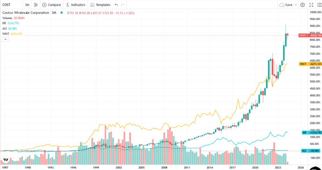
The CFNAI Bark Is Worse Than Its Bite

Peter Schiff tweeted the following in regards to the Chicago Fed National Activity Index (CFNAI):

The July Chicago Fed National Activity Index ‘unexpectedly’ plunged to minus 0.34, its lowest since April 2020, when the economy was initially shut down by the COVID pandemic.

Peter’s commentary is undoubtedly concerning. However, if you examine the CFNAI data and its long-term history, you will quickly realize the most recent data point is not as irregular as he alludes.

The Chicago Fed generally considers periods of economic expansion to be when the three-month moving average of the CFNAI is above –0.35. The graph below shows that the recent reading is near the -.35 line in the sand. However, the CFNAI tends to be volatile; thus, we and most economists look at this data using trends. Despite the “unexpected plunge,” the three-month moving average fell 0.01 to -.07. Accordingly, it is well above the -.35 level we note above.

We like CFNAI a lot due to its breadth of economic indicators across all major parts of the economy. Once you recognize the nature of the data and its volatility, it’s hard to find anything concerning about the recent reading. Our tone will change if the next few months are similar to the current reading, but Peter Schiff’s comments are not too concerning for now.

cfnai economic conditions

The Cash On The Sidelines Myth Debunked Again

It seems like a day doesn’t go by without someone presuming the stock market is due to rally, as there is a tremendous amount of cash on the sidelines. The Tweet below exemplifies this common sentiment.

cash on the sidelines

The graph shows that the amount of cash in money market funds has increased threefold over the last four years. This cash is the supposed fuel for a coming surge in stocks. We think the argument is nonsense. If the money on the sidelines bought stocks, by default, they would give their cash to the stock sellers. The seller’s cash would replace that cash coming off the sidelines.

The second graph should give you a reason to pause if you buy into the cash-on-the-sidelines argument. The amount of cash available to buy stocks may have increased significantly, but so has the size of the asset markets. As a percentage of the market cap of the S&P 500, money market fund balances are at the same level as in 2018. There are reasons to be bullish, but the graph in the tweet above is not one of them.

money market fund assets

More Concerning Employee Sentiment

Wednesday’s Commentary shared pessimistic data from the University of Michigan sentiment survey on the expected change in incomes for 2025. As we discussed, the survey is at levels associated with prior recessions. Weak sentiment regarding wages or job security can lead to weak consumer confidence, which in turn can negatively impact the economy. In its latest labor survey, the Federal Reserve of New York confirms the growing negative sentiment in the labor markets. Per the survey:

The proportion of individuals who reported searching for a job in the past four weeks rose to 28.4 percent from 19.4 percent in July 2023, marking the highest reading since March 2014, according to the July 2024 SCE Labor Market Survey. The expected likelihood of moving to a new employer increased to 11.6 percent from 10.6 percent in July 2023. Satisfaction with wage compensation, nonwage benefits, and promotion opportunities at respondents’ current jobs deteriorated by 3.2, 8.6, and 9.3 percentage points from July 2023, falling to 56.7 percent, 56.3 percent, and 44.2 percent, respectively.

The report’s graph below shows that 4.4% of those surveyed expect to enter unemployment in the next four months, the highest level since at least 2014. Accordingly, we will seek confirmation in broader consumer sentiment surveys and retail sales data.

job sentiment unemployment

Tweet of the Day

greenspan quote

“Want to achieve better long-term success in managing your portfolio? Here are our 15-trading rules for managing market risks.


Please subscribe to the daily commentary to receive these updates every morning before the opening bell.

If you found this blog useful, please send it to someone else, share it on social media, or contact us to set up a meeting.
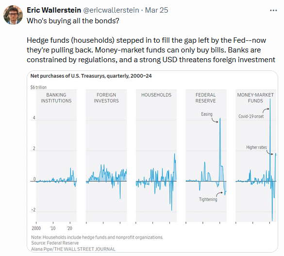
Red Flags In The Latest Retail Sales Report

The latest retail sales report seems to have given Wall Street something to cheer about. Headlines touting resilience in consumer spending increased hopes of a “soft landing” boosting the stock market. However, as is often the case, the devil is in the details. We uncover a more troubling picture when we peel back the layers of this seemingly positive data. Seasonal adjustments, downward revisions, and rising delinquency rates on credit cards and auto loans suggest a more cautious view. The consumer—the backbone of the U.S. economy—may be in more trouble than the headline numbers indicate.

The Mirage of Seasonal Adjustments

The July retail sales report showed a sharp increase of 1.0% month-over-month, surpassing expectations. However, while that number supports the idea of a resilient consumer, these spikes have been more anomalous than not. Since 2021, real retail sales have virtually flatlined. Such is unsurprising as consumers run out of savings to sustain their standard of living.
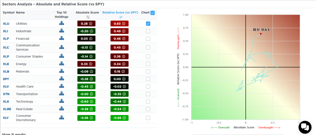
Advanced real retail sales

The following chart of real retail sales clearly shows the consumer dilemma. Over the past two years, retail sales have not grown to support more robust economic growth rates. Notably, flat real retail sales growth was pre-recessionary and a “red flag” of weakening economic growth. However, given the massive surge in spending driven by repeated rounds of Government stimulus, the reversion of retail sales to the long-term trend has taken longer than previous periods, leading economists to believe “this time is different.”

Real retail sales trend

But before we break out the champagne, let’s examine how these numbers are calculated. Retail sales data is notoriously volatile. Factors like weather, holidays, and even the day of the week play a significant role. To smooth out these fluctuations, the data is seasonally adjusted. The chart shows the magnitude of these seasonal adjustments since 1992. Interestingly, the magnitude of these adjustments is increasing over time.

Retail sales seasonal adjustments

But what happens when those adjustments paint an overly rosy picture?

Downward Revisions: A Growing Trend

Seasonal adjustments are a double-edged sword. While they aim to provide a clearer view of underlying trends, they can also distort reality, especially in an economy as dynamic and unpredictable as ours. Unfortunately, these adjustments are often revised in hindsight as more data becomes available. For example, a “red flag” is that eight of the past twelve-monthly retail sales reports were revised significantly lower, making the recent monthly “beat” much less impressive.

Monthly revisions to retail sales data

Why are retail sales being revised downward so frequently? One possible explanation is that initial estimates are overly optimistic, perhaps due to seasonal adjustments. As more accurate data becomes available, the true picture emerges, and it’s not as pretty as many believe. So, is there potentially a better method?

As noted, monthly retail sales are volatile due to various events. Christmas, Thanksgiving, Easter, summer travel, back-to-school, and weather all impact consumer spending. Therefore, “seasonally adjusting” the raw data may seem necessary to smooth out these periods of higher volatility. However, such a process introduces substantial human error. Using a simplistic 12-month average of the non-seasonally adjusted data (raw data) provides a smoother and more reliable analysis of consumer strength. Historically, when the 12-month average of the raw data approaches or declines below 2% annualized, it is a “red flag” for the economy. Again, the massive spike in COVID-related stimulus is reversing towards levels that should concern investors.

Retail sales vs 12-month average.

In other words, if we strip out the seasonal adjustments and apply a smoothing process to volatile data, the issue of consumer strength becomes more questionable.

Another “red flag” is realizing that retail sales should grow as the population grows. If we look at retail sales per capita, we see that before 2010, retail sales grew at a 5% annualized trend. However, that changed after the “financial crisis,” retail sales fell well below the previous trend despite an increasing population. While that gap improved following the Covid-stimulus supports, the gap is once again widening.
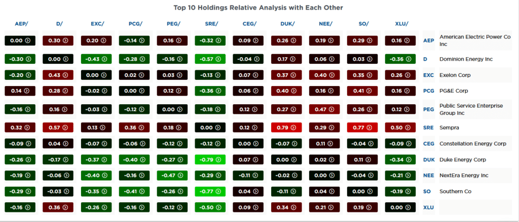
Retail sales per capita

As you can see, the data shows a much more subdued picture of consumer spending, which raises a critical question: Are we being lulled into a false sense of security by the headline numbers? The reality is likely far more sobering.
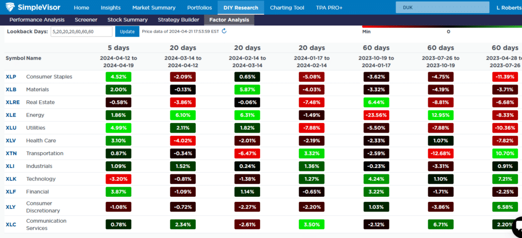
The Debt Bomb: Rising Delinquency Rates

Perhaps the most alarming signal comes from the rising credit card and auto loan delinquency rates. Consumers have been relying heavily on credit to maintain their spending habits in the face of high inflation and stagnant wage growth. The spread between retail sales and consumer credit to disposable personal income rises as COVID-related stimulus runs dry and inflation is outstripping wages, forcing consumers to turn to credit.

Consumer credit to DPI spread to retail sales

But there’s a limit to how much debt consumers can take on before the house of cards tumbles.

According to the latest data, delinquency rates (more than 90 days) on both auto loans and credit cards have reached their highest level since 2012. Notably, delinquency rates are rising the fastest for younger generations that tend to have lower incomes and less savings. (Charts courtesy of Mish Shedlock)

Credit Card delinquency rates
Auto loan delinquency rates

These rising delinquency rates are a warning sign that consumers struggle to keep up with their debt obligations. As more consumers fall behind on their payments, the risk of a broader economic slowdown increases. After all, consumer spending accounts for nearly 70% of U.S. GDP. If the consumer falters, the entire economy is at risk.

banner ad for SimpleVisor, our do it yourself investing tool. sign up for your free trial now

The Implications for Future Consumption

Given these “red flags,” it is difficult to see how the current level of consumer spending can be sustained. Rising delinquency rates, downward revisions to retail sales, and questionable seasonal adjustments all suggest the consumer is running out of spending power.

In the near term, we may continue to see headline retail sales numbers that appear healthy, especially if seasonal adjustments continue to provide a tailwind. However, the underlying data tells a different story. As more consumers reach their debt limits and delinquency rates continue to rise, we could see a significant spending slowdown later this year.

That slowdown would have far-reaching implications for the broader economy. Retailers could see further revenue declines, leading to potential layoffs and further weakening of consumer spending. Banks and financial institutions could also face higher loan losses, particularly in the credit card and auto loan sectors.
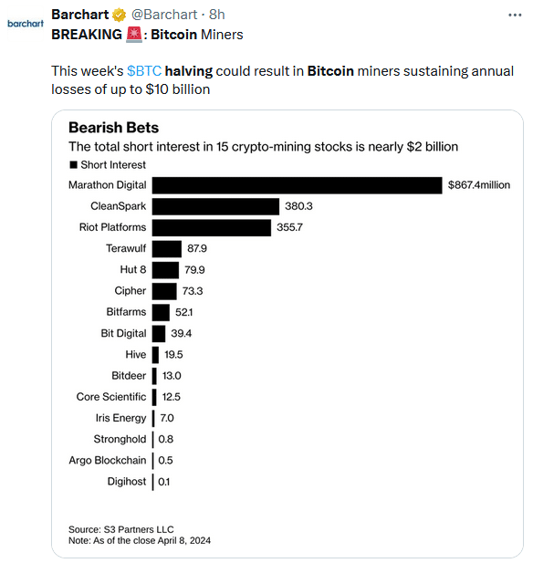

In summary, while the latest retail sales report may have given the market a short-term boost, suggesting a “soft landing” economically, the underlying data suggests we should be cautious. Seasonal adjustments and downward revisions are masking the actual state of consumer spending, while rising delinquency rates are a clear sign of trouble ahead.

Investors and policymakers would do well to look beyond the headlines and focus on the economy’s real risks. The consumer may be hanging on for now, but the cracks are starting to show. Ignoring these red flags could lead to a rude awakening in the months ahead.