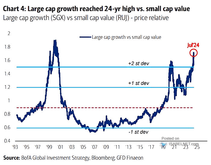
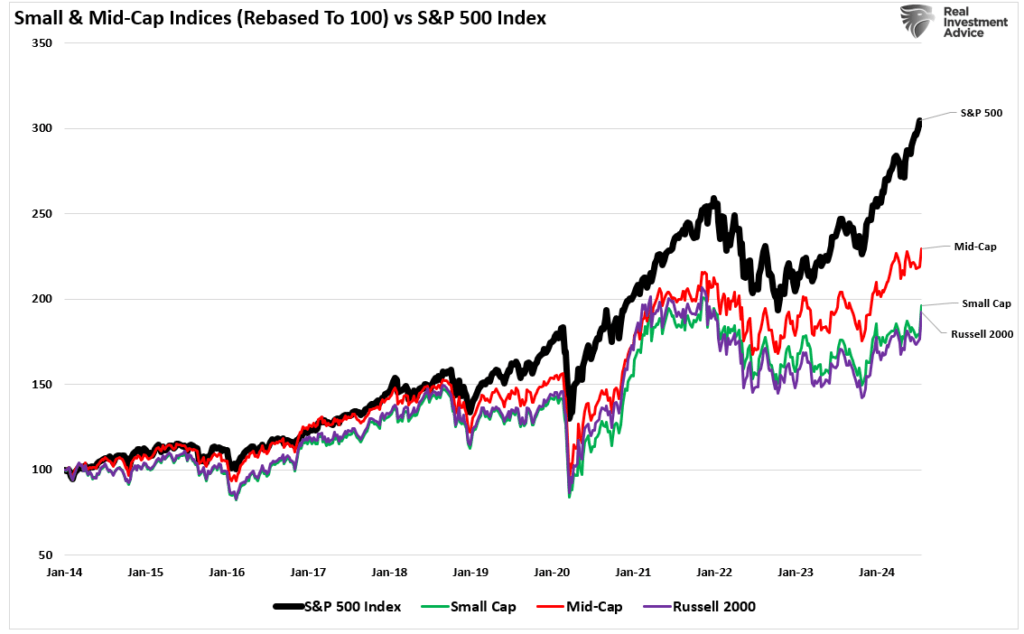
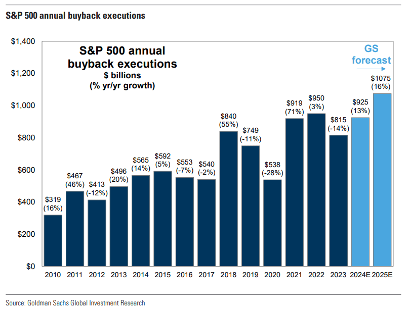
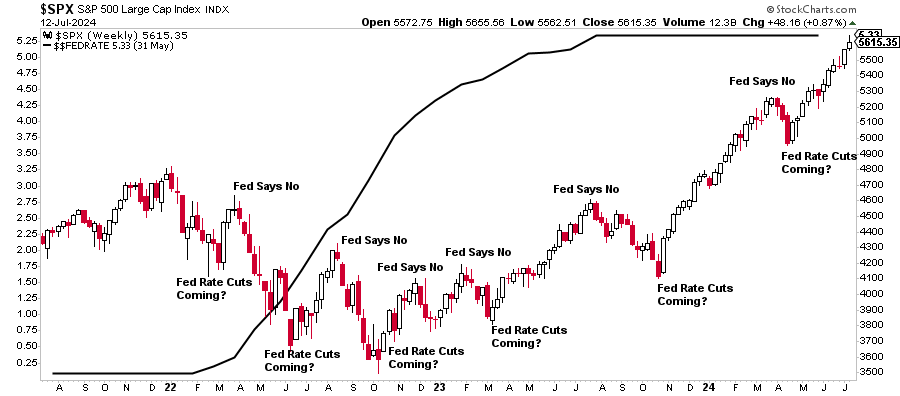
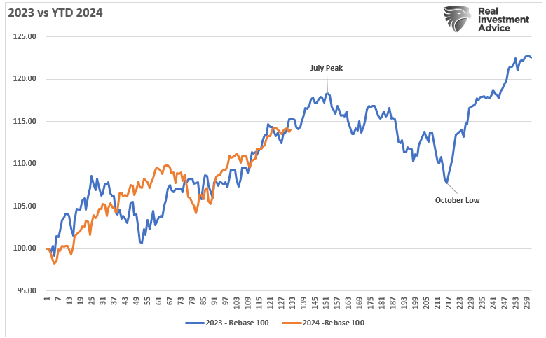
Is The Market Decline And Rotation Due To The Yen?
Can we blame the yen for the recent market decline and severe rotation from large to small caps? Before discussing the yen and its potential role, it’s important to disclaim that this is just one possible theory to explain the recent violent market decline and rotation.
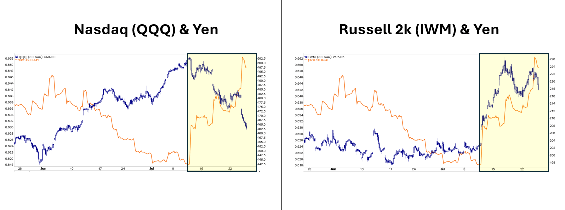
The yen carry trade occurs when hedge funds and other institutional investors borrow in yen at near-zero interest rates. They convert the yen to dollars and buy stocks and bonds. This leveraged trade depends on Japan’s low borrowing rates and a weak yen as the funds are essentially short yen. A sharp yen appreciation versus the dollar could generate a margin call from the lending bank, forcing the firm(s) to liquidate the trade quickly.
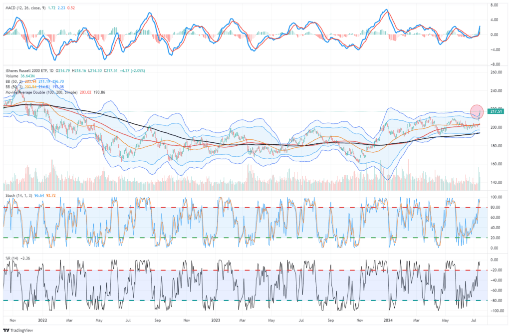
On July 11, CPI was weaker than expected. As the data was released, the yen shot higher versus the dollar as the BOJ intervened in the currency markets. Despite the good CPI data, the Nasdaq got hammered, and the small-cap Russell 2000 surged. From then on, the markets began experiencing a downward trend, and yen appreciation continued. Might some yen carry trades have been buying large caps while short small caps? If so, they may have been forced to reverse out of the trade in a hurry when the yen appreciated. While it’s just a theory to help explain the recent market decline, the graphs below give it some credence.
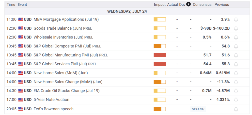
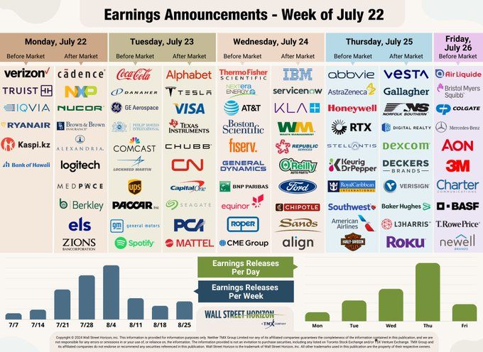
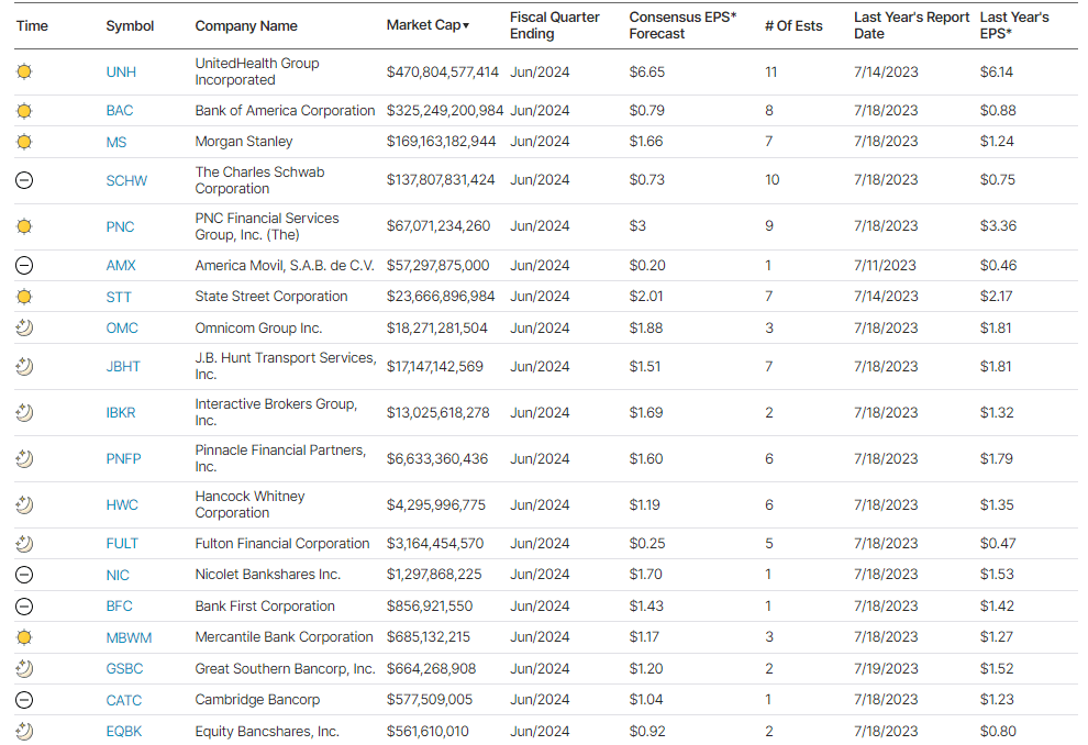
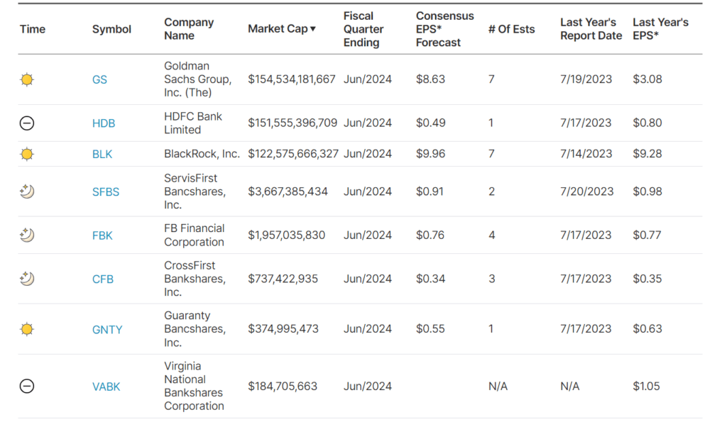
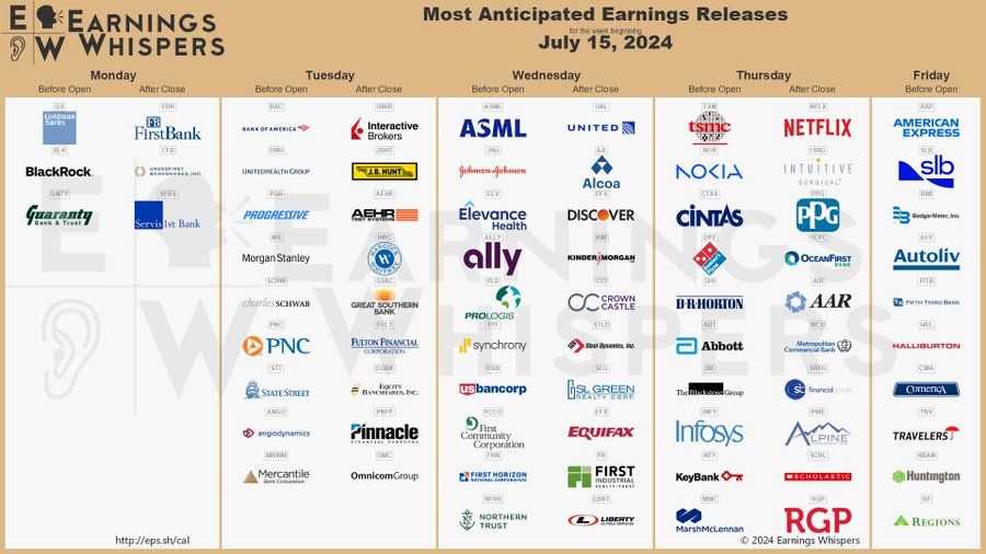
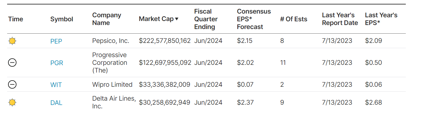
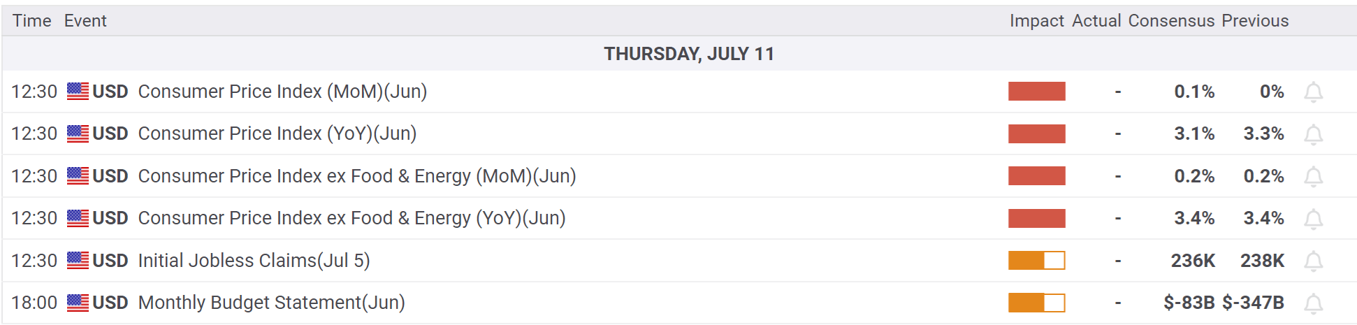
What To Watch Today
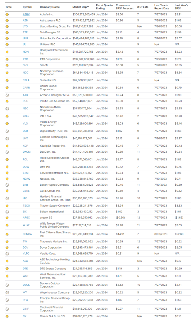
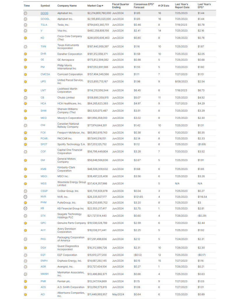
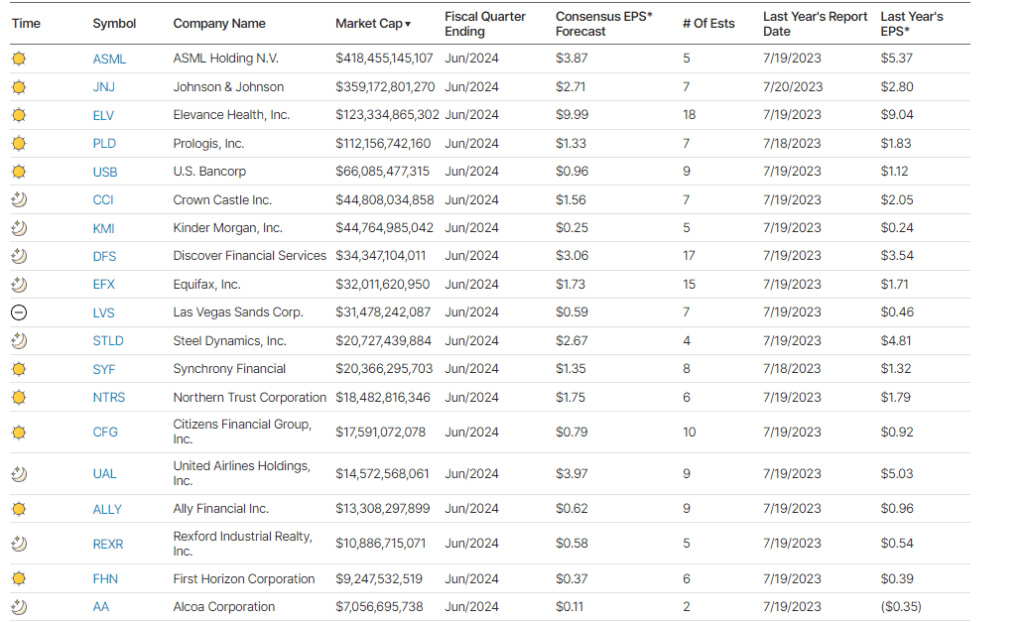
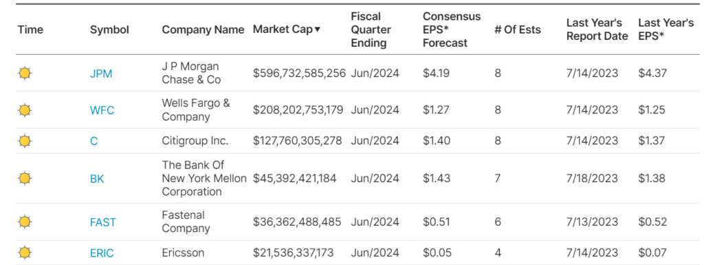
Earnings
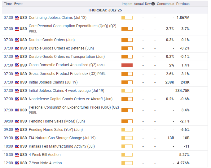
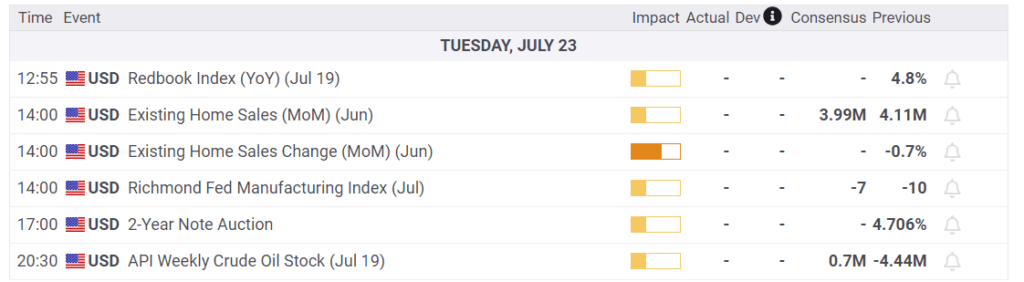
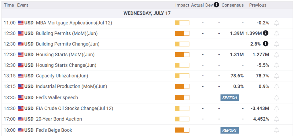
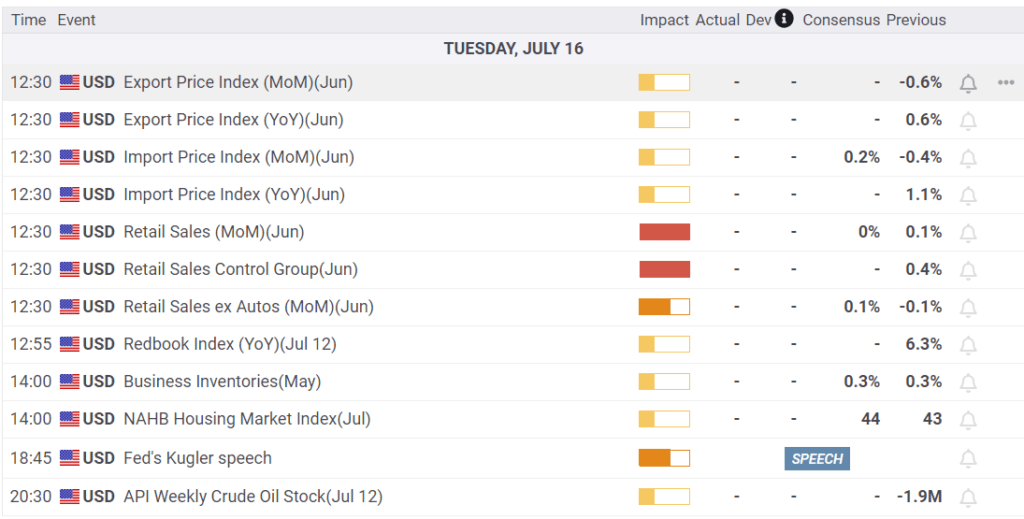
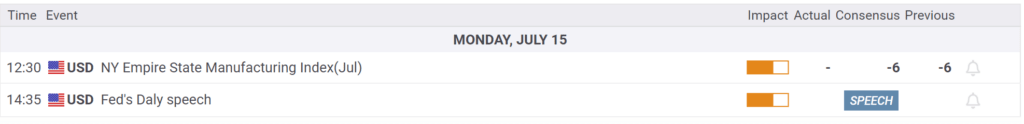
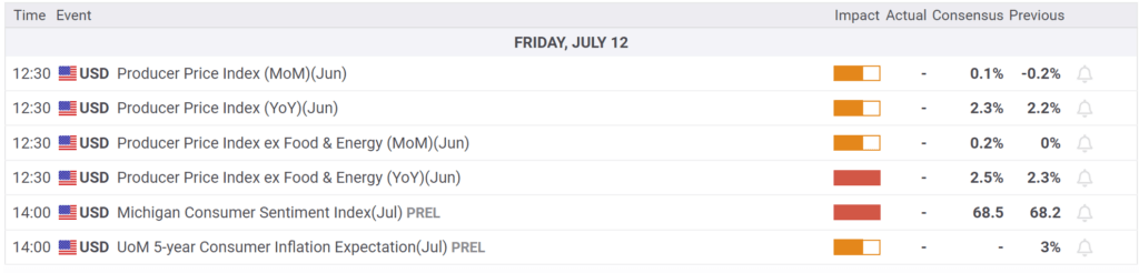
Economy
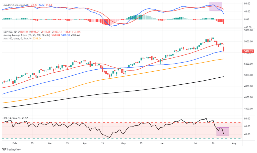
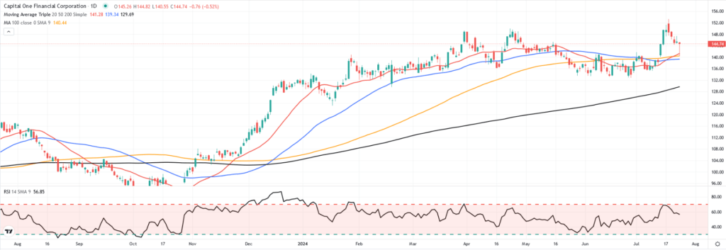
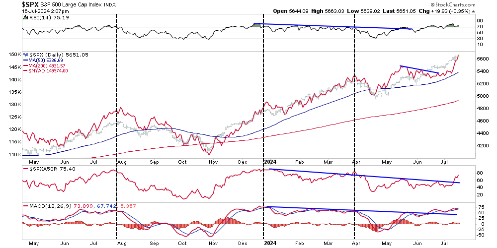
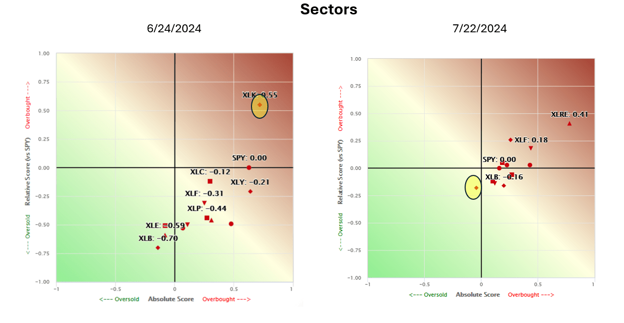
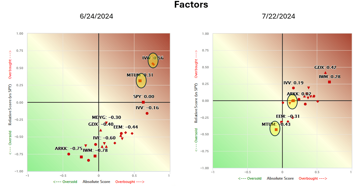
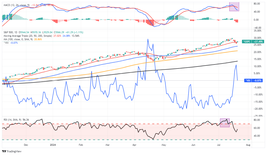
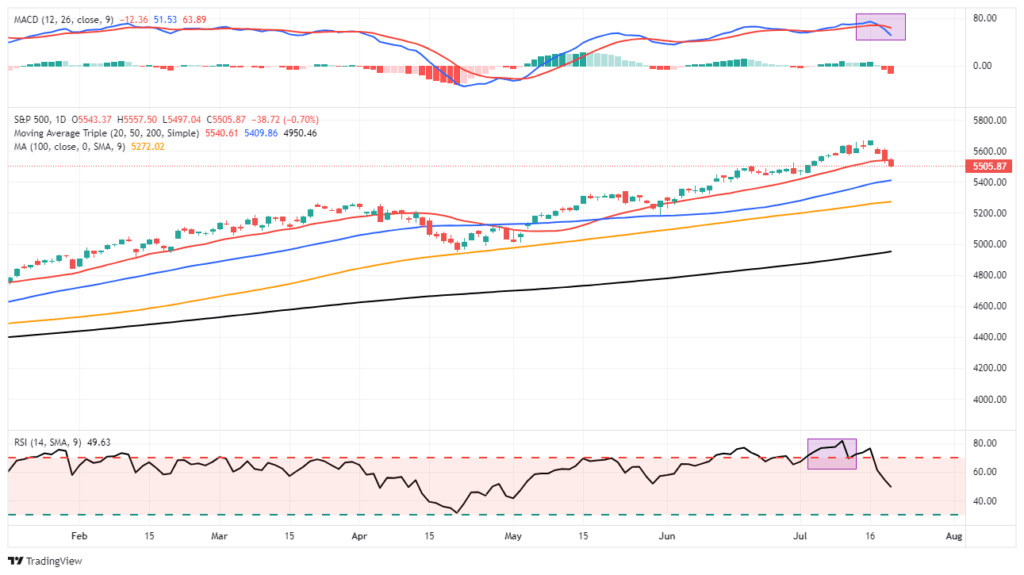
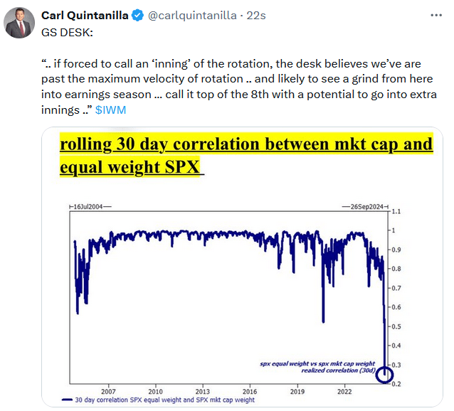
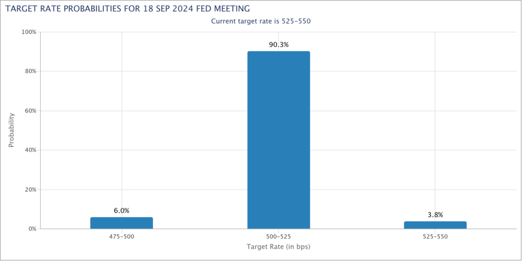
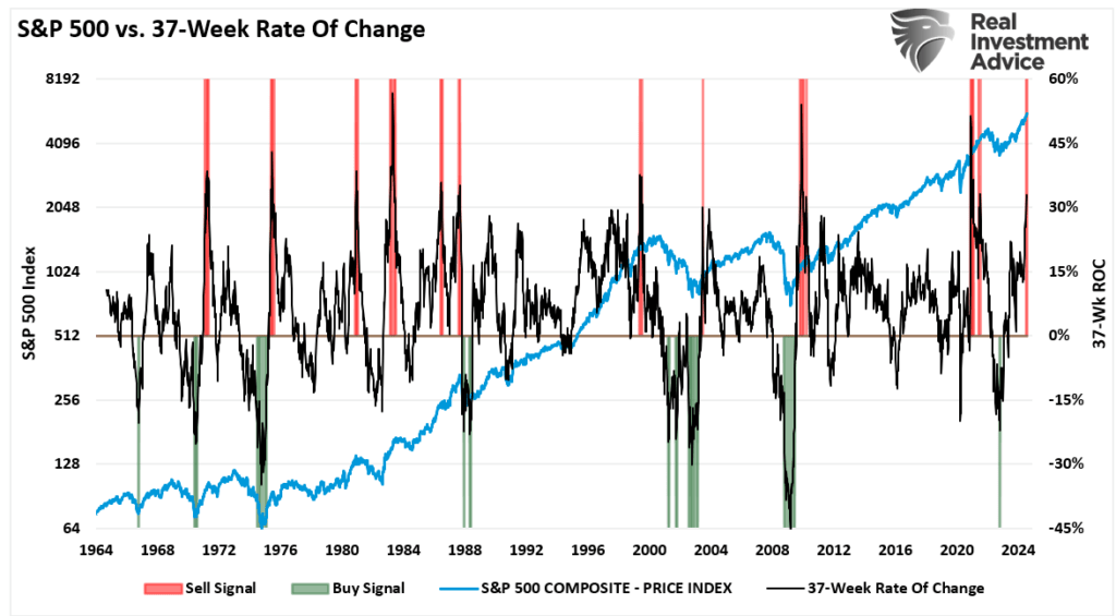
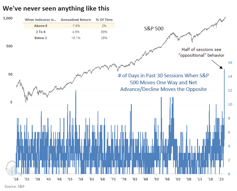
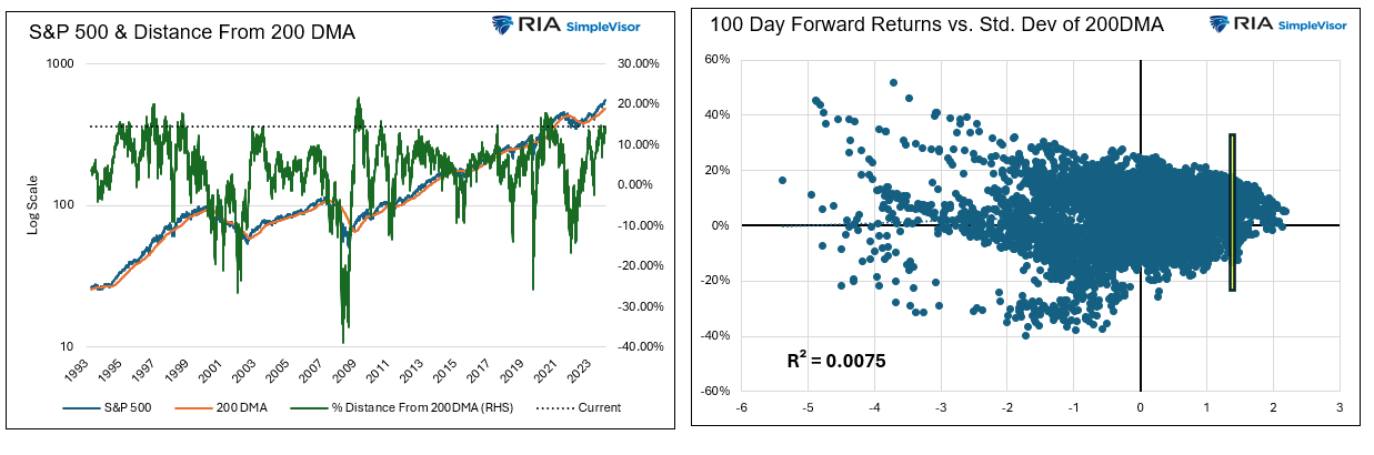
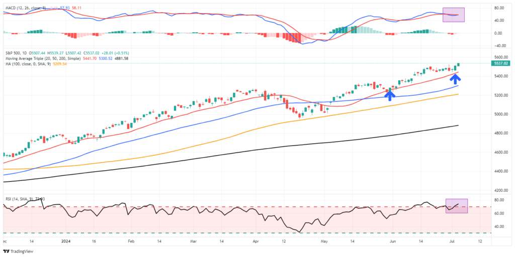
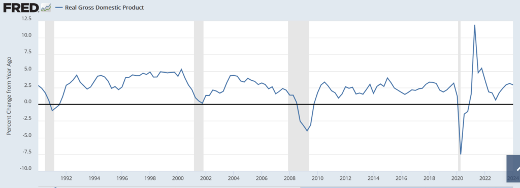
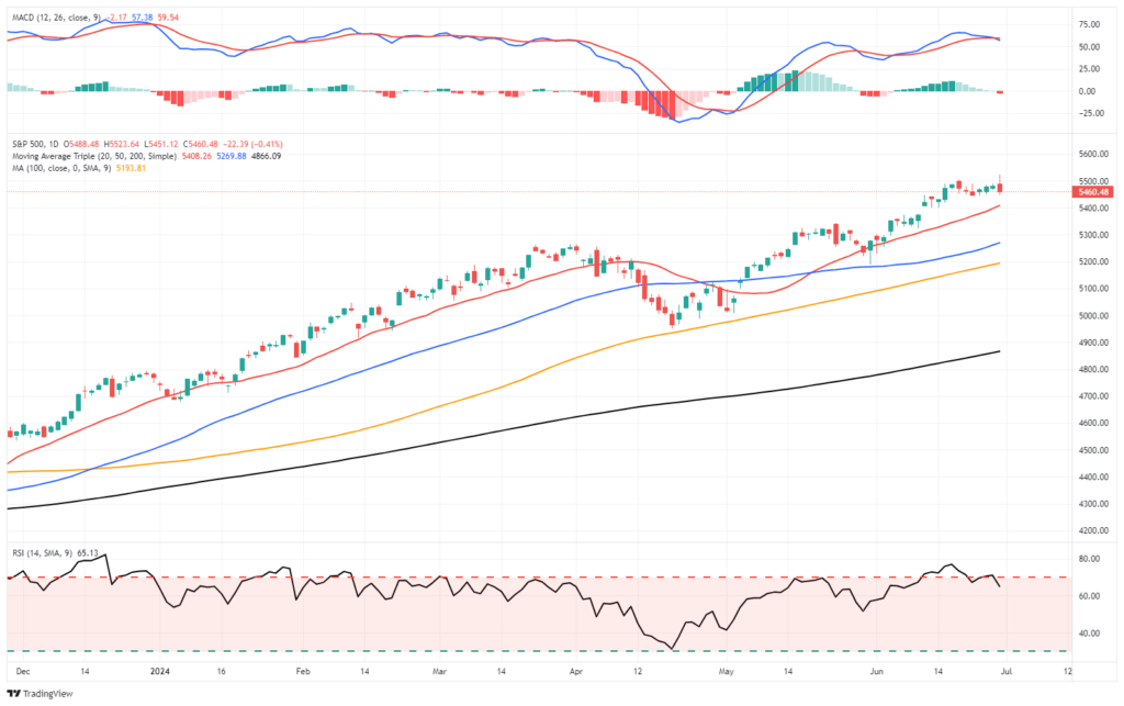
Market Trading Update
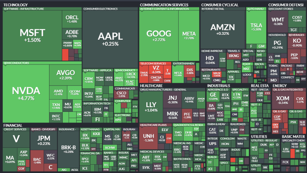
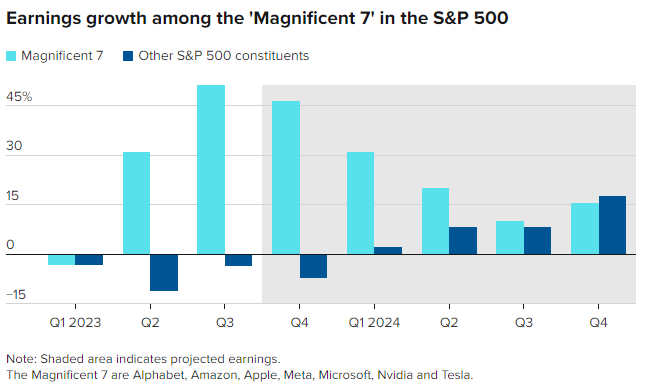
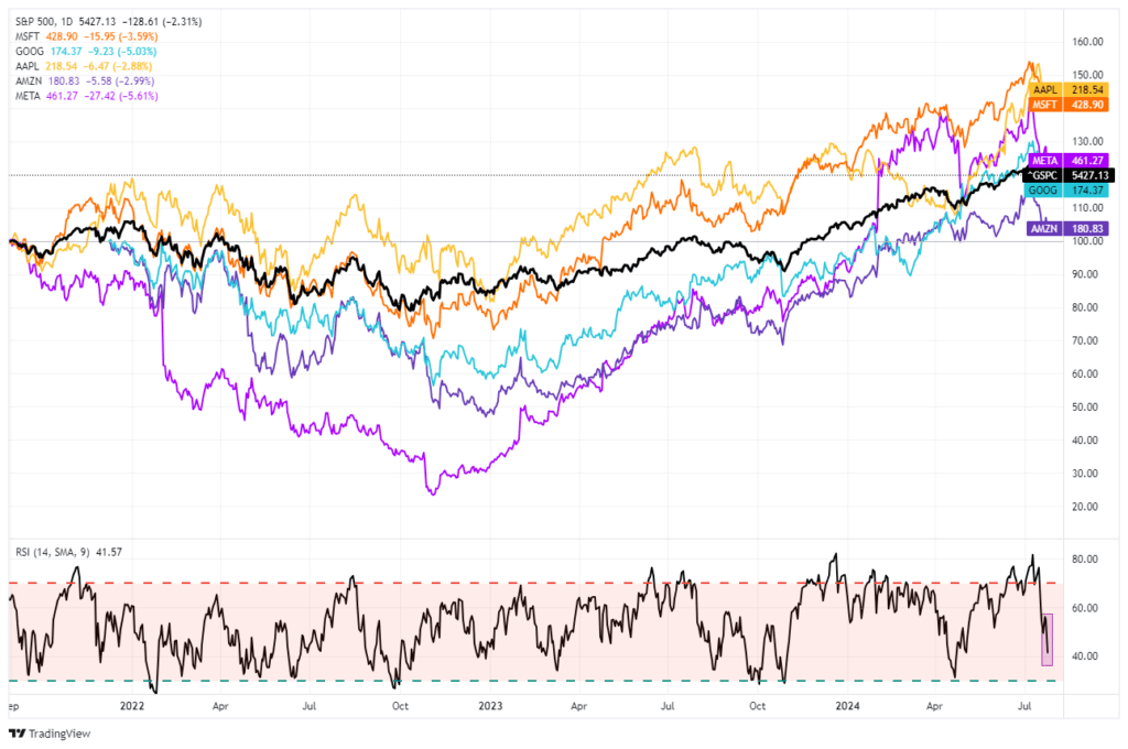
In yesterday’s commentary, we noted that the current corrective process was similar to that seen in April when the market broke the 20-DMA and eventually challenged the 100-DMA. Of course, whenever there is a market decline, we humans must try to rationalize the “chaos” by assigning a reason to it. The most recent rationalization is that the “AI trade” is dead. As noted by the better-than-expected revenue and earnings from Google (GOOG), most earnings growth comes from the largest companies. As such, we seriously doubt that managers will abandon these companies anytime soon. Furthermore, given that hedge funds need to move large amounts of capital at a time, these large-cap companies are the only companies that provide the needed liquidity.
However, every time these “Mega-Cap” companies pull back, the media assigns a new rationale for why it is happening. The reality is that these companies have posted stellar returns this year, and a bit of profit-taking is unsurprising, just as we have seen at each previous market peak over the last two years. The chart below compares the darlings of the “AI trade,” Apple (AAPL), Microsoft (MSFT), Google (GOOG), and Amazon (AMZN) to the S&P 500 index. (I would have included NVDA, but it has rallied so much that it skews the chart too much.)
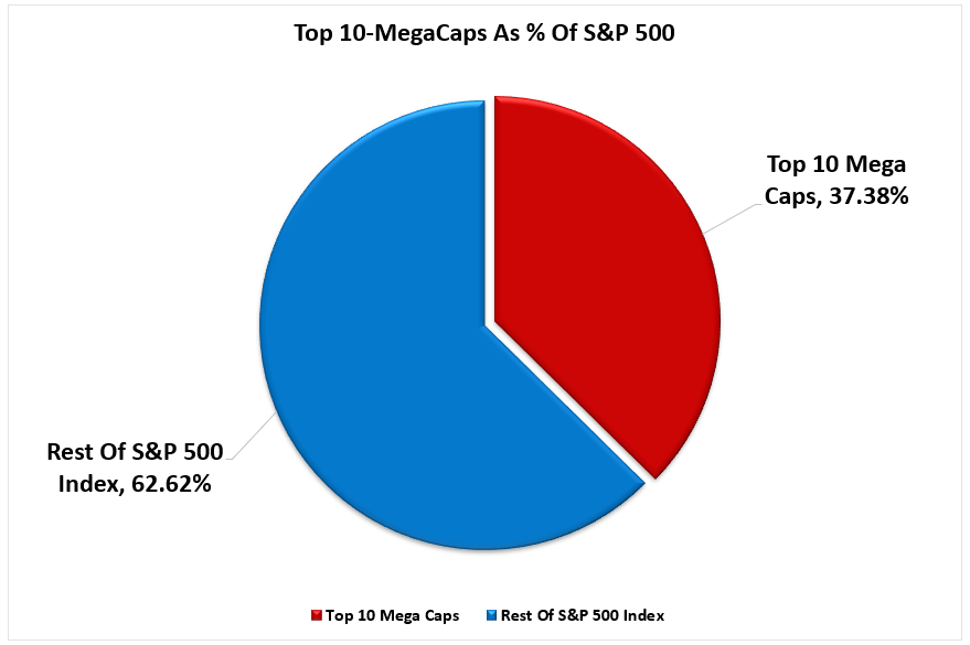
When the S&P 500 index advances or declines, there is a high price correlation with the “Mega-Cap” stocks. That correlation should be unsurprising because they make up ~35% of the index. The crucial point is that the current correction is likely just like every other correction we have seen over the last few years. It is highly likely that when this current corrective process concludes, large-cap stocks will once again resume their leadership.

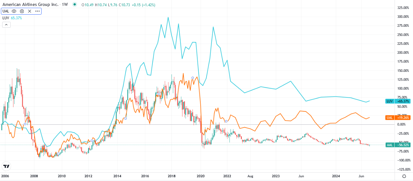
Airline Sale
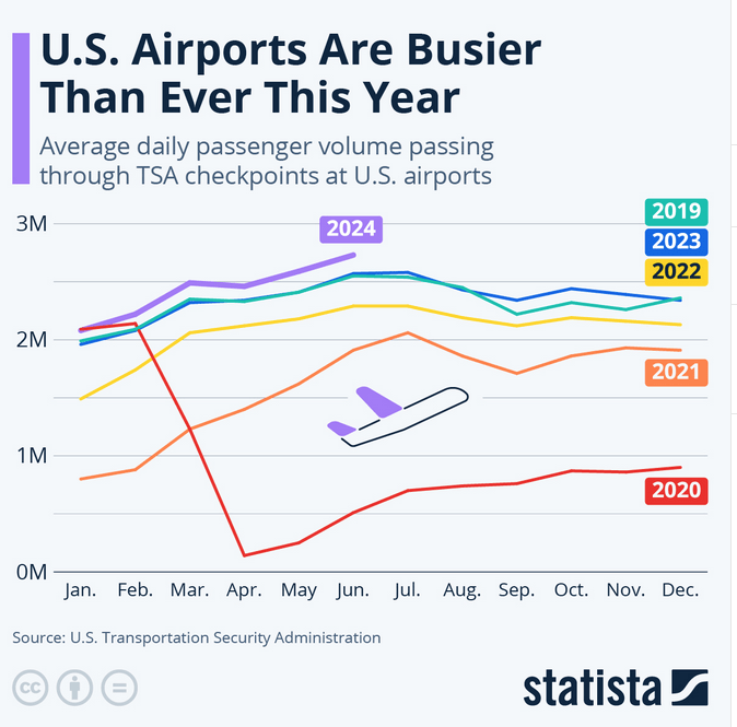
The large U.S. airlines are having a sale. Unfortunately, it’s not on ticket prices but their share prices. Despite booming air travel, as shown below courtesy of Statista, U.S. airline stocks are trading near their pandemic lows. To stress that point, airline share prices are at similar levels as when air travel was all but shut down, and there was no clear timetable for when it would resume. The second graph shows American, United, and Southwest Airlines.
Focusing on American Airlines (AAL) as an example, its revenues are at record highs commensurate with the TSA data. Furthermore, its EBITDA is back to pre-COVID levels, albeit showing little signs of growth despite higher revenues. Operating margins have been declining, eroding their profits. While little earnings growth weighs on investor sentiment, its valuations have become dirt cheap. AAL has a P/E ratio of 4.5 and a P/S of 0.13. There is value, but as we have been well aware for quite a few years, value is not in vogue.
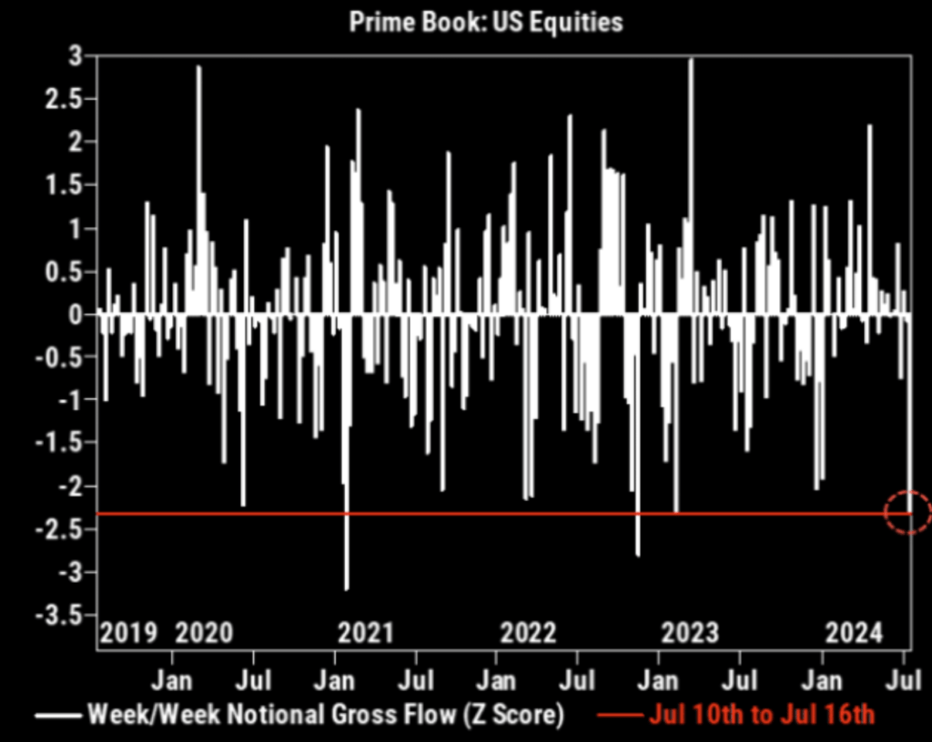
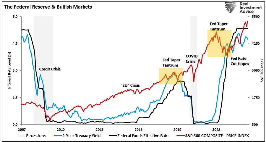
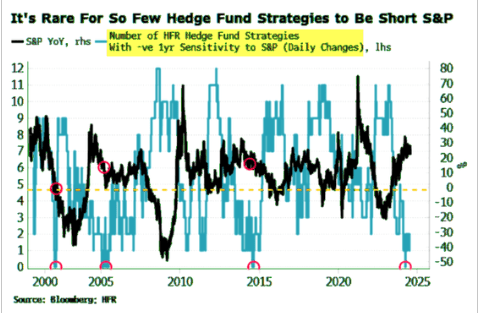
Hedge Funds Arent Hedged
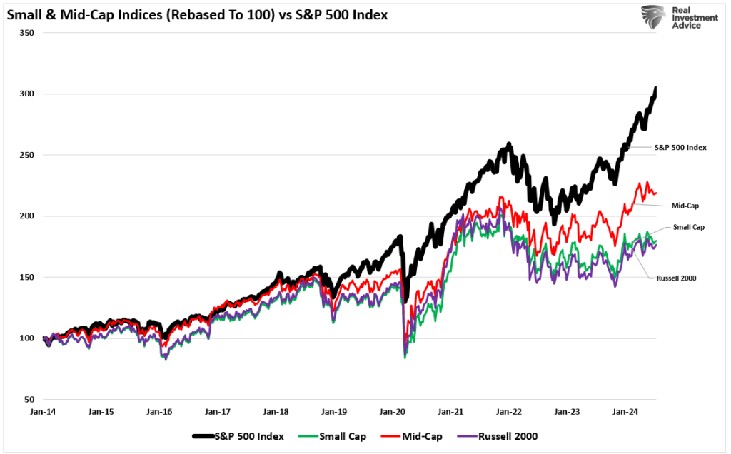
We opened by discussing the yen carry trade and how it could be behind the recent stock market decline, rotation, and volatility. However, we would be remiss if we didn’t consider the graph below. Hedge funds were not hedging their stock bets with S&P futures or options. They may have been hedged via shorts on the Russell 2000 small-cap index. Given the recent decline, they may now be rushing to hedge their stock position or cover their Russell short hedges.
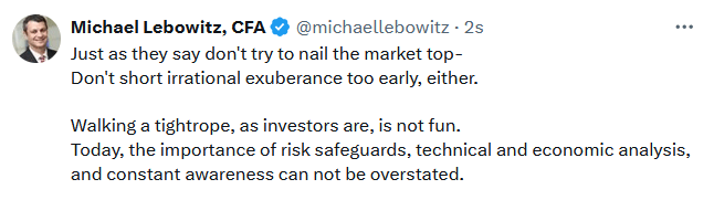
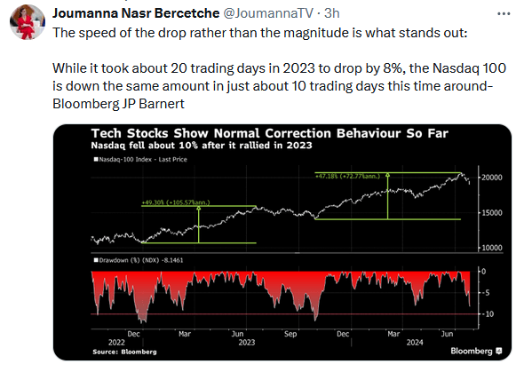
Tweet of the Day
“Want to achieve better long-term success in managing your portfolio? Here are our 15-trading rules for managing market risks.”
Please subscribe to the daily commentary to receive these updates every morning before the opening bell.
If you found this blog useful, please send it to someone else, share it on social media, or contact us to set up a meeting.