
Inside This Week’s Bull Bear Report
- Breakout or Fakeout?
- Is A Soft Recession A Possibility?
- How We Are Trading It
- Research Report – Time To Buy Treasury Bonds?
- Youtube – Before The Bell
- Stock Of The Week
- Daily Commentary Bits
- Market Statistics
- Stock Screens
- Portfolio Trades This Week
Was The Breakout A “Fakeout?”
Analysts are full of economic possibilities, from hard landing to no landing scenarios, but what about a soft recession? As noted last week, with earnings season mostly behind us, reported earnings came in “better than expected.” Such put Wall Street analysts in an optimistic mood hoping the worst is behind us.
“Why are equity markets so buoyant at the moment?” The red lines show a surge higher in analyst estimate upgrades. Such upward spikes are usually a prelude to sharply higher actual earnings growth and the bottoming of the cycle. Yet the chart shows a big divergence in analyst optimism from the official economic leading indicator, which has NEVER been so weak without signaling an imminent recession. So have analysts already discounted a recession? I think not.” – Albert Edwards
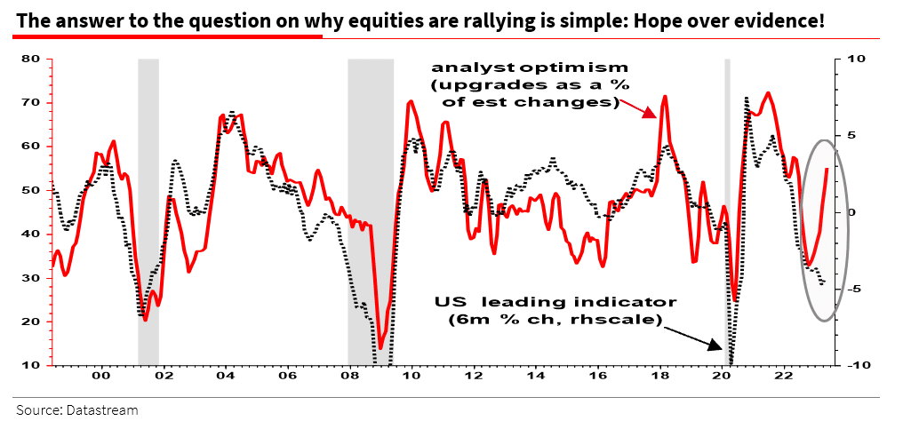
As Albert notes, the “hope” is either the avoidance of a recession entirely or a very soft recession at worst. We will discuss the possibility of a soft recession momentarily.
However, was the breakout last week just a “fake out?” As noted previously:
“That consolidation was resolved this past week. After 45 days of sideways action, the market broke decisively higher this week. While narrow in scope, that breakout allows the market to move higher. As I noted in Friday morning’s Daily Market Commentary:
‘Following more good news from retailers, which further confirmed no imminent recession, stocks broke above the trading range that has contained markets since February. That breakout sparked massive short covering and a rush to buy into the technology sector index, with the mega-caps again leading the way, as discussed in yesterday’s morning note.‘
Following that breakout, the market declined early in the week, sparking concerns of a “fake out.” The market initially tested the rising bullish trend line from the October lows sparking fears of more selling pressure. However, following Nvidia’s stellar earnings report on Thursday, the market staged a strong comeback and confirmed the breakout on Friday by setting a new closing high. This is a classic breakout of the consolidation range over the last couple of months.
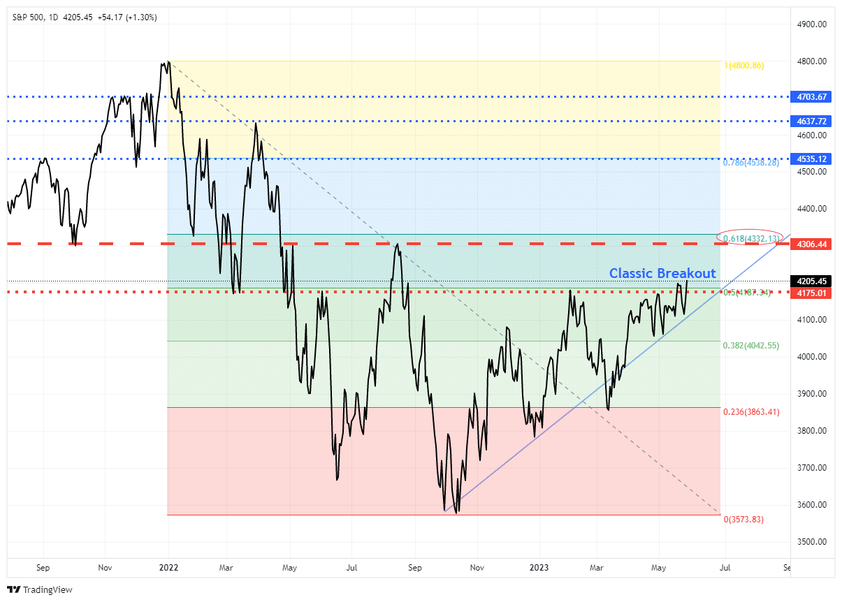
This breakout is very bullish for two reasons. First, the market has completed a 50% retracement of the 2022 decline, which sets the stage for a further advance. Secondly, the breakout confirms the bullish trend that started from the October lows. While many reasons exist to bearish, the market suggests those concerns are misplaced for now.
The next resistance level for the market is the 61.8% Fibonacci retracement level at 4332 which is slightly above the July 2022 high of 4306. A break above those levels, and there is only some minor resistance to fully recovering from the 2022 decline.
The driver for a full recovery will be a soft recession scenario. However, is that a possibility?
Need Help With Your Investing Strategy?
Are you looking for complete financial, insurance, and estate planning? Need a risk-managed portfolio management strategy to grow and protect your savings? Whatever your needs are, we are here to help.

Is A Soft Recession A Possibility?
If you read or watch the media, the debate over a recession continues to rage. In one camp are those concerned about debt increases, surging interest rates, and a reversal of stimulus that a “hard recession” is inevitable. Others, especially those on Wall Street hoping for higher equity prices, suggest that “no recession” is likely and why earnings will begin to rise again. Then there is the possibility of a “soft recession,” where the economy does slow but does lead to a sharp increase in unemployment or a dramatic decline in equity prices.
Let me state that I do NOT know the answer. We can only evaluate the data as it comes in and manage portfolios according to the risks we are willing to accept.
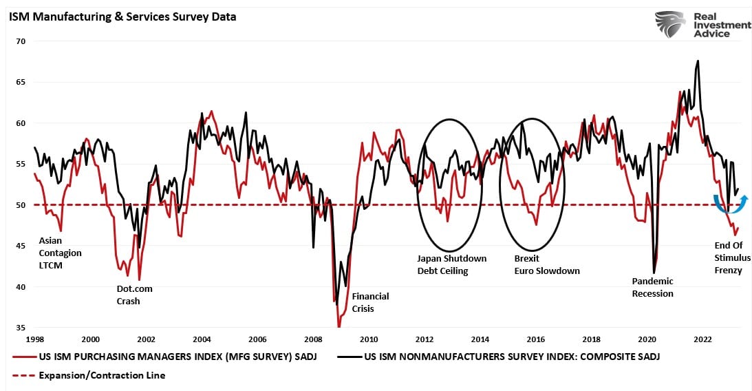
However, with that said, some evidence supports the “soft recession” scenario. A recent precedent for such an economic outcome was in 2011. Interestingly, during that period, the world faced a manufacturing shutdown in Japan due to an undersea earthquake creating a tsunami that flooded Japan and sparked a nuclear meltdown. At the same time, the U.S. was entrenched in a debt ceiling debate, a downgrade of the U.S. debt rating, and threats of default. Given the combination of events, and the dependence on Japanese suppliers, the economy’s manufacturing sector contracted, convincing many of an impending recession.
However, as shown, that recession never happened.
Services Are The Driver
The reason was that the service sector of the U.S. economy remained strong enough to keep the economy afloat until the debt ceiling issue was resolved and Japan returned online. Unlike in the past, where manufacturing was a significant component of economic activity, today, services comprise nearly 80% of each dollar spent.

This isn’t the first time we have seen the manufacturing side of the economy contract, but services remained robust enough to keep the overall economy out of recession. As shown, when the economy’s manufacturing side contracts while services remain expanding, the economy has a “soft recession.” The 1998, 2011, and 2015 periods are the most recent examples.
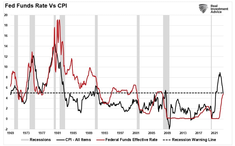
Of course, there are some crucial differences between today and 2011. In 2011, inflation was low, the Fed funds rate was zero, and Ben Bernanke was providing additional accommodative monetary conditions through “Operation Twist” Today, inflation is running at 5%, the Fed funds rate is 5%, and the Fed is removing accommodative monetary conditions through “Quantitative Tightening.” Given such a different backdrop of accommodative versus non-accommodative monetary conditions, the economy seems unlikely to avoid a recession in 2023.
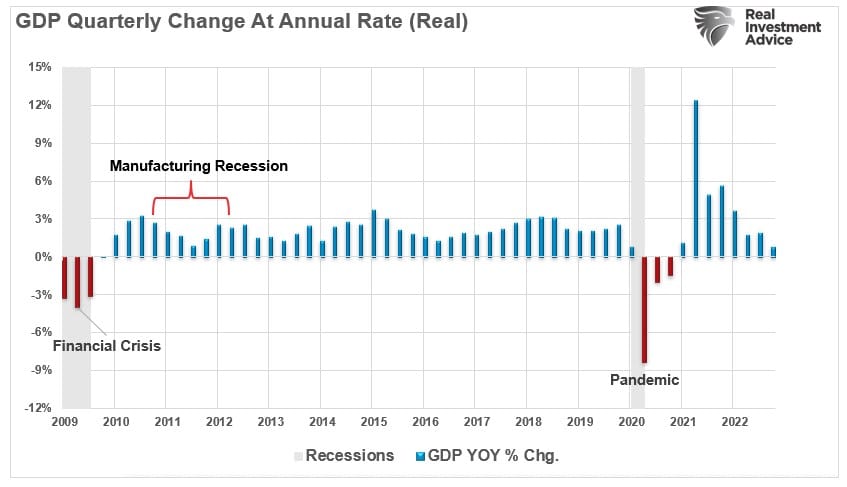
A Return To Normal
However, another consideration is that the economy has contracted sharply over the last 12 months. Had the economy been running at 2%, as previously, a recession would have been assured. The difference was that the contraction occurred when the economy ran at an accelerated annualized rate of nearly 12% due to $5 Trillion in liquidity. As shown below, the contraction has reversed the entirety of that previous growth. On an equivalent basis, the decline during the Pandemic shutdown was roughly equal in magnitude. The difference was that decline started with the economy running just above 2% annualized. In other words, on a normalized basis, the contraction has been equally as significant as the 2020 recession and nearly twice as large as the “Financial Crisis.”

Monetary conditions are also providing support for a “soft recession” scenario.
Monetary Conditions Index
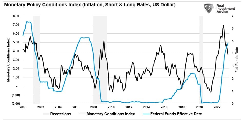
In a previous article on why the “Bulls May Not Like The Pivot,” I introduced a composite index that tracks changes to monetary conditions. Effective monetary conditions were significantly tighter as the Fed hiked rates and inflation surged from massive tranches of monetary support.
The “monetary policy conditions index” measures the 2-year Treasury rate, which impacts short-term loans; the 10-year rate, which affects longer-term loans; inflation which impacts the consumer; and the dollar, which impacts foreign consumption. Historically, when the index has reached higher levels, it has preceded economic downturns, recessions, and bear markets. To visualize the correlation, I have inverted the monetary conditions index so that “easier” monetary conditions correspond to rising economic growth. Such suggests that economic growth could increase later this year with conditions now easing.
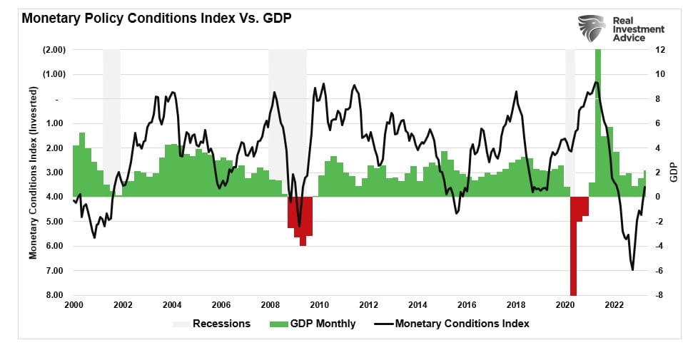
It is worth noting that the monetary conditions index typically precedes Federal Reserve rate cuts.
Notably, if the monetary conditions index suggests that economic growth will pick up later this year, such does support the rally in the stock market since October of last year. As shown, there is a decent correlation between the monetary conditions index and the annual change in the S&P 500.
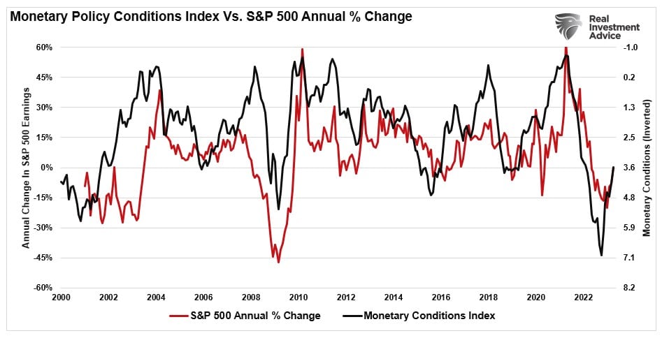
The reason for the optimism in the stock market is the expectation that earnings will increase over the next. If monetary conditions point to strong economic growth, earnings should follow.
While there are undoubtedly many bearish arguments currently, as investors, we must remember that markets tend to be forward-looking. Expectations of a deeper recession due to aggressive rate hikes by the Federal Reserve, tight lending standards from banks, and still high inflation are certainly valid.
However, the monetary conditions index shows that competing forces potentially offset those risks.
Recession Avoidance
While there are certainly reasons supporting the “soft recession” scenario, the Fed’s aggressive rate hiking campaign, “quantitative tightening,” and leading economic indicators do not. The chart below was discussed in more detail in last week’s newsletter and certainly doesn’t support the more bullish outlook of analysts.
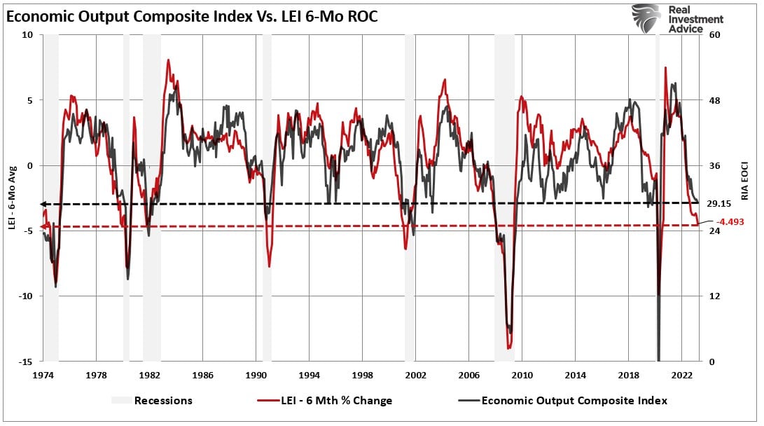
There are many differences between the current economic environment and those of past soft landing scenarios, the most important of which are inflation and the Fed’s interest rates. As noted, the economy has never had a “soft recession” outcome when both of those economically important levels were above 5%.
The most significant risk for investors remains the ability for earnings and profits to meet current expectations. While the media often states that “stocks are not the economy,” economic activity creates corporate revenues and earnings. As such, stocks can not grow faster than the economy over long periods. As we concluded last week:
“With the Federal Reserve intent on slowing economic growth to quell inflation, it is only logical earnings will decline. Prices must accommodate lower earnings by reducing current valuation multiples if such is the case.”
The conundrum between competing pieces of data make deciphering the current market environment exceedingly tricky. As noted, we have no idea how this story eventually plays out.
For now, the best we can do is remain hyper-focused on the price data and signals we can visually observe. Markets tend to be a leading indicator long-term but have a nasty habit of being wrong short term. More importantly, as John Maynard Keynes once quipped:
“The markets can remain illogical longer than you can remain solvent.”
With that, we agree. Such is why we are remaining cautiously but optimistically positioned for now. When the technicals change, so will our allocations.
How We Are Trading It
As noted, we are very skeptical of the current market environment, but given the market’s rally since the October lows, we need to keep exposure to the equity market. As noted last week, we further increased our equity exposure to areas of the market that are currently out of favor, which we think will benefit from a rotational shift in the market. Some of that rotation occurred this past week, with financials and energy performing better while technology took a needed breather.
Overall, these continue to be tiny moves to align the risk profile of portfolios to the market. Given the recent buy signals from our indicators, we cautiously added that needed exposure. However, we maintain a very tight discipline over our current positioning and how we manage risk. The improvement in the overall price action confirms that downside risk is somewhat limited in the current environment.
The Rules
If you are grossly underweight equities and are pressured to add positions, do so carefully. As an individual investor, there is no need to chase markets. Use pullbacks opportunistically to add exposure as needed to match your risk profile. The following rules are helpful in adding exposure in a tenuous environment.
- Move slowly. There is no rush to make dramatic changes. Doing anything in a moment of “panic” tends to be the wrong thing.
- If you are underweight equities, DO NOT try and fully adjust your portfolio to your target allocation in one move. Again, after significant market moves, individuals feel like they “must” do something. Consider your allocation and use rallies or pullbacks to adjust risk tolerance levels.
- Begin by selling laggards and losers. These positions were dragging on performance as the market rose, and they led on the way down.
- Add to sectors or positions performing with or outperforming the broader market if you need risk exposure.
- Move “stop-loss” levels up to recent lows for each position. Managing a portfolio without “stop-loss” levels is like driving with your eyes closed.
- Be prepared to sell into the rally and reduce overall portfolio risk. You will sell many positions at a loss simply because you overpaid for them. Selling at a loss DOES NOT make you a loser. It just means you made a mistake.
- If none of this makes sense, please consider hiring someone to manage your portfolio. It will be worth the additional expense over the long term.
Everyone approaches money management differently. Our process isn’t perfect, but it works more often than not. The important message is that the bearish cycle will end, and the next bull cycle will begin.
Have a great week.
Research Report

Subscribe To “Before The Bell” For Daily Trading Updates (Formerly 3-Minutes)
We have set up a separate channel JUST for our short daily market updates. Please subscribe to THIS CHANNEL to receive daily notifications before the market opens.
Click Here And Then Click The SUBSCRIBE Button
Subscribe To Our Youtube Channel To Get Notified Of All Our Videos
Stock Of The Week In Review
5-For Friday, Will Return Next Week
Login to Simplevisor.com to read the full 5-For-Friday report.
Daily Commentary Tidbits
NVDA and AI Stocks Surge
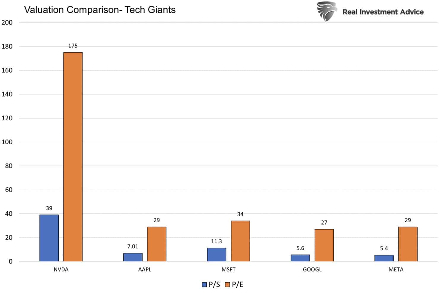
Chipmaker Nvidia (NVDA), one of the biggest beneficiaries of AI technologies, soared Thursday as its earnings and revenues beat expectations. However, what drove NVDA higher by over 25% was not its quarterly results, which incidentally showed negative earnings and revenue growth, but its outlook. NVDA’s management stunned investors by forecasting $11 billion in revenue for Q2, well above the prior $7.18 Billion forecast. Such a sharp increase over a short period is nearly unprecedented. Wall Street analysts quickly raised their price targets for NVDA, as shown in the Tweet of the Day below. Many other AI-related stocks are following NVDA’s lead higher.
With Thursday’s price surge, NVDA gained over $220 billion in market cap. To put that in context, an AI competitor of theirs, AMD, has a market cap of $174 billion. Further, 473 S&P 500 stocks have a market cap below $220 billion. NVDA will benefit greatly from AI. The question, however, for investors is whether the valuations for NVDA and some other AI companies are too high. To wit, at its current price-to-sales ratio of 39x, NVDA will have to own the entirety of the GPU chip space in ten years, the stock price can’t change, and it will still be costly at 13x price to sales. NVDA’s P/E and P/S dwarf other technology market cap giants like Apple, Microsoft, Google, and Meta.
(Subscribe To The Daily Market Commentary For A FREE Pre-Market Email)
Bull Bear Report Market Statistics & Screens

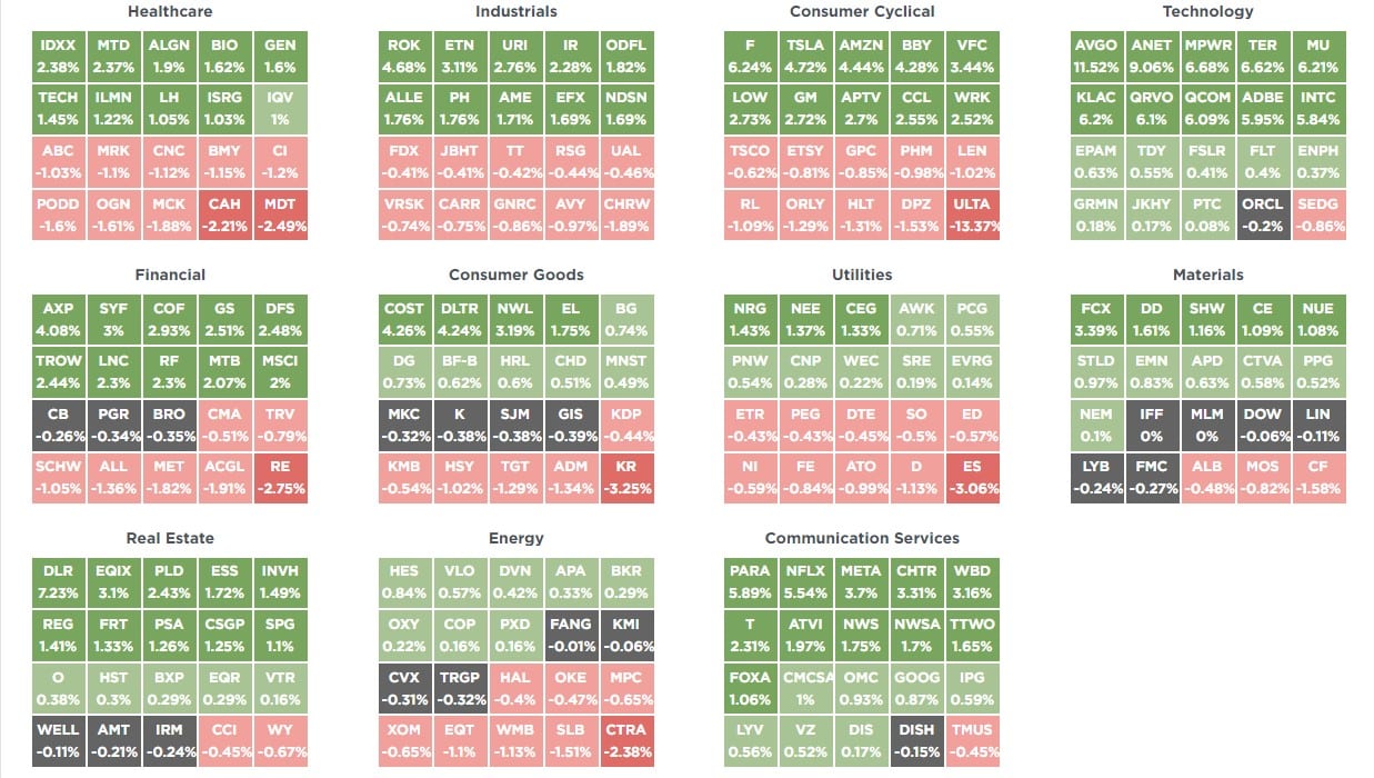
SimpleVisor Top & Bottom Performers By Sector
S&P 500 Weekly Tear Sheet
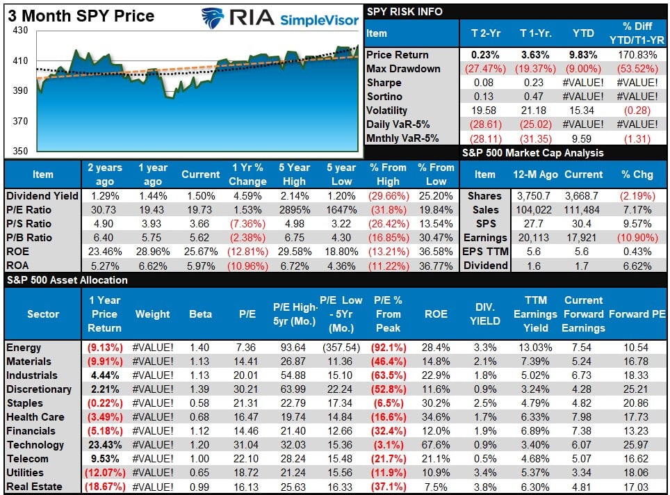
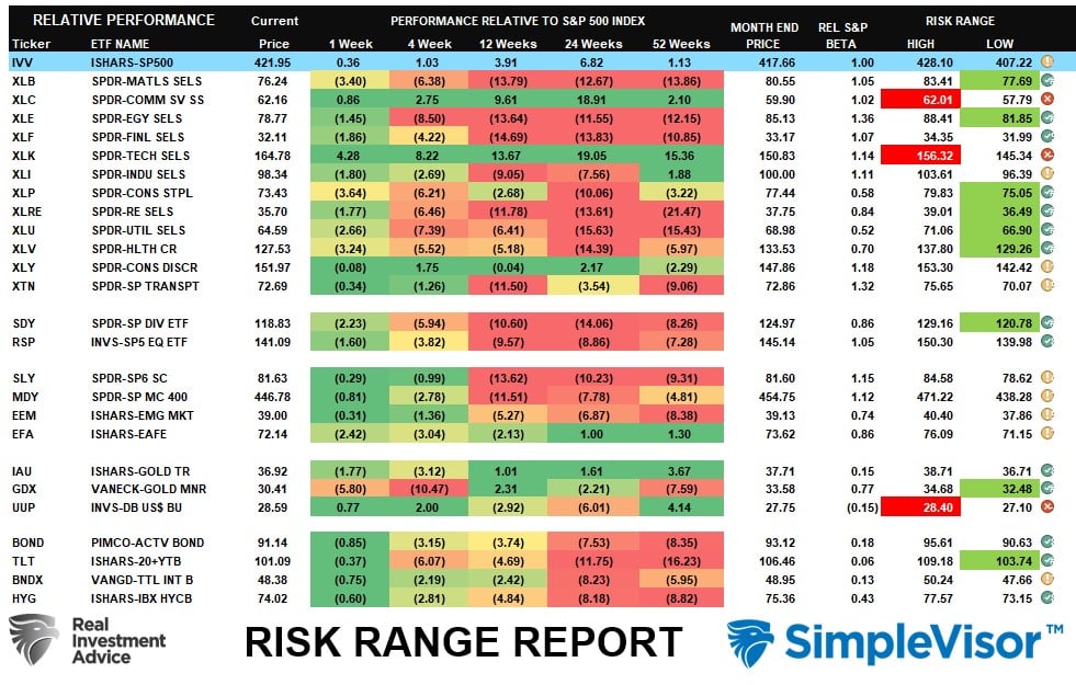
Relative Performance Analysis
With the market confirming the breakout, such suggests a continued move higher. However, the market has a clear division between the leaders (Technology, Communication, Discretionary) and the laggards (Staples, Real Estate, and Utilities.) We continue to expect a short-term rotation between the overbought areas of the market and the oversold. With the S&P 500 now in highly overbought territory, relative to itself, along with Technology and Communications, we are in a good position for a bit of short-term rotation.
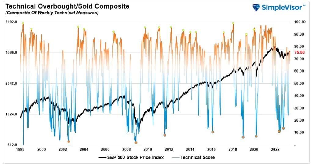
Technical Composite
The technical overbought/sold gauge comprises several price indicators (RSI, Williams %R, etc.), measured using “weekly” closing price data. Readings above “80” are considered overbought, and below “20” are oversold. The market peaks when those readings are 80 or above, suggesting prudent profit-taking and risk management. The best buying opportunities exist when those readings are 20 or below.
The current reading is 75.53 out of a possible 100.
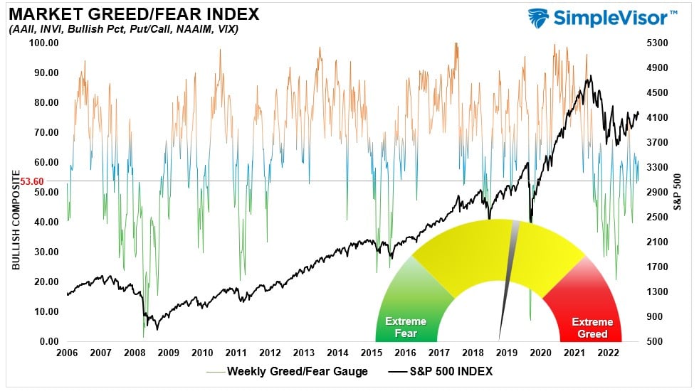
Portfolio Positioning “Fear / Greed” Gauge
The “Fear/Greed” gauge is how individual and professional investors are “positioning” themselves in the market based on their equity exposure. From a contrarian position, the higher the allocation to equities, the more likely the market is closer to a correction than not. The gauge uses weekly closing data.
NOTE: The Fear/Greed Index measures risk from 0 to 100. It is a rarity that it reaches levels above 90. The current reading is 53.60 out of a possible 100.
Sector Model Analysis & Risk Ranges
How To Read This Table
- The table compares the relative performance of each sector and market to the S&P 500 index.
- “MA XVER” (Moving Average Cross Over) is determined by the short-term weekly moving average crossing positively or negatively with the long-term weekly moving average.
- The risk range is a function of the month-end closing price and the “beta” of the sector or market. (Ranges reset on the 1st of each month)
- The table shows the price deviation above and below the weekly moving averages.
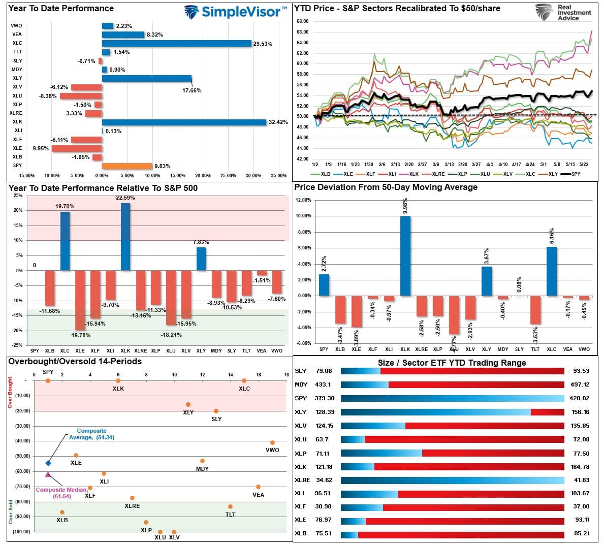
As noted last week, “the market remains bullish, with Technology, Discretionary, and Communications continuing to lead the way.” Those sectors are now highly overbought short-term and beyond normal monthly risk ranges. The dollar rally also has moved beyond normal ranges. A dollar reversal should benefit commodity-related stocks, and the debt ceiling resolution will help bonds, all of which are oversold short-term.
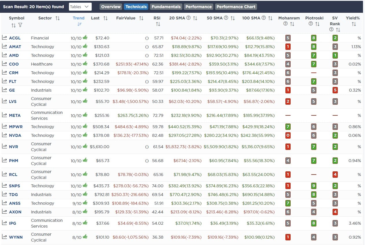
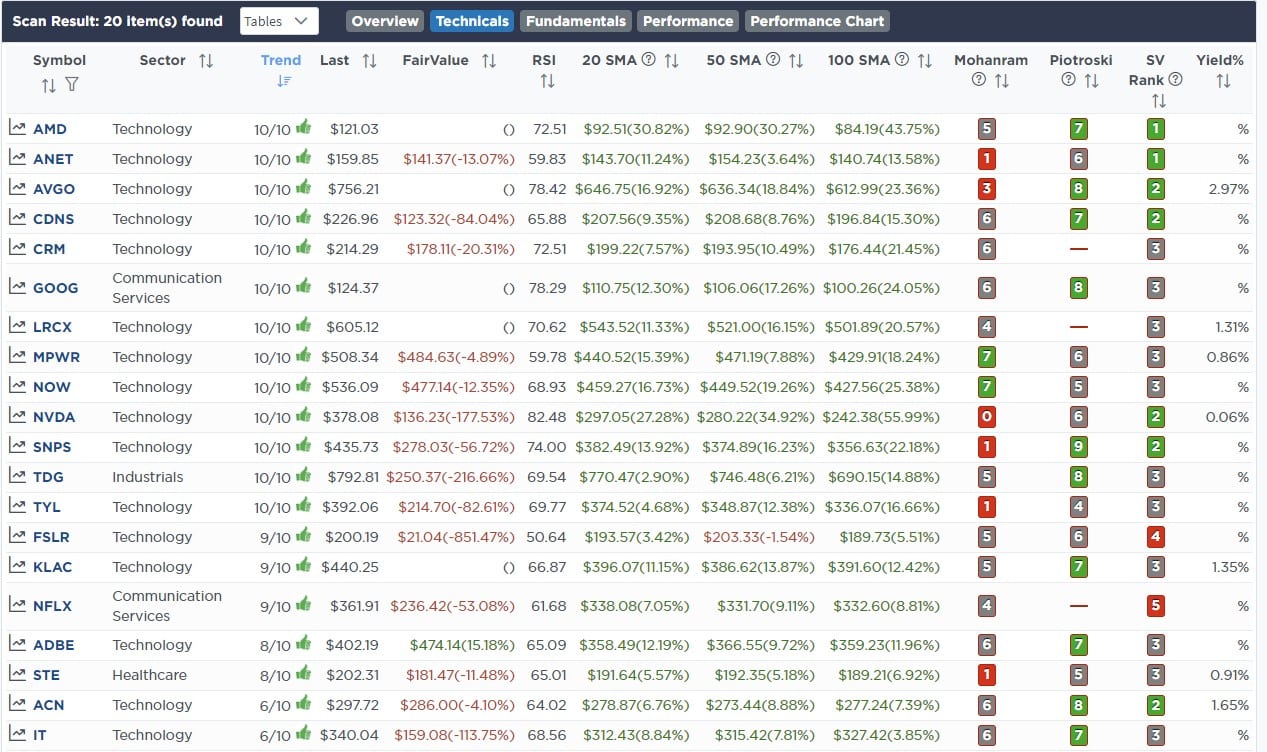
Weekly SimpleVisor Stock Screens
We provide three stock screens each week from SimpleVisor.
This week we are searching for the Top 20:
- Relative Strength Stocks
- Momentum Stocks
- Technically Strong Stocks With Dividends
(Click Images To Enlarge)
RSI Screen
Momentum Screen
Technically Strong With Dividends

SimpleVisor Portfolio Changes
We post all of our portfolio changes as they occur at SimpleVisor:
No Trades This Week

Lance Roberts, CIO
Have a great week!