Economic Stagflation – Myth Or Reality?


Inside This Week’s Bull Bear Report
- Economic Stagflation – Myth Or Reality
- How We Are Trading It
- Research Report –These 5 Biases Are Killing Your Portfolio
- Youtube – Before The Bell
- Market Statistics
- Stock Screens
- Portfolio Trades This Week
Powell’s Comments Spark A Buying Frenzy
Last week, we discussed whether the recent rally from the lows was just a sucker rally ahead of a more significant decline. Our assessment was that was likely not the case. To wit:
“On Friday, following blowout earnings from Google and Microsoft, the market challenged the intersection of the 20- and 50-DMA. With the market not overbought yet and the MACD ‘buy signal’ approaching, the bullish case is building. However, the initial resistance of the 50-DMA could prove challenging.”
On Wednesday, Jerome Powell’s speech following the conclusion of the latest FOMC meeting provided a more “dovish” than expected message. While Powell did note that progress on inflation has been lackluster, the announcement of the reversal of “Quantitative Tightening” (QT) excited the bulls.
Beginning in June, the Committee will slow the pace of decline of its securities holdings by reducing the monthly redemption cap on Treasury securities from $60 billion to $25 billion. The Committee will maintain the monthly redemption cap on agency debt and agency mortgage‑backed securities at $35 billion and will reinvest any principal payments in excess of this cap into Treasury securities”
Of course, the reversal of QT means a buyer of Treasury bonds is returning to the market, increasing overall market liquidity. It also means the Treasury will issue $105 billion less in gross in Q3. The bond market also got the memo, as the Fed’s return to the bond market suggests lower yields in the months ahead, easing financing pressure in the economy.
The market surged higher on Thursday and Friday, supported by Apple’s massive $110 billion stock buyback program. With a MACD “buy signal” triggered on Friday and the market not overbought yet, a push above resistance at the 50-DMA seems likely next week. That break of resistance should allow the bulls an opportunity to retest 5200 over the next month or so.
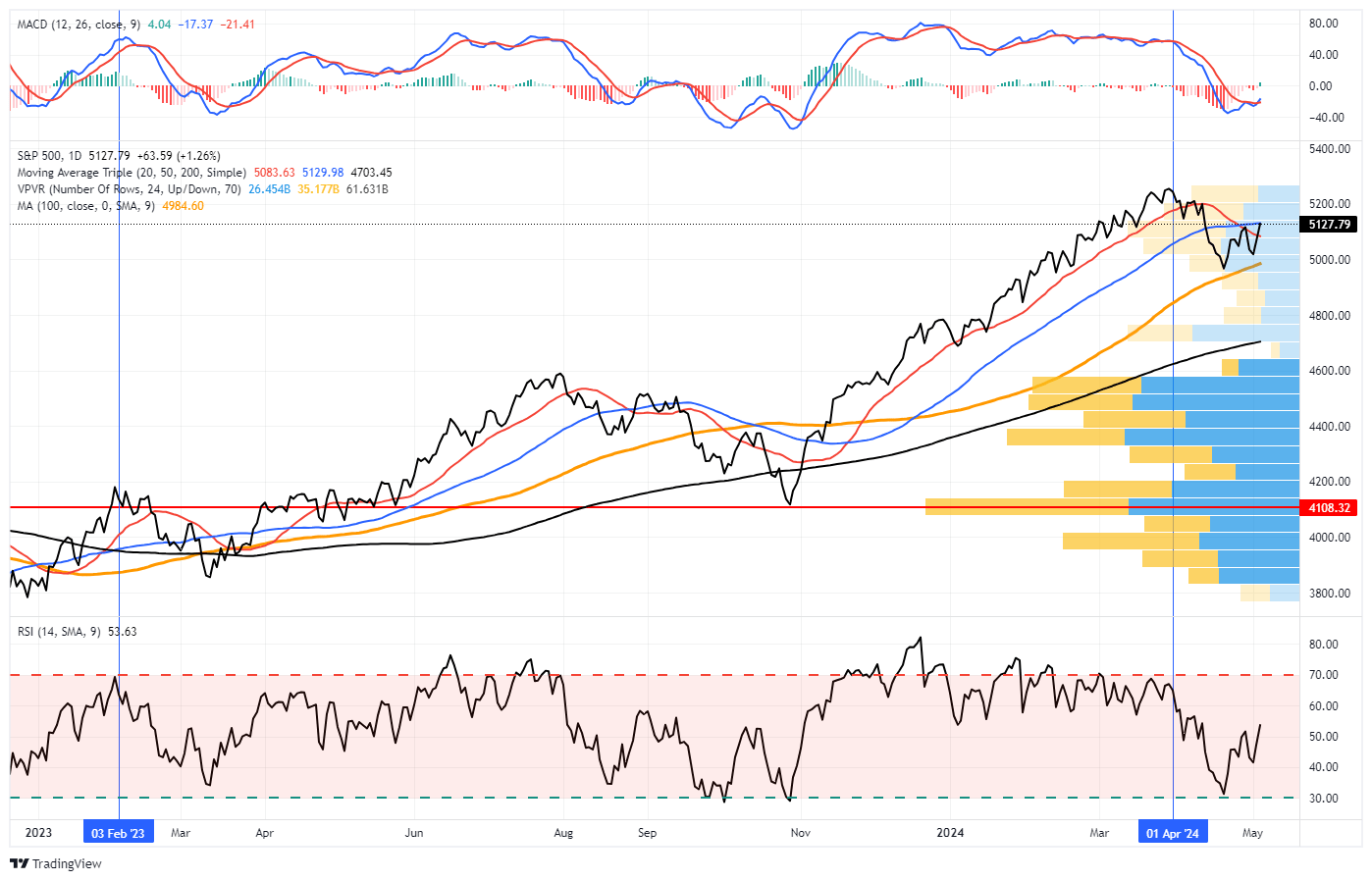
However, while the bullish market setup is intact in the near term, we continue to expect another decline this summer before the election. Historically, institutional players are reticent about holding long exposures heading into an election, so we often see weakness in September and October.
This week, we will delve into the topic of “stagflation.” Is it a myth or a fact?
Need Help With Your Investing Strategy?
Are you looking for complete financial, insurance, and estate planning? Need a risk-managed portfolio management strategy to grow and protect your savings? Whatever your needs are, we are here to help.

Economic Stagflation – What Is It?
Over the last few weeks, the term “economic stagflation,” or just stagflation, has buzzed in the financial markets and media. Of course, such is excellent fodder for clicks and views as it scares the “bejeebers” out of people.
The problem is that economic “stagflation” is a complex economic phenomenon with significant implications for investors and the broader economy. As Taylor Sohns recently noted:
“It’s a bit like having a skunk in your backyard – an unpleasant situation that’s hard to manage.”
However, to understand economic stagflation, we need a precise definition.
“Stagflation is an economic cycle characterized by slow [economic] growth and a high unemployment rate accompanied by inflation.” – Investopedia.
Economic stagflation is a rare economic phenomenon that is difficult for policymakers to handle as attempting to correct one issue tends to exacerbate the others.
Notably, while many point to the ’70s as an example of economic stagflation in the U.S., such was not the case. While the 70s did experience a sharp rise in inflation, much of that was due to strong economic growth rates nearing 15% annually. While the oil embargo of the ’70s certainly created economic uncertainty, the underlying economic growth rate was primarily responsible for higher prices. (Supply versus demand)
Regardless, the definition of economic stagflation was not met in the ’70s.
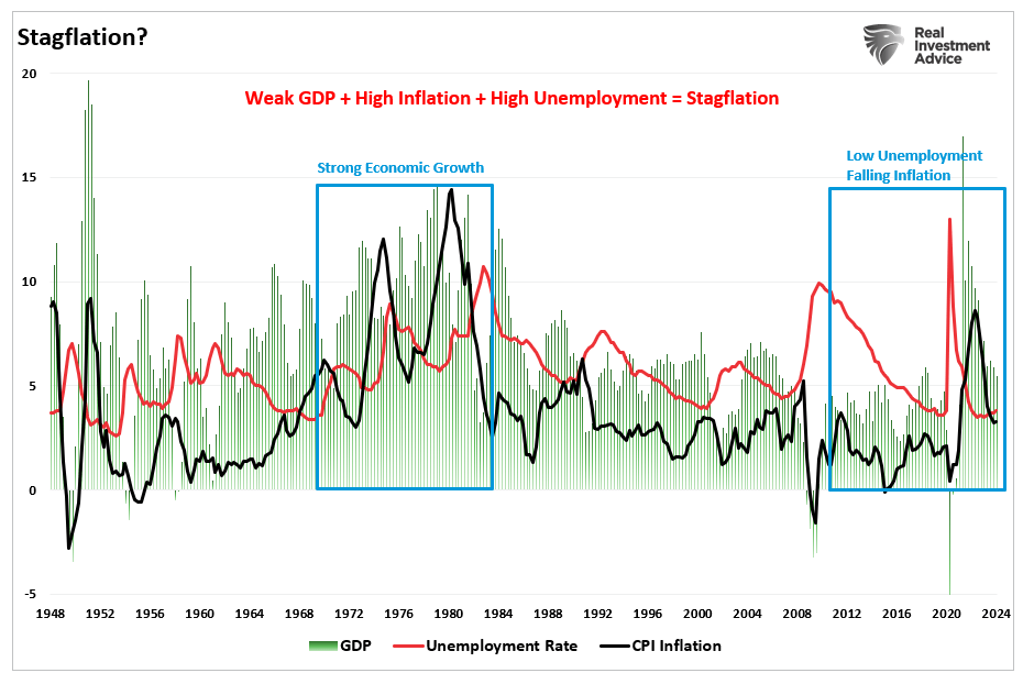
The same is true currently, as above-trend economic growth, falling inflation rates, and low unemployment certainly do not suggest economic stagflation is present.
So why the concern?
Short-Term Data Point Versus Long-Term Trends
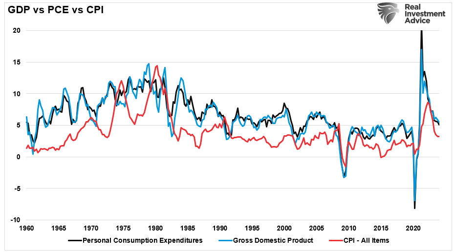
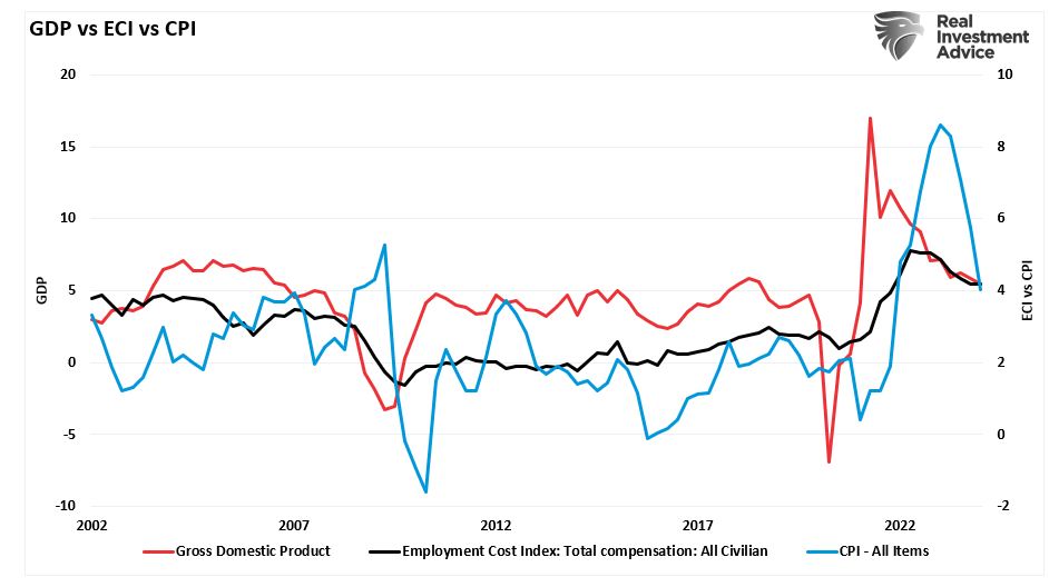
Recent data points have given more “bearish” commentators much to chew on. For example, the recent increase in the Personal Consumption Expenditures (PCE) price index was undoubtedly a reason for alarm when economic growth rates failed to meet expectations. Higher inflationary pressures and slower economic growth are two points of the economic stagflation equation.
The chart below shows the quarterly PCE price index versus economic growth. What is important to note is the PCE price index is very volatile. While the bearish media jumped on the increase in the last quarter, they entirely dismissed the previous quarter’s sharp drop.
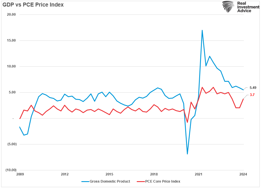
However, a very different picture emerges if we smooth the volatility of the quarterly PCE number using a 12-month average. The smoothed PCE price index correlates highly to CPI and GDP. Given that economic growth is slowing, as the flood of monetary stimulus and high savings rates reverse, the supply/demand imbalance that supported inflation is also reversing.
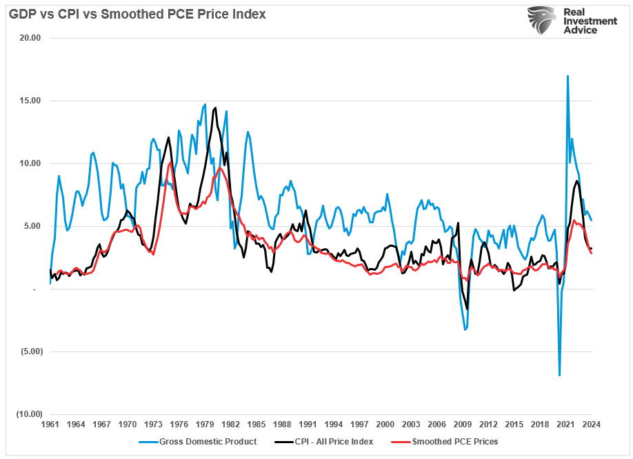
With unemployment rates still near record lows, there is little to suggest that economic stagflation is a real threat in the current environment. Crucially, while short-term price pressures may lead to “sticky inflation” in the near term, the longer-term pressure of higher borrowing costs continues to weigh on consumption. Given the PCE is nearly 70% of the GDP equation, as consumption goes, so goes economic growth and inflation.
Employment Cost Index Rises
Another piece of bearish fodder was the Employment Cost Index (ECI) for the first quarter. Unsurprisingly, the index spurted higher in the first quarter as annual bonuses, pay raises, and benefit changes all kicked in. Again, as with the PCE price index, the “stagflationistas” all previously dismissed the relatively sharp decline in the ECI index.
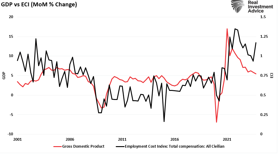
However, once again, if we look at the annual rate of change in the ECI, we find a more muted reality. Yes, employment costs are still high, a hangover from the pandemic-driven economic shutdown. However, those trends are reversing, and the bargaining power of labor for higher wages is reversing.
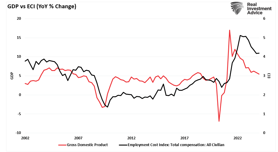
Unsurprisingly, given that consumers must produce first (work and get a paycheck) before they can consume, there is a high correlation between inflation, the economy, and employment costs. As the economy slows and unemployment rises, the cost of labor will decline.
This Isn’t The ’70s
I was born in the ’60s and lived my childhood in the ’70s. Almost 50 years later, financial commentators, some of whom were not alive, suggest that inflation and yields will repeat “That 70s Show.” Understandably, the increase in inflation and interest rates from their historic lows is cause for concern. As James Bullard noted, “Inflation is a pernicious problem,” which is why the Federal Reserve lept into action.
“When the US Federal Reserve embarked on an aggressive campaign to quash inflation last year, it did so with the goal of avoiding a painful repeat of the 1970s, when inflation spun out of control and economic malaise set in.” – CNN
The Federal Reserve’s concern about “spiraling inflation” remains key in its current monetary policy decisions. Such has also pushed many economists to look back at history, using “That 70s Show” period as the yardstick for justifying their concerns about a resurgence of economic stagflation.
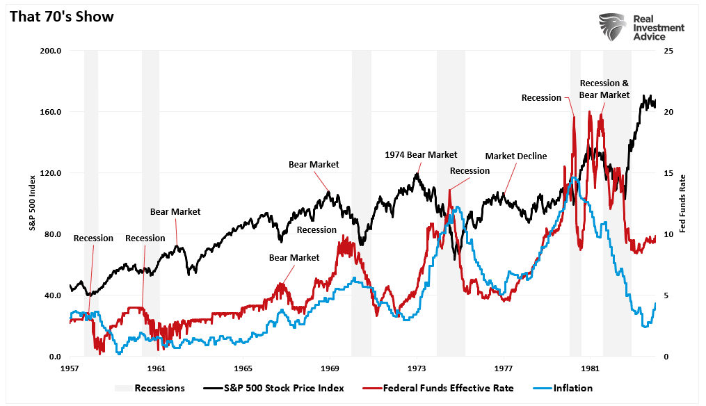
However, there are some critical primary differences between today and the 1970s.
It’s All About The Debt
Notably, the Government ran no deficit, and household debt to net worth was about 60%. So, while inflation increased and interest rates rose in tandem, the average household could sustain its living standard. The chart shows the difference between household debt and incomes in the pre-and post-financialization eras.
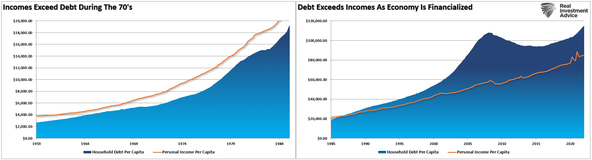
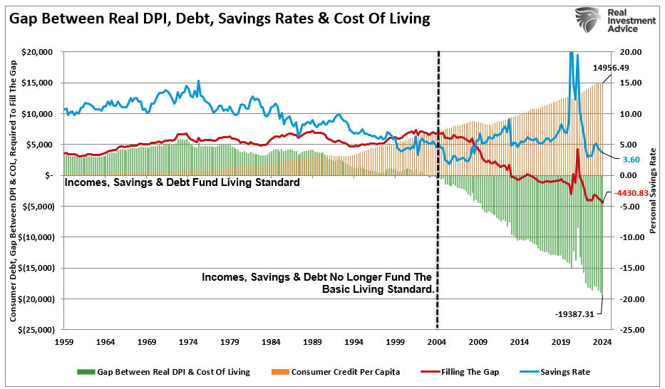
With the Government running a deep deficit with debt exceeding $34 trillion, consumer debt at record levels, and economic growth rates fragile, consumers’ ability to withstand higher inflation and interest rates is limited. As noted previously, the “gap” between income and savings to sustain the standard of living is at record levels. The chart shows the gap between the inflation-adjusted cost of living and the spread between incomes and savings. It currently requires more than $4400 of debt annually to fill the “gap. “
While the Fed is currently engaged “in the fight of its life,” trying to quell inflation, The economic differences are vastly different today. Due to the heavy debt burden, the economy requires lower interest rates to sustain even meager economic growth rates of 2%. Historically, economists considered such levels as “pre-recessionary,” but today, 2% growth is a level economists hope to maintain.
Furthermore, the changes in structural employment, demographics, and deflationary pressures derived from changes in productivity will magnify these problems.
The reality is that while “economic stagflation” may appear to be a short-term problem, the debt dynamics remain highly disinflationary in the long term.
As Jerome Powell quipped during the latest FOMC presser:
‘So I don’t see the ‘stag’ or the ‘flation.'”
The reality is, you probably shouldn’t either.
How We Are Trading It
This week’s important lesson for investors is to pay less attention to “media headlines.” Remember that for a media personality to make money, they need views, clicks, and reads. Since “doom and gloom” gets attention, it is an easy platform to peddle from.
Investors should step back and pay attention to the actual data. Crucially, what economic data does in a month or a quarter has minimal impact in the long term. This is why paying attention to the trend of the data is far more important.
With our portfolios rebalanced, we watch the current corrective cycle for opportunities to increase exposure. This earnings season has been “hit and miss” on many fronts, but for the most part, it has been supportive of the overall market. We continue to look for market mispricing in holdings for opportunistic positioning, but we remain cautious until we are confident the current correction is behind us.
Continue to manage risk accordingly and pay less attention to the headlines.
I promise you will sleep better.
Have a great week.
Research Report

Subscribe To “Before The Bell” For Daily Trading Updates
We have set up a separate channel JUST for our short daily market updates. Please subscribe to THIS CHANNEL to receive daily notifications before the market opens.
Click Here And Then Click The SUBSCRIBE Button
Subscribe To Our YouTube Channel To Get Notified Of All Our Videos
Bull Bear Report Market Statistics & Screens

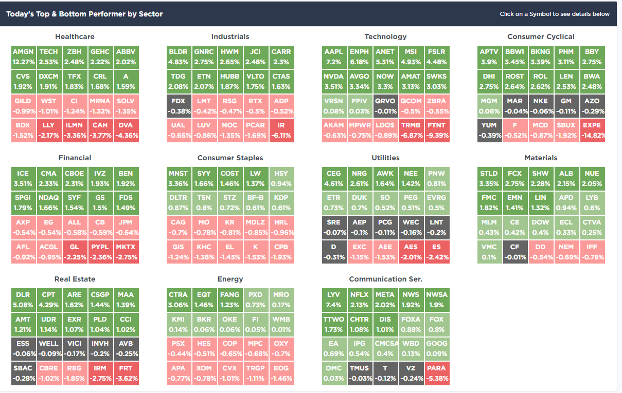
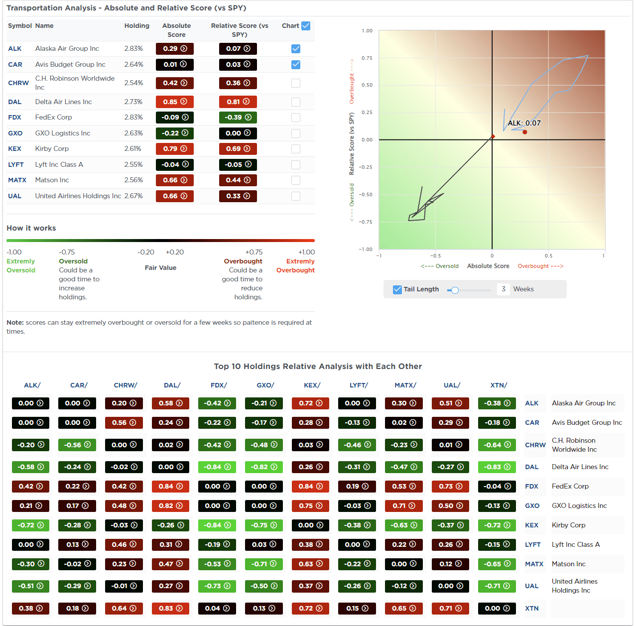
SimpleVisor Top & Bottom Performers By Sector
S&P 500 Weekly Tear Sheet
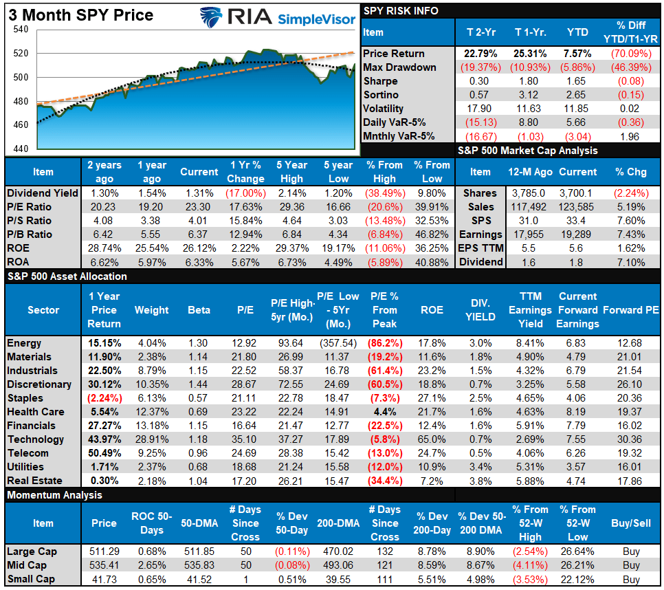
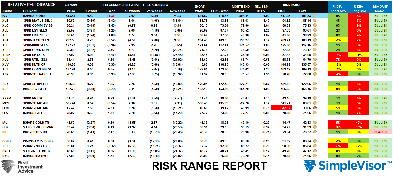
Relative Performance Analysis
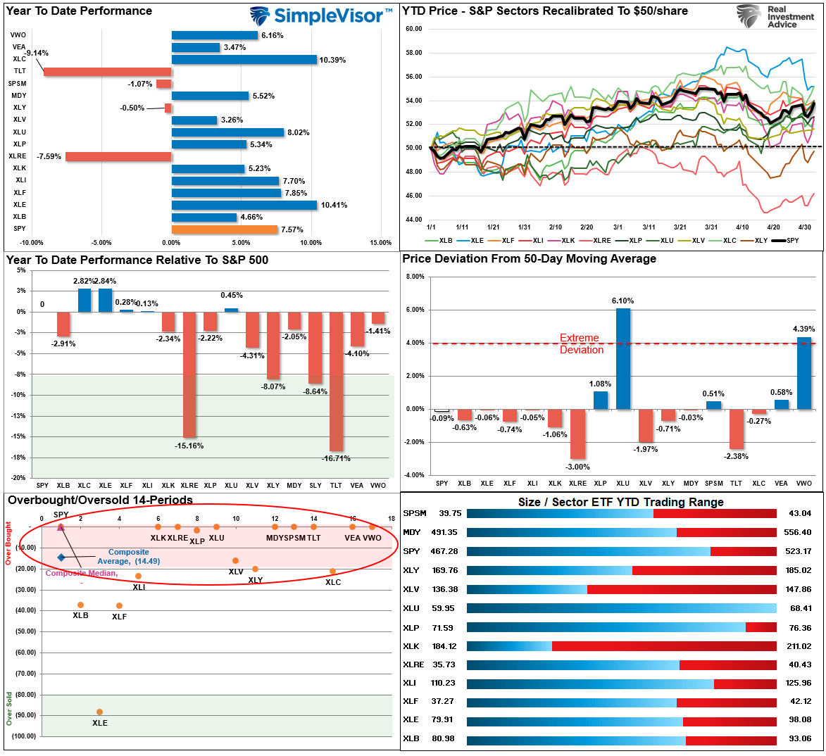
Last week, we noted that “most markets and sectors are now oversold, which suggests we could see a bit of buying next week with the market sitting on the 100-DMA.” That rally came this past week with the market recovering to the first resistance level at the 50-DMA. Given the short-term overbought conditions of most sectors and the market testing resistance at the 50-DMA, this is an excellent spot to rebalance risks as needed. We could see some selling pressure next week as traders profit from the recent rally.
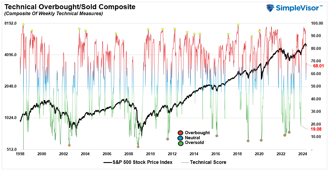
Technical Composite
The technical overbought/sold gauge comprises several price indicators (R.S.I., Williams %R, etc.), measured using “weekly” closing price data. Readings above “80” are considered overbought, and below “20” are oversold. The market peaks when those readings are 80 or above, suggesting prudent profit-taking and risk management. The best buying opportunities exist when those readings are 20 or below.
The current reading is 68.01 out of a possible 100.
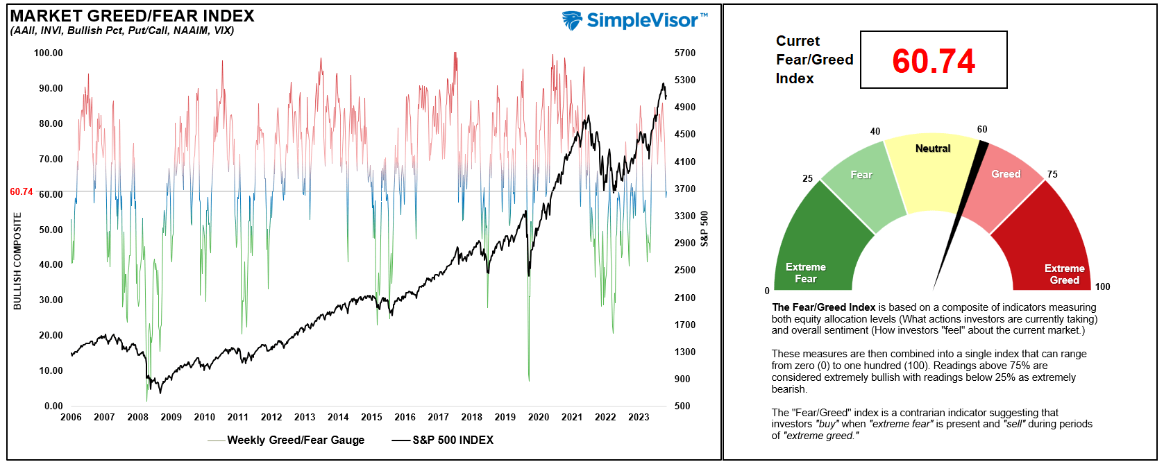
Portfolio Positioning “Fear / Greed” Gauge
The “Fear/Greed” gauge is how individual and professional investors are “positioning” themselves in the market based on their equity exposure. From a contrarian position, the higher the allocation to equities, the more likely the market is closer to a correction than not. The gauge uses weekly closing data.
NOTE: The Fear/Greed Index measures risk from 0 to 100. It is a rarity that it reaches levels above 90. The current reading is 60..74 out of a possible 100.
Relative Sector Analysis
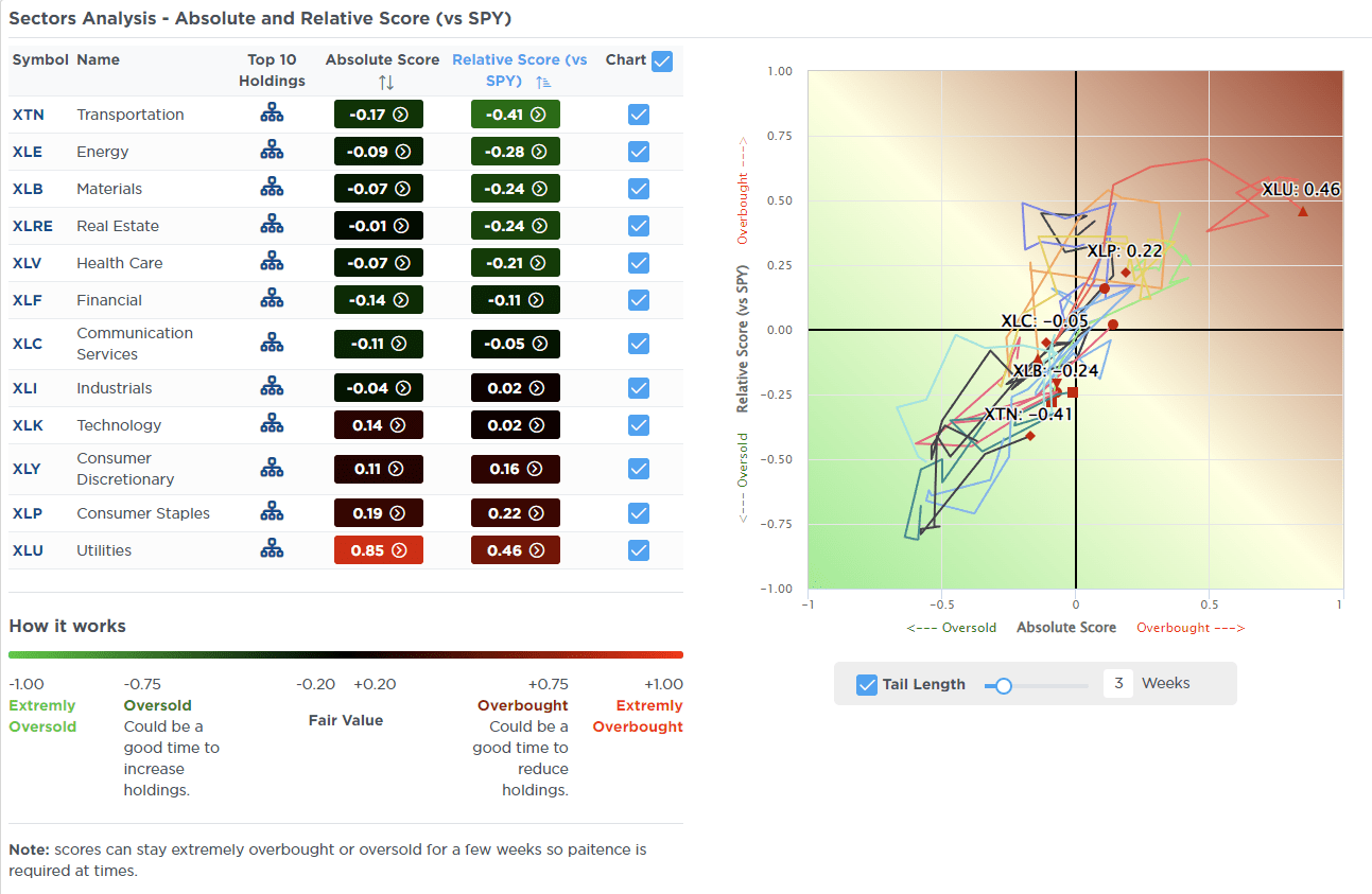
Most Oversold Sector Analysis
Sector Model Analysis & Risk Ranges
How To Read This Table
- The table compares the relative performance of each sector and market to the S&P 500 index.
- “MA XVER” (Moving Average Crossover) is determined by the short-term weekly moving average crossing positively or negatively with the long-term weekly moving average.
- The risk range is a function of the month-end closing price and the “beta” of the sector or market. (Ranges reset on the 1st of each month)
- The table shows the price deviation above and below the weekly moving averages.
As noted last week:
“While that correction is not yet likely complete, a majority of markets and sectors have reached levels that suggest a bounce.“
That bounce came last week, and there is potentially further upside in the near term, with many sectors reversing some of their previous double-digit deviations from long-term weekly means. The table resets on the first of each month, so next week, we will have a better gauge of risk/reward ranges for the month.
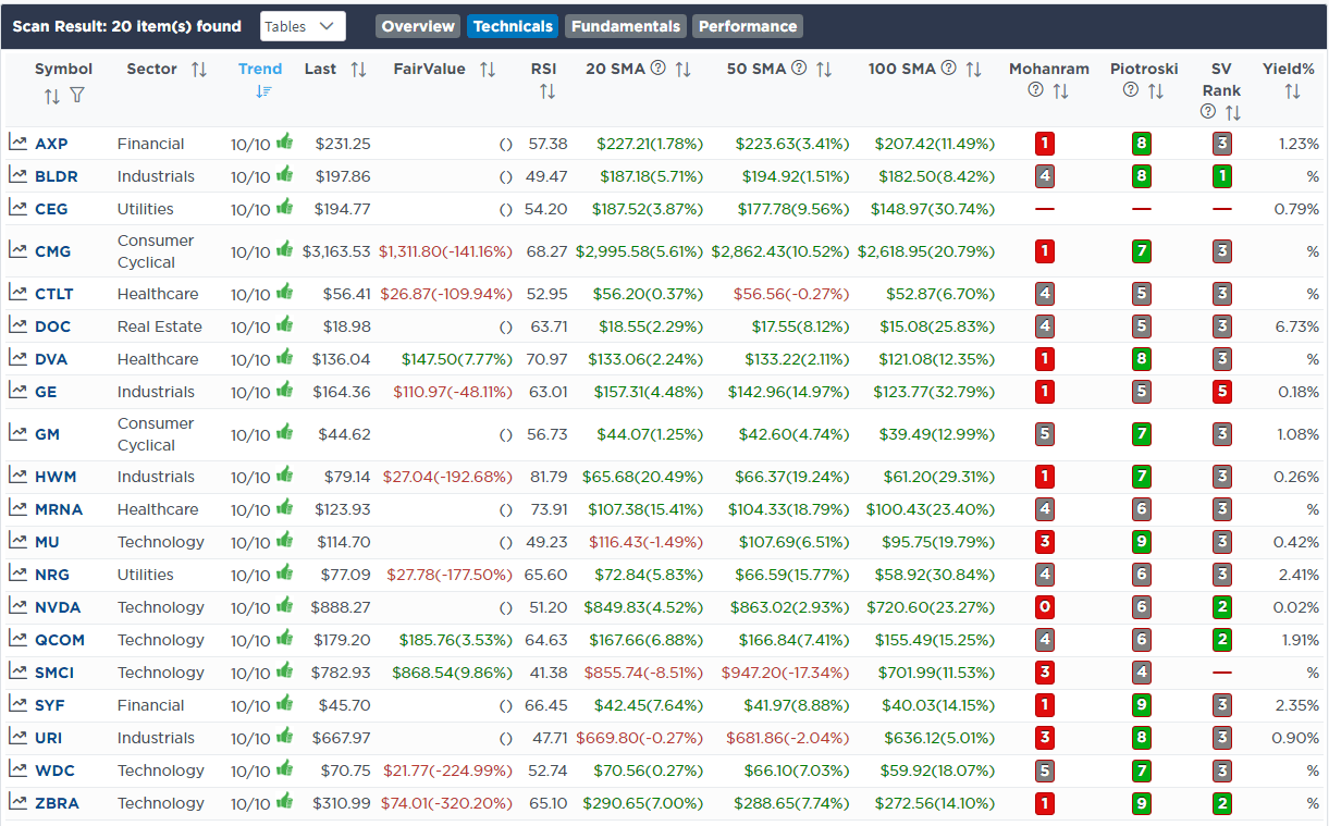
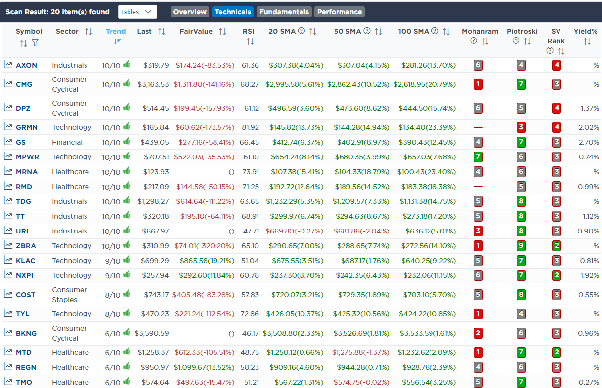
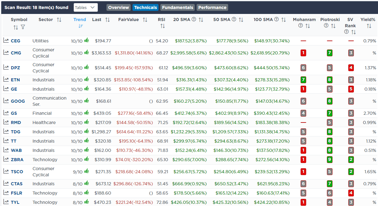
Weekly SimpleVisor Stock Screens
We provide three stock screens each week from SimpleVisor.
This week, we are searching for the Top 20:
- Relative Strength Stocks
- Momentum Stocks
- Fundamental & Technical Strength W/ Dividends
(Click Images To Enlarge)
RSI Screen
Momentum Screen
Fundamental & Technical Screen
SimpleVisor Portfolio Changes
We post all of our portfolio changes as they occur at SimpleVisor:
May 3rd
“I give up! I have tried a couple of times to add value and fundamentals to the portfolio with CVS (CVS) which trades at an insanely cheap valuation with a good dividend. However, it is just one bad piece of news after another. The latest earnings announcement is just the latest catastrophe for the company. As such, we are swapping CVS for American Electric Power (AEP) in the Dividend Model and bringing Meta (META) to target weight. We are overweight electric utilities in the portfolio based on the coming power consumption needs of data centers for Artificial Intelligence.
In the Equity Model, Stanley Black & Decker (SWK) reported earnings that were better than estimates, and executive commentary was very upbeat. They are well positioned for a slower growth economy where DIY house projects will become more common. As such, we are using yesterday’s selloff to bring SWK up to 3.5% of the portfolio today.”
Equity Model
- Increase Stanley Black & Decker (SWK) to 3.5% of the portfolio
Dividend Equity Model
- Increase Meta (META) to 5% of the portfolio.
- Sell 100% of CVS (CVS) in the portfolio.
- Initiate a 3.3% position in American Electric Power (AEP)

Lance Roberts, C.I.O.
Have a great week!