Tag Archives: bear market

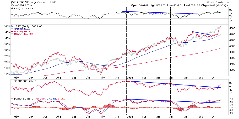
Overly Optimistic Investors Face Potential Disappointment

Overly optimistic investor expectations of market returns may be a problem. To wit:

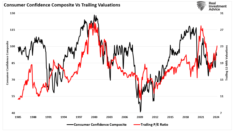
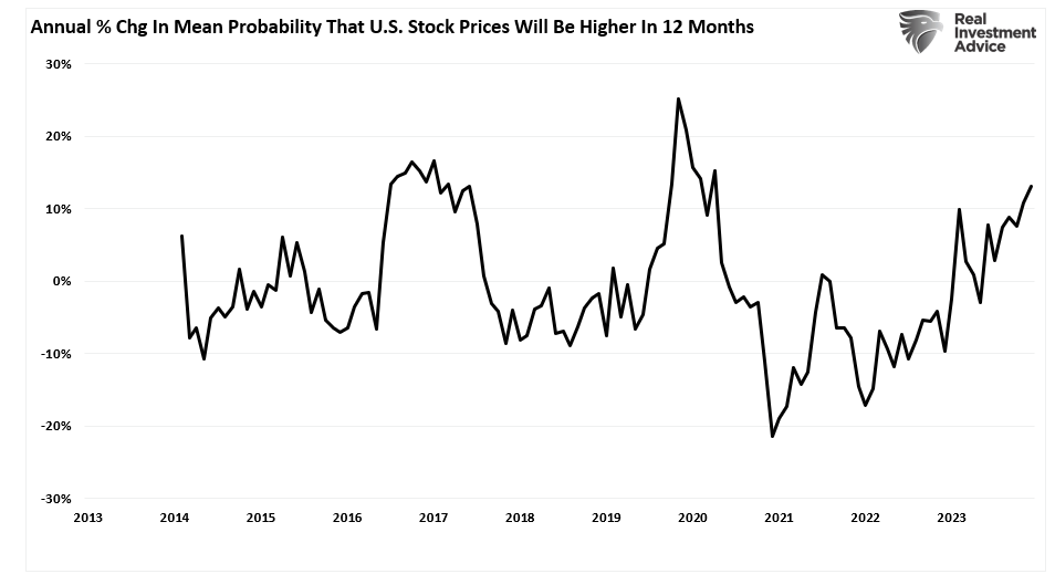
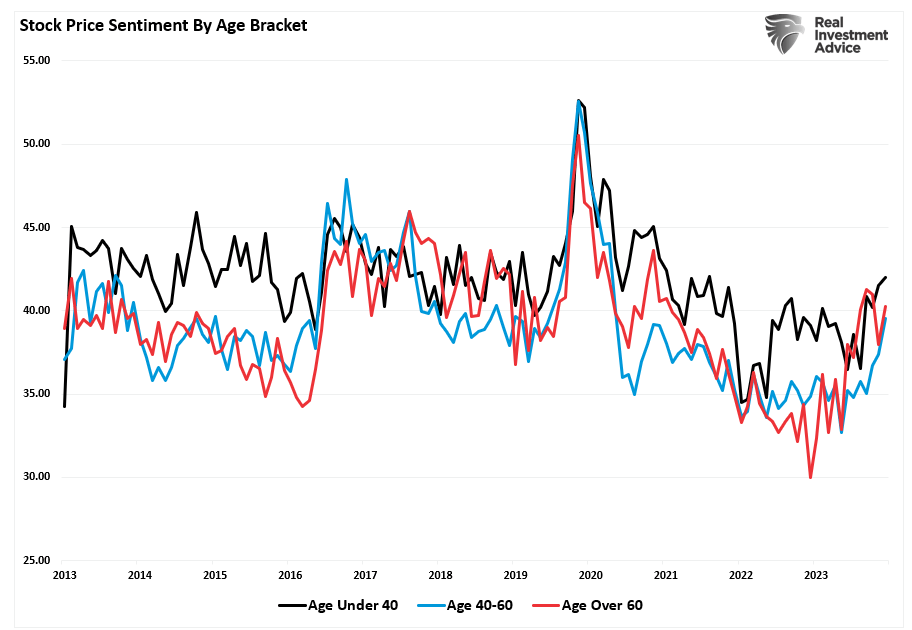
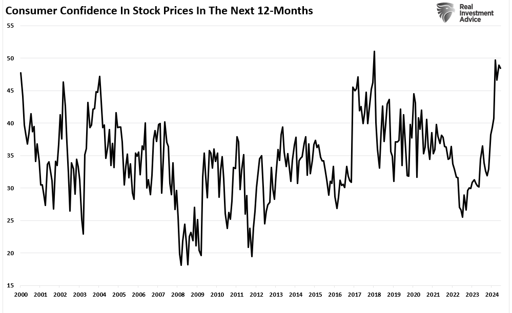
“While consumers are not very confident about the economy, they are highly optimistic about the stock market. In that same consumer confidence report from the Conference Board, the expectations for rising stock prices over the next 12 months are near the highest on record.

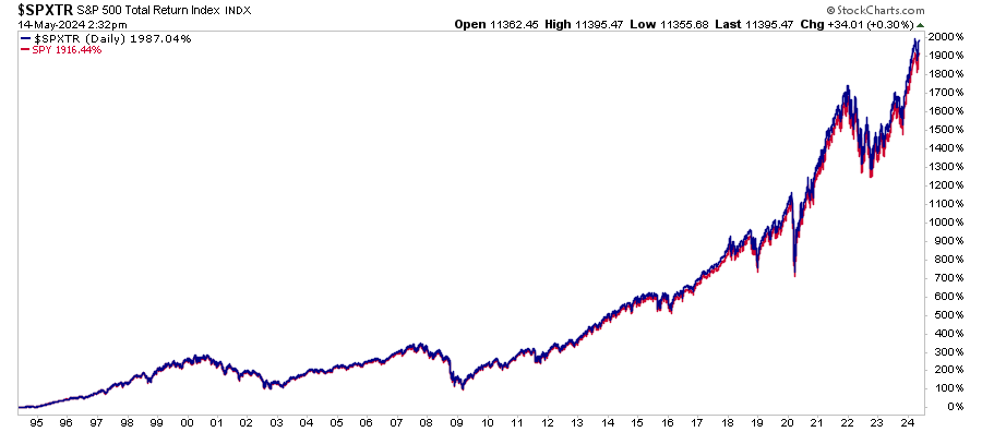
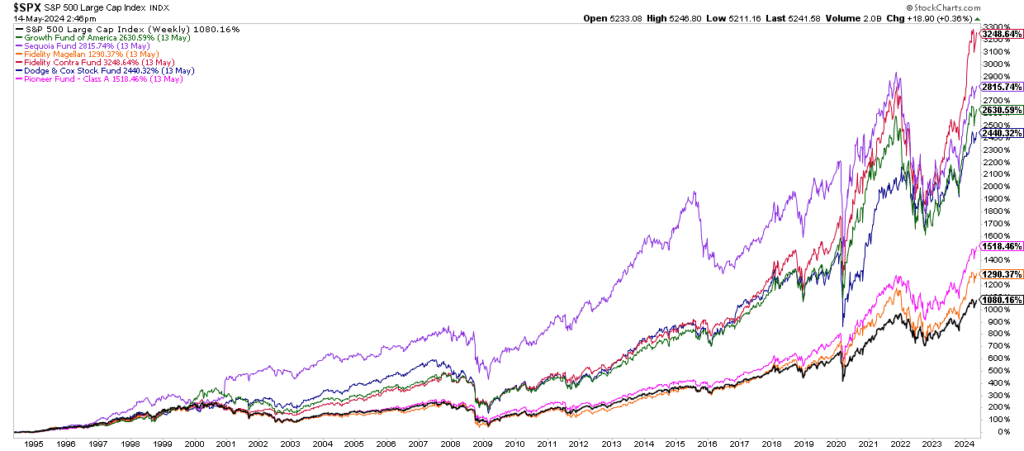
Of course, after a decade of 12% returns, why should they not be optimistic that the future will be much the same as the past? A good example came from a recent discussion with an individual wanting me to review the “financial plan” for their retirement goals. The plan was generated by one of the many “off the shelf” software packages that take all the inputs of income, assets, pensions, social security, etc., and then spits out assumptions of future asset values and drawdowns in retirement.

The problem is that the return assumptions were grossly flawed.

In the vast majority of these plans, the optimistic assumption is that individuals will have a rate of return of somewhere between 6-10% annually heading into retirement and 4-8% thereafter. The first major flaw in the plan is the “compounding” of annual returns over time, which does NOT happen.

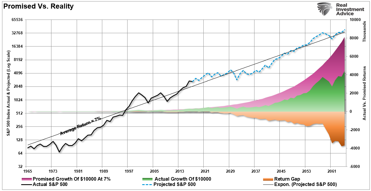
“There is a massive difference between AVERAGE and ACTUAL returns on invested capital. Thus, in any given year, the impact of losses destroys the annualized “compounding” effect of money.

The chart below shows the difference between “actual” investment returns and “average” returns over time. See the problem? The purple-shaded area and the market price graph show “average” returns of 7% annually. However, the return gap in “actual returns,” due to periods of capital destruction, is quite significant.”

Average versus actual retunrs

The second and most important is the future expectation of individual returns over the next 10-20 years.

This second point is what I want to address today.

There are two main reasons why returns over the next decade or two are currently overestimated. The first is a “you problem,” and the second is “math.”

It’s A You Problem

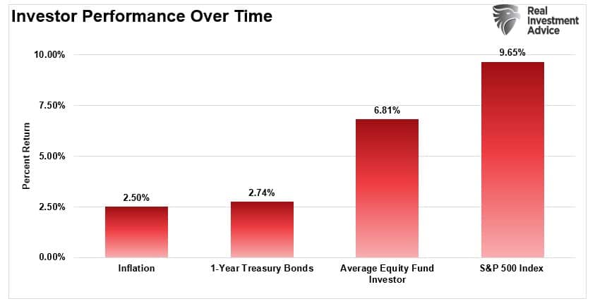
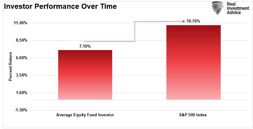
Back in 2016, I wrote an article discussing a Dalbar investor study explaining why investors consistently “suck” at investing. As I detailed in that article, one of the biggest impediments to achieving long-term investment returns is the impact of emotionally driven investment mistakes.

Investor psychology helps us to understand the thoughts and actions that lead to poor decision-making. That psychology drives the “buy high/sell low” syndrome and the traps, triggers, and misconceptions that lead to irrational mistakes that reduce returns over time.

As the Dalbar study showed, nine distinct behaviors impede optimistic investors based on their personal experiences and unique personalities.

Dalbar-Psychology-061316

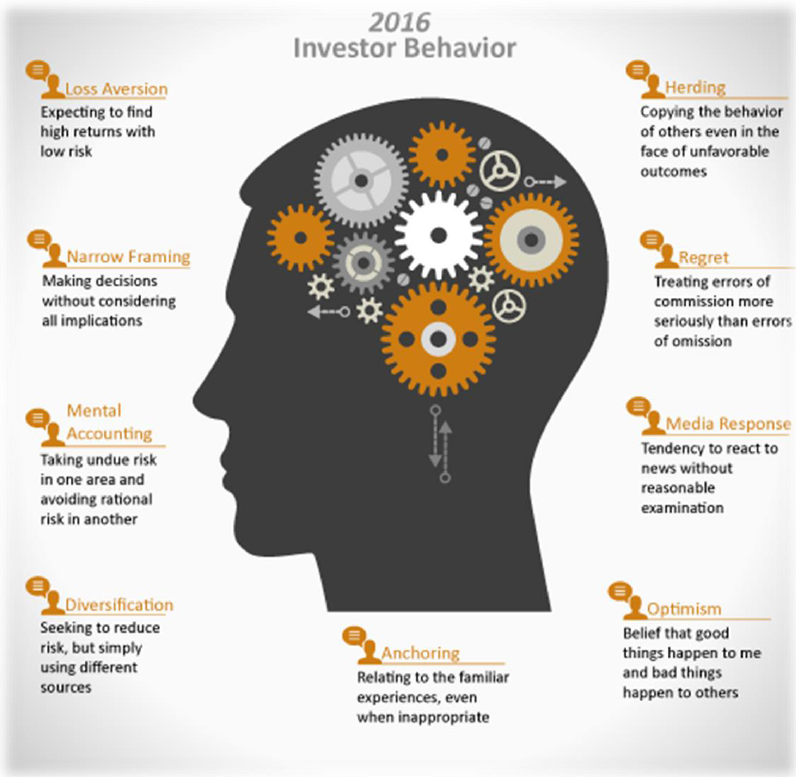
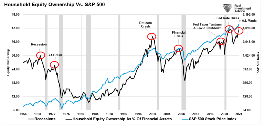
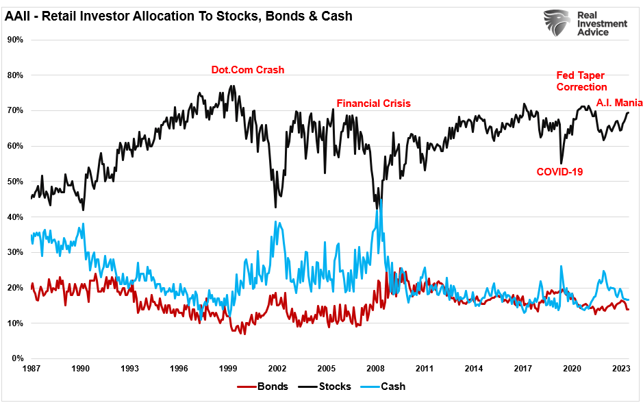
The most significant problems for individuals are the “herding effect” and “loss aversion.”

These two behaviors tend to function together compounding the issues of investor mistakes over time. As markets are rising, individuals are optimistic the current price trend will continue to last for an indefinite period. The longer the rising trend last, the more ingrained that optimistic belief becomes until the last of “holdouts” finally “buys in” as the financial markets evolve into a “euphoric state.”

As the markets decline, there is a slow realization that “this decline” is something more than a “buy the dip”opportunity. As losses mount, the anxiety of loss begins to mount until individuals seek to “avert further loss” by selling.

As shown in the chart below, this behavioral trend runs counter-intuitive to the “buy low/sell high” investment rule.”

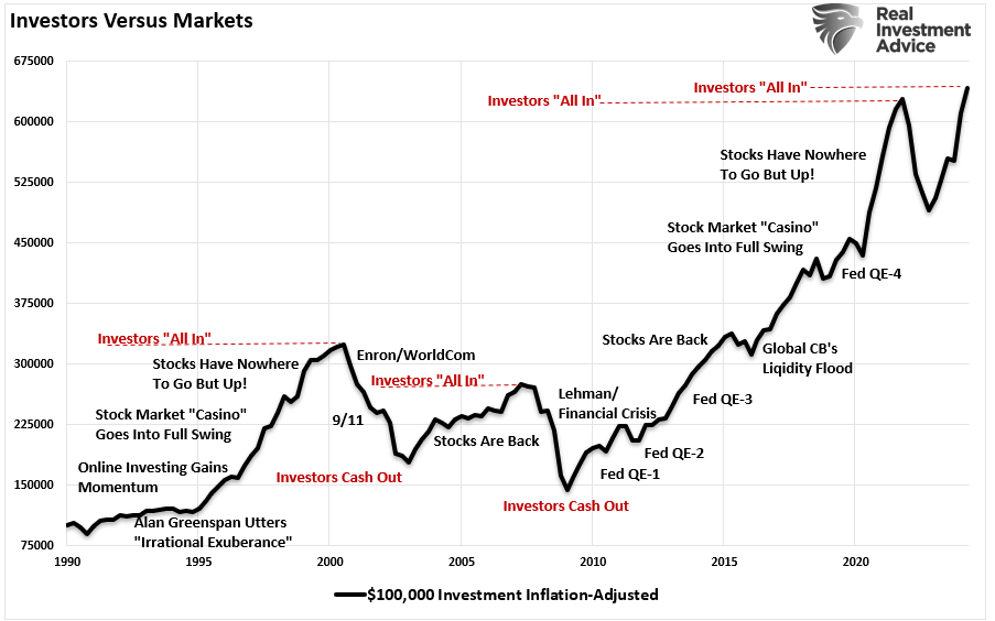
“In the end, we are just human. Despite the best of our intentions, it is nearly impossible for an individual to be devoid of the emotional biases that inevitably lead to poor investment decision-making over time. This is why all great investors have strict investment disciplines that they follow to reduce the impact of human emotions.

More importantly, despite studies that show that “buy and hold,” and “passive indexing” strategies, do indeed work over very long periods of time; the reality is that few will ever survive the downturns in order to see the benefits.”

The impact of these emotionally driven mistakes leads to long-term underperformance below those “goal-based” financial projections.

It’s Just Math 

“But Lance, the markets has returned 10% on average over the last century, so I will probably be okay.”

True. If you can contract “vampirism,” avoid sunlight, garlic, and crosses, you can live long enough to achieve the “average annual rate of return” over the last 124 years.

For the rest of us mere mortals, and why “duration matching” is crucial, we only have between today and retirement to reach our goals. For the majority of us – that is about 15 years.

And therein lies the problem.

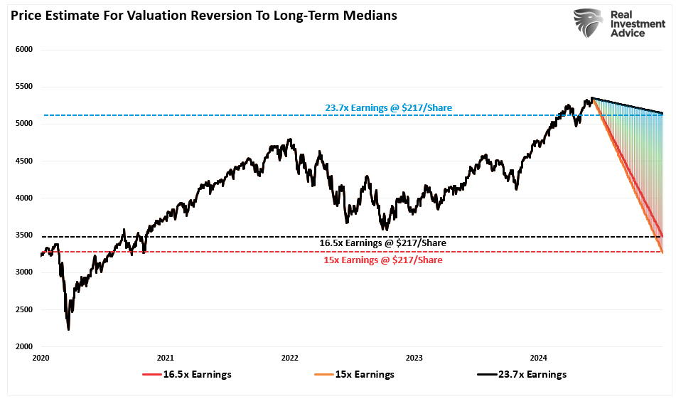
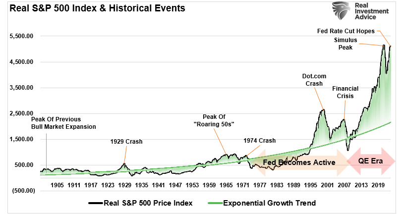
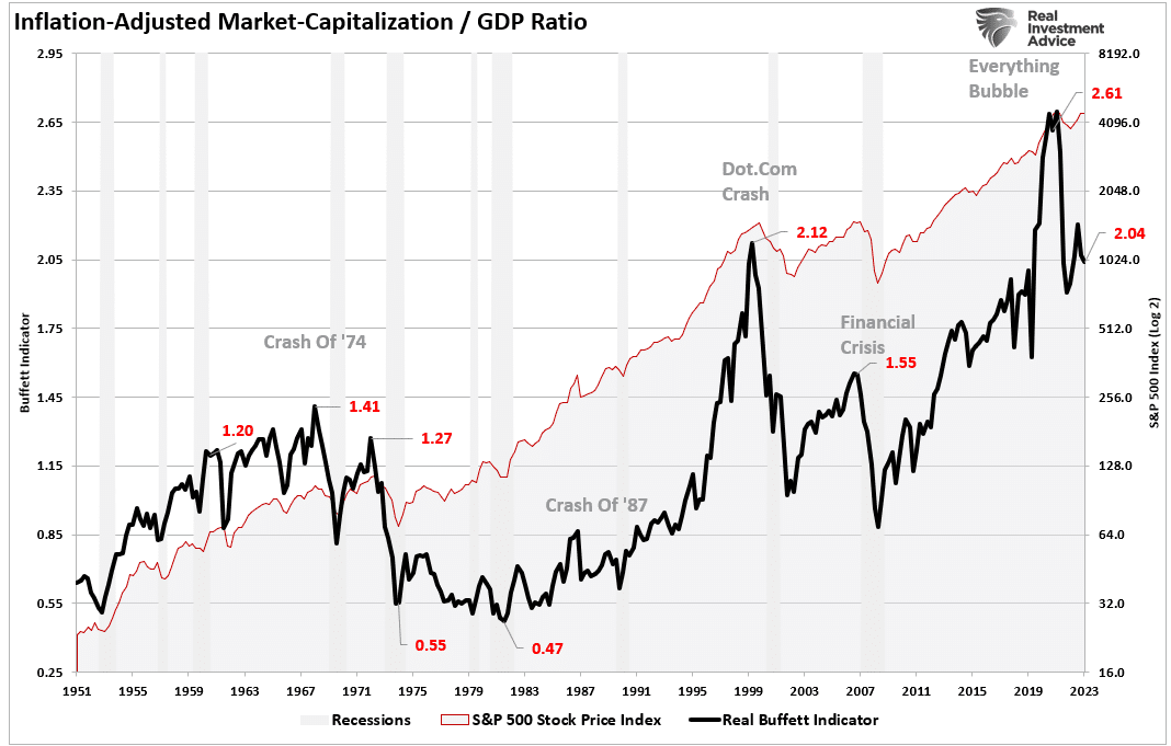
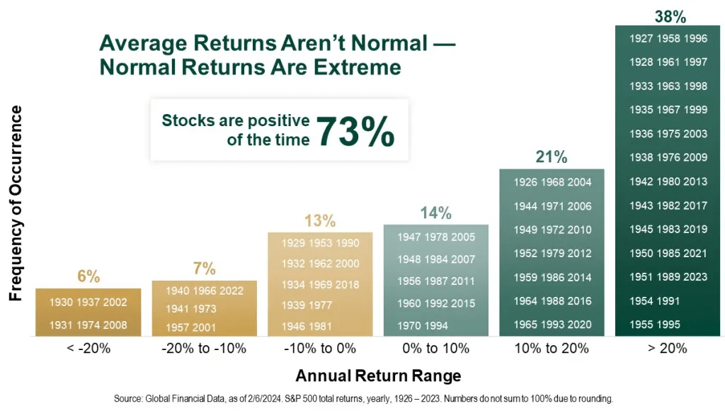
Despite much of the commentary that continues to suggest we are in a long-term secular bull market, the math suggests something substantially different. However, it is essential to understand that when low future rates of return are discussed, it does not mean that each year will be low, but the return for the entire period will be low. 

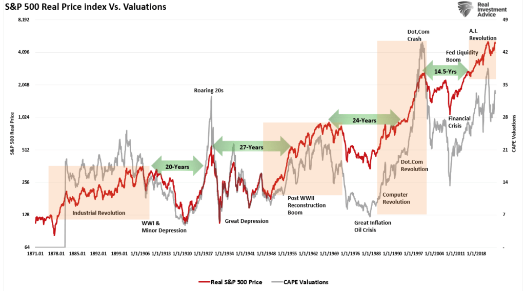
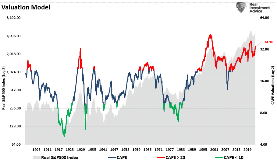
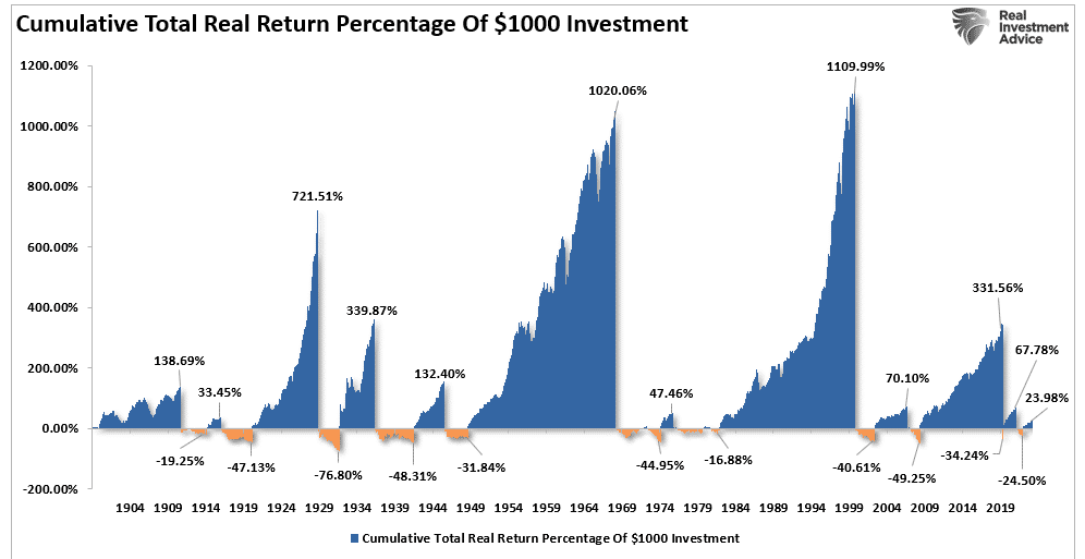
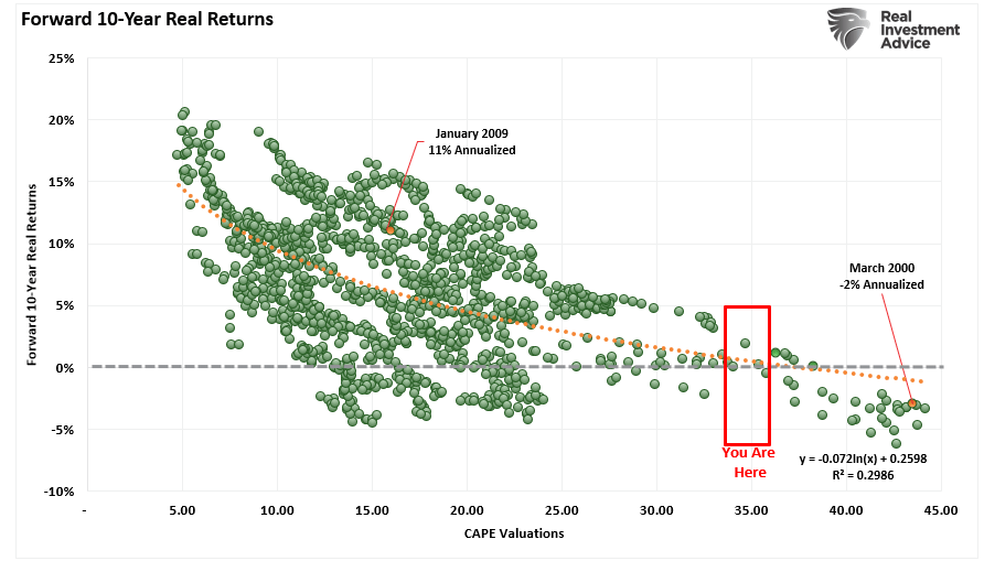
The charts below show the 10- and 20-year rolling REAL, inflation-adjusted returns for the markets compared to trailing valuations.

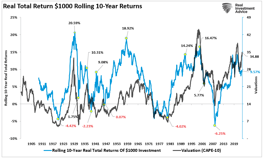
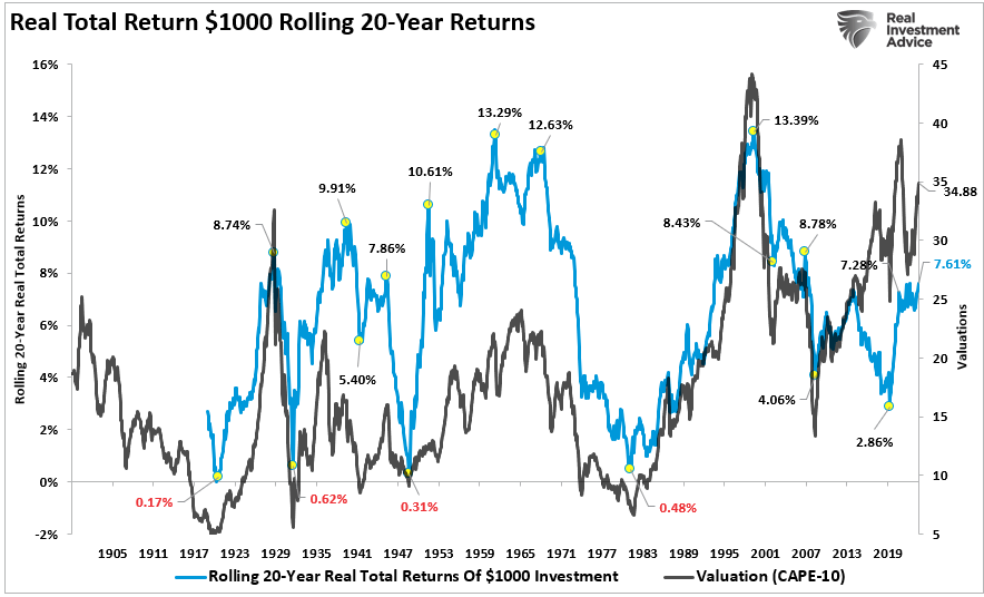
(Important note: Many advisors/analysts often pen that the market has never had a 10 or 20-year negative return. That is only nominal and should be disregarded as inflation must be included in the debate.)

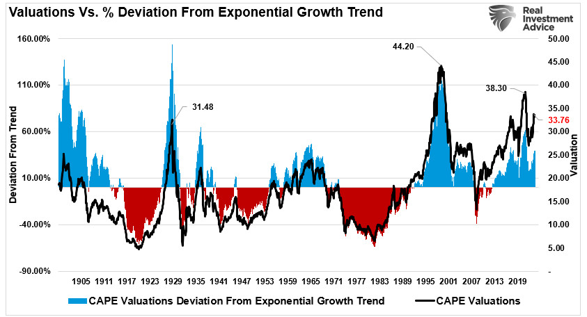
There are two crucial points to take away from the data. First, there are several periods throughout history where market returns were near zero and negative. Secondly, the periods of low returns follow periods of excessive market valuations. Such suggests that betting “This time is not different” may not work well.

As David Leonhardt noted previously:

“The classic 1934 textbook ‘Security Analysis’ – by Benjamin Graham, a mentor to Warren Buffett, and David Dodd – urged investors to compare stock prices to earnings over ‘not less than five years, preferably seven or ten years.’ Ten years is enough time for the economy to go in and out of recession. It’s enough time for faddish theories about new paradigms to come and go.

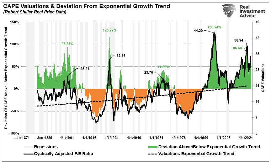
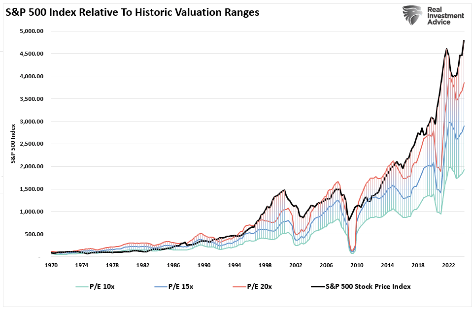
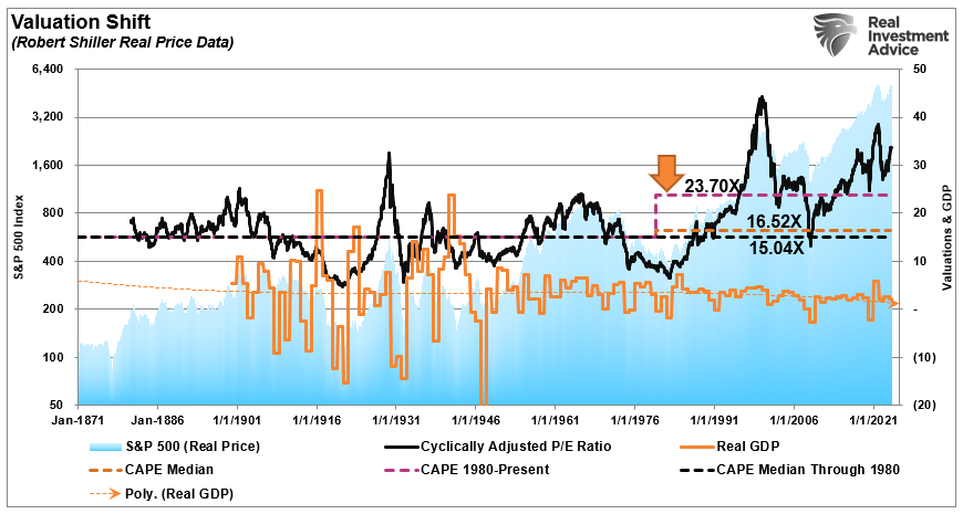
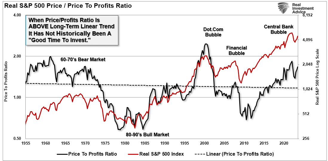
History shows that valuations above 23x earnings have tended to denote secular bull market peaks. Conversely, valuations at 7x earnings or less have tended to denote secular bull market starting points.

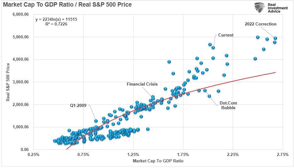
This point is proven simply by looking at the distribution of returns as compared to valuations over time.

From current levels, history suggests that returns to investors over the next 10 and 20 years will likely be lower than higher. However, as I said, we can also prove this mathematically. As I discussed in “Rising Bullishness:”
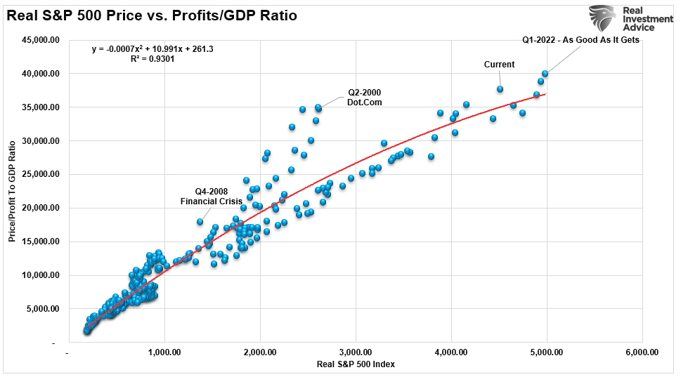
Capital gains from markets are primarily a function of market capitalization, nominal economic growth, plus dividend yield. Using John Hussman’s formula, we can mathematically calculate returns over the next 10-year period as follows:

(1+nominal GDP growth)*(normal market cap to GDP ratio / actual market cap to GDP ratio)^(1/10)-1

Therefore, IF we assume that GDP could maintain 2% annualized growth in the future, with no recessions ever, AND IF current market cap/GDP stays flat at 2.0, AND IF the dividend yield remains at roughly 2%, we get forward returns of:

(1.02)*(1.2/1.5)^(1/10)-1+.02 = -(1.08%)

But there are a “whole lotta ifs” in that assumption. Most importantly, we must also assume the Fed can get inflation to its 2% target, reduce current interest rates, and, as stated, avoid a recession over the next decade.”

In either case, these numbers are well below most financial plan projections, leaving retirees well short of their expected retirement goals. 

Ad for SimpleVisor. Don't invest alone. Tap into the power of SimpleVisor. Click to sign up now.

Conclusion

While most analysis assumes that individuals should “buy and hold” indexed-based portfolios, the reality is quite different.

Retirement plans have a finite period for asset accumulation and distribution. The time lost “getting back to even” following a significant market correction should be a primary consideration.

Unfortunately, most investors remain woefully behind their promised financial plans. Given current valuations and the ongoing impact of “emotional decision-making,” the outcome will not likely improve over the next decade or two.

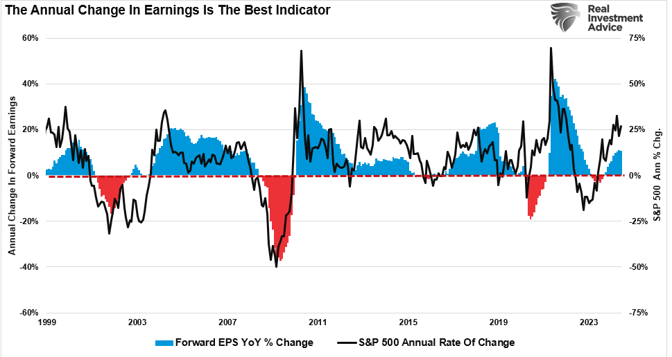
Markets are not cheap by any measure. If earnings growth slows, interest rates remain elevated, and demographic trends impact the economy, the bull market thesis will disappoint as “expectations” collide with “reality.” 

Such is not a dire doom and gloom prediction or a “bearish” forecast. It is just a function of how the “math works over time.”

For optimistic investors, understanding potential returns from any given valuation point is crucial when considering putting their “savings” at risk. Risk is an important concept as it is a function of “Loss.

The more risk taken within a portfolio, the greater the destruction of capital will be when reversions occur.

This time is “not different.” The only difference will be what triggers the next valuation reversion when it occurs. If the last two bear markets haven’t taught you this by now, I am unsure what will. 

Maybe the third time will be the “charm.”

The Bull Market – Could It Just Be Getting Started?

We noted last Friday that over the previous few years, a handful of “Mega-Capitalization” (mega-market capitalization) stocks have dominated market returns and driven the bull market. In that article, we questioned whether the dominance of just a handful of stocks can continue to drive the bull market. Furthermore, the breadth of the bull market rally has remained a vital concern of the bulls. We discussed that issue in detail in “Bad Breadth Keeps Getting Worse,”

While the market is making all-time highs as momentum continues, its breadth is narrowing. The number of stocks trading above their respective 50-DMA continues to decline as the market advances, along with the MACD signal. Furthermore, the NYSE Advance-Decline line and the Relative Strength Index (RSI) have reversed, adding to the negative divergences from a rising market. While this does not mean the market is about to crash, it does suggest that the current rally is weaker than the index suggests.

Since the beginning of this year, the “bad breadth” issue has been a concern for the current bull market rally. Such is because, historically speaking, periods of narrow market advances typically precede short-term corrections and bear markets. As Bob Farrell once noted:

“Markets are strongest when broad, and weakest when narrow.”

However, as the Federal Reserve prepares to cut rates for the first time since 2020, there seems to be a change afoot. Following the most recent Consumer Price Index (CPI) report, there was an evident rotation from the previous market leaders to the laggards. More importantly, the breadth of the market has improved markedly, with the NYSE Advance-Decline hitting all-time highs. Furthermore, the previous negative divergences in the Relative Strength Index (RSI) and the number of stocks above their 50-DMA also reversed higher.

What does that mean?

“The market action as of late has been refreshing and could be the sign of a maturing bull market, where a wide range of stocks are contributing to the rally, providing more support for stock indexes at record levels.”Yahoo Finance

Historically, improving breadth suggests that the bull market’s health is improving. However, while breadth has undoubtedly improved, with the bulls encouraged by the prospect of Federal Reserve rate cuts, is the recent broadening of the market sustainable? Maybe. However, as Sentiment Trader recently noted:

“After more than a month of meaningful divergences between indexes and individual stocks, those were largely resolved in a historic shift late last week. While a new high in cumulative breadth has been a positive long-term sign, returns were more questionable in the shorter term when the S&P 500 had far outpaced market-wide breadth.”

In this particular case, we agree. There are risks to this current rally in small-cap stocks worth understanding.

Risks To The Russell

With the Fed cutting rates and the prospect of a pro-growth, tax-cut, and tariff-friendly President, it is unsurprising to see narratives about why the market rally will broaden with Small and Mid-capitalization companies taking leadership.

However, while such could be the case, many problems still plague these companies. As we noted in this past weekend’s Bull Bear Report:

First, nearly 40% of the Russell 2000 is unprofitable.

“However, some issues also plague smaller capitalization companies that remain. The first, as noted by Goldman Sachs, remains a fundamental one.

“I’m surprised how easy it is to find someone who wants to call the top in tech and slide those chips into small cap. Aside from the prosect of short-term pain trades, I don’t get the fundamental argument for sustained outperformance of an index where 1-in-3 companies will be unprofitable this year.”

As shown in the chart by Apollo below, in the 1990s, 15% of companies in the Russell 2000 had negative 12-month trailing EPS. Today, that share is 40%.”

Besides the apparent fact that retail investors are chasing a rising slate of unprofitable companies, these companies are also heavily leveraged and dependent on debt issuance to stay afloat (a.k.a. zombies.) These companies are susceptible to actual changes in the underlying economy.

With a slowing economy, these companies depend highly on the consumer to generate revenues. As consumption decreases, so does their profitability, which will weigh on share performance. Such was a point made by Simon White via Bloomberg last week:

“The yield curve based on inflation expectations has flattened significantly and is now more inverted than it ever has been – and it will remain under pressure in the event of a Trump presidential victory. This “expectations curve” shows that consumers are anticipating much tighter financial conditions than inferred by the market via the nominal yield curve, presenting a risk to consumption, broader economic growth and equity valuations and returns.

Furthermore, the companies in the Russell 2000 (a good proxy for small- and mid-capitalization companies) do not have the financial capital to execute large-scale buybacks to support asset prices and offset slowing earnings growth by reducing share count. As we noted previously, since 2000, corporations have been the sole net buyers of equities, which has created a substantial outperformance over time by large capitalization stocks.

However, while the rally’s breadth has improved, those headwinds may substantially challenge the bull market’s sustainability.

Ad for SimpleVisor. Don't invest alone. Tap into the power of SimpleVisor. Click to sign up now.

Breadth Has Improved, But Is it Enough?

A market rally needs buyers to be sustainable.

If the current rotation were occurring from a deeply oversold condition following a broader market correction, I would be a stronger believer in its sustainability. However, as we have noted previously, investors (both retail and professional) are exceptionally bullish.

Furthermore, with that bullish sentiment, investors are fully allocated to equities. The chart below shows the average equity allocation of both retail and professional investors. Historically, readings above 80 are associated with near-market peaks. The current reading is 87, which is in more rarefied air.

Given the more aggressive equity allocation levels, which also translates into low cash levels, the ability to take on more exposure to continue to boost the market higher is somewhat questionable.

Lastly, while the market sentiment is bullish, we are beginning to see some early cracks in the credit market. Historically, when credit spreads start to widen, such has preceded a rise in market volatility. As shown, the yield spread on junk bonds is rising again. While early, such increases between CCC-rated and B-rated corporate bonds have been an early warning sign of market stress.

Yes, the market could continue to rotate massively from large-cap to small and mid-capitalization companies. However, given the current levels of bullish sentiment and allocations against a backdrop of weakening economic data and widening spreads, this suggests the current rotation may be nothing more than a significant short-covering rally. Furthermore, the current technical overbought and extended conditions also suggest sustainability remains questionable.

With investors already heavily allocated to equities, the question remains: “Who is left to buy?”

Furthermore, the risk remains with a broader market correction heading into the election. Such would likely impact large and small-cap companies.

As Yahoo suggests, could this be the start of the real bull market?

Of course, markets can always do the unexpected. If the rotation continues and the economic backdrop improves markedly, supporting earnings growth, we will modify our portfolios accordingly.

It is possible.

However, we will remain in our portfolio management process’s “show me” phase until the market convinces us differently.

Can Mega-Capitalization Stocks Continue Their Dominance?

Over the last few years, a handful of “Mega-Capitalization” (mega-market capitalization) stocks have dominated market returns. The question is whether that dominance will continue and if the same companies remain the leaders. It is an interesting question. The number of publicly traded companies continues to decline, as shown in the following chart from Apollo.

This decline has many reasons, including mergers and acquisitions, bankruptcy, leveraged buyouts, and private equity. For example, Twitter (now X) was once a publicly traded company before Elon Musk acquired it and took it private. Unsurprisingly, with fewer publicly traded companies, there are fewer opportunities as market capital increases. Such is particularly the case for large institutions that must deploy large amounts of capital over short periods. With nearly 40% of the companies in the Russell 2000 index currently non-profitable, the choices are limited even further.

However, this period’s concentration of market capitalization into a few names is not unique. In the 1960s and 1970s, it was the “Nifty 50.” Then, in the late 90s, it was the “Dot.com” darlings like Cisco Systems. Today, it is anything related to “artificial Intelligence.”

As shown, the leaders of the past are not today’s leaders. Notably, Nvidia (NVDA) will get added to the list of the largest “mega-cap” companies for the first time in 2024.

However, investors must decide whether Microsoft, Apple, Google, and Amazon will remain the leaders over the coming decade. Just as AT&T and GM were once the darlings of Wall Street, today’s Technology shares may become relics of the past.

advertisement for our bull/bear report newsletter. click to subscribe today

Earnings Growth

One primary determinant in answering that question is earnings growth. As should be obvious, investors are willing to pay higher prices when corporate earnings are growing.

The problem is that in 2023, all the earnings growth came from the index’s top-7 “mega-capitalization” stocks. The S&P 500 would have had negative earnings growth excluding those seven stocks. Such would have likely resulted in a more disappointing market outcome. Notably, while analysts are optimistic that earnings growth for the bottom 493 stocks will accelerate into the end of 2024, with economic data slowing, those hopes will likely be disappointed.

Over the next decade, companies like Microsoft, Apple, and Alphabet will face the challenge of growing revenues fast enough to keep earnings growth rates elevated. Given that Nvidia is a relatively young company in a fast-growing industry, it has been able to increase revenues sharply to support higher valuation multiples.

However, Apple, a very mature company, cannot grow revenues at such a high rate. Such is simply because of the law of large numbers. I have included a 5-year annualized growth rate of revenues to illustrate the issue better.

That is where the Wall Street axiom “Trees don’t grow to the sky” comes from.  

In investing, it describes the danger of maturing companies with a high growth rate. In some cases, a company with an exponential growth rate will achieve a high valuation based on the unrealistic expectation that growth will continue at the same pace as the company becomes larger. For example, if a company has $10 billion in revenue and a 200% growth rate, it’s easy to think it will achieve 100s of billions in revenue within a few short years.

However, the larger a company becomes, the more difficult it becomes to achieve a high growth rate. For example, a firm with a 1% market share might quickly achieve 2%. However, when a firm has an 80% market share, doubling sales requires growing the market or entering new markets where it isn’t as strong. Firms also tend to become less efficient and innovative as they grow due to diseconomies of scale.

For this reason, many of today’s top market capitalization-weighted stocks may not be the same in a decade. Just as AT&T is a relic of yesterday’s “new technology,” such may be true with Apple a few years from now when no one needs a “smartphone” anymore.

Passive Investing’s Impact

Over the last two decades, the rise of passive investing has been another interesting change in the financial markets. As discussed previously, the top-10 “mega-capitalization” stocks in the S&P 500 index comprise more than 1/3rd of the index. In other words, a 1% gain in the top 10 stocks is the same as a 1% gain in the bottom 90%. As investors buy shares of a passive ETF, the ETF must purchase the shares of all the underlying companies. Given the massive inflows into ETFs over the last year and subsequent inflows into the top 10 stocks, the mirage of market stability is not surprising.

Unsurprisingly, the forced feeding of dollars into the largest weighted stocks makes market performance appear more robust than it is. That is also why the S&P 500 market-capitalization weighted index has outperformed the equal-weighted index over the last few years.

Investors often overlook this double-edged sword. For example, let’s assume that Tesla was 5% in the S&P 500 index before Nvidia entered the top 10. As Nivida’s rapid share price increased its market capitalization, Tesla’s was reduced as its stock price fell. Therefore, all index funds, passive fund managers, portfolio managers, etc., had to increase their weightings in Nvidia and reduce their ownership in Tesla.

In the future, whatever the next generation of companies garners Wall Street’s favor, the current leaders could fall out of the top 10 as the “passive” flows require additional selling of today’s leaders to buy more of tomorrow’s.

Ad for SimpleVisor. Don't invest alone. Tap into the power of SimpleVisor. Click to sign up now.

Share Buybacks

Lastly, corporate share buybacks, expected to approach $1 trillion and exceed that in 2024, could weigh on current leadership. That is because the largest companies with the cash to execute large multi-billion dollar programs, like Apple, Microsoft, Alphabet, and Nvidia, dominate buybacks. For example, Apple alone will account for over 10% of 2024 buybacks.

If you don’t understand the importance of share buybacks in maintaining the largest companies’ current market dominance, here is some basic math.

  • Pensions and MF = (-$2.7 Trillion)
  • Households and Foreign = +$2.4 Trillion
    • Sub Total = (-$0.3 Trillion)
  • Corporations (Buybacks) = $5.5 Trillion
    • Net Total = $5.2 Trillion

In other words, since 2000, corporations have provided 100% of all the net equity buying.

Therefore, it should be unsurprising that there is a high correlation between the ebbs and flows of corporate share buybacks and market performance.

Therefore, as long as corporations remain the top buyers of their shares, the current dominance of the “Mega-caps” will continue. Of course, there are reasons the current rate of corporate share repurchases will end.

  • Changes to the tax code
  • A ban on share repurchases (they were previously illegal due to their ability to manipulate markets)
  • A reversal of profitability, making share repurchases onerous.
  • Economic recession/credit event where corporations go on the defensive (i.e., 2000, 2008, 2022)

Whatever the reason, the eventual reversal of buyback programs could severely limit the current leader’s market dominance.

I have no clue what event causes such a reversal or when. However, a reversal could undo mega-cap dominance since corporate share buybacks have provided all the net equity buying for the largest stocks.

Conclusion

The current dominance of the largest “Mega-capitalization” companies is unsurprising. As noted, they make up the bulk of earnings growth and revenues of the S&P 500 index, the largest purchasers of their shares. These are also the same companies in the middle of the current “Artificial Intelligence” revolution, as has been the case for the last decade.

However, given the speed at which technology and the economy rapidly change, such suggests that leaders of the last decade may not be the leaders of the next.

As investors, it is vital to understand the dynamics of each market cycle and invest accordingly. However, those buying stocks today at some of the most extreme valuations we have seen over the last century and expecting those shares to dominate over the next decade could be disappointed.

Many variables support the current secular bull market cycle. However, as has been the case throughout history, a myopic approach to investing has led to poor outcomes.

Invest accordingly.

Fed Rate Cuts – A Signal To Sell Stocks And Buy Bonds?

With both economic and inflation data continuing to weaken, expectations of Fed rate cuts are rising. Notably, following the latest consumer price index (CPI) report, which was weaker than expected, the odds of Fed rate cuts by September rose sharply. According to the CME, the odds of a 0.25% cut to the Fed rate are now 90%.

Since January 2022, the market has repeatedly rallied on hopes of Fed cuts and a return to increased monetary accommodation. Yet, so far, each rally eventually failed as economic data kept the Federal Reserve on hold.

However, as noted, the latest economic and inflation data show clear signs of weakness, which has bolstered Jerome Powell’s comments that we are nearing the point where Fed rate cuts are warranted. To wit:

Major indexes rose as Federal Reserve Chair Jerome Powell spoke to a House committee after his first day of congressional testimony on Tuesday inched the Fed closer to lowering interest rates. In his testimony this week, Powell pointed to a cooling labor market and suggested that further softening might be unwelcome.”

Following those comments, the financial markets cruised to new highs. This is unsurprising since the last decade taught investors that stocks rally when the Fed “eases” financial conditions. Since 2008, stocks are up more than 500% from the lows. The only exceptions to that rally were corrections when the Fed was hiking rates.

Given recent history, why should investors not expect a continued rally in the stock market when Fed rate cuts begin?

Fed Rate Cuts And Market Outcomes

One constant from Wall Street is that “buy stocks” is the answer no matter what the question. Such is the case again as Fed rate cuts loom. The belief, as noted, is that rate cuts will boost the demand for equities as yields on short-term cash assets fall. However, as Michael Lebowitz pointed out previously in “Federal Reserve Pivots Are Not Bullish:”

“Since 1970, there have been nine instances in which the Fed significantly cut the Fed Funds rate. The average maximum drawdown from the start of each rate reduction period to the market trough was 27.25%.

The three most recent episodes saw larger-than-average drawdowns. Of the six other experiences, only one, 1974-1977, saw a drawdown worse than the average.”

Given that historical perspective, it certainly seems apparent that investors should NOT anticipate a Fed rate-cutting cycle. There are several reasons why:

  1. Rate cuts generally coincide with the Fed working to counter a deflationary economic cycle or financial event.
  2. As deflationary or financial events unfold, consumer activity contracts, which impairs corporate earnings.
  3. As corporate earnings decline, markets must reprice current valuations for lower earnings.

The chart below shows corporate earnings’ deviation from long-term exponential growth trends. You will note that the earnings deviation reverts when the Fed cuts rates. Therefore, while analysts are optimistic about earnings growth going into 2025, a Fed rate-cutting cycle will likely disappoint those expectations.

More interestingly, the worse the economic data is, the more bullish investors have become in their search for that policy reversal. Of course, as noted, weaker economic growth and lower inflation, which would coincide with a rate-cutting cycle, do not support currently optimistic earnings estimates or valuations that remain well deviated above long-term trends.

Of course, that valuation deviation directly resulted from more than $43 Trillion in monetary interventions since 2008. The consistent support of any market decline trained investors to ignore the fundamental factors in the short term. However, as the Fed cuts rates to stave off a disinflationary or recessionary environment, the collision of economic realities with optimistic expectations has tended to turn out poorly.

Ad for SimpleVisor. Don't invest alone. Tap into the power of SimpleVisor. Click to sign up now.

Time To Buy Bonds?

One asset class stands out as an opportunity for investors to shelter during a Fed rate-cutting cycle: Treasury bonds. Notably, we are discussing U.S. Government Treasury bonds and not corporate bonds. As shown, during disinflationary events, economic recessions, and credit-related events, Treasury bonds benefit from the flight to safety, while corporate bonds are liquidated to offset default risks.

As stock prices fall during the valuation reversion proceeds, investors tend to look for a “safe harbor” to shelter capital from declining values. Historically, the 10-year Treasury bond yield (the inverse of bond prices) shows a very high correlation to Federal Reserve rate changes. That is because while the Fed controls the short end of the yield curve, the economy controls the long end. Therefore, longer-term yields respond to economic realities as the Fed cuts rates in response to a disinflationary event.

Could this time be different? Sure, but you are betting on a lot of historical evidence to the contrary.

While the hope is that the Fed will start dropping interest rates again, the risk skews toward stocks. As noted, the only reason for Fed rate cuts is to offset the risk of an economic recession or a financially related event. The “flight to safety” will cause a rate decline in such an event. The previous rise in rates equated to a 50% reduction in bond prices. Therefore, a similar rate reversion could increase bond prices by as much as 70% from current yields.

In other words, the most hated asset class of the last two years may perform much better than stocks when the Fed cuts rates.

Therefore, as we approach the first Fed rate cut in September, it may be time to consider reducing equity risk and increasing exposure to Treasury bonds.

Private Equity – Why Am I So Lucky?

Lately, I have been getting many questions about investing in private equity. Such is common during raging bull markets, as individuals seek higher rates of return than the market generates. Also, during these periods, Wall Street tends to bring new companies to market to fill the demand of the investing public. Private equity is always alluring, as is the tale of someone who bought the company’s shares when it was private and made a massive fortune when it went public.

Who wouldn’t want a piece of that?

The private equity (PE) business is huge. When I say huge, I mean $4.4 Trillion huge.

Those PE companies have been extremely busy over the last several years. While there has been a surge in private equity startups, there has also been the privatizing of public companies. The Atlantic shared some data about the dwindling number of publicly traded stocks along with the corresponding growth in private equity investments:

The publicly traded company is disappearing. In 1996, about 8,000 firms were listed in the U.S. stock market. Since then, the national economy has grown by nearly $20 trillion. The population has increased by 70 million people. And yet, today, the number of American public companies stands at fewer than 4,000. How can that be?

One answer is that the private-equity industry is devouring them.

In 2000, private-equity firms managed about 4 percent of total U.S. corporate equity. By 2021, that number was closer to 20 percent. In other words, private equity has been growing nearly five times faster than the U.S. economy as a whole.

PE firms managed less than $1 billion in the mid-1970s. Today, it’s more than $4 trillion. There is more than $2.5 trillion in dry powder alone globally:

However, that “dry powder” is problematic for PE companies as they must invest it or return it to the investors. Therefore, the demand for deals often means that the deals getting funding may not be the “best” deals.

That is a substantial risk we will discuss in more detail momentarily.

Is Private Equity Right For You?

Many individuals hear tales of how high-net-worth individuals (the smart money) own private equity in their allocations. As shown in the chart below from Long Angle, roughly 17% of their allocations are to private equities. These reports don’t generally tell you that their allocation to “private equity” often tends to be their personal businesses. Nonetheless, individual investors frequently see this type of analysis and think they should be replicating that process. But should they?

There are significant differences to consider between the vast majority of retail investors and high-net-worth individuals before investing in private equity. The underlying risks of private equity investments can define these differences. There are many risks, but I want to focus on three.

  1. Liquidity Risk
  2. Duration
  3. Loss Absorption

Liquidity Risk: Many individuals don’t realize when entering into private equity investments that they cannot liquidate them if capital is needed for another reason. While investors often enter into private equity with the anticipation of making outsized returns, they frequently leave themselves vulnerable to the impact of having capital tied up in an illiquid investment. When the eventual crisis happens, the illiquid status of private equity becomes problematic.

Duration Risk: The duration of private equity can often be much longer duration than initially estimated. When a private equity deal is pitched to an individual, it is always accompanied by the most optimistic projections. The projections always include optimistic exit assumptions where the individual will receive an enormous windfall. More often than not, the projections fall very short of reality. A market downturn, economic recession, or a change in underlying industries, interest rates, or inflation can turn an initial 3-year investment into a decade or more. That duration risk multiplies the liquidity risk of keeping capital tied up for much longer than anticipated, sometimes with little or no return. While high-net-worth individuals can absorb both the duration and liquidity issues, most individual investors can not.

Loss Risk: Lastly, high-net-worth individuals can absorb losses. Many private equity deals inevitably fail, leaving investors with enormous losses on their balance sheets. While high-net-worth investors can invest in numerous deals, the hope is that a successful private equity venture will offset the losses of one or more that failed. Individuals often do not have the capital for that kind of diversification, and a loss on a private equity investment can be very detrimental. The chart below from S&P Global shows the number of private transactions terminated between 2020-2023.

To that point, you should realize that most private equity investments (65%) either fail or return the initial investment at best.

Yes, private equity can be very lucrative. Depending on the deal you invest in, it can also be very harmful. This brings us to the most important question to ask: “Why am I so lucky?”

Ad for SimpleVisor. Don't invest alone. Tap into the power of SimpleVisor. Click to sign up now.

Why Am I So Lucky?

If you are approached by someone pitching a “private investment,” the first question you should ask is, “Why am I so lucky to be given this opportunity?”

As noted above, the global PE dry powder has soared to an unprecedented $2.59 trillion in 2023 as a slow year in dealmaking closes with limited opportunities for firms to deploy capital raised in previous years. The dry powder total as of Dec. 1st represented close to an 8% increase over December 2022, according to S&P Global Market Intelligence and Preqin data.

That capital is held by some of the largest PE companies in the world. The list below is just a view of the names that you will likely recognize.

Importantly, as noted, these firms must deploy that “dry powder,” or they will eventually lose it. As such, they have armies of employees to scout for the best opportunities, analysts, legal and accounting professionals to analyze those deals, and immediate capital to fund them.

Therefore, as an individual, several questions need to be thoroughly answered.

If this private equity investment is such a good opportunity, then:

  1. Why did the company not approach one of the major P/E firms with capital ready to invest?
  2. If they did and were turned down, why?
  3. How many private equity investors did the company approach before you contacted me?
  4. What is the track record of this salesman’s previous investments in private equity, if any?
  5. Can you analyze the many investment risks associated with illiquid investments?

Yes, some private equity transactions are too small for a major private equity company like Black Rock, which must invest billions at once. However, many mid-tier private equity companies will take those types of deals.

Most importantly, for you to “exit” the investment and realize the windfall, does the person selling you the investment have the network of investment banks, market makers, and institutions to provide that exit? Finding a future buyer or taking a company from private to public can be exceedingly difficult without that network.

These are just some things to consider before committing your hard-earned capital to a risky, highly illiquid investment.

Does this mean that you should never make a private equity investment? Of course not. However, you must understand the risk of investing and the potential ramifications on your financial situation when something goes wrong.

So, “Why am I so lucky?”

Earnings Bar Lowered As Q2 Reports Begin

Wall Street analysts continue significantly lowering the earnings bar as we enter the Q2 reporting period. Even as analysts lower that earnings bar, stocks have rallied sharply over the last few months.

As we have discussed previously, it will be unsurprising that we will see a high percentage of companies “beat” Wall Street estimates. Of course, the high beat rate is always the case due to the sharp downward revisions in analysts’ estimates as the reporting period begins. The chart below shows the changes for the Q2 earnings period from when analysts provided their first estimates in March 2023. Analysts have slashed estimates over the last 30 days, dropping estimates by roughly $5/share.

That is why we call it “Millennial Earnings Season.” Wall Street continuously lowers estimates as the reporting period approaches so “everyone gets a trophy.” An easy way to see this is the number of companies beating estimates each quarter, regardless of economic and financial conditions. Since 2000, roughly 70% of companies regularly beat estimates by 5%, but since 2017, that average has risen to approximately 75%. Again, that “beat rate” would be substantially lower if investors held analysts to their original estimates.

Analysts remain optimistic about earnings even with economic growth weakening, inflation remaining elevated, and liquidity declining. However, despite the decline in Q2 earnings estimates, analysts still believe that the first quarter of 2023 marked the bottom for the earnings decline. Again, this is despite the Fed rate hikes and tighter bank lending standards that will act to slow economic growth.

However, between March and June of this year, analysts cut forward expectations for 2025 by roughly $9/share.

However, even with the earnings bar lowered going forward, earnings estimates remain detached from the long-term growth trend.

As discussed previously, economic growth, from which companies derive revenue and earnings, must also strongly grow for earnings to grow at such an expected pace.

Since 1947, earnings per share have grown at 7.72%, while the economy has expanded by 6.35% annually. That close relationship in growth rates is logical, given the significant role that consumer spending has in the GDP equation. However, while nominal stock prices have averaged 9.35% (including dividends), reversions to underlying economic growth will eventually occur. Such is because corporate earnings are a function of consumptive spending, corporate investments, imports, and exports. The same goes for corporate profits, where stock prices have significantly deviated.

Corporate profits vs real GDP.

Such is essential to investors due to the coming impact on “valuations.”

Given current economic assessments from Wall Street to the Federal Reserve, strong growth rates are unlikely. The data also suggest a reversion to the mean is entirely possible.

The Reversion To The Mean

Following the pandemic-driven surge in monetary policy and a shuttering of the economy, the economy is slowly returning to normal. Of course, normal may seem very different compared to the economic activity we have witnessed over the last several years. Numerous factors at play support the idea of weaker economic growth rates and, subsequently, weaker earnings over the next few years.

  1. The economy is returning to a slow growth environment with a risk of recession.
  2. Inflation is falling, meaning less pricing power for corporations.
  3. No artificial stimulus to support demand.
  4. Over the last three years, the pull forward of consumption will now drag on future demand.
  5. Interest rates remain substantially higher, impacting consumption.
  6. Consumers have sharply reduced savings and higher debt loads.
  7. Previous inventory droughts are now surpluses.

Notably, this reversion of activity will become exacerbated by the “void” created by pulling forward consumption from future years.

“We have previously noted an inherent problem with ongoing monetary interventions. Notably, the fiscal policies implemented post the pandemic-driven economic shutdown created a surge in demand and unprecedented corporate earnings.”

As shown below, the surge in the M2 money supply is over. Without further stimulus, economic growth will revert to more sustainable and lower levels.

While the media often states that “stocks are not the economy,” as noted, economic activity creates corporate revenues and earnings. As such, stocks can not grow faster than the economy over long periods. A decent correlation exists between the expansion and contraction of M2 less GDP growth (a measure of liquidity excess) and the annual rate of change in the S&P 500 index. Currently, the deviation seems unsustainable. More notably, the current percentage annual change in the S&P 500 is approaching levels that have preceded a reversal of that growth rate.

So, either the annualized rate of return from the S&P 500 will decline due to repricing the market for lower-than-expected earnings growth rates, or the liquidity measure is about to turn sharply higher.

Ad for SimpleVisor. Don't invest alone. Tap into the power of SimpleVisor. Click to sign up now.

Valuations Remain A Risk

The problem with Wall Street consistently lowering the earnings bar by reducing forward estimates should be obvious. Given that Wall Street touts forward earnings estimates, investors overpay for investments. As should be obvious, overpaying for an investment today leads to lower future returns.

Even with the decline in earnings from the peak, valuations remain historically expensive on both a trailing and forward basis. (Notice the significant divergences in valuations during recessionary periods as adjusted earnings do NOT reflect what is occurring with actual earnings.)

Most companies report “operating” earnings, which obfuscate profitability by excluding all the “bad stuff.” A significant divergence exists between operating (or adjusted) and GAAP earnings. When such a wide gap exists, you must question the “quality” of those earnings.

The chart below uses GAAP earnings. If we assume current earnings are correct, then such leaves the market trading above 27x earnings. (That valuation level remains near previous bull market peak valuations.)

Since markets are already trading well above historical valuation ranges, this suggests that outcomes will likely not be as “bullish” as many currently expect. Such is particularly the case if more monetary accommodations from the Federal Reserve and the Government are absent.

S&P 500 historical valuations ranges

Trojan Horses

As always, the hope is that Q2 earnings and the entire coming year’s reports will rise to justify the market’s overvaluation. However, when earnings are rising, so are the markets.

Most importantly, analysts have a long and sordid history of being overly bullish on growth expectations, which fall short. Such is particularly the case today. Much of the economic and earnings growth was not organic. Instead, it was from the flood of stimulus into the economy, which is now evaporating.

Overpaying for assets has never worked out well for investors.

With the Federal Reserve intent on slowing economic growth to quell inflation, it is only logical that earnings will decline. If this is the case, prices must accommodate lower earnings by reducing current valuation multiples.

When it comes to analysts’ estimates, always remain wary of “Greeks bearing gifts.”

S&P 6300? Is That Outside The Realm Of Possibility?

Goldman Sachs recently upped its price target to S&P 6300 for the end of this year, along with Evercore ISI upping its year-end target to 6000. Such is not surprising given the strong run in the markets this year. Just two weeks ago, I posted the following chart saying:

“We should soon start getting a raft of S&P 500 price target upgrades for year-end.”

While such a bold number may seem unrealistic, there is a fundamental case to support it.

Last week, I discussed how there has been a “Fundamental Shift Higher In Valuations.” In that article, we discussed how that occurred. To wit:

“There are many reasons why valuations have shifted higher over the years. The increase is partly due to economic expansion, globalization, and increased profitability. However, since the turn of the century, changes in accounting rules, share buybacks, and greater public adoption of investing (aka ETFs) have also contributed to the shift. Furthermore, as noted above, the massive monetary and fiscal interventions since the “Financial Crisis” created a seemingly “risk-free” environment for equity risk.

The chart shows the apparent shift in valuations.”

  1. The “median” CAPE ratio is 15.04 times earnings from 1871-1980.
  2. The long-term “median” CAPE is 16.52 times earnings from 1871-Present (all years)
  3. The “median” CAPE is 23.70 times earnings from 1980 to the present.

There are two critical things to consider concerning the chart above.

  1. The shift higher in MEDIAN valuations was a function of falling economic growth and deflationary pressures, and,
  2. Increasing levels of leverage and debt, which eroded economic growth, facilitated higher prices. 

So, the question is, “IF” valuations have permanently shifted higher, what will the next market mean-reverting event look like to reset fundamental valuations to a more attractive level?

We answered that question by analyzing current market prices and expected earnings to determine the shape of such a valuation reversion.

As of this writing, the S&P 500 is trading at roughly $5,300 (we will use a round number for easy math). The projected earnings for 2024 are approximately $217/share. We can plot the price decline needed to revert valuations using the abovementioned median valuation levels.

  • 23.70x = 5142.90 = 3% decline
  • 16.52x = 3584.84 = 33% decline
  • 15.04x = 3263.68 = 38.5% decline

However, that story’s “other side” is where a multiple expansion occurs.

S&P 6300 – The Other Side Of The Story

How did we pick S&P 6300? We used a standard Fibonacci sequence to identify the logical, numerical sequence from the November 2023 lows. From those lows, an extension of 1.62% would take the market to roughly 6300 (6255, to be exact). However, for the market to make that advance, the underlying earnings will need to support the continued rise.

As noted in the previous article, valuation contractions happen during recessionary and bear market periods. During such a phase, the exuberance of the market realigns the price of the market with the underlying fundamentals. However, multiple expansions are underway before the beginning of the reversion process. During this bullish phase, Wall Street analysts continue to ratchet earnings estimates higher to justify rising prices. Currently, we are in the multiple expansion phase, where analysts are dramatically increasing earnings estimates to more extreme levels. As shown, the earnings estimates for 2025 are at a record deviation from the long-term exponential growth trend.

So, how can the S&P 500 get to 6300? We can use current Wall Street estimates to work backward through the valuation process. As we did previously, we usually look at the market’s price and determine the “fair value” of the market based on expected earnings. In this case, we will take the denominator (earnings) of the valuation equation to find the “fair price” of the market.

While Goldman is looking at 6300 for the end of this year, for this thought experiment, we will use S&P Global’s current estimates of $216/share for the end of 2024. For Goldman’s estimate of 6300, trailing one-year valuations will rise to 29x earnings. However, we will also assume some lower valuation of 27x and 25x earnings by year-end if economic growth continues to slow. Furthermore, we will consider a drop in earnings to $200/share if the economy starts heading into a soft recession. However, given that Wall Street estimates are always overly optimistic, a deeper discount in earnings is possible. However, those parameters give us the following results.

  • $216/share * 29x Trailing Earnings = 6264 (Assumes continued economic growth)
  • $216/share * 27x Trailing Earnings = 5832 (Assumes economic growth stabilizes.)
  • $216/share * 25x Trailing Earnings = 5400 (Assumes economic growth slows further)
  • $200/share * 25x Trailing Earnings = 5000 (Assumes a mild economic recession)

As we did previously, we can use these forecasts to build a chart showing the range of potential outcomes over the next 6 months.

Those outcomes are just one set of assumptions. By adjusting valuation and earnings expectations, we could create infinite possibilities. The purpose of the exercise, however, is to establish a reasonable range of possibilities for the market at the end of the year. As shown, the range of potential outcomes is broad from market levels at the time of this writing. The bullish argument of “no recession” suggests a possible upside from 7.4% to 15%. However, if the economy slows or slips into a soft recession, the potential downside ranges from a -1% loss to -8%.

Ad for SimpleVisor. Don't invest alone. Tap into the power of SimpleVisor. Click to sign up now.

Challenges Remain

Let me state that I have no idea what the next 6 to 18 months hold in store. As noted, there are an infinite number of possibilities. What happens in the November election, Fed policy, and the potential for a recession will all affect one of those outcomes.

Here is our concern with the bullish scenario. It entirely depends on a “no recession” outcome, and the Fed must reverse its monetary tightening. The issue with that view is that IF the economy does indeed have a soft landing, there is no reason for the Federal Reserve to reverse its balance sheet reduction or cut interest rates drastically.

More importantly, the rise in asset prices continues to ease financial conditions, keeping inflation “sticky,” thereby eroding consumer purchasing power. The bull case also suggests that employment remains strong, along with wage growth, but there is clear evidence of erosion on both.

While the bullish scenario of S&P 6300 is possible, that outcome faces many challenges heading into 2025, given the market already trades at fairly lofty valuations. Even in a “soft landing” environment, earnings should weaken, making current valuations more challenging to sustain.

Our best guess is that reality lies somewhere in the middle. Yes, there is a bullish scenario in which earnings decline, and a monetary policy reversal leads investors to pay more for lower earnings. However, that outcome has a limited lifespan as valuations matter to long-term returns.

As investors, we should hope for lower valuations and prices, which gives us the best potential for long-term returns. Unfortunately, we don’t want the pain of getting there.

Regardless of which scenario plays out in real-time, there is a substantial risk of poor returns over the next 6-18 months. As investors, we must manage the risk of an unexpected turn of events undermining Wall Street’s continued optimistic views.

After all, the math is just the math.

A Fundamental Shift Higher In Valuations

Over the last decade, there has been an ongoing fundamental debate about markets and valuations. The bulls have long rationalized that low rates and increased liquidity justify overpaying for the underlying fundamentals. For the last decade, that view appears correct as zero interest rates combined with massive monetary and fiscal support increased market returns by 50% since 2009. We discussed this point in “Long-Term Returns Are Unsustainable.” To wit:

“The chart below shows the average annual inflation-adjusted total returns (dividends included) since 1928. I used the total return data from Aswath Damodaran, a Stern School of Business professor at New York University. The chart shows that from 1928 to 2021, the market returned 8.48% after inflation. However, notice that after the financial crisis in 2008, returns jumped by an average of four percentage points for the various periods.”

As noted, an unprecedented amount of monetary accommodation drove those excess returns. Unsurprisingly, this resulted in one of the most significant deviations from the market’s exponential growth trend.

(Usually, when charting long-term stock market prices, I would use a log-scale to minimize the impact of large numbers on the whole. However, in this instance, such is not appropriate as we examine the historical deviations from the underlying growth trend.)

Wall Street Exuberance

The fiscal policies implemented after the pandemic-driven economic shutdown created a surge in demand that further exacerbated an already extended market. As shown, those fiscal interventions led to an unprecedented surge in earnings, with current expectations through 2025 significantly extended.

Given that markets historically track the annual change in earnings, it is unsurprising that stocks have once again reached more extreme valuation levels, given the rather ebullient forecast. The table below, from BofA, shows 20 different valuation measures for the S&P 500 index. Except for market-based equity risk premium (ERP), every other measure is at some of the most extreme levels.

Unsurprisingly, when discussing more extreme fundamental valuations, the expectation is that a more significant correction will eventually occur. While historically, the markets have often experienced “mean reverting events,” we will explore how the past 20 years of monetary and fiscal interventions have potentially permanently shifted market valuations higher.

A Permanent Shift Higher

As discussed in Technical Measures, valuations are a terrible market timing tool. Valuations only measure when prices are moving faster or slower than earnings. As we noted, in the short-term valuations are a measure of psychology. To wit:

“Valuation metrics are just that – a measure of current valuation. More importantly, when valuation metrics are excessive, it is a better measure of ‘investor psychology’ and the manifestation of the ‘greater fool theory.’ As shown, there is a high correlation between our composite consumer confidence index and trailing 1-year S&P 500 valuations.”

However, just because current valuations are elevated, does that mean a massive mean reverting event is required?

Maybe not.

Dr. Robert Shiller’s fundamental valuation method, using ten years of earnings, or the cyclically adjusted price-earnings ratio (CAPE), is over 33 times trailing earnings. While that valuation level seems elevated on a nominal basis, its deviation from the long-term exponential growth trend is not. While 33x earnings is a high price for future earnings (implying 33 years to break even), the reduced deviation from the long-term exponential growth trend exposes the shift higher in valuation levels.

There are many reasons why valuations have shifted higher over the years. The increase is partly due to economic expansion, globalization, and increased profitability. However, since the turn of the century, changes in accounting rules, share buybacks, and greater public adoption of investing (aka ETFs) have also contributed to the shift. Furthermore, as noted above, the massive monetary and fiscal interventions since the “Financial Crisis” created a seemingly “risk-free” environment for equity risk.

The chart shows the apparent shift in valuations.

  1. The “median” CAPE ratio is 15.04 times earnings from 1871-1980.
  2. The long-term “median” CAPE is 16.52 times earnings from 1871-Present (all years)
  3. The “median” CAPE is 23.70 times earnings from 1980 to the present.

There are two critical things to consider concerning the chart above.

  1. The shift higher in MEDIAN valuations was a function of falling economic growth and deflationary pressures, and,
  2. Increasing levels of leverage and debt, which eroded economic growth, facilitated higher prices. 

So, the question is, “IF” valuations have permanently shifted higher, what will the next market mean-reverting event look like to reset fundamental valuations to a more attractive level?

Ad for SimpleVisor. Don't invest alone. Tap into the power of SimpleVisor. Click to sign up now.

Mapping A Reversion To The Mean

Many video channels, commentators, and media types suggest another “major market correction” is coming. There are many reasons for their claims running the gamut, including de-dollarization, loss of the reserve currency, higher rates, debt defaults, etc. As we noted previously, while these are possibilities, they are pretty remote.

The chart below is a normally distributed “bell curve” of potential events and outcomes. In simple terms, 68.26% of the time, typical outcomes occur. Economically speaking, such would be a normal recession or the avoidance of a recession. 95.44% of the time, we are most likely dealing with a range of outcomes between a reasonably deep recession and standard economic growth rates. However, there is a 2.14% chance that we could see another economic crisis like the 2008 Financial Crisis.

But what about “economic armageddon?”

That event where nothing matters but “gold, beanie weenies, and bunker.” That is a 0.14% possibility.

While “fear sells,” we must assess the “probabilities” versus “possibilities” of various outcomes. Since valuations are a fundamental function of price and earnings, we can use the current price of the market and earnings to map out various valuation reversions.

As of this writing, the S&P 500 is trading at roughly $5,300 (we will use a round number for easy math). The projected earnings for 2024 are approximately $217/share. We can plot the price decline needed to revert valuations using the abovementioned median valuation levels.

  • 23.70x = 5142.90 = 3% decline
  • 16.52x = 3584.84 = 33% decline
  • 15.04x = 3263.68 = 38.5% decline

Here is the vital point.

While a near 40% decline in stocks is quite significant and would undoubtedly send the Federal Reserve scrambling to cut rates and restart “Quantitative Easing,” the reversion would only reverse the post-pandemic stimulus-driven gains. In other words, a near 40% correction would NOT be a “bear market” but just a correction in the ongoing bull market since 2009. (This shows how egregious the price deviation has become from the long-term price trend since the pandemic.)

Conclusion

While this is just a thought experiment, there are two critical takeaways.

  1. The deviation from the long-term means is extreme, suggesting a more significant decline is possible in the future and
  2. While valuations are elevated relative to long-term history, if there has been a permanent shift in valuations, the subsequent correction may not be as deep as some expect.

Importantly, investors repeatedly make the mistake of dismissing valuations in the short term because there is no immediate impact on price returns. As noted above, valuations, by their very nature, are HORRIBLE predictors of 12-month returns. Therefore, investors should avoid any investment strategy that has such a focus. However, in the longer term, valuations excellent predictors of expected returns.

From current valuation levels, investors’ expected rate of return over the next decade will be lower than it was over the past decade. That is unless the Federal Reserve and the government launch another massive round of monetary stimulus and cut interest rates to zero.

This does not mean that markets will produce single-digit rates of return each year for the next decade. There will likely be some tremendous investing years over that period and a couple of tough years in between.

That is the nature of investing and the market cycles.

Consumer Survey Shows Rising Bullishness

The latest consumer survey data from the New York Federal Reserve had interesting data.

“The New York Fed’s latest consumer survey found that expectations that stocks will be higher in the next 12 months rose from 39% to 41% since last month’s reading. At the same time, inflation expectations dropped slightly. Consumer sentiment numbers have recently highlighted how certain demographics are thriving while others aren’t, but with the market near all-time highs, it’s no surprise that those who own stocks are feeling good.” – Yahoo Finance

The chart below shows the annual change in consumer surveys of higher stock prices. Unsurprisingly, investors have become increasingly exuberant about stock prices in conjunction with the market rally that began in 2022.

However, Yahoo suggests that the rising bullish sentiment in the consumer survey reflects the “haves and have-nots.” That statement is understandable when considering the breakdown of household equity ownership and the finding that the top 10% of households hold 85% of the equities.

However, consumer survey data shows rising stock market prices lifted confidence across age and income brackets. That should be unsurprising given the daily drumbeat of social and mainstream media highlights of the current bullish market.

Furthermore, when looking at the consumer survey data by income bracket, we see that the lowest and middle-income brackets have seen the most prominent advances in confidence.

Given the popularization of the financial markets through trading apps like Robinhood combined with a rising tide of social media commentary, it is unsurprising that lower income brackets have joined the fray hoping to “get rich quick.”

However, a warning is buried in the rising tide of bullish sentiment.

Market Warning In Bullishness

To understand the problem, we must first realize from which capital gains are derived.

Capital gains from markets are primarily a function of market capitalization, nominal economic growth, plus dividend yield. Using John Hussman’s formula, we can mathematically calculate returns over the next 10-year period as follows:

(1+nominal GDP growth)*(normal market cap to GDP ratio / actual market cap to GDP ratio)^(1/10)-1

Therefore, IF we assume that GDP could maintain 2% annualized growth in the future, with no recessions ever, AND IF current market cap/GDP stays flat at 2.0, AND IF the dividend yield remains at roughly 2%, we get forward returns of:

(1.02)*(1.2/1.5)^(1/10)-1+.02 = -(1.08%)

But there are a “whole lotta ifs” in that assumption. Most importantly, we must also assume the Fed can get inflation to its 2% target, reduce current interest rates, and, as stated, avoid a recession over the next decade.”

Yet, despite these essential fundamental factors, retail investors are again throwing caution to the wind. As shown, household equity ownership has reverted to near-record levels. Historically, such exuberance has been the mark of more important market cycle peaks.

If economic growth reverses, the valuation reduction will be quite detrimental. Again, this has been the case at previous peaks when expectations exceeded economic realities.

Bob Farrell once quipped investors tend to buy the most at the top and the least at the bottom. Such is simply the embodiment of investor behavior over time. Our colleague, Jim Colquitt, previously made an important observation.

The graph below compares the average investor allocation to equities to S&P 500 future 10-year returns. As we see, the data is very well correlated, lending credence to Bob Farrell’s Rule #5. Note the correlation statistics at the top left of the graph.”

The 10-year forward returns are inverted on the right scale. Such suggests that future returns will revert toward zero over the next decade from current levels of household equity allocations by investors.

The reason is that when investor sentiment is extremely bullish or bearish, such is the point where reversals have occurred. As Sam Stovall, the investment strategist for Standard & Poor’s, once stated:

“If everybody’s optimistic, who is left to buy? If everybody’s pessimistic, who’s left to sell?”

The only question is what eventually reverses that psychology.

Ad for SimpleVisor. Don't invest alone. Tap into the power of SimpleVisor. Click to sign up now.

Exuberance Fails With Reality

Unsurprisingly, equity markets are rising currently. Such is particularly the case as expectations for earnings growth have surged, with analysts expecting near 20% annualized growth rates over the next 18 months.

At the same time, corporations have engaged in massive share buyback programs, which have elevated prices and reported earnings per share by lowering the number of shares outstanding.

However, as economic growth slows, profit margins will begin to revert, and disinflation eats into earnings. Profit margins are tied to economic activity.

Profit margins are probably the most mean-reverting series in finance. And if profit margins do not mean-revert, then something has gone badly wrong with capitalism. If high profits do not attract competition, there is something wrong with the system, and it is not functioning properly.” – Jeremy Grantham

Historically, when the market trades well above actual profits, there has always been a mean-reverting event to realign expectations with economic realities.

Many things can go wrong in the months and quarters ahead. This is particularly true when economic growth and unemployment are slowing.

While the consumer survey is very bullish on the outlook for continuing asset price increases, that sentiment is based on the “hope” that the Fed has everything under control. History suggests there is more than a reasonable chance they don’t.

Grant: Rates Are Going Much Higher. Is He Right?

Recently, James Grant, editor of the Interest Rate Observer, was asked about his outlook for interest rates. He sees interest rates moving in a cyclical pattern, potentially rising for another multi-decade period. Grant bases his view on historical observations rather than a mystical belief in cycles. He states that finance has shown a cyclical nature, moving from extremes of euphoria to revulsion in various asset classes. Therefore, he proposes that persistent inflation, increased military spending, and significant fiscal deficits could drive rates higher. The Fed’s target of a 2% inflation rate and the electorate’s preference for policies that lead to inflation also contribute to this trend.

Let me state that I have a tremendous amount of respect for Grant and his work. However, I can’t entirely agree with his view. I will focus today’s discussion on the outlook for interest rates based on the two bolded sentences above.

The chart below shows the long-term view of short and long-bond interest rates, inflation, and GDP. As Grant notes, there is a cycle to interest rates previously.

Interest rates rose during three previous periods in history.

  1. During the economic/inflationary spike in the early 1860s
  2. The “Golden Age” from 1900-1929 saw inflation rise as economic growth resulted from the Industrial Revolution.
  3. The most recent period was the prolonged manufacturing cycle in the 1950s and 1960s. That cycle followed the end of WWII when the U.S. was the global manufacturing epicenter.

Remembering History

However, while interest rates fell during the Depression, economic growth and inflationary pressures remained robust. Such was due to the very lopsided nature of the economy at that time. Like the current economic cycle, the wealthy prospered while the middle class suffered. Therefore, money did not flow through the system, leading to a decline in monetary velocity.

The 1950s and 60s are the most important.

Following World War II, America became the “last man standing.” France, England, Russia, Germany, Poland, Japan, and others were devastated, with little ability to produce for themselves. America found its most substantial economic growth as the “boys of war” returned home to start rebuilding a war-ravaged globe.

But that was just the start of it.

In the late ’50s, America stepped into the abyss as humankind took its first steps into space. The space race, which lasted nearly two decades, led to leaps in innovation and technology that paved the way for America’s future.

These advances, combined with the industrial and manufacturing backdrop, fostered high levels of economic growth, increased savings rates, and capital investment, which supported higher interest rates.

Furthermore, the Government ran NO deficit, and household debt to net worth was about 60%. So, while inflation increased and interest rates rose in tandem, the average household could sustain its living standard. 

So, why is this bit of history so important to the outlook of interest rates,

What Drives Interest Rates

Grant suggests that interest rates will rise because they have been low for so long. That is akin to saying that since the Atlanta Falcons have not won a Super Bowl in the last 58 years, they should now win it every year for the next 58 years. What drives the Atlanta Falcons to win a Super Bowl are the ingredients to lead to a great team, not just the fact that they have never won one. The same goes for interest rates.

Interest rates are a function of the general trend of economic growth and inflation. More robust growth and inflation rates allow lenders to charge higher borrowing costs within the economy. Such is also why bonds can’t be overvalued. To wit:

“Unlike stocks, bonds have a finite value. The principal and final interest payments are returned to the lender at maturity. Therefore, bond buyers know the price they pay today for the return they will get tomorrow. Unlike an equity buyer taking on investment risk, a bond buyer loans money to another entity for a specific period. Therefore, the interest rate takes into account several substantial risks:”

  • Default risk
  • Rate risk
  • Inflation risk
  • Opportunity risk
  • Economic growth risk

Since the future return of any bond, on the date of purchase, is calculable to the 1/100th of a cent, a bond buyer will not pay a price that yields a negative return in the future. (This assumes a holding period until maturity. One might purchase a negative yield on a trading basis if expectations are benchmark rates will decline further.) “

The chart below shows the correlation between economic growth, inflation, and interest rates. Unsurprisingly, interest rates rise when economic growth increases, leading to more demand for credit. Inflation rises with economic activity as the supply/demand imbalance increases prices. That is basic economics.

The chart above shows a lot going on, so let’s create a composite index of wages (which provides consumer purchasing power, aka demand), economic growth (the result of production and consumption), and inflation (the byproduct of increased demand from rising economic activity). We then compare that composite index to interest rates. Unsurprisingly, there is a high correlation between economic activity, inflation, and interest rates as rates respond to the drivers of inflation.

Grant further suggests that interest rates will be higher due to increased debt and deficits. Unfortunately, there is no evidence supporting that hypothesis.

The Deficit Fallacy

As shown below, the 10-year economic growth average correlates with interest rates. When economic growth rises, lenders can charge higher interest rates.

What should immediately jump out at you is that the 10-year average economic growth rate was around 8%, except for the Great Depression era, from 1900 through 1980. However, there has been a marked decline in economic growth since then. (The current spike in interest rates is a function of the artificial stimulus injected into the economy, which is now reversing.)

Increases in the national debt squandered on non-productive investments and rising debt service results in a negative return on investment. Therefore, the larger the debt balance, the more economically destructive it is by diverting increasing amounts of dollars from productive assets to debt service.

Since 1980, the overall increase in debt has surged to levels that currently usurp the entirety of economic growth. What should be evident is that increases in debt and deficits continue to divert more tax dollars away from productive investments into the service of debt and social welfare. The result is lower, not higher, economic growth, inflation, and, ultimately, interest rates.

When put into perspective, one can understand the more significant problem plaguing economic growth. A long look at history clearly shows the negative impact of debt on economic growth.

Furthermore, changes in structural employment, demographics, and deflationary pressures derived from changes in productivity will magnify these problems.

Ad for SimpleVisor. Don't invest alone. Tap into the power of SimpleVisor. Click to sign up now.

Inflation Wasn’t Just The 1970s

While many focus on the inflation surge during the late 1970s, as noted above, the entire period from the 1950s through 1980 was marked by rising interest rates and inflation due to a more robust economic growth cycle.

Like today, the Fed was hiking rates to quell inflationary pressures from exogenous factors. In the late 70s, the oil crisis led to inflationary pressures as oil prices fed through a manufacturing-intensive economy. Today, inflation resulted from monetary interventions that created demand against a supply-constrained economy.

Such is a critical point.

During “That 70s Show,” the economy was primarily manufacturing-based, providing a high multiplier effect on economic growth. Today, the mix has reversed, with services making up the bulk of economic activity. While services are essential, they have an extremely low multiplier effect on economic activity.

One primary reason is that services require lower wage growth than manufacturing. Inflation rose in the 1970s due to a steady trend of increasing wages, which created more economic demand. Outside of the artificial spike in demand from government stimulus in 2020, the longer-term trend of wage growth, and ultimately inflation, is lower as wage growth remains suppressed.

Wages come from the type of employment. Full-time employment provides higher salaries to support economic growth. Unfortunately, full-time employment as a percentage of the working-age population has declined since the turn of the century. Such is due to increased productivity levels through technology, offshoring, and immigration. The byproduct of fewer full-time employees is lower consumption and lower rates of economic growth.

Today’s economic environment vastly differs from the economic boom years of the 1970s. Rising debt levels, increased deficits, productivity, and wage suppression erode economic growth, not support it. Therefore, while Grant makes the case for higher interest rates for “much, much longer,” the economic evidence does not support that thesis.

Conclusion

However, even if Grant is correct and increasing debt levels and deficits do cause higher rates, central banks will take actions to artificially lower rates.

At 4% on 10-year Treasury bonds, borrowing costs remain relatively low from a historical perspective. However, we still see signs of economic deterioration and negative consumer impacts even at that rate. When the economy’s leverage ratio is nearly 5:1, 5% to 6% rates are an entirely different matter.

  • Interest payments on the Government debt increase, requiring further deficit spending.
  • The housing market will decline. People buy payments, not houses, and rising rates mean higher payments.
  • Higher interest rates will increase borrowing costs, which leads to lower profit margins for corporations. 
  • There is a negative impact on the massive derivatives market, leading to another potential credit crisis as interest rate spread derivatives go bust.
  • As rates increase, so do the variable interest payments on credit cards. Such will lead to a contraction in disposable income and rising defaults. 
  • Rising rates negatively impact banks, as higher rates impair the banks’ collateral, leading to bank failures.

I could go on, but you get the idea.

Therefore, as debt and deficits increase, Central Banks are forced to suppress interest rates to keep borrowing costs down and sustain weak economic growth rates.

The problem with Grant’s assumption that rates MUST go higher is three-fold:

  1. All interest rates are relative. The assumption that rates in the U.S. are about to spike higher is likely wrong. Higher yields on U.S. debt attract flows of capital from countries with low to negative yields, pushing rates lower in the U.S. Given the current push by Central Banks globally to suppress interest rates to keep nascent economic growth going, an eventual zero-yield on U.S. debt is not unrealistic.
  2. The budget deficit balloon. Given Washington’s lack of fiscal policy controls and promises of continued largesse, the budget deficit is set to swell above $2 Trillion in coming years. This will require more government bond issuance to fund future expenditures, which will be magnified during the next recessionary spat as tax revenue falls.
  3. Central Banks will continue to buy bonds to maintain the current status quo but will become more aggressive buyers during the next recession. The Fed’s next QE program to offset the next economic downturn will likely be $4 trillion or more, pushing the 10-year yield toward zero.

If you need a road map of how this ends with lower rates, look at Japan.

Historical evidence suggests that interest rates will be lower, not higher, unless the Government embarks on a massive infrastructure development program. Such would potentially revitalize the American economy and lead to higher rates, stronger wages, and a prosperous society.

However, outside of that, the path of interest rates in the future remains lower.

It’s Not 2000. But There Are Similarities.

More than a few individuals were active in the markets in 1999-2000, but many participants today were not. I remember looking at charts and writing about the craziness in markets as the fears of “Y2K” and the boom of “internet” filled media headlines. It was quite the dichotomy. On one hand, it was feared that the turn of the century would “break the computer age,” as computers could not handle the date change to 2000. However, at the same moment, the internet would turbocharge the world with massive productivity increases.

Back then, the S&P 500, particularly the Nasdaq, rallied harder each day than the last. Market breadth looked pretty weak, as the big names were soaring, forcing indexers and ETFs to buy them to keep their weightings. The reinforcing positive feedback cycle fueled markets higher day after day.

I remember those days clearly. It was the “gold rush” of the 21st century for investors.

Interestingly, much like then, we are witnessing investors chase anything related to “artificial Intelligence.” Just as the internet had companies adding a “dot.com” address to their corporate name in 1999, today, we are seeing an increasing number of companies announce an “AI” strategy in their corporate outlooks.

“Execs can’t stop talking about AI. The number of companies that have mentioned AI on earnings calls has rocketed since the launch of ChatGPT. The number of times AI has been mentioned on earnings calls has seen a similar rise.” – Accenture Technology Vision 2024 Report

The difference versus today was that companies would advance regardless of actual revenue, earnings, or valuations. It only mattered if they were on the cutting edge of the internet revolution. Today, the companies racing higher on artificial intelligence have actual revenues and income.

But does that difference remove the risk of another disappointing outcome?

A Forced Feeding Frenzy

As noted above, in 1999, as the “Dot.com” bubble swelled, ETF providers and index tracking managers were forced to buy increasing quantities of the largest stocks to remain balanced with the index. As we have discussed previously, given the proliferation of ETFs and investors’ increasing amount of money flows into passive ETFs, there is a forced feeding frenzy in the largest stocks. To wit:

“The top-10 stocks in the S&P 500 index comprise more than 1/3rd of the index. In other words, a 1% gain in the top-10 stocks is the same as a 1% gain in the bottom 90%.

As investors buy shares of a passive ETF, the shares of all the underlying companies must get purchased. Given the massive inflows into ETFs over the last year and subsequent inflows into the top-10 stocks, the mirage of market stability is not surprising.

Unsurprisingly, the forced feeding of dollars into the largest weighted stocks makes market performance appear more robust than it is. As of June 1st, only 30% of stocks were outperforming the index as a whole.

That lack of breadth is far more apparent when comparing the market-capitalization-weighted index to the equal-weighted index.

However, the concentration of flows into the largest market-cap-weighted companies continues to increase the market capitalization of those top stocks to levels well above that of the “Dot.com” bubble.

The forced feeding of the largest companies in the index, while reminiscent of 2000, does not mean there will be an immediate reversal. If this is indeed a bubble in the market, it can last far longer than logic would suggest.

Just as it was in 2000, what eventually causes the market reversal is when reality fails to live up to expectations. Currently, the sales growth expectations are an exponential growth trend higher.

While it is certainly possible that those expectations will be met, there is also a considerable risk that something will happen.

Ad for SimpleVisor. Don't invest alone. Tap into the power of SimpleVisor. Click to sign up now.

Trees Don’t Grow To The Sky

Just as in 2000, the valuations investors paid for companies like Cisco Systems (CSCO), which was the Nvidia (NVDA) of the Dot.com craze, plunged back to reality. The same could be true for Artificial Intelligence in the future. As noted recently by the WSJ:

“AI has had an astounding run since OpenAI unveiled ChatGPT to the world in late 2022, and Nvidia has been the biggest winner as everyone races to buy its microchips. To see what could go wrong, note that this isn’t the usual speculative mania (though there was a mini-AI bubble last year). Nvidia’s profits are rising about as fast as its share price, so if there is a bubble, it’s a bubble in demand for chips, not a pure stock bubble. To the extent there is a mispricing, it’s more like the banks in 2007—when profits were unsustainably high—than it is to the profitless dot-coms of the 2000 bubble.”

It is a good analysis of the four (4) things that could go wrong with AI:

  1. Demand falls because AI is overhyped. (Much like we saw with the Dot.com companies.)
  2. Competition reduces prices.
  3. Suppliers ask for a more significant share of the revenue.
  4. What if the scale doesn’t matter?

As Rober McNamee, a Silicon Valley investing legend, stated:

“There are corporations and journalists that have completely bought into this [the AI hype.] Before investors buy into this we should just ask: How are you going to get paid? How are you going to get a return on something that is effectively a half million dollars each time you do a training set… in a 5% environment.”

As is always the case, the current boom of “artificial intelligence” stocks is just another in a series of “investment themes” over the market’s long term.

“But if we learned nothing else during the SPACs, the crypto, the meme stocks, and whatever else fueled the market’s last run – you know, the one when stocks were the only place to put your money because rates were so low – it’s that when this stuff reverses, it’s always brutal.”Herb Greenberg

And, as we noted previously:

“These booms provided great opportunities as the innovations offered great investment opportunities to capitalize on the advances. Each phase led to stellar market returns that lasted a decade or more as investors chased emerging opportunities.” 

We are again experiencing another of these speculative “booms,” as anything related to artificial intelligence grips investors’ imaginations. What remains the same is that analysts and investors once again believe that “trees can grow to the sky.” 

Trees don’t grow to the sky is a German proverb that suggests that there are natural limits to growth and improvement.
The proverb is associated with investing and banking where it is used to describe the dangers of maturing companies with a high growth rate. In some cases, a company that has an exponential growth rate will achieve a high valuation based on the unrealistic expectation that growth will continue at the same pace as the company becomes larger. For example, if a company has $10 billion in revenue and a 200% growth rate it’s easy to think that it will achieve 100s of billions in revenue within a few short years.

Generally speaking, the larger a company becomes the more difficult it becomes to achieve a high growth rate. For example, a firm that has a 1% market share might easily achieve 2%. However, when a firm has an 80% market share, doubling sales requires growing the market or entering new markets where it isn’t as strong. Firms also tend to become less
efficient and innovative as they grow due to diseconomies of scale.

Modeling how quickly a growth rate will slow as a firm becomes larger is amongst the most difficult elements of equity valuation.”Simplicable

The internet craze in 1999 sucked in retail and professionals alike. Then, Jim Cramer published his famous list of “winners” for the decade in March 2000.

Jim Cramer's Dot.com Winners For The Next Decade

Such is unsurprising, as endless possibilities existed of how the internet would change our lives, the workplace, and futures. While the internet did indeed change our world, the reality of valuations and earnings growth eventually collided with the fantasy.

No, today is not like 2000, but there are similarities. Is this time different, or will trees again fail to reach the sky? Unfortunately, we won’t know for certain until we can look back through the lens of history.

Commodities And The Boom-Bust Cycle

It is always interesting when commodity prices rise. The market produces various narratives to suggest why prices will keep growing indefinitely. Such applies to all commodities, from oil to orange juice or cocoa beans. For example, Michael Hartnett of BofA recently noted:

The 40-year period from 1980 to 2020 was the era of disinflation: thanks to fiscal discipline, globalization, and peace, markets saw ‘deflation assets’ (government and corporate bonds, S&P, growth stocks) outperform ‘inflation assets’ (cash, commodities, TIPS, EAFE, banks, value). As shown below, ‘deflation’ annualized 10% vs. 8% for ‘inflation’ over the 40-year period.

But the regime change of the past 4 years has roles reversed, and now ‘magnificent’ inflation assets are annualizing 11% returns vs 7% for deflation assets.”

Mind you, this is not the first time that markets have gone “cuckoo for commodities.” The most recent episode in 2007 was “Peak Oil.” However, crucially, this time is never different. As shown below, commodities regularly have surges in performance and are the best-performing asset class in a given year or two. Then, that performance reverses sharply to the worst-performing asset class.

That performance “boom and bust” has remained since the 1970s. The chart below shows the Commodities Index’s performance over the last 50 years. On a buy-and-hold basis, investors received a 40% total return on their investment. This is because, along the way, there were fantastic rallies in commodities followed by huge busts.

Such brings us to the big question? Why do commodities regularly boom and bust?

Why Do Commodities Boom And Bust

The problem with the idea of a structural shift to commodities in the future and why it hasn’t happened in the past is due to the drivers of commodity prices.

Here is a simplistic example.

  • During a commodity cycle, the initial phase of a commodity price increase is due to rising demand exceeding existing supply. This is often seen in orange juice, where a drought or infestation wipes out a season’s crops. Suddenly, the existing demand for orange juice massively outweighs the supply of oranges.
  • As orange juice prices rise, Wall Street speculators start bidding up the price of orange juice futures contracts. As orange juice prices increase, more speculators buy futures contracts driving the price of orange juice higher.
  • Farmers scrap plans to produce lemons and increase the orange supply in response to higher orange juice prices. As more oranges are produced, the supply of oranges begins to outstrip the demand for orange juice, leading to an inventory glut of oranges. The excess supply of oranges requires producers to sell them at a cheaper price; otherwise, they will rot in the warehouses.
  • Wall Street speculators begin to sell their futures contracts as prices decline, pushing the price lower. As prices fall, more speculators dump their contracts and sell short orange futures contracts, causing prices to fall further.
  • With the price of oranges crashing, farmers stop planting orange trees and start growing lemons again.
  • The cycle then repeats.

Furthermore, high commodity prices threaten themselves. As always, “high prices are a cure for high prices.” If orange juice prices become too expensive, consumers will consume less, leading to declining demand and supply buildup. The following chart of commodities compared to nominal GDP shows the same. Whenever there was a sharp rise in commodity prices, it slowed economic growth rates. Such is unsurprising since consumption drives ~70% of GDP.

There is also a high correlation between commodities and inflation. It should be self-evident that when commodity prices rise, the cost of goods and services also rises due to higher input costs. However, the price increase is constrained as consumers are unable to purchase those goods and services. As noted, the consequence of higher prices is less demand. Less demand leads to lower prices or disinflation.

Such is why hard asset trades repeatedly end badly despite the more ebullient media coverage.

Ad for SimpleVisor. Don't invest alone. Tap into the power of SimpleVisor. Click to sign up now.

Hard Asset Trades Tend To End Badly

Commodities, and hard assets in general, can be an exhilarating and profitable ride on the way up. However, as shown in the long-term chart above, that trade tends to end badly. Commodities have repeatedly led market downturns and recessions.

Will this time be different? Such is unlikely to be the case for two reasons.

As discussed, high prices (inflation) are the cure for high prices as it reduces demand. As shown above, as the consumer retrenches, demand will fall, leading to lower inflation in the future.

Secondly, as the country moves toward a more socialistic profile, economic growth will remain constrained to 2% or less, with deflation remaining a consistent long-term threat. Dr. Lacy Hunt suggests the same.

Contrary to conventional wisdom, disinflation is more likely than accelerating inflation. Since prices deflated in the second quarter of 2020, the annual inflation rate will move transitorily higher. Once these base effects are exhausted, cyclical, structural, and monetary considerations suggest that the inflation rate will moderate lower by year-end and undershoot the Fed Reserve’s target of 2%. The inflationary psychosis that has gripped the bond market will fade away in the face of such persistent disinflation.

As he concludes:

The two main structural impediments to traditional U.S. and global economic growth are massive debt overhang and deteriorating demographics both having worsened as a consequence of 2020.

The last point is crucial. As liquidity drains from the system, the debt overhang weighs on consumption as incomes are diverted from productive activity to debt service. As such, the demand for commodities will weaken.

While the commodity trade is certainly “in bloom” with the surge in liquidity, be careful of its eventual reversal.

For investors, deflation remains a “trap in the making” for hard assets.

There is nothing wrong with owning commodities; just don’t forget to take profits.

Deviations From Long-Term Growth Trends Back To Extremes

In 2022, we discussed the market’s deviations from long-term growth trends. That discussion centered on Jeremy Grantham’s commentary about market bubbles. To wit:

All 2-sigma equity bubbles in developed countries have broken back to trend. But before they did, a handful went on to become superbubbles of 3-sigma or greater: in the U.S. in 1929 and 2000 and in Japan in 1989. There were also superbubbles in housing in the U.S. in 2006 and Japan in 1989. All five of these superbubbles corrected all the way back to trend with much greater and longer pain than average.

Today in the U.S. we are in the fourth superbubble of the last hundred years.”

Are we currently in a market bubble? Maybe. Honestly, I have no idea. The problem is that market bubbles are only evident and acknowledged after they pop. This is because, during the inflation phase of the market bubble, investors rationalize why “this time is different.” 

As we noted then, there are three components of market bubbles:

  1. Price
  2. Valuations
  3. Investor Psychology

When investors bid up asset prices that exceed underlying earnings growth rates, market bubbles were previously present. Since economic activity generates revenues and earnings, valuations can not indefinitely exceed the underlying fundamental realities.

Interestingly, the correction in 2022 started the reversion process of that deviation. However, investor speculation has since pushed that deviation near its previous peak.

As is always the case, valuations are a function of price and earnings; therefore, deviations in price from the long-term exponential growth trend have marked prior peaks. Unsurprisingly, when price momentum increases rapidly, investors rationalize why overpaying for earnings is justified this time. Unfortunately, as shown, such has rarely worked out well.

As the chart shows, and the definition of a market bubble states, “assets typically trade at a price that significantly exceeds the asset’s intrinsic value. Instead, the price does not align with the fundamentals of the asset. “

Crucially, as previously discussed, excess valuations and price deviations from long-term norms are solely a function of investor psychology.

“Valuation metrics are just that – a measure of current valuation. More importantly, when valuation metrics are excessive, it is a better measure of ‘investor psychology’ and the manifestation of the ‘greater fool theory.’ As shown, there is a high correlation between our composite consumer confidence index and trailing 1-year S&P 500 valuations.”

What valuations do provide is a reasonable estimate of long-term investment returns. It is logical that if you overpay for a stream of future cash flows today, your future return will be low.

So, why are we rehashing this topic?

An Optimistic Bunch

While sufficient data suggests that economic growth rates are weakening, investors are again chasing assets with near reckless abandon. For example, investor allocations to equities are rising sharply as chasing asset market returns displaces logic and underlying fundamentals.

The American Association Of Individual Investors (AAII) allocation measures suggest the same, with investors increasing exposure to equities and reducing cash.

Furthermore, extremely low levels of volatility suggest a high level of complacency among investors. Historically, low levels of market volatility tend to reverse suddenly.

Suppose we create a composite index of investor sentiment and volatility (when one is high, the other is low). In that case, current levels align with short- to intermediate-term market peaks and corrections.

Does this mean the market is about to crash? No. However, as Howard Marks previously noted:

We can infer psychology from investor behavior. That allows us to understand how risky the market is, even though the direction in which it will head can never be known for certain. By understanding what’s going on, we can infer the ‘temperature’ of the market. 

We must remember to buy more when attitudes toward the market are cool and less when heated. For example, the ability to do inherently unsafe deals in quantity suggests a dearth of skepticism among investors. Likewise, when every new fund is oversubscribed, you know there’s eagerness.

Currently, there is little denying the more excessive bullish sentiment that abounds. Investors are willing to take on risk, overpay for underlying valuations, and rationalize their actions. Historically, these actions have been the precedents of markets where expectations exceed underlying fundamental realities.

However, while that may indeed be the case, we must never forget the famous words from John Maynard Keynes:

“The markets can remain irrational longer than you can remain solvent.”

Ad for SimpleVisor. Don't invest alone. Tap into the power of SimpleVisor. Click to sign up now.

Managing Risk And Reward

Whether you agree that current market deviations are important is mostly irrelevant. Every investor approaches investing differently. We spend much time researching current market environments to reduce the risk of catastrophic losses. Does that guarantee we will be successful in that endeavor? No. However, understanding the risks we are undertaking helps us quantify capital destruction in case something goes wrong.

Managing risk is far more crucial if you are nearing or have entered retirement. The reason is that your investment horizon is shorter than that of those much younger. Therefore, you are less able to recover from short-term market repricings.

There are some simple steps you can take to prepare yourself.

  • Avoid the “herd mentality” of paying increasingly higher prices without sound reasoning.
  • Do your research and avoid “confirmation bias.” 
  • Develop a sound long-term investment strategy that includes “risk management” protocols.
  • Diversify your portfolio allocation model to include “safer assets.”
  • Control your “greed” and resist the temptation to “get rich quick” in speculative investments.
  • Resist getting caught up in “what could have been” or “anchoring” to a past value. Such leads to emotional mistakes. 
  • Realize that price inflation does not last forever. The larger the deviation from the mean, the greater the eventual reversion. Invest accordingly. 

The increase in speculative risks and excess leverage leaves the market vulnerable to a sizable correction. Unfortunately, the only missing ingredient is the catalyst that brings “fear” into an overly complacent marketplace.  

Currently, investors believe “this time IS different.” 

“This time” is different only because the variables are different. The variables always are, but outcomes are always the same.

When the eventual correction comes, the media will tell you, “No one could have seen it coming.”

Of course, hindsight isn’t very useful in protecting your capital.

Electricity Demand May Cure Debt Concerns

The future of electricity demand for everything from electric cars to Bitcoin mining to artificial intelligence may also be the cure for our debt concerns.

Before you dismiss that statement, let me explain.

One of the bears’ primary arguments against the financial market and the economy’s health is what is perceived as the surging increase in Government debt. That increase in debt supports their frantic calls for the “end of the dollar,” economic disruption, and essentially the demise of the U.S. as a global power. Looking at the increased Government debt in a vacuum, you can understand the concern.

Of course, the increase in federal debt results from excess government spending, particularly since the pandemic-related shutdown. We see the surge in the federal deficit, the largest since the financial crisis and the most significant deficit outside of a wartime economy.

It is also notable that economic growth has slowed markedly as both debts and deficits have increased. That decrease in economic growth is an essential point of our discussion.

In “40-Years Of Economic Erosion,” we discussed the difference between productive and unproductive debt. To wit:

The problem is that these progressive programs lack an essential component of what is required for ‘deficit’ spending to be beneficial – a ‘return on investment.’ 

Country A spends $4 Trillion with receipts of $3 Trillion. This leaves Country A with a $1 Trillion deficit. In order to make up the difference between the spending and the income, the Treasury must issue $1 Trillion in new debt. That new debt is used to cover the excess expenditures but generates no income leaving a future hole that must be filled.

Country B spends $4 Trillion and receives $3 Trillion income. However, the $1 Trillion of excess, which was financed by debt, was invested into projects, infrastructure, that produced a positive rate of return. There is no deficit as the rate of return on the investment funds the “deficit” over time.

There is no disagreement about the need for government spending. The disagreement is with the abuse and waste of it.

John Maynard Keynes’ was correct in his theory that in order for government ‘deficit’ spending to be effective, the ‘payback’ from investments being made through debt must yield a higher rate of return than the debt used to fund it.

Currently, the U.S. is ‘Country A.”

Read that carefully, as electricity demand may provide that needed change to the debt dynamic.

Electricity Demand To Surge

As noted, the United States power grid has lacked sufficient investment to handle the increasing burdens of electricity demand in previous years. It isn’t just a growing population that needs more housing, mobile phones, laptops, and computers. However, adding electric vehicles, bitcoin mining, and artificial intelligence will overwhelm the current electricity supply in the U.S.

For example, bitcoin mining demands an extreme amount of electricity. As noted by Paul Hoffman in Bitcoin Power Dynamics:

“The daily consumption of 145.6 GWh for Bitcoin mining in the U.S. is about 1.34% of the total daily power consumption in the country. Despite the small percentage this is still an enormous amount of electricity, keeping in mind that the U.S. is a heavily-industrialized country consuming a lot. When we extrapolate this daily consumption to a year, we get 53,144 GWh.”

Bitcoin mining is a relatively small industry with a large footprint on electricity demand. However, “generative artificial intelligence (AI)” is a different beast. According to S&P Global Commodity Insights, the electricity needed for AI remains unclear, but the technology will lead to a significant net increase in US power consumption. Medium recently had some charts detailing that growth.

“AI energy demand is projected to surge from approximately $527.4 million in 2022 to a substantial $4,261.4 million by 2032, with a robust compound annual growth rate (CAGR) of 23.9% from 2023 to 2032.”Medium.

“Simultaneously, the Utility Market is expected to experience even more significant expansion, increasing from $534 million in 2022 to a substantial $8,676 million by 2032, driven by a remarkable CAGR of 33.1% from 2023 to 2032.”

As S&P points out:

“Power demand from operational and currently planned datacenters in US power markets is expected to total about 30,694 MW once all the planned datacenters are operational, according to analysis of data from 451 Research, which is part of S&P Global Market Intelligence. Investor-owned utilities are set to supply 20,619 MW of that capacity. To put those numbers into perspective, consider that US Lower 48 power demand is forecast to total about 473 GW in 2023, and rise to about 482 GW in 2027.”

So, what does this have to do with the debt?

Ad for SimpleVisor. Don't invest alone. Tap into the power of SimpleVisor. Click to sign up now.

Growing Our Way Out

We have used deficit spending for decades to fund social welfare programs. Those programs have a long-term negative multiplier on economic growth. However, the future requires building an electricity infrastructure, which is a different dynamic. However, using deficit spending for projects with a “return on investment,” such as power production (geothermal, nuclear, tidal) or broadband, which users pay a fee to consume, is valid. This is because the long-term revenue generated by these projects repays the debt over time. Furthermore, these projects are labor intensive, creating demand for jobs, commodities, and capital expenditures.

Since 1980, capital expenditures (CapEx) have dropped as economic growth slowed. The chart shows the 10-year average annual change in CapEx vs. GDP. If economic growth (primarily consumption) is slowing, then the demand to expend CapEx is also reduced. This is because corporations seek out cheaper alternatives such as offshoring, productivity increases, and wage suppression.

However, building infrastructure is very labor-intensive, and CapEx is labor—and investment-intensive. Those dynamics change the economic growth dynamic.

While corporations increase capital investment to build the power supply, the Government will likely enter the fray with further infrastructure-focused spending bills. This is because AI is a critical component of ensuring the defense and national security of the United States. However, instead of issuing debt to spend on domestic welfare programs, the debt used in infrastructure will create economic growth through labor creation.

The chart below assumes we will continue to issue debt at the average quarterly pace since 2021. However, instead of wasting money, we focus on productive investments while maintaining all current spending programs and obligations. Assuming some conservative growth estimates resulting from the investments, the “debt to GDP” ratio will begin declining in 2026 and revert to more sustainable levels by 2030.

advertisement for our bull/bear report newsletter. click to subscribe today

Conclusion

While the bears constantly ring the alarm bell about the current level of debt and deficits, the more dire economic consequences they forecast may fail to come to fruition.

As noted by Goldman Sachs:

“Generative artificial intelligence has the potential to automate many work tasks and eventually boost global economic growth. AI will start having a measurable impact on US GDP in 2027 and begin affecting growth in other economies worldwide in the following years. The foundation of the forecast is the finding that AI could ultimately automate around 25% of labor tasks in advanced economies and 10-20% of work in emerging economies.”

They currently estimate a growth boost to GDP from AI of 0.4 percentage points in the US.

Increases in productivity, productive capital investment, and increased labor demand for the infrastructure buildout (which will also result in higher wages) should provide the economic boost needed.

Will it solve all of the current socio-economic ills facing the U.S.? No. However, it may provide the growth boost necessary to revitalize economic growth and prosperity in the U.S., which we have not seen since the 1970s.

It may also just be enough to keep the demise of the U.S. from occurring any time soon.

No, Corporate Greed Is Not The Cause Of Inflation.

Corporate greed is not causing inflation, despite the claims of many on the political left who failed to understand the very basics of economic supply and demand.

“If you take a look at what people have, they have the money to spend. It angers them and angers me that you have to spend more. It’s like 20% less for the same price. That’s corporate greed. That’s corporate greed. And we have got to deal with it. And that’s what I’m working on.” – President Biden via CNN

Yes, prices have certainly gone up due to inflation. However, that wasn’t the fault of corporations. The surge in inflation directly resulted from the supply-to-demand imbalance caused by shutting down the economy (supply) and increasing household purchasing power by sending them checks (demand).

For the majority of Americans who now get their “news” from social media, the uneducated masses now have a new target of hatred for their financial woes – corporate greed.

A Claim Of Absurdity

The problem, as with many of the narratives ramping up the ire of Americans on social media, is it is patently false.

As Michael Maharrey previously penned:

“One simply has to reason through the claim to uncover the absurdity. If corporations can willy-nilly raise prices and enjoy “excessive” profits, why don’t they do it all the time? Did corporations suddenly get greedy in 2021? And why did the Federal Reserve spend a decade fretting about inflation being ‘too low’ as it struggled to hit its 2% target? Was there not enough corporate greed before coronavirus?”

When you think about it this way, something else apparently happened.

Let’s begin with Powell’s assessment of the cause of inflation.

“The ongoing episode of high inflation initially emerged from a collision between very strong demand and pandemic-constrained supply. By the time the Federal Open Market Committee raised the policy rate in March 2022, it was clear that bringing down inflation would depend on both the unwinding of the unprecedented pandemic-related demand and supply distortions and on our tightening of monetary policy, which would slow the growth of aggregate demand, allowing supply time to catch up.”

It’s crucial to note the complete dismissal of the causes behind the “collision between robust demand and pandemic-constrained supply.” I suspect this was intentional in avoiding placing blame at the feet of the current or previous administrations or themselves. However, it muddies the impact of their actions that created the problem.

The following economic illustration is taught in every “Econ 101” class. Unsurprisingly, inflation is the consequence if supply is restricted and demand increases via monetary interventions.

  • Who had the power to shut down the entire economy and force everyone into their homes using a fear-driven campaign? Was it the war, corporations, or the Government?
  • Who then supplied trillions in stimulus checks directly to households to spend when no supply could be produced? Was that corporations? Russia? Or was it the Government?
  • Who supported the issuance of trillions in debt issuance to fund those stimulus checks and keep interest rates suppressed? Was that the Federal Reserve, Russia, or corporations?
  • Was it corporations that put a moratorium on student loans, rent, and mortgage payments, giving individuals a source of additional funds to spend? Or was it the Government?

Milton Friedman also had much to say on this issue.

Corporate Greed Does Not Cause Inflation

Regarding inflation, many armchair economists are quick to quote Milton Friedman.

“Inflation is always and everywhere a monetary phenomenon.”

The problem is there is much more to Friedman’s statement on the cause of inflation.

As Milton Friedman once stated, corporations don’t cause inflation; governments create inflation by printing money. 

“It is always and everywhere a result of too much money, of a more rapid increase of money, than of output. Moreover, in the modern era, the important next step is to recognize that today the governments control the quantity of money so that, as a result, inflation in the United States is made in Washington and nowhere else. Of course, no government any more than any of us, likes to responsibility for bad things.

All of us are humans. If something bad happens, it wasn’t our fault. And the government is the same way, so it doesn’t accept responsibility for inflation. If you listen to people in Washington talk, they will tell you that inflation is produced by greedy businessmen, or it’s produced by grasping unions, or it’s produced by spendthrift consumers, or maybe its those terrible Arab sheiks who are producing it.”

As he concludes:

“But none of them produce inflation, for the very simple reason that neither the businessmen, not the trade union, nor the housewife have a printing press in their basement on which they can turn out those green pieces of paper we call money. Only Washington has the printing press, and therefore, only Washington can produce inflation.”

The inflation surge has nothing to do with corporate greed taking advantage of consumers but rather the actions of the Federal Reserve and the Government. The cause of inflation was the economic consequence of “too much money chasing too few goods.”

Milton Friedman’s statement is supported by the chart below showing the M2 money supply compared to inflation (with a 16-month lag).

You can watch Milton’s entire speech on “Money and Inflation.”

Ad for SimpleVisor. Don't invest alone. Tap into the power of SimpleVisor. Click to sign up now.

Corporations Respond To Inflation

So, if it isn’t corporate greed, why are corporations raising prices so much on everything?

Corporations have a responsibility to their shareholders to remain in business. If the costs to their business increase (i.e., wages, benefits, commodities, utilities, etc.), such must be factored into the selling price to maintain profitability. Crucially, corporations can only pass on higher input costs to consumers if demand remains higher than the available supply of those goods or services.

In 2020 and 2021, corporations could pass on most of the inflationary increase to consumers as they were willing to spend the Government’s money. However, as excess savings run out, inflation declines as consumers decrease spending. Corporate profits weaken as the ability to pass on higher input costs to customers fades. As shown, as inflation declines, the rate of change in corporate profits also weakens.

We see the same if you use a two-year average of corporate profits minus inflation. Again, when inflation surged in 2020, corporations could pass on the bulk of the cost increases to consumers. Today, as inflation slows due to declining demand, corporations must absorb the inflation to sell products or services.

Another way to view this issue is by comparing the spread between the consumer price index (what consumers pay for goods and services) and the producer price index (what corporations pay). When inflation rises, and consumer demand exceeds supply, corporations can pass on higher input costs to consumers. Corporations absorb higher input costs when inflation declines to sell products or services.

Here is the crucial point:

“Corporations don’t create inflation. They merely react to changes in demand and adjust pricing and supply to maintain profitability. When the consumer slows down, corporations cut prices to reduce supply.”

advertisement for our bull/bear report newsletter. click to subscribe today

Who Is Responsible For Inflation?

If there is a “greed factor” in inflation, it is more of a function of political policy and Wall Street. Let’s start with political policies.

Most government policies are passed to appease the masses in one form or another, but mostly to appease those who fund campaigns to keep them in office. We have already addressed the side effects of shuttering the economy and sending checks to households while halting debt payments. That had nothing to do with corporate greed, but the voting base was happy getting “free money.”

There are also policies pushed at the state level that result in higher inflation but keep politicians in office. For example, California’s minimum wage hike to $22/hour is an inflationary policy. Corporations’ obvious response is to raise prices to offset the higher wage costs.

To wit:

“Labor costs are the highest expense to any business. It’s not just the actual wages, but also payroll taxes, benefits, paid vacation, healthcare, etc. Employees are not cheap, and that cost must be covered by the goods or services sold. Therefore, if the consumer refuses to pay more, the costs have to be offset elsewhere.

For example, after Walmart and Target announced higher minimum wages, layoffs occurred and cashiers were replaced with self-checkout counters. Restaurants added surcharges to help cover the costs of higher wages, a “tax” on consumers, and chains like McDonald’s, and Panera Bread, replaced cashiers with apps and ordering kiosks.”

Furthermore, Wall Street itself is a factor. Prices of commodities are controlled by traders on the New York Mercantile Exchange. Those traders look for opportunities to place bets on commodities based on many events that could impact supply, such as weather, transportation disruptions, or geopolitical conflicts. Take a look at the commodity index below.

That surge in commodity prices, which resulted from the economic shutdown, raises the cost of input prices to corporations. That additional cost must be accounted for in the production process and is ultimately passed on to the consumer.

This isn’t corporate greed. The increased cost to consumers is a byproduct of Wall Street raising the price of commodities to gain profit from supply disruptions.

While it is easy to blame corporate greed for higher prices, it is not the fault of corporations. As noted, corporations are responding to higher input costs to maintain profitability for both shareholders and to remain in business.

No, corporate greed is not responsible for inflation.

Yes, it is a nice fantasy that corporations should eat higher costs and be benefactors to consumers.

However, corporations are not charities.

The Risk Of Recession Isn’t Zero

As we discussed recently, Wall Street economists increasingly believe the risk of recession has fallen sharply. To wit:

Economists don’t think the economy will get even close to a recession. In January, they, on average, forecast sub-1% growth in each of the first three quarters of this year. Now, they expect growth to bottom out this year at an inflation-adjusted 1.4% in the third quarter.” – WSJ

Of course, this outlook seems contradictory to numerous indicators with a long history of preceding recessionary onsets, such as yield curve inversions. As shown, we currently have the longest, consistent period in history where the yield spread between the 10-year Treasury bond and the 3-month Treasury bill is inverted. Yet, no recession has manifested itself this time.

Another historically reliable recession indicator is the 6-month rate of change of the Leading Economic Index. As with yield curve inversion, the current depth and duration of the LEI’s negative readings have always coincided with a recession. But again, the U.S. has avoided such an outcome.

Of course, the Federal Reserve’s tightening of monetary policy through one of its more aggressive rate-hiking campaigns also failed to push the economy into a recession.

Given that the economy has continued to defy recession expectations, it is understandable that economists have “given up” anticipating one.

But is the risk of recession gone?

The Risk Of Recession Isn’t Zero

There is a very funny meme circulating on social media. Yes, cute, cuddly animals seem safe, but “the risk of them murdering you is low but never zero.”

Such seems like an apropos meme, given that the economy’s recession risk may be low currently, but it isn’t zero.

As discussed previously, one of the primary reasons why the economy has defied the recessionary drag from higher borrowing costs has been the ample supply of fiscal support through previously passed spending bills such as the Inflation Reduction Act and the CHIPs Act. When combined with stimulus checks, tax credits, and moratoriums on various debt payments like rent and student loans, the amount of monetary support for consumption supported economic growth as the Federal Reserve tightened monetary policy.

What is crucial to understand is that the surge in monetary support acted as an “adrenaline” boost to the economy. Yes, many economic data series suggest the risk of recession is elevated. However, the surge of monetary injections sent the economy into overdrive, as evidenced by economic growth in 2021.

The crucial point to understand, and what eludes most economists, is that the economy slows as that “adrenaline” boost fades. Had the economy been growing at 5% nominal, as in 2019, the decline from the post-pandemic peak would already register a recession. However, given that nominal growth neared 18%, it will take much longer than normal for growth to revert below zero. To show this, we looked at the number of quarters between peak economic activity and the entrance into a recession. Using that historical analysis, we can estimate the reversion of economic growth into a recession could take roughly 22 quarters. Such would time the next recession in late 2025 to mid-2026.

Many things could certainly happen to lengthen or shorten that estimated time frame. However, the importance is that a reversal of growth from elevated economic growth rates can take much longer than normal. Another similar period was the 25 quarters of slowing economic growth before the 1991 recession.

For investors, while consensus estimates of economists put the risk of recession very low, it is not zero.

Ad for SimpleVisor. Don't invest alone. Tap into the power of SimpleVisor. Click to sign up now.

Economic Data To Watch

Given the long lag between recessionary indicators and economic recession, it is unsurprising economists gave up anticipating a recession. However, while the recession has not happened yet, it does not mean that it still can’t. We should pay special attention to data historically correlated to economic growth.

For example, real retail sales have weakened materially since the peak of economic activity in 2021. As shown, retail sales make up roughly 40% of Personal Consumption Expenditures (PCE). Therefore, it is unsurprising that retail sales precede PCE changes. The importance of that lead is that PCE comprises nearly 70% of the GDP calculation. Therefore, as consumer demand slows, the economy slows, and inflation falls. Real retail sales are now negative as consumers run out of excess savings, likely slowing economic growth further in the quarters ahead.

Of course, without employment, it is hard to increase economic consumption further. Notably, while we count part-time employment, those jobs do not provide the wages and benefits of full-time employment to support a family. Unsurprisingly, a key leading indicator to every previous recession has been a reversal of full-time employment.

While it is certainly possible that the economy could avoid a recession given additional monetary or fiscal support, government and business investment comprise a much smaller contribution to GDP than consumer spending. As noted in “Bad News Is Good News,” with consumers strangled between declining wage growth and higher living costs, the ability to fuel the difference with debt is becoming increasingly challenging.

“The consequence of that lack of income growth is that they are the first to run into the limits of taking on additional debt.”

Pay attention to the economic data in the future. While it may take much longer than many expect, we suspect the risk of recession is likely greater than zero.

Benchmarking Your Portfolio May Have More Risk Than You Think

During ripping bull markets, investors often start benchmarking. That is comparing their portfolio’s performance against a major index—most often, the S&P 500 index. While that activity is heavily encouraged by Wall Street and the media, funded by Wall Street, is benchmarking the right for you?

Let’s begin with why Wall Street wants you to compare your performance to a benchmark index.

Comparison-created unhappiness and insecurity are pervasive, judging from the amount of spam touting everything from weight loss to plastic surgery. The basic principle seems to be that whatever we have is enough until we see someone else who has more. Whatever the reason, comparison in financial markets can lead to terrible decisions.

This ongoing measurement against some random benchmark index remains the key reason investors have trouble patiently sitting on their hands and letting whatever process they are comfortable with work for them. They get waylaid by some comparison along the way and lose their focus.

Clients are pleased if you tell them they made 12% on their account. Subsequently, if you inform them that “everyone else” made 14%, you’ve upset them. As it is constructed now, the financial services industry is predicated on upsetting people so they will move their money around in a frenzy.

Therein lies the dirty little secret. Money in motion creates revenue. Creating more benchmarks, indexes, and style boxes is nothing more than creating more things to compare against, allowing clients to stay in a perpetual state of outrage.

This also explains why “indexing” has become a new mantra for financial advisors. Since most fund managers fail to outperform their relative benchmark index from one year to the next, advisors suggest buying the index. This is particularly true as the increasing market share of indexing (and passive, or systematic, investing in general) has made markets less liquid.

However, the rise in indexing has resulted in a concentration of dollars into a decreasing number of assets. The combined market capitalization of the top seven companies in the S&P 500 index is around $12.3 trillion. That is more than four times the size of the nearly $3 trillion market capitalization of the Russell 2000 Index, which consists of 2,000 small-cap stocks.

While that statistic may be shocking, it also represents the most significant risk in benchmarking your portfolio.

Market Cap Weighting Your Portfolio

When most investors or financial advisors build portfolios, they invest in companies they like. They then compare the portfolio’s performance to an index. This benchmarking process is where the risk lies, more so today than previously. The reason is in an article we wrote previously:

In other words, out of roughly 1750 ETF’s, the top-10 stocks in the index comprise approximately 25% of all issued ETFs. Such makes sense, given that for an ETF issuer to ‘sell’ you a product, they need good performance. Moreover, in a late-stage market cycle driven by momentum, it is not uncommon to find the same ‘best performing’ stocks proliferating many ETFs.”

The issue of asset consolidation is exacerbated as investors buy shares of an indexed ETF or mutual fund. Each purchase of a passive index requires the purchase of the shares of all the underlying companies. Therefore, the rise in the overall index is unsurprising. The massive inflows into passive indexes force-fed the top-10 market capitalization-weighted companies.

Here is how it works. When $1 is invested in the S&P 500 index, $0.35 flows directly into the top 10 stocks. The remaining $0.65 is divided between the remaining 490 stocks.

Investors who benchmark their index risk failing unless 35% of the portfolio is invested in those 10 stocks. With the market capitalization weighting of the largest companies nearing a record, taking on a 35% stake in those companies increases the portfolio’s risk profile significantly more than many investors think.

Notably, we are discussing only the risk involved in “matching” the index.

Trying to beat the index consistently from one year to the next is a far more challenging process.

A perfect example is Bill Miller from Legg Mason, who achieved 15 consecutive years of beating the S&P. That put him on the cover of magazines. Investors poured billions into the Legg Mason Value Fund in 2005 and 2006. Unfortunately, that was just before his strategy ran into headwinds and stopped working. The same occurred with Peter Lynch at Fidelity.

Here is the point. The probability of beating the S&P for 15 consecutive years is 1 in 2.3 million.

Ad for SimpleVisor. Don't invest alone. Tap into the power of SimpleVisor. Click to sign up now.

A Well Managed Portfolio Can Beat The Index Over The Long Term

The problem with mainstream benchmarking analysis is that it always focuses on the trailing one-year performance. The reality is that even if you buy an index, you will still underperform it over time. Over the last 30 years, the S&P 500 Index has risen by 1987% versus the ETF’s gain of 1916%. The difference is due to the ETF’s operating fees, which the index does not have.

Comparison of market performance index vs ETF

However, while a fund manager may NOT beat the index from one year to the next, it doesn’t mean that a sound investment strategy won’t outperform significantly, with lower risk, over the long term. Finding funds with long-term track records is difficult because many mutual funds didn’t launch until the late “go-go 90s” and early 2000s. However, I quickly looked up some of the largest mutual funds with long-term track records. The chart below compares Fidelity Magellan and Contrafund, Pioneer Fund, Sequoia Fund, Dodge & Cox Stock Fund, and Growth Fund of America to the S&P 500 Index.

I don’t know about you, but investing in quality, actively managed funds over the long term seems a better bet. Crucially, they did it without heavily concentrated positions in just a handful of stocks.

Financial Resource Corporation summed it up best; 

For those who are not satisfied with simply beating the average over any given period, consider this: if an investor can consistently achieve slightly better than average returns each year over a 10-15 year period, then cumulatively over the full period they are likely to do better than roughly 80% or more of their peers. They may never have discovered a fund that ranked #1 over a subsequent one or three-year period. That ‘failure,’ however, is more than offset by their having avoided options that dramatically underperformed.

For those that are looking to find a new method of discerning the top ten funds for the next year, this study will prove frustrating. There are no magic short-cut solutions, and we urge our readers to abandon the illusive and ultimately counterproductive search for them.

For those who are willing to restrain their short-term passions, embrace the virtue of being only slightly better than average, and wait for the benefits of this approach to compound into something much better.”

advertisement for our bull/bear report newsletter. click to subscribe today

The Only Thing That Matters

There are many reasons why you shouldn’t chase an index over time and why you see statistics such as “80% of all funds underperform the S&P 500” in any given year. The impact of share buybacks, substitutions, lack of taxes, no trading costs, and replacement all contribute to the index’s outperformance over those investing real dollars who do not receive the same advantages. 

More importantly, any portfolio allocated differently than the benchmark to provide for lower volatility, income, or long-term financial planning and capital preservation will also underperform the index. Therefore, comparing your portfolio to the S&P 500 is inherently “apples to oranges” and will always lead to disappointing outcomes.

“But it gets worse.  Often times, these comparisons are made without even considering the right way to quantify ‘risk’. That is, we don’t even see measurements of risk-adjusted returns in these ‘performance’ reviews. Of course, that misses the whole point of implementing a strategy that is different than a long only index.

It’s fine to compare things to a benchmark. In fact, it’s helpful in a lot of cases. But we need to careful about how we go about doing it.” – Cullen Roche

For all these reasons and more, comparing your portfolio to a “benchmark index” will ultimately lead you to take on too much risk and make emotionally based investment decisions.

But here is the only question that matters in the active/passive debate:

“What’s more important – matching an index during a bull cycle, or protecting capital during a bear cycle?”  

You can’t have both.

If you benchmark an index during the bull cycle, you will lose equally during the bear cycle. However, while an active manager focusing on “risk” may underperform during a bull market, preserving capital during a bear cycle will salvage your investment goals.

Investing is not a competition, and as history shows, treating it as such has horrid consequences. So, do yourself a favor and forget what the benchmark index does from one day to the next. Instead, match your portfolio to your personal goals, objectives, and time frames. 

In the long run, you may not beat the index, but you are likely to achieve your personal investment goals, which is why you invested in the first place.

Is Buffett’s Cash Hoard A Market Warning?

Every year, investors anxiously await the release of Warren Buffett’s annual letter to see what the “Oracle of Omaha” says about the markets, the economy, and where he is placing his money.

“One of the longest-running traditions in modern finance is that every year, one Saturday morning in late February, the world’s financial class – from professionals to mere amateurs – sit down as they have for the past 65 or so years – for an hour and read the latest Berkshire annual letter written by Warren Buffett. In that letter, the man seen by many as the world’s greatest investor, wrote down his reflections, observations, aphorisms and other thoughts which are closely parsed and analyzed for insight into what he may do next, what he thinks of the current economy and market climate, or simply for insights into how to become a better investor.” – Tyler Durden

This year’s letter was no different, with various tidbits about the current market and investing environment for investors to digest. The one thing that got most of my attention was his comments about the recent surge in cash holdings. Buffett’s cash and short-term investments (read T-bills) exceed $189 billion as of Q1, 2024.

Berkshire Hathaway Cash Holdings

To put that into context, that $189 billion cash pile alone would make Berkshire the 58th-largest economy in the world, only slightly smaller than Hungary.

GDP Value by Country

There are two critical messages regarding Buffett’s cash hoard. The first is that due to the size of Berkshire Hathaway, which is approaching a $1 Trillion market capitalization, acquisitions have to be of substantial size. As Warren previously noted:

“There remain only a handful of companies in this country capable of truly moving the needle at Berkshire, and they have been endlessly picked over by us and by others. Some we can value; some we can’t. And, if we can, they have to be attractively priced.”

Such was an essential statement. One of the most intelligent investors in history suggests that deploying Buffett’s cash hoard in meaningful size is difficult due to an inability to find reasonably priced acquisition targets. With a $189 war chest, there are plenty of companies that Berkshire could either acquire outright, use a stock/cash offering, or acquire a controlling stake in. However, given the rampant increase in stock prices and valuations over the last decade, they are not reasonably priced.

In other words:

“Price is what you pay, value is what you get.” – Warren Buffett

The Valuation Dilemma

The problem with the valuation dilemma is that historically, such has preceded market repricings.

One of Warren Buffett’s favorite valuation measures is the market capitalization to GDP ratio. I have modified it slightly to use inflation-adjusted numbers. This measure is simple: stocks should not trade above the value of the economy. The reason is because economic activity provides revenues and earnings to businesses.

Market Cap to GDP Ratio

As discussed in “Stock Markets Are Detached From Everything,” the current environment is anything but opportunistic for a value investor like Warren Buffett. To wit:

“While stock prices can deviate from immediate activity, reversions to actual economic growth eventually occur. Such is because corporate earnings are a function of consumptive spending, corporate investments, imports, and exports. The market disconnect from underlying economic activity is due to psychology. Such is particularly the case over the last decade, as successive rounds of monetary interventions led investors to believe ‘this time is different.’”

There is a correlation between economic activity and the rise and fall of equity prices. For example, in 2000 and again in 2008, corporate earnings contracted by 54% and 88%, respectively, as economic growth declined. Such was despite calls for never-ending earnings growth before both previous contractions.

As earnings disappointed, stock prices adjusted by nearly 50% to realign valuations with weaker-than-expected current earnings and slower future earnings growth. So, while stock markets are once again detached from reality, looking at past earnings contractions suggests such deviations are not sustainable.

GDP vs the market vs earnings

With the current market capitalization to GDP ratio data outside the historical range as economic growth slows, you can understand Berkshire’s dilemma of deploying cash.

Market Cap to GDP ratio to S&P 500 market correlation

The risk of overpaying for assets comes down to sustaining current profitability.

Berkshire’s issue of finding “reasonably priced” acquisitions is not just one of being overly picky about opportunities. After more than a decade of monetary infusions and zero interest rates, most companies are priced well beyond what economic dynamics can support.

The second message from Buffett’s cash hoard was more of a warning.

Ad for SimpleVisor. Don't invest alone. Tap into the power of SimpleVisor. Click to sign up now.

Buffett’s Cash Looking For A Crash?

“Occasionally, markets and/or the economy will cause stocks and bonds of some large and fundamentally sound businesses to be strikingly mispriced. Indeed, markets can – and will – unpredictably seize up or vanish as they did for four months in 1914 and a few days in 2001. If you believe American investors are now more stable than in the past, think back to September 2008. Speed of communication and the wonders of technology facilitates instant worldwide paralysis, and we have come a long way since smoke signals. Such instant panics won’t happen often – but they will happen.

Berkshire’s ability to immediately respond to market seizures with both huge sums and certainty of performance may offer us an occasional large-scale opportunity. Though the stock market is massively larger than it was in our early years, today’s active participants are neither more emotionally stable nor better taught than when I was in school. For whatever reasons, markets now exhibit far more casino-like behavior than when I was young. The casino now resides in many homes and daily tempts the occupants.

One investment rule at Berkshire has not and will not change: Never risk permanent loss of capital. Thanks to the American tailwind and the power of compound interest, the arena in which we operate has been – and will be – rewarding if you make a couple of good decisions during a lifetime and avoid serious mistakes.” – Warren Buffett

In other words, he holds such high cash levels to take advantage of market dislocations. Such is what happened in 2008 when the prestigious “white shoe” investment firm of Goldman Sachs came begging with “hat in hand” for a bailout to avoid bankruptcy. Buffett was glad to oblige by providing a massive infusion of capital at lucrative terms. During a crisis, those who “have the gold make the rules.”

Is there such an opportunity coming in the future? The answer is most likely yes. If we examine corporate profits as they relate to economic growth, we find another measure of excess. The chart below measures the cumulative change in the S&P 500 index compared to corporate profits. Again, when investors pay more than $1 for $1 worth of profits, those excesses are eventually reversed. The current deviation of the market from underlying profitability suggests that eventual reversion will be pretty unkind to investors.

Price to profits ratio

The correlation is more evident in the market versus the price-to-corporate profits ratio. Again, since corporate profits are ultimately a function of economic growth, the correlation is not unexpected. Hence, neither should the impending reversion in both series. Currently, that ratio is approaching levels that preceded more significant market reversions to realign the markets to profitability.

Real S&P 500 market price to price to profits ratio

As noted, the high correlation is unsurprising. Investors should expect an eventual reversal with the market on the more extreme end of the valuation spectrum. However, those reversals can take much longer to occur than logic would assume.

Profits to GDP Ratio vs Market correlation

Investors believe the deviation between fundamentals and fantasy doesn’t matter as long as the Fed supports asset prices. Such a point remains challenging to argue.

Market vs Fed Operations.

However, as is always the case, the reversion of excesses will occur. Buffett’s cash hoard suggests that he realizes that such a reversion is not unprecedented. More importantly, he wants to capitalize on it when it occurs.

Moving Average Crossovers Suggest The Bull Is Back

While there is much debate over whether another bear market is imminent, weekly moving average crossovers suggest a different outcome for now. There are many current concerns, from geopolitical risk to still inverted yield curves, slowing economic growth, high interest rates, and inflation. Yet, despite those concerns, markets are flirting with all-time highs.

While 5% money market yields are certainly enticing, investors often need to step back from the “doomsday” dripping headlines. Given that one of our behavioral investing traits is “loss avoidance,” it is easy to talk ourselves into an overly cautionary position. The mistake is that while alleviating our short-term emotional concerns, it can lead to a significant wealth impairment in the long term.

Therefore, it is often worth digging ourselves out of the media headlines and focusing on what the market tells us. After all, the stock market has a long track record of leading the economy by 6-9 months. To explain this, start with the chart of the S&P 500 index below and notice those interesting blue dots.

Stock market chart with interesting blue dots

What Did The Market Know?

Yes, those market dots represent stock market peaks. However, why did the stock market top at those particular points?

Let’s take a look at the data below of real (inflation-adjusted) economic growth rates:

Market Peaks and GDP and Recession table.

Each of the dates above shows the economy’s growth rate immediately before the onset of a recession. The table above notes that in 7 of the last 10 recessions, real GDP growth was 2% or above. In other words, according to the media, there was NO indication of a recession.

But the next month, one began.

With that understanding, let’s return to those “interesting blue dots” in the S&P 500 chart above. Each dot represents the market peak before the onset of a recession. The S&P 500 peaked and turned lower in nine of ten instances before a recession was recognized, anywhere from 6 to 16 months later.

NBER Recession dating vs market

The crucial point is that the stock market signaled a coming recession in the months ahead, but the economic data didn’t reflect it. (The only exception was 1980 when they coincided in the same month.) The table below shows the date of the market peak and real GDP versus the start of the recession and GDP growth at that time.

Market peaks, recession and GDP table.

The problem for investors is waiting for the data to catch up.

Moving Average Signals

Understanding that the market tends to lead the economy by six months or more, we can use longer-term market signals to help us navigate the risk of a recessionary downturn.

We have produced a weekly “risk range report” in the Bull Bear Report for several years. That report contains several measures of analysis, as shown below.

  • The table compares the relative performance of each sector and market to the S&P 500 index.
  • “MA XVER” (Moving Average Crossover) is determined by the short-term weekly moving average crossing positively or negatively with the long-term weekly moving average.
  • The risk range is a function of the month-end closing price and the”“bet”” of the sector or market. (Ranges reset on the 1st of each month)
  • The table shows the price deviation above and below the weekly moving averages.
Risk Range Report Explanation

For this analysis, we will focus on the far right column. Every major market and sector (except for the U.S. dollar) is currently on a bullish moving average crossover. Given this is weekly data, it is slower to move, which tends to provide better signals for both increasing and reducing portfolio risk.

A Simple Chart

However, are these signals useful in safeguarding against the onset of a recession or just a more protracted market downturn like the one we saw in 2022? The chart below uses a simple weekly moving average crossover analysis to determine where investors should consider increasing or reducing risk to equity exposure.

Moving Average Crossover Signal

In 2000 and 2008, the moving average crossover signal warned investors that a recessionary onset was coming 9 and 12 months ahead of actual recognition. The weekly moving average signals also triggered a sell signal in early 2022 ahead of the ~20 decline, although the NBER has not recognized a recession yet.

Notably, these signals are not always perfect. The drawdown was so swift in 2020 during the pandemic shutdown that the signals to reduce and increase exposure coincided with the market. However, paying attention to these moving average signals over the longer term can provide investors with a valuable roadmap to follow.

Ad for SimpleVisor. Don't invest alone. Tap into the power of SimpleVisor. Click to sign up now.

Bullish Buy Signals Tend To Be Correct

Returning to the”“risk range repor”” above, a review of late 2021 warned our readers that market deterioration was increasing. The report below is from the October 6th, 2022, Bull Bear Report:

“The selling pressure continued this week, taking almost every sector and market into double-digit deviations below long-term weekly moving averages. Such extremes are not sustainable, and when all markets and sectors are this oversold, a reflexive rally becomes highly probable.”

The table below shows that almost every sector and market had bearish moving average sell signals triggered. At the time, however, media headlines were filled with “death of the dollar,” recession warnings, and bear market alerts. However, such negative extremes are often coincident with market bottoms.

Risk Reward Range October 2022

Furthermore, investor sentiment and allocations were likewise extremely negative.

October 2022 Fear Greed Index

Of course, as we now know in hindsight, October 2022 marked the bottom of the market, and the recession predictions have faded into the midst.

The market has recovered since then, and those bearish moving average sell signals have reversed to bullish buy signals. As discussed in this past weekend’s Bull Bear Report, while the market is overbought, and consolidation or correction is likely, with every major equity and bond market on bullish buy signals, the market is not predicting the onset of a recession.

Risk Range Report Current

Furthermore, investor sentiment and allocations are also bullish, which supports higher prices.

Current Fear Greed Index

Corrections Tend To Opportunities

Does this mean that markets will be devoid of any short-term corrections? Of course not. We just experienced a 5.5% correction in April. Furthermore, corrections during market advances happen every year and tend to be opportunities to increase equity exposure as needed.

Intra-year market corrections 2024

While some unexpected, exogenous events could send markets reeling, the market has a long history of anticipating recessionary onsets well before economists and the mainstream media recognize them.

With the plethora of “armchair commentators” pointing at every piece of data as an indicator of economic doom to get more clicks and views, we suggest sitting back and paying attention to the markets. Given that the market represents a vast group of individuals analyzing every possible data point, the signals the market provides tend to be a more reliable signal to follow.

When those bullish weekly moving average buy signals begin to reverse, with one following another, we will know it’s time to become increasingly more conscious of risk.

As of now, the market suggests that sitting in cash may be a mistake when it comes to reaching retirement goals.

The Investment “Holy Grail” Doesn’t Exist

When it comes to the financial markets, investors have a litany of investment vehicles to choose from. The choices are nearly unlimited, from brokered certificates of deposit to complex derivative instruments. Of course, investment vehicles’ proliferation comes from investors’ demand for everything from excess benchmark returns to income generation to downside protection.

Of course, every investor wants “all the upside, with none of the downside.” While there are vehicles, like indexed annuities, that can provide no downside risk, they cap the upside return. If you buy an index fund, you can get “all the upside” and “all the risk.”

However, an email from a reader last week got me thinking about the perfect “investment vehicle” and the search for the “holy grail” of investing.

“My wife and I are looking for a place to position some of our ’emergency funds’ for a better return. Our requirements are pretty simplistic:

  • Guarantee at least a 4% rate of return.
  • Allow me to withdraw cash without penalty when needed.
  • Reinvest all income
  • If bond yields decline as expected, the value of the investment increases.

At this point, I was confident in just suggesting purchasing a 10-year Treasury bond. At current rates, the investment would yield greater than 4% and guarantee the principal. If yields decline, the bond rises in price, reinvestment of income is an option, and the investment is highly liquid.

Theoretically, this would be the “perfect investment” vehicle for their needs. I said “theoretically” because they added one more requirement just as I was about to spout off my terrific idea.

“Oh, and one more thing, the dollar value of the account must remain stable at all times.”

And that, as they say, quickly ended the “perfect investment” vehicle for their needs.

Why did the addition of “price stability” make their request impossible?

The 3-Components Of All Investments

In portfolio management, you can ONLY have two of three components of any investment or asset class:

  • Safety – The return of principal without loss due to price change or fees
  • Liquidity – Immediately accessible without penalties or fees
  • Return – Appreciation in the price of the investment

The table below is the matrix of your options.

3 Components Of All Investments

The takeaway is that cash is the only asset class that provides safety and liquidity. Safety comes at the cost of return. Equities are liquid and provide returns but can suffer a significant loss of principal. Bonds can offer returns through income and safety if held to maturity. But in exchange for that safety, investors must forego liquidity.

In other words, no investment can provide all three factors simultaneously. While the table above uses only Equities, Bonds, and Cash, those three factors apply to any investment vehicle you may consider.

  • Fixed Annuities (Indexed) – safety and return, no liquidity. 
  • Certificates of Depositsafety and return, no liquidity.
  • ETFs – liquidity and return, no safety.
  • Mutual Funds – liquidity and return, no safety.
  • Real Estate – safety and return, no liquidity.
  • Traded REITs – liquidity and return, no safety.
  • Commodities – liquidity and return, no safety.
  • Gold – liquidity and return, no safety. 

You get the idea.

Let’s revisit our email question.

While I initially focused on the cash requirements, these were also funds set aside for an “emergency.” In other words, these funds must be readily available when an unexpected event arises. Since “unexpected events” tend to happen at the worst possible time, these funds should never be put at risk. The need for “safety” and “liquidity” eliminates the third factor: Return.

No matter what investment vehicle you choose, you can only have two of the three components. Such is an essential and often overlooked consideration when determining portfolio construction and allocation. 

Ad for SimpleVisor. Don't invest alone. Tap into the power of SimpleVisor. Click to sign up now.

8-Reasons To Focus On Liquidity

Liquidity is the most essential factor in making any investment. Without liquidity, I can not invest. Therefore, liquidity should always remain a high priority when managing your portfolio.

I learned a long time ago that while a “rising tide lifts all boats,” eventually, the “tide recedes.” Over the years, I made a straightforward adjustment to my portfolio management, which has served me well. When risks begin to outweigh the potential for reward, I raise cash.

The great thing about holding extra cash is that if I’m wrong, I simply make the proper adjustments to increase the risk in my portfolios. However, if I am right, I protect investment capital from destruction and spend far less time ‘getting back to even.’ Despite media commentary to the contrary, regaining losses is not an investment strategy. 

Here are 8-reasons why you should focus on liquidity first:

1) We are speculators, not investors. We buy pieces of paper at one price with hopes of selling at a higher price. Such is speculation in its purest form. When risk outweighs rewards, cash is a good option. 

2) 80% of stocks move in the direction of the market. If the market is falling, regardless of the fundamentals, the majority of stocks will decline also.

3) The best traders understand the value of cash. From Jesse Livermore to Gerald Loeb, each believed in “buying low and selling high.” If you “sell high,” you have raised cash to “buy low.”

4) Roughly 90% of what we think about investing is wrong. Two 50% declines since 2000 should have taught us to respect investment risks.

5) 80% of individual traders lose money over ANY 10-year period. Why? Investor psychology, emotional biases, lack of capital, etc. Repeated studies by Dalbar prove this. 

6) Raising cash is often a better hedge than shorting. While shorting the market, or a position, to hedge risk in a portfolio is reasonable, it also merely transfers the “risk of being wrong” from one side of the ledger to the other. Cash protects capital and eliminates risk. 

7) You can’t “buy low” if you don’t have anything to “buy with.” While the media chastises individuals for holding cash, it should be somewhat evident that without cash you can’t take advantage of opportunities.

8) Cash protects against forced liquidations. One of the biggest problems for Americans  is a lack of cash to meet emergencies. Having a cash cushion allows for handling life’s “curve-balls,” without being forced to liquidate retirement plans.Layoffs, employment changes, etc. are economically driven and tend to occur with downturns that coincide with market losses. Having cash allows you to weather the storms. 

Importantly, I want to stress that I am not talking about being 100% in cash.

I suggest that holding higher cash levels during periods of uncertainty provides both stability and opportunity.

With the political, fundamental, and economic backdrop becoming much more hostile toward investors in the intermediate term, understanding the value of cash as a “hedge” against loss becomes much more critical. 

Chasing yield at any cost has typically not ended well for most.

Of course, since Wall Street does not make fees on investors holding cash, maybe there is another reason they are so adamant that you remain invested all the time.

Stock Rally As Powell Sparks A Buying Frenzy

The latest FOMC meeting caused a stock rally as Jerome Powell turned more “dovish” than expected. While Powell did note that progress on inflation has been lackluster, the announcement of the reversal of “Quantitative Tightening” (QT) excited the bulls.

Beginning in June, the Committee will slow the pace of decline of its securities holdings by reducing the monthly redemption cap on Treasury securities from $60 billion to $25 billion. The Committee will maintain the monthly redemption cap on agency debt and agency mortgage‑backed securities at $35 billion and will reinvest any principal payments in excess of this cap into Treasury securities”

Of course, the reversal of QT means a buyer of Treasury bonds is returning to the market, increasing overall market liquidity. It also means the Treasury will issue $105 billion less in gross in Q3. The bond market also got the memo, as the Fed’s return to the bond market suggests lower yields in the months ahead, easing financing pressure in the economy.

We have previously discussed the following chart of “liquidity,” which subtracts the Treasury General Account and Reverse Repo from the Federal Reserve’s balance sheet. The recent market decline coincided with a sharp drop in liquidity as the TGA account surged to almost $1 trillion from April tax receipts. Over the next few months, that liquidity in the TGA will get released into the economy. At the same time, the Federal Reserve will reduce its balance sheet runoff, which will further add to overall liquidity.

Liquidity Index vs Sp500

Notably, the market has weathered the reduction in liquidity to date. While higher rates and the reversal of “Quantitative Easing” led to a 20% market decline in 2022, investors began to “front run” the Fed in anticipation of rate cuts and a return to balance sheet expansion.

Fed QE vs Sp500

Given that “QE” programs increase bank reserves by crediting their reserve accounts for bonds bought, the introduction of the tapering of “QT” is the first step in increasing system liquidity.

Sp500 vs Bank Reserves vs Fed Balance Sheet

This is why there was a vicious stock rally last week. For the markets, this rang “Pavlov’s Bell.”

The Correction May Not Be Over Just Yet

While the stock rally last week certainly surprised many, given the weaker-than-expected economic data, there are some reasons to suspect the correction may not be complete just yet.

In mid-March, we suggested that due to the “buyback blackout” window, a 5-10% correction was likely. To wit:

“As noted, the market remains in a bullish trend. The 20-DMA, the bottom of the trend channel, will likely serve as an initial warning sign to reduce risk when it is violated. That level has repeatedly seen ‘buying programs’ kick in and suggests that breaking that support will cause the algos to start selling. Such a switch in market dynamics would likely lead to a 5-10% correction over a few months.

The following month, the market violated that 20-DMA, and selling commenced, leading to a 5.5% drawdown. However, buyers initially stepped back in at the 100-DMA, which has now acted as support over the last two weeks. With the rally last week, the stock rally is now testing crucial resistance at the 50-DMA.

Market Trading update 1

The stock rally is at a critical juncture, and what happens next will determine whether the current market correction is over. Three possible scenarios over the next month or so exist.

Path A: The market breaks above the 50-DMA and retests previous highs. While this path is indeed possible, the markets are overbought on a very short-term basis, suggesting further price appreciation will become more challenging.

Path B: Many investors were surprised by the recent market decline. As such, these “trapped longs” will likely use the current stock rally as an opportunity to reduce risk. Another retest of the 100-DMA seems probable before the next leg of the current bull rally ensues.

Path C: With earnings season mostly behind us and stock buybacks set to resume, a reversion to the 200-DMA seems the least probable. However, as is always the case, it is a risk that we should not ignore. A sharp uptick in inflation or stronger-than-expected economic data could spark concerns about a “higher for longer” Fed policy. Such an event would likely lead to a further repricing of risk assets.

Sp500 market potential paths for a rally

I am less concerned about “Path C” for three reasons.

Ad for SimpleVisor. Don't invest alone. Tap into the power of SimpleVisor. Click to sign up now.

Little Evidence Of Market Stress

While a more profound decline is certainly possible, there is little evidence of market stress. For example, even during the latest correction, volatility remained very subdued. Yes, volatility increased during the decline but failed to reach the levels witnessed during the 10% correction last summer.

VIX vs Sp500

Secondly, a substantially deeper market decline would likely widen credit spreads between junk bonds and treasuries. That was not evident during the latest market decline, as spreads remain well below the long-term average. Watching credit spreads is the best indicator for investors to determine market risks.

Credit Spreads CCC vs AAA

Third, the window for stock buybacks reopens this week, and with Apple and Google announcing $110 and $70 billion programs, respectively, those two companies alone will account for roughly 18% of this year’s slated activity.

Annual change in buybacks vs Sp500

Combining current sentiment, buybacks, and liquidity hopes makes the stock rally over the last two weeks logical. Furthermore, given that early summer months tend to be bullish for markets during election years, it is likely too soon to be overly bearish.

Presidential Election Year stock market performance by month.

However, we are also not completely oblivious to the numerous risks that lie ahead. Weaker economic data, the lag effect from higher rates, and sticker inflation pose portfolio risks worth monitoring. Furthermore, in the two months before the election, investors tend to de-risk their portfolios. This year, we could see a larger-than-normal event, given the risks associated with the current matchup.

While Powell’s “dovish” twist fueled the current stock rally, continue to manage risk accordingly. There is a reasonable chance this correction is not over just yet.

Bullish Sentiment Index Reverses With Buybacks Resuming

Over the last two weeks, the bullish sentiment index has reversed from extreme greed to fear. The composite net bullish sentiment index, comprised of professional and retail investors, fell from 38.15 to 9.9 in two weeks. The previous drop between July and October last year was similar and marked the bottom of the correction.

Net bullish sentiment vs the market

While the bullish sentiment index can indeed fall further, what is notable is the sharp reversal of market “exuberance” in such a short span. However, as discussed in “Just A Correction,” there was a significant gap between buyers and sellers.

However, at some point, for whatever reason, this dynamic will change. Buyers will become more scarce as they refuse to pay a higher price. When sellers realize the change, they will rush to sell to a diminishing pool of buyers. Eventually, sellers will begin to “panic sell” as buyers evaporate and prices plunge.”

Like clockwork, that correction came quickly, with the market finding initial support at the 100-DMA. With solid earnings from GOOG and MSFT, the market rallied to initial resistance at the convergence of the 20- and 50-DMA. It would be unsurprising if the market failed this initial resistance test and ultimately retested the 100-DMA soon. Such a pullback would solidify that support and complete the reversal of the bullish sentiment index.

Stock market trading update

In early April, we wrote:

“Whatever trigger causes a reversal in the bullish signals, we will act accordingly to reduce risk and rebalance exposures. But one thing is sure: investor sentiment is extremely bullish, which has almost always been a good “bearish signal” to be more cautious.

While we have warned of a potential correction over the past few weeks, it reminds us much of June and July last year, where similar warnings for a 10% correction went unheeded. We are now seeing many individuals ‘jumping into the pool’ in some of the most speculative areas of the market. Such is usually a sign we are closer to a market peak than not. As such, we want to make adjustments before the correction comes.”

Very quickly, as supported by the bullish sentiment index, those bulls are turning bearish and are now calling for a more profound decline.

While such is possible, I suspect most of this correction is complete for two reasons.

Earnings Continue To Remain Strong

The first reason is that despite higher interest rates, earnings growth continues to remain robust, at least among the “Magnificent 7,” where Google (GOOG) and Microsoft (MSFT), in particular, exceeded estimates by a wide margin. However, overall, and most importantly, earnings growth has continued since the October lows of 2022. Notably, the support for improving earnings comes from the increased fiscal policies such as the Inflation Reduction Act and CHIPS Act.

Earnings vs money supply growth

While those policies will eventually fade, making forward estimates subject to downward revisions, the current earnings environment remains relatively robust. Furthermore, forward estimates remain optimistic that the Federal Reserve will cut rates later this year, lowering borrowing costs and supporting economic activity.

Earnings versus Fed funds rate

Notably, the increase in earnings, at least for now, remains a strong indicator of rising asset prices. The risk of a deeper market correction (greater than 10%) is significantly reduced during previous periods of improving earnings. While such does not mean a deeper correction can not happen, historically, corrections between 5% and 10% in an earnings growth environment tend to be buying opportunities and limit deeper reversal in the bullish sentiment index.

Annual change in earnings versus the market.

Improving earnings also precedes improving CEO confidence, which has provided pivotal support to financial markets since 2000.

Ad for SimpleVisor. Don't invest alone. Tap into the power of SimpleVisor. Click to sign up now.

Buybacks Returning

We discussed the most critical reason we expected a market correction in mid-March. To wit:

“Notably, since 2009, and accelerating starting in 2012, the percentage change in buybacks has far outstripped the increase in asset prices. As we will discuss, it is more than just a casual correlation, and the upcoming blackout window may be more critical to the rally than many think.”March 19, 2024

Furthermore, the “blackout” of corporate buybacks coincided with more extreme readings in the bullish sentiment index. Buybacks are crucial to the market because corporations have accounted for roughly 100% of net equity purchases over the last two decades.

Equity flows since 2000

Here is the math of net flows if you don’t believe the chart:

  • Pensions and Mutual Funds = (-$2.7 Trillion)
  • Households and Foreign Investors = +$2.4 Trillion
    • Sub Total = (-$0.3 T)
  • Corporations (Buybacks) = $5.5T
    • Net Total = $5.2 Trillion = Or 100% of all equities purchased

Unsurprisingly, that blackout window coincided with a sharp contraction of more than $367 billion in buybacks over the last 4-weeks. Consequently, when you remove a critical “buyer” from the market, the ensuing correction is unsurprising.

4-week buyback chart vs the market

However, corporate share buybacks will resume in the next couple of weeks, and with more than $1 trillion slated for 2024, many buybacks remain to complete. Such is particularly the case with Google adding another $70 billion to that total.

Goldman Sachs estimates of share repurchases.

As noted above, improving earnings and a decent outlook for the rest of this year also boost CEO confidence. (If you don’t understand why buybacks benefit insiders and not shareholders, read this.)

With robust economic activity supporting earnings growth, that improvement boosts CEO confidence. As CEOs are more confident about their business, they accelerate share buybacks to increase executive compensation.

CEO Confidence vs Buybacks

The liquidity boost from buybacks and stronger earnings will likely provide a floor below the market. This doesn’t mean the current correction doesn’t have more work to do. However, it is unlikely that it will resolve into something more significant.

At least for now.

Retail Sales Data Suggests A Strong Consumer Or Does It

The latest retail sales data suggests a robust consumer, leading economists to become even more optimistic about more robust economic growth this year. To wit:

“It has been two years since forecasters felt this good about the economic outlook. In the latest quarterly survey by The Wall Street Journal, business and academic economists lowered the chances of a recession within the next year to 29% from 39% in the January survey. That was the lowest probability since April 2022, when the chances of a recession were set at 28%.

Economists don’t think the economy will get even close to a recession. In January, they, on average, forecast sub-1% growth in each of the first three quarters of this year. Now, they expect growth to bottom out this year at an inflation-adjusted 1.4% in the third quarter.” – WSJ

WSJ economists recession forecast

According to the March retail sales data, consumer spending added “fuel” to economists’ exuberance about this year.

Rising inflation in March didn’t deter consumers, who continued shopping at a more rapid pace than anticipated, the Commerce Department reported Monday. Retail sales increased 0.7% for the month, considerably faster than the Dow Jones consensus forecast for a 0.3% rise though below the upwardly revised 0.9% in February, according to Census Bureau data that is adjusted for seasonality but not for inflation.”CNBC

The chart below shows the monthly change in the retail sales data over the last two years.

Nominal Retail Sales MoM percentage change

While mainstream economists trumpeted the strength of the consumer, the March retail sales data had some interesting points worth noting.

First, retail sales data was extraordinarily weak from October to January, the traditionally strongest shopping months of the year. That period included Halloween, Thanksgiving, Christmas, and NYear’sr’s. So, to some degree, the strength of spending over the last two months is unsurprising as, eventually, consumers need to buy goods or services previously postponed.

Secondly, while the March retail sales data was strong, it was weaker than February. However, March contained two significant spending periods, Spring Break and Easter, which generally don’t occur. Since Spring Break and Easter are considerable travel and shopping periods, it is unsurprising that the retail sales data increased with oil prices rising. As shown below, there is a very high correlation between nominal retail sales and oil prices.

Retail sales track oil prices.

Paying More For The Same Amount

Economists often overlook another important point about the retail sales data. As noted above, the March retail sales report was NOT adjusted for inflation. Furthermore, the report is in nominal “dollar volume” and not the amount of goods or services sold. Oil and gasoline prices are an excellent example of the issue with the retail sales data.

Let’s assume you own a car with 18-gallon fuel tank. Your daily activities are mostly going to work, going to the grocery store, eating out, having entertainment, etc. As such, you consume one tank of gas each week. Here is the math:

Week 1: 18-gallons of gas @ $3/gallon = $54.

That week, the store adds $54 to the monthly retail sales total for selling 18 gallons of gasoline. However, the price will increase to $4 per gallon next week.

Week 2: 18-gallons of gas @ $4/gallon = $72.

Here is the question.

While the retail sales data increased by $18 in week two, did the consumer purchase more gasoline? In other words, if the economy’s strength is ultimately measured by how much we produce (gross domestic product), then does spending more for the same amount of goods or services equate to a stronger economy?

The picture is quite different if we adjust the nominal retail sales data for inflation. Again, it is unsurprising that even on an inflation-adjusted basis, retail sales rose in February after declining for four months previously. However, with March containing Spring Break and Easter, the data suggests a weaker consumer that headlines tout.

Advanced real retail sales

It is worth noting that retail sales data is not very useful in determining whether the economy is nearing a recession. As shown below, an annual growth rate of 2% has been a good marker for economic growth. As such, retail sales should grow at roughly 2% annually as well, given that personal consumption expenditures comprise approximately 70% of the economic equation. However, other than 2007, retail sales did not clarify economic strength.

Nominal retail sales above / below 2%.

In other words, spending more for the same amount of goods and services is not a sign of economic strength.

Ad for SimpleVisor, the do-it-yourself investing tool by RIA Advisors. Get the latest trades, analysis, and insights from the RIA SimpleVisor team. Click to sign up now.

Economic Forecasts Tend To Be Erroneous

Furthermore, while the recent nominal sales data was robust, it is crucial to remember the economic data has a significant lag. Each of the dates below shows the economy’s growth rate immediately before the onset of a recession. You will note in the table that in 7 of the last 10 recessions, real GDP growth was running at 2% or above. In other words, according to the media, there was NO indication of a recession. But the next month, one began.

Market Peaks and GDP and Recession table.

Crucially, I am not saying a recession is starting next month. However, I suggest that relying heavily on one month’s retail sales data to claim the economy avoided a recession is not likely ideal. Let’s revisit that chart of the WSJ economic forecast. I have added two notations: the start and end of recessions and when the NBER officially dated that period. As shown in both previous recessions, WSJ economists had a very low probability of the economy entering a recession just before it occurred.

WSJ recession forecast vs NBER dating

The reality is that on an inflation-adjusted basis, the retail sales data suggests the consumer remains weak. While spending more to buy the same amount of goods or services may look good on paper, the average household has less money to spend elsewhere. As shown, the annual rate of change in real retail sales is near some of the lowest levels outside of a recession.

Real retail sales monthly percentage change linear.

Lastly, consumer credit supporting retail sales will become more problematic with rising interest rates. Higher interest rates tend to reduce the average growth rate of retail sales data.

Retail sales versus interest rates YoY % Change.

Our advice is to remain cautious about economic exuberance. Those forecasts are often disappointing.

Just A Correction, Or Is The Bull Market Over?

Is this just a correction after a strong bullish advance from November, or is the bull market ending? If you read some of the headlines, you would suspect the latter. As noted by MarketWatch last week:

“For the first time since early November 2023, less than 30% of S&P 500 stocks are trading above their 50-day moving average — a clear indicator of the current poor market’s breadth. This significant drop from the 85% observed in late March and 92% at the beginning of January highlights a dramatic reversal in market dynamics.

The 50-day moving average is often seen as a barometer for the short-term health of stocks. Falling below this level en masse suggests that a broad swath of the market is facing downward pressure. This shift comes amid escalating geopolitical tensions in the Middle East and renewed concerns over inflation, which have collectively nudged traders towards a more guarded stance in April.”

Of course, there are many “reasons” lately for the drop in stock prices. Geopolitical stress between Israel and Iran and hotter-than-expected inflation data that paused Fed rate cuts brought sellers into the market. However, none of this is shocking, as we previously noted in “Blackout Of Buybacks:”

“Notably, since 2009, and accelerating starting in 2012, the percentage change in buybacks has far outstripped the increase in asset prices. As we will discuss, it is more than just a casual correlation, and the upcoming blackout window may be more critical to the rally than many think.”March 19, 2024

Share buybacks vs SP500

Furthermore, the “blackout” of corporate buybacks coincided with an aggressively bullish investor sentiment. As we noted in that same article:

“Investor sentiment is once again very bullish. Historically, when retail investor sentiment is exceedingly bullish combined with low volatility, such has generally corresponded to short-term market peaks.”

Sentiment vs the market.

We will return to this chart momentarily, but given that corporate share buybacks have accounted for roughly 100% of net equity purchases over the last two decades, the blackout period combined with aggressive bullish sentiment was the recipe for a decline in asset prices.

Equity flows since 2000

Here is the math of net flows if you don’t believe the chart:

  • Pensions and Mutual Funds = (-$2.7 Trillion)
  • Households and Foreign Investors = +$2.4 Trillion
    • Sub Total = (-$0.3 T)
  • Corporations (Buybacks) = $5.5T
    • Net Total = $5.2 Trillion = Or 100% of all equities purchased

Such is crucial to understand as we head into the rest of the year. It will determine whether this is just a correction within a bullish trend or something more significant.

Buyers Live Lower

In No Cash On The Sidelines,” we discussed the importance of understanding that “market prices” are set by the demand and supply between buyers and sellers. To wit:

“As noted above, the stock market is always a function of buyers and sellers, each negotiating to make a transaction. While there is a buyer for every seller, the question is always at “what price?” 

In the current bull market, few people are willing to sell, so buyers must keep bidding up prices to attract a seller to make a transaction. As long as this remains the case and exuberance exceeds logic, buyers will continue to pay higher prices to get into the positions they want to own.

Such is the very definition of the “greater fool” theory.

However, at some point, for whatever reason, this dynamic will change. Buyers will become more scarce as they refuse to pay a higher price. When sellers realize the change, they will rush to sell to a diminishing pool of buyers. Eventually, sellers will begin to “panic sell” as buyers evaporate and prices plunge.”

In other words, Sellers live higher. Buyers live lower.

We can see where the buyers and sellers “live” in the following chart, which shows where the highest volume occurred.

Volume at price current

This current correction is becoming increasingly oversold (bottom panel), which suggests a bounce is likely toward the previous support of the 50-DMA. For comparison, we can look at last year’s market correction. As noted, the bullish rally into July peaked late that month. As the market corrected, it bounced from oversold conditions, allowing investors to reduce risk and hedge portfolios. The markets will likely present investors with that opportunity soon.

Volume at price 2023

Then, like today, many investors began to believe it wasn’t just a correction but something much more. However, the reality was that the “buyers lived lower.” Buyers stepped in as prices approached the October lows, coinciding with the return of corporate share buybacks.

Ad for SimpleVisor. Don't invest alone. Tap into the power of SimpleVisor. Click to sign up now.

Sentiment Is Reversing Quickly

As I said, we need to revisit the sentiment chart above. Investors’ more frothy, bullish sentiment is reversing quickly on many fronts. The chart below, the same as above, is the composite net bullish sentiment index of retail and professional investors divided by the volatility index (VIX). If this is just a market correction, the index tends to bottom between zero (0) and negative (20). With a current reading of 4.15, down from 25.99 just two weeks ago, bullish sentiment has significantly reversed.

Investor sentiment vs VIX index vs market

Notably, professional investor allocations to equities recently peaked at 103.88%, which has collapsed in just two weeks to just 62.98% exposure. (Professional investors are notorious for buying market peaks.)

Professional investor NAAIM allocations vs  the market.

Also, the number of stocks on bullish “buy signals” has dropped from 80.2 to 48.2.

Bullish percent index vs the market

Furthermore, the number of stocks trading above the 50-DMA has fallen from over 80% to 37%, with money flows hitting levels lower than previous market bottom lows. Notably, with just a 5.5% correction from the recent peak (as of last Friday), much of the work of clearing the previous overbought conditions is completed.

Money flow index vs the market.

Given the significant reversal in sentiment and short-term oversold conditions, we highly suspect the markets will provide a reflexive rally soon. However, with the number of bullish investors who got “trapped” in the selloff, any rallies will likely be met with further selling.

However, despite the current “panic” in the media headlines, this is likely just a correction within an ongoing bullish market. Such is particularly the case given that corporate share buybacks will resume in May, providing critical support for the markets heading into summer.

With that said, this correction, when complete, likely won’t be the last we see this year. Market history suggests we could see another “bumpy ride” heading into what many expect will be a somewhat contentious election.

But that is an article we will write when we get there.

Economic Warning From The NFIB

The latest National Federation of Independent Business (NFIB) survey was an economic warning that departed widely from more robust governmental reports. In a recent analysis of small businesses, we discussed the importance those business owners play in the economy.

“It is crucial to understand that small and mid-sized businesses comprise a substantial percentage of the U.S. economy. Roughly 60% of all companies in the U.S. have less than ten employees.

Small businesses drive the economy, employment, and wages. Therefore, the NFIB’s statements are highly relevant to the economy’s current state compared to the headline economic data from Government sources.”

While recent government data on economic growth and employment remain robust, the NFIB small business confidence survey declined in its latest reading. Not only did it fall to the lowest level in 11 years, but, as far as an economic warning goes, it remained at levels historically associated with a recessionary economy.

NFIB Small Business Survey

The decline in confidence should be unsurprising given the largest deviation of interest rates from their 5-year average since 1975. Higher borrowing costs impede business growth for small businesses, as they don’t have access to the bond market like major companies.

NFIB Deviation from 5-year average rates

Therefore, as the economy slows and interest rates rise, small business owners turn to their local banks for operating loans. However, higher rates and tighter lending standards make access to capital more difficult.

Bank lending standards

Of course, given that capital is the lifeblood of any business, decisions on hiring, capital expenditures, and expansion hang in the balance.

Economic WarningCapital Expenditures

It should be unsurprising that if the economy were expanding as quickly as headline data suggests, business owners would be expending capital to increase capacity to meet rising demand. However, in the most recent NFIB report, the percentage of business owners planning capital expenditures over the 3-6 months dropped to the lowest level since the pandemic-driven shutdown.

Capital expenditure plans

Again, given that small businesses comprise about 50% of the economy, there is more than just a casual relationship between their capital expenditure plans (CapEx) and real gross private investment, which is part of the GDP equation.

CapEx plans vs real private investment

In other words, if small businesses cut back on CapEx, this will eventually translate into slower rates of private investment and, ultimately, economic growth in coming quarters.

Real gross private investment vs real GDP

As shown, the correlation between small business CapEx plans and economic growth should not be dismissed. While mainstream economists are becoming increasingly optimistic about an “economic reflation,” the economic warning between real GDP and CapEx suggests caution.

CapEx plans vs Real GDP

Of course, if small businesses are unwilling to increase CapEx, it is because there is a lack of demand to justify those expenditures. Therefore, if CapEx is falling, we should expect economic warnings from employment and sales.

Ad for SimpleVisor, the do-it-yourself investing tool by RIA Advisors. Get the latest trades, analysis, and insights from the RIA SimpleVisor team. Click to sign up now.

Something Amiss With Sales

Many reasons feed into a small business owner’s decision NOT to invest in their business. As noted above, tighter bank lending standards and increased borrowing costs certainly weigh on that decision. However, if “business is booming,” business owners will find the capital needed to meet increased demand. However, looking deeper into the NFIB data, we find rising concerns about the “demand” side of the equation.

The NFIB publishes several data points from the survey concerning the “concerns” small business owners have. These cover many concerns, from government regulations to taxes, labor costs, sales, and other concerns confronting business owners. When it comes to the “demand” side of the equation, there are three crucial categories:

  1. Poor sales (demand),
  2. Cost of labor (the most significant expense to any business), and
  3. Is it a “Good time to expand?” (Capex)

In the chart below, I have inverted “Good time to expand,” so it correlates with rising concerns about the cost of labor and poor sales. What should be obvious is that the average of these concerns escalates as economic growth weakens (recessionary periods) and falls during economic recoveries. Currently, these rising concerns should provide an economic warning to economists.

Top 3 concerns of NFIB survey

Examining sales and employment figures can help us understand why business owners remain pessimistic about the overall economy. The chart below shows the NFIB members’ sales expectations over the next quarter compared to the previous quarter. The black line is the average of both with a long-term median.

Unsurprisingly, business owners are always optimistic that sales will improve in the next quarter. However, actual sales tend to fall short of those expectations. The two have a very high correlation, which is why the average of both provides valuable information. Sales expectations and actual sales are well below levels typically witnessed during recessions. With sales (demand) weak, there is little need to increase production (supply) substantially.

NFIB sales expectations vs actual sales

Here is the economic warning to pay attention to. Real retail sales comprise about 40% of personal consumption expenditures (PCE), roughly 70% of the economic growth rate. The decline in the average of actual and expected sales of small businesses suggests weaker retail sales and, by extension, a slower economic growth rate.

NFIB average of sales vs real retail sales
advertisement for our bull/bear report newsletter. click to subscribe today

Employment Warning

The demand side of the economic equation is crucially important. If the demand for a business owner’s products or services declines, there is little need to increase employment. Therefore, if economic growth was as robust as headlines suggest, why are small businesses’ plans to increase employment declining sharply?

NFIB increases in employment

Furthermore, when demand falls, business owners look to cut operating costs to protect profitability. While cutting future employment is part of that equation, so are plans to raise worker compensation.

NFIB plans to increase employment

The last chart is crucial. The U.S. is a consumption-based economy. However, consumers can not consume without producing something first. Production must come first to generate the income needed for that consumption. The cycle is displayed below.

Economic Cycle.

As employees receive fewer compensation increases (raises, bonuses, etc.) amid rising living costs, they cut consumption, which translates into slower economic growth rates. In turn, business owners cut employment and compensation further. It is a virtual spiral that historically ends in recession.

While this time could certainly be different, the economic warnings from the NFIB survey should not be dismissed. The data could explain why the Fed is adamant about cutting rates.

Reflation Trade Is The New Bullish Narrative

Economic “reflation” is becoming the next bullish narrative as equity valuation increases continue to outpace earnings gains, at least according to Gold Sachs and Tony Pasquariello.

“If GS is correct on the big calls, the macro backdrop is set to remain friendly: the US economy should continue to grow nicely above trend — picking up speed as the year moves along — with three adjustment rates cuts along the way.  to not obscure the moral of that story: the Fed is set to ease policy … into an upswing.  while Fedspeak this week had a somewhat hawkish bent, the house view for 2024 remains intact.”

Interest rates, gold, and commodity prices have increased in the past few months. Unsurprisingly, the bullish narrative to support that rise has gained traction. Interestingly, this “reflation” narrative tends to resurface by Wall Street whenever there is a need to explain the surge in commodity prices. Notably, the last time Wall Street focused on the reflation trade was in 2009, as noted by the WSJ:

“The most talked-about investing strategy these days isn’t stuffing money in a mattress, it’s the reflation trade — the bet that the world economy will rebound, driving up interest rates and commodities prices.”

CRB index vs Oil Prices

While that “reflation trade” lasted for about two years, it quickly failed as economic growth returned to 2%-ish growth along with inflation and interest rates. As shown, oil and commodity prices have a very high correlation. The critical reason is that higher oil prices reduce economic demand. As consumption falls, so does the demand for commodities in general. Therefore, if commodity prices are to “reflate,” as shown, such will depend on more robust economic activity.

CRB index vs GDP

As such. The reflation trade hinges on a global resurgence of economic activity, usually associated with economies recovering from a recessionary period. However, the U.S. never experienced a recession. As discussed in “Deficit Spending,” despite numerous recessionary signals, like the inverted yield curve, manufacturing data, and leading economic indicators, the economy avoided recession due to massive governmental spending. To wit:

“One explanation for this has been the surge in Federal expenditures since the end of 2022 stemming from the Inflation Reduction and CHIPs Acts. The second reason is that GDP was so grossly elevated from the $5 Trillion in previous fiscal policies that the lag effect is taking longer than historical norms to resolve.”

Federal Receipts & Expenditures

While economists focus on the “reflation trade,” we must answer whether the support for more substantial economic growth exists. This is the sole determining factor in whether the “reflation trade” can continue.

Is Reflation Already Behind Us?

Interest rates and inflation have ticked up recently, driving investors into gold and commodities. However, the surge in precious metals and commodities is more of a function of speculative exuberance rather than an economic resurgence. As discussed in “Speculative Warnings,”

“In other words, the stock market frenzy to “buy anything that is going up” has spread from just a handful of stocks related to artificial intelligence to gold and digital currencies.

SP500 vs Gold

Notably, the gold, commodities, and interest rate surge corresponded with more robust economic growth beginning in the third quarter of last year. That uptick in economic growth defied economists’ expectations of a recession. Such was because of the massive flood of monetary support from Government spending programs. However, that monetary impulse is now reversing.

M2 vs GDP

As far as the “reflation trade” is concerned, as that monetary impulse recedes, so will economic growth, as shown. Even if the economy continues to grow at 2-2.5% annualized each quarter, the annual rate of change in growth will continue to slow.

GDP Actual and Estimates

Importantly, this assumes that the Government will keep “spending like drunken sailors” over that same period. However, if they don’t, the economic growth rate will slow even more quickly without increasing monetary spending.

Debt issuance to support spending

It is important to remember that increasing debts and deficits do not elicit stronger long-term economic growth. As debt levels rise, economic growth rates will slow as money diverts from productive investment into debt service.

Debt to GDP Ratio

That reality should be unsurprising, as this is not the first time the Government has gone “all in” on a reflation trade. As noted above, following the Financial Crisis, the Government intervened with HAMP, HARP, TARP, and a host of other spending programs to “reflate” the economy.

Let’s review what happened with interest rates, inflation, and gold and commodity trade.

Ad for SimpleVisor. Don't invest alone. Tap into the power of SimpleVisor. Click to sign up now.

Past May Be Prologue

As noted in 2009, following the “Financial Crisis” and recession, the Government and the Federal Reserve engaged in various monetary and fiscal supports to repair the economy. While the economy initially recovered from the recessionary lows, inflation, economic growth, and interest rates remained subdued despite ongoing interventions.

Interest rates vs GDP

That is because debt and artificially low interest rates lead to malinvestment, which acts as a wealth transfer mechanism from the middle class to the wealthy. However, that activity erodes economic activity, leading to suppressed inflation and a surging wealth gap.

Inflation adjusted household equity ownership

During that same period, commodities and precious metals rose initially as the “reflation expectation” was widespread. However, debt-driven realities quickly undermined that assessment and those investments languished relative to equities, as the flood of liquidity and low rates made equities far more attractive to investment.

SP500 market vs gold vs commodities

While the relative performance of precious metals and commodities has picked up in recent months, this is more likely a function of “irrational exuberance” in the financial markets. As discussed previously, the surge in speculative investment activity is not uncommon to markets, and currently, many asset classes are becoming highly correlated.

However, while there is a compelling narrative around gold and precious metals from an investment perspective, those chasing that trade have had many years of terrible underperformance. While this time could be different, the “reflation narrative” will most likely fall prey to the realities of excessive debt, which will pressure Governments to cut rates once again.

If the past is potentially prologue, likely, the bullish narrative of “reflation” may once again find future disappointment. Such is particularly the case as the economics of debt and poor policy choices continue to erode the middle class further.

Immigration And Its Impact On Employment

Is immigration why employment reports from the Bureau of Labor Statistics (BLS) continue defying mainstream economists’ estimates? Many are asking this question as the U.S. experiences a flood of immigrants across the southern border. Concurrently, many young college graduates continue to complain about the inability to receive a job offer. As noted recently by CNBC:

The job market looks solid on paper. According to government data, U.S. employers added 2.7 million people to their payrolls in 2023. Unemployment hit a 54-year low of 3.4% in January 2023 and ticked up just slightly to 3.7% by December.

But active job seekers say the labor market feels more difficult than ever. A 2023 survey from staffing agency Insight Global found that recently unemployed full-time workers had applied to an average of 30 jobs only to receive an average of four callbacks or responses.”

These stories are not unique. If you Google “Can’t find a job,” you will get many article links. Yet employment reports have been exceedingly strong for the past several months. In March, the U.S. economy added 303,000 jobs, exceeding every economist’s estimate by four standard deviations. In terms of statistics, a single four-standard deviation event should be rare. Three months in a row is a near statistical impossibility.

Nonfarm payrolls monthly estimate history

Despite weakness in manufacturing and services, with many companies recently announcing layoffs, we have near-record-low jobless claims and employment. According to official government data, the economy has rarely been more robust.

Unemployment and jobless claims.

Such a situation begs an obvious question: How are college graduates struggling to find employment while the labor market remains so strong?

We may find the answer in immigration.

Immigrations Impact By The Numbers

A recent study by Wendy Edelberg and Tara Watson at the Brookings Institution found that illegal immigrants in the country helped boost the labor market, steering the economy from a downturn. Data from the Congressional Budget Office shows a massive uptick of 2.4 million “other immigrants” who don’t fall into the category of lawful immigrants or those on temporary visas. The chart below shows how this figure has spiked from a level of less than 500,000 at the beginning of the 2020s.

CBO Estimates Of Net Immigration

The most significant change relative to the past stems from CBO’s other non-immigrant category, which includes immigrants with a nonlegal or pending status.

“We indicate our estimates of ‘likely stayers’ by diamonds in Figure 2. In FY 2023, almost a million people encountered at the border were given a ‘notice to appear,’ meaning they have permission to petition a court for asylum or other immigration relief. Most of these individuals are waiting in the U.S. for the asylum court queue, which has over a million case backlog. In addition, over 800,000 have been granted humanitarian parole (mostly immigrants from Ukraine, Haiti, Cuba, Nicaragua, and Venezuela). These 1.8 million ‘likely stayers’ in FY 2023 may or may not remain in the U.S. permanently, but most are currently living in the U.S. and participating in the economy. CBO estimates that there were 2 million such entries over the calendar year 2023, which is consistent with higher encounters at the end of the calendar year.”

Border Encounters By Fiscal Year

According to the CBO’s estimates for 2023, the categories of lawful permanent resident migration, INA non-immigrant, and other non-immigrant equated to 3.3 million net entries. However, the number is likely much higher than estimates, subject to uncertainty about unencountered border crossings, visa overstays, and “got-aways.”

As such, this influx of immigrants has significantly added to payroll growth and has accounted for the uptick in economic growth starting in 2022. While the uptick in border encounters began in earnest in 2021, as the current Administration repealed previous border security actions, there is a “lag effect” of immigration on economic growth.

GDP Growth Vs Employment

However, not all jobs are created equal.

advertisement for our bull/bear report newsletter. click to subscribe today

Immigration’s Impact On Job Availability

Since 1980, the U.S. economy has shifted from a manufacturing-based economy to a service-oriented one. The reason is that the “cost of labor” in the U.S. to manufacture goods is too high. Domestic workers want high wages, benefits, paid vacations, personal time off, etc. On top of that are the numerous regulations on businesses from OSHA to Sarbanes-Oxley, FDA, EPA, and many others. All those additional costs are a factor in producing goods or services. Therefore, corporations must offshore production to countries with lower labor costs and higher production rates to manufacture goods competitively.

In other words, for U.S. consumers to “afford” the latest flat-screen television, iPhone, or computer, manufacturers must “export” inflation (the cost of labor and production) to import “deflation” (cheaper goods.) There is no better example of this than a previous interview with Greg Hays of Carrier Industries. Following the 2016 election, President Trump pushed for reshoring U.S. manufacturing. Carrier Industries was one of the first to respond. Mr. Hays discussed the reasoning for moving a plant from Mexico to Indiana.

So what’s good about Mexico? We have a very talented workforce in Mexico. Wages are obviously significantly lower. About 80% lower on average. But absenteeism runs about 1%. Turnover runs about 2%. Very, very dedicated workforce. Which is much higher versus America. And I think that’s just part of these — the jobs, again, are not jobs on an assembly line that [Americans] really find all that attractive over the long term.

The need to lower costs by finding cheaper and plentiful sources of labor continues. While employment continues to increase, the bulk of the jobs created are in areas with lower wages and skill requirements.

Where the jobs are

As noted by CNBC:

“The continued rebound of these jobs, along with strong months for sectors like construction, could be a sign that immigration is helping the labor market grow without putting too much upward pressure on wages.”

This is a crucial point. If there is strong employment growth, wages should increase commensurately as the demand for labor increases. However, that isn’t happening, as the cost of labor is suppressed by hiring workers willing to work for less compensation. In other words, the increase in illegal immigrants is lowering the “average” wage for Americans.

Wage growth of the bottom 80% of workers

Nonetheless, in the last year, 50% of the labor force growth came from net immigration. The U.S. added 5.2 million jobs last year, which boosted economic growth without sparking inflationary pressures.

While immigration has positively impacted economic growth and disinflation, this story has a dark side.

Ad for SimpleVisor, the do-it-yourself investing tool by RIA Advisors. Get the latest trades, analysis, and insights from the RIA SimpleVisor team. Click to sign up now.

The Profit Motive

In a previous article, I discussed an interview by Fed Chair Jerome Powell discussing immigration during a 60-Minutes Interview. To wit:

“SCOTT PELLEY: Why was immigration important?

FED CHAIR POWELL: Because, you know, immigrants come in, and they tend to work at a rate that is at or above that for non-immigrants. Immigrants who come to the country tend to be in the workforce at a slightly higher level than native Americans. But that’s primarily because of the age difference. They tend to skew younger.

You should read that comment again carefully. As noted by Greg Hayes, immigrants tend to work harder and for less compensation than non-immigrants. That suppression of wages and increased productivity, which reduces the amount of required labor, boosts corporate profitability.

Porfits to wages ratio

The move to hire cheaper labor should be unsurprising. Following the pandemic-related shutdown, corporations faced multiple threats to profitability from supply constraints, a shift to increased services, and a lack of labor. At the same time, mass immigration (both legal and illegal) provided a workforce willing to fill lower-wage paying jobs and work regardless of the shutdown. Since 2019, the cumulative employment change has favored foreign-born workers, who have gained almost 2.5 million jobs, while native-born workers have lost 1.3 million. Unsurprisingly, foreign-born workers also lost far fewer jobs during the pandemic shutdown.

Native vs Foreign Born Workers

Given that the bulk of employment continues to be in lower-wage paying service jobs (i.e., restaurants, retail, leisure, and hospitality) such is why part-time jobs have dominated full-time in recent reports. Since last year, part-time jobs have risen by 1.8 million while full-time employment has declined by 1.35 million.

Full time vs Part Time employment

Not dismissing the implications of the shift to part-time employment is crucial.

Personal consumption, what you and I spend daily, drives nearly 70% of economic growth in the U.S. Therefore, Americans require full-time employment to consume at an economically sustainable rate. Full-time jobs provide higher wages, benefits, and health insurance to support a family, whereas part-time jobs do not.

Notably, given the surge in immigration into the U.S. over the last few years, the all-important ratio of full-time employees relative to the population has dropped sharply. As noted, given that full-time employment provides the resources for excess consumption, that ratio should increase for the economy to continue growing strongly. 

Full Time Employees to Working age population

However, the reality is that the full-time employment rate is falling sharply. Historically, when the annual rate of change in full-time employment dropped below zero, the economy entered a recession.

Annual Change in Full-Time Employment

While there is much debate over immigration, most of the arguments do not differentiate between legal and illegal immigration. There are certainly arguments that can be made on both sides. However, what is less debatable is the impact that immigration is having on employment and wages. Of course, as native-born workers continue to demand higher wages, benefits, and other tax-funded support, those costs must be passed on by the companies creating those products and services. At the same time, consumers are demanding lower prices.

That imbalance between input costs and selling price drives companies to aggressively seek options to reduce the highest cost to any business – labor. 

Such is why full-time employment has declined since 2000 despite the surge in the Internet economy, robotics, and artificial intelligence. It is also why wage growth fails to grow fast enough to sustain the cost of living for the average American. These technological developments increased employee productivity, reducing the need for additional labor.

Unfortunately, college graduates expecting high-paying jobs will likely continue to find it increasingly frustrating. Such is particularly the case as “Artificial Intelligence” gains traction and displaces “white collar” work, further squeezing the demand for “native-born” workers.

Margin Debt Surges As Bulls Leverage Bets

In the most recent report from FINRA, margin debt levels have surged as bullish investors leverage their bets in the equity market. The increase in leverage is not surprising, as it represents increased risk-taking by investors in the stock market.

We previously discussed that valuations, in the short term, reflect investor optimism. In other words, as prices increase, investors rationalize why paying more for current earnings is rational.

“Valuation metrics are just that – a measure of current valuation. More importantly, when valuation metrics are excessive, it is a better measure of ‘investor psychology’ and the manifestation of the ‘greater fool theory.’ As shown, there is a high correlation between our composite consumer confidence index and trailing 1-year S&P 500 valuations.”

Consumer confidence vs valuations

The same holds for margin debt. Unsurprisingly, as consumer confidence improves, so does the speculative demand for equities. As stock markets improve, the “fear of missing out” becomes more prevalent. Such boosts demand for equities, and as prices rise, investors take on more risk by adding leverage.

Consumer confidence vs margin debt.

Adding to that exuberance is the increased demand for share repurchases, which has been a primary source of “buying” since 2000. As CEO confidence improves, a byproduct of increased consumer confidence, they increase the demand for share repurchases. As buybacks boost asset prices, investors take on more leverage and increase exposure as a virtual spiral develops.

CEO Confidence vs Share Buybacks

However, should investors be afraid of rising margin debt?

A Byproduct Of Exuberance

Before we dig further into what margin debt tells us, let’s begin with where we are currently. There is clear evidence that investors are once again highly exuberant. The “Fear Greed” index below differs from the CNN measure in that our model measures positioning in the market by how much professional and retail investors are exposed to equity risk. Currently, that exposure is at levels associated with investors being “all in” the equity “pool.”

Fear Greed Gauge

As Howard Marks noted in a December 2020 Bloomberg interview:

“Fear of missing out has taken over from the fear of losing money. If people are risk-tolerant and afraid of being out of the market, they buy aggressively, in which case you can’t find any bargains. That’s where we are now. That’s what the Fed engineered by putting rates at zerowe are back to where we were a year ago—uncertainty, prospective returns that are even lower than they were a year ago, and higher asset prices than a year ago. People are back to having to take on more risk to get return. At Oaktree, we are back to a cautious approach. This is not the kind of environment in which you would be buying with both hands.

The prospective returns are low on everything.”

Margin debt vs SP500

Of course, in 2021, that market continued its low volatility grind higher as investors took on increasing margin debt levels to chase higher equities. However, this is the crucial point about margin debt.

Margin debt is not a technical indicator for trading markets. What it represents is the amount of speculation occurring in the market. In other words, margin debt is the “gasoline,” which drives markets higher as the leverage provides for the additional purchasing power of assets. However, leverage also works in reverse, as it supplies the accelerant for more significant declines as lenders “force” the sale of assets to cover credit lines without regard to the borrower’s position.

The last sentence is the most important. The issue with margin debt is that the unwinding of leverage is NOT at the investor’s discretion. That process is at the discretion of the broker-dealers that extended that leverage in the first place. (In other words, if you don’t sell to cover, the broker-dealer will do it for you.) When lenders fear they may not recoup their credit lines, they force the borrower to put in more cash or sell assets to cover the debt. The problem is that “margin calls” generally happen simultaneously, as falling asset prices impact all lenders simultaneously.

Margin debt is NOT an issue – until it is.

As shown, Howard was eventually right. In 2022, the decline wiped out all of the previous year’s gains and then some.

So, where are we currently?

Ad for SimpleVisor. Don't invest alone. Tap into the power of SimpleVisor. Click to sign up now.

Margin Debt Confirms The Exuberance

As noted, margin debt supports the advance when markets are rising and investors are taking on additional leverage to increase buying power. Therefore, the recent rise in margin debt is unsurprising as investor exuberance climbs. The chart shows the relationship between cash balances and the market. I have inverted free cash balances, so the relationship between increases in margin debt and the market is better represented. (Free cash balances are the difference between margin balances less cash and credit balances in margin accounts.)

SP500 vs Free cash Balances

Note that during the 1987 correction, the 2015-2016 “Brexit/Taper Tantrum,” the 2018 “Rate Hike Mistake,” and the “COVID Dip,” the market never broke its uptrend, AND cash balances never turned positive. Both a break of the rising bullish trend and positive free cash balances were the 2000 and 2008 bear market hallmarks. With negative cash balances shy of another all-time high, the next downturn could be another “correction.” However, if, or when, the long-term bullish trend is broken, the unwinding of margin debt will add “fuel to the fire.”

While the immediate response to this analysis will be, “But Lance, margin debt isn’t as high as it was previously,” there are many differences between today and 2021. The lack of stimulus payments, zero interest rates, and $120 billion in monthly “Quantitative Easing” are just a few. However, some glaring similarities exist, including the surge in negative cash balances and extreme deviations from long-term means.

Technical Model

In the short term, exuberance is infectious. The more the market rallies, the more risk investors want to take on. The issue with margin debt is that when an event eventually occurs, it creates a rush to liquidate holdings. Since margin debt is a function of the value of the underlying “collateral,” the forced sale of assets will reduce the value of the collateral. The decline in value then triggers further margin calls, triggering more selling, forcing more margin calls, and so forth.

Margin debt levels, like valuations, are not useful as a market-timing device. However, they are a valuable indicator of market exuberance.

While it may “feel” like the market “just won’t go down,” it is worth remembering Warren Buffett’s sage words.

“The market is a lot like sex, it feels best at the end.”

Investing Lessons From Your Mother

Your mother likely imparted valuable investing lessons you may not have known. With Mother’s Day approaching and bullish market exuberance present, such is an excellent time to revisit the investing lessons she taught me.

Personally, when I was growing up, my Mother had a saying, or an answer, for almost everything… as most mothers do. Every answer to the question “Why?” was immediately met with the most intellectual of answers:

“…because I said so”.

Seriously, my Mother was a resource of knowledge that has served me well over the years, and it wasn’t until late in life that I realized that she had taught me, unknowingly, valuable investing lessons to keep me safe.

So, by imparting her secrets to you, I may be violating some sacred ritual of motherhood knowledge, but I felt it was worth the risk of sharing the knowledge that has served me well.


1) Don’t Run With Sharp Objects!

It wasn’t hard to understand why she didn’t want me to run with scissors through the house – I think I did it early on to watch her panic. However, later in life, when I got my first apartment, I ran through the entire place with a pair of scissors, left the front door open with the air conditioning on, and turned every light on in the house.

That rebellion immediately stopped when I received my first electric bill.

Sometime in the mid-90s, the financial markets became a casino as the internet age ignited a whole generation of stock market gamblers who thought they were investors. There is a vast difference between investing and speculating; knowing the difference is critical to overall success.

A solid investment strategy combines defined goals, an accumulation schedule, allocation analysis, and, most importantly, a defined sell strategy and risk management plan.

Speculation is nothing more than gambling. If you are buying the latest hot stock, chasing stocks that have already moved 100% or more, or just putting money in the market because you think you “have to,” you are gambling.

The most important thing to understand about gambling is that success is a function of the probabilities and possibilities of winning or losing on each bet.

In the stock market, investors continue to play the possibilities instead of the probabilities. The trap comes with early success in speculative trading. Success breeds confidence, and confidence breeds ignorance. Most speculative traders tend to “blow themselves up” because of early success in their speculative investing habits.

When investing, remember that the odds of making a losing trade increase with the frequency of transactions. Just as running with a pair of scissors, do it often enough, and eventually, you could end up hurting yourself. 

2) Look Both Ways Before You Cross The Street.

I grew up in a small town, so crossing the street wasn’t as dangerous as in the city. Nonetheless, she yanked me by the collar more than once as I started to bolt across the street, seemingly anxious to “find out what’s on the other side.” It is essential to understand that traffic does flow in two directions. If you only look in one direction, you will get hit sooner or later.

Many people want to classify themselves as a “Bull” or a “Bear.” The savvy investor doesn’t pick a side; he analyzes both sides to determine what the best course of action in the current market environment is most likely to be.

The problem with the proclamation of being a “bull” or a “bear” means that you are not analyzing the other side of the argument and that you become so confident in your position that you tend to forget that “the light at the end of the tunnel…just might be an oncoming train.”

Valuation Model

It is an essential part of your analysis, before you invest in the financial markets, to determine not only “where” but also “when” to invest your assets.

3) Always Wear Clean Underwear

This was one of my favorite sayings from my Mother because I always wondered about the rationality of it. I always figured that even if you wore clean underwear before an accident, you’re still likely left without clean underwear following it.

The investing lesson is: You are only wrong – if you stay wrong.

However, being an intelligent investor means always being prepared in case of an accident. That means simply having a mechanism to protect you when you are wrong with an investment decision.

You will notice that I said “when you are wrong” in the previous paragraph. Many of your investment decisions will likely turn out wrong. However, cutting those wrong decisions short and letting your right decisions continue to work will make you profitable over time.

Any person who tells you about all the winning trades he has made in the market – is either lying or hasn’t blown up yet.

One of the two will be true – 100% of the time.

Understanding the “risk versus reward” trade-off of any investment is the beginning step to risk management in your portfolio. Knowing how to mitigate the risk of loss in your holdings is crucial to your long-term survivability in the financial markets.

4) If Everyone Jumped Off The Cliff – Would You Do It Too?

Every kid, at one point or another, has tried to convince their Mother to allow them to do something through “peer pressure.” I figured if she wouldn’t let me do what I wanted, she would bend to the will of the imaginary masses. She never did.

“Peer pressure” is one of the biggest mistakes investors repeatedly make. Chasing the latest “hot stocks” or “investment fads” that are already overvalued and are running up on speculative fervor always ends in disappointment.

Investors buy stocks that have moved significantly off their lows in the financial markets because they fear “missing out.” This is speculating, gambling, guessing, hoping, praying – anything but investing. Generally, when the media begins featuring a particular investment, individuals have already missed the major part of the move. By that point, the probability of a decline began to outweigh the possibility of further rewards.

The investing lesson is to be aware of the “herd mentality.” Historically, investors tend to run in the same direction until that direction falters. The “herd” then turns and runs in the opposite direction. This continues to the detriment of investors’ returns over long periods.

Investor Performance Over Time

This is also generally why investors wind up buying high and selling low. To be a long-term successful investor, you must understand the “herd mentality” and use it to your benefit – getting out from in front of the herd before you are trampled.

So, before you chase a stock that has already moved 100% or more, figure out where the herd may move to next and “place your bets there.” This takes discipline, patience, and a lot of homework, but you will often be rewarded for your efforts.

advertisement for our bull/bear report newsletter. click to subscribe today

5) Don’t Talk To Strangers

This is just good, solid advice all the way around. Turn on the television, any time of the day or night, and it is the “Stranger’s Parade of Malicious Intent.” I don’t know if it is just me or if the media only broadcasts news revealing human depravity’s depths. Still, sometimes, I wonder if we are not due for a planetary cleansing through divine intervention.

However, back to investing lessons, getting your stock tips from strangers is a sure way to lose money in the stock market. Your investing homework should NOT consist of a daily regimen of CNBC, followed by a dose of Grocer tips, capped off with a financial advisor’s sales pitch.

To succeed in the long run, you must understand investing principles and the catalysts to make that investment profitable. Remember, when you invest in a company, you buy a piece of it and its business plan. You are placing your hard-earned dollars into the belief that the individuals managing the company have your best interests at heart. The hope is they will operate in such a manner as to make your investment more valuable so that it may eventually be sold to someone else for a profit.

This also embodies the “Greater Fool Theory,” which states that someone will always be willing to buy an investment at an ever higher price. The investing lesson is that, in the end, someone is always left “holding the bag.” The trick is to ensure that it isn’t you.

Also, you must be aware of this when getting advice from the “One Minute Money Manager” crew on television. When an “expert” tells you about a company you should be buying, remember he already owns it and most likely will be the one selling his shares to you.

6) You Either Need To “Do It” (polite version) Or Get Off The Pot!

When I was growing up, I hated to do my homework, which is ironic since I now do more homework than I ever dreamed of in my younger days. Since I wouldn’t say I liked doing homework, school projects were rarely started until the night before they were due. I was the king of procrastination.

My Mom was always there to help, giving me a hand and an ear full of motherly advice, usually consisting of many “because I told you so…”

Interestingly, many investors tend to watch stocks for a very long period, never acting on their analysis but idly watching as their instinct proves correct and the stock rises in price.

The investor then feels that they missed his entry point and decides to wait, hoping the stock will go back down one more time so that he can get in. The stock continues to rise. The investor continues to watch, becoming more frustrated until he finally capitulates on his emotion and buys the investment near the top.

The investing lesson is to be aware of the dangers of procrastination. On the way up and down, procrastination is the precursor of emotional duress derived from the loss of opportunity or the destruction of capital.

However, if you do your homework and can build a case for the purchase, don’t procrastinate. If you miss your opportunity for the correct entry into the position – don’t chase it. Leave it alone, and come back another day when ole’ Bob Barker is telling you – “The Price Is Right.”

7) Don’t Play With It – You’ll Go Blind

Well…do I need to go into this one? All I know for sure is that I am not blind today. What I will never know for sure is whether she believed it or if it was just meant to scare the hell out of me.

However, kidding aside, the investing lesson is that when you invest in the financial markets, it is very easy to lose sight of your intentions in the first place. Getting caught up in the hype, getting sucked in by the emotions of fear and greed, and generally being confused by the multitude of options available can cause you to lose your focus.

Always return to the basic principle you started with. That goal was to grow your small pile of money into a much larger one.

Ad for SimpleVisor. Don't invest alone. Tap into the power of SimpleVisor. Click to sign up now.

Putting It All Together

My Dad once taught me a fundamental investing lesson as well: KISS: Keep It Simple Stupid.

This is one of the best investment lessons you will ever receive. Too many people try to outsmart the market to gain a small, fractional increase in return. Unfortunately, they take disproportionate risks, often leading to negative results. The simpler the strategy is, the better the returns tend to be. Why? There is better control over the portfolio.

Designing a KISS portfolio strategy will help ensure that you don’t get blinded by continually playing with your portfolio and losing sight of what your original goals were in the first place.

  1. Decide what your objective is: Retirement, College, House, etc.
  2. Define a time frame to achieve your goal.
  3. Determine how much money you can “realistically” put toward your monthly goal.
  4. Calculate the return needed to reach your goal based on your starting principal, the number of years to your goal, and your monthly contributions.
  5. Break down your goal into achievable milestones. These milestones could be quarterly, semi-annual, or annual and will help ensure you are on track to meet your objective.
  6. Select the appropriate asset mix that achieves your required results without taking on excess risk that could lead to more significant losses than planned.
  7. Develop and implement a specific strategy to sell positions during random market events or unexpected market downturns.
  8. If this is more than you know how to do – hire a professional who understands essential portfolio and risk management.

There is much more to managing your portfolio than just the principles we learned from our Mothers. However, this is a start in the right direction, and if you don’t believe me – just ask your Mother.

Market Corrections Matter More Than You Think

During running bull markets, much commentary is written on why this time is different and why investors should not worry about market corrections. One such piece was written recently by Fisher Investments. To wit:

“After the S&P 500’s 26% return last year and this year’s strong start, many investors are worried – understandably – that this bull run is getting ahead of itself. 

They shouldn’t. The strange-but-true fact is that, statistically speaking, average returns — which have amounted to about 10% a year over nearly a century of trading — aren’t normal in the stock market for any given year. A second, surprisingly pleasant fact is that so-called “extreme” returns are far closer to what we’d call normal — and they’re mostly on the positive side.”

There are a lot of problems with that statement, which we will get into. However, there are some essential facts about markets that should be understood. First, indeed, stocks rise more often than they fall. Historically speaking, the stock market increases about 73% of the time. The other 27% of the time, market corrections are reversing the excesses of the previous advance. The table below shows the dispersion of returns over time.

Average Returns Annual

However, fairly substantial corrections have not been uncommon in those positive return years. As shown in the table below, intra-year corrections, which average roughly 10%, are common.

There is little to be concerned about as 38% of the time, the market is cranking out greater than 20% returns versus just 6% of 20% or more market corrections. As Mr. Fisher notes:

“The upshot? Big returns simply aren’t the rarity that “too far, too fast” bears claim. In bull markets, they are more normal than not. Why? The roughly 10% long-term annual average includes bear markets. Strip out the bears and you’ll find that during the 14 S&P 500 bull markets before this one, stocks annualized 23%.

The problem with Mr. Fisher’s statement is that he doesn’t understand the math behind market corrections. As we will explain, a significant difference exists between a 20% advance and a 20% market correction. Such is particularly the case if you are in or approaching retirement.

Market Corrections And The Function Of Math

Notice that the table above uses percentage returns. As noted, that is a deceptive take if you don’t examine the issue beyond a cursory glance.

For example, assume an arbitrary stock market index that trades at 1000 points. Over the next 12 months, the index will increase by 20%. The index value is now 1200 points.

During the next 12 months, the index declines by one of those rare outliers of 20%. The index doesn’t just give up its gain of 200 points.

  • 1200 x (-20%) = 240 points = 960 points

The investor now has an unrealized capital loss.

Let’s take this example further and assume the index goes from 1000 to 8000.

  • 1000 to 2000 = 100% return
  • From 1000 to 3000 = 200% return
  • The next 1000 to 4000 = 300% return
  • The final 1000 to 8000 = 700% return

No one would argue that a 700% return on their money wasn’t fantastic. However, let’s do some math:

  • 10% loss equals an 800-point decline, nearly wiping out the last 1000-point advance.
  • 20% market correction is 1600 points
  • 30% decline erases 2400 points.
  • 40% loss equals 3200 points or nearly 50% of all the gains.
  • 50% decline is 4000 points.

The problem with using percentages to measure an advance is that there is an unlimited upside. However, you can only lose 100%. 

A Graphic Example

That is the problem of percentages. We can also show this graphically.

One of the charts often used by the “perma bulls” like Ken Fisher to coax individuals into not worrying about portfolio risk is measuring the cumulative advances and declines of the market in percentages. When presented this way, the bear market corrections are hardly noticeable. This chart is often used to convince individuals that bear markets don’t matter much over the long term.

Cumulative Percentage Returns

However, as noted above, this presentation is very deceptive due to how math works. If we change from percentages to actual point changes, the devastation of market corrections becomes more evident. Historically, the subsequent declines wiped out huge chunks of the previous advances. Of course, at the bottom of these market corrections, investors generally sell due to the mounting losses’ psychological pressures.

Cumulative Point Returns

This is why, after two of the most significant bull markets in history, most individuals have very little money invested in the financial markets.

Ad for SimpleVisor, the do-it-yourself investing tool by RIA Advisors. Get the latest trades, analysis, and insights from the RIA SimpleVisor team. Click to sign up now.

Average And Actual Returns Are Not The Same

There is a massive difference between AVERAGE and ACTUAL returns on invested capital. Thus, in any given year, the impact of losses destroys the annualized “compounding” effect of money.

The chart below shows the difference between “actual” investment returns and “average” returns over time. See the problem? The purple-shaded area and the market price graph show “average” returns of 7% annually. However, the return gap in “actual returns,” due to periods of capital destruction, is quite significant.

Average versus actual retunrs

In the chart box below, I have taken a $1000 investment for each period and assumed the total return holding period until death. There are no withdrawals made. (Note: the periods from 1983 forward are still running as the investable life expectancy span is 40-plus years.)

The orange sloping line is the “promise” of 6% annualized compound returns. The black line represents what happened with invested capital from 35 years of age until death. At the bottom of each holding period, the bar chart shows the surplus, or shortfall, of the 6% annualized return goal.

Real Total Return vs Life Span

At the point of death, the invested capital is short of the promised goal in every case except the current cycle starting in 2009. However, that cycle is yet to be complete, and the next significant downturn will likely reverse most, if not all, of those gains. Such is why using “compounded” or “average” rates of return in financial planning often leads to disappointment.

Three Key Considerations

Over the next few months, the markets can extend the current deviations from the long-term mean even further. But that is the nature of every bull market peak and bubble throughout history as the seeming impervious advance lures the last stock market “holdouts” back into the markets.

As such, three key considerations exist for individuals currently invested in the stock market.

  1. Time horizon (retirement age less starting age)
  2. Valuations at the beginning of the investment period.
  3. Rate of return required to achieve investment goals.

Suppose valuations are high at the beginning of the investment journey. In that case, if the time horizon is too short or the required rate of return is too high, the outcome of a “buy and hold” strategy will most likely disappoint expectations.

Mean reverting events expose the fallacies of “buy-and-hold” investment strategies. The “stock market” is NOT the same as a “high yield savings account,” and losses devastate retirement plans. (Ask any “boomer” who went through the dot.com crash or the financial crisis.”)

Therefore, during excessively high valuations, investors should consider opting for more “active” strategies with a goal of capital preservation.

As Vitaliy Katsenelson once wrote:

Our goal is to win a war, and to do that we may need to lose a few battles in the interim. Yes, we want to make money, but it is even more important not to lose it.”

I agree with that statement, so we remain invested but hedged within our portfolios.

Unfortunately, most investors do not understand market dynamics and how prices are “ultimately bound by the laws of physics.” While prices can certainly seem to defy the law of gravity in the short term, the subsequent reversion from extremes has repeatedly led to catastrophic losses for investors who disregard the risk.

Just remember, in the market, there is no such thing as “bulls” or “bears.” 

There are only those who “succeed” in reaching their investing goals and those who “fail.”