
Fed Chairman Kevin Warsh’s recent Hawkish Pivot raises a troubling question: is he actually worried about inflation, or is he changing his tune to build the Fed’s inflation-fighting credibility as it tries to stabilize long-term yields? If the latter, he risks making a policy error if he raises rates.
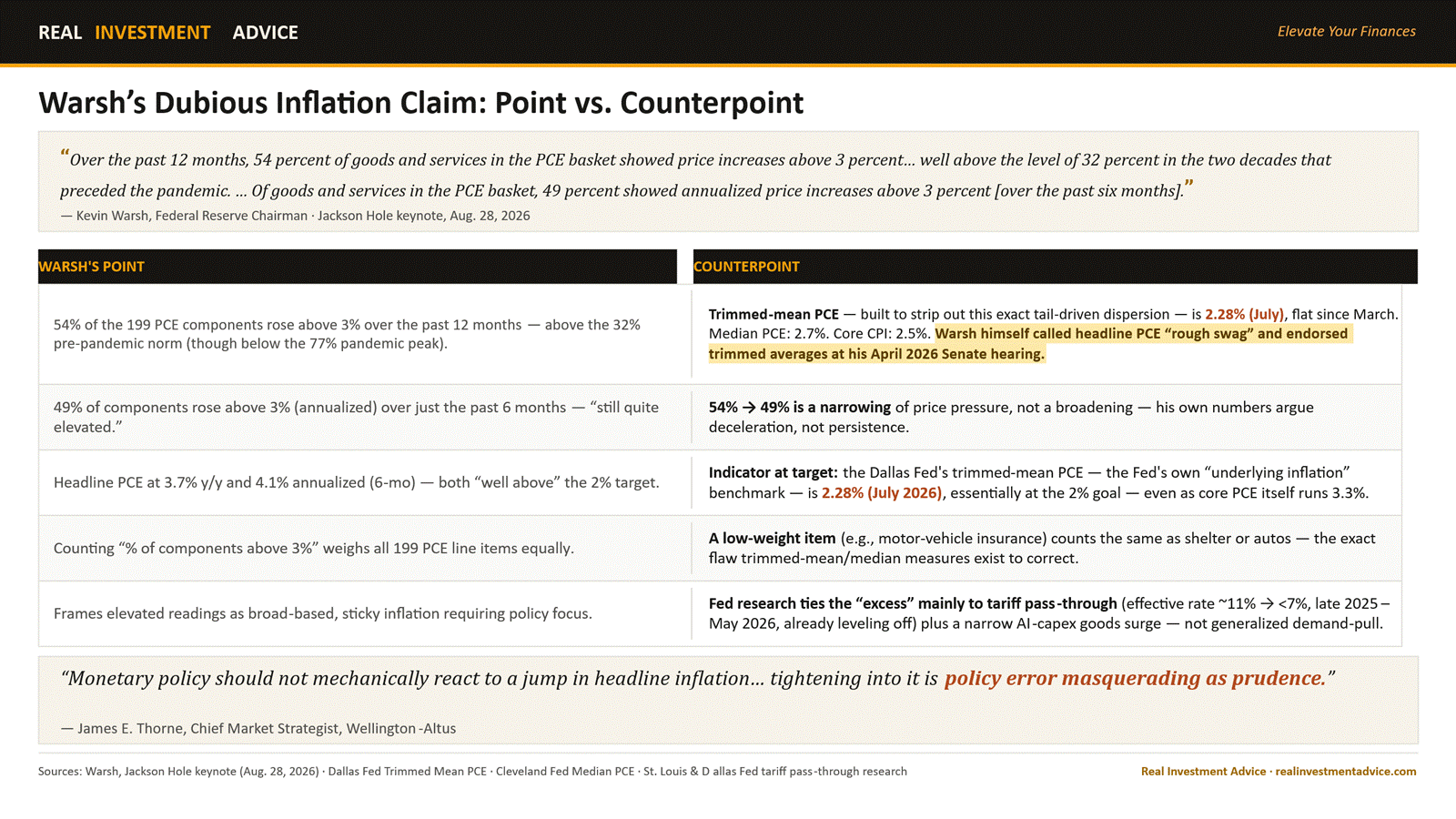
At his recent Jackson Hole speech, Warsh provided some specific inflation data. For instance, he disaggregated the PCE’s 199 components and found 54% rose above 3% over the past year, citing it as evidence of broad-based inflation. We think it’s an unusual choice of inflation data, given his prior discussions of inflation metrics. To wit, at his Senate confirmation hearing four months ago, Warsh dismissed headline PCE as “rough swag” and a “scientific wild guess.” He called trimmed-mean PCE, which removes volatile components, the better gauge of “underlying” inflation because it strips out one-off noise. The Dallas Fed Mean Trimmed PCE has been hovering around 2.3% for the last five months. The table below walks through five of his quantitative claims and offers a compelling counterpoint.
As a new Fed chair, Warsh is inheriting persistent above-target headline inflation and concerning bond market price activity; he must sound vigilant. It’s cheaper to sound hawkish now than to lose inflation-fighting credibility, but doing so risks tightening rates when employment and inflation data don’t necessarily justify higher rates.
The bond market’s reaction has thus far been positive to his hawkish pivot. Fed rate-hike odds are rising, and the yield curve is flattening. Both suggest investors are taking the rhetoric seriously. The big question, however, is whether he will back up his words with actions and support a rate hike at the September 16 FOMC meeting. The risk is that Warsh puts credibility over proper monetary policy and risks a policy error.
What To Watch Today
Earnings

Economy
Market Trading Update
Yesterday, we walked through what the yield curve is telling us about the Fed and the labor market. Today, a chart making the rounds says stocks are cheap. They are not cheap. They are priced on record profit margins that have never been sustained.
Goldman’s Tony Pasquariello circulated his post-Labor Day note and saved the punchline for the end. Take the S&P 500’s forward price-to-earnings ratio and divide it by forward profit margins. That ratio just printed 113.7, the lowest since the 2011 European crisis and inside the range last visited in the depths of 2008. On its face, that reads like a screaming buy signal.
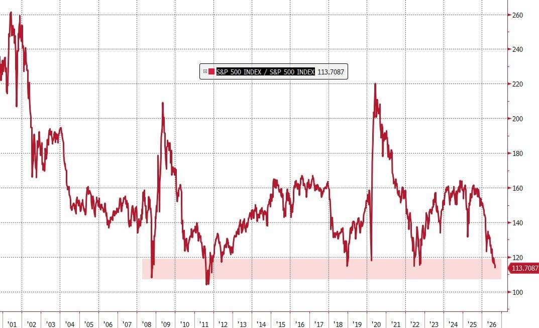
Now look at the denominator. Forward margins for the index sit at 17.07%, an all-time high, and the move over the past year has been close to vertical. The ratio isn’t low because stocks got cheap. It’s low because analysts assume corporate America keeps the most profitable margin structure ever recorded. The numerator, 19.4 times forward earnings, sits near the top of its 30-year range. Both things are true at once, and only ONE of them shows up in the ratio. Such is the trouble with a ratio that buries its own assumption.

Here is the arithmetic that matters. Hold the multiple at 19.4 times and walk forward margins back to 14%, and the ratio snaps to 138.7. Run it the other way. If margins normalize to 14% and the market still demands that same 113.7 reading, the multiple compresses 18%. Applied to Friday’s close of 7,718, that puts the S&P 500 at 6,331. The index bottomed at 6,334 on March 30. I don’t publish that as a forecast. I publish it because Bob Farrell’s Rule #1 is still undefeated. “Markets return to the mean over time,” and margins are a market too.

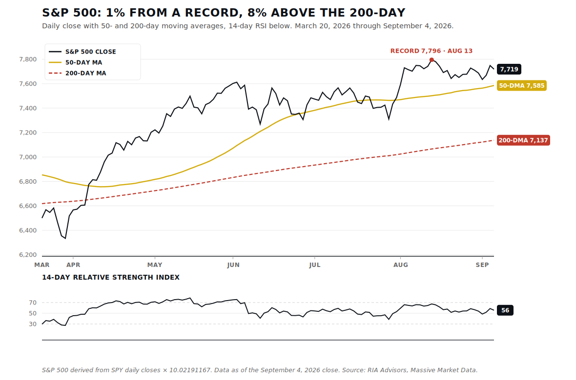
The tape gives you no help here. The index closed Friday at 7,718, less than 1% off the August 13 record of 7,796 and 1.8% above a rising 50-day average near 7,585. The 200-day sits well below at 7,137. RSI is a middling 56, and the MACD has rolled under its signal line. The VIX hasn’t closed outside a 14 to 17 band in 25 straight sessions.
So here is the posture. We suggest leaving the cash and Treasury buffer alone into Friday’s CPI print rather than chasing a tape this extended. Pasquariello’s advice was to collect cheap convexity while the market offers it, and he’s right about that. When protection costs this little and record profit margins are doing all the work in the bull case, you don’t have to sell what’s working. You hedge it. The market will re-price those margins eventually, and it won’t send a calendar invite.

Dispersion Creeps Into The Market
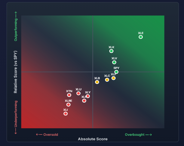
Recently, performance has increasingly diverged across sectors. For instance, the first graph below shows widening gaps in relative performance across sectors. Note that, excluding energy (XLE), the absolute scores are not that different. However, the relative scores (y-axis) are diverging.
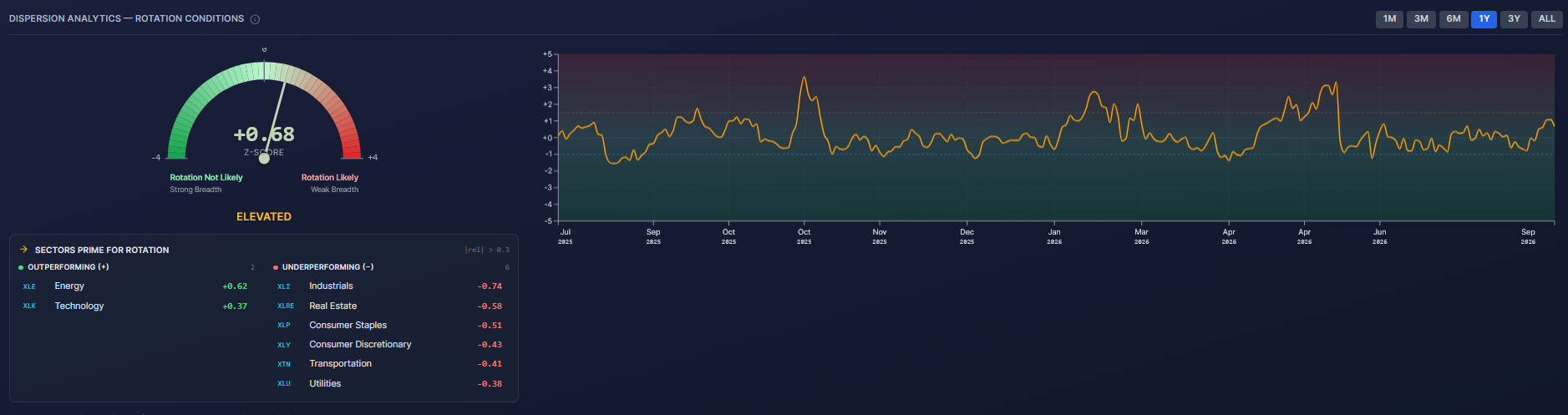
The second graphic, coming soon in the newest version of SimpleVisor, quantifies this divergence, also known in market parlance as dispersion. Our new indicator tracks the differences between the sectors in both graph form and via the gauge. As the graph shows, it has recently climbed, albeit not to concerning levels. Below the gauge, industrials are the weakest sector on a relative basis, while energy is the strongest. For those looking for a rotation trade, those two sectors are worth tracking.
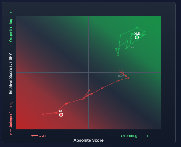
The third graphic, another new feature, allows us to pick specific stocks and ETFs and track their scores. As we show, energy has been stuck in the upper quadrant, outperforming on an absolute and relative basis due to high oil prices. At the same time, industrials have steadily moved deeper into the bottom left quadrant, likely due to weakening economic data and higher oil prices. The relative performance seems overdone, and a rotation is likely, but we caution that such a rotation likely hinges on the Iranian conflict cooling off and energy prices falling.
Investing Myths Dismantled (Chapter 4 of 5)
From your first day as an investor, you are handed a scoreboard. The S&P 500 index. If you beat it, you win; but if you trail it, for any one of a million different reasons, you lose. Wall Street loves this scoreboard because a scoreboard keeps you comparing, and comparing keeps you moving your money, chasing whichever fund topped the index last year.
Perhaps it is inevitable that, as social animals, we have an urge to compare ourselves with one another. Such is particularly the case since the rise of social media, where we are constantly bombarded by images of how well “everyone” else seems to be doing. Here is an example.
Assume your boss gave you a new Mercedes as a yearly bonus. You would be thrilled until you learned everyone in the office got two. Now you are upset because on a “relative” basis, you got less than everyone else. However, are you deprived on an absolute basis by getting a Mercedes?
Comparison-created unhappiness and insecurity are pervasive. Social media is full of images of people showing off their lavish lifestyles, giving you something to compare to. It is unsurprising that repeated studies show that social media users are terminally unhappy.
The flaw of human nature is that whatever we have is enough, until we see someone else who has more.
Therefore, it should be unsurprising that comparison in financial markets can lead to awful decisions, so investors have trouble being patient and letting whatever process they have work for them. Chasing that scoreboard does not just set you up for disappointment. It makes you behave badly. You lag the index for a year, so you fire your fund and chase last year’s winner, usually right before it reverts to the mean. You buy high and sell low on a permanent loop, all in the name of keeping up with a number.
But here is the part you may not know – the scoreboard you are comparing yourself to is rigged, and not in your favor.
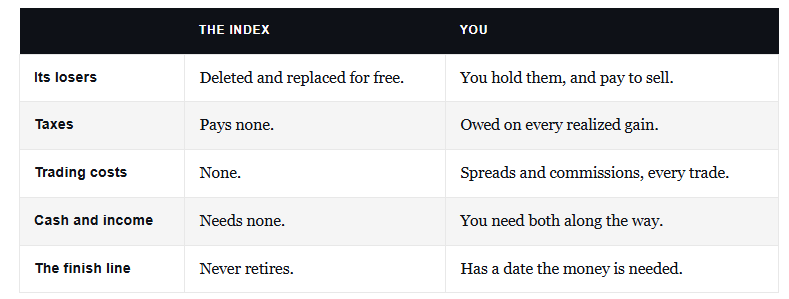
“There are many reasons why you shouldn’t chase an index over time and why you see statistics such as ‘80% of all funds underperform the S&P 500’ in any given year. The impact of share buybacks, substitutions, lack of taxes, no trading costs, and replacement all contribute to the index’s outperformance over those investing real dollars who do not receive the same advantages. More importantly, any portfolio allocated differently than the benchmark to provide for lower volatility, income, or long-term financial planning and capital preservation will also underperform the index. Therefore, comparing your portfolio to the S&P 500 is inherently ‘apples to oranges’ and will always lead to disappointing outcomes.“ – Absolute vs Relative Returns

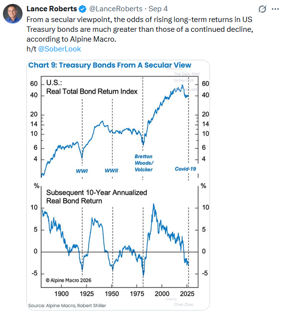
Tweet of the Day
New UPDATED Trading Rules With Desktop Printout
“Want to achieve better long-term success in managing your portfolio? Here are our 15-trading rules for managing market risks.”
Please subscribe to the daily commentary to receive these updates every morning before the opening bell.
If you found this blog useful, please send it to someone else, share it on social media, or contact us to set up a meeting.