
A viral stat claims credit card delinquencies just hit their worst level since 2008. However, the New York Fed’s own data shows the opposite, and the real consumer credit stress is hiding exactly where the headlines aren’t looking.
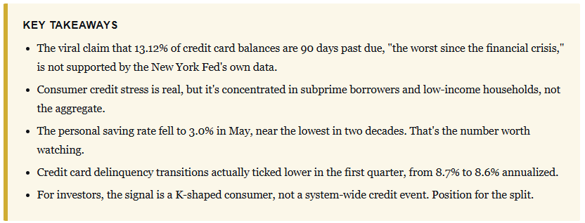
A number has been making the rounds all year, and it’s misleading. The claim: roughly 13% of credit card balances are 90 days or more past due, the worst since 2008. Here’s the twist. That number is real, and it comes straight from the New York Fed. It just doesn’t mean what the scary charts say it means. Sorting the real signal from the viral one matters because one of them belongs in your portfolio decisions and the other belongs in the trash.
Where The Scary Number Comes From
Let’s start with the Q2 2026 Household Debt and Credit Report, released August 11. Total household debt actually fell $13 billion on the quarter, a rounding error of 0.1%, to $18.8 trillion. Credit card balances rose $21 billion to $1.26 trillion, up 1.7%. So far, nothing that looks like a crisis.
However, this is the point where you are hit with the delinquency rate that everyone screenshots. The share of card balances 90 days or more past due has climbed from 7.6% in late 2022 to 12.8%. That is a real figure from the Fed’s data, and it’s the source the viral posts were reaching for without knowing it. Here’s the problem with reading it as a crisis. The Fed published a companion piece the same day, and its own economists took the number apart.
Crucially, they draw a very clear distinction between a “stock” measure and a “flow” measure. The stock measure simply counts every delinquent dollar remaining on a credit report, including old charged-off debts that lenders keep reporting for years. The flow measure counts how much debt newly goes bad each quarter. The flow indicates how households are actually doing, and it has been roughly flat since 2024. It rose from 6.93% to 6.97% year over year. That’s not an acceleration. That’s noise.
The obvious question is: “Then why is the stock number climbing?”
The answer is that lenders now report charged-off debt to the bureaus far longer than they used to. From 2004 through 2012, only about 40% of charged-off balances were still reported a year later. By 2024, that figure had doubled to 80%. Strip those stale balances out, and the stock delinquency rate falls right back in line with the flow. As usual, when everyone agrees on something, something else is usually going on. In this case, the crowd agreed on a chart that the people who built it were quietly warning you not to trust. I’ve made the same point before about the gap between what the data says and what the tape feels like, in the consumer sentiment disconnect.
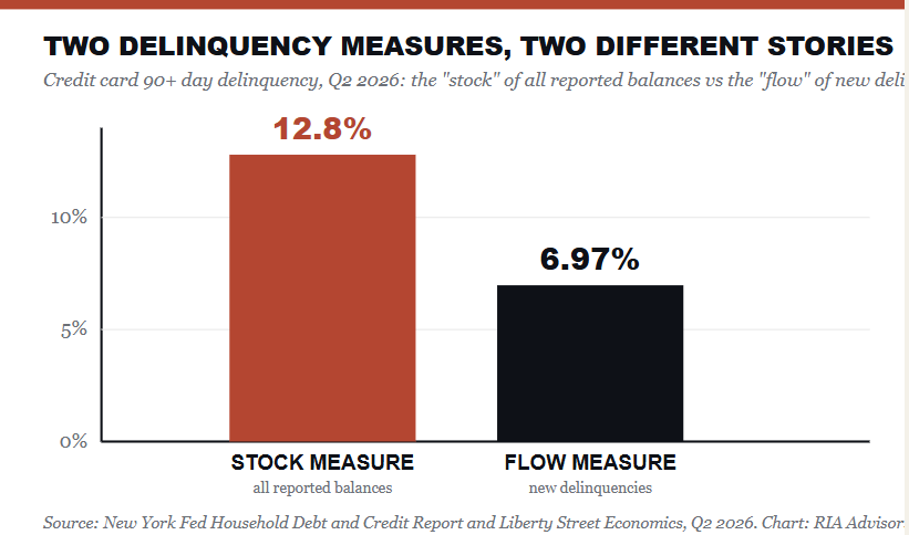
(The “stock” delinquency measure that went viral reads 12.8%, but it counts years of stale charged-off debt. The “flow” of new delinquencies, the honest read on current stress, sits at 6.97% and has been flat since 2024. Source: New York Fed, Q2 2026)
“When the question is ‘how are households doing right now?’ the flow delinquency rates provide a more accurate view of current consumer repayment behavior. By those measures, the pace of credit card delinquency is elevated but has been largely stable since 2024.” – Lee, Mangrum, Scally, Sinha and van der Klaauw, New York Fed Liberty Street Economics

The Consumer Credit Stress That’s Actually Real
Dismissing the meme doesn’t mean the consumer is fine. Parts of the consumer are cracking. The stress is REAL. It just isn’t spread evenly across the system, and the aggregate delinquency chart hides that. Dig below the surface, and you find a household sector splitting in two, with the top half spending comfortably and the bottom half running on fumes.
The savings data gives us the clearest read into what is actually happening. In July, the personal saving rate fell to 3.0% of disposable income, with total personal saving of $712.0 billion, according to the Bureau of Economic Analysis. Put that in context. For most of the decade before the pandemic, households saved 7% to 8% of income. The rate spiked above 16% in 2020 when stimulus landed, and there was nowhere to spend it. It has bled lower ever since. A 3.0% print is near the lowest reading in 20 years.
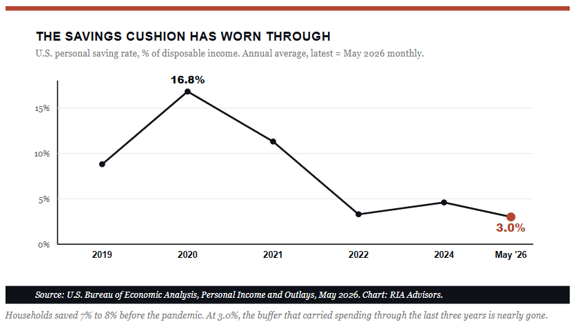
Notably, a thin savings rate isn’t a crisis on its own. There are plenty of households that carry very little cash and never miss a payment. However, it does change the math on resilience. When the family car breaks down or a parent’s work hours get reduced, a family saving 8% of its income can absorb the hit. Conversely, a family that only saves 3% of its income reaches for a credit card more quickly. That’s the mechanism, and it’s why the delinquency increases we have seen are showing up first among subprime and lower-income borrowers, while prime credit performance has barely moved.
The Two-Speed Consumer, In One Table
The cleanest way to see the gap is to line up the viral claim against what the primary sources report. Almost every week, someone sends me a chart or a screenshot from somewhere, showing the consumer on the edge of collapse. The data, however, continues to tell a more specific story.
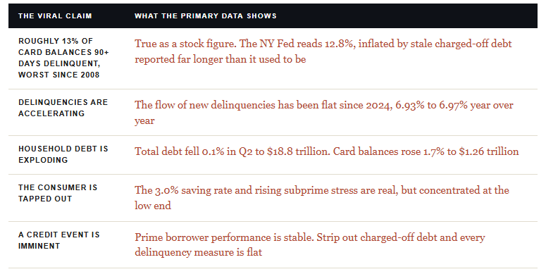
That split is the whole story, and it shows up in spending, too. The top 10% of earners now drive 49.2% of all consumer spending, the highest share since Moody’s began collecting data in 1989, up from about 36% three decades ago. Meanwhile, spending by households earning under $175,000 has barely grown in real terms since the pandemic. One consumer is fine. The other is the one filling up the subprime delinquency buckets.
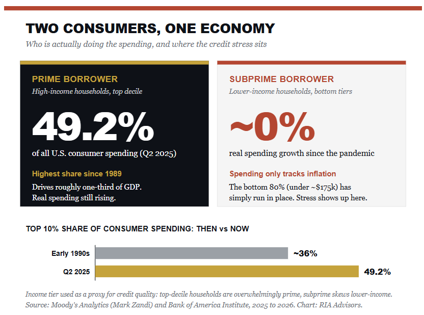
The top decile drives 49.2% of all consumer spending, the highest share since 1989 and up from about 36% three decades ago. The bottom 80% has barely grown their spending in real terms. That’s the two-speed consumer in one picture.- Source: Moody’s Analytics, 2025
“Consumer credit stress is real. It’s just wearing a name tag that says subprime, and the headline chart keeps reading it as systemic.”

Where The Bears Are Right
I readily admit that the bearish case has a valid point. They state that aggregate data lags current realities. Therefore, by the time the Fed’s quarterly report confirms a broad deterioration, the damage is already done. Furthermore, a 3.0% savings rate means the marginal household has no shock absorber left.
If you then layer on a labor market that ran soft through the summer, with June and July payrolls revised down to 31,000 and 21,000 before August rebounded to 162,000, you have the setup for spending to roll over faster than the smoothed data will admit.
Those are all valid points. However, here’s the problem with treating it as today’s reality. It’s a forecast about tomorrow, not a reading of the current tape. The same case was made in 2023 and again in 2024. Each time, behavior beat feelings and spending held firm. I’m reasonably confident the low-end consumer market will continue to deteriorate from here. I’m far less confident it will drag down the aggregate over the next two quarters, because the prime borrower, who does most of the spending, is still in good shape.
What Consumer Credit Stress Means For Investors
So what do you actually do with this information?
- Stop trading off the scary screenshot. A K-shaped consumer calls for a scalpel, not a sledgehammer. The businesses exposed to the bottom third of the income distribution, dollar stores, subprime lenders, buy-now-pay-later names, and lower-end restaurants, are where the stress shows up first and hits margins hardest. That’s a real and specific risk you can underwrite.
- Respect the split rather than betting the whole book on one side. Higher-end consumer names and companies serving households with intact balance sheets are a different animal. Positioning for a total consumer collapse has been a losing trade for three years running. So has assuming everything is fine. The trade is the divergence itself.
- Lastly, keep the real watchlist in front of you. Not the meme number. Watch the savings rate, the subprime delinquency trend, the quarterly New York Fed report, and retailer margin guidance through earnings season. We covered the deeper split between what households say and what they do in our look at the consumer sentiment disconnect, and in the piece on record retail inflows. The through line is consistent. Behavior beats feelings, and primary data beats viral charts.
The bottom line is this. The consumer credit stress story deserves your attention, but only the true version. A 3% savings rate indicates the cushion is thin, and the low end is exposed. The New York Fed data tells you this is a distribution problem, not a solvency crisis, at least for now. The moment the prime borrower starts slipping in the quarterly print, the calculus changes, and that’s the number that will tell you when to lean out.
If this raises questions about how your own portfolio is positioned for a two-speed consumer and a softening labor market, that’s the conversation we have with investors every day. Our process starts with your complete financial picture, not just your investment account. Schedule a complimentary portfolio review, and let’s pressure-test your exposure together.
Questions This Article Answers
Are credit card delinquencies really the worst since 2008? Only by one measure. The New York Fed’s “stock” delinquency rate, which counts all reported balances 90+ days past due, hit 12.8% in Q2 2026. That measure is inflated by old charged-off debt that lenders now report for far longer. The “flow” of new delinquencies, a better read on current stress, has been roughly flat since 2024 at just under 7%.
What’s the difference between stock and flow delinquency? The stock measure is the share of all outstanding balances currently marked delinquent, including stale charged-off debt. The flow measure is the amount of debt that goes bad each quarter. The flow tells you how households are doing right now, and the Fed’s own economists say it’s the more accurate gauge of current repayment behavior.
Is the U.S. consumer actually in trouble? Part of it. The stress is concentrated in subprime and lower-income households, where the 3.0% saving rate leaves no cushion. Prime borrowers, who account for most spending, are still in good shape. It’s a K-shaped consumer, not a system-wide credit event.
What should investors watch instead of the viral chart? The flow delinquency rate, the subprime delinquency trend, the quarterly New York Fed report, the personal saving rate, and retailer margin guidance. Those tell you when the stress is spreading from the low end into the prime borrower, which is the turn that actually matters for portfolios.
Sources
- New York Fed. Household Debt and Credit Report, Q2 2026, released August 11, 2026.
- New York Fed Liberty Street Economics. “How Distressed Are Consumers? Reconciling Diverging Credit Card Delinquency Measures,” Lee, Mangrum, Scally, Sinha, and van der Klaauw, August 11, 2026.
- U.S. Bureau of Economic Analysis. Personal Income and Outlays, July 2026, released August 26, 2026.
- U.S. Bureau of Labor Statistics. Employment Situation, August 2026, released September 4, 2026.
- Moody’s Analytics (Mark Zandi). Consumer spending by income cohort, Q2 2025, as reported by Bloomberg, September 16, 2025. Note: Some economists have since questioned whether the 49.2% figure overstates the concentration.
- Bank of America Institute. Consumer Checkpoint, 2026 monthly releases.