Tag Archives: federal reserve

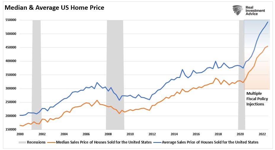
Home Prices Will Likely Fall Further

Home prices have started to correct as interest rates rose sharply in 2022. However, the real problem for home prices is still coming in 2023 as the standoff between sellers and buyers comes to a head.

However, before we get there, let’s review how we got here.

Since the turn of the century, there have been two housing bubbles, with home prices reaching levels of unaffordability not previously seen in the United States. Such was, of course, due to lax lending policies and artificially low-interest rates luring financially unstable individuals into buying homes they could not afford. Such is easily seen in the chart below, which shows home equity versus mortgage debt. (Home equity is the difference between home prices and the underlying debt.)

Housing bubble 2.0

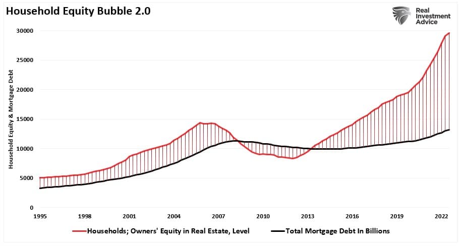
The current surge in home prices makes the previous bubble in 2008 look quaint by comparison.

At that previous peak in 2007, the equity in people’s homes was around $15 trillion, while mortgage debt stood at $9 trillion. When the bubble popped, home prices collapsed, flipping homeowner’s equity from positive to negative. Home equity is roughly $30 trillion, while mortgage debts have increased to roughly $12 trillion. That is an incredible spread, unlike anything seen previously.

However, this time, the surge in home prices wasn’t due to a surge in lax underwriting by mortgage companies but rather the infusion of capital directly to households following the COVID-19 pandemic-driven shutdown.

Median vs average housing home price

Of course, many young Millennials took that money and jumped into the home-buying frenzy. In many cases, buying sight unseen or willing to pay way over the asking price (thereby inflating home prices.) To wit:

“More and more millennials are sinking huge sums of money into homes they’ve never actually set foot in. While the sharp increase in sight-unseen buying in 2020 was certainly driven by pandemic restrictions, the phenomenon appears to be here to stay, due to the tech-forward nature of millennials and the competitive nature of the housing market.”Insider Business

Of course, the rush to buy a home, and overpaying for it, led to regret.

“The number-one reason for buyer’s remorse: 30% of respondents said they spent too much money. The second most common regret was rushing the home-buying process, with 30% saying their purchase decision was rushed and 26% indicating they bought too quickly.”CNBC

Unfortunately, there will be less demand as the massive flood of money into the housing market from Government stimulus reverses.

At The Margin

The problem with much of the mainstream analysis is that it is based on the transactional side of housing. Such only represents what is happening at the “margin.” Rather, the few people actively trying to buy or sell a home impact the data presented monthly.

To understand “housing,” we must analyze the “housing market” as a whole rather than what is happening at the fringes. For this analysis, we can use the data published by the U.S. Census Bureau.

To present some context for the following analysis, we must first have some basis from which to work. Our baseline for this analysis will be the number of total housing units, which, as of Q3-2021, was 143,613,000 units. The chart below shows the historical progression of the number of housing units in the United States compared to the total number of households and an estimate of the total potential households of buyers over the age of 25. For the estimate, we dividend the total active population over the age of 25 by 1.5 to account for single buyers and couples, who tend to make up the majority.

Total housing units vs households

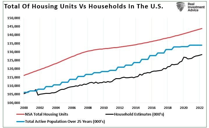
Not surprisingly, there are currently more houses than households to buy. Such is because several homes are vacant for different reasons, second homes, vacation homes, etc. Such is why, as we wrote previously, there is no such thing as a housing shortage. To wit:

“There are three primary issues that lead to changes in the supply of housing:

  1. Prices rise to the point that sellers come into the market.
  2. Interest rates rise, pulling buyers out of the market.
  3. An economic recession removes buyers due to job loss.

“When those occur, transactions slow down, and inventory rises sharply.”

Not surprisingly, since that article was written in November 2020, just 2-years later, the supply of homes has risen sharply. Such is often a leading indicator of recessionary onsets as well.

months of supply of new homes

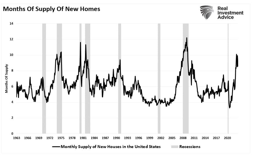
Also, sharply rising interest rates pull buyers out of the market.

New homes sales vs 10-year rates

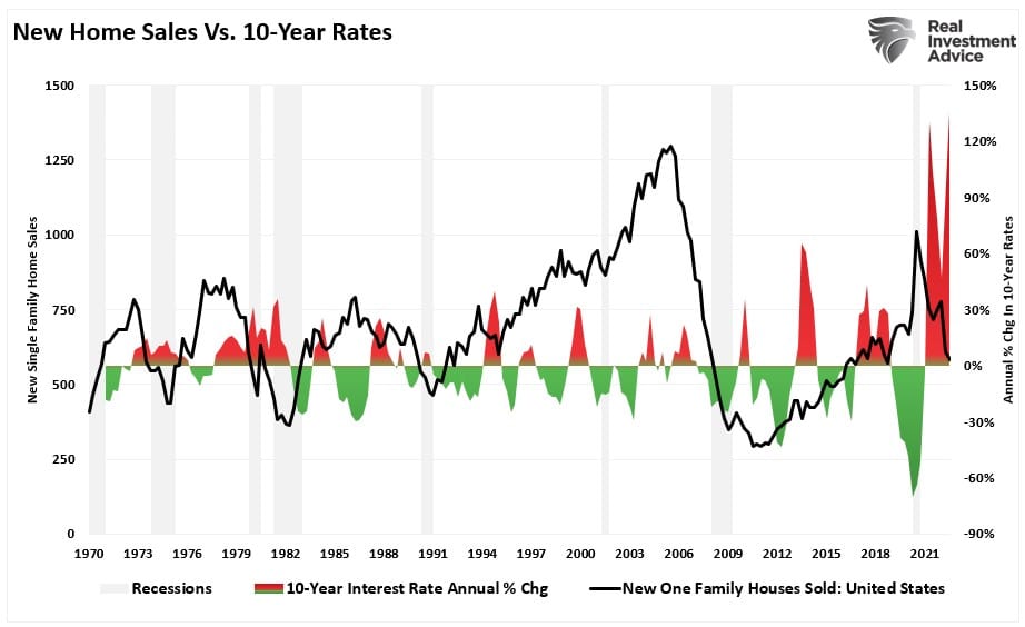
 Another drag on prices in the new year will continue to be inventory coming to market as existing homeowners also try to sell their homes. More inventory and few buyers will equate to a further price drop in the coming year.

Housing home process activity index
banner ad for SimpleVisor, our do it yourself investing tool. sign up for your free trial now

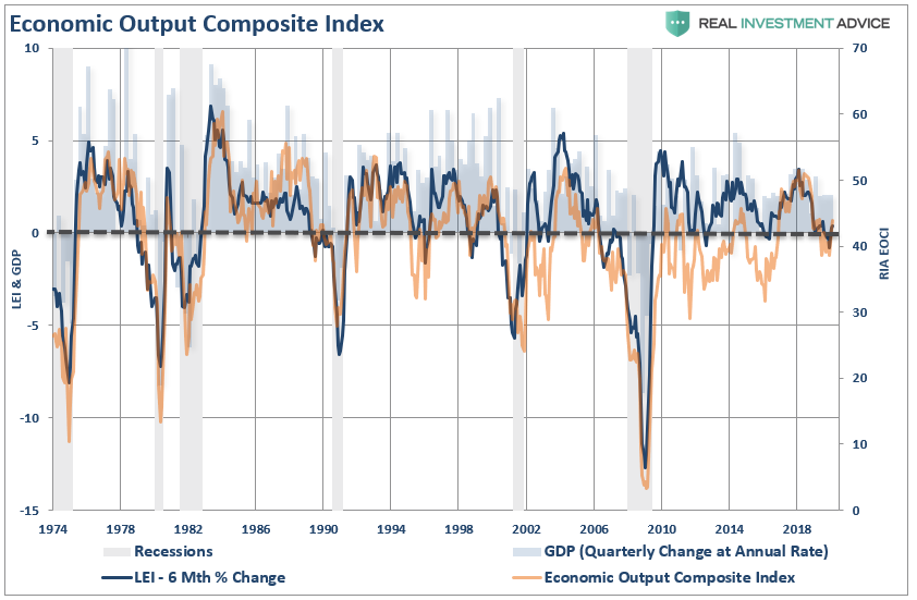
Home Prices To Fall Further

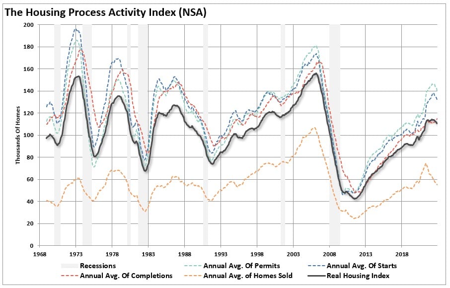
The chart below is the most telling of why home prices will fall further in the coming year. It is a composite index of everything involved in housing activity. It compiles new and existing home sales, permits, and housing starts. The index was rebased to 100 in 1999. The runup in the activity index into 2007 was a function, as noted above, of lax lending policies that led to the collapse in activity in 2008.

Total housing activity index

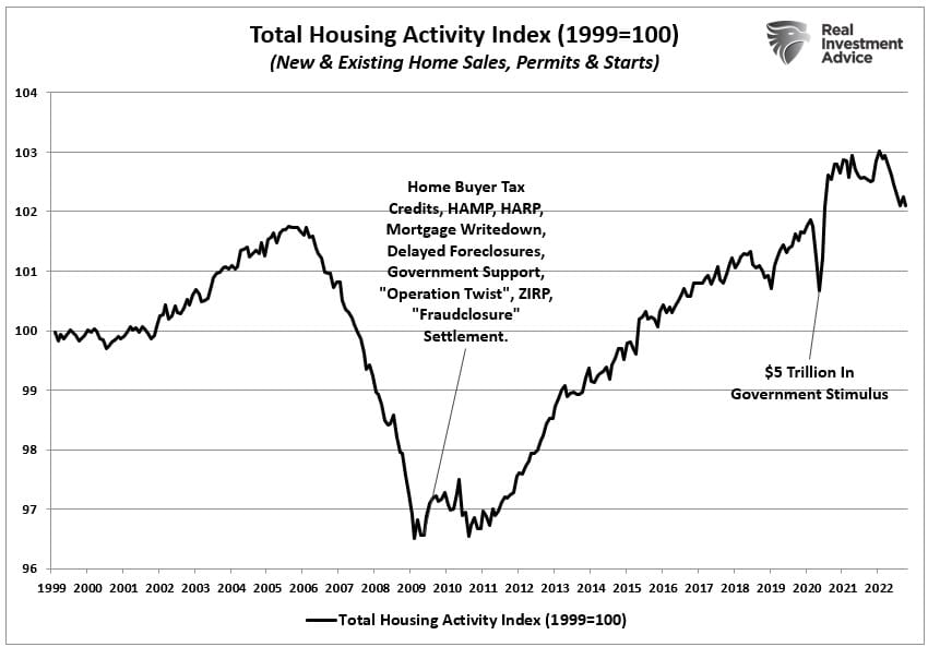
Following the collapse in 2008, the Fed dropped rates to zero and launched multiple QE programs as the Government bailed out everything that moved. The increase in housing activity over the next decade was unsurprising, and repeated monetary interventions boosted the wealth effect.

However, the sharp jump in housing activity in 2020 resulted from the direct monetary injections into households.

The reversion in home prices that has begun will likely continue as that excess liquidity continues to leave the economic system. That drain of liquidity, coupled with higher interest rates, and less monetary accommodation, will drag home prices lower. As that occurs, the “home equity” that many new buyers had in their homes will dissipate as homeownership costs continue to rise due to higher rates and inflation.

As home price depreciation gains traction, more homeowners will be dragged into selling to retain what value they had. For many Americans, most of their net worth is tied up in the homesteads. As the value fades, the decision to sell becomes more of a panic rather than a need.

While there isn’t a vast wasteland of bad mortgages sitting on the books, as seen in 2008, that doesn’t negate the risk of further home price declines in the coming year.

Not only are further home price declines possible, but it is also probable they could be deeper than many currently expect.

Where “I Bought It For The Dividend” Went Wrong

In early 2017, I warned investors about the “I bought it for the dividend” investment thesis. To wit:

“Company ABC is priced at $20/share and pays $1/share in a dividend each year. The dividend yield is 5%, which is calculated by dividing the $1 cash dividend into the price of the underlying stock.

Here is the important point. You do NOT receive a ‘yield.’

What you DO receive is the $1/share in cash paid out each year.

Yield is simply a mathematical calculation.

At that time, the article was scoffed at because we were 8-years into an unrelenting bull market where even the most stupid of investments made money.

Unfortunately, the “mean reversion” process has taken hold, which is the point where the investment thesis falls apart.

The Dangers Of “I Bought It For The Dividend”

“I don’t care about the price, I bought it for the yield.”

First of all, let’s clear up something.

In January of 2018, Exxon Mobil, for example, was slated to pay an out an annual dividend of $3.23, and was priced at roughly $80/share setting the yield at 4.03%. With the 10-year Treasury trading at 2.89%, the higher yield was certainly attractive.

Assuming an individual bought 100 shares at $80 in 2018, “income” of $323 annually would be generated.

Not too shabby.

Fast forward to today with Exxon Mobil trading at roughly $40/share with a current dividend of $3.48/share.

Investment Return (-$4000.00 ) + Dividends of $323 (Yr 1) and $343 (Yr 2)  = Net Loss of $3334

That’s not a good investment.

In just a moment, we will come and revisit this example with a better process.

There is another risk, which occurs during “mean reverting” events, that can leave investors stranded, and financially ruined.

Dividend Loss

When things “go wrong,” as they inevitably do, the “dividend” can, and often does, go away.

  • Boeing (BA)
  • Marriott (MAR)
  • Ford (F)
  • Delta (DAL)
  • Freeport-McMoRan (FCX)
  • Darden (DRI)

These companies, and many others, have all recently cut their dividends after a sharp fall in their stock prices.

I previously posted an article discussing the “Fatal Flaws In Your Financial Plan” which, as you can imagine, generated much debate. One of the more interesting rebuttals was the following:

If a retired person has a portfolio of high-quality dividend growth stocks, the dividends will most likely increase every single year. Even during the stock market crashes of 2002 and 2008, my dividends continued to grow. The total value of the portfolio will indeed fluctuate every year, but that is irrelevant since the retired person is living off his dividends and never selling any shares of stock.

Dividends usually go up even when the stock market goes down.

This comment is the basis of the “buy and hold” mentality, and many of the most common investing misconceptions.

Let’s start with the notion that “dividends always increase.”

When a recession/market reversion occurs, the “cash dividends” don’t increase, but the “yield” does as prices collapse. However, your INCOME does NOT increase. There is a risk it will decline as companies cut the dividend or eliminate it.

During the 2008 financial crisis, more than 140 companies decreased or eliminated their dividends to shareholders. Yes, many of those companies were major banks; however, leading up to the financial crisis, there were many individuals holding large allocations to banks for the income stream their dividends generated. In hindsight, that was not such a good idea.

But it wasn’t just 2008. It also occurred dot.com bust in 2000. In both periods, while investors lost roughly 50% of their capital, dividends were also cut on average of 12%.

While the current market correction fell almost 30% from its recent peak, what we haven’t seen just yet is the majority of dividend cuts still to come.

Naturally, not EVERY company will cut their dividends. But many did, many will, and in quite a few cases, I would expect dividends to be eliminated entirely to protect cash flows and creditors.

As we warned previously:

“Due to the Federal Reserve’s suppression of interest rates since 2009, investors have piled into dividend yielding equities, regardless of fundamentals, due to the belief ‘there is no alternative.’ The resulting ‘dividend chase’ has pushed valuations of dividend-yielding companies to excessive levels disregarding underlying fundamental weakness. 

As with the ‘Nifty Fifty’ heading into the 1970s, the resulting outcome for investors was less than favorable. These periods are not isolated events. There is a high correlation between declines in asset prices, and the dividends paid out.”

Love Dividends, Love Capital More

I agree investors should own companies that pay dividends (as it is a significant portion of long-term total returns)it is also crucial to understand that companies can, and will, cut dividends during periods of financial stress.

It is a good indicator of the strength of the underlying economy. As noted by Political Calculations recently:

Dividend cuts are one of the better near-real-time indicators of the relative health of the U.S. economy. While they slightly lag behind the actual state of the economy, dividend cuts represent one of the simplest indicators to track.

In just one week, beginning 16 March 2020, the number of dividend cuts being announced by U.S. firms spiked sharply upward, transforming 2020-Q1 from a quarter where U.S. firms were apparently performing more strongly than they had in the year-ago quarter of 2019-Q1 into one that all-but-confirms that the U.S. has swung into economic contraction.

Not surprisingly, the economic collapse, which will occur over the next couple of quarters, will lead to a massive round of dividend cuts. While investors lost 30%, or more in many cases, of their capital, they will lose the reason they were clinging on to these companies in the first place.

You Can’t Handle It

EVERY investor has a point, when prices fall far enough, regardless of the dividend being paid, they WILL capitulate, and sell the position. This point generally comes when dividends have been cut, and capital destruction has been maximized.

While individuals suggest they will remain steadfast to their discipline over the long-term, repeated studies show that few individuals actually do. As noted just recently is “Missing The 10-Best Days:”

“As Dalbar regularly points out, individuals always underperform the benchmark index over time by allowing “behaviors” to interfere with their investment discipline. In other words, investors regularly suffer from the ‘buy high/sell low’ syndrome.”

Behavioral biases, specifically the “herding effect” and “loss aversion,” repeatedly leads to poor investment decision-making. In fact, Dalbar is set to release their Investor Report for 2020, and they were kind enough to send me the following graphic for investor performance through 2019. (Pre-Order The Full Report Here)

These differentials in performance can all be directly traced back to two primary factors:

  • Psychology
  • Lack of capital

Understanding this, it should come as no surprise during market declines, as losses mount, so does the pressure to “avert further losses” by selling. While it is generally believed dividend-yielding stocks offer protection during bear market declines, we warned previously this time could be different:

“The yield chase has manifested itself also in a massive outperformance of ‘dividend-yielding stocks’ over the broad market index. Investors are taking on excessive credit risk which is driving down yields in bonds, and pushing up valuations in traditionally mature companies to stratospheric levels. During historic market corrections, money has traditionally hidden in these ‘mature dividend yielding’ companies. This time, such rotation may be the equivalent of jumping from the ‘frying pan into the fire.’” 

The chart below is the S&P 500 High Dividend Low Volatility ETF versus the S&P 500 Index. During the recent decline, dividend stocks were neither “safe,” nor “low volatility.” 

But what about previous “bear markets?” Since most ETF’s didn’t exist before 2000, we can look at the “strategy” with a mutual fund like Fidelity’s Dividend Growth Fund (FDGFX)

As you can see, there is little relative “safety” during a market reversion. The pain of a 38%, 56%, or 30%, loss, can be devastating particularly when the prevailing market sentiment is one of a “can’t lose” environment. Furthermore, when it comes to dividend-yielding stocks, the psychology is no different; a 3-5% yield, and a 30-50% loss of capital, are two VERY different issues.

A Better Way To “Invest For The Dividend”

“Buy and hold” investing, even with dividends and dollar-cost-averaging, will not get you to your financial goals. (Click here for a discussion of chart)

So, what’s the better way to invest for dividends? Let’s go back to our example of Exxon Mobil for a moment. (This is for illustrative purposes only and not a recommendation.)

In 2018, Exxon Mobil broke below its 12-month moving average as the overall market begins to deteriorate.

If you had elected to sell on the break of the moving average, your exit price would have been roughly $70/share. (For argument sake, you stayed out of the position even though XOM traded above and below the average over the next few months.)  

Let’s rerun our math from above.

  • In 2018, an individual bought 100 shares at $80.
  • In 2019, the individual sold 100 shares at $70.

Investment Return (-$1000.00 ) + Dividends of $323 (Yr 1) and $343 (Yr 2)  = Net Loss of $334

Not to bad.

Given the original $8,000 investment has only declined to $7,666, the individual could now buy 200 shares of Exxon Mobil with a dividend of $3.48 and a 9.3% annual yield.

Let’s compare the two strategies.

  • Buy And Hold: 100 shares bought at $80 with a current yield of 4.35% 
  • Risk Managed: 200 shares bought at $40 with a current yield of 9.3%

Which yield would you rather have in your portfolio?

In the end, we are just human. Despite the best of our intentions, emotional biases inevitably lead to poor investment decision-making. This is why all great investors have strict investment disciplines they follow to reduce the impact of emotions.

I am all for “dividend investment strategies,” in fact, dividends are a primary factor in our equity selection process. However, we also run a risk-managed strategy to ensure we have capital available to buy strong companies when the opportunity presents itself.

The majority of the time, when you hear someone say “I bought it for the dividend,” they are trying to rationalize an investment mistake. However, it is in the rationalization that the “mistake” is compounded over time. One of the most important rules of successful investors is to “cut losers short and let winners run.” 

Unfortunately, the rules are REALLY hard to follow. If they were easy, then everyone would be wealthy from investing. They aren’t because investing without a discipline and strategy has horrid consequences.

#MacroView: The Fed Can’t Fix What’s Broken

“The Federal Reserve is poised to spray trillions of dollars into the U.S. economy once a massive aid package to fight the coronavirus and its aftershocks is signed into law. These actions are unprecedented, going beyond anything it did during the 2008 financial crisis in a sign of the extraordinary challenge facing the nation.” Bloomberg

Currently, the Federal Reserve is in a fight to offset an economic shock bigger than the financial crisis, and they are engaging every possible monetary tool within their arsenal to achieve that goal. The Fed is no longer just a “last resort” for the financial institutions, but now are the lender for the broader economy.

There is just one problem.

The Fed continues to try and stave off an event that is a necessary part of the economic cycle, a debt revulsion.

John Maynard Keynes contended that:

“A general glut would occur when aggregate demand for goods was insufficient, leading to an economic downturn resulting in losses of potential output due to unnecessarily high unemployment, which results from the defensive (or reactive) decisions of the producers.”

In other words, when there is a lack of demand from consumers due to high unemployment, then the contraction in demand would force producers to take defensive actions to reduce output. Such a confluence of actions would lead to a recession.

On Thursday, initial jobless claims jumped by 3.3 million. This was the single largest jump in claims ever on record. The chart below shows the 4-week average to give a better scale.

This number will be MUCH worse next week as many individuals are slow to file claims, don’t know how, and states are slow to report them.

The importance is that unemployment rates in the U.S. are about to spike to levels not seen since the “Great Depression.” Based on the number of claims being filed, we can estimate that unemployment will jump to 20%, or more, over the next quarter as economic growth slides 8%, or more. (I am probably overly optimistic.)

More importantly, since the economy is 70% driven by consumption, we can approximate the loss in full-time employment by the surge in claims. (As consumption slows, and the recession takes hold, more full-time employees will be terminated.)

This erosion will lead to a sharp deceleration in economic confidence. Confidence is the primary factor of consumptive behaviors, which is why the Federal Reserve acted so quickly to inject liquidity into the financial markets. While the Fed’s actions may prop up financial markets in the short-term, it does little to affect the most significant factor weighing on consumers – their job. 

Another way to analyze confidence data is to look at the consumer expectations index minus the current situation index in the consumer confidence report.

This measure also says a recession is here. The differential between expectations and the current situation, as you can see below, is worse than the last cycle, and only slightly higher than prior to the “dot.com” crash. Recessions start after this indicator bottoms, which has already occurred.

Importantly, bear markets end when the negative deviation reverses back to positive. Currently, we have only just started that reversion process.

While the virus was “the catalyst,” we have discussed previously that a reversion in employment, and a recessionary onset, was inevitable. To wit:

“Notice that CEO confidence leads consumer confidence by a wide margin. This lures bullish investors, and the media, into believing that CEO’s really don’t know what they are doing. Unfortunately, consumer confidence tends to crash as it catches up with what CEO’s were already telling them.

What were CEO’s telling consumers that crushed their confidence?

“I’m sorry, we think you are really great, but I have to let you go.” 

Confidence was high because employment was high, and consumers operate in a microcosm of their own environment.

“[Who is a better measure of economic strength?] Is it the consumer cranking out work hours, raising a family, and trying to make ends meet? Or the CEO of a company who is watching sales, prices, managing inventory, dealing with collections, paying bills, and managing changes to the economic landscape on a daily basis? A quick look at history shows this level of disparity (between consumer and CEO confidence) is not unusual. It happens every time prior to the onset of a recession.

Far From Over

Why is this important?

Hiring, training, and building a workforce is costly. Employment is the single largest expense of any business, but a strong base of employees is essential for the prosperity of a business. Employers do not like terminating employment as it is expensive to hire back and train new employees, and there is a loss of productivity during that process. Therefore, CEOs tend to hang onto employees for as long as possible until bottom-line profitability demands “leaning out the herd.” 

The same process is true coming OUT of a recession. Companies are “lean and mean” and are uncertain about the actual strength of the recovery. Again, given the cost to hire and train employees, they tend to wait as long as possible to be certain of justifying the expense.

Simply, employers are slow to hire and slow to fire. 

While there is much hope that the current “economic shutdown” will end quickly, we are still very early in the infection cycle relative to other countries. Importantly, we are substantially larger than most, and on a GDP basis, the damage will be worse.

What the cycle tells us is that jobless claims, unemployment, and economic growth are going to worsen materially over the next couple of quarters.

“But Lance, once the virus is over everything will bounce back.” 

Maybe not.

The problem with the current economic backdrop, and mounting job losses, is the vast majority of American’s were woefully unprepared for any type of disruption to their income going into recession. As discussed previously:

“The ‘gap’ between the ‘standard of living’ and real disposable incomes is shown below. Beginning in 1990, incomes alone were no longer able to meet the standard of living so consumers turned to debt to fill the ‘gap.’ However, following the ‘financial crisis,’ even the combined levels of income and debt no longer fill the gap. Currently, there is almost a $2654 annual deficit that cannot be filled.”

As job losses mount, a virtual spiral in the economy begins as reductions in spending put further pressures on corporate profitability. Lower profits lead to more unemployment, and lower asset prices until the cycle is complete.

While the virus may end, the disruption to the economy will last much longer, and be much deeper, than analysts currently expect. Moreover, where the economy is going to be hit the hardest, is a place where Federal Reserve actions have the least ability to help – the private sector.

Currently, businesses with fewer than 500-employees comprise almost 60% of all employment. 70% of employment is centered around businesses with 1000-employees, or less. Most of the businesses are not publicly traded, don’t have access to Wall Street, or Federal Reserve’s bailouts.

The problem with the Government’s $2 Trillion fiscal stimulus bill is that while it provides one-time payments to taxpayers, which will do little to extinguish the financial hardships and debt defaults they will face.

Most importantly, as shown below, the majority of businesses will run out of money long before SBA loans, or financial assistance, can be provided. This will lead to higher, and a longer-duration of, unemployment.

One-Percenter

What does this all mean going forward?

The wealth gap is going to explode, demands for government assistance will skyrocket, and revenues coming into the government will plunge as trillions in debt issuance must be absorbed by the Federal Reserve. 

While the top one-percent of the population will exit the recession relatively unscathed, again, it isn’t the one-percent I am talking about.

It’s economic growth. 

As discussed previously, there is a high correlation between debts, deficits, and economic prosperity. To wit:

“The relevance of debt growth versus economic growth is all too evident as shown below. Since 1980, the overall increase in debt has surged to levels that currently usurp the entirety of economic growth. With economic growth rates now at the lowest levels on record, the growth in debt continues to divert more tax dollars away from productive investments into the service of debt and social welfare.”

However, simply looking at Federal debt levels is misleading.

It is the total debt that weighs on the economy.

It now requires nearly $3.00 of debt to create $1 of economic growth. This will rise to more than $5.00 by the end of 2020 as debt surges to offset the collapse in economic growth. Another way to view the impact of debt on the economy is to look at what “debt-free” economic growth would be. 

In other words, without debt, there has been no organic economic growth.

Notice that for the 30-year period from 1952 to 1982, the economic surplus fostered a rising economic growth rate, which averaged roughly 8% during that period. Since then, the economic deficit has only continued to erode economic prosperity.

Given the massive surge in the deficit that will come over the next year, economic growth will begin to run a long-term average of just one-percent. This is going to make it even more difficult for the vast majority of American’s to achieve sufficient levels of prosperity to foster strong growth. (I have estimated the growth of Federal debt, and deficits, through 2021)

The Debt End Game

The massive indulgence in debt has simply created a “credit-induced boom” which has now reached its inevitable conclusion. While the Federal Reserve believed that creating a “wealth effect” by suppressing interest rates to allow cheaper debt creation would repair the economic ills of the “Great Recession,” it only succeeded in creating an even bigger “debt bubble” a decade later.

“This unsustainable credit-sourced boom led to artificially stimulated borrowing, which pushed money into diminishing investment opportunities and widespread mal-investments. In 2007, we clearly saw it play out “real-time” in everything from sub-prime mortgages to derivative instruments, which were only for the purpose of milking the system of every potential penny regardless of the apparent underlying risk.”

In 2019, we saw it again in accelerated stock buybacks, low-quality debt issuance, debt-funded dividends, and speculative investments.

The debt bubble has now burst.

Here is the important point I made previously:

“When credit creation can no longer be sustained, the markets must clear the excesses before the next cycle can begin. It is only then, and must be allowed to happen, can resources be reallocated back towards more efficient uses. This is why all the efforts of Keynesian policies to stimulate growth in the economy have ultimately failed. Those fiscal and monetary policies, from TARP and QE, to tax cuts, only delay the clearing process. Ultimately, that delay only deepens the process when it begins.

The biggest risk in the coming recession is the potential depth of that clearing process.”

This is why the Federal Reserve is throwing the “kitchen sink” at the credit markets to try and forestall the clearing process.

If they are unsuccessful, which is a very real possibility, the U.S. will enter into a “Great Depression” rather than just a “severe recession,” as the system clears trillions in debt.

As I warned previously:

“While we do have the ability to choose our future path, taking action today would require more economic pain and sacrifice than elected politicians are willing to inflict upon their constituents. This is why throughout the entirety of history, every empire collapsed eventually collapsed under the weight of its debt.

Eventually, the opportunity to make tough choices for future prosperity will result in those choices being forced upon us.”

We will find out in a few months just how bad things will be.

But I am sure of one thing.

The Fed can’t fix what’s broken.

While the financial media is salivating over the recent bounce off the lows, here is something to think about.

  • Bull markets END when everything is as “good as it can get.”
  • Bear markets END when things simply can’t “get any worse.”

We aren’t there yet.

“No One Saw It Coming” – Should You Worry About The 10-Best Days

Pippa Stevens via CNBC recently had some advice:

“Panic selling not only locks in losses, but also puts investors at risk for missing the market’s best days.

Looking at data going back to 1930, Bank of America found that if an investor missed the S&P 500′s 10 best days in each  decade, total returns would be just 91%, significantly below the 14,962% return for investors who held steady through the downturns.”

But here was her key point, which ultimately invalidates her entire premise:

“The firm noted this eye-popping stat while urging investors to ‘avoid panic selling,’ pointing out that the ‘best days generally follow the worst days for stocks.’” 

Think about that for a moment.

“The best days generally follow the worst days.

The statement is correct, as the S&P 500’s largest percentage gain days, tend to occur in clusters during the worst of times for investors.

Here is another way to look at this through Friday’s close. For an investor trying to catch the markets best 10-days, they wound up losing almost 30% of their portfolio, an astounding -9,254 points over the span of 3 weeks.

The analysis of “missing out on the 10-best days” of the market is steeped in the myth of the benefits of “buy and hold” investing. (Read more: The Definitive Guide For Investing.Buy and hold, as a strategy works great in a long-term rising bull market. It fails as a strategy during a bear market for one simple reason: Psychology.

I agree investors should never “panic sell,” as such “emotional” decisions are always made at the worst possible times. As Dalbar regularly points out, individuals always underperform the benchmark index over time by allowing “behaviors” to interfere with their investment discipline.

In other words, investors regularly suffer from the “buy high/sell low” syndrome.

Such is why investors should follow an investment discipline or strategy which mitigates volatility to avoid being put into a situation where “panic selling” becomes an issue.

Let me be clear; an investment disciple does NOT ensure your portfolio against losses if the market declines. This is particularly the case when it plummets, as we’ve seen in the last couple of weeks. However, in any event, it will work to minimize the damage to a recoverable state.

The Market Timing Myth

We previously stated, that when the “crash” came, the mainstream media’s response would be: “Well, no one could have seen it coming.” 

Simply always being “bullish,” like Mr. Santolli, is what leads investors into being blindsided by rising risks in the market.

Yes, you can see, and predict, when risks exceed the grasp of rationality.

This brings us to the basic argument from the financial media which is simply you are NOT smart enough to manage your investments, so your only option is to “buy and hold.”

In 2010, Brett Arends wrote an excellent commentary entitled: “The Market Timing Myth” which primarily focused on several points we have made over the years. Brett really hits home with the following statement:

For years, the investment industry has tried to scare clients into staying fully invested in the stock market at all times, no matter how high stocks go or what’s going on in the economy. ‘You can’t time the market,’ they warn. ‘Studies show that market timing doesn’t work.’

He goes on:

“They’ll cite studies showing that over the long-term investors made most of their money from just a handful of big one-day gains. In other words, if you miss those days, you’ll earn bupkis. And as no one can predict when those few, big jumps are going to occur, it’s best to stay fully invested at all times. So just give them your money… lie back, and think of the efficient market hypothesis. You’ll hear this in broker’s offices everywhere. And it sounds very compelling.

There’s just one problem. It’s hooey.

They’re leaving out more than half the story.

And what they’re not telling you makes a real difference to whether you should invest, when and how.”

The best long-term study relating to this topic was conducted a few years ago by Javier Estrada, a finance professor at the IESE Business School at the University of Navarra in Spain. To find out how important those few “big days” are, he looked at nearly a century’s worth of day-to-day moves on Wall Street and 14 other stock markets around the world, from England to Japan to Australia.

Correctly, the study did find that if you missed the 10-best days of the market, you did indeed give up much of the gains. What he also found is that by missing the 10-worst days, you did remarkably better.

(The blue highlight shows, as of Friday’s close, investors will need a more than 40% return just to get back to even.)

Clearly, avoiding major drawdowns in the market is key to long-term investment success. If I am not spending the bulk of my time making up previous losses in my portfolio, I spend more time compounding my invested dollars towards my long term goals.

Over an investing period of about 40 years, just missing the 10-best days would have cost you about half your capital gains. But successfully avoiding the 10-worst days would have had an even bigger positive impact on your portfolio. Someone who avoided the 10-biggest slumps would have ended up with two and a half times the capital gains of someone who simply stayed in all the time.

As Brett concluded:

“In other words, it’s something of a wash. The cost of being in the market just before a crash, are at least as great as being out of the market just before a big jump, and may be greater. Funny how the finance industry doesn’t bother to tell you that.”

The reason that the finance industry doesn’t tell you the other half of the story is because it is NOT PROFITABLE for them. The finance industry makes money when you are invested – not when you are in cash. Since a vast majority of financial advisors can’t actually successfully manage money, they just tell you to “stay the course.”

However, you DO have options.

A Simple Method

Now, let me clarify. I do not strictly endorse “market timing,” which is specifically being “all-in” or “all-out” of the market at any given time. The problem with market timing is consistency.

You cannot, over the long term, effectively time the market. Being all in, or out, of the market will eventually put you on the wrong side of the “trade,” which will lead to a host of other problems.

However, there are also no great investors in history who employed “buy and hold” as an investment strategy. Even the great Warren Buffett occasionally sells investments. True investors buy when they see the value, and sell when value no longer exists.

While there are many sophisticated methods of handling risk within a portfolio, even using a basic method of price analysis, such as a moving average crossover, can be a valuable tool over the long term holding periods. Will such a method ALWAYS be right? Absolutely not. However, will such a method keep you from losing large amounts of capital? Absolutely.

The chart below shows a simple 12-month moving average crossover study. (via Portfolio Visualizer)

What should be obvious is that using a basic form of price movement analysis can provide a useful identification of periods when portfolio risk should be REDUCED. Importantly, I did not say risk should be eliminated; just reduced. 

Here are the comparative results.

Again, I am not implying, suggesting, or stating that such signals mean going 100% to cash. What I am suggesting is that when “sell signals” are given, that is the time when individuals should perform some basic portfolio risk management such as:

  • Trim back winning positions to original portfolio weights: Investment Rule: Let Winners Run
  • Sell positions that simply are not working (if the position was not working in a rising market, it likely won’t in a declining market.) Investment Rule: Cut Losers Short
  • Hold the cash raised from these activities until the next buying opportunity occurs. Investment Rule: Buy Low

By using some measures, fundamental or technical, to reduce portfolio risk by taking profits as prices/valuations rise, or vice versa, the long-term results of avoiding periods of severe capital loss will outweigh missed short term gains.

Small adjustments can have a significant impact over the long run.

As Brett continues:

Let’s be clear what it doesn’t mean. It still doesn’t mean you should try to ‘time’ the market day to day. Mr. Estrada’s conclusion is that a small number of big days, in both directions, account for most of the stock market’s price performance. Trying to catch the 10-biggest jumps, or avoid the 10-big tumbles, is almost certainly a fool’s errand. Hardly anyone can do this sort of thing successfully. Even most professionals can’t.

But, second, it does mean you that you shouldn’t let scare stories dominate your approach to investing. Don’t let yourself be bullied. Least of all by someone who isn’t telling you the full story.”

There is little point in trying to catch each twist and turn of the market. But that also doesn’t mean you simply have to be passive and let it wash all over you. It may not be possible to “time” the market, but it is possible to reach intelligent conclusions about whether the market offers good value for investors.

There is a clear advantage of providing risk management to portfolios over time. The problem, as I have discussed many times previously, is that most individuals cannot manage their own money because of “short-termism.”

Despite their inherent belief that they are long-term investors, they are consistently swept up in the short-term movements of the market. Of course, with the media and Wall Street pushing the “you are missing it” mantra as the market rises – who can really blame the average investor “panic” buying market tops, and selling out at market bottoms.

Yet, despite two major bear market declines, and working its third, it never ceases to amaze me that investors still believe they can invest their savings into a risk-based market, without suffering the eventual consequences of risk itself.

Despite being a totally unrealistic objective, this “fantasy” leads to excessive speculation in portfolios, which ultimately results in catastrophic losses. Aligning expectations with reality is the key to building a successful portfolio. Implementing a strong investment discipline, and applying risk management, is what leads to the achievement of those expectations.

#MacroView: Mnuchin & Kudlow Say No Recession?

“Treasury Secretary Steven Mnuchin on Sunday downplayed the likelihood of an economic recession as the economy takes a beating from the coronavirus outbreak.

When asked on ABC’s ‘This Week’ if the US was now in an economic recession as some have suggested, Munchin said, ‘I don’t think so.’ ” – CNN

However, it wasn’t just Mnuchin making such a claim, but Larry Kudlow as well:

“I just think, in general, I would be very careful to put too much emphasis on what bond rates are doing, what interest rates are doing. Or even in the short, short run, the stock market. I think you have a lot of mood swings here and I don’t think it reflects the fundamentals.” – Larry Kudlow via CNBC

I understand they have to pander to the administration, but this is a stretch to say the least. 

Let’s dig into some facts to determine our real risks.

Even before COVID-19 had infected the planet, economic data, and inflationary pressures were already weakening. This already suggested the decade long economic expansion was “running lean.”

However, the sharp decline in both 5- and 10-year “breakeven inflation rates,” are suggesting economic growth over the next couple of quarters will drop markedly. The last time there was such a sharp drop in inflation expectations at the beginning of the “financial crisis.”

Since then, the markets have been rocked as concerns over the spread of the“COVID-19” virus. The U.S. has shut down sporting events, travel, consumer activities, restaurants, bars, stores, and a host of other economically sensitive inputs. This is on top of the collapse in oil prices, which impacts a very important economic sector of the economy. (The O&G sector either directly or indirectly creates millions of jobs, has some of the highest wages, and is responsible for about 1/4th of all capital expenditures.)

However, this is just in the United States. This is a “global issue,” and the supply chains of the world are tightly interconnected. As we discussed previously:

“Given that U.S. exporters have already been under pressure from the impact of the ‘trade war,’ the current outbreak could lead to further deterioration of exports to and from China, South Korea, and Japan. This is not inconsequential as exports make up about 40% of corporate profits in the U.S.”

Our Economic Output Composite Indicator (EOCI) was already at levels which warned of weak economic growth. Furthermore, as shown below, even the Leading Economic Indicators (LEI) were already suggesting something was amiss long before the virus became “a thing.”

Data as of February 2020.

(The EOCI is comprised of the Fed Regional Surveys, CFNAI, Chicago PMI, NFIB, LEI, and ISM Composites. The indicator is a broad measure of hard and soft data of the U.S. economy)”

One reason we are confident the economic data will worsen near term is the correlation between the index and the annual rate of change of the S&P 500 index.

The financial markets lead the economy by about 6-months as markets begin to “price in” changes to earnings due to the outlook for economic strength. The recent plunge in the S&P 500 has deviated from the current EOCI index reading suggesting the index will decline towards recessionary levels over the next two months.

The Question Isn’t If…

The U.S. economy, along with the bulk of the globe, is already in “recession.”

Let’s start with a bit of historical context. Since the 1800’s, the average length of an economic recession has been 18-months. Some of that length is skewed by a more agricultural-based economy at the beginning, with more modern recessions having been shorter. (We are assuming that March 2020 was the start of a new recession at one-month.)

While the average recession has been somewhat shorter in recent decades, the recessions of 1973, 1991, and 2007 have pushed those long-term averages. The chart below also shows the subsequent decline in asset prices during subsequent recessions.

Given, declines of these magnitudes only occur during recessionary periods, the recent near 30% decline is likely good confirmation a recession has begun. (However, at just one-month, it may be overly optimistic to assume it is over with already. )

Yields Are Screaming: “Recession”

Interest rates are also a very good confirmation of recessionary periods as well. 

Since 2013, I have disagreed the mainstream analysis (including Jeff Gundlach and Bill Gross) that the “bond bull market” was dead. The reality has been substantially different as rates have continued to trend lower, and recently approached our long-term target of ZERO.

“There is an assumption that because interest rates are low, the bond bull market has come to its inevitable conclusion. The problem with this assumption is three-fold:

  1. All interest rates are relative. With more than $10-Trillion in debt globally sporting negative interest rates, the assumption that rates in the U.S. are about to spike higher is likely wrong. 
  2. The coming budget deficit balloon. Given the lack of fiscal policy controls in Washington, and promises of continued largesse in the future, the budget deficit is set to swell back to $1 Trillion or more in the coming years. 
  3. Central Banks will continue to be a buyer of bonds to maintain the current status quo, but will become more aggressive buyers during the next recession. The next QE program by the Fed to offset the next economic recession will likely be $2-4 Trillion, which will push the 10-year yield towards zero.” – August 30, 2016

So, where are we nearly 4-years later?

  • 23% of global debt is now supporting negative interest rates. 
  • The U.S. deficit has well surpassed $1 Trillion on its way to $2 Trillion.
  • Central Banks continue to be a primary buyer of bonds as the Fed’s balance sheet has swelled back to its previous peak and the Fed recently dropped rates to zero and started a $700 billion QE program.

Here is the relevant chart I posted in 2016. At that time rates were hitting lows of 1.6%, which was unthinkable at the time. And, where are rates, today? Approaching zero.

As shown above, over the last sixty years, the yield on the 10 year has approximated real GDP plus inflation (shown in the chart below). Given this historical fact, we can do some basic math to determine what yields are currently predicting for the U.S. economy currently. 

Via Doug Kass:

“Given ZIRP and QE policies around the globe which has pulled an extraordinary amount of sovereign debt into negative territory coupled with secular headwinds to energy prices, I have assumed that the 10 year yield will fall from 1.0x nominal GDP and average about 0.8x nominal GDP. 

According to my pal Peter Boockvar, the 10 year inflation breakeven (in the tips market) stands at 1.41% this morning:

So, let’s solve for what the market expects Real GDP to be (over the next 1-2 years) with this formula:

10 Year Yield (0.744% Actual) = 0.8x (Real GDP + 1.41% Actual (inflation))

The implied U.S. Real GDP of this equation is now negative — at -0.48%. (This compares to the consensus 2020 Real GDP growth forecast of between +1.75% to +2.00%) It also implies that nominal GDP (Real GDP plus Inflation) will be only about +0.93% – substantially below consensus expectations of slightly above 3%.”

It’s markedly worse now as the collapse in oil prices has sent breakeven rates below 1%. 

As we noted in “On The Cusp Of A Bear Market,” the collapse in interest rates, as well as the annual rate of change in rates, is screaming that something “has broken,” economically speaking.

Mnuchin’s suggestion the economy will likely avoid “recession,” is a bit ludicrous. The data suggests an entirely different outcome. However, David Rosenberg recently put some numbers on the impact to the economy from the “economic shutdown” from the virus. To wit:

“The pandemic is a clear ‘black swan’ event. There will be a whole range of knock-on effects. Fully 40 million American workers, or one-third of the private-sector labor force, are directly affected ─ retail, entertainment, events, sports, theme parks, conferences, travel, tourism, restaurants and, of course, energy.

This doesn’t include all the multiplier effects on other industries. It would not surprise me at all if real GDP in Q2 contracts at something close to an 8% annual rate (matching what happened in the fourth quarter of 2008, which was a financial event alone).

The hit to GDP can be expected to be anywhere from $400 billion to $600 billion for the year. But the market was in trouble even before COVID-19 began to spread, with valuations and complacency at cycle highs.

Given the average recession is 18-months, and given the severity of the economic impact, even this 12-month forecast is likely overly optimistic. However, we are still missing a LOT of data, which will come to light over the next several months. 

The recession will be quite severe.

As David concludes:

“A 35% slump in global financial stocks and a similar plunge in U.S. small-cap equities cannot be wrong on this forecast. And the massive volume of leverage complicates the outlook that much more.”

I know you shouldn’t point and laugh, but you almost have to when Mnuchin and Kudlow have the audacity to suggest this is a temporary negative shock. This a collision of multiple shocks impacting an overly leveraged, overly valued, and overly bullish market simultaneously.

  • Coronvirus impact
  • Supply chain shutdowns
  • Economy wide “closures”
  • Consumer confidence collapse.
  • Employment shock
  • Debt crisis

The problem for the Federal Reserve is this is NOT a “financial crisis,” or a simple “business cycle” recession, that monetary policy can fix. Governments have opted for to “contain the virus” by shutting down the economy. Giving households $1000 checks sounds great, but not if you can’t spend them. Maybe they will opt to pay down debt, but that doesn’t spur economic activity, or improve earnings, in the near term. 

Of course, since stocks price in future earnings growth, and since we have a feel for the impact of the recession coming, we can guesstimate the impact to earnings.

Profit margins are probably the most mean-reverting series in finance, and if profit margins do not mean-revert, then something has gone badly wrong with capitalism. If high profits do not attract competition, there is something wrong with the system, and it is not functioning properly.” – Jeremy Grantham

The impending recession, and consumption freeze, is going to start the mean-reversion process in both corporate profits and earnings. In the following series of charts, I have projected the potential reversion.

The reversion in GAAP earnings is pretty calculable as swings from peaks to troughs have run on a fairly consistent trend. (The last drop off is the estimate to for a recession)

“Using that historical context, we can project a recession will reduce earnings to roughly $100/share. The resulting decline asset prices to revert valuations to a level of 18x (still high) trailing earnings would suggest a level of $1800 for the S&P 500 index.”

“If our, and Mr. Rosenberg’s, estimates are correct of a 5-8% recessionary drag in the second quarter of 2020, then an average reduction in earnings of 30% is most likely overly optimistic. 

However, here is the math:

  • Current Earnings = 132.90
  • 30% Reduction = $100 (rounding down for easier math)

At various P/E multiples, we can predict where “fair value” for the market is based on historical assumptions:

  • 20x earnings:  Historically high but markets have traded at high valuations for the last decade. 
  • 18x earnings: Still historically high.
  • 15x earnings: Long-Term Average
  • 13x earnings: Undervalued 
  • 10x earnings: Extremely undervalued but aligned with secular bear market bottoms.

You can pick your own level where you think P/E’s will account for the global recession but the chart below prices it into the market.”

Unfortunately, both Larry Kudlow, Steve Mnuchin, and the Fed, are still misdiagnosing what ails the economy, and monetary policy is unlikely to change the outcome in the U.S. Furthermore, the lack of economic growth, resulting in lower earnings growth, will eventually lead to a full repricing of assets.

Yes, we are in a recession, it has just started, and we have quite a ways to go before it is over. 

Fade rallies, and reduce risk accordingly. 

Margin Call: You Were Warned Of The Risk

I have been slammed with emails over the last couple of days asking the following questions:

“What just happened to my bonds?”

“What happened to my gold position, shouldn’t it be going up?”

“Why are all my stocks being flushed at the same time?”

As noted by Zerohedge:

“Stocks down, Bonds down, credit down, gold down, oil down, copper down, crypto down, global systemically important banks down, and liquidity down

Today was the worst day for a combined equity/bond portfolio… ever…”

This Is What A “Margin Call,” Looks Like.

In December 2018, we warned of the risk. At that time, the market was dropping sharply, and Mark Hulbert wrote an article dismissing the risk of margin debt. To wit:

“Plunging margin debt may not doom the bull market after all, reports to the contrary notwithstanding.

According to research conducted in the 1970s by Norman Fosback, then the president of the Institute for Econometric Research, there is an 85% probability that a bull market is in progress when margin debt is above its 12-month moving average, in contrast to just a 41% probability when it’s below.

Why, then, do I suggest not becoming overly pessimistic? For several reasons:

1) The margin debt indicator issues many false signals

2) There is insufficient data

3) Margin debt is a strong coincident indicator.”

I disagreed with Mark on several points at the time. But fortunately the Federal Reserve’s reversal on monetary policy kept the stock market from sinking to levels that would trigger “margin calls.”

As I noted then, margin debt is not a technical indicator that can be used to trade markets. Margin debt is the “gasoline,” which drives markets higher as the leverage provides for the additional purchasing power of assets. However, that “leverage” also works in reverse as it provides the accelerant for larger declines as lenders “force” the sale of assets to cover credit lines without regard to the borrower’s position.

That last sentence is the most important and is what is currently happening in the market.

The issue with margin debt, in terms of the biggest risk, is the unwinding of leverage is NOT at the investor’s discretion.

It is at the discretion of the broker-dealers that extended that leverage in the first place. (In other words, if you don’t sell to cover, the broker-dealer will do it for you.) 

When lenders fear they may not be able to recoup their credit-lines, they force the borrower to either put in more cash or sell assets to cover the debt. The problem is that “margin calls” generally happen all at once as falling asset prices impact all lenders simultaneously.

Margin debt is NOT an issue – until it is.

When an “event” occurs that causes lenders to “panic” and call in margin loans, things progress very quickly as the “math” becomes a problem. Here is a simple example.

“If you buy $100,000 of stock on margin, you only need to pay $50,000. Seems like a great deal, especially if the stock price goes up. But what if your stock drops to $60,000? Suddenly, you’ve lost $40,000, leaving you with only $10,000 in your margin account. The rules state that you need to have at least 25 percent of the $60,000 stock value in your account, which is $15,000. So not only do you lose $40,000, but you have to deposit an additional $5,000 in your margin account to stay in business.

However, when margin calls occur, and equity is sold to meet the call, the equity in the portfolio is reduced further. Any subsequent price decline requires additional coverage leading to a “death spiral” until the margin line is covered.

Example:

  • $100,000 portfolio declines to $60,000. Requiring a margin call of $5000.
  • You have to deposit $5000, or sell to cover. 
  • However, if you don’t have the cash, then a problem arises. The sell of equity reduces the collateral requirement requiring a larger transaction: $5000/.25% requirement = $20,000
  • With the margin requirement met, a balance of $40,000 remains in the account with a $10,000 margin requirement. 
  • The next morning, the market declines again, triggering another margin call. 
  • Wash, rinse, repeat until broke.

This is why you should NEVER invest on margin unless you always have the cash to cover.

Just 20% 

As I discussed previously, the level we suspected would trigger a margin event was roughly a 20% decline from the peak.

“If such a decline triggers a 20% fall from the peak, which is around 2340 currently, broker-dealers are likely going to start tightening up margin requirements and requiring coverage of outstanding margin lines.

This is just a guess…it could be at any point at which “credit-risk” becomes a concern. The important point is that ‘when’ it occurs, it will start a ‘liquidation cycle’ as ‘margin calls’ trigger more selling which leads to more margin calls. This cycle will continue until the liquidation process is complete.

The Dow Jones provided the clearest picture of the acceleration in selling as “margin calls” kicked in.

The last time we saw such an event was in 2008.

How Much More Is There To Go?

Unfortunately, FINRA only updates margin debt with about a 2-month lag.

Mark’s second point was a lack of data. This isn’t actually the case as margin debt has been tracked back to 1959. However, for clarity, let’s just start with data back to 1980. The chart below tracks two things:

  1. The actual level of margin debt, and;
  2. The level of “free cash” balances which is the difference between cash and borrowed funds (net cash).

As I stated above, since the data has not been updated since January, the current level of margin, and negative cash balances, has obviously been reduced, and likely sharply so.

However, previous “market bottoms,” have occurred when those negative cash balances are reverted. Given the extreme magnitude of the leverage that was outstanding, I highly suspect the “reversion” is yet complete. 

The relationship between cash balances and the market is better illustrated in the next chart. I have inverted free cash balances, to show the relationship between reversals in margin debt and the market. Given the market has only declined by roughly 30% to date, there is likely more to go. This doesn’t mean a fairly sharp reflexive bounce can’t occur before a further liquidation ensues.

If we invert margin debt to the S&P 500, you can see the magnitude of both previous market declines and margin liquidation cycles. As stated, this data is as of January, and margin balances will be substantially lower following the recent rout. I am just not sure we have “squeezed” the last bit of blood out of investors just yet. 

You Were Warned

I warned previously, the idea that margin debt levels are simply a function of market activity, and have no bearing on the outcome of the market, was heavily flawed.

“By itself, margin debt is inert.

Investors can leverage their existing portfolios and increase buying power to participate in rising markets. While ‘this time could certainly be different,’ the reality is that leverage of this magnitude is ‘gasoline waiting on a match.’

When an event eventually occurs, it creates a rush to liquidate holdings. The subsequent decline in prices eventually reaches a point that triggers an initial round of margin calls. Since margin debt is a function of the value of the underlying ‘collateral,’ the forced sale of assets will reduce the value of the collateral, triggering further margin calls. Those margin calls will trigger more selling, forcing more margin calls, so forth and so on.

That event was the double-whammy of collapsing oil prices and the economic shutdown in response to the coronavirus.

While it is certainly hoped by many that we are closer to the end of the liquidation cycle, than the beginning, the dollar funding crisis, a blowout in debt yields, and forced selling of assets, suggests there is likely more pain to come before we are done.

It’s not too late to take actions to preserve capital now, so you have capital to invest later.

As I wrote in Tuesday’s missive “When Too Little Is Too Much:”

“With our risk limits hit, and in order to protect our clients from both financial and emotional duress, we made the decision that even the reduced risk we were carrying was still too much.

The good news is that a great ‘buying’ opportunity is coming. Just don’t be in a ‘rush’ to try and buy the bottom. 

I can assure you, when we ultimately see a clear ‘risk/reward’ set up to start taking on equity risk again, we will do so ‘with both hands.’ 

And we are sitting on a lot of cash just for that reason.”

You can’t “buy low,” if you don’t have anything to “buy with.”

Market Crash Reveals The “Liquidity Problem” Of Passive Investing

When it comes to investing, it’s a losing proposition to try and be anything better than average.

If there’s no point in trying to beat the market through ‘active’ investing – using mutual funds that managers run, selecting what they hope are market-beating investments – what is the best way to invest? Through “passive” investing, which accepts average market returns ­(this means index funds, which track market benchmarks)”Forbes

The idea of “passive indexing” sounds harmless enough, buy an “index” and be an “average” investor.

However, it isn’t as simple as that, and we have spilled a lot of ink digging into the relative dangers of it. Last week, investors saw those risks first hand.

The biggest risk to investors is when “passive indexers” turn into “panic sellers.” 

While the “sell-off” over the last couple of weeks was brutal, with the Dow posting some of the biggest declines in its history, as I will explain, it was exacerbated by the “passive indexing revolution.” 

Jim Cramer previously penned (courtesy of Doug Kass) an interesting note on the active vs. passive conflict.

“The answer is that there are two kinds of sellers in this market: hedge fund sellers, who react off of research, and portfolio shufflers, who buy and sell ETFs and index funds.

The former jumps on anything, right or wrong, as long as it is actionable. The latter, the index funds and ETF traders, rarely jump although they may press down harder on a bedraggled ETF, like one that includes the consumer products group.

But there are two kinds of buyers. The opportunistic buyers, and the index buyers. The opportunists think that the downgrades are noise and give them a chance to buy high-quality stocks with the money that comes in over the transom.

The index and ETF buyers? Well, they just buy.”

The dichotomy explains a lot of the bullish action, and isn’t talked about enough.

While Jim wrote this about those “buying” ETF’s, the same is true when they begin to “sell.” 

“The index and ETF sellers? Well, they just sell.”

It is often suggested that individuals who buy “passive indexes,” such as the SPDR S&P 500 Index (SPY), are they themselves “passive investors.” In other words, these individuals are willing to buy an “index” and hold it for an extended period regardless of market volatility.

Reality has been far different.

This was clear last week as the S&P 500 ETF (SPY) saw some of the biggest outflows in its history with the exception of the February 2018 market plunge as Trump announced his “Trade War with China.” 

The problem with individuals and “passive” investing is they are just “active” investors in a different form. They make all the same mistakes that individual stock investors make, such as “buying high and selling low,” but just using a different instrument to do it.

As the markets declined last week, there was a slow realization “this decline” was something more than another “buy the dip” opportunity. Concerns of the impact on the global supply chain, due to “COVID-19,” slowing earnings, economic growth, and a reduction of liquidity from the Federal Reserve, all culminated in a “panicked exit.”

As losses mounted, anxiety rose until individuals began to sell to “avert further losses” by selling.

Yes….it’s that psychology thing.

Individuals refuse to act “rationally” by holding their investments as losses mount.

The behavioral biases of investors are one of the most serious risks arising from ETFs as too much capital is concentrated into too few places. This concentration risk in ETF’s is not the first time this has occurred:

  • In the early 70’s it was the “Nifty Fifty” stocks,
  • Then Mexican and Argentine bonds a few years after that
  • “Portfolio Insurance” was the “thing” in the mid -80’s
  • Dot.com anything was a great investment in 1999
  • Real estate has been a boom/bust cycle roughly every other decade, but 2007 was a doozy
  • Today, it’s ETF’s and Bitcoin

Risk concentration always seems rational at the beginning, and the initial successes of the trends it creates can be self-reinforcing.

Until it goes in the other direction.

While the sell-off last week was large, it was the uniformity of the price moves, which revealed the fallacy “passive investing” as investors headed for the exits all at the same time.

The Apple Problem

Currently, there more than 1750 ETF”s trading in the U.S., with each of those ETF’s owning many of the same underlying companies. For an ETF company to “sell” you product, they need good performance. In a late-stage market cycle driven by momentum, it is not uncommon to find the same “best performing” stocks proliferating a large number of ETF’s.

For example, out of the 1750 ETF’s in the U.S., there are 175, or 10%, which own Apple (AAPL). Given that so many ETF’s own the same company, the problem of “liquidity” is exposed during a market rout. The head of the BOE, Mark Carney, warned about the risk of “disorderly unwinding of portfolios” due to the lack of market liquidity.

“Market adjustments to date have occurred without significant stress. However, the risk of a sharp and disorderly reversal remains given the compressed credit and liquidity risk premia. As a result, market participants need to be mindful of the risks of diminished market liquidity, asset price discontinuities and contagion across asset markets.”

Howard Marks, also noted in “Liquidity:”

“ETF’s have become popular because they’re generally believed to be ‘better than mutual funds,’ in that they’re traded all day. Thus an ETF investor can get in or out anytime during trading hours. But do the investors in ETFs wonder about the source of their liquidity?’”

Let me explain.

There is a statement often made by individuals about the market.

“For every buyer, there is a seller.” 

The belief has always been that if an individual wants to sell, there will always be a buyer available to execute the transaction at any given price.

However, such is not actually the case.

The correct statement is:

“For every buyer, there is a seller….at a specific price.”

In other words, when the selling begins, those wanting to “sell” overrun those willing to “buy,” so prices have to drop until a “buyer” is willing to execute a trade.

The “Apple” problem, using our example above, is that while investors who are long Apple shares directly are trying to find buyers, the 175 ETF’s that also own Apple shares are vying for the same buyers to meet redemption requests.

This surge in selling pressure creates a “liquidity vacuum” between the current price and the price at which a “buyer” is willing to step in. As we saw last week, Apple shares fell faster than the SPDR S&P 500 ETF, of which Apple is one of the largest holdings.

Secondly, the ETF market is not a PASSIVE MARKET. Today, advisors are actively migrating portfolio management to the use of ETF’s for either some, if not all, of the asset allocation equation. Importantly, they are NOT doing it “passively.” The rise of index funds has turned everyone into “asset class pickers,” instead of stock pickers. However, just because individuals are choosing to “buy baskets” of stocks, rather than individual securities, it is not a “passive” choice, but rather “active management” in a different form.  

While “passive indexing” sounds like a winning approach to “pace” the markets during the late stages of an advance, it is worth remembering it will also “pace” just as well during the subsequent decline.

The correction had the “perma-bulls” scrambling to produce commentary as to why markets will continue only to rise. Unfortunately, that is not the way markets actually work over the long-term, and why the basic rules of investing are REALLY hard to follow.

Despite the best of intentions, individual investors are NOT passive even though they are investing in “passive” vehicles. When these market swoons begin, the rush to liquidate entire baskets of stocks accelerate the decline making sell-offs much more violently than what we have seen in the past.

This concentration of risk, lack of liquidity, and a market increasingly driven by “robot trading algorithms,” reversals are no longer a slow and methodical process but rather a stampede with little regard to price, valuation, or fundamental measures as the exit becomes very narrow.

February was just a “sampling” of what will happen to the markets when the next bear market begins.

Are you prepared?

Our Triple-C Rated Economy: Complacency, Contradictions, and Corona

“I got my toes in the water, ass in the sand

Not a worry in the world, a cold beer in my hand

Life is good today, life is good today” – Toes, Zac Brown Band

The economic and social instabilities in the U.S. are numerous and growing despite the fact that many of these factors have been in place and observable for years.   

  • Overvaluation of equity markets
  • Weak GDP Growth
  • High Debt to GDP levels
  • BBB Corporate Debt at Record Levels
  • High Leverage and Margin Debt
  • Weak Productivity
  • Growing Fiscal Deficits
  • Geopolitical uncertainty
  • Acute Domestic Political Divisiveness
  • Rising Populism
  • Trade Wars
  • Corona Virus

As we know, this list could be extended for pages, however, the one thing that will never show up on this list is…? 

Inflation.

Inflation

As reported by the Bureau of Labor Statistics (BLS) and the Bureau of Economic Analysis (BEA), inflation has been running above 2% for the better part of the last few years. Despite CPI being greater than their 2% target, the Federal Reserve (Fed) has been wringing their hands about the lack of inflation. They insist that inflation, as currently measured, is too low. We must disclaim, this all assumes we should have confidence in these measurements.

At his January 29, 2020 press conference, Chairman Powell stated:

“…inflation that runs persistently below our objective can lead longer-term inflation expectations to drift down, pulling actual inflation even lower. In turn, interest rates would be lower, as well, closer to their effective lower bound.

As a result, we would have less room to reduce interest rates to support the economy in a future downturn to the detriment of American families and businesses. We have seen this dynamic play out in other economies around the world and we’re determined to avoid it here in the United States.”

Contradictions

There are a couple of inconsistencies in Powell’s comments from the most recent January 2020 post-FOMC press conference. These are issues we have become increasingly interested in exploring because of the seeming incoherence of Fed policy. Further, as investors, high valuations and PE multiple expansion appear predicated upon “favorable” monetary policy. If investors are to rely on the Fed, they would be well-advised to understand them and properly judge their coherence.

 As discussed in Jerome Powell & the Fed’s Great Betrayal, Powell states that the supply of money that the Fed provides to the system is to be based on the demand for money – not the economic growth rate. That is a major departure from orthodox monetary policy. If investors had been paying attention, the bond market should have melted down on that one sentence. It did not because the market pays attention to the current implications for the Fed’s actions, not the future shock of such a policy. It is a myopic curse that someday could prove costly to investors.

As for Powell’s quote above, the first inconsistency is that the circumstances they have seen “play out in other countries” have not shown itself in the U.S. To front-run something that has not occurred assumes you are correct to anticipate it occurring in the future. It is pure speculation and quite a leap even for those smart PhDs at the Fed.

“Overall, the U.S. economy appears likely to expand at a moderate pace over the second half of 2007, with growth then strengthening a bit in 2008 to a rate close to the economy’s underlying trend.”  – Ben Bernanke, Testimony to Senate Banking Committee, July 2007

Although we have not actually seen this “dynamic” play out in the U.S. since the great depression, Fed officials are so concerned about deflation that they have begun telegraphing their intent to allow inflation to overshoot their 2% target. Based on current Fed guidance, periods of lesser inflation would be offset by periods of higher inflation.

Our question is, how do they come to that conclusion and based on what analytical rigor and evidence? There is, by the way, evidence from other countries throughout the history of humanity, that when money is printed to accommodate the spending incontinence of politicians, people lose confidence in the domestic currency. That would be devastatingly inflationary, and it is, without question of measurements, where we are headed.

The next inconsistency is that the Fed’s protracted engagement in quantitative easing (QE) over the past ten years has created precisely the circumstances about which Powell warns here – “less room to reduce interest rates… to the detriment of American families and businesses.”

The Chairman of the U.S. Fed, Jerome Powell, should understand how supply and demand works, but as a reminder, the less available something is, everything else constant, the more it is worth. Mr. Chairman, your predecessors removed $3.5 trillion of bonds from the market, what did you think would happen to bond prices and therefore yields?

Powell stumbled head-first into that self-contradiction, especially after watching the fantastic failure to normalize rates through rate hikes and quantitative tightening (QT) earlier in 2019, which caused him to perform a hasty 180-degree policy reversal in the fall of 2019.

We think this is a workable plan, and it will, as one of my colleagues, President Harker, described it, it will be like watching paint dry, that this will just be something that runs quietly in the background. – Janet Yellen, Federal Reserve Chairman, June 14, 2017, FOMC Press Conference

Contrary to the reassurances of Janet Yellen and many other Fed members, it (QT) was a lot more exciting than watching paint dry. That too is troubling.

Wise Owl

In a recent interview on RealVision TV, James Grant, publisher of Grants Interest Rate Observer said:

“Is inflation a thing of the past?… are forces in place today that could reproduce [the great inflation of the 1970s? Inflation by definition, represents a loss of confidence in money. How do you lose confidence in money? Well, you create too much of it to subsidize the spending habits of the politicians. That’s one possible cause and are we on the way to something like that? Well, possibly. In this splendid economy, we’re generating a trillion-dollar budget deficit.”

Grant continues:

“Then two, there is the physical structure of the economy. We live in a world of expedited delivery of just in time rather than just in case. We live in a world of ubiquitous information about supply chains, but maybe if push comes to shove in the world of geopolitics, the supply chains might break. Lo and behold, we might be on our own in America for things we now import, and if we are, those prices would not be so low, they would be much higher.”

Again, pointing back to our recent article referenced above, Jerome Powell & the Fed’s Great Betrayal, there are other indicators of inflation that contradict what the Fed believes. In that article, we discussed real-world examples such as M2 growth, and auto and housing prices, to contrast with the BLS and Fed engineered metrics. Despite a plethora of readily available data to the contrary, we are continually reminded by the Fed of the absence of inflation.

As we know, the Fed just began another round of radical policy accommodation to incite higher inflation. If you pre-suppose a confluence of circumstances that begins to constrict global supply chains, then the inflation Grant theorizes might not be so far-fetched. The Fed, as has historically been the case, would be caught looking the wrong way, and given their proclivity toward wanting more inflation, it would almost certainly be too late to respond.

“Moreover, the agencies have made clear that no bank is too-big-too-fail, so that bank management, shareholders, and un-insured debt holders understand that they will not escape the consequences of excessive risk-taking. In short, although vigilance is necessary, I believe the systemic risk inherent in the banking system is well-managed and well-controlled.” – Benjamin S. Bernanke Fed Chairman confirmation hearing November 15, 2005

“Rather than making management, shareholders, and debt holders feel the consequences of their risk-taking, you bailed them out. In short, you are the definition of moral hazard.” – Senator Jim Bunning at Bernanke second confirmation hearing December 3, 2009

In the same way, there were recorded levels of laughter in FOMC meetings at the absurd incentives homebuilders were offering to sell houses in 2004, 2005, and 2006. The Fed is now equally blind, neglect, and arrogant concerning the perceived absence of inflation. The laughter in the Eccles Building boardroom stopped abruptly in mid-2007 as the housing market stalled. The Coronavirus may be a similar wake-up call with serious economic consequences.

Here and Now

The situation that is developing illustrates the one-dimensional nature of Fed thinking. Despite having the latest news on the spread of the Corona Virus at the January 29, 2020 Federal Open Market Committee (FOMC) meeting, the Fed’s concern was for a slowdown in global growth and failed attempts to prime inflation. There was no consideration for possible second and third-order effects of the virus.

What are the possible second and third-order effects? They are the things that follow after the obvious occurs. In this case, there is no question that China’s growth is going to be hurt by the virus and quarantines, the restrictions on flight and travel, and factory shutdowns. That is obvious.

Consider the virus is now spreading rapidly to other suppliers of U.S. goods and services such as Korea, Japan, and Italy. What might not be obvious is that the growing problem will impede global commerce and cause fractures in the extensive and complex network of global supply chains. Goods and services we are accustomed to finding on the shelves of the local Wal-Mart or via the internet may not be available to us, or if they are, they may come at a cost well above the price we paid before the pandemic. If that occurs, those changes in prices will eventually find their way to the BLS inflation data collectors, and then, as the old saying goes, all bets are off.

Summary

There are plenty of uncertainties in the world. Individuals have the decision-making ability to evaluate those uncertainties and the risks they pose. That said, it is difficult to remember a time when the potential turbulence we face has been so broadly ignored by the “market” and so overlooked by the Fed and politicians. It is as though we have been tranquilized by the ever-rising stock market and net worth as an artifact of that fallacious indicator of security.

By all appearances, stock index levels convey not a worry in the world. Indeed, life is good today. We are just not so sure about tomorrow.

Decoding Media Speak & What You Can Do About It

Just recently, the Institutional Investor website published a brilliant piece entitled “Asset Manager B.S. Decoded.”

“The investment chief for one institution-sized single-family fortune decided to put pen to paper, translating these overused phrases, sales jargon, and excuses into plain — and satirical — English.”

A Translation Guide to Asset Manager-Speak

  • Now is a good entry point = Sorry, we are in a drawdown
  • We have a high Sharpe ratio = We don’t make much money
  • We have never lost money = We have never made money
  • We have a great backtest = We are going to lose money after we take your money
  • We have a proprietary sourcing approach = We invest in whatever our hedge fund friends do
  • We are not in crowded positions = We missed all the best-performing stocks
  • We are not correlated = We are underperforming while the market keeps going up
  • We invest in unique uncorrelated assets = We have an illiquid portfolio which can’t be valued and will suspend soon
  • We are soft-closing the fund = We want to raise as much money as we can right now
  • We are hard-closing the fund = We are definitely open for you
  • We are not responsible for the bad track record at our prior firm = We lost money but are blaming all our ex-colleagues
  • We have a bottom-up approach = We have no idea what markets are going to do
  • We have a top-down process = We think we know what markets will do but really who does?
  • The markets had a temporary mark-to-market loss = Our fundamental analysis was wrong and we don’t know why we lost money
  • We don’t believe in stop-loss limits = We have no risk management

Wall Street is a business.

The “business” of any business is to make a profit. Wall Street makes profits by building products to sell you, whether it is the latest “fad investment,” an ETF, or bringing a company public. While Wall Street tells you they are “here to help you grow your money,” three decades of Wall Street shenanigans should tell you differently.

I know you probably don’t believe that, but here is a survey that was done of Wall Street analysts. It is worth noting where “you” rank in terms of their concern, and compensation.

Not surprisingly, you are at the bottom of the list.

While the translation is satirical, it is also more than truthful. Investors are often told what they “want” to hear, but actual actions are always quite different, along with the eventual outcomes.

So, what can you do about it?

You can take actions to curb those emotional biases which lead to eventual impairments of capital. The following actions are the most common mistakes investors repeatedly make, mostly by watching the financial media, and what you can do instead.

1) Refusing To Take A Loss – Until The Loss Takes You.

When you buy a stock it should be with the expectation that it will go up – otherwise, why would you buy it?. If it goes down instead, you’ve made a mistake in your analysis. Either you’re early, or just plain wrong. It amounts to the same thing.

There is no shame in being wrongonly in STAYING wrong.

This goes to the heart of the familiar adage: “let winners run, cut losers short.”

Nothing will eat into your performance more than carrying a bunch of dogs and their attendant fleas, both in terms of actual losses and in dead, or underperforming, money.

2) The Unrealized Loss

From whence came the idiotic notion that a loss “on paper” isn’t a “real” loss until you actually sell the stock? Or that a profit isn’t a profit until the stock is sold and the money is in the bank? Nonsense!

Your portfolio is worth whatever you can sell it for, at the market, right at this moment. No more. No less.

People are reluctant to sell a loser for a variety of reasons. For some, it’s an ego/pride thing, an inability to admit they’ve made a mistake. That is false pride, and it’s faulty thinking. Your refusal to acknowledge a loss doesn’t make it any less real. Hoping and waiting for a loser to come back and save your fragile pride is just plain stupid.

Realize that your loser may NOT come back. And even if it does, a stock that is down 50% has to put up a 100% gain just to get back to even. Losses are a cost of doing business, a part of the game. If you never have losses, then you are not trading properly.

Take your losses ruthlessly, put them out of mind and don’t look back, and turn your attention to your next trade.

3) More Risk

It is often touted the more risk you take, the more money you will make. While that is true, it also means the losses are more severe when the tide turns against you.

In portfolio management, the preservation of capital is paramount to long-term success. If you run out of chips the game is over. Most professionals will allocate no more than 2-5% of their total investment capital to any one position. Money management also pertains to your total investment posture. Even when your analysis is overwhelmingly bullish, it never hurts to have at least some cash on hand, even if it earns nothing in a “ZIRP” world.

This gives you liquid cash to buy opportunities and keeps you from having to liquidate a position at an inopportune time to raise cash for the “Murphy Emergency:”

This is the emergency that always occurs when you have the least amount of cash available – (Murphy’s Law #73)

4) Bottom Feeding Knife Catchers

Unless you are really adept at technical analysis, and understand market cycles, it’s almost always better to let the stock find its bottom on its own, and then start to nibble. Just because a stock is down a lot doesn’t mean it can’t go down further. In fact, a major multi-point drop is often just the beginning of a larger decline. It’s always satisfying to catch an exact low tick, but when it happens, it’s usually by accident. Let stocks and markets bottom and top on their own and limit your efforts to recognizing the fact “soon enough.”

Nobody, and I mean nobody, can consistently nail the bottom or top ticks. 

5) Averaging Down

Don’t do it. For one thing, you shouldn’t even have the opportunity, as a failing investment should have already been sold long ago.

The only time you should average into any investment is when it is working. If you enter a position on a fundamental or technical thesis, and it begins to work as expected, thereby confirming your thesis to be correct, it is generally safe to increase your stake in that position, on the way up.

6) Don’t Fight The Trend

Yes, there are stocks that will go up in bear markets and stocks that will go down in bull markets, but it’s usually not worth the effort to hunt for them. The vast majority of stocks, some 80+%, will go with the market flow. And so should you.

It doesn’t make sense to counter trade the prevailing market trend. Don’t try and short stocks in a strong uptrend and don’t own stocks that are in a strong downtrend. Remember, investors don’t speculate – “The Trend Is Your Friend”

7) A Good Company Is Not Necessarily A Good Stock

There are some great companies that are mediocre stocks, and some mediocre companies that have been great stocks over a short time frame. Try not to confuse the two.

While fundamental analysis will identify great companies, it doesn’t take into account market and investor sentiment. Analyzing price trends, a view of the “herd mentality,” can help in the determination of the “when” to buy a great company that is also a great stock.

8) Technically Trapped

Amateur technicians regularly fall into periods where they tend to favor one or two indicators over all others. No harm in that, so long as the favored indicators are working, and keep on working.

But always be aware of the fact that as market conditions change, so will the efficacy of indicators. Indicators that work well in one type of market may lead you badly astray in another. You have to be aware of what’s working now and what’s not, and be ready to shift when conditions change.

There is no “Holy Grail” indicator that works all the time and in all markets. If you think you’ve found it, get ready to lose money. Instead, take your trading signals from the “accumulation of evidence” among ALL of your indicators, not just one.

9) The Tale Of The Tape

I get a kick out of people who insist that they’re long-term investors, buy a stock, then anxiously ask whether they should bail the first time the stocks drops a point or two. More likely than not, the panic was induced by listening to financial television.

Watching “the tape” can be dangerous. It leads to emotionalism and hasty decisions. Try not to make trading decisions when the market is in session. Do your analysis and make your plan when the market is closed. Turn off the television, get to a quiet place, and then calmly and logically execute your plan.

10) Worried About Taxes

Don’t let tax considerations dictate your decision on whether to sell a stock.  Pay capital gains tax willingly, even joyfully. The only way to avoid paying taxes on a stock trade is to not make any money on the trade.

“If you are paying taxes – you are making money…it’s better than the alternative”

Conclusion

Don’t confuse genius with a bull market. It’s not hard to make money in a roaring bull market. Keeping your gains when the bear comes prowling is the hard part. The market whips all our butts now and then, and that whipping usually comes just when we think we’ve got it all figured out.

Managing risk is the key to survival in the market and ultimately in making money. Focus on managing risk, market cycles and exposure.

The law of change states: Change will occur, and the elements in the environment will adapt or become extinct, and that extinction in and of itself is a consequence of change. 

Therefore, even if you are a long-term investor, you have to modify and adapt to an ever-changing environment otherwise, you will become extinct.

To navigate through this complex world, we suggest investors need to be open-minded, avoid concentrated risks, be sensitive to early warning signs, constantly adapt and always prepare for the worst.” – Tim Hodgson, Thinking Ahead Institute

Investing is not a competition.

It is a game of long-term survival.

Start by turning off the mainstream financial media. You will be a better investor for it.

I hope you found this helpful.

Why “Not-QE” is QE: Deciphering Gibberish

I guess I should warn you, if I turn out to be particularly clear, you’ve probably misunderstood what I’ve said.”  – Alan Greenspan

Imagine if Federal Reserve (Fed) Chairman Jerome Powell told the American people they must pay more for the goods and services they consume.

How long would it take for mobs with pitchforks to surround the Mariner Eccles building?  However, Jerome Powell and every other member of the Fed routinely and consistently convey pro-inflationary ideals, and there is nary a protest, which seems odd. The reason for the American public’s complacency is that the Fed is not that direct and relies on carefully crafted language and euphemisms to describe the desire for higher inflation.

To wit, the following statements from past and present Fed officials make it all but clear they want more inflation:  

  • That is why it is essential that we at the Fed use our tools to make sure that we do not permit an unhealthy downward drift in inflation expectations and inflation,” – Jerome Powell November 2019
  • In order to move rates up, I would want to see inflation that’s persistent and that’s significant,” -Jerome Powell December 2019
  • Been very challenging to get inflation back to 2% target” -Jerome Powell December 2019
  • Ms. Yellen also said that continuing low inflation, regarded as a boon by many, could be “dangerous” – FT – November 2017
  • One way to increase the scope for monetary policy is to retain the Fed’s current focus on hitting a targeted value of inflation, but to raise the target to, say, 3 or 4 percent.” –Ben Bernanke October 2017
  • Further weakness in inflation could prompt the U.S. Federal Reserve to cut interest rates, even if economic growth maintains its momentum”  -James Bullard, President of the Federal Reserve Bank of St. Louis  May 2019
  • Fed Evans Says Low Inflation Readings Elevating His Concerns” -Bloomberg May 2019
  • “I believe an aggressive policy action such as this is required to re-anchor inflation expectations at our target.”  Neel Kashkari, President Minneapolis Fed June 2019

As an aside, it cannot be overemphasized the policies touted in the quotes above actually result in deflation, an outcome the Fed desperately fears.

The Fed, and all central banks for that matter, have a long history of using confusing economic terminology. Economics is not as complicated as the Fed makes it seem. What does make economics hard to grasp is the technical language and numerous contradictions the Fed uses to explain economics and justify unorthodox monetary policy. It is made even more difficult when the Fed’s supporting cast – the media, Wall Street and other Fed apologists – regurgitate the Fed’s gibberish.   

The Fed’s fourth installment of quantitative easing (“QE4”, also known as “Not-QE QE”) is vehemently denied as QE by the Fed and Fed apologists. These denials, specifically a recent article in the Financial Times (FT), provide us yet another opportunity to show how the Fed and its minions so blatantly deceive the public.

What is QE?

QE is a transaction in which the Fed purchases assets, mainly U.S. Treasury securities and mortgage-backed-securities, via their network of primary dealers. In exchange for the assets, the Fed credits the participating dealers’ reserve account at the Fed, which is a fancy word for a place for dormant money. In this transaction, each dealer receives payment for the assets sold to the Fed in an account that is essentially the equivalent of a depository account with the Fed. Via QE, the Fed has created reserves that sit in accounts maintained by it.

Reserves are the amount of funds required by the Fed to be held by banks (which we are using interchangeably with “primary dealer” for the remainder of this discussion) in their Fed account or in vault cash to back up a percentage of specified deposit liabilities. While QE is not directly money printing, it enables banks to create loans at a multiple of approximately ten times the reserves available, if they so choose.

Notice that “Quantitative Easing” is the preferred terminology for the operations that create additional reserves, not something easier to understand and more direct like money/reserve printing, Fed bond buying program, or liquidity injections. Consider the two words used to describe this policy – Quantitative and Easing. Easing is an accurate descriptor of the Fed’s actions as it refers to an action that makes financial conditions easier, e.g., lower interest rates and more money/liquidity. However, what does quantitative mean? From the Oxford Dictionary, “quantitative” is “relating to, measuring, or measured by the quantity of something rather than its quality.”   

So, QE is a measure of the amount of easing in the economy. Does that make sense to you? Would the public be so complacent if QE were called BBMPO (bond buying and money printing operations)? Of course not. The public’s acceptance of QE without much thought is a victory for the Fed marketing and public relations departments.

Is “Not-QE” QE?

The Fed and media are vehemently defending the latest round of repurchase market (“repo”) operations and T-bill purchases as “not QE.” Before the Fed even implemented these new measures, Jerome Powell was quick to qualify their actions accordingly: “My colleagues and I will soon announce measures to add to the supply of reserves over time,” “This is not QE.”

This new round of easing is QE, QE4, to be specific. We dissect a recent article from the FT to debunk the nonsense commonly used to differentiate these recent actions from QE.  

On February 5th, 2020, Dominic White, an economist with a research firm in London, wrote an article published by the FT entitled The Fed is not doing QE. Here’s why that matters.

The article presents three factors that must be present for an action to qualify as QE, and then it rationalizes why recent Fed operations are something else. Here are the requirements, per the article:

  1. “increasing the volume of reserves in the banking system”
  2. “altering the mix of assets held by investors”
  3. “influence investors’ expectations about monetary policy”

Simply:

  1.  providing banks the ability to make more money
  2.  forcing investors to take more risk and thereby push asset prices higher
  3.  steer expectations about future Fed policy. 

Point 1

In the article, White argues “that the US banking system has not multiplied up the Fed’s injection of reserves.”

That is an objectively false statement. Since September 2019, when repo and Treasury bill purchase operations started, the assets on the Fed’s balance sheet have increased by approximately $397 billion. Since they didn’t pay for those assets with cash, wampum, bitcoin, or physical currency, we know that $397 billion in additional reserves have been created. We also know that excess reserves, those reserves held above the minimum and therefore not required to backstop specified deposit liabilities, have increased by only $124 billion since September 2019. That means $273 billion (397-124) in reserves were employed (“multiplied up”) by banks to support loan growth.

Regardless of whether these reserves were used to back loans to individuals, corporations, hedge funds, or the U.S. government, banks increased the amount of debt outstanding and therefore the supply of money. In the first half of 2019, the M2 money supply rose at a 4.0% to 4.5% annualized rate. Since September, M2 has grown at a 7% annualized rate.  

Point 2

White’s second argument against the recent Fed action’s qualifying as QE is that, because the Fed is buying Treasury Bills and offering short term repo for this round of operations, they are not removing riskier assets like longer term Treasury notes and mortgage-backed securities from the market. As such, they are not causing investors to replace safe investments with riskier ones.  Ergo, not QE.

This too is false. Although by purchasing T-bills and offering repo the Fed has focused on the part of the bond market with little to no price risk, the Fed has removed a vast amount of assets in a short period. Out of necessity, investors need to replace those assets with other assets. There are now fewer non-risky assets available due to the Fed’s actions, thus replacement assets in aggregate must be riskier than those they replace.

Additionally, the Fed is offering repo funding to the market.  Repo is largely used by banks, hedge funds, and other investors to deploy leverage when buying financial assets. By cheapening the cost of this funding source and making it more readily available, institutional investors are incented to expand their use of leverage. As we know, this alters the pricing of all assets, be they stocks, bonds, or commodities.

By way of example, we know that two large mortgage REITs, AGNC and NLY, have dramatically increased the leverage they utilize to acquire mortgage related assets over the last few months. They fund and lever their portfolios in part with repo.

Point 3

White’s third point states, “the Fed is not using its balance sheet to guide expectations for interest rates.”

Again, patently false. One would have to be dangerously naïve to subscribe to White’s logic. As described below, recent measures by the Fed are gargantuan relative to steps they had taken over the prior 50 years. Are we to believe that more money, more leverage, and fewer assets in the fixed income universe is anything other than a signal that the Fed wants lower interest rates? Is the Fed taking these steps for more altruistic reasons?

Bad Advice

After pulling the wool over his reader’s eyes, the author of the FT article ends with a little advice to investors: Rather than obsessing about fluctuations in the size of the Fed’s balance sheet, then, investors might be better off focusing on those things that have changed more fundamentally in recent months.”

After a riddled and generally incoherent explanation about why QE is not QE, White has the chutzpah to follow up with advice to disregard the actions of the world’s largest central bank and the crisis-type operations they are conducting. QE 4 and repo operations were a sudden and major reversal of policy. On a relative basis using a 6-month rate of change, it was the third largest liquidity injection to the U.S. financial system, exceeded only by actions taken following the 9/11 terror attacks and the 2008 financial crisis. As shown below, using a 12-month rate of change, recent Fed actions constitute the single biggest liquidity injection in 50 years of data.

Are we to believe that the latest round of Fed policy is not worth following? In what is the biggest “tell” that White is not qualified on this topic, every investment manager knows that money moves the markets and changes in liquidity, especially those driven by the central banks, are critically important to follow.

The graph below compares prior balance sheet actions to the latest round.

Data Courtesy St. Louis Federal Reserve

This next graph is a not so subtle reminder that the current use of repo is simply unprecedented.

Data Courtesy St. Louis Federal Reserve

Summary

This is a rebuttal to the FT article and comments from the Fed, others on Wall Street and those employed by the financial media. The wrong-headed views in the FT article largely parrot those of Ben Bernanke. This past January he stated the following:

“Quantitative easing works through two principal channels: by reducing the net supply of longer-term assets, which increases their prices and lower their yields; and by signaling policymakers’ intention to keep short rates low for an extended period. Both channels helped ease financial conditions in the post-crisis era.”   -LINK

Bourbon, tequila, and beer offer drinkers’ very different flavors of alcohol, but they all have the same effect. This round of QE may be a slightly different cocktail of policy action, but it is just as potent as QE 1, 2, and 3 and will equally intoxicate the market as much, if not more.

Keep in mind that QE 1, 2, and 3 were described as emergency policy actions designed to foster recovery from an economic crisis. Might that fact be the rationale for claiming this round of liquidity is far different from prior ones? Altering words to describe clear emergency policy actions is a calculated effort to normalize those actions. Normalizing them gives the Fed greater latitude to use them at will, which appears to be the true objective. Pathetic though it may be, it is the only rationale that helps us understand their obfuscation.

Jerome Powell & The Fed’s Great Betrayal

“Lenin was certainly right. There is no subtler, no surer means of overturning the existing basis of society than to debauch the currency. The process engages all the hidden forces of economic law on the side of destruction, and does it in a manner which not one man in a million is able to diagnose.”

John Maynard Keynes – The Economic Consequences of Peace 1920

“And when we see that we’ve reached that level we’ll begin to gradually reduce our asset purchases to the level of the underlying trend growth of demand for our liabilities.” –Jerome Powell January 29, 2020.

With that one seemingly innocuous statement, Chairman Powell revealed an alarming admission about the supply of money and your wealth. The current state of monetary policy explains why so many people are falling behind and why wealth inequality is at levels last seen almost 100 years ago. 

REALity

 “Real” is a very important concept in the field of economics. Real generally refers to an amount of something adjusted for the effects of inflation. This allows economists to measure true organic growth or decline.

Real is equally important for the rest of us. The size of our paycheck or bank account balance is meaningless without an understanding of what money can buy. For instance, an annual income of $25,000 in 1920 was about eight times the national average. Today that puts a family of four below the Federal Poverty Guideline. As your grandfather used to say, a dollar doesn’t go as far as it used to.

Real wealth and real wage growth are important for assessing your economic standing and that of the nation.

Here are two facts:

  • Wealth is largely a function of the wages we earn
  • The wages we earn are predominately a function of the growth rate of the economy

These facts establish that the prosperity and wealth of all citizens in aggregate is meaningfully tied to economic growth or the output of a nation. It makes perfect sense.

Now, let us consider inflation and the role it plays in determining our real wages and real wealth.

If the rate of inflation is less than the rate of wage growth over time, then our real wages are rising and our wealth is increasing. Conversely, if inflation rises at a pace faster than wages, wealth declines despite a larger paycheck and more money in the bank.

With that understanding of “real,” let’s discuss inflation.

What is Inflation?

Borrowing from an upcoming article, we describe inflation in the following way:

“One of the most pernicious of these issues in our “modern and sophisticated” intellectual age is that of inflation. Most people, when asked to define inflation, would say “rising prices” with no appreciation for the fact that price movements are an effect, not a cause. They are a symptom of monetary circumstances. Inflation defined is, in fact, a disequilibrium between the amount of currency entering an economic system relative to the productive output of that same system.”

The price of cars, cheeseburgers, movie tickets, and all the other goods and services we consume are chiefly based on supply and demand. Demand is a function of both our need and desire to own a good and, equally importantly, how much money we have. The amount of money we have in aggregate, known as money supply, is governed by the Federal Reserve. Therefore, the supply of money is a key component of demand and therefore a significant factor affecting prices.

With the linkage between the supply of money and inflation defined, let us revisit Powell’s recent revelation.

“And when we see that we’ve reached that level we’ll begin to gradually reduce our asset purchases to the level of the underlying trend growth of demand for our liabilities.”

In plain English, Powell states that the supply of money is based on the demand for money and not the economic growth rate.  To clarify, one of the Fed’s largest liabilities currently are bank reserves. Banks are required to hold reserves for every loan they make. Therefore, they need reserves to create money to lend. Ergo, “demand for our liabilities,” as Powell states, actually means bank demand for the seed funding to create money and make loans.

The relationship between money supply and the demand for money may, in fact, be aligned with economic growth. If so, then the supply of money should rise with the economy. This occurs when debt is predominately employed to facilitate productive investments.

The problem occurs when money is demanded for consumption or speculation. For example:

  • When hedge funds demand billions to leverage their trading activity
  • When Apple, which has over $200 billion in cash, borrows money to buy back their stock  
  • When you borrow money to buy a car, the size of the economy increases but not permanently as you are not likely to buy another car tomorrow and the next day

Now ask, should the supply of money increase because of those instances?

The relationship between the demand for money and economic activity boils down to what percentage of the debt taken on is productive and helps the economy and the populace grow versus what percentage is for speculation and consumption.

While there is no way to quantify how debt is used, we do know that speculative and consumptive debt has risen sharply and takes up a much larger percentage of all debt than in prior eras.  The glaring evidence is the sharp rise of debt to GDP.

Data Courtesy St. Louis Federal Reserve

If most of the debt were used productively, then the level of debt would drop relative to GDP. In other words, the debt would not only produce more economic growth but would also pay for itself.  The exact opposite is occurring as growth languishes despite record levels of debt accumulation.

The speculative markets provide further evidence. Without presenting the long list of asset valuations that stand at or near record levels, consider that since the last time the S&P 500 was fairly valued in 2009, it has grown 375%. Meanwhile, total U.S. Treasury debt outstanding is up by 105% from $11 trillion to $22.5 trillion and corporate debt is up 55% from $6.5 trillion to $10.1 trillion. Over that same period, nominal GDP has only grown 46% and Average Hourly Earnings by 29%.

When the money supply is increased for consumptive and speculative purposes, the Fed creates dissonance between our wages, wealth, and the rate of inflation. In other words, they generate excessive inflation and reduce our real wealth.  

If this is the case, why is the stated rate of inflation less than economic growth and wage growth?

The Wealth Scheme

This scheme works like all schemes by keeping the majority of people blind to what is truly occurring. To perpetuate such a scheme, the public must be convinced that inflation is low and their wealth is increasing.

In 2000, a brand new Ford Taurus SE sedan had an original MSRP of $18,935. The 2019 Ford Taurus SE has a starting price of $27,800.  Over the last 19 years, the base price of the Ford Taurus has risen by 2.05% a year or a total of 47%. According to the Bureau of Labor Statics (BLS), since the year 2000, the consumer price index for new vehicles has only risen by 0.08% a year and a total of 1.68% over the same period.

For another instance of how inflation is grossly underreported, we highlighted flaws in the reporting of housing prices in MMT Sounds Great in Theory But…  To wit: 

“Since then, inflation measures have been tortured, mangled, and abused to the point where it scarcely equates to the inflation that consumers deal with in reality. For example, home prices were substituted for “homeowners equivalent rent,” which was falling at the time, and lowered inflationary pressures, despite rising house prices.

Since 1998, homeowners equivalent rent has risen 72% while house prices, as measured by the Shiller U.S. National Home Price Index has almost doubled the rate at 136%. Needless to say, house prices, which currently comprise almost 25% of CPI, have been grossly under-accounted for. In fact, since 1998 CPI has been under-reported by .40% a year on average. Considering that official CPI has run at a 2.20% annual rate since 1998, .40% is a big misrepresentation, especially for just one line item.”

Those two obscene examples highlight that the government reported inflation is not the same inflation experienced by consumers. It is important to note that we are not breaking new ground with the assertion that the government reporting of inflation is low. As we have previously discussed, numerous private assessments quantify that the real inflation rate could easily be well above the average reported 2% rate. For example, Shadow Stats quantifies that inflation is running at 10% when one uses the official BLS formula from 1980.

Despite what we may sense and a multitude of private studies confirming that inflation is running greater than 2%, there are a multitude of other government-sponsored studies that argue inflation is actually over-stated. So, the battle is in the trenches, and the devil is in the details.

As defined earlier, inflation is “a disequilibrium between the amount of currency entering an economic system relative to the productive output of that same system.”

The following graph shows that the supply of money, measured by M2, has grown far more than the rate of economic growth (GDP) over the last 20 years.

Data St. Louis Federal Reserve

Since 2000, M2 has grown 234% while GDP has grown at half of that rate, 117%. Over the same period, the CPI price index has only grown by 53%. M2 implies an annualized inflation rate over the last 20 years of 6.22% which is three times that of CPI. 

Dampening perceived inflation is only part of the cover-up. The scheme is also perpetuated with other help from the government. The government borrows to boost temporary economic growth and help citizens on the margin. This further limits people’s ability to detect a significant decline in their standard of living.

As shown below, when one strips out the change in government debt (the actual increase in U.S. Treasury debt outstanding) from the change in GDP growth, the organic economy has shrunk for the better part of the last 20 years. 

Data St. Louis Federal Reserve

It doesn’t take an economist to know that a 6.22% inflation rate (based on M2) and decade long recession would force changes to our monetary policy and send those responsible to the guillotines. If someone suffering severe headaches is diagnosed with a brain tumor, the problem does not go away because the doctor uses white-out to cover up the tumor on the x-ray film.

Despite crystal clear evidence, the mirages of economic growth and low inflation prevent us from seeing reality.

Summary

Those engaging in speculative ventures with the benefit of cheap borrowing costs are thriving. Those whose livelihood and wealth are dependent on a paycheck are falling behind. For this large percentage of the population, their paychecks may be growing in line with the stated government inflation rate but not the true inflation rate they pay at the counter. They fall further behind day by day as shown below.

While this may be hard to prove using government inflation data, it is the reality. If you think otherwise, you may want to ask why a political outsider like Donald Trump won the election four years ago and why socialism and populism are surging in popularity. We doubt that it is because everyone thinks their wealth is increasing. To quote Bill Clinton’s 1992 campaign manager James Carville, “It’s the economy, stupid.”

That brings us back to Jerome Powell and the Fed. The U.S. economy is driven by millions of individuals making decisions in their own best interests. Prices are best determined by those millions of people based on supply and demand – that includes the price of money or interest rates. Any governmental interference with that natural mechanism is a recipe for inefficiency and quite often failure.

If monetary policy is to be set by a small number of people in a conference room in the Eccles Building in Washington, D.C. who think they know what is best for us based on flawed data, then they should prepare themselves for even more radical social and political movements than we have already seen.

Yes, Rates Are Still Going To Zero

“If the U.S. economy entered a recession soon and interest rates fell in line with levels seen during the moderate recessions of 1990 and 2001, yields on even longer-dated Treasury securities could fall to or below zero.” – Senior Fed Economist, Michael Kiley – January 20, 2020

I was emailed this article no less than twenty times within a few hours of it hitting the press. Of course, this was not a surprise to us. To wit:

“Outside of other events such as the S&L Crisis, Asian Contagion, Long-Term Capital Management, etc. which all drove money out of stocks and into bonds pushing rates lower, recessionary environments are especially prone at suppressing rates further. Given the current low level of interest rates, the next recessionary bout in the economy will very likely see rates near zero.” 

That article was written more than 3-years ago in August 2016. 

Of course, three-years ago, as the “Bond Gurus,” like Jeff Gundlach and Bill Gross, were flooding the media with talk about how the “bond bull market was dead,” and “interest rates were going to rise to 4%, or more,” I repeatedly penned why this could not, and would not, be the case.

While it seemed a laughable concept at the time, particularly as the Fed was preparing to hike rates and reduce their balance sheet, the critical aspect of leverage was overlooked.

“There is an assumption that because interest rates are low, that the bond bull market has come to its inevitable conclusion. The problem with this assumption is three-fold:

  1. All interest rates are relative. With more than $10-Trillion in debt globally sporting negative interest rates, the assumption that rates in the U.S. are about to spike higher is likely wrong. Higher yields in U.S. debt attracts flows of capital from countries with negative yields, which pushes rates lower in the U.S. Given the current push by Central Banks globally to suppress interest rates to keep nascent economic growth going, an eventual zero-yield on U.S. debt is not unrealistic.
  2. The coming budget deficit balloon. Given the lack of fiscal policy controls in Washington, and promises of continued largesse in the future, the budget deficit is set to swell above $1 Trillion in coming years. This will require more government bond issuance to fund future expenditures, which will be magnified during the next recessionary spat as tax revenue falls.
  3. Central Banks will continue to be a buyer of bonds to maintain the current status quo, but will become more aggressive buyers during the next recession. The next QE program by the Fed to offset the next economic recession will likely be $2-4 Trillion which will push the 10-year yield towards zero.”

Of course, since the penning of that article, let’s take a look at where we currently stand:

  1. Negative yielding debt surged past $17 trillion pushing more dollars into positive yielding U.S. Treasuries which led to rates hitting decade lows in 2019.
  2. The budget deficit has indeed swelled to $1 Trillion and will exceed that mark in 2020 as unbridled Government largesse continues to run amok in Washington.
  3. The Federal Reserve, following a very short period of trying to hike rates and reduce the bloated balance sheet, completely reversed the policy stance by cutting rates and flooding the system with liquidity by ramping up bond purchases.

The biggest challenge the Fed faces currently is how to deal with a recession. Given the current expansion is the longest on record; a downturn at some point is inevitable. Over the last decade, as shown in the chart below, the Federal Reserve has kept rates at extremely low levels, and flooded the system with liquidity, which did NOT have the effect of fostering either economic growth or inflation to any significant degree. (As noted the composite index is of inflation, GDP, wages, and savings which has closely tracked the long-term trend of interest rates.)

Naturally, at any point monetary accommodation is removed, an economic, and market downturn is almost immediate. This is why it is feared central banks do not have enough tools to fight the next recession. During and after the financial crisis, they responded with a mixture of conventional interest-rate cuts and, when these reached their limit, with experimental measures, such as bond-buying (“quantitative easing”, or QE) and making promises about future policy (“forward guidance”).

The trouble currently is that global short-term interest rates are still close to, or below zero, and cannot be cut much more, which has deprived central banks of their main lever if a recession strikes.

The Fed Is Trapped

While the Fed talks about wanting higher rates of inflation, as shown above, they can’t run the risk that rates will rise. Simply, in an economy that requires $5 of debt to create $1 of economic growth, the leverage ratio requires rates to remain low or “bad things” happen economically.

1) The Federal Reserve has been buying bonds for the last 10- years in an attempt to keep interest rates suppressed to support the economy. The recovery in economic growth is still dependent on massive levels of domestic and global interventions. Sharply rising rates will immediately curtail that growth as rising borrowing costs slows consumption.

2) Rising interest rates immediately slows the housing market, taking that small contribution to the economy away. People buy payments, not houses, and rising rates mean higher payments.

3) An increase in interest rates means higher borrowing costs, which leads to lower profit margins for corporations. This will negatively impact the stock market given that a bulk of the “share buybacks” have been completed through the issuance of debt.

4) One of the main arguments of stock bulls over the last 10-years has been the stocks are cheap based on low interest rates. When rates rise, the market becomes overvalued very quickly.

5) The massive derivatives market will be negatively impacted, leading to another potential credit crisis as interest rate spread derivatives go bust.

6) As rates increase, so does the variable rate interest payments on credit cards. With the consumer being impacted by stagnant wages, higher credit card payments will lead to a rapid contraction in disposable income and rising defaults. 

7) Rising defaults on debt service will negatively impact banks, which are still not adequately capitalized and still burdened by large levels of risky debt.

8) Commodities, which are very sensitive to the direction and strength of the global economy, will plunge in price as recession sets in. (Such may already be underway.)

9) The deficit/GDP ratio will begin to soar as borrowing costs rise sharply. The many forecasts for lower future deficits have already crumbled as the deficits have already surged to $1 Trillion and will continue to climb.

10) Rising interest rates will negatively impact already massively underfunded pension plans leading to insecurity about the ability to meet future obligations. With a $7 Trillion funding gap, a “run” on the pension system becomes a high probability.

I could go on but you get the idea.

The issue of rising borrowing costs spreads through the entire financial ecosystem like a virus. The rise and fall of stock prices have very little to do with the average American and their participation in the domestic economy. This is because the vast majority of Americans are living paycheck-to-paycheck.

However, since average American’s requires roughly $3000 in debt annually to maintain their standard of living, interest rates are an entirely different matter.

As I noted last week, this is a problem too large for the Fed to bail out, which is why they are terrified of an economic downturn.

The Fed’s End Game

The ability of the Fed to use monetary policy to combat recessions is at an end. A recent article by the WSJ agrees with our assessment above.

“In many countries, interest rates are so low, even negative, that central banks can’t lower them further. Tepid economic growth and low inflation mean they can’t raise rates, either.

Since World War II, every recovery was ushered in with lower rates as the Fed moved to stimulate growth. Every recession was preceded by higher interest rates as the Fed sought to contain inflation.

But with interest rates now stuck around zero, central banks are left without their principal lever over the business cycle. The eurozone economy is stalling, but the European Central Bank, having cut rates below zero, can’t or won’t do more. Since 2008, Japan has had three recessions with the Bank of Japan, having set rates around zero, largely confined to the sidelines.

The U.S. might not be far behind. ‘We are one recession away from joining Europe and Japan in the monetary black hole of zero rates and no prospect of escape,’ said Harvard University economist Larry Summers. The Fed typically cuts short-term interest rates by 5 percentage points in a recession, he said, yet that is impossible now with rates below 2%.”

This too sounds familiar as it is something we wrote in 2017 prior to the passage of the tax reform bill:

The reality is that the U.S. is now caught in the same liquidity trap as Japan. With the current economic recovery already pushing the long end of the economic cycle, the risk is rising that the next economic downturn is closer than not. The danger is that the Federal Reserve is now potentially trapped with an inability to use monetary policy tools to offset the next economic decline when it occurs.

This is the same problem that Japan has wrestled with for the last 20 years. While Japan has entered into an unprecedented stimulus program (on a relative basis twice as large as the U.S. on an economy 1/3 the size) there is no guarantee that such a program will result in the desired effect of pulling the Japanese economy out of its 30-year deflationary cycle. The problems that face Japan are similar to what we are currently witnessing in the U.S.:

  • A decline in savings rates to extremely low levels which depletes productive investments
  • An aging demographic that is top heavy and drawing on social benefits at an advancing rate.
  • A heavily indebted economy with debt/GDP ratios above 100%.
  • A decline in exports due to a weak global economic environment.
  • Slowing domestic economic growth rates.
  • An underemployed younger demographic.
  • An inelastic supply-demand curve
  • Weak industrial production
  • Dependence on productivity increases to offset reduced employment

The lynchpin to Japan, and the U.S., remains demographics and interest rates. As the aging population grows becoming a net drag on “savings,” the dependency on the “social welfare net” will continue to expand. The “pension problem” is only the tip of the iceberg.

It’s good news the WSJ, and mainstream economists, are finally catching up to analysis we have been producing over the last several years.

The only problem is that it is likely too little, too late.Save

Save

Save

The Fed Won’t Avert The Next “Crisis,” They Will Cause It.

John Mauldin recently penned an interesting piece:

“Ignoring problems rarely solves them. You need to deal with them—not just the effects, but the underlying causes, or else they usually get worse. In the developed world, and especially the US, and even in China, our economic challenges are rapidly approaching that point. Things that would have been easily fixed a decade ago, or even five years ago, will soon be unsolvable by conventional means.

Yes, we did indeed need the Federal Reserve to provide liquidity during the initial crisis. But after that, the Fed kept rates too low for too long, reinforcing the wealth and income disparities and creating new bubbles we will have to deal with in the not-too-distant future.

This wasn’t a ‘beautiful deleveraging’ as you call it. It was the ugly creation of bubbles and misallocation of capital. The Fed shouldn’t have blown these bubbles in the first place.”

John is correct. The problem with low interest rates for so long is they have encouraged the misallocation of capital. We see it everywhere throughout the entirety of the financial system from consumer debt, to subprime auto-loans, to corporate leverage, and speculative greed.

Misallocation Of Capital – Everywhere

Debt, if used for productive purposes, can be beneficial. However, as discussed in The Economy Should Grow Faster Than Debt:

“Since the bulk of the debt issued by the U.S. has been squandered on increases in social welfare programs and debt service, there is a negative return on investment. Therefore, the larger the balance of debt becomes, the more economically destructive it is by diverting an ever-growing amount of dollars away from productive investments to service payments.”

Currently, throughout the entire monetary ecosystem, there is a rising consensus that “debt doesn’t matter” as long as interest rates and inflation remain low. Of course, the ultra-low interest rate policy administered by the Federal Reserve is responsible for the “yield chase,” and the massive surge in debt since the “financial crisis.” 

Yes, current economic growth is good, but not great. Inflation, and interest rates, remain low, which creates an “illusion” that using debt remains opportunistic. However, as stated, rising levels of non-productive debt has negative long-term economic consequences.

Before the deregulation of the financial industry under President Reagan, which led to an explosion in consumer credit issuance, it required just $1.00 of total system-wide debt to create $1.00 of economic growth. Today, it requires $3.97 to create the same $1 of economic growth. This shouldn’t be surprising, given that “debt” detracts from economic growth as the “debt service” diverts income from productive investments and leads to a “diminishing rate of return” for each new dollar of debt.

The irony is that while it appears the economy is growing, akin to the analogy of “boiling a frog,” we accept 2% economic growth as “strong,” whereas such growth rates were previously considered near recessionary.

Another conundrum is that corporations, and financial institutions, appear to be healthier, not to mention wealthier than ever. If such is indeed the case, then why is the Federal Reserve still needing to engage in “emergency monetary measures” to support the financial markets and economy after more than a decade?

As John stated above, the Fed’s actions are only “ignoring the problems” which, combined, is a problem too large for the Federal Reserve to fix.

The Dark Side Of Stock Buybacks

While many argue that “share buybacks” are just a method by which corporations can return cash to shareholders, there is a dark side. In moderation, repurchases can be a beneficial method for a company to deploy capital when no better options are available. (It’s the least best use of cash.)

But, as with everything in life, when taken to “excess” the beneficial effects, can become detrimental.

The rules now reward management, not for generating revenue, but to drive up the price of the share price, thus making their options and stock grants more valuable.” – John Mauldin

The problem for the Fed was, despite the best of intentions, lowering interest rates to zero did not spark a “bank lending spree” throughout the economy. Instead, the excess liquidity flowed directly back into the financial system, creating a global wealth gap, rather than supporting stronger economic growth.

The most vivid example of this “closed loop” was in corporate share repurchases. Corporations, able to borrow cheaply due to low rates, used debt and cash to repurchase shares to increase earnings per share. This was the easiest route to create “executive wealth,” rather than deploying capital in more risky endeavors. As the Financial Times penned:

Corporate executives give several reasons for stock buybacks but none of them has close to the explanatory power of this simple truth: Stock-based instruments make up the majority of their pay and in the short-term buybacks drive up stock prices.

Importantly, as noted by the Securities & Exchange Commission:

“SEC research found that many corporate executives sell significant amounts of their own shares after their companies announce stock buybacks.”

Again, buybacks may not be an issue, but when taken to excess such can have the negative side effects of inflating asset bubbles. As John Authers pointed out:

“For much of the last decade, companies buying their own shares have accounted for all net purchases. The total amount of stock bought back by companies since the 2008 crisis even exceeds the Federal Reserve’s spending on buying bonds over the same period as part of quantitative easing. Both pushed up asset prices.”

“Stock buybacks” are only a short-term benefit. With liquid cash, or worse debt, used for a one-time benefit, there is a long-term negative return on uses of capital for non-productive investments.

All Levered Up

Currently, total corporate debt has surged to $10.1 trillion – its highest level relative to U.S. GDP (47%) since the financial crisis. In just the last two years, corporations have issued another $1.2 trillion of new debt NOT for expansion, but primarily used for share buybacks.

For the last 10-years, the Fed’s “zero interest rate policy” has left investors chasing yield, and corporations were glad to oblige. The end result is the risk premium for owning corporate bonds over U.S. Treasuries is at historic lows, and debt has allowed many “zombie companies” to remain alive.

During the next market reversion, the 10-year rate will fall towards “zero” as money seeks the stability and safety of the U.S Treasury bond. However, corporate bonds will be decimated. When “high yield,” or “junk bonds,” begin to default in large numbers, as they always do in a recession, which is why they are called “junk bonds,” investors will face sharp losses on the one side of their portfolio they “thought” was safe. 

As the credit market falls into crisis, the Fed will have to ramp up additional stimulus to bail out the financial institutions caught long with an exceeding amount of poor-quality debt. As shown below, Treasuries will gain a bid as yields fall to zero, while corporate bonds lose value.

“In just the last 10 years, the triple-B bond market has exploded from $686 billion to $2.5 trillion—an all-time high. To put that in perspective, 50% of the investment-grade bond market now sits on the lowest rung of the quality ladder.

And there’s a reason BBB-rated debt is so plentiful. Ultra-low interest rates have seduced companies to pile into the bond market and corporate debt has surged to heights not seen since the global financial crisis.” John Mauldin:

As noted previously, there is a large tranche of BBB bonds on the verge of being downgraded to “junk.” When this occurs, there will be an avalanche of selling as pension, mutual, and hedge fund managers dump bonds simultaneously into what will be an illiquid market.

Pensions Are Broke

But it is NOT just “share buybacks” and debt, which are problems hiding in plain sight.

“Moody’s Investor Service estimated last year that the total pension funding gap in the U.S. is $4.4 trillion. A few months ago, the American Legislative Exchange Council estimated it at nearly $6 trillion.”

With pension funds already wrestling with largely underfunded liabilities, the aging demographics are further complicating funding problems.

The $6 Trillion “Pension Crisis” is just one sharp market downturn away from imploding. As I wrote in “The Next Financial Crisis Will Be The Last:”

“The real crisis comes when there is a ‘run on pensions.’ With a large number of pensioners already eligible for their pension, the next decline in the markets will likely spur the ‘fear’ that benefits will be lost entirely. The combined run on the system, which is grossly underfunded, at a time when asset prices are declining, will cause a debacle of mass proportions. It will require a massive government bailout to resolve it.”

This $6 trillion hit is going to come at a time where the Federal Reserve will already be at “full tilt” monetizing debt to stabilize declining financial markets to keep a “debt crisis” from spreading.

Strike Three, You’re Out

While investors have become extremely complacent over the last decade that Central Banks have gained control of the financial markets, this is likely an illusion. There are numerous catalysts which could pressure a downturn in the equity markets:

  • An exogenous geopolitical event
  • A credit-related event
  • Failure of a major financial institution
  • Recession
  • Falling profits and earnings
  • A loss of confidence by corporations which contacts share buybacks

Whatever the event is, which is currently unexpected and unanticipated, the decline in asset prices will initiate a “chain reaction.”

  • Investors will begin to panic as asset prices drop, curtailing economic activity, and further pressuring economic growth.
  • The pressure on asset prices and weaker economic growth, which impairs corporate earnings, shifts corporate views from “share repurchases” to “liquidity preservation.” This removes a major support of asset prices.
  • As asset prices decline further, and economic growth deteriorates, credit defaults begin triggering a near $5 Trillion corporate bond market problem.
  • The bond market decline will pressure asset prices lower, which triggers an aging demographic who fears the loss of pension benefits, sparks the $6 trillion pension problem. 
  • As the market continues to cascade lower at this point, the Fed is monetizing nearly 100% of all debt issuance, and has to resort to even more drastic measures to stem selling and defaults. 
  • Those actions lead to a further loss of confidence and pressures markets even further. 

The Federal Reserve can not fix this problem, and the next “bear market” will NOT be like that last.

It will be worse.

As John concluded:

Coordinated monetary policy is the problem, not the solution. And while I have little hope for change in that regard, I have no hope that monetary policy will rescue us from the next crisis.

Let me amplify that last line: Not only is there no hope monetary policy will save us from the next crisis, it will help cause the next crisis. The process has already begun.” – John Mauldin

Comparing Yield Curves

Since August of 1978, there have been seven instances where the yields on ten-year Treasury Notes were lower than those on two-year Treasury Notes, commonly referred to as “yield curve inversion.” That count includes the current episode which only just occurred. In all six prior instances a recession followed, although in some cases with a lag of up to two years.

Given the yield curve’s impeccable 30+ year track record of signaling recessions, we think it is appropriate to compare the current inversion to those of the past. In doing so, we can further refine our economic and market expectations.

Bull or Bear Flattening

In this section, we graph the seven yield curve inversions since 1978, showing how ten-year U.S. Treasuries (UST), two-year UST and the 10-year/2 year curve performed in the year before the inversion.

Before progressing, it is worth defining some bond trading lingo:

  • Steepener- Describes a situation in which the difference between the yield on the 10-year UST and the yield on the 2y-year UST is increasing. Steepeners can occur when both securities are trending up or down in yield or when the 2-year yield declines while the 10-year yield increases.
  • Flattener- A flattener is the opposite of a steepener, and the difference between yields is declining.  As shown in the graph above, the slope of the curve has been in a flattening trend for the last five years.
  • Bullish/Bearish- The terms steepener and flattener are typically preceded with the descriptor bullish or bearish. Bullish means yields are declining (bond prices are rising) while bearish means yields are rising (bond prices are falling). For instance, a bullish flattener means that both 2s and 10s are declining in yield but 10s are declining at a quicker pace. A bearish flattener implies that yields for 2s and 10s are rising with 2s increasing at a faster pace.  Currently, we are witnessing a bullish flattener. All inversions, by definition, are preceded by a flattening trend.

As shown in the seven graphs below, there are two distinct patterns, bullish flatteners and bearish flatteners, which emerged before each of the last seven inversions. The red arrows highlight the general trend of yields during the year leading up to the curve inversion.  

Data for all graphs courtesy St. Louis Federal Reserve

Five of the seven instances exhibited a bearish flattening before inversion. In other words, yields rose for both two and ten year Treasuries and two year yields were rising more than tens. The exceptions are 1998 and the current period. These two instances were/are bullish flatteners.

Bearish Flattener

As the amount of debt outstanding outpaces growth in the economy, the reliance on debt and the level of interest rates becomes a larger factor driving economic activity and monetary and fiscal policy decisions. In five of the seven instances graphed, interest rates rose as economic growth accelerated and consumer prices perked up. While the seven periods are different in many ways, higher interest rates were a key factor leading to recession. Higher interest rates reduce the incentive to borrow, ultimately slowing growth and in these cases resulted in a recession.

Bullish Insurance Flattener

As noted, the current period and 1998 are different from the other periods shown. Today, as in 1998, yields are falling as the 10-year Treasury yield drops faster than the 2-year Treasury yield. The curve thus flattens and ultimately inverts.

Seven years into the economic expansion, during the fall of 1998, the Fed cut rates in three 25 basis point increments. Deemed “insurance cuts,” the purpose was to counteract concerns about sluggish growth overseas and financial market concerns stemming from the Asian crisis, Russian default, and the failure of hedge fund giant Long Term Capital. The yield curve inversion was another factor driving the Fed. The domestic economy during the period was strong, with real GDP staying above 4%, well above the natural growth rate.  

The current period is somewhat similar. The U.S. economy, while not nearly as strong as the ’98 experience, has registered above-trend economic growth for the last two years. Also similar to 1998, there are exogenous factors that are concerning for the Fed. At the top of the list are the trade war and sharply slowing economic activity in Europe and China. Like in 1998, we can add the newly inverted yield curve to the list.

The Fed reduced rates by 25 basis points on July 31, 2019. Chairman Powell characterized the cut as a “mid-cycle adjustment” designed to ensure solid economic growth and support the record-long expansion. Some Fed members are describing the cuts as an insurance measure, similar to the language employed in 1998.

If 1998-like “insurance” measures are the Fed’s game plan to counteract recessionary pressures, we must ask if the periods are similar enough to ascertain what may happen this time.

A key differentiating factor between today and the late 1990s is not only the amount of debt but the dependence on it.   Over the last 20 years, the amount of total debt as a ratio to GDP increased from 2.5x to over 3.5x.

Data Courtesy St. Louis Federal Reserve

In 1998, believe it or not, the U.S. government ran a fiscal surplus and Treasury debt issuance was declining. Today, the reliance on debt for new economic activity and the burden of servicing old debt has never been greater in the United States. Because rates are already at or near 300-year lows, unlike 1998, the marginal benefits from borrowing and spending as a result of lower rates are much less economically significant currently.

In 1998, the internet was in its infancy and its productive benefits were just being discovered. Productivity, an essential element for economic growth, was booming. By comparison, current productivity growth has been lifeless for well over the last decade.

Demographics, the other key factor driving economic activity, was also a significant component of economic growth. Twenty years ago, the baby boomers were in their spending and investing prime. Today they are retiring at a rate of 10,000 per day, reducing their consumption and drawing down their investment accounts.

The key point is that lower rates are far less likely to spur economic activity today than in 1998. Additionally, the natural rate of economic growth is lower today, so the economy is more susceptible to recession given a smaller decline in economic activity than it was in 1998.

The 1998 rate cuts led to an explosion of speculative behavior primarily in the tech sectors. From October of 1998 when the Fed first cut rates, to the market peak in March of 2000, the NASDAQ index rose over 300%. Many equity valuation ratios from the period set records.

We have witnessed a similar but broader-based speculative fervor over the last five years. Valuations in some cases have exceeded those of the late 1990s and in other cases stand right below them. While the economic, productivity, and demographic backdrops are not the same, we cannot rule out that Fed cuts might fuel another explosive rally. If this were to occur, it will further reduce expected returns and could lead to a crushing decline in the years following as occurred in the early 2000s.  

Summary

A yield curve inversion is the bond market’s way of telegraphing concern that economic growth will slow in the coming months. Markets do not offer guarantees, but the 2s-10s yield curve has been right every time in the last 30 years it voiced this concern. As the book of Ecclesiastes reminds us, “the race does not always go to the swift nor the battle to the strong…”, but that’s the way to bet.

Insurance rate cuts may buy the record-long economic expansion another year or two as they did 20 years ago, but the marginal benefit of lower rates is not nearly as powerful today as it was in 1998.

Whether the Fed combats a recession in the months ahead as the bond market warns or in a couple of years, they are very limited in their abilities. In 2000 and 2001, the Fed cut rates by a total of 575 basis points, leaving the Fed Funds rate at 1.00%. This time around, the Fed can only cut rates by 225 basis points until it reaches zero percent. When we reach that point, and historical precedence argues it will be quicker than many assume, we must then ask how negative rates, QE, or both will affect the economy and markets. For this there is no prescriptive answer.

The Wisdom of Peter Fisher

“In recent years, numerous major central banks announced objectives of achieving more rapid rates of inflation as strategies for fostering higher standards of living. All of them have failed to achieve their objectives.” – Jerry Jordan, former Cleveland Federal Reserve Bank President

In March 2017, former Treasury and Federal Reserve (Fed) official, Peter R. Fisher, delivered a speech at the Grant’s Interest Rate Observer Spring Conference entitled Undoing Extraordinary Monetary Policy. It is one of the most insightful and compelling assessments of the Fed’s post-financial crisis policy actions available.

Now a professor at the Tuck School of Business at Dartmouth, Fisher is a true insider with experience in the government and private sector that affords him unique insight. Given the recent policy “pivot” by Chairman Powell and all members of the Fed, Fisher’s comments from two years ago take on fresh relevance worth revisiting.

In the past, when Fed leadership discussed normalizing the Fed’s post-crisis policy actions, they exuded confidence that it can and will be done smoothly and without any implications for the economy or markets. Specifically, in a Washington Post article from 2010, Bernanke stated, “We have made all necessary preparations, and we are confident that we have the tools to unwind these policies at the appropriate time.” More recently, Janet Yellen and others have echoed those sentiments. Current Fed Chairman Jerome Powell, tasked with normalizing policy, appears to be finding out differently.

Define “Normal”

Taking a step back, there are important issues at stake if the Fed truly wants to unshackle the market economy from the influences of extreme monetary policy and the harm it may be causing. To normalize policy, the Fed first needs to explicitly define “normal.”

For instance:

  • The Fed should take steps to raise interest rates to what is considered “normal” levels. Normal can be characterized as a Federal Funds target rate in line with the average of the past 30 years or it might be a level that reflects sufficient “dry powder” were the Fed to need that policy tool in a future economic slowdown.
  • The Fed should reduce the size of their balance sheet. In this case, normal under reasonable logic would be the size of the balance sheet before the financial crisis either in absolute terms or as a percentage of nominal gross domestic production (GDP). Despite some reductions, it is not close on either count.

The Fed consistently feeds investors’ guessing games about what they deem appropriate. There appears to be little rigor, debate, or transparency about the substance of those decisions. Neither Ben Bernanke nor Janet Yellen offered details about how they would accurately characterize “normal” in either context. The reason for this seems obvious enough. If they were to establish reasonable parameters that defined normal levels in either case, they would be held accountable for differences from their prescribed benchmarks. It might force them to take actions that, while productive and proper in the long-run, may be disruptive to the financial markets in the short run. How inconvenient.

In most instances, normal is defined as something that conforms to a standard or that which has been common under historical experience. Begin by looking at the Fed Funds target rate. A Fed Funds rate of 0.0% for seven years is not normal, nor is the current rate range of 2.25-2.50%.

As illustrated in the chart below, in each of the past three recessions dating back to 1989, the Fed cut the fed funds rate by an average of 5.83%. In that context, and now resting at less than half the average historical pre-recession level, a Fed Funds rate of 2.25-2.50% is clearly abnormal and of greater concern, insufficient to combat a downturn.

Interest rates should mimic the structural growth rate of the economy. As we have illustrated in prior analysis and articles, particularly Wicksell’s Elegant Model, using a 7-year cycle for economic growth reflective of historical expansions, that time-frame should offer a reasonable proxy for “structural” economic growth. The issue of greater concern is that, contrary to the statement above, structural growth appears to be imitating the level of interest rates meaning the more the Fed suppresses interest rates, the more growth languishes.

Next, let’s look at the Fed balance sheet. Quantitative tightening began in late 2017 gradually increasing as the Fed allowed their securities bought during QE to mature without replacing them. As shown in the blue shaded area in the chart below, QT reduced the Fed balance sheet by about $500 billion, but it remains absurdly high at nearly $4.0 trillion. As a percentage of GDP, it has dropped from a peak of 25.3% to 19%. Before the point at which QE was initiated in September 2008, the size of the Fed balance sheet was roughly $900 billion or 6% of nominal GDP and was in a tight range around that level for decades. Now, with the Fed halting any further reductions in the balance sheet, are we to assume 20% of GDP to be a normal level? If so, what is the basis for that conclusion?

The bottom line: simple analysis, straight-forward logic, and common sense dictate that monetary policy remains abnormal.

Fisher helps us understand why the Fed is so hesitant to normalize policy, despite their outward confidence in being able to do so.

Second-Order Effects

As Fisher stated in his remarks at the conference, The challenge of normalizing policy will be to undo bad habits that have developed in how monetary policy is explained and understood.” This is a powerfully important statement highlighting second-order effects. He continues, “…the Fed will have to walk back from their early assurances that the “exit would be easy.” Prophetic indeed.

The “easy” part of getting rates and the balance sheet back to “normal” is now proving to be not so easy. What the Fed did not account for when they unleashed unprecedented policy was the habits and behaviors among governments, corporations, households, and investors. Modifying these behaviors will come at a debilitating cost.

Think of it like this: Nobody starts smoking cigarettes with a goal of smoking two packs a day for 30 years, but once introduced, it is difficult to stop. Furthermore, trying to stop smoking can be very painful and expensive. NOT stopping is medically and scientifically proven to be even more so.

Fisher goes on to explain in real-world terms how two households are impacted in an environment of extraordinary policy actions. One household possesses savings; the other does not. Consider their traditional liabilities such as mortgage and auto loans, “but also their future consumption expenditures, their liability to feed and clothe themselves in the future.” The family with savings may feel wealthier from gains in their invested savings and retirement accounts as a result of extraordinary policies pushing financial markets higher, but they also must endure an increase in the cost of living. In the final analysis, they end up where they started. “They may… perceive a wealth effect but, ultimately, there is only a wealth illusion.”

As for the family without savings, they had no investments to go up in value, so there is no wealth effect. This means that their cost of living rose and, wages largely stagnant, it occurred without any form of a commensurate rise in income. That can only mean their standard of living dropped. As Fisher states, given extraordinary policy imposed, “There was no wealth effect, not even a wealth illusion, just a cruel hoax.” He further adds, “…the next time you hear that the net-wealth of American households is at an all-time high, do spend a minute thinking about the present value of the unrecorded future consumption expenditures, particularly of households with no savings.”

What is remarkable about Fisher’s analysis is contrasting it with the statements of Fed officials who say they are acting in the best interest of all U.S. citizens. Quoting from George Orwell’s Animal Farm, “All animals are equal, but some animals are more equal than others.”

A man can easily drown crossing a stream that is on average 3 feet deep. Household wealth as a macro measure of monetary policy success in a period when wealth inequality is at such extremes perfectly illustrates this imperfection. As Fisher states, “Out of both humility and self-preservation, let’s hope the Fed finds a way to stop targeting the level of wealth.”

Linear Extrapolation

Fisher also addresses the issue of Fed forward guidance stating, “Implicit in forward guidance…is the idea that dampening short-term market uncertainty and volatility is a good thing. But removing uncertainty from our capital markets is not, in my view, an unambiguous blessing.”

Forward guidance, whereby the Fed provides expectations about future policy, targets an optimal level of volatility without being clear about what “optimal” means. How does the Fed know what is optimal? As we have stated before, a market made up of millions of buyers and sellers is a much better arbiter of prices, value, and the resulting volatility than is the small group of unelected officials at the Fed. Yet, they do indeed falsely portray an understanding of “optimal” by managing the prices of interest rates but theirs is a guess no better than yours or mine. Based upon their economic track record, we would argue their guess is far worse.

Fisher goes on to reference John Maynard Keynes on the subject of extrapolative expectations which is commonly used as a basis for asset pricing. Referring to it as the “conventional valuation” in his book The General Theory of Employment, Interest and Money, Keynes said this reflects investors’ assumptions “that the existing state of affairs will continue indefinitely, except in so far as we have specific reasons to expect a change.” Connecting those dots, Fisher states that “forward guidance is the process through which the Fed – through its more explicit influence on the expected rate of interest – becomes the much more explicit owner of the “conventional valuation” of asset prices… the Fed now has a heightened responsibility and sensitivity to asset pricing.

That conclusion is critically important and clarifies the behavior we see coming out of the Eccles Building. In becoming the “explicit owner” of valuations in the stock market, the Fed now must adhere to a pattern of decisions and actions that will ultimately support the prices of risky assets under all circumstances. Far from rigorous scrutiny of doubts and assumptions, the Fed fails in every way to apply the scientific method of analyzing their actions before and after they take them. So desperate are they to manage the expectations of the public, their current posture leaves no latitude for uncertainty. As Fisher further points out, the last time we saw evidence of a similar stance was in 2007 when the Fed rejected the possibility of a nation-wide decline in house prices.

Summary

Fisher fittingly sums up by restating the point he made at the beginning:

“…the Fed and other central banks appear to have avoided being candid about the uncertainty (of extraordinary monetary policies) in order to maintain their credibility. But this is backwards. They cannot regain their credibility unless they are candid about the uncertainty and how they confront it.”

The power of Fisher’s perspectives is in his candor. Now at a time when the Fed is proving him correct on every count, it is worthwhile to refresh our memories. We would encourage investors to read the transcript in full. Given the clarity of the insights he shares, summarized here, their importance cannot be overstated.

Undoing Extraordinary Monetary Policy

Pulling Forward versus Paying Forward

Debt allows a consumer (household, business, or government) to pull consumption forward or acquire something today for which they otherwise would have to wait. When the primary objective of fiscal and monetary policy becomes myopically focused on incentivizing consumers to borrow, spend, and pull consumption forward, there will eventually be a painful resolution of the imbalances that such policy creates. The front-loaded benefits of these tactics are radically outweighed by the long-term damage they ultimately cause.

Due to the overwhelming importance that the durability of economic growth has on future asset returns, we take a new approach in this article to drive home a message from our prior article The Death of the Virtuous Cycle. In this article, we use two simple examples to demonstrate how the Virtuous Cycle (VC) and Un-Virtuous Cycle (U-VC) have benefits and costs to society that play out over time.

The Minsky Moment

Before walking you through the examples contrasting the two economic cycles, it is important to put debt into its proper context. Debt can be used productively to benefit the economy in the long term, or it can be used to fulfill materialistic needs and to temporarily stimulate economic growth in the short term. While both uses of debt look the same on a balance sheet, the effect that each has on the borrower and the economy over time is remarkably different.

In the course of his life’s work as an economist, Hyman Minsky focused on the factors that cause financial market fragility and how extreme circumstances eventually resolve themselves. Minsky, who died in 1996, only recently became “famous” as a result of the sub-prime mortgage debacle and ensuing financial crisis in 2008. 

Minsky elaborated on his “stability breeds instability” theory by identifying three types of borrowers and how they evolve to contribute to the accumulation of insolvent debt and inherent instability.

  • Hedge borrowers can make interest and principal payments on debt from current cash flows generated from existing investments.
  • Speculative borrowers can cover the interest on the debt from the investment cash flows but must regularly refinance, or “roll-over,” the debt as they cannot pay off the principal.
  • Ponzi borrowers cannot cover the interest payments or the principal on debt from the investment cash flows, but believe that the appreciation of the investments will be sufficient to refinance outstanding debt obligations when the investment is sold.

Over the past 20 years, investors have been witness to a remarkable sequence of bubbles. The first culminated when an abundance of Ponzi borrowers concentrated their investments in the equity markets and technology stocks in particular. Technology companies, frequently with operating losses, raised capital through stock and debt offerings from investors who believed excessive valuations could expand indefinitely.

The second bubble emerged in housing. Many home buyers acquired houses via mortgages payments they could in no way afford, but believed house prices would rise indefinitely allowing them to service their mortgage obligations via the extraction of equity.

Today, we are witnessing a broader asset price inflation driven by a belief that central banks will engage in extraordinary monetary policy indefinitely to prop up valuations in the hope for the always “just around the corner” wealth effect. Equity markets are near all-time highs and at extreme valuations despite weak economic growth and limited earnings growth. Bond yields are near the lowest levels (highest prices) human civilization has ever seen. Commercial real estate is back at 2007 bubble valuations and real assets such as art, wine, and jewelry are enjoying record-setting bidding at auction houses.

These financial bubbles could not occur in an environment of weak domestic and global economic growth without the migration of debt borrowers from hedge to speculative to Ponzi status.

Compare and Contrast

The tables below summarize two extreme economic models to exhibit how an economy dependent upon “Ponzi” financing compares to one in which savings are prioritized. In both cases, we show how the respective financial decisions influence consumption, profits, and wages.

Table 1, below, is based on the assumption that consumers spend 100% of their wages and borrow an additional amount equivalent to 10% of their income annually for ten years straight. The debt amortizes annually and is therefore retired in full in 20 years.  

Assumptions: Debt is borrowed each year for the first ten years at a 5% interest rate and ten year term, corporate profits and employee wages are 7% and 3% of consumption respectively, annual income is constant at $100,000 per year. 

Table 2, below, assumes consumers spend 90% of wages, save and invest 10% a year, and do not borrow any money. The table is based on the work of Henry Hazlitt from his book Economics in One Lesson.  

Assumptions: Productivity growth is 2.5% per year, corporate profits and employee wages are 7% and 3% of consumption respectively.

Table 1 is the U-VC and Table 2 is the VC. The tables illustrate that there are immediate economic benefits of borrowing and economic costs of saving. For example, in year one, consumption in Table 1 rises as a result of the new debt ($100,000 to $108,705) and wages and corporate profits follow proportionately. Conversely, table 2 exhibits an initial $10,000 decline in consumption to $90,000, and a similar decline in wages and corporate profits as a result of deferring consumption on 10% of the income that was designated for saving and investing.

After year one, however, the trends begin to reverse. In the U-VC example (Table 1), when new debt is added, debt servicing costs rise, and the marginal benefits of additional debt decline. By year eight, debt service costs ($10,360) are larger than the additional new debt ($10,000). At that point, without lower interest rates or larger borrowings, consumption will fall below the income level.

Conversely, in the VC example (Table 2), savings and investments engender productivity growth, which drives wages, profits, and consumption higher.

The graphs below highlight the consumption and wage trends from both tables.

As illustrated in both graphs, the short term justification for promoting the U-VC is prompt economic growth. Equally important, the reason that savings and investments in the VC are admonished is that they require discipline and a period of lesser growth, profits, and wages.

Debt-fueled consumption is an expedient measure to take when economic growth stalls and immediate economic recovery is demanded. While the marginal benefits of such action fade quickly, a longer-term policy that consistently encourages greater levels of debt and lower debt servicing costs can extend the beneficial economic effects for years, fooling many consumers, economists and business leaders into believing these activities are sustainable.

In the tables above, it takes almost seven years before consumption in the VC (Table 2) is greater than in U-VC (Table 1).  However, after that breakeven point, the benefits of a VC become evident as economic growth compounds at an increasing rate, quickly surpassing the stagnating trends occurring under the U-VC.

In the real world, VC or U-VC economies do not exist. Economies tend to exhibit characteristics of both cycles. In the United States, for example, some consumers and corporations are saving, investing, and generating productive economic gains. Productivity gains from years past are still providing benefits as well.  However, over the past 30 years, consumers have increasingly opted to borrow and consume in a Ponzi-like manner and neglect savings. In other words, the U.S. economy has increasingly favored “Ponzi” debt-fueled consumption and denied the benefits of savings and the VC. Then again, U.S. leadership has only encouraged these behavioral patterns through imprudent fiscal and monetary policies.

The U.S. and many other countries are once again approaching what has been deemed the Minsky Moment.  Similar to 2008, this is the point when debt becomes unserviceable and a sharp increase in defaults is unavoidable. Will the Federal Reserve be able to once again reignite “Ponzi” borrowing to suspend that outcome?

Summary

The U.S. and many other countries are forced to deal with the consequences of economic policy actions, borrowing, and consumption behaviors from years past. While the present economic situation is troubling, leadership is obligated to reflect on past choices and move forward with changes that are in the best interest of the country and its entire population. As our title suggests, we can continue to try to pull consumption forward and further harm future growth, or we can save and reward future generations with productivity gains resulting in greater economic growth and prosperity. 

Shifting direction, and “paying forward,” via more savings and investments and the deferral of some consumption, comes with immediate negative consequences to wages, profits, and economic growth. Nothing worth having is easy, as the saying goes. However, over time, the discipline is rewarded, and the economy can be on a more sustainable, prosperous path.

These economic concepts, tables, and graphs extend an accurate diagnosis of the “Death of the Virtuous Cycle.” They are intended to help investment managers better understand the costs and benefits of saving versus borrowing from a macroeconomic perspective. If successful in that endeavor, the substance of this article will afford managers better ideas about how to navigate a very uncertain investment landscape. The implications for the sustainability of economic growth and therefore long term asset returns are profound and the bedrock of all investment decisions. 

Hope For The Best, Plan For The Worst

Around 46 BC, Cicero wrote to a friend saying, “you must hope for the best.” To be happy in life we must always have “hope.” It is “hope” which is the beacon that lights the pathway from the darkness that eventually befalls everyone at one point or another in their life.

However, when it comes to financial planning and investing we should consider Benjamin Disraeli’s version from “The Wondrous Tale Of Alroy:”

“I am prepared for the worst, but hope for the best.” 

During very late stage bull markets, the financial press is lulled into a sense of complacency that markets will only rise. It is during these late stage advances you start seeing a plethora articles suggesting simple ways to create wealth. Here are a few of the most recent ones I have seen:

  • The Power Of Compounding
  • The New Math Of Retirement: Save 10%.
  • 3-Easy Steps To Retire Early

It’s easy.

Just stick your money in an index fund and “viola” you will be rich.

It reminds me of the old Geico commercials: “It’s so easy a cave man can do it.”

The problem is that these articles are all written by individuals who have never seen, must less survived, a bear market. Bear markets change your way of thinking.

For instance, Grant Sabatier has been in the media a good bit as of late with his success story of going from a net worth of $2.26 to $1 million in 5-years. It is quite an accomplishment. So what was his secret? Save like crazy and invest in index funds, stocks and REIT’s. It’s simple, as long as you have the benefit of a liquidity driven stock market make it all work. (As is always the case, the best way to become a millionaire is to write a book about how to become a millionaire.)

This is all a symptom of the decade-long bull market which has all but erased the memories of the financial crisis.

Following the financial crisis, you didn’t see stories like these. The brutal reality of what happened to individual’s life savings, and lives, was too brutal to discuss. No longer were there mentions of “buy and hold” investing, “dollar cost averaging,” and “buying dips.”

10-years, and 300% gains later, those brutal lessons have been forgotten as the “Wall Street Casino” has finally reignited the “animal spirits” of individuals.

Animal spirits came from the Latin term “spiritus animalis” which means the breath that awakens the human mind. Its use can be traced back as far as 300BC where the term was used in human anatomy and physiology in medicine. It referred to the fluid or spirit that was responsible for sensory activities and nerves in the brain. Besides the technical meaning in medicine, animal spirits was also used in literary culture and referred to states of physical courage, gaiety, and exuberance.

It’s more modern usage came about in John Maynard Keynes’ 1936 publication, “The General Theory of Employment, Interest, and Money,” wherein he used the term to describe the human emotions driving consumer confidence. Ultimately, the “breath that awakens the human mind,” was adopted by the financial markets to describe the psychological factors which drive investors to take action in the financial markets.

The 2008 financial crisis revived the interest in the role that “animal spirits” could play in both the economy and the financial markets. The Federal Reserve, then under the direction of Ben Bernanke, believed it to be necessary to inject liquidity into the financial system to lift asset prices in order to “revive” the confidence of consumers. The result of which would evolve into a self-sustaining environment of economic growth.

Ben Bernanke & Co. were successful in fostering a massive lift to equity prices since 2009 which, in turn, did correspond to a lift in the confidence of consumers. (The chart below is a composite index of both the University of Michigan and Conference Board surveys.)

Unfortunately, despite the massive expansion of the Fed’s balance sheet and the surge in asset prices, there was relatively little translation into wages, full-time employment, or corporate profits after tax which ultimately triggered very little economic growth.

The problem, of course, is the surge in asset prices remained confined to those with “investible wealth” but failed to deliver a boost to the roughly 90% of American’s who have experienced little benefit.  In turn, this has pushed asset prices, which should be a reflection of underlying economic growth, well in advance of the underlying fundamental realities. Since 2009, the S&P has risen by roughly 300%, while economic and earnings per share growth (which has been largely fabricated through share repurchases, wage and employment suppression and accounting gimmicks) have lagged.

The stock market has returned almost 80% since the 2007 peak which is more than twice the growth in GDP and nearly 4-times the growth in corporate revenue. (I have used SALES growth in the chart below as it is what happens at the top line of income statements and is not as subject to manipulation.) The all-time highs in the stock market have been driven by the $4 trillion increase in the Fed’s balance sheet, hundreds of billions in stock buybacks, PE expansion, and ZIRP. With Price-To-Sales ratios and median stock valuations not the highest in history, one should question the ability to continue borrowing from the future?

A Late Stage Event

Here’s a little secret, “Animal Spirits” is simply another name for “Irrational Exuberance,” as it is the manifestation of the capitulation of individuals who are suffering from an extreme case of the “FOMO’s” (Fear Of Missing Out). The chart below shows the stages of the previous bull markets and the inflection points of the appearance of “Animal Spirits.” 

Not surprisingly, the appearance of “animal spirits” has always coincided with the latter stages of a bull market advance and has been coupled with over valuation, high levels of complacency, and high levels of equity ownership.

As we wrote in detail just recently, valuations are problematic for investors going forward. When high valuations are combined with an extremely long economic expansion, the risk to the “bull market” thesis is an economic slowdown, or contraction, that derails the lofty expectations of continued earnings growth.

The rise in “animal spirits” is simply the reflection of the rising delusion of investors who frantically cling to data points which somehow support the notion “this time is different.”  As David Einhorn once stated:

The bulls explain that traditional valuation metrics no longer apply to certain stocks. The longs are confident that everyone else who holds these stocks understands the dynamic and won’t sell either. With holders reluctant to sell, the stocks can only go up – seemingly to infinity and beyond. We have seen this before.

There was no catalyst that we know of that burst the dot-com bubble in March 2000, and we don’t have a particular catalyst in mind here. That said, the top will be the top, and it’s hard to predict when it will happen.”

This is a crucially important point.

There is nothing wrong with “hoping” for the best possible outcome. However, taking actions to prepare for a negative consequence removes a good deal of the risk with very low short-term costs.

Rules Of The Road

While investing in the markets over the last decade has generated a good deal of wealth for those that have been fortunate enough to have liquid assets to invest, the next bear market will also take much, if not all of it, away.

As the last two decades should have taught the financial media by now, the stock market is not a “get wealthy for retirement” scheme. You cannot continue to under save for your retirement hoping the stock market will make up the difference. This is the same trap that pension funds all across this country have fallen into and are now paying the price for.

Chasing an arbitrary index that is 100% invested in the equity market requires you to take on far more risk that you most likely want. Two massive bear markets have left many individuals further away from retirement than they ever imagined. Furthermore, all investors lost something far more valuable than money – the TIME that was needed to prepare properly for retirement.

Investing for retirement, no matter what age you are, should be done conservatively and cautiously with the goal of outpacing inflation over time. This doesn’t mean that you should never invest in the stock market, it just means that your portfolio should be constructed to deliver a rate of return sufficient to meet your long-term goals with as little risk as possible.

  1. The only way to ensure you will be adequately prepared for retirement is to “save more and spend less.” It ain’t sexy, but it will absolutely work.
  2. You Will Be WRONG. The markets cycle, just like the economy, and what goes up will eventually come down. More importantly, the further the markets rise, the bigger the correction will be. RISK does NOT equal return.   RISK = How much you will lose when you are wrong, and you will be wrong more often than you think.
  3. Don’t worry about paying off your house. A paid off house is great, but if you are going into retirement being “house rich” and “cash poor” will get you in trouble. You don’t pay off your house UNTIL your retirement savings are fully in place and secure.
  4. In regards to retirement savings – have a large CASH cushion going into retirement. You do not want to be forced to draw OUT of a pool of investments during years where the market is declining.  This compounds the losses in the portfolio and destroys principal which cannot be replaced.
  5. Hope for the best, but plan for the worst. You should want a happy and secure retirement – so plan for the worst. If you are banking solely on Social Security and a pension plan, what would happen if the pension was cut? Corporate bankruptcies happen all the time and to companies that most never expected. By planning for the worst, anything other outcome means you are in great shape.

Most likely what ever retirement planning you have done, is wrong.

Change your assumptions, ask questions, and plan for the worst.

There is no one more concerned about YOUR money than you and if you don’t take an active interest in your money – why should anyone else?

Party Like It’s 1992?

Last week, Mark Hulbert warned of an indicator that hasn’t been this inflated since the “Dot.com” bubble. To wit:

“It’s been more than 25 years since the stock market’s long-term trailing return was as low as it is today. Since the top of the internet bubble in March 2000, the S&P 500 has produced a 1.4% annualized return after adjusting for both dividends and inflation. “

Whoa! How can that be given the market just set a record for the “longest bull market” in U.S. history?

This is a point that is lost on many investors who have only witnessed one half of a full market cycle. It is also the very essence of Warren Buffett’s most basic investment lesson:

“Price is what you pay. Value is what you get.”

Over the last 147-years of market history, there have only been five (5), relatively short periods, in history where the entirety of market “gains” were made. The rest of the time, the market was simply getting back to even.

Where you start your investing journey has everything to do with outcomes. Warren Buffett, for example, launched Berkshire Hathaway when valuations, and markets, were becoming historically undervalued. If Buffett had launched his firm in 2000, or even today, his “fame and fortune” would likely be drastically different.

Timing, as they say, is everything.

It is also worth noting, as shown below, that valuations clearly run in cycles over time. The current evolution of valuations has been extended longer than previous cycles due to 30-years of falling interest rates, massive increases in debt and leverage, unprecedented amounts of artificial stimulus, and government spending.

This was a point I discussed last week:

“There are two important things to consider with respect to the chart below.

  1. The shift higher in MEDIAN valuations was a function of falling economic growth and inflationary pressures.
  2. Higher prices were facilitated by increasing levels of leverage and debt, which eroded economic growth. “

But with returns low over the last 25-years, future returns should be significantly higher. Right?

Not necessarily. As Mark noted:

“Your conclusion from this sobering factoid depends on whether you see the glass as half-full or half-empty. The ‘half-full’ camp calls attention to what happened to stocks in the years after 1992, when stocks’ trailing two-decade return regressed to the mean — and then some: equities skyrocketed, elevating their trailing 18.5 year inflation-adjusted dividend-adjusted return to 11% annualized.

This optimistic view is the most pervasive. Return estimates for the S&P 500 have steadily risen in recent months as earnings have been buoyed by massive amounts of share buybacks and tax cuts.

With earnings rising, what’s not to love?

I get it.

But I disagree, and here’s why.

Throughout history, there is an undeniable link between valuation and return. More importantly, it is the expansion, or contraction, in valuations which are directly tied to the cycles of the market. When investors are willing to “pay up” for a future stream of cash flows, prices rise. When expectations for future cash flows decline, so do prices.

For those expecting a repeat of the post-1992 period, they are likely to be disappointed. As shown, in 1992, the deviation from the long-term median price/earnings ratio (using Shiller’s CAPE) was just below 0%. This gave investors plenty of room to expand valuations as inflation and interest rates fell, consumer and government debts surged, and the general masses swept into the “Wall Street Casino.” 

Today, valuations are at the second highest level in history. Despite the massive surge in earnings due to tax cuts – inflation and interest rates are low, revenue growth is weak as consumers, government, and corporations are fully leveraged, and households are “all in” the equity pool.

This is an important point which should not be overlooked.

The bullish premise has been that since tax cuts will cause a surge in earnings which we reduce valuations back to their long-term average. However, such is true as long as prices don’t increase during the period earnings are rising. But such as NOT been the case. Currently, the market has continued to “price in” those earnings increases keeping valuations elevated. 

As noted by Mark:

“Unfortunately, the CAPE today is back to within shouting distance of where it stood at the top of the internet bubble. It reached 44.2 then, and is 33.2 today. At no time in U.S. history other than the internet bubble has the CAPE been as high as it is now.”

CAPE Is B.S.

It is not surprising that during periods of valuation expansion that investors eventually come to the conclusion that “this time is different.” The argument goes something like this:

“Sure, the CAPE ratio is elevated but had you sold, you would have missed out on this booming bull market.”

That statement is 100% true.

However, it grossly misunderstands the “value” of “valuations.” 

Valuations are not, and have never been, useful as a market timing indicator. Valuations should not be used as a “buy” or “sell” indicator in a portfolio management process.

What valuations do provide is a very clear understanding of what future expected returns will be over the next 10-20 years. Bill Hester wrote a very good note in this regard in response to critics of Shiller’s CAPE ratio and future annualized returns:

We feel no particular obligation defend the CAPE ratio. It has a strong long-term relationship to subsequent 10-year market returns. And it’s only one of numerous valuation indicators that we use in our work – many which are considerably more reliable. All of these valuation indicators – particularly when record-high profit margins are accounted for – are sending the same message: The market is steeply overvalued, leaving investors with the prospect of low, single-digit long-term expected returns.

It is also the same over 20-year periods even on a rolling 20-year real total-return basis.

“Even on a 20-year real total return basis, there was a negative return period. But while the three other periods were not negative after including dividends, when it comes to saving for retirement, a 20-year period of 1% returns isn’t much different from zero.”

There is also a reasonable argument that due to the “speed of movement” in the financial markets, a shortening of business cycles, changes to accounting rules, buyback activity, and increased liquidity, there is a “duration mismatch” between Shiller’s 10-year CAPE and the financial markets currently.

Therefore, in order to compensate for the potential “duration mismatch” of a faster moving market environment, I recalculated the CAPE ratio using a 5-year average as shown in the chart below.

The high correlation between the movements of the CAPE-5 and the S&P 500 index shouldn’t be a surprise. However, notice that prior to 1950 the movements of valuations were more coincident with the overall index as price movement was a primary driver of the valuation metric. As earnings growth began to advance much more quickly post-1950, price movement became less of a dominating factor. Therefore, you can see that the CAPE-5 ratio began to lead overall price changes.

A key “warning” for investors, since 1950, has been a decline in the CAPE-5 ratio which has tended to lead price declines in the overall market. The two most recent declines in the CAPE-5 also correlated with drops in the market in 2015-2016 and the beginning of 2018.

To get a better understanding of where valuations are currently relative to past history, and why this is likely NOT 1992, we can look at the deviation between current valuation levels and the long-term average. 

The importance of deviation is crucial to understand. In order for there to be an “average,” valuations had to be both above and below that “average” over history. These “averages” provide a gravitational pull on valuations over time which is why the further the deviation is away from the “average,” the greater the eventual “mean reversion” will be.

The first chart below is the percentage deviation of the CAPE-5 ratio from its long-term average going back to 1900.

Currently, the 76.15% deviation above the long-term CAPE-5 average of 15.86x earnings puts valuations at levels only witnessed two (2) other times in history – 1929 and 2000. As stated above, while it is hoped “this time will be different,” which were the same words uttered during each of the two previous periods, you can clearly see that the eventual outcomes were much less optimal.

However, as noted, the changes that have occurred Post-WWII in terms of economic prosperity, changes in operational capacity and productivity warrant a look at just the period from 1944-present.

Again, as with the long-term view above, the current deviation is 61.8% above the Post-WWII CAPE-5 average of 17.27x earnings. Such a level of deviation has only been witnessed one other time previously over the last 70 years as we headed into the “Dot.com” peak. Again, as with the long-term view above, the resulting “reversion” was not kind to investors.

Is this a better measure than Shiller’s CAPE-10 ratio?

Maybe, as it adjusts more quickly to a faster moving marketplace. However, I want to reiterate that neither the Shiller’s CAPE-10 ratio or the modified CAPE-5 ratio were ever meant to be “market timing” indicators.

Since valuations determine forward returns, the sole purpose is to denote periods which carry exceptionally high levels of investment risk and resulted in exceptionally poor levels of future returns.

Currently, valuation measures are clearly warning the future market returns are going to be substantially lower than they have been over the past ten years. Therefore, if you are expecting the markets to crank out 10% annualized returns over the next 10 years for you to meet your retirement goals, it is likely that you are going to be very disappointed.

Does that mean you should be all in cash today? Of course, not.

However, it does suggest that a more cautious stance to equity allocations and increased risk management will likely offset much of the next “reversion” when it occurs.

My client’s have only two objectives:

  1. Protect investment capital from major market reversions,  and;
  2. Meet investment returns anchored to retirement planning projections.

Not paying attention to rising investment risks, or adjusting for lower expected future returns, are detrimental to both of those objectives.

Or, you can just hope it all works out.

For 80% of Americans, it just simply hasn’t been the case.

Curb Your Expectations

“The great economist John Maynard Keynes once said: ‘Practical men, who believe themselves to be quite exempt from any intellectual influence, are usually the slaves of some defunct economist.’” – John Coumarianos

The whole idea of “efficient markets” and “random walk” theories play out well on paper, they just never have in actual practice. The reality is investors make repeated emotional mistakes which are ultimately driven by the very volatility they are supposed to withstand.

These emotional mistakes, as I have discussed repeatedly in the past, are the biggest reason for underperformance by investors. These behavioral biases can be broadly defined as Loss Aversion, Narrow Framing, Anchoring, Mental Accounting, Lack of Diversification, Herding, Regret, Media Response, and Optimism.

When prices rise on a consistent basis, investors begin viewing stocks as a “no lose proposition which simply deliver high-rates of return over the long-term. The reality has actually been quite different. The chart below shows the real, total return, (inflation and dividends included) versus it’s annualized rate of return using a geometric average.

It took nearly 14-years just to break even and 18-years to generate just a 2.93% compounded annual rate of return since 2000. (If you back out dividends, it was virtually zero.) This is a far cry from the 6-8% annualized return assumptions promised to “buy and hold” investors.

But such a low rate of return should not have been surprising.

What drives stock prices (long-term) is the value of what you pay today for a future share of the company’s earnings in the future. Simply put – “it’s valuations, stupid.”  

Instead of magical lottery tickets that automatically and necessarily reward those who wait, stocks are ownership units of businesses. That’s banal, I know, but everyone seems to forget it. And it means equity returns depend on how much you pay for their future profits, not on how much price volatility you can endure.

Stocks are not so efficiently priced that they are always poised to deliver satisfying returns even over a decade or more, as we’ve just witnessed for 18 years. A glance at future 10-year real returns based on the starting Shiller PE (price relative to past 10 years’ average, inflation-adjusted earnings) in the chart above tells the story. Buying high locks in low returns and vice versa.

Generally, if you pay a lot for profits, you’ll lock in lousy returns for a long time.

While volatility is the short-term price dynamics of “fear” and “greed” at play, in the long-term it is simply valuation. Despite the recent correction, valuations are once again pushing more extreme levels which suggest lower future forward returns.

With valuations at levels that have historically been coincident with the end, rather than the beginning, of bull markets, the expectation of future returns should be adjusted lower. This expectation is supported in the chart below which compares valuations to forward 10-year market returns.”

“The function of math is pretty simple – the more you pay, the less you get.”

As a long-term investor, we experience short-term price volatility as “opportunity,” and high prices as “risk.” With economic growth to remain weak, and valuation expansion elevated, the risk of high prices has risen sharply.

Nothing But “Net”

This brings me to one of the biggest myths perpetrated by Wall Street on investors. Individuals are often shown some variation of the following chart to support the claim that over the “long-term” the stock market has generated a 10% annualized total return.

The statement is not entirely false. Since 1900, stock market appreciation plus dividends have provided investors with an AVERAGE return of 10% per year. Historically, 4%, or 40% of the total return, came from dividends alone. The other 60% came from capital appreciation that averaged 6% and equated to the long-term growth rate of the economy.

However, there are several fallacies with the notion the markets will compound over the long-term at 10% annually.

1) The market does not return 10% every year. There are many years where market returns have been sharply higher and significantly lower.

2) The analysis does not include the real world effects of inflation, taxes, fees and other expenses that subtract from total returns over the long-term.

3) You don’t have 146 years to invest and save.

The chart below shows what happens to a $1000 investment from 1871 to present including the effects of inflation, taxes, and fees. (Assumptions: I have used a 15% tax rate on years the portfolio advanced in value, CPI as the benchmark for inflation and a 1% annual expense ratio. In reality, all of these assumptions are quite likely on the low side.)

As you can see, there is a dramatic difference in outcomes over the long-term.

From 1871 to present the total nominal return was 9.15% versus just 6.93% on a “real” basis. While the percentages may not seem like much, over such a long period the ending value of the original $1000 investment was lower by millions of dollars.

Importantly, the return that investors receive from the financial markets is more dependent on “WHEN” you begin investing with respect to “valuations” and your personal “life-span”.

Curb Your Expectations

Following on with the point above, with valuations currently at one of the highest levels on record, forward returns are very likely going to be substantially lower for an extended period. Yet, listen to the media, and the majority of the bullish analysts, and they are still suggesting that markets should compound at 8% annually going forward as stated by BofA:

“Based on current valuations, a regression analysis suggests compounded annual returns of 8% over the next 10 years with a 90% confidence interval of 4-12%. While this is below the average returns of 10% over the last 50 years, asset allocation is a zero-sum game. Against a backdrop of slow growth and shrinking liquidity, 8% is compelling in our view. With a 2% dividend yield, we think the S&P 500 will reach 3500 over the next 10 years, implying annual price returns of 6% per year.”

However, there are two main problems with that statement:

1) The Markets Have NEVER Returned 8-10% EVERY SINGLE Year.

Annualized rates of return and real rates of return are VASTLY different things. The destruction of capital during market downturns destroys years of previous capital appreciation. Furthermore, while the markets have indeed AVERAGED an 8% return over the last 117 years, you will NOT LIVE LONG ENOUGH to receive the same.

The chart below shows the real return of capital over time versus what was promised.

The shortfall in REAL returns is a very REAL PROBLEM for people planning their retirement.

2) Net, Net, Net Returns Are Even Worse

Okay, for a moment let’s just assume the Wall Street “world of fantasy” actually does exist and you can somehow achieve a stagnant rate of return over the next 10-years.

As discussed above, the “other” problem with the analysis is that it excludes the effects of fees, taxes, and inflation. Here is another way to look at it. Let’s start with the fantastical idea of 8% annualized rates of return.

8% – Inflation (historically 3%) – Taxes (roughly 1.5%) – Fees (avg. 1%) = 2.5%

Wait? What?

Hold on…it gets worse. Let’s look forward rather than backward.

Let’s assume that you started planning your retirement at the turn of the century (this gives us 15 years plus 15 years forward for a total of 30 years)

Based on current valuation levels future expected returns from stocks will be roughly 2% (which is what it has been for the last 17 years as well – which means the math works.)

Let’s also assume that inflation remains constant at 1.5% and include taxes and fees.

2% – Inflation (1.5%) – Taxes (1.5%) – Fees (1%) = -2.0%

A negative rate of real NET, NET return over the next 15 years is a very real problem. If I just held cash, I would, in theory, be better off.

However, this is why capital preservation and portfolio management is so critically important going forward.

There is no doubt that another major market reversion is coming. The only question is the timing of such an event which will wipe out the majority of the gains accrued during the first half of the current full market cycle. Assuming that you agree with that statement, here is the question:

“If you were offered cash for your portfolio today, would you sell it?”

This is the “dilemma” that all investors face today – including me.

Just something to think about.

The Risk Spectrum

Cause when life looks like Easy Street, there is danger at your door – Grateful Dead

On numerous occasions, we have posited that equity investors appear to be blinded by consistently rising stock prices and the allure of minimal risks as portrayed by record low volatility. It is quite possible these investors are falling for what behavioral scientists diagnose as “recency bias”. This condition, in which one believes that the future will be similar to the past, distorts rational perspective. If an investor believes that tomorrow will be like yesterday, a prolonged market rally actually leads to a perception of lower risk which is then reinforced over time. In reality, risk rises with rapidly rising prices and valuations. When investors’ judgement becomes clouded by recent events, instead of becoming more cautious, they actually become more aggressive in their risk-taking.

In our premier issue of The Unseen, 720Global’s premium subscription service, we quantified how much riskier financial assets are than most investors suspect. The message in, The Fat Tail Wagging the Dog, is that extreme historical price changes occur with more frequency than a normal distribution predicts. Reliance upon faulty theories laced with flawed assumptions can lead investors to take substantial risks despite paltry expected returns.

In this article, we further expand on those concepts and present a simple framework to help readers understand the spectrum of risks that equity holders are currently taking.

Risk Spectrum

When one assesses risk and return, the most important question to ask is “Do my expectations for a return on this investment properly compensate me for the risk of loss?” For many of the best investors, the main concern is not the potential return but the probability and size of a loss.  A key factor to consider when calculating risk and return is the historical reference period. For example, if one is to estimate the risk of severe thunderstorms occurring in July in New York City, they are best served looking at many years of summer meteorological data for New York City as their reference period. Data from the last few weeks or months would provide a vastly different estimate. Likewise, if one is looking at the past few months of market activity to gauge the potential draw down risk of the stock market, they would end up with a different result than had they used data which included 2008 and 2009.

No one has a crystal ball that allows them to see into the future. As such the best tools we have are those which allow for common sense and analytical rigor applied to historical data. Due to the wide range of potential outcomes, studying numerous historical periods is advisable to gain an appreciation for the spectrum of risk to which an investor may be exposed. This approach does not assume the past will conform to a specific period such as the last month, the past few years or even the past few decades. It does, however, reveal durable patterns of risk and reward based upon valuations, economic conditions and geopolitical dynamics. Armed with an appreciation for how risk evolves, investors can then give appropriate consideration to the probability of potential loss.

Measuring Risk

The graph below plots the percentage price change of the S&P 500 that one would expect at each respective date given a 3-standard deviation price change. The data is computed based on price changes from the preceding six months. Essentially, the graph depicts expected outcomes for those solely relying on recency biased risk management approaches.  (On a side note, a 3-standard deviation price change should have occurred 14 times over the 17 year period based on a normal distribution. In reality, it happened 249 times!)

Data Courtesy: Bloomberg

Currently, if one is basing their risk forecast on the last six months of price data, they should anticipate that a “rare” 3-standard deviation change will result in a price change of 7.11% (green line). Accordingly, the table below applies a range of readings from the graph above to create an array of potential draw downs. The historical data is applied to the current S&P 500 price to provide current context.

We caution you, major draw downs are frequently much greater than a 3-standard deviation event.

Summary

As mentioned earlier, the best investment managers obsess not about what they hope to make on an investment but what they fear they could lose. At this juncture, current market dynamics offer a lot of reasons one should be concerned. For those who rest assured that the future will be representative of the immediate past, you likely already stopped reading this article. For those who recognize that regime shifts to higher volatility tend to follow periods when risk is under-appreciated, valuations are high and economic growth feeble, this framework should be a beneficial guide to better risk management. Although the timing is uncertain, we are confident that it will pay handsome dividends at some point in the future.

Save

Save

Save

Save

The Lowest Common Denominator

The Lowest Common Denominator: Debt

At a recent investment conference, hedge fund billionaire Stanley Druckenmiller predicted that interest rates would continue rising. Specifically, he suggested that, consistent with the prospects for economic growth, the 10-year U.S. Treasury yield could reach 6.00% over the next couple of years. Druckenmiller’s track record lends credence to his economic perspectives.  While we would very much like to share his optimism, we find it difficult given the record levels of public and private debt.

Druckenmiller’s comments appear to be based largely on enthusiasm for the new administration’s proposals for increased infrastructure and military spending along with tax cuts and deregulation. This is consistent with the outlook of most investors today.  Although proposals of this nature have stimulated economic growth in the past, today’s economic environment is dramatically different from prior periods. Investors and the market as a whole are failing to consider the importance of the confluence of the highest debt levels (outright and as a % of GDP) and the lowest interest rates (real and nominal) in the nation’s history.  Because of the magnitude and extreme nature of these two factors, the economic sensitivity to interest rates is greater and more asymmetric now than it has ever been.  Additionally, due the manner in which debt and interest rates have evolved over time, the amount of interest rate risk held by fixed income and equity investors poses unparalleled risks and remains, for the moment, grossly under-appreciated.

Proper assessment of future investment and economic conditions must carefully consider changes in the debt load and the interest rates at which new and existing debt will be serviced.

A 45-year Trend

For more than a generation, there has been a dramatic change in the landscape of interest rates as illustrated in the graph below.  Despite the recent rise in yields (red arrow), interest rates in the United States are still near record-low levels.

Data Courtesy: Bloomberg

Declining interest rates have been a dominant factor driving the U.S. economy since 1981. Since that time, there have been brief periods of higher interest rates, as we see today, but the predictable trend has been one of progressively lower highs and lower lows.

Since the Great Financial Crisis in 2008, interest rates have been further nudged lower in part by the Federal Reserve’s (Fed) engagement in a zero-interest rate policy, quantitative easing and other schemes.  Their over-arching objective has been three-fold:

  • Lower interest rates to encourage more borrowing and thus more consumption (“How do you make poor people feel wealthy? You give them cheap loans.” –The Big Short)
  • Lower interest rates to allow borrowers to reduce payments on existing debt thus making their balance sheet more manageable and freeing up capacity for even more borrowing
  • Maintain a prolonged period of low interest rates “forcing” investors out of safe-haven assets like Treasuries and money market funds and into riskier asset classes like junk bonds and stocks with the aim of manufacturing a durable wealth effect that might eventually lift all boats

In hindsight, lower interest rates were successful in accomplishing some of these objectives and failed on others. What is getting lost in this experiment, however, is that the marginal benefits of decreasing interest rates are significantly contracting while the marginal consequences are growing rapidly.

Interest Rates and Duration

What are the implications of historically low interest rates for a prolonged period of time?  What is “seen” and touted by policy makers are the marginal benefits of declining interest rates on housing, auto lending, commercial real estate and corporate funding to name just a few beneficiaries. What is “unseen” are the layers of accumulating risks that are embedded in a system which discourages savings and therefore eschews productivity growth. Companies that should be forced into bankruptcy or reorganization remain viable, and thus drain valuable economic resources from other productive uses of capital.

In other words, capital is being misallocated on a vast scale and Ponzi finance is flourishing.

In an eerie parallel to the years leading up to the crisis of 2008, hundreds of billions of dollars of investors’ capital is being jack-hammered into high-risk, fixed-income bonds and dividend-paying stocks in a desperate search for additional yield. The prices paid for these investments are at unprecedented valuations and razor thin yields, resulting in a tiny margin of safety. The combination of high valuations and low coupon payments leave investors highly vulnerable. Because of the many layers of risk across global asset markets that depend upon the valuations observed in the U.S. Treasury markets, deeper analysis is certainly a worthy cause.

At the most basic level, it is important to appreciate how bond prices change as interest rates rise and fall.  The technical term for this is duration. Since that price/interest rate relationship is the primary determinant of a bond’s profit and loss, this analysis will begin to reveal the potential risk bond investors face. Duration is defined as the sensitivity of a bond’s price to changes in interest rates. For example, a 10-year U.S. Treasury note priced at par with a 6.50% coupon (the long term average coupon on U.S. Treasury 10-year notes) has a duration of 7.50. In other words, if interest rates rise by 1.00%, the price of that bond would decline approximately 7.50%.  An investor who purchased $100,000 of that bond at par and subsequently saw rates rise from 6.50% to 7.50%, would own a bond worth approximately $92,500.

By comparison, the 10-year Treasury note auctioned in August 2016 has a coupon of 1.50% and a duration of 9.30. Due to the lower semi-annual coupon payments compared to the 6.50% Treasury note, its duration, which also is a measure of the timing of a bonds cash flows, is higher. Consequently, a 1.00% rise in interest rates would cause the price of that bond to drop by approximately 9.30%. The investor who bought $100,000 of this bond at par would lose $9,300 as the bond would now have a price of $90.70 and a value of $90,700.

A second matter of importance is that the coupon payments, to varying degrees, mitigate the losses described above. In the first example, the annual coupon payments of $6,500 (6.50% times the $100,000 investment) soften the blow of the $7,500 loss covering 86% of the drop in price. In the second example, the annual coupon payments of $1,500 are a much smaller fraction (16%) of the $9,300 price change caused by the same 1.00% rise in rates and therefore provide much less cushion against price declines.

In the following graph, the changing sensitivity of price to interest rate (duration- blue) is highlighted and compared to the amount of coupon cushion (red), or the amount that yield can change over the course of a year before a bondholder incurs a loss.

The coupon on the 10-year U.S. Treasury note used in our example only allows for a 16 basis point (0.16%) increase in interest rates, over the course of a year, before the bondholder posts a total return loss. In 1981, the bondholder could withstand a 287 basis point (2.87%) increase in interest rates before a loss was incurred.

Debt Outstanding

While the increasing interest rate risk and price sensitivity coupled with a decreasing margin of safety (lower coupon payments) of outstanding debt is alarming, the story is incomplete. To fully appreciate the magnitude of this issue, one must overlay those risks with the amount of debt outstanding.

Since 1982, the duration (price risk) of nominal U.S. Treasury securities has risen 70% while the average coupon, or margin of safety, has dropped 85%. Meanwhile, the total amount of U.S. public federal debt has exploded higher by 1,600% and total U.S. credit market debt, as last reported by the Federal Reserve in 2015, has increased over 1,000% standing at $63.4 trillion. When contrasted with nominal GDP ($18.6 trillion) as graphed below, one begins to gain a sense for how radically out of balance the accumulation of debt has been relative to the size of the economy required to support and service that debt.  In other words, were it not for the steady long-term decline in interest rates, this arrangement likely would have collapsed under its own weight long ago.

Data Courtesy: St. Louis Federal Reserve (FRED)

To provide a slightly different perspective, consider the three tables below, which highlight the magnitude of government and personal debt burdens on an absolute basis as well as per household and as a percentage of median household income.

Data Courtesy St. Louis Federal Reserve (FRED) and USdebtclock.org

If every U.S. household allocated 100% of their income to paying off the nation’s total personal and governmental debt burden, it would take approximately six years to accomplish the feat (this calculation uses aggregated median household incomes). Keep in mind, this assumes no expenditures on income taxes, rent, mortgages, food, or other necessities. Equally concerning, the trajectory of the growth rate of this debt is parabolic.

As the tables above reflect, for over a generation, households, and the U.S. government have become increasingly dependent upon falling interest rates to fuel consumption, refinance existing debt and pay for expanded social and military obligations. The muscle memory of a growing addiction to debt is powerful, and it has created a false reality that it can go on indefinitely. Although no rational individual, CEO or policy-maker would admit to such a false reality, their behavior argues otherwise.

Investors Take Note

This article was written largely for investors who own securities with embedded interest rate risks such as those described above. Although we use U.S. Treasury Notes to illustrate, duration is a component of all bonds. The heightened sensitivities of price changes coupled with historically low offsetting coupons, in almost all cases, leaves investors in a more precarious position today than at any other time in U.S. history. In other words, investors, whether knowingly or unknowingly, have been encouraged by Fed policies to take these and other risks and are now subject to larger losses than at any time in the past.

This situation was beautifully illustrated by BlackRock’s CIO Rick Rieder in a presentation he gave this fall. In it he compared the asset allocation required for a portfolio to achieve a 7.50% target return in the years 1995, 2005 and 2015. He further contrasts those specific asset allocations against the volatility (risk) that had to be incurred given that allocation in each respective year. His takeaway was that investors must take on four times the risk today to achieve a return similar to that of 1995.

Summary

We generally agree with Stanley Druckenmiller. If enacted correctly, there are economic benefits to deregulation, tax reform and fiscal stimulus policies. However, we struggle to understand how higher interest rates for an economy so dependent upon ever-increasing amounts of leverage is not a major impediment to growth under any scenario. Also, consider that we have not mentioned additional structural forces such as demographics and stagnating productivity that will provide an increasingly brisk headwind to economic growth. Basing an investment thesis on campaign rhetoric without consideration for these structural obstacles is fraught with risk.

The size of the debt overhang and dependency of economic growth on low interest rates means that policy will not work going forward as it has in the past. Although it has been revealed to otherwise intelligent human beings on many historical occasions, we retain a false belief that the future will be like the past. If the Great Recession and post-financial crisis era taught us nothing else, it should be that the cost of too much debt is far higher than we believe.  More debt and less discipline is not the solution to a pre-existing condition characterized by the same. The price tag for failing to acknowledge and address that reality rises exponentially over time.

Save

Save

Save

Save