Monthly Archives: August 2024

Yen Carry Trade Blows Up Sparking Global Sell-Off

On Monday morning, investors woke up to plunging stock markets as the “Yen Carry Trade” blew up. While media headlines suggested the sell-off was due to fears of a recession, slowing employment growth, or fears over Israel and Iran, such is not the case. As previously noted, headline events like the economy, employment, or geopolitical conflict are quickly evaluated and hedged by market participants. However, as we saw on Monday, what sparks a global sell-off is always an “unexpected, exogenous event.” To wit:

“If I gave you a bunch of ingredients such as nitrogen, glycerol, sand, and shell, you would probably stick them in the garbage and think nothing of it. They are innocuous ingredients and pose little real danger by themselves. However, you make dynamite using a process to combine and bind them. However, even dynamite is safe as long as it is stored properly. Only when dynamite comes into contact with the appropriate catalyst does it become a problem. 

‘Mean reverting events,’ bear markets, and financial crises result from a combined set of ingredients that a catalyst ignites. Like dynamite, the individual ingredients are relatively harmless but dangerous when combined.

Leverage + Valuations + Psychology + Ownership + Momentum = “Mean Reverting Event”

Importantly, this particular formula remains supportive of higher asset prices in the short term. Of course, the more prices rise, the more optimistic investors become. While the combination of ingredients is dangerous, they remain “inert” until exposed to the right catalyst.

That catalyst is always an unexpected, exogenous event that triggers a rush for the exits.

On Monday, that unexpected, exogenous event was the forced unwinding of the “Yen Carry Trade.” Of course, such begs the question, precisely what is it?

The Yen Carry Trade

The Yen carry trade has been going on in the financial markets for decades. It has been a significant driver for hedge funds in leveraging their portfolios to generate higher returns. An elementary example of the Yen carry trade is as follows:

  • A hedge fund sells short $10 million in Japanese Government Bonds that yield zero percent. (The hedge fund sold an asset they didn’t own, netting the fund $10 million and effectively shorting the Japanese Yen.)
  • The hedge fund then buys $10 million in U.S. Treasuries, yielding 4%, capturing the spread between the bonds.
  • Then, the hedge fund leverages that $10 million into $100 million (10x leverage) to buy risk assets.

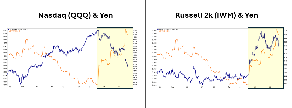
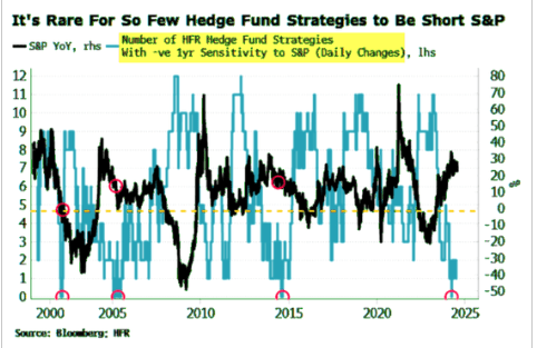
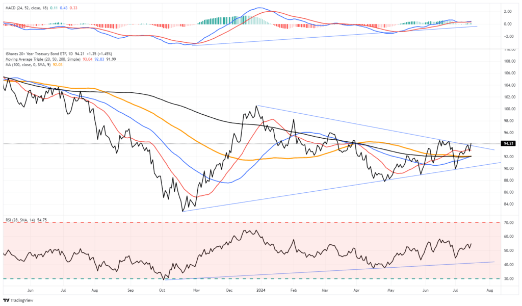
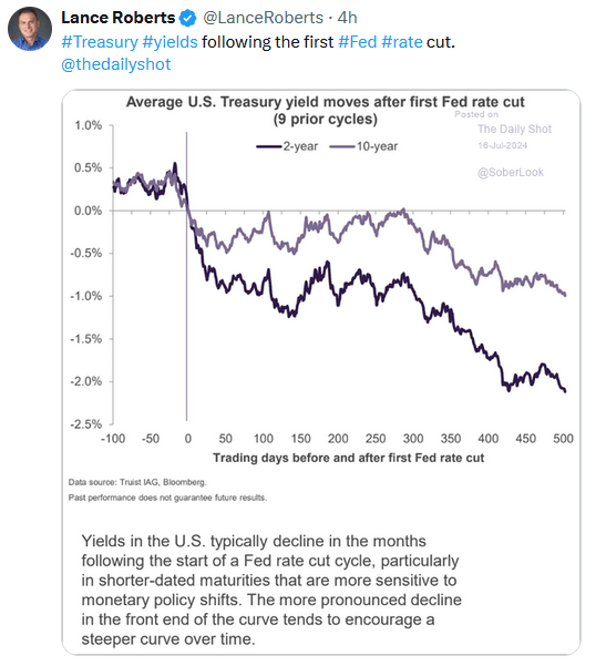
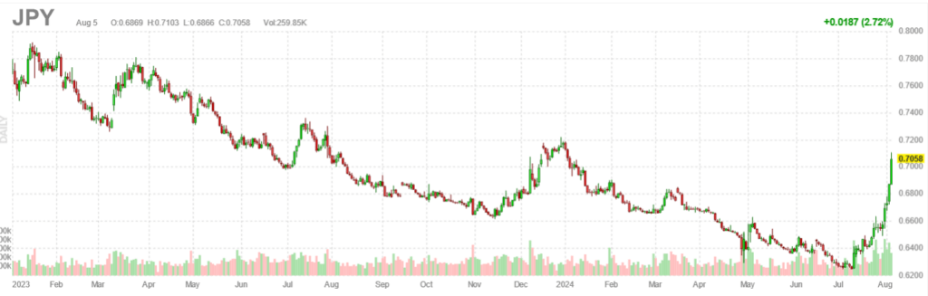
Now, consider that “yen carry traders” have leveraged highly volatile risk assets like cryptocurrencies, small-cap stocks, mega-cap stocks, and even the Japanese market. The carry trade works well as long as the Japanese Yen does not markedly appreciate, forcing a liquidation of the market leverage.

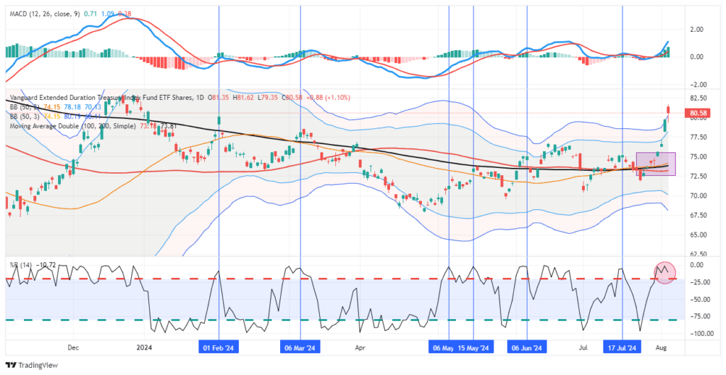
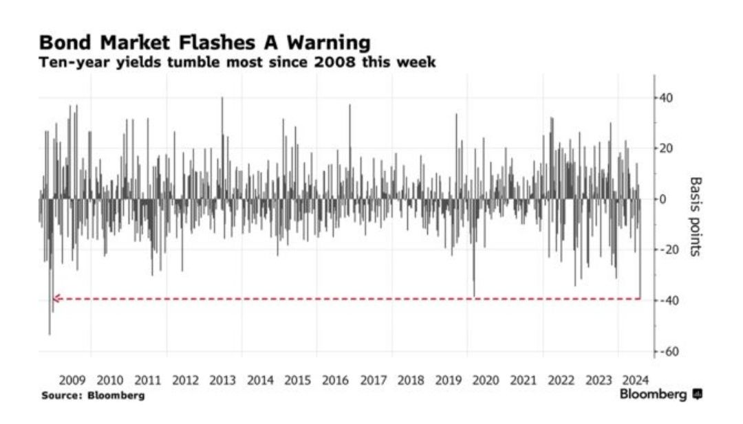
The problem, as shown below, is that the Yen has appreciated more than 15% in the last few weeks. As the Yen appreciates, the Japanese banks demand margin calls (i.e., the catalyst). When that occurs, the hedge funds, pension funds, insurance companies, or investors using the “Yen carry trade” must either put up more collateral or sell the leveraged assets. That reversal and forced liquidation created a vicious spiral by pushing the Yen higher and risk assets lower.

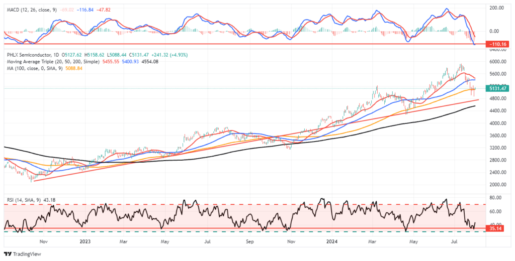
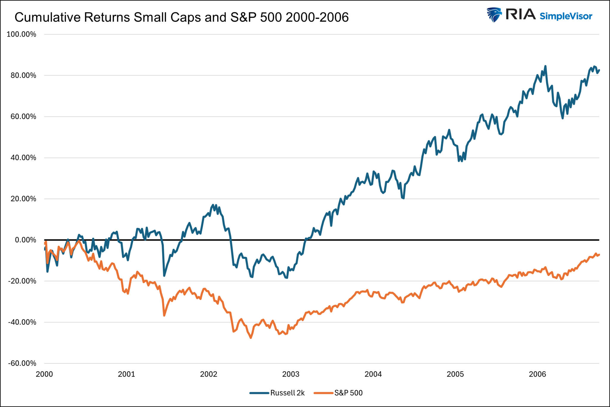
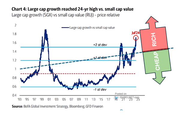
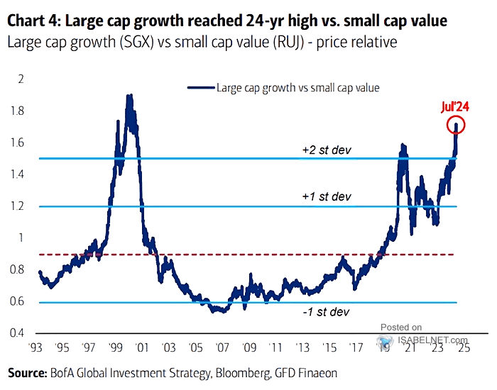
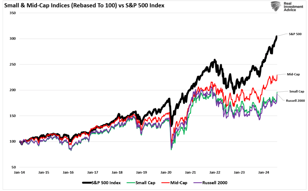
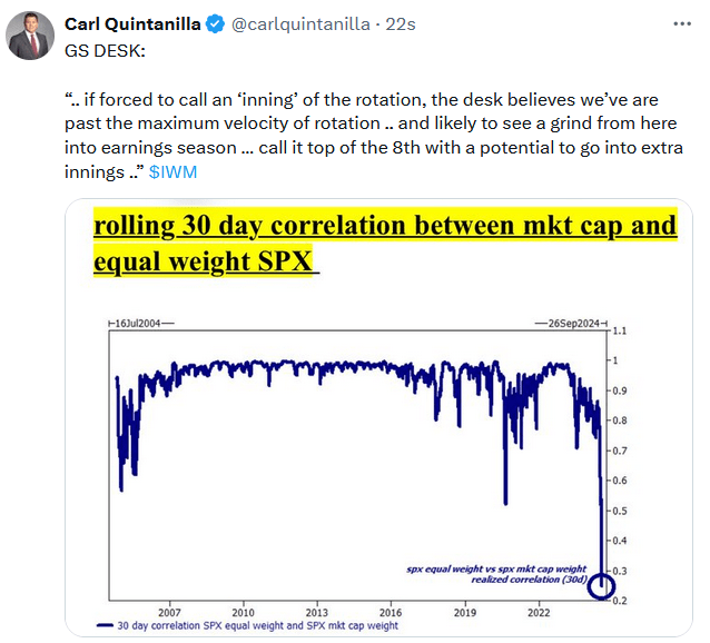
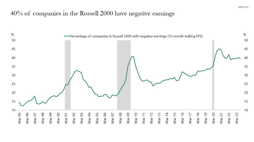
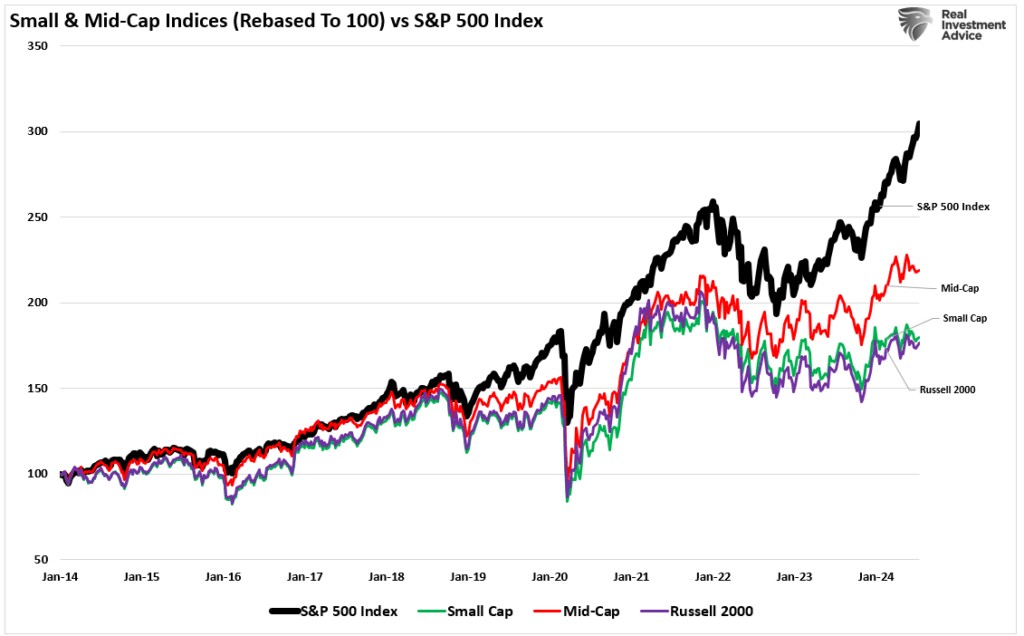
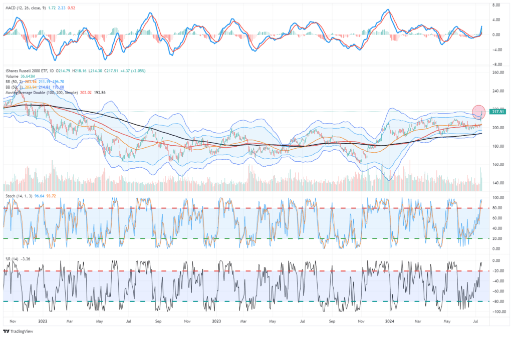
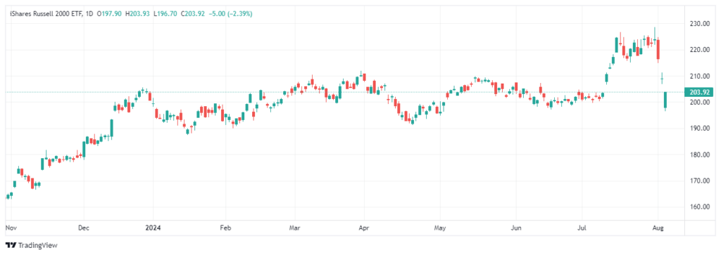
An excellent example of the “yen carry trade” was seen in the recent surge in the Russell 2000 index. As we warned in “Risks To The Russell,” the fundaments didn’t support the rotation.

For a deeper discussion on the “Yen Carry Trade,” Michael Lebowitz and I discussed the issue in a video update we sent to our clients Monday morning.

So, what happens next?

Ad for SimpleVisor. Don't invest alone. Tap into the power of SimpleVisor. Click to sign up now.

Market Unwind – More To Go?

As an investor, the most crucial action to take during”a“unexpected, exogenous event” is to DO NOTHING.

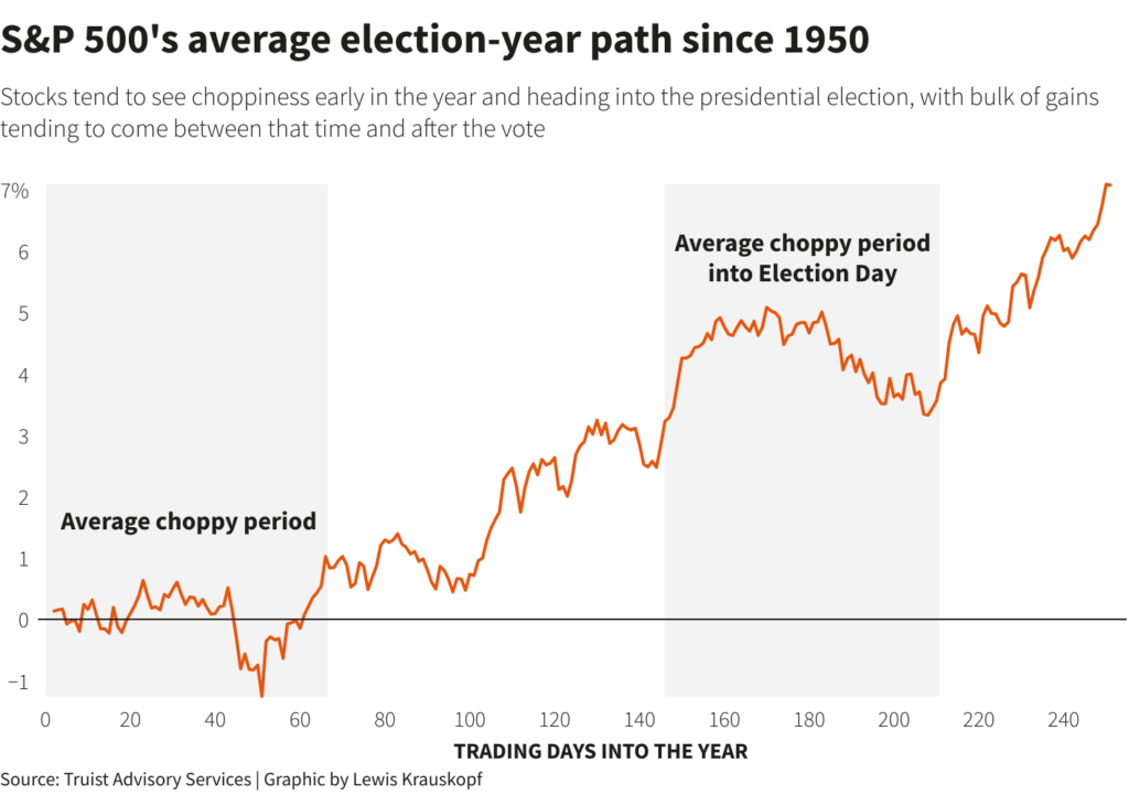
That’s right, don’t do anything. When something occurs, like a sharp market correction, our initial emotional response is to take action and begin liquidating positions. Such would certainly seem to be a logical reaction; however, more often than not, the time to sell positions was ahead of the event. Over the last two months, we have repeatedly warned that a 5-10% market correction was likely heading into the election. To wit:

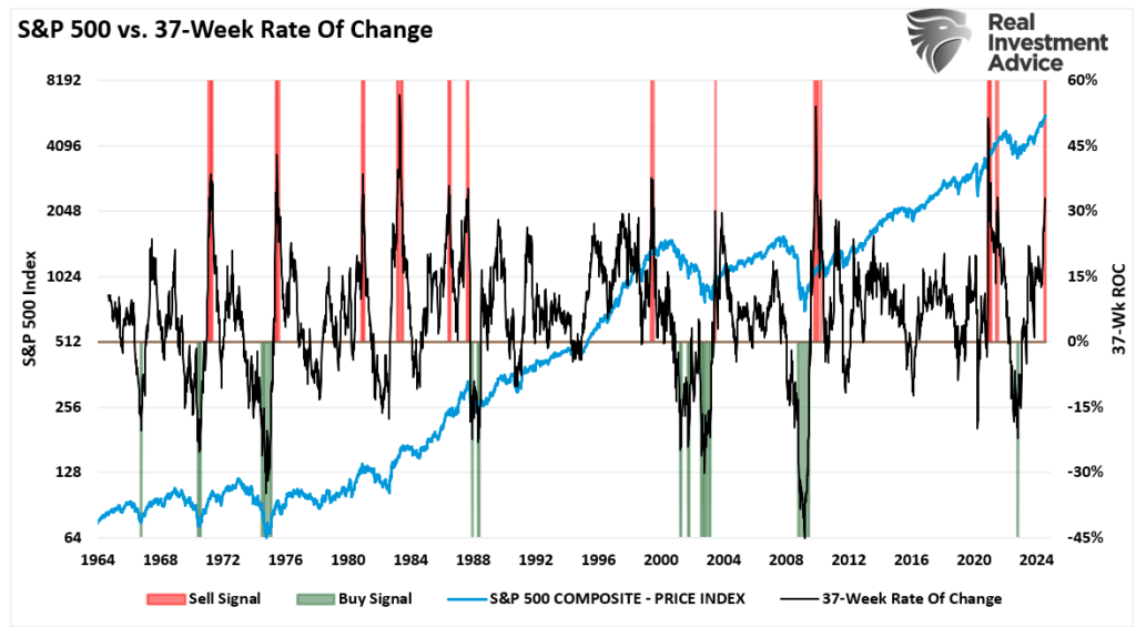
Historically, when the 37-week rate of change is greater than 30%, such events typically precede short—to intermediate-term corrections. While the bulls are very confident, the risk of a 5% to 10% correction over the next three months remains elevated.

In our non-options models, we will transition to more “defensive” positions, raise cash levels, and hedge as needed. Nothing suggests anything more than a 5-10% correction between now and November. Such will be the same as last year and historically in line with Presidential election cycles. While many often ignore the warning signs while markets rise, they tend to be the same ones panic-selling when they should buy.”July 13, 2024

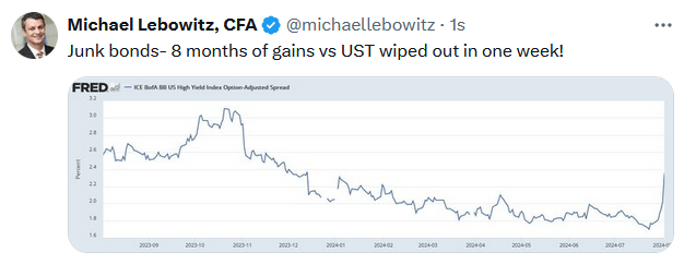
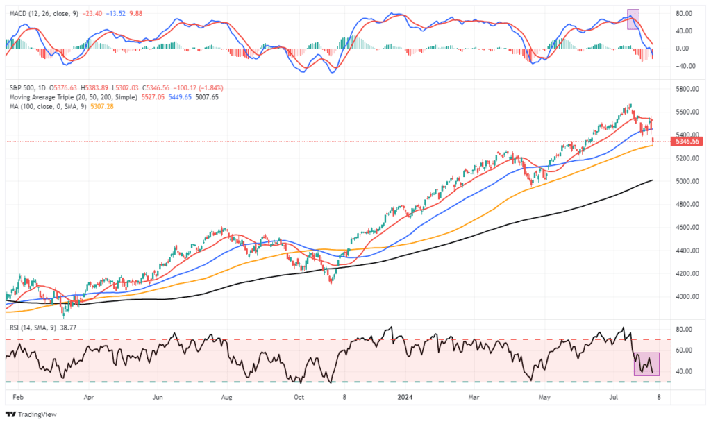
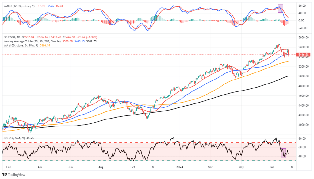
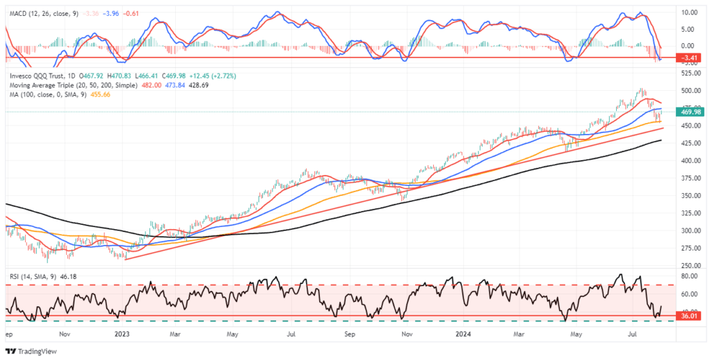
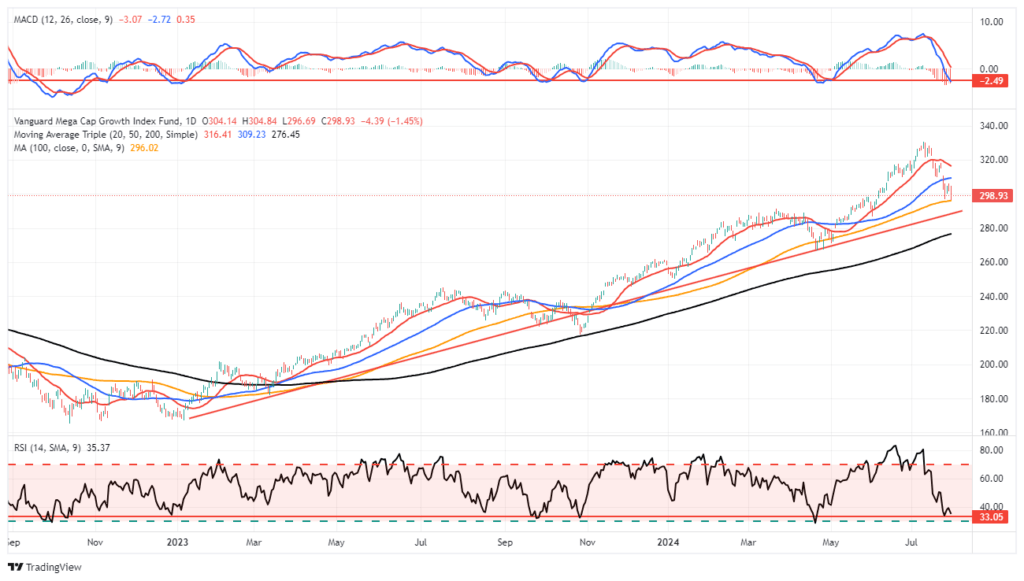
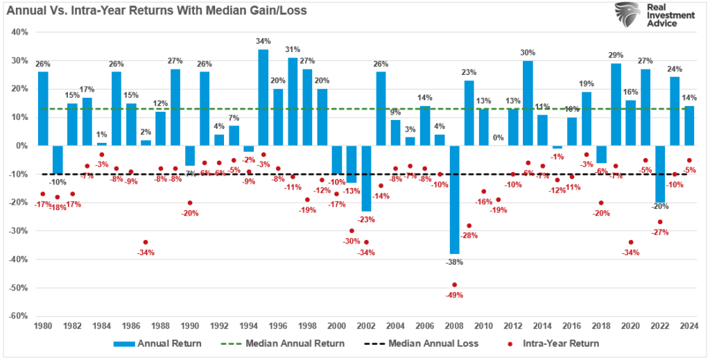
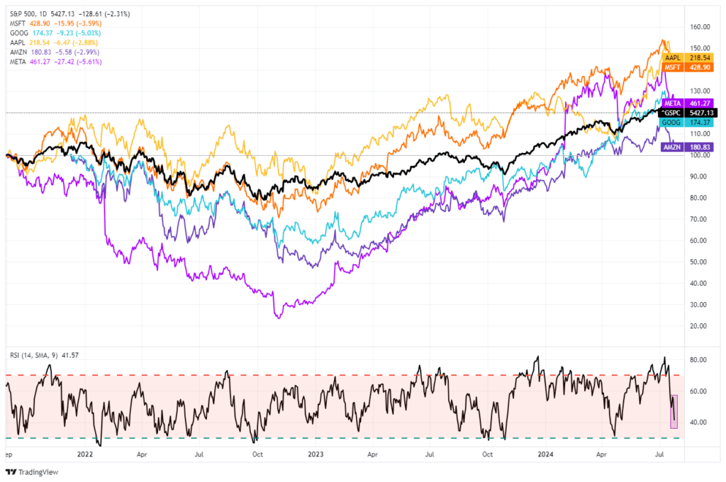
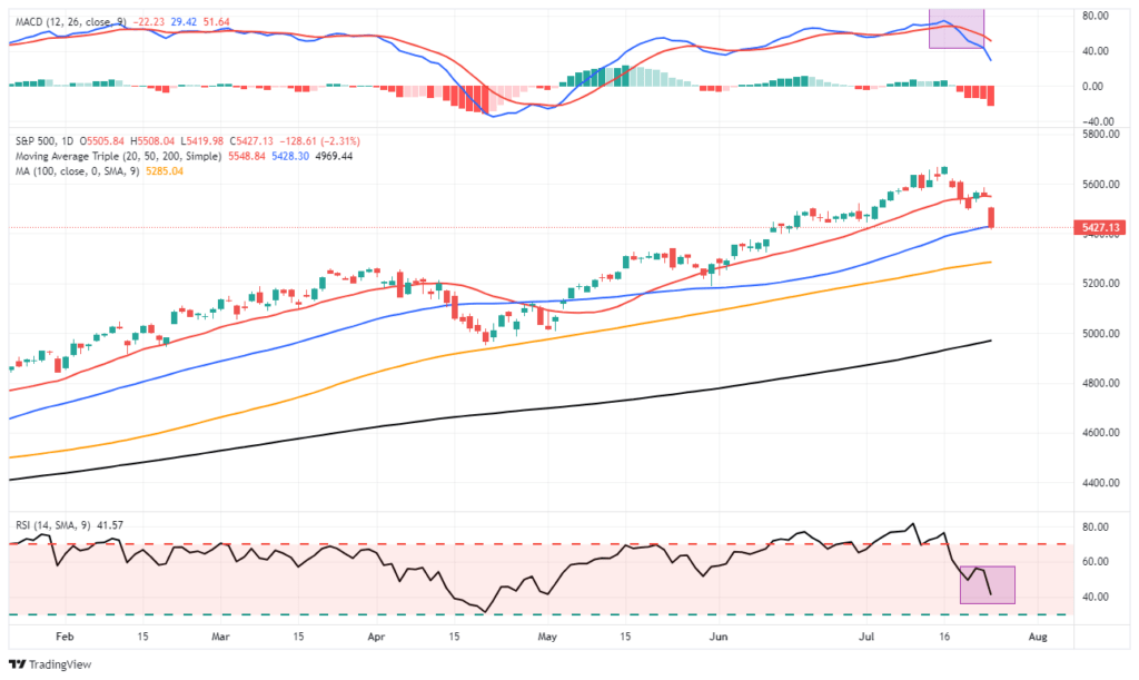
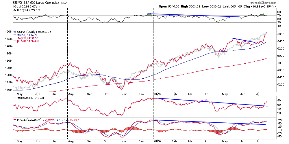
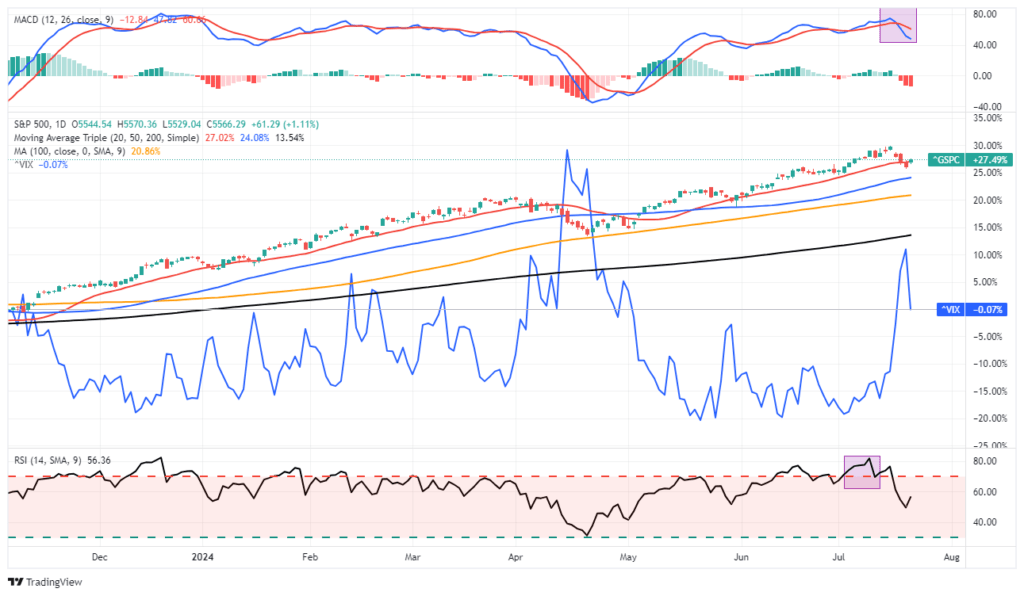
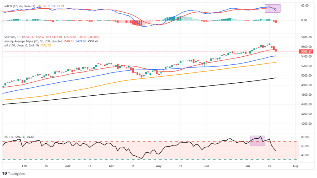
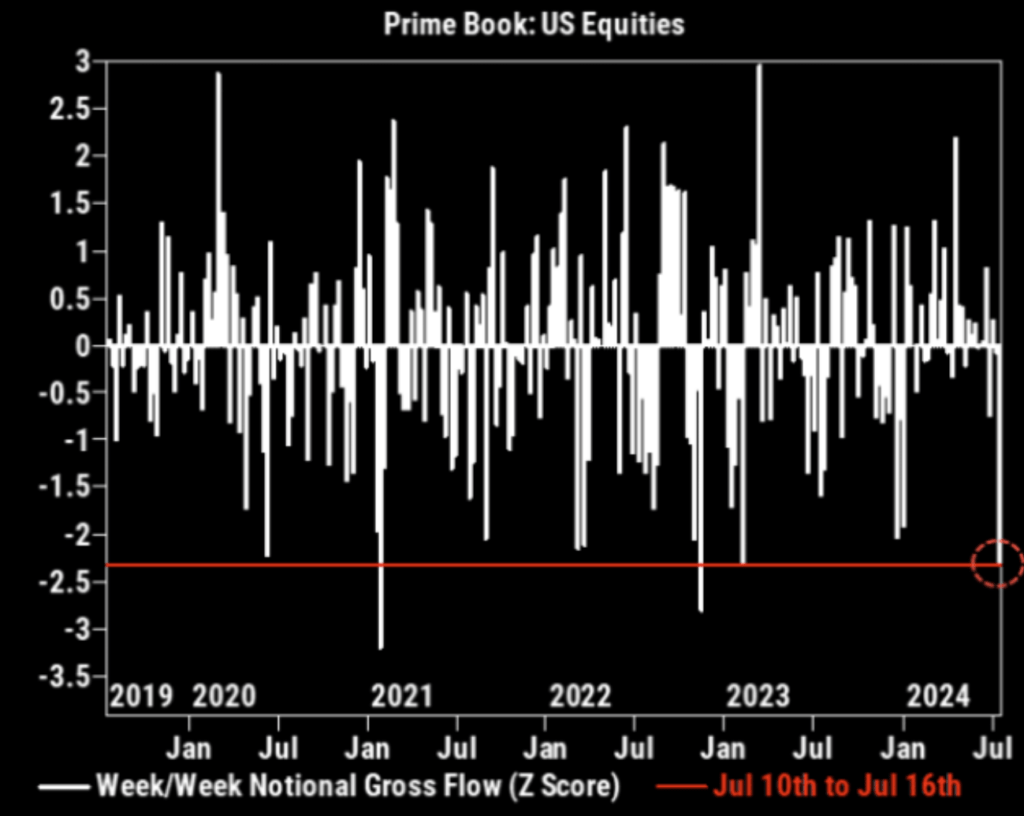
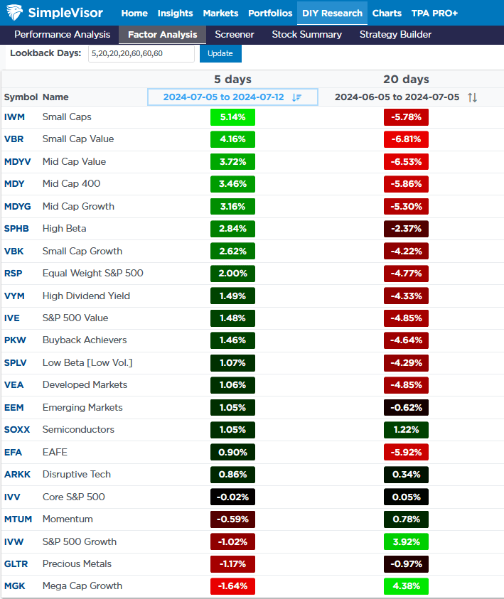
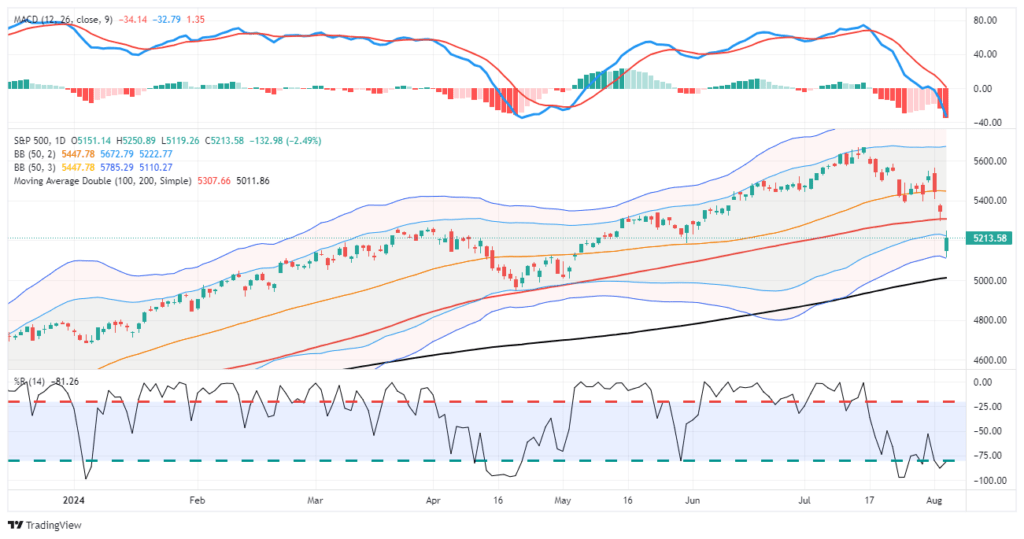
With the major markets deeply oversold short-term and sentiment becoming more bearish, it is quite likely the market will bounce over the next several days to a couple of weeks. However, as shown below, many investors were caught by the swiftness of the sell-off across all markets. These “trapped longs” will look for a rally to sell into, particularly in the more speculative areas of the market like small and mid-cap stocks, cryptocurrencies, and meme-stocks.

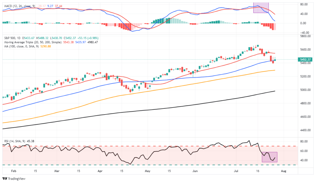
As shown, as of yesterday, the S&P 500 traded well into three (3) standard deviations below the 50-DMA. These more extreme and sharp declines are often met with buyers looking to “buy the dip.” However, with the market “gapping down” over the last couple of sessions, many of these “trapped longs” will look to exit closer to the 100-DMA. Following that, I would be unsurprised to see the market retest recent lows or decline further over the next month towards the 200-DMA.

Crucially, this event will pass, and patient investors will be rewarded with an opportunity to acquire assets at discounted prices. Such is, in fact, the very essence of investing and the goal of “selling high and buying low.” However, we must survive the turmoil until the next buying opportunity arrives.

Navigating The Pullback

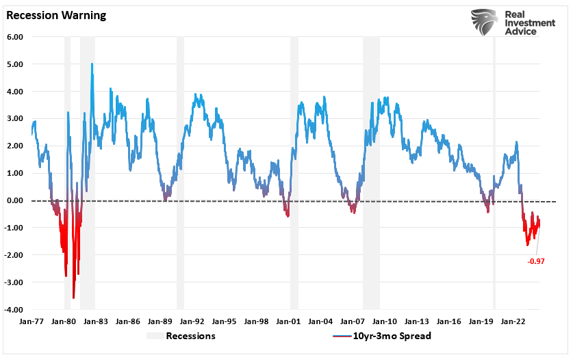
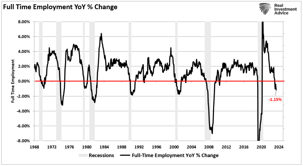
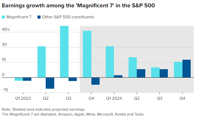
While the sell-off will certainly impair investor confidence, the demise of the “yen carry trade” is temporary. Wall Street has been using that strategy for the last 20 years. However, while expected, this decline could be with us for a while longer, particularly as the economy continues to show signs of slowing down. While the economy will likely avoid a “deep recession,” the odds of a “no landing scenario” are slim. Therefore, we should at least prepare for a slower earnings growth rate as economic activity recedes. The rules are simple but effective.

  1. Use near-term rallies to raise cash levels in portfolios.
  2. Reduce equity risk, particularly in areas highly dependent on economic growth.
  3. Add or increase the duration of bond allocations, which tend to offset risk during recessionary downturns.
  4. Reduce exposure to commodities and inflation trades as economic growth slows.

If the market declines further or a recession occurs, preparation allows you to survive the impact. Protecting capital will mean less time spent getting back to breakeven afterward. Alternatively, it is relatively easy to reallocate funds to equity risk if we avoid a recession and achieve a “soft landing.”

Other steps to take to ensure better portfolio outcomes are:

  • Have excess emergency savings, so you are not “forced” to sell during a decline to meet obligations.
  • Extend your time horizon to 5-7 years, as buying distressed stocks can get more distressed.
  • Don’t obsessively check your portfolio.
  • Consider tax-loss harvesting (selling stocks at a loss) to offset those losses against future gains.
  • Stick to your investing discipline regardless of what happens.

However, if I am wrong and the bull market resumes, it is an easy process to reallocate cash to equities and rebalance portfolios for growth as needed,

Most importantly, follow your process and keep your emotions in check.

The Yen Carry Dump

CLICK HERE for a short video on the state of the markets and yen carry trade.

Weak employment data, the simmering Middle East, election jitters, and many other factors are taking the blame for rattling the markets. Those are important issues, but the infamous yen carry trade is the culprit. How do we know? Some of the assets most popular with short-term speculators are getting hit the hardest. Furthermore, the sharp declines in those popular assets align with surges in the yen.

The following example of the yen carry trade is from our article, Japanese Inflation – Liquidity Crisis In The Making. The article is from 2022.

For example, you go to a Japanese bank and put down $100,000 in assets to borrow 1,000,000 yen for one year at 0%. You convert the yen to dollars and buy a one-year U.S. Treasury note at 3%. Assuming the yen’s value doesn’t change versus the dollar, the return will be 30% (3% * 10x leverage). If the yen appreciates by 1% over the year, and you did not hedge the currency risk, the return falls to 20%. A 5% appreciation of the yen results in a 20% loss.

The article’s example was a conservative version of the yen carry trade using a low-volatility Treasury note and comparatively minor yen moves. Now, consider that yen carry traders have been leveraging much more volatile assets like crypto, mega-cap US stocks, and Japanese stocks. Moreover, the yen has appreciated 15% in the last few weeks, as shown below. As the yen appreciates, the Japanese banks demand more collateral to support the loans. The investor then must put up more collateral or reverse the yen carry trade. Reversing, or forced liquidation, pushes the yen higher and said assets lower.

For now, the carry trade victims appear limited. We presume the Bank of Japan and the Fed have been on the phone constantly and will intervene in the currency markets before the problem spreads to a broader array of assets.

japanese yen

What To Watch Today

Earnings

Economy

Market Trading Update

As discussed yesterday, the market selloff caused by the “yen carry trade” certainly surprised traders. However, while stocks sold off, bonds rallied as the “risk off” trade continued recent momentum. From a trading perspective, bonds are now extremely overbought, and we will likely see a pullback in the next few days as potential profit-taking sets in. The ISM Services report was stronger than expected on Monday and was back in expansion territory. Given that services comprise nearly 80% of the economy, such suggests a near-term recession is unlikely.

The good news is that Treasury bonds have cleared all previous resistance levels, confirming the recent breakout. However, given the extremely overbought conditions, a retracement of the recent gains should be expected. Key support is the cluster of moving averages that coincides with the downtrend from the end of 2023.

We have previously warned that bond movements would be rapid. This is because Treasury bonds are the “risk-off” trade and become “in demand” when an event occurs. If you want to add bonds to your portfolio, remain patient and wait for a reversal of some of the more extreme overbought conditions. If you are long bonds, this isn’t a bad place to take some profits and rebalance holdings to target weights.

The BLS Is the Unlikely Driver Of The Yen Carry Dump

A few days ago, as shown below, the Bank of Japan raised interest rates to 0.25%, a 15-year high, and released a detailed plan to slow its bond-buying program. Higher interest rates and more prudent monetary policy are positive for a currency. Conversely, Friday’s weak BLS employment report and other poor economic data make Fed rate cuts more likely. Moreover, the Fed may slow down QT. Simply, the BOJ and Fed are moving in opposite directions. The result is a strengthening yen versus the dollar.

As the yen strengthens against the dollar, the yen carry trade becomes less rewarding. Therefore, if the BOJ continues to raise rates and reduce QE and if the Fed embarks on a rate-cutting policy, the yen will appreciate further. If it can do so relatively calmly, the risk to asset markets should be minimal. However, if the currencies move abruptly, so will the markets. Ergo, if there is central bank intervention, it will likely involve the currency and not emergency Fed rate cuts.

boj interest rates

Bond Yields Tumble

The bond market sent a clear warning last week. As shown below, last week’s 40bps decline in ten-year yields was the largest since the financial crisis. To be fair, yields fell by slightly less than 40bps during the start of the pandemic. Such a sharp drop in yields so suddenly is what the market calls a flight to safety. Typically, investors sell risky assets in times of turmoil and flock to safer ones.

The second graph shows the 30-year futures price of treasury bonds. Over the last week, bond prices broke out of a wedge pattern and briefly surpassed the December 2023 high. Furthermore, its price is closing in on a longer-term resistance line dating back to mid-2020 when yields were at record lows. We suspect that will hold as resistance until evidence of a recession becomes more significant. However, further yen carry volatility may push it higher temporarily. When the markets calm down, we suspect the price will fall back to prior resistance, between 120-123. From that point, a more sustainable rally will be possible.

10 year bond yields
30 year bond yield

Tweet of the Day

junk bonds

“Want to achieve better long-term success in managing your portfolio? Here are our 15-trading rules for managing market risks.


Please subscribe to the daily commentary to receive these updates every morning before the opening bell.

If you found this blog useful, please send it to someone else, share it on social media, or contact us to set up a meeting.

Are The Credit Markets Cracking?

This past weekend’s Newsletter discussed how yield curve un-inversions have an excellent track record of predicting recessions. Another historically reliable indicator of recessions is weakness in the corporate credit markets. In mid-July, we highlighted a troubling divergence between the best and worst-rated junk bonds in our Daily Commentary, The Credit Widening In The Coal Mine.

Our canary is the difference between the highest-rated junk bonds, BB, and the junk bonds closest to default, CCC. As shown, CCC bond spreads have been rising. However, BB spreads continue to drift lower. The increased spread between BB and CCC is only minor. In other words, the canary just coughed. Let’s watch the canary to see if its condition worsens.

The credit market canary is still coughing. The graph below shares a unique SimpleVisor tool that allows us to gauge the technical situation of the corporate credit markets. The screenshot captures the price ratio of a popular junk-rated bond ETF (JNK) to the 3-7-year U.S. Treasury ETF (IEI). The relationship serves as a proxy for credit spreads. The top blue line charts the price ratio. The long-standing outperformance of JNK vs. IEI has reversed. Further, in just two weeks, the price ratio erased its year-to-date gains. The graphs below the blue line show our proprietary stochastic model, the MACD, and a popular stochastic model. All three show the JNK/IEI relationship is on a sell signal. Moreover, as the price ratio rose this year, the three indicators were setting lower highs.

The canary is far from keeling over, but like the yield curve, credit spreads should be followed closely if the economy continues to weaken.

simplevisor junk spreads credit

What To Watch Today

Earnings

Economy

Market Trading Update

As noted last week, the continuation of the market correction is unsurprising.

However, while the markets are oversold enough for a reflexive bounce, the current correction process is likely incomplete. Moreover, the MACD “sell signal” also suggests that the current upside remains limited.

It is quite likely that any short-term, reflexive rally will fail during this corrective process. For now, use rallies to rebalance portfolios and reduce risk as needed. Our only concern is that with investors remaining very bullish despite the recent pullback, a further correction is required to resolve that condition.

Such happened this past week, with a strong rally on Wednesday that failed. What is clear is the market is starting to recognize that Federal Reserve rate cuts are not bullish for stocks. As we have discussed, when the Fed cuts rates, it often coincides with weaker economic activity, which precedes a decline in earnings growth. The drop in the ISM manufacturing index and a terrible employment report bolstered those concerns. Unsurprisingly, the market is beginning to discount the impact on earnings by reducing stock prices.

While the correction has been quite normal, Friday’s break of the 50-DMA suggests the correctional process continues. As we discussed in June and July, a 5-10% correction was likely, and we are in the middle of that process. The market is getting decently oversold, and we are likely seeing a short-term exhaustion of sellers. Notably, the market held the 100-DMA on Friday, which was critical support during the April correction. With markets oversold, we would be unsurprised to see a reflexive rally next week. Use rallies to rebalance risk and reduce exposure as needed.

We are seeing a consistent string of weaker-than-expected economic data, which suggests the economy is slowing more than headlines suggest.

The Week Ahead

The bulk of corporate earnings are now behind us. Nvidia’s earnings report on August 28 will be the next big one for the market. Accordingly, with stock buyback blackouts over, stock buybacks may provide some ballast to the market.

Fed members will hit the speaking circuit this week, and we presume many of them will cement the idea of a rate cut in September. More importantly, we look forward to hearing their views on whether 50bps in September is appropriate and the total cuts they expect for the year.

ISM Services on Monday will help the market better assess inflation and employment. As we noted, the ISM manufacturing employment report was decidedly weak. Jobless claims on Thursday will also shed more light on the labor market.

The BLS Labor Report Triggers Calls For A 50bps Rate Cut

The employment situation took a turn for the worse on Friday. The BLS employment report headline gain of 114k jobs was 60k weaker than expected. Furthermore, last month’s figure was revised lower by 27k jobs. However, as we have seen in the previous few months, the underlying data points to more weakness than the headline figure. The unemployment rose two-tenths of a percent to 4.3%, while average hourly earnings and hours worked fell. The U6 unemployment rate, which is more encompassing than the oft-quoted U3, rose from 7.4% to 7.8%.

The first graph below shows the annual growth of average hourly earnings times average weekly hours. This proxy for average yearly salaries shows that the current growth rate is back to pre-pandemic levels. The three-month growth rate is equal to the 2012-2019 average. Is it any wonder Powell said the labor market is back to where it was on the eve of the pandemic?

The Fed Funds futures markets now imply a 70% chance the Fed will cut rates by 50bps at the September 18 meeting. Furthermore, the market is now pricing 100 to 125bps of rate cuts by year-end. Given Powell’s statements last week, seeing the market aggressively pricing in rate cuts on the heels of the BLS report is unsurprising.

labor market hourly earnings and hours worked bls
fed probabiities

Tweet of the Day

credit spreads versus the Russell 2000

“Want to achieve better long-term success in managing your portfolio? Here are our 15-trading rules for managing market risks.


Please subscribe to the daily commentary to receive these updates every morning before the opening bell.

If you found this blog useful, please send it to someone else, share it on social media, or contact us to set up a meeting.

The Election Nears: What Can Investors Expect?

As the election nears, investors will become more anxious about how the market may react to each candidate and their campaign promises. Accordingly, we suspect that shifting polls will breed volatility. Moreover, with President Biden dropping out of the race, this presidential election is unique. Below, we share and discuss two charts to help guide our expectations.

The graph on the left, courtesy of Ryan Detrick, shows that since 1900, there have only been five Presidents, excluding Biden, who have decided not to run for a second term. Four of those five years saw stocks make impressive gains. Furthermore, the average for the five instances is a gain of 16.5%. As of early August, the market is ahead of the average. Given that there have been only five examples over the last 125 years, take the graph results and average with a grain of salt.

The graph on the right may be more salient. It shows that, on average, stocks tend to do well during election years. However, the average is boosted by years in which the sitting President ran for another term. Years like this one, in which neither candidate is the sitting President, have been weak on average. Notably, the market seems to grow the most anxious in the two months leading to the election. Therefore, the simple takeaway from the chart is that markets do not like uncertainty as we have.

election year outcomes

What To Watch Today

Earnings

Economy

Economic Calendar

Market Trading Update

As noted yesterday, the market is decently oversold; however, we remain somewhat cautious with sell signals in place. Following yesterday’s weak economic data, the market sold off as concerns of slower economic growth overshadowed strong earnings from META and ELY. As noted previously, the Fed cuts rates to stave off economic weakness. However, the market has largely ignored the “economic weakness” part, which will impact earnings growth.

While yesterday’s selloff reversed most of Wednesday’s gains, the market held support at the 50-DMA, which continues to act as key support. If the market breaks the 50-DMA, which is possible, the 100-DMA will provide the next support. As noted, the market is oversold enough for a short-term rally. We continue to suggest using rallies to reduce risk and rebalance exposures as needed. Notably, many stocks are reaching levels where good buying opportunities have previously presented themselves.

ISM Provides An Omen For Today’s Employment Report

The ISM Manufacturing survey sent bond yields lower as the odds of a weak employment number today, and a Fed cut in September increased. The broad ISM survey fell further into economic contractionary territory at 46.8, down from 48.5 last month. Most stunning, the employment component fell sharply and is now at its lowest level since mid-2020. The second graph below, courtesy of Rosenberg Research, shows that the employment index is now at levels only seen during recessions.

Also noteworthy was that prices paid were faster than the prior month, but new orders, a good indicator of future activity, fell into contractionary territory. The bond market seems to be ignoring the price component and focusing on employment.

ism manufacturing table
ism employment

Earnings Expectations and Confidence Diverge

The first graph below, courtesy of Francois Trahan, highlights that consumer confidence is declining, yet EPS expectations are rising. Since personal consumption drives the economy and consumer confidence plays a significant role in personal spending habits, earnings and confidence are typically well correlated.

Trahan’s second set of graphs shows historical instances with similar deviations as we see today. As shown, earnings ultimately fell back in line with declining confidence.

earnings estimates and consumer confidence

Tweet of the Day

truflation inflation

“Want to achieve better long-term success in managing your portfolio? Here are our 15-trading rules for managing market risks.


Please subscribe to the daily commentary to receive these updates every morning before the opening bell.

If you found this blog useful, please send it to someone else, share it on social media, or contact us to set up a meeting.

The Sahm Rule, Employment, And Recession Indicators

Economist Claudia Sahm developed the “Sahm Rule,” which states that the economy is in recession when the unemployment rate’s three-month average is a half percentage point above its 12-month low. As shown, the latest employment report has triggered that indicator.

Sahm rule, unemployment rate and recessions.

So, does this mean a recession is imminent? Maybe. However, we can now add this indicator to the long list of other recessionary indicators, also flashing warning signs.

As discussed in “Conference Board Scraps Its Recession Call,” the Leading Economic Index (LEI) has a long history of accurately predicting recession outcomes. As we showed, each previous decline in the 6-month rate of change in the LEI from the Conference Board has aligned with a recession. We are currently in one of the most extended periods on record where the LEI reading has remained below zero but without a declared recession.

We also discussed the inverted yield curve, which suggests that recession risks remain. To wit:

“While the Conference Board has abandoned its recession call, the bond market has not. The yield spread between the 10-year and 2-year Treasury Bonds remains deeply inverted. Notably, the inversion is NOT the recessionary warning. It is when that yield-curve UN-inverts that signals the onset of a recession. Such has historically occurred in response to Federal Reserve rate cuts to try and offset a rapidly slowing economy.”

Rate Cuts Coming

With the Fed getting ready to cut rates for the first time since 2020, will the yield curve’s un-inversion again signal a recessionary onset?

So far, the economy has defied recessionary expectations. That was due to the flood of monetary stimulus from the Inflation Reduction Act and the CHIPS Act and a surge in deficit spending, which supported economic growth. However, that expenditure surge has now peaked and turned lower, dragging on economic growth in the future.

We see that same support to economic activity in the monetary supply (M2) as a percentage of the economy. While those monetary and fiscal supports caused economic growth to surge following the “pandemic-related” spending spree, both are reversing.

However, as the monetary stimulus reverses, the risk of a recession increases as consumption slows.

That is why the “Sahm Rule” and employment in general are among the most critical recessionary indicators.

Why Is Employment So Important?

The U.S. is a consumption-based economy. Critically, consumers can not consume without producing something first. Production must come first to generate the income needed for that consumption. The cycle is displayed below.

Of course, if you bypass the production phase of the cycle by sending checks directly to households, you will get a strong surge in economic growth. As shown in the M2 to GDP chart above, the massive spike in economic growth in the second quarter of 2021 directly resulted from those fiscal policies.

However, once individuals spent that stimulus, economic activity subsided as the production side of the equation remained lagging. Here is the crucial point about employment and why the “Sahm Rule” matters.

“For a household to consume at an economically sustainable rate, such requires full-time employment. These jobs provide higher wages, benefits, and health insurance to support a family. Part-time jobs do not.”

While the media touts the ‘strong employment reports,’ such is mostly the recovery of jobs lost during the economic shutdown. However, the reality is that the full-time employment rate is falling sharply. Historically, when the rate of change in full-time employment dropped below zero, the economy entered a recession.

Notably, given the surge in immigration into the U.S. over the last few years, the all-important ratio of those employed full-time relative to the population has dropped sharply. As noted, given that full-time employment provides the resources for excess consumption, that ratio should increase for the economy to continue growing strongly. However, full-time employment has decreased since the turn of the century as automation, technology, and offshoring have risen. While President Biden recently touted strong employment growth in his SOTU address, full-time employment as a percentage of the working-age population failed to recover to pre-pandemic levels.

Notably, sharp downturns in full-time employment have coincided with recessionary onsets. Such should be unsurprising as corporations scale back on labor, their most considerable expense, as consumer demand falls.

Ad for SimpleVisor. Don't invest alone. Tap into the power of SimpleVisor. Click to sign up now.

No Job = No Income

The problem with declines in full-time employment is that, as noted, it negatively impacts economic consumption. While the current administration has been able to offset that decline with a massive increase in deficit spending, the latter is not sustainable. Combine that with the decline in wage growth, and the potential stress on the economy becomes more apparent. As shown, compensation continues to decline even as price inflation remains elevated, which weighs on consumers’ ability to maintain their living standards.

However, that chart is a bit deceiving as it reflects all compensation and wages. Twenty percent (20%) of income earners have seen wages increase, particularly for “C-Suite” executives. However, for the bottom eighty percent (80%) of employees, the decline in wage growth is quite dramatic and on par with previous recessions.

As noted, as the economy slows, employers look to reduce the most costly aspect of any business – employment. Cutting full-time jobs is the most efficient way to protect earnings and profitability. While employers tend to hang on to employees as long as possible, employees eventually get sacrificed when protecting profits. As such, a reasonably predictable cycle continues until exhaustion is reached.

Conclusion

However, it is worth noting that while full-time employment is declining as the economy slows, temporary help is also declining. In other words, companies are slashing employment at all levels, which doesn’t support the “strong economy” narrative.

The decline in wages and jobs should be unsurprising. Small businesses comprise 50% of the employment makeup and have failed to see the surge in sales growth touted by the mainstream media. While they initially raised wages to attract talent following the shutdown, that is beginning to reverse as sales fail to materialize.

While there may not be any indication of a recession in the next 12 months, according to mainstream economists, it is likely worth paying attention to what is happening in employment since nearly 70% of economic growth is derived from consumption. The “Sahm Rule” is another essential indicator suggesting that underlying economic weakness is more significant than the headlines suggest.

Sure, this “time could be different.” The problem is that, historically, such has not been the case. Therefore, while we must weigh the possibility that analysts are correct in their more optimistic predictions of a “soft landing,” the probabilities still lie with the indicators.

While the LEI and inverted yield curves suggest that the “conditions” for a recession are present, the “Sahm Rule” and measure of full-time employment tend to be the “evidence” of one.

Of course, this is probably why the Federal Reserve is pushing to cut rates even though inflation remains well above its target.

A Fed Cut In September Nears Certainty

While it’s far from guaranteed, a Fed rate cut in September is looking increasingly likely. Wednesday’s FOMC statement changed to reflect a growing concern for the labor markets and less worry about inflation. The opening paragraph below says job gains have moderated, whereas the prior statement said job gains remained strong. They also changed the characterization of inflation by adding the word “somewhat” in front of elevated.

Recent indicators suggest that economic activity has continued to expand at a solid pace. Job gains have moderated, and the unemployment rate has moved up but remains low. Inflation has eased over the past year but remains somewhat elevated. In recent months, there has been some further progress toward the Committee’s 2 percent inflation objective.

For the first time in a while, the Fed appears to be equally managing their two mandates, labor and prices. Before this meeting, inflation was the most important of the two. As they note:

The economic outlook is uncertain, and the Committee is attentive to the risks to both sides of its dual mandate.

The prior statement said: “The economic outlook is uncertain, and the Committee remains highly attentive to inflation risks.

While not explicit, the Fed’s FOMC statement certainly leaves the door open for a rate cut at the next meeting. As shown below, Fed Funds futures imply a 100% chance of a Fed cut in September and a 12% chance that the Fed’s September rate cut will be 50bps.


What To Watch Today

Earnings

Economy

Market Trading Update

After the recent decline, I am starting to like the setup for adding back to Technology and Semiconductor stocks. From a technical perspective, the recent decline in the Nasdaq (QQQ) and the Semiconductor sectors (SOX) was needed to reverse some of the more egregious overbought conditions. Such was the point of yesterday’s commentary on the Megacap Growth ETF (MGK). The chart of QQQ shows the same setup as MGK yesterday, which is obvious since they are dominated by the same stocks.

The Philadelphia Semiconductor Index (SOX) has a similar setup.

Notably, the recent drawdown in the SOX index was extremely aggressive, and previous such drawdowns have been good buying opportunities for increasing exposure.

Notably, the recent selloff in the semiconductor and mega-cap stocks was driven by a narrative that the “AI Trade” is dead as there is no viable money-making product for AI, and companies will drastically cut CapEx in artificial intelligence. The problem with that narrative is that it is WAY too early to know that with any certainty, and AMD’s earnings report certainly doesn’t support that narrative. As noted yesterday:

“My 2c is that there is enough evidence in tech prints tonight that suggests to me that growing AI fears lately on fears of capex stalling/slowing or lack of monetization proof (essentially any way for ppl to try to call peak on AI spend) is not necessarily occurring in the fundamentals nor the company’s messages as much as one would think reading news or looking at how any of these stocks have traded in the last 6 weeks.” – JP Morgan.

Will the “AI Trade” eventually come to an end? Most assuredly. However, it is likely not now, and the recent selloff looks more like a buying opportunity to me than not.

Jerome Powell’s Press Conference

Given that the Fed appears to be preparing markets for a rate cut in September, it’s worth sharing a few quotes from Jerome Powell’s FOMC press conference and some commentary.

  • “Data suggest that the labor market has returned to where it was on the eve of the pandemic.”
  • “If the labor market were to weaken unexpectedly, we are prepared to respond.”
  • The Fed remains data-dependent.
  • Powell thinks a rate could occur in September if inflation continues moving down with expectations and the labor market remains firm.
  • The Fed is “well-positioned to respond to labor market weakness.” A poor employment number from the BLS all but assures a rate cut in September.
  • They didn’t cut at the meeting because they didn’t want to undermine progress on inflation.
  • He won’t give specific forward guidance on the pace or timing of future rate cuts.
  • This is a broader disinflation.” This is in reference to the recent decline in inflation compared to last year. Powell is optimistic the recent decline in inflation is sustainable.
  • “There was a real discussion about the case for reducing rates at this meeting, but the strong majority supported not moving rates at this meeting.”

Another Weak Labor Report

The ADP private sector jobs report showed a below-consensus gain of 122K compared to 155K last month. This is the lowest job growth since January’s 111K, bringing the 2024 monthly average to 160K. ADP’s Chief Economist Nela Richardson made a very important statement regarding the report: “If inflation goes back up, it won’t be because of labor.” If correct, a critical driver of inflation is no longer a problem.

The breakdown of the contribution within the labor report was interesting. Services comprised +85K of these new hires, with goods-producing businesses adding +37K. By industry, Trade/Transportation/Utilities led the way with +61K jobs filled, followed by +39K in Construction, +24K in Leisure/Hospitality, and +22K in Education/Healthcare. Remember, Leisure/Hospitality was adding 400k to 500k jobs a month not long ago.

Manufacturing lost 4K jobs, Information Services were down 18K, and Professional/Business Services, which, like Leisure/Hospitality, had been among the highest-growing employment sectors, shed 37K jobs.

Between ADP and JOLTs, the labor market clearly shows signs that the labor market has normalized completely. The current estimate for Friday’s BLS payroll growth is +185K. Note that the BLS survey only includes large companies. However, as shown below, companies with less than 50 employees have seen no job growth for about a year. This is a good example of the weakness beneath the headlines.

adp small jobs vs large jobs payrolls

Tweet of the Day

wage labor growth

“Want to achieve better long-term success in managing your portfolio? Here are our 15-trading rules for managing market risks.


Please subscribe to the daily commentary to receive these updates every morning before the opening bell.

If you found this blog useful, please send it to someone else, share it on social media, or contact us to set up a meeting.

Hedges For A Volatile Market- Answering A Reader Question

A SimpleVisor subscriber asked us a poignant question; we think the answer is worth sharing. Simply put, we were asked if we had any hedges in the portfolio and how we might hedge in the future. We currently do not have any shorts or option hedges in place. However, we have trimmed some positions to reduce our equity holdings and increase cash. Cash can be a great hedge in this environment. It earns over 5%, but more importantly, if there is a correction, it allows us the means to buy stocks at discounted prices.

As we note daily in our Market Trading Update within our Commentaries, we are not expecting a sharp drawdown but a market that may go nowhere over the next several months, albeit with some volatile up-and-down movements. We may take a few additional steps if we change our forecast and grow concerned that the recent correction may have more legs. For starters, we may hedge by further reducing our equity exposure, thereby increasing our cash position. We may also add to our bond positions if we believe bond yields will fall with a declining equity market. As we have in the past, we may add short positions, be it inverse ETFs and or option strategies for our high-net-worth clients. Further, if the rotation trade continues, we may replace some large-cap exposure with small-cap and/or value stocks. Such a hedging strategy worked well in the dot-com bust.

The graph below charts the price return from the S&P 500 peak in 2000 through 2006. As shown, small caps were a good hedge and produced robust returns.

small cap hedge versus S&P 500

What To Watch Today

Earnings

Economy

Market Trading Update

Over the last few weeks, we have seen a normal and healthy rotation out of mega-cap growth companies and into other market areas. Small and mid-cap value have done well but are now overbought, while the mega-cap growth companies are oversold.

While this rotation could last a bit longer, the technicals of the “Mega-cap” stocks, represented by the Mega-Cap Growth ETF (MGK), are becoming more compelling. With MGK very oversold and on a deep “sell signal,” a tradeable rally looks quite probable. However, such will likely not be the case until after the mega-caps report, and share buybacks can be restarted in the next few weeks.

We added to our AMD position a bit yesterday and are looking for an opportunity to add back to our Mega-caps soon. As we noted previously, given that the bulk of earnings come from these mega-cap companies, we seriously doubt the dominance of these stocks is over…at least for now.

JOLTs

The number of job openings in the JOLTs survey fell slightly from 8.23mm in May to 8.18 in June but was above the consensus of 8.00mm. While the headline data was solid, the underlying data points to weakness in the labor markets. We have witnessed the same type of discrepancies in the BLS employment reports. To wit, the hires rate fell from 3.6% to 3.4% and is now the lowest since the early days of the pandemic. Moreover, excluding 2020, it is at a ten-year low. Further, the unemployment rate was almost 7% in 2013, when it was last at 3.4%.

Also noteworthy is the quits rate. The second graph shows that it has steadily declined and is at three-year lows. Quits are a good barometer of employee confidence. When employees are confident they can easily find another job, typically higher paying, the quits rate rises. Thus, this report points to broad employee consternation, which may be one factor behind sagging consumer confidence.

jolts hires rate
jolts quits rate

P&G- Another Consumer Company Feeling The Effects Of A Slowing Consumer

On Monday, we highlighted McDonald’s same-store sales, which had declined for the first time since spring 2020 when the pandemic was raging. Like McDonald’s, P&G’s CEO noted that its customers are tightening their purse strings. Its earnings slightly beat estimates, but sales fell short and were flat compared to last year. It appears that P&G, like many retailers, is struggling to pass on higher prices and is increasingly in the position of having to discount prices to drive sales. P&G also reduced forward guidance as its CEO acknowledges it is “in a challenging economic and geopolitical environment.” As shown below, P&G shareholders are not taking the news well. The shares are down over 5% on the day, erasing nearly half of the shares’s 2024 gains.

p&G stock

Tweet of the Day

consumer confidence

“Want to achieve better long-term success in managing your portfolio? Here are our 15-trading rules for managing market risks.


Please subscribe to the daily commentary to receive these updates every morning before the opening bell.

If you found this blog useful, please send it to someone else, share it on social media, or contact us to set up a meeting.

Is There Value In Small Cap Value Versus Large Cap Growth

The graph below, making the rounds on social media, serves as evidence from many market pundits that the significant outperformance of large cap growth stocks versus small cap value stocks is due for an imminent reversal. While their predictions may prove correct, it is a grossly flawed argument if it’s based on the graph.

large cap growth vs small cap value

The graph charts the price of a portfolio of large cap growth stocks divided by the price of a portfolio of small cap value stocks. The relationship, or price ratio, is currently over two standard deviations above its 30-year average. The graph alludes that the average price ratio is also a fair value. Such an assumption is ridiculous.

Orange Juice and Coffee

Just as large cap growth and small cap value stocks are stocks, orange juice and coffee are types of drinks. Should the price of coffee relative to orange juice be constant? Probably not.

They may move similarly up and down with food commodity prices or other broad macro factors. However, their long-term price relationship depends on their individual supply and demand curves. Assuming coffee prices are cheap compared to orange juice prices based solely on the graph below is erroneous.

coffee vs orange juice prices
Ad for financial planning services. Need a plan to protect your hard earned savings from the next bear market? Click to schedule your consultation today.

Defining Large Cap Growth and Small Cap Value

Like coffee and orange juice, small cap value stocks differ vastly from large cap growth stocks.

One of the most critical factors explaining the performance differences between small cap value and large cap growth stocks is the sector in which the companies operate, and the earnings growth associated with each industry.

To better appreciate the differences between the two stock factors, we use two popular ETFs.

  • IVW is the iShares S&P 500 Large Cap Growth ETF. Its top five holdings, accounting for about 45% of the ETF, are Microsoft (12.30%), Apple (12.10%), Nvidia (11.40%), Amazon (4.20%), and Meta (4.20%). The combined market caps of those five stocks sum up to $13 trillion. That is quite impressive, considering it represents over 10% of the total size of global stock markets and a quarter of the U.S. stock markets.
  • IJS is the iShares S&P 600 Small Cap 600 Value ETF. Its top five holdings, accounting for less than 5% of the ETF, are Robert Half (1.05%), Comerica (1.04%), Mr. Cooper Group (0.88%), Organon (0.86%), and Lincoln National (0.86%). Their combined market caps total $31 billion, or the size of Archer Daniels Midland, the 273rd largest stock in the S&P 500.

Sector Breakdown

The following graph shows the stark differences in the sector contributions to IVW and IJS.

holdings large cap growth vs small cap value

Technology stocks represent 50% of IVW, yet less than 10% of IJS. Conversely, Financials comprise 28% of IJS but only 5% of IVW. Utilities and Real Estate account for less than 1% of IVW in aggregate but are over 10% of IJS.

Each sector and its underlying companies have different earnings growth profiles. The technology sector tends to exhibit the highest earnings growth. Financials, utilities, and real estate often have more reliable but slower growth rates.  

Earnings Matter

Ask yourself this:

Should an ETF consisting of companies growing earnings at a double-digit pace maintain a steady price relationship with an ETF of companies growing earnings at a much lesser growth rate?

To answer the question, consider the scatter plot below. It charts the annualized ten-year S&P 500 price returns with annualized ten-year EPS growth rates. Note the trend line is upward-sloping, meaning that higher earnings growth begets higher stock prices and vice versa.

correlation earnings and prices
Ad for The Bull/Bear Report by SimpleVisor. The most important things you need to know about the markets. Click to subscribe.

Microsoft and Robert Half

To better approximate the fair value of a pair of stocks, we run a similar analysis as the opening graph, but instead, we use the largest holding of IVW and IJS, Microsoft and Robert Half. The graph below shows that assuming the logic of the first graph is correct, Microsoft is significantly overvalued relative to Robert Half.

microsoft versus robert half

The following graph charts the cumulative net income growth rate of Microsoft and Robert Half. Since 2000, Microsoft has increased its net income at an annualized rate of 15%. Robert Half’s net income has grown at a 6% annualized rate.

net income microsoft vs robert half

The final graph using cumulative income growth puts the price ratio into a more realistic perspective.

price ratio microsoft vs robert half

Instead of using the average price ratio, the graph takes the initial price ratio and adjusts it, as well as the standard deviations for the cumulative income growth difference. As we should expect, when adjusted for earnings, the average price ratio, or what some may deem fair value, grows over time. For the last 20 years, Microsoft is less than one standard deviation overvalued to Robert Half, not seven, as the average price ratio suggests.

We can debate where to start the trend line and what periods to use. Such assumptions will shift the “average” and standard deviation lines up or down. What’s not debatable is that a meaningful analysis of the price ratio of two stocks should not be based solely on prices. 

Ad for SimpleVisor. Get the latest trades, analysis, and insights from the RIA SimpleVisor team. Click to sign up now.

ETFs Versus Stocks

The analysis above uses two companies. Over time, Microsoft’s earnings will slow, and it will no longer be considered a growth stock. At some point, the earnings growth of Microsoft and Robert Half may converge, and the fair value of the two may be much closer to a flat line.

However, our contention is with the opening graph comparing large cap growth stocks to small cap value stocks. Over time, stocks will be removed and added to both indexes to ensure they continue to reflect their goals. Unlike Microsoft and Robert Half, which may see their earnings growth differential shrink, the earnings growth differential of the ETFs is likely to remain much more consistent even as underlying stocks change in both indexes.

Buybacks

Buybacks are also a consideration. The largest companies buy back shares at much greater rates than smaller companies. Therefore, their EPS will grow faster, further justifying our use of earnings to determine fair value.

Summary

We end this article as we started it with the graph that spurred it. However, we cannot access long-term earnings data for a large cap growth or small cap value index. Accordingly, we cannot provide analysis as we did with Microsoft and Robert Half.

However, the graph below provides a much better approximation of the opportunity in small cap value stocks versus large cap growth ones.

The bottom line is that it is not nearly as enticing as the lead graph promises.

earnings adjusted large cap growth vs small cap value

McDonalds Issues A Health Warning

Yesterday, McDonalds issued a health warning in their earnings announcement. The warning is not about the physical health of its consumers but the customers’ financial health. McDonalds global sales were down 1%, and U.S. sales fell by 0.7% in the second quarter. Moreover, as shown below, its same-store sales have fallen for the first time since 2020. Same-store sales only account for revenue from existing stores. Thus, revenue added due to the growth in the number of stores is eliminated. This is the preferred measure of sales for most retail outlets.

The McDonalds CEO opened the earnings call by saying low-end consumer weakness has deepened and broadened. We have heard this theme in many retail earnings announcements over the past six months. Savings have been depleted, and credit card debt has accelerated, leaving many consumers lacking funds to consume at prior rates. Typically, lower-end restaurants like McDonalds fare well during economic slowdowns or recessions due to their low prices. This time, however, its prices are not so low in the consumer’s mind. The Big Mac, for instance, averages $5.29, an increase of over 20% since the pandemic. Throw in fries and a drink, and the meal is over $10 in many locations. Any wonder McDonalds extended its $5 value meal, and many of its competitors offer similar deals.

mcdonalds same store sales

What To Watch Today

Earnings

Economy

Market Trading Update

At the beginning of July, we discussed the “lowering of the earnings bar” for the Q2 reporting period. To wit:

“It will be unsurprising that we will see a high percentage of companies “beat” Wall Street estimates. Of course, the high beat rate is always the case due to the sharp downward revisions in analysts’ estimates as the reporting period begins. The chart below shows the changes for the Q2 earnings period from when analysts provided their first estimates in March 2023. Analysts have slashed estimates over the last 30 days, dropping estimates by roughly $5/share.”

Q2 Earnings Estimates

“That is why we call it “Millennial Earnings Season.” Wall Street continuously lowers estimates as the reporting period approaches so “everyone gets a trophy.” An easy way to see this is the number of companies beating estimates each quarter, regardless of economic and financial conditions. Since 2000, roughly 70% of companies regularly beat estimates by 5%, but since 2017, that average has risen to approximately 75%. Again, that “beat rate” would be substantially lower if investors held analysts to their original estimates.”

Average earnings beat rates by quarter

During just this past month, the expected earnings for not just Q2 but through 2025 have been cut further. As noted by Jefferies:

“….the negative revision skew (to earnings) is below the magic 1x level and bottom quartile. Although the magnitude of cuts is different vs. lockdowns & the tech layoffs, the mismatch between CY25 expectations earlier in the year vs. now looks widespread across most sectors as 7 of 11 are <1x.”

Given the current state of consumer data and the potential for slower economic growth in the months ahead, current Wall Street expectations seem overly optimistic. Furthermore, given the correlation between earnings and economic growth, a more cautious outlook would seem in order.

As noted previously:

“For investors, the most significant risk to portfolios is not inflation but most likely disinflation as the economy, and ultimately earnings, come under pressure in the months ahead. Such is crucial given that expectations for earnings growth in the overall index remain elevated, but that growth depends on just 7 stocks. In fact, since the beginning of this bull market cycle in Q4 of 2022, there has been ZERO earnings growth in the bottom 493 stocks of the S&P 500.”

We must pay close attention to consumer data. It will likely provide the warnings necessary to reduce equity risk in portfolios.

As the economy slows, the subsequent decline in earnings is unsurprising. With valuations high, a deeper correction to revert company prices to slower underlying earnings growth is becoming a higher probability event. As such, we suggest remaining cautious for now and managing exposure to companies with the highest probability of negative earning revisions in the near term.

Is The Rotation Trade Over?

Over the last few weeks, the gross market imbalances of 2024 have somewhat normalized. The question now facing investors is whether the rotation trade away from the largest stocks continues. The recent severe rotations and the minor S&P 500 correction from record highs leave the market in a healthier condition than it was a few weeks ago. SimpleVisor can help us appreciate the changes in the market by sector and help guide us on what’s next.

The first graph below highlights that the sectors’ relative scores (versus the S&P 500) show that 2024 laggards like Real Estate and Financials are the most overbought. Conversely, Communications and Technology are the most oversold. Neither the overbought or oversold sectors are in extreme territory. Thus, the rotation can undoubtedly continue. The second table compares the relative performance of each sector to the S&P 500 over the last 25 days and the 60 days before that. This, too, shows the market balance has improved markedly over the previous five weeks.

simplevisor relative scores vs S&P 500 for the sectors
simplevisor excess returns vs S&P 500 for the sectors

WSJ’s Nick Timiraos Signals September Rate Cut

The Fed’s media mouthpiece, Nick Timiraos of the Wall Street Journal, all but affirmed the Fed would not change rates tomorrow but will likely cut in mid-September. Per his latest, A Fed Rate Cut Is Finally Within View.

At each of their four meetings this year, interest-rate cuts have been a question for later. This time, though, inflation and labor-market developments should allow officials to signal a cut is very possible at their next meeting, in September.

Per his article, the Fed’s case rests on three factors as follows:

The Fed’s newfound readiness to cut rates reflects three factors: better news on inflation, signs that labor markets are cooling and a changing calculus of the dueling risks of allowing inflation to remain too high and of causing unnecessary economic weakness.

Regarding his three points, the graph below shows that PCE prices are closing in on the Fed’s 2% target. Per Fed estimates, it should reach the target in late 2025. In regards to the labor market, they are comfortable with current levels of hiring and unemployment but are mindful of the weakening trends. Moreover, they want to arrest any further weakness that may develop. The third point is risk management, or balancing inflation and labor market goals properly. They appear fearful of cutting too late, just as they waited too long to raise rates in 2022.

The Fed was late to raise interest rates two years ago in part because it had incorrectly judged inflation would subside rapidly. The Fed was able to correct that mistake, but to do so, had to rapidly raise rates from near zero in 2022 to around 5.3% in July 2023, the highest in more than two decades. One lesson: “When you’re too confident that your view is correct, you’re prone to mistakes,” said San Francisco Fed President Mary Daly.

pce prices inflation

Tweet of the Day

dollar yen at key support

“Want to achieve better long-term success in managing your portfolio? Here are our 15-trading rules for managing market risks.


Please subscribe to the daily commentary to receive these updates every morning before the opening bell.

If you found this blog useful, please send it to someone else, share it on social media, or contact us to set up a meeting.

Bullish Years Often Have Corrections

In bullish years, markets often have corrections. Yet, after a lengthy bullish run, it always surprises me how quickly investors and the media panic with the slightest hint of a market pullback.

During bullish years, corrections happen more often than you think. However, when corrections occur, it is not uncommon to see concerns about a “bear market” rise. However, historically speaking, the stock market increases about 73% of the time. The other 27% of the time, market corrections reverse the excesses of the previous advance. The table below shows the dispersion of returns over time. Critically, note that drawdowns of greater than 10% only occur 13% of the time.

However, 10% or less market corrections are more common and occur in every bullish year, as shown.

As investors, we must focus on probabilities versus possibilities. As noted, 38% of the time, the market is cranking out 20% or returns versus just a 6% chance of a greater than 20% correction. While the possibility of a 20% is not zero, the probability of a market advance outweigh those more rare events.

More importantly, a correction of more than 20% rarely happens in the middle of a bullish year. That is because “momentum” and “bullish psychology” drive markets higher. Secondly, drawdowns greater than 20% are almost always associated with an exogenous event like the 2008 banking crisis or the “Dot.com” crash.

Therefore, as we look at the current market, we must evaluate the possibilities versus probabilities of the current market correction devolving into something more egregious.

So Far, Just A Healthy Correction

In a market driven by bullish momentum, it is challenging to abruptly change its direction without the influence of an outside force. Think about it this way via the Physics Classroom:

“The sports announcer says, ‘Going into the all-star break, the Chicago White Sox have the momentum.’ The headlines declare ‘Chicago Bulls Gaining Momentum.’ The coach pumps up his team at half-time, saying ‘You have the momentum; the critical need is that you use that momentum and bury them in this third quarter.”

Momentum is a commonly used term in sports. A team that has the momentum is on the move and is going to take some effort to stop. A team that has a lot of momentum is really on the move and is going to be hard to stop. Momentum is a physics term; it refers to the quantity of motion that an object has. A sports team that is on the move has the momentum. If an object is in motion (on the move) then it has momentum.

Momentum can be defined as “mass in motion.” All objects have mass; so if an object is moving, then it has momentum – it has its mass in motion. The amount of momentum that an object has is dependent upon two variables: how much stuff is moving and how fast the stuff is moving. Momentum depends upon the variables mass and velocity. In terms of an equation, the momentum of an object is equal to the mass of the object times the velocity of the object.

The markets currently have both “mass,” a large contingent of equity buyers, and the “velocity” of increasing asset prices. Notably, we are nearing one of investors’ longest streaks of “risk-on” behavior. (h/t @sentimentrader)

Considering a speeding train with both mass and velocity, what would it take to stop that momentum abruptly? According to the laws of physics, applying a force “against” its motion for a given period is necessary. The more momentum an object has, the harder it is to stop. Thus, it would require a more significant amount of force, a more extended period, or both to bring such an object to a halt. As the force acts upon the object for a given amount of time, the object’s velocity is changed, and hence, the object’s momentum changes.

In the case of our speeding train, applying its brakes will slow it down gradually over a long distance, or a “derailer” can stop it immediately with devastating consequences.

The stock market has many of the same characteristics. In bullish years, market momentum can push asset prices for an extended period. However, there are points where “brakes” are applied, slowing that momentum. As shown, periods of “risk on” behavior can last for extended periods before a gradual reversal occurs.

However, you will note that in 2020, the market’s bullish momentum was “derailed” by the pandemic-related economic shutdown. That 35% decline was an unexpected, exogenous event that surprised investors. We saw the same during the “financial crisis” in 2008. However, outside of those two exogenous events, investor positioning and sentiment reversals, which lead to a loss of momentum, involved price corrections of 20% or less. As noted above, most of those corrections were 5-10%.

There is no evidence currently of an exogenous event that would “derail” the financial markets. Credit spreads, as shown, remain significantly suppressed, and economic data, while weakening, is not recessionary.

So far, the current correction, which has recently worried investors and the media, remains an expected and rather ordinary correction within a bullish year. As we noted in our previous Bull Bear Report:

“Such suggests that, as we saw in late May and June, the market will either consolidate or correct back to the 20-DMA. If the bulls can hold that level again, as they have, the market could continue to push higher. Such is possible given the current exuberance surrounding the Fed cutting rates. However, if the 20-DMA fails, as in early April, the 50-DMA becomes the next logical support, with the 100-DMA close behind. Such would encompass another 3-5% correction.

That correction process could encompass as much as 10%, as we saw in the summer of 2023.

However, like last summer, when investors should have been buying, they didn’t. This is because declines tend to lead investors to make one of the most significant investing mistakes.

Ad for SimpleVisor. Don't invest alone. Tap into the power of SimpleVisor. Click to sign up now.

Anchoring – The Biggest Mistake We Make

The thing that pushes individuals into making investing mistakes is almost always psychological. Yes, the pullback in the indices over the last two weeks certainly woke up overly complacent investors, both retail and professional alike. However, the pullback was unsurprising and a possibility we have discussed over the last few weeks.

Market corrections often trigger the “Anchoring effect” or the “relativity trap.” Anchoring is the tendency to compare our current situation within the scope of our limited experiences. Most investors become anchored to the value of their portfolio from one day, week, or month to the next. When that value is rising, we remember that value vividly. If there is a gain in that value, it is a positive event, and therefore, we assume that the next period will have a similar result.

When an inevitable correction comes, we measure the current value as the “high water mark.” The temporary loss of market momentum triggers investors into another psychological behavior of “loss avoidance,” where they exit the financial markets to avoid further losses.

These emotionally driven decisions often lead to inferior outcomes, and “anchoring” is one of our most significant mistakes.

To minimize that risk, “anchor” on the portfolio’s value two or three years ago. In any given market year, stocks will correct anywhere from 5% to 20%. However, focusing on the difference between principal value and gains will reduce the impulse to make drastic decisions that lead to poor investing outcomes.

Make Better Bad Choices

My nutrition coach had a great saying about dieting; “make better bad choices.”

We are all going to make bad choices from time to time. The goal is to try to make bad choices that don’t have an outsized effect on our investing. For example, when it comes to dieting, if you eat a burger, order it without cheese and mayonnaise.

The current market correction is likely just that—an ordinary pullback that is normal within every bullish year. Could it devolve into something larger? Absolutely, but the credit and stock markets “technicals” will likely provide sufficient warning.

However, if you feel you must “do something,” make small changes to avoid the risks of “bad decisions.”

  • Do more of what is working and less of what isn’t. 
  • Remember that the “Trend Is My Friend.”
  • Be either bullish or bearish, but not “hoggish.” (Hogs get slaughtered)
  • Remember, it is “Okay” to pay taxes.
  • Maximize profits by staging buys, working orders, and getting the best price.
  • Look to buy damaged opportunities, not damaged investments.
  • Diversify to control risk.
  • Control risk by always having pre-determined sell levels and stop-losses.
  • Do your homework.
  • Not allow panic to influence buy/sell decisions.
  • Remember that “cash” is for winners.
  • Expect, but do not fear corrections.
  • Expect to be wrong, and will correct errors quickly. 
  • Check “hope” at the door.
  • Be flexible.
  • Have the patience to allow your discipline and strategy to work.
  • Turn off the television, put down the newspaper, and focus on your analysis.

Importantly, keep your market perspectives and behavioral traits in check. We aim to ensure that reliable data and psychological emotions influence our decisions.

Most importantly, if you don’t have an investment strategy and discipline you are stringently following, that is an ideal place to begin.

Doctor Copper Warns Of Slowing Growth

Copper is often called Doctor Copper as its price serves as an economic barometer. Before Friday, Doctor Copper was down for nine consecutive days. In the first five months of the year, copper prices rose by 38% as inflation stagnated, worrying the Fed that it could start a new upward trend. In reaction to stubborn inflation and a robust labor market, the Fed and markets sharply reduced their easing forecasts for the year. The market, economy, and Doctor Copper were on the same page. There would be no recession in 2024.

Over the last few months, inflation has resumed its downward trend. Equally important, the unemployment rate has risen by half a percent. As the economy started showing signs of slowing and the market began pricing in more rate cuts, Doctor Copper sprung a leak. Since peaking in mid-May, it has given up most of its 2024 gains. The losses are not only due to anticipation of a cooling economy but also a sharp decline in the demand for copper, as seen by rapidly rising inventories. Per the Kobeissi Letter:

Over the last 10 weeks, copper prices have dropped by 21% to their lowest level since April 1st, officially entering a bear market. This sharp turnaround comes after total global exchange inventories have skyrocketed. Inventory levels jumped from ~220,000 metric tons in Q1 2024 to ~580,000 currently, the highest level since Q2 2020.

doctor copper

What To Watch Today

Earnings

Economy

Market Trading Update

This past week, that pullback continued with the market breaking through the 20-DMA and testing the 50-DMA on Thursday. As we noted in Friday’s Daily Market Commentary (Subscribe for free daily pre-market email):

“Whenever there is a market decline, we humans must try to rationalize the “chaos” by assigning a reason to it. The most recent rationalization is that the “AI trade” is dead. As noted by the better-than-expected revenue and earnings from Google (GOOG), most earnings growth comes from the largest companies. As such, we seriously doubt that managers will abandon these companies anytime soon. Furthermore, given that hedge funds need to move large amounts of capital at a time, these large-cap companies are the only companies that provide the needed liquidity.

However, every time these “Mega-Cap” companies pull back, the media assigns a new rationale for why it is happening. The reality is that these companies have posted stellar returns this year, and a bit of profit-taking is unsurprising, just as we have seen at each previous market peak over the last two years. The chart below compares the darlings of the “AI trade,” Apple (AAPL), Microsoft (MSFT), Google (GOOG), and Amazon (AMZN) to the S&P 500 index. (I would have included NVDA, but it has rallied so much that it skews the chart too much.)

When the S&P 500 index advances or declines, there is a high price correlation with the “Mega-Cap” stocks. That correlation should be unsurprising because they make up ~35% of the index. The crucial point is that the current correction is likely just like every other correction we have seen over the last few years. It is highly likely that when this current corrective process concludes, large-cap stocks will once again resume their leadership.

On Friday, the market reclaimed and held the 50-DMA with an encouraging broad market rally. However, while the markets are oversold enough for a reflexive bounce, the current correction process is likely incomplete. Moreover, the MACD “sell signal” also suggests that the current upside remains limited.

For now, use rallies to rebalance portfolios and reduce risk as needed. Our only concern is that with investors remaining very bullish despite the recent pullback, a further correction is required to resolve that condition.

The Week Ahead

The market will have a lot of data for investors to digest this week. Some of the largest market cap stocks will report earnings. Given the recent volatility in tech and mega-cap stocks, these reports could stir the markets. On Tuesday, MSFT and AMD report. META follows on Wednesday, with AAPL and AMZN on Thursday. Many other large corporations, such as XOM, MA, and PG, will also report.

The FOMC announcement is also on the docket this week. While Doctor Copper and other economic indicators point to a weakening economic trend, it is doubtful the Fed will cut rates. Instead, they will likely open the door for a September rate cut.

Lastly, the BLS and ADP will update us on the labor markets. The consensus for Friday’s BLS report is for a gain of 185k jobs, with the unemployment rate stable at 4.1%. Also, the ISM Manufacturing survey on Thursday is expected to remain in economically contractionary territory at 48.5.

PCE Prices Point To A September Rate Cut

The monthly June PCE price index aligned with expectations, rising 0.08% m/m. Importantly, it affirms the string of slowing price data we have seen over the past few months. Services inflation continues to report higher inflation than goods. This past month, it contributed 0.14% to monthly PCE. Accordingly, goods prices fell slightly. The chart below shows the history of inflation in goods and services.

Core PCE was slightly higher than expectations at 0.18% versus 0.15%. Also, personal incomes, which feed inflation, were 0.2% below expectations at +0.2%. The market odds of a September rate cut were unchanged on the data. Currently, the odds are 110% for a cut in September. In other words, 25bps is fully priced in, with small odds of a 50bps cut.

pce prices goods and services

Tweet of the Day

buy sell cartoon narrative

“Want to achieve better long-term success in managing your portfolio? Here are our 15-trading rules for managing market risks.


Please subscribe to the daily commentary to receive these updates every morning before the opening bell.

If you found this blog useful, please send it to someone else, share it on social media, or contact us to set up a meeting.

Is The Market Decline And Rotation Due To The Yen?

Can we blame the yen for the recent market decline and severe rotation from large to small caps? Before discussing the yen and its potential role, it’s important to disclaim that this is just one possible theory to explain the recent violent market decline and rotation.

The yen carry trade occurs when hedge funds and other institutional investors borrow in yen at near-zero interest rates. They convert the yen to dollars and buy stocks and bonds. This leveraged trade depends on Japan’s low borrowing rates and a weak yen as the funds are essentially short yen. A sharp yen appreciation versus the dollar could generate a margin call from the lending bank, forcing the firm(s) to liquidate the trade quickly.

On July 11, CPI was weaker than expected. As the data was released, the yen shot higher versus the dollar as the BOJ intervened in the currency markets. Despite the good CPI data, the Nasdaq got hammered, and the small-cap Russell 2000 surged. From then on, the markets began experiencing a downward trend, and yen appreciation continued. Might some yen carry trades have been buying large caps while short small caps? If so, they may have been forced to reverse out of the trade in a hurry when the yen appreciated. While it’s just a theory to help explain the recent market decline, the graphs below give it some credence.

yen carry trade rotation nasdaq russell 2000

What To Watch Today

Earnings

Economy

Market Trading Update

In yesterday’s commentary, we noted that the current corrective process was similar to that seen in April when the market broke the 20-DMA and eventually challenged the 100-DMA. Of course, whenever there is a market decline, we humans must try to rationalize the “chaos” by assigning a reason to it. The most recent rationalization is that the “AI trade” is dead. As noted by the better-than-expected revenue and earnings from Google (GOOG), most earnings growth comes from the largest companies. As such, we seriously doubt that managers will abandon these companies anytime soon. Furthermore, given that hedge funds need to move large amounts of capital at a time, these large-cap companies are the only companies that provide the needed liquidity.

However, every time these “Mega-Cap” companies pull back, the media assigns a new rationale for why it is happening. The reality is that these companies have posted stellar returns this year, and a bit of profit-taking is unsurprising, just as we have seen at each previous market peak over the last two years. The chart below compares the darlings of the “AI trade,” Apple (AAPL), Microsoft (MSFT), Google (GOOG), and Amazon (AMZN) to the S&P 500 index. (I would have included NVDA, but it has rallied so much that it skews the chart too much.)

When the S&P 500 index advances or declines, there is a high price correlation with the “Mega-Cap” stocks. That correlation should be unsurprising because they make up ~35% of the index. The crucial point is that the current correction is likely just like every other correction we have seen over the last few years. It is highly likely that when this current corrective process concludes, large-cap stocks will once again resume their leadership.

Market Chart Update

Airline Sale

The large U.S. airlines are having a sale. Unfortunately, it’s not on ticket prices but their share prices. Despite booming air travel, as shown below courtesy of Statista, U.S. airline stocks are trading near their pandemic lows. To stress that point, airline share prices are at similar levels as when air travel was all but shut down, and there was no clear timetable for when it would resume. The second graph shows American, United, and Southwest Airlines.

Focusing on American Airlines (AAL) as an example, its revenues are at record highs commensurate with the TSA data. Furthermore, its EBITDA is back to pre-COVID levels, albeit showing little signs of growth despite higher revenues. Operating margins have been declining, eroding their profits. While little earnings growth weighs on investor sentiment, its valuations have become dirt cheap. AAL has a P/E ratio of 4.5 and a P/S of 0.13. There is value, but as we have been well aware for quite a few years, value is not in vogue.

tsa air traffic
aal, ual, luv us airlines

Hedge Funds Arent Hedged

We opened by discussing the yen carry trade and how it could be behind the recent stock market decline, rotation, and volatility. However, we would be remiss if we didn’t consider the graph below. Hedge funds were not hedging their stock bets with S&P futures or options. They may have been hedged via shorts on the Russell 2000 small-cap index. Given the recent decline, they may now be rushing to hedge their stock position or cover their Russell short hedges.

hedge funds are not short S&P

Tweet of the Day

nasdaq market decline

“Want to achieve better long-term success in managing your portfolio? Here are our 15-trading rules for managing market risks.


Please subscribe to the daily commentary to receive these updates every morning before the opening bell.

If you found this blog useful, please send it to someone else, share it on social media, or contact us to set up a meeting.

Overly Optimistic Investors Face Potential Disappointment

Overly optimistic investor expectations of market returns may be a problem. To wit:

“While consumers are not very confident about the economy, they are highly optimistic about the stock market. In that same consumer confidence report from the Conference Board, the expectations for rising stock prices over the next 12 months are near the highest on record.

Of course, after a decade of 12% returns, why should they not be optimistic that the future will be much the same as the past? A good example came from a recent discussion with an individual wanting me to review the “financial plan” for their retirement goals. The plan was generated by one of the many “off the shelf” software packages that take all the inputs of income, assets, pensions, social security, etc., and then spits out assumptions of future asset values and drawdowns in retirement.

The problem is that the return assumptions were grossly flawed.

In the vast majority of these plans, the optimistic assumption is that individuals will have a rate of return of somewhere between 6-10% annually heading into retirement and 4-8% thereafter. The first major flaw in the plan is the “compounding” of annual returns over time, which does NOT happen.

“There is a massive difference between AVERAGE and ACTUAL returns on invested capital. Thus, in any given year, the impact of losses destroys the annualized “compounding” effect of money.

The chart below shows the difference between “actual” investment returns and “average” returns over time. See the problem? The purple-shaded area and the market price graph show “average” returns of 7% annually. However, the return gap in “actual returns,” due to periods of capital destruction, is quite significant.”

Average versus actual retunrs

The second and most important is the future expectation of individual returns over the next 10-20 years.

This second point is what I want to address today.

There are two main reasons why returns over the next decade or two are currently overestimated. The first is a “you problem,” and the second is “math.”

It’s A You Problem

Back in 2016, I wrote an article discussing a Dalbar investor study explaining why investors consistently “suck” at investing. As I detailed in that article, one of the biggest impediments to achieving long-term investment returns is the impact of emotionally driven investment mistakes.

Investor psychology helps us to understand the thoughts and actions that lead to poor decision-making. That psychology drives the “buy high/sell low” syndrome and the traps, triggers, and misconceptions that lead to irrational mistakes that reduce returns over time.

As the Dalbar study showed, nine distinct behaviors impede optimistic investors based on their personal experiences and unique personalities.

Dalbar-Psychology-061316

The most significant problems for individuals are the “herding effect” and “loss aversion.”

These two behaviors tend to function together compounding the issues of investor mistakes over time. As markets are rising, individuals are optimistic the current price trend will continue to last for an indefinite period. The longer the rising trend last, the more ingrained that optimistic belief becomes until the last of “holdouts” finally “buys in” as the financial markets evolve into a “euphoric state.”

As the markets decline, there is a slow realization that “this decline” is something more than a “buy the dip”opportunity. As losses mount, the anxiety of loss begins to mount until individuals seek to “avert further loss” by selling.

As shown in the chart below, this behavioral trend runs counter-intuitive to the “buy low/sell high” investment rule.”

“In the end, we are just human. Despite the best of our intentions, it is nearly impossible for an individual to be devoid of the emotional biases that inevitably lead to poor investment decision-making over time. This is why all great investors have strict investment disciplines that they follow to reduce the impact of human emotions.

More importantly, despite studies that show that “buy and hold,” and “passive indexing” strategies, do indeed work over very long periods of time; the reality is that few will ever survive the downturns in order to see the benefits.”

The impact of these emotionally driven mistakes leads to long-term underperformance below those “goal-based” financial projections.

It’s Just Math 

“But Lance, the markets has returned 10% on average over the last century, so I will probably be okay.”

True. If you can contract “vampirism,” avoid sunlight, garlic, and crosses, you can live long enough to achieve the “average annual rate of return” over the last 124 years.

For the rest of us mere mortals, and why “duration matching” is crucial, we only have between today and retirement to reach our goals. For the majority of us – that is about 15 years.

And therein lies the problem.

Despite much of the commentary that continues to suggest we are in a long-term secular bull market, the math suggests something substantially different. However, it is essential to understand that when low future rates of return are discussed, it does not mean that each year will be low, but the return for the entire period will be low. 

The charts below show the 10- and 20-year rolling REAL, inflation-adjusted returns for the markets compared to trailing valuations.

(Important note: Many advisors/analysts often pen that the market has never had a 10 or 20-year negative return. That is only nominal and should be disregarded as inflation must be included in the debate.)

There are two crucial points to take away from the data. First, there are several periods throughout history where market returns were near zero and negative. Secondly, the periods of low returns follow periods of excessive market valuations. Such suggests that betting “This time is not different” may not work well.

As David Leonhardt noted previously:

“The classic 1934 textbook ‘Security Analysis’ – by Benjamin Graham, a mentor to Warren Buffett, and David Dodd – urged investors to compare stock prices to earnings over ‘not less than five years, preferably seven or ten years.’ Ten years is enough time for the economy to go in and out of recession. It’s enough time for faddish theories about new paradigms to come and go.

History shows that valuations above 23x earnings have tended to denote secular bull market peaks. Conversely, valuations at 7x earnings or less have tended to denote secular bull market starting points.

This point is proven simply by looking at the distribution of returns as compared to valuations over time.

From current levels, history suggests that returns to investors over the next 10 and 20 years will likely be lower than higher. However, as I said, we can also prove this mathematically. As I discussed in “Rising Bullishness:”

Capital gains from markets are primarily a function of market capitalization, nominal economic growth, plus dividend yield. Using John Hussman’s formula, we can mathematically calculate returns over the next 10-year period as follows:

(1+nominal GDP growth)*(normal market cap to GDP ratio / actual market cap to GDP ratio)^(1/10)-1

Therefore, IF we assume that GDP could maintain 2% annualized growth in the future, with no recessions ever, AND IF current market cap/GDP stays flat at 2.0, AND IF the dividend yield remains at roughly 2%, we get forward returns of:

(1.02)*(1.2/2)^(1/10)-1+.02 = -(1.08%)

But there are a “whole lotta ifs” in that assumption. Most importantly, we must also assume the Fed can get inflation to its 2% target, reduce current interest rates, and, as stated, avoid a recession over the next decade.”

In either case, these numbers are well below most financial plan projections, leaving retirees well short of their expected retirement goals. 

Ad for SimpleVisor. Don't invest alone. Tap into the power of SimpleVisor. Click to sign up now.

Conclusion

While most analysis assumes that individuals should “buy and hold” indexed-based portfolios, the reality is quite different.

Retirement plans have a finite period for asset accumulation and distribution. The time lost “getting back to even” following a significant market correction should be a primary consideration.

Unfortunately, most investors remain woefully behind their promised financial plans. Given current valuations and the ongoing impact of “emotional decision-making,” the outcome will not likely improve over the next decade or two.

Markets are not cheap by any measure. If earnings growth slows, interest rates remain elevated, and demographic trends impact the economy, the bull market thesis will disappoint as “expectations” collide with “reality.” 

Such is not a dire doom and gloom prediction or a “bearish” forecast. It is just a function of how the “math works over time.”

For optimistic investors, understanding potential returns from any given valuation point is crucial when considering putting their “savings” at risk. Risk is an important concept as it is a function of “Loss.

The more risk taken within a portfolio, the greater the destruction of capital will be when reversions occur.

This time is “not different.” The only difference will be what triggers the next valuation reversion when it occurs. If the last two bear markets haven’t taught you this by now, I am unsure what will. 

Maybe the third time will be the “charm.”

Bill Dudley Says Cut Rates Now

In a stunning reversal of opinion, ex. New York Fed Governor Bill Dudley now calls on the Fed to immediately cut rates. In a Bloomberg article titled I Changed My Mind. The Fed Needs To Cut Rates Now, he states:

“I’ve long been in the ‘higher for longer’ camp…The facts have changed, so I’ve changed my mind. The Fed should cut, preferably at next week’s policy-making meeting.Although it might already be too late to fend off a recession

Like ourselves, Bill Dudley is noticing a degradation of important but lesser-followed labor market data. He notes that the household employment survey from the BLS shows the economy only added 195k jobs in the last year. Conversely, the well-followed BLS establishment survey shows gains of over 2.6 million jobs. He also justifies his decision with the core PCE prices data showing that inflation is nearing the Fed’s 2% target. He concludes as follows:

Although it might already be too late to fend off a recession by cutting rates, dawdling now unnecessarily increases the risk.

The next FOMC meeting is next Wednesday. As we share below the market, pricing in a slim 6.7% chance of a rate cut, does not agree with the logic of Bill Dudley.

fed funds rate probabilities

What To Watch Today

Earnings

Economy

Market Trading Update

Yesterday, we discussed the average Presidential election year path for markets and the rules to follow to navigate this current corrective process. The correction that started last week continued yesterday despite good earnings and revenue numbers from Google (GOOG). Hence, with the market retesting and failing the 20-DMA, the 50-DMA becomes the next logical support.

So far, this correction is very close to what we saw in April. The market initially broke the 20-DMA, rallied above it, then failed and took out the 50-DMA, eventually finding support at the 100-DMA. If we replay that episode, the current correction will again encompass a roughly 5-7% decline from the previous peak. As of yesterday’s close, the market is testing the 50-DMA and is moving into more oversold conditions. The market needs to hold support here, or we will retest the 100-DMA once again, which we think is ultimately most likely.

Market Trading Update

That statement should be unsurprising, as we have repeatedly discussed the need for a 5-10% correction to resolve the overbought and extended conditions. While we have previously suggested that we though such a correction may occur later in the summer, we may be in the process now.

Manage your risks accordingly.

The Deficit Is Misleading

The federal deficit is massive and growing too rapidly. It is obscene, whether you measure it in absolute terms or as a percentage of GDP. This is one crucial factor that warrants concern for bond investors and keeps yields higher than they should be.

However, deficit analysis is complicated. Our latest article, Interest Rates Are Too High, helps ease some concerns about the deficit. It is essential to consider the effect of higher interest rates on the deficit and the circular relationship between rates and the deficit. Fears over high deficits keep interest rates high, which adds to deficit spending. To explain, consider the first graph below. It shows that over $500 billion of the recent annual deficit is solely a function of higher interest expenses. However, on the bright side, lower interest rates will lower government spending, easing bond investors’ concerns. As we wrote:

Assuming no significant changes to the rate of government spending, deficits will fluctuate with interest rates. Therefore, in a circular fashion, when interest rates fall, the market’s fear of fiscal deficits will likely lessen.

The second graph helps put context to the deficit sans interest expenses. To wit:

The graph below puts the deficit and interest expenses into context. It shows deficits, sans interest expenses, as a percentage of GDP. The recent peak, 5.71%, is historically high, but notice the deficit spending of the financial crisis and pandemic-related stimulus dwarf it. Further, last quarter’s peak is not far from the 2016 and 2018 highs when spending was not generally considered out of control.

federal interest expense
deficit less interest expense

Capital One Paints A Mixed Picture Of The Consumer

Capital One is a good barometer for the financial health of the average consumer as they are a large retail bank and credit card company. Its earnings report on Wednesday paints a mixed picture. Regarding consumer savings, Richard Fairbank, Capital One’s CEO, appears optimistic. To wit:

“When we look at our customers, we see that on average, they have higher bank balances than before the pandemic, and this is true across income levels….on the whole, I’d say consumers are in reasonably good shape relative to most historical benchmarks”

However, while consumers, at least those with Capital One Bank accounts, seem to have relatively substantial savings on average, Capital One’s credit card division is worried about growing losses. The following figures indicate they are building their financial buffer to protect against increasing credit card losses.

  • Provision for credit losses increased $1.2 billion to $3.9 billion
  • Net charge-offs of $2.6 billion
  • $1.3 billion loan reserve build
capital one

Tweet of the Day

consumer debt interest expense

“Want to achieve better long-term success in managing your portfolio? Here are our 15-trading rules for managing market risks.


Please subscribe to the daily commentary to receive these updates every morning before the opening bell.

If you found this blog useful, please send it to someone else, share it on social media, or contact us to set up a meeting.

Home Prices And Sales Data Are Difficult To Make Sense Of

Making sense of home sales and prices data is challenging as there is little activity in the real estate markets. High mortgage rates have made it difficult for buyers to buy homes. Accordingly, more would-be sellers are unable or unwilling to sell because they do not want to trade their current low mortgage rate for a much higher one with a new home.

The latest data from the National Association of Realtors (NAR) shows existing home sales fell in June to a seasonally adjusted annual rate of 3.89 million homes. On a non-seasonally adjusted rate, it was 375k, the lowest level in June going back to 1999. The prior low was in June of 2008. The median home price rose 4.1% to $426,900. There is some hope for homebuyers that home price growth may slow. The inventory of unsold existing homes rose to 4.1 months of supply. Furthermore, June marks the end of the buying season. As shown below, existing home prices (blue) often decline as the buying season ends. The Chief Economist from the NAR sees the potential for a buyer’s market to emerge as home prices potentially moderate. Per the latest NAR report.

“We’re seeing a slow shift from a seller’s market to a buyer’s market,” said NAR Chief Economist Lawrence Yun. “Homes are sitting on the market a bit longer, and sellers are receiving fewer offers. More buyers are insisting on home inspections and appraisals, and inventory is definitively rising on a national basis.”

seasonal home prices

What To Watch Today

Earnings

Economy

Market Trading Update

As noted yesterday, market breadth has improved recently, which provides support for a continued bullish rally. The recovery of the 20-DMA and the drop in the VIX also support a continued bull market for now. However, this does not negate the potential for a 5-10% correction later this summer heading into the election. As shown, during presidential election years, the markets tend to de-risk a bit before the election simply due to the risk of the outcome.

Could this year be different? This is why it is important to maintain exposure for now and continue to manage risk as needed.

There are plenty of reasons to be very concerned about the market over the next few months. We suggest using rallies to reduce equity exposure and hedge risks accordingly.

  1. Move slowly. There is no rush to make dramatic changes. Doing anything in a moment of “panic” tends to be the wrong thing.
  2. If you are overweight equities, DO NOT try to fully adjust your portfolio to your target allocation in one move. Individuals often feel like they “must” do something. Think logically about where you want to be and use a rally to adjust to that level.
  3. Begin by selling laggards and losers. These positions were dragging on performance as the market rose, they tend to lead on the way down.
  4. Add to sectors or positions performing with or outperforming the broader market if you need risk exposure.
  5. Move “stop-loss” levels up to recent lows for each position. Managing a portfolio without “stop-loss” levels is like driving with your eyes closed.
  6. Be prepared to sell into the rally and reduce overall portfolio risk. You will sell many positions at a loss simply because you overpaid for them to begin with. Selling at a loss DOES NOT make you a loser. It just means you made a mistake.
  7. If none of this makes sense to you, please consider hiring someone to manage your portfolio. It will be worth the additional expense over the long term.

Follow your process.

Small Caps Have Potential, But

Many investors are starting to think small-cap and value stocks may finally be in vogue. The rotation from large-cap growth to those sectors was certainly eye-opening these past few weeks. Before jumping into the small-cap value camp, consider the important differences between the two indexes.

The BofA graph below, courtesy of ISABELNET.com, shows the price ratio of large-cap growth versus small-cap value stocks. Excluding the sharp drawdown in the ratio in 2020, large-cap growth stocks have consistently outperformed small-cap value stocks since the end of the financial crisis. Generally, large-cap and growth stocks outperform during periods of economic growth. Conversely, small-cap and value stocks outperform during recessions. Not surprisingly, valuations tend to expand during economic growth and contract during recessions. Therefore, much attribution for the recent gross outperformance of large-cap growth versus small-cap value can be attributed to the type of stocks the two indexes hold.

The second graph compares the holdings by sector of popular ETFs tracking large-cap growth (IVW) and small-cap value (IJS). As shown, technology accounts for a big difference between the two ETFs. It represents 50% of IVW and slightly less than 10% of IJS. Conversely, financials are only 5% of IVW but 28% of IJS. The point of showing these stark differences is that the price ratio graph may not revert to normal, as some investors appear to believe. Simply put, the massive differences in the type of stocks, growth patterns, and valuations of said stocks should lead to long-term performance differences. Those differences may get extreme sometimes, but correcting to the average is far from a foregone conclusion.

price ratio large cap growth vs small cap value
large cap growth vs small cap value contribution by sector

A Crude Oil Breakout Is Likely

For the past year, the price of crude oil has been forming a wedge pattern. The pattern, as shown below, is a series of lower highs and higher lows that is increasingly becoming less range-bound. Often, such a pattern ultimately resolves itself with a sharp move. The question is, what direction? Further signs of a slowing economy may mean that the resolution of the pattern will result in lower oil prices. Political or geopolitical concerns could also dictate the breakout.

crude oil chart

Tweet of the Day

national interest on the debt

“Want to achieve better long-term success in managing your portfolio? Here are our 15-trading rules for managing market risks.


Please subscribe to the daily commentary to receive these updates every morning before the opening bell.

If you found this blog useful, please send it to someone else, share it on social media, or contact us to set up a meeting.

Interest Rates Are Too High – Blame The Mythical R Star

As we shared in a recent Daily Commentary about interest rates:

The current unemployment rate is 4%, and the core PCE inflation rate is 2.6%. In December 2019, the unemployment rate was 3.6%, and the core PCE was 1.6%. At the time, Fed Funds were 1.5%. Here we sit today, with the unemployment rate .4% higher and core PCE 1% higher than in 2019. Yet, the Fed Funds rate is 4% more than in 2019. Does it seem a bit high?

Nine months ago, we discussed some factors keeping yields above what we believe is their fair value. To wit, we ended Bond Market Noise, with the following statement:

The noise in the bond market is thunderous these days as inflation is still well above norms, deficits remain high, and the Fed continues to promise higher rates for longer. Noise creates differences between the yield on bonds and their true fair value.

Noise is hard to ignore, but it can create tremendous opportunities!

Neither the Commentary nor the article discussed R Star as a culprit behind higher yields. Therefore, given some recent mentions of R Star by Fed members, it’s worth adding to our prior analysis by diving into this wonky economics topic.

Before discussing R Star, we will update you on inflation and deficits, the two factors keeping yields high, as discussed in Bond Market Noise.  

Ad for financial planning services. Need a plan to protect your hard earned savings from the next bear market? Click to schedule your consultation today.

Inflation

In our opinion, the primary reason that yields are too high is a pronounced fear from the Fed and bond investors of another round of inflation. The Fed runs an extraordinarily tight monetary policy to ensure it doesn’t reoccur. Investors are demanding a premium on yields to help protect against said fear.

In Bond Market Noise, we shared the best predictor of long-term yields, the Cleveland Fed Inflation Expectations Index. As shown below, the index, using current, surveyed, and market implied inflation is extremely correlated with ten-year Treasury yields.

cleveland fed inflation expecations

Since we published the graph, the Cleveland Fed index has fallen by 0.01%, while the yield on the ten-year Treasury is down by .35%. The extreme yield differential that existed when we wrote the article has normalized somewhat. However, the model’s fair value ten-year yield is about .40% below current yields.

If the disinflation trend resumes, as seems increasingly likely, the Cleveland Fed index will likely decline. Every basis point decline in the index results in a 2.75 basis point decline in the model Treasury yield. Therefore, a substantial yield decrease is plausible if the index returns to the pre-pandemic average. Furthermore, a recession could push the index and model yields much lower.

Such may sound absurd given where yields are and what we have experienced over the last few years, but the ten-year yield was 0.50% not so long ago.

Deficits

Federal deficits are running larger than average, causing a bearish skew of Treasury debt supply versus investor demand. The imbalance is partially due to an extra $500 billion yearly in interest expenses, almost entirely due to higher interest rates. Of course, significant deficit spending is also responsible.  

interest expense

Assuming no significant changes to the rate of government spending, deficits will fluctuate with interest rates. Therefore, in a circular fashion, when interest rates fall, the market’s fear of fiscal deficits will likely lessen.

The graph below puts the deficit and interest expenses into context. It shows deficits, sans interest expenses, as a percentage of GDP. The recent peak, 5.71%, is historically high, but notice the deficit spending of the financial crisis and pandemic-related stimulus dwarf it. Further, last quarter’s peak is not far from the 2016 and 2018 highs when spending was not generally considered out of control.

debt outstanding interest

We are not trying to minimize the deficits in how we present the data. However, proper consideration is warranted since interest rates substantially impact deficits and debt issuance.

Ad for The Bull/Bear Report by SimpleVisor. The most important things you need to know about the markets. Click to subscribe.

The Mythical R Star

Now, let’s dig into the economic textbooks and share a third reason: yields are higher than expected.

R Star is the real neutral rate of interest that balances the economy. It guides the Fed on how much of a headwind or tailwind their interest rate policy impacts the economy. The problem is that R Star is mythical. There is no definitive R Star. Hence, managing interest rates for the Fed is based on a guessing game of R Star.

Some economists and bond investors believe the R Star has increased over the past four years due to the pandemic. Thus, bond yields should be higher if R Star or the natural economic growth rate has increased.

The first graph below, courtesy of the New York Fed, shows two similar R Star models the Fed relies upon. The second graph charts them together with their trend lines.

r star natural real rate of interest estimates
r star estimates

As you can see, the two model rates fluctuate, but both have a decidedly lower trend. The Laubach-Williams model (blue) shows that the R Star is 1.18%, while the Holston-Laubach-Williams model (orange) is 0.70%. Assuming the Fed’s 2% target rate is the “stable inflation rate,” the models would argue an appropriate Fed Funds rate is between 2.70% and 3.18%. Currently, the rate is 5.25-5.50%.

Also noteworthy is that the trend lines imply that the R Star will decline by roughly .06% yearly.

Those bearish bond investors who think R Star will trend higher must believe the economic growth rate will reverse its trend of the last 40+ years.

Fed President Williams on R Star

We appreciate the argument that AI can be significant but are not sure we buy into how it affects economic productivity. Furthermore, demographics and massive outstanding unproductive debt will likely detract from economic growth in the future. 

In a recent speech, New York Fed President John Williams stated his case against a new upward trend in R Star.

Although the value of R Star is always highly uncertain, the case for a sizable increase in R Star has yet to meet two important tests.

The first is the “interconnectedness” or the R Star in other developed countries. There is no evidence that R Star is rising in Europe, China, or Japan.

Second, any increase in R Star must overcome the forces that have been pushing R Star down for decades.

Have productivity and demographics suddenly changed for the better? Again, there is no evidence that this is happening.

Lastly, we share a graph from Irrational Exuberance Then and Now.

Despite the internet and technology boom of the late 1990s and beyond, the economic and corporate earnings growth rate did not increase. In fact, as shown below, the economy grew at an average rate of nearly 3% from 1975 to 1999. Since then, the average growth rate has been closer to 2%. 

real gdp growth
Ad for SimpleVisor. Get the latest trades, analysis, and insights from the RIA SimpleVisor team. Click to sign up now.

Summary

Suppose you think rates have reversed their downtrend of the last forty years and will reside at current levels or even higher. In that case, you must believe something significant has materially changed with the economy. The pandemic and the associated stimulus provided a roller coaster of economic activity, creating an economic mirage, but have the primary factors driving growth changed?

We say no and thus believe that interest rates still have plenty to decline alongside the mythological R Star.

The Bull Market – Could It Just Be Getting Started?

We noted last Friday that over the previous few years, a handful of “Mega-Capitalization” (mega-market capitalization) stocks have dominated market returns and driven the bull market. In that article, we questioned whether the dominance of just a handful of stocks can continue to drive the bull market. Furthermore, the breadth of the bull market rally has remained a vital concern of the bulls. We discussed that issue in detail in “Bad Breadth Keeps Getting Worse,”

While the market is making all-time highs as momentum continues, its breadth is narrowing. The number of stocks trading above their respective 50-DMA continues to decline as the market advances, along with the MACD signal. Furthermore, the NYSE Advance-Decline line and the Relative Strength Index (RSI) have reversed, adding to the negative divergences from a rising market. While this does not mean the market is about to crash, it does suggest that the current rally is weaker than the index suggests.

Since the beginning of this year, the “bad breadth” issue has been a concern for the current bull market rally. Such is because, historically speaking, periods of narrow market advances typically precede short-term corrections and bear markets. As Bob Farrell once noted:

“Markets are strongest when broad, and weakest when narrow.”

However, as the Federal Reserve prepares to cut rates for the first time since 2020, there seems to be a change afoot. Following the most recent Consumer Price Index (CPI) report, there was an evident rotation from the previous market leaders to the laggards. More importantly, the breadth of the market has improved markedly, with the NYSE Advance-Decline hitting all-time highs. Furthermore, the previous negative divergences in the Relative Strength Index (RSI) and the number of stocks above their 50-DMA also reversed higher.

What does that mean?

“The market action as of late has been refreshing and could be the sign of a maturing bull market, where a wide range of stocks are contributing to the rally, providing more support for stock indexes at record levels.”Yahoo Finance

Historically, improving breadth suggests that the bull market’s health is improving. However, while breadth has undoubtedly improved, with the bulls encouraged by the prospect of Federal Reserve rate cuts, is the recent broadening of the market sustainable? Maybe. However, as Sentiment Trader recently noted:

“After more than a month of meaningful divergences between indexes and individual stocks, those were largely resolved in a historic shift late last week. While a new high in cumulative breadth has been a positive long-term sign, returns were more questionable in the shorter term when the S&P 500 had far outpaced market-wide breadth.”

In this particular case, we agree. There are risks to this current rally in small-cap stocks worth understanding.

Risks To The Russell

With the Fed cutting rates and the prospect of a pro-growth, tax-cut, and tariff-friendly President, it is unsurprising to see narratives about why the market rally will broaden with Small and Mid-capitalization companies taking leadership.

However, while such could be the case, many problems still plague these companies. As we noted in this past weekend’s Bull Bear Report:

First, nearly 40% of the Russell 2000 is unprofitable.

“However, some issues also plague smaller capitalization companies that remain. The first, as noted by Goldman Sachs, remains a fundamental one.

“I’m surprised how easy it is to find someone who wants to call the top in tech and slide those chips into small cap. Aside from the prosect of short-term pain trades, I don’t get the fundamental argument for sustained outperformance of an index where 1-in-3 companies will be unprofitable this year.”

As shown in the chart by Apollo below, in the 1990s, 15% of companies in the Russell 2000 had negative 12-month trailing EPS. Today, that share is 40%.”

Besides the apparent fact that retail investors are chasing a rising slate of unprofitable companies, these companies are also heavily leveraged and dependent on debt issuance to stay afloat (a.k.a. zombies.) These companies are susceptible to actual changes in the underlying economy.

With a slowing economy, these companies depend highly on the consumer to generate revenues. As consumption decreases, so does their profitability, which will weigh on share performance. Such was a point made by Simon White via Bloomberg last week:

“The yield curve based on inflation expectations has flattened significantly and is now more inverted than it ever has been – and it will remain under pressure in the event of a Trump presidential victory. This “expectations curve” shows that consumers are anticipating much tighter financial conditions than inferred by the market via the nominal yield curve, presenting a risk to consumption, broader economic growth and equity valuations and returns.

Furthermore, the companies in the Russell 2000 (a good proxy for small- and mid-capitalization companies) do not have the financial capital to execute large-scale buybacks to support asset prices and offset slowing earnings growth by reducing share count. As we noted previously, since 2000, corporations have been the sole net buyers of equities, which has created a substantial outperformance over time by large capitalization stocks.

However, while the rally’s breadth has improved, those headwinds may substantially challenge the bull market’s sustainability.

Ad for SimpleVisor. Don't invest alone. Tap into the power of SimpleVisor. Click to sign up now.

Breadth Has Improved, But Is it Enough?

A market rally needs buyers to be sustainable.

If the current rotation were occurring from a deeply oversold condition following a broader market correction, I would be a stronger believer in its sustainability. However, as we have noted previously, investors (both retail and professional) are exceptionally bullish.

Furthermore, with that bullish sentiment, investors are fully allocated to equities. The chart below shows the average equity allocation of both retail and professional investors. Historically, readings above 80 are associated with near-market peaks. The current reading is 87, which is in more rarefied air.

Given the more aggressive equity allocation levels, which also translates into low cash levels, the ability to take on more exposure to continue to boost the market higher is somewhat questionable.

Lastly, while the market sentiment is bullish, we are beginning to see some early cracks in the credit market. Historically, when credit spreads start to widen, such has preceded a rise in market volatility. As shown, the yield spread on junk bonds is rising again. While early, such increases between CCC-rated and B-rated corporate bonds have been an early warning sign of market stress.

Yes, the market could continue to rotate massively from large-cap to small and mid-capitalization companies. However, given the current levels of bullish sentiment and allocations against a backdrop of weakening economic data and widening spreads, this suggests the current rotation may be nothing more than a significant short-covering rally. Furthermore, the current technical overbought and extended conditions also suggest sustainability remains questionable.

With investors already heavily allocated to equities, the question remains: “Who is left to buy?”

Furthermore, the risk remains with a broader market correction heading into the election. Such would likely impact large and small-cap companies.

As Yahoo suggests, could this be the start of the real bull market?

Of course, markets can always do the unexpected. If the rotation continues and the economic backdrop improves markedly, supporting earnings growth, we will modify our portfolios accordingly.

It is possible.

However, we will remain in our portfolio management process’s “show me” phase until the market convinces us differently.

Market Breadth Improves Amid Massive Rotation

To show the dramatic shift in market breadth, we compare the SimpleVisor Absolute/Relative sector and factor analysis from yesterday to one month ago. The top graphs show that technology (XLK) was the only sector with a positive absolute and relative score a month ago. Today, every sector except technology has a positive absolute score, and most have positive relative scores. Consequently, XLK is now the most oversold sector. The factor graphs are similar. A month ago, S&P 500 growth (IVW) and Momentum (MTUM) were the only factors overbought on an absolute and relative basis. Today, MTUM is the most oversold factor when using both measures. IVW is close to fair value.

The two important takeaways are the massive market rotation from large cap and tech to small cap and value and the improving breadth. Regarding the market breadth, note in both graphs how much closer every sector and factor is to each other. This grouping tells us the sectors and factors are more aligned technically than they were. However, the market’s breadth could worsen if the rotation toward value and small caps continues. Furthermore, it could revert to prior conditions.

simplevisor sector analysis
simplevisor factor analysis

What To Watch Today

Earnings

Economy

Market Trading Update

Well, that didn’t take long. As we noted yesterday, small caps dominated the market last week. However, that changed on Monday, with the “Mega-caps” stocks roaring back to life and volatility dropping sharply. Such is seen in the market’s heat map.

The quick return to the previous leaders is not surprising. As we discussed in yesterday’s post, “Can Mega-Caps Continue Their Dominance,” nothing has derailed that trade currently. These stocks provide a lot of liquidity for portfolio managers and hedge and pension funds. They also provide the bulk of earnings growth for the entire market. Furthermore, they are the biggest buyers of their shares.

The good news is that the market regained the 20-DMA, which negates the break on Friday. So far, this is a successful retest of support and suggests the bullish trend remains intact. With volatility declining, a return to previous market highs would be unsurprising. However, the market remains on a short-term MACD “sell signal,” which may limit any upside to the market in the near term. Given that we took profits out of holdings last week, there is not much we need to do currently. However, we are watching closely for any further cracks that suggest a corrective process is continuing.

Lithium Prices Languish

Mining.Com wrote a telling article about the state of lithium and lithium producers- With no recovery in sight, lithium prices force miners to reevaluate output. The article talks about the growing glut of lithium in the market. The first graph below shows an expectation that the lithium supply will exceed the demand until 2029. As a result, lithium prices are declining alongside the share prices of lithium producers, as we share in the second and third graphs.

While the article depicts a case for lower lithium prices, it also points to an important factor that may argue against that. Specifically, as lithium prices fall, so does the profitability of lithium miners. Consequently, they invest less in future production to help bring supply back into balance. Per the article:

A prolonged period of low lithium prices could “trigger a renewed wave of mine supply cuts and project delays,” said Alice Yu, the lead metals and mining research analyst at S&P Global Commodity Insights.

The article offers that coming earnings reports may guide how miners are reacting to the supply glut.

Clearer indications of the intentions of some top miners may be revealed in the coming weeks with the release of quarterly production reports or earnings. The insights from Pilbara Minerals Ltd., Mineral Resources Ltd., Albemarle Corp. and Arcadium Lithium Plc may provide clues on what the supply response might look like.

lithium supply glut
lithium prices
albermarle lithium stock

Yield Curve Update

The Treasury 2-10-year yield curve has been inverted for over two years. Such is the longest since at least 1975. The graph shows that the un-inversion of inverted yield curves preceded the last four recessions by 6-18 months. However, the uninversion coincided with the onset of the two prior recessions. The yield curve is off its lows but remains inverted near levels seen before the 1990, 2000, and 2008 recessions. Hence, we need to ask ourselves whether the yield curve will uninvert.

The answer is primarily dependent on the Fed. If the market starts pricing in more aggressive rate cuts and the Fed does indeed cut rates, the yield curve would most likely uninvert. Consequently, the Fed and investors would take the odds of a recession more seriously.

2 10 year yield curve


Tweet of the Day

S&P 500 earnings   tech bubble

“Want to achieve better long-term success in managing your portfolio? Here are our 15-trading rules for managing market risks.


Please subscribe to the daily commentary to receive these updates every morning before the opening bell.

If you found this blog useful, please send it to someone else, share it on social media, or contact us to set up a meeting.

Small Stocks Dominate Large Ones- What Comes Next?

Over the five trading days ending July 16, the small-cap Russell 2000 Index (IWM) had its largest five-day outperformance versus the S&P 500 (SPY) since the two ETFs started trading in 2000. In just five days, IWM beat SPY by nearly 10%. Despite the recent outperformance, the S&P 500 is still beating small caps by over 8% year to date. Therefore, the critical question for investors is what comes next. Might small-cap stocks continue to outperform in the coming weeks and possibly months? Also, do large-cap stocks continue to outperform as they have done all year? To answer the question, we created the table below.

The table shows the top 11 five-day periods of small-cap outperformance over large-cap stocks, including the recent period. In addition to the 5-day excess returns, we also show the relative performance of small caps versus large caps over the next 20, 50, and 100 days. On average, the small-cap index tends to slightly underperform the market after outperforming. However, there is a wide range of outcomes, as shown by each experience and the minimum and maximum excess returns for each forward return period.

small cap vs large cap five day performance records

What To Watch Today

Earnings

Economy

Market Trading Update

Last week, we noted that the market did flip the previous “sell signal,” with stocks topping 5600 for the first time. However, that move also pushed the market back into extremely overbought territory, and the deviation from the 50-DMA is quite significant. As noted:

“Such suggests that, as we saw in late May and June, the market will either consolidate or correct back to the 20-DMA. If the bulls can hold that level again, as they have, the market could continue to push higher. Such is possible given the current exuberance surrounding the Fed cutting rates. However, if the 20-DMA fails, as in early April, the 50-DMA becomes the next logical support, with the 100-DMA close behind. Such would encompass another 3-5% correction.

On Friday, the market broke the 20-DMA and flipped the MACD indicator back onto a short-term “sell signal.” While we will likely see a rally early next week, a failure to close above the 20-DMA may suggest a further correction to the 50-DMA. A further correction is possible with the market oversold and triggering a fresh sell signal. Those triggers led us to take profits out of several positions this past week to hedge against a further decline. We will raise cash levels further if technical deterioration continues.

The big story this past week was the rapid rotation from the “Mega-cap” stocks to the Russell 2000. That rotation surprised many managers, leading to a rapid de-risking of portfolios. To wit:

“The de-grossing activity over the past 5 sessions is the largest since Nov ’22 and ranks in the 99th percentile on a 5-year lookback.”

While the short-term rotation could continue, we suspect that it will eventually revert back to the large-cap stocks as the economy continues to slow. There are several reasons for this.

  1. Large caps are generating earnings growth to support valuations, whereas small caps are not.
  2. Portfolio managers will hide in highly liquid large capitalization companies.
  3. 40% of the Russell 2000 is non-profitable, and earnings depend highly on a growing economy.
  4. Small and Mid-cap companies can not execute buybacks on scale.
  5. Large capitalization companies continue to benefit from passive investing ETFs, whereas Russell 2000 does not.

While it is certainly possible for a sustainable rotation to occur, the many headwinds facing the market into the end of this year suggest there is more risk than not.

The Week Ahead

The number of quarterly earnings reports will expand as we enter the heart of earnings season. However, many of the largest cap stocks and Magnificent Seven members will report next week. But Google and Tesla will report their earnings on Tuesday.

The economic calendar heats up later this week, with GDP on Thursday and PCE prices on Friday. The consensus is for 2% economic growth in the second quarter. The Atlanta Fed GDPNow is forecasting 2.7% growth for the quarter. Also of importance for the Fed will be the PCE prices index. As we saw with CPI, a negative number could warrant an unexpected ease at the July 31 meeting. The current estimate is for a 0.1% increase.

The Fed will be quiet this week as it goes on a media blackout ahead of the FOMC meeting on July 30-31.

earnings calendar the week ahead

CrowdStrike and Microsoft Have A Massive Glitch

CrowdStrike shares opened lower by nearly 15% on Friday morning as the cybersecurity company took the blame for a glitch that created widespread internet outages. The glitch was due to a software update and affected many services hosted on the Microsoft cloud platform. It appears the outage most affected the airline industry. Per NBC News, the glitch caused nearly 1400 flight delays and cancelations. Furthermore, is the following from their article on the subject:

Major carriers, including American Airlines, Delta Air Lines and United Airlines, all issued ground stops Friday morning citing communications issues. Passengers traveling to the United States from as far away as Japan have had their flights canceled. Delta has ordered a “global ground stop,” said Rep. Eric Swalwell, a member of the House subcommittee on cybersecurity.

crowdstrike massive glitch

Tweet of the Day

fast food inflation

“Want to achieve better long-term success in managing your portfolio? Here are our 15-trading rules for managing market risks.


Please subscribe to the daily commentary to receive these updates every morning before the opening bell.

If you found this blog useful, please send it to someone else, share it on social media, or contact us to set up a meeting.

Stock Rotations On Steriods

On Wednesday, the Nasdaq fell by nearly 3%, the most significant decline in over two years. However, the Dow, representing more value stocks, was up over half a percent and set a record high. If the recent rotations out of technology, communications, and the largest market-cap stocks continue, the broad S&P 500 and the Nasdaq will likely decline. However, might the small cap, medium cap, and value stocks that have been lagging considerably do well? Conversely, might this stock rotation be a healthy pause in the uptrend, allowing the unsustainable breadth to normalize?

We use SimpleVisor to help us appreciate the performance of stock factors and sectors over the last ten trading days and the 60 days prior. The first graphics show stock factors and sectors’ excess returns versus the S&P 500. Simply, what underperformed in the prior 60 days (red) is outperforming in the last two weeks, and vice versa.

The lower graphic charts the price of the Russell small cap index (IWM) divided by the price of the Nasdaq (QQQ). Below the price ratio graph, SimpleVisor applies a few technical models. All three have recently flipped to a buy signal favoring IWM to QQQ. However, they have triggered similar buy signals in the past two years, which resolved themselves in consolidation, not meaningful IWM outperformance. Time will tell if this stock rotation is lasting.

simplevisor stock and sector and factor rotations
simplevisor money flow indicator

What To Watch Today

Earnings

Economy

Market Trading Update

Yesterday’s update discussed the many sectors and markets trading well above their monthly risk/reward ranges. In particular, Gold and Gold Miners are trading at double-digit deviations from their long-term moving averages. Historically, when Gold, and by extension Gold Miners, are well deviated above their longer-term moving averages, as they are now, it has been a good opportunity to take profits and rebalance risk.

Gold has had an excellent move over the last few years, but with the MACD indicator very elevated, such suggests that performance may start to lag. Such does not mean that the price of gold will crash. However, as we saw in 2020, gold may go into a long period of consolidation where other assets perform better. As always, gold is a commodity with no fundamentals or dividend. The commodity traders on the exchanges solely determine its price. Therefore, from a risk management perspective, manage your position size accordingly and take profits as needed.

Market Trading Update

The Rising Unemployment Rate Is Signalling Trouble

The unemployment rate is a lagging economic indicator. Often, it doesn’t rise materially until a recession has started. This is important because one of the Fed’s mandated objectives is maximum employment. Per the Federal Reserve Act:

The Board of Governors of the Federal Reserve System and the Federal Open Market Committee shall maintain long run growth of the monetary and credit aggregates commensurate with the economy’s long run potential to increase production, so as to promote effectively the goals of maximum employment, stable prices, and moderate long-term interest rates.

The graph below shows the six-month change in the unemployment rate of 16-24 year olds. Many of these job holders are in economically sensitive areas. As such, the employment trends in this age group tend to lead the broader employment data. The graph shows where the change in the unemployment rate for 16-24-year-olds was between two years before the last six recessions and two years after it started. The current rate is higher than the onset of the previous six recessions. The Fed may be worried that this graph and other labor indicators warn the Fed they have left Fed Funds too high for too long.

labor market unemployment rate

Update On Jobless Claims

The importance of jobless claims is not what it used to be, as jobless claims benefits have not kept up with wages. Many recently fired employees can make much more money doing part-time or gig-economy jobs. While the absolute number of claims may not be comparable to the past, the trend is still noteworthy.

Jobless claims for the week were +243k, which is near a one-year high. A better measure of the health of the labor market is continuing or longer-term claims. This week’s 1.87 million longer-term jobless claims is the highest weekly figure since November 2021. This is a decent increase from the 1.847 million reported last week. However, while the trend is becoming concerning, anything less than 2 million longer-term jobless claims is consistent with a healthy labor market.

labor market continuing jobless claims

Tweet of the Day

correlation s&P 500 to equal weighted index

“Want to achieve better long-term success in managing your portfolio? Here are our 15-trading rules for managing market risks.


Please subscribe to the daily commentary to receive these updates every morning before the opening bell.

If you found this blog useful, please send it to someone else, share it on social media, or contact us to set up a meeting.

Can Mega-Capitalization Stocks Continue Their Dominance?

Over the last few years, a handful of “Mega-Capitalization” (mega-market capitalization) stocks have dominated market returns. The question is whether that dominance will continue and if the same companies remain the leaders. It is an interesting question. The number of publicly traded companies continues to decline, as shown in the following chart from Apollo.

This decline has many reasons, including mergers and acquisitions, bankruptcy, leveraged buyouts, and private equity. For example, Twitter (now X) was once a publicly traded company before Elon Musk acquired it and took it private. Unsurprisingly, with fewer publicly traded companies, there are fewer opportunities as market capital increases. Such is particularly the case for large institutions that must deploy large amounts of capital over short periods. With nearly 40% of the companies in the Russell 2000 index currently non-profitable, the choices are limited even further.

However, this period’s concentration of market capitalization into a few names is not unique. In the 1960s and 1970s, it was the “Nifty 50.” Then, in the late 90s, it was the “Dot.com” darlings like Cisco Systems. Today, it is anything related to “artificial Intelligence.”

As shown, the leaders of the past are not today’s leaders. Notably, Nvidia (NVDA) will get added to the list of the largest “mega-cap” companies for the first time in 2024.

However, investors must decide whether Microsoft, Apple, Google, and Amazon will remain the leaders over the coming decade. Just as AT&T and GM were once the darlings of Wall Street, today’s Technology shares may become relics of the past.

advertisement for our bull/bear report newsletter. click to subscribe today

Earnings Growth

One primary determinant in answering that question is earnings growth. As should be obvious, investors are willing to pay higher prices when corporate earnings are growing.

The problem is that in 2023, all the earnings growth came from the index’s top-7 “mega-capitalization” stocks. The S&P 500 would have had negative earnings growth excluding those seven stocks. Such would have likely resulted in a more disappointing market outcome. Notably, while analysts are optimistic that earnings growth for the bottom 493 stocks will accelerate into the end of 2024, with economic data slowing, those hopes will likely be disappointed.

Over the next decade, companies like Microsoft, Apple, and Alphabet will face the challenge of growing revenues fast enough to keep earnings growth rates elevated. Given that Nvidia is a relatively young company in a fast-growing industry, it has been able to increase revenues sharply to support higher valuation multiples.

However, Apple, a very mature company, cannot grow revenues at such a high rate. Such is simply because of the law of large numbers. I have included a 5-year annualized growth rate of revenues to illustrate the issue better.

That is where the Wall Street axiom “Trees don’t grow to the sky” comes from.  

In investing, it describes the danger of maturing companies with a high growth rate. In some cases, a company with an exponential growth rate will achieve a high valuation based on the unrealistic expectation that growth will continue at the same pace as the company becomes larger. For example, if a company has $10 billion in revenue and a 200% growth rate, it’s easy to think it will achieve 100s of billions in revenue within a few short years.

However, the larger a company becomes, the more difficult it becomes to achieve a high growth rate. For example, a firm with a 1% market share might quickly achieve 2%. However, when a firm has an 80% market share, doubling sales requires growing the market or entering new markets where it isn’t as strong. Firms also tend to become less efficient and innovative as they grow due to diseconomies of scale.

For this reason, many of today’s top market capitalization-weighted stocks may not be the same in a decade. Just as AT&T is a relic of yesterday’s “new technology,” such may be true with Apple a few years from now when no one needs a “smartphone” anymore.

Passive Investing’s Impact

Over the last two decades, the rise of passive investing has been another interesting change in the financial markets. As discussed previously, the top-10 “mega-capitalization” stocks in the S&P 500 index comprise more than 1/3rd of the index. In other words, a 1% gain in the top 10 stocks is the same as a 1% gain in the bottom 90%. As investors buy shares of a passive ETF, the ETF must purchase the shares of all the underlying companies. Given the massive inflows into ETFs over the last year and subsequent inflows into the top 10 stocks, the mirage of market stability is not surprising.

Unsurprisingly, the forced feeding of dollars into the largest weighted stocks makes market performance appear more robust than it is. That is also why the S&P 500 market-capitalization weighted index has outperformed the equal-weighted index over the last few years.

Investors often overlook this double-edged sword. For example, let’s assume that Tesla was 5% in the S&P 500 index before Nvidia entered the top 10. As Nivida’s rapid share price increased its market capitalization, Tesla’s was reduced as its stock price fell. Therefore, all index funds, passive fund managers, portfolio managers, etc., had to increase their weightings in Nvidia and reduce their ownership in Tesla.

In the future, whatever the next generation of companies garners Wall Street’s favor, the current leaders could fall out of the top 10 as the “passive” flows require additional selling of today’s leaders to buy more of tomorrow’s.

Ad for SimpleVisor. Don't invest alone. Tap into the power of SimpleVisor. Click to sign up now.

Share Buybacks

Lastly, corporate share buybacks, expected to approach $1 trillion and exceed that in 2024, could weigh on current leadership. That is because the largest companies with the cash to execute large multi-billion dollar programs, like Apple, Microsoft, Alphabet, and Nvidia, dominate buybacks. For example, Apple alone will account for over 10% of 2024 buybacks.

If you don’t understand the importance of share buybacks in maintaining the largest companies’ current market dominance, here is some basic math.

  • Pensions and MF = (-$2.7 Trillion)
  • Households and Foreign = +$2.4 Trillion
    • Sub Total = (-$0.3 Trillion)
  • Corporations (Buybacks) = $5.5 Trillion
    • Net Total = $5.2 Trillion

In other words, since 2000, corporations have provided 100% of all the net equity buying.

Therefore, it should be unsurprising that there is a high correlation between the ebbs and flows of corporate share buybacks and market performance.

Therefore, as long as corporations remain the top buyers of their shares, the current dominance of the “Mega-caps” will continue. Of course, there are reasons the current rate of corporate share repurchases will end.

  • Changes to the tax code
  • A ban on share repurchases (they were previously illegal due to their ability to manipulate markets)
  • A reversal of profitability, making share repurchases onerous.
  • Economic recession/credit event where corporations go on the defensive (i.e., 2000, 2008, 2022)

Whatever the reason, the eventual reversal of buyback programs could severely limit the current leader’s market dominance.

I have no clue what event causes such a reversal or when. However, a reversal could undo mega-cap dominance since corporate share buybacks have provided all the net equity buying for the largest stocks.

Conclusion

The current dominance of the largest “Mega-capitalization” companies is unsurprising. As noted, they make up the bulk of earnings growth and revenues of the S&P 500 index, the largest purchasers of their shares. These are also the same companies in the middle of the current “Artificial Intelligence” revolution, as has been the case for the last decade.

However, given the speed at which technology and the economy rapidly change, such suggests that leaders of the last decade may not be the leaders of the next.

As investors, it is vital to understand the dynamics of each market cycle and invest accordingly. However, those buying stocks today at some of the most extreme valuations we have seen over the last century and expecting those shares to dominate over the next decade could be disappointed.

Many variables support the current secular bull market cycle. However, as has been the case throughout history, a myopic approach to investing has led to poor outcomes.

Invest accordingly.

What Can We Expect When The Fed Cuts Rates

On Tuesday, we published Fed Rate Cuts – A Signal To Sell Stocks And Buy Bonds? The article presents a historical context for what investors can expect when the Fed cuts rates. Unlike the bullish sentiment prevailing around rate cuts, historical reality has not been so friendly to equity investors.

So what can we expect?

Given that historical perspective, it certainly seems apparent that investors should NOT anticipate a Fed rate-cutting cycle. There are several reasons why: 1- Rate cuts generally coincide with the Fed working to counter a deflationary economic cycle or financial event. 2- As deflationary or financial events unfold, consumer activity contracts, which impairs corporate earnings. 3- As corporate earnings decline, markets must reprice current valuations for lower earnings.

The article ends as follows:

Therefore, as we approach the first Fed rate cut in September, it may be time to consider reducing equity risk and increasing exposure to Treasury bonds.

We enhanced an important graph from the article to help answer the question- what can we expect? The original graph showed the maximum drawdowns of stocks during periods of Fed rate cuts. The graph below shows the total return of ten-year UST notes during the entire rate-cutting time frame alongside the equity drawdowns. While history doesn’t always repeat itself, an investor would have been much better off in bonds versus stocks during each of the last nine significant Fed Fund rate cuts. This time may differ, but history is not on your side.

fed funds rate cuts and stock and bond returns

What To Watch Today

Earnings

Economy

Market Trading Update

Yesterday’s commentary discussed the more bullish setup that is forming in the bond market. As Michael notes above, when the Fed cuts rates, bonds have performed much better than stocks on average.

Each week in the #BullBearReport (Subscribe for free), we publish a Risk-Range report that examines the current price movement of major sectors and markets relative to their historical monthly norms. As shown below, many sectors and markets are currently trading well above those norms.

In particular, the S&P 500, Communications, Technology, Small Cap, Gold, and Gold Miners are trading above normal historical monthly ranges and sport double-digit deviations from their long-term moving averages. These double-digit deviations are not sustainable and will eventually lead to a correction or consolidation (like what technology is currently going through).

The last time I wrote about these double-digit deviations, it was concerning Gold and Gold miners, which were near the peak in mid-April. From that point, gold traded sideways and lower through mid-June before working off that condition. That extreme has now returned.

This analysis does not suggest that a major correction will occur. However, it is good for understanding when to take profits and reduce portfolio risk. That analysis suggests we are once again near that point.

Tangible Vs. Intangible Assets

The graph below, courtesy of the Visual Capitalist, speaks volumes about how the US economy and the S&P 500 have changed over the last 50 years. In the 1970s, the energy, industrial, and automotive sectors were the drivers of the economy. However, over time, it has shifted considerably from the manufacturing sector to the service sector. In 1975, only 17% of assets on corporate balance sheets were intangible. These included things like patents and goodwill. Today, those intangible assets, including customer data and software, account for 90% of corporate assets.

As this shift occurred, the traditional manufacturing industries fell in importance to the S&P 500. At the same time, technology and communications gained significant ground. Utilities, for instance, have an aggregate market cap of approximately $1.70 trillion. Apple is more than double that at $3.60 trillion.

tangible vs intangible assets

Trump Warns Powell

According to the Financial Times, Donald Trump has told Powell not to cut interest rates before the election. If he obeys, Trump will let Powell serve his full term. Per Trump:

I would let him serve it out. Especially if I thought he was doing the right thing.

So, if elected, can Trump fire Powell? The answer is yes, but as shown below from the Federal Reserve Act, Trump would need a reason. Given the current state of the economy and slowing inflation, lowering interest rates is not a viable reason to fire Powell. While the election is still months away, we must wait to see if this is another idle threat toward Powell or if it has teeth.

fed powell trump federal reserve act

Tweet of the Day

30 year Treasury bonds

“Want to achieve better long-term success in managing your portfolio? Here are our 15-trading rules for managing market risks.


Please subscribe to the daily commentary to receive these updates every morning before the opening bell.

If you found this blog useful, please send it to someone else, share it on social media, or contact us to set up a meeting.

Goldman Sachs Makes A Case For A July Cut

Goldman Sachs has been vocal over the last week or two, making a good case for the Fed to cut rates as soon as the July 31st FOMC meeting. Goldman Sachs strategist Jan Hitzius was quoted as follows:

While September remains our baseline, we see a solid rationale for already cutting in July. If the case for a cut is clear, why wait another seven weeks before delivering it?

The graph below also from Goldman Sachs shows that many monetary policy rules the Fed tracks imply that Fed Funds are, on average, about 1.25-1.50% too high. Moody’s seems to agree with Goldman Sachs. In a recent statement, they say:

The Fed could begin policy easing with a 25 basis point cut as early as in the upcoming 30-31 July meeting.

While we believe there is a good case for rate cuts, it still appears the Fed wants to wait for more economic data. Thus, a September hike is the most likely date for the first rate cut. However, history shows the Fed can change its mind quickly. In June 2019, the Fed said it would not cut rates until 2020. They lowered the Fed Funds rate in the following month (July).

fed funds, the case for a rate cut

What To Watch Today

Earnings

Economy

Market Trading Update

Yesterday, we discussed the small and mid-cap trade, which has become very extended and overbought very quickly. That performance rotation from large caps to the Russell 2000 index continued yesterday, spurred by a decline in interest rates.

The bond market has continued to improve technically for quite some time now. In contrast, many market participants continue to shun longer-duration bonds due to misguided information on how the bond market works. On a technical basis, the price action since October has been solidly bullish. Higher bottoms in price and a rising trend in relative strength suggest buyers are accumulating positions. Most notably, bond prices have cleared all their major moving averages and are trying to break above the current downtrend line.

As discussed yesterday, with expectations rising, the Federal Reserve will cut rates; the reduction of rates on the front end of the curve, along with slowing economic growth, historically precedes a decline in longer-duration bond yields.

While bond volatility has not ended, the bullish trend in bonds is beginning to take shape. As discussed in that article, the risk to investors may lie with the stock market as Fed rate cuts historically collide with slower economic activity and a reduction in earnings growth.

Retail Sales Are Weaker Than It Appears

Retail sales came in at 0.0%, which aligns with the consensus. Additionally, last month’s figure was revised from 0.1% to 0.3%. The data continue to point to weak personal consumption. The graph below from Charlie Bilello shows that retail sales are tracking well below the historical average. Further, they are down 1% on an inflation-adjusted basis. More troubling is the following quote from David Rosenberg:

If you were rubbing your eyes as I was over that retail sales report, I think I found the answer. A very generous seasonal adjustment factor was at play. The raw NSA data actually showed retail sales plunging -5.6% MoM in June, the worst drubbing in a decade and tied for the steepest plunge since the series began in 1992! Lies, damned lies, and statistics.

retail sales

Advice From Howard Marks, A Value Investor

Passive investing is the rage these days, but active investment strategies exist and will likely thrive one day. As such, we thought we would share some of the logic of Howard Marks, one of the most successful value investors. Marks is the chairman and one of the founders of Oaktree Capital Management. Over his 40 years of investing experience, he has had much success. Furthermore, he shares his market and economic thoughts with the public. You can find 35 years of his archived Memos HERE.

The following are a few choice quotes from his book The Most Important Thing:

If we avoid the losers, the winners take care of themselves.

Understand the psychology of the investor- greed, fear, ego, biases, and envy.

The investor’s job is to take risks intelligently. Doing it well separates the good investor from the rest.

Markets swing like pendulums.

Without an accurate estimate of intrinsic value, any hope for consistent success as an investor is just that: HOPE.

Investment success doesn’t come from “buying good things,” but rather from “buying things well.”

howard marks the most important thing

Tweet of the Day

bond yields after rate cuts

“Want to achieve better long-term success in managing your portfolio? Here are our 15-trading rules for managing market risks.


Please subscribe to the daily commentary to receive these updates every morning before the opening bell.

If you found this blog useful, please send it to someone else, share it on social media, or contact us to set up a meeting.

Irrational Exuberance Then And Now

On December 5, 1996, Chairman of the Fed Alan Greenspan offered that stock prices may be too high, thus risking a correction that could result in an economic fallout. He wondered out loud if the market had reached a state of “irrational exuberance.”

Over the past few months, we have seen the same term, irrational exuberance, used to describe the current state of the stock market. To gain perspective on the future, let’s compare the market environment that prompted Greenspan’s comments to today. 

Irrational Exuberance

Clearly, sustained low inflation implies less uncertainty about the future, and lower risk premiums imply higher prices of stocks and other earning assets. We can see that in the inverse relationship exhibited by price/earnings ratios and the rate of inflation in the past. But how do we know when irrational exuberance has unduly escalated asset values, which then become subject to unexpected and prolonged contractions as they have in Japan over the past decade? And how do we factor that assessment into monetary policy? We as central bankers need not be concerned if a collapsing financial asset bubble does not threaten to impair the real economy, its production, jobs, and price stability. Indeed, the sharp stock market break of 1987 had few negative consequences for the economy. But we should not underestimate or become complacent about the complexity of the interactions of asset markets and the economy. Thus, evaluating shifts in balance sheets generally, and in asset prices particularly, must be an integral part of the development of monetary policy. –Alan Greenspan December 1996

The simple translation: Greenspan was apprehensive due to high stock valuations; therefore, a correction of stock prices could damage the economy. He didn’t want to be “complacent about the complexity of the interactions of asset markets and the economy.”

Ad for financial planning services. Need a plan to protect your hard earned savings from the next bear market? Click to schedule your consultation today.

Let’s review a few graphs to appreciate Greenspan’s point of view.

In just two years, between 1994 and the day Greenspan uttered irrational exuberance, the S&P 500 had risen nearly 60%. Furthermore, from the 1990 recession trough to his speech, the S&P had climbed almost 250%. 

s&P 500

The economic recovery from the recession of 1990 kicked off the bull market. Further fueling the run were fabulous projections of how the budding World Wide Web, computers, and the powers of modern technology would result in outsized corporate profits and economic growth. Sound familiar?

With such lofty projections came immense speculation. Investors were willing to pay more for corporate sales and earnings due to higher growth prospects. In other words, valuations rose.

The first graph below shows the Shiller CAPE10 valuation stood at levels last seen in 1929 and were moderately higher than those at the peak of the Nifty Fifty Bubble. For more on the Nifty Fifty, check out our article Are The Magnificent Seven In A Bubble? Ask The Nifty Fifty.

cape valuation

Another valuation metric, Tobin’s Q ratio, uses a company’s assets’ market value and replacement value to determine if a stock is over or undervalued. A ratio greater than one means the market values the company more than the value of its assets. Therefore, a high reading implies expectations for above-average earnings growth. As shown, in 1996, the ratio was slightly higher than the Nifty Fifty Bubble peak but below the 1929 peak.

tobins q ratio

Was Greenspan Prescient?

Greenspan had ample reason to worry with higher stock prices and valuations at levels seen near the tops of the last two stock booms. His warning caused the market to stutter for a few weeks before continuing its climb higher. Between December 5, 1996, and the bull market peak three years later, in 2000, the S&P more than doubled, and its valuations far exceeded the lofty levels of 1996.

Keep in mind that despite Greenspan’s weariness of market conditions, he cut rates by 75 basis points in late 1998 over concerns related to the Long Term Capital Hedge Fund bankruptcy. His actions further fueled the market significantly higher.

S&P 500

From the market peak in August of 2000 to its low in 2003, the S&P 500 erased a big chunk of the post “irrational exuberance” gains. Those highs would not be seen again until 2013.

Ad for The Bull/Bear Report by SimpleVisor. The most important things you need to know about the markets. Click to subscribe.

Today’s Exuberance

The recent performance of the S&P 500 is like that of the mid to late 1990s. Similarly, current valuation metrics are at or above those Greenspan feared in 1996.

S&P 500
cape valuation
tobins q ratio valuation

Today’s AI narrative mirrors the enthusiasm for the internet and technology forecasts of the mid- to late 1990s. Investors seem assured that AI will make the economy much more productive. Therefore, corporate profits will boom, and the economy will flourish. Those companies at the heart of AI, like Nvidia, Google, and Microsoft, will experience growth that dwarfs market averages. Or so we are told.

While the AI narrative sounds excellent, reality and narratives are often quite different. Despite the internet and technology boom of the late 1990s and beyond, the economic and corporate earnings growth rate did not increase. In fact, as shown below, the economy grew at an average rate of nearly 3% from 1975 to 1999. Since then, the average growth rate has been closer to 2%. 

real gdp growth

Corporate earnings have followed a similar path despite the internet’s benefits.

corporate profit growth
Ad for SimpleVisor. Get the latest trades, analysis, and insights from the RIA SimpleVisor team. Click to sign up now.

Lessons From An Irrational Market

The market will likely correct meaningfully, and valuations will normalize. This time is not different.

However, the timing of a correction is far from known. Mr. Market doesn’t care what you, we, or the Fed Chairman think of valuations and prices. The market is bigger than all of us and can have a mind of its own. High valuations, even if in already record territory, can go higher.

The market can stay irrational longer than you can stay solvent. John Maynard Keynes

Some in the bearish camp advise taking our chips off the table and not trying to pick the top. That may be prescient. However, it may be years too early, like Greenspan’s irrational exuberance advice.

Walking the tightrope between irrational exuberance and reality is complex. Therefore, appreciate the market for what it is. This bull market has no known expiration date. Active management, using technical and fundamental analysis along with macroeconomic forecasting, is crucial to managing the potential risks and rewards that lie ahead.  

Summary

We leave you with a contrarian thought. What if we are experiencing rational exuberance and AI is an economic game changer? What if current valuations aptly reflect enhanced economic growth? Such profits and wealth formation may allow us to service unproductive debts better. Accordingly, today’s haunting macroeconomic issues may fade into a glorious future.

No one knows what the future holds. But, there are tools allowing us to maximize the upside better and limit the downside. With such potential returns and drawdowns lurking on the horizon, active management may likely prove to be the best way to manage your investments.

Fed Rate Cuts – A Signal To Sell Stocks And Buy Bonds?

With both economic and inflation data continuing to weaken, expectations of Fed rate cuts are rising. Notably, following the latest consumer price index (CPI) report, which was weaker than expected, the odds of Fed rate cuts by September rose sharply. According to the CME, the odds of a 0.25% cut to the Fed rate are now 90%.

Since January 2022, the market has repeatedly rallied on hopes of Fed cuts and a return to increased monetary accommodation. Yet, so far, each rally eventually failed as economic data kept the Federal Reserve on hold.

However, as noted, the latest economic and inflation data show clear signs of weakness, which has bolstered Jerome Powell’s comments that we are nearing the point where Fed rate cuts are warranted. To wit:

Major indexes rose as Federal Reserve Chair Jerome Powell spoke to a House committee after his first day of congressional testimony on Tuesday inched the Fed closer to lowering interest rates. In his testimony this week, Powell pointed to a cooling labor market and suggested that further softening might be unwelcome.”

Following those comments, the financial markets cruised to new highs. This is unsurprising since the last decade taught investors that stocks rally when the Fed “eases” financial conditions. Since 2008, stocks are up more than 500% from the lows. The only exceptions to that rally were corrections when the Fed was hiking rates.

Given recent history, why should investors not expect a continued rally in the stock market when Fed rate cuts begin?

Fed Rate Cuts And Market Outcomes

One constant from Wall Street is that “buy stocks” is the answer no matter what the question. Such is the case again as Fed rate cuts loom. The belief, as noted, is that rate cuts will boost the demand for equities as yields on short-term cash assets fall. However, as Michael Lebowitz pointed out previously in “Federal Reserve Pivots Are Not Bullish:”

“Since 1970, there have been nine instances in which the Fed significantly cut the Fed Funds rate. The average maximum drawdown from the start of each rate reduction period to the market trough was 27.25%.

The three most recent episodes saw larger-than-average drawdowns. Of the six other experiences, only one, 1974-1977, saw a drawdown worse than the average.”

Given that historical perspective, it certainly seems apparent that investors should NOT anticipate a Fed rate-cutting cycle. There are several reasons why:

  1. Rate cuts generally coincide with the Fed working to counter a deflationary economic cycle or financial event.
  2. As deflationary or financial events unfold, consumer activity contracts, which impairs corporate earnings.
  3. As corporate earnings decline, markets must reprice current valuations for lower earnings.

The chart below shows corporate earnings’ deviation from long-term exponential growth trends. You will note that the earnings deviation reverts when the Fed cuts rates. Therefore, while analysts are optimistic about earnings growth going into 2025, a Fed rate-cutting cycle will likely disappoint those expectations.

More interestingly, the worse the economic data is, the more bullish investors have become in their search for that policy reversal. Of course, as noted, weaker economic growth and lower inflation, which would coincide with a rate-cutting cycle, do not support currently optimistic earnings estimates or valuations that remain well deviated above long-term trends.

Of course, that valuation deviation directly resulted from more than $43 Trillion in monetary interventions since 2008. The consistent support of any market decline trained investors to ignore the fundamental factors in the short term. However, as the Fed cuts rates to stave off a disinflationary or recessionary environment, the collision of economic realities with optimistic expectations has tended to turn out poorly.

Ad for SimpleVisor. Don't invest alone. Tap into the power of SimpleVisor. Click to sign up now.

Time To Buy Bonds?

One asset class stands out as an opportunity for investors to shelter during a Fed rate-cutting cycle: Treasury bonds. Notably, we are discussing U.S. Government Treasury bonds and not corporate bonds. As shown, during disinflationary events, economic recessions, and credit-related events, Treasury bonds benefit from the flight to safety, while corporate bonds are liquidated to offset default risks.

As stock prices fall during the valuation reversion proceeds, investors tend to look for a “safe harbor” to shelter capital from declining values. Historically, the 10-year Treasury bond yield (the inverse of bond prices) shows a very high correlation to Federal Reserve rate changes. That is because while the Fed controls the short end of the yield curve, the economy controls the long end. Therefore, longer-term yields respond to economic realities as the Fed cuts rates in response to a disinflationary event.

Could this time be different? Sure, but you are betting on a lot of historical evidence to the contrary.

While the hope is that the Fed will start dropping interest rates again, the risk skews toward stocks. As noted, the only reason for Fed rate cuts is to offset the risk of an economic recession or a financially related event. The “flight to safety” will cause a rate decline in such an event. The previous rise in rates equated to a 50% reduction in bond prices. Therefore, a similar rate reversion could increase bond prices by as much as 70% from current yields.

In other words, the most hated asset class of the last two years may perform much better than stocks when the Fed cuts rates.

Therefore, as we approach the first Fed rate cut in September, it may be time to consider reducing equity risk and increasing exposure to Treasury bonds.

The UM Sentiment Survey Confirms Consumer Jitters

The University of Michigan consumer sentiment survey (UM) unexpectedly fell sharply a month ago after steadily improving. The report aligned with recent consumer surveys, retail sales data, and revenues from retail-oriented companies. Last Friday, the latest UM survey further confirmed a downshift in consumers’ sentiment. Let’s start with some perspective on the latest data. The July UM sentiment figure was 66, above the 53.2 set when inflation raged in August 2022. However, it is well below the nearly fifty-year average of 84 and aligns with levels recorded during recessions, as the red dotted line shows in the upper left graph.

Inflation expectations further confirm consumer weakness within the UM survey. As shown in the upper right corner, the expected inflation rate over the next year is back to pre-pandemic levels. The graph on the bottom left shows that house buying conditions are the worst in at least 45 years. Buying conditions for vehicles and durable goods have also retreated significantly. Lastly, the graph on the bottom right shows that expectations for the future are declining in line with current sentiment.

It’s tricky to decipher this analysis. Is the decided decline in consumer sentiment and spending habits based on political preferences and trepidations surrounding the election? Otherwise, it may be that the consumer is running out of gas, having depleted their pandemic-related savings and normalized their spending habits.

um sentiment survey

What To Watch Today

Earnings

Economy

Market Trading Update

As noted yesterday, the broad market is overbought, and rallies are sold into, limiting the current upside. However, small and mid-cap stocks have been on fire for the last few days, surging higher. It is unsurprising to see narratives popping up as to why these stocks will now take leadership, but many problems still plague these companies.

First, nearly 40% of the Russell 2000 is unprofitable. As we discussed previously:

“However, some issues also plague smaller capitalization companies that remain. The first, as noted by Goldman Sachs, remains a fundamental one.

“I’m surprised how easy it is to find someone who wants to call the top in tech and slide those chips into small cap. Aside from the prosect of short-term pain trades, I don’t get the fundamental argument for sustained outperformance of an index where 1-in-3 companies will be unprofitable this year.”

As shown in the chart by Apollo below, in the 1990s, 15% of companies in the Russell 2000 had negative 12-month trailing EPS. Today, that share is 40%.”

“Besides the obvious fact that retail investors are chasing a rising slate of unprofitable companies that are heavily leveraged and dependent on debt issuance to stay afloat (a.k.a. zombies), these companies are susceptible to actual changes in the underlying economy.”

With a slowing economy, these companies depend highly on the consumer to generate revenues. As consumption decreases, so does their profitability, which will weigh on share performance.

Secondly, these companies do not have the financial capital to execute large-scale buybacks to support asset prices and offset slowing earnings growth by reducing share count.

Lastly, unlike the Mega-caps that dominate the ETF world, small and mid-cap companies do not benefit from the passive flows that continue to support their large-cap brethren. The underperformance of small and mid-caps, relative to large caps, has been a long-term issue.

Technically speaking, the Rusell 2000 index (which comprises both small and mid-cap stocks) is 3 standard deviations overbought. Furthermore, other technical measures suggest the recent move is a bit extreme. Notably, while the recent increase in the Russell 2000 index is encouraging, it should be noted that the index remains well below the previous high in January 2022.

While the Russell 2000 has provided traders with decent opportunities, it is difficult to suggest the recent move is the beginning of a major market shift.

Maybe it will, but there will be plenty of time to make that decision. In the short term, the recent “Trump trade” higher in these stocks has likely run its course, and profit-taking would seem to be a better decision than trying to “jump on that trade” at these levels.

Atlanta Fed Sticky and Flexible Core CPI

Following last week’s CPI data, we thought we might share a unique look at inflation to gain more insight into inflation trends. The graph below compares core CPI to its sticky and flexible components. Sticky prices are those goods that tend to change in price infrequently. Often, economists use sticky inflation to gain confidence in their inflation expectations. Conversely, flexible prices are more volatile. These prices tend to be much more responsive to economic conditions.

The graph below shows that core CPI and sticky prices track each other well. Flexible prices are highly volatile, but they provide helpful information. Often, sharp changes in flexible prices precede changes in sticky prices and CPI. The latest CPI report shows flexible prices are down 1.9% annually. In the last 35 years, they have only been lower twice. The first was at the onset of the pandemic, and the second was almost 20 years ago. While flexible CPI is volatile, it argues that the deflationary trend in core CPI will likely continue.

sticky, flexible, and core cpi

Market Breadth Improves

The market breadth improved last week. Per the SimpleVisor table below, small-caps, small-and mid-cap value led the way. Mega-cap growth, the best performer over the 20 prior days, was the worst last week, down 1.64% despite the S&P 500 up nearly 1%.

The better breadth can also be seen in the second graphic. Technology and consumer discretionary are not as overbought on a relative basis as they were. Furthermore, the graph on the right shows every sector has a positive absolute score. Additionally, the distance between the highest and lowest has narrowed.

simplevisor factor performance
relative sector analysis simplevisor

Tweet of the Day

freight rates

“Want to achieve better long-term success in managing your portfolio? Here are our 15-trading rules for managing market risks.


Please subscribe to the daily commentary to receive these updates every morning before the opening bell.

If you found this blog useful, please send it to someone else, share it on social media, or contact us to set up a meeting.

The Credit Widening In The Coal Mine

Coal miners used to bring canaries into the mines to protect themselves from harmful gases. The canary will keel over if the gas levels increase, giving the miners time to exit before meeting the same fate. In the same vein, no pun intended, there is a corporate bond credit spread that can serve as an economic canary.

Corporate credit spreads, or the difference between a bond’s yield and Treasury yields, measure the perceived risk of default. Thus, the higher the spread, the greater the premium investors demand to insure against default. From AAA to junk-rated credit, spreads are historically tight. Thus, investors are not overly concerned about economic weakness, which usually precedes defaults. However, a closer inspection of credit spreads by ratings exposes a bit of a warning.

Our canary is the difference between the highest-rated junk bonds, BB, and the junk bonds closest to default, CCC. As shown, CCC bond spreads have been rising. However, BB spreads continue to drift lower. The increased spread between BB and CCC is only minor. In other words, the canary just coughed. Let’s watch the canary to see if its condition worsens.

junk bond spreads

What To Watch Today

Earnings

Economy

Market Trading Update

As noted on Friday,

“The rally that began in late October is one of the longest rallies in history. The chart below shows the 37-week rate of change for the S&P 500 index. While there have certainly been periods with larger percentage gains, the current change exceeds 30%, which has historically preceded corrections and consolidations. Conversely, 20% or greater reversions have been decent buying opportunities for investors. The shaded periods show the buying and selling opportunities that have not been that numerous since 1964.”

As discussed last week, the market did indeed flip that “sell signal,” pushing higher and topping 5600 for the first time. However, it also pushed the market back into extremely overbought territory, and the deviation from the 50-DMA is quite significant. Such suggests that, as we saw in late May and June, the market will either consolidate or correct back to the 20-DMA. If the bulls can hold that level again, as they have, the market could continue to push higher. Such is possible given the current exuberance surrounding the Fed cutting rates. However, if the 20-DMA fails, as in early April, the 50-DMA becomes the next logical support, with the 100-DMA close behind. Such would encompass another 3-5% correction.

With the market continuing its “non-stop” advance, the bulls have become emboldened to take on more risk and are unconcerned about the risk of a correction. Such often does not end well, but as Warren Buffett once quipped:

“The markets are a lot like sex; it feels best just before the end.”

The Week Ahead

With inflation and the unemployment reports in the rearview mirror, corporate earnings will take center stage. Leading the list are Goldman Sachs, Bank America, United Healthcare, J&J, Netflix, and American Express. We will be watching to see if companies can maintain higher-than-average profit margins despite normalizing inflation. Furthermore, companies like J&J, American Express, and United will provide insight into personal consumption.

Jerome Powell will speak again today. He may opine on the latest inflation data and how that affects the Fed’s outlook. Also on the calendar is Retail Sales on Tuesday.

corporate earnings calendar

Bizarro Stocks

Sentimentrader shared the graph below, showing that fifteen of the last thirty days have seen the S&P 500 index move in the opposite direction as the advance-decline line. The next closest instance, going back to 1928, is 12 days. The table on the top left shows that prior instances when the number of occurrences was above eight were followed by an average annualized return of -7.6%. Furthermore, about 40% of stocks in the S&P 500 are down this year despite the index being up nearly 20%.

Bizzaro stats like these and many others attest to the heavy contribution of large-cap stocks to index returns and how they mask underlying market weakness. The top 30 stocks account for over half of the index. Moreover, Microsoft, Apple, Nvidia, and Amazon account for 25% of the total.

bad stock market breadth

Tweet of the Day

stocks russell 2000 S&P 500

“Want to achieve better long-term success in managing your portfolio? Here are our 15-trading rules for managing market risks.


Please subscribe to the daily commentary to receive these updates every morning before the opening bell.

If you found this blog useful, please send it to someone else, share it on social media, or contact us to set up a meeting.

Prices Decline Raising The Odds Of A Rate Cut

The Consumer Price Index (CPI) fell 0.1% last month, following 0.0% the prior month and expectations for a 0.1% increase. Core prices rose 0.1%, a tenth below last month’s reading and the consensus forecast. Year-over-year inflation is down to 3.0%.

The better-than-expected inflation data further affirms the disinflation trend may be back on track. The two graphs below, charting the three-month average of the monthly CPI and the year-over-year CPI, show they are nearing the ten-year average preceding the pandemic and well below the high levels we saw in 2022.

Before cutting interest rates, the Fed may want another month or two of CPI and PCE prices at or below the pre-pandemic average. Such would confirm the year-over-year trend is back on a downward trajectory. However, the Fed is now balanced regarding its reaction to prices and the labor market. If the next CPI is low and the labor market shows further signs of cooling, the September FOMC might be when the Fed makes the first rate cut of this cycle. The odds of a cut at the July 31 meeting rose slightly to 10%. Furthermore, the odds are over 80% that they will reduce rates in September.


What To Watch Today

Earnings

Economy

Market Trading Update

As discussed yesterday, the market has continued to rise as investors chase a small handful of stocks. The rally that began in late October is one of the longest rallies in history. The chart below shows the 37-week rate of change for the S&P 500 index. While there have certainly been periods with larger percentage gains, the current change exceeds 30%, which has historically preceded corrections and consolidations. Conversely, 20% or greater reversions have been decent buying opportunities for investors. The shaded periods show the buying and selling opportunities that have not been that numerous since 1964.

Of course, as noted, just because the market rally currently exceeds 30% does not mean a reversal is imminent. It is just a warning that investors should pay attention to as they continue to manage risk.

Greg Valliere’s Washington Insight On Biden’s Chances

As promised, we occasionally provide Greg Valliere’s latest political insights throughout this election season. His 40+ years of experience analyzing and assessing the political landscape helps us gauge what the coming election may bring so we can focus on what that means for our investments.

Beneath his latest thoughts on the coming election and President Biden’s predicament, we share the current betting odds. The source is Election Betting Odds, which aggregates five betting platforms. As of yesterday, Kamala Harris is slightly favored over Joe Biden, while Donald Trump is the clear favorite.

THE ISSUE IS NOT WHETHER JOE BIDEN WILL STEP DOWN — it’s simply when, our sources are reporting, after the president’s campaign essentially collapsed yesterday. We have no idea when Biden will drop out — it could come as early as his press conference today, but more likely not until late July, ahead of the Democrats’ national convention, which runs from Aug.19 until Aug.22.

MOST POLLS SHOW BIDEN TRAILING by only 2 or 3 points nationwide, a remarkably tight margin, considering his disastrous debate performance two weeks ago. Why?

OUR TAKE is that most voters made up their minds months ago — and they tuned out of the cringe-inducing debate. The public shrugged off the Trump guilty verdicts in NYC, which had virtually no impact on the polls.  And the public probably isn’t wondering about Biden’s Parkinson’s doctor.

THE RACE MAY BE SURPRISINGLY CLOSE, but the outlook isn’t good for Biden because he still trails in virtually all of the key battleground states — Georgia, Nevada, Arizona, North Carolina, etc. And in the most important state of all — Pennsylvania — Trump appears to be ahead. Biden has a small lead in Wisconsin and Michigan.

THE ELECTORATE DECIDED MONTHS AGO that Biden was too old to be president, and that concern has grown. The public overwhelmingly believes that Biden isn’t fit to serve for four and a half more years; perhaps the only game changer would be signs that Trump’s cognitive skills are failing — but you underestimate Trump at your own peril.

biden trump betting odds

Is Private Equity For You?

Lance Roberts wrote a thoughtful article this week about private equity. His article, Private Equity – Why Am I so Lucky, helps readers appreciate the rapidly growing $4.4 trillion asset class. Notably, he provides three risks often accompanying private equity investments and why they may be better served for high-net-worth individuals and pension and endowment funds. To wit:

There are significant differences to consider between the vast majority of retail investors and high-net-worth individuals before investing in private equity. The underlying risks of private equity investments can define these differences. There are many risks, but I want to focus on three.

  • Liquidity Risk
  • Duration
  • Loss Absorption

He thoroughly explains those risks and how they differ from traditional investments. Furthermore, he dispels the notion that private equity investments are better than the stocks and bonds most retail investors own. Per the article:

To that point, you should realize that most private equity investments (65%) either fail or return the initial investment at best.

private equity returns

The article does not dissuade individuals from making private equity investments. However, it raises awareness of the risks and complications associated with private equity and how they differ from what most stock and bond investors are used to.

Does this mean that you should never make a private equity investment? Of course not. However, you must understand the risk of investing and the potential ramifications on your financial situation when something goes wrong.


Tweet of the Day

stocks market breadth

“Want to achieve better long-term success in managing your portfolio? Here are our 15-trading rules for managing market risks.


Please subscribe to the daily commentary to receive these updates every morning before the opening bell.

If you found this blog useful, please send it to someone else, share it on social media, or contact us to set up a meeting.

The “Broken Clock” Fallacy & The Art Of Contrarianism

Some state that “bears are like a ‘broken clock,’ they are right twice a day.” While it may seem true during a rising bull market, the reality is that both “bulls” and “bears” are owned by the “broken clock syndrome.”

The statement exposes the ignorance or bias of those making such a claim. If you invert the logic, such things become more evident.

“If ‘bears’ are right twice a day, then ‘bulls’ must be wrong twice a day.”

In the investing game, the timing of being “wrong” is critical to your long-term goals. As discussed in “The Best Way To Invest,”

“There is a massive difference between AVERAGE and ACTUAL returns on invested capital. Thus, in any given year, the impact of losses destroys the annualized ‘compounding’ effect of money.

Throughout history, bull market cycles are only one-half of the “full market cycle.” That is because, during every “bull market cycle,” the markets and economy build up excesses that are then “reversed” during the following “bear market.” In other words, as Sir Issac Newton once stated:

“What goes up, must come down.” 

Ad for a financial planner. Need a plan to protect your hard earned savings from the next bear market? Click to schedule your consultation today.

Bulls Are Wrong At The Worst Time

During rising bull markets, the bears become an easy target for ridicule. While the bears have logical arguments for why the markets should reverse, markets can often remain “illogical longer than you can remain solvent,” to quote John M. Keynes. Such is an important point because, as Howard Marks once quipped:

“Being early is the same as being wrong.”

The problem for perennially bearish people is that while they may eventually be deemed correct, they were so early to the call that they became the “boy who cried wolf.”

Robert Kiyosaki, who has long called for a market crash, is a good case study.

“But the real tragedy here is that one day he will be right. One day a crash will come and Kiyosaki will take a victory lap for all to see.

Will his prior incorrect calls matter? Not at all. You can try to point out his flawed track record, but it won’t make a difference. Most people aren’t going to see your reply. But what they will see is his tweet. They will feel the pain from the crash after it happens and then they will think, ‘Kiyosaki knew it all along.’”

Oh he got it wrong eight times before? Who cares? He is right now, isn’t he?”NIck Mugulli

Nick is correct. No one will remember the “bears” wrong calls when the crash eventually comes. However, Nick is also incorrect because the same applies to the “bulls.”

For example, few remember Jim Cramer’s Top 10 Picks in March 2000 or the bullish media analysts who said “buy” through the entire 2008 crisis? But they remember the eventual “buy” recommendations that were eventually right. Unfortunately, few investors had capital left at that point.

We give Nick a pass because he is young and has not lived through an actual bear market. As anyone who has will tell you, it is not an adventure they care to repeat.

The problem with being “bullish all the time” is that when you are eventually wrong, it comes at the worst possible cost: the destruction of investment capital. However, being “bearish all the time” also has a price, such as failing to grow investment capital to reach financial goals. While some investors left the market to avoid a 50% crash in 2008, they never returned for the subsequent 500% return. What was worse?

While the “bulls” seem to have their way during rising markets, the always-bullish media overlooks a problem. Over the past 120 years, the market has indeed risen. However, 85% of that time was spent making up previous losses, and only 15% making new highs.

The importance of this point should not be overlooked. Most investors’ “time horizon” only covers one market cycle. Suppose you are starting at or near all-time highs. In that case, there is a relatively significant possibility you may wind up spending a significant chunk of your time horizon “getting back to even.”

Ad for SimpleVisor. Get the latest trades, analysis, and insights from the RIA SimpleVisor team. Click to sign up now.

The “Art Of Being A Contrarian

The biggest problem for investors, and the “broken clock syndrome,” is the emotional biases by being either “bullish” or “bearish.” Effectively, when individuals pick a side, they become oblivious to the risks. One of the most significant factors is “confirmation bias,” where individuals seek confirmation and ignore non-confirming data.

As investors, we should avoid such a view and be neither bullish nor bearish. We should be open to all the data, weigh incoming data accordingly, and assess the risk inherent in our portfolios. That risk assessment should be an open analysis of our current positioning relative to the market environment. Being underweight equities in a rising bull market can be as harmful as being overweight in a bear market.

As a portfolio manager, I invest money in a way that creates short-term returns but reduces the possibility of catastrophic losses that wipe out years of growth.

We believe you should not be “bullish” or “bearish.” While being “right” during the first half of the cycle is essential, it is far more critical not to be “wrong” during the second half.

Howard Marks once stated that being a “contrarian” is tough, lonely, and generally right. To wit:

“Resisting – and thereby achieving success as a contrarian – isn’t easy. Things combine to make it difficult; including natural herd tendencies and the pain imposed by being out of step, particularly when momentum invariably makes pro-cyclical actions look correct for a while. (That’s why it’s essential to remember that ‘being too far ahead of your time is indistinguishable from being wrong.’)

Given the uncertain nature of the future, and thus the difficulty of being confident your position is the right one – especially as price moves against you – it’s challenging to be a lonely contrarian.”

The problem with being a contrarian is determining where you are during a market cycle. The collective wisdom of market participants is generally “right” during the middle of a market advance but “wrong” at market peaks and troughs.

As an individual, you can avoid the “broken clock syndrome.

  • Avoid the “herd mentality” of paying increasingly higher prices without sound reasoning.
  • Do your research and avoid “confirmation bias.” 
  • Dev”lop a sound long-term investment strategy that includes “risk management” protocols.
  • Diversify your portfolio allocation model to include “safer assets.”
  • Control your “greed” and resist the temptation to “get rich quick” in speculative investments.
  • Resist getting caught up in “what could have been” or “anchoring” to a past value. Such leads to emotional mistakes. 
  • Realize that price inflation does not last forever. The larger the deviation from the mean, the greater the eventual reversion. Invest accordingly. 

Being a contrarian does not mean always going against the grain regardless of market dynamics. However, it does mean that when “everyone agrees,” it is often better to look at what “the crowd” may be overlooking.

QT Today: QE Tomorrow

The Fed’s balance sheet peaked at $9 billion in April 2022. Today, after two years of Quantitative Tightening (QT), it has fallen to $7.2 trillion. When the Fed embarked on QT, its goal was to “normalize” its balance sheet. At the time, the St. Louis Fed claimed the purpose of QT was:

“This policy, termed balance sheet “normalization” or “quantitative tightening” (QT), is designed to drain excess liquidity from the banking system. QT is the opposite of quantitative easing (QE).”

Today, after a healthy dose of QT, the Fed’s balance sheet is still far from normalized. It is over $5 trillion larger than in 2008 when Ben Bernanke promised that the initial round of QE was a temporary measure to stabilize the economy and markets.

Might today’s and many continued rounds of QT normalize the Fed’s balance sheet? We doubt it, and so does the Fed. In our latest article, Fiscal Dominance Is Here, we discuss the bind the Fed is in and how they must enact monetary policy with the massive Federal debt load in mind. Powell will never admit that monetary policy is beholden to the nation’s debt. However, the Fed does. The graphs below from the Fed project its SOMA account, which holds their bonds, will grow by 8-10% a year starting in 2025. The Fed and Treasury have no choice if deficits continue!

fed soma qe qt balances

What To Watch Today

Earnings

earnings calendar

Economy

economic calendar

Market Trading Update

The market is poised to move higher again today if the CPI report confirms what the market is expecting – cooler inflation. With Jerome Powell heading into the FOMC meeting at the end of the month, the recent spat of weaker data has hopes mounting that the Fed could cut rates in July. That hope was recently underpinned by comments from Powell that he doesn’t want to wait too long to cut rates and risk undermining economic growth. That risk is clearly reflected in consumer interest payments (non-mortgage) as a percentage of disposable income, which has risen sharply. The longer high borrowing costs remain, the risk of a recessionary draw down increases.

consumer interest rates as percent of disposable income

Do not dismiss that risk. When it comes to the financial market, investors are chasing a handful of stocks higher based on expectations of exponential earnings growth in the future. However, a recessionary onset will undermine those expectations as earnings fall and valuations reset. As shown, the last time that the largest 7-stocks outperformed the rest of the market to such a degree was heading into the “Dot.com” bubble. While this time is indeed different, it is unlikely that it is different enough to create infinite earnings growth.

largest seven outperformance

While we remain long equities in our portfolio currently, as we will discuss in this weekend’s newsletter, we are starting to aggressively research multiple hedging strategies to reduce portfolio risk heading into the end of summer. Such a move certainly seems prudent.

Forward Earnings Projections Appear Optimistic

Corporate earnings tend to be well correlated with economic activity. Also, as the graph below from Yardeni Research shows, forward earnings correlate well with current economic growth. Keep in mind that forward earnings are forecasts, not actual earnings. Recently, as Yardeni highlights with the yellow arrows, forward earnings expectations have been rising while the GDP growth rate has been declining. Therefore we must ask, can earnings expectations continue increasing if the economy slows beyond the natural growth rate? We doubt it, but never rule anything out in this market.

forward earnings and gdp

More On Construction Employment

Yesterday’s Commentary touched on the significant jump in construction worker layoffs in the latest Challenger report. We track the sector closely because construction jobs have played a significant role in the robust job market. And as you know, the strong labor market is one reason the Fed is apprehensive about cutting interest rates.

The graph below, courtesy of CoStar, warns that the Challenger warning may not be a one-month anomaly. As measured in square footage, the amount of new commercial projects getting underway has plummeted from over 200 million square feet to just over 50 million. Such is the lowest since the aftermath of the financial crisis.

construction starts

Tweet of the Day

new  car loan interest rates

“Want to achieve better long-term success in managing your portfolio? Here are our 15-trading rules for managing market risks.


Please subscribe to the daily commentary to receive these updates every morning before the opening bell.

If you found this blog useful, please send it to someone else, share it on social media, or contact us to set up a meeting.