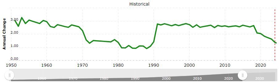
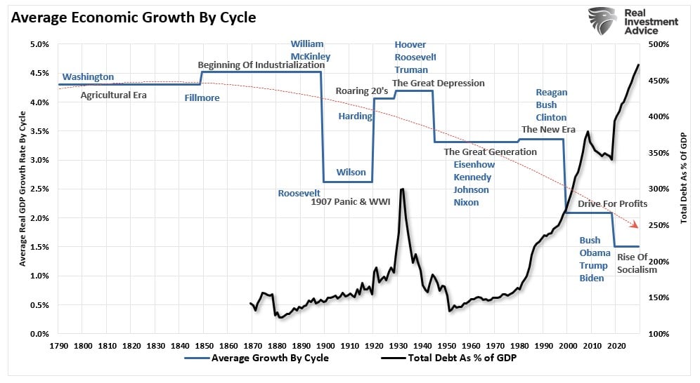
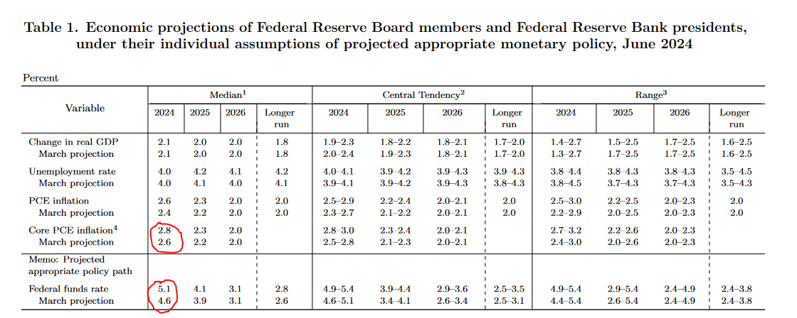
Let’s step back and ignore the last four years in which the economy cratered with the onset of the pandemic and then boomed on massive monetary and fiscal stimulus. Let’s also try to ignore the peak 6% core PCE inflation rate in 2022 and the historically low 3.4% unemployment rate in 2023. What if, in the years preceding the pandemic, we told you that in 2024, the Fed Funds rate would be 5.25-5.50%? You probably would have assumed inflation was at least 5% and the unemployment rate was exceptionally low.
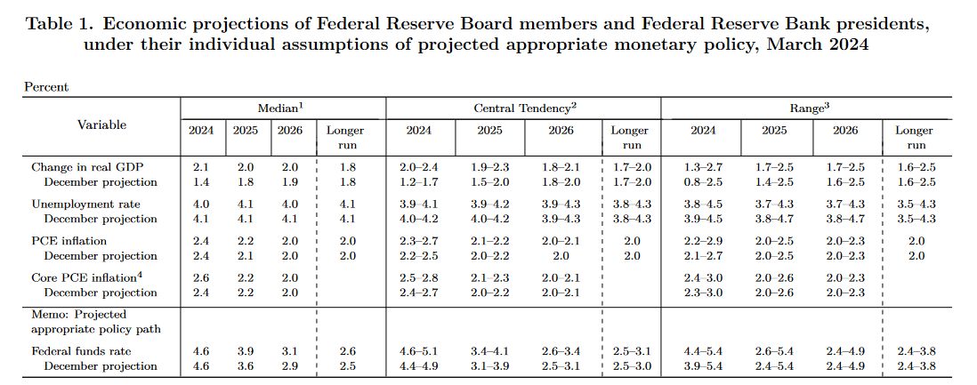
The current unemployment rate is 4%, and the core PCE inflation rate is 2.6%. In December 2019, the unemployment rate was 3.6%, and the core PCE was 1.6%. At the time, Fed Funds were 1.5%. Here we sit today, with the unemployment rate .4% higher and core PCE 1% higher than in 2019. Yet, the Fed Funds rate is 4% more than in 2019. Does it seem a bit high? To help answer the question, consider the Fed’s long-term forecasts.
As we circle below, the Fed thinks the natural long-term unemployment rate is 4.2% and PCE 2.0%. Under such an outlook, the Fed believes Fed Funds should be 2.8%. While it’s hard to make a case for the Fed to cut rates today, a simple look at their two objectives, full employment and stable prices, and its long-term economic projections make one appreciate that the current Fed Funds rate is exceptionally high. Even if the economy continues to chug along without a recession, it appears that barring higher inflation, significant rate cuts in the coming year will be consistent with the Fed’s economic outlook.
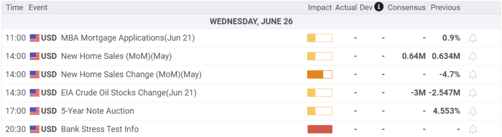
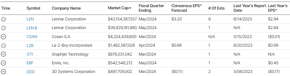
What To Watch Today
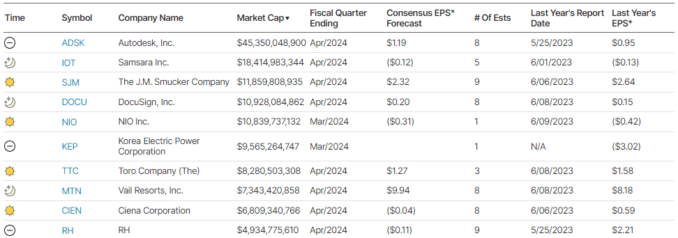
Earnings
No notable earnings releases today
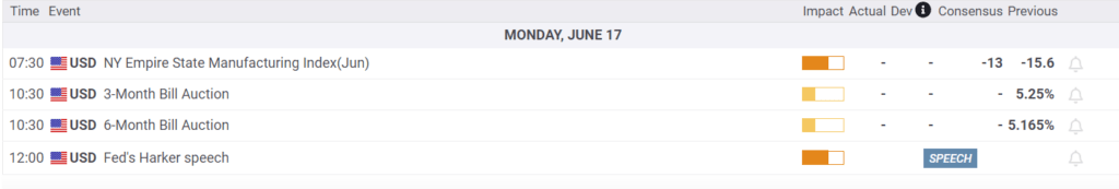
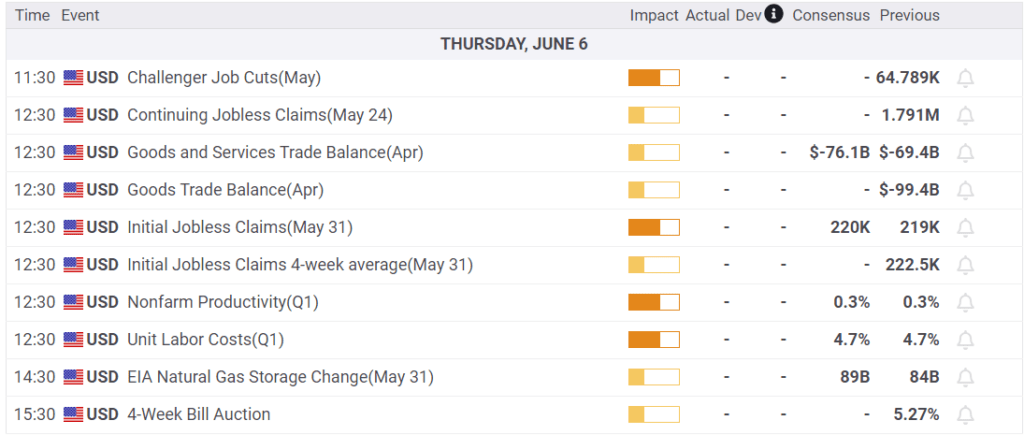
Economy
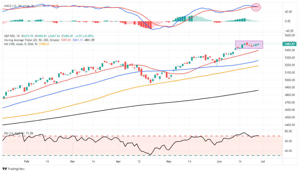
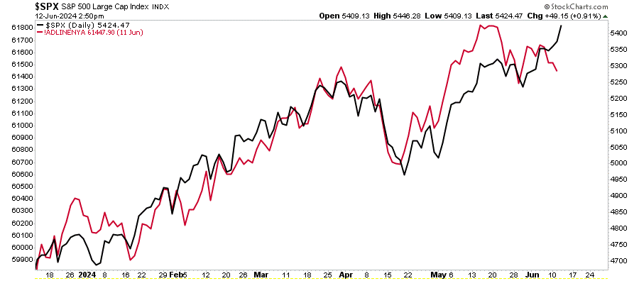
Market Trading Update
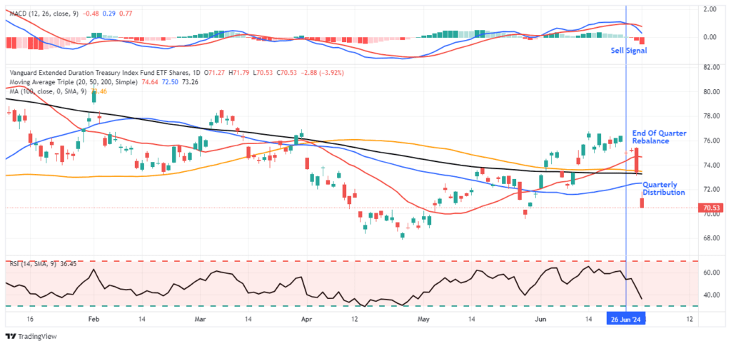
As discussed yesterday, this is the beginning of a new quarter, the end of the first half, and the beginning of the Q2 earnings season. We noted that with this holiday-shortened week, volatility could certainly pick up. Unsurprisingly, I received several emails about the sharp sell-off in long-date Treasury bond ETFs. As shown, bond ETFs had a sharp reversal due to end-of-quarter rebalancing and dividend distributions yesterday, temporarily suppressing the price. However, bonds had enjoyed a very nice rally and were overbought going into quarter-end, so the sell-off is unsurprising
The economic data continues to show economic deterioration, which is bond-supportive, so the recent selloff in bond ETFs is likely presenting a good buying opportunity for traders. The last time bonds approached this level of oversold conditions was in April and May before a decent rally occurred.
Economic Surprise Index
We have read articles warning of an imminent recession due to the low economic surprise index. While we rule nothing out, it’s best to appreciate what the index tells us. Surprise indexes measure specific economic data forecasts versus the actual data. When the surprise index declines, it simply means that economic forecasters are generally overly optimistic. Hence, economic data is weaker than expected. Initially, that typically means the economy is slowing. However, economists are quick to adjust their forecasts for trend changes. Once this occurs, data may still deteriorate, but economists’ forecasts tend to be closer to reality or often overly pessimistic. Frequently, the surprise index will rebound. However, that doesnt mean the economy is improving, it only means forecasts are more realistic.
As shown below, the surprise index tends to oscillate. Low readings can precede a recession, but they occur with enough frequency they often prove to be a false alarm.
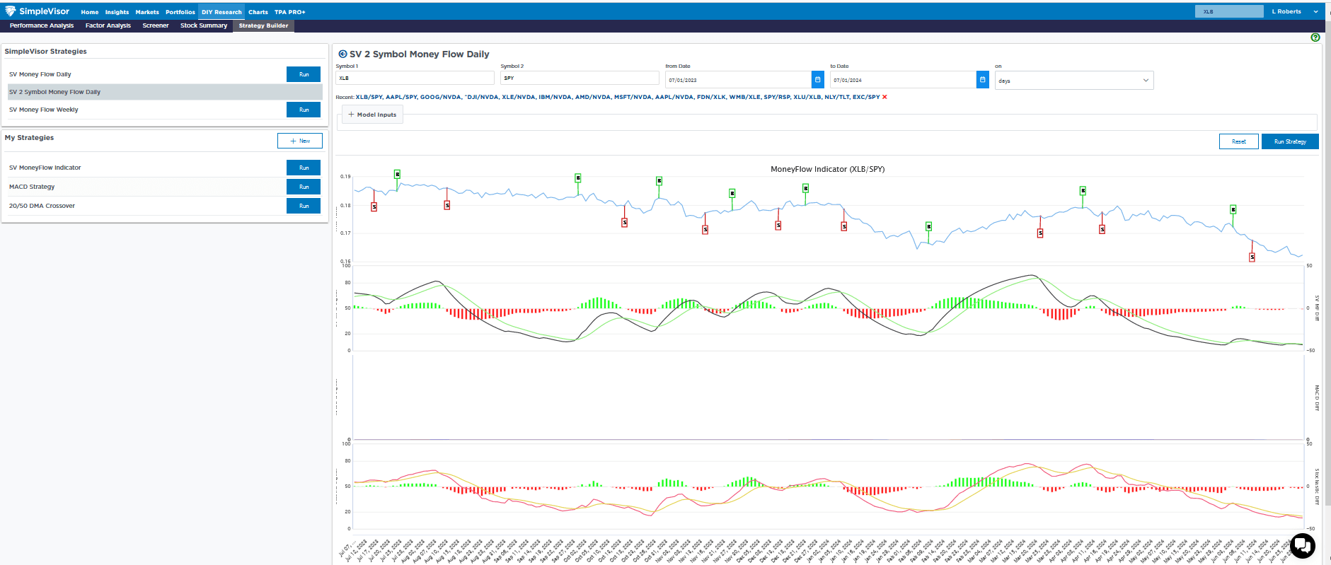
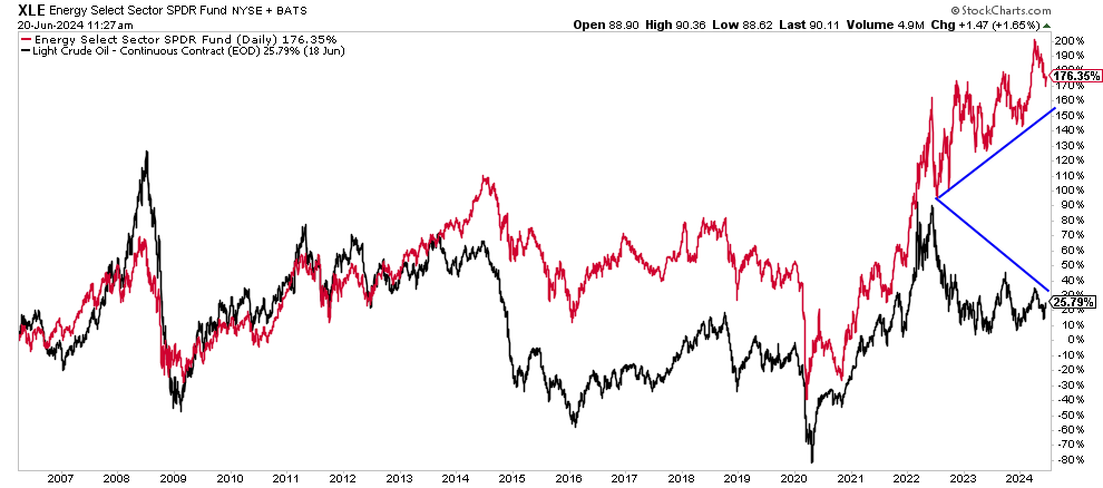
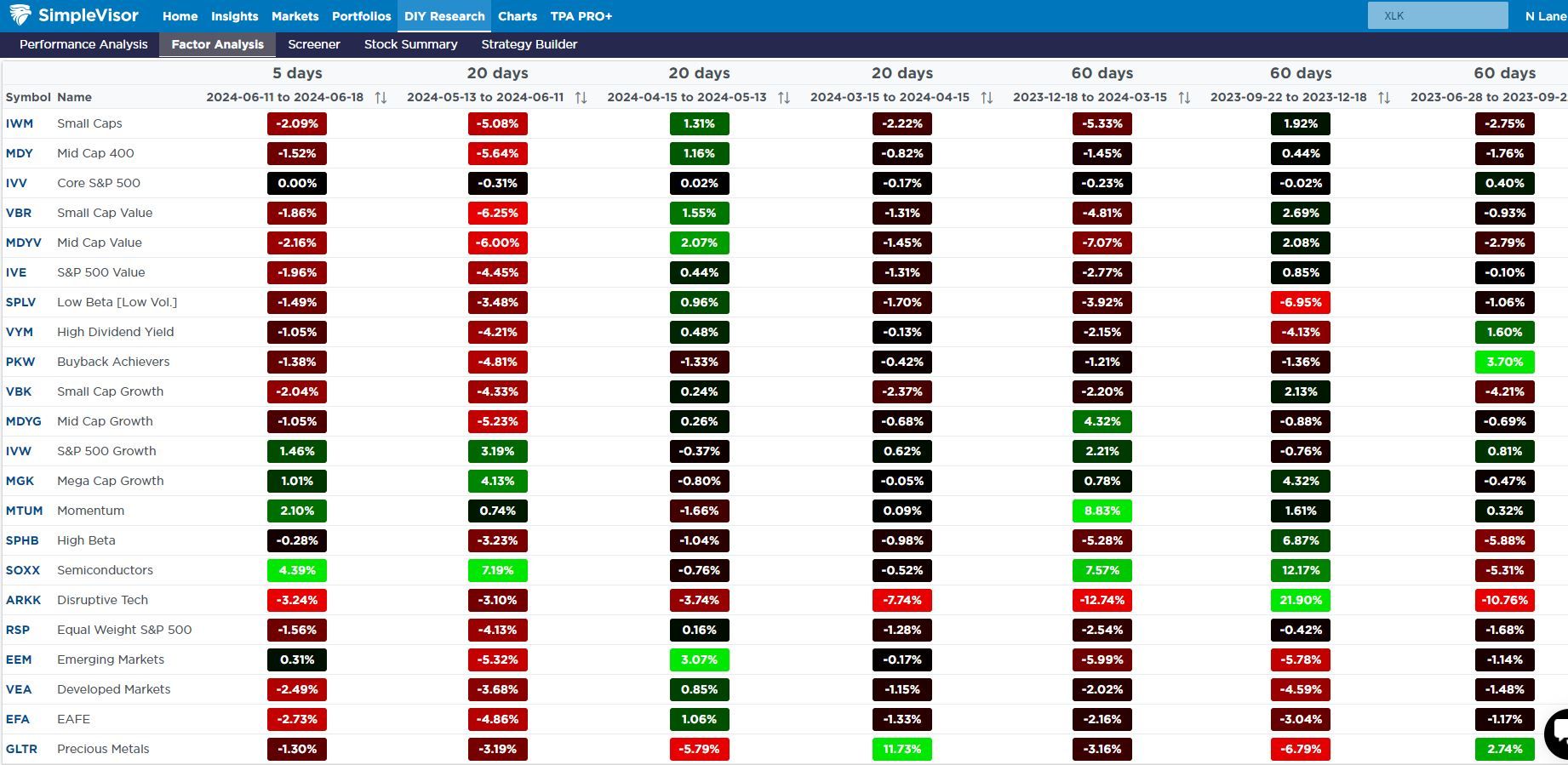
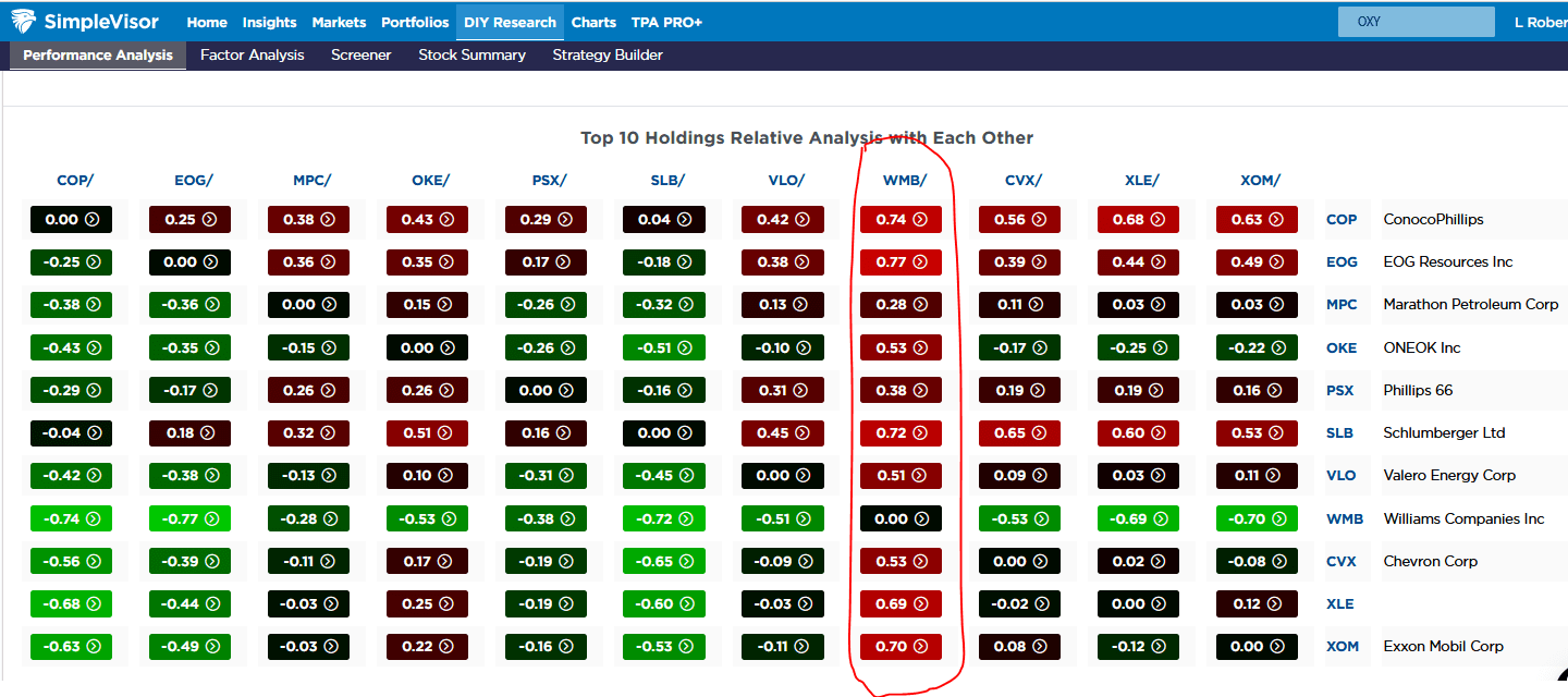
Sector Review- Materials Continue to Struggle
Over the last four weeks, the materials sector (XLB) has slipped by nearly 5% versus the S&P 500. Other than utilities, which are 6.5% worse than the S&P 500, it is the worst-performing sector over that period. Energy, which had the lowest relative SimpleVisor score for a few weeks running, was the market’s best-performing sector last week.
The second table, courtesy of SimpleVisor, shows the performance of each sector over consecutive periods ranging from the last five days to 20 and 60-day increments.
The third graph shows the price ratio of XLB to SPY. Other than XLB’s outperformance in the first quarter of 2024, XLB has been weak on a relative basis.
Some may say that the weakness in materials stocks is a telling signal about the state of the economy. We would counter, claiming that the service sector accounts for three-quarters of economic activity. The manufacturing sector has been in a recession for about two years, yet economic growth has been above average.
If you found this blog useful, please send it to someone else, share it on social media, or contact us to set up a meeting.
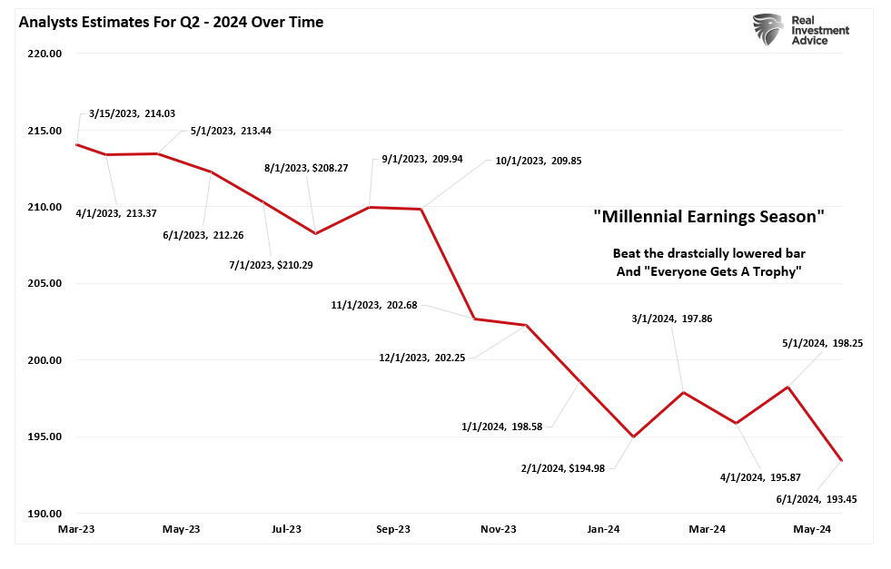
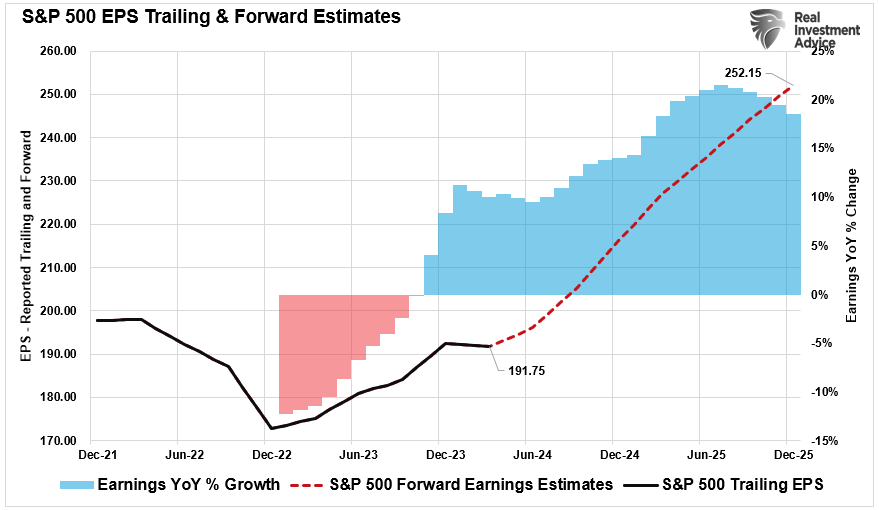
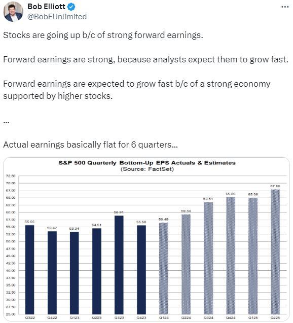
Earnings Bar Lowered As Q2 Reports Begin
Wall Street analysts continue significantly lowering the earnings bar as we enter the Q2 reporting period. Even as analysts lower that earnings bar, stocks have rallied sharply over the last few months.
As we have discussed previously, it will be unsurprising that we will see a high percentage of companies “beat” Wall Street estimates. Of course, the high beat rate is always the case due to the sharp downward revisions in analysts’ estimates as the reporting period begins. The chart below shows the changes for the Q2 earnings period from when analysts provided their first estimates in March 2023. Analysts have slashed estimates over the last 30 days, dropping estimates by roughly $5/share.
That is why we call it “Millennial Earnings Season.” Wall Street continuously lowers estimates as the reporting period approaches so “everyone gets a trophy.” An easy way to see this is the number of companies beating estimates each quarter, regardless of economic and financial conditions. Since 2000, roughly 70% of companies regularly beat estimates by 5%, but since 2017, that average has risen to approximately 75%. Again, that “beat rate” would be substantially lower if investors held analysts to their original estimates.
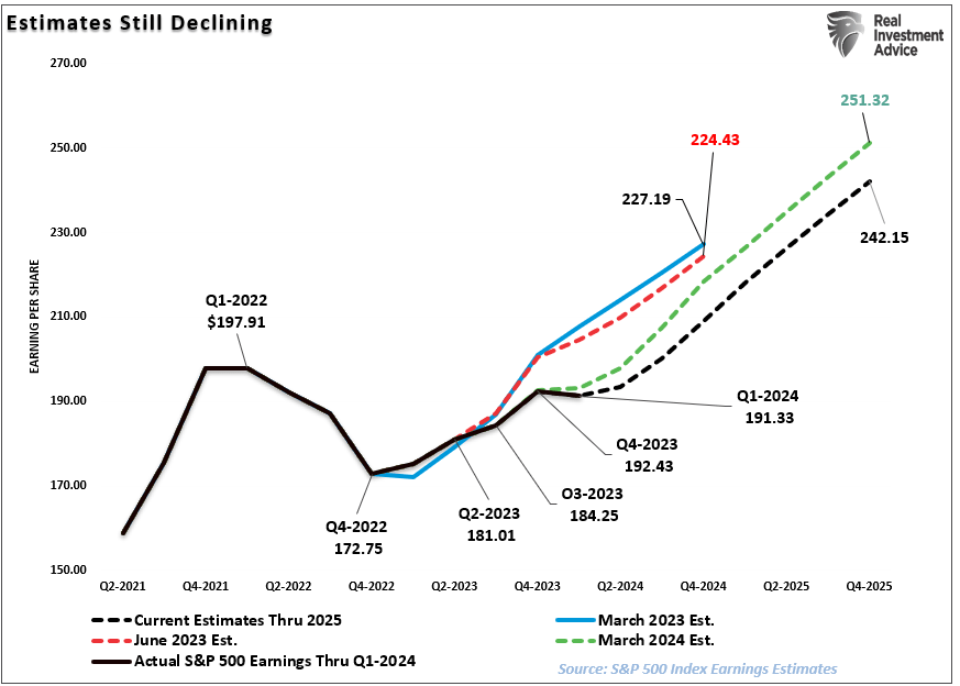
Analysts remain optimistic about earnings even with economic growth weakening, inflation remaining elevated, and liquidity declining. However, despite the decline in Q2 earnings estimates, analysts still believe that the first quarter of 2023 marked the bottom for the earnings decline. Again, this is despite the Fed rate hikes and tighter bank lending standards that will act to slow economic growth.
However, between March and June of this year, analysts cut forward expectations for 2025 by roughly $9/share.
However, even with the earnings bar lowered going forward, earnings estimates remain detached from the long-term growth trend.
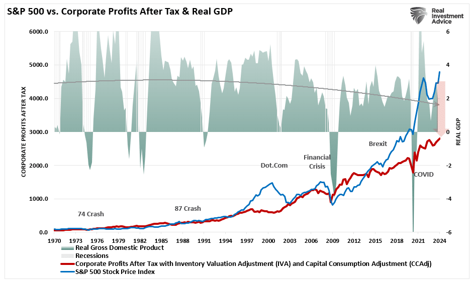
As discussed previously, economic growth, from which companies derive revenue and earnings, must also strongly grow for earnings to grow at such an expected pace.
Since 1947, earnings per share have grown at 7.72%, while the economy has expanded by 6.35% annually. That close relationship in growth rates is logical, given the significant role that consumer spending has in the GDP equation. However, while nominal stock prices have averaged 9.35% (including dividends), reversions to underlying economic growth will eventually occur. Such is because corporate earnings are a function of consumptive spending, corporate investments, imports, and exports. The same goes for corporate profits, where stock prices have significantly deviated.
Such is essential to investors due to the coming impact on “valuations.”
Given current economic assessments from Wall Street to the Federal Reserve, strong growth rates are unlikely. The data also suggest a reversion to the mean is entirely possible.
The Reversion To The Mean
Following the pandemic-driven surge in monetary policy and a shuttering of the economy, the economy is slowly returning to normal. Of course, normal may seem very different compared to the economic activity we have witnessed over the last several years. Numerous factors at play support the idea of weaker economic growth rates and, subsequently, weaker earnings over the next few years.
The economy is returning to a slow growth environment with a risk of recession.
Inflation is falling, meaning less pricing power for corporations.
No artificial stimulus to support demand.
Over the last three years, the pull forward of consumption will now drag on future demand.
“We have previously noted an inherent problem with ongoing monetary interventions. Notably, the fiscal policies implemented post the pandemic-driven economic shutdown created a surge in demand and unprecedented corporate earnings.”
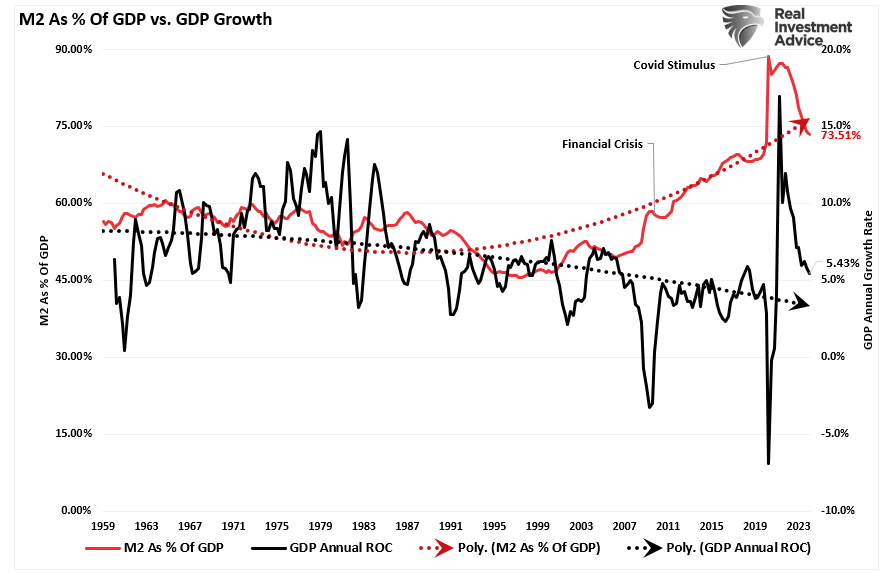
As shown below, the surge in the M2 money supply is over. Without further stimulus, economic growth will revert to more sustainable and lower levels.
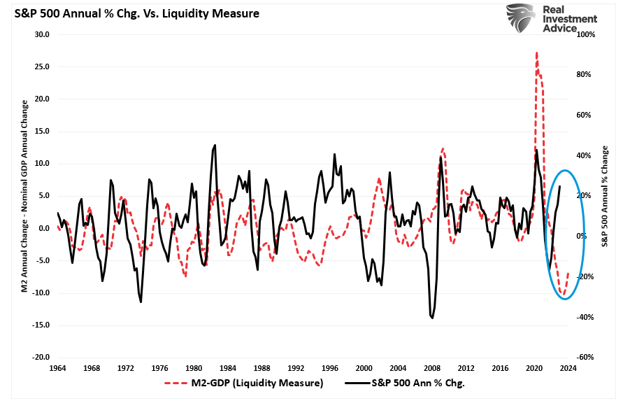
While the media often states that “stocks are not the economy,” as noted, economic activity creates corporate revenues and earnings. As such, stocks can not grow faster than the economy over long periods. A decent correlation exists between the expansion and contraction of M2 less GDP growth (a measure of liquidity excess) and the annual rate of change in the S&P 500 index. Currently, the deviation seems unsustainable. More notably, the current percentage annual change in the S&P 500 is approaching levels that have preceded a reversal of that growth rate.
So, either the annualized rate of return from the S&P 500 will decline due to repricing the market for lower-than-expected earnings growth rates, or the liquidity measure is about to turn sharply higher.
Valuations Remain A Risk
The problem with Wall Street consistently lowering the earnings bar by reducing forward estimates should be obvious. Given that Wall Street touts forward earnings estimates, investors overpay for investments. As should be obvious, overpaying for an investment today leads to lower future returns.
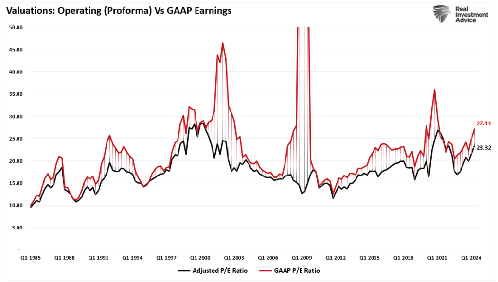
Even with the decline in earnings from the peak, valuations remain historically expensive on both a trailing and forward basis. (Notice the significant divergences in valuations during recessionary periods as adjusted earnings do NOT reflect what is occurring with actual earnings.)
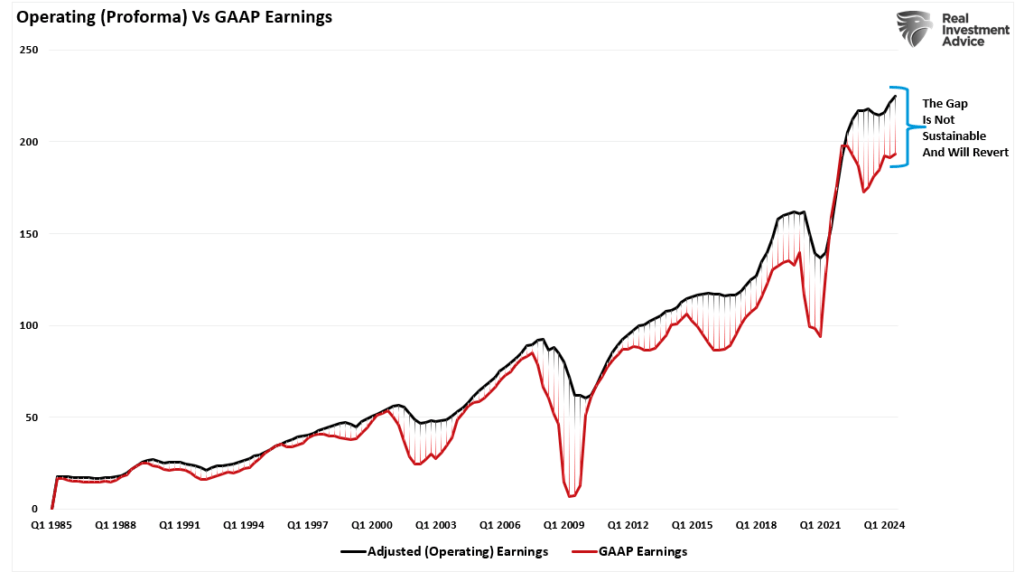
Most companies report “operating” earnings, which obfuscate profitability by excluding all the “bad stuff.” A significant divergence exists between operating (or adjusted) and GAAP earnings. When such a wide gap exists, you must question the “quality” of those earnings.
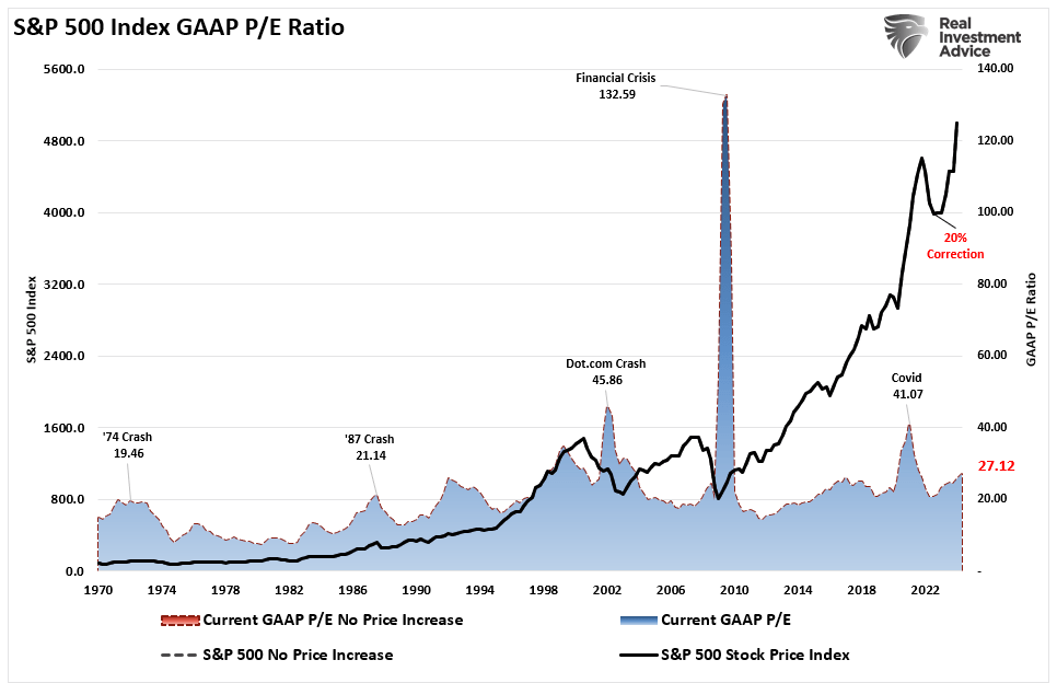
The chart below uses GAAP earnings. If we assume current earnings are correct, then such leaves the market trading above 27x earnings. (That valuation level remains near previous bull market peak valuations.)
Since markets are already trading well above historical valuation ranges, this suggests that outcomes will likely not be as “bullish” as many currently expect. Such is particularly the case if more monetary accommodations from the Federal Reserve and the Government are absent.
Trojan Horses
As always, the hope is that Q2 earnings and the entire coming year’s reports will rise to justify the market’s overvaluation. However, when earnings are rising, so are the markets.
Most importantly, analysts have a long and sordid history of being overly bullish on growth expectations, which fall short. Such is particularly the case today. Much of the economic and earnings growth was not organic. Instead, it was from the flood of stimulus into the economy, which is now evaporating.
Overpaying for assets has never worked out well for investors.
With the Federal Reserve intent on slowing economic growth to quell inflation, it is only logical that earnings will decline. If this is the case, prices must accommodate lower earnings by reducing current valuation multiples.
When it comes to analysts’ estimates, always remain wary of “Greeks bearing gifts.”
Supercore PCE Is The Weakest Since August
Jerome Powell and his Fed colleagues breathed a sigh of relief Friday morning as the PCE inflation report was weaker than expected. The headline PCE price index was +0.0% versus expectations of a 0.1% increase and a previous monthly change of +0.3%. The Core PCE was +0.1%, also a tenth below expectations. Recent inflation data provides hope that the trend lower in inflation will resume after stalling out for about six months. Further encouraging is the newly popular Supercore PCE reading, a subset of inflation, which was only up 0.1%. This index surged by 0.8% in January, causing the Fed and the market to reduce their expectations for a Fed rate. This report provides further evidence that the instance was a one-time spike and not likely a trend reversal.
Supercore prices, accounting for roughly 50% of PCE, include the prices of core services, excluding housing. The Fed has mentioned Supercore PCE on numerous occasions. Their rationale for following it is that many of the categories in the Supercore calculation are labor-intensive sectors. Therefore, Supercore PCE is a decent indicator of tightness in the labor markets, which can impact wages and, ultimately, inflation. The graphs below, courtesy of ZeroHedge, break out Supercore by its components. If it weren’t for health insurance, Supercore PCE would have been negative. Five of the eight components are negative, with one at essentially zero and two (healthcare and food service/accommodations) positive.
What To Watch Today
Earnings
No notable reports today.
Economy
Market Trading Update
Last week, we did an in-depth discussion of the worsening breadth of the market. However, the important point was that investors make two mistakes regarding such data. To wit:
“The first is overreacting to these technical signals, thinking a more severe correction is coming. The second is taking action too soon.
Yes, these signals often precede corrections, but there are also periods of consolidation when the market trades sideways. Secondly, reversals of overbought conditions tend to be shallow in a momentum-driven bullish market. These corrections often find support at the 20 and 50-day moving averages (DMA), but the 100 and 200-DMAs are not outside regular corrective periods.
If you remember, in March, we discussed the potential for a 5% to 10% correction due to many of the same concerns noted above. That correction of 5.5% came in April. We are again at a juncture where a 5-10% correction is likely. The only issue is that it could come anytime between now and October. As is always the case, timing is always the most significant risk.”
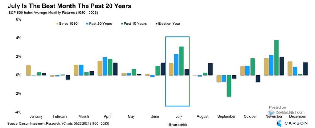
As shown, the market’s monthly seasonality supports that view of a potential correction later this summer. July tends to be a decent performance month, with an average return of more than 2%.
That boost in performance in July is supported by the kick-off of the Q2 earnings season. Such is particularly the case as investor sentiment is extremely bullish, which will continue to put a bid under stocks in the short term.
Speaking of earnings, analysts have been extremely busy over the last 30 days, slashing estimates. In June, Q2 earnings estimates for the S&P 500 index were cut by $5/share to the lowest level yet. Interestingly, while Wall Street continues to boast confidence in rising asset prices, they have cut estimates from $214/share in March last year to just $193/share. Such suggests a dichotomy between expected market performance and the economy, which is where earnings come from.
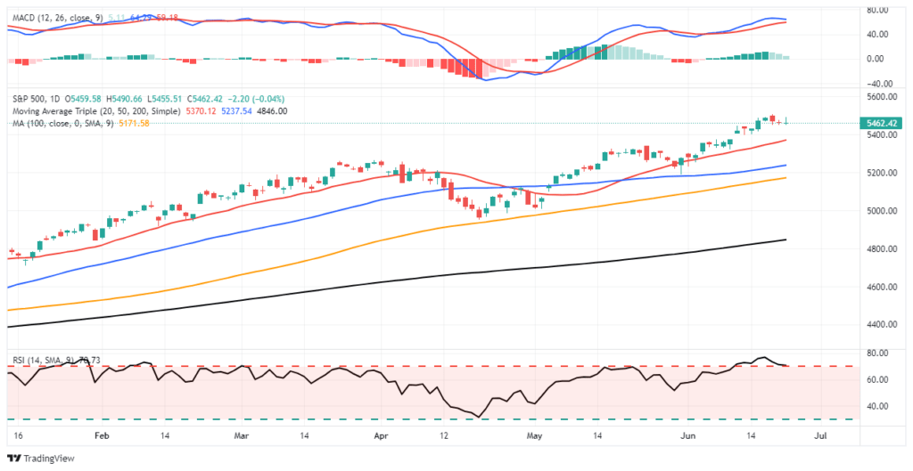
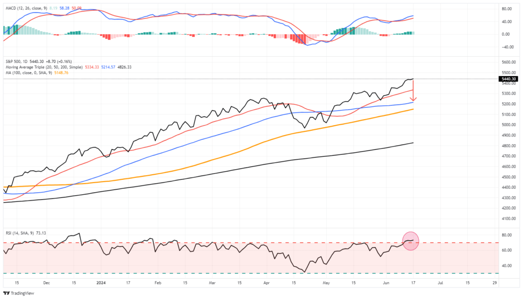
Nonetheless, the market remains overbought short-term and has triggered a short-term MACD “sell signal,” which could limit the upside in the near term. Continue to manage portfolio risk accordingly, but the bullish trend remains intact for now.
The Week Ahead
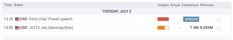
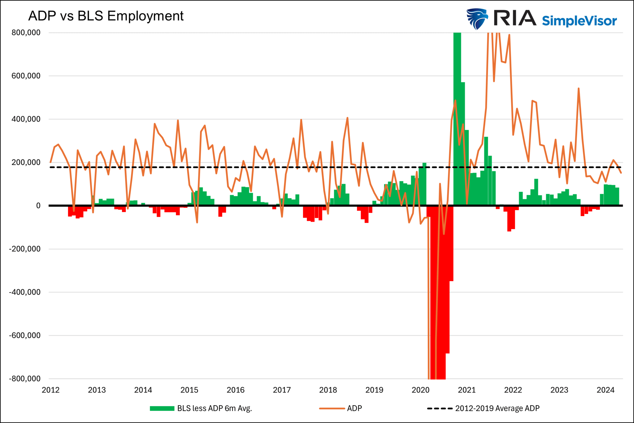
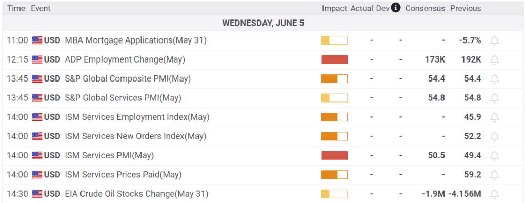
Despite the holiday-shortened week, investors will have plenty of economic data to digest. The ISM manufacturing survey will be released on Monday, and the services survey will be released on Wednesday. After Friday’s robust Chicago PMI survey, investors will look for confirmation in the ISM reports. Employment data, including JOLTs on Tuesday, ADP on Wednesday, and the BLS employment report on Friday, will be the most critical data points of the week. Recent jobless claims data point to some weakness in the labor markets.
Jerome Powell will be speaking on Tuesday at 8:30. By that time, he may have a good sense of what the BLS employment report holds. Further, investors will be looking to see if the recent weakness in economic data is starting to sway the Fed’s comfort regarding cutting rates. The next Fed meeting is July 31st.
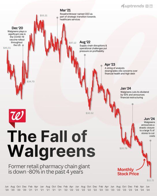
Nike and Walgreens Tumble On Weakening Sales
Nike and Walgreens’ off-calendar earnings highlight a continuation of weakening personal consumption. In late May, we discussed this troubling theme in retail and food services earnings. Those Commentaries can viewed HERE and HERE.
On Thursday night, Nike disclosed that it bettered earnings expectations by .17 cents due to cost-cutting. However, it missed revenue forecasts by $250 million. Furthermore, they guided expectations down for fiscal year 2025. Nike can no longer hike prices to keep up with inflation, which indicates that the consumer is becoming more frugal. They also speak to weakness in China. Many companies have echoed similar sentiments about China’s economy.
NIke’s poor earnings are not just about slowing consumption. It also appears that “lifestyle brand competitors” are taking market share from Nike. Per the CEO:
There was a shift in our lifestyle brands that caught us by surprise, and without new products, we’ve had less interest. Newness is driving the consumer and we’ve got to move to more newness. We are also chasing our competition in women’s apparel and running. We said last quarter we had a new playbook that will start our comeback with new innovations. We aren’t there yet, and our numbers are going to be worse in 2025 than we previously thought.
Walgreens also struggles partly due to weaker consumption. Like Nike, it is losing market share due to its business model. They reported earnings of $.63, $.05 short of estimates. However, revenues were slightly better than expected. While revenues were okay, they lowered EPS guidance from $3.20-$3.35 to $2.80-$2.95. Further, they are Closing 25% of their 8,600 stores over the next three years, which will lead to a decrease of 57,000 employees.
“We assumed the consumer would get somewhat stronger,” but “that is not the case,” said Walgreens CEO.
In regards to their business model, he states:
We are at a point where the current pharmacy model is not sustainable, and the challenges in our operating environment require we approach the market differently.
As we share below, NKE opened trading about 15% lower on the news last Friday and is at five-year lows. Walgreens is down about 20% since earnings. It has declined by 80% over the last five years, sitting at its lowest price since 1997!
If you found this blog useful, please send it to someone else, share it on social media, or contact us to set up a meeting.
Career Risk Traps Advisors Into Taking On Excess Risk
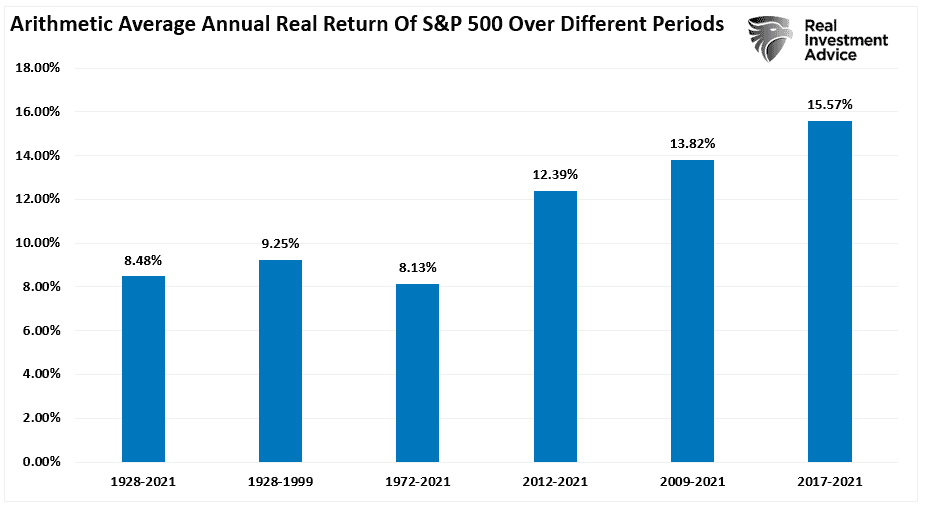
Financial advisors get a bad rap. Some deserve it; most don’t. The problem for the entire investment advisory and portfolio management community stems from the “career risk” they inevitably face. That “career risk” has been exacerbated over the last decade as massive monetary interventions and zero interest rates created outsized returns. A point we discussed last week in “A Permanent Shift Higher In Valuations.”
“The chart below shows the average annual inflation-adjusted total returns (dividends included) since 1928. I used the total return data from Aswath Damodaran, a Stern School of Business professor at New York University. The chart shows that from 1928 to 2021, the market returned 8.48% after inflation. However, notice that after the financial crisis in 2008, returns jumped by an average of four percentage points for the various periods.”
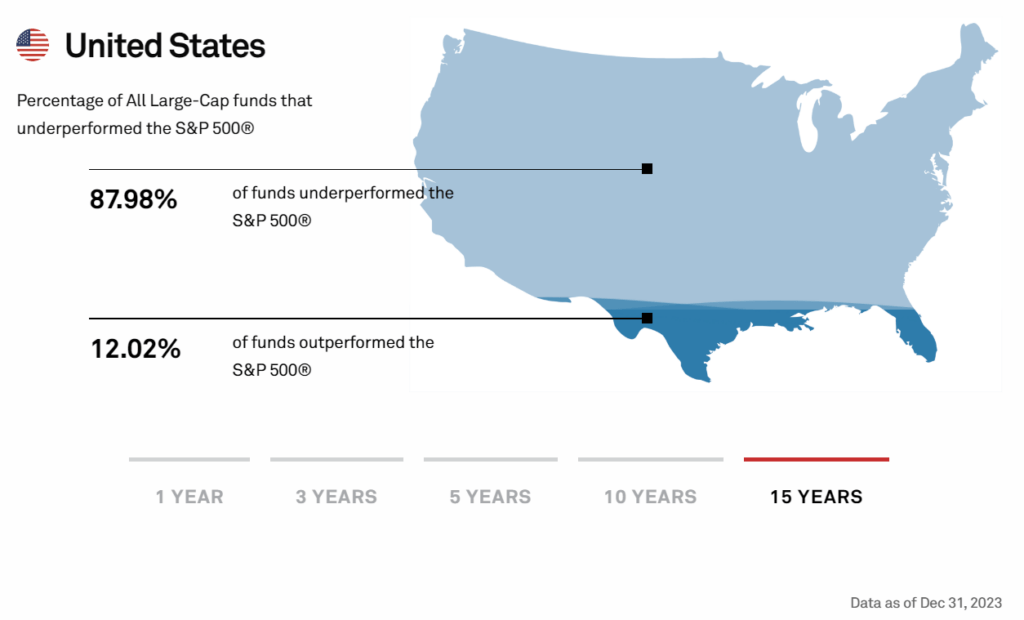
With social and mainstream media reporting on the latest investment hype surrounding market phases like “disruptive technology,”“meme stocks,” and “artificial intelligence,” it is unsurprising investors will salivate over the next “get rich quick” scheme. In addition, the annual reports from SPIVA measuring the performance of actively managed funds against their benchmark index intensify the “fear of missing out.”
The SPIVA report further fuels the debate over active versus passive indexing, or the “if you can’t beat ’em, join ’em” mentality.
Unsurprisingly, the result is the increasing pressure on financial advisors and portfolio managers to “chase performance.” Such is the basis of “career risk.”
“Career risk is the probability of a negative outcome in your career due to action or inaction.”
In other words, if financial advisors or portfolio managers don’t meet or beat benchmark returns from one year to the next, they risk losing clients. Lose enough clients, and your “career” is over. However, it is worse than that because even if the client states they are “conservative” and want little risk, they then compare their returns to that of an all-equity benchmark index. (Read this to understand why benchmarking your portfolio increases risk.)
Therefore, this career risk forces financial advisors and portfolio managers to push boundaries due to the risk of losing clients.
That brings us to two primary questions. The first is how we got here. The second is what you (as an investor or financial advisor) should do about it.
Performance Chases Performance
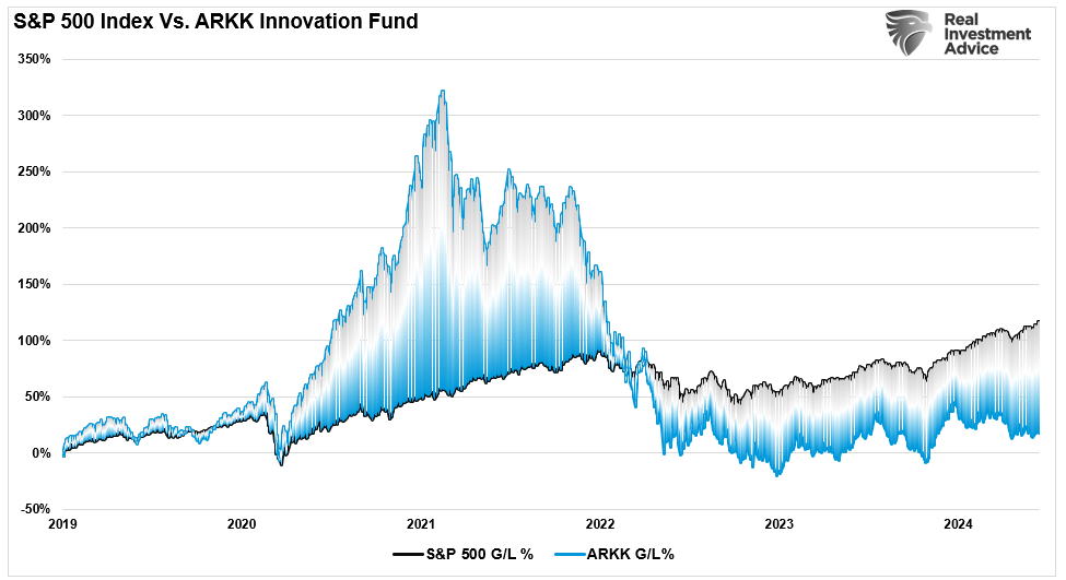
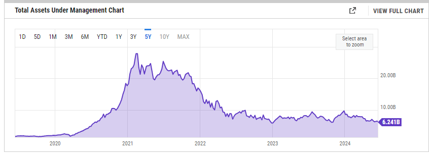
I recently discussed on the “Real Investment Show” that there is a big difference between a financial advisor or portfolio manager and an individual investor. The difference is the “career risk” of underperformance from one year to the next. Therefore, advisors and managers MUST own the assets that are rising in the market or risk losing assets. A great example of career risk is seen with Cathy Wood’s ARK Innovation Fund. That fund was the darling of Wall Street during the “disruptive technology” mania phase of the market following the stimulus-fueled investing craze following the Pandemic shutdown.
Unsurprisingly, during the mania phase, investors poured billions into the fund. Unfortunately, as with all mania phases, that investing style lost favor, and the fund has recently underperformed the S&P 500. That underperformance resulted in a massive loss of assets under management for ARK and Cathy Woods
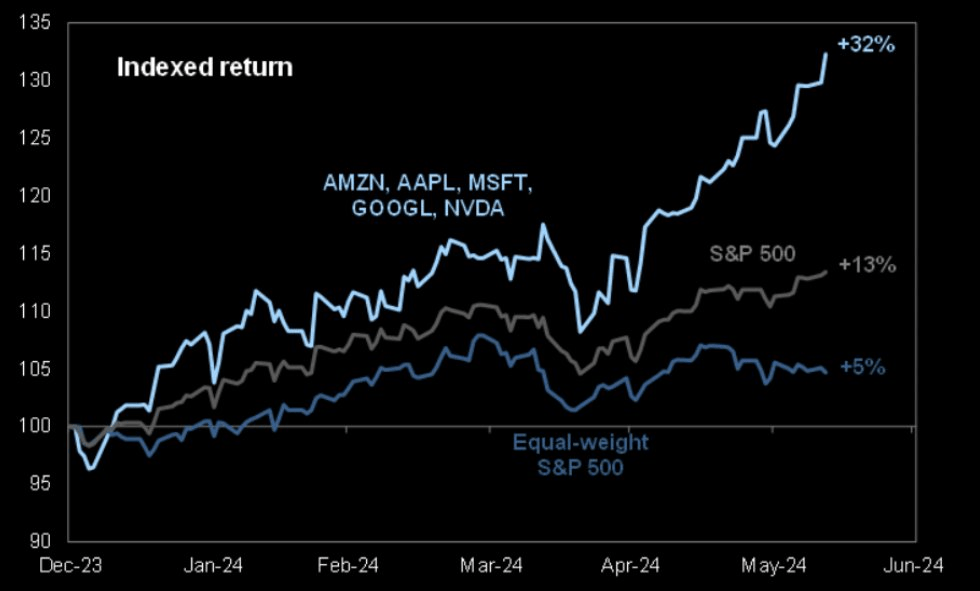
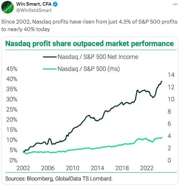
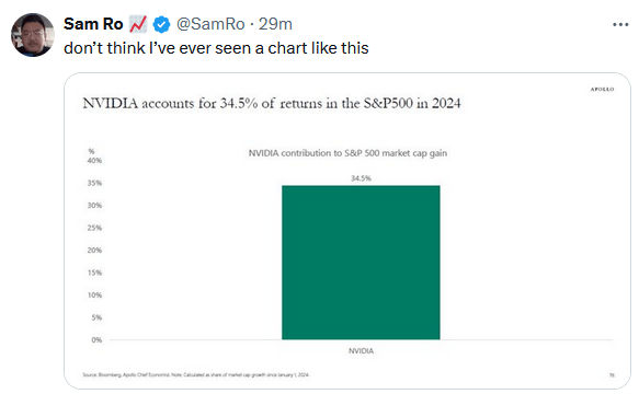
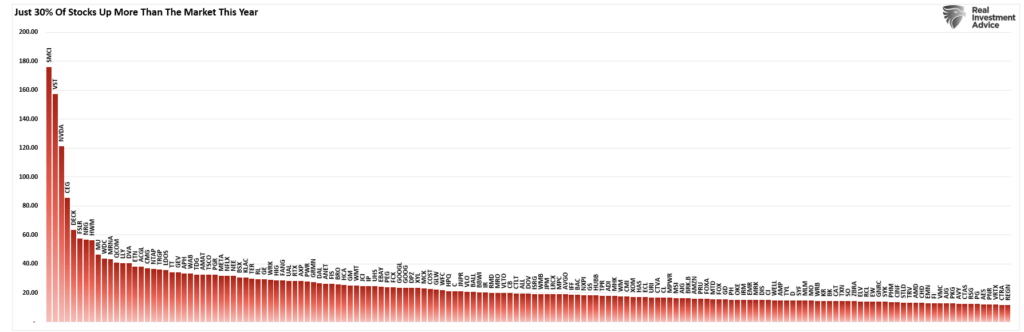
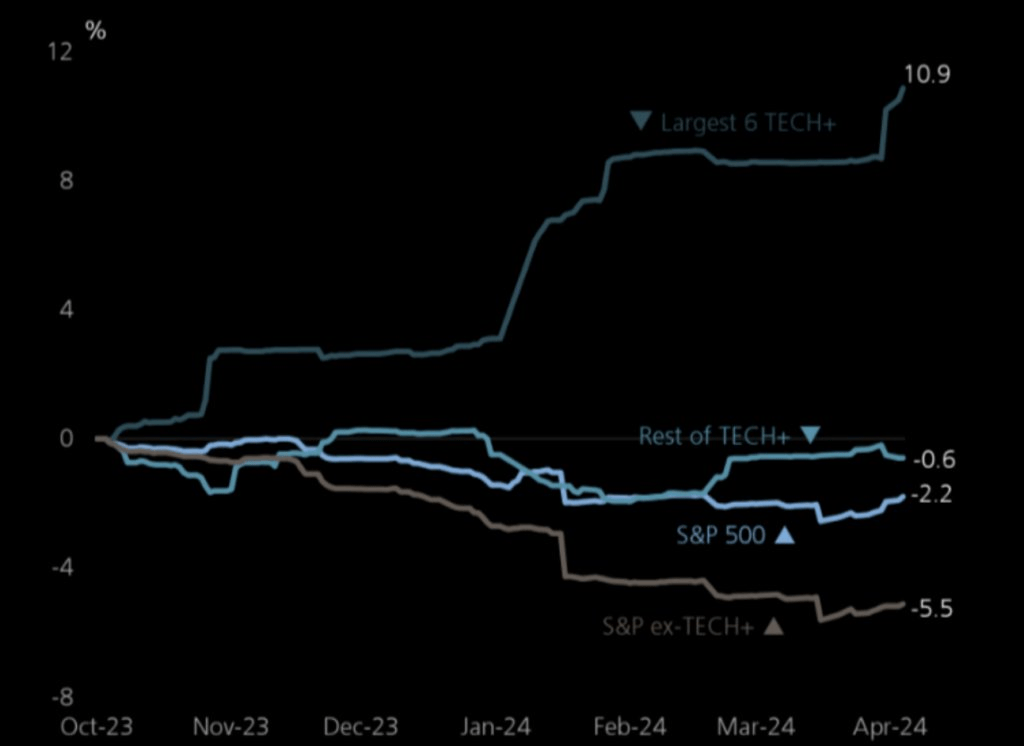
Today, the investment chase is all about “artificial intelligence.” Such has led to an enormous bifurcation in the market as a handful of stocks increasingly rise versus the rest of the market, as shown.
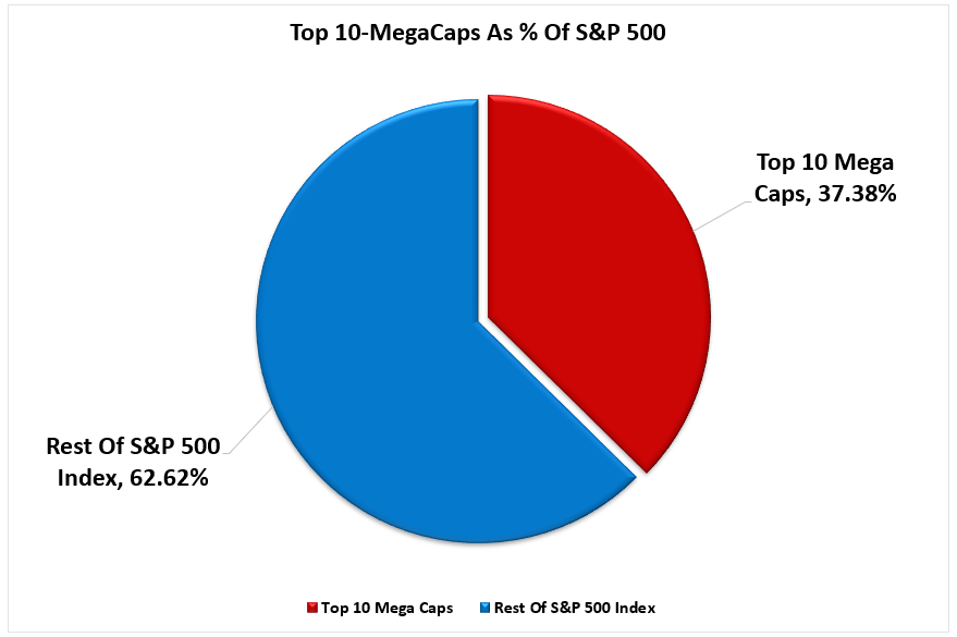
Once again, portfolio managers and financial advisors face enormous “career risk” pressure. As discussed in “It’s Not 2000,” as the market’s breadth narrows, advisors and managers must take on increasingly larger weights of fewer stocks in portfolios.
“The top-10 stocks in the S&P 500 index comprise more than 1/3rd of the index. In other words, a 1% gain in the top-10 stocks is the same as a 1% gain in the bottom 90%.As investors buy shares of a passive ETF, the shares of all the underlying companies must get purchased. Given the massive inflows into ETFs over the last year and subsequent inflows into the top-10 stocks, the mirage of market stability is not surprising.
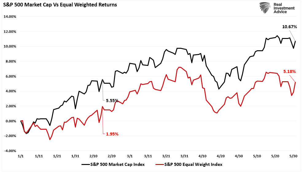
“That lack of breadth is far more apparent when comparing the market-capitalization-weighted index to the equal-weighted index.”
The question every investor should be asking themselves is:
“Is it really wise from risk management perspective to have nearly 40% of my portfolio in just 10-stocks?”
However, if you answer that question “no,” or if you have any other type of investment allocation, you will underperform the benchmark index. If you have an advisor or manager that matches a portfolio to your financial goals, they will also underperform. They now face the potential “career risk” of getting fired if the client fails to understand the reason for the underperformance.
So, what should financial advisors and clients do?
What Should Advisors Do?
For advisors, “career risk” is a real and present danger. Many opt for simplistic ETFs or mutual fund-based portfolios that track an index. The question is, as a client, what are you paying for?
Knowing that clients are emotional and subject to market volatility, Dalbar suggests four practices to reduce harmful behaviors:
Set Expectations Below Market Indices: Set reasonable expectations and do not permit expectations to be inferred from historical records, market indexes, personal experiences, or media coverage. The average investor cannot be above average. Investors should understand this fact and not judge the performance of their portfolio based on broad market indices.
Control Exposure to Risk: Explicit, reasonable expectations should be set by agreeing on predetermined risk and expected return. Focusing on the goal and the probability of its success will divert attention away from frequent fluctuations that lead to imprudent actions.
Monitor Risk Tolerance: Even when presented as alternatives, investors intuitively seek capital preservation and appreciation. Risk tolerance is the proper alignment of an investor’s need for preservation and desire for capital appreciation. The determination of risk tolerance is highly complex and is not rational, homogenous, or stable.
Present forecasts in terms of probabilities: Provide credible information by specifying probabilities or ranges that create the necessary sense of caution without adverse effects. Measuring progress based on a statistical probability enables the investor to make a rational choice among investments based on the reward probability.
When Must Advisors Take Action?
Dalbar’s data shows that the “cycle of loss” starts when investors abandon their investments, followed by remorse as the markets recover (sell low). Unsurprisingly, the investor eventually re-enters the market when their confidence gets restored (buys high).
Preventing this cycle requires having a plan in place beforehand.
When markets decline, investors become fearful of total loss. Those fears compound as the barrage of media outlets “fan the flames” of those fears. Advisors must remain aware of client’s emotional behaviors and substantially reduce portfolio risk during major impact events while repeatedly delivering counter-messaging to keep clients focused on long-term strategies.
Dalbar notes that during impact events, messages delivered to clients should have three characteristics to be effective at calming emotional panic:
Deliver messages when fear is present. Statements made well before the investor experiences the event will not be effective. On the other hand, if the messages are delivered too long after the fact, investors will already have made decisions and taken actionsthat are difficult to reverse.
Messages must relate directly to the event causing the fear. Providing generic messages such as the market has its ups and downs is of little use during a time of anxiety.
Messages must assure recovery. Qualified statements regarding recovery tend to fuel fear instead of calming it.
Messages must ALSO present evidence that forms the basis for forecasting recovery. Credible and quotable data, analysis, and historical evidence can provide an answerto the investor when the pressure mounts to “just do something.”
Providing “generic media commentary” with a litany of qualifiers to specific questions will likely fail to calm their fears.
Conclusion
An experienced advisor does more than “invest money in the market.” The professionals’ primary job is providing counsel, planning, and stewardship of the client’s financial capital. In addition, the advisor’s job is to understand how individuals respond to impact events and get in front of them to plan, prepare, and initiate an appropriate response.
Negative behaviors all have one trait in common. They lead individuals to deviate from a sound investment strategy tailored to their goals, risk tolerance, and time horizon. The best way to ward off the aforementioned negative behaviors is to employ an approach that focuses on one’s goals and is not reactive to short-term market conditions.
The data shows that the average investor does not stay invested long enough to reap the market’s rewards for more disciplined investors. The data also shows that investors often make the wrong decision when they react.
But here is the only question that matters in the active/passive debate:
“What’s more important – matching an index during a bull cycle, or protecting capital during a bear cycle?”
You can’t have both.
If you benchmark an index during the bull cycle, you will lose equally during the bear cycle. However, while an active manager focusing on “risk” may underperform during a bull market, preserving capital during a bear cycle will salvage your investment goals.
Investing is not a competition, and as history shows, treating it as such has horrid consequences. So, do yourself a favor and forget what the benchmark index does from one day to the next. Instead, match your portfolio to your personal goals, objectives, and time frames.
In the long run, you may not beat the index, but you are likely to achieve your personalinvestment goals, which is why you invested in the first place.
Cognitive Dissonance Is On Full Display
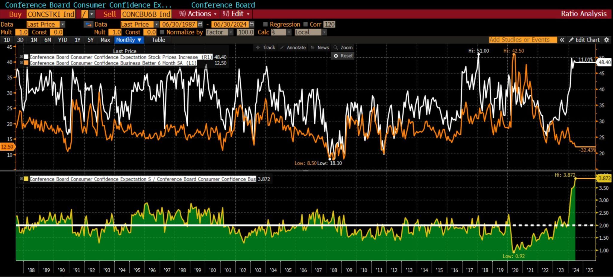
The recent Conference Board Consumer Confidence survey data show a state of cognitive dissonance among U.S. citizens. Cognitive dissonance occurs when a person believes in two contradictory things simultaneously. For instance, the latest Conference Board survey shows that expectations for increasing stock prices are among the highest since the late 1980s. However, citizens believe the business climate for the next six months will be among the worst environments over the last 35+ years. The graph below, courtesy of Michael Green, shows the two data series. Most often, they are correlated, rising and falling in unison. However, the recent gap is well beyond past experiences. The green chart at the bottom divides stock expectations by business expectations. It sits well above anything witnessed since the late 1980s.
In the short term, stock prices are a function of liquidity and investor behaviors. Over extended periods, prices represent the value of a company’s cash flows, which are highly predicated on economic activity and the business climate. Thus, investors can, at times, have cognitive dissonance, being bullish on stocks and bearish on the economy. However, the gap will most certainly close. Will it be due to improving economic confidence or stocks catching down with poor economic expectations?
What To Watch Today
Earnings
No notable earnings reports today.
Economy
Market Trading Update
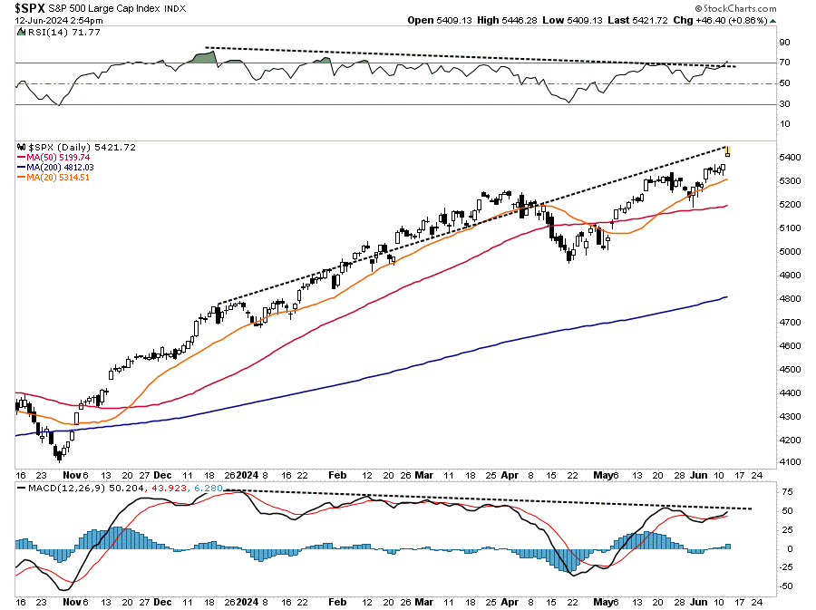
As we head into the last trading day of the month, the market remains range-bound near all-time highs. With the market still overbought, the upside remains limited near-term. However, we are close to triggering a short-term MACD “sell signal,” which further confirms that markets may be somewhat contained regarding further upside over the next week.
It has been a rather boring week of trading with little movement. Next week promises much of the same, with the July 4th holiday falling on Thursday. We expect to see a rather light trading week, but due to the lack of volume, there is a risk of a pickup in volatility.
There is little to be concerned about currently. Continue to let your equity positions play out. However, continue to follow risk-management protocols as needed to rebalance risk.
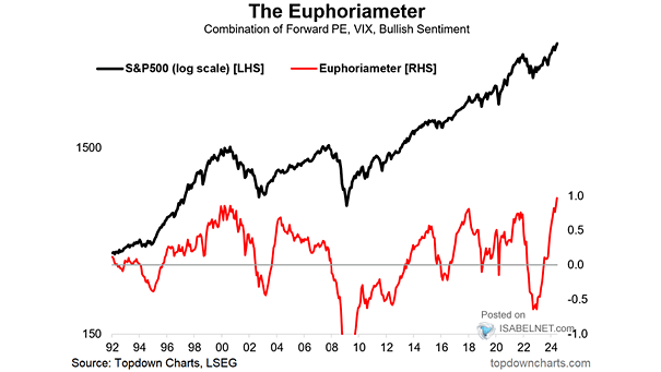
The Definition of Euphoria
While on the topic of cognitive dissonance, we think a recent segment from CNBC seems appropriate to share. On CNBC, hedge fund manager Eric Jackson of EMJ Capital stated:
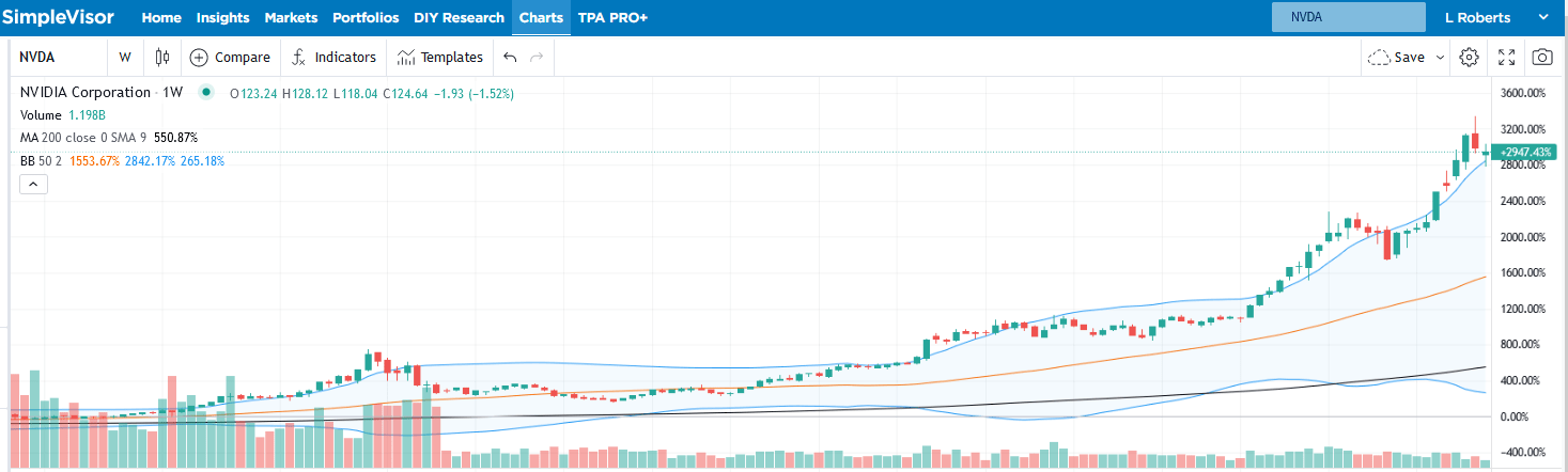
Over the last five years, Nvidia’s average look forward price to earnings multiple has been 40x. Yesterday (Monday), after this two day correction, it was 39x forward price to earnings. But there have been three times in the last five years where it had a look forward price to earnings multiple of over 50x, and two times in the last five years where it’s gotten just about to 70x and then pulled back. So we haven’t see that euphoria yet.
Jackson thinks Nvidia could have a $6 trillion valuation by the end of the year. Such means its stock price will double. He claims Nvidia investors haven’t seen euphoria yet. The stock is up nearly 3,000% in about five years, as shown below. That is euphoria! We are not sure there is a word to describe investor sentiment if Jackson proves accurate. However, stocks trading in a euphoric phase are often followed by a dysphoric feeling.
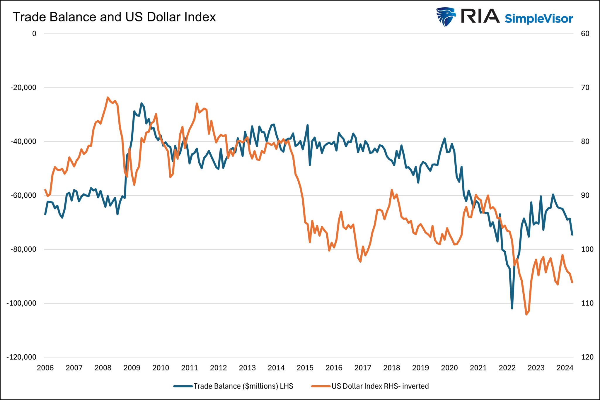
Weaker Trade Balances Accompany’s A Strong Dollar
The U.S. dollar index has been up about 4% this year. A stronger dollar results in lower import prices because America runs trade deficits, i.e., we import more than we export. On the margin, trade deficits reduce prices. That is a positive. However, from a GDP perspective, it is not good news.
The formula for GDP is C+I+G+(X-M). C is consumer spending, I is business investment, G is government spending, and (X-M) is net exports. The X-M part of the formula is exports less imports. Running a trade deficit, as we consistently do, makes the net result negative. The graph below shows that trade deficits and dollar value correlate decently. Recently, dollar strength has pushed net exports further into deficit territory, thus dampening economic growth.
If you found this blog useful, please send it to someone else, share it on social media, or contact us to set up a meeting.
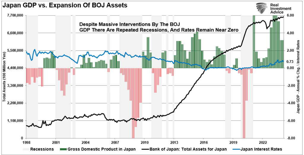
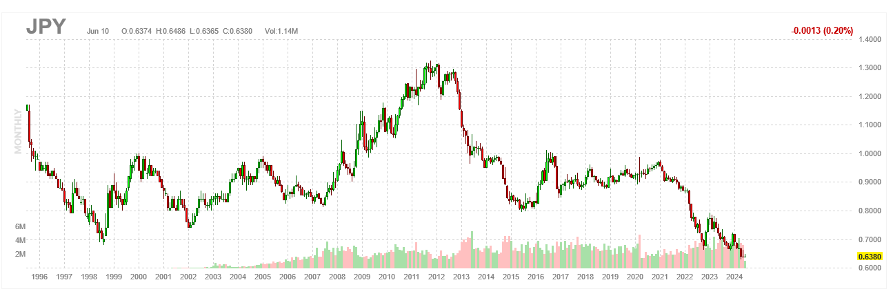
Will Japan Dump U.S. Treasury Securities?
Japan holds $1.150 trillion of U.S. Treasury securities, well above the next major foreign holder, China, which has $770 billion. Therefore, given Japan holds 3.3% of all Treasury debt, it is worth appreciating the recent news that Japan is selling bonds. First, to dispel some fear, Nornichukin Bank, not the Bank of Japan or the Japanese government, is selling U.S. Treasury bonds. Their goal is to sell $63 billion of U.S. and European government bonds by March 2025. Importantly, this is not a government policy decision but one the bank is making to fortify its deteriorating balance sheet. According to SIFMA, $879.8 billion Treasuries trade daily on average. With 262 days to sell less than $63 billion, their actions should have zero impact on Treasury yields.
However, persistent rumors have been circulating for years that the Japanese government and/or BOJ will sell bonds to prop up its currency. The yen has been in a free fall recently. On Wednesday morning, it traded at levels last seen in 1986! To appreciate Japan’s dilemma of selling Treasuries, providing it with dollars in which to buy the yen, consider a quote we wrote two years ago (LINK):
“However, as the BOJ tries to stop rates from rising, they weaken the yen. Japan is in a trap. They can protect interest rates or the yen, but not both. Further, its actions are circular. As the yen depreciates, inflation increases, and the Japanese central bank must do even more QE to keep interest rates capped.”
The cartoon below helps answer our question. Selling Treasuries in large quantities to support the yen risks increasing interest rates, which can increase the odds of insolvency.
What To Watch Today
Earnings
Economy
Market Trading Update
As discussed yesterday, the market was under pressure recently due to the decline in Nvidia ($NVDA). However, that sell-off seems to have abated for now, and there has been little other data to move the market as we head into the month’s end. Since this is the second quarter’s end, portfolio managers must rebalance their holdings by Friday. Furthermore, next week is shortened by the July 4th holiday, so trading will be light. Today and tomorrow are full of economic data that will be eyed closely for further clues to the upcoming Federal Reserve meeting in July. Furthermore, next week starts the beginning of the Q2 earnings season.
Speaking of earnings season, analysts have slashed estimates over the last 30 days. Despite ratcheting their views on the market outlook, with Goldman Sachs leading the way at 6300 by year-end, analysts reduced estimates from $198.25 to $193.45. That is the lowest estimate for this quarter since last year, when they started at $214.03.
As noted, this is why we call it “MIllennial Earnings Season,” as analysts keep lowering the bar until “everyone gets a trophy.”
Small Cap Stocks Are Relatively Cheap
Much of the recent market conversation revolves around the strength of large-cap stocks and the relative weakness of most other stocks. What is not often heard is how the performance is affecting valuations. The graph below, courtesy of Yardeni Research, shows that the forward P/E ratio for large-cap stocks is near the highest level since the dot com bust. Yet, the forward P/E for small and mid-cap stocks has been lingering at their lowest levels in over ten years. More importantly, the current valuation has been the lowest since 2008, excluding periods when the market was in a correction. The gap between large and small-cap stocks will likely converge at some point. However, it can get more dislocated before such a normalization occurs.
Office Carnage Continues
The price decline of some office properties in many major cities is startling. We follow @TripleNetInvest on X/Twitter to keep us updated on commercial real estate fire sales. On Wednesday, he posted the following:
An office tower (pictured below) in San Francisco’s Mid Market area shockingly sold for 90% LESS than what it last traded for.
The previous owner paid $62M in 2018 for the 90k SF building.
It was recently acquired by a Starwood affiliate for $6.5M ($72 per SF)
Despite the post-Covid normalization across most economic sectors, vacancy rates around the country are not falling. San Francisco has the highest vacancy rate of big cities, at 37%. For context, it was 7% in 2019. Furthermore, it has an occupancy rate of 44%. Per Optimize Reality:
As those drastically under-occupied leases come due, they will exaggerate an already market clogged by empty office space. The over-saturation will become far worse indicated already by dropping rents and hundreds of thousands of square feet hitting the sublease market.
If you found this blog useful, please send it to someone else, share it on social media, or contact us to set up a meeting.
Why Economists And Citizens Have Different Inflation Realities
The Fed and economists are encouraged because CPI is down to 3.3% from a high of nearly 9% in 2022. Despite the Fed’s “significant progress” in lowering inflation, most citizens are outraged and confused by economists’ relatively rosy inflation observations. Most citizens believe inflation is still rampant.
The Fed and economists are correct in that inflation is now tame. At the same time, citizens dissatisfied with high prices have solid grounds on which to base their disapproval.
Let’s better understand how such contradictory beliefs can both be factual. Furthermore, in the process, we can help Jerome Powell understand why economic sentiment is poor despite a near-record low unemployment rate.
You know, I don’t think anyone knows, has a definitive answer why people are not as happy about the economy as they might be. -Jerome Powell 6/12/2024
Visualizing Divergent Inflation Opinions
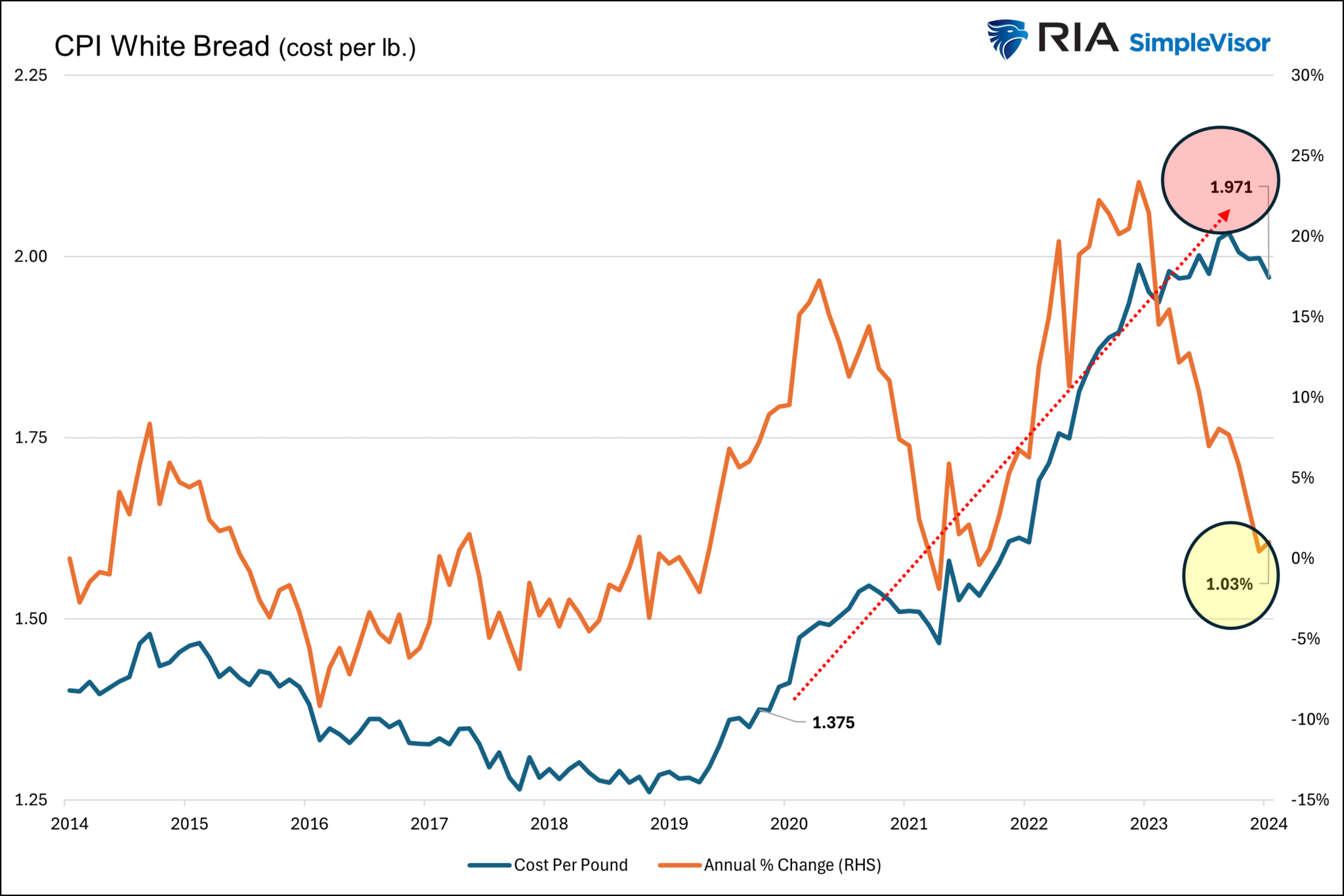
The graph below of the BLS CPI New Vehicles price index, a CPI component, demonstrates why economists and citizens have such grossly contrasting opinions of inflation.
Economists focus on the blue line, graphing the year-over-year change in new vehicle prices. Over the last year, the price index of new vehicles has decreased by .60%. Economists can say the cost of buying a new vehicle is in a deflationary state.
While the chart may warm the hearts of economists and the Fed, most individuals see the orange line, the CPI price index for new vehicles instead. It shows that new vehicle prices are up about 20% since the pandemic. Yes, they may have recently declined slightly, but today’s prices are nowhere close to where they were four years ago. In their minds, there is significant inflation in new vehicles.
Economists Prefer Growth Rates, Not Absolutes
Ask an economist what the nation’s GDP is, and they will quote an annualized growth rate to a decimal point. We bet almost all of them will get the answer correct within one or two-tenths of one percent.
Ask them again, but request the answer in dollars. It would not be surprising if many economists are off by a trillion or even two trillion dollars, representing anywhere from 3.00% to 7.00% of the economy.
Economists prefer to analyze and quote many economic data points in terms of percentage change. For instance, how much did industrial production or retail sales change versus last month or over the previous quarter or year? They vastly prefer growth rates because it gives them a comparable and insightful way of analyzing economic data. Let’s review why this is the case.
Comparative Analysis
Economists are more adept at comparing data from different periods, industries, and countries if they have a common measurement calculation. Instead of absolute change, which doesn’t account for the starting point, a growth rate captures the absolute change and the starting point. Consider the following:
If GDP increases by $1 trillion this year, how would that compare to a $1 trillion increase in 2000? The question is challenging to answer using absolute numbers. However, growth rates allow us to evaluate the two periods quickly. Today, GDP is $28.284 trillion; therefore, a $1 trillion increase would represent 3.50% growth. In 2000, GDP was close to $10 trillion. Adding a trillion dollars of economic growth would have resulted in a 10% growth rate. While a trillion dollars is a trillion dollars in absolute terms, there is a stark difference between 10% and 3.50% growth.
Trend Analysis
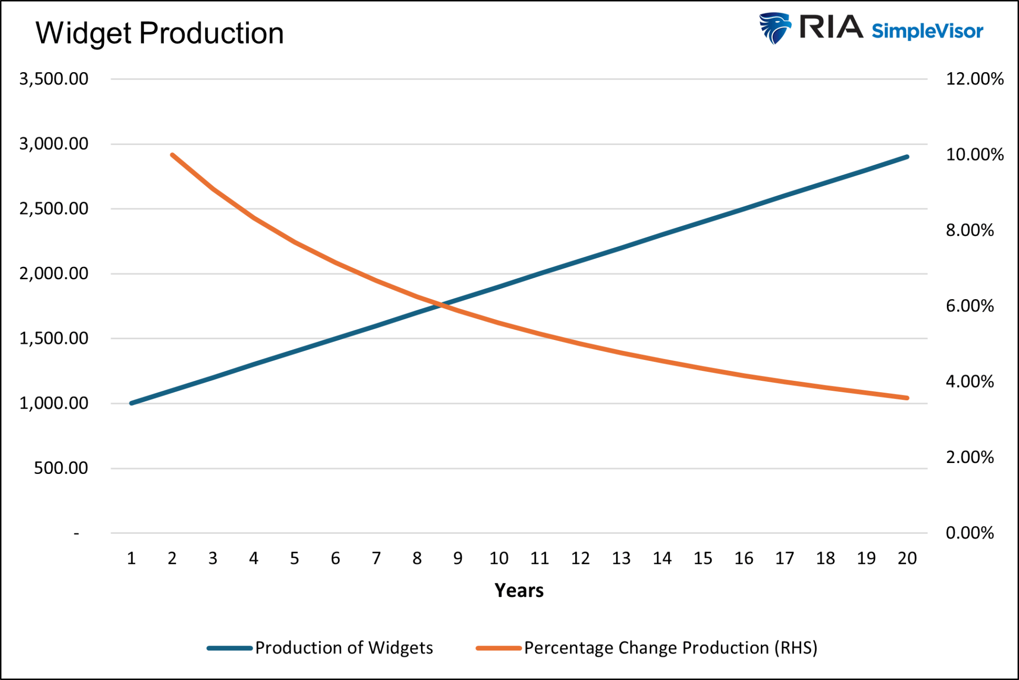
Growth rates highlight trends and changes over time more clearly than absolute numbers. They can show whether an economy is accelerating, decelerating, or maintaining a steady pace.
Consider the graph below. The blue line, showing the make-believe production of widgets, starts at 1,000 widgets and increases by 100 widgets annually. The steady growth in absolute terms is a linear upward trending line. However, the annual growth rate steadily declines from 10% to 4% by year 20. An economist looking at the graph would say the rate of the production of widgets is declining despite the upward trend in the number of widgets being produced annually.
Policy Decision Making
The Fed aims to promote stable economic growth. To do so they balance the level of interest rates with inflation and economic activity. Having like figures to analyze, such as growth rates, makes their task significantly more straightforward. Imagine if the Fed had to determine the appropriate interest rate given that the economy grew by $750 billion last year and the CPI price index rose by 2.45.
Investors prefer growth rates for the same reason. If I can estimate the economy’s growth rate and other critical economic figures, they can better determine a growth rate or interest rate they would accept for taking risks.
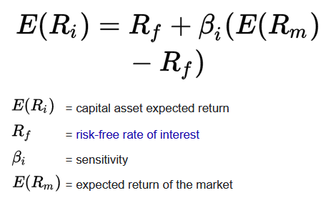
The capital asset pricing model (CAPM) is a bedrock for finance. The formula states that an asset’s expected return should equal the risk-free interest rate plus the asset’s sensitivity (beta) times the market’s expected return. This formula can only work with growth rates, not absolute numbers.
Consumer’s Point Of View
Regarding inflation, consumers are less concerned with growth rates and heavily focused on absolute prices. They remember that bread used to cost $4 a loaf and now costs $7. The graph below shows the price of white bread was stable between $1.25 and $1.50 a pound from 2008 to the pandemic. It is now close to $2 a pound.
That is significant inflation. But it doesn’t tell the whole story. If wages also rose similarly, purchasing power hasn’t changed. It is similar to hearing stories from your parents or grandparents about going to the movies and getting popcorn and a soda, all for $1. Did you ever ask them how much money they made at the time?
Summary
We want to make it clear that we do not condone inflation. It accelerates an already wide wealth gap and creates hardships for many citizens. For more, please read our article, Fed Policies Turn The Wealth Gap Into A Chasm.
We analyze inflation data similarly to economists. We accept that absolute prices are much higher today than a few years ago, but we also acknowledge that, in general, wages are higher as well. Just like we can’t realistically compare a 15-cent McDonald’s hamburger to a $3.00 one today, we should be careful comparing prices today to their prices a few years ago.
Prices are not returning to 2020 levels. In fact, any hint that aggregate prices retreat from current levels will cause the Fed to panic and quickly stimulate inflation via lower interest rates and QE. We remind you that the Fed was lamenting that we didn’t have enough inflation throughout most of the period between the financial crisis and the pandemic.
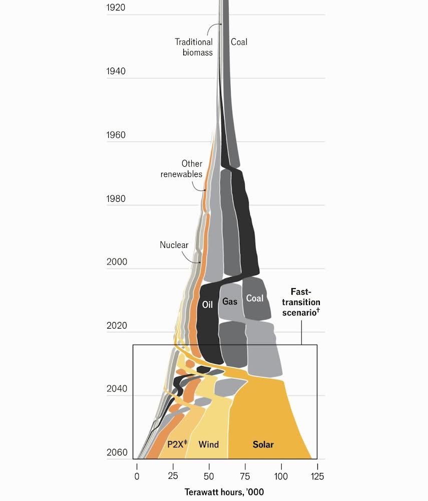
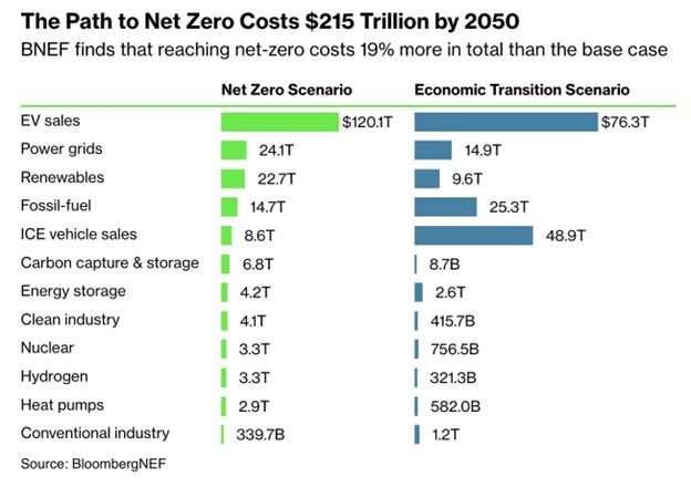
The Economist Makes A Case For Solar Energy
The unique graph below caught our attention, compelling us to read Solar Power Is Going To Be Huge by the Economist. The graph shows that solar energy will be the primary energy source for the world by 2040 under its “fast transition scenario.” The Economist article walks through some stats on the growth of solar energy as well as obstacles. Given the immense growing demand for electricity from AI data centers and EVs, it’s worth appreciating what energy sources will fuel the power grid and their respective investment opportunities. For more on the topic, we wrote a three-part article, which can be accessed here (parts ONE, TWO, and THREE ).
The Economist shares some interesting statistics on the rise of solar energy. For instance, solar energy is on track to produce “more electricity than all the world’s nuclear power plants in 2026, than its wind turbines in 2027, than its dams in 2028, its gas-fired power plants in 2030 and its coal-fired ones in 2032.” The increasing use of solar energy is due not only to its environmental benefits but also its falling cost. Per the Economist:
Since the 1960s…the levelised cost of solar energy—the break-even price a project needs to get paid in order to recoup its financing for a fixed rate of return—has dropped by a factor of more than 1,000.” Over the period, “prices dropped by a factor of 500. That is a 27% decrease in costs for each doubling of installed capacity, which means a halving of costs every time installed capacity increases by 360%.
The Economist makes a strong case for solar energy being dominant in fifteen years. If they are correct, there are some investment ideas worth researching with solar panel and battery manufacturers and producers of solar energy. However, investors must also consider the near future. Specifically, which energy source can fuel the current rapid expansion of power grids today and for the next fifteen years? As portrayed in the graph, natural gas is likely to remain the primary fuel for the power grid for at least another ten years.
What To Watch Today
Earnings
Economy
Market Trading Update
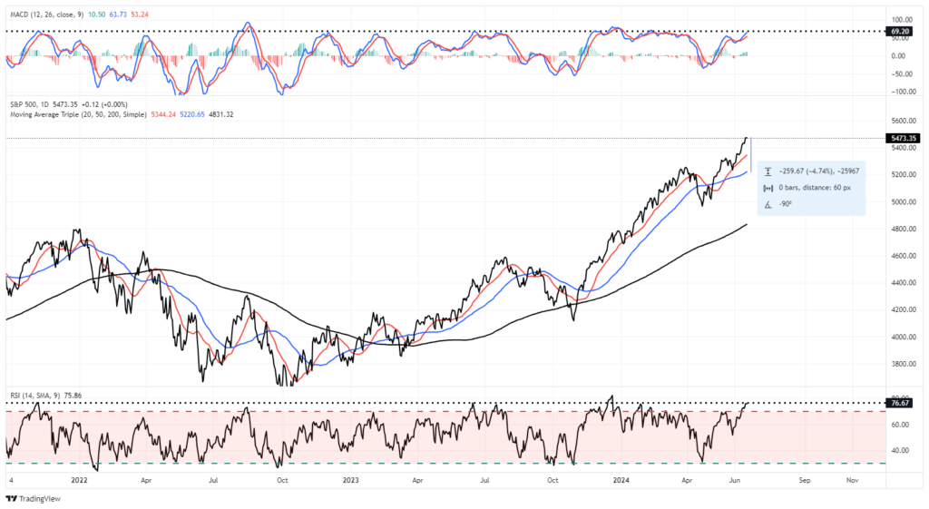
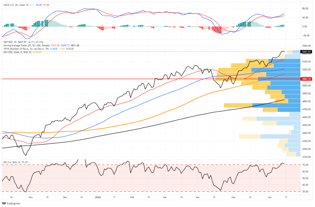
Over the last three days, the mainstream financial media has expressed much angst about the 13% decline in Nvidia (NVDA) shares. Of course, as noted yesterday, Nvidia is a leader in the technology sector (in terms of weighting), and its decline has impacted the entire S&P 500.
As discussed on theReal Investment Showyesterday, despite the nail-biting by the mainstream media and Nvidia bears discussing the end of the A.I. run, the reality was that portfolio managers were overweight shares of Nvidia heading into month end given the post-split run up, and options expiration last Friday, all contributed to the short-term bought of selling. As shown, it is not surprising that Nvidia found support at the 20-DMA and bounced sharply higher as the “A.I. chase” is still in full swing and buyers were looking for a dip to buy.
Notably, while NVDA held support at the 20-DMA and will likely push back towards $135-140/share, we suggest using that rally to rebalance risk. The last time NVDA triggered a MACD “sell signal,” the stock retested the previous highs and drifted lower for a month to reverse the overbought condition. We suspect we could see similar action over the next couple of months heading into the summer. While there is still much momentum behind NVDA, it is overbought, which will likely limit the current upside. To some degree, a reversal would provide a much better entry point to rebuild or increase exposures as needed.
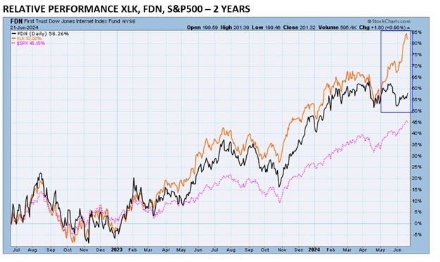
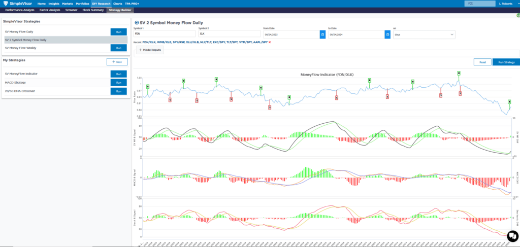
TPA Spots A Rare Divergence Worth Following
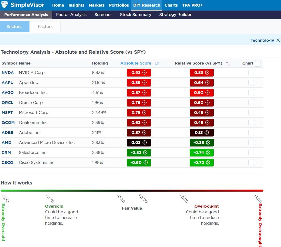
Jeffrey Marcus of TPA Analytics recently provided his subscribers with a summary of a critical ETF divergence. The first graph below, from his article, compares the price performance of FDN (internet stocks) and XLK (technology stocks). Nearly 50% of XLK is comprised of Microsoft, Apple, and Nvidia. Amazon, Meta, and Google make up about 30% of the FDN internet ETF. As shown, the two indexes tend to correlate very well. However, recently, they have diverged. Consequently, the unusual price behavior has resulted in what Jefferey believes is a good trade opportunity.
SimpleVisor subscribers can add Jeffrey’s TPA-RRG summary to their subscription package. TPA-RRG analyzes momentum and relative strength to help pick stocks and sectors likely to outperform or underperform the market. XLK is among the best performers, and FDN is near the bottom. Jeffery also points out that the RSI on the top four XLK stocks are decently overbought. As such, he offers the following advice:
Focusing on the 14-day RSI, it is clear that the top 4 stocks on XLK have gotten ahead of themselves (they are overbought). TPA expects that in thenext several weeks, a convergence of XLK and FDN will be seen. This would demand that AMZN, META, GOOGL, and GOOG outperform MSFT, AAPL, NVDA, and AVG as the long-term pattern ofcorrelated performance returns.
The second graphic from SimpleVisor compares the price ratio of FDN to XLK. It too shows that the pair is grossly oversold (FDN compared to XLK), thus supporting TPA’s view that FDN is likely due for better returns than XLK in the coming weeks.
Sector Performance Following Rate Cuts
The Strategas graphic below shows how each sector performed in the six months following the first cut since 1995. Strategas sorts the sectors left to right by the average return. Utilities, staples, and healthcare have the three highest averages. Utilities are the only sector that was positive in all four instances. The recent leading market sector, technology, has the worst average, including two double-digit declines.
If you found this blog useful, please send it to someone else, share it on social media, or contact us to set up a meeting.
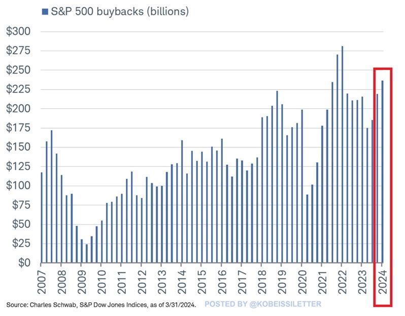
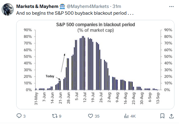
Buybacks Are Back
Over the last six-plus months, we have written plenty on how a few stocks lead the market higher while a large majority languishes. For example, in our latest Newsletter, Bad Breadth Keeps Getting Worse, we wrote the following: “With a market sitting at all-time highs, combined with robust money flows, the breadth of the market should be healthy. However, despite the market advance, the number of stocks above their respective moving averages has declined since April.” Why is this occurring? While there are many reasons, the most impactful may be stock buybacks.
The graph below by @kobeissiletter shows that, as he highlights, $237 billion of stock buybacks occurred in the first quarter. A similar or even greater number of buybacks likely occurred this quarter ending Friday. Furthermore, Goldman Sachs forecasts $925 billion in buybacks this year and over $1 trillion in 2025. Now consider that the 20 largest companies in the S&P 500 account for slightly over half of all buybacks in the first quarter. If buybacks continue at the pace Goldman expects, it will provide a nice tailwind for the largest stocks. Therefore, the bad breadth may continue longer than many think.
What To Watch Today
Earnings
Economy
Market Trading Update
Yesterday, we touched on the negative divergences and weakening market breadth. As we noted, while these indicators suggest internal market weakness that precedes corrections historically, the timing of such an event is always problematic. One thing these internals do suggest, from a more immediate impact view, is a limited upside to the market’s advance. Over the last three days, the market has started consolidating recent gains and is working off some overbought conditions. Keep a watch on the MACD signal in the top panel. If it triggers a “sell signal,” we will see further consolidation or a correction until that signal reverses. Such a signal would give investors a better entry point for additional exposure.
The bullish trend remains intact, and investor sentiment remains very bullish. As such, continue to maintain exposure as needed, but, as always, follow risk management protocols for rebalancing as needed.
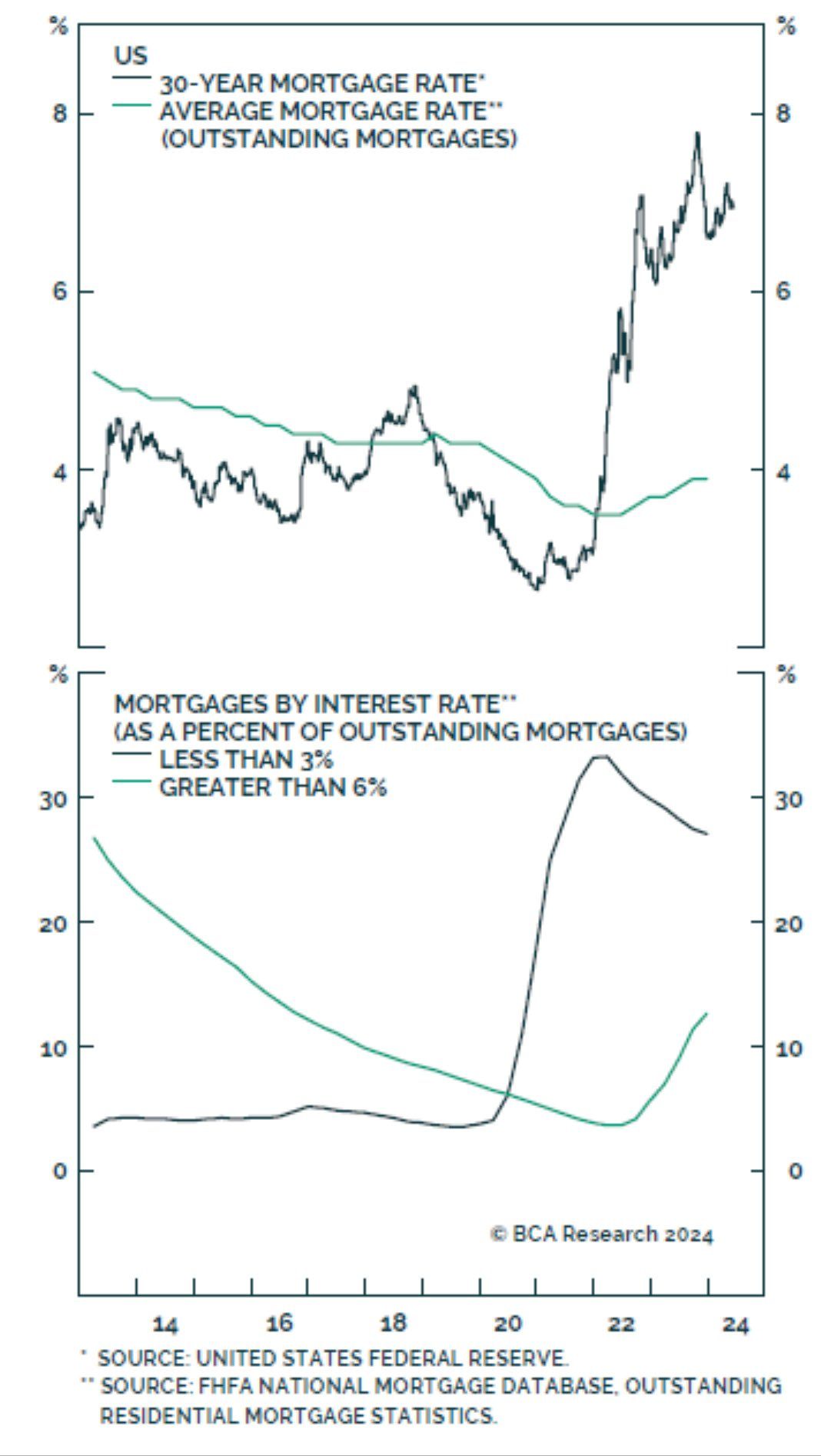
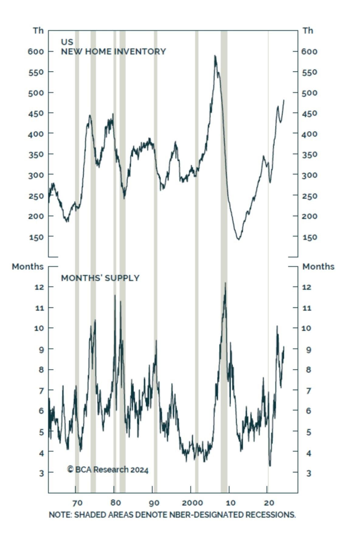
Fed Rate Cuts May Not Help The Real Estate Market
Typically, the Fed has been able to boost economic growth with lower rates. This occurs, in part, because some debtors can refinance debt at lower rates. For example, it has become commonplace to refinance a mortgage when rates fall. Lower payments, in turn, allow consumers to spend more, thus boosting economic activity.
What has worked in the past may be much less effective the next time the Fed cuts rates. The top graph below, courtesy of BCA Research, shows that the average mortgage rate is still below 4%. Mortgage rates would have to drop by nearly 4% to entice the average borrower to refinance. The lower graph shows that about a third of mortgages are 3% or below. Those borrowers will need ten-year yields of near zero percent to refinance.
A similar construct exists in the business world. Many large corporations refinanced their debt in 2020 and 2021 when rates were historically low. If the Fed slowly decreases rates, it’s quite possible the benefits will be much more limited than in the past.
Relative Sector and Factor Analysis
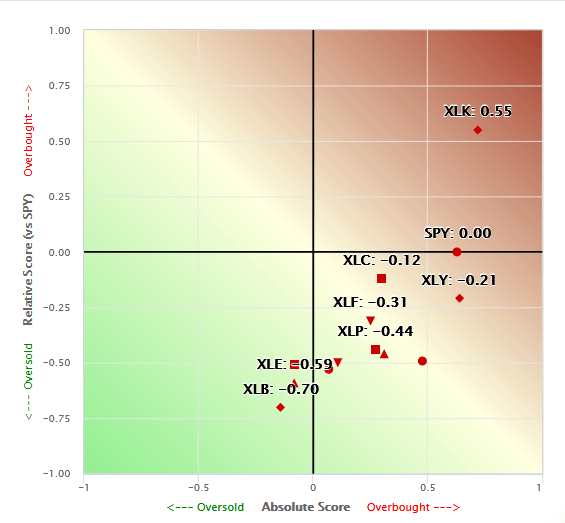
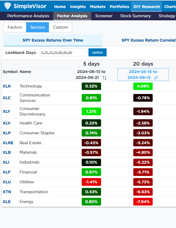
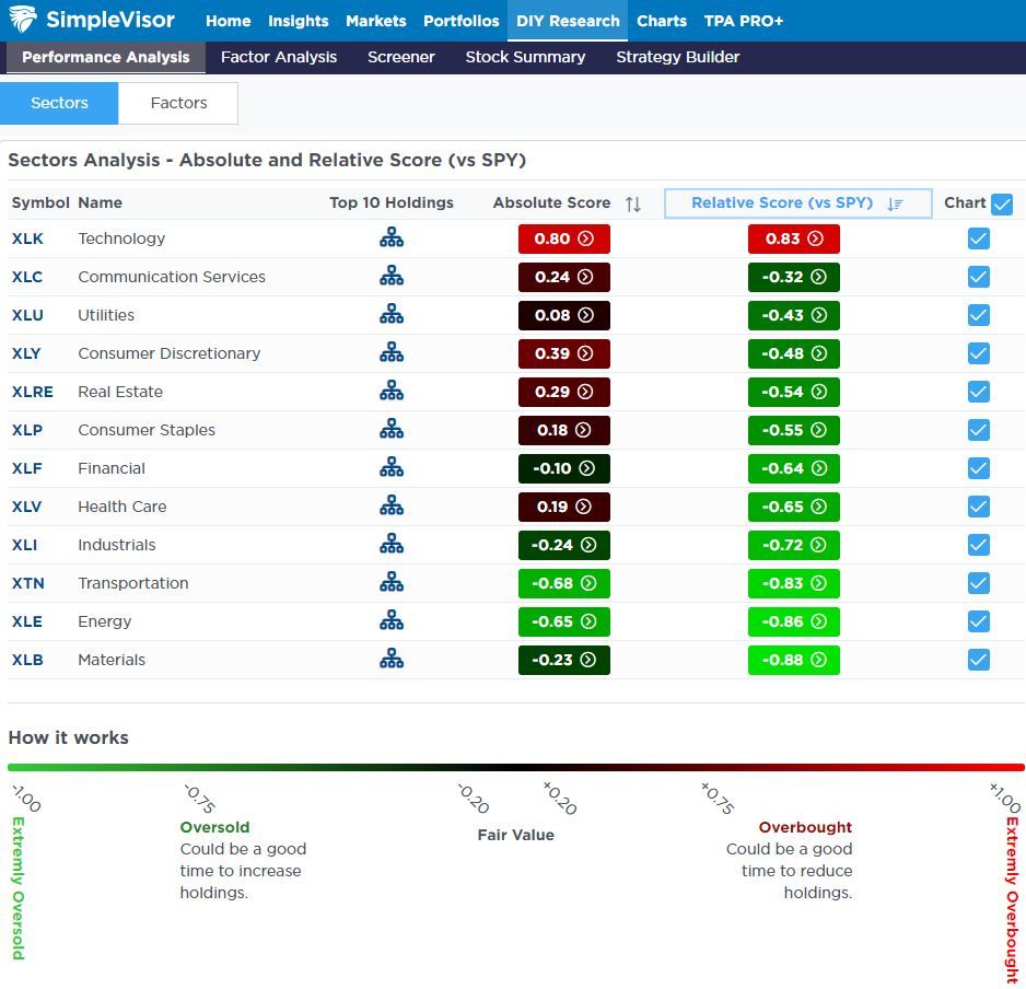
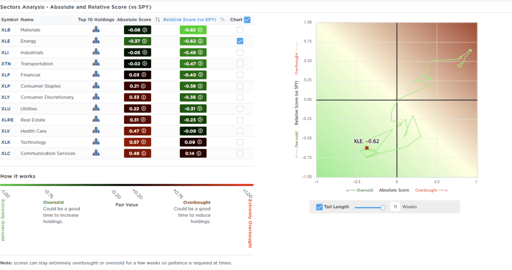
Once again, technology stocks are considerably overbought on a relative analysis. At the same time, every other sector is oversold versus the S&P 500. The first graph charts each sector’s relative and absolute SimpleVisor proprietary scores. XLK (technology) is the only sector with a relative score above zero. Many economically sensitive sectors (materials XLB, energy XLE, and XLI industrials) are very oversold.
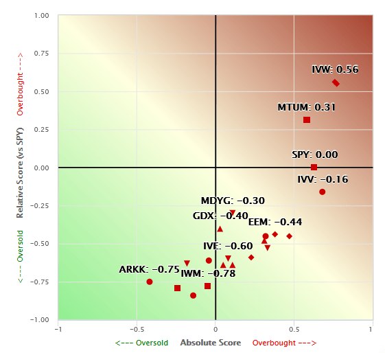
The second scatter plot using stock factors and indexes is very similar. S&P 500 Growth (IVW), Megacap Growth (MGK), and Momentum (MTUM) are the only factors with positive relative scores. Many other factors are grossly oversold. The two most oversold are foreign markets (EFA and VEA). The third table shows that XLK is up 4.08% over the last four weeks. Conversely, every other sector is lower over the period. Furthermore, half of the sectors are down by 5% or more.
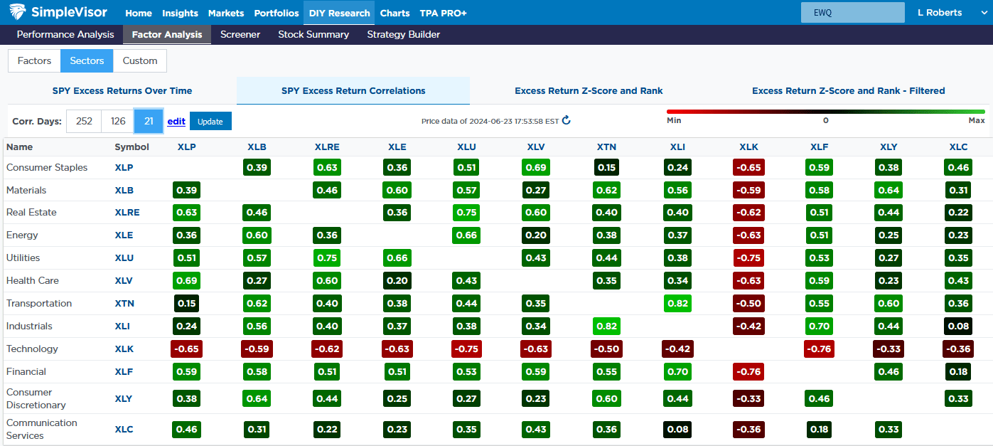
Lastly, the fourth table shows the price correlations of each sector versus every other sector for the last 21 days. XLK has a negative correlation to every sector, while every other sector is positively correlated to each other. The set of images below helps better appreciate the horrendous market breadth.
If you found this blog useful, please send it to someone else, share it on social media, or contact us to set up a meeting.
S&P 6300? Is That Outside The Realm Of Possibility?
Goldman Sachs recently upped its price target to S&P 6300 for the end of this year, along with Evercore ISI upping its year-end target to 6000. Such is not surprising given the strong run in the markets this year. Just two weeks ago, I posted the following chart saying:
“We should soon start getting a raft of S&P 500 price target upgrades for year-end.”
While such a bold number may seem unrealistic, there is a fundamental case to support it.
“There are many reasons why valuations have shifted higher over the years. The increase is partly due to economic expansion, globalization, and increased profitability. However, since the turn of the century, changes in accounting rules, share buybacks, and greater public adoption of investing (aka ETFs) have also contributed to the shift. Furthermore, as noted above, the massive monetary and fiscal interventions since the “Financial Crisis” created a seemingly “risk-free” environment for equity risk.
The chart shows the apparent shift in valuations.”
The “median” CAPE ratio is 15.04 times earnings from 1871-1980.
The long-term “median” CAPE is 16.52 times earnings from 1871-Present (all years)
The “median” CAPE is 23.70 times earnings from 1980 to the present.
There are two critical things to consider concerning the chart above.
The shift higher in MEDIAN valuations was a function of falling economic growth and deflationary pressures, and,
Increasing levels of leverage and debt, which eroded economic growth, facilitated higher prices.
So, the question is, “IF” valuations have permanently shifted higher, what will the next market mean-reverting event look like to reset fundamental valuations to a more attractive level?
We answered that question by analyzing current market prices and expected earnings to determine the shape of such a valuation reversion.
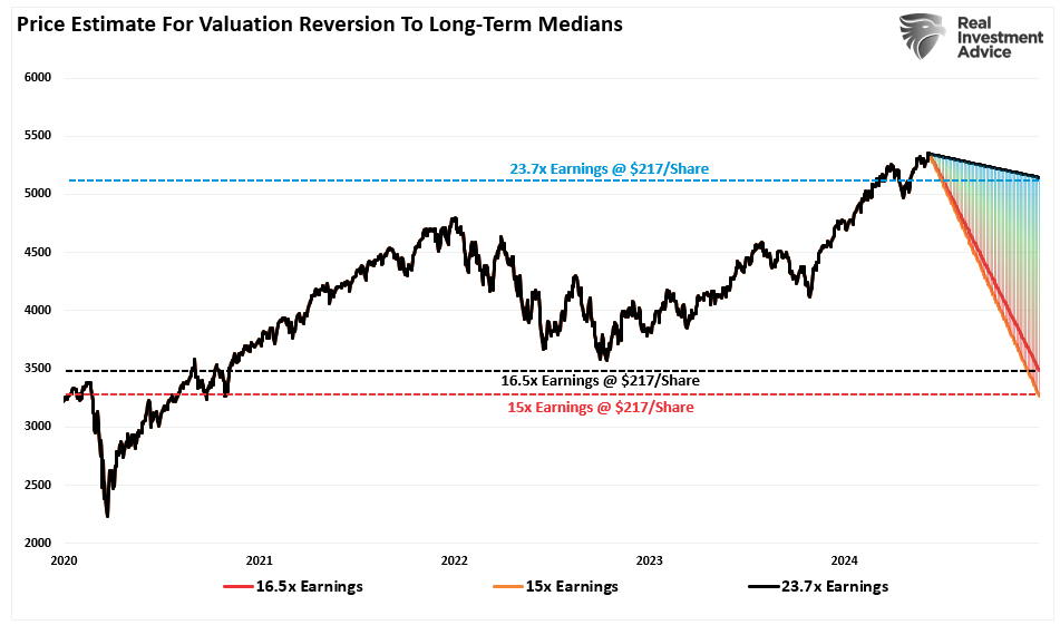
As of this writing, the S&P 500 is trading at roughly $5,300 (we will use a round number for easy math). The projected earnings for 2024 are approximately $217/share. We can plot the price decline needed to revert valuations using the abovementioned median valuation levels.
23.70x = 5142.90 = 3% decline
16.52x = 3584.84 = 33% decline
15.04x = 3263.68 = 38.5% decline
However, that story’s “other side” is where a multiple expansion occurs.
S&P 6300 – The Other Side Of The Story
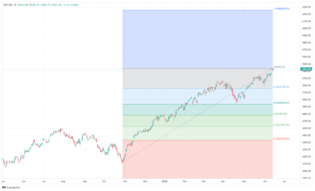
How did we pick S&P 6300? We used a standard Fibonacci sequence to identify the logical, numerical sequence from the November 2023 lows. From those lows, an extension of 1.62% would take the market to roughly 6300 (6255, to be exact). However, for the market to make that advance, the underlying earnings will need to support the continued rise.
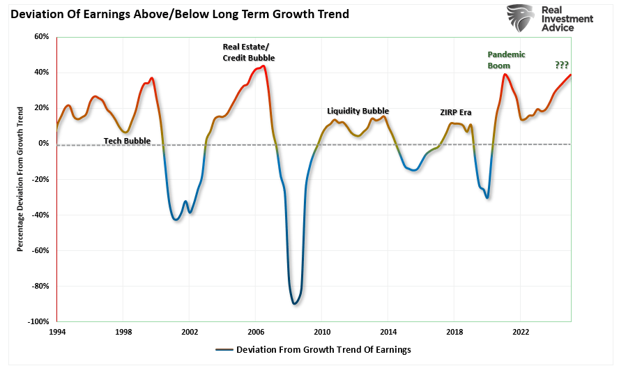
As noted in the previous article, valuation contractions happen during recessionary and bear market periods. During such a phase, the exuberance of the market realigns the price of the market with the underlying fundamentals. However, multiple expansions are underway before the beginning of the reversion process. During this bullish phase, Wall Street analysts continue to ratchet earnings estimates higher to justify rising prices. Currently, we are in the multiple expansion phase, where analysts are dramatically increasing earnings estimates to more extreme levels. As shown, the earnings estimates for 2025 are at a record deviation from the long-term exponential growth trend.
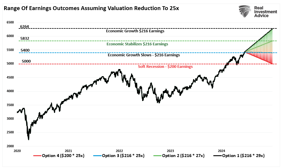
So, how can the S&P 500 get to 6300? We can use current Wall Street estimates to work backward through the valuation process. As we did previously, we usually look at the market’s price and determine the “fair value” of the market based on expected earnings. In this case, we will take the denominator (earnings) of the valuation equation to find the “fair price” of the market.
While Goldman is looking at 6300 for the end of this year, for this thought experiment, we will use S&P Global’s current estimates of $216/share for the end of 2024. For Goldman’s estimate of 6300, trailing one-year valuations will rise to 29x earnings. However, we will also assume some lower valuation of 27x and 25x earnings by year-end if economic growth continues to slow. Furthermore, we will consider a drop in earnings to $200/share if the economy starts heading into a soft recession. However, given that Wall Street estimates are always overly optimistic, a deeper discount in earnings is possible. However, those parameters give us the following results.
$216/share * 29x Trailing Earnings = 6264(Assumes continued economic growth)
As we did previously, we can use these forecasts to build a chart showing the range of potential outcomes over the next 6 months.
Those outcomes are just one set of assumptions. By adjusting valuation and earnings expectations, we could create infinite possibilities. The purpose of the exercise, however, is to establish a reasonable range of possibilities for the market at the end of the year. As shown, the range of potential outcomes is broad from market levels at the time of this writing. The bullish argument of “no recession” suggests a possible upside from 7.4% to 15%. However, if the economy slows or slips into a soft recession, the potential downside ranges from a -1% loss to -8%.
Challenges Remain
Let me state that I have no idea what the next 6 to 18 months hold in store. As noted, there are an infinite number of possibilities. What happens in the November election, Fed policy, and the potential for a recession will all affect one of those outcomes.
Here is our concern with the bullish scenario. It entirely depends on a “no recession” outcome, and the Fed must reverse its monetary tightening. The issue with that view is that IF the economy does indeed have a soft landing, there is no reason for the Federal Reserve to reverse its balance sheet reduction or cut interest rates drastically.
More importantly, the rise in asset prices continues to ease financial conditions, keeping inflation “sticky,” thereby eroding consumer purchasing power. The bull case also suggests that employment remains strong, along with wage growth, but there is clear evidence of erosion on both.
While the bullish scenario of S&P 6300 is possible, that outcome faces many challenges heading into 2025, given the market already trades at fairly lofty valuations. Even in a “soft landing” environment, earnings should weaken, making current valuations more challenging to sustain.
Our best guess is that reality lies somewhere in the middle. Yes, there is a bullish scenario in which earnings decline, and a monetary policy reversal leads investors to pay more for lower earnings. However, that outcome has a limited lifespan as valuations matter to long-term returns.
As investors, we should hope for lower valuations and prices, which gives us the best potential for long-term returns. Unfortunately, we don’t want the pain of getting there.
Regardless of which scenario plays out in real-time, there is a substantial risk of poor returns over the next 6-18 months. As investors, we must manage the risk of an unexpected turn of events undermining Wall Street’s continued optimistic views.
After all, the math is just the math.
Consumers Are Turning to Private Label Brands
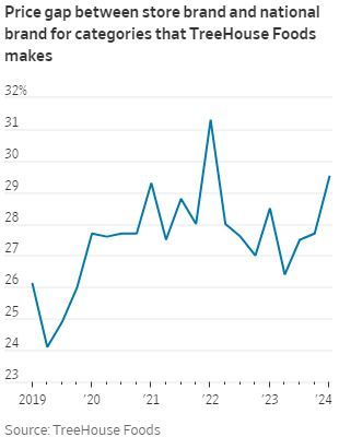
Consumers are turning away from name-brand foods in an attempt to cut back on spending. Consumer Packaged Goods (CPG) companies such as Proctor & Gamble, General Mills, and Kellogg benefited from supply chain disruptions during the pandemic as private label products saw restricted supply. Thus, the CPG brands with more resilient supply chains used the combination of shortages and heightened demand for food at home to exercise pricing power. As shown below, the price premium between national and store brands for TreeHouse Foods, a private-label manufacturer, remains substantially higher than pre-pandemic levels.
However, this advantage also meant that CPG brands relaxed their efforts to innovate their product lines. Private-label brands are also honing in on quality, meaning CPG brands must compete through innovation or lowering prices to maintain market share. The latter seems more likely, given the recent retail sales data. Now that supply chain pressures have alleviated and inflation is straining household budgets, consumers are turning to private-label brands to control costs. Per the Wall Street Journal:
Amid elevated demand for food at home and consumer wallets flush with stimulus cash, CPG companies were able to raise prices without much resistance. But that is now quickly changing as retailers deal with price-sensitive consumers increasingly exhausted with the cumulative impact of inflation: Grocery prices are about 26% higher than they were in 2019. In a recent survey of U.S. consumers by Jefferies, some 51% of respondents said they are buying more private-label products to save money on grocery bills.
What To Watch Today
Earnings
No notable earnings releases.
Economy
Market Trading Update
Last week, we discussed the issue of the negative divergences and bad breadth of the market. To wit:
“While the bullish trend remains intact, along with a MACD ‘buy signal,’ which suggests an increased allocation to equity exposure, we have some concerns.
While the market is making all-time highs as momentum continues, its breadth is narrowing. The number of stocks trading above their respective 50-DMA continues to decline as the market advances, along with the MACD signal. Furthermore, the NYSE Advance-Decline line and the Relative Strength Index (RSI) have reversed, adding to the negative divergences from a rising market. While this does not mean the market is about to crash, it does suggest that the current rally is weaker than the index suggests.
As we discussed, these negative divergences have often preceded short- and intermediate-term corrective market actions. Such is the point where Investors tend to make two mistakes. The first is overreacting to these technical signals, thinking a more severe correction is coming. The second is taking action too soon.
Yes, these signals often precede corrections, but there are also periods of consolidation where the market trades sideways. Secondly, reversals of overbought conditions tend to be shallow in a momentum-driven bullish market. These corrections often find support at the 20 and 50-day moving averages (DMA), but the 100 and 200-DMAs are not outside normal corrective periods.
If you remember, in March, we discussed the potential for a 5 to 10% correction due to many of the same concerns noted above. That correction of 5.5% came in April. We are again at a juncture where a 5-10% is likely. The only issue is it could come anytime between now and October.
As is always the case, timing is always the biggest risk. Therefore, be careful not to overreact or act too soon. The market will let us know when to become more aggressive in reducing risk.
The Week Ahead
The second quarter comes to an end this week. The primary focus will be PCE prices plus personal income and outlays on Friday. The all-important core PCE price index is the Fed’s preferred measure of inflation; thus, it carries extra weight. The consensus expects personal income to rise 0.4% MoM in May versus the 0.3% increase in April. Meanwhile, the consensus expects personal expenditures to rise by 0.3% MoM in May after increasing by 0.2% in April.
This week starts slowly with speeches by the Fed’s Waller and Daly today. Tomorrow, we will hear from Bowman and Cook and get data on April home prices via the Case-Shiller Home Price Index. We’ll also get updated consumer confidence data, where the consensus forecasts a decrease to 100 in June from 102 in May. Wednesday will bring New Home Sales data for May. We don’t expect any positive surprises, given that consumers are turning down purchases due to high mortgage rates. Durable Goods Orders for May are released on Thursday. The consensus expects a slowdown in growth to 0.3% in May from 0.7% in April. As mentioned above, we cap off the quarter with PCE prices and personal income & outlays on Friday.
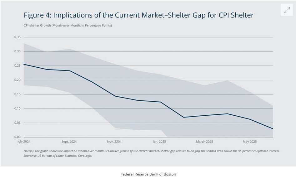
Boston Fed Economist: Shelter Inflation May Be Stubborn Through Year-End
A recently published paper by a Boston Fed Economist suggests that rent increases will keep inflation above the Fed’s target for longer than most expect. The Author proposes that the effect will be most notable through the end of 2024 and diminish significantly in 2025. In addition, the Author expects CPI shelter inflation to slow considerably in periods beyond the next twelve months. His research focuses on the gap between market rent and the shelter component of CPI and how those dynamics pass through to CPI and PCE. Below, we provide excerpts and a chart from the paper that sums it up nicely.
The overall trend is clear: CPI shelter is expected to grow quickly in the summer and fall of 2024 but then slow down markedly when we move into 2025. Therefore, according to the estimates, the market–shelter gap is likely to pose a significant, but diminishing, challenge to the Fed’s ability to achieve its 2 percent inflation target over the next year.
Back-of-the-envelope calculations show how high CPI shelter could raise overall inflation this year. Given that shelter comprises 36.1 percent of the CPI and 15.5 percent of the PCE, the post-pandemic pass-through estimates imply that the current market–shelter gap will lead to an additional 0.59 and 0.25 percentage point growth in headline (including food and energy) CPI and headline PCE, respectively, from June 2024 to June 2025 relative to there being no market–shelter gap. The estimates also show that the deviation will lead to an additional growth in core (excluding food and energy) CPI and core PCE of 0.74 percentage point and 0.29 percentage point, respectively, from June 2024 to June 2025.
If you found this blog useful, please send it to someone else, share it on social media, or contact us to set up a meeting.
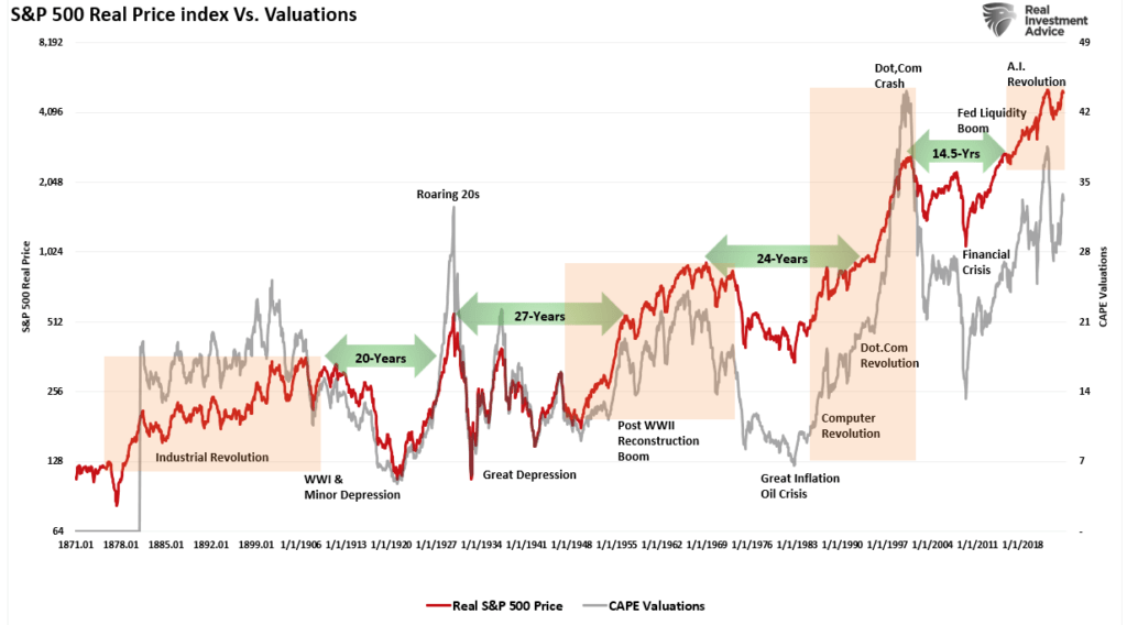
A Fundamental Shift Higher In Valuations
Over the last decade, there has been an ongoing fundamental debate about markets and valuations. The bulls have long rationalized that low rates and increased liquidity justify overpaying for the underlying fundamentals. For the last decade, that view appears correct as zero interest rates combined with massive monetary and fiscal support increased market returns by 50% since 2009. We discussed this point in“Long-Term Returns Are Unsustainable.” To wit:
“The chart below shows the average annual inflation-adjusted total returns (dividends included) since 1928. I used the total return data from Aswath Damodaran, a Stern School of Business professor at New York University. The chart shows that from 1928 to 2021, the market returned 8.48% after inflation. However, notice that after the financial crisis in 2008, returns jumped by an average of four percentage points for the various periods.”
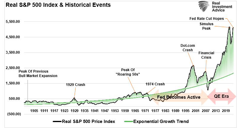
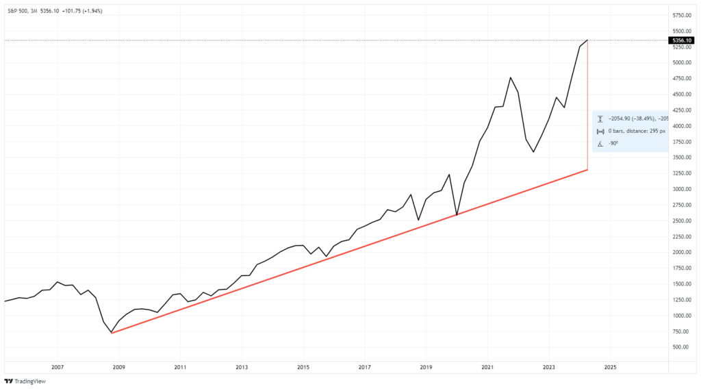
As noted, an unprecedented amount of monetary accommodation drove those excess returns. Unsurprisingly, this resulted in one of the most significant deviations from the market’s exponential growth trend.
(Usually, when charting long-term stock market prices, I would use a log-scale to minimize the impact of large numbers on the whole. However, in this instance, such is not appropriate as we examine the historical deviations from the underlying growth trend.)
Wall Street Exuberance
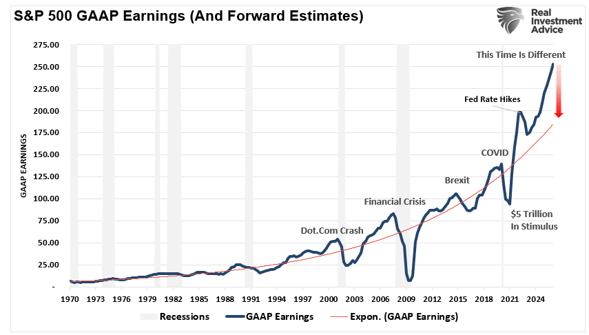
The fiscal policies implemented after the pandemic-driven economic shutdown created a surge in demand that further exacerbated an already extended market. As shown, those fiscal interventions led to an unprecedented surge in earnings, with current expectations through 2025 significantly extended.
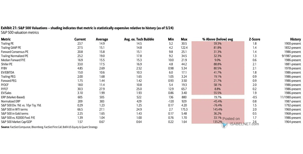
Given that markets historically track the annual change in earnings, it is unsurprising that stocks have once again reached more extreme valuation levels, given the rather ebullient forecast. The table below, from BofA, shows 20 different valuation measures for the S&P 500 index. Except for market-based equity risk premium (ERP), every other measure is at some of the most extreme levels.
Unsurprisingly, when discussing more extreme fundamental valuations, the expectation is that a more significant correction will eventually occur. While historically, the markets have often experienced “mean reverting events,” we will explore how the past 20 years of monetary and fiscal interventions have potentially permanently shifted market valuations higher.
A Permanent Shift Higher
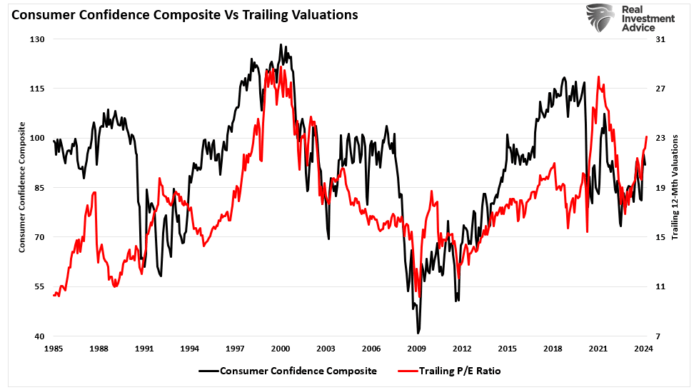
As discussed in “Technical Measures,“ valuations are a terrible market timing tool. Valuations only measure when prices are moving faster or slower than earnings. As we noted, in the short-term valuations are a measure of psychology. To wit:
“Valuation metrics are just that – a measure of current valuation. More importantly, when valuation metrics are excessive, it is a better measure of ‘investor psychology’ and the manifestation of the ‘greater fool theory.’ As shown, there is a high correlation between our composite consumer confidence index and trailing 1-year S&P 500 valuations.”
However, just because current valuations are elevated, does that mean a massive mean reverting event is required?
Maybe not.
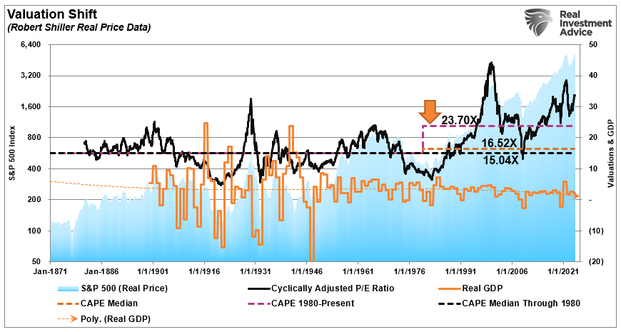
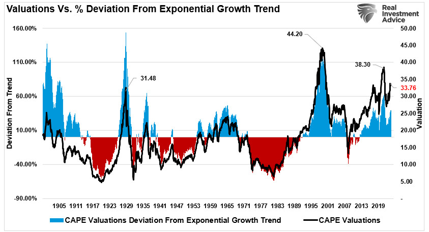
Dr. Robert Shiller’s fundamental valuation method, using ten years of earnings, or the cyclically adjusted price-earnings ratio (CAPE), is over 33 times trailing earnings. While that valuation level seems elevated on a nominal basis, its deviation from the long-term exponential growth trend is not. While 33x earnings is a high price for future earnings (implying 33 years to break even), the reduced deviation from the long-term exponential growth trend exposes the shift higher in valuation levels.
There are many reasons why valuations have shifted higher over the years. The increase is partly due to economic expansion, globalization, and increased profitability. However, since the turn of the century, changes in accounting rules, share buybacks, and greater public adoption of investing (aka ETFs) have also contributed to the shift. Furthermore, as noted above, the massive monetary and fiscal interventions since the “Financial Crisis” created a seemingly “risk-free” environment for equity risk.
The chart shows the apparent shift in valuations.
The “median” CAPE ratio is 15.04 times earnings from 1871-1980.
The long-term “median” CAPE is 16.52 times earnings from 1871-Present (all years)
The “median” CAPE is 23.70 times earnings from 1980 to the present.
There are two critical things to consider concerning the chart above.
The shift higher in MEDIAN valuations was a function of falling economic growth and deflationary pressures, and,
Increasing levels of leverage and debt, which eroded economic growth, facilitated higher prices.
So, the question is, “IF” valuations have permanently shifted higher, what will the next market mean-reverting event look like to reset fundamental valuations to a more attractive level?
Mapping A Reversion To The Mean
Many video channels, commentators, and media types suggest another “major market correction” is coming. There are many reasons for their claims running the gamut, including de-dollarization, loss of the reserve currency, higher rates, debt defaults, etc. As we noted previously, while these arepossibilities, they are pretty remote.
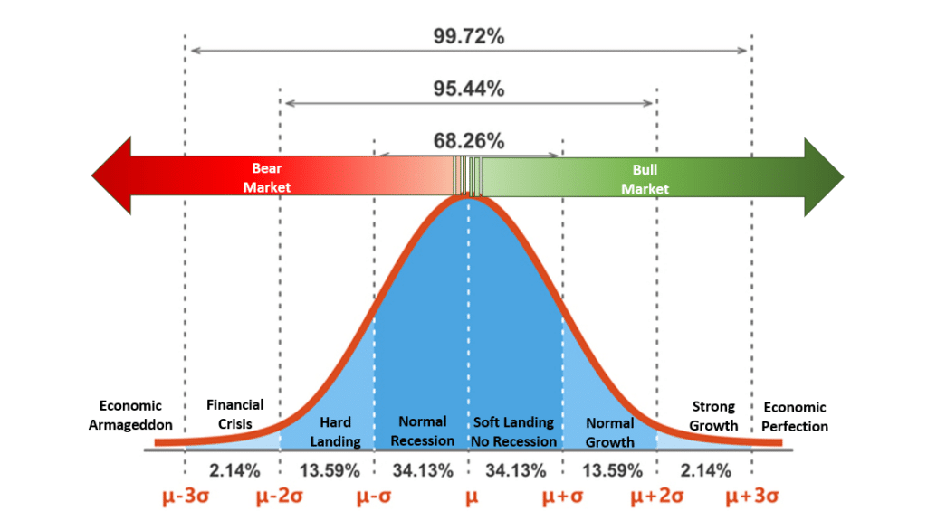
“The chart below is a normally distributed “bell curve” of potential events and outcomes. In simple terms, 68.26% of the time, typical outcomes occur. Economically speaking, such would be a normal recession or the avoidance of a recession. 95.44% of the time, we are most likely dealing with a range of outcomes between a reasonably deep recession and standard economic growth rates. However, there is a 2.14% chance that we could see another economic crisis like the 2008 Financial Crisis.
But what about “economic armageddon?”
That event where nothing matters but “gold, beanie weenies, and bunker.” That is a 0.14% possibility.“
While “fear sells,” we must assess the “probabilities” versus “possibilities” of various outcomes. Since valuations are a fundamental function of price and earnings, we can use the current price of the market and earnings to map out various valuation reversions.
As of this writing, the S&P 500 is trading at roughly $5,300 (we will use a round number for easy math). The projected earnings for 2024 are approximately $217/share. We can plot the price decline needed to revert valuations using the abovementioned median valuation levels.
23.70x = 5142.90 = 3% decline
16.52x = 3584.84 = 33% decline
15.04x = 3263.68 = 38.5% decline
Here is the vital point.
While a near 40% decline in stocks is quite significant and would undoubtedly send the Federal Reserve scrambling to cut rates and restart “Quantitative Easing,” the reversion would only reverse the post-pandemic stimulus-driven gains. In other words, a near 40% correction would NOT be a “bear market” but just a correction in the ongoing bull market since 2009. (This shows how egregious the price deviation has become from the long-term price trend since the pandemic.)
Conclusion
While this is just a thought experiment, there are two critical takeaways.
The deviation from the long-term means is extreme, suggesting a more significant decline is possible in the future and
While valuations are elevated relative to long-term history, if there has been a permanent shift in valuations, the subsequent correction may not be as deep as some expect.
Importantly, investors repeatedly make the mistake of dismissing valuations in the short term because there is no immediate impact on price returns. As noted above, valuations, by their very nature, are HORRIBLE predictors of 12-month returns. Therefore, investors should avoid any investment strategy that has such a focus. However, in the longer term, valuations excellent predictors of expected returns.
From current valuation levels, investors’ expected rate of return over the next decade will be lower than it was over the past decade. That is unless the Federal Reserve and the government launch another massive round of monetary stimulus and cut interest rates to zero.
This does not mean that markets will produce single-digit rates of return each year for the next decade. There will likely be some tremendous investing years over that period and a couple of tough years in between.
That is the nature of investing and the market cycles.
Communication Data Implies Remote Work is Here to Stay
The chart below, courtesy of @KobeissiLetter on X, depicts downtown cell communication data for several major metropolitan areas as of March 2024. Cell phone activity during working hours is significantly below pre-pandemic levels in almost every major city across the country, including areas with significant population growth. The second chart below, from Macrotrends, shows Nashville’s population growth since 2019. While the high pre-pandemic growth rate has slowed, Nashville’s population still expanded by 1.4%, 1.6%, 1.7%, and 1.8% in the last four years, respectively. Yet, downtown Nashville’s cell communication data during working hours has declined by 24%.
Given that the labor market has remained tight in the days since the pandemic, the dip in communication data serves as a reminder that remote work is still going strong. Thus, the troubling devaluation in commercial real estate is likely not temporary. It’s only a matter of time until regional banks accept the losses as permanent, and hopefully, it will stop there. Jerome Powell has expressed confidence that any problems will be containable. However, GSIBs have exposure to regional banks, whether directly or indirectly.
What To Watch Today
Earnings
Economy
Market Trading Update
We discussed the current concern with the market’s overbought condition and weakening breadth yesterday. Not much changed, with the exception of the shear meltup in Nvidia shares. However, yesterday morning on the “Real Investment Show,” I had a question about energy stocks and their recent lag relative to oil prices.
We agree. About a month ago, we noted that oil prices had become very oversold and were due for a bounce. Based on that analysis, we added to our portfolios’ current energy exposures. Subsequently, oil prices rose as expected, but energy company prices did not. Such got me to discuss that issue with our audience, where I produced the following chart of West Texas Intermediate Crude versus the SPDR Energy Sector ETF (XLE).
It should be unsurprising that oil prices and energy stocks generally have a high correlation. This is because oil prices drive energy companies’ revenue. However, since 2022, energy stocks have massively deviated from the underlying commodity. The chase for yield, market speculation, and other factors explain the current deviation. History suggests that the current deviation in performance is unsustainable, and the energy sector could see rather substantial declines during the next period of oil price weakness. Such a downturn in oil prices would result from a demand drop during a recessionary cycle.
Given that historically, energy stocks catch “down” to oil prices during such events, the next correction in energy stock prices could be rather substantial.
Could Nuclear Energy End Up Powering the Future?
There’s likely a bright future in Uranium, as nuclear energy could power the digital economy. Growth in electricity demand is projected to outpace capacity in coming years due to increased consumption by data centers and electrification in general. Although the reactors can take many years to come online, nuclear energy certainly aligns with energy transition goals as a carbon-free energy source. Bill Gates’ nuclear power startup, TerraEnergy, broke ground on its first commercial reactor earlier this month. Gates expects the project to be complete by 2030. A downside to the energy source is that perceived risks, long lead times to completion, and high costs may make these projects less compelling investment opportunities. While nuclear energy projects are expanding globally, unfortunately, the US is lagging in terms of capacity in the works. As shown in the chart below from @chigrl, China and India currently lead the world in reactors under construction.
Home Builder Sentiment is Struggling
The home construction industry is showing signs of slowing down lately. May housing starts posted the fifth decline in the past six months (-5.5% MoM). Meanwhile single-family permits fell for the fourth consecutive month (-3.8% MoM). The picture looks grim as both housing starts and permits fell to their lowest since the pandemic. The slowing home builder data aligns with other evidence we’ve seen that indicates the economy is beginning to slow. What’s contradictive, however, is that residential construction employment has been charging on to record highs. Given housing starts as a leading indicator, we believe the residential construction employment market will begin showing signs of loosening sooner rather than later.
If you found this blog useful, please send it to someone else, share it on social media, or contact us to set up a meeting.
Global Diversification Might Not Be Dead
The chart below suggests that global diversification could be dead. The S&P 500 notched a total return of 13.3% annually over the past 15 years, while the MSCI EAFE and MSCI Emerging Markets indices returned 5.9% and 3.2% per annum respectively. The performance gap primarily stems from differences in earnings growth. S&P 500 earnings grew 14.1% annually over the past 15 years, while developed international and emerging markets grew earnings of 10.6% and 2.9% per annum, respectively. In addition, the global market has afforded the S&P 500 higher P/E multiples since the global financial crisis- a reflection of both more confidence and higher growth expectations.
But is Global Diversification really dead? It hasn’t worked in over a decade, but a recent Bloomberg article postulates that the lack of global diversification in the post-GFC period is an exception rather than a new norm. From 1973 to 2009, earnings growth was 5.7% annually for both EAFE and the S&P 500. Valuation multiples grew at 0.9% annually in EAFE compared to 0.5% for the S&P 500. There used to be a semblance of parity between domestic and international stocks.
On top of that, since 2015, a handful of US companies have driven a large share of S&P 500 earnings growth. The Bloomberg Magnificent Seven Index has seen annual earnings growth of 36% since 2015, while the rest of the S&P 500 grew earnings by roughly 6% annually. Ultimately, the Author’s idea is that a mean reversion is likely. It’s certainly possible that global diversification isn’t dead, but it doesn’t mean the US is bound for underperformance. It could simply mean the S&P 500’s days of drastic outperformance are numbered.
What To Watch Today
Earnings
No notable earnings releases today.
Economy
The marketis closed for Juneteenth. No data releases today.
Market Trading Update
Tuesday, the market held somewhat firm despite a retail sales report that suggests the consumer is slowing down. Furthermore, the already weak April retail sales data was revised lower. Such is not surprising given some of the recent reports from retailers like Walmart.
However, while weak economic data has been causing rather strong market rallies lately, increasing hope for Fed rate cuts, such was not the case yesterday. The reason is that following Monday’s rally, the market deviation from the 50-DMA is getting extreme. Furthermore, the market is very overbought, which limits the upside further. The Relative Strength Index is pushing limits that have previously marked short-term market peaks. A retracement to the 50-DMA would entail a roughly 4.5% decline, which, while not significant, will “feel” much worse given the high level of complacency. This is likely a good point to take profits, rebalance positions to target, and raise some cash as needed heading into quarter-end rebalancing.
Retail Sales Disappointed in May, Price Cuts May Be on the Way
Retail sales came in weaker than expected across the board on Tuesday. Growth was 0.1% in May versus a consensus estimate of 0.2%. Excluding auto sales, retail sales dipped 1%. The control group, which feeds GDP, is now running at -0.1% on a two-month basis. After a year’s long runup in prices that has caused many to pull back on spending, analysts sense a turning point, according to a recent report in the Washington Post. This weak retail sales number adds further credence to the idea that more price cuts may be in store. The article cites several examples of price cutting by major retailers which we summarize below:
Ford marked down its electric Mustang Mach-E by 17%.
Target is slashing prices on 5,000 items, including Persil laundry detergent by 5%, Clorox wipes by 14% and Purina One cat food by 7%.
Walgreens is discounting swim goggles and Squishmallows by as much as 40%.
Ikea has lowered prices three times in the past year, while Best Buy has been marking down appliances.
Arts and crafts chain Michaels says it’s slashing prices on 5,000 items including stickers, canvases and T-shirts.
Several fast food chains, like McDonalds and Burger King, are offering lower-priced options.
The spate of lower prices, combined with slowing spending, suggests the economy is losing some steam after last year’s rapid momentum. That could create room for the Fed to start cutting interest rates by the end of the year. Some Wall Street economists say rate cuts could begin as early as September, especially if inflation continues its descent.
But the economy’s direction is still very much up in the air. Fresh jobs data on Friday showed that employers added 272,000 jobs in May — far more than expected — suggesting that growth is still running hot.
Mega Cap Growth Stocks Are Stretched
The two graphs below show the SimpleVisor proprietary factor analysis tool. It helps users identify factor trends as they occur and notice when relationships are becoming stretched. The tool focuses on the relative performance of various factors to the S&P 500 and plays on the concept of reversion to the mean with negatively correlated factor pairs. One of the most reliable pairs compares the excess return of MGK (Mega Cap Growth) to that of VYM (High Dividend Yield). The pair has a 252-day correlation in excess returns of -0.94.
The first table depicts the factors’ performance relative to the index over discrete periods, forming a type of heat map. As shown below, Mega Cap Growth and Large Cap Growth are two of the few factors that have outperformed that index since mid-May. Small and mid-cap growth have largely underperformed as breadth narrows to a few stocks.
The second chart below illustrates the level to which the relationship of outperformance between MGK and VYM is currently stretched. The pair is trading in the 72nd percentile of the 3-month average daily excess return relationship- a level that has commonly seen a reversal over the past year. The short-term relationship is even more protracted, trading in the 95th percentile. Given the simultaneous overbought level in the market, this relationship could face slight normalization in the short term.
If you found this blog useful, please send it to someone else, share it on social media, or contact us to set up a meeting.
Consumer Survey Shows Rising Bullishness
The latest consumer survey data from the New York Federal Reserve had interesting data.
“The New York Fed’s latest consumer survey found that expectations that stocks will be higher in the next 12 months rose from 39% to 41% since last month’s reading. At the same time, inflation expectations dropped slightly. Consumer sentiment numbers have recently highlighted how certain demographics are thriving while others aren’t, but with the market near all-time highs, it’s no surprise that those who own stocks are feeling good.” – Yahoo Finance
The chart below shows the annual change in consumer surveys of higher stock prices. Unsurprisingly, investors have become increasingly exuberant about stock prices in conjunction with the market rally that began in 2022.
However, Yahoo suggests that the rising bullish sentiment in the consumer survey reflects the “haves and have-nots.” That statement is understandable when considering the breakdown of household equity ownership and the finding that the top 10% of households hold 85% of the equities.
However, consumer survey data shows rising stock market prices lifted confidence across age and income brackets. That should be unsurprising given the daily drumbeat of social and mainstream media highlights of the current bullish market.
Furthermore, when looking at the consumer survey data by income bracket, we see that the lowest and middle-income brackets have seen the most prominent advances in confidence.
Given the popularization of the financial markets through trading apps like Robinhood combined with a rising tide of social media commentary, it is unsurprising that lower income brackets have joined the fray hoping to “get rich quick.”
However, a warning is buried in the rising tide of bullish sentiment.
“Capital gains from markets are primarily a function of market capitalization, nominal economic growth, plus dividend yield. Using John Hussman’s formula, we can mathematically calculate returns over the next 10-year period as follows:
(1+nominal GDP growth)*(normal market cap to GDP ratio / actual market cap to GDP ratio)^(1/10)-1
Therefore, IF we assume that GDP could maintain 2% annualized growth in the future, with no recessions ever, AND IF current market cap/GDP stays flat at 2.0, AND IF the dividend yield remains at roughly 2%, we get forward returns of:
(1.02)*(1.2/1.5)^(1/10)-1+.02 = -(1.08%)
But there are a “whole lotta ifs” in that assumption. Most importantly, we must also assume the Fed can get inflation to its 2% target, reduce current interest rates, and, as stated, avoid a recession over the next decade.”
Yet, despite these essential fundamental factors, retail investors are again throwing caution to the wind. As shown, household equity ownership has reverted to near-record levels. Historically, such exuberance has been the mark of more important market cycle peaks.
If economic growth reverses, the valuation reduction will be quite detrimental. Again, this has been the case at previous peaks when expectations exceeded economic realities.
Bob Farrell once quipped investors tend to buy the most at the top and the least at the bottom. Such is simply the embodiment of investor behavior over time. Our colleague, Jim Colquitt, previously made an important observation.
“The graph below compares the average investor allocation to equities to S&P 500 future 10-year returns. As we see, the data is very well correlated, lending credence to Bob Farrell’s Rule #5. Note the correlation statistics at the top left of the graph.”
The 10-year forward returns are inverted on the right scale. Such suggests that future returns will revert toward zero over the next decade from current levels of household equity allocations by investors.
The reason is that when investor sentiment is extremely bullish or bearish, such is the point where reversals have occurred. As Sam Stovall, the investment strategist for Standard & Poor’s, once stated:
“If everybody’s optimistic, who is left to buy? If everybody’s pessimistic, who’s left to sell?”
The only question is what eventually reverses that psychology.
Exuberance Fails With Reality
Unsurprisingly, equity markets are rising currently. Such is particularly the case as expectations for earnings growth have surged, with analysts expecting near 20% annualized growth rates over the next 18 months.
At the same time, corporations have engaged in massive share buyback programs, which have elevated prices and reported earnings per share by lowering the number of shares outstanding.
However, as economic growth slows, profit margins will begin to revert, and disinflation eats into earnings. Profit margins are tied to economic activity.
“Profit margins are probably the most mean-reverting series in finance. And if profit margins do not mean-revert, then something has gone badly wrong with capitalism. If high profits do not attract competition, there is something wrong with the system, and it is not functioning properly.” – Jeremy Grantham
Historically, when the market trades well above actual profits, there has always been a mean-reverting event to realign expectations with economic realities.
Many things can go wrong in the months and quarters ahead. This is particularly true when economic growth and unemployment are slowing.
While the consumer survey is very bullish on the outlook for continuing asset price increases, that sentiment is based on the “hope” that the Fed has everything under control. History suggests there is more than a reasonable chance they don’t.
Mega Cap Valuations are Dwarfed by Tesla
Tesla investors are betting on the EV maker’s path to tech-caliber profitability. However, the manifestation of that investment thesis is still a pretty long way off, as shown by the degree to which Tesla dwarfs other mega cap valuations in the chart below, courtesy of Bloomberg.
Increasing competition amid a declining consumer appetite for EV purchases is culminating in price cuts and declining margins this year. At a valuation that towers over other mega cap peers, it’s increasingly evident that the investment thesis entirely relies on Tesla’s ability to develop AI capabilities into Full Self-Driving Software. If Tesla can execute its transformation into a software-first robotaxi business, then these valuations may not be all that crazy. Yet, this is a bold assumption to make, as was noted by JP Morgan analysts.
J.P. Morgan warned that consensus expectations and valuation demands around the robotaxi business imply it will be a home run, which is considered far from certain. Notably, the firm thinks the timeframe for any company to generate material revenue from robotaxi operations is years out. That plays into its view that investors in Tesla (TSLA) may have gotten ahead of themselves in terms of baking in a robotaxi premium.
What To Watch Today
Earnings
Economy
Market Trading Update
As noted yesterday, the market breadth has become very narrow. Combined with near-term overbought conditions and a decent deviation from the 50-DMA, the market needs a catalyst for a short-term correction. Today, there are five speeches from Federal Reserve members and retail sales. The markets will be parsing the speeches and retail sales data for further clues as to the Fed’s next actions of cutting rates. A very weak retail sales report will lift expectations for cuts sooner rather than later. A strong retail sales number could see a fairly negative market reaction given the current overbought conditions.
This is likely a good time if you haven’t taken any actions to rebalance portfolio risk. While the downside risk isn’t significant, it would take a 4% decline to reconnect with the 50-DMA. Such would provide a much better point to add exposure if needed.
Market Breadth is Narrowing Further
Breadth has narrowed even further over the past week. Technology remains the only overbought sector versus the index, notching its highest relative score in the past year. The sector is also highly overbought in absolute terms- reaching its highest absolute score since the beginning of this year. Such narrow performance argues for a minor correction given the short-term overbought condition in the market mentioned above.
The usual mega cap suspects (Apple, Microsoft, and Nvidia) drove the action last week as the market advanced 1.9%. The second chart below highlights the ten largest stocks in the technology sector. Given their recent performance, it wouldn’t be surprising to see a short-term pullback in NVDA, AAPL, and AVGO. On the other hand, AMD and CRM could be the beneficiaries of a rotation out of those stocks and into the second-string AI trade.
Freeport McMoran Looks to Innovation to Expand Production
The Copper mining industry has faced a troubling problem for years. It faces a looming Copper shortage related to the electrification demands from the energy transition. Supply is tight, and new mines are hard to find and getting more expensive to build. Luckily, there’s a potential solution to the conundrum. A type of copper ore that’s in large supply but has been too difficult and costly to extract copper from in the past. Instead, it ended up either not being extracted from mines or sitting in waste piles. However, Freeport McMoran may be able to circumvent these challenges with complex new mining technology. The technology will allow the company to further exploit its existing mines in addition to waste piles that have built up over the years, which still hold viable copper. It could allow the company to grow its copper production by the equivalent of a large new mine.
During the next three to five years, Quirk said the company hopes to generate annual production of as much as 800 million pounds of copper through that kind of processing technology — equal to one-fifth of its current total production.
Freeport has already extracted an additional 200 million pounds of copper through the recovery process, and is targeting another 200 million pounds in the next two years. Developing the complex technology has stalled the firm’s push to hit 800 million pounds, but Quirk said the company is making progress.
“We think we’re going to get there — it’s just a matter of time,” said Quirk, who stepped into the top job Tuesday to become the only female CEO of a major mining company.
If you found this blog useful, please send it to someone else, share it on social media, or contact us to set up a meeting.
Michigan Survey Shows Consumer Concerns
Over the past few months, we have witnessed a decided deterioration in consumer spending. For instance, first-quarter sales from many large retailers showed little to no growth. Economic data like Q1 GDP and the recent retail sales report further confirm that personal consumption is slowing. Last Friday, the University of Michigan Consumer Sentiment Survey followed suit as it was much weaker than expected. In particular, as shown below, the University of Michigan’s current economic conditions survey fell sharply and is not far from record lows. Current conditions are 62.5. That compares to a prior reading of 69.6. Furthermore, the expectation was for the index to increase to 72.2. According to the University of Michigan, the average since 1951 has been 95.31.
With the boost in pandemic-related savings largely depleted, credit usage soaring, and irregular post-pandemic consumption behaviors finally normalizing, consumers no longer have the means or desire to overspend. While one’s financial situation plays a vital role in spending, sentiment is also a function of politics and inflation. The rate of inflation has come down, but the price of goods is still rising—and, importantly, they remain well above what consumers are used to. Regarding politics, other surveys have shown significant differences between what Republicans and Democrats think on economic issues. Because the election is nearing, some of those surveyed by the University of Michigan may be swayed by their politics.
What To Watch Today
Earnings
Economy
Market Trading Update
As noted on Friday, market breadth remains weak even as the market continues to push higher. Furthermore, investors are now primarily going “all in” on Technology and selling everything else. This kind of behavior has historically ended poorly, but irrational behavior can last much longer than logic predicts.
The economic data shows signs of weakness, which will likely feed into the Fed’s outlook for rate cuts over the next few months. While the market remains oblivious to the diversion between economic realities and Wall Street exuberance, such will eventually reconnect. However, for now, as we enter a new trading week, there is little standing in the way of the bulls momentarily. The market remains on a buy signal, and while short-term overbought, corrections should be contained by the 20-DMA. For investors, adding risk exposure on dips remains a logical strategy. However, that will eventually change.
The Week Ahead
Retail sales kick off the economic calendar on Tuesday. As we led this commentary, will it show that consumers are retrenching? The current estimate is for a gain of 0.3% versus 0.0% last month. Building permits and housing starts will likely show that new construction of homes and multifamily properties is slowing rapidly. The graph below shows that housing starts have been trending lower for two years and are back to the peak of the pre-pandemic era. Building permits are now slightly below the 2019 highs.
With the FOMC meeting past, Fed members will be on the speaking circuit. It will be interesting to hear their views on recent data and if they are reconsidering the potential for a rate cut in July.
Many companies will enter buyback blackout windows as we are about a month away from Q2 earnings reports.
Macron’s Gamble Is Blowing Up Alongside French Markets
After Marine Le Pen and other right-wing parties pulled off stunning and decisive victories in the European Union elections a week ago, French President Emmanuel Macron made a bold political gamble. He dissolved France’s National Assembly and held snap elections. With the first round of voting occurring in only three weeks, he didn’t think there was enough time for his opponents to form alliances. Hence, they would struggle to win enough votes to advance to the July 7th runoff election. His plan, if successful, helps him secure the backing of a large block of voters in the National Assembly. It appears his plan is backfiring.
The most recent polls show Le Pen could garner about 270 seats in the 577-seat National Assembly. That would make Le Pen’s party, the National Rally, the biggest party in the lower chamber. Furthermore, it gives Le Pen a decent chance to become the next President in 2027 when Macron’s term ends and term limits preclude him from running again. Markets are uneasy with Le Pen’s victory. While Macron vows to hold on to his seat, markets are betting that his powers will be much more limited.
The first graph below, courtesy of SimpleVisor, shares information on EWQ, the U.S. ETF representing the primary French stock index, the CAC 40. It has fallen by about 8% in the last week while the S&P 500 continues to rally. The second graph shows that the yield on French bonds recently rose about 30bps versus German bonds. Lastly, as a result of right-wing gains in France and Germany, volatility in many European stock markets is increasing.
If you found this blog useful, please send it to someone else, share it on social media, or contact us to set up a meeting.
Sentimentrader Highlights Bad Market Breadth
Bad market breadth seems to be a hallmark of the rally off of the 2022 lows. Simply, very few stocks are leading markets higher, while many stocks languish. Consider that the equal-weighted S&P 500 index (RSP) is up 3.70% since the start of the year. Over the same period, the market-weighted S&P 500 (SPY) is up over 14%. Just Nvidia has contributed more to the market-weighted S&P 500 than the entire RSP gain for the year. With that in mind, consider the graph below from Sentimentrader. It shows the S&P 500 is hitting new highs, but three important breadth indicators are troublesome.
Per Sentimentrader:
More NYSE issues are hitting 52-week lows than highs
More NYSE issues are declining than advancing
and More NYSE volume is flowing into losers than winners
This confluence of negative indicators with the market at new highs is rare. Per Sentimentrader’s graph, it has occurred four times, including today, since 1965. In 1995, the market surged despite the warning. It was again triggered multiple times in 1999, which was followed by a significant decline. Similarly, the signal in late 2021 was followed by a moderate drawdown in 2022. The new Sentimentrader signal could be a false alarm like in 1995. However, it might be a more immediate warning that the market is heading lower. Given the market breadth and large deviations from key moving averages, we are paying close attention to our technical indicators and will act if necessary. For more information on Sentimentrader’s services, please click HERE.
What To Watch Today
Earnings
No notable earnings reports
Economy
Market Trading Update
In yesterday’s market update, we touched on the negative divergences in the market and the poor breadth of the advance. Due to that lack of breadth, combined with a more overbought condition, we noted that the upside may be somewhat limited in the near term until a correction or consolidation occurs. Yesterday, despite a much cooler PPI report, stocks sold off mid-day, although they recovered somewhat into the afternoon. Furthermore, as shown in the heat map below, winners were sparse, with Nvidia and Tesla doing most of the work on the market capitalization-weighted index.
Furthermore, the weaker-than-expected inflation reports and strong bond auctions sent bonds higher. Bond prices have cleared all the major moving averages, are on a buy signal, and successfully retested the breakout of the downtrend from the beginning of the year.
From a technical perspective, bonds appear to have gained some traction on several fronts, and a retracement to the highs from the beginning of the year seems reasonable. While rates are set up for a decent trade, we have not reached the point where the fundamentals support a substantial move higher. For that, it will likely take weaker economic growth into the 2nd half of this year, a further decline in inflation, and the Fed cutting rates.
We will get there. It will most likely be later this year or early next year.
Helping Powell Appreciate Poor Consumer Sentiment
At the FOMC press conference on Wednesday, Jerome Powell stated:
“I don’t think anyone…has a definitive answer why people are not as happy about the economy as they might be.”
He went on to say that the unemployment rate is near record lows. Essentially, he presumes that because most people have jobs, they should be happy with the economy. Apparently, Jerome Powell doesn’t go shopping. The graph below shows the CPI price index for white bread and the annual percentage price change for white bread. In Jerome Powell’s economist mindset, he will tell you that the price of white bread per pound has risen 1.03% over the last year. In his mind, that is a reason for optimism, as white bread inflation is below his 2% inflation objective.
On the other hand, the consumer sees that white bread now costs $1.97 a pound, much higher than the $1.37 a pound before the pandemic. The data in the graph is the same, but the way of looking at it is starkly different. This explains why people have a very different opinion of the economy than Powell expects they should have.
Furthermore
The Rise of Technology
The chart below shows how the mix of sectors within the S&P 500 and the economy as a whole has changed drastically since 1980. When comparing today to 1980, the most notable change is the decline of manufacturing and the increase in innovation. Appreciating this massive shift in the economic structure of the market and the economy helps us understand why valuations have increased over the last forty years. Innovation stocks, predominately residing in the technology sector, tend to be in high-growth situations. As such, they trade with high valuations as investors, and the companies will grow at above-market rates. Manufacturing tends to grow more in line with the economy. Therefore, many of these companies have lower valuations. More innovation and less manufacturing equals higher valuations.
If you found this blog useful, please send it to someone else, share it on social media, or contact us to set up a meeting.
Grant: Rates Are Going Much Higher. Is He Right?
Recently, James Grant, editor of the Interest Rate Observer, was asked about his outlook for interest rates. He sees interest rates moving in a cyclical pattern, potentially rising for another multi-decade period. Grant bases his view on historical observations rather than a mystical belief in cycles. He states that finance has shown a cyclical nature, moving from extremes of euphoria to revulsion in various asset classes. Therefore, he proposes that persistent inflation, increased military spending, and significant fiscal deficits could drive rates higher. The Fed’s target of a 2% inflation rate and the electorate’s preference for policies that lead to inflation also contribute to this trend.
Let me state that I have a tremendous amount of respect for Grant and his work. However, I can’t entirely agree with his view. I will focus today’s discussion on the outlook for interest rates based on the two bolded sentences above.
The chart below shows the long-term view of short and long-bond interest rates, inflation, and GDP. As Grant notes, there is a cycle to interest rates previously.
Interest rates rose during three previous periods in history.
During the economic/inflationary spike in the early 1860s
The “Golden Age” from 1900-1929 saw inflation rise as economic growth resulted from the Industrial Revolution.
The most recent period was the prolonged manufacturing cycle in the 1950s and 1960s. That cycle followed the end of WWII when the U.S. was the global manufacturing epicenter.
Remembering History
However, while interest rates fell during the Depression, economic growth and inflationary pressures remained robust. Such was due to the very lopsided nature of the economy at that time. Like the current economic cycle, the wealthy prospered while the middle class suffered. Therefore, money did not flow through the system, leading to a decline in monetary velocity.
The 1950s and 60s are the most important.
Following World War II, America became the “last man standing.” France, England, Russia, Germany, Poland, Japan, and others were devastated, with little ability to produce for themselves. America found its most substantial economic growth as the “boys of war” returned home to start rebuilding a war-ravaged globe.
But that was just the start of it.
In the late ’50s, America stepped into the abyss as humankind took its first steps into space. The space race, which lasted nearly two decades, led to leaps in innovation and technology that paved the way for America’s future.
These advances, combined with the industrial and manufacturing backdrop, fostered high levels of economic growth, increased savings rates, and capital investment, which supported higher interest rates.
Furthermore, the Government ran NO deficit, and household debt to net worth was about 60%. So, while inflation increased and interest rates rose in tandem, the average household could sustain its living standard.
So, why is this bit of history so important to the outlook of interest rates,
What Drives Interest Rates
Grant suggests that interest rates will rise because they have been low for so long. That is akin to saying that since the Atlanta Falcons have not won a Super Bowl in the last 58 years, they should now win it every year for the next 58 years. What drives the Atlanta Falcons to win a Super Bowl are the ingredients to lead to a great team, not just the fact that they have never won one. The same goes for interest rates.
Interest rates are a function of the general trend of economic growth and inflation. More robust growth and inflation rates allow lenders to charge higher borrowing costs within the economy. Such is also why bonds can’t be overvalued. To wit:
“Unlike stocks, bonds have a finite value. The principal and final interest payments are returned to the lender at maturity. Therefore, bond buyers know the price they pay today for the return they will get tomorrow. Unlike an equity buyer taking on investment risk, a bond buyer loans money to another entity for a specific period. Therefore, the interest rate takes into account several substantial risks:”
Default risk
Rate risk
Inflation risk
Opportunity risk
Economic growth risk
“Sincethefuture return of any bond, on the date of purchase, is calculable to the 1/100th of a cent, a bond buyer will not pay a price that yields a negative return in the future. (This assumes a holding period until maturity. One might purchase a negative yield on a trading basis if expectations are benchmark rates will decline further.) “
The chart below shows the correlation between economic growth, inflation, and interest rates. Unsurprisingly, interest rates rise when economic growth increases, leading to more demand for credit. Inflation rises with economic activity as the supply/demand imbalance increases prices. That is basic economics.
The chart above shows a lot going on, so let’s create a composite index of wages (which provides consumer purchasing power, aka demand), economic growth (the result of production and consumption), and inflation (the byproduct of increased demand from rising economic activity). We then compare that composite index to interest rates. Unsurprisingly, there is a high correlation between economic activity, inflation, and interest rates as rates respond to the drivers of inflation.
Grant further suggests that interest rates will be higher due to increased debt and deficits. Unfortunately, there is no evidence supporting that hypothesis.
The Deficit Fallacy
As shown below, the 10-year economic growth average correlates with interest rates. When economic growth rises, lenders can charge higher interest rates.
What should immediately jump out at you is that the 10-year average economic growth rate was around 8%, except for the Great Depression era, from 1900 through 1980. However, there has been a marked decline in economic growth since then. (The current spike in interest rates is a function of the artificial stimulus injected into the economy, which is now reversing.)
Increases in the national debt squandered on non-productive investments and rising debt service results in a negative return on investment. Therefore, the larger the debt balance, the more economically destructive it is bydiverting increasing amounts of dollars from productive assets to debt service.
Since 1980, the overall increase in debt has surged to levels that currently usurp the entirety of economic growth. What should be evident is that increases in debt and deficits continue to divert more tax dollars away from productive investments into the service of debt and social welfare. The result is lower, not higher, economic growth, inflation, and, ultimately, interest rates.
When put into perspective, one can understand the more significant problem plaguing economic growth. A long look at history clearly shows the negative impact of debt on economic growth.
Furthermore, changes in structural employment, demographics, and deflationary pressures derived from changes in productivity will magnify these problems.
Inflation Wasn’t Just The 1970s
While many focus on the inflation surge during the late 1970s, as noted above, the entire period from the 1950s through 1980 was marked by rising interest rates and inflation due to a more robust economic growth cycle.
Like today, the Fed was hiking rates to quell inflationary pressures from exogenous factors. In the late 70s, the oil crisis led to inflationary pressures as oil prices fed through a manufacturing-intensive economy. Today, inflation resulted from monetary interventions that created demand against a supply-constrained economy.
Such is a critical point.
During “That 70s Show,” the economy was primarily manufacturing-based, providing a high multiplier effect on economic growth. Today, the mix has reversed, with services making up the bulk of economic activity. While services are essential, they have an extremely low multiplier effect on economic activity.
One primary reason is that services require lower wage growth than manufacturing. Inflation rose in the 1970s due to a steady trend of increasing wages, which created more economic demand. Outside of the artificial spike in demand from government stimulus in 2020, the longer-term trend of wage growth, and ultimately inflation, is lower as wage growth remains suppressed.
Wages come from the type of employment. Full-time employment provides higher salaries to support economic growth. Unfortunately, full-time employment as a percentage of the working-age population has declined since the turn of the century. Such is due to increased productivity levels through technology, offshoring, and immigration. The byproduct of fewer full-time employees is lower consumption and lower rates of economic growth.
Today’s economic environment vastly differs from the economic boom years of the 1970s. Rising debt levels, increased deficits, productivity, and wage suppression erode economic growth, not support it. Therefore, while Grant makes the case for higher interest rates for “much, much longer,” the economic evidence does not support that thesis.
Conclusion
However, even if Grant is correct and increasing debt levels and deficits do cause higher rates, central banks will take actions to artificially lower rates.
At 4% on 10-year Treasury bonds, borrowing costs remain relatively low from a historical perspective. However, we still see signs of economic deterioration and negative consumer impacts even at that rate. When the economy’s leverage ratio is nearly 5:1, 5% to 6% rates are an entirely different matter.
Interest payments on the Government debt increase, requiring further deficit spending.
The housing market will decline. People buy payments, not houses, and rising rates mean higher payments.
Higher interest rates will increase borrowing costs, which leads to lower profit margins for corporations.
There is a negative impact on the massive derivatives market, leading to another potential credit crisis as interest rate spread derivatives go bust.
As rates increase, so do the variable interest payments on credit cards. Such will lead to a contraction in disposable income and rising defaults.
Rising rates negatively impact banks, as higher rates impair the banks’ collateral, leading to bank failures.
I could go on, but you get the idea.
Therefore, as debt and deficits increase, Central Banks are forced to suppress interest rates to keep borrowing costs down and sustain weak economic growth rates.
The problem with Grant’s assumption that rates MUST go higher is three-fold:
All interest rates are relative. The assumption that rates in the U.S. are about to spike higher is likely wrong. Higher yields on U.S. debt attract flows of capital from countries with low to negative yields, pushing rates lower in the U.S. Given the current push by Central Banks globally to suppress interest rates to keep nascent economic growth going, an eventual zero-yield on U.S. debt is not unrealistic.
The budget deficit balloon. Given Washington’s lack of fiscal policy controls and promises of continued largesse, the budget deficit is set to swell above $2 Trillion in coming years. This will require more government bond issuance to fund future expenditures, which will be magnified during the next recessionary spat as tax revenue falls.
Central Banks will continue to buy bonds to maintain the current status quo but will become more aggressive buyers during the next recession. The Fed’s next QE program to offset the next economic downturn will likely be $4 trillion or more, pushing the 10-year yield toward zero.
If you need a road map of how this ends with lower rates, look at Japan.
However, outside of that, the path of interest rates in the future remains lower.
The CPI Report Supports Rate Cuts Later This Year
The Fed got good news yesterday, with the headline CPI coming in at 0% for the month. More importantly, core CPI rose by +.16% versus expectations of +.30%. That brings the year-over-year core CPI rate to 3.4%, a tenth below expectations. Excluding shelter costs, accounting for 40% of CPI, core CPI, also called “super core,” was down for the month. This is the first decline since September 2021. This is important because CPI shelter costs should decrease in the coming months. Thus, “super core” could push further into deflationary territory. The graph below shows that CPI rents, a large component of shelter costs, lag changes in current rental costs. For almost a year, actual rent cost changes have hovered near zero percent. Inflation will likely approach the Fed’s 2% target when the CPI shelter costs catch up with actual data.
In our opinion, it’s a matter of when, not if, shelter prices normalize. Therefore, it’s likely that when the CPI shelter normalizes, the Fed will be more comfortable with inflation trends, allowing it to cut the Fed Funds rate. The December Fed Funds contract jumped by 12 bps on the CPI number, thus implying that investors added an additional 50% chance of a rate cut by year-end. With the market reaction, Fed Funds futures now imply two rate cuts by year-end. As we share below, the Fed projects only one rate cut by year-end.
What To Watch Today
Earnings
Economy
Market Trading Update
As noted yesterday, the market has been waiting on the inflation data and the Fed meeting. With inflation coming in cooler than expected and the Fed still on track to cut rates, the market closed higher yesterday. Bonds also rallied sharply, and rates fell.
The bullish underpinnings have weakened while the market continues to set new highs. Breadth has narrowed, and the negative divergence of the advance-decline line to the market has previously warned of a potential overshoot by overly zealous investors.
Speaking of negative divergences, the market has also been rising against a decline in the relative strength index and the MACD. As shown, these negative divergences often suggest that the market’s internals are weaker than the index may suggest.
For now, the 20-DMA continues to act as initial support, but the growing divergence between the market and the 50-DMA is reaching levels that have previously preceded a short-term correction. That deviation, combined with the negative divergences, suggests that investors be a little more cautious with risk exposure in the near term. While nothing suggests that a correction of magnitude is in the offing, a pullback to the 20- and 50-DMA is quite likely in the near term.
Trade accordingly.
The FOMC Meeting Recap
The market was not expecting much in the way of surprises from the FOMC minutes, and the Fed lived up to expectations. However, the quarterly economic projections of the Fed members were a little more hawkish than expected. As we circle below, they increased their core PCE inflation forecast from 2.6% to 2.8% for year-end. Accordingly, they reduced the number of Fed Funds rate cuts to one from three last March.
While their projections seem hawkish, a slight tweak in the statement’s language suggests a dovish tilt. The May minutes say, “In recent months, there has been a lack of further progress toward the Committee’s 2% inflation objective.” The latest minutes state, “In recent months, there has been modest further progress toward the Committee’s 2% inflation objective.“
The following comments are from Jerome Powell’s press conference following the release of the minutes and economic projections:
The Fed is prepared to respond if unemployment rises quicker than expected or prices fall faster than expected.
Two or three more CPI readings like yesterday’s could lead to a September cut.
Powell stressed numerous times that their decisions are data-dependent, and they do not confidently hold their projections. “Do we have high confidence in forecasts? No, we don’t.” He also mentioned they made their projections prior to knowing the data within the CPI report.
Powell acknowledged the argument that the strength in job creation (non-farm payrolls) “may be a bit overstated.”
“post-pandemic normalization of the labor market has now run its course.”
“Rates are less likely to go down to pre-pandemic levels.” But, “we do not know that.”
Market Cap Distortion On Display
On Tuesday, the S&P 500 rose by 0.25% on the back of Apple’s 7% gain, while the equal weight S&P 500 index (RSP) fell by -0.45%. This familiar story of a few stocks driving the market has been happening for over six months. Statistically, as we show below courtesy of Tier1 Alpha, the 3-month rolling correlation between the market cap-weighted and equal-weighted S&P 500 is at a three-decade low.
The second graph shows the price of the two indexes (SPY/RSP). As shown, it has risen by about 30%. In other words, an equal investment in all 500 S&P stocks would have underperformed the index by 30%. How long can such outperformance continue? With 28% of the S&P market cap concentrated in five stocks (MSFT 7.05%, NVDA 6.68%, AAPL 6.21%, GOOG 4.22%, and AMZN 3.79%), the more direct question is how long can those five stocks or a subset of them continue to grossly beat the markets?
If you found this blog useful, please send it to someone else, share it on social media, or contact us to set up a meeting.
Energy Prices Drive The Fed Despite What They Say
The Fed often stresses that it prefers core inflation measures, which exclude food and energy prices. They do this for a few reasons. First, food and energy tend to be more volatile than most other goods. Accordingly, they can distort the broader price trends. Second, food and energy prices are affected by many variables, many of which the Fed is unable to manage. Lastly, the Fed believes core inflation is a better predictive measure of inflation.
So, while the Fed prefers to ignore food and energy prices, they also heavily rely on energy prices, albeit indirectly. Jerome Powell and other Fed members have emphasized that inflation expectations are very important to follow as they influence inflation. The problem with the Fed’s logic is that energy prices greatly sway inflation expectations. The graph on the left shows crude oil and 1-year inflation expectations. As shown, they track each other closely. We share the same data in a scatter plot to the right to highlight the relationship further. The R-squared (.57) is statistically significant.
Bottom line: energy is used to manufacture, produce, and ship a wide range of goods. While the Fed may want to ignore energy prices, they are too important to the economy, the prices of other goods, and our inflation expectations to dismiss.
What To Watch Today
Earnings
Economy
Market Trading Update
In yesterday’s commentary, we discussed the decline in oil prices and how, from a trading perspective, this sets up a decent opportunity for an energy trade. Adding to that thesis were two other points for why we added to our position in Diamondback Energy (FANG) in our equity portfolio yesterday.
The first is that speculative trading accounts sharply reduced their bets on oil. The recent sharp liquidation of those contracts provides the fuel for a reversal trade.
Secondly, over the last 10 weeks, energy has been corrected from being overbought to being oversold on a relative and absolute performance basis.
While this does not mean that energy stocks are about to explode higher, the data does suggest that a tradable opportunity is present over the next few months. Such is particularly true as we enter peak driving and hurricane season, where potential demand and drilling disruptions could increase prices.
New Fed Dot Plots Today
Part of today’s FOMC announcement will include the revised economic projections, aka dot plots. The table below shows the projections from March. Revisions to the unemployment rate and GDP will shed light on how their views may have changed over the past three months due to some weaker-than-expected economic data. Projections for Core PCE were increased by 0.2% at the March meeting. If they lower it back down, it will infer confidence that inflation is falling again after having stalled.
Lastly, and certainly most important for investors, is the Fed’s outlook on the Fed Funds rate. In March, they thought they could reduce Fed Funds by .75% by year-end. The Fed Funds market implies equal odds of 25 or 50 bps in cuts by year-end. We suspect the Fed will gravitate toward the market’s view. The Fed will probably want to avoid adjusting rates at the September meeting because it’s an election year. Furthermore, July may be too early for a cut unless inflation declines more than expected. If we assume they skip the next two meetings, that only leaves two more meetings before the year’s end.
The Bogus Gas Price Narrative
Given our opening paragraphs about the connection between energy prices and inflation expectations and how the Fed may proceed with monetary policy, it’s worth debunking a narrative. As much as you keep hearing, gas prices are not spiking. Yes, they have been up over 10% for the year to date. However, gas prices tend to follow a seasonal pattern, increasing into the summer driving season and then giving up those price increases in the year’s second half.
The graph below charts the average weekly year-to-date change in gas prices from 2005 to 2023 and compares it to the change in gas prices this year. As shown, gas prices rose more than the average in the first fifteen weeks of 2024. However, that reversed sharply. The current year-to-date change is now about 10% less than is typical for this time of the year. Gasoline prices are volatile, so we should be careful not to read too much into this graph. But, the narrative that high gas prices are a reason to suspect inflation is rising is false.
If you found this blog useful, please send it to someone else, share it on social media, or contact us to set up a meeting.
Golf and Investing: Mastering Long and Short Games For Success
Let’s play a hole of golf to appreciate how two distinct aspects of golf provide valuable lessons for investors.
You tee off with a driver on a 450-yard par four hole. Your drive is perfect. Not only does the ball land in the middle of the fairway, but you only have 200 yards remaining to the pin. Next, you pull out an iron, hit a beautiful shot, and the ball bounces onto the putting green. With only 40 feet between the ball and the pin and over 95% of the hole behind you, you think a birdie is possible, and in the worst case, you can get a par.
Your birdie putt misses by 10 feet. You come up just short on the next putt, and your confidence turns to angst. Finally, the third putt rattles into the cup, scoring a disappointing bogey.
Your long and straight 250-yard drive counts precisely as the 3-foot short putt you missed for par. Similarly, an investment idea backed by a well-thought-out macro thesis is only as good as adequately navigating the many short-term factors that can threaten investment performance.
Investing’s Long Game
The long game involves forming expectations of economic growth and how revenues and earnings for sectors and industries may change with the economy as it cycles through your big-picture thesis. More simply, the long game is investing based on a macroeconomic outlook.
Macroeconomic Analysis
Macroeconomic analysis studies the behavior and performance of a country’s economy and its interaction with the global economy. It focuses on broad aggregate variables, including existing economic trends, business cycles, productivity, demographics, geopolitics, governments/central banks, credit, and technological change.
An increasingly important part of macroeconomic analysis is assessing how fiscal and monetary policies might affect economic growth and price trends.
As we have recently witnessed, fiscal spending can have a massive impact on economic activity and inflation. However, as we may find out, it can also be a drag on economic activity in future years. Similarly, a central bank’s monetary policy, including how it manages interest rates and asset holdings, often dictates liquidity and financial conditions, significantly influencing asset markets and the economy.
International trade and finance, including geopolitics, can play noteworthy roles in macroeconomic analysis. This incorporates trade balances and exchange rates, which are predicated on interest rates and inflation. Other factors include competitiveness, foreign relationships, and foreign investor cash flows.
While longer-term views on the factors we note are critically important, we must also appreciate shorter periods in which our long-term thesis may seem out of favor. Importantly, we must assess whether aberrations to longer trends are short-term or new trends being established.
Similar to golf, an excellent long investing game is crucial to understanding the economic path that directly feeds corporate earnings and consumer and government spending behaviors. Think of the long game as a road map, and your goal is to get from point A to point B. Therefore, assessing the most efficient route is your paramount task.
Investing’s Short Game
As we now discuss, an investor’s short game is equally important. These are the inevitable traffic jams, accidents, and weather conditions that will force you to stray from the long game.
Investing’s short game includes market conditions, narratives, personal biases, behavioral traits, liquidity, and other factors that briefly influence asset prices away from longer-term trends.
Even if you have an outstanding macroeconomic outlook, ignoring the short game, like being a lousy putter in golf, virtually ensures a bogey or worse on your investment performance.
Biases and Behaviors
We have written numerous articles on our inherent biases and behavioral traits. For example, our latest on the topic, Behavioral Traits That Are Killing Your Portfolio Returns, reviews five traits that often hurt investors’ performance. We share a summary below, along with a bit of advice.
Confirmation Bias: favoring information that affirms your beliefs. Therefore, read investment advice that goes against your views and may be uncomfortable. It will strengthen your convictions or help you appreciate where your thesis may prove wrong.
Gamblers Fallacy: believing that future outcomes will follow prior outcomes. Today’s hot assets are often laggards tomorrow. While tracking and investing in today’s popular stocks is worthy, keep an open mind that some other stock or asset will likely be tomorrow’s winner.
Herd Bias: doing what everyone else is doing. The thought process is rooted in the belief that if “everyone else” is doing something, I must do it to be accepted. As we wrote in Behavioral Traits:
Investors generate the most profits in the long term by moving against the “herd.” Unfortunately, most individuals have difficulty knowing when to “bet” against the stampede.
Trading with the “herd” can be profitable at times. However, we must understand the inherent flaws in group logic and always appreciate the contrarian opinion.
The table below provides a few more examples.
Technical Analysis
Technical analysis is one of the best clubs in our short-game bag. While it can be inconsistent, as with every other forecasting model, it is the best tool for quantifying investors’ collective behaviors. Historical price and volume data provide a critical context for various price levels likely to motivate buyers and sellers.
Technical analysis helps detect trend changes. Like reading a putt, technical analysis can help us grasp the risks and rewards a market offers. Furthermore, it can provide price levels with which to buy or sell. In turn, limits allow us to separate our trading actions from our behavioral traits.
Liquidity Drivers/Fed
Financial market liquidity is impossible to quantify, even though investors throw the word around like it’s a known commodity. Liquidity refers to the funds available for investors to invest. When liquidity is plentiful, investors tend to take more risk. Conversely, when liquidity is lacking, investors are often risk-averse.
While liquidity is often considered part and parcel with actual investible dollars available, it’s more a function of investors’ cumulative actions. For instance, the Fed supplied the market with ample liquidity in late 2008, but a meaningful fear of significant bank failures crippled many investors. Sellers were plentiful, and buyers were hard to find. Liquidity was poor. The result was a sharp drawdown in equity prices with high volatility.
The Fed supplies monetary liquidity to the banking system through interest rate policy and its balance sheet. Furthermore, as their role seemingly becomes more dominant with time, their actions become more impactful to markets. Consequently, as we see today, the stock market rallies as prospects of the Fed providing more liquidity via lower interest rates.
Domestic and Global Events
War, weather events, terrorism, political instability, and other local or global events can move markets. Quite often, event-driven trends are short-lived. During event-related volatile periods, investors should try to remain cool and calm. It’s easy to sell into a fear-laced narrative. It’s much harder to buy in such an environment. To quote Warren Buffett:
Be fearful when others are greedy and be greedy only when others are fearful.
Summary
A well-thought-out long-game thesis can stay intact for long periods with slight adjustments when needed. Like a long and straight drive in golf, when your macroeconomic thesis proves correct, a good portion of your investing job is done.
But, like golf, letting your irrational behaviors control your investment acumen, not appreciating that markets are sometimes foolish, or misdiagnosing what the Fed is doing can devastate shorter- and longer-term results.
Do not forget the two-foot putt counts the same as a daunting drive off the tee box.
Degen Traders Are Taking Storm Of The Markets
Degen traders, short for degenerates, are taking storm of the markets. The Wall Street Journal recently published Meet The Degen Traders Fueling The Latest Meme-Stock Mania. The article introduces its readers to a new type of investor creating incredible volatility in a handful of stocks and cryptocurrencies. Per the article: “Degens are gamblers, not traders or investors. Fundamentals are not a concern for Degens. Instead, they seek excitement.“
Degens largely day trade. Furthermore, they have become adept at trading same-day expiration options (0DTE – see Tweet of the Day). We believe 0DTE trades are akin to playing roulette or flipping a coin. Similarly, penny stocks are in vogue with the Degen crowd. The seeming leader of the Degen movement is Keith Gill, aka Roaring Kitty. Through tweets and Reddit posts, Roaring Kitty has single-handedly caused stocks to more than double in minutes. His latest foray is in GameStop shares. As the SimpleVisor graphic below shows, its stock (green) has seen massive volatility. In comparison, the S&P 500 (gray) looks like a flat line.
The ending quote from the article summarizes the story well: “It ends up shaping your way of seeing things. You’re not looking at things as financial instruments anymore,” she said. “You’re just absorbed into this micro-culture.” Our take: unlike most investors, Degens’ are not evaluating stocks based on the potential future earnings of the corporation. Instead, they view it like sports gambling. While Degens can warp the value of stocks for short periods, we believe fundamental investors will take advantage of such opportunities to short said stocks and bring them back toward their fair value.
What To Watch Today
Earnings
Economy
Market Trading Update
As discussed yesterday, the markets are in a holding pattern ahead of this week’s CPI inflation report and the June FOMC meeting. However, today, the market will focus on the latest OPEC report to assess the next moves in the oil market. After the post-pandemic run-up, the Ukraine war, and unrest in the Middle East, Wall Street was expecting oil prices to soar above $150/bbl. However, as is almost always the case, those exuberant estimates rarely come to fruition.
Since April 2022, oil prices have steadily declined and are flirting with support around $70/bbl. That level is high enough to encourage producers to drill but not enough to impede the economy grossly.
Unsurprisingly, given the input cost of oil to energy companies, there is a high correlation between the Energy Sector ETF (XLE) and oil prices.
From a trading perspective, we remain long our energy holdings, after having taken profits in them early this year, and are looking for a reversal in oil prices to signal the next entry point. With Hurricane season fast approaching, we may get another short-term trading opportunity in the next couple of months.
Market Breadth Is Poor As Nvdia Drives The S&P 500
Nvidia, up 35% last month, has become the second-largest stock in the S&P 500, overtaking Apple last week. As such, its contribution to the index grows. This week’s SimpleVisor sector analysis shows that while the S&P 500 rose 1% last week and 2.5% over the previous month, the underlying sectors are not keeping up. The absolute scores also confirm this. Other than XLC (.54), SPY is more overbought than every other sector. Simply, Nvidia and a small handful of other stocks are leading the markets.
The energy sector remains the weakest on an absolute and relative basis. The second graphic below highlights the sector’s top ten holdings and their relative scores versus each other and the XLE sector ETF. We circle Williams (WMB) as it is overbought versus every other energy stock and the sector ETF. The third graph shows the price ratio of WMB to XLE is very extended and has just triggered a sell signal on our proprietary model. Mind you, the sell signal is on the price ratio. This implies that XLE will outperform WMB over the coming weeks, but not necessarily that WMB shares will fall.
Japan Takes Another Economic Step Backwards
The good news for Japan is that its GDP has been revised higher. However, the revision brought it from -2% to -1.8%. Interestingly, the negative growth occurs when its central bank (BOJ) is removing stimulus. The BOJ just raised its benchmark rate for the first time since 2007 and is discussing curbing its bond purchases. This comes at a time when the ECB and Bank of Canada cut rates for the first time since the pandemic. Further, the Fed is reducing the amount of monthly QT, and it is widely expected the Fed’s next move will be a rate reduction.
The yen has traded poorly, as its interest rates are much lower than most developed economies. The graph below shows the yen sits at its lowest level in at least 30 years. If the Bank of Japan does indeed reduce bond purchases and allows rates to move higher, the Fed cuts rates later this year, and other banks follow with similar rate cuts, the yen may finally catch a bid. For now, betting on the yen is like trying to catch a falling knife. However, if the BOJ can revive growth and its interest rates become more in line with those of other nations, the yen may be a good investment at some point in the next six months to a year.
If you found this blog useful, please send it to someone else, share it on social media, or contact us to set up a meeting.
It’s Not 2000. But There Are Similarities.
More than a few individuals were active in the markets in 1999-2000, but many participants today were not. I remember looking at charts and writing about the craziness in markets as the fears of “Y2K” and the boom of “internet” filled media headlines. It was quite the dichotomy. On one hand, it was feared that the turn of the century would “break the computer age,” as computers could not handle the date change to 2000. However, at the same moment, the internet would turbocharge the world with massive productivity increases.
Back then, the S&P 500, particularly the Nasdaq, rallied harder each day than the last. Market breadth looked pretty weak, as the big names were soaring, forcing indexers and ETFs to buy them to keep their weightings. The reinforcing positive feedback cycle fueled markets higher day after day.
I remember those days clearly. It was the “gold rush” of the 21st century for investors.
Interestingly, much like then, we are witnessing investors chase anything related to “artificial Intelligence.” Just as the internet had companies adding a “dot.com” address to their corporate name in 1999, today, we are seeing an increasing number of companies announce an “AI” strategy in their corporate outlooks.
“Execs can’t stop talking about AI. The number of companies that have mentioned AI on earnings calls has rocketed since the launch of ChatGPT. The number of times AI has been mentioned on earnings calls has seen a similar rise.” – Accenture Technology Vision 2024 Report
The difference versus today was that companies would advance regardless of actual revenue, earnings, or valuations. It only mattered if they were on the cutting edge of the internet revolution. Today, the companies racing higher on artificial intelligence have actual revenues and income.
But does that difference remove the risk of another disappointing outcome?
A Forced Feeding Frenzy
As noted above, in 1999, as the “Dot.com” bubble swelled, ETF providers and index tracking managers were forced to buy increasing quantities of the largest stocks to remain balanced with the index. As we have discussed previously, given the proliferation of ETFs and investors’ increasing amount of money flows into passive ETFs, there is a forced feeding frenzy in the largest stocks.To wit:
“The top-10 stocks in the S&P 500 index comprise more than 1/3rd of the index. In other words, a 1% gain in the top-10 stocks is the same as a 1% gain in the bottom 90%.
As investors buy shares of a passive ETF, the shares of all the underlying companies must get purchased. Given the massive inflows into ETFs over the last year and subsequent inflows into the top-10 stocks, the mirage of market stability is not surprising.
Unsurprisingly, the forced feeding of dollars into the largest weighted stocks makes market performance appear more robust than it is. As of June 1st, only 30% of stocks were outperforming the index as a whole.
That lack of breadth is far more apparent when comparing the market-capitalization-weighted index to the equal-weighted index.
However, the concentration of flows into the largest market-cap-weighted companies continues to increase the market capitalization of those top stocks to levels well above that of the “Dot.com” bubble.
The forced feeding of the largest companies in the index, while reminiscent of 2000, does not mean there will be an immediate reversal. If this is indeed a bubble in the market, it can last far longer than logic would suggest.
Just as it was in 2000, what eventually causes the market reversal is when reality fails to live up to expectations. Currently, the sales growth expectations are an exponential growth trend higher.
While it is certainly possible that those expectations will be met, there is also a considerable risk that something will happen.
Trees Don’t Grow To The Sky
Just as in 2000, the valuations investors paid for companies like Cisco Systems (CSCO), which was the Nvidia (NVDA) of the Dot.com craze, plunged back to reality. The same could be true for Artificial Intelligence in the future. As noted recently by the WSJ:
“AI has had an astounding run since OpenAI unveiled ChatGPT to the world in late 2022, and Nvidia has been the biggest winner as everyone races to buy its microchips. To see what could go wrong, note that this isn’t the usual speculative mania (though there was a mini-AI bubble last year). Nvidia’s profits are rising about as fast as its share price, so if there is a bubble, it’s a bubble in demand for chips, not a pure stock bubble. To the extent there is a mispricing, it’s more like the banks in 2007—when profits were unsustainably high—than it is to the profitless dot-coms of the 2000 bubble.”
It is a good analysis of the four (4) things that could go wrong with AI:
Demand falls because AI is overhyped. (Much like we saw with the Dot.com companies.)
Competition reduces prices.
Suppliers ask for a more significant share of the revenue.
What if the scale doesn’t matter?
As Rober McNamee, a Silicon Valley investing legend, stated:
“There are corporations and journalists that have completely bought into this [the AI hype.] Before investors buy into this we should just ask: How are you going to get paid? How are you going to get a return on something that is effectively a half million dollars each time you do a training set… in a 5% environment.”
As is always the case, the current boom of “artificial intelligence” stocks is just another in a series of “investment themes” over the market’s long term.
“But if we learned nothing else during the SPACs, the crypto, the meme stocks, and whatever else fueled the market’s last run – you know, the one when stocks were the only place to put your money because rates were so low – it’s that when this stuff reverses, it’s always brutal.” – Herb Greenberg
And, as we noted previously:
“These booms provided great opportunities as the innovations offered great investment opportunities to capitalize on the advances. Each phase led to stellar market returns that lasted a decade or more as investors chased emerging opportunities.”
We are again experiencing another of these speculative “booms,” as anything related to artificial intelligence grips investors’ imaginations. What remains the same is that analysts and investors once again believe that “trees can grow to the sky.”
“Trees don’t grow to the sky is a German proverb that suggests that there are natural limits to growth and improvement. The proverb is associated with investing and banking where it is used to describe the dangers of maturing companies with a high growth rate. In some cases, a company that has an exponential growth rate will achieve a high valuation based on the unrealistic expectation that growth will continue at the same pace as the company becomes larger. For example, if a company has $10 billion in revenue and a 200% growth rate it’s easy to think that it will achieve 100s of billions in revenue within a few short years.
Generally speaking, the larger a company becomes the more difficult it becomes to achieve a high growth rate. For example, a firm that has a 1% market share might easily achieve 2%. However, when a firm has an 80% market share, doubling sales requires growing the market or entering new markets where it isn’t as strong. Firms also tend to become less efficient and innovative as they grow due to diseconomies of scale.
Modeling how quickly a growth rate will slow as a firm becomes larger is amongst the most difficult elements of equity valuation.” – Simplicable
The internet craze in 1999 sucked in retail and professionals alike. Then, Jim Cramer published his famous list of “winners” for the decade in March 2000.
Such is unsurprising, as endless possibilities existed of how the internet would change our lives, the workplace, and futures. While the internet did indeed change our world, the reality of valuations and earnings growth eventually collided with the fantasy.
No, today is not like 2000, but there are similarities. Is this time different, or will trees again fail to reach the sky? Unfortunately, we won’t know for certain until we can look back through the lens of history.
A Great Jobs Report With Ugly Underpinings
The BLS jobs report showed the economy added 272k jobs, well above expectations of 175k, and the 152k jobs reported by ADP. Also pointing to a strong labor market, average hourly earnings were 0.1% above expectations at +0.4%. While the jobs data seems strong, there is a lot of other data within the report, leading us to question its veracity. For starters, the unemployment rose from 3.9% to 4.0%. While the economy did add jobs per the establishment survey, the unemployment rate calculation uses the household survey. That shows the number of employed people fell by 408k. Further, the participation rate dropped from 62.7% to 62.5%. The graph below shows that over the last six months, the headline-garnering establishment survey has added 2.3 million more jobs than the household survey. Such dwarfs any divergence since the pandemic.
The quality of jobs also has a lot to be desired. The number of full-time jobs fell by 625k while part-time jobs rose by 286k. Such is the biggest drop in full-time employment since last December. Furthermore, the number of people with multiple jobs is now 8.4 million, which is just below a record high. The report also highlights why economic survey results, including Democrats, show dismay at Biden’s economic performance. In just May alone, 414k legal and illegal immigrants gained a job. Meanwhile, 663k native-born Americans lost their jobs. Since the pandemic, native-born workers have lost around 2 million jobs.
The bond market’s initial reaction was very negative due to the strong headline job growth and hourly earnings beat. However, we think that over the next few days, as the market digests the complete set of jobs data, it may feel otherwise. Remember that the coming CPI, FOMC meetings, and Treasury bond auctions also weigh on bonds.
What To Watch Today
Earnings
There are no notable earnings reports today.
Economy
There are no notable economic reports today.
Market Trading Update
Last week, we noted that the market remains range-bound within the recent consolidation. To wit:
“Crucially, the market has now registered a ‘sell signal,’ which will limit any rallies in the near term. Therefore, investors should continue to use bounces to reduce exposure and rebalance portfolios as needed. The upside to the market is likely constrained to recent highs.“
While the market set marginal new all-time highs this past week, the upside likely remains somewhat limited in the near term, given the more overbought conditions. On Friday, the market flipped back onto a MACD “buy signal,” suggesting that the rally remains firmly intact, with the 20-DMA continuing to act as the primary support. Furthermore, volatility remains very suppressed, suggesting that traders are not worried about a significant decline anytime soon. However, with that said, the FOMC meeting and inflation reports are next week, which will have an outsized impact on the broader market. Therefore, continue to manage risk accordingly.
While the market did sell off early on Friday with the strong headline report, the underlying data strongly suggests that employment is much weaker than headlines suggest. For the Federal Reserve and the upcoming FOMC meeting next week, the 4% unemployment rate will likely keep them focused on the risk to the economy and on track to cut rates this year.
Such should continue to a bid under the market for now.
The Week Ahead
This will be a very busy week with lots of information for investors to digest. Wednesday, in particular, could be volatile, with CPI being released at 8:30 am ET, followed by the FOMC at 2:00 pm ET. The market expects CPI to be 0.3% on a monthly basis. Little is expected of the Fed, although it will be interesting to see if they shift their view on the economy to a slightly weaker outlook based on recent data. Jerome Powell may share his thoughts on Friday’s employment report. Given that the Philadelphia Fed expects a significant downward revision of employment figures, he may offer that the jobs market is not as strong as the headlines portray. We look forward to hearing his thoughts on the recent rate cuts by the ECB and Bank of Canada.
Also, this week, the 10-year UST auction will be held on Tuesday, and the 30-year auction will be held on Thursday. Like CPI, PPI on Thursday is expected to rise +0.3%.
Housing Struggles
Not surprisingly, with almost two years of mortgage rates north of 7%, the existing home market has been struggling. Buyers are few and far between as high prices and mortgage rates make home-buying difficult. Further, for many homeowners with sub-4 % mortgages, selling a home and buying a new home with much higher mortgage rates is not appealing. Sales for new homes have performed much better than those for existing homes as homebuilders have been offering customers reduced-rate mortgages. The graphs below show us that both the new and existing markets are essentially shut down.
The first graph shows pending home sales. They are homes under contract but have yet to go to settlement. Last month, they declined 7.7% compared to the prior month. Furthermore, they are down 7.4% versus one year ago. Most stunning, the index is at the same level as in April of 2020, when COVID essentially closed the real estate market. Home sales track very closely with pending home sales.
The second graph shows that the supply of new homes is rising and approaching the 2008 highs. The lower graph measures the supply slightly differently.
The final graph is important as it shows that the balance between supply and demand for homes may be shifting. Before recently, home prices have remained relatively stable despite high mortgage rates. This is largely a function of the small number of sellers in the market. However, as the third graph shows, price cuts to entice borrowers are becoming more popular. In fact, the percentage of listings with a price cut is back to pre-pandemic levels.
If you found this blog useful, please send it to someone else, share it on social media, or contact us to set up a meeting.
The Texas Stock Exchange
Yes, you read that right: Texas will host a stock exchange. BlackRock and Citadel are lead investors in a new national stock exchange that plans on calling Texas its headquarters. The Texas Stock Exchange will file for registration with the SEC later this year and hopes to be operational in 2026. The exchange will be 100% electronic, meaning there will not be an iconic trading floor like the New York Stock Exchange (NYSE) or the commodity and futures exchanges in Chicago.
Many upstart exchanges have recently failed. Furthermore, older regional exchanges, like Boston and Philadelphia, which were bought out by the NYSE, no longer exist. However, the odds of success are better for the Texas Stock Exchange due to its backing by Citadel and BlackRock. Blackrock is the world’s largest money management firm, and, therefore, it can shift business toward the new exchange. Citadel is one of the largest electronic trading firms. Ergo, it can also force some of its trades to the new exchange. While the Texas Stock Exchange has financially strong supporters, the Exchange has stiff competition. The graphic below, courtesy of the Visual Capitalist, shows that the NYSE and NASDAQ are the largest stock exchanges in America and the world.
What To Watch Today
Earnings
No notable earnings releases.
Economy
Market Trading Update
In yesterday’s commentary, we discussed how the mega-cap stocks continue to drive the market. This has left a widening gap between the S&P market-cap weighted index, the equal-weight index, and mid-cap and small-cap stocks.
This bifurcation of performance should not be overly surprising. The reason is that 100% of the entire market’s earnings growth comes from the top-7 stocks in the index. In other words, those improving earnings of the S&P index are non-existent if you strip out the “Magnificent 7.”
The problem with this, of course, is that it leaves very little room for error in Wall Street expectations. Eventually, when the economy slows, earnings will slow even for those magnificent companies, and the market will need to reprice accordingly.
Trade accordingly.
The ECB Cuts Rates
We shared news of the Bank of Canada cutting its interest rates two days ago. Yesterday, the European Central Bank (ECB) cut its interest rates for the first time since it began tightening rates two years ago. It lowered interest rates by 25 basis points on its three key monetary facilities as follows: Deposit (to +3.75%), Marginal Lending (to +4.50%), and Main Refi (to +4.25%).
ECB President Lagarde said they would now wait and see what other central bankers do. Clearly, this is a reference to the Fed. The U.S. economy has been much more robust than most other economies. Therefore, there is less need for the Fed to cut rates. The problem facing the ECB and other central banks that cut rates is the potential for dollar strength, which would increase inflationary pressures.
World central banks often coordinate their efforts. Assuming the next couple of rounds of employment and inflation data are weak, the Fed could ease rates as soon as the July 31st meeting, although the market only implies a 16% chance they will do so at that meeting.
Lower For Longest
The chart below from Charlie Bilello shows the current yield curve inversion is the longest in at least 60 years. This means monetary policy has been restrictive for a long time. What the graph doesn’t tell you is whether it’s restrictive enough. The massive stimulus from the pandemic caused a surge in economic activity and inflation. Restrictive policy is needed to help balance the economy. Even with the yield curve inversion, which limits profits on bank lending and thus disincentivizes lending, the economy has done well. However, with the stimulus having primarily left the system, restrictive policy will weigh on the economy. Once the Fed starts to cut rates, which could come as early as July, the yield curve will start to uninvert, and Fed policies will become less restrictive.
If you found this blog useful, please send it to someone else, share it on social media, or contact us to set up a meeting.
Commodities And The Boom-Bust Cycle
It is always interesting when commodity prices rise. The market produces various narratives to suggest why prices will keep growing indefinitely. Such applies to all commodities, from oil to orange juice or cocoa beans. For example, Michael Hartnett of BofA recently noted:
The 40-year period from 1980 to 2020 was the era of disinflation: thanks to fiscal discipline, globalization, and peace, markets saw ‘deflation assets’ (government and corporate bonds, S&P, growth stocks) outperform ‘inflation assets’ (cash, commodities, TIPS, EAFE, banks, value). As shown below, ‘deflation’ annualized 10% vs. 8% for ‘inflation’ over the 40-year period.
But the regime change of the past 4 years has roles reversed, and now ‘magnificent’ inflation assets are annualizing 11% returns vs 7% for deflation assets.”
Mind you, this is not the first time that markets have gone “cuckoo for commodities.” The most recent episode in 2007 was “Peak Oil.” However, crucially, this time is never different. As shown below, commodities regularly have surges in performance and are the best-performing asset class in a given year or two. Then, that performance reverses sharply to the worst-performing asset class.
That performance “boom and bust” has remained since the 1970s. The chart below shows the Commodities Index’s performance over the last 50 years. On a buy-and-hold basis, investors received a 40% total return on their investment. This is because, along the way, there were fantastic rallies in commodities followed by huge busts.
Such brings us to the big question? Why do commodities regularly boom and bust?
Why Do Commodities Boom And Bust
The problem with the idea of a structural shift to commodities in the future and why it hasn’t happened in the past is due to the drivers of commodity prices.
Here is a simplistic example.
During a commodity cycle, the initial phase of a commodity price increase is due to rising demand exceeding existing supply. This is often seen in orange juice, where a drought or infestation wipes out a season’s crops. Suddenly, the existing demand for orange juice massively outweighs the supply of oranges.
As orange juice prices rise, Wall Street speculators start bidding up the price of orange juice futures contracts. As orange juice prices increase, more speculators buy futures contracts driving the price of orange juice higher.
Farmers scrap plans to produce lemons and increase the orange supply in response to higher orange juice prices. As more oranges are produced, the supply of oranges begins to outstrip the demand for orange juice, leading to an inventory glut of oranges. The excess supply of oranges requires producers to sell them at a cheaper price; otherwise, they will rot in the warehouses.
Wall Street speculators begin to sell their futures contracts as prices decline, pushing the price lower. As prices fall, more speculators dump their contracts and sell short orange futures contracts, causing prices to fall further.
With the price of oranges crashing, farmers stop planting orange trees and start growing lemons again.
The cycle then repeats.
Furthermore, high commodity prices threaten themselves. As always, “high prices are a cure for high prices.” If orange juice prices become too expensive, consumers will consume less, leading to declining demand and supply buildup. The following chart of commodities compared to nominal GDP shows the same. Whenever there was a sharp rise in commodity prices, it slowed economic growth rates. Such is unsurprising since consumption drives ~70% of GDP.
There is also a high correlation between commodities and inflation. It should be self-evident that when commodity prices rise, the cost of goods and services also rises due to higher input costs. However, the price increase is constrained as consumers are unable to purchase those goods and services. As noted, the consequence of higher prices is less demand. Less demand leads to lower prices or disinflation.
Such is why hard asset trades repeatedly end badly despite the more ebullient media coverage.
Hard Asset Trades Tend To End Badly
Commodities, and hard assets in general, can be an exhilarating and profitable ride on the way up. However, as shown in the long-term chart above, that trade tends to end badly. Commodities have repeatedly led market downturns and recessions.
Will this time be different? Such is unlikely to be the case for two reasons.
As discussed, high prices (inflation) are the cure for high prices as it reduces demand. As shown above, as the consumer retrenches, demand will fall, leading to lower inflation in the future.
Secondly, as the country moves toward a more socialistic profile, economic growth will remain constrained to 2% or less, with deflation remaining a consistent long-term threat. Dr. Lacy Hunt suggests the same.
“Contrary to conventional wisdom, disinflation is more likely than accelerating inflation. Since prices deflated in the second quarter of 2020, the annual inflation rate will move transitorily higher. Once these base effects are exhausted, cyclical, structural, and monetary considerations suggest that the inflation rate will moderate lower by year-end and undershoot the Fed Reserve’s target of 2%. The inflationary psychosis that has gripped the bond market will fade away in the face of such persistent disinflation.“
As he concludes:
“The two main structural impediments to traditional U.S. and global economic growth are massive debt overhang and deteriorating demographics both having worsened as a consequence of 2020.“
The last point is crucial. As liquidity drains from the system, the debt overhang weighs on consumption as incomes are diverted from productive activity to debt service. As such, the demand for commodities will weaken.
While the commodity trade is certainly “in bloom” with the surge in liquidity, be careful of its eventual reversal.
For investors, deflation remains a “trap in the making” for hard assets.
Here we go again. At the peak of the mortgage bubble, leading to the Great Financial Crisis (GFC), lenders were offering zero down mortgages. As you may remember, that ended poorly. Accordingly, we presumed that the mistake would not be repeated. We are proven wrong. Per CNN, United Wholesale Mortgage (UWM) is offering mortgage borrowers a traditional 30-year mortgage for 97% of the purchase price and a 3% interest-free loan for the remaining 3%. The 3% interest-free loan does not accrue interest, but the loan must be paid back if you sell the home or refinance the mortgage. In other words, a borrower does not come to the settlement table with cash and thus has zero home equity on day one. Compare that to data from ATTOM below, which shows that the median down payment across the United States is 15%.
UWM claims their robust underwriting process will help ensure this is a profitable business for them. Per the article:
“People who make these claims are uneducated about the current state of the industry,” Alex Elezaj, UWM’s chief strategy officer, told CNN. “In today’s environment, UWM is responsible for underwriting the loan, which gives us confidence that these are high quality loans.”
They may have excellent underwriting, but zero-down mortgages are a recipe for problems. Without sufficient equity in a house, zero down borrowers will have trouble refinancing into a new mortgage when mortgage rates fall. Further, if home prices decline, the lender has no equity to cushion a default. As we saw in 2008, some borrowers will mail in the keys to the bank and make the loss the bank’s problem. It will be interesting to see if zero down mortgages are a one-off offering from UWM or a product their competitors will soon offer.
What To Watch Today
Earnings
Economy
Market Trading Update
Yesterday’s commentary noted that the market continues to hold support along the bullishly trending moving averages. However, the internal breadth of the market remains a non-confirmation of the current bullish views. The market rallied strongly yesterday, with many familiar names leading the charge, with Semiconductors at the head of the pack. Such remains a familiar rally themeover the last several months, where a brief rotation into defensive stocks quickly returns to the “Magnificent 7.”
While it seems unlikely, Danny and I discussed what a potential market reversal would look like on yesterday’s Real Investment Show. I got a few emails asking if I could reproduce the chart I quickly threw together during the broadcast. I used a simple 50- and 200-month moving average during the show. However, the following chart uses a 24, 48, and 96-month moving average, which are better trend lines for the market. The 48-month moving average was the trend line support for the “Dot.com” crash. That moving average was taken out during the “Financial Crisis,” which bottomed at the 96-month moving average. Since the onset of the liquidity-driven, zero-interest rate cycle in 2009, the 24-month moving average has supported the bull market.
Using a Fibonacci retracement sequence, a correction back to the 96-month moving average would be a roughly 50% decline from current levels and would equate to the previous two bear market cycles. However, such a decline would require a 61.8% retracement of the market from current levels, suggesting a really deep economic recession/credit cycle has unfolded. The most likely corrective levels for a more normal economic recession will be a retest of the 24- or 48-month moving averages with a maximum drawdown of a 38.2% retracement, which would align with the 2022 corrective lows.
This is strictly a hypothetical exercise but does provide some reasonable risk/reward analysis for the future.
ADP and ISM Services
The ADP reported the economy added 152k jobs last month, below the 175k expected jobs. The quote below from ADP’s Chief Economist, Nela Richardson, summarizes the report well.
Job gains and pay growth are slowing going into the second half of the year. The labor market is solid, but we’re monitoring notable pockets of weakness tied to both producers and consumers.
The graph below charts the monthly change in ADP employment (orange). The dotted line represents the 2012-2019 average. As shown, job growth has been below the pre-pandemic average for nearly a year. The green and red bars highlight the six-month moving average of the difference between BLS job growth and ADP. Thus far, in 2024, the average difference is nearly 100k jobs. The average was only 16k between 2012 and 2019. Based solely on this data, it appears the BLS jobs data is due for a “catch-down” with ADP.
On the heels of an unexpectedly weak ISM manufacturing survey, the ISM services sector survey was stronger than expected at 53.8, well above estimates of 50.8 and last month’s 49.4. Given that the service sector represents over three-quarters of the U.S. economy, this survey indicates continued economic growth. The employment sub-component was 47.1, below expectations and 50. Such points to a contraction in service sector jobs. The price index was 58.1, a relatively high number but below the previous reading of 59.2 and expectations of 60.0. The graph below shows that ISM services have fluctuated between 50 and 55 for the last year and a half. Before the pandemic, the range was 55 to 60
The Bank Of Canada Cuts Rates
On Wednesday, the Bank of Canada (BOC) cut its overnight borrowing rate from 5.25% to 5.00%. Similar to the Fed, the BOC is making interest rate decisions one meeting at a time. However, they expect further cuts if inflation continues to ease.
The graph below shows that central bank rates between the U.S. and Canada are often very similar. Hence, might this be a precursor to the Fed cutting rates?
If you found this blog useful, please send it to someone else, share it on social media, or contact us to set up a meeting.
Why is Crude Oil Tumbling?
Crude oil prices have fallen by 10% over the last five days and nearly 20% since early April. As we will share, a few factors are negatively impacting the price of crude oil. First, OPEC surprised the markets this past weekend. They agreed to extend most of its production cuts to next year but are phasing out voluntary cuts. The deal appears to be an underhanded way of increasing production. Further pushing crude oil lower is a growing likelihood of a cease-fire agreement in Gaza. Importantly, an agreement could include broader peace agreements extending through the Middle East. Lastly, the recent slowing of economic activity in the U.S. and continued poor economic growth in China are weakening the demand for crude oil. Along those lines, the EIA recently shared that U.S. demand for diesel fell to its lowest seasonal level in over 25 years. Per Reuters:
Products supplied of distillate, EIA’s measure of demand, fell over 6% from February to 3.67 million barrels per day (bpd) in March, lowest for the month since 1998.
The long-term crude oil graph below, using a log scale y-axis, shows that the price of crude oil has formed a wedge pattern over the last two years. Typically, the price breaks out of wedge patterns with a sharp move higher or lower. A break lower would be troublesome, as the blue dotted support line has been dependable support for nearly ten years, except for the early days of the pandemic. Further, a break lower could result in the 50-week moving average crossing below the 200-week moving average. The price of crude oil sits on its 200-week moving average, which has been good support for the last year. On the bullish side, the trend has been upward for eight years, and a break above the dotted blue resistance line could propel crude oil prices back closer to $100.
What To Watch Today
Earnings
Economy
Market Trading Update
As we have noted over the last few days, there is nothing seemingly “wrong” with the market that would require investors to take a more defensive posture. However, with that said, since we tend to be more “risk averse” by nature, we do pay attention to internal signals that could suggest that risk is rising.
One thing that we do pay attention to is market breadth. When the stock market rises, it should be accompanied by a rising number of stocks trading above their respective 50- and 200-DMAs. The opposite is true during declining markets. However, there are times when breadth does not confirm the market’s current bullish or bearish trend. These “negative divergences” are often worth paying attention to as they suggest that underlying weaknesses or strengths in the market may exist.
While the market has rallied fairly sharply from the April lows, the number of stocks trading above their respective 50 and 200-DMA is mostly unchanged. There are periods when the market has rallied despite weak participation, but more often than not, this is a sign worth paying attention to. If the current market rally will continue higher over the next few months, we need to see broader participation in the market to support that rise. Otherwise, if that breadth continues to narrow, any upside is likely going to be very limited.
As Bob Farrell once wrote:
Rule #7. “Markets are strongest when they are broad, and weakest when they narrow to a handful of blue-chip names”
Small Caps And Bonds Are Well-correlated
The graph below shows that bond prices and the Russell 2000 small-cap index have been well-correlated since bond yields started rising in 2022. Small-cap stock earnings tend to be more sensitive to debt costs and have less access to the capital markets to meet their borrowing needs. Furthermore, banks have been running conservative lending policies, disproportionately affecting smaller companies more than larger ones. If the recent downtick in yields due to weakening economic activity holds, we might expect the small-cap sector to lead the market. Mind you, it is too early, and there is insufficient data to make such an economic claim at this point.
JOLTs
In the latest JOLTs report, the number of job openings fell below 8.1 million to its lowest level since February 2021. Expectations were for 8.4 million. The graph below further indicates that the jobs market is normalizing. It shows the ratio of job openings to the number of unemployed is back to its pre-pandemic peak. The quits rate and hires rate are also back to pre-pandemic levels. We suspect that expectations for Friday’s employment figures will decline slightly on the JOLTs data.
If you found this blog useful, please send it to someone else, share it on social media, or contact us to set up a meeting.
Investments For The Coming Power Grid Expansion- Part 3
We continue with our discussion of investment ideas that could benefit from upgrading and expanding the power grid to accommodate surging demand from AI data centers and EVs.
This third and final part of this series focuses on alternative energy sources, utility companies, and other companies related to the power grid infrastructure.
If you haven’t read Parts ONE or TWO we recommend reading them before continuing.
Alternative/Renewable Energy Sources
In 2022, the Department of Energy calculated that renewable energy from solar, wind, hydro, geothermal, and biomass accounted for a fifth of all electricity generation. By 2028, the IEA thinks the percentage will double to 42%. Solar and wind power are expected to be the primary alternative energy sources.
Investments in solar, wind, and other alternative energy sources, along with natural gas, coal, and nuclear, will be increasingly vital to power our utility plants. Furthermore, suppose the US and other nations continue to strive for net zero emissions by 2050 and other environmental goals. The demand for existing and new alternative energy sources will surge in that case.
Renewable energy has benefits and flaws compared to natural gas. The significant advantage of renewable energy is it produces minimal greenhouse gas emissions, as shown below. Second, and equally important, according to the IEA World Energy Outlook, solar and wind energy are the cheapest renewable energy sources and cost much less than carbon-based ones.
However, they have considerable flaws that need to be overcome. Consider the following from Green Solutions.
Relies heavily on weather conditions. When adverse weather conditions occur, renewable energy technologies like solar cells may not be as effective. For example, during periods of rain, PV panels cannot generate electricity, necessitating a shift back to traditional power sources.
Lower efficiency. Regrettably, renewable technologies generally exhibit lower efficiency compared to traditional energy conversion devices. For example, commercially available solar panels have an efficiency of about 15% to 20%. In contrast, traditional technologies utilizing coal or natural gas can achieve efficiency levels of up to 40% and 60%, respectively.
High upfront cost. The manufacturing and installation processes for renewable energy devices, such as PV panels, can be relatively expensive. Only for installation, solar panels cost about $17,430 to $23,870 on average.
Limited geographical region. The availability of high-quality land is limited, leading developers to urgently search for new sites. For example, in Germany, regulatory, environmental, and technical limitations significantly reduce the potentially suitable for onshore wind farms to just 2%.
Shortages of key raw materials. This includes essential metals like nickel, copper, and rare earth metals, such as neodymium and praseodymium, which are vital for the creation of magnets used in wind turbine generators.
Renewable Stocks Are Not Following the Narrative
With time, we believe renewable energy will become much more efficient and hopefully be in a better position to help meet the surging needs of the nation’s utility plants. Investors do not seem as hopeful.
The recent narrative pushing investors to power grid-related investments has skipped past renewable stocks. The graph below shows two popular alternative energy ETFs, Invesco’s Solar ETF (TAN) and iShares Global Clean Energy ETF (ICLN). Both ETFs are well off their 2008 highs and recent peaks in late 2020.
Alternative energy stocks and diversified ETFs may be excellent investments for longer-term investors as renewable energy will be relied upon heavily. Furthermore, their stocks have not benefited from the power grid expansion narrative.
Batteries Technology Is Vital To Renewable Energy
Solar and wind energy are not dependable due to weather conditions. For example, the following quote from OilPrice.com:
But while solar power has made the U.S. power-generating system greener, it has also made it more volatile, especially in the top solar market, California.
There, peak solar power generation coincides with the lowest residential electricity demand during the midday. When power demand begins to surge after 6 p.m., solar output begins to fade.
In California, for example, “on sunny spring days when there is not as much demand, electricity prices go negative and solar generation must be ‘curtailed’ or essentially, thrown away,” says the Institute for Energy Research (IER).
Accordingly, utilities need more efficient batteries to store excess renewable energy for use during peak demand periods and when the weather isn’t conducive for electricity generation. Without more efficient batteries, undependable alternative energy sources cannot be relied upon as much as the environmental goals demand.
Companies involved in energy storage, especially those at the forefront of producing more efficient batteries, may have significant upside. But, with unproven technology come substantial risks for investors. For instance, many new types of battery technology are in development.
Solid-state batteries
Lithium-sulfur batteries
Cobalt-free lithium-ion batteries
Sodium-ion batteries
Iron-air batteries
Zinc-based batteries
Graphene batteries
Battery Diversification May Be Critical
Even if you know which type of battery will be the winner, so to speak, you also have the arduous task of figuring out which company will be a primary producer of the battery. Unless you believe you have good insight into battery technology and the key players in the industry, we think a diversified battery ETF may provide the best investment results. Further, the large battery ETFs are also diversified, with investments in lithium and other metal producers. Unfortunately, ETFs in this space are limited.
Global X Lithium & Battery Tech (LIT) is far and away the largest, with nearly $1.5 billion AUM. While it invests in companies with new battery technology, it also “invests in the full lithium cycle, from mining and refining the metal, through battery production.” Its top three holdings are lithium producers.
Amplify Lithium and Battery Technology (BATT) is the second largest ETF with a mere $89 million in AUM. Like LIT, they invest in lithium producers like BHP and Albemarle.
If you want to make investments in individual companies, Tesla (battery technologies), LG Chem, and Samsung SDI are well-positioned in the industry.
Lithium Miners
Assuming lithium remains a crucial component in electricity storage batteries, its miners should do well, especially given the recent decline in lithium prices and the related stocks.
North Carolina-based Albemarle (ALB) is the world’s top lithium producer and the largest producer by market cap. It is the only lithium producer of size based in the US. Like the rest of the alternative energy sector, its stock has traded poorly recently. However, with a forward P/E of 16, there is value if its revenues continue upward at their recent pace.
We caution you that lithium deposits are being actively explored. Assuming success, the lithium supply may limit the price appreciation of lithium. As an example from The Hill- Researchers make massive lithium discovery in Pennsylvania.
Utility and Grid Operators
Utilities will generate more power, thus increasing their revenue. However, they must invest significant capital to modernize, expand, and reduce greenhouse emissions.
AI data center locations are partially chosen based on their ability to source cheap electricity. Thus, utility companies in the Southeast and Midwest, with access to cheaper natural gas and more reliable alternative energy generation, will be the most cost-effective locations for data centers. The map below shows that Virginia hosts the greatest number of data centers, followed by California and Texas.
Dominion Energy (D) in Virginia and Entergy (ETR) in Texas are the two utility companies that may be the biggest beneficiaries of the growth of AI data centers. Both stocks have relatively low forward P/E’s of approximately 14 and dividend yields of 4.25% for D and 5.50% for ETR. It will be crucial to follow their margins to see how effectively they offset the expansion costs with rising revenue.
Constellation Energy (CEG) and NextEra Energy (NEE) are also worth tracking as they invest heavily in renewable energy infrastructure and will benefit from increased demand. We would add Duke (DUK) and Southern Company (SO) to the list of companies to follow.
Additional Investment Ideas
We now present an assortment of industries and firms that can benefit.
Technology and AI Firms
Companies specializing in AI software for energy efficiency and management will find opportunities in this evolving landscape. Some of the more prominent names in this sector include IBM, Google, Microsoft, Oracle, and GE Vernova.
Physical Plant Expansion
Companies that supply utility plants with generators, transformers, circuit breakers, and switchboards, among many other parts, will undoubtedly benefit from power grid expansion.
GE Vernova, Eaton, Quanta Services, Emerson Electric, and Siemens
Water/Cooling
The average data center uses 300,000 gallons of water a day to cool its equipment. That is the equivalent of the water used by 100,000 homes. Therefore, companies that can develop cheap cooling solutions for data centers will be in high demand.
Vertiv Holdings (VRT) is a leader in this segment. Its shares have risen tenfold since it went public in 2019 and now trades at a P/E of 100. It’s a high-risk, high-reward stock, not for the faint of heart.
Infrastructure ETFs
There are many other businesses set to profit from the coming infrastructure boom.
Those looking for a diversified investment approach in the power grid may want to explore thematic ETFs.
For example, the First Trust Clean Edge Smart Grid Infrastructure Fund (GRID) holds 103 positions. Beyond diversification and portfolio manager expertise, the fund can buy stocks in foreign markets, which many US investors do not have access to or are uncomfortable with.
iShares (IFRA) is a similar fund with a different basket of stocks and approach toward investing in the industry.
The bottom line is we are confident the expansion and modernization of the power grid will be highly profitable for some companies. However, many companies involved, especially smaller companies with limited product offerings, offer massive rewards but substantial risks. Diversification will prove to be essential for investors.
Summary
The more we researched the power grid expansion, the more industries, and companies we exposed that could benefit from it. While this article stops here, we will continue investigating the topic and share any exciting findings in the future. The number of rabbit holes is seemingly endless. We encourage you to explore the topic and share any findings you may uncover with us.
Like the birth of the internet, some companies like AOL, Yahoo, and Sun Microsystem, which were the supposed internet leaders, fell by the wayside. Other companies, some already large, others virtually unknown, become leaders. The key to investing in this expansion is to remain vigilant for new companies and technologies that can blossom. Do not assume that the companies in charge today will be so tomorrow. Keep your head on a swivel.
For those unable to invest the time and effort to understand industry trends and identify companies likely to profit, a fund(s) with professionals highly focused on the industry may prove an excellent way to take advantage of the potential infrastructure boom.
The most important things you need to know about the markets.
Subscribe today!
We respect your privacy and will only send you emails that are related to what you subscribed for. You may unsubscribe anytime with just a click. For more information, please see Disclosure & Privacy Policy.
Coverage of global markets, bond markets, equity markets, commodities and economic news.
Subscribe today!
We respect your privacy and will only send you emails that are related to what you subscribed for. You may unsubscribe anytime with just a click. For more information, please see Disclosure & Privacy Policy.
Get it on your favorite podcast
Ways to listen
Ways to watch
We respect your privacy and will only send you emails that are related to what you subscribed for. You may unsubscribe anytime with just a click. For more information, please see Disclosure & Privacy Policy.