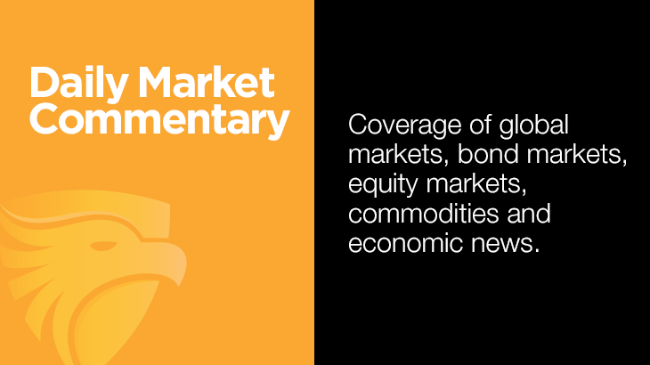
Goldman Sachs’s volatility desk made the following comment: “With the VIX back to its lowest levels in more than a month, our Vol desk is focused on hedging opportunities as 1-month S&P implied correlation is near its lowest level in 20 years.” Simply, a low VIX can convey a sense of market calm on the surface, yet implied correlation tells a different story.
The VIX, based on option trading data, measures the implied volatility of the S&P 500 index. A low VIX means traders expect the market to be relatively calm with not much volatility. Conversely, a higher VIX reflects expectations for high levels of volatility. Today, the VIX is relatively low at 17, as S&P 500 index option trades appear complacent.
Implied correlation measures how much S&P 500 stocks are expected to move together. When implied correlation is high, as it was during COVID, the 2022 interest rate shock, and more recently at the beginning of the Iran conflict, macro forces dominate trading activity, and stocks tend to go up or down together. When correlation is low, stocks decouple. Individual company fundamentals, technical setups, and momentum chasing drive returns. As we see in the chart below, the implied correlation is at a 20-year low.
The low VIX implies smooth sailing ahead, while a record-low implied correlation suggests the market could be at risk. Goldman is hedging the risk of a correction, i.e., an implied correlation spike. Often, when implied correlation rises sharply from extreme lows, as it did in August 2024 during the yen carry trade unwind, the divergences that kept the index calm disappear. Stocks start moving together again, and most of the time they move down. This condition is not a warning to expect a market downdraft, but it does suggest that risk awareness is critical.
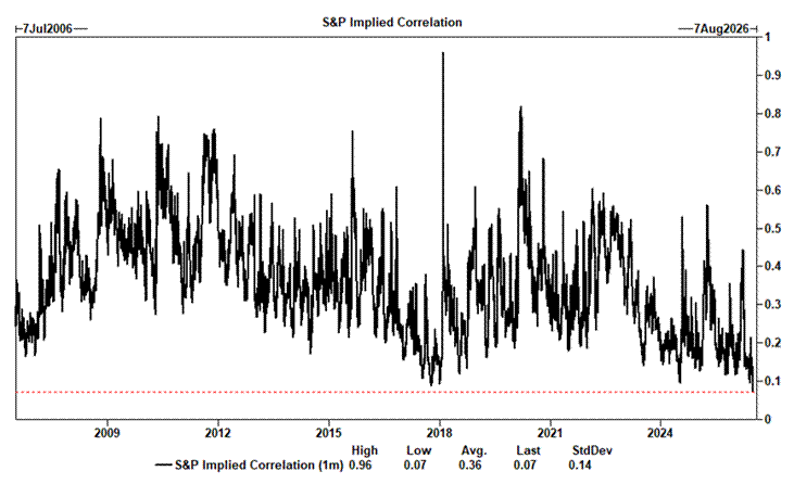
What To Watch Today
Earnings

Economy
Market Trading Update
Yesterday, we walked through how the dollar narrative flipped from collapse to strength. Today, I want to add to Michael’s commentary above and focus on volatility and positioning side by side, because together they describe a tape priced for calm, even as almost everyone is already long. That’s the setup that tends to bite.
Start with the volatility complex. The VIX closed Tuesday at 15.57 and popped back toward 16 on Wednesday as oil jumped and headlines about the Iran ceasefire returned. A 16 handle looks tame on its own. The tell sits underneath it. Twenty-day realized volatility on the S&P 500 has nearly doubled since early June, climbing from under 9 to the mid-teens and brushing 18 last week. So implied vol isn’t sitting comfortably above what the market is actually delivering anymore. On Tuesday, it even printed a hair below realized, which almost never happens outside of stress. The cushion option sellers count on, the gap between implied and realized, has compressed to almost nothing.
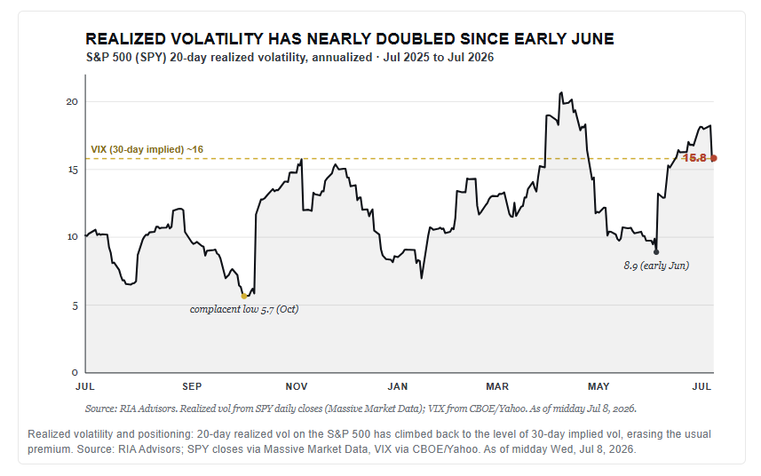
That changes the math for the crowd that’s been short volatility and long everything. When implied runs well above realized, selling vol pays you to wait. When the two converge, you’re collecting pennies with no margin for a surprise. And the surprises are stacking up, from oil to the Iran deal back in doubt to the first real Q2 earnings prints.
Now layer positioning on top. The NAAIM Exposure Index, which tracks how invested active managers actually are, hit 98.6 in late June and still sat near 85 into July. That’s NOT cash on the sidelines waiting to buy a dip. That’s money already committed. The BofA Fund Manager Survey pushed equity allocation to its most overweight since early 2022 this spring, close to Michael Hartnett’s contrarian sell trigger.

None of this is a sell signal. It’s a risk-management signal, and the difference matters. We’ve written for weeks that this is a tape driven by positioning more than fundamentals, and nothing this week changes that.
In our Equity models, we haven’t chased the tape. We previously trimmed the most stretched winners back toward their target weights, lifted quality, and kept the cash buffer rather than spending it in a crowded, low-premium market. If volatility stays this cheap relative to what stocks are actually doing, that’s your cue to buy protection while it’s still on sale, not to add risk. Manage the position before the crowd tries to leave through the same door. Trade accordingly.

Iran: Oil, Gold, And Bonds
Yesterday, President Trump told reporters that he considers the US-Iran ceasefire “over,” after Iran struck American bases in Bahrain and Kuwait following renewed US strikes. Crude oil jumped on the headline, now trading near $74/bbl, up from the mid- to upper-$60s last week.
Textbook logic says gold should be rallying alongside oil due to a war premium, inflation risk, and safe-haven bid. Despite what “logic” may expect, gold has had a negative correlation with oil prices since the war started. Bond yields, on the other hand, are positively correlated with oil prices as inflation concerns dominate bond trading. The 10-year Treasury yield has climbed by nearly 15 basis points from a week ago. We think the confusing gold trade can be explained by the rational bond trade.
We discussed the recent disconnect in gold prices in “Gold Investors Are Likely Confused.” To wit:
As we have quantified in numerous articles, gold prices often have a strong negative correlation with real rates. High real rates, denoting a hawkish, restrictive monetary policy, typically correlate with lower gold prices. Conversely, low to negative real rates point to easy policy and are usually friendly to gold investors. The relationship stopped working for the last two years. With real rates remaining high and the Fed moving to a more hawkish stance, might the historical correlation be reasserting itself? Might gold investors be betting on a hawkish Fed?
Gold’s decoupling from war headlines isn’t irrational; it reflects rising real rates. When nominal yields rise faster than inflation expectations, real yields rise, which raises the opportunity cost of holding a non-yielding asset like gold. Oil-driven inflation fears are pushing yields higher, while inflation expectations stay reasonably anchored. Gold, which should theoretically benefit from the same inflation fear, is instead punished by the widening gap between yields and inflation expectations.
The graph below shows that the relationship that matters for gold holders is not between oil and gold, but between gold and 10-year yields. Our advice: watch real yields, not war headlines, for the next move in gold.

Are Flattening Curves And Fierce Style Rotations A Deceptive Omen?
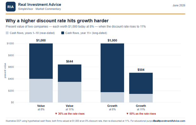
Bond market pundits often warn that bear yield curve flatteners or inverted yield curves ultimately lead to recessions. Similarly, some equity experts caution that periods of violent back-and-forth rotations among stock sectors and/or style factors are precursors to a market top. Additionally, the combination of a bearish flattening trend and volatile equity rotations leads some analysts to forecast a recession, with concerning market repercussions.
The argument we present in this article is that predicting economic or financial market activity is not as simple as following two indicators. Bear flattening trades, inverted yield curves, and frantic style (factor or sector) rotations are not definitive warnings of a market peak. They are extremely informative about where the economy, markets, and investor sentiment stand, but they do not tell investors whether or when the economic or market cycle will turn. Knowing where you are in a cycle is not the same as knowing when it ends. Confusing the two is a common mistake and can be a costly one for investors in late-cycle analysis.

Tweet of the Day
New UPDATED Trading Rules With Desktop Printout
“Want to achieve better long-term success in managing your portfolio? Here are our 15-trading rules for managing market risks.”
Please subscribe to the daily commentary to receive these updates every morning before the opening bell.
If you found this blog useful, please send it to someone else, share it on social media, or contact us to set up a meeting.