In several recent blog posts and weekly Bull Bear Reports, we discussed our concern over the narrow breadth of the rally in 2023. To wit:
“The A.I. chase is making for a very narrow market. As Bob Farrell once quipped:
“Markets are strongest when they are broad and weakest when they narrow to a handful of blue-chip names.”
Breadth is important. A rally on narrow breadth indicates limited participation, and the chances of failure are above average. The market cannot continue to rally with just a few large-caps (generals) leading the way. Small and mid-caps (troops) must also be on board to give the rally credibility. A rally that “lifts all boats” indicates far-reaching strength and increases the chances of further gains.”
As we noted then, we can visualize the outperformance of the mega-capitalization stocks by looking at the spread between the market capitalization and equal-weighted indices.
The following chart underscores the remarkable year-to-date outperformance of the unweighted Nasdaq versus the equal-weighted Index. This NDX > NDXE spread is now +11% on the year, by far the widest spread over any 4.5 month period in the last 18 years.”
The chart is updated through the end of May and shows the full 5-month historical differentials. That spread is now the largest on record at more than 15%.

It’s A One-Sided Market
As noted in last week’s post, the absolute versus relative performance of the S&P 500’s market sectors shows a similar breadth of participation. Or, rather, a lack thereof.
“The technology trade is absorbing the bulk of inflows as every other market sector remains under pressure. Such is due to the continued economic and fundamental outlooks of weaker growth, bank stress, and higher rates.”
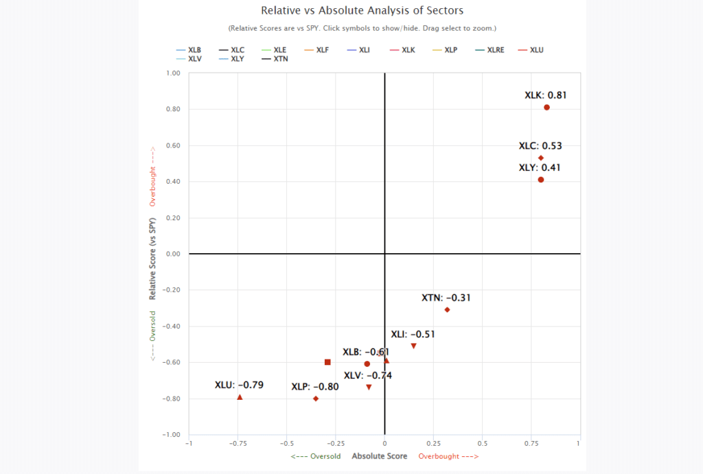
If we dig deeper, we find the same “breadth” problem is more apparent when considering factor participation. This analysis used the Vanguard Mega-Cap Growth ETF (MGK) as a proxy for the top-10 stocks compared to Small and Mid-Cap stocks (IWM) and the Equal Weighted index (RSP). We even included the Vanguard High-Dividend Yield ETF (VYM).
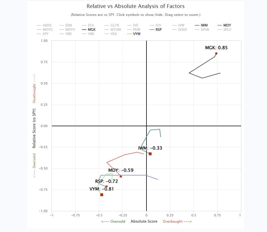
What is abundantly clear is that owning any other assets other than the largest market-capitalization stocks has led to rather disappointing performance this year.
However, a look at the advance-decline ratio of the S&P 500 gives a very different story.

Market Breadth Is Just Fine?
Just recently, Barry Ritholtz published “10-Bad Takes On This Market,” which is worth a read. However, he points out that market breadth is much better than many believe. To wit:
“There are many ways to depict how broad market participation is, but the simplest is the ADVANCE/DECLINE line. It measures how many stocks are going up versus down. Here are the NDX & SPX (Redlines at bottom). Both seem to be doing fine.”
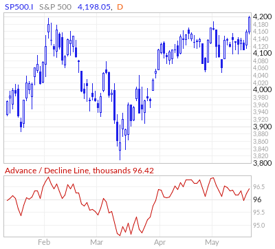
To his point, it certainly appears that breadth is much better than much of the data suggests.
However, there is a problem with the analysis. An explanation of the Advance-Decline line is needed to understand the issue better.
“The advance/decline line (or A/D line) is a technical indicator that plots the difference between the daily number of advancing and declining stocks. The indicator is cumulative, with a positive number being added to the prior number, or if the number is negative, it is subtracted from the prior number.” – Investopedia
The key to the definition is the “number of advancing or declining stocks.” This is important to our understanding of what is happening in the overall market. While the indicator tracks the number of rising or falling stocks daily, it does not account for two things:
- The amount by which those stocks are rising or falling.
- Volatility and rotation between sectors of the market. (Some stocks may be up one day but down the next.)

Analyzing The S&P 500
The chart below shows every stock in the S&P 500 and whether it is positive or negative for the year. As shown, quite a few stocks are positive for the year, but more than half are not. The horizontal red line shows the number of stocks with a return of greater than 10% year-to-date. This data is clearly different than what the Advance-Decline line suggests.
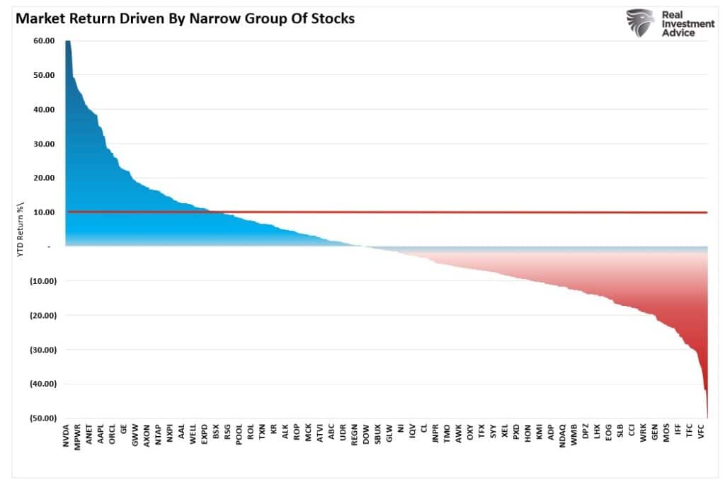
However, let’s drill down into the data a bit more. The next chart shows only the stocks in the S&P 500 that have positive returns (as of the end of May) for the year. (Click the chart to enlarge) As noted above, out of 500 stocks in the index, less than half are positive for the year, and many are just barely positive.

However, on a year-to-date basis, less than 25% of stocks are sporting returns greater than the market as of the end of May.

Of course, the mega-cap stocks are leading the returns for the year by a large margin. Such is an important fact when you consider the weights of these mega-capitalization companies within the S&P 500 index. Each percentage point gained in those stocks has an outsized impact on the index as a whole. As shown, each point gained by the top 10 companies in the index has the same impact as that gained by the bottom 426 stocks.
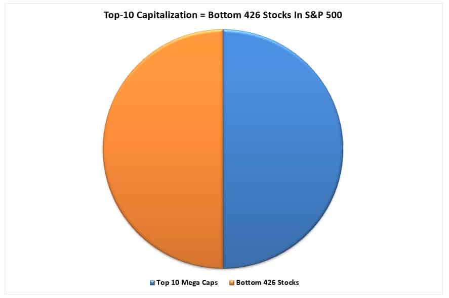
If the bottom 426 stocks gained one point each, but the top 10 stocks were flat, the market advance would be zero. In other words, the market breadth, as determined by the advance-decline line, would be strong, but the market would not advance.
See the problem?

It’s A Bull Market Until It’s Not
While the narrowness of the market advance is a concern, as we have stated previously, such advances can last much longer than is logical. As we showed previously, the current market advance based on speculation in “artificial intelligence” continues to track along what we saw in the 1999 “Dot.com” moonshot.
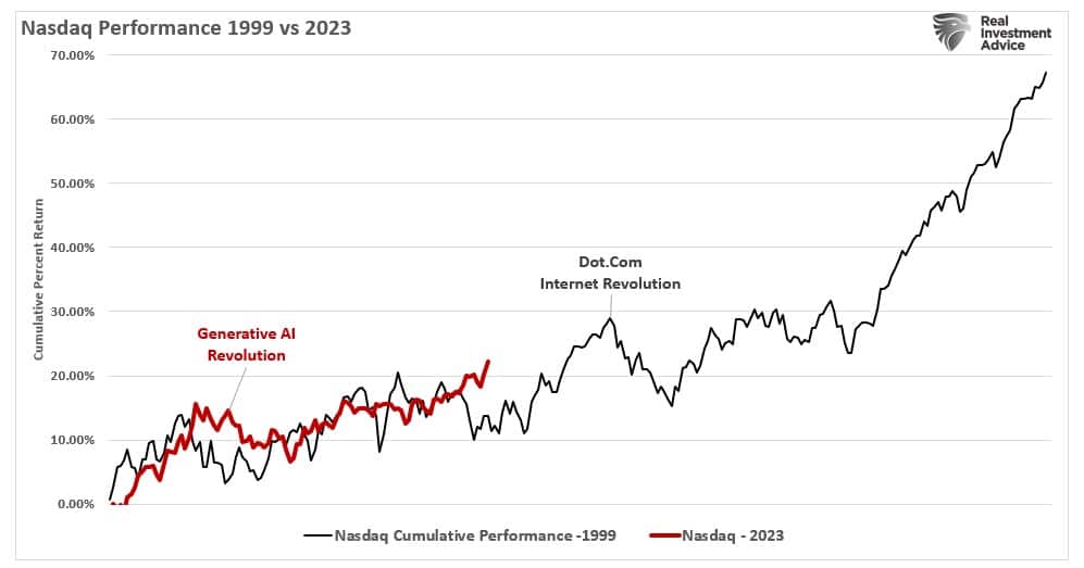
If you invested in the market in 1999, it was a literal “mania.” Companies were frantically launching websites and changing corporate focus to “the web” during earnings calls. Portfolio managers launched funds to chase internet-based stocks, and other funds simply changed the fund’s name to capture fund flows from the internet mania.
Of course, it was all over by March of the following year, and all of the gains that were made, for most, were lost.
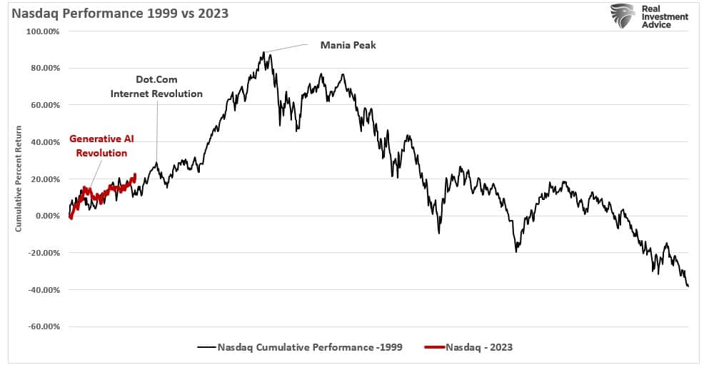
The internet is still here, of course, and it has changed the world as we know it. The problem, as is the case today, is that the earnings growth expected from the Internet failed to mature. It wasn’t that companies didn’t grow earnings to a great degree, but the expectations were so outlandish that many companies would never be able to achieve them.
In simpler terms, valuations eventually mattered.
Today, we are witnessing much the same as a narrow market rally buoys the index, excites investors, and creates dreams of unimaginable riches.
Let me restate my previous conclusion, in case you missed it.
As investors, it is essential to participate in these market evolutions. However, it is equally important to remember to sell when expectations exceed fundamental realities.
In other words, in the famous words of legendary investor Bernard Baruch:
“I made my money by selling too soon.”


