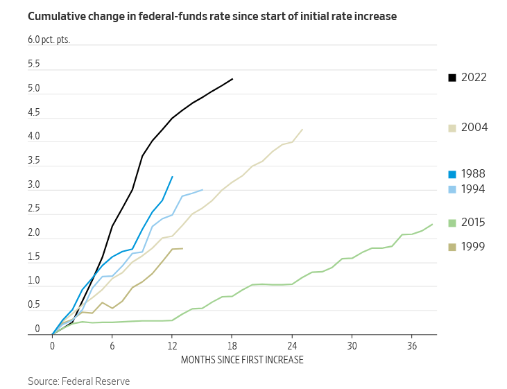
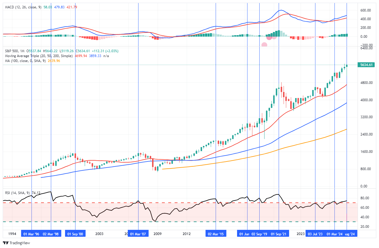
The Easing Campaign Begins
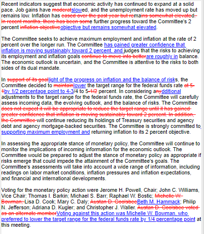
On Wednesday, the Fed embarked on an easing campaign with a somewhat surprising 50 bps cut in the Fed Funds rate. The shift toward an easy money policy follows a 2.5-year tight monetary policy regime. 11 members voted for the rate cut, with one member dissenting. The dissent was the first dissent in almost 20 years. As shown below, the Fed made several changes to its FOMC statement. Specifically, they downgraded their forecast for job growth and are showing more confidence that inflation is heading toward their 2% target. Importantly, its inflation and employment goals are now “roughly in balance.” Subsequently, they added the phrase “securing maximum employment” to its strong commitment to get inflation back to target.
Following the FOMC statement release, Jerome Powell addressed reporters. He continued to stress that the Fed has growing confidence that inflation is moving sustainably to 2%. However, they see increased risks of the labor market weakening. Their decision to by 50bps instead of 25bps was largely based on its concerns that the labor market is weaker than reported and expectations the BLS will continue to revise job growth numbers lower. Powell downplayed the dissent and said the members were mainly on the same page. He did not commit to a schedule of easing going forward. Also of interest, the Fed is comfortable letting the balance sheet shrink (QT) while cutting interest rates.
The critical takeaway from Powell’s comments and the Fed statement is that labor market data will likely steer the Fed forward. Therefore, look for more financial market volatility around labor market data releases.
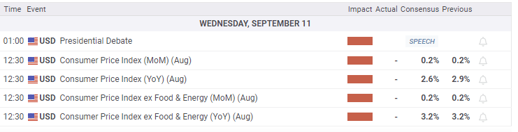
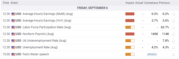
What To Watch Today
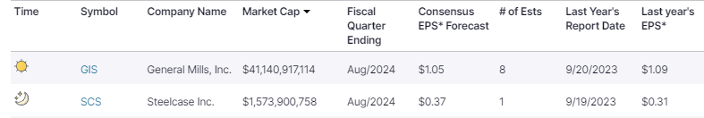
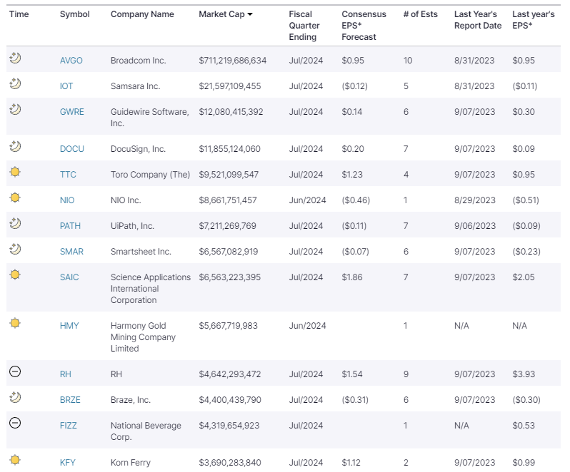
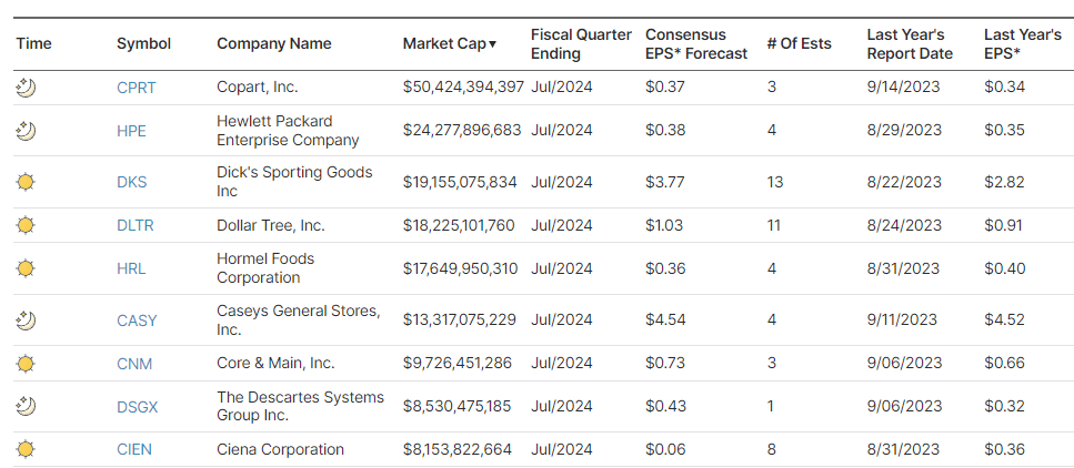
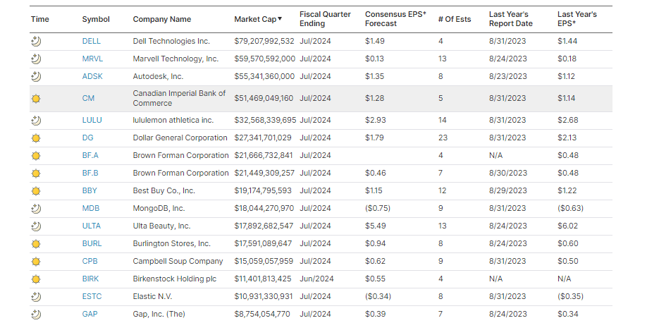
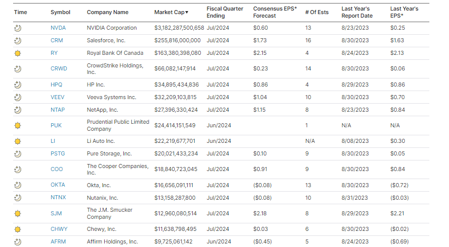
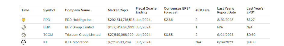
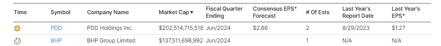
Earnings

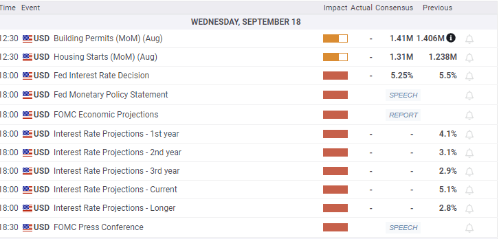
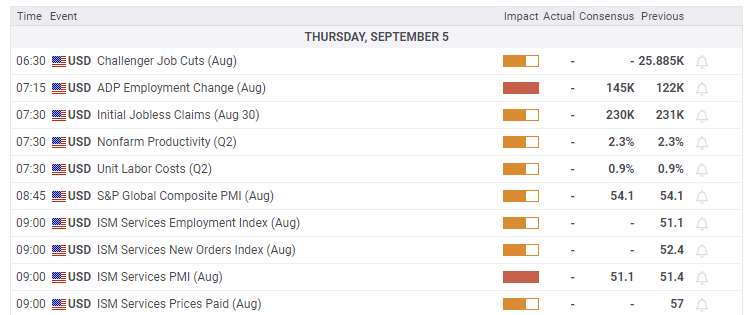
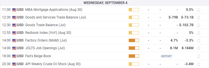
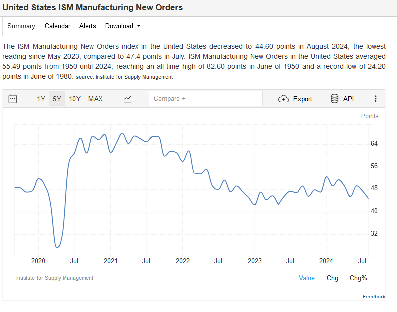
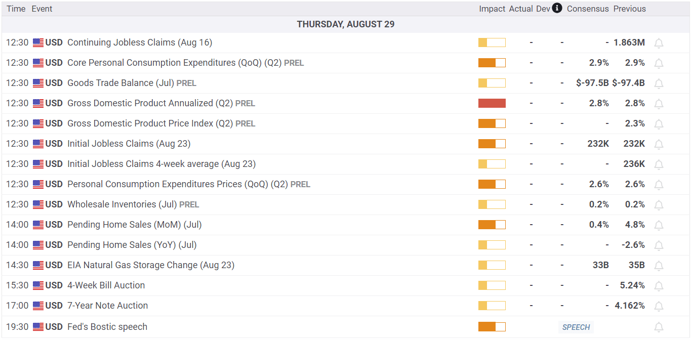
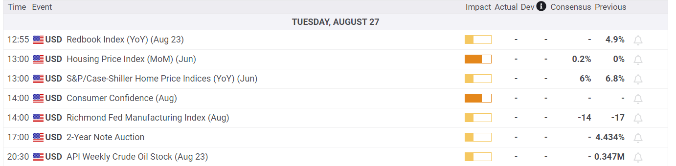
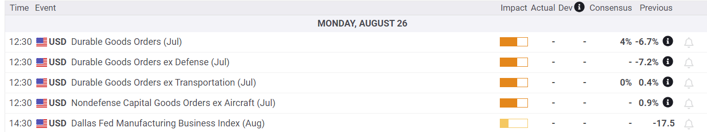
Economy
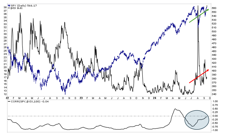
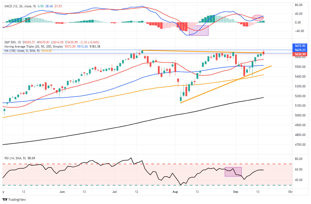
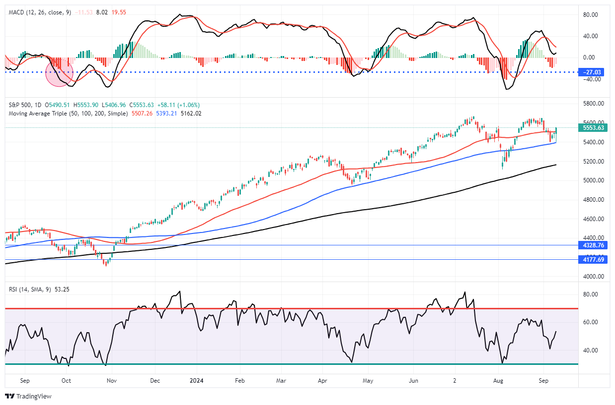
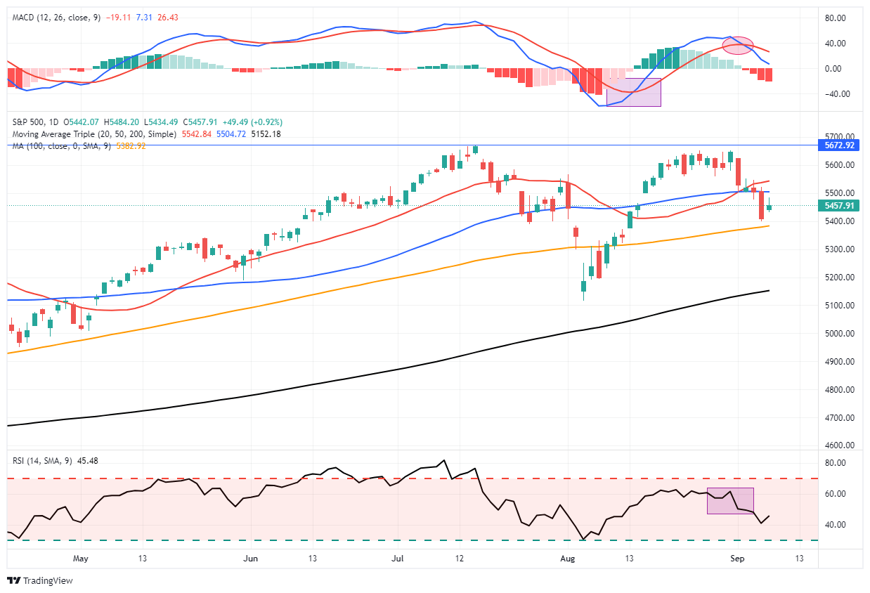
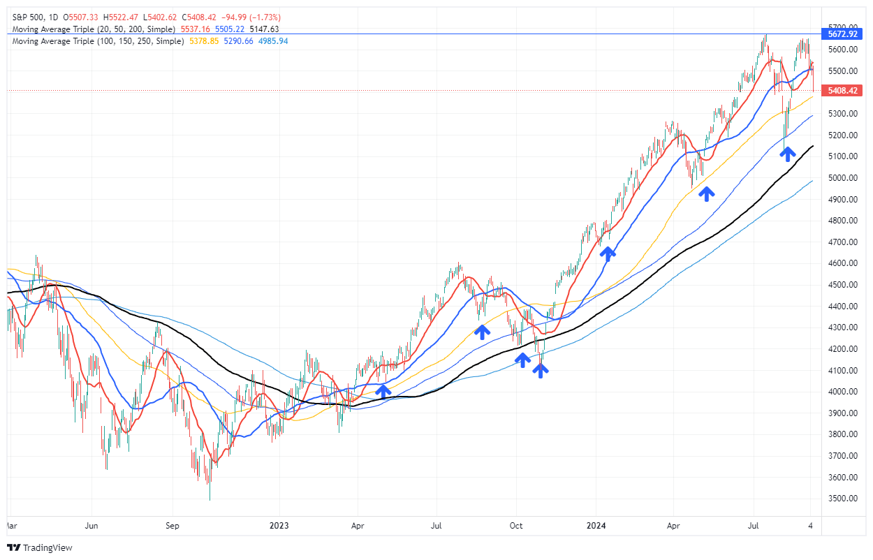
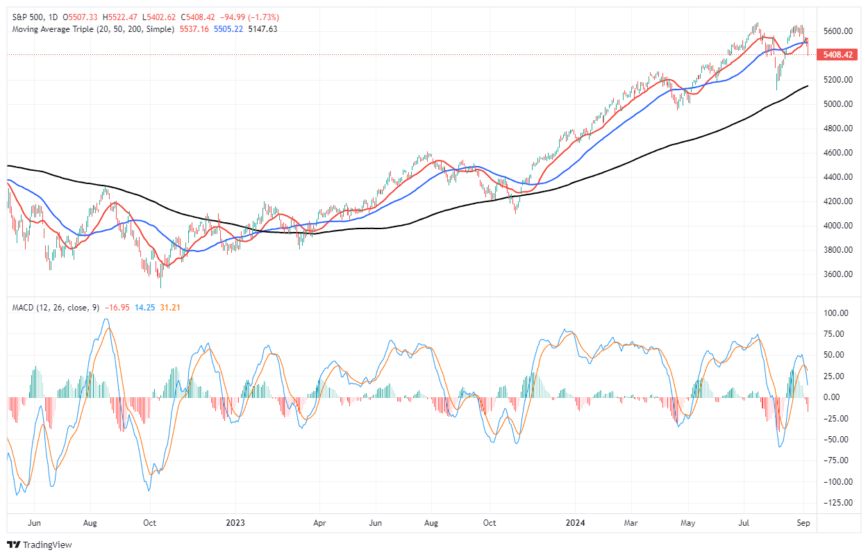
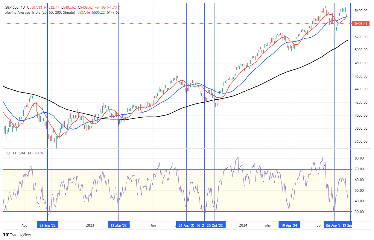
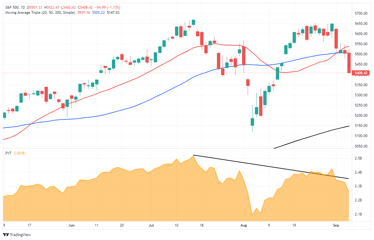
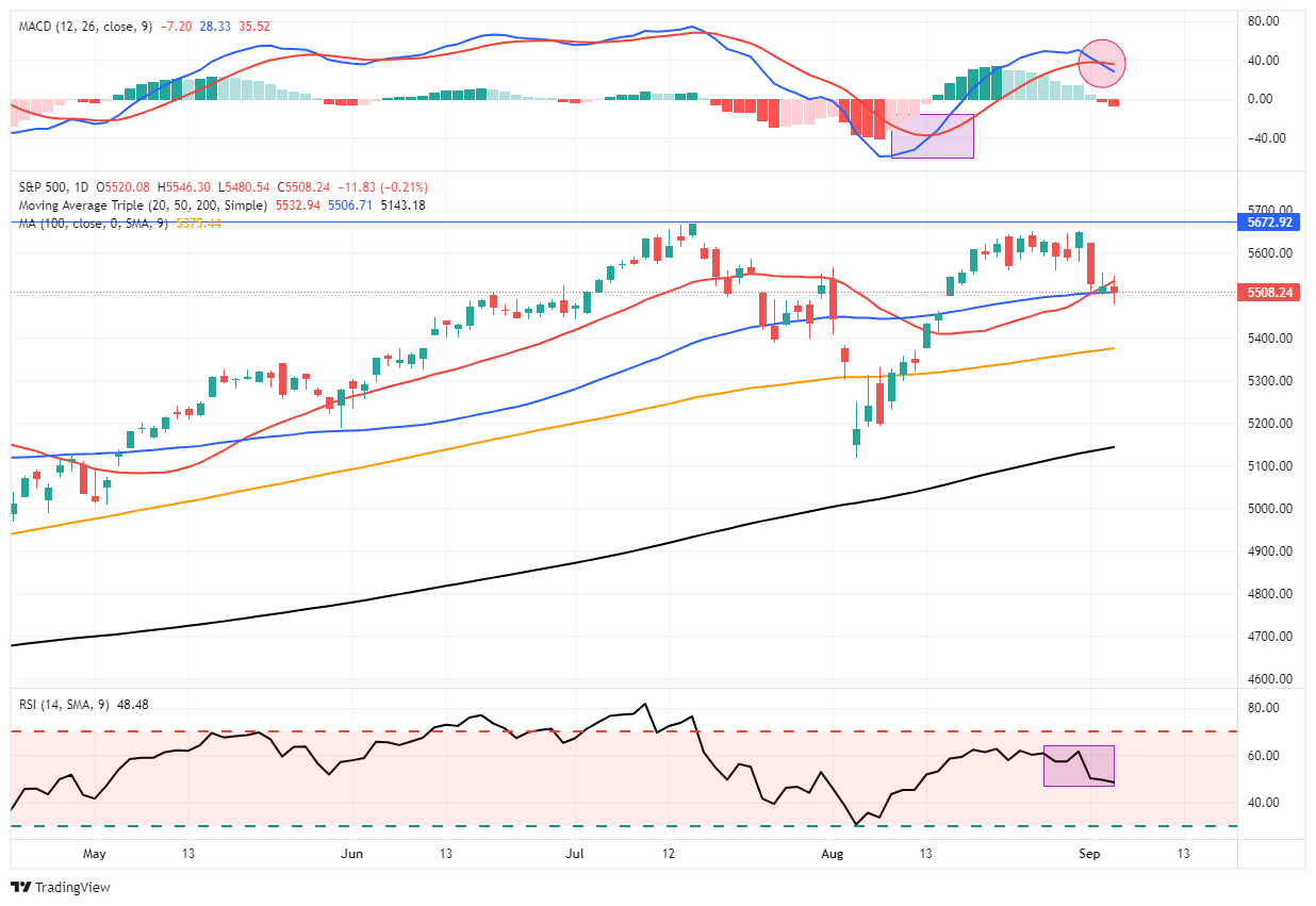
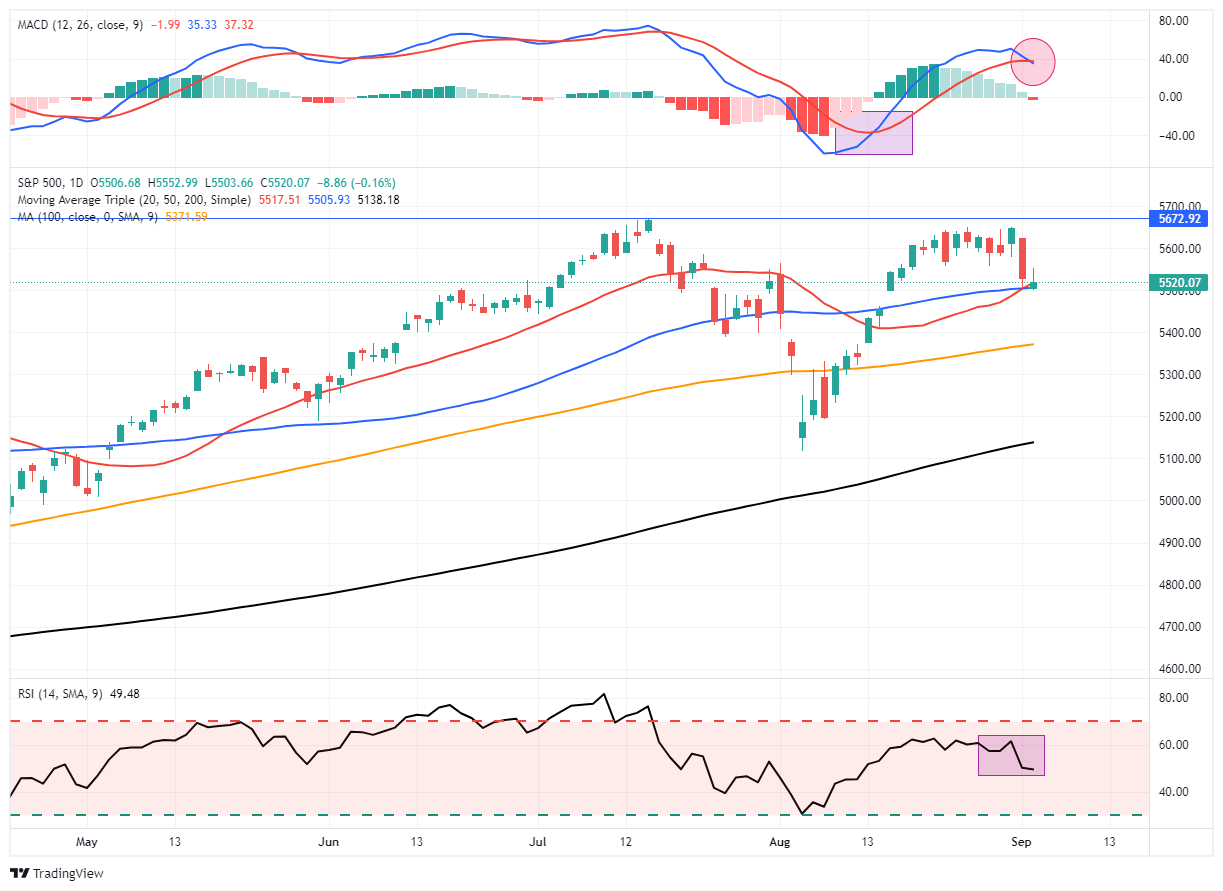
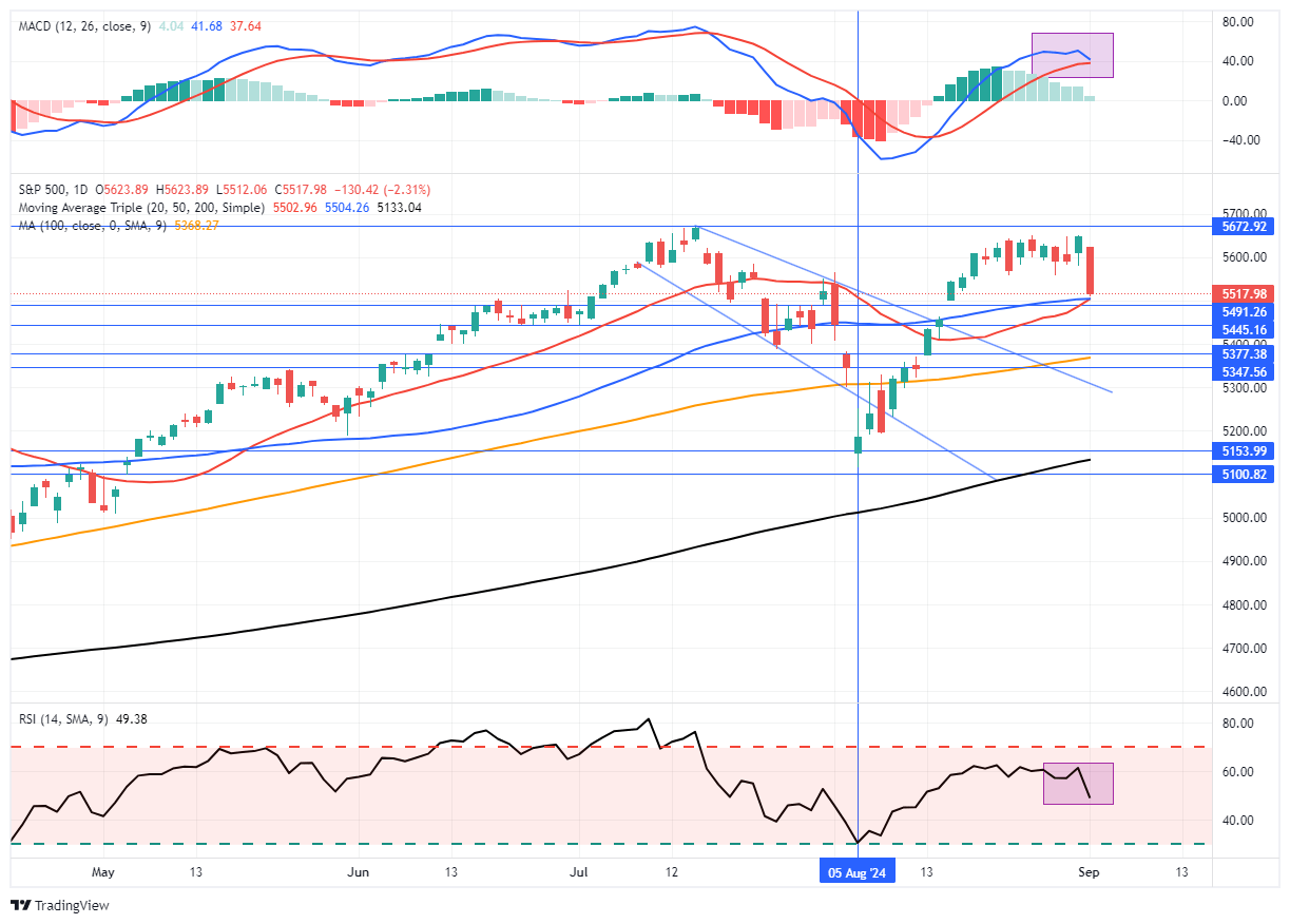
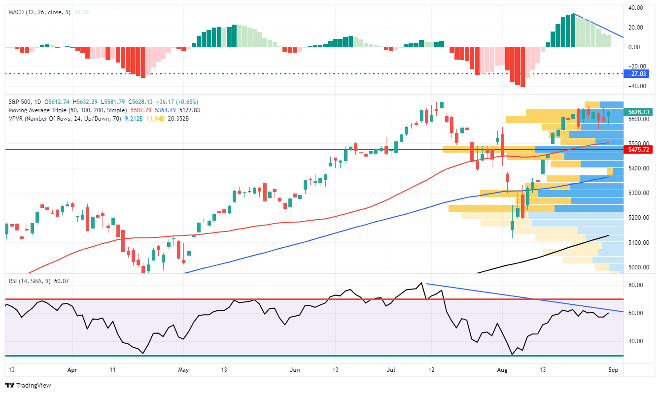
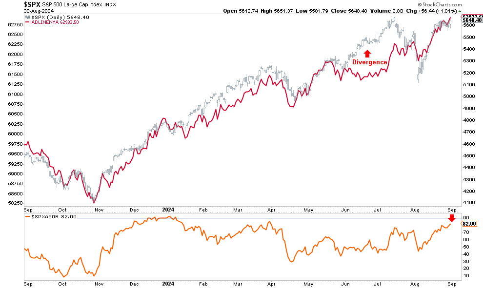
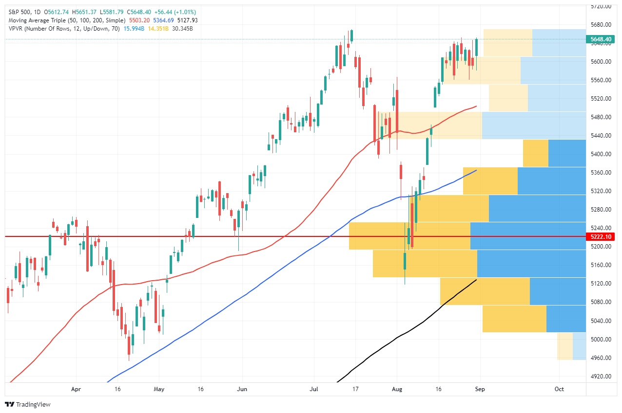
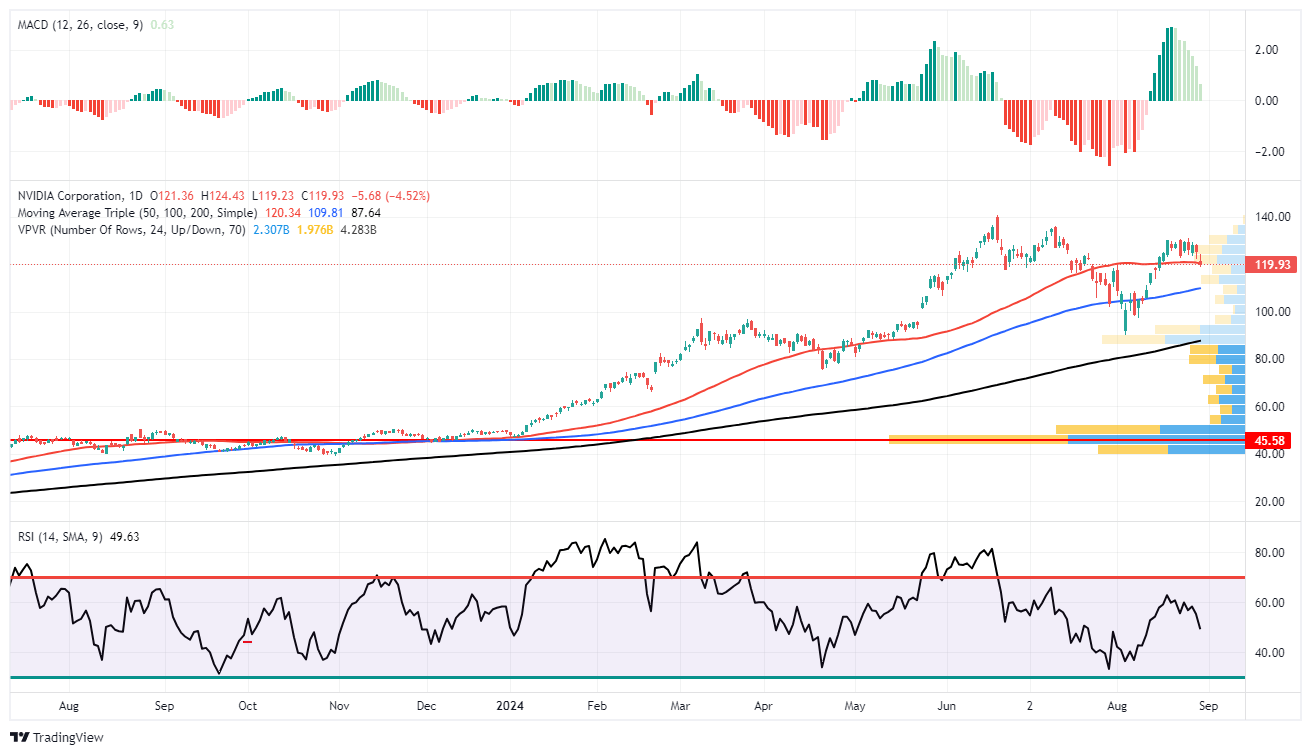
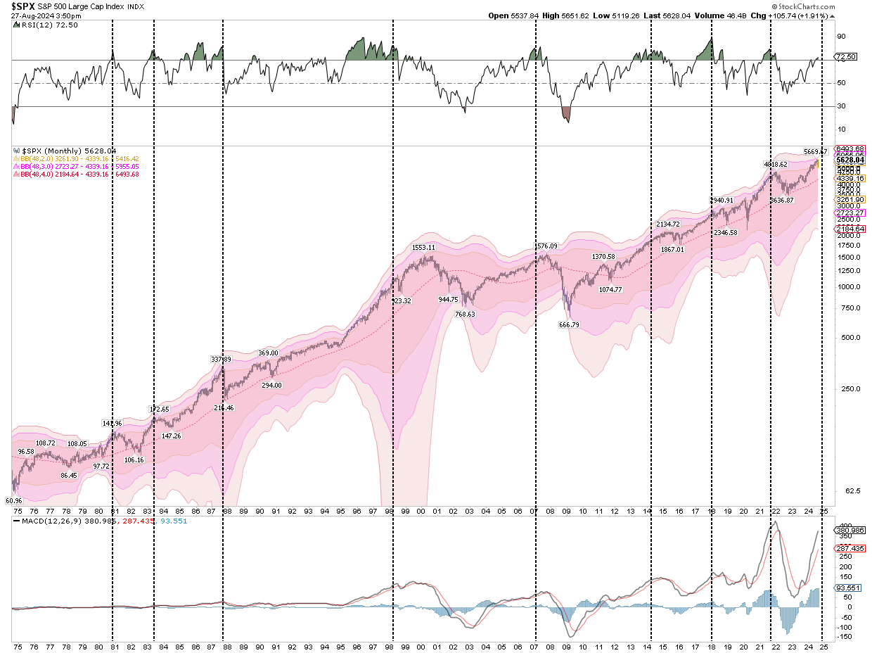
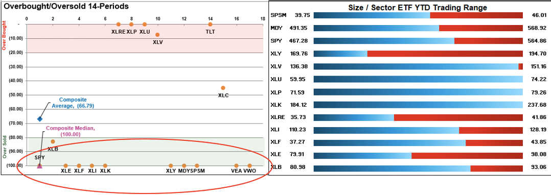
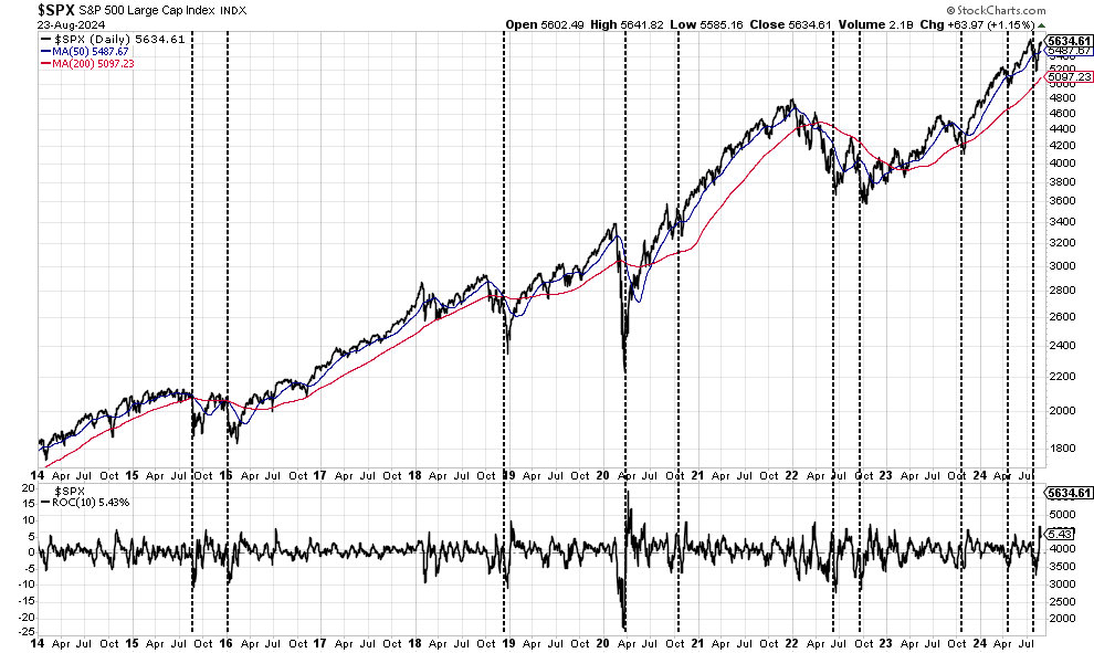
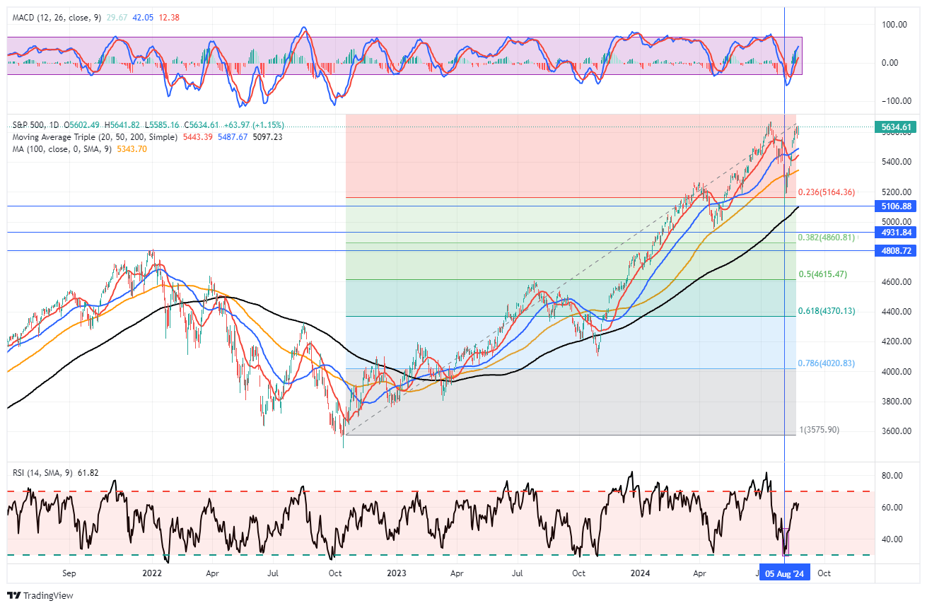
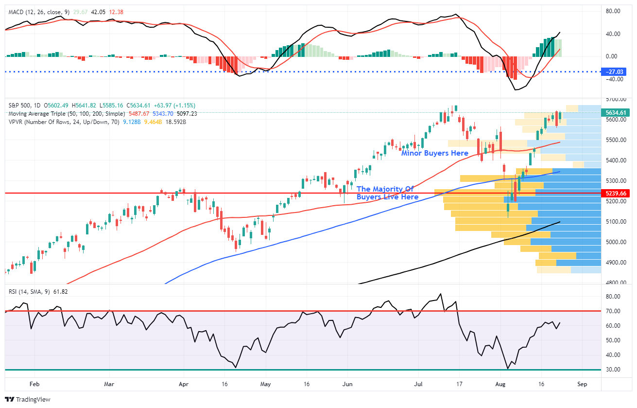
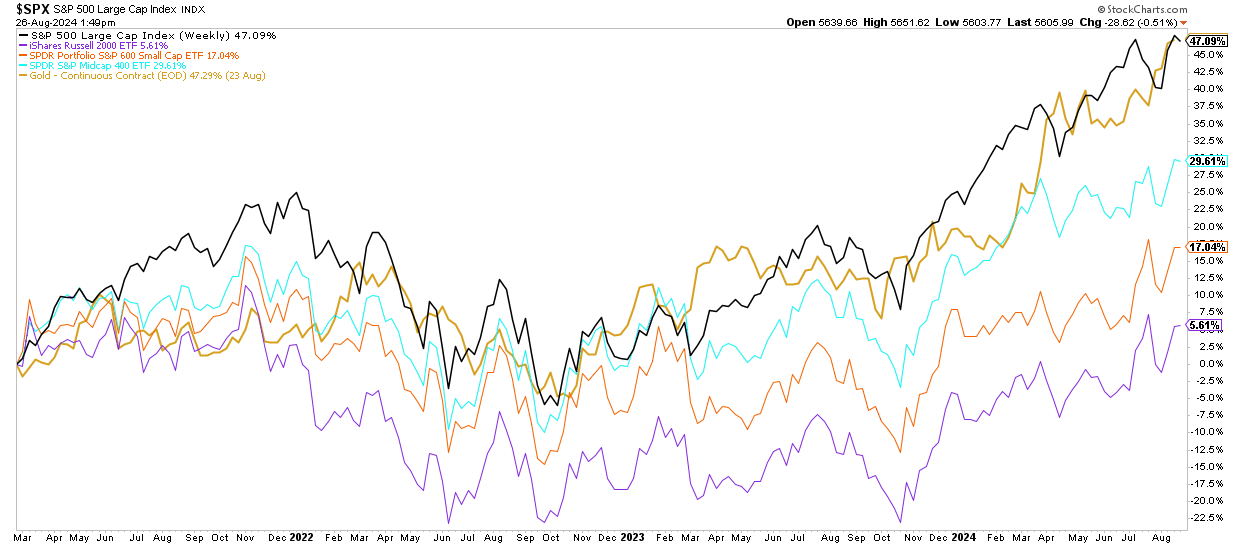
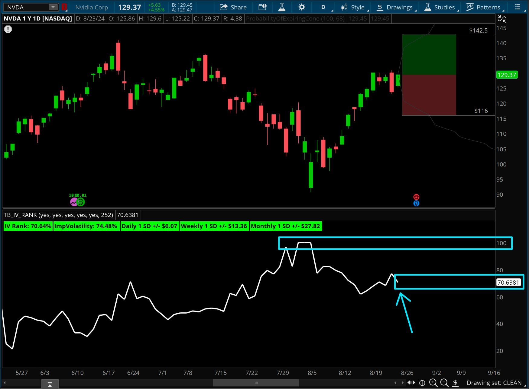
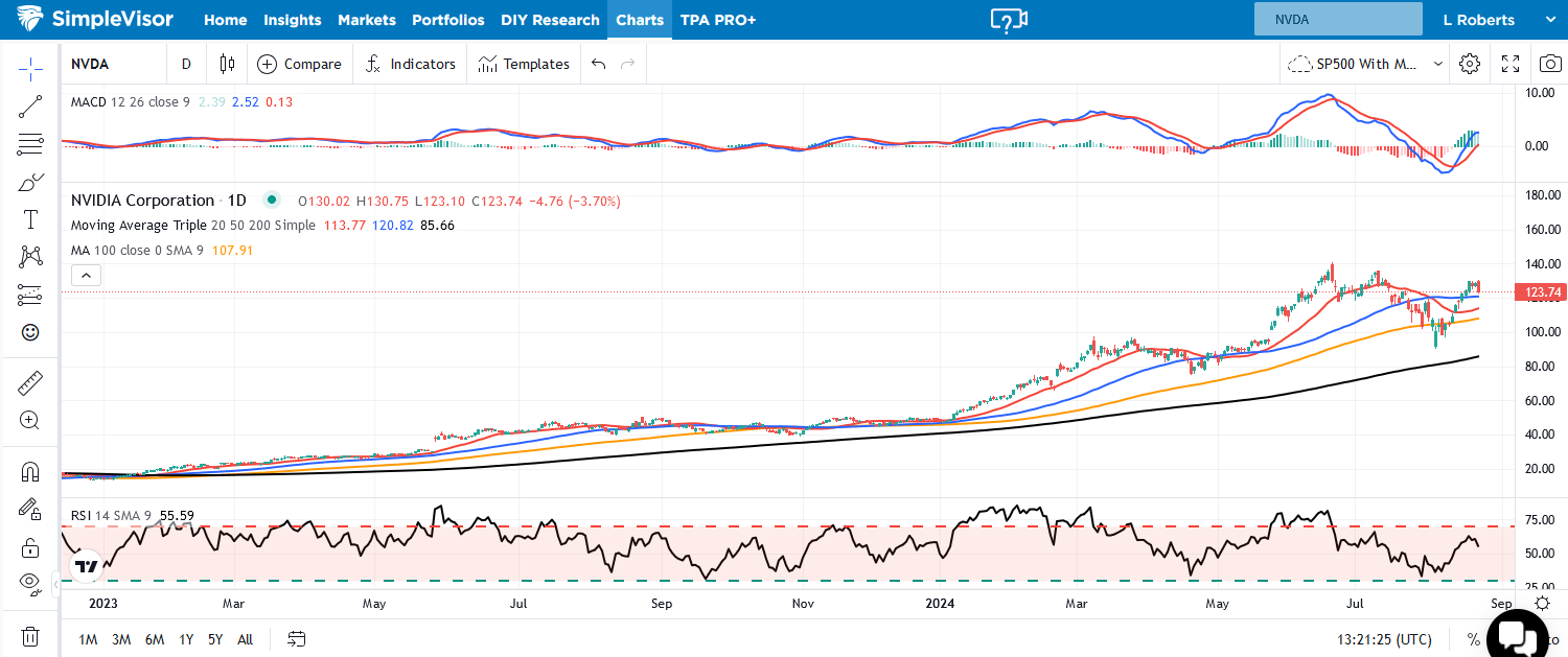
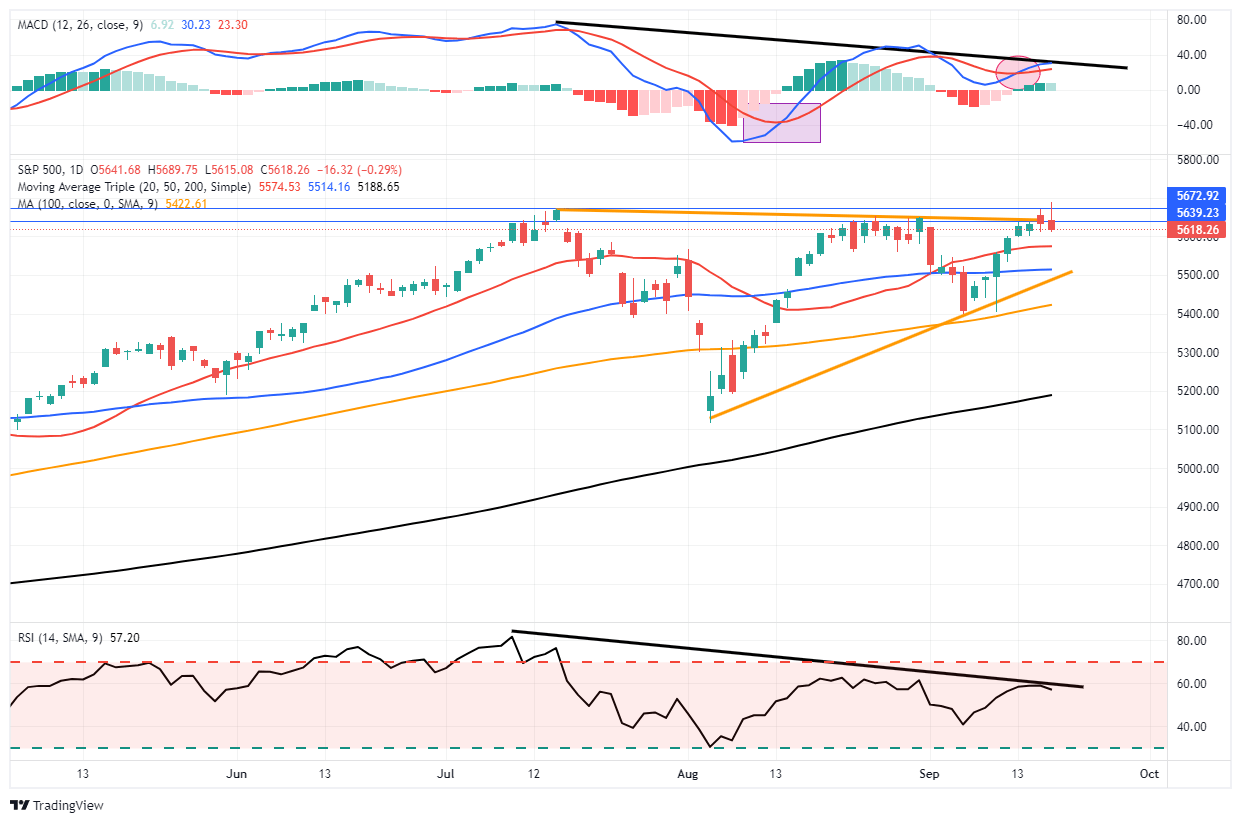
Market Trading Update
“…the rally in stocks and bonds could be a “buy the rumor, sell the news” type event, so a bit of caution ahead of the Fed announcement is prudent.“
That seemed to be the case yesterday, as the market initially rallied as the Federal Reserve cut rates by 50 bps. However, after that initial “knee-jerk” reaction to the announcement, sellers showed up, erasing the gains for the day. I asked ChatGPT how the market previously responded to the Fed’s initial 50 bps cuts.
“A 50-basis-point rate cut is generally seen as a more aggressive form of monetary easing, signaling that the Fed is taking swift action to address economic weakness. Historically, the S&P 500’s response to such cuts has been varied, depending on the underlying economic environment.
In January 2001, when the Fed implemented a 50-basis-point rate cut, the initial response was positive, but the market ultimately declined as the economic slowdown persisted.
Conversely, in October 2007, when the Fed cut rates by 50 basis points, the S&P 500 initially rallied but soon faced the headwinds of the looming financial crisis, leading to a prolonged bear market.”
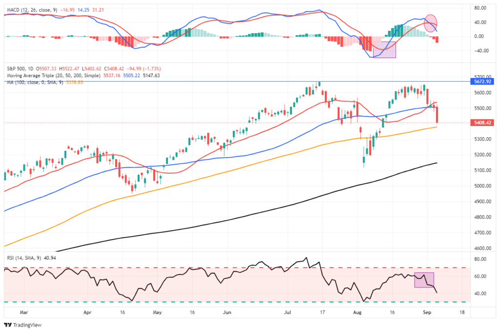
While there is little evidence currently of a worsening economic condition, the markets must question whether the Federal Reserve is aware of some rising risk that has yet to manifest itself in the economic data. However, in the short term, there are technical concerns to consider. There is a negative divergence in the relative strength and momentum of the market, which suggests a weakening of buying demand below the surface. We have previously discussed these negative divergences often precede short-term corrections, so it is something investors should pay attention to. Secondly, the market failed at key overhead resistance. While the initial failure has not yet been confirmed, the market must break out to new highs by the end of the week, or downside risk will increase.
Trade cautiously through Friday, and we will let the market dictate the next steps in our portfolios.

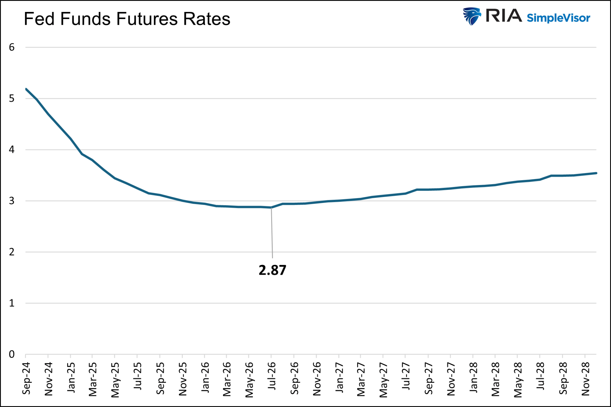
Fed Quarterly Economic Projections
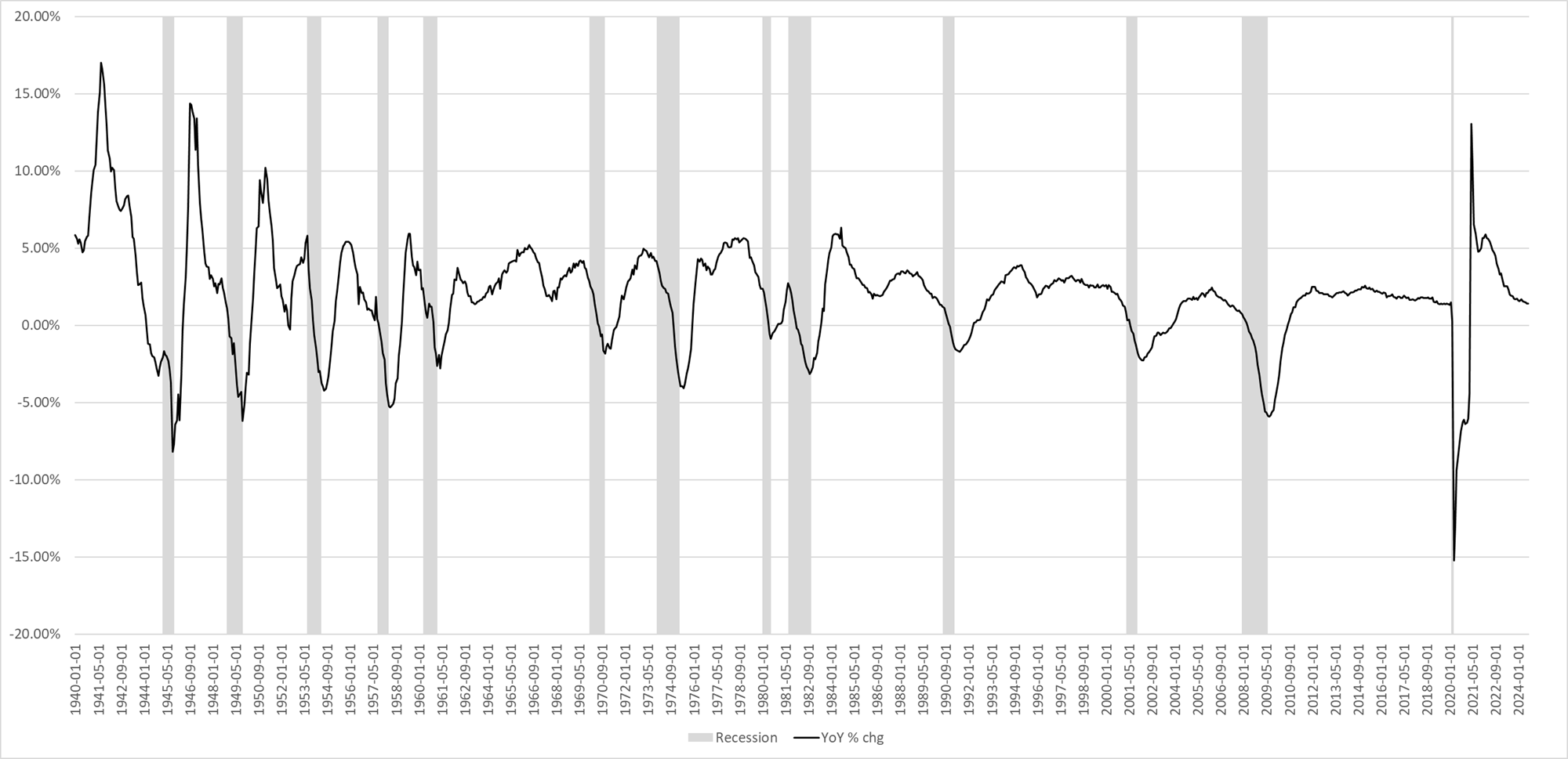
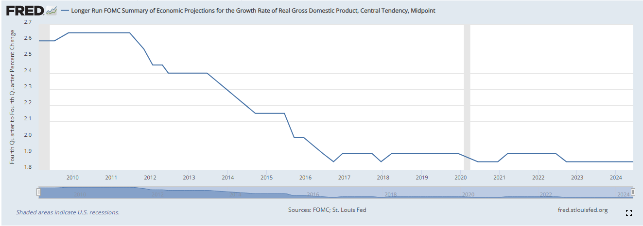
The Fed’s quarterly economic projections, aka dot plots, show increased confidence in lower inflation and more economic weakness than they expected in June, the last time they published their forecasts. They expect the unemployment rate to be 4.4% at year-end, up from 4.0% in June and up 0.2% from the current 4.2% rate. Furthermore, they decreased their year-end GDP forecast by a tenth of a percent to 2.0%. Additionally, they cut their forecast for PCE from 2.6% to 2.3% and Core PCE from 2.8% to 2.6%. Currently, Core PCE is 2.8%.
Regarding their forecasts for 2025 and 2026, they increased their unemployment projections by 0.1% in 2025 and 0.2% in 2026. PCE was revised slightly lower for 2025.
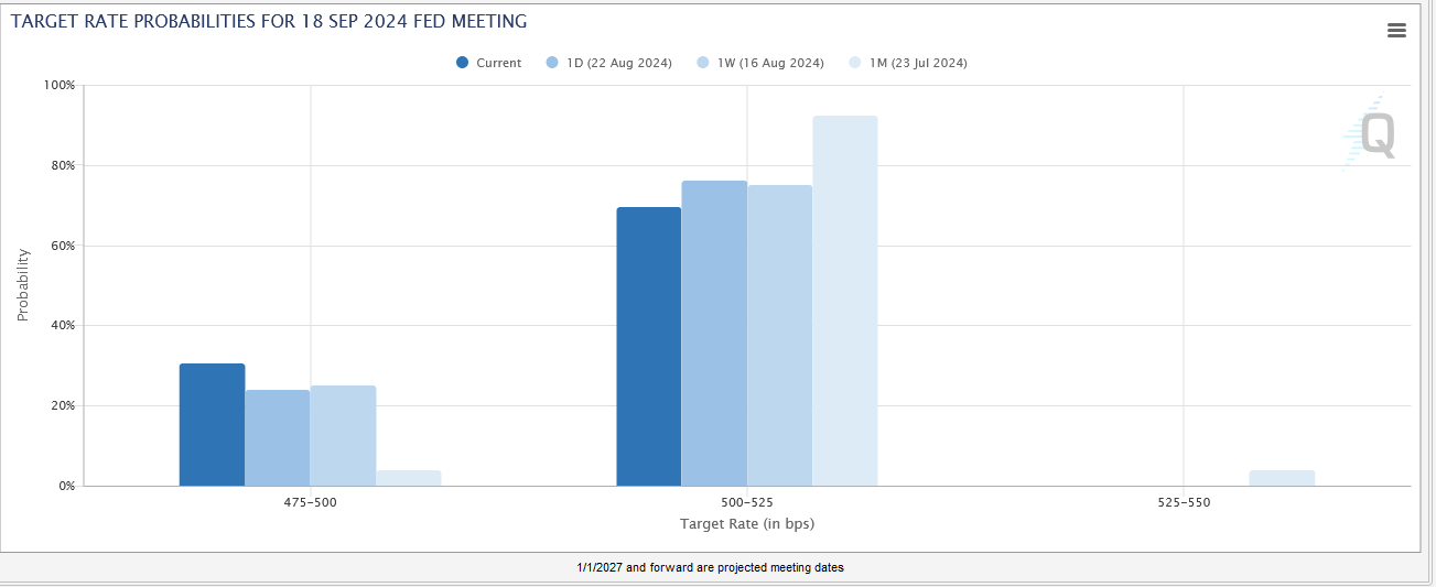
The Fed expects the Fed Funds rate to end the year at 4.4%. Given that only two meetings are left in 2024, we now have solid guidance that the easing campaign will include another 50bps in rate cuts this year, likely 25bps at each meeting. Moreover, the Fed expects to cut an additional 1% in 2025. They think the terminal rate for this easing campaign will be 2.90%, which is in line with implied Fed Funds futures forecasts but moderately above the 2.50% peak in 2019.

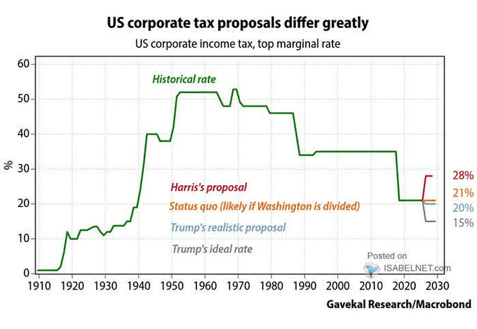
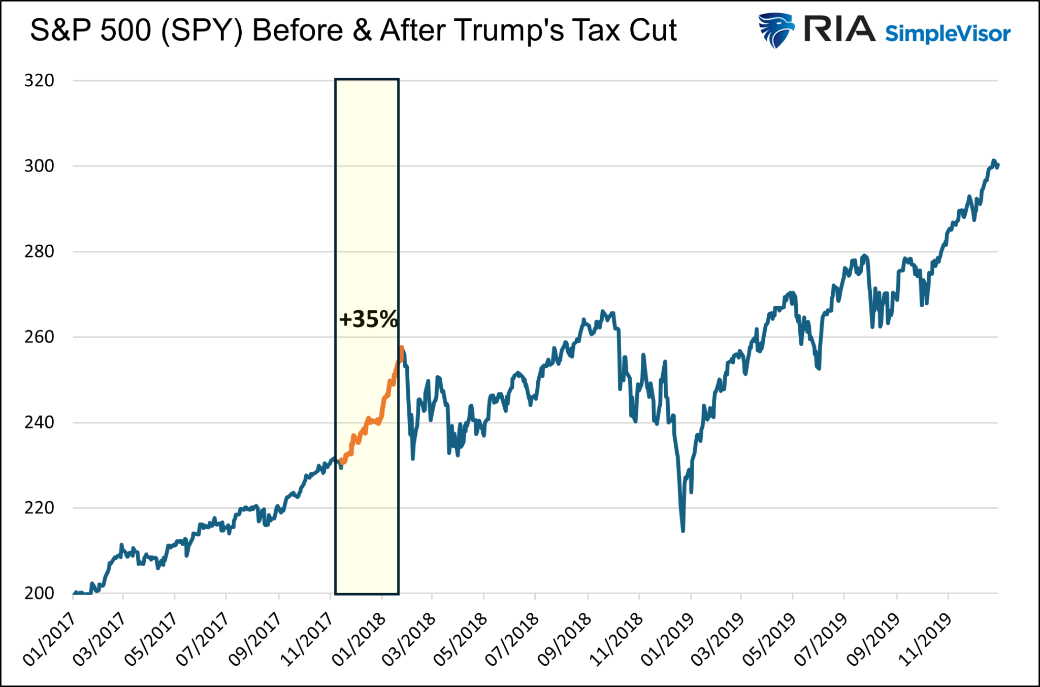
Trump Or Harris: Corporate Tax Winners And Losers
Markets handicap unknown scenarios all the time. In some cases, stock prices can move violently as the odds of an event occurring change. Since corporate taxes may be the most significant short-term political factor affecting stock prices, it’s worth understanding what both candidates propose, allowing us to try to stay a step ahead of the market handicappers.
Furthermore, with the recent history of Donald Trump’s 2017 corporate tax cuts, we quantify which companies are best suited to take advantage of or be penalized by a change to the tax code.
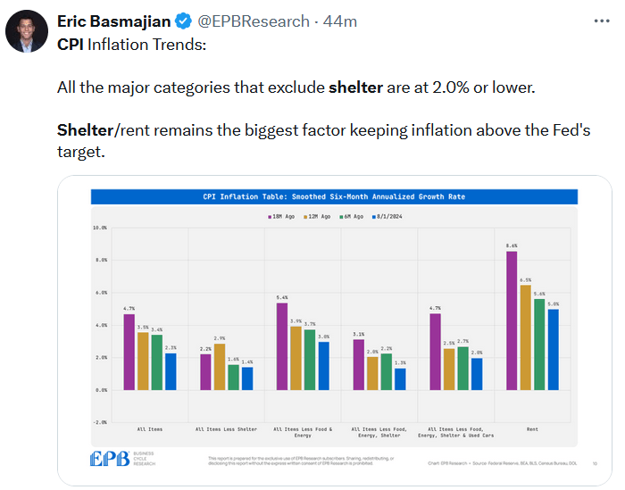
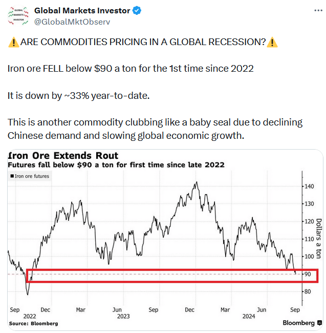
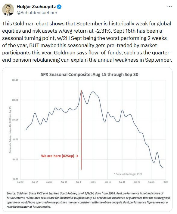
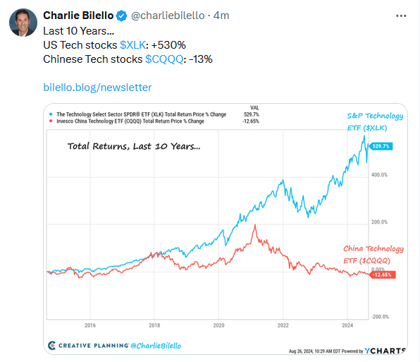
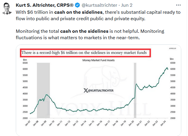
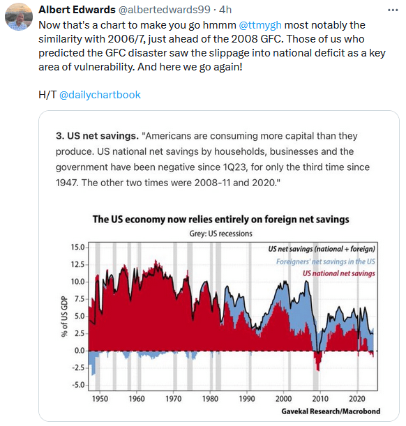
Tweet of the Day
“Want to achieve better long-term success in managing your portfolio? Here are our 15-trading rules for managing market risks.”
Please subscribe to the daily commentary to receive these updates every morning before the opening bell.
If you found this blog useful, please send it to someone else, share it on social media, or contact us to set up a meeting.