During the downturn, I made these points in an article about the history of market crashes. I showed that the 150-year record of U.S. market returns is littered with bear markets (downturns of 20% or more)—and in each case, the market eventually recovered and then went on to new heights.”
Not A Bear Market
The problem with the analysis is that March was a “correction” and not a “bear market.”
Let me start with an insightful note from Sentiment Trader:
“Using the completely arbitrary definition of a 20% decline from a multi-year high, it has taken the index only 110 days to cycle to a fresh high. That’s several months faster than the other fastest recoveries in 1967 and 1982.”
Such was a point I discussed on May 20th in “Just A Big Correction:”
“Price is nothing more than a reflection of the ‘psychology’ of market participants. A potential mistake in evaluating ‘bull’ or ‘bear’ markets is using a ‘20% advance or decline’ to distinguish between them.”
Importantly, the 20% rule is completely arbitrary.
The question is, after a decade-long bull market, which stretched prices to extremes above long-term trends, is the measure still valid?
To answer that question, let’s clarify the premise.
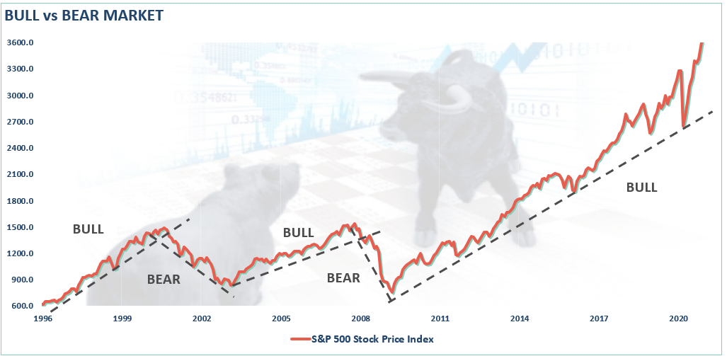
- A bull market is when the price of the market is trending higher over a long-term period.
- A bear market is when the previous advance breaks, and prices begin to trend lower.
The chart below provides a visual of the distinction. When you look at price “trends,” the difference becomes both apparent and useful.
The distinction is essential.
- “Corrections” generally occur over short time frames, do not break the prevailing trend in prices, and are quickly resolved by markets reversing to new highs.
- “Bear Markets” tend to be long-term affairs where prices grind sideways or lower over several months as valuations are reverted.
Using monthly closing data, the “correction” in March was unusually swift but did not break the long-term bullish trend. Such suggests the bull market that began in 2009 is still intact as long as the monthly trend line holds.
I discussed this concept in the video below.
A Major Difference
There is a significant difference in investment outcomes between a correction within an ongoing uptrend and an actual “bear market.”
As is usually the case in articles pushing the “always bullish mantra,” it isn’t long before they pull out the 150-year chart to make their case.
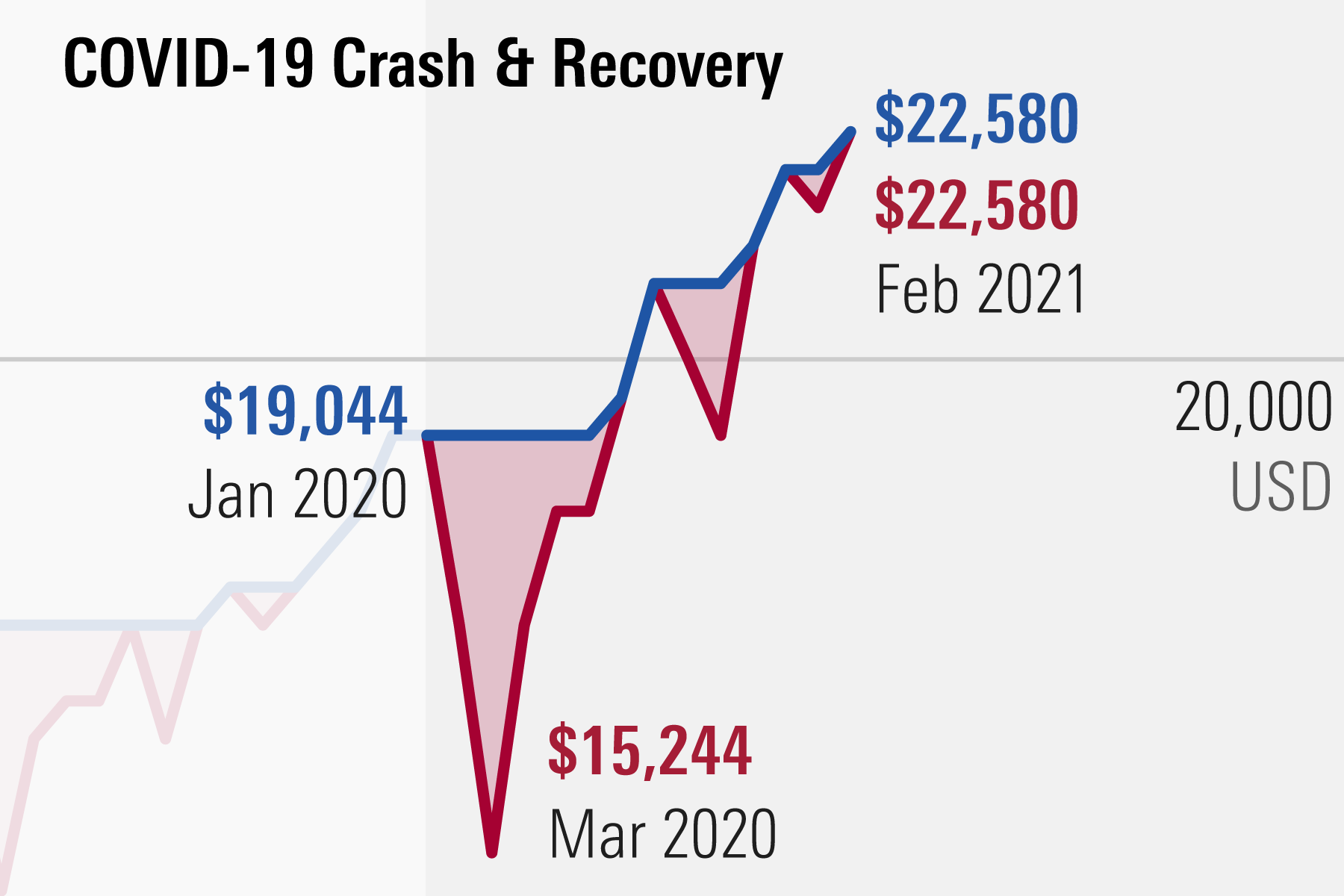
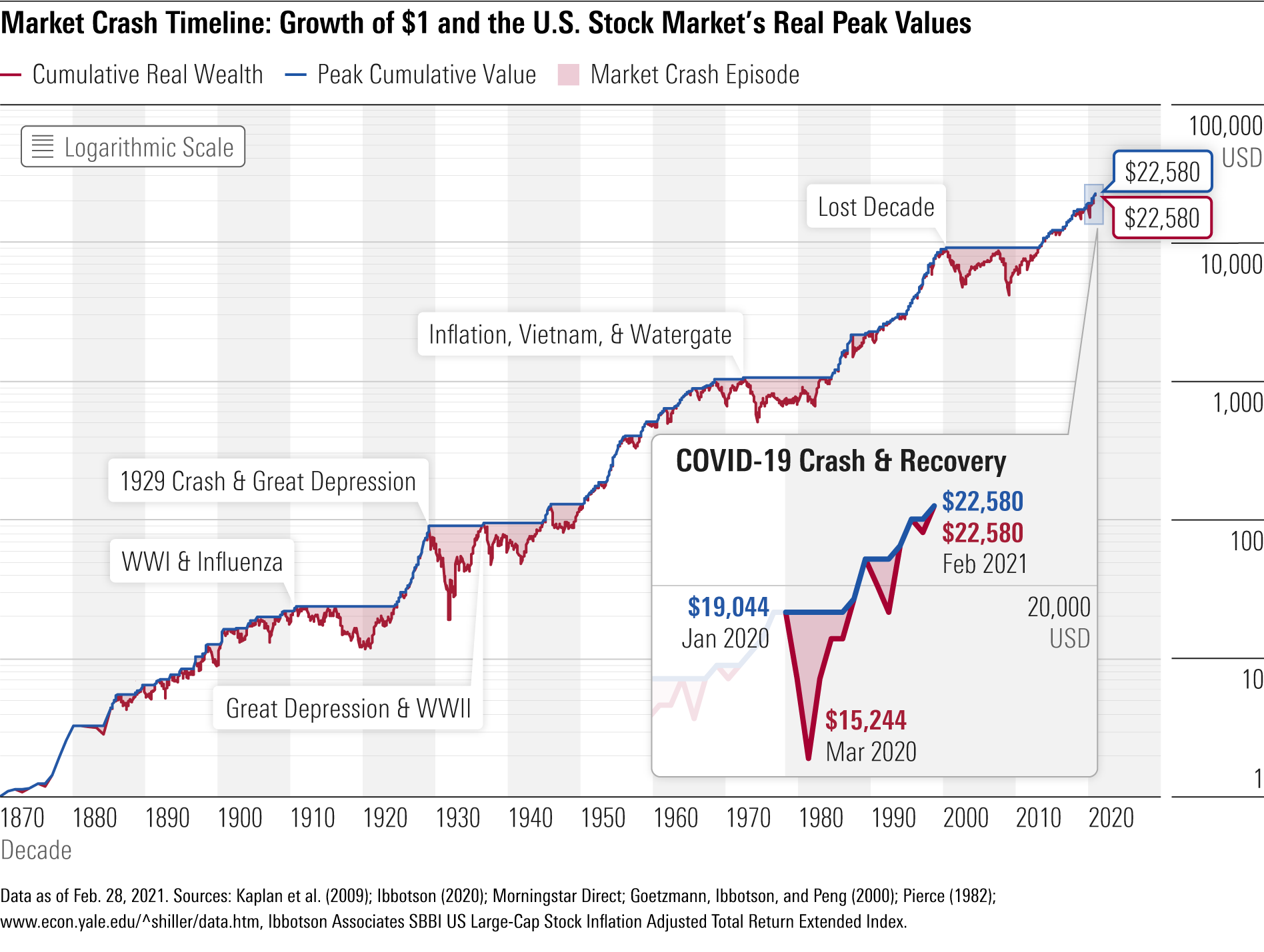
“To put the COVID-19 downturn and stock market recovery into context, I updated the chart that shows the history of market crashes. The chart, which is based on a series of returns I created to form a hypothetical U.S. stock market index, displays U.S. real inflation-adjusted equity returns going back to 1871.
In this exhibit, the red cumulative wealth line shows the growth of the U.S. $1 (starting in 1870), with dividends reinvested, in the stock market index. In blue is the peak-to-recovery line, which traces the growth of $1 until the start of a decline, and then stays at that same peak value until the market recovers to that level. The gap created, shaded in the chart, shows the depth and length of each decline.”
In this context, there certainly seems to be nothing of worry. As the article notes:
“This exhibit illustrates two important aspects of U.S. market return history:
- Despite numerous severe drops, the cumulative wealth line shows that $1 grows to $22,580 over this period of 150 years. In other words, staying in the market and weathering the storms have paid off for investors. (However, this could be a case of survivorship bias.)
- The range in shaded areas shows that some declines are worse than others—and how long each lasts is unpredictable.
Lost And Found
There is a sizable contingent of investors, and advisors, today who have never been through a real bear market. (No, March was not it.) After a decade-long bull-market cycle fueled by Central Bank liquidity, it is understandable why mainstream analysis believes markets can only go higher. What concerns us is the rather cavalier attitude they take about the risk.
“Sure, a correction will eventually come, but that is just part of the deal.”
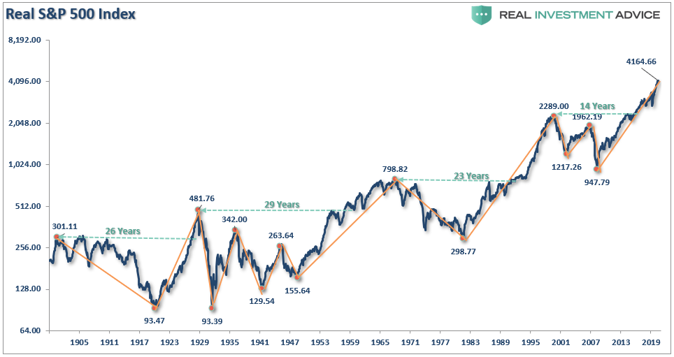
What gets lost during bull cycles, and found in the most brutal of fashions, is the devastation caused to financial wealth during a “mean reversion” process. (Or more commonly known as a “real bear market.”)
Such is the story told by the S&P 500 inflation-adjusted index. The chart shows all of the measurement lines for all the previous bull and bear markets. It also denotes the number of years required to get back to even. Yes, this is similar to the chart above, but note the long periods of “no asset growth.”
Bear market cycles do not end in a month. Corrections often do.
Until Death Do Us Part
One of the critical issues with Morningstar’s analysis is that it completely ignores the issue of “life expectancy.” When discussing long periods of “no return” from markets, the problem of “time” becomes a critical factor. (That is, of course, unless you have contracted “vampirism.” In that case, the following only applies to mortals.)
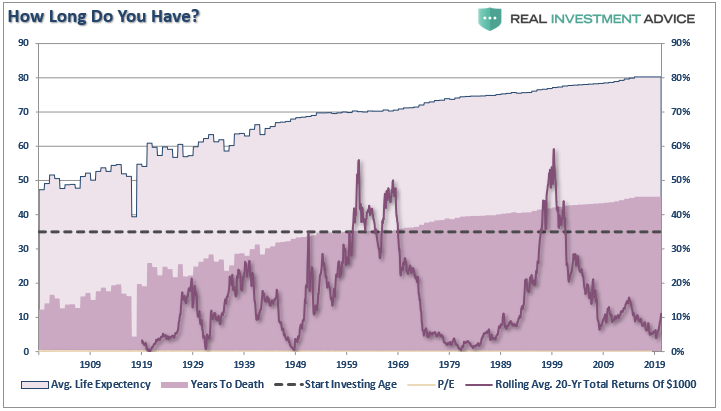
To calculate REAL, TOTAL RETURN, we must adjust the total return formula by including “life expectancy.”
RTR =((1+(Ca + D)/ 1+I)-1)^(Si-Lfe)
Where:
- Ca = Capital Appreciation
- D = Dividends
- I = Inflation
- Si = Starting Investment Age
- Lfe = Life Expectancy
We assume the average starting investment age is 35. We will also consider the holding period for stocks is equal to the life expectancy less the starting age. The chart below shows the calculation of total life expectancy (based on the average of males and females) from 1900-present, the average starting age of 35, and the resulting years until death. I have also overlaid the rolling average of the 20-year total, real returns, and valuations.
The Lie Of Compounding
One of the most egregious investing “myths” said to investors is:
“The power of compounding is the most powerful force in investing.”
The stock market does not COMPOUND returns.
There is a massive difference between AVERAGE and ACTUAL returns on invested capital. In any given year, the impact of losses destroys the annualized “compounding” effect of money.
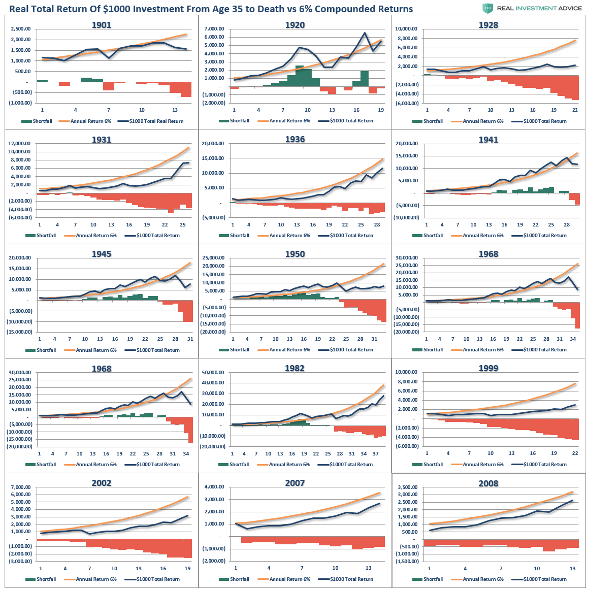
As shown in the chart box below, I have taken a $1000 investment for each period and assumed the total return holding period until death. There are no withdrawals made. (Note: the periods from 1983 forward are still running as the investable life expectancy span is 40-plus years.)
The gold sloping line is the “promise” of 6% annualized compound returns. The blue line represents what happened with invested capital from 35 years of age until death. At the bottom of each holding period, the bar chart shows the surplus, or shortfall, of the 6% annualized return goal.
At the point of death, the invested capital is short of the promised goal in every single case. Such is why using “compounded” rates of return in financial planning often leads to disappointment.
Most importantly, the difference between “close” to a goal or “not” depends on the starting valuation level when individuals started their investment journey.
Such is why you should compensate for both starting period valuations and variability in returns when making future return assumptions. If you calculate your retirement plan using a 6% compounded growth rate (much less 8% or 10%), you WILL be disappointed.
Understanding The Risk
Over the next several weeks, or even months, the markets can extend the current deviations from the long-term mean even further. But that is the nature of every bull market peak and bubble throughout history as the seeming impervious advance lures the last of the stock market “holdouts” back into the markets.
As Vitaliy Katsenelson once wrote:
“Our goal is to win a war, and to do that we may need to lose a few battles in the interim. Yes, we want to make money, but it is even more important not to lose it.”
I wholeheartedly agree with that statement, which is why we remain invested but hedged within our portfolios currently.
Unfortunately, most investors have very little understanding of markets’ dynamics and how prices are “ultimately bound by the laws of physics.” While prices can certainly seem to defy the law of gravity in the short term, the subsequent reversion from extremes has repeatedly led to catastrophic losses for investors who disregard the risk.
Just remember, in the market, there is no such thing as “bulls” or “bears.”
There are only those who “succeed” in reaching their investing goals and those that “fail.”


