Put Options – Nobody Wants Them
Inside This Week’s Bull Bear Report
- Put Options – Nobody Wants Them
- How We Are Trading It
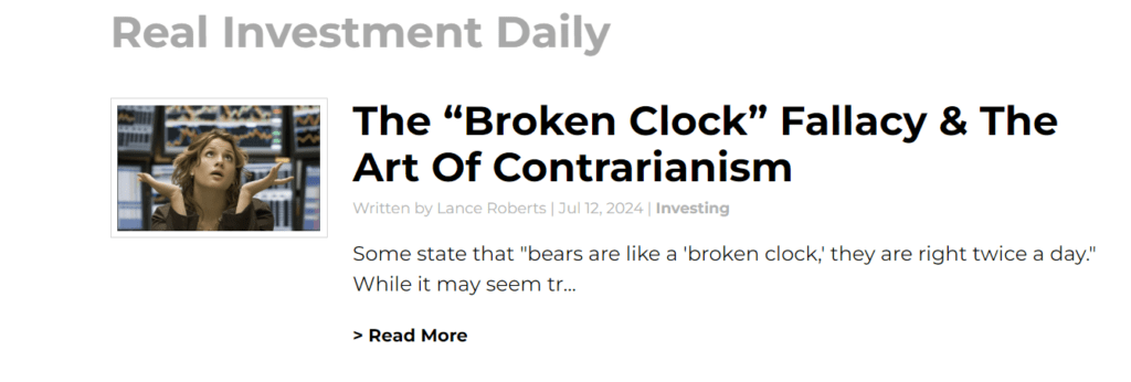
- Research Report – The Broken Clock Fallacy
- Youtube – Before The Bell
- Market Statistics
- Stock Screens
- Portfolio Trades This Week
Administrative Note
This past week, I had a fun and exciting family adventure, visiting ancient ruins in Greece and the blue waters off the coast of Mykonos. However, while I was fortunate to miss Houston’s power outage and sweltering heat as Hurricane Beryl landed, I am still without power as of Saturday morning.
While I may have missed the Hurricane, the heavy rains, wind, and falling tree limbs minorly damaged one of our cars and the house. As they say, there is “no free lunch.”
Next week, we will return to our full newsletter commentary and the attendant charts, tables, and analysis. I appreciate your patience and continue to express my sincere thanks for your readership.
S&P 5600
This past week, the market broke above 560 as Jerome Powell’s testimony confirmed rate cuts are coming. Per the WSJ:
“The S&P 500 and Nasdaq Composite cruised to fresh records Wednesday, with investors appearing more confident that interest-rate cuts are on their way..
Major indexes rose as Federal Reserve Chair Jerome Powell spoke to a House committee, after his first day of congressional testimony on Tuesday inched the Fed closer to lowering interest rates. In his testimony this week, Powell pointed to a cooling labor market and suggested that further softening might be unwelcome.”
That narrative was reinforced Thursday by a soft reading in the Consumer Price Index (CPI), showing inflation continues to cool. As noted in our Daily Market Commentary (Subscribe for free pre-market email.)
“The Consumer Price Index (CPI) fell 0.1% last month, following 0.0% the prior month and expectations for a 0.1% increase. Core prices rose 0.1%, a tenth below last month’s reading and the consensus forecast. Year-over-year inflation is down to 3.0%.”

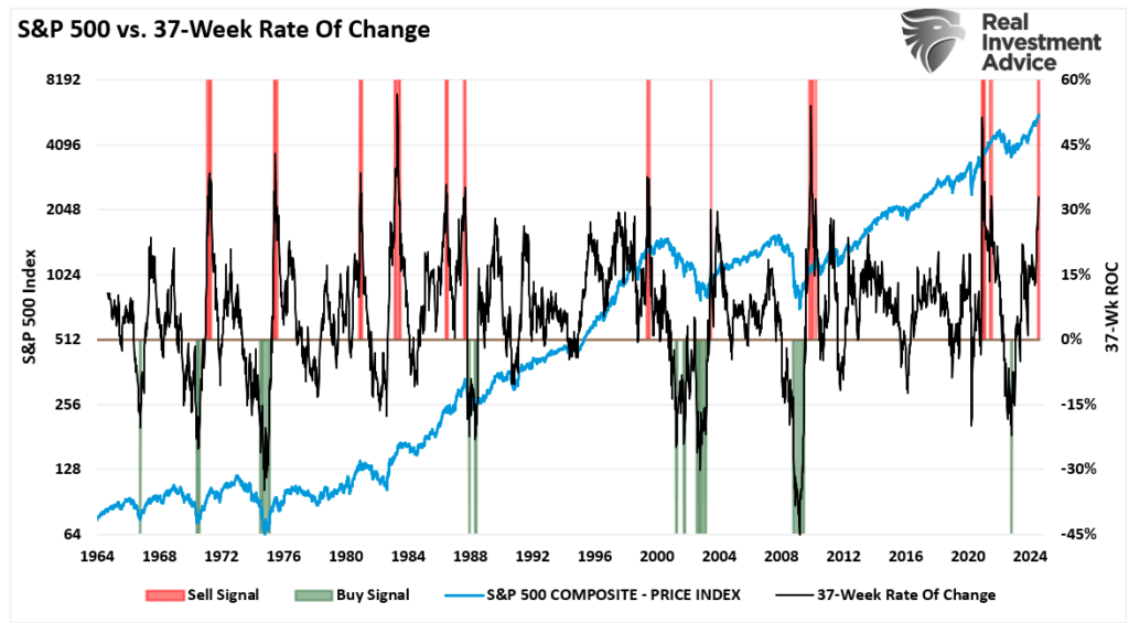
However, the markets already expected that information, which continues in one of the most extended rallies on record. Historically, when the 37-week rate of change is greater than 30%, such events typically precede short—to intermediate-term corrections. While the bulls are very confident, the risk of a 5% to 10% correction over the next three months remains elevated.
Last week, we noted that the market remains bullish as we enter Q2 earnings season. To wit:
“The market remains overbought short-term, but the recent rally is close to flipping the short-term MACD ‘sell signal.’ Such would suggest that while the overbought condition could limit the upside, the market will likely try to climb higher over the next two weeks. Continue to manage portfolio risk accordingly, but the bullish trend remains intact.“
The market did indeed flip that “sell signal,” pushing higher and topping 5600 for the first time. However, it also pushed the market back into extremely overbought territory, and the deviation from the 50-DMA is quite significant. Such suggests that, as we saw in late May and June, the market will either consolidate or correct back to the 20-DMA. If the bulls can hold that level again, as they have, the market could continue to push higher. Such is possible given the current exuberance surrounding the Fed cutting rates. However, if the 20-DMA fails, as in early April, the 50-DMA becomes the next logical support, with the 100-DMA close behind. Such would encompass another 3-5% correction.

With the market continuing its “non-stop” advance, the bulls have become encouraged to take on more risk and are unconcerned about the risk of a correction. As we will discuss, market participants no longer want to buy put options to provide “insurance” against a market decline, but is that a good idea?
Need Help With Your Investing Strategy?
Are you looking for complete financial, insurance, and estate planning? Need a risk-managed portfolio management strategy to grow and protect your savings? Whatever your needs are, we are here to help.

Sellers Live Higher
As noted, during strongly trending bullish markets, investors become overconfident in pursuing gains as “greed” overtakes “logic.” Such is the basis of the psychological behaviors that repeatedly lead to poor investor outcomes.
The “greed factor” has overtaken logic in the current market environment. Such isn’t just from a retail investor view; professionals are now “all in the pool” as well. From the retail perspective, household equity allocations are at record levels.
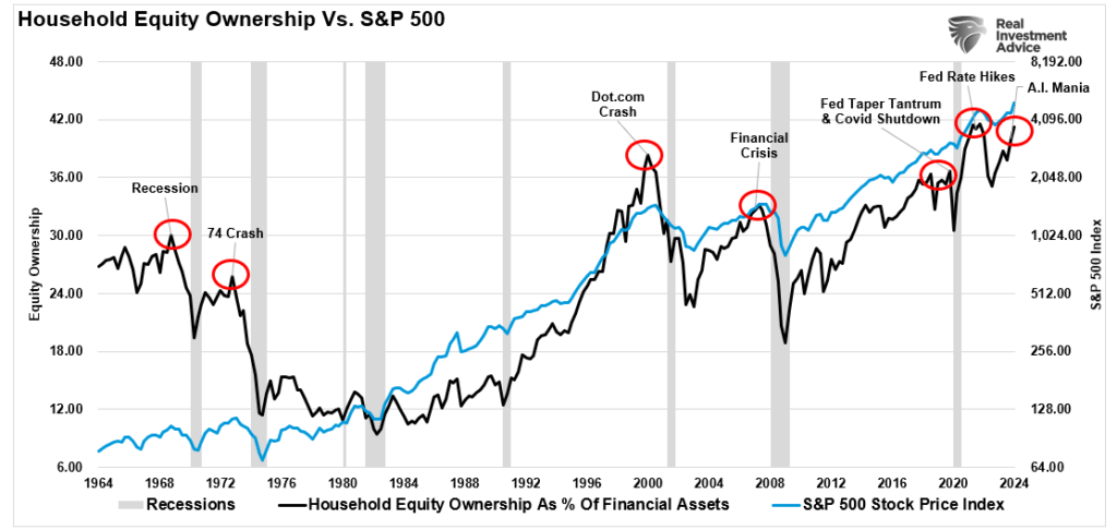
Likewise, professional investors, represented by the National Association Of Investment Managers, are fully allocated to equities.
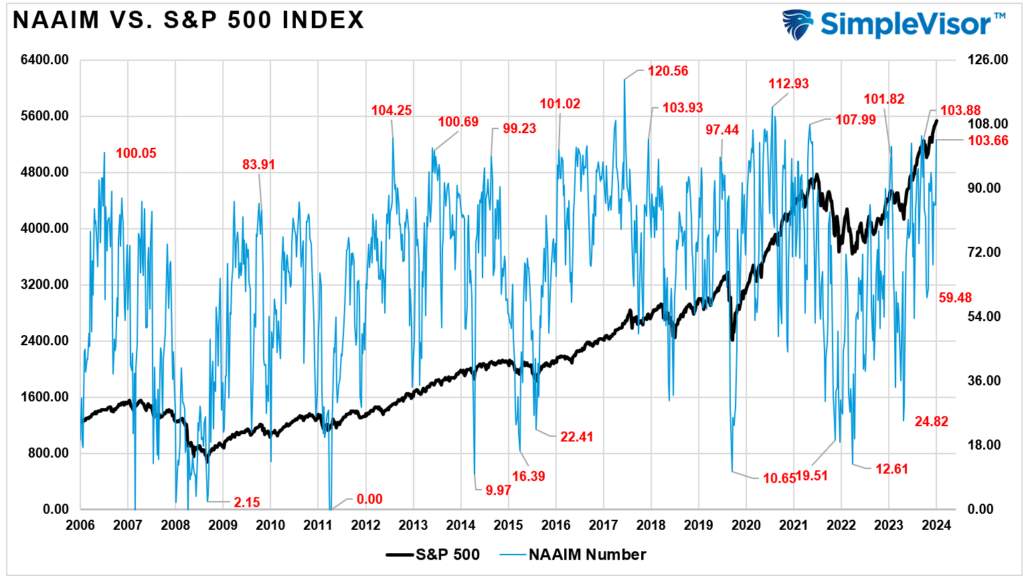
Unsurprisingly, such aggressive positioning generally occurs near short-term market peaks as equity demand declines. As Sam Stovall once quipped:
“If everyone has bought, who is left to buy?”
Such is a crucial point. As we have discussed previously, the demand for equities moves prices, notably “Sellers live higher. Buyers live lower.”
“The stock market is always a function of buyers and sellers, each negotiating to make a transaction. While there is a buyer for every seller, the question is always at ‘what price?‘
In the current bull market, few people are willing to sell, so buyers must keep bidding up prices to attract a seller to make a transaction. As long as this remains the case and exuberance exceeds logic, buyers will continue to pay higher prices to get into the positions they want to own.
Such is the very definition of the ‘greater fool’ theory.
However, at some point, for whatever reason, this dynamic will change. Buyers will become more scarce as they refuse to pay a higher price. When sellers realize the change, they will rush to sell to a diminishing pool of buyers. Eventually, sellers will begin to “panic sell” as buyers evaporate and prices plunge.
Sellers live higher. Buyers live lower.“
Of course, for now, such commentary tends to fall on deaf ears as the hope belief of continually rising stock prices becomes more ingrained. We can view that optimism through the demand for put options.
Put Options – Unloved And Unwanted
First, what is a put option?
“A put option (or “put”) is a contract giving the option buyer the right, but not the obligation, to sell—or sell short—a specified amount of an underlying security at a predetermined price within a specified time frame. This predetermined price at which the buyer of the put option can sell the underlying security is called the strike price.
A put option becomes more valuable as the underlying stock or security price decreases. Conversely, a put option loses its value as the price of the underlying stock increases. As a result, they are typically used for hedging purposes or to speculate on downside price action.” – Investopedia
From an investment management perspective, put options are used to manage portfolio risk by adding an “insurance policy” or hedge to ensure that losses in the underlying asset do not exceed a certain amount. This is an important concept. Daily, we buy insurance to cover most things, from our cars to our health, home, and even our lives. When we buy that insurance, the hope is that we will never need it, but it is there “just in case” the unexpected happens – an accident, an illness, a fire, or our untimely death.
Yet, when it comes to investing, investors make a conscious decision to invest their hard-earned capital without insurance for the unexpected. The higher the market goes, the greater the probability of an eventual reversion and the less demand for insurance to hedge against that risk.
While seemingly backward, the reasoning is that investors don’t want to reduce their returns by spending money on insurance. As I said, “greed outweighs logic.”
Currently, the demand for put options is extremely low. As I noted on “X” this past week:
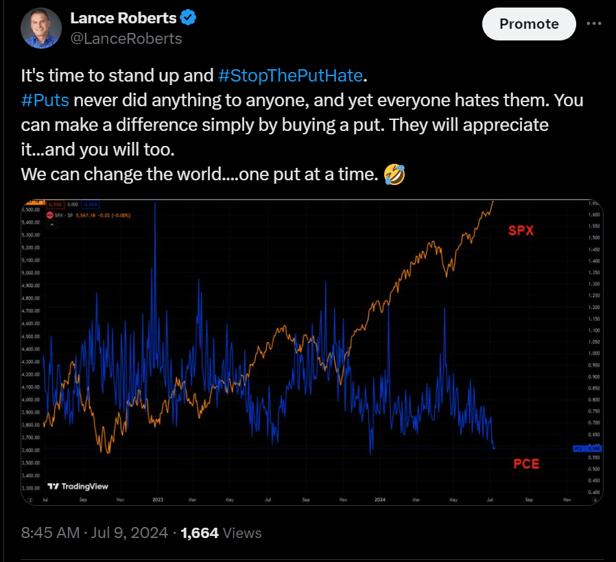
You will note that historically, periods of very low put option demand precede periods of high demand as markets correct. Unfortunately, for many investors, the time to own “insurance” is before the accident. Trying to buy insurance while in the middle of a crash gets very expensive very quickly.
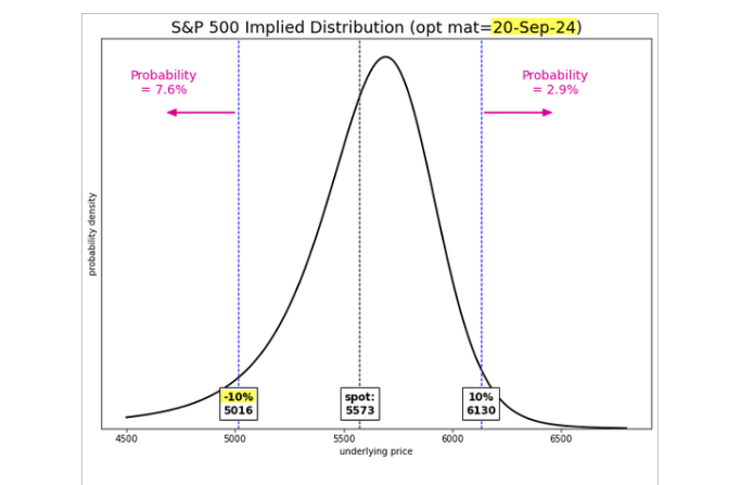
Currently, the option implied probability assigns only an 8% chance of a 10% correction by September. So, why own “insurance” when there is only an 8% risk? First, because it is cheap insurance against that risk. Secondly, it will be too late when you are in the middle of that correction.
Buying put options is NOT about making money on a trade. As an investor, you should hope you will lose money every time you buy a put. The reason is that the rest of your portfolio is increasing in value. However, if a correction does happen, that “cheap insurance” will be worth every penny in offsetting risk to the rest of your portfolio.
How We Are Trading It
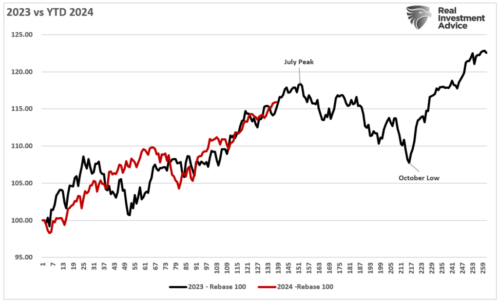
As noted last week, 2024 has been almost a mirror image of last year, with market performance very close. Will the correlation continue, and we see a correction this summer, or will this time be different? I don’t know, but the similarity is eerie, and the risk of a correction is elevated in the near term, given current overbought conditions. However, the “timing” of that correction is the most challenging part.
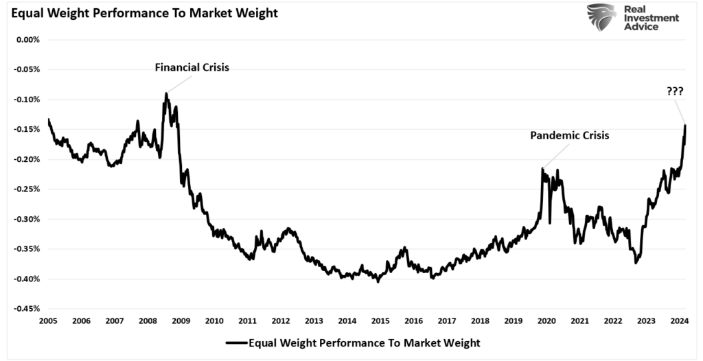
Furthermore, the gap in performance between the S&P 500 equal weight index and the S&P 500 market weight index is at levels not seen since the Financial Crisis. While there are many differences between the current market and 2008, the optimism placed on a handful of names seems illogical. When earnings disappoint optimistic expectations, a market reversion will be required to reset those expectations with reality.
As such, we are looking to take advantage of “cheap insurance” in our options-based portfolios to hedge against the risk of a near-term correction heading into the November presidential election. In our non-options models, we will transition to more “defensive” positions, raise cash levels, and hedge as needed.
Nothing currently suggests anything more than a 5-10% correction between now and November. Such will be the same as last year and historically in line with Presidential election cycles. While many often ignore the warning signs while markets rise, they tend to be the same ones panic-selling when they should buy.
Yes, hedging some risks today means giving up performance in the near term. However, you will more than appreciate the “insurance” when the storm eventually hits.
Have a great week.
Research Report
Subscribe To “Before The Bell” For Daily Trading Updates
We have set up a separate channel JUST for our short daily market updates. Please subscribe to THIS CHANNEL to receive daily notifications before the market opens.
Click Here And Then Click The SUBSCRIBE Button
Subscribe To Our YouTube Channel To Get Notified Of All Our Videos
Bull Bear Report Market Statistics & Screens

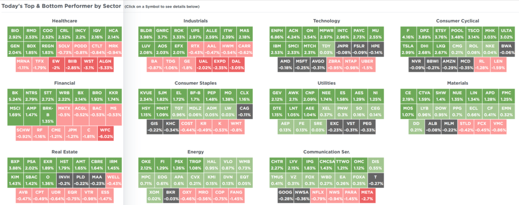
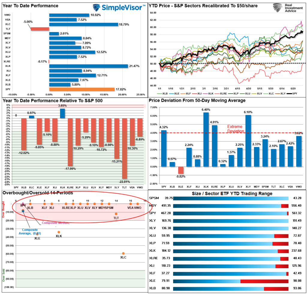
SimpleVisor Top & Bottom Performers By Sector
S&P 500 Weekly Tear Sheet
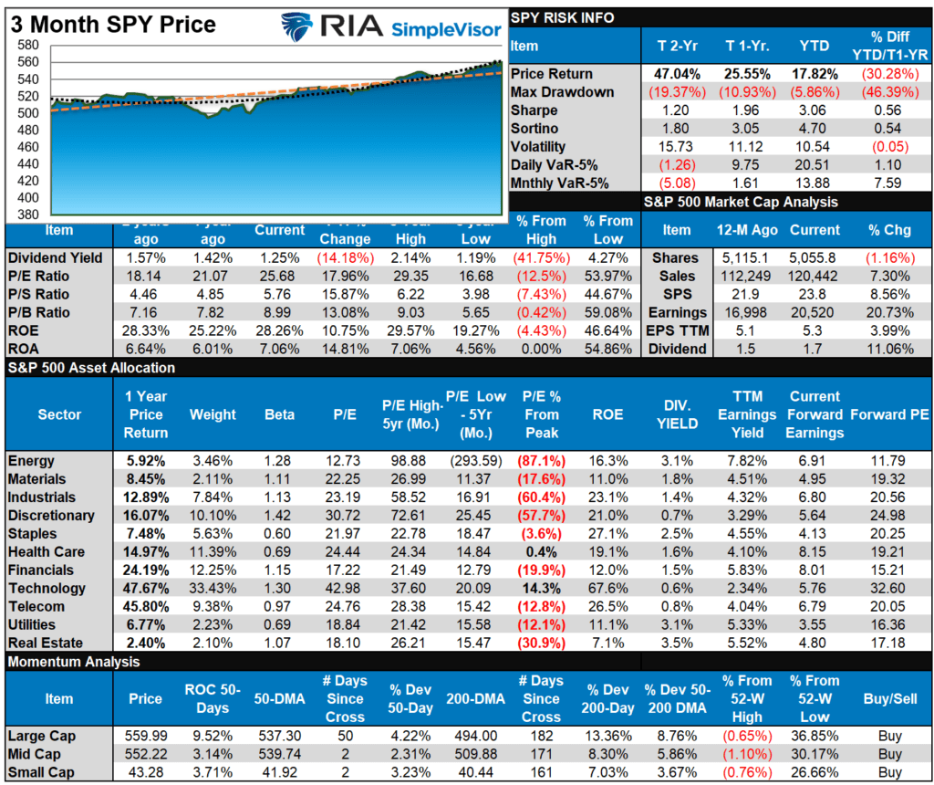
Relative Performance Analysis
This past week, as the markets cleared 5600 for the first time, the chase for assets pushed the majority of sectors and markets into overbought territory. Historically, such overbought conditions lead to either a consolidation or short-term correction. We suspect the latter is more likely as we move into August/September. In the short term, the upside is limited from current levels, and this is a good time to perform rebalancing and risk reduction measures.
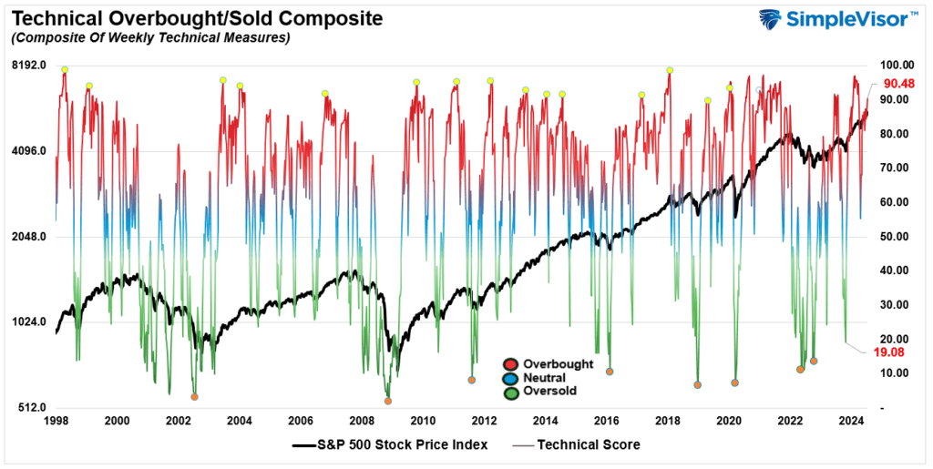
Technical Composite
The technical overbought/sold gauge comprises several price indicators (R.S.I., Williams %R, etc.), measured using “weekly” closing price data. Readings above “80” are considered overbought, and below “20” are oversold. The market peaks when those readings are 80 or above, suggesting prudent profit-taking and risk management. The best buying opportunities exist when those readings are 20 or below.
The current reading is 87.08 out of a possible 100.
Portfolio Positioning “Fear / Greed” Gauge
The “Fear/Greed” gauge is how individual and professional investors are “positioning” themselves in the market based on their equity exposure. From a contrarian position, the higher the allocation to equities, the more likely the market is closer to a correction than not. The gauge uses weekly closing data.
NOTE: The Fear/Greed Index measures risk from 0 to 100. It is a rarity that it reaches levels above 90. The current reading is 79.60 out of a possible 100.

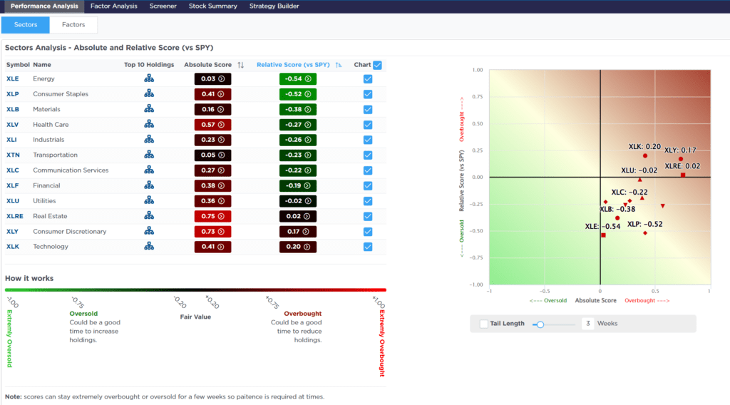
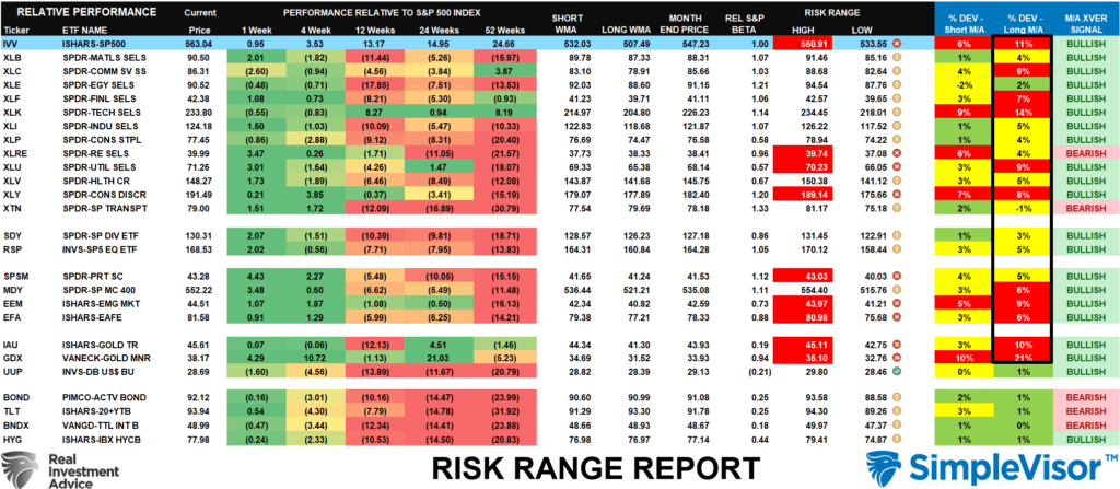
Relative Sector Analysis
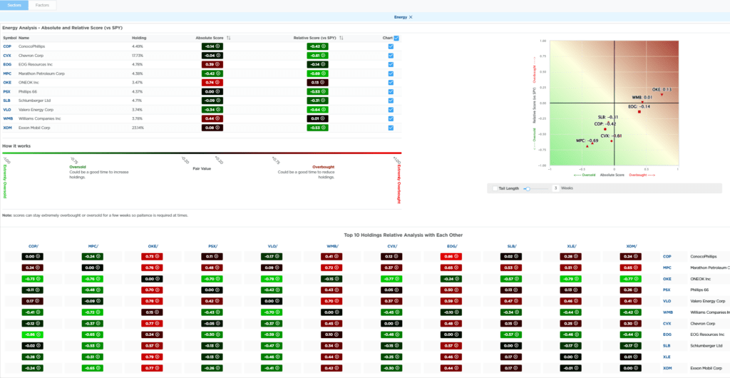
Most Oversold Sector Analysis
Sector Model Analysis & Risk Ranges
How To Read This Table
- The table compares the relative performance of each sector and market to the S&P 500 index.
- “MA XVER” (Moving Average Crossover) is determined by the short-term weekly moving average crossing positively or negatively with the long-term weekly moving average.
- The risk range is a function of the month-end closing price and the “beta” of the sector or market. (Ranges reset on the 1st of each month)
- The table shows the price deviation above and below the weekly moving averages.
Last week’s push higher has put several sectors and markets, including the S&P 500, above their risk/reward ranges. Such is particularly the case with Gold and Gold Miners, whose deviations from long-term moving averages are significant. The last time I discussed a similar condition was at the previous peak in gold prices, and a correction followed shortly after that. I would expect the same this time as well.
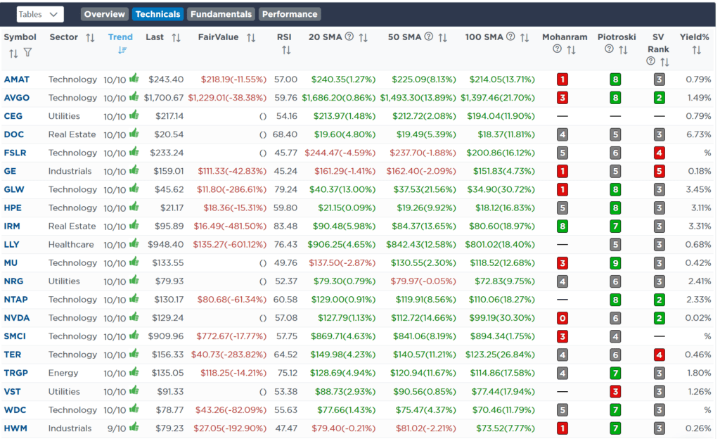
Weekly SimpleVisor Stock Screens
We provide three stock screens each week from SimpleVisor.
This week, we are searching for the Top 20:
- Relative Strength Stocks
- Momentum Stocks
- Fundamental & Technical Strength W/ Dividends
(Click Images To Enlarge)
RSI Screen
Momentum Screen
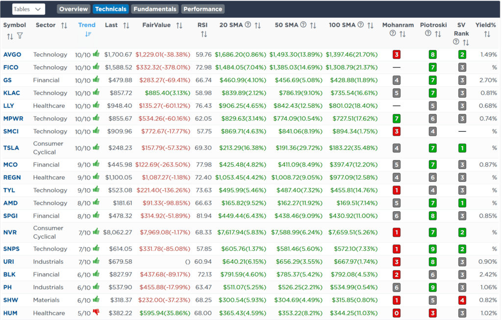
Fundamental & Technical Screen

SimpleVisor Portfolio Changes
We post all of our portfolio changes as they occur at SimpleVisor:
No Trades This Week

Lance Roberts, C.I.O.
Have a great week!