Coal miners used to bring canaries into the mines to protect themselves from harmful gases. The canary will keel over if the gas levels increase, giving the miners time to exit before meeting the same fate. In the same vein, no pun intended, there is a corporate bond credit spread that can serve as an economic canary.
Corporate credit spreads, or the difference between a bond’s yield and Treasury yields, measure the perceived risk of default. Thus, the higher the spread, the greater the premium investors demand to insure against default. From AAA to junk-rated credit, spreads are historically tight. Thus, investors are not overly concerned about economic weakness, which usually precedes defaults. However, a closer inspection of credit spreads by ratings exposes a bit of a warning.
Our canary is the difference between the highest-rated junk bonds, BB, and the junk bonds closest to default, CCC. As shown, CCC bond spreads have been rising. However, BB spreads continue to drift lower. The increased spread between BB and CCC is only minor. In other words, the canary just coughed. Let’s watch the canary to see if its condition worsens.
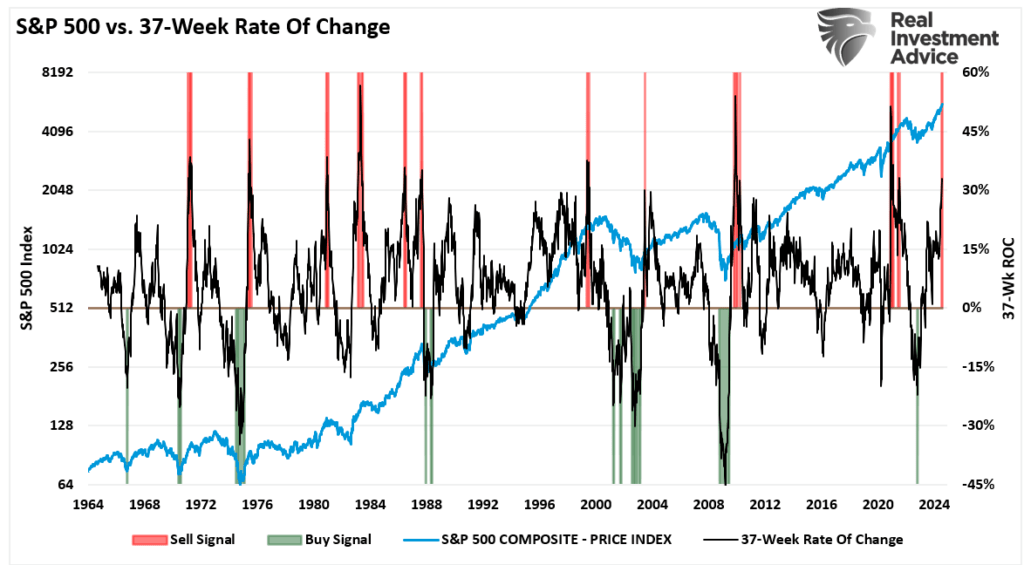
“The rally that began in late October is one of the longest rallies in history. The chart below shows the 37-week rate of change for the S&P 500 index. While there have certainly been periods with larger percentage gains, the current change exceeds 30%, which has historically preceded corrections and consolidations. Conversely, 20% or greater reversions have been decent buying opportunities for investors. The shaded periods show the buying and selling opportunities that have not been that numerous since 1964.”
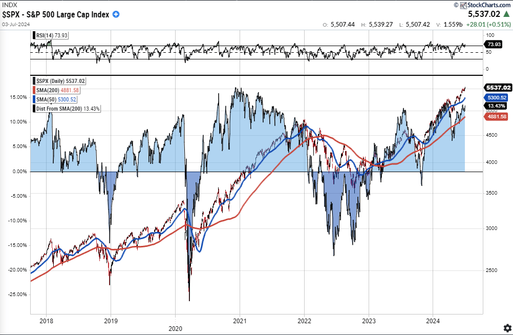
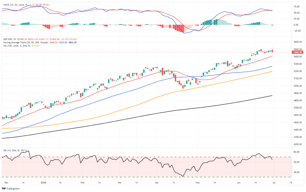
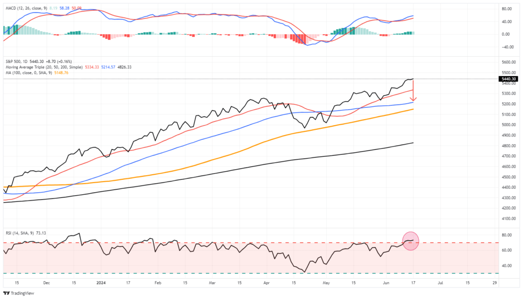
As discussed last week, the market did indeed flip that “sell signal,” pushing higher and topping 5600 for the first time. However, it also pushed the market back into extremely overbought territory, and the deviation from the 50-DMA is quite significant. Such suggests that, as we saw in late May and June, the market will either consolidate or correct back to the 20-DMA. If the bulls can hold that level again, as they have, the market could continue to push higher. Such is possible given the current exuberance surrounding the Fed cutting rates. However, if the 20-DMA fails, as in early April, the 50-DMA becomes the next logical support, with the 100-DMA close behind. Such would encompass another 3-5% correction.
With the market continuing its “non-stop” advance, the bulls have become emboldened to take on more risk and are unconcerned about the risk of a correction. Such often does not end well, but as Warren Buffett once quipped:
“The markets are a lot like sex; it feels best just before the end.”
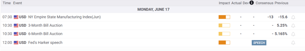
The Week Ahead
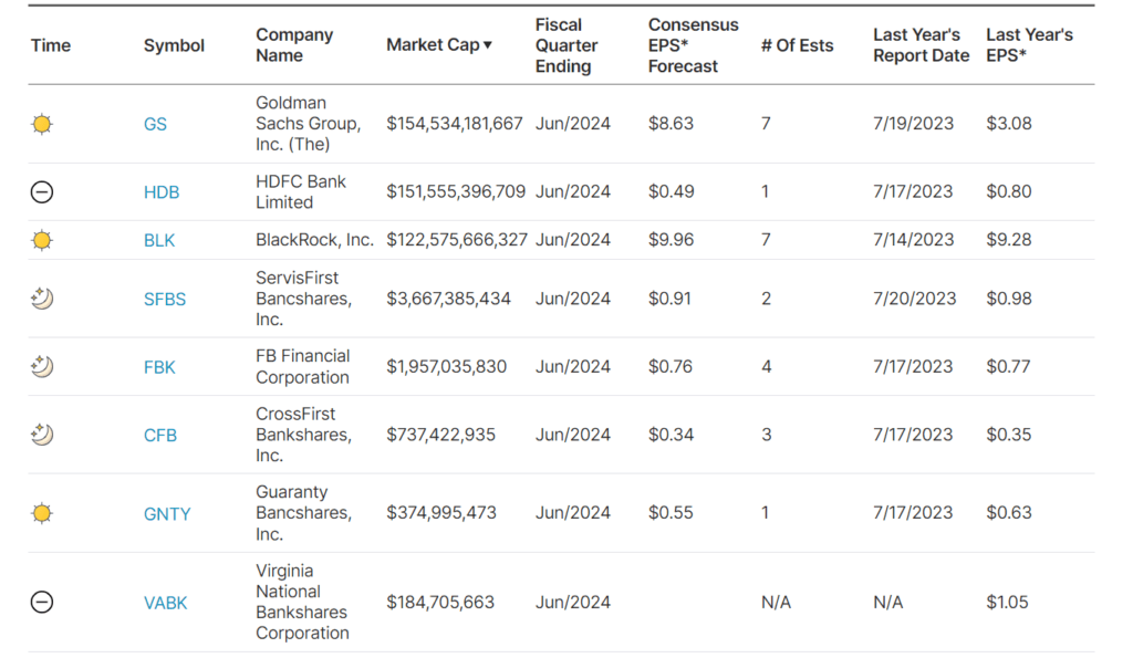
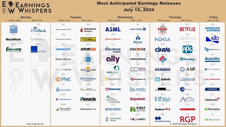
With inflation and the unemployment reports in the rearview mirror, corporate earnings will take center stage. Leading the list are Goldman Sachs, Bank America, United Healthcare, J&J, Netflix, and American Express. We will be watching to see if companies can maintain higher-than-average profit margins despite normalizing inflation. Furthermore, companies like J&J, American Express, and United will provide insight into personal consumption.
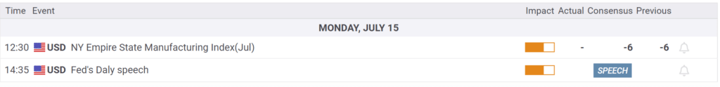
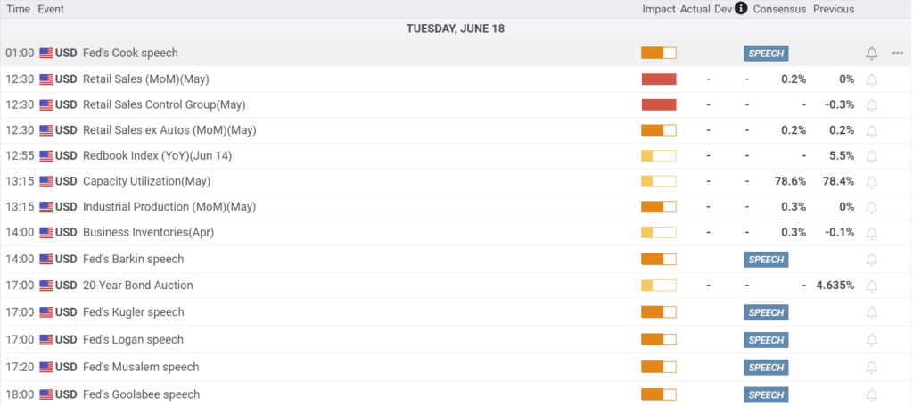
Jerome Powell will speak again today. He may opine on the latest inflation data and how that affects the Fed’s outlook. Also on the calendar is Retail Sales on Tuesday.
Bizarro Stocks
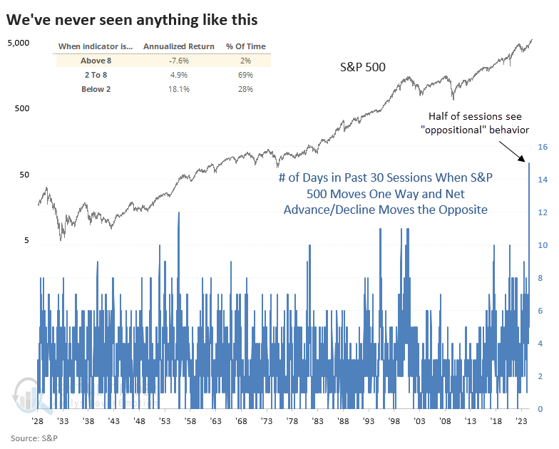
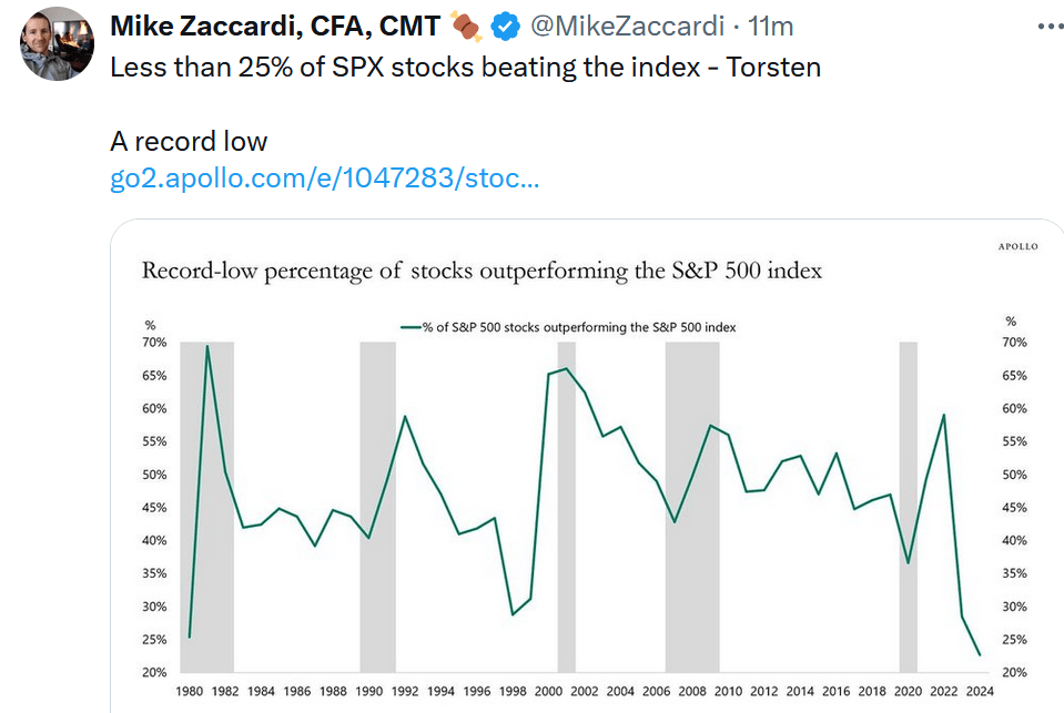
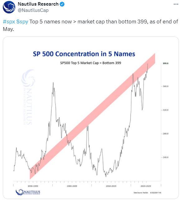
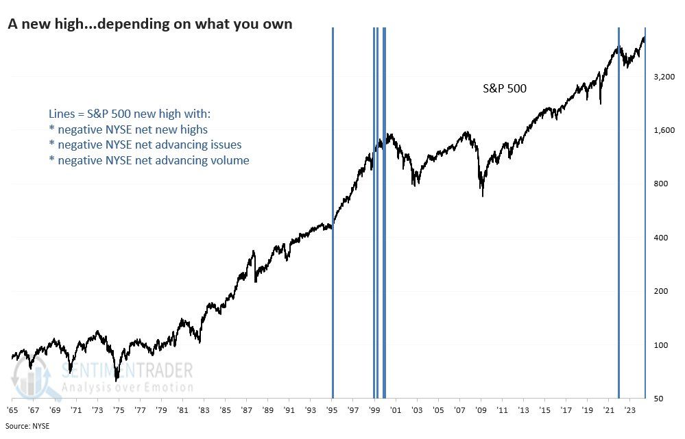
Sentimentrader shared the graph below, showing that fifteen of the last thirty days have seen the S&P 500 index move in the opposite direction as the advance-decline line. The next closest instance, going back to 1928, is 12 days. The table on the top left shows that prior instances when the number of occurrences was above eight were followed by an average annualized return of -7.6%. Furthermore, about 40% of stocks in the S&P 500 are down this year despite the index being up nearly 20%.
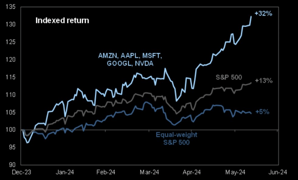
Bizzaro stats like these and many others attest to the heavy contribution of large-cap stocks to index returns and how they mask underlying market weakness. The top 30 stocks account for over half of the index. Moreover, Microsoft, Apple, Nvidia, and Amazon account for 25% of the total.
If you found this blog useful, please send it to someone else, share it on social media, or contact us to set up a meeting.
Prices Decline Raising The Odds Of A Rate Cut
The Consumer Price Index (CPI) fell 0.1% last month, following 0.0% the prior month and expectations for a 0.1% increase. Core prices rose 0.1%, a tenth below last month’s reading and the consensus forecast. Year-over-year inflation is down to 3.0%.
The better-than-expected inflation data further affirms the disinflation trend may be back on track. The two graphs below, charting the three-month average of the monthly CPI and the year-over-year CPI, show they are nearing the ten-year average preceding the pandemic and well below the high levels we saw in 2022.
Before cutting interest rates, the Fed may want another month or two of CPI and PCE prices at or below the pre-pandemic average. Such would confirm the year-over-year trend is back on a downward trajectory. However, the Fed is now balanced regarding its reaction to prices and the labor market. If the next CPI is low and the labor market shows further signs of cooling, the September FOMC might be when the Fed makes the first rate cut of this cycle. The odds of a cut at the July 31 meeting rose slightly to 10%. Furthermore, the odds are over 80% that they will reduce rates in September.
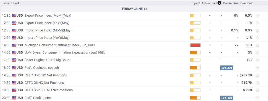
What To Watch Today
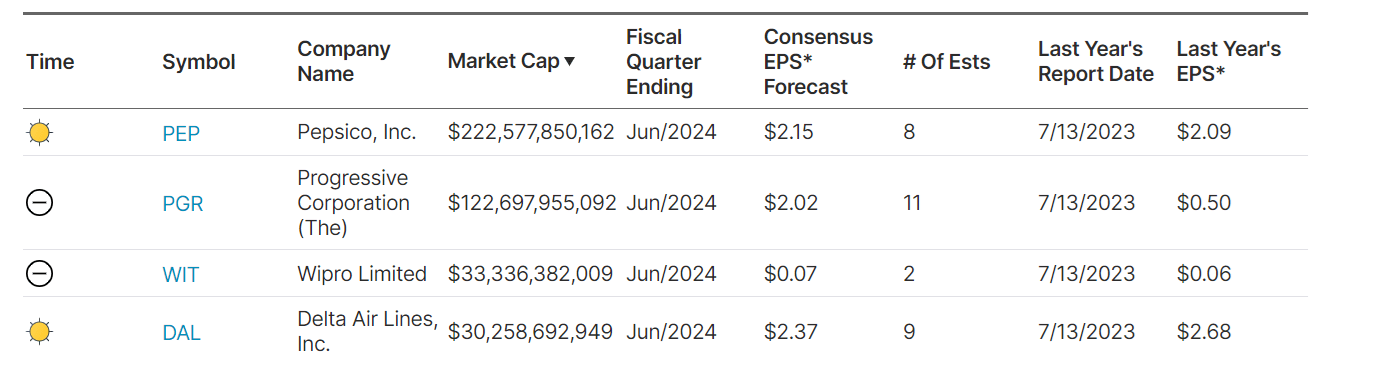
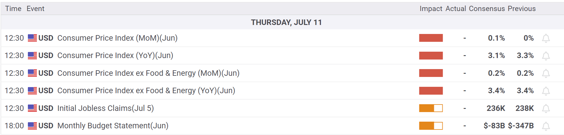
Earnings
Economy
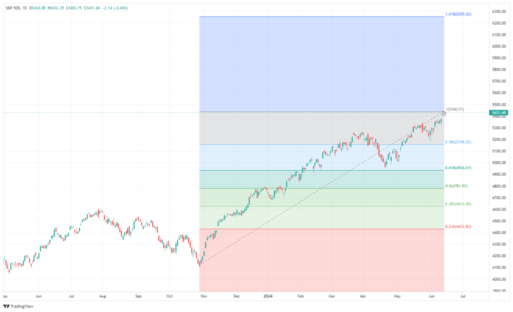
Market Trading Update
As discussed yesterday, the market has continued to rise as investors chase a small handful of stocks. The rally that began in late October is one of the longest rallies in history. The chart below shows the 37-week rate of change for the S&P 500 index. While there have certainly been periods with larger percentage gains, the current change exceeds 30%, which has historically preceded corrections and consolidations. Conversely, 20% or greater reversions have been decent buying opportunities for investors. The shaded periods show the buying and selling opportunities that have not been that numerous since 1964.
Of course, as noted, just because the market rally currently exceeds 30% does not mean a reversal is imminent. It is just a warning that investors should pay attention to as they continue to manage risk.
Greg Valliere’s Washington Insight On Biden’s Chances
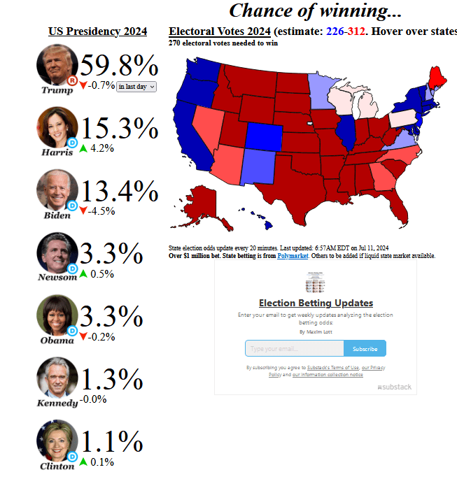
As promised, we occasionally provide Greg Valliere’s latest political insights throughout this election season. His 40+ years of experience analyzing and assessing the political landscape helps us gauge what the coming election may bring so we can focus on what that means for our investments.
Beneath his latest thoughts on the coming election and President Biden’s predicament, we share the current betting odds. The source is Election Betting Odds, which aggregates five betting platforms. As of yesterday, Kamala Harris is slightly favored over Joe Biden, while Donald Trump is the clear favorite.
THE ISSUE IS NOT WHETHER JOE BIDEN WILL STEP DOWN — it’s simply when, our sources are reporting, after the president’s campaign essentially collapsed yesterday. We have no idea when Biden will drop out — it could come as early as his press conference today, but more likely not until late July, ahead of the Democrats’ national convention, which runs from Aug.19 until Aug.22.
MOST POLLS SHOW BIDEN TRAILING by only 2 or 3 points nationwide, a remarkably tight margin, considering his disastrous debate performance two weeks ago. Why?
OUR TAKE is that most voters made up their minds months ago — and they tuned out of the cringe-inducing debate. The public shrugged off the Trump guilty verdicts in NYC, which had virtually no impact on the polls. And the public probably isn’t wondering about Biden’s Parkinson’s doctor.
THE RACE MAY BE SURPRISINGLY CLOSE, but the outlook isn’t good for Biden because he still trails in virtually all of the key battleground states — Georgia, Nevada, Arizona, North Carolina, etc. And in the most important state of all — Pennsylvania — Trump appears to be ahead. Biden has a small lead in Wisconsin and Michigan.
THE ELECTORATE DECIDED MONTHS AGO that Biden was too old to be president, and that concern has grown. The public overwhelmingly believes that Biden isn’t fit to serve for four and a half more years; perhaps the only game changer would be signs that Trump’s cognitive skills are failing — but you underestimate Trump at your own peril.
Is Private Equity For You?
Lance Roberts wrote a thoughtful article this week about private equity. His article, Private Equity – Why Am I so Lucky, helps readers appreciate the rapidly growing $4.4 trillion asset class. Notably, he provides three risks often accompanying private equity investments and why they may be better served for high-net-worth individuals and pension and endowment funds. To wit:
There are significant differences to consider between the vast majority of retail investors and high-net-worth individuals before investing in private equity. The underlying risks of private equity investments can define these differences. There are many risks, but I want to focus on three.
Liquidity Risk
Duration
Loss Absorption
He thoroughly explains those risks and how they differ from traditional investments. Furthermore, he dispels the notion that private equity investments are better than the stocks and bonds most retail investors own. Per the article:
To that point, you should realize that most private equity investments (65%) either fail or return the initial investment at best.
The article does not dissuade individuals from making private equity investments. However, it raises awareness of the risks and complications associated with private equity and how they differ from what most stock and bond investors are used to.
Does this mean that you should never make a private equity investment? Of course not. However, you must understand the risk of investing and the potential ramifications on your financial situation when something goes wrong.
If you found this blog useful, please send it to someone else, share it on social media, or contact us to set up a meeting.
The “Broken Clock” Fallacy & The Art Of Contrarianism
Some state that “bears are like a ‘broken clock,’ they are right twice a day.” While it may seem true during a rising bull market, the reality is that both “bulls” and “bears” are owned by the “broken clock syndrome.”
The statement exposes the ignorance or bias of those making such a claim. If you invert the logic, such things become more evident.
“If ‘bears’ are right twice a day, then ‘bulls’ must be wrong twice a day.”
In the investing game, the timing of being “wrong” is critical to your long-term goals. As discussed in “The Best Way To Invest,”
“There is a massive difference between AVERAGE and ACTUAL returns on invested capital. Thus, in any given year, the impact of losses destroys the annualized ‘compounding’ effect of money.”
Throughout history, bull market cycles are only one-half of the “full market cycle.” That is because, during every “bull market cycle,” the markets and economy build up excesses that are then “reversed” during the following “bear market.” In other words, as Sir Issac Newton once stated:
“What goes up, must come down.”
Bulls Are Wrong At The Worst Time
During rising bull markets, the bears become an easy target for ridicule. While the bears have logical arguments for why the markets should reverse, markets can often remain “illogical longer than you can remain solvent,” to quote John M. Keynes. Such is an important point because, as Howard Marks once quipped:
“Being early is the same as being wrong.”
The problem for perennially bearish people is that while they may eventually be deemed correct, they were so early to the call that they became the “boy who cried wolf.”
Robert Kiyosaki, who has long called for a market crash, is a good case study.
“But the real tragedy here is that one day he will be right. One day a crash will come and Kiyosaki will take a victory lap for all to see.
Will his prior incorrect calls matter? Not at all. You can try to point out his flawed track record, but it won’t make a difference. Most people aren’t going to see your reply. But what they will see is his tweet. They will feel the pain from the crash after it happens and then they will think, ‘Kiyosaki knew it all along.’”
Oh he got it wrong eight times before? Who cares? He is right now, isn’t he?” – NIck Mugulli
Nick is correct. No one will remember the “bears” wrong calls when the crash eventually comes. However, Nick is also incorrect because the same applies to the “bulls.”
For example, few remember Jim Cramer’s Top 10 Picksin March 2000 or the bullish media analysts who said “buy” through the entire 2008 crisis? But they remember the eventual “buy” recommendations that were eventually right. Unfortunately, few investors had capital left at that point.
We give Nick a pass because he is young and has not lived through an actual bear market. As anyone who has will tell you, it is not an adventure they care to repeat.
The problem with being “bullish all the time” is that when you are eventually wrong, it comes at the worst possible cost: the destruction of investment capital. However, being “bearish all the time” also has a price, such asfailing to grow investment capital to reach financial goals. While some investors left the market to avoid a 50% crash in 2008, they never returned for the subsequent 500% return. What was worse?
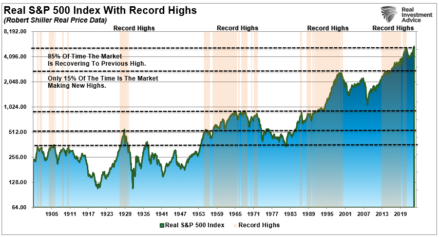
While the “bulls” seem to have their way during rising markets, the always-bullish media overlooks a problem. Over the past 120 years, the market has indeed risen. However, 85% of that time was spent making up previous losses, and only 15% making new highs.
The importance of this point should not be overlooked. Most investors’ “time horizon” only covers one market cycle. Suppose you are starting at or near all-time highs. In that case, there is a relatively significant possibility you may wind up spending a significant chunk of your time horizon “getting back to even.”
The “Art Of Being A Contrarian
The biggest problem for investors, and the “broken clock syndrome,” is the emotional biases by being either “bullish” or “bearish.” Effectively, when individuals pick a side, they become oblivious to the risks. One of the most significant factors is “confirmation bias,” where individuals seek confirmation and ignore non-confirming data.
As investors, we should avoid such a view and be neither bullish nor bearish. We should be open to all the data, weigh incoming data accordingly, and assess the risk inherent in our portfolios. That risk assessment should be an open analysis of our current positioning relative to the market environment. Being underweight equities in a rising bull market can be as harmful as being overweight in a bear market.
As a portfolio manager, I invest money in a way that creates short-term returns but reduces the possibility of catastrophic losses that wipe out years of growth.
We believe you should not be “bullish” or “bearish.” While being “right” during the first half of the cycle is essential, it is far more critical not to be “wrong” during the second half.
Howard Marks once stated that being a “contrarian” is tough, lonely, and generally right. To wit:
“Resisting – and thereby achieving success as a contrarian – isn’t easy. Things combine to make it difficult; including natural herd tendencies and the pain imposed by being out of step, particularly when momentum invariably makes pro-cyclical actions look correct for a while. (That’s why it’s essential to remember that ‘being too far ahead of your time is indistinguishable from being wrong.’)
Given the uncertain nature of the future, and thus the difficulty of being confident your position is the right one – especially as price moves against you – it’s challenging to be a lonely contrarian.”
The problem with being a contrarian is determining where you are during a market cycle. The collective wisdom of market participants is generally “right” during the middle of a market advance but “wrong” at market peaks and troughs.
As an individual, you can avoid the “broken clock“ syndrome.
Avoid the “herd mentality” of paying increasingly higher prices without sound reasoning.
Do your research and avoid “confirmation bias.”
Dev”lop a sound long-term investment strategy that includes “risk management” protocols.
Diversify your portfolio allocation model to include “safer assets.”
Control your “greed” and resist the temptation to “get rich quick” in speculative investments.
Resist getting caught up in “what could have been” or “anchoring” to a past value. Such leads to emotional mistakes.
Realize that price inflation does not last forever. The larger the deviation from the mean, the greater the eventual reversion. Invest accordingly.
Being a contrarian does not mean always going against the grain regardless of market dynamics. However, it does mean that when “everyone agrees,” it is often better to look at what “the crowd” may be overlooking.
QT Today: QE Tomorrow
The Fed’s balance sheet peaked at $9 billion in April 2022. Today, after two years of Quantitative Tightening (QT), it has fallen to $7.2 trillion. When the Fed embarked on QT, its goal was to “normalize” its balance sheet. At the time, the St. Louis Fed claimed the purpose of QT was:
“This policy, termed balance sheet “normalization” or “quantitative tightening” (QT), is designed to drain excess liquidity from the banking system. QT is the opposite of quantitative easing (QE).”
Today, after a healthy dose of QT, the Fed’s balance sheet is still far from normalized. It is over $5 trillion larger than in 2008 when Ben Bernanke promised that the initial round of QE was a temporary measure to stabilize the economy and markets.
Might today’s and many continued rounds of QT normalize the Fed’s balance sheet? We doubt it, and so does the Fed. In our latest article, Fiscal Dominance Is Here, we discuss the bind the Fed is in and how they must enact monetary policy with the massive Federal debt load in mind. Powell will never admit that monetary policy is beholden to the nation’s debt. However, the Fed does. The graphs below from the Fed project its SOMA account, which holds their bonds, will grow by 8-10% a year starting in 2025. The Fed and Treasury have no choice if deficits continue!
What To Watch Today
Earnings
Economy
Market Trading Update
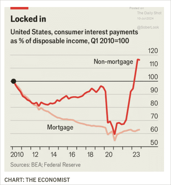
The market is poised to move higher again today if the CPI report confirms what the market is expecting – cooler inflation. With Jerome Powell heading into the FOMC meeting at the end of the month, the recent spat of weaker data has hopes mounting that the Fed could cut rates in July. That hope was recently underpinned by comments from Powell that he doesn’t want to wait too long to cut rates and risk undermining economic growth. That risk is clearly reflected in consumer interest payments (non-mortgage) as a percentage of disposable income, which has risen sharply. The longer high borrowing costs remain, the risk of a recessionary draw down increases.
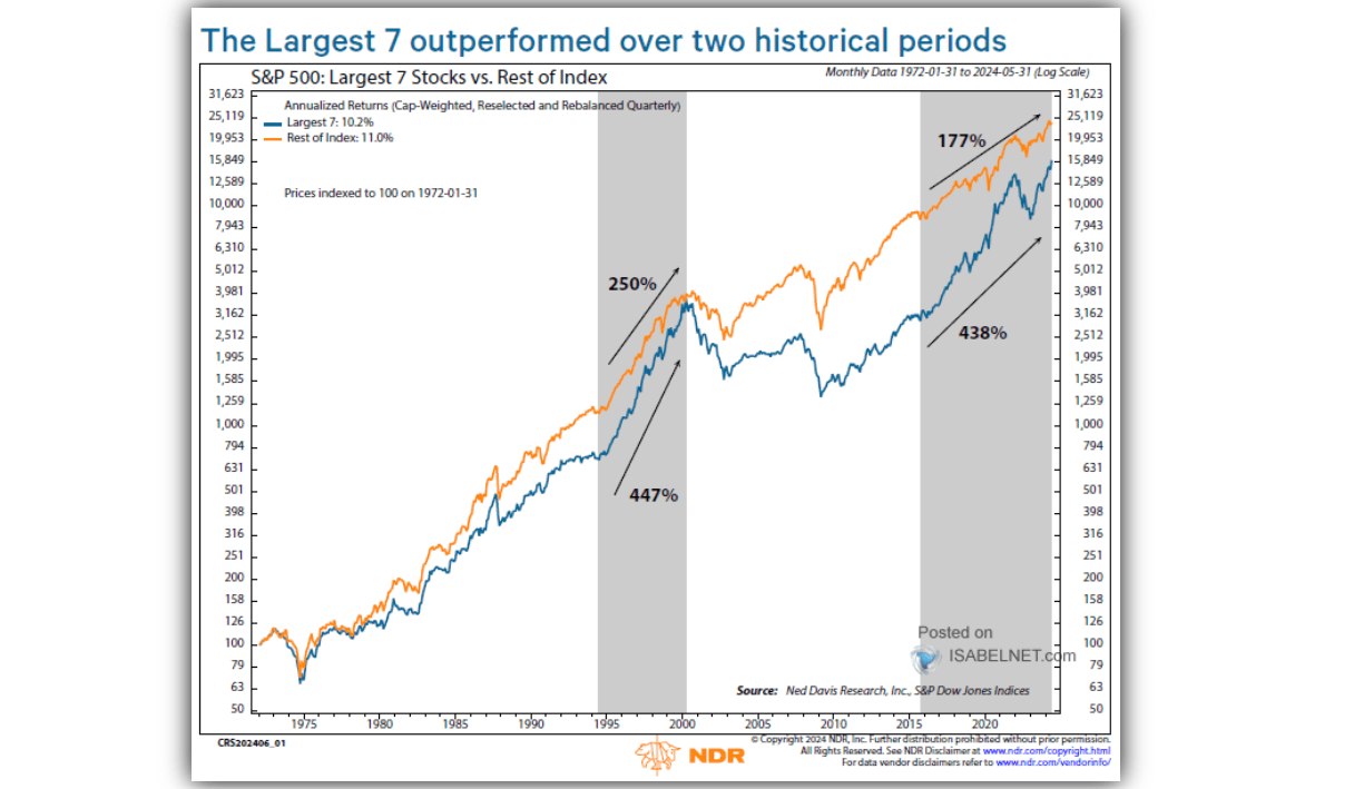
Do not dismiss that risk. When it comes to the financial market, investors are chasing a handful of stocks higher based on expectations of exponential earnings growth in the future. However, a recessionary onset will undermine those expectations as earnings fall and valuations reset. As shown, the last time that the largest 7-stocks outperformed the rest of the market to such a degree was heading into the “Dot.com” bubble. While this time is indeed different, it is unlikely that it is different enough to create infinite earnings growth.
While we remain long equities in our portfolio currently, as we will discuss in this weekend’s newsletter, we are starting to aggressively research multiple hedging strategies to reduce portfolio risk heading into the end of summer. Such a move certainly seems prudent.
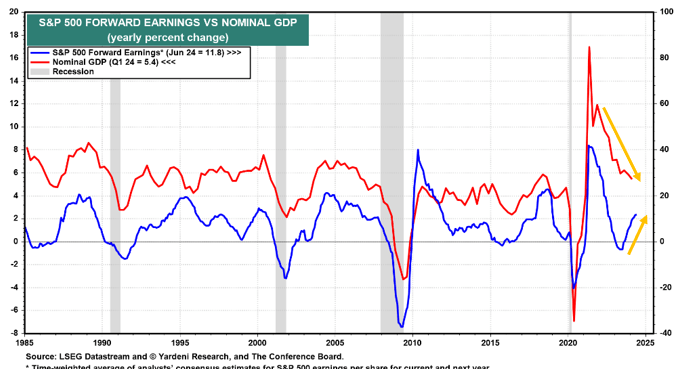
Forward Earnings Projections Appear Optimistic
Corporate earnings tend to be well correlated with economic activity. Also, as the graph below from Yardeni Research shows, forward earnings correlate well with current economic growth. Keep in mind that forward earnings are forecasts, not actual earnings. Recently, as Yardeni highlights with the yellow arrows, forward earnings expectations have been rising while the GDP growth rate has been declining. Therefore we must ask, can earnings expectations continue increasing if the economy slows beyond the natural growth rate? We doubt it, but never rule anything out in this market.
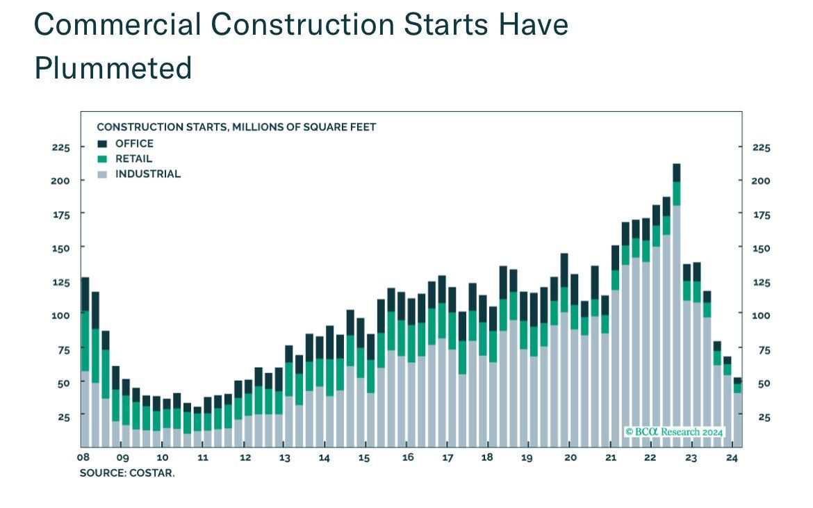
More On Construction Employment
Yesterday’s Commentary touched on the significant jump in construction worker layoffs in the latest Challenger report. We track the sector closely because construction jobs have played a significant role in the robust job market. And as you know, the strong labor market is one reason the Fed is apprehensive about cutting interest rates.
The graph below, courtesy of CoStar, warns that the Challenger warning may not be a one-month anomaly. As measured in square footage, the amount of new commercial projects getting underway has plummeted from over 200 million square feet to just over 50 million. Such is the lowest since the aftermath of the financial crisis.
If you found this blog useful, please send it to someone else, share it on social media, or contact us to set up a meeting.
Chair Powell Testifies To Congress
Fed Chair Jerome Powell testified to Congress yesterday and updated them with the Fed’s latest views on the economy, inflation, and monetary policy. The Fed has kept rates at current levels in part because the labor market was tight. Chair Powell’s concern was that higher wages due to a shortage of workers would feed inflation. In his testimony, Chair Powell claimed that is no longer a concern. To wit:
The most recent labor market data sent a pretty clear signal that the labor market has cooled considerably and appears to be fully back in balance.
Regarding monetary policy, he said, “It’s not likely the next move will be a rate hike.” Further, he continued to stress the risks the Fed faces. Per his speech:
In light of the progress made both in lowering inflation and in cooling the labor market over the past two years, elevated inflation is not the only risk we face. Reducing policy restraint too late or too little could unduly weaken economic activity and employment.
On the inflation front, Chair Powell appears to be getting more optimistic that the recent inflation readings are heading lower again. “More good data would strengthen our confidence that inflation is moving sustainably toward 2%.”
He did not break new ground, but his general tone indicates the Fed wants to cut rates. However, they want more data confirming that the inflationary tailwinds are fading quickly. As shown below, the market favors a rate cut in September. The odds of a cut in July remain low at 5%.
Construction Job Layoffs Rising
The graph below, courtesy of Longview Economics, shows an unusual jump in the number of layoffs in the construction industry. Similarly, the recent data on building permits and housing starts have been slowing rapidly. Accordingly, layoffs in the industry should not be shocking.
There are approximately 8 million construction workers in the labor force. The sector has been one of the leading growth sectors over the last few years. Therefore, we should watch whether the layoffs continue in the Challenger data and if they also appear in the BLS data.
As Longview states:
Unusual to get such a large monthly ‘construction’ layoffs data point Way too soon to extrapolate. BUT a second similar month at this level would be troubling (especially when many other labour market indicators are so soft!)
Tobin’s Q Ratio At A Record High
The graph below, courtesy of ASR Ltd., shows that the Tobin Q ratio is now at its highest level in nearly 125 years. Tobin’s Q ratio uses the market value and replacement value of a company’s assets to determine if they are over or undervalued. When the ratio is greater than one, it means the market values the company more than the value of its assets. Therefore, today’s record readings imply expectations for high growth and, ultimately, profits.
Like Tobin’s, many valuation metrics are at or near historic highs. However, technically, the market remains very strong. Accordingly, investors need to pay close attention to technical warnings that could result in some normalization of valuations.
If you found this blog useful, please send it to someone else, share it on social media, or contact us to set up a meeting.
Fiscal Dominance Is Here
As quoted below from an executive summary of a joint report by the Department of Treasury and the Office of Management and Budget (OMB), the current deficit policy is deemed unsustainable. However, they fail to mention how long the Fed, via fiscal dominance, can sustain the unsustainable.
“The debt-to-GDP ratio was approximately 97 percent at the end of FY 2023. Under current policy and based on this report’s assumptions, it is projected to reach 531 percent by 2098. The projected continuous rise of the debt-to-GDP ratio indicates that current policy is unsustainable.” – Financial Report of the United States Government -February 2024.
Fed speakers will deny any notion that its monetary policy aims in part to help the government fund her debts. Regardless of what they say, we are already in an age of fiscal dominance. Monetary policy must consider the nation’s debt situation.
Fiscal Dominance
Fiscal dominance is a condition whereby the amount of debt in an economy reaches a point where monetary policy actions must allow Federal debts and deficits to be serviced and funded cost-effectively. By default, such monetary policy decisions will often come at the expense of traditional employment and price goals. As a result, the Fed must further distort the price of money and ultimately lessen the wealth of the nation’s citizens.
A lender or investor should never accept a yield below the inflation rate. If they do, the loan or investment will reduce their purchasing power.
Regardless of what should happen in an economics classroom, the Fed has forced a negative real rate regime upon lenders and investors for the better part of the last 20+ years. The graph below shows the real Fed Funds rate (black). This is Fed Funds less CPI. The gray area shows the percentage of time over running five-year periods that real Fed Funds were negative. Negative real Fed Funds have become the rule, not the exception.
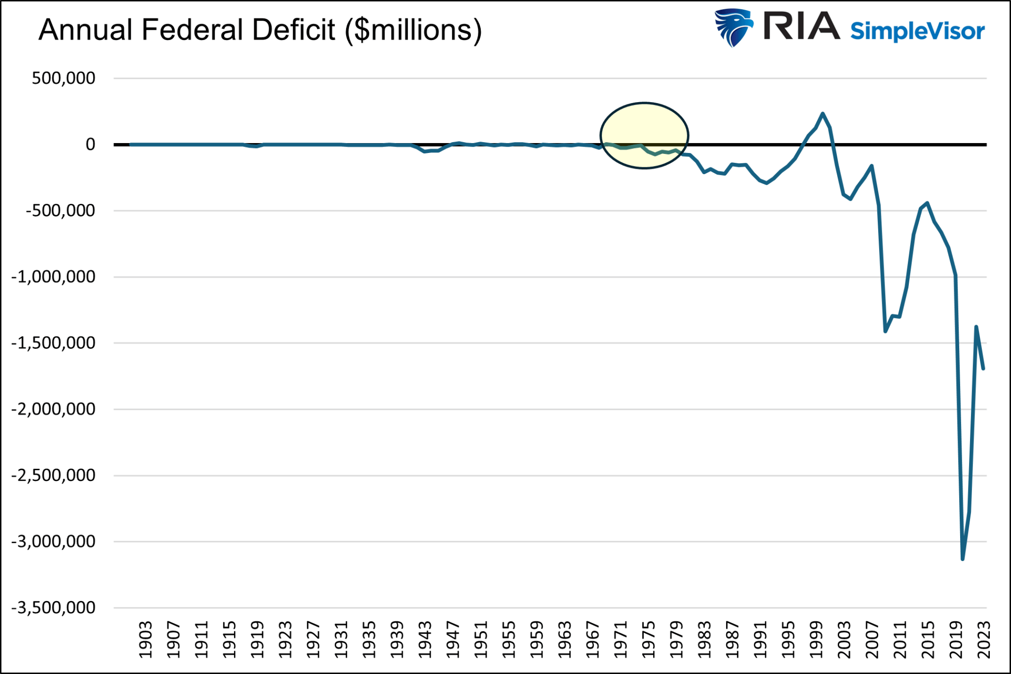
Soaring Debt Outstanding and Rising Rates
The government has added $2.5 trillion in debt over the last four quarters. Of that, over $1 trillion was to pay its interest expenses on the entire debt stock. Despite recent high interest rates, the average interest rate on the debt is still relatively low at 3.06%.
The two graphs below show why a relatively minimal uptick in the average interest rate on the debt is so troublesome. The federal debt (blue) has grown by 8.5% annually over the last ten years. Despite the amount of debt more than doubling over the period, the interest expense on the debt until very recently has remained very low. The first graph shows that the average interest rate increase is barely visible. However, the second graph shows that the rise in the government’s interest expenses is substantial.
As debt issued years ago with low interest rates matures and new debt with higher interest rates replaces it, the interest expense will keep rising. For context, if we assume the government’s average interest rate is 4.75%, likely close to their weighted average rate on recent debt issuance, the interest expense will rise to $1.65 trillion, not including new debt.
$1.65 trillion is over $300 billion above the government’s next largest expenditure, Social Security. Furthermore, it is double defense spending for 2023. The annual federal deficit has only been above $1.65 trillion twice (2020 and 2021) since its founding in 1776.
While the situation may sound gloomy, lower interest rates solve the problem. If interest rates return to the levels existing before 2022, the interest expense could easily fall below $700 billion, about half of the cost than if rates remain at current levels.
Therefore, interest rates will have to be kept in check by the Fed.
The Fed Understands Their Role
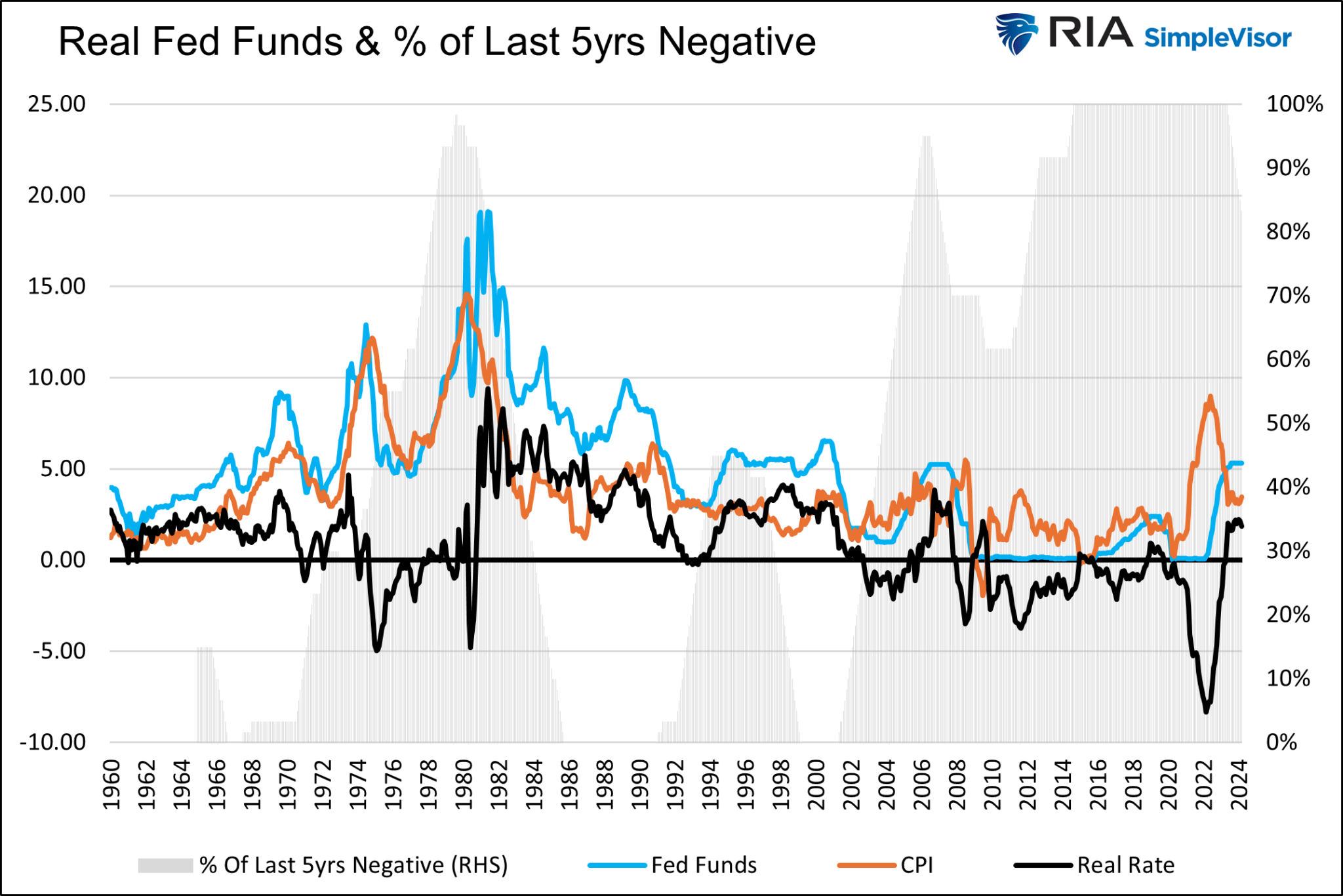
In 2008, Ben Bernanke said QE was a temporary measure that would be reversed once the economy and markets returned to normal. Trillions worth of Treasury purchases later, and the Fed now tells us it’s permanent. Consider the following graph and paragraph by the New York Fed.
“Under the two purely illustrative scenarios, the size of the SOMA portfolio continues to decline to $6.5 trillion and $6.0 trillion, respectively. The portfolio size then remains steady for roughly one year before increasing to keep pace with growth of demand for Federal Reserve liabilities, reaching $9.2 trillion and $8.4 trillion, respectively, by the end of the forecast horizon in 2033.”
The SOMA portfolio is the Fed’s System Open Market Account Holdings. This is the portfolio that holds bonds purchased via QE as well as its other monetary operations.
The graph on the left shows that the Fed expects the SOMA account to rise by about 40% starting in later 2024 through 2032. More importantly, the graph on the right shows that its increase will be commensurate with GDP. In other words, the Fed will continue to help fund the deficit by buying Treasury debt.
Monetary Policy
We know how QE and lower interest rates cut interest expenses, allowing the government to spend recklessly. However, there are other ways the Fed can supplement their efforts if needed. For instance, in our daily Market Commentary from April 24th, we shared the following:
If enacted, the new bank rules would force all banks to “preposition billions more in collateral” at the Fed to support future discount window borrowing. The article estimates that the Fed would require collateral matching up to 40% of a bank’s uninsured deposits, accounting for about 45% of the $17.5 trillion commercial bank deposits. Further, the new rules would require the banks to borrow from the window numerous times a year to help remove the program’s stigma.
In addition to bolstering the banking safety net, it would also force banks to hold significant collateral balances at the Fed. Collateral for Fed loans is quite often U.S. Treasury securities. Accordingly, this new bank rule is another way to help the Treasury fund its massive deficits and stock of outstanding debt from years past.
Rumor has it that the regulators could eliminate leverage requirements for the GSIBs. Doing so would infinitely expand their capacity to own Treasury securities. That may sound like a perfect solution, but there are two problems: the banks must be able to fund the Treasury assets and avoid losing money on them.
The bank bailout BTFP enacted in March 2023 addresses the problems. As we wrote:
In a new scheme, bank regulators could eliminate the need for GSIBs to hold capital against Treasury securities while the Fed reenacts some version of BTFP. Under such a regime, the banks could buy Treasury notes and fund them via the BTFP. If the borrowing rate is less than the bond yield, they make money and, therefore, should be very willing to participate, as there is potentially no downside.
Summary
With the Fed willingly helping the government fund her debts, we believe the odds are small that any significant deficit reduction is possible. While the path is unsustainable, it is likely much longer than most pundits appreciate.
However, fiscal dominance comes with a significant cost. The Fed fuels the widening wealth gap by manipulating interest rates and indirectly influencing the stock market. As we have seen glimpses over the last five years, social unrest will likely become more prevalent. With that comes poor economic confidence from consumers and businesses, which in turn generates a headwind to the economy.
It’s not too late to try and fix our fiscal problems, but time is ticking. As the saying goes, Rule #1 of holes: when you are in one, the first thing to do is stop digging.
The Market Is Very Extended But It Can Stay That Way
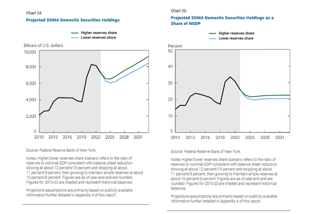
A reader asked us how concerned we are about the market’s extension from crucial moving averages. The short answer is we are. But that doesn’t mean we are moving our equity holdings to cash. We continue to hold our equity positions for two reasons but we remain vigilant.
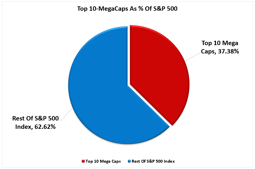
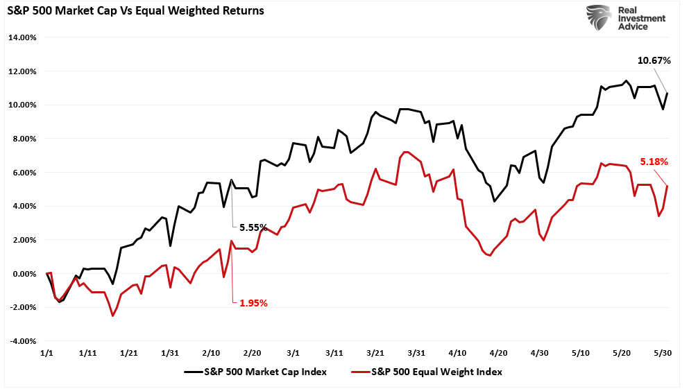
First, the S&P 500 is doing great, but only because of a small handful of the largest-cap stocks. This imbalance is getting extreme. However, the condition doesn’t require a sharp downturn to correct itself. Simply, the other 480 or so stocks that have been underperforming can outperform without the market declining.
Secondly, similar historical deviations from important moving averages offer no conclusive evidence of an imminent downturn. The graph on the left shows the S&P 500 and its 200dma. The green line is the percentage market deviation from the 200dma. As the dotted line shows, the current instance is somewhat extreme but can remain so for a while. The scatter plot on the right compares the standard deviation of the market divergence from the 200 DMA with forward 100-day returns. The yellow bar is where the market currently is. Again, based on prior instances, an impending downturn is not a foregone conclusion. Furthermore, the R2 shows there is no correlation between the two factors.
The bottom line: watch for technical signs the market is breaking down but appreciate this current condition can continue.
What To Watch Today
Earnings
Economy
Market Trading Update
FOMC Minutes
Last Wednesday, after the market closed early for the July 4th holiday, the Fed released its minutes from the mid-June meeting. The minutes were generally dovish. In particular, the Fed seems to be getting more comfortable with continued disinflation. Per the minutes:
“Participants highlighted a variety of factors that were likely to help contribute to continued disinflation in the period ahead. The factors included continued easing of demand–supply pressures in product and labor markets, lagged effects on wages and prices of past monetary policy tightening, the delayed response of measured shelter prices to rental market developments, or the prospect of additional supply-side improvements. The latter prospect included the possibility of a boost to productivity associated with businesses’ deployment of artificial intelligence–related technology.”
Nevertheless, participants suggested that a number of developments in the product and labor markets supported their judgment that price pressures were diminishing. In particular, a few participants emphasized that nominal wage growth, though still above rates consistent with price stability, had declined, notably in labor-intensive sectors. A few participants also noted reports that various retailers had cut prices and offered discounts. Participants further indicated that business contacts reported that their pricing power had declined. Participants suggested that evidence of firms’ reduced pricing power reflected increased customer resistance to price increases, slower growth in economic activity, and a reassessment by businesses of prospective economic conditions.
Their disinflationary views are supported by their opinions on the labor market, which they believe has primarily normalized.
Several participants also suggested that the establishment survey may have overstated actual job gains. Several participants remarked that a variety of indicators, including wage gains for job switchers, suggested that nominal wage growth was slowing, consistent with easing labor market pressures. A number of participants noted that, although the labor market remained strong, the ratio of vacancies to unemployment had returned to pre-pandemic levels and there was some risk that further cooling in labor market conditions could be associated with an increased pace of layoffs. Some participants observed that, with the risks to the Committee’s dual-mandate goals having now come into better balance, labor market conditions would need careful monitoring.
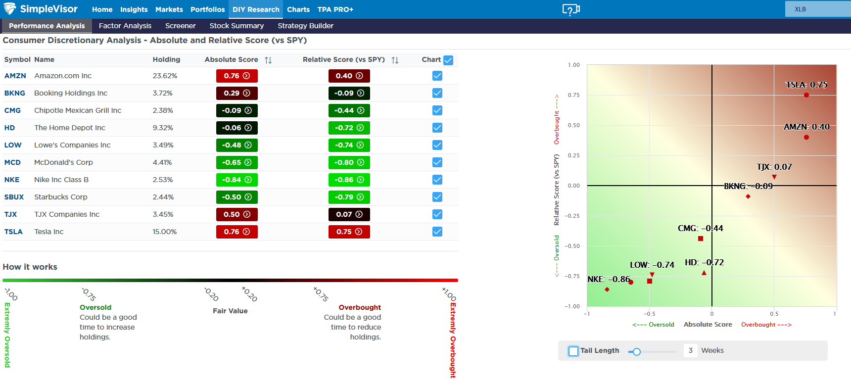
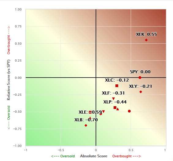
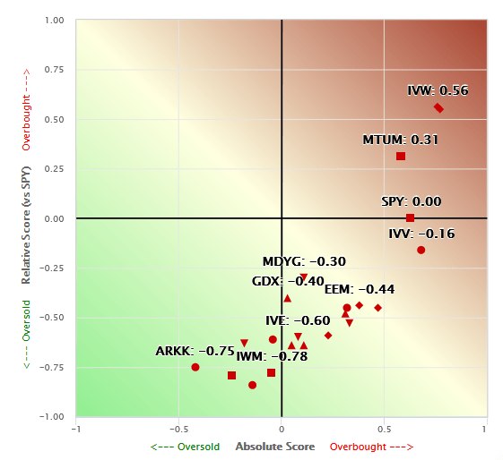
Tesla Powers Consumer Discretionary Stocks
Last week, Tesla was up over 25%, leading the market higher and contributing to the gross outperformance of the consumer discretionary sector (XLY). Tesla accounts for roughly 2% of the S&P 500. Thus, last week’s gain contributed to over a third of the market’s 1.4% increase. Tesla also contributes about 30% to XLY. XLY was up about 3% last week. Tesla added over 6%; therefore, the sector would have been down by approximately 3% without Tesla.
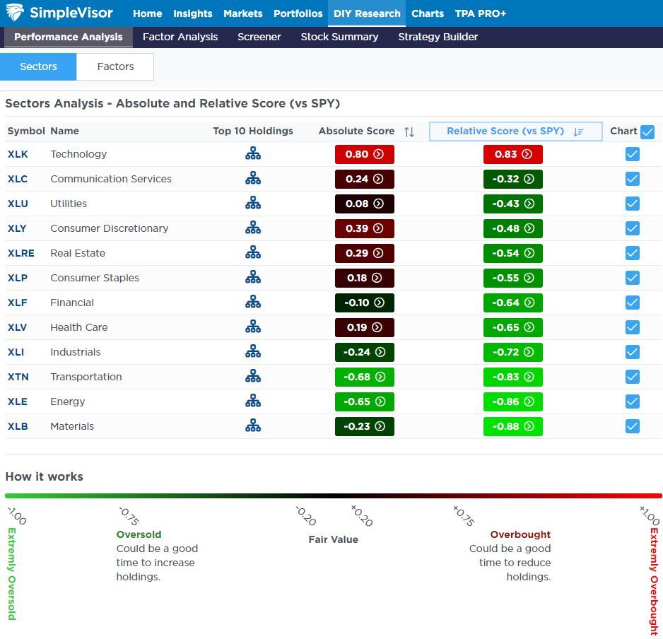
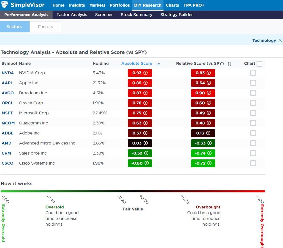
Tesla and Amazon are overbought compared to the market, while most consumer discretionary stocks are grossly oversold (bright green). The first graphic below, courtesy of SimpleVisor, shows that most discretionary stocks are grossly oversold. This is another example of the extreme performance bifurcation we are witnessing. The five-day heat map also shows the massive performance divergence. Note how many of the largest stocks by market cap had great five-day performances. However, the large majority of stocks were lower on the week.
If you found this blog useful, please send it to someone else, share it on social media, or contact us to set up a meeting.
Private Equity – Why Am I So Lucky?
Lately, I have been getting many questions about investing in private equity. Such is common during raging bull markets, as individuals seek higher rates of return than the market generates. Also, during these periods, Wall Street tends to bring new companies to market to fill the demand of the investing public. Private equity is always alluring, as is the tale of someone who bought the company’s shares when it was private and made a massive fortune when it went public.
Who wouldn’t want a piece of that?
The private equity (PE) business is huge. When I say huge, I mean $4.4 Trillion huge.
Those PE companies have been extremely busy over the last several years. While there has been a surge in private equity startups, there has also been the privatizing of public companies. The Atlantic shared some data about the dwindling number of publicly traded stocks along with the corresponding growth in private equity investments:
The publicly traded company is disappearing. In 1996, about 8,000 firms were listed in the U.S. stock market. Since then, the national economy has grown by nearly $20 trillion. The population has increased by 70 million people. And yet, today, the number of American public companies stands at fewer than 4,000. How can that be?
One answer is that the private-equity industry is devouring them.
In 2000, private-equity firms managed about 4 percent of total U.S. corporate equity. By 2021, that number was closer to 20 percent. In other words, private equity has been growing nearly five times faster than the U.S. economy as a whole.
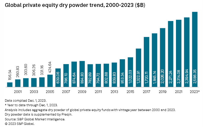
PE firms managed less than $1 billion in the mid-1970s. Today, it’s more than $4 trillion. There is more than $2.5 trillion in dry powder alone globally:
However, that “dry powder” is problematic for PE companies as they must invest it or return it to the investors. Therefore, the demand for deals often means that the deals getting funding may not be the “best” deals.
That is a substantial risk we will discuss in more detail momentarily.
Is Private Equity Right For You?
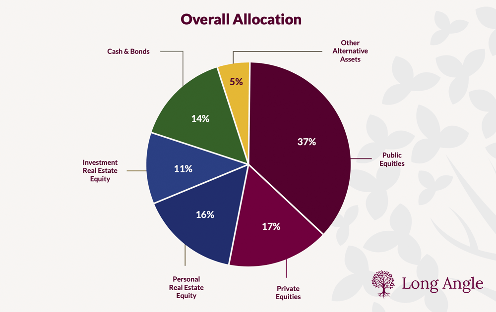
Many individuals hear tales of how high-net-worth individuals (the smart money) own private equity in their allocations. As shown in the chart below from Long Angle, roughly 17% of their allocations are to private equities. These reports don’t generally tell you that their allocation to “private equity” often tends to be their personal businesses. Nonetheless, individual investors frequently see this type of analysis and think they should be replicating that process. But should they?
There are significant differences to consider between the vast majority of retail investors and high-net-worth individuals before investing in private equity. The underlying risks of private equity investments can define these differences. There are many risks, but I want to focus on three.
Liquidity Risk
Duration
Loss Absorption
Liquidity Risk: Many individuals don’t realize when entering into private equity investments that they cannot liquidate them if capital is needed for another reason. While investors often enter into private equity with the anticipation of making outsized returns, they frequently leave themselves vulnerable to the impact of having capital tied up in an illiquid investment. When the eventual crisis happens, the illiquid status of private equity becomes problematic.
Duration Risk: The duration of private equity can often be much longer duration than initially estimated. When a private equity deal is pitched to an individual, it is always accompanied by the most optimistic projections. The projections always include optimistic exit assumptions where the individual will receive an enormous windfall. More often than not, the projections fall very short of reality. A market downturn, economic recession, or a change in underlying industries, interest rates, or inflation can turn an initial 3-year investment into a decade or more. That duration risk multiplies the liquidity risk of keeping capital tied up for much longer than anticipated, sometimes with little or no return. While high-net-worth individuals can absorb both the duration and liquidity issues, most individual investors can not.
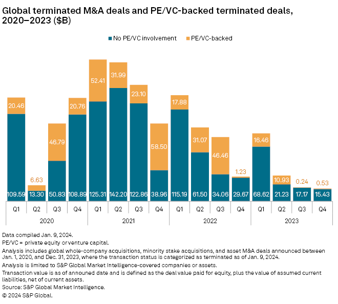
Loss Risk: Lastly, high-net-worth individuals can absorb losses. Many private equity deals inevitably fail, leaving investors with enormous losses on their balance sheets. While high-net-worth investors can invest in numerous deals, the hope is that a successful private equity venture will offset the losses of one or more that failed. Individuals often do not have the capital for that kind of diversification, and a loss on a private equity investment can be very detrimental. The chart below from S&P Global shows the number of private transactions terminated between 2020-2023.
To that point, you should realize that most private equity investments (65%) either fail or return the initial investment at best.
Yes, private equity can be very lucrative. Depending on the deal you invest in, it can also be very harmful. This brings us to the most important question to ask: “Why am I so lucky?”
Why Am I So Lucky?
If you are approached by someone pitching a “private investment,” the first question you should ask is, “Why am I so lucky to be given this opportunity?”
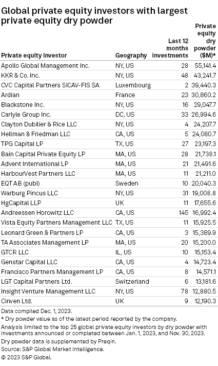
As noted above, the global PE dry powder has soared to an unprecedented $2.59 trillion in 2023 as a slow year in dealmaking closes with limited opportunities for firms to deploy capital raised in previous years. The dry powder total as of Dec. 1st represented close to an 8% increase over December 2022, according to S&P Global Market Intelligence and Preqin data.
That capital is held by some of the largest PE companies in the world. The list below is just a view of the names that you will likely recognize.
Importantly, as noted, these firms must deploy that “dry powder,” or they will eventually lose it. As such, they have armies of employees to scout for the best opportunities, analysts, legal and accounting professionals to analyze those deals, and immediate capital to fund them.
Therefore, as an individual, several questions need to be thoroughly answered.
If this private equity investment is such a good opportunity, then:
Why did the company not approach one of the major P/E firms with capital ready to invest?
If they did and were turned down, why?
How many private equity investors did the company approach before you contacted me?
What is the track record of this salesman’s previous investments in private equity, if any?
Can you analyze the many investment risks associated with illiquid investments?
Yes, some private equity transactions are too small for a major private equity company like Black Rock, which must invest billions at once. However, many mid-tier private equity companies will take those types of deals.
Most importantly, for you to “exit” the investment and realize the windfall, does the person selling you the investment have the network of investment banks, market makers, and institutions to provide that exit? Finding a future buyer or taking a company from private to public can be exceedingly difficult without that network.
These are just some things to consider before committing your hard-earned capital to a risky, highly illiquid investment.
Does this mean that you should never make a private equity investment? Of course not. However, you must understand the risk of investing and the potential ramifications on your financial situation when something goes wrong.
So, “Why am I so lucky?”
July 31 Is Back On The Markets Calendar With Fridays Jobs Report
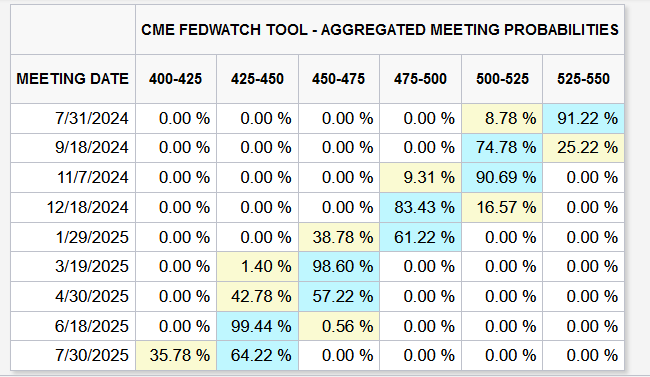
A year ago, the Fed Funds futures market thought the Fed would have cut rates two to three times before the July 31, 2024 FOMC meeting. Two weeks ago, the odds of a rate cut at the July 31 meeting were near zero. Furthermore, the market was only pricing in one cut for the remainder of the year. With Friday’s jobs report, a fragile ISM report detailed below, and renewed signs that the disinflation trend may be resuming, the prospect of a July 31 rate cut back into focus.
On Friday, the BLS reported the economy gained 206k jobs. The growth was slightly better than expected; however, the unemployment rate rose from 4.0% to 4.1%. Further, the April and May jobs figures were revised lower by 111k in aggregate. Like the prior few employment reports, this report was good from a headline perspective, but a look beneath the hood is troubling.
So, with the unemployment rate ticking up, might the Fed cut rates as soon as July if this week’s inflation data is weak? While the odds remain low, we will watch Jerome Powell’s speeches on Tuesday and Wednesday for clues. This weekend’s Newsletter discusses why the thought of a Fed cut in July is not unthinkable. Per the article, “We don’t think so, but the data is becoming more supportive of action. However, if the Fed cuts rates in July, it is likely a good signal that we will need to become less aggressive on equity allocations.“
What To Watch Today
Earnings
There are no significant reports today.
Economy
There are no significant reports today.
Market Trading Update
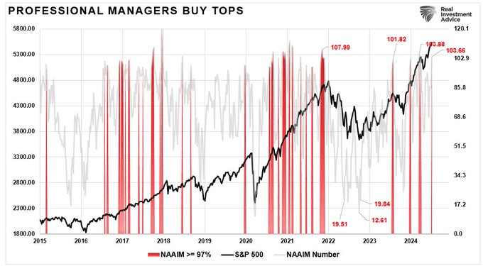
The market continues in a very bullish trend, with investors increasingly confident that they will receive higher returns. That infectious greed has also spilled over onto professionals, with their equity exposure exceeding 100%. While such is a warning sign, it does not necessarily mean the markets will have a deep correction. However, such positioning extremes have previously marked short-term tops and consolidations.
Furthermore, the market’s deviation from the underlying 200-DMA is also starting to reach levels that have previously preceded short-term market corrections or consolidations. As is always the case, for an “average” to exist, the market must trade above and below that average over time. Therefore, the more extreme the deviation from that average, the stronger the pull for a reversion.
These are warning signs that the market needs a short-term correction or consolidation to alleviate those conditions. Such a process would be healthy for a continued bullish advance. However, it doesn’t mean it will happen today or this month. As is always the case, timing is the critical part.
Trade accordingly.
The Week Ahead
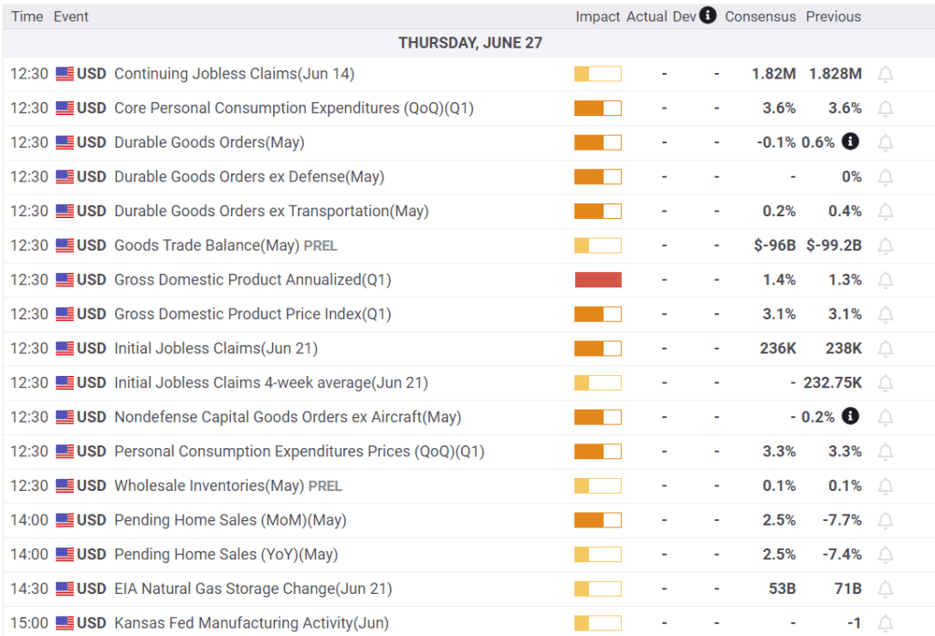
This week will be highlighted by CPI on Thursday, PPI on Friday, two Jerome Powell appearances, and the start of earnings reporting season.
If the Fed is going to cut rates on July 31, it will likely require a lower-than-expected CPI number. The market expects CPI to rise by 0.1% and Core CPI by 0.2%. After declining by 0.2% last month, PPI is expected to increase by 0.2%. Jerome Powell speaks on Tuesday and Wednesday. He will likely have the inflation reports before the speeches.
Earnings season kicks off this week, with the large banks reporting earnings on Friday. The following week, a broader array of company earnings reports will be released.
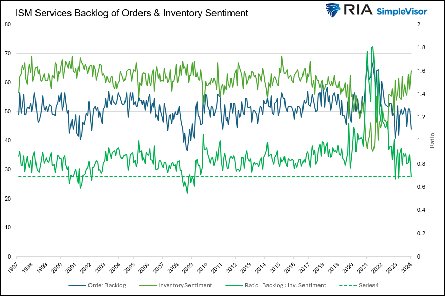
ISM Services Was Much Weaker Than Expected
For the first time since 2009, excluding April and May of 2020, the ISM services index (blue- -lower graph) is in economic contraction territory. Wednesday’s reading of 48.8 was well below estimates of 52.7 and the prior reading of 53.8. Within the index, the prices paid index was weaker than expectations although still above 50, pointing to higher prices. That said, the manufacturing and services ISM are seeing their price indexes resume lower trends. Of the most concern is the employment index. It came in at 46.1, well below the estimate of 49.5. Such further affirms that the BLS headline job growth figures may be overstating the actual state of the labor markets. This is not lost on the Fed as they have acknowledged such.
New orders, a good leading indicator of activity, were also well below expectations at 47.3 versus an expected 53.6. The first graph below shows a robust leading economic indicator for the service sector. The ratio of order backlogs to inventory sentiment is in recessionary territory. Furthermore, within the report is the following quote:
The percentage of ISM Services respondents expecting higher new orders is at its lowest since the GFC and lower than ’01 recession
If you found this blog useful, please send it to someone else, share it on social media, or contact us to set up a meeting.
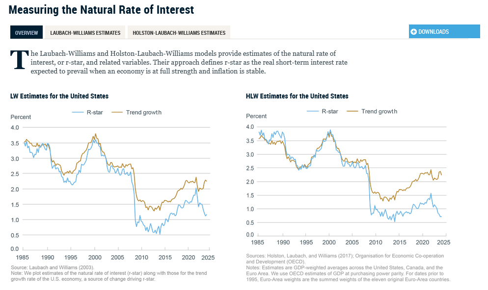
R Star: A Culprit Behind Higher Interest Rates
As we shared on Monday, The Fed Funds Rate Is Too High. The biggest reason is the Fed fears another round of inflation. Therefore, they try to ensure it doesn’t happen via tight money policy. Second, federal deficits have been larger than average, causing a jump in Treasury debt issuance. This is primarily the function of an extra $500 billion a year in interest expenses due to higher interest rates. However, significant deficit spending certainly does not help the cause. Lastly, there is R Star, an explanation many may not have heard of.
R Star is the real neutral rate of interest that balances the economy. Unfortunately, there is no way to calculate an economy’s R Star. Hence, managing interest rates to the figure is a guessing game for the Fed. Some economists and bond investors believe the R Star has increased over the past four years due to the pandemic. Therefore, bond yields should be higher if the natural economic growth rate is higher.
On Wednesday, New York Fed President Williams debunks the idea of a higher R Star. He states:
“Although the value of R Star is always highly uncertain, the case for a sizable increase in R-Star has yet to meet two important tests.”
The first is the “interconnectedness” of R Star across countries. There is no evidence that it is rising in Europe or other developed nations. Actually, it is likely declining in Europe, the UK, and China. “Second, any increase in R Star must overcome the forces that have been pushing R Star down for decades.” Have productivity and demographic trends suddenly changed for the better? Again, there is no evidence this is occurring. The two Fed economic models below show that R Star remains on the same trend for the last 40 years.
What To Watch Today
Earnings
No notable earnings reports
Economy
Market Trading Update
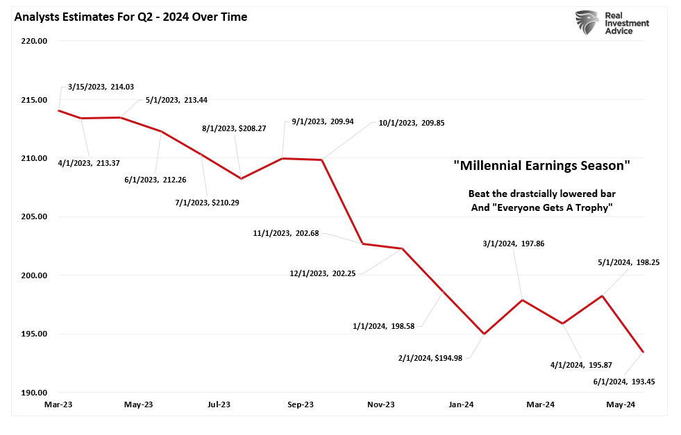
Last week, we noted that we were about to enter Q2 earnings season.
“Speaking of earnings, analysts have been extremely busy over the last 30 days, slashing estimates. In June, Q2 earnings estimates for the S&P 500 index were cut by $5/share to the lowest level yet. Interestingly, while Wall Street continues to boast confidence in rising asset prices, they have cut estimates from $214/share in March last year to just $193/share. Such suggests a dichotomy between expected market performance and the economy, which is where earnings come from.”
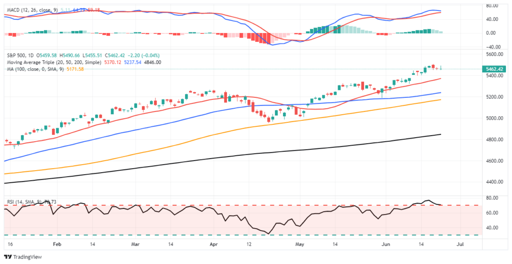
As noted, I am using Wednesday’s closing data for the current analysis before I head out for vacation. First, while markets hit an all-time high, I wouldn’t read much into it. Trading volume was light due to the shortening of the week for the Independence Day holiday week. Secondly, while the market did make a new high, it remains a marginal new high tracking along the 20-DMA, which continues to act as bullish support.
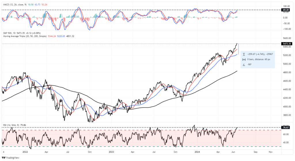
The market remains overbought short-term, but the recent rally is close to flipping the short-term MACD “sell signal.” Such would suggest that while the overbought condition could limit the upside, the market will likely try to climb higher over the next two weeks. Continue to manage portfolio risk accordingly, but the bullish trend remains intact.
As noted, investors remain very optimistic about the market currently. Net bullish sentiment remains elevated, volatility is suppressed, and “bad news remains good news” for now.
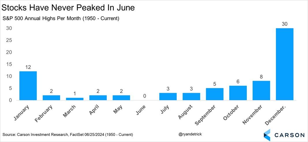
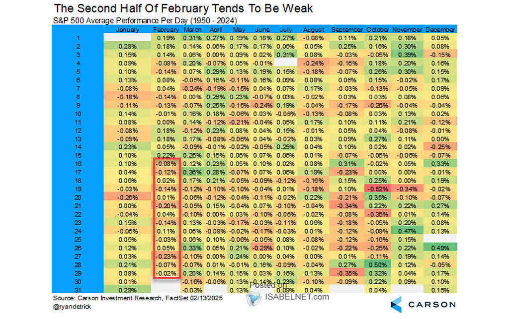
Did Stocks Peak In June?
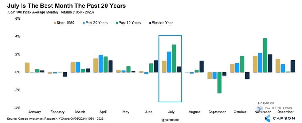
No, at least according to the last 75 years of history. The graph below, courtesy of Ryan Detrick of Carson, shows that the S&P 500 has never peaked for the year in June. However, not surprisingly, the odds of an annual high steadily increase from here.
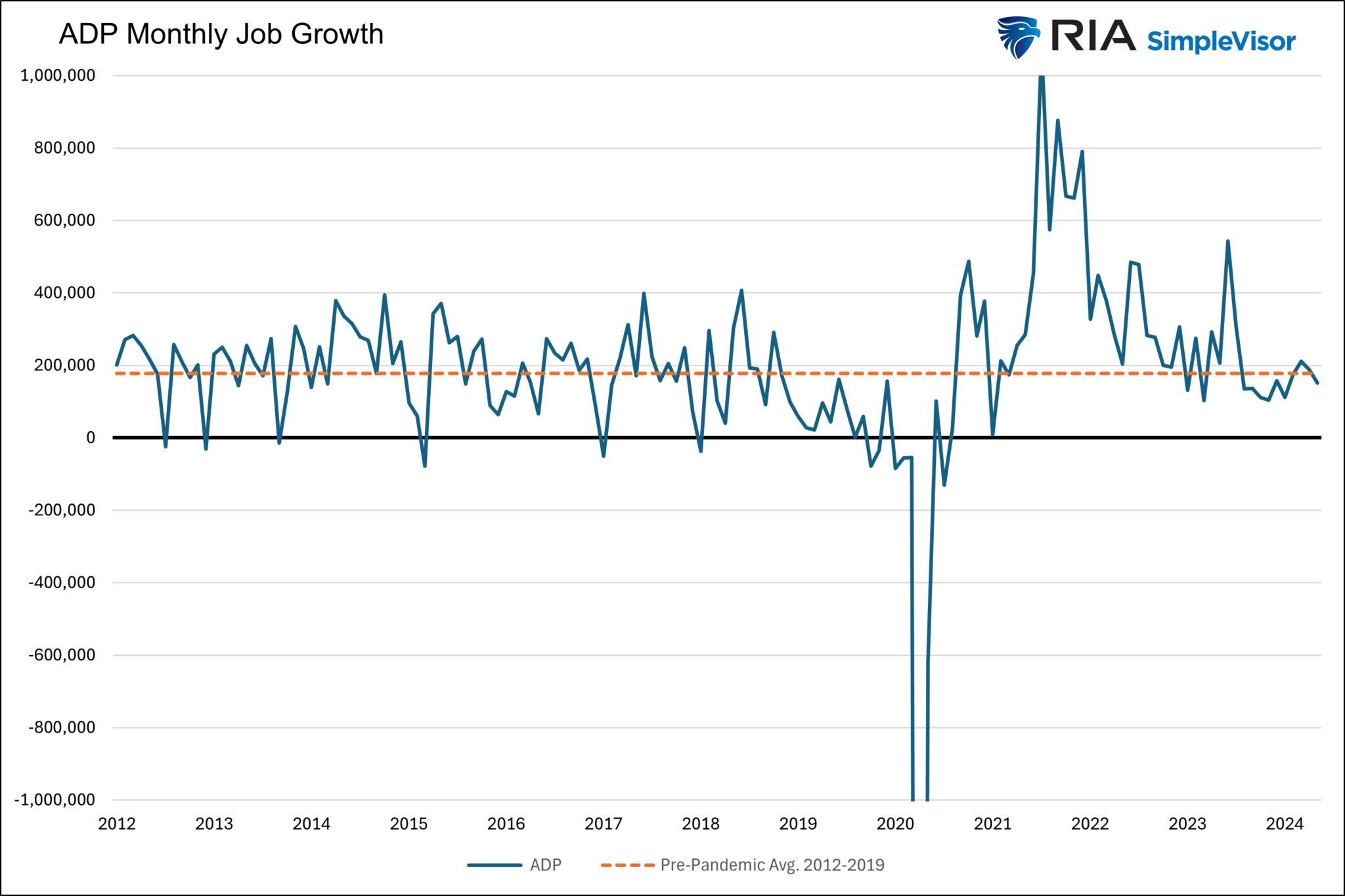
ADP Job Growth
ADP job growth, calculated from actual employment data and not surveys like the BLS, shows that the economy added 150k jobs last month. This is the lowest monthly growth since January. For context, ADP job growth averaged +178k from 2012 through 2019. Over the last twelve months, it has averaged 194k. The current reading (150k) is below both long-term and short-term trends but not overly concerning. That is not to say that the lower trend won’t continue, thus raising concerns in the future.
If you found this blog useful, please send it to someone else, share it on social media, or contact us to set up a meeting.
Petrodollar Panic: Separating Fact From Fiction
Recently, a few media outlets have warned of the imminent demise of the petrodollar agreement, commonly called the petrodollar. With such narratives comes investor anxiety. Consider the following article titles on the topic.
OPEC Will Sever Link With Dollar For Pricing Oil- The New York Times
The Petrodollar Is Dead and that’s a big deal- FX Street
After 50 Years, Death of the Petrodollar Signal End of U.S. Hegemony- The Street Pro
Before jumping to conclusions, let’s discuss what the petrodollar is and isn’t. With that knowledge, we can address concerns about the death of the petrodollar. Furthermore, we can discredit menacing headlines like-Petrodollar Deal Expires; Why This Could Trigger ‘Collapse of Everything.’
Before starting, we need to make a disclaimer. The New York Times article we bullet point above is not recent. We added it to show this is not a new story. The article dated June 1975 starts as follows:
LIBREVILLE, Gabon, June 9 — The oil‐producing nations agreed today to sever the link between oil prices and the dollar and to start quoting prices in Special Drawing Rights, the governor of the Iranian national bank, Mohammed Yeganeh, said.
What Is The Petrodollar?
In 1974, following the economically devastating oil embargo in which the price of crude oil per barrel rose four-fold, sparking a surge in inflation and weakening the economy, the U.S. desperately sought to avoid another embargo at all costs. U.S. politicians theorized that a stronger relationship with Saudi Arabia would go a long way toward achieving its goal.
Fortunately, the Saudis also hoped for a beneficial relationship with the U.S., and they needed a trustworthy investment home for their new oil riches. They also desired better military equipment. At the time, Saudi Arabia was running a huge budget surplus because of its windfall from high oil prices and relatively minor spending needs from within the country.
While there was never a formal petrodollar pact, it is widely believed that the U.S. and Saudi Arabia had a handshake agreement to meet each other’s needs. Saudi Arabia was encouraged to invest its surplus dollars in safe, high-yielding U.S. Treasury securities. In exchange, the U.S. would sell Saudi Arabia military equipment. Both hoped a better relationship would be a productive byproduct. Such is the petrodollar agreement.
The Petrodollar Was Not Really About The Dollar
We think the petrodollar discussions were principally about Saudi Arabia needing a safe home for their surpluses and the U.S. seeking dollars to fund her large fiscal deficits. While the dollar would be the currency for said transactions, it was not likely the focus of the talks.
In dealing with the immense costs of the Vietnam War and ambitious social spending to pacify social unrest, America sought deficit funding. Saudi Arabia needed to invest its surpluses. Given the unprecedented liquidity and safety of the U.S. Treasury market compared to other options, the “agreement” made a lot of sense for both parties. Furthermore, because Saudi oil revenue would be used to buy dollar-based U.S. Treasury bonds, it made sense for Saudi Arabia to require other oil buyers to pay in U.S. dollars.
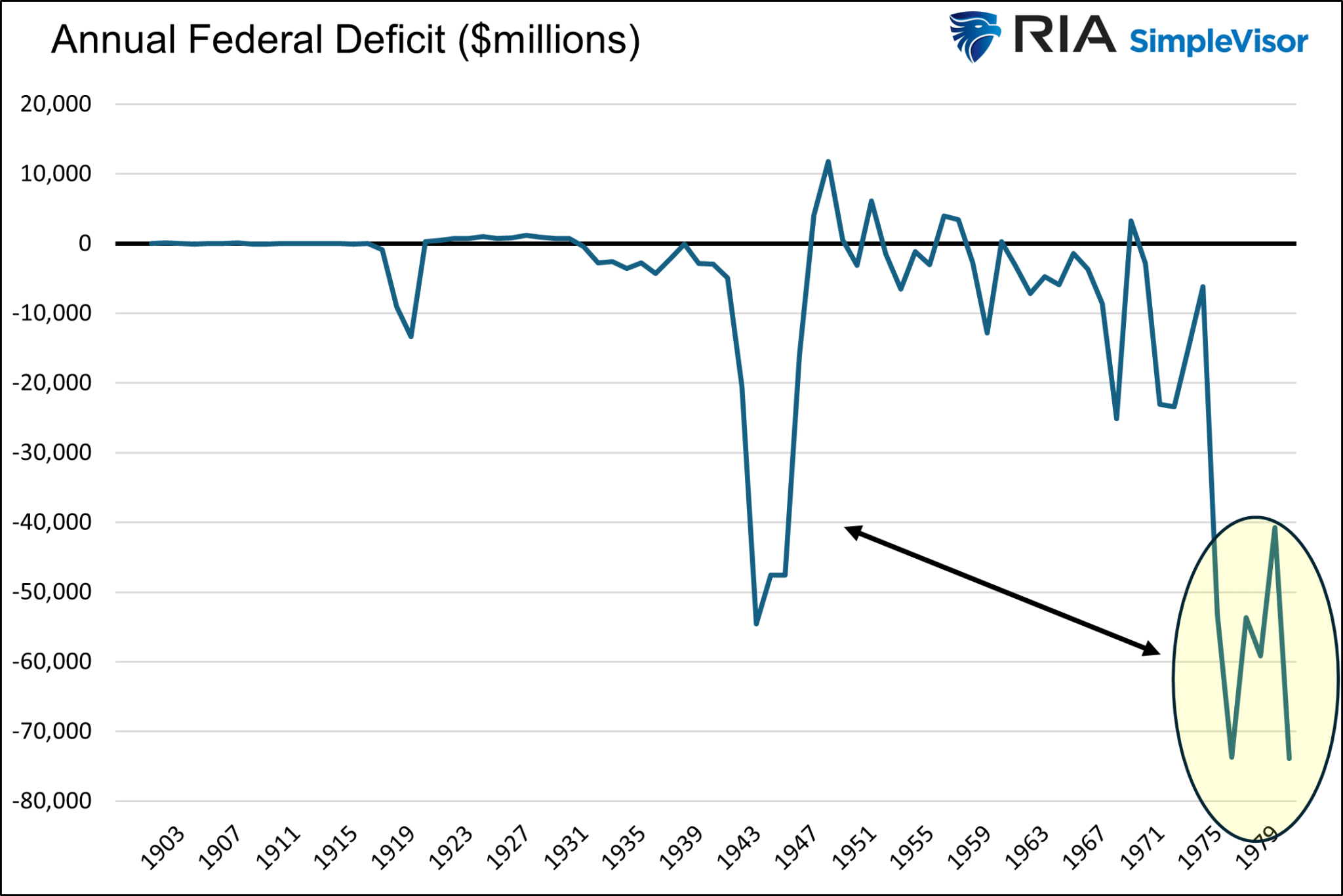
We share two graphs to better appreciate the deteriorating U.S. fiscal position at the time. The first graph below highlights the deficits during the mid-1970s. Today, many would consider a $50—or $60 billion deficit minimal. But then, the deficits incurred were a sharp departure from the norm.
The second graph provides proper context. The nation was experiencing more significant federal deficits in the mid- to late 1970s than it faced during World War II. Given the immense spending on World War II, that fact was stunning to many people at the time.
Saudi Arabia Doesn’t Have Investible Dollars
Today, the situation is different. America still desperately needs funding, but Saudi Arabia doesn’t have budget surpluses to invest. Per a Bloomberg article entitled The Petrodollar Is Dead, Long Live The Petrodollar:
Fast forward to today, and Saudi Arabia doesn’t have a surplus to recycle at all. Instead, the country is borrowing heavily in the sovereign debt market and selling assets, including chunks of its national oil company, to finance its grand economic plans. True, Riyadh still holds significant hard currency reserves, some of them invested in US Treasuries. But it’s not accumulating them anymore. China and Japan have significant more money tied up on the American debt market than the Saudis do.
The Reserves Monopoly
Many believe the U.S. government bullies foreign countries into using the dollar, thus forcing them to have dollar reserves. Such seems logical as the reserves must be invested and can help fund our deficits.
We do not know what our politicians say to other countries behind closed doors. But we presume some “persuasion” presses other countries to use the dollar. Regardless, there are not many options for the dollar.
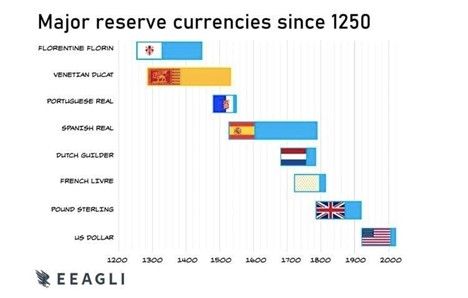
The four reasons, the rule of law, liquid financial markets, and economic and military might, all but guarantee the death of the dollar will not occur anytime soon.
No other country has all four of those traits. China and Russia lack the rule of law and liquid financial markets. Russia also has a small and fragile economy. Europe does not have liquid enough capital markets or military might.
Gold and Bitcoin are often rumored candidates to usurp the dollar. For starters, they do not earn a return on investment. Possibly more problematic, their prices are incredibly volatile. There are many other difficulties precluding them from full-fledged currency status, which we will save for another article.
Summary
Notwithstanding whether there was a formal agreement, the petrodollar is not going anywhere. Even if Saudi Arabia accepts rubles, yuan, pesos, or gold for its oil, it will need to convert those currencies into dollars in almost all instances.
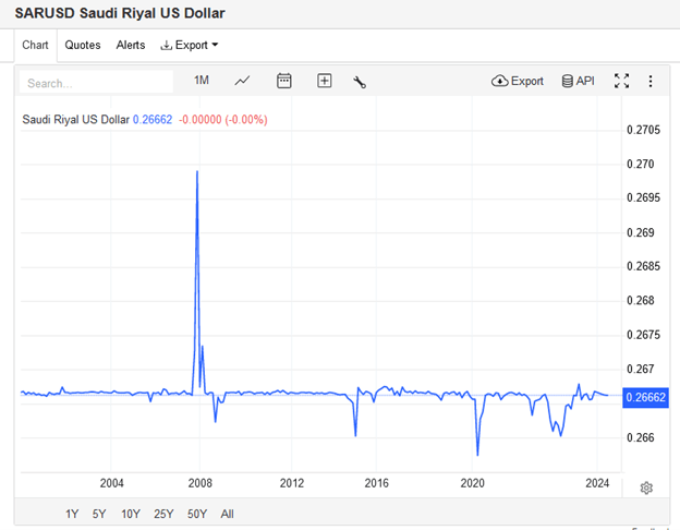
Consider that Saudi Arabia keeps its currency value pegged to the dollar, as shown in the graph below, courtesy of Trading Economics. They also hold approximately $135 billion of U.S. Treasury securities, a three-year high. Does it seem like Saudi Arabia is trying to disassociate from the U.S. dollar and U.S. financial markets?
Stories like those on the petrodollar and others on the “imminent” death of the dollar have been around for decades. Someday they will be right, and the dollar will follow the way of prior global reserve currencies. But for that to happen there needs to be a better alternative, and today, nothing even close exists.
The Economy Is Normalizing – Whats Next?
Tuesday’s JOLTs report is one of many data points showing that the labor market is near or back to the prevailing conditions before the pandemic. It’s not just JOLTs and the labor market normalizing; most other economic indicators show the economy is finally normalizing at pre-pandemic levels.
Yesterday’s Commentary argued that while the unemployment and PCE inflation rates are not far from the Fed’s longer-term projections, the Fed Funds rate is too high, at almost 3% above their extended forecast. Given that divergence, we wrote: “Even if the economy continues to chug along without a recession, it appears that barring higher inflation, significant rate cuts in the coming year will be consistent with the Fed’s economic outlook.”
A reader asked us: “If the economy is normalizing, what comes next?” The oft-used airplane analogy may be the best way to answer. Can the Fed bring the economy back to a typical economic cruising altitude and keep it there? Or might the downward trajectory continue, leading to a soft or hard landing? Given that most other major economies exhibit little economic growth and the Fed is applying tight monetary policy, a new period of higher-than-average growth is the least likely scenario. However, that could change if significant fiscal stimulus follows the election. We are looking for signs that the economy might continue to weaken, thus prompting recession calls. However, the Wall Street consensus is for smooth sailing ahead. Stay tuned!
What To Watch Today
Earnings
Economy
Market Trading Update
In yesterday’s commentary, we discussed the drastic drop in bond ETFs, which sparked many questions. As usual, most things don’t mean anything. Intra-day and daily price movements in anything are usually unrelated to any macro theme and are a function of short-term overbought or oversold conditions.
Such is the case with the market as we begin the year’s second half. Historically, performance tends to be stronger in the first half of the month and weaker in the last half. August and September also tend to be weaker, particularly in election years.
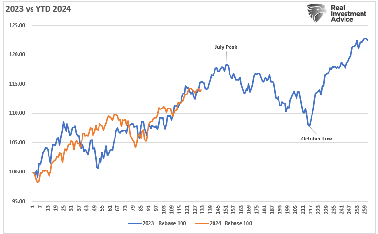
Interestingly, we are now repeating much of what we said this time last year. In 2023, the markets were racing higher, hoping for Fed rate cuts and the “artificial intelligence” craze. At that time, markets were overbought and deviated from their means, but momentum was very strong as volatility remained suppressed. Then, like today, we were warning of the potential for a 5-10% correction to reverse some of those conditions.
As shown, the beginning of this year has been almost a mirror image of last year, with market performance very close. Will the correlation continue, and we see a correction this summer, or will this time be different? I don’t know for certain, but the similarity is eerie, and the risk of correction is elevated in the near term. Trade accordingly.
More On Bad Breadth
The graph below from Ned Davis Research is very telling for two reasons. First, thus far in 2024, the percentage of stocks outperforming the S&P 500 is at a record low, going back about fifty years. This follows a near-record low in 2023. Looking back, there is only one other instance of two consecutive years with such poor market breadth: 1998 and 1999.
While comparing the internet era in the late 1990s to the AI era today may seem appropriate, it’s important to remember the old adage: “Markets can remain irrational longer than you can remain solvent.” The point is that while the market will correct at some point, and yes, AI and other stocks with massive price surges can fall by 30, 40, or even 50% or more, that may not occur for a while.
Accordingly, appreciate the risks and realize a correction is highly likely. However, to better anticipate such an event, close attention must be paid to the market technicals. As they always have, they will alert us when to take a more conservative posture.
Jerome Powell’s Latest Thoughts
Fed Chair Powell spoke on Tuesday morning in Portugal at an ECB forum and shared his latest thoughts on the economy, inflation, and rate cuts. He was generally dovish but didn’t seem overly anxious to cut interest rates. Below, we share a few poignant comments.
Inflation now shows signs of resuming its disinflationary trend.” “We are getting back on a disinflationary path.” “We’ve made a lot of progress.
I’m not going to be landing on any specific dates here today…so we’re aware that we have two-sided risks now, more so than we did a year ago. That’s a big change. I’d say risks are coming much more into balance now
The risk of inflation is that we act too fast
We are well aware of the risk going too soon and too fast
Inflation may get back to 2% late next year or the following year
As shown below, Fed Funds futures now imply an 83% chance the Fed will cut rates twice by year-end. The number of rate cuts has fluctuated between one and two over the previous two months.
If you found this blog useful, please send it to someone else, share it on social media, or contact us to set up a meeting.
The Fed Funds Rate Is Too High
Let’s step back and ignore the last four years in which the economy cratered with the onset of the pandemic and then boomed on massive monetary and fiscal stimulus. Let’s also try to ignore the peak 6% core PCE inflation rate in 2022 and the historically low 3.4% unemployment rate in 2023. What if, in the years preceding the pandemic, we told you that in 2024, the Fed Funds rate would be 5.25-5.50%? You probably would have assumed inflation was at least 5% and the unemployment rate was exceptionally low.
The current unemployment rate is 4%, and the core PCE inflation rate is 2.6%. In December 2019, the unemployment rate was 3.6%, and the core PCE was 1.6%. At the time, Fed Funds were 1.5%. Here we sit today, with the unemployment rate .4% higher and core PCE 1% higher than in 2019. Yet, the Fed Funds rate is 4% more than in 2019. Does it seem a bit high? To help answer the question, consider the Fed’s long-term forecasts.
As we circle below, the Fed thinks the natural long-term unemployment rate is 4.2% and PCE 2.0%. Under such an outlook, the Fed believes Fed Funds should be 2.8%. While it’s hard to make a case for the Fed to cut rates today, a simple look at their two objectives, full employment and stable prices, and its long-term economic projections make one appreciate that the current Fed Funds rate is exceptionally high. Even if the economy continues to chug along without a recession, it appears that barring higher inflation, significant rate cuts in the coming year will be consistent with the Fed’s economic outlook.
What To Watch Today
Earnings
No notable earnings releases today
Economy
Market Trading Update
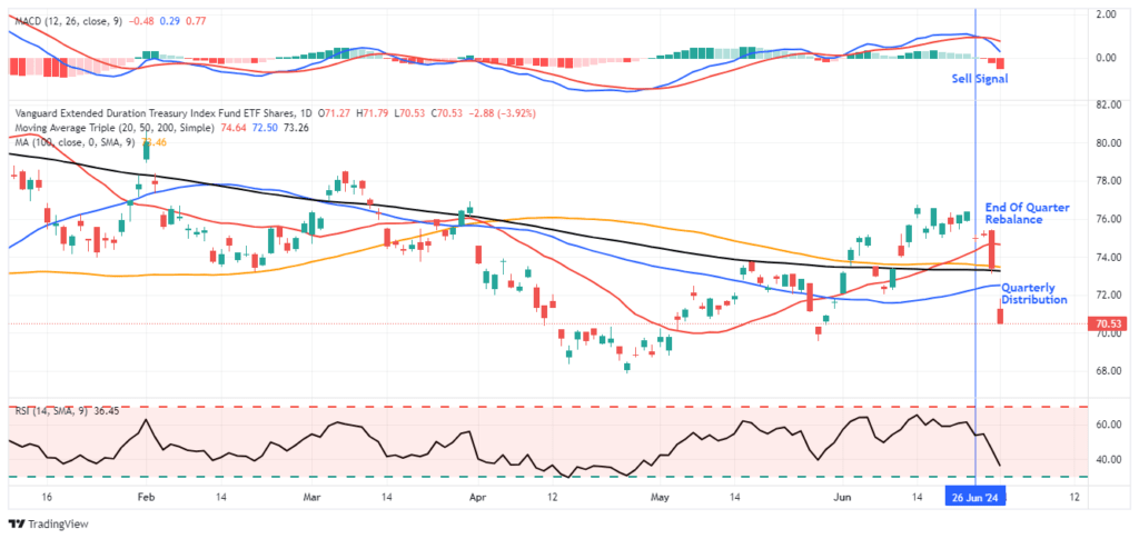
As discussed yesterday, this is the beginning of a new quarter, the end of the first half, and the beginning of the Q2 earnings season. We noted that with this holiday-shortened week, volatility could certainly pick up. Unsurprisingly, I received several emails about the sharp sell-off in long-date Treasury bond ETFs. As shown, bond ETFs had a sharp reversal due to end-of-quarter rebalancing and dividend distributions yesterday, temporarily suppressing the price. However, bonds had enjoyed a very nice rally and were overbought going into quarter-end, so the sell-off is unsurprising
The economic data continues to show economic deterioration, which is bond-supportive, so the recent selloff in bond ETFs is likely presenting a good buying opportunity for traders. The last time bonds approached this level of oversold conditions was in April and May before a decent rally occurred.
Economic Surprise Index
We have read articles warning of an imminent recession due to the low economic surprise index. While we rule nothing out, it’s best to appreciate what the index tells us. Surprise indexes measure specific economic data forecasts versus the actual data. When the surprise index declines, it simply means that economic forecasters are generally overly optimistic. Hence, economic data is weaker than expected. Initially, that typically means the economy is slowing. However, economists are quick to adjust their forecasts for trend changes. Once this occurs, data may still deteriorate, but economists’ forecasts tend to be closer to reality or often overly pessimistic. Frequently, the surprise index will rebound. However, that doesnt mean the economy is improving, it only means forecasts are more realistic.
As shown below, the surprise index tends to oscillate. Low readings can precede a recession, but they occur with enough frequency they often prove to be a false alarm.
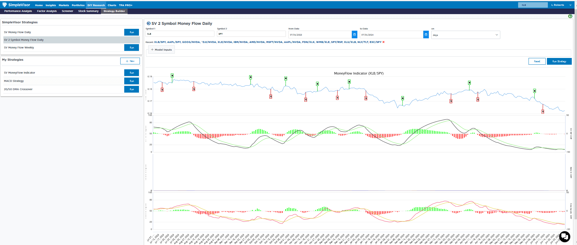
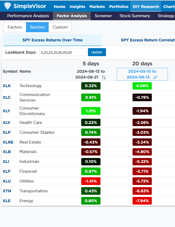
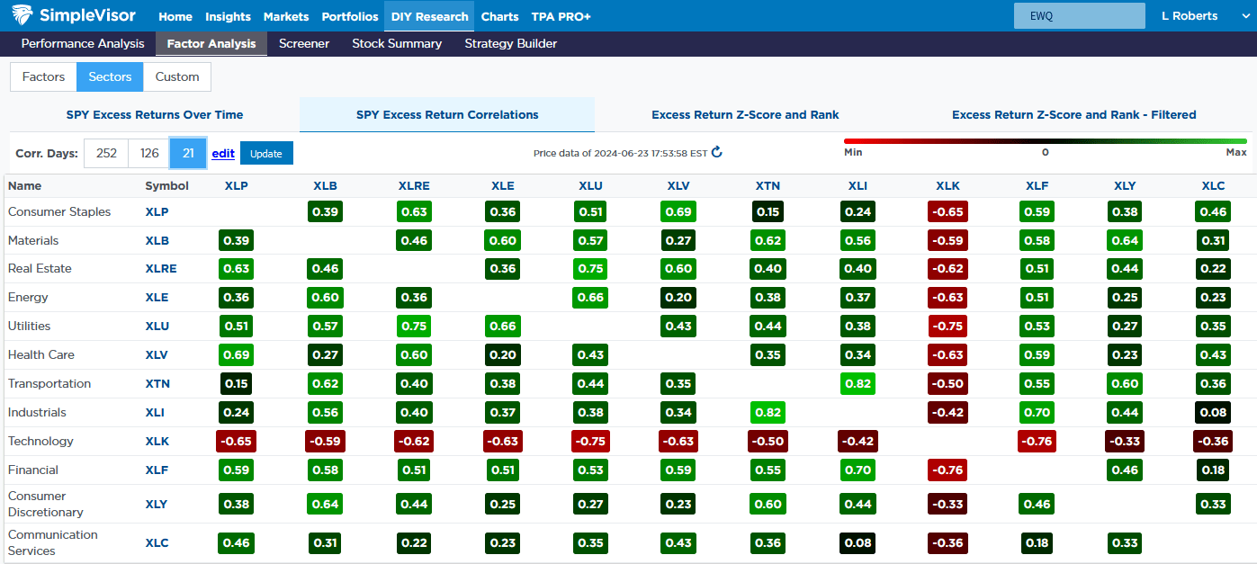
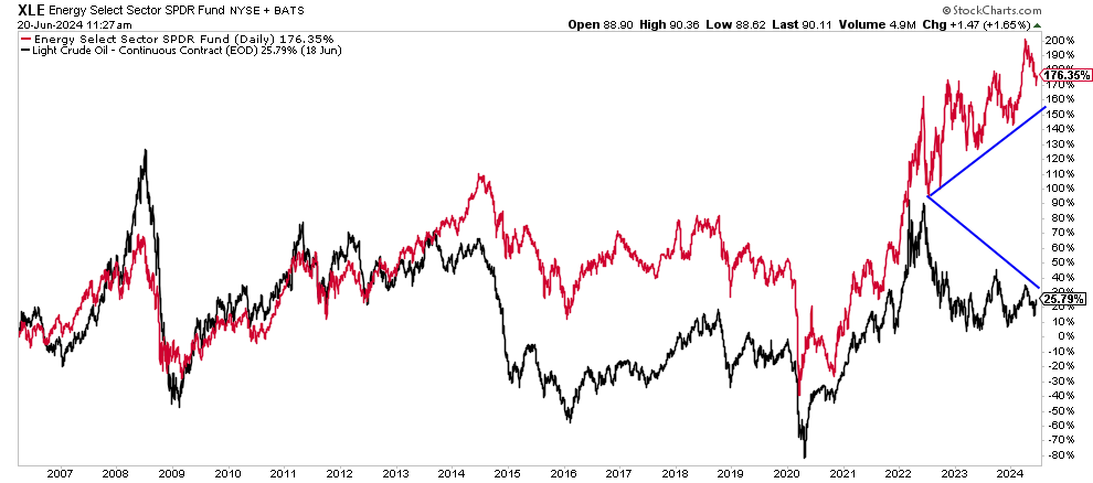
Sector Review- Materials Continue to Struggle
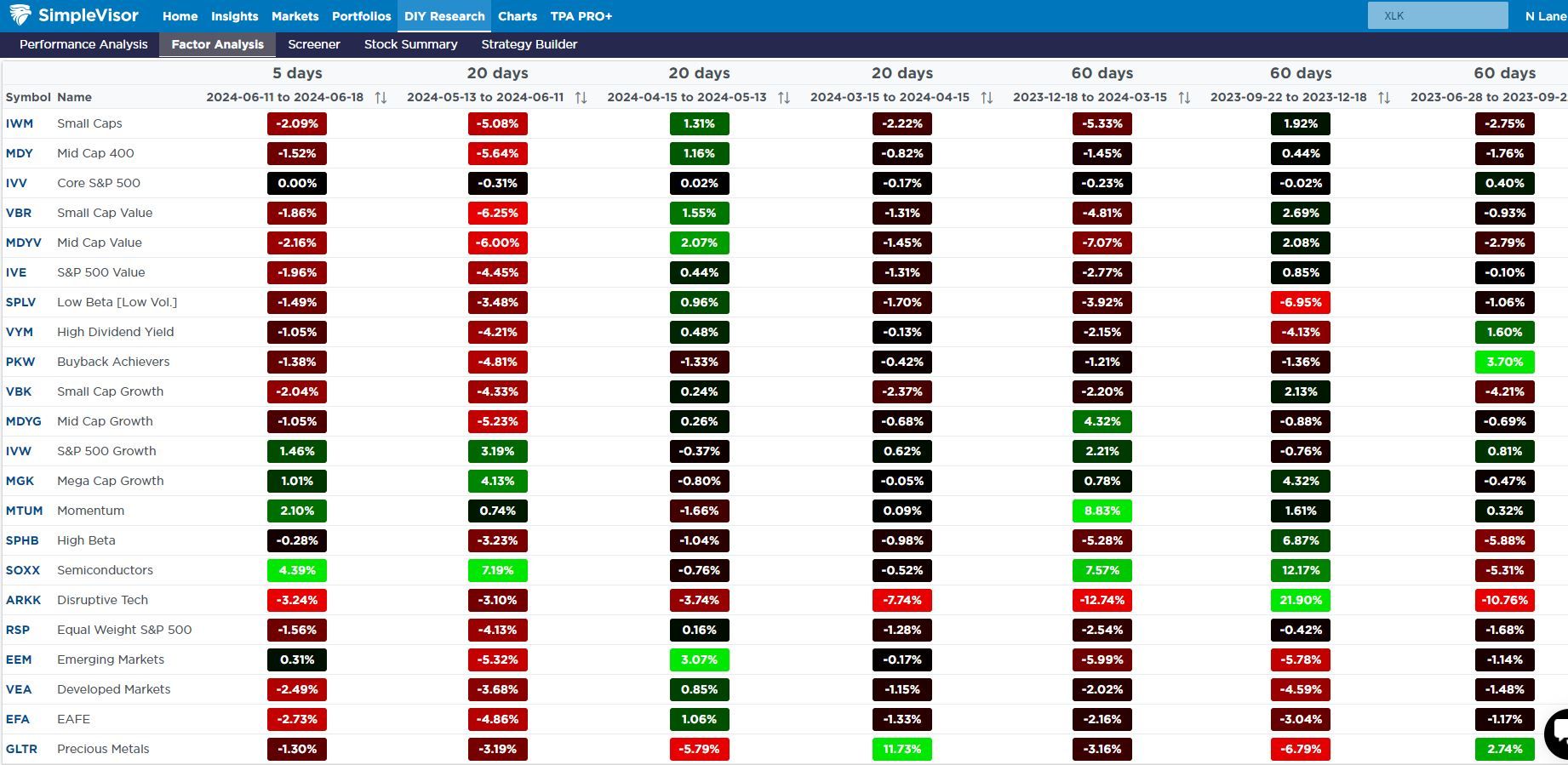
Over the last four weeks, the materials sector (XLB) has slipped by nearly 5% versus the S&P 500. Other than utilities, which are 6.5% worse than the S&P 500, it is the worst-performing sector over that period. Energy, which had the lowest relative SimpleVisor score for a few weeks running, was the market’s best-performing sector last week.
The second table, courtesy of SimpleVisor, shows the performance of each sector over consecutive periods ranging from the last five days to 20 and 60-day increments.
The third graph shows the price ratio of XLB to SPY. Other than XLB’s outperformance in the first quarter of 2024, XLB has been weak on a relative basis.
Some may say that the weakness in materials stocks is a telling signal about the state of the economy. We would counter, claiming that the service sector accounts for three-quarters of economic activity. The manufacturing sector has been in a recession for about two years, yet economic growth has been above average.
If you found this blog useful, please send it to someone else, share it on social media, or contact us to set up a meeting.
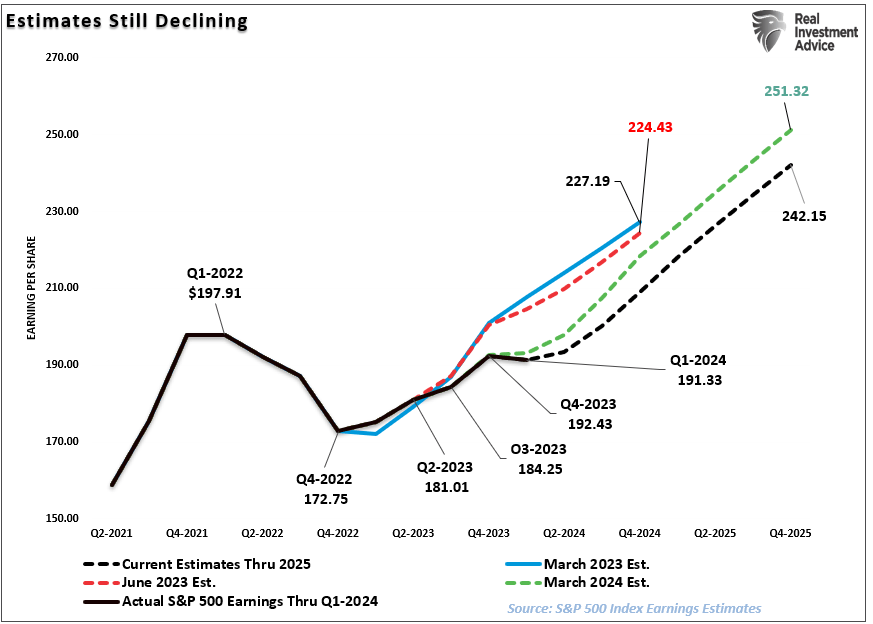
Earnings Bar Lowered As Q2 Reports Begin
Wall Street analysts continue significantly lowering the earnings bar as we enter the Q2 reporting period. Even as analysts lower that earnings bar, stocks have rallied sharply over the last few months.
As we have discussed previously, it will be unsurprising that we will see a high percentage of companies “beat” Wall Street estimates. Of course, the high beat rate is always the case due to the sharp downward revisions in analysts’ estimates as the reporting period begins. The chart below shows the changes for the Q2 earnings period from when analysts provided their first estimates in March 2023. Analysts have slashed estimates over the last 30 days, dropping estimates by roughly $5/share.
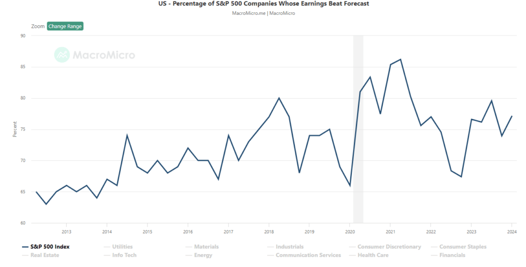
That is why we call it “Millennial Earnings Season.” Wall Street continuously lowers estimates as the reporting period approaches so “everyone gets a trophy.” An easy way to see this is the number of companies beating estimates each quarter, regardless of economic and financial conditions. Since 2000, roughly 70% of companies regularly beat estimates by 5%, but since 2017, that average has risen to approximately 75%. Again, that “beat rate” would be substantially lower if investors held analysts to their original estimates.
Analysts remain optimistic about earnings even with economic growth weakening, inflation remaining elevated, and liquidity declining. However, despite the decline in Q2 earnings estimates, analysts still believe that the first quarter of 2023 marked the bottom for the earnings decline. Again, this is despite the Fed rate hikes and tighter bank lending standards that will act to slow economic growth.
However, between March and June of this year, analysts cut forward expectations for 2025 by roughly $9/share.
However, even with the earnings bar lowered going forward, earnings estimates remain detached from the long-term growth trend.
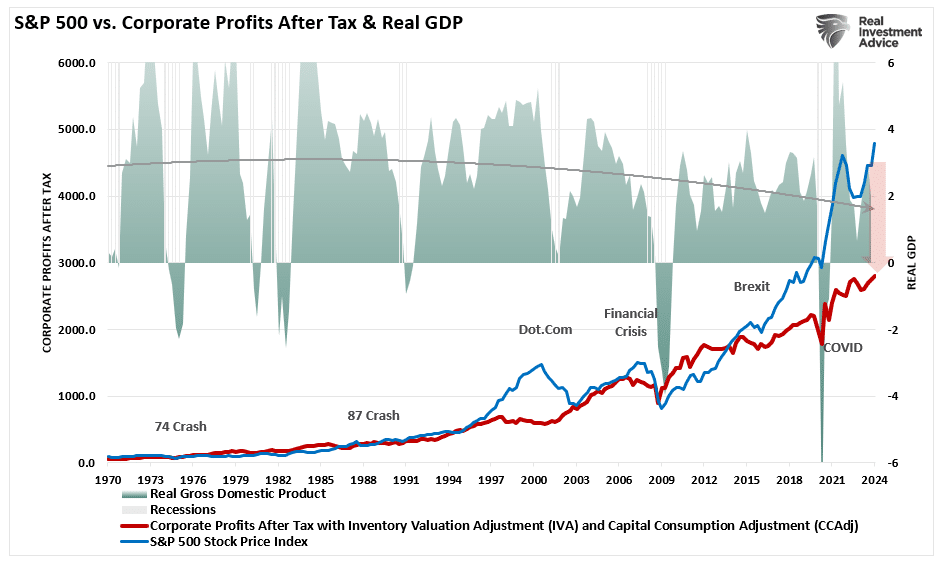
As discussed previously, economic growth, from which companies derive revenue and earnings, must also strongly grow for earnings to grow at such an expected pace.
Since 1947, earnings per share have grown at 7.72%, while the economy has expanded by 6.35% annually. That close relationship in growth rates is logical, given the significant role that consumer spending has in the GDP equation. However, while nominal stock prices have averaged 9.35% (including dividends), reversions to underlying economic growth will eventually occur. Such is because corporate earnings are a function of consumptive spending, corporate investments, imports, and exports. The same goes for corporate profits, where stock prices have significantly deviated.
Such is essential to investors due to the coming impact on “valuations.”
Given current economic assessments from Wall Street to the Federal Reserve, strong growth rates are unlikely. The data also suggest a reversion to the mean is entirely possible.
The Reversion To The Mean
Following the pandemic-driven surge in monetary policy and a shuttering of the economy, the economy is slowly returning to normal. Of course, normal may seem very different compared to the economic activity we have witnessed over the last several years. Numerous factors at play support the idea of weaker economic growth rates and, subsequently, weaker earnings over the next few years.
The economy is returning to a slow growth environment with a risk of recession.
Inflation is falling, meaning less pricing power for corporations.
No artificial stimulus to support demand.
Over the last three years, the pull forward of consumption will now drag on future demand.
“We have previously noted an inherent problem with ongoing monetary interventions. Notably, the fiscal policies implemented post the pandemic-driven economic shutdown created a surge in demand and unprecedented corporate earnings.”
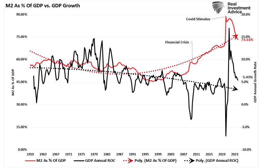
As shown below, the surge in the M2 money supply is over. Without further stimulus, economic growth will revert to more sustainable and lower levels.
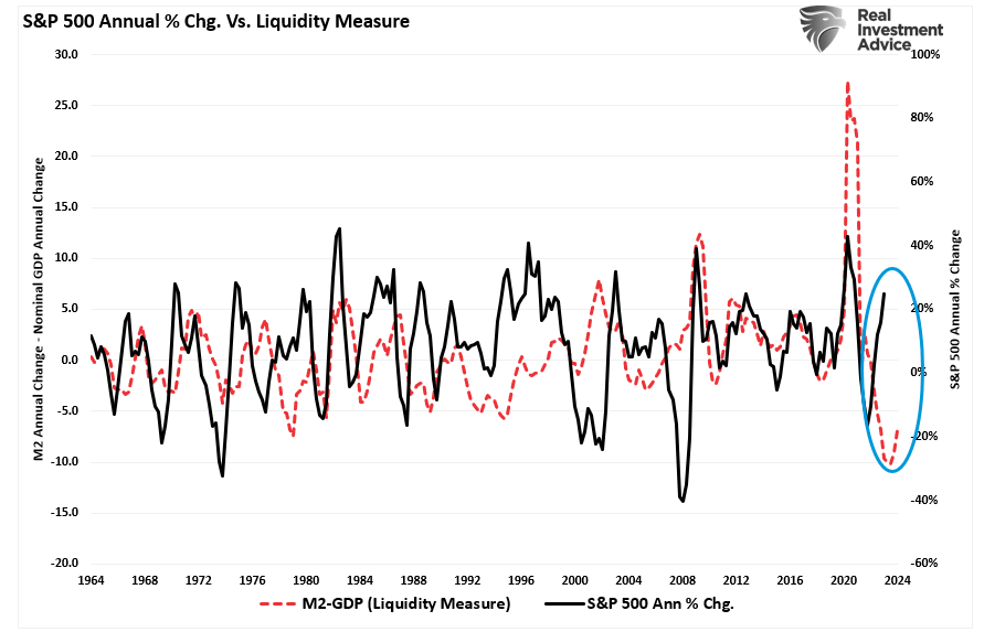
While the media often states that “stocks are not the economy,” as noted, economic activity creates corporate revenues and earnings. As such, stocks can not grow faster than the economy over long periods. A decent correlation exists between the expansion and contraction of M2 less GDP growth (a measure of liquidity excess) and the annual rate of change in the S&P 500 index. Currently, the deviation seems unsustainable. More notably, the current percentage annual change in the S&P 500 is approaching levels that have preceded a reversal of that growth rate.
So, either the annualized rate of return from the S&P 500 will decline due to repricing the market for lower-than-expected earnings growth rates, or the liquidity measure is about to turn sharply higher.
Valuations Remain A Risk
The problem with Wall Street consistently lowering the earnings bar by reducing forward estimates should be obvious. Given that Wall Street touts forward earnings estimates, investors overpay for investments. As should be obvious, overpaying for an investment today leads to lower future returns.
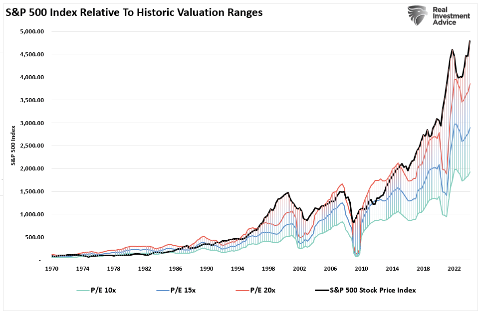
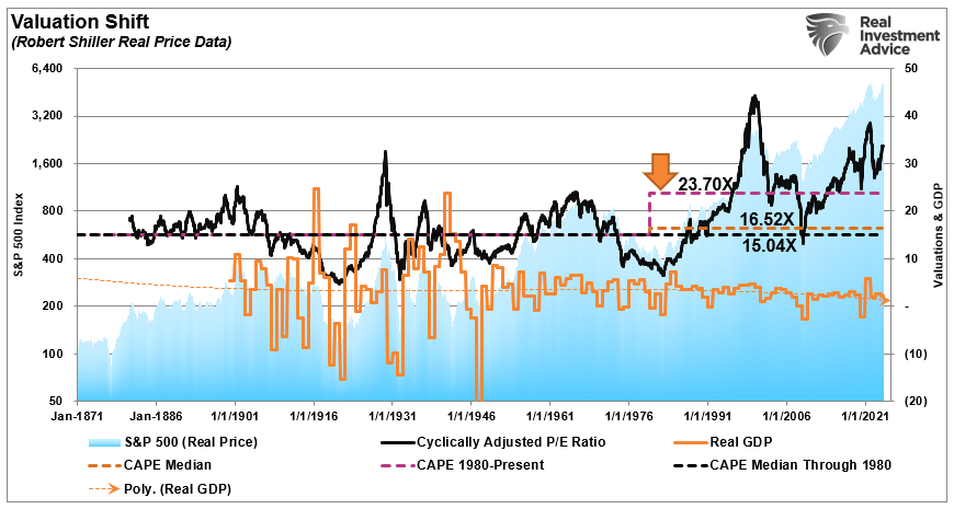
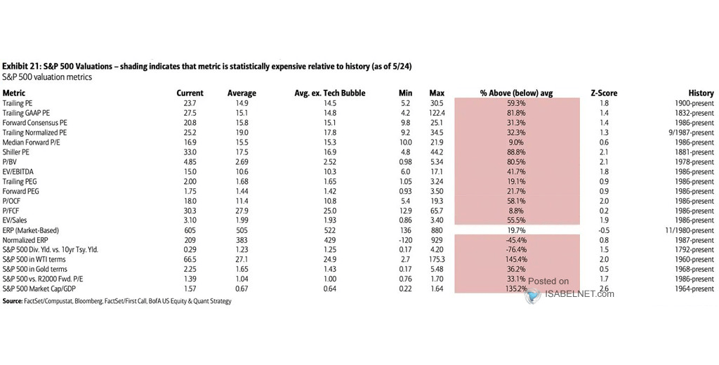
Even with the decline in earnings from the peak, valuations remain historically expensive on both a trailing and forward basis. (Notice the significant divergences in valuations during recessionary periods as adjusted earnings do NOT reflect what is occurring with actual earnings.)
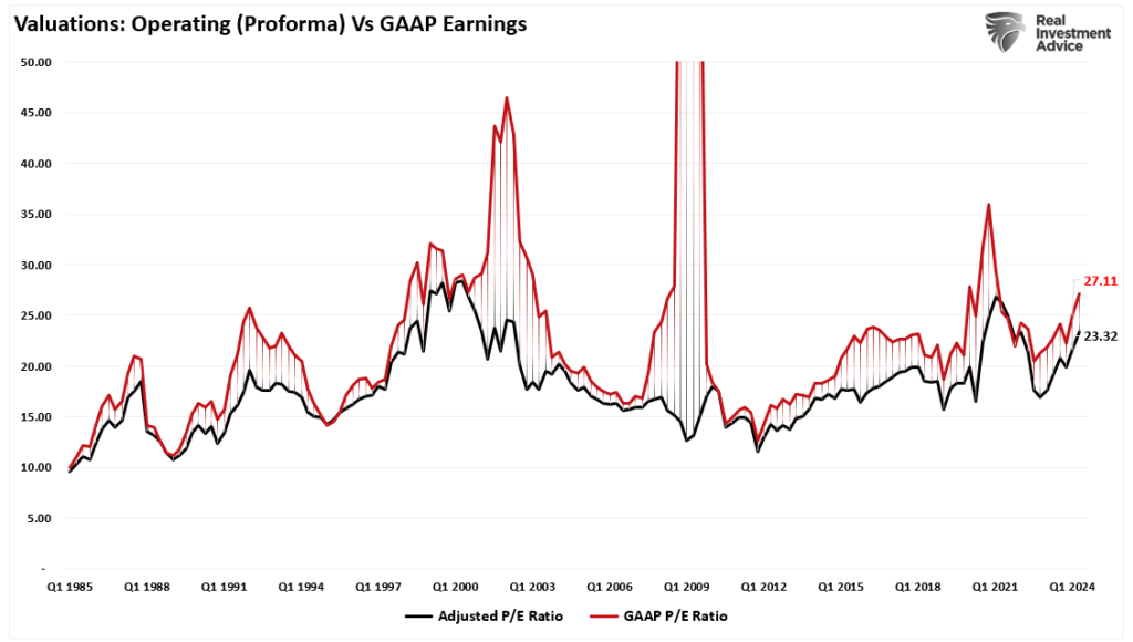
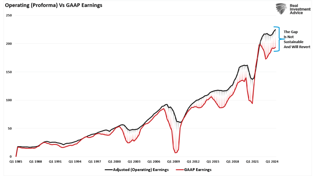
Most companies report “operating” earnings, which obfuscate profitability by excluding all the “bad stuff.” A significant divergence exists between operating (or adjusted) and GAAP earnings. When such a wide gap exists, you must question the “quality” of those earnings.
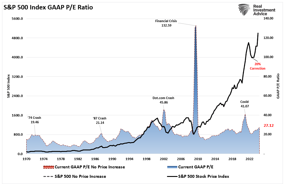
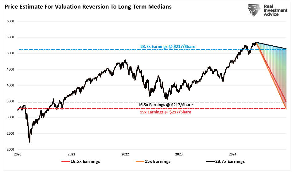
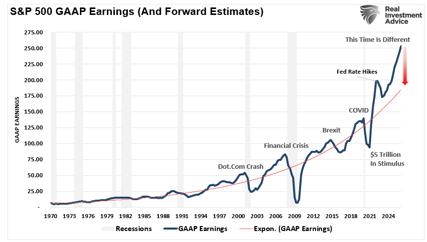
The chart below uses GAAP earnings. If we assume current earnings are correct, then such leaves the market trading above 27x earnings. (That valuation level remains near previous bull market peak valuations.)
Since markets are already trading well above historical valuation ranges, this suggests that outcomes will likely not be as “bullish” as many currently expect. Such is particularly the case if more monetary accommodations from the Federal Reserve and the Government are absent.
Trojan Horses
As always, the hope is that Q2 earnings and the entire coming year’s reports will rise to justify the market’s overvaluation. However, when earnings are rising, so are the markets.
Most importantly, analysts have a long and sordid history of being overly bullish on growth expectations, which fall short. Such is particularly the case today. Much of the economic and earnings growth was not organic. Instead, it was from the flood of stimulus into the economy, which is now evaporating.
Overpaying for assets has never worked out well for investors.
With the Federal Reserve intent on slowing economic growth to quell inflation, it is only logical that earnings will decline. If this is the case, prices must accommodate lower earnings by reducing current valuation multiples.
When it comes to analysts’ estimates, always remain wary of “Greeks bearing gifts.”
Supercore PCE Is The Weakest Since August
Jerome Powell and his Fed colleagues breathed a sigh of relief Friday morning as the PCE inflation report was weaker than expected. The headline PCE price index was +0.0% versus expectations of a 0.1% increase and a previous monthly change of +0.3%. The Core PCE was +0.1%, also a tenth below expectations. Recent inflation data provides hope that the trend lower in inflation will resume after stalling out for about six months. Further encouraging is the newly popular Supercore PCE reading, a subset of inflation, which was only up 0.1%. This index surged by 0.8% in January, causing the Fed and the market to reduce their expectations for a Fed rate. This report provides further evidence that the instance was a one-time spike and not likely a trend reversal.
Supercore prices, accounting for roughly 50% of PCE, include the prices of core services, excluding housing. The Fed has mentioned Supercore PCE on numerous occasions. Their rationale for following it is that many of the categories in the Supercore calculation are labor-intensive sectors. Therefore, Supercore PCE is a decent indicator of tightness in the labor markets, which can impact wages and, ultimately, inflation. The graphs below, courtesy of ZeroHedge, break out Supercore by its components. If it weren’t for health insurance, Supercore PCE would have been negative. Five of the eight components are negative, with one at essentially zero and two (healthcare and food service/accommodations) positive.
What To Watch Today
Earnings
No notable reports today.
Economy
Market Trading Update
Last week, we did an in-depth discussion of the worsening breadth of the market. However, the important point was that investors make two mistakes regarding such data. To wit:
“The first is overreacting to these technical signals, thinking a more severe correction is coming. The second is taking action too soon.
Yes, these signals often precede corrections, but there are also periods of consolidation when the market trades sideways. Secondly, reversals of overbought conditions tend to be shallow in a momentum-driven bullish market. These corrections often find support at the 20 and 50-day moving averages (DMA), but the 100 and 200-DMAs are not outside regular corrective periods.
If you remember, in March, we discussed the potential for a 5% to 10% correction due to many of the same concerns noted above. That correction of 5.5% came in April. We are again at a juncture where a 5-10% correction is likely. The only issue is that it could come anytime between now and October. As is always the case, timing is always the most significant risk.”
As shown, the market’s monthly seasonality supports that view of a potential correction later this summer. July tends to be a decent performance month, with an average return of more than 2%.
That boost in performance in July is supported by the kick-off of the Q2 earnings season. Such is particularly the case as investor sentiment is extremely bullish, which will continue to put a bid under stocks in the short term.
Speaking of earnings, analysts have been extremely busy over the last 30 days, slashing estimates. In June, Q2 earnings estimates for the S&P 500 index were cut by $5/share to the lowest level yet. Interestingly, while Wall Street continues to boast confidence in rising asset prices, they have cut estimates from $214/share in March last year to just $193/share. Such suggests a dichotomy between expected market performance and the economy, which is where earnings come from.
Nonetheless, the market remains overbought short-term and has triggered a short-term MACD “sell signal,” which could limit the upside in the near term. Continue to manage portfolio risk accordingly, but the bullish trend remains intact for now.
The Week Ahead
Despite the holiday-shortened week, investors will have plenty of economic data to digest. The ISM manufacturing survey will be released on Monday, and the services survey will be released on Wednesday. After Friday’s robust Chicago PMI survey, investors will look for confirmation in the ISM reports. Employment data, including JOLTs on Tuesday, ADP on Wednesday, and the BLS employment report on Friday, will be the most critical data points of the week. Recent jobless claims data point to some weakness in the labor markets.
Jerome Powell will be speaking on Tuesday at 8:30. By that time, he may have a good sense of what the BLS employment report holds. Further, investors will be looking to see if the recent weakness in economic data is starting to sway the Fed’s comfort regarding cutting rates. The next Fed meeting is July 31st.
Nike and Walgreens Tumble On Weakening Sales
Nike and Walgreens’ off-calendar earnings highlight a continuation of weakening personal consumption. In late May, we discussed this troubling theme in retail and food services earnings. Those Commentaries can viewed HERE and HERE.
On Thursday night, Nike disclosed that it bettered earnings expectations by .17 cents due to cost-cutting. However, it missed revenue forecasts by $250 million. Furthermore, they guided expectations down for fiscal year 2025. Nike can no longer hike prices to keep up with inflation, which indicates that the consumer is becoming more frugal. They also speak to weakness in China. Many companies have echoed similar sentiments about China’s economy.
NIke’s poor earnings are not just about slowing consumption. It also appears that “lifestyle brand competitors” are taking market share from Nike. Per the CEO:
There was a shift in our lifestyle brands that caught us by surprise, and without new products, we’ve had less interest. Newness is driving the consumer and we’ve got to move to more newness. We are also chasing our competition in women’s apparel and running. We said last quarter we had a new playbook that will start our comeback with new innovations. We aren’t there yet, and our numbers are going to be worse in 2025 than we previously thought.
Walgreens also struggles partly due to weaker consumption. Like Nike, it is losing market share due to its business model. They reported earnings of $.63, $.05 short of estimates. However, revenues were slightly better than expected. While revenues were okay, they lowered EPS guidance from $3.20-$3.35 to $2.80-$2.95. Further, they are Closing 25% of their 8,600 stores over the next three years, which will lead to a decrease of 57,000 employees.
“We assumed the consumer would get somewhat stronger,” but “that is not the case,” said Walgreens CEO.
In regards to their business model, he states:
We are at a point where the current pharmacy model is not sustainable, and the challenges in our operating environment require we approach the market differently.
As we share below, NKE opened trading about 15% lower on the news last Friday and is at five-year lows. Walgreens is down about 20% since earnings. It has declined by 80% over the last five years, sitting at its lowest price since 1997!
If you found this blog useful, please send it to someone else, share it on social media, or contact us to set up a meeting.
Career Risk Traps Advisors Into Taking On Excess Risk
Financial advisors get a bad rap. Some deserve it; most don’t. The problem for the entire investment advisory and portfolio management community stems from the “career risk” they inevitably face. That “career risk” has been exacerbated over the last decade as massive monetary interventions and zero interest rates created outsized returns. A point we discussed last week in “A Permanent Shift Higher In Valuations.”
“The chart below shows the average annual inflation-adjusted total returns (dividends included) since 1928. I used the total return data from Aswath Damodaran, a Stern School of Business professor at New York University. The chart shows that from 1928 to 2021, the market returned 8.48% after inflation. However, notice that after the financial crisis in 2008, returns jumped by an average of four percentage points for the various periods.”
With social and mainstream media reporting on the latest investment hype surrounding market phases like “disruptive technology,”“meme stocks,” and “artificial intelligence,” it is unsurprising investors will salivate over the next “get rich quick” scheme. In addition, the annual reports from SPIVA measuring the performance of actively managed funds against their benchmark index intensify the “fear of missing out.”
The SPIVA report further fuels the debate over active versus passive indexing, or the “if you can’t beat ’em, join ’em” mentality.
Unsurprisingly, the result is the increasing pressure on financial advisors and portfolio managers to “chase performance.” Such is the basis of “career risk.”
“Career risk is the probability of a negative outcome in your career due to action or inaction.”
In other words, if financial advisors or portfolio managers don’t meet or beat benchmark returns from one year to the next, they risk losing clients. Lose enough clients, and your “career” is over. However, it is worse than that because even if the client states they are “conservative” and want little risk, they then compare their returns to that of an all-equity benchmark index. (Read this to understand why benchmarking your portfolio increases risk.)
Therefore, this career risk forces financial advisors and portfolio managers to push boundaries due to the risk of losing clients.
That brings us to two primary questions. The first is how we got here. The second is what you (as an investor or financial advisor) should do about it.
Performance Chases Performance
I recently discussed on the “Real Investment Show” that there is a big difference between a financial advisor or portfolio manager and an individual investor. The difference is the “career risk” of underperformance from one year to the next. Therefore, advisors and managers MUST own the assets that are rising in the market or risk losing assets. A great example of career risk is seen with Cathy Wood’s ARK Innovation Fund. That fund was the darling of Wall Street during the “disruptive technology” mania phase of the market following the stimulus-fueled investing craze following the Pandemic shutdown.
Unsurprisingly, during the mania phase, investors poured billions into the fund. Unfortunately, as with all mania phases, that investing style lost favor, and the fund has recently underperformed the S&P 500. That underperformance resulted in a massive loss of assets under management for ARK and Cathy Woods
Today, the investment chase is all about “artificial intelligence.” Such has led to an enormous bifurcation in the market as a handful of stocks increasingly rise versus the rest of the market, as shown.
Once again, portfolio managers and financial advisors face enormous “career risk” pressure. As discussed in “It’s Not 2000,” as the market’s breadth narrows, advisors and managers must take on increasingly larger weights of fewer stocks in portfolios.
“The top-10 stocks in the S&P 500 index comprise more than 1/3rd of the index. In other words, a 1% gain in the top-10 stocks is the same as a 1% gain in the bottom 90%.As investors buy shares of a passive ETF, the shares of all the underlying companies must get purchased. Given the massive inflows into ETFs over the last year and subsequent inflows into the top-10 stocks, the mirage of market stability is not surprising.
“That lack of breadth is far more apparent when comparing the market-capitalization-weighted index to the equal-weighted index.”
The question every investor should be asking themselves is:
“Is it really wise from risk management perspective to have nearly 40% of my portfolio in just 10-stocks?”
However, if you answer that question “no,” or if you have any other type of investment allocation, you will underperform the benchmark index. If you have an advisor or manager that matches a portfolio to your financial goals, they will also underperform. They now face the potential “career risk” of getting fired if the client fails to understand the reason for the underperformance.
So, what should financial advisors and clients do?
What Should Advisors Do?
For advisors, “career risk” is a real and present danger. Many opt for simplistic ETFs or mutual fund-based portfolios that track an index. The question is, as a client, what are you paying for?
Knowing that clients are emotional and subject to market volatility, Dalbar suggests four practices to reduce harmful behaviors:
Set Expectations Below Market Indices: Set reasonable expectations and do not permit expectations to be inferred from historical records, market indexes, personal experiences, or media coverage. The average investor cannot be above average. Investors should understand this fact and not judge the performance of their portfolio based on broad market indices.
Control Exposure to Risk: Explicit, reasonable expectations should be set by agreeing on predetermined risk and expected return. Focusing on the goal and the probability of its success will divert attention away from frequent fluctuations that lead to imprudent actions.
Monitor Risk Tolerance: Even when presented as alternatives, investors intuitively seek capital preservation and appreciation. Risk tolerance is the proper alignment of an investor’s need for preservation and desire for capital appreciation. The determination of risk tolerance is highly complex and is not rational, homogenous, or stable.
Present forecasts in terms of probabilities: Provide credible information by specifying probabilities or ranges that create the necessary sense of caution without adverse effects. Measuring progress based on a statistical probability enables the investor to make a rational choice among investments based on the reward probability.
When Must Advisors Take Action?
Dalbar’s data shows that the “cycle of loss” starts when investors abandon their investments, followed by remorse as the markets recover (sell low). Unsurprisingly, the investor eventually re-enters the market when their confidence gets restored (buys high).
Preventing this cycle requires having a plan in place beforehand.
When markets decline, investors become fearful of total loss. Those fears compound as the barrage of media outlets “fan the flames” of those fears. Advisors must remain aware of client’s emotional behaviors and substantially reduce portfolio risk during major impact events while repeatedly delivering counter-messaging to keep clients focused on long-term strategies.
Dalbar notes that during impact events, messages delivered to clients should have three characteristics to be effective at calming emotional panic:
Deliver messages when fear is present. Statements made well before the investor experiences the event will not be effective. On the other hand, if the messages are delivered too long after the fact, investors will already have made decisions and taken actionsthat are difficult to reverse.
Messages must relate directly to the event causing the fear. Providing generic messages such as the market has its ups and downs is of little use during a time of anxiety.
Messages must assure recovery. Qualified statements regarding recovery tend to fuel fear instead of calming it.
Messages must ALSO present evidence that forms the basis for forecasting recovery. Credible and quotable data, analysis, and historical evidence can provide an answerto the investor when the pressure mounts to “just do something.”
Providing “generic media commentary” with a litany of qualifiers to specific questions will likely fail to calm their fears.
Conclusion
An experienced advisor does more than “invest money in the market.” The professionals’ primary job is providing counsel, planning, and stewardship of the client’s financial capital. In addition, the advisor’s job is to understand how individuals respond to impact events and get in front of them to plan, prepare, and initiate an appropriate response.
Negative behaviors all have one trait in common. They lead individuals to deviate from a sound investment strategy tailored to their goals, risk tolerance, and time horizon. The best way to ward off the aforementioned negative behaviors is to employ an approach that focuses on one’s goals and is not reactive to short-term market conditions.
The data shows that the average investor does not stay invested long enough to reap the market’s rewards for more disciplined investors. The data also shows that investors often make the wrong decision when they react.
But here is the only question that matters in the active/passive debate:
“What’s more important – matching an index during a bull cycle, or protecting capital during a bear cycle?”
You can’t have both.
If you benchmark an index during the bull cycle, you will lose equally during the bear cycle. However, while an active manager focusing on “risk” may underperform during a bull market, preserving capital during a bear cycle will salvage your investment goals.
Investing is not a competition, and as history shows, treating it as such has horrid consequences. So, do yourself a favor and forget what the benchmark index does from one day to the next. Instead, match your portfolio to your personal goals, objectives, and time frames.
In the long run, you may not beat the index, but you are likely to achieve your personalinvestment goals, which is why you invested in the first place.
Cognitive Dissonance Is On Full Display
The recent Conference Board Consumer Confidence survey data show a state of cognitive dissonance among U.S. citizens. Cognitive dissonance occurs when a person believes in two contradictory things simultaneously. For instance, the latest Conference Board survey shows that expectations for increasing stock prices are among the highest since the late 1980s. However, citizens believe the business climate for the next six months will be among the worst environments over the last 35+ years. The graph below, courtesy of Michael Green, shows the two data series. Most often, they are correlated, rising and falling in unison. However, the recent gap is well beyond past experiences. The green chart at the bottom divides stock expectations by business expectations. It sits well above anything witnessed since the late 1980s.
In the short term, stock prices are a function of liquidity and investor behaviors. Over extended periods, prices represent the value of a company’s cash flows, which are highly predicated on economic activity and the business climate. Thus, investors can, at times, have cognitive dissonance, being bullish on stocks and bearish on the economy. However, the gap will most certainly close. Will it be due to improving economic confidence or stocks catching down with poor economic expectations?
What To Watch Today
Earnings
No notable earnings reports today.
Economy
Market Trading Update
As we head into the last trading day of the month, the market remains range-bound near all-time highs. With the market still overbought, the upside remains limited near-term. However, we are close to triggering a short-term MACD “sell signal,” which further confirms that markets may be somewhat contained regarding further upside over the next week.
It has been a rather boring week of trading with little movement. Next week promises much of the same, with the July 4th holiday falling on Thursday. We expect to see a rather light trading week, but due to the lack of volume, there is a risk of a pickup in volatility.
There is little to be concerned about currently. Continue to let your equity positions play out. However, continue to follow risk-management protocols as needed to rebalance risk.
The Definition of Euphoria
While on the topic of cognitive dissonance, we think a recent segment from CNBC seems appropriate to share. On CNBC, hedge fund manager Eric Jackson of EMJ Capital stated:
Over the last five years, Nvidia’s average look forward price to earnings multiple has been 40x. Yesterday (Monday), after this two day correction, it was 39x forward price to earnings. But there have been three times in the last five years where it had a look forward price to earnings multiple of over 50x, and two times in the last five years where it’s gotten just about to 70x and then pulled back. So we haven’t see that euphoria yet.
Jackson thinks Nvidia could have a $6 trillion valuation by the end of the year. Such means its stock price will double. He claims Nvidia investors haven’t seen euphoria yet. The stock is up nearly 3,000% in about five years, as shown below. That is euphoria! We are not sure there is a word to describe investor sentiment if Jackson proves accurate. However, stocks trading in a euphoric phase are often followed by a dysphoric feeling.
Weaker Trade Balances Accompany’s A Strong Dollar
The U.S. dollar index has been up about 4% this year. A stronger dollar results in lower import prices because America runs trade deficits, i.e., we import more than we export. On the margin, trade deficits reduce prices. That is a positive. However, from a GDP perspective, it is not good news.
The formula for GDP is C+I+G+(X-M). C is consumer spending, I is business investment, G is government spending, and (X-M) is net exports. The X-M part of the formula is exports less imports. Running a trade deficit, as we consistently do, makes the net result negative. The graph below shows that trade deficits and dollar value correlate decently. Recently, dollar strength has pushed net exports further into deficit territory, thus dampening economic growth.
If you found this blog useful, please send it to someone else, share it on social media, or contact us to set up a meeting.
Will Japan Dump U.S. Treasury Securities?
Japan holds $1.150 trillion of U.S. Treasury securities, well above the next major foreign holder, China, which has $770 billion. Therefore, given Japan holds 3.3% of all Treasury debt, it is worth appreciating the recent news that Japan is selling bonds. First, to dispel some fear, Nornichukin Bank, not the Bank of Japan or the Japanese government, is selling U.S. Treasury bonds. Their goal is to sell $63 billion of U.S. and European government bonds by March 2025. Importantly, this is not a government policy decision but one the bank is making to fortify its deteriorating balance sheet. According to SIFMA, $879.8 billion Treasuries trade daily on average. With 262 days to sell less than $63 billion, their actions should have zero impact on Treasury yields.
However, persistent rumors have been circulating for years that the Japanese government and/or BOJ will sell bonds to prop up its currency. The yen has been in a free fall recently. On Wednesday morning, it traded at levels last seen in 1986! To appreciate Japan’s dilemma of selling Treasuries, providing it with dollars in which to buy the yen, consider a quote we wrote two years ago (LINK):
“However, as the BOJ tries to stop rates from rising, they weaken the yen. Japan is in a trap. They can protect interest rates or the yen, but not both. Further, its actions are circular. As the yen depreciates, inflation increases, and the Japanese central bank must do even more QE to keep interest rates capped.”
The cartoon below helps answer our question. Selling Treasuries in large quantities to support the yen risks increasing interest rates, which can increase the odds of insolvency.
What To Watch Today
Earnings
Economy
Market Trading Update
As discussed yesterday, the market was under pressure recently due to the decline in Nvidia ($NVDA). However, that sell-off seems to have abated for now, and there has been little other data to move the market as we head into the month’s end. Since this is the second quarter’s end, portfolio managers must rebalance their holdings by Friday. Furthermore, next week is shortened by the July 4th holiday, so trading will be light. Today and tomorrow are full of economic data that will be eyed closely for further clues to the upcoming Federal Reserve meeting in July. Furthermore, next week starts the beginning of the Q2 earnings season.
Speaking of earnings season, analysts have slashed estimates over the last 30 days. Despite ratcheting their views on the market outlook, with Goldman Sachs leading the way at 6300 by year-end, analysts reduced estimates from $198.25 to $193.45. That is the lowest estimate for this quarter since last year, when they started at $214.03.
As noted, this is why we call it “MIllennial Earnings Season,” as analysts keep lowering the bar until “everyone gets a trophy.”
Small Cap Stocks Are Relatively Cheap
Much of the recent market conversation revolves around the strength of large-cap stocks and the relative weakness of most other stocks. What is not often heard is how the performance is affecting valuations. The graph below, courtesy of Yardeni Research, shows that the forward P/E ratio for large-cap stocks is near the highest level since the dot com bust. Yet, the forward P/E for small and mid-cap stocks has been lingering at their lowest levels in over ten years. More importantly, the current valuation has been the lowest since 2008, excluding periods when the market was in a correction. The gap between large and small-cap stocks will likely converge at some point. However, it can get more dislocated before such a normalization occurs.
Office Carnage Continues
The price decline of some office properties in many major cities is startling. We follow @TripleNetInvest on X/Twitter to keep us updated on commercial real estate fire sales. On Wednesday, he posted the following:
An office tower (pictured below) in San Francisco’s Mid Market area shockingly sold for 90% LESS than what it last traded for.
The previous owner paid $62M in 2018 for the 90k SF building.
It was recently acquired by a Starwood affiliate for $6.5M ($72 per SF)
Despite the post-Covid normalization across most economic sectors, vacancy rates around the country are not falling. San Francisco has the highest vacancy rate of big cities, at 37%. For context, it was 7% in 2019. Furthermore, it has an occupancy rate of 44%. Per Optimize Reality:
As those drastically under-occupied leases come due, they will exaggerate an already market clogged by empty office space. The over-saturation will become far worse indicated already by dropping rents and hundreds of thousands of square feet hitting the sublease market.
If you found this blog useful, please send it to someone else, share it on social media, or contact us to set up a meeting.
Why Economists And Citizens Have Different Inflation Realities
The Fed and economists are encouraged because CPI is down to 3.3% from a high of nearly 9% in 2022. Despite the Fed’s “significant progress” in lowering inflation, most citizens are outraged and confused by economists’ relatively rosy inflation observations. Most citizens believe inflation is still rampant.
The Fed and economists are correct in that inflation is now tame. At the same time, citizens dissatisfied with high prices have solid grounds on which to base their disapproval.
Let’s better understand how such contradictory beliefs can both be factual. Furthermore, in the process, we can help Jerome Powell understand why economic sentiment is poor despite a near-record low unemployment rate.
You know, I don’t think anyone knows, has a definitive answer why people are not as happy about the economy as they might be. -Jerome Powell 6/12/2024
Visualizing Divergent Inflation Opinions
The graph below of the BLS CPI New Vehicles price index, a CPI component, demonstrates why economists and citizens have such grossly contrasting opinions of inflation.
Economists focus on the blue line, graphing the year-over-year change in new vehicle prices. Over the last year, the price index of new vehicles has decreased by .60%. Economists can say the cost of buying a new vehicle is in a deflationary state.
While the chart may warm the hearts of economists and the Fed, most individuals see the orange line, the CPI price index for new vehicles instead. It shows that new vehicle prices are up about 20% since the pandemic. Yes, they may have recently declined slightly, but today’s prices are nowhere close to where they were four years ago. In their minds, there is significant inflation in new vehicles.
Economists Prefer Growth Rates, Not Absolutes
Ask an economist what the nation’s GDP is, and they will quote an annualized growth rate to a decimal point. We bet almost all of them will get the answer correct within one or two-tenths of one percent.
Ask them again, but request the answer in dollars. It would not be surprising if many economists are off by a trillion or even two trillion dollars, representing anywhere from 3.00% to 7.00% of the economy.
Economists prefer to analyze and quote many economic data points in terms of percentage change. For instance, how much did industrial production or retail sales change versus last month or over the previous quarter or year? They vastly prefer growth rates because it gives them a comparable and insightful way of analyzing economic data. Let’s review why this is the case.
Comparative Analysis
Economists are more adept at comparing data from different periods, industries, and countries if they have a common measurement calculation. Instead of absolute change, which doesn’t account for the starting point, a growth rate captures the absolute change and the starting point. Consider the following:
If GDP increases by $1 trillion this year, how would that compare to a $1 trillion increase in 2000? The question is challenging to answer using absolute numbers. However, growth rates allow us to evaluate the two periods quickly. Today, GDP is $28.284 trillion; therefore, a $1 trillion increase would represent 3.50% growth. In 2000, GDP was close to $10 trillion. Adding a trillion dollars of economic growth would have resulted in a 10% growth rate. While a trillion dollars is a trillion dollars in absolute terms, there is a stark difference between 10% and 3.50% growth.
Trend Analysis
Growth rates highlight trends and changes over time more clearly than absolute numbers. They can show whether an economy is accelerating, decelerating, or maintaining a steady pace.
Consider the graph below. The blue line, showing the make-believe production of widgets, starts at 1,000 widgets and increases by 100 widgets annually. The steady growth in absolute terms is a linear upward trending line. However, the annual growth rate steadily declines from 10% to 4% by year 20. An economist looking at the graph would say the rate of the production of widgets is declining despite the upward trend in the number of widgets being produced annually.
Policy Decision Making
The Fed aims to promote stable economic growth. To do so they balance the level of interest rates with inflation and economic activity. Having like figures to analyze, such as growth rates, makes their task significantly more straightforward. Imagine if the Fed had to determine the appropriate interest rate given that the economy grew by $750 billion last year and the CPI price index rose by 2.45.
Investors prefer growth rates for the same reason. If I can estimate the economy’s growth rate and other critical economic figures, they can better determine a growth rate or interest rate they would accept for taking risks.
The capital asset pricing model (CAPM) is a bedrock for finance. The formula states that an asset’s expected return should equal the risk-free interest rate plus the asset’s sensitivity (beta) times the market’s expected return. This formula can only work with growth rates, not absolute numbers.
Consumer’s Point Of View
Regarding inflation, consumers are less concerned with growth rates and heavily focused on absolute prices. They remember that bread used to cost $4 a loaf and now costs $7. The graph below shows the price of white bread was stable between $1.25 and $1.50 a pound from 2008 to the pandemic. It is now close to $2 a pound.
That is significant inflation. But it doesn’t tell the whole story. If wages also rose similarly, purchasing power hasn’t changed. It is similar to hearing stories from your parents or grandparents about going to the movies and getting popcorn and a soda, all for $1. Did you ever ask them how much money they made at the time?
Summary
We want to make it clear that we do not condone inflation. It accelerates an already wide wealth gap and creates hardships for many citizens. For more, please read our article, Fed Policies Turn The Wealth Gap Into A Chasm.
We analyze inflation data similarly to economists. We accept that absolute prices are much higher today than a few years ago, but we also acknowledge that, in general, wages are higher as well. Just like we can’t realistically compare a 15-cent McDonald’s hamburger to a $3.00 one today, we should be careful comparing prices today to their prices a few years ago.
Prices are not returning to 2020 levels. In fact, any hint that aggregate prices retreat from current levels will cause the Fed to panic and quickly stimulate inflation via lower interest rates and QE. We remind you that the Fed was lamenting that we didn’t have enough inflation throughout most of the period between the financial crisis and the pandemic.
The Economist Makes A Case For Solar Energy
The unique graph below caught our attention, compelling us to read Solar Power Is Going To Be Huge by the Economist. The graph shows that solar energy will be the primary energy source for the world by 2040 under its “fast transition scenario.” The Economist article walks through some stats on the growth of solar energy as well as obstacles. Given the immense growing demand for electricity from AI data centers and EVs, it’s worth appreciating what energy sources will fuel the power grid and their respective investment opportunities. For more on the topic, we wrote a three-part article, which can be accessed here (parts ONE, TWO, and THREE ).
The Economist shares some interesting statistics on the rise of solar energy. For instance, solar energy is on track to produce “more electricity than all the world’s nuclear power plants in 2026, than its wind turbines in 2027, than its dams in 2028, its gas-fired power plants in 2030 and its coal-fired ones in 2032.” The increasing use of solar energy is due not only to its environmental benefits but also its falling cost. Per the Economist:
Since the 1960s…the levelised cost of solar energy—the break-even price a project needs to get paid in order to recoup its financing for a fixed rate of return—has dropped by a factor of more than 1,000.” Over the period, “prices dropped by a factor of 500. That is a 27% decrease in costs for each doubling of installed capacity, which means a halving of costs every time installed capacity increases by 360%.
The Economist makes a strong case for solar energy being dominant in fifteen years. If they are correct, there are some investment ideas worth researching with solar panel and battery manufacturers and producers of solar energy. However, investors must also consider the near future. Specifically, which energy source can fuel the current rapid expansion of power grids today and for the next fifteen years? As portrayed in the graph, natural gas is likely to remain the primary fuel for the power grid for at least another ten years.
What To Watch Today
Earnings
Economy
Market Trading Update
Over the last three days, the mainstream financial media has expressed much angst about the 13% decline in Nvidia (NVDA) shares. Of course, as noted yesterday, Nvidia is a leader in the technology sector (in terms of weighting), and its decline has impacted the entire S&P 500.
As discussed on theReal Investment Showyesterday, despite the nail-biting by the mainstream media and Nvidia bears discussing the end of the A.I. run, the reality was that portfolio managers were overweight shares of Nvidia heading into month end given the post-split run up, and options expiration last Friday, all contributed to the short-term bought of selling. As shown, it is not surprising that Nvidia found support at the 20-DMA and bounced sharply higher as the “A.I. chase” is still in full swing and buyers were looking for a dip to buy.
Notably, while NVDA held support at the 20-DMA and will likely push back towards $135-140/share, we suggest using that rally to rebalance risk. The last time NVDA triggered a MACD “sell signal,” the stock retested the previous highs and drifted lower for a month to reverse the overbought condition. We suspect we could see similar action over the next couple of months heading into the summer. While there is still much momentum behind NVDA, it is overbought, which will likely limit the current upside. To some degree, a reversal would provide a much better entry point to rebuild or increase exposures as needed.
TPA Spots A Rare Divergence Worth Following
Jeffrey Marcus of TPA Analytics recently provided his subscribers with a summary of a critical ETF divergence. The first graph below, from his article, compares the price performance of FDN (internet stocks) and XLK (technology stocks). Nearly 50% of XLK is comprised of Microsoft, Apple, and Nvidia. Amazon, Meta, and Google make up about 30% of the FDN internet ETF. As shown, the two indexes tend to correlate very well. However, recently, they have diverged. Consequently, the unusual price behavior has resulted in what Jefferey believes is a good trade opportunity.
SimpleVisor subscribers can add Jeffrey’s TPA-RRG summary to their subscription package. TPA-RRG analyzes momentum and relative strength to help pick stocks and sectors likely to outperform or underperform the market. XLK is among the best performers, and FDN is near the bottom. Jeffery also points out that the RSI on the top four XLK stocks are decently overbought. As such, he offers the following advice:
Focusing on the 14-day RSI, it is clear that the top 4 stocks on XLK have gotten ahead of themselves (they are overbought). TPA expects that in thenext several weeks, a convergence of XLK and FDN will be seen. This would demand that AMZN, META, GOOGL, and GOOG outperform MSFT, AAPL, NVDA, and AVG as the long-term pattern ofcorrelated performance returns.
The second graphic from SimpleVisor compares the price ratio of FDN to XLK. It too shows that the pair is grossly oversold (FDN compared to XLK), thus supporting TPA’s view that FDN is likely due for better returns than XLK in the coming weeks.
Sector Performance Following Rate Cuts
The Strategas graphic below shows how each sector performed in the six months following the first cut since 1995. Strategas sorts the sectors left to right by the average return. Utilities, staples, and healthcare have the three highest averages. Utilities are the only sector that was positive in all four instances. The recent leading market sector, technology, has the worst average, including two double-digit declines.
If you found this blog useful, please send it to someone else, share it on social media, or contact us to set up a meeting.
Buybacks Are Back
Over the last six-plus months, we have written plenty on how a few stocks lead the market higher while a large majority languishes. For example, in our latest Newsletter, Bad Breadth Keeps Getting Worse, we wrote the following: “With a market sitting at all-time highs, combined with robust money flows, the breadth of the market should be healthy. However, despite the market advance, the number of stocks above their respective moving averages has declined since April.” Why is this occurring? While there are many reasons, the most impactful may be stock buybacks.
The graph below by @kobeissiletter shows that, as he highlights, $237 billion of stock buybacks occurred in the first quarter. A similar or even greater number of buybacks likely occurred this quarter ending Friday. Furthermore, Goldman Sachs forecasts $925 billion in buybacks this year and over $1 trillion in 2025. Now consider that the 20 largest companies in the S&P 500 account for slightly over half of all buybacks in the first quarter. If buybacks continue at the pace Goldman expects, it will provide a nice tailwind for the largest stocks. Therefore, the bad breadth may continue longer than many think.
What To Watch Today
Earnings
Economy
Market Trading Update
Yesterday, we touched on the negative divergences and weakening market breadth. As we noted, while these indicators suggest internal market weakness that precedes corrections historically, the timing of such an event is always problematic. One thing these internals do suggest, from a more immediate impact view, is a limited upside to the market’s advance. Over the last three days, the market has started consolidating recent gains and is working off some overbought conditions. Keep a watch on the MACD signal in the top panel. If it triggers a “sell signal,” we will see further consolidation or a correction until that signal reverses. Such a signal would give investors a better entry point for additional exposure.
The bullish trend remains intact, and investor sentiment remains very bullish. As such, continue to maintain exposure as needed, but, as always, follow risk management protocols for rebalancing as needed.
Fed Rate Cuts May Not Help The Real Estate Market
Typically, the Fed has been able to boost economic growth with lower rates. This occurs, in part, because some debtors can refinance debt at lower rates. For example, it has become commonplace to refinance a mortgage when rates fall. Lower payments, in turn, allow consumers to spend more, thus boosting economic activity.
What has worked in the past may be much less effective the next time the Fed cuts rates. The top graph below, courtesy of BCA Research, shows that the average mortgage rate is still below 4%. Mortgage rates would have to drop by nearly 4% to entice the average borrower to refinance. The lower graph shows that about a third of mortgages are 3% or below. Those borrowers will need ten-year yields of near zero percent to refinance.
A similar construct exists in the business world. Many large corporations refinanced their debt in 2020 and 2021 when rates were historically low. If the Fed slowly decreases rates, it’s quite possible the benefits will be much more limited than in the past.
Relative Sector and Factor Analysis
Once again, technology stocks are considerably overbought on a relative analysis. At the same time, every other sector is oversold versus the S&P 500. The first graph charts each sector’s relative and absolute SimpleVisor proprietary scores. XLK (technology) is the only sector with a relative score above zero. Many economically sensitive sectors (materials XLB, energy XLE, and XLI industrials) are very oversold.
The second scatter plot using stock factors and indexes is very similar. S&P 500 Growth (IVW), Megacap Growth (MGK), and Momentum (MTUM) are the only factors with positive relative scores. Many other factors are grossly oversold. The two most oversold are foreign markets (EFA and VEA). The third table shows that XLK is up 4.08% over the last four weeks. Conversely, every other sector is lower over the period. Furthermore, half of the sectors are down by 5% or more.
Lastly, the fourth table shows the price correlations of each sector versus every other sector for the last 21 days. XLK has a negative correlation to every sector, while every other sector is positively correlated to each other. The set of images below helps better appreciate the horrendous market breadth.
If you found this blog useful, please send it to someone else, share it on social media, or contact us to set up a meeting.
S&P 6300? Is That Outside The Realm Of Possibility?
Goldman Sachs recently upped its price target to S&P 6300 for the end of this year, along with Evercore ISI upping its year-end target to 6000. Such is not surprising given the strong run in the markets this year. Just two weeks ago, I posted the following chart saying:
“We should soon start getting a raft of S&P 500 price target upgrades for year-end.”
While such a bold number may seem unrealistic, there is a fundamental case to support it.
“There are many reasons why valuations have shifted higher over the years. The increase is partly due to economic expansion, globalization, and increased profitability. However, since the turn of the century, changes in accounting rules, share buybacks, and greater public adoption of investing (aka ETFs) have also contributed to the shift. Furthermore, as noted above, the massive monetary and fiscal interventions since the “Financial Crisis” created a seemingly “risk-free” environment for equity risk.
The chart shows the apparent shift in valuations.”
The “median” CAPE ratio is 15.04 times earnings from 1871-1980.
The long-term “median” CAPE is 16.52 times earnings from 1871-Present (all years)
The “median” CAPE is 23.70 times earnings from 1980 to the present.
There are two critical things to consider concerning the chart above.
The shift higher in MEDIAN valuations was a function of falling economic growth and deflationary pressures, and,
Increasing levels of leverage and debt, which eroded economic growth, facilitated higher prices.
So, the question is, “IF” valuations have permanently shifted higher, what will the next market mean-reverting event look like to reset fundamental valuations to a more attractive level?
We answered that question by analyzing current market prices and expected earnings to determine the shape of such a valuation reversion.
As of this writing, the S&P 500 is trading at roughly $5,300 (we will use a round number for easy math). The projected earnings for 2024 are approximately $217/share. We can plot the price decline needed to revert valuations using the abovementioned median valuation levels.
23.70x = 5142.90 = 3% decline
16.52x = 3584.84 = 33% decline
15.04x = 3263.68 = 38.5% decline
However, that story’s “other side” is where a multiple expansion occurs.
S&P 6300 – The Other Side Of The Story
How did we pick S&P 6300? We used a standard Fibonacci sequence to identify the logical, numerical sequence from the November 2023 lows. From those lows, an extension of 1.62% would take the market to roughly 6300 (6255, to be exact). However, for the market to make that advance, the underlying earnings will need to support the continued rise.
As noted in the previous article, valuation contractions happen during recessionary and bear market periods. During such a phase, the exuberance of the market realigns the price of the market with the underlying fundamentals. However, multiple expansions are underway before the beginning of the reversion process. During this bullish phase, Wall Street analysts continue to ratchet earnings estimates higher to justify rising prices. Currently, we are in the multiple expansion phase, where analysts are dramatically increasing earnings estimates to more extreme levels. As shown, the earnings estimates for 2025 are at a record deviation from the long-term exponential growth trend.
So, how can the S&P 500 get to 6300? We can use current Wall Street estimates to work backward through the valuation process. As we did previously, we usually look at the market’s price and determine the “fair value” of the market based on expected earnings. In this case, we will take the denominator (earnings) of the valuation equation to find the “fair price” of the market.
While Goldman is looking at 6300 for the end of this year, for this thought experiment, we will use S&P Global’s current estimates of $216/share for the end of 2024. For Goldman’s estimate of 6300, trailing one-year valuations will rise to 29x earnings. However, we will also assume some lower valuation of 27x and 25x earnings by year-end if economic growth continues to slow. Furthermore, we will consider a drop in earnings to $200/share if the economy starts heading into a soft recession. However, given that Wall Street estimates are always overly optimistic, a deeper discount in earnings is possible. However, those parameters give us the following results.
$216/share * 29x Trailing Earnings = 6264(Assumes continued economic growth)
As we did previously, we can use these forecasts to build a chart showing the range of potential outcomes over the next 6 months.
Those outcomes are just one set of assumptions. By adjusting valuation and earnings expectations, we could create infinite possibilities. The purpose of the exercise, however, is to establish a reasonable range of possibilities for the market at the end of the year. As shown, the range of potential outcomes is broad from market levels at the time of this writing. The bullish argument of “no recession” suggests a possible upside from 7.4% to 15%. However, if the economy slows or slips into a soft recession, the potential downside ranges from a -1% loss to -8%.
Challenges Remain
Let me state that I have no idea what the next 6 to 18 months hold in store. As noted, there are an infinite number of possibilities. What happens in the November election, Fed policy, and the potential for a recession will all affect one of those outcomes.
Here is our concern with the bullish scenario. It entirely depends on a “no recession” outcome, and the Fed must reverse its monetary tightening. The issue with that view is that IF the economy does indeed have a soft landing, there is no reason for the Federal Reserve to reverse its balance sheet reduction or cut interest rates drastically.
More importantly, the rise in asset prices continues to ease financial conditions, keeping inflation “sticky,” thereby eroding consumer purchasing power. The bull case also suggests that employment remains strong, along with wage growth, but there is clear evidence of erosion on both.
While the bullish scenario of S&P 6300 is possible, that outcome faces many challenges heading into 2025, given the market already trades at fairly lofty valuations. Even in a “soft landing” environment, earnings should weaken, making current valuations more challenging to sustain.
Our best guess is that reality lies somewhere in the middle. Yes, there is a bullish scenario in which earnings decline, and a monetary policy reversal leads investors to pay more for lower earnings. However, that outcome has a limited lifespan as valuations matter to long-term returns.
As investors, we should hope for lower valuations and prices, which gives us the best potential for long-term returns. Unfortunately, we don’t want the pain of getting there.
Regardless of which scenario plays out in real-time, there is a substantial risk of poor returns over the next 6-18 months. As investors, we must manage the risk of an unexpected turn of events undermining Wall Street’s continued optimistic views.
After all, the math is just the math.
Consumers Are Turning to Private Label Brands
Consumers are turning away from name-brand foods in an attempt to cut back on spending. Consumer Packaged Goods (CPG) companies such as Proctor & Gamble, General Mills, and Kellogg benefited from supply chain disruptions during the pandemic as private label products saw restricted supply. Thus, the CPG brands with more resilient supply chains used the combination of shortages and heightened demand for food at home to exercise pricing power. As shown below, the price premium between national and store brands for TreeHouse Foods, a private-label manufacturer, remains substantially higher than pre-pandemic levels.
However, this advantage also meant that CPG brands relaxed their efforts to innovate their product lines. Private-label brands are also honing in on quality, meaning CPG brands must compete through innovation or lowering prices to maintain market share. The latter seems more likely, given the recent retail sales data. Now that supply chain pressures have alleviated and inflation is straining household budgets, consumers are turning to private-label brands to control costs. Per the Wall Street Journal:
Amid elevated demand for food at home and consumer wallets flush with stimulus cash, CPG companies were able to raise prices without much resistance. But that is now quickly changing as retailers deal with price-sensitive consumers increasingly exhausted with the cumulative impact of inflation: Grocery prices are about 26% higher than they were in 2019. In a recent survey of U.S. consumers by Jefferies, some 51% of respondents said they are buying more private-label products to save money on grocery bills.
What To Watch Today
Earnings
No notable earnings releases.
Economy
Market Trading Update
Last week, we discussed the issue of the negative divergences and bad breadth of the market. To wit:
“While the bullish trend remains intact, along with a MACD ‘buy signal,’ which suggests an increased allocation to equity exposure, we have some concerns.
While the market is making all-time highs as momentum continues, its breadth is narrowing. The number of stocks trading above their respective 50-DMA continues to decline as the market advances, along with the MACD signal. Furthermore, the NYSE Advance-Decline line and the Relative Strength Index (RSI) have reversed, adding to the negative divergences from a rising market. While this does not mean the market is about to crash, it does suggest that the current rally is weaker than the index suggests.
As we discussed, these negative divergences have often preceded short- and intermediate-term corrective market actions. Such is the point where Investors tend to make two mistakes. The first is overreacting to these technical signals, thinking a more severe correction is coming. The second is taking action too soon.
Yes, these signals often precede corrections, but there are also periods of consolidation where the market trades sideways. Secondly, reversals of overbought conditions tend to be shallow in a momentum-driven bullish market. These corrections often find support at the 20 and 50-day moving averages (DMA), but the 100 and 200-DMAs are not outside normal corrective periods.
If you remember, in March, we discussed the potential for a 5 to 10% correction due to many of the same concerns noted above. That correction of 5.5% came in April. We are again at a juncture where a 5-10% is likely. The only issue is it could come anytime between now and October.
As is always the case, timing is always the biggest risk. Therefore, be careful not to overreact or act too soon. The market will let us know when to become more aggressive in reducing risk.
The Week Ahead
The second quarter comes to an end this week. The primary focus will be PCE prices plus personal income and outlays on Friday. The all-important core PCE price index is the Fed’s preferred measure of inflation; thus, it carries extra weight. The consensus expects personal income to rise 0.4% MoM in May versus the 0.3% increase in April. Meanwhile, the consensus expects personal expenditures to rise by 0.3% MoM in May after increasing by 0.2% in April.
This week starts slowly with speeches by the Fed’s Waller and Daly today. Tomorrow, we will hear from Bowman and Cook and get data on April home prices via the Case-Shiller Home Price Index. We’ll also get updated consumer confidence data, where the consensus forecasts a decrease to 100 in June from 102 in May. Wednesday will bring New Home Sales data for May. We don’t expect any positive surprises, given that consumers are turning down purchases due to high mortgage rates. Durable Goods Orders for May are released on Thursday. The consensus expects a slowdown in growth to 0.3% in May from 0.7% in April. As mentioned above, we cap off the quarter with PCE prices and personal income & outlays on Friday.
Boston Fed Economist: Shelter Inflation May Be Stubborn Through Year-End
A recently published paper by a Boston Fed Economist suggests that rent increases will keep inflation above the Fed’s target for longer than most expect. The Author proposes that the effect will be most notable through the end of 2024 and diminish significantly in 2025. In addition, the Author expects CPI shelter inflation to slow considerably in periods beyond the next twelve months. His research focuses on the gap between market rent and the shelter component of CPI and how those dynamics pass through to CPI and PCE. Below, we provide excerpts and a chart from the paper that sums it up nicely.
The overall trend is clear: CPI shelter is expected to grow quickly in the summer and fall of 2024 but then slow down markedly when we move into 2025. Therefore, according to the estimates, the market–shelter gap is likely to pose a significant, but diminishing, challenge to the Fed’s ability to achieve its 2 percent inflation target over the next year.
Back-of-the-envelope calculations show how high CPI shelter could raise overall inflation this year. Given that shelter comprises 36.1 percent of the CPI and 15.5 percent of the PCE, the post-pandemic pass-through estimates imply that the current market–shelter gap will lead to an additional 0.59 and 0.25 percentage point growth in headline (including food and energy) CPI and headline PCE, respectively, from June 2024 to June 2025 relative to there being no market–shelter gap. The estimates also show that the deviation will lead to an additional growth in core (excluding food and energy) CPI and core PCE of 0.74 percentage point and 0.29 percentage point, respectively, from June 2024 to June 2025.
If you found this blog useful, please send it to someone else, share it on social media, or contact us to set up a meeting.
A Fundamental Shift Higher In Valuations
Over the last decade, there has been an ongoing fundamental debate about markets and valuations. The bulls have long rationalized that low rates and increased liquidity justify overpaying for the underlying fundamentals. For the last decade, that view appears correct as zero interest rates combined with massive monetary and fiscal support increased market returns by 50% since 2009. We discussed this point in“Long-Term Returns Are Unsustainable.” To wit:
“The chart below shows the average annual inflation-adjusted total returns (dividends included) since 1928. I used the total return data from Aswath Damodaran, a Stern School of Business professor at New York University. The chart shows that from 1928 to 2021, the market returned 8.48% after inflation. However, notice that after the financial crisis in 2008, returns jumped by an average of four percentage points for the various periods.”
As noted, an unprecedented amount of monetary accommodation drove those excess returns. Unsurprisingly, this resulted in one of the most significant deviations from the market’s exponential growth trend.
(Usually, when charting long-term stock market prices, I would use a log-scale to minimize the impact of large numbers on the whole. However, in this instance, such is not appropriate as we examine the historical deviations from the underlying growth trend.)
Wall Street Exuberance
The fiscal policies implemented after the pandemic-driven economic shutdown created a surge in demand that further exacerbated an already extended market. As shown, those fiscal interventions led to an unprecedented surge in earnings, with current expectations through 2025 significantly extended.
Given that markets historically track the annual change in earnings, it is unsurprising that stocks have once again reached more extreme valuation levels, given the rather ebullient forecast. The table below, from BofA, shows 20 different valuation measures for the S&P 500 index. Except for market-based equity risk premium (ERP), every other measure is at some of the most extreme levels.
Unsurprisingly, when discussing more extreme fundamental valuations, the expectation is that a more significant correction will eventually occur. While historically, the markets have often experienced “mean reverting events,” we will explore how the past 20 years of monetary and fiscal interventions have potentially permanently shifted market valuations higher.
A Permanent Shift Higher
As discussed in “Technical Measures,“ valuations are a terrible market timing tool. Valuations only measure when prices are moving faster or slower than earnings. As we noted, in the short-term valuations are a measure of psychology. To wit:
“Valuation metrics are just that – a measure of current valuation. More importantly, when valuation metrics are excessive, it is a better measure of ‘investor psychology’ and the manifestation of the ‘greater fool theory.’ As shown, there is a high correlation between our composite consumer confidence index and trailing 1-year S&P 500 valuations.”
However, just because current valuations are elevated, does that mean a massive mean reverting event is required?
Maybe not.
Dr. Robert Shiller’s fundamental valuation method, using ten years of earnings, or the cyclically adjusted price-earnings ratio (CAPE), is over 33 times trailing earnings. While that valuation level seems elevated on a nominal basis, its deviation from the long-term exponential growth trend is not. While 33x earnings is a high price for future earnings (implying 33 years to break even), the reduced deviation from the long-term exponential growth trend exposes the shift higher in valuation levels.
There are many reasons why valuations have shifted higher over the years. The increase is partly due to economic expansion, globalization, and increased profitability. However, since the turn of the century, changes in accounting rules, share buybacks, and greater public adoption of investing (aka ETFs) have also contributed to the shift. Furthermore, as noted above, the massive monetary and fiscal interventions since the “Financial Crisis” created a seemingly “risk-free” environment for equity risk.
The chart shows the apparent shift in valuations.
The “median” CAPE ratio is 15.04 times earnings from 1871-1980.
The long-term “median” CAPE is 16.52 times earnings from 1871-Present (all years)
The “median” CAPE is 23.70 times earnings from 1980 to the present.
There are two critical things to consider concerning the chart above.
The shift higher in MEDIAN valuations was a function of falling economic growth and deflationary pressures, and,
Increasing levels of leverage and debt, which eroded economic growth, facilitated higher prices.
So, the question is, “IF” valuations have permanently shifted higher, what will the next market mean-reverting event look like to reset fundamental valuations to a more attractive level?
Mapping A Reversion To The Mean
Many video channels, commentators, and media types suggest another “major market correction” is coming. There are many reasons for their claims running the gamut, including de-dollarization, loss of the reserve currency, higher rates, debt defaults, etc. As we noted previously, while these arepossibilities, they are pretty remote.
“The chart below is a normally distributed “bell curve” of potential events and outcomes. In simple terms, 68.26% of the time, typical outcomes occur. Economically speaking, such would be a normal recession or the avoidance of a recession. 95.44% of the time, we are most likely dealing with a range of outcomes between a reasonably deep recession and standard economic growth rates. However, there is a 2.14% chance that we could see another economic crisis like the 2008 Financial Crisis.
But what about “economic armageddon?”
That event where nothing matters but “gold, beanie weenies, and bunker.” That is a 0.14% possibility.“
While “fear sells,” we must assess the “probabilities” versus “possibilities” of various outcomes. Since valuations are a fundamental function of price and earnings, we can use the current price of the market and earnings to map out various valuation reversions.
As of this writing, the S&P 500 is trading at roughly $5,300 (we will use a round number for easy math). The projected earnings for 2024 are approximately $217/share. We can plot the price decline needed to revert valuations using the abovementioned median valuation levels.
23.70x = 5142.90 = 3% decline
16.52x = 3584.84 = 33% decline
15.04x = 3263.68 = 38.5% decline
Here is the vital point.
While a near 40% decline in stocks is quite significant and would undoubtedly send the Federal Reserve scrambling to cut rates and restart “Quantitative Easing,” the reversion would only reverse the post-pandemic stimulus-driven gains. In other words, a near 40% correction would NOT be a “bear market” but just a correction in the ongoing bull market since 2009. (This shows how egregious the price deviation has become from the long-term price trend since the pandemic.)
Conclusion
While this is just a thought experiment, there are two critical takeaways.
The deviation from the long-term means is extreme, suggesting a more significant decline is possible in the future and
While valuations are elevated relative to long-term history, if there has been a permanent shift in valuations, the subsequent correction may not be as deep as some expect.
Importantly, investors repeatedly make the mistake of dismissing valuations in the short term because there is no immediate impact on price returns. As noted above, valuations, by their very nature, are HORRIBLE predictors of 12-month returns. Therefore, investors should avoid any investment strategy that has such a focus. However, in the longer term, valuations excellent predictors of expected returns.
From current valuation levels, investors’ expected rate of return over the next decade will be lower than it was over the past decade. That is unless the Federal Reserve and the government launch another massive round of monetary stimulus and cut interest rates to zero.
This does not mean that markets will produce single-digit rates of return each year for the next decade. There will likely be some tremendous investing years over that period and a couple of tough years in between.
That is the nature of investing and the market cycles.
Communication Data Implies Remote Work is Here to Stay
The chart below, courtesy of @KobeissiLetter on X, depicts downtown cell communication data for several major metropolitan areas as of March 2024. Cell phone activity during working hours is significantly below pre-pandemic levels in almost every major city across the country, including areas with significant population growth. The second chart below, from Macrotrends, shows Nashville’s population growth since 2019. While the high pre-pandemic growth rate has slowed, Nashville’s population still expanded by 1.4%, 1.6%, 1.7%, and 1.8% in the last four years, respectively. Yet, downtown Nashville’s cell communication data during working hours has declined by 24%.
Given that the labor market has remained tight in the days since the pandemic, the dip in communication data serves as a reminder that remote work is still going strong. Thus, the troubling devaluation in commercial real estate is likely not temporary. It’s only a matter of time until regional banks accept the losses as permanent, and hopefully, it will stop there. Jerome Powell has expressed confidence that any problems will be containable. However, GSIBs have exposure to regional banks, whether directly or indirectly.
What To Watch Today
Earnings
Economy
Market Trading Update
We discussed the current concern with the market’s overbought condition and weakening breadth yesterday. Not much changed, with the exception of the shear meltup in Nvidia shares. However, yesterday morning on the “Real Investment Show,” I had a question about energy stocks and their recent lag relative to oil prices.
We agree. About a month ago, we noted that oil prices had become very oversold and were due for a bounce. Based on that analysis, we added to our portfolios’ current energy exposures. Subsequently, oil prices rose as expected, but energy company prices did not. Such got me to discuss that issue with our audience, where I produced the following chart of West Texas Intermediate Crude versus the SPDR Energy Sector ETF (XLE).
It should be unsurprising that oil prices and energy stocks generally have a high correlation. This is because oil prices drive energy companies’ revenue. However, since 2022, energy stocks have massively deviated from the underlying commodity. The chase for yield, market speculation, and other factors explain the current deviation. History suggests that the current deviation in performance is unsustainable, and the energy sector could see rather substantial declines during the next period of oil price weakness. Such a downturn in oil prices would result from a demand drop during a recessionary cycle.
Given that historically, energy stocks catch “down” to oil prices during such events, the next correction in energy stock prices could be rather substantial.
Could Nuclear Energy End Up Powering the Future?
There’s likely a bright future in Uranium, as nuclear energy could power the digital economy. Growth in electricity demand is projected to outpace capacity in coming years due to increased consumption by data centers and electrification in general. Although the reactors can take many years to come online, nuclear energy certainly aligns with energy transition goals as a carbon-free energy source. Bill Gates’ nuclear power startup, TerraEnergy, broke ground on its first commercial reactor earlier this month. Gates expects the project to be complete by 2030. A downside to the energy source is that perceived risks, long lead times to completion, and high costs may make these projects less compelling investment opportunities. While nuclear energy projects are expanding globally, unfortunately, the US is lagging in terms of capacity in the works. As shown in the chart below from @chigrl, China and India currently lead the world in reactors under construction.
Home Builder Sentiment is Struggling
The home construction industry is showing signs of slowing down lately. May housing starts posted the fifth decline in the past six months (-5.5% MoM). Meanwhile single-family permits fell for the fourth consecutive month (-3.8% MoM). The picture looks grim as both housing starts and permits fell to their lowest since the pandemic. The slowing home builder data aligns with other evidence we’ve seen that indicates the economy is beginning to slow. What’s contradictive, however, is that residential construction employment has been charging on to record highs. Given housing starts as a leading indicator, we believe the residential construction employment market will begin showing signs of loosening sooner rather than later.
If you found this blog useful, please send it to someone else, share it on social media, or contact us to set up a meeting.
Global Diversification Might Not Be Dead
The chart below suggests that global diversification could be dead. The S&P 500 notched a total return of 13.3% annually over the past 15 years, while the MSCI EAFE and MSCI Emerging Markets indices returned 5.9% and 3.2% per annum respectively. The performance gap primarily stems from differences in earnings growth. S&P 500 earnings grew 14.1% annually over the past 15 years, while developed international and emerging markets grew earnings of 10.6% and 2.9% per annum, respectively. In addition, the global market has afforded the S&P 500 higher P/E multiples since the global financial crisis- a reflection of both more confidence and higher growth expectations.
But is Global Diversification really dead? It hasn’t worked in over a decade, but a recent Bloomberg article postulates that the lack of global diversification in the post-GFC period is an exception rather than a new norm. From 1973 to 2009, earnings growth was 5.7% annually for both EAFE and the S&P 500. Valuation multiples grew at 0.9% annually in EAFE compared to 0.5% for the S&P 500. There used to be a semblance of parity between domestic and international stocks.
On top of that, since 2015, a handful of US companies have driven a large share of S&P 500 earnings growth. The Bloomberg Magnificent Seven Index has seen annual earnings growth of 36% since 2015, while the rest of the S&P 500 grew earnings by roughly 6% annually. Ultimately, the Author’s idea is that a mean reversion is likely. It’s certainly possible that global diversification isn’t dead, but it doesn’t mean the US is bound for underperformance. It could simply mean the S&P 500’s days of drastic outperformance are numbered.
What To Watch Today
Earnings
No notable earnings releases today.
Economy
The marketis closed for Juneteenth. No data releases today.
Market Trading Update
Tuesday, the market held somewhat firm despite a retail sales report that suggests the consumer is slowing down. Furthermore, the already weak April retail sales data was revised lower. Such is not surprising given some of the recent reports from retailers like Walmart.
However, while weak economic data has been causing rather strong market rallies lately, increasing hope for Fed rate cuts, such was not the case yesterday. The reason is that following Monday’s rally, the market deviation from the 50-DMA is getting extreme. Furthermore, the market is very overbought, which limits the upside further. The Relative Strength Index is pushing limits that have previously marked short-term market peaks. A retracement to the 50-DMA would entail a roughly 4.5% decline, which, while not significant, will “feel” much worse given the high level of complacency. This is likely a good point to take profits, rebalance positions to target, and raise some cash as needed heading into quarter-end rebalancing.
Retail Sales Disappointed in May, Price Cuts May Be on the Way
Retail sales came in weaker than expected across the board on Tuesday. Growth was 0.1% in May versus a consensus estimate of 0.2%. Excluding auto sales, retail sales dipped 1%. The control group, which feeds GDP, is now running at -0.1% on a two-month basis. After a year’s long runup in prices that has caused many to pull back on spending, analysts sense a turning point, according to a recent report in the Washington Post. This weak retail sales number adds further credence to the idea that more price cuts may be in store. The article cites several examples of price cutting by major retailers which we summarize below:
Ford marked down its electric Mustang Mach-E by 17%.
Target is slashing prices on 5,000 items, including Persil laundry detergent by 5%, Clorox wipes by 14% and Purina One cat food by 7%.
Walgreens is discounting swim goggles and Squishmallows by as much as 40%.
Ikea has lowered prices three times in the past year, while Best Buy has been marking down appliances.
Arts and crafts chain Michaels says it’s slashing prices on 5,000 items including stickers, canvases and T-shirts.
Several fast food chains, like McDonalds and Burger King, are offering lower-priced options.
The spate of lower prices, combined with slowing spending, suggests the economy is losing some steam after last year’s rapid momentum. That could create room for the Fed to start cutting interest rates by the end of the year. Some Wall Street economists say rate cuts could begin as early as September, especially if inflation continues its descent.
But the economy’s direction is still very much up in the air. Fresh jobs data on Friday showed that employers added 272,000 jobs in May — far more than expected — suggesting that growth is still running hot.
Mega Cap Growth Stocks Are Stretched
The two graphs below show the SimpleVisor proprietary factor analysis tool. It helps users identify factor trends as they occur and notice when relationships are becoming stretched. The tool focuses on the relative performance of various factors to the S&P 500 and plays on the concept of reversion to the mean with negatively correlated factor pairs. One of the most reliable pairs compares the excess return of MGK (Mega Cap Growth) to that of VYM (High Dividend Yield). The pair has a 252-day correlation in excess returns of -0.94.
The first table depicts the factors’ performance relative to the index over discrete periods, forming a type of heat map. As shown below, Mega Cap Growth and Large Cap Growth are two of the few factors that have outperformed that index since mid-May. Small and mid-cap growth have largely underperformed as breadth narrows to a few stocks.
The second chart below illustrates the level to which the relationship of outperformance between MGK and VYM is currently stretched. The pair is trading in the 72nd percentile of the 3-month average daily excess return relationship- a level that has commonly seen a reversal over the past year. The short-term relationship is even more protracted, trading in the 95th percentile. Given the simultaneous overbought level in the market, this relationship could face slight normalization in the short term.
If you found this blog useful, please send it to someone else, share it on social media, or contact us to set up a meeting.
Consumer Survey Shows Rising Bullishness
The latest consumer survey data from the New York Federal Reserve had interesting data.
“The New York Fed’s latest consumer survey found that expectations that stocks will be higher in the next 12 months rose from 39% to 41% since last month’s reading. At the same time, inflation expectations dropped slightly. Consumer sentiment numbers have recently highlighted how certain demographics are thriving while others aren’t, but with the market near all-time highs, it’s no surprise that those who own stocks are feeling good.” – Yahoo Finance
The chart below shows the annual change in consumer surveys of higher stock prices. Unsurprisingly, investors have become increasingly exuberant about stock prices in conjunction with the market rally that began in 2022.
However, Yahoo suggests that the rising bullish sentiment in the consumer survey reflects the “haves and have-nots.” That statement is understandable when considering the breakdown of household equity ownership and the finding that the top 10% of households hold 85% of the equities.
However, consumer survey data shows rising stock market prices lifted confidence across age and income brackets. That should be unsurprising given the daily drumbeat of social and mainstream media highlights of the current bullish market.
Furthermore, when looking at the consumer survey data by income bracket, we see that the lowest and middle-income brackets have seen the most prominent advances in confidence.
Given the popularization of the financial markets through trading apps like Robinhood combined with a rising tide of social media commentary, it is unsurprising that lower income brackets have joined the fray hoping to “get rich quick.”
However, a warning is buried in the rising tide of bullish sentiment.
“Capital gains from markets are primarily a function of market capitalization, nominal economic growth, plus dividend yield. Using John Hussman’s formula, we can mathematically calculate returns over the next 10-year period as follows:
(1+nominal GDP growth)*(normal market cap to GDP ratio / actual market cap to GDP ratio)^(1/10)-1
Therefore, IF we assume that GDP could maintain 2% annualized growth in the future, with no recessions ever, AND IF current market cap/GDP stays flat at 2.0, AND IF the dividend yield remains at roughly 2%, we get forward returns of:
(1.02)*(1.2/1.5)^(1/10)-1+.02 = -(1.08%)
But there are a “whole lotta ifs” in that assumption. Most importantly, we must also assume the Fed can get inflation to its 2% target, reduce current interest rates, and, as stated, avoid a recession over the next decade.”
Yet, despite these essential fundamental factors, retail investors are again throwing caution to the wind. As shown, household equity ownership has reverted to near-record levels. Historically, such exuberance has been the mark of more important market cycle peaks.
If economic growth reverses, the valuation reduction will be quite detrimental. Again, this has been the case at previous peaks when expectations exceeded economic realities.
Bob Farrell once quipped investors tend to buy the most at the top and the least at the bottom. Such is simply the embodiment of investor behavior over time. Our colleague, Jim Colquitt, previously made an important observation.
“The graph below compares the average investor allocation to equities to S&P 500 future 10-year returns. As we see, the data is very well correlated, lending credence to Bob Farrell’s Rule #5. Note the correlation statistics at the top left of the graph.”
The 10-year forward returns are inverted on the right scale. Such suggests that future returns will revert toward zero over the next decade from current levels of household equity allocations by investors.
The reason is that when investor sentiment is extremely bullish or bearish, such is the point where reversals have occurred. As Sam Stovall, the investment strategist for Standard & Poor’s, once stated:
“If everybody’s optimistic, who is left to buy? If everybody’s pessimistic, who’s left to sell?”
The only question is what eventually reverses that psychology.
Exuberance Fails With Reality
Unsurprisingly, equity markets are rising currently. Such is particularly the case as expectations for earnings growth have surged, with analysts expecting near 20% annualized growth rates over the next 18 months.
At the same time, corporations have engaged in massive share buyback programs, which have elevated prices and reported earnings per share by lowering the number of shares outstanding.
However, as economic growth slows, profit margins will begin to revert, and disinflation eats into earnings. Profit margins are tied to economic activity.
“Profit margins are probably the most mean-reverting series in finance. And if profit margins do not mean-revert, then something has gone badly wrong with capitalism. If high profits do not attract competition, there is something wrong with the system, and it is not functioning properly.” – Jeremy Grantham
Historically, when the market trades well above actual profits, there has always been a mean-reverting event to realign expectations with economic realities.
Many things can go wrong in the months and quarters ahead. This is particularly true when economic growth and unemployment are slowing.
While the consumer survey is very bullish on the outlook for continuing asset price increases, that sentiment is based on the “hope” that the Fed has everything under control. History suggests there is more than a reasonable chance they don’t.
Mega Cap Valuations are Dwarfed by Tesla
Tesla investors are betting on the EV maker’s path to tech-caliber profitability. However, the manifestation of that investment thesis is still a pretty long way off, as shown by the degree to which Tesla dwarfs other mega cap valuations in the chart below, courtesy of Bloomberg.
Increasing competition amid a declining consumer appetite for EV purchases is culminating in price cuts and declining margins this year. At a valuation that towers over other mega cap peers, it’s increasingly evident that the investment thesis entirely relies on Tesla’s ability to develop AI capabilities into Full Self-Driving Software. If Tesla can execute its transformation into a software-first robotaxi business, then these valuations may not be all that crazy. Yet, this is a bold assumption to make, as was noted by JP Morgan analysts.
J.P. Morgan warned that consensus expectations and valuation demands around the robotaxi business imply it will be a home run, which is considered far from certain. Notably, the firm thinks the timeframe for any company to generate material revenue from robotaxi operations is years out. That plays into its view that investors in Tesla (TSLA) may have gotten ahead of themselves in terms of baking in a robotaxi premium.
What To Watch Today
Earnings
Economy
Market Trading Update
As noted yesterday, the market breadth has become very narrow. Combined with near-term overbought conditions and a decent deviation from the 50-DMA, the market needs a catalyst for a short-term correction. Today, there are five speeches from Federal Reserve members and retail sales. The markets will be parsing the speeches and retail sales data for further clues as to the Fed’s next actions of cutting rates. A very weak retail sales report will lift expectations for cuts sooner rather than later. A strong retail sales number could see a fairly negative market reaction given the current overbought conditions.
This is likely a good time if you haven’t taken any actions to rebalance portfolio risk. While the downside risk isn’t significant, it would take a 4% decline to reconnect with the 50-DMA. Such would provide a much better point to add exposure if needed.
Market Breadth is Narrowing Further
Breadth has narrowed even further over the past week. Technology remains the only overbought sector versus the index, notching its highest relative score in the past year. The sector is also highly overbought in absolute terms- reaching its highest absolute score since the beginning of this year. Such narrow performance argues for a minor correction given the short-term overbought condition in the market mentioned above.
The usual mega cap suspects (Apple, Microsoft, and Nvidia) drove the action last week as the market advanced 1.9%. The second chart below highlights the ten largest stocks in the technology sector. Given their recent performance, it wouldn’t be surprising to see a short-term pullback in NVDA, AAPL, and AVGO. On the other hand, AMD and CRM could be the beneficiaries of a rotation out of those stocks and into the second-string AI trade.
Freeport McMoran Looks to Innovation to Expand Production
The Copper mining industry has faced a troubling problem for years. It faces a looming Copper shortage related to the electrification demands from the energy transition. Supply is tight, and new mines are hard to find and getting more expensive to build. Luckily, there’s a potential solution to the conundrum. A type of copper ore that’s in large supply but has been too difficult and costly to extract copper from in the past. Instead, it ended up either not being extracted from mines or sitting in waste piles. However, Freeport McMoran may be able to circumvent these challenges with complex new mining technology. The technology will allow the company to further exploit its existing mines in addition to waste piles that have built up over the years, which still hold viable copper. It could allow the company to grow its copper production by the equivalent of a large new mine.
During the next three to five years, Quirk said the company hopes to generate annual production of as much as 800 million pounds of copper through that kind of processing technology — equal to one-fifth of its current total production.
Freeport has already extracted an additional 200 million pounds of copper through the recovery process, and is targeting another 200 million pounds in the next two years. Developing the complex technology has stalled the firm’s push to hit 800 million pounds, but Quirk said the company is making progress.
“We think we’re going to get there — it’s just a matter of time,” said Quirk, who stepped into the top job Tuesday to become the only female CEO of a major mining company.
If you found this blog useful, please send it to someone else, share it on social media, or contact us to set up a meeting.
Michigan Survey Shows Consumer Concerns
Over the past few months, we have witnessed a decided deterioration in consumer spending. For instance, first-quarter sales from many large retailers showed little to no growth. Economic data like Q1 GDP and the recent retail sales report further confirm that personal consumption is slowing. Last Friday, the University of Michigan Consumer Sentiment Survey followed suit as it was much weaker than expected. In particular, as shown below, the University of Michigan’s current economic conditions survey fell sharply and is not far from record lows. Current conditions are 62.5. That compares to a prior reading of 69.6. Furthermore, the expectation was for the index to increase to 72.2. According to the University of Michigan, the average since 1951 has been 95.31.
With the boost in pandemic-related savings largely depleted, credit usage soaring, and irregular post-pandemic consumption behaviors finally normalizing, consumers no longer have the means or desire to overspend. While one’s financial situation plays a vital role in spending, sentiment is also a function of politics and inflation. The rate of inflation has come down, but the price of goods is still rising—and, importantly, they remain well above what consumers are used to. Regarding politics, other surveys have shown significant differences between what Republicans and Democrats think on economic issues. Because the election is nearing, some of those surveyed by the University of Michigan may be swayed by their politics.
What To Watch Today
Earnings
Economy
Market Trading Update
As noted on Friday, market breadth remains weak even as the market continues to push higher. Furthermore, investors are now primarily going “all in” on Technology and selling everything else. This kind of behavior has historically ended poorly, but irrational behavior can last much longer than logic predicts.
The economic data shows signs of weakness, which will likely feed into the Fed’s outlook for rate cuts over the next few months. While the market remains oblivious to the diversion between economic realities and Wall Street exuberance, such will eventually reconnect. However, for now, as we enter a new trading week, there is little standing in the way of the bulls momentarily. The market remains on a buy signal, and while short-term overbought, corrections should be contained by the 20-DMA. For investors, adding risk exposure on dips remains a logical strategy. However, that will eventually change.
The Week Ahead
Retail sales kick off the economic calendar on Tuesday. As we led this commentary, will it show that consumers are retrenching? The current estimate is for a gain of 0.3% versus 0.0% last month. Building permits and housing starts will likely show that new construction of homes and multifamily properties is slowing rapidly. The graph below shows that housing starts have been trending lower for two years and are back to the peak of the pre-pandemic era. Building permits are now slightly below the 2019 highs.
With the FOMC meeting past, Fed members will be on the speaking circuit. It will be interesting to hear their views on recent data and if they are reconsidering the potential for a rate cut in July.
Many companies will enter buyback blackout windows as we are about a month away from Q2 earnings reports.
Macron’s Gamble Is Blowing Up Alongside French Markets
After Marine Le Pen and other right-wing parties pulled off stunning and decisive victories in the European Union elections a week ago, French President Emmanuel Macron made a bold political gamble. He dissolved France’s National Assembly and held snap elections. With the first round of voting occurring in only three weeks, he didn’t think there was enough time for his opponents to form alliances. Hence, they would struggle to win enough votes to advance to the July 7th runoff election. His plan, if successful, helps him secure the backing of a large block of voters in the National Assembly. It appears his plan is backfiring.
The most recent polls show Le Pen could garner about 270 seats in the 577-seat National Assembly. That would make Le Pen’s party, the National Rally, the biggest party in the lower chamber. Furthermore, it gives Le Pen a decent chance to become the next President in 2027 when Macron’s term ends and term limits preclude him from running again. Markets are uneasy with Le Pen’s victory. While Macron vows to hold on to his seat, markets are betting that his powers will be much more limited.
The first graph below, courtesy of SimpleVisor, shares information on EWQ, the U.S. ETF representing the primary French stock index, the CAC 40. It has fallen by about 8% in the last week while the S&P 500 continues to rally. The second graph shows that the yield on French bonds recently rose about 30bps versus German bonds. Lastly, as a result of right-wing gains in France and Germany, volatility in many European stock markets is increasing.
If you found this blog useful, please send it to someone else, share it on social media, or contact us to set up a meeting.
Sentimentrader Highlights Bad Market Breadth
Bad market breadth seems to be a hallmark of the rally off of the 2022 lows. Simply, very few stocks are leading markets higher, while many stocks languish. Consider that the equal-weighted S&P 500 index (RSP) is up 3.70% since the start of the year. Over the same period, the market-weighted S&P 500 (SPY) is up over 14%. Just Nvidia has contributed more to the market-weighted S&P 500 than the entire RSP gain for the year. With that in mind, consider the graph below from Sentimentrader. It shows the S&P 500 is hitting new highs, but three important breadth indicators are troublesome.
Per Sentimentrader:
More NYSE issues are hitting 52-week lows than highs
More NYSE issues are declining than advancing
and More NYSE volume is flowing into losers than winners
This confluence of negative indicators with the market at new highs is rare. Per Sentimentrader’s graph, it has occurred four times, including today, since 1965. In 1995, the market surged despite the warning. It was again triggered multiple times in 1999, which was followed by a significant decline. Similarly, the signal in late 2021 was followed by a moderate drawdown in 2022. The new Sentimentrader signal could be a false alarm like in 1995. However, it might be a more immediate warning that the market is heading lower. Given the market breadth and large deviations from key moving averages, we are paying close attention to our technical indicators and will act if necessary. For more information on Sentimentrader’s services, please click HERE.
What To Watch Today
Earnings
No notable earnings reports
Economy
Market Trading Update
In yesterday’s market update, we touched on the negative divergences in the market and the poor breadth of the advance. Due to that lack of breadth, combined with a more overbought condition, we noted that the upside may be somewhat limited in the near term until a correction or consolidation occurs. Yesterday, despite a much cooler PPI report, stocks sold off mid-day, although they recovered somewhat into the afternoon. Furthermore, as shown in the heat map below, winners were sparse, with Nvidia and Tesla doing most of the work on the market capitalization-weighted index.
Furthermore, the weaker-than-expected inflation reports and strong bond auctions sent bonds higher. Bond prices have cleared all the major moving averages, are on a buy signal, and successfully retested the breakout of the downtrend from the beginning of the year.
From a technical perspective, bonds appear to have gained some traction on several fronts, and a retracement to the highs from the beginning of the year seems reasonable. While rates are set up for a decent trade, we have not reached the point where the fundamentals support a substantial move higher. For that, it will likely take weaker economic growth into the 2nd half of this year, a further decline in inflation, and the Fed cutting rates.
We will get there. It will most likely be later this year or early next year.
Helping Powell Appreciate Poor Consumer Sentiment
At the FOMC press conference on Wednesday, Jerome Powell stated:
“I don’t think anyone…has a definitive answer why people are not as happy about the economy as they might be.”
He went on to say that the unemployment rate is near record lows. Essentially, he presumes that because most people have jobs, they should be happy with the economy. Apparently, Jerome Powell doesn’t go shopping. The graph below shows the CPI price index for white bread and the annual percentage price change for white bread. In Jerome Powell’s economist mindset, he will tell you that the price of white bread per pound has risen 1.03% over the last year. In his mind, that is a reason for optimism, as white bread inflation is below his 2% inflation objective.
On the other hand, the consumer sees that white bread now costs $1.97 a pound, much higher than the $1.37 a pound before the pandemic. The data in the graph is the same, but the way of looking at it is starkly different. This explains why people have a very different opinion of the economy than Powell expects they should have.
Furthermore
The Rise of Technology
The chart below shows how the mix of sectors within the S&P 500 and the economy as a whole has changed drastically since 1980. When comparing today to 1980, the most notable change is the decline of manufacturing and the increase in innovation. Appreciating this massive shift in the economic structure of the market and the economy helps us understand why valuations have increased over the last forty years. Innovation stocks, predominately residing in the technology sector, tend to be in high-growth situations. As such, they trade with high valuations as investors, and the companies will grow at above-market rates. Manufacturing tends to grow more in line with the economy. Therefore, many of these companies have lower valuations. More innovation and less manufacturing equals higher valuations.
If you found this blog useful, please send it to someone else, share it on social media, or contact us to set up a meeting.
The most important things you need to know about the markets.
Subscribe today!
We respect your privacy and will only send you emails that are related to what you subscribed for. You may unsubscribe anytime with just a click. For more information, please see Disclosure & Privacy Policy.
Coverage of global markets, bond markets, equity markets, commodities and economic news.
Subscribe today!
We respect your privacy and will only send you emails that are related to what you subscribed for. You may unsubscribe anytime with just a click. For more information, please see Disclosure & Privacy Policy.
Get it on your favorite podcast
Ways to listen
Ways to watch
We respect your privacy and will only send you emails that are related to what you subscribed for. You may unsubscribe anytime with just a click. For more information, please see Disclosure & Privacy Policy.