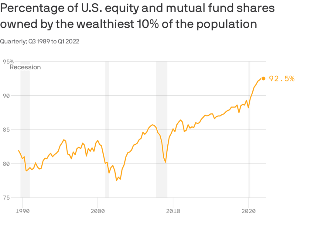
Axios recently put out an article with the graph below. As shown, the wealthy, defined as the top ten percent of the population as measured in wealth, own over 90% of stocks. The percentage has been steadily increasing. Axios notes that 58% of American households own stocks, but “in the aggregate, the amount of stock most of these folks own is tiny.” Considering that over the last ten years, the S&P 500 has grown on average slightly more than 10% a year, this graph partially explains the growing divergence between the wealthy and the poor. Is this Fed policy?
While the Fed will never say it, the divergence between the wealthy and the poor is partly a function of its policy. In 2010, Ben Bernanke came close to admitting such. He said, “Higher stock prices will boost consumer wealth and help increase confidence, which can also spur spending. Increased spending will lead to higher incomes and profits that, in a virtuous circle, will further support economic expansion.” In simple terms, the Fed, via easy monetary policy, sought to make the wealthy wealthier. Consequently, their increased spending would trickle down to the remaining 90% of the population. Fed policy is not well understood by the public. Maybe if it were, monetary policy for all, not just the banks and wealthy, would be in place.
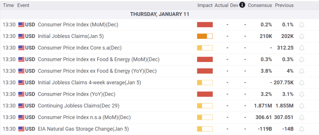
What To Watch Today
Earnings

Economy
Investing Summit: Early Bird Registration Available Now
January 27th, we are hosting a live event featuring Greg Valliere to discuss investing in the 2024 presidential election. What will a new president mean for the markets, the risks, and where to invest through it all? Greg will be joined by Lance Roberts, Michael Lebowitz, and Adam Taggart for morning presentations covering everything you need to know for the New Year.
Register now, as there are only 150 seats. The session is a LIVE EVENT, and no recordings will be provided.

Market Trading Update
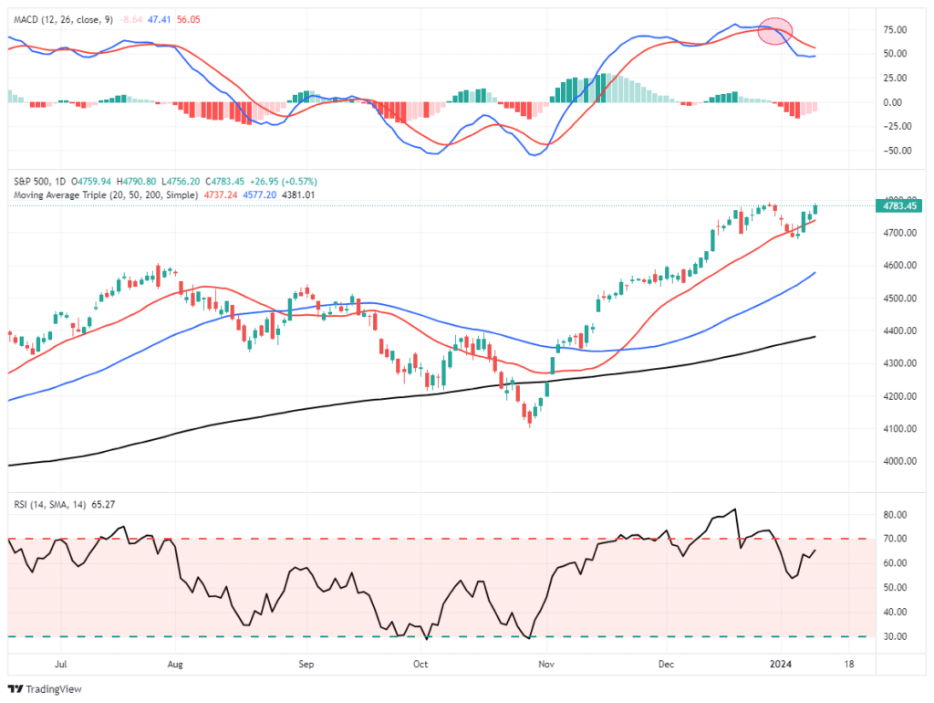
The market staged a decent rally yesterday, bouncing off the 20-DMA, but failed to push above last year’s highs. With all-time highs “within spitting distance,” the natural inclination is to push the market to that level sooner rather than later.
Notably, the rally over the last week has been a return of the “Magnificent 7,” which we saw again in yesterday’s heat map.
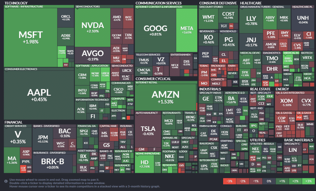
While we continue to expect a rotation of some sort to occur this year, it has yet to reveal itself. We continue to watch our factor and sector absolute performance graphs but have yet to see a definable trend emerge. As noted yesterday,
“The good news is that the market continues to hold above the 20-DMA, which is bullish. Continue to hold long positions as needed and watch for oversold opportunities to pick entry points for new or existing positions to increase overall equity exposure.”
So far, there has been little confirmation of any change other than the market continues its consolidation process that began in mid-December. However, if the inflation report comes in substantially weaker than expected, such could provide the boost needed for the market to break out to the upside. Such would provide a better opportunity to increase equity exposure if that should occur. Continue to maintain exposures for now.

Marathon Makes A Case For Resource Stocks
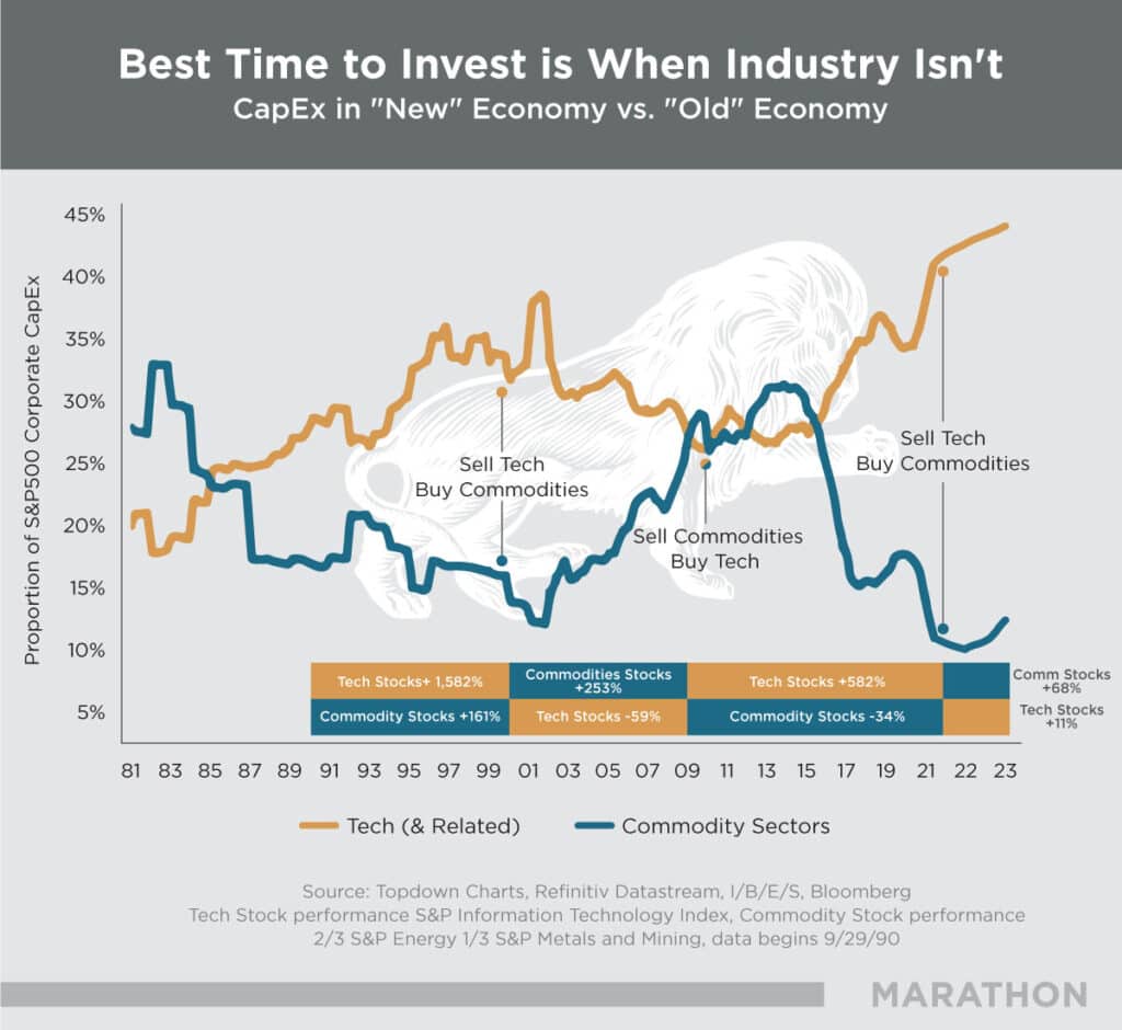
Marathon Resource Advisors recently published the graph below and, with it, a short explanation of why resource companies may outperform tech stocks in the coming years. Graphs showing the relative performance of resource stocks to broader market indexes are popular and, in some cases, the sole rationale for promoting resource stock investment. While cheap valuations are important, improving returns on capital is vital and often overlooked. Per their research:
Outsized investment returns come when two things happen – the initial price paid (in terms of valuation) for a company is relatively low, and that company experiences a period of improving returns on the capital it invests. The overall level of capital expenditures in any given sector gives clues as to the future returns in that sector, as both overcapitalized and undercapitalized sectors inevitably revert to the mean. High returns attract more capital, which effectively compete down returns as even marginal ideas/projects move forward. Eventually capital goes elsewhere, and that capital starvation creates a period of elevated returns as only the best ideas/projects get funded.
Since 2021, they have seen improved returns on capital. In fact, in many cases “superior to some of the most lauded and highly valued tech companies.” They summarize their investment outlook as follows:
Should we prove correct, then the current valuation of resource equities (in the cheapest 3% over the last 100 years per GMO) are likely unsustainably low. Improving valuations and accelerating profitability are a powerful combination.
Stocks and Bonds Are Highly Correlated
Often, the correlation between stocks and bonds vacillates. The graph on the left shows the five-year history of the S&P 500 and TLT. When the pandemic struck in 2020, fear of a recession or depression killed stock prices and significantly boosted bond prices. Consequently, the Fed and government rode to the rescue, and the trends reversed. The graph on the right highlights the last year. In the first half of the year, stock prices rose while bond prices fell. However, by August, higher bond yields began to worry stock investors. From that point on, the correlation between stock and bond prices has been incredibly positively correlated, as seen in the lower graph on the right side.
Looking ahead, the positive correlation may not hold. For example, if yields continue to fall, is it signaling a potential recession? If so, stocks may retreat. However, if yields start returning to recent highs, the stock market might fret as it did in August 2023. Ideally, steady to slightly lower bond yields are probably the best-case scenario for the stock market. In this case, the market calls it the Goldilocks scenario. Our latest article discusses this narrative- The Goldilocks Narrative Reigns For Now.

Tweet of the Day
“Want to have better long-term success in managing your portfolio? Here are our 15-trading rules for managing market risks.”
Please subscribe to the daily commentary to receive these updates every morning before the opening bell.
If you found this blog useful, please send it to someone else, share it on social media, or contact us to set up a meeting.
Also Read


