The scorecard report uses a series of technical studies to quantify how various sectors, factors, and indexes score on a technical basis versus the S&P 500 (relative value) or versus a more appropriate benchmark, as well as on an absolute stand alone basis (absolute value).
Relative Value Graphs
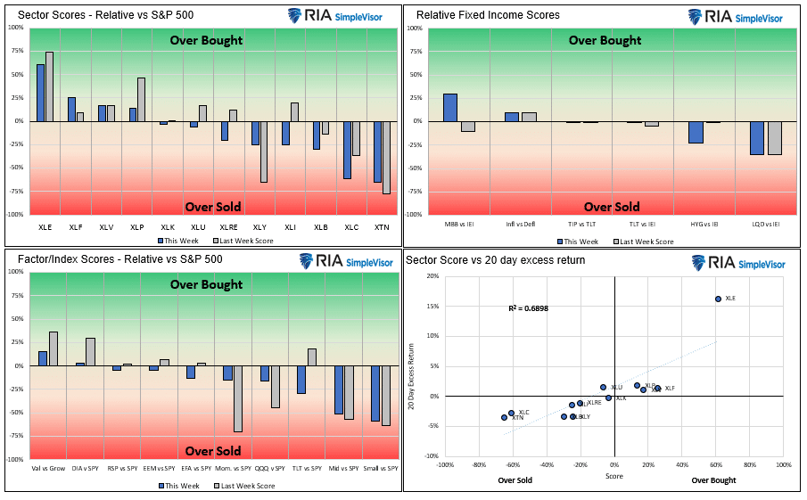
- Despite heavy volatility, the S&P ended relatively flat (-.27%) on the week. Many sectors outperformed or underperformed the benchmark by a good amount. Once again, the Energy sector continued to lead the market. Last week it beat the S&P 500 by nearly 5%. In the previous 35 trading days, it is beating the market by over 30%. Despite its strong relative performance, its relative score at 61% is not extremely overbought. As we show in the second set of charts, its absolute score is 74%, which is overbought and at a level that typically coincides with a decline. It has been nearly three standard deviations above its 200 dma for a few weeks running, arguing for consolidation or decline.
- Despite the 22% decline for Meta (Facebook) on weak earnings last week and its 22% weighting in the Communications sector (XLC), the relative score for Communications is only -61%. More relative downside is possible. However, its absolute score at -72% might spell temporary relief for the sector.
- Financial, Healthcare, and Staples, are relatively overbought, which is not surprising given they tend to be safer, more conservative sectors. The recent bout of volatility is likely pushing investors to the relative safety of these sectors.
- Small and Mid-Cap stocks continue to be the worst relative performers. Higher interest rates and inflation is problematic for many of these companies. Like the sector graphs, the most conservative sectors (Value and Dow Jones) are the highest-scoring in the factor/index graphs.
- The scatter plot shows a strong correlation between sectors score and excess returns. The correlation tells us the scores have been good predictors of relative performance.
Absolute Value Graphs
- The absolute scores tell a similar story, with Energy very overbought and the conservative sectors having the highest scores. While Transportations (XTN) has the weakest relative score, its absolute score at –32% is not too oversold and is higher than three other sectors. Communications remain the most oversold sector, in large part due to Meta’s weakness.
- Value vs. Growth is the only overbought factor/index. We venture to bet that its score would be oversold if you strip out energy stocks from the value sector.
- The S&P 500 remains slightly oversold as it has been for the last few weeks. The graph shows it retraced about a third of its recent decline in price and nearly half of its score. Our proprietary model is still on a buy signal but closing in on a potential sell signal in the next week or so. The S&P 500 MACD indicators are a little more bullish as it just signaled a bullish crossover from relatively low levels.
- Small-Cap, Developed Markets, and Communications are all over two standard deviations above their respective 200 dmas. Energy is nearly three above its 200 dma.


Users Guide
The technical value scorecard report is one of many tools we use to manage our portfolios. This report may send a strong buy or sell signal, but we may not take action if other research and models do not affirm it.
The score is a percentage of the maximum score based on a series of weighted technical indicators for the last 200 trading days. Assets with scores over or under +/-70% are likely to either consolidate or change the trend. When the scatter plot in the sector graphs has an R-squared greater than .60, the signals are more reliable.
The first set of four graphs below are relative value-based, meaning the technical analysis is based on the ratio of the asset to its benchmark. The second set of graphs is computed solely on the price of the asset. At times we present “Sector spaghetti graphs,” which compare momentum and our score over time to provide further current and historical indications of strength or weakness. The square at the end of each squiggle is the current reading. The top right corner is the most bullish, while the bottom left corner is the most bearish.
The ETFs used in the model are as follows:
- Staples XLP
- Utilities XLU
- Health Care XLV
- Real Estate XLRE
- Materials XLB
- Industrials XLI
- Communications XLC
- Banking XLF
- Transportation XTN
- Energy XLE
- Discretionary XLY
- S&P 500 SPY
- Value IVE
- Growth IVW
- Small Cap SLY
- Mid Cap MDY
- Momentum MTUM
- Equal Weighted S&P 500 RSP
- NASDAQ QQQ
- Dow Jones DIA
- Emerg. Markets EEM
- Foreign Markets EFA
- IG Corp Bonds LQD
- High Yield Bonds HYG
- Long Tsy Bonds TLT
- Med Term Tsy IEI
- Mortgages MBB
- Inflation TIP
- Inflation Index- XLB, XLE, XLF, and Value (IVE)
- Deflation Index- XLP, XLU, XLK, and Growth (IWE)


Michael Lebowitz, CFA is an Investment Analyst and Portfolio Manager for RIA Advisors. specializing in macroeconomic research, valuations, asset allocation, and risk management. RIA Contributing Editor and Research Director. CFA is an Investment Analyst and Portfolio Manager; Co-founder of 720 Global Research.
Follow Michael on Twitter or go to 720global.com for more research and analysis.
Customer Relationship Summary (Form CRS)
Also Read