S&P 500 – A Bullish And Bearish Analysis
The S&P 500 index is a critical benchmark for the U.S. equity market, and its performance often dictates investor sentiment and decision-making. Between November 1, 2022, and September 6, 2024, the S&P 500 experienced a significant rally but not without volatility. Currently, investors have very mixed views about where markets are heading next as concerns of a recession linger or what changes to monetary policy will cause.
However, as investors, we must trade the market we have today. Therefore, using technical analysis, we can explore bullish and bearish market dynamics to assist us in managing risk more effectively. This blog will outline three bullish and bearish perspectives using momentum, relative strength, and other key technical indicators. Finally, we will conclude with five actionable steps investors can take today to mitigate risk.
(Note: All data is as of the Friday, September 6 close.)
Bullish Outlook
1. Strong Support at Key Moving Averages
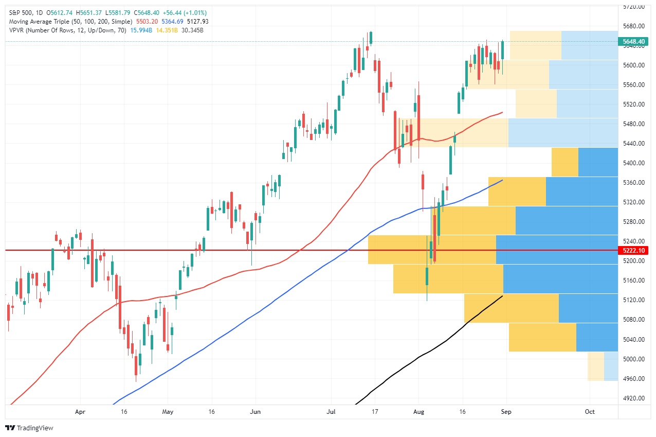
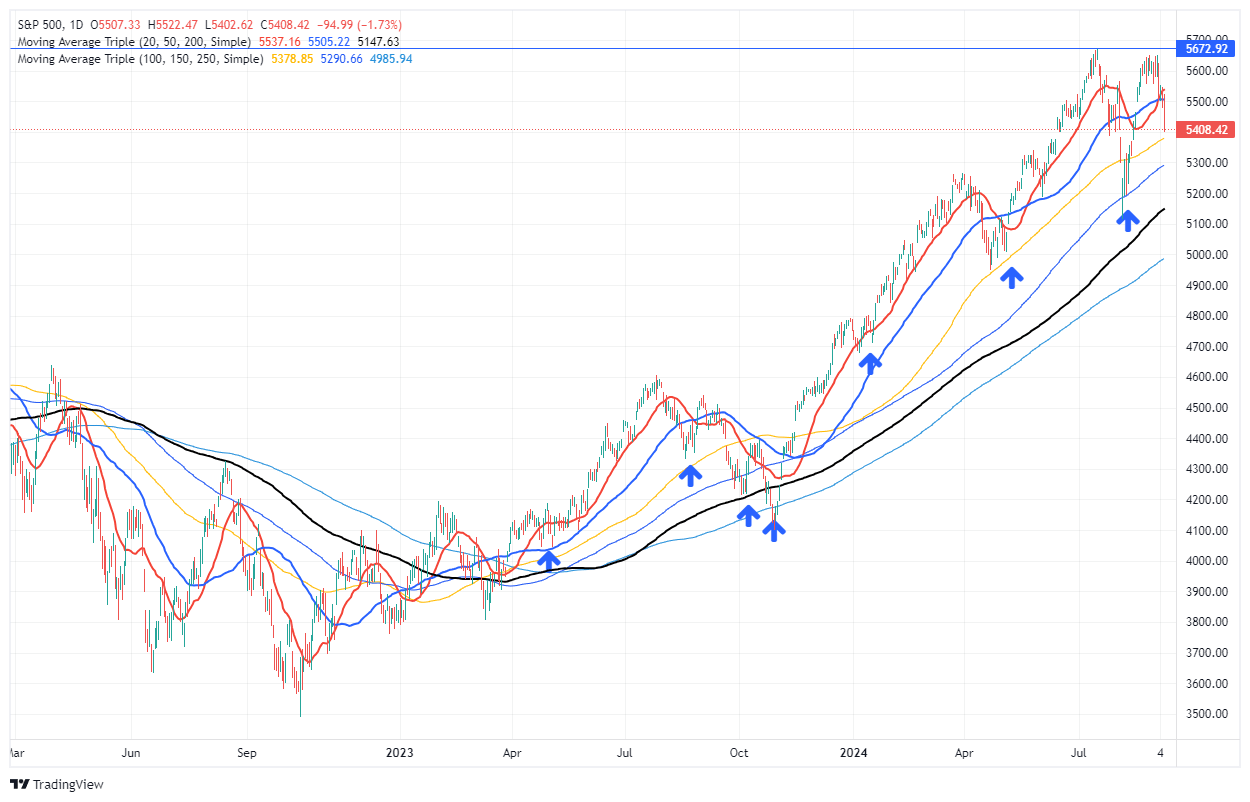
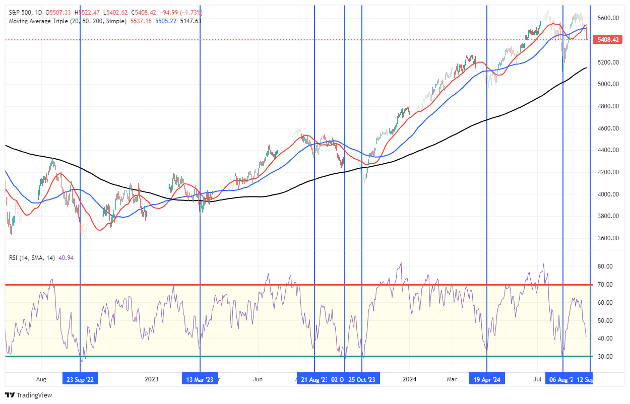
One of the primary bullish signals for the S&P 500 is its tendency to find support at critical moving averages. Throughout the analyzed period, the 50, 100, and 200-day moving averages supported the index significantly, particularly in late 2023 and early 2024. Even though the index faced downward pressure in August, its ability to bounce from the 150-day moving average indicates that buyers continue to find levels to increase equity exposure. Given the market has remained steadily above the 200-DMA and that average is trending higher, it signals that the longer-term bullish trend remains intact.
2. Momentum Indicators Point to Potential Reversal
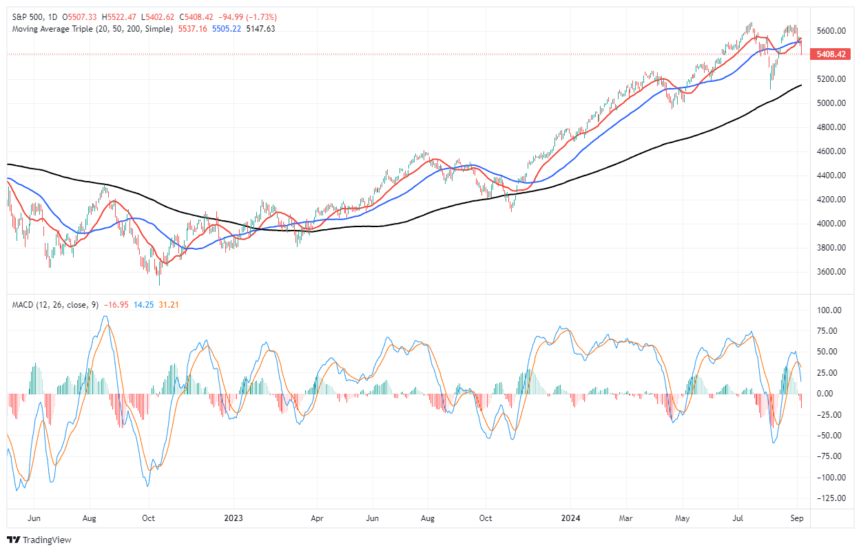
Momentum indicators such as the Moving Average Convergence Divergence (MACD) have recently triggered a short-term “sell signal,” which coincides with the recent price correction. However, while these signals have coincided with lower prices in the near term, they have consistently bottomed between -25 and -50. Such has provided investors with repeated opportunities to increase equity exposure over the last two years. When the MACD begins to register readings below -50, such has historically indicated when markets are turning from upward trending to lower trending prices.
3. Relative Strength Index (RSI) Near Oversold Levels
The Relative Strength Index (RSI) measures the magnitude of recent price changes. As of Friday’s close, the RSI is approaching more oversold levels near 30. While not there yet, which suggests markets could see additional weakness in the near term, low readings historically signal short-term market bottoms. Readings of 30 or below indicate that the selling pressure is likely overextended, and buyers tend to regain market control. In April and August 2024, the RSI hovered around these oversold levels, providing a strong signal for bullish traders to take advantage of a bounce. While the recent correction likely has further to go, the current low RSI readings suggest a bounce is likely. Investors should use any rally to rebalance portfolio risk.
However, investors should also consider the bearish warnings.

Bearish Outlook
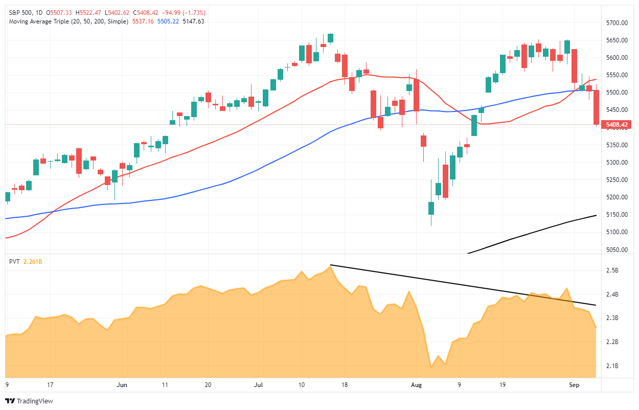
1. A Lower High
From a bearish perspective, the recent lower high of the market is concerning. If the market declines and sets a lower low, that is one of the more telling technical signals indicating a new potential bearish trend. Lower highs suggest buyers are losing conviction, and each new rally is weaker than the previous one. Simultaneously, lower lows suggest that selling pressure is increasing. This pattern, if sustained, could indicate a deeper corrective phase, possibly targeting lower support zones between 4600 and 5200. While the recent lower high is very early, a recent pattern to review is 2022.

If the market rallies in the weeks ahead, setting a new high, that price action will negate the warning from lower highs.
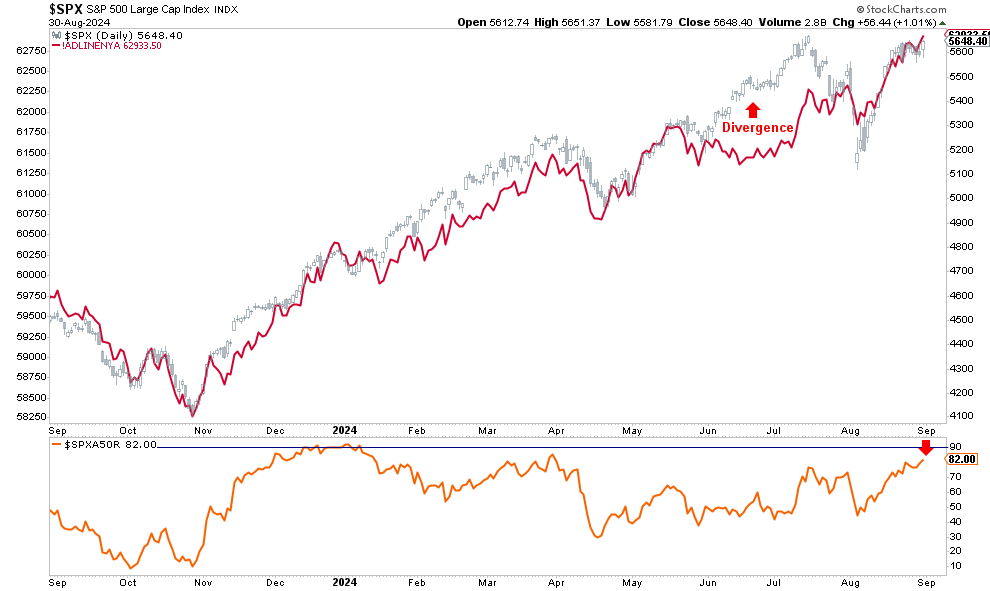
2. Decreasing Volume of Rallies
Another bearish indicator is the declining trading volume during recent rallies. According to technical analysis principles, strong price moves should be accompanied by increasing volume, signaling widespread market participation. However, rallies in the S&P 500 over the last two months coincided with lower volume levels. As discussed previously, these negative divergences warned investors that the upward move lacks conviction. The divergence between price and volume forewarned of this recent correction.
3. Longer-Term MACD Signals Turn Bearish
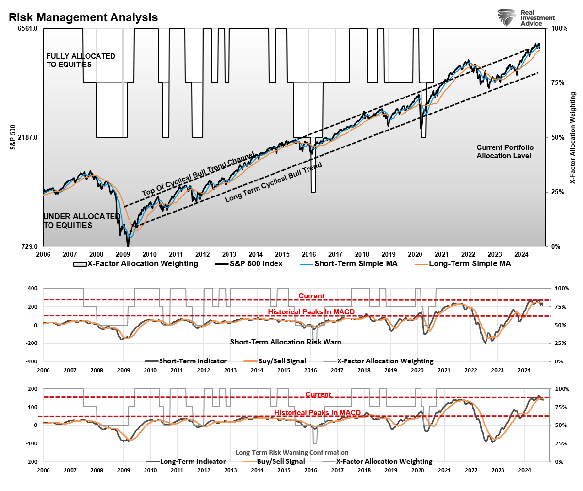
We regularly publish our longer-term technical analysis and statistics in the weekly Bull Bear Report (Subscribe for FREE). One of those charts is the Weekly Risk Management Analysis. The chart below matches an intermediate and longer-term weekly MACD signal to the markets. When both signals are on “buy signals,” such has coincided with a trending bull market advance. When both signals confirm a “sell,” as in early 2022, the market has gone through correctional phases.
Currently, while early, both the intermediate and longer-term MACD “sell” signals are registered. There are several crucial points to note:
- The market is trading at the top of its long-term trend channel from the 2009 lows. While it previously traded above that channel in 2021 due to artificial stimulus, the current advance may be near its current cycle peak.
- These are weekly signals and, therefore, very slow to move. Signals can whip back and forth for a month or so before becoming confirmed by a breakdown in the market.
- As noted, the market’s price action needs to confirm the “buy” and “sell” signals. If the market enters a deeper corrective phase, a break of the 200-DMA will confirm the end of the bullish advance that started in 2022.
Notably, while bullish and bearish signals exist, the market can remain in flux for quite some time. For example, the market is approaching oversold territory based on RSI, which typically suggests a reversal. However, the bearish price action and weak volume indicate that caution is warranted. Therefore, while some technical indicators provide conflicting signals, investors must manage near-term risk while waiting for markets to confirm their next direction.

5-Actions Investors Can Take Today to Minimize Risk
Given the mixed technical outlook for the S&P 500, investors should focus on managing risk while positioning themselves for potential market swings. Here are five actions to consider:
1. Trim Winning Positions Back to Their Original Portfolio Weightings
This strategy involves reducing your exposure to positions that have grown beyond their initial allocation due to price appreciation. When a particular asset or stock performs well, its weight in the portfolio increases, potentially leading to overexposure and imbalance. Trimming these positions back to their original weight helps lock in profits while maintaining your intended risk profile. It’s a way to ensure that no single asset dominates the portfolio, which could lead to increased risk if that asset faces a downturn.
2. Sell Those Positions That Aren’t Working
Selling underperforming assets is essential for managing risk and avoiding unnecessary losses. Suppose a stock or asset consistently underperforms relative to its peers or the market. In that case, it may be a sign that the investment thesis has failed or external factors negatively affect the position. Selling these positions frees up capital investors can reallocate to better-performing or more stable assets. It’s a proactive step to cut losses and prevent further erosion of your portfolio value.
3. Move Trailing Stop Losses Up to New Levels
A trailing stop loss is a risk management tool that automatically adjusts as a stock price rises, locking in profits and protecting against downside risk. Moving these stop-loss levels up as the price of an asset increases ensures that if the market reverses, you can capture gains without manually monitoring and selling the position. This strategy helps protect profits while allowing for further upside potential. It’s advantageous in volatile markets where prices can fluctuate significantly.
4. Review Your Portfolio Allocation Relative to Your Risk Tolerance
You should always align your investment portfolio with your risk tolerance, which may change over time due to market conditions or personal factors such as age, income, or financial goals. Reviewing your portfolio allocation means assessing how much your portfolio is invested in different asset classes (e.g., stocks, bonds, cash) and ensuring the risk level matches your current comfort level. For instance, if your portfolio has become more aggressive (higher exposure to stocks or growth assets), you may need to rebalance to reflect a more conservative risk profile, particularly as market conditions change.
5. Raise Cash Levels And Add Treasury Bonds to Reduce Portfolio Volatility
Increasing your cash allocation is a simple but effective way to reduce portfolio volatility. In times of uncertainty or market downturns, holding more cash can help minimize losses and provide liquidity for future opportunities. Cash is a low-risk asset that doesn’t fluctuate with the market, so increasing your cash position can help stabilize the overall portfolio and provide peace of mind during volatile periods.
Furthermore, investors consider Treasury bonds safer investments than stocks, providing stability and predictable income through interest payments. Adding bonds to a portfolio can help reduce volatility, particularly during economic uncertainty or stock market corrections. Bonds tend to have an inverse relationship with stocks, meaning they can perform well when equities struggle, particularly during Fed rate-cutting cycles.
Conclusion
The S&P 500’s technical landscape presents both opportunities and challenges. Bullish indicators such as support at the 200-day moving average and oversold RSI levels suggest a “buy the dip” opportunity could be on the horizon. However, bearish patterns like lower highs and weakening volume during rallies warn of further downside risks.
We don’t know what will happen next, nor does anyone else. Therefore, we suggest a regular diet of risk management and portfolio rebalancing to navigate periods of elevated uncertainty.
Could I be wrong? Absolutely.
But what is worse:
- Missing out temporarily on some additional short-term gains or
- Spending time getting back to even, which is not the same as making money.
“Opportunities are made up far easier than lost capital.” – Todd Harrison
Trade accordingly.