The MACD, or moving average convergence divergence, is a well-followed technical indicator that helps spot changes in the momentum and strength of a trend. The MACD is the difference between a longer and shorter-term moving average, while its signal is a shorter-term moving average. Like any technical indicator, it is not perfect, but the MACD and its signal at their current juncture are worth watching. When using the MACD, it’s important to follow the indicator and its relationship to its signal. Sometimes, a cross of the MACD and its signal is a first warning of pending trend changes. The graph below shows the weekly S&P 500, the 50- and 200-wma’s, and below it, the MACD (orange) and its signal (blue).
The MACD just started to decline from a high level and just crossed its signal. That is an early warning that the rally that kicked off in October may be ending. However, we are not overly concerned at the moment. First of all, the market was overextended versus its moving averages. As we have been saying, a correction is normal and healthy. Second, it’s not uncommon for the MACD to stay elevated and cross back and forth with its signal. From August 2020 through April 2021, the MACD and signal crossed a few times, but both kept rising. Similar activity occurred through much of 2019. We will watch out for further technical deterioration, but thus far, we remain in the camp that this is a healthy rest bit, and the bullish trend may continue through year-end. All bets are off in 2024 as headwinds from higher interest rates will strengthen.

What To Watch Today
Earnings

Economy

Market Trading Update
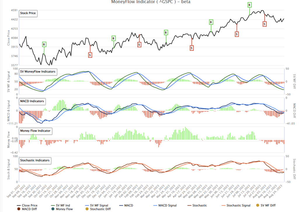
As we noted yesterday, a rally this week was expected, given both the short-term oversold condition of the market and the rather marked decline in investor sentiment. The market successfully tested and held the rising bullish trend, and the MACD “sell signal” is very close to a turn. If the market gets some follow-through tomorrow and breaks above last week’s pre-Jackson Hole Summit speech high, then there is little to stop the rally from retracing to 4600.

Our SimpleVisor MoneyFlow signal is also oversold and beginning to turn, which should confirm the MACD buy signal when it occurs. Such would also suggest a short-term push higher. This rally could be short-lived as we are still in the seasonally weak period heading into September. Therefore, use the rally to rebalance portfolio risks accordingly for now.


Stocks Vs. Bonds
Over the past month, we have written two articles comparing the prospects of stocks versus bonds: Government Bonds Or Stocks, Which is the Better Choice Now? and Stocks Versus Bonds: Allocating For The Next Ten Years.
Both tackle the return prospects of stocks versus bonds from different angles but come to similar conclusions.
In other words, the most hated asset class of 2022 may perform much better than stocks when a recession occurs. So, yes, individuals have a significant value opportunity to buy government bonds today.
History, analytical rigor, and logic argue that long-term buy-and-hold investors should shift their allocations from stocks toward bonds.
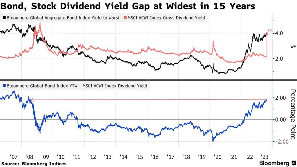
The Bloomberg graph below also argues that bond allocations should be increased. Bonds currently offer a 180 basis point yield premium over equity dividend returns, the widest gap in 15 years.

Tightest Fed Monetary Policy In Decades
Last week, we wrote about the neutral interest rate and Fed members pushing to consider increasing it. Per our Daily Commentary from August 25:
The neutral rate is a hypothetical interest rate that matches the supply and demand for capital. Most economists believe the neutral rate equals the natural economic growth rate. Some Fed members think it should be increased. They believe the nation’s natural economic growth rate will be higher than it has been. Powell has previously poo-pooed the neutral rate, saying that using it to administer monetary policy is akin to “navigating by the celestial stars.”
We also wrote about the neutral rate a few days earlier in a section entitled Is Fed Policy Shifting To Higher For Longer Forever? Per the article:
A higher neutral rate implies the Fed would keep the long-term average Fed Funds rates higher than otherwise.
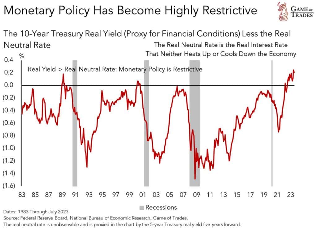
The graph below, courtesy of the Game of Trades, sheds light on why some Fed members think the neutral rate should be higher. Bond real yields (nominal yield less inflation) minus the real neutral rate is at the highest level in decades. Such implies that monetary policy is now the most restrictive since the early 1980s. Each prior peak ultimately resulted in a recession. The neutral rate should be higher if you think the natural economic growth rate is now higher than prior trends. Increase the neutral rate, and the red line below will not be at a peak. Such a stance justifies higher for longer. It’s worth pointing out on the graph that it can take a year or two between peak restrictive policy and recession. Such is the lag effect.

Tweet of the Day

Please subscribe to the daily commentary to receive these updates every morning before the opening bell.
If you found this blog useful, please send it to someone else, share it on social media, or contact us to set up a meeting.


