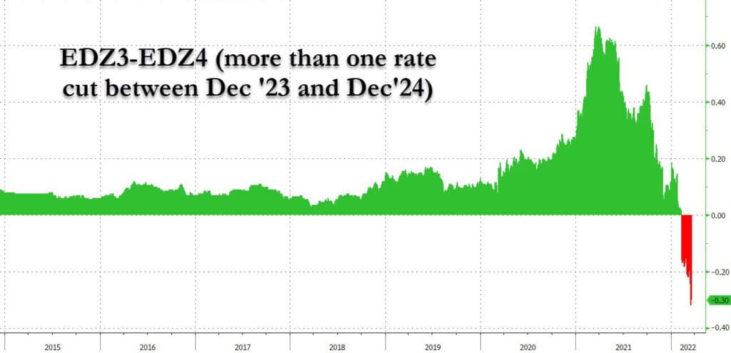
On Monday, Powell reiterated the need to normalize monetary policy. Per his speech: “There is an obvious need to move expeditiously to return the stance of monetary policy to a more neutral level, and then to move to more restrictive levels if that is what is required to restore price stability.” At the same time, yield curves continue to flatten signaling a future recession. With it, the odds of future interest rate cuts increase. The graph below from Zero Hedge shows the eurodollar markets are priced for 30bps of interest rate cuts in 2024. While such expectations may seem odd given Fed plans, higher interest rates will slow economic growth and inflation substantially and likely warrant a cut in rates. Given the economy’s heavy dependence on debt, we would not be surprised if the next interest rate cut comes sooner than 2024.
[dmc]
What To Watch Today
Economy
- 10:00 a.m. ET: Richmond Fed Manufacturing Index, March (2 expected, 1 in February)
Earnings
Pre-market
- Carnival Corp. (CCL) is expected to report an adjusted loss of $1.23 per share on revenue of $2.24 billion
Post-market
- Adobe (ADBE) is expected to report adjusted earnings of $3.34 per share on revenue of $4.24 billion
Market Trading Update
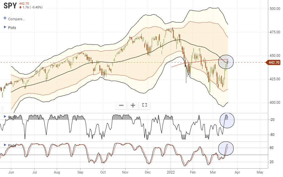
After a strong run last week, it wasn’t surprising to see the markets digest their gains a bit. The 50- and 200-dma crossover is providing strong resistance, but the market held the 50-dma yesterday. A pullback and test of the previous support is possible to reduce some of the current short-term overbought conditions. However, for the market to make new all-time highs, we will need interest rate cuts from the Fed rather than hikes.
The Pain Trade May Be To The Upside
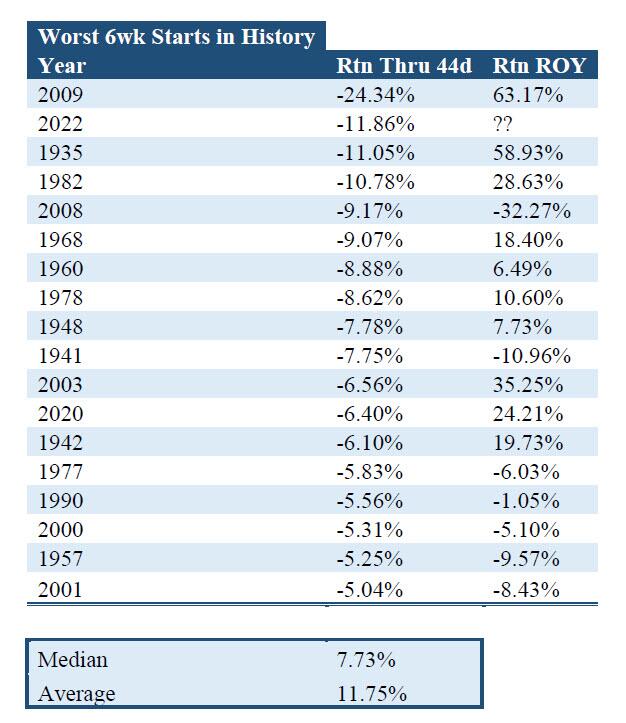
“Entering last week, the S&P 500 was off to the second-worst start to the year since 1928, with only 2009 starting off worse. However, in a remarkable reversal, heading into Wednesday’s FOMC rate hike – the first since 2018 – and Friday’s massive OpEx, stocks shot up on the back of a massive delta and gamma squeeze as well as rising expectations for a full-blown recession as soon as 2023, and posted their best 4-day return since the 2020 election on hopes the Fed’s tightening cycle will be far shorter than consensus expects.
Is sentiment starting to shift? Consider this: since 1928, there have been 17 instances that the S&P was down at least >5% through 45 trading days. What happened next – the average return for the rest of the year is +11.75%.” – Zerohedge
Treasury Supply is Coming!
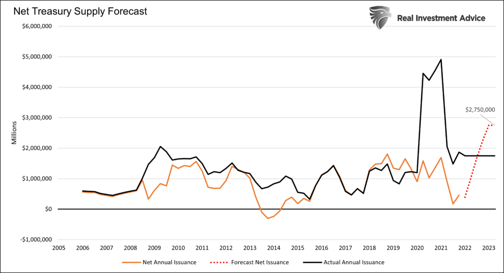
At last week’s FOMC meeting, Jerome Powell hinted the Fed could begin reducing its balance sheet by $1 trillion per year starting as early as May. The graph below shows that if the Fed follows such a path, the supply of Treasury debt will be significant. The black line below plots annual issuance. The orange line subtracts Fed purchases to arrive at net issuance/supply. As we show, the net issuance (after Fed purchases) was about $1.5 trillion during the Pandemic. The Fed absorbed a large portion of the massive fiscal stimulus.
The red dotted line projects the net supply/issuance in the future. Assuming $1.75 trillion in annual borrowing and $1 trillion a year of QT, there will be $2.75 trillion of bonds on the market. That is well above the levels of 2020 and 2021, and nearly 3x the amount in the years before the Pandemic. The Fed may want to normalize its balance sheet, but such may not be possible without causing problems in the Treasury market.
Margin Debt vs Buybacks
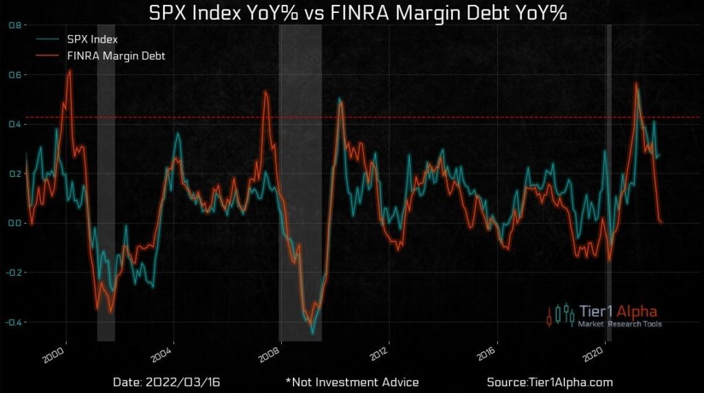
The graphs below, courtesy of Callum Thomas, tell an interesting story. The first graph shows the robust correlation between the change in margin debt and the S&P 500. Recently the correlation has broken down. Typically a sharp decline in margin debt is accompanied by a similar change in the S&P 500. While the year-over-year change in the S&P 500 has fallen, it has not declined as much as margin debt. The second graph may help answer what is supporting stocks as margin liquidity declines. Per Callum: Buybacks to the rescue? “Firms in the S&P 500 have outlined buyback plans valued at $238 billion through the first two months of 2022, according to data from Goldman Sachs, a high for this point in the year.”

Bonds Back In Favor
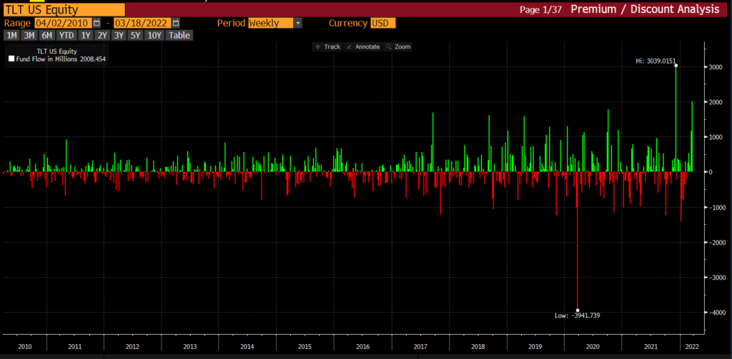
The graph below shows investors are accumulating the long-term Treasury ETF TLT at a near-record rate. Last week TLT, the 20-30yr Treasury ETF proxy, saw approximately $2 billion in inflows, the second-highest amount in 20 years. That follows strong inflows in the week prior. Longer maturity bond investors seem to be looking beyond the current bout of inflation. The focus is likely the adverse economic effects of higher Fed Funds and the economic tax of high inflation rates.
Utilities– An Expensive Safe Haven
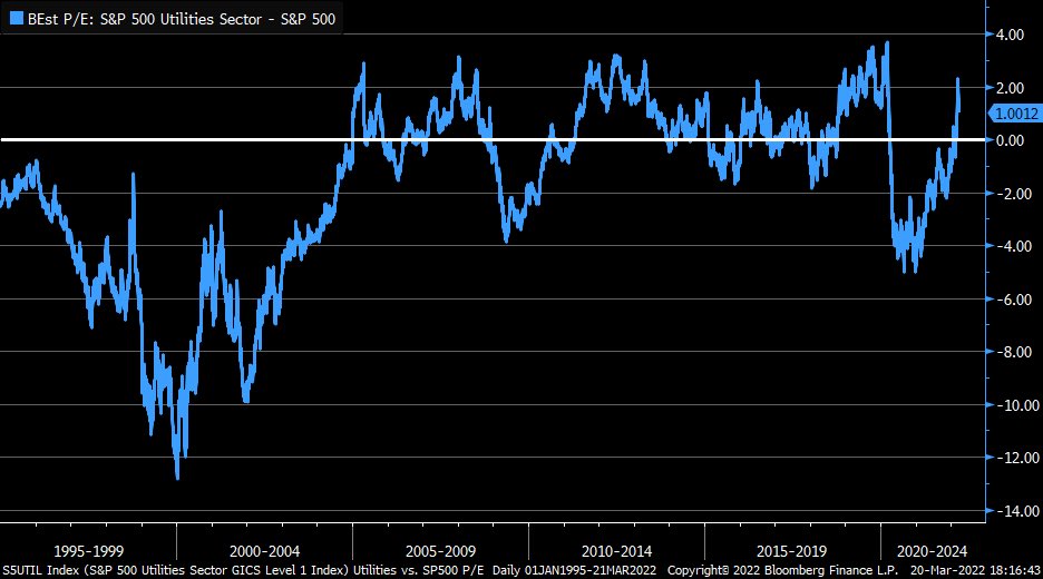
The graph below charts the difference between the P/E ratio of the Utilities Sector and the S&P 500. Currently, the Utility sector has a higher P/E valuation than the market and is currently closing in on its peak differential from the last 25+ years. The Russian invasion is helping Utilities as investors flock to the “safe haven” sector. Such is typical when markets are volatile. Year to date, XLU is flat while the S&P 500 is down 7%.
Please subscribe to the daily commentary to receive these updates every morning before the opening bell.


