It’s a tale of two bull markets. One part of the market is trading as you would expect with near depressionary economic numbers. The only description for the other part is “insane.”
In last week’s #Macroview, we discussed that “March Was Only A Correction” and not a bear market. To wit:
“The distinction is essential.
- ‘Corrections’ generally occur over short time frames, do not break the prevailing trend in prices, and are quickly resolved by markets reversing to new highs.
- ‘Bear Markets’ tend to be long-term affairs where prices grind sideways or lower over several months as valuations are reverted.
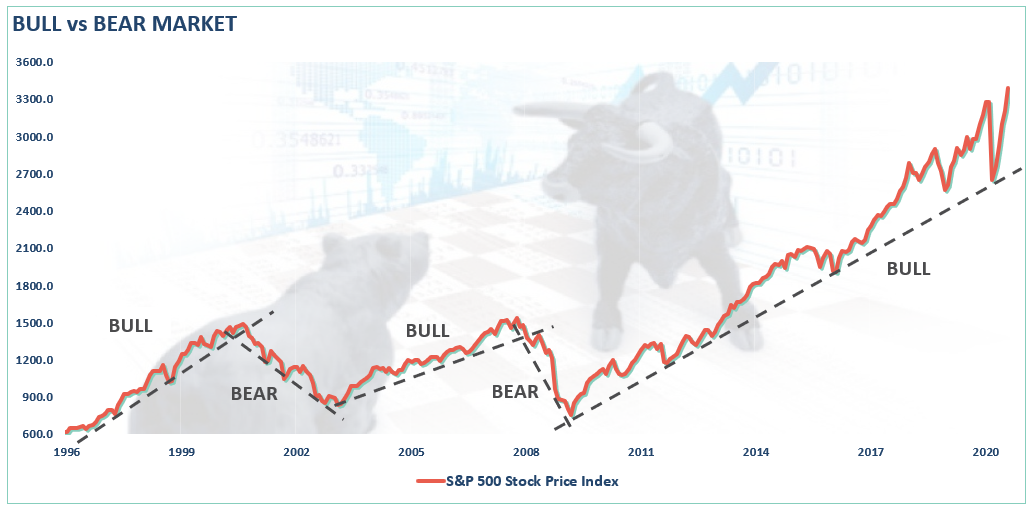
Using monthly closing data, the “correction” in March was unusually swift but did not break the long-term bullish trend. Such suggests the bull market that began in 2009 is still intact as long as the monthly trend line holds.
As we concluded last week:
“There is a sizable contingent of investors, and advisors, today who have never been through a real bear market. (No, March was not it) After a decade long bull-market cycle, fueled by Central Bank liquidity, it is understandable why mainstream analysis believed the markets could only go higher. What was always a concern to us was the rather cavalier attitude they took about the risk.
What gets lost during bull cycles, and is always found in the most brutal of fashions, is the devastation caused to financial wealth during a ‘mean reversion’ process.”
It is the issue of a “mean reversion” that we want to delve into this week.
Kyōki
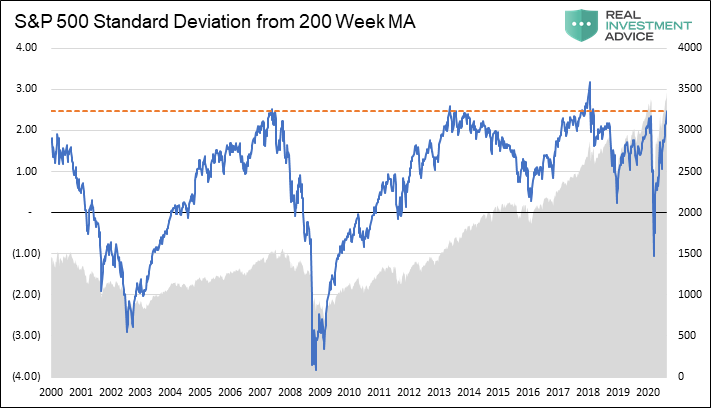
Kyōki is the Japanese word for “insanity.” That was the word that came to mind when my co-portfolio manager, Michael Lebowitz, emailed me the following chart.
The chart is WEEKLY data, which smooths out some of the short-term volatility. What is displayed is the standard deviation of the market from its 200-WEEK (4-year) moving average.
Another reason March was only a “correction” within the bull trend, is the reversion did not violate the negative 1-standard deviation level during the retracement. Such was the same as during 2015-2016, and 2018 corrections.
Notably, each time of the 5-times previously, going back to 1999, where the market traded at 2-standard deviations or higher from the 4-year moving average, a reversion occurred. Those periods were 2000, 2007, 2014, 2018, February 2020, and now.
The critical definition is that of a “mean reversion:”
“Mean reversion is a theory used in finance that suggests that asset prices and historical returns eventually will revert to the long-run mean or average level of the entire dataset.”
An average price can only exist if the market trades both above and below the average price during the period. As shown, “reversions to the mean,” have occurred with regularity from extremes and tend to be more destructive events from deep corrections to bear markets.
Before we go much further, let’s get a better understanding of the importance of “standard deviation.”
What Is Standard Deviation
As I discussed in “Revisiting Bob Farrell’s 10 Investing Rules”:
“Like a rubber band that has been stretched too far – it must be relaxed in order to be stretched again. This is exactly the same for stock prices that are anchored to their moving averages. Trends that get overextended in one direction, or another, always return to their long-term average. Even during a strong uptrend or strong downtrend, prices often move back (revert) to a long-term moving average.”
The idea of “stretching the rubber band” can be measured in several ways, but I will limit our discussion this week to Standard Deviation and measuring deviation with “Bollinger Bands.”
“Standard Deviation” is defined as:
“A measure of the dispersion of a set of data from its mean. The more spread apart the data, the higher the deviation. Standard deviation is calculated as the square root of the variance.”
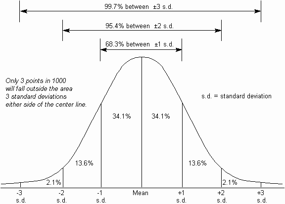
In plain English, and as shown in the chart below, the further away from the average an event occurs, the more unlikely it becomes. As shown below, out of 1000 occurrences, only three will fall outside of the area of 3 standard deviations. 95.4% of the time, events will occur within two standard deviations.
For the stock market, and as shown in Michael’s chart above, the standard deviation is currently outside of 2-standard deviations.
In other words, the “rubber band is extremely stretched.”
Bollinger Bands
Another way to measure deviation is by using “Bollinger bands,” which we will use in the charts below. John Bollinger, a famous technical trader, applied the theory of standard deviation to the financial markets.
Because standard deviation is a measure of volatility, Bollinger created a set of bands that would adjust themselves to the current market conditions. When the markets become more volatile, the bands widen (move further away from the average), and during less volatile periods, the band’s contract (move closer to the average).
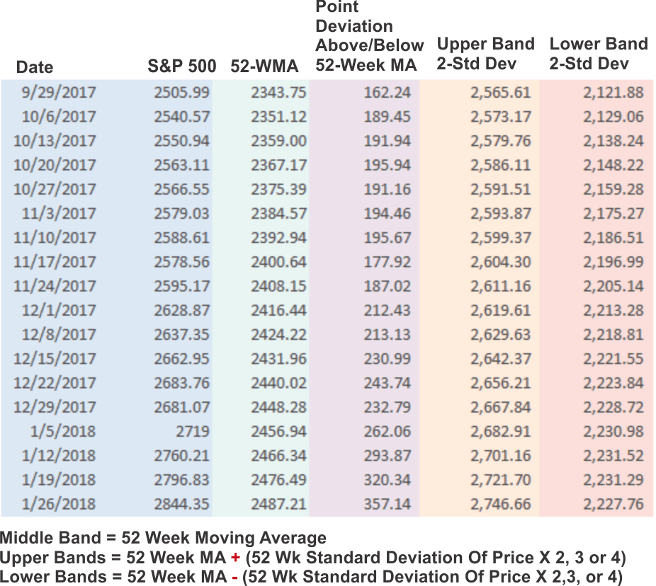
The math, courtesy of Stockcharts.com is pretty straight-forward, as shown in the table below. (The only difference between 2, 3 or 4 standard deviations from the mean is the multiplication factor at the end of the formula)
Note: For you excel geeks like me, you can calculate using the STDEVPA formula as follows:
=Current 52-Week MA level +/- (STDEVPA(52-week range of S&P 500 prices) * 2, 3 or 4)
Measuring Markets
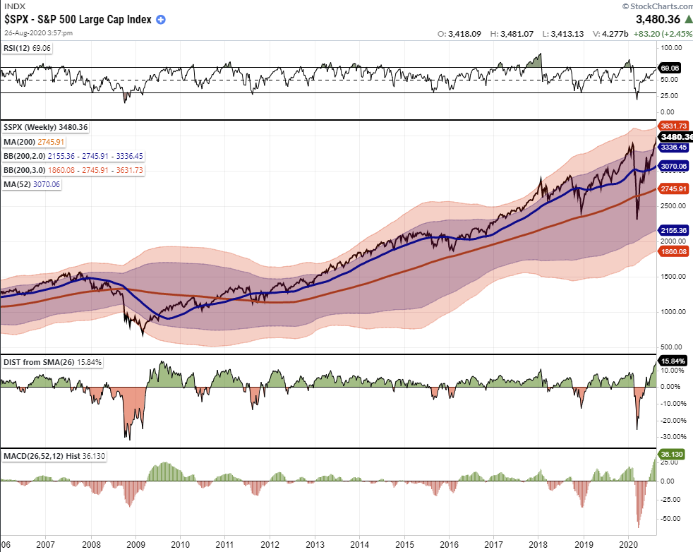
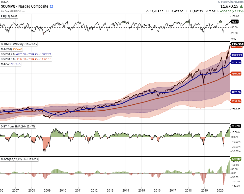
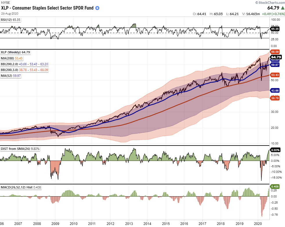
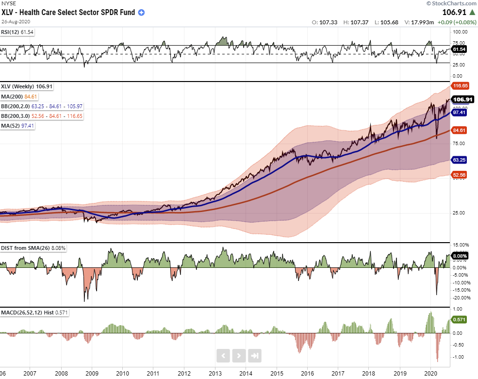
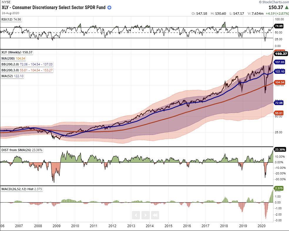
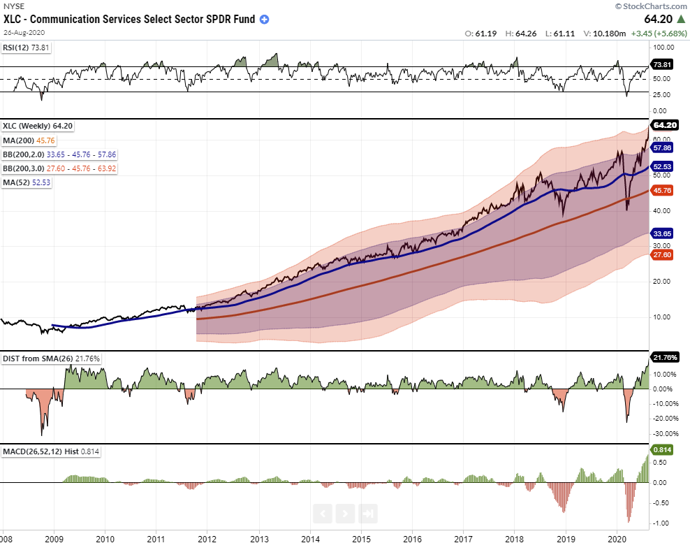
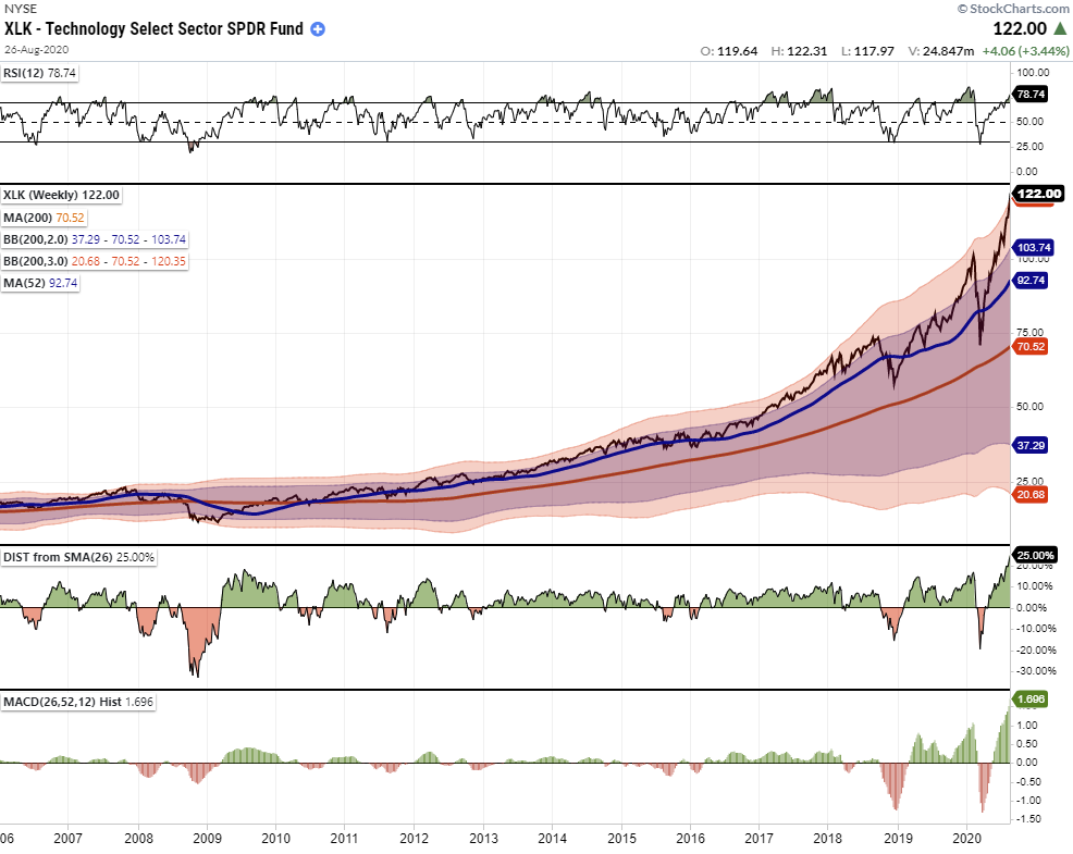
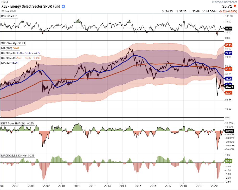
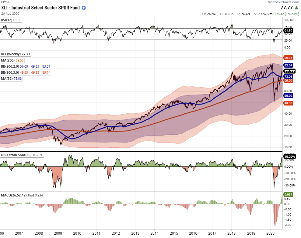
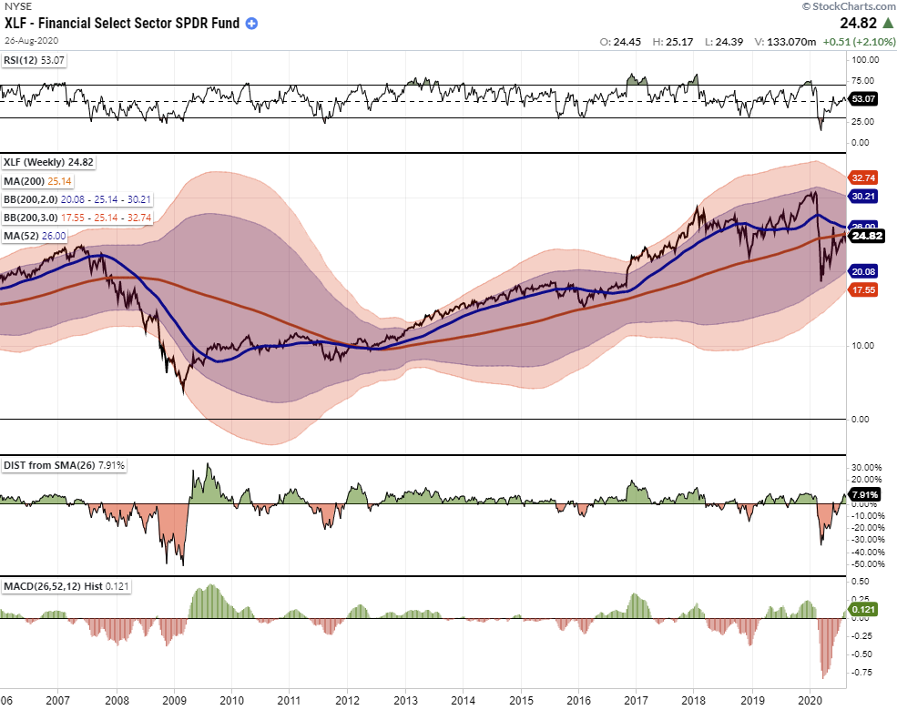
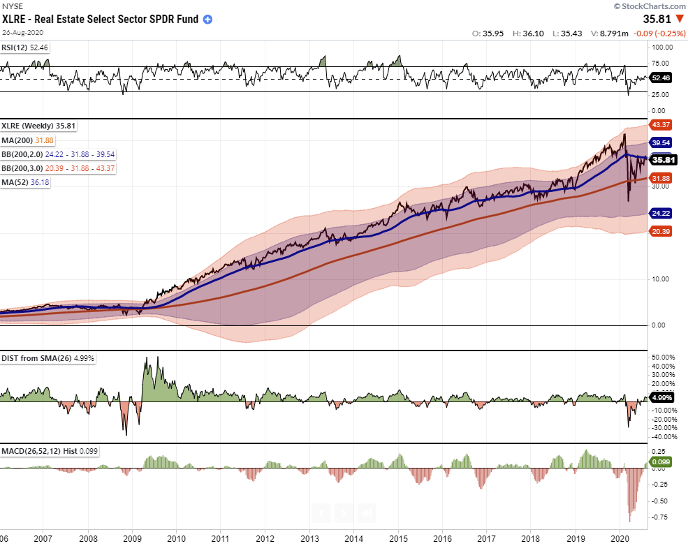
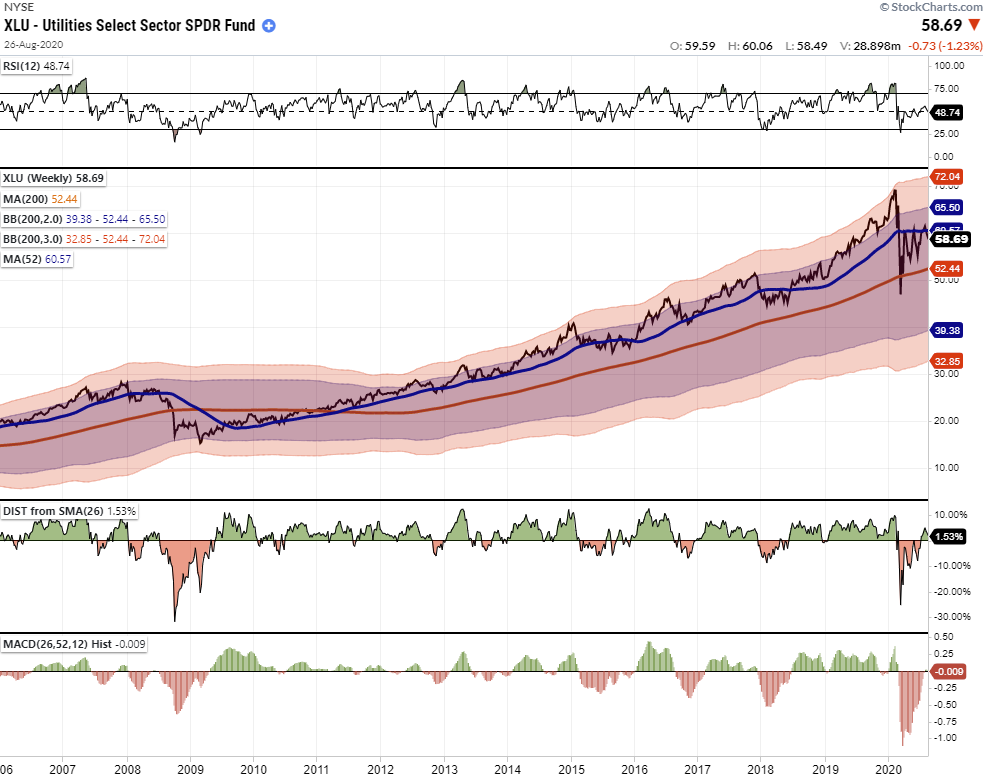
All of the following charts are WEEKLY and use the same measures for consistency in the analysis.
- Top Panel: 12-week RSI (Relative Strength Index) (One quarter)
- Main Panel: Index 52-week (1-year) and 200-week (4-year) moving averages AND 2- and 3-standard deviation measures of the 200-week moving average.
- Lower Panel: Distance of the index from its respective 200-week moving average.
- Bottom Panel: Moving Average Convergence Divergence (MACD) histogram using 26-weeks (6-months) and 52-weeks (1-year) for the short and long-term moving averages.
Because we are using weekly data, these charts are longer-term in nature and will take time to develop. Therefore, it does NOT mean that a “reversion” process will begin tomorrow. However, the message these charts provide is essential over longer holding periods.
In the charts below here are the critical items to note:
- The current level of RSI is above 70
- Index is ABOVE 2-standard deviations (pushing into the “red zone.”)
- The distance from the 26-week moving average (6-months) is above 12%
- The MACD histogram is above 20
These are all levels that have typically represented extremes and have preceded short-term correction. The MORE EXTREME readings generally have resulted in deeper corrections and outright bear markets.
With that explanation, let’s explore the two different bull markets which currently exist.
Major Markets At Extremes
It is quite remarkable that given the economic devastation, the S&P 500 is trading at not only at record highs, but at near-record deviations of the 4-year moving average and MACD readings. Historically, such deviations have either been resolved by a correction back to the 4-year moving average or a full-fledged bear market.
The technology-heavy Nasdaq is hitting massive extremes with the one-year RSI above 70, and trading at 4-standard deviations above the 4-year moving average. (Note: 4-standard deviations suggests the Nasdaq has accounted for roughly 99.99% of all potential price gains.) With the deviation from the 6-month moving average and the MACD extension at record levels, there is an increased risk of a significant correction.
It is hard to make a technical case at this juncture for significant price gains from current levels. While it is possible prices could push higher in the very short-term, it is only increasing the amount of “fuel” to feed the next correction.
Looking at the major markets, however, is akin to viewing the ocean. What you see on the surface may hide what lurks beneath.
When we look at individual sectors, this is where we see two very different bull markets.
Sectors At Extremes
As shown in the series of charts below, Staples, Healthcare, Communications, Technology, and Discretionary have been the drivers of the “raging” bull market. Such is because these sectors also make up roughly 75% of the S&P 500 index. Importantly, Technology (MSFT), Discretionary (AAPL, AMZN), and Communications (FB, NFLX, GOOG), comprise 51% of the index total.
Given the extreme extensions in the underlying stocks which comprise these sectors, the record extensions of the sectors should be no surprise.
Each of the sectors shown below is pushing 3-standard deviations of the 4-year moving average. Furthermore, each has significantly deviated from their respective 6-month moving averages. Their respective MACD’s and RSI’s are also pushing levels which have previously coincided with corrections and bear markets.\
Staples
Health Care
Discretionary
Communications
Technology
Not surprisingly, given the Top-5 mega-capitalization companies are found in Technology, Discretionary, and Communications, these are the most egregiously overbought and extended sectors.
When these sectors correct, and they will, it will drag the entire market lower.
So, is there a place to potentially shield yourself within the stock market itself? Maybe.
Sectors In A Struggling Bull Market
As I stated, however, there is another bull market, which is not so “bullish.” These sectors also contain companies that exhibit real value and high dividend yields.
Energy, Real Estate, Utilities, and Finance are in a much different position than the rest of the market. Each of these sectors just recently triggered MACD “buy signals” (the 6-month moving average crossed above the 1-year moving average), which suggests there may be opportunities in these sectors.
Energy
Industrials
Financials
Real Estate
Utilities
In theory, these sectors, which have been weak in terms of relative performance to the S&P 500, may well provide some “safety” during a market correction. Given Utilities, Real Estate, Financials, and Energy specifically have a substantially higher “dividend yield” relative to the S&P 500, money tends to hide in these sectors during “risk-off” market rotations.
Understanding The Risk
Over the next several weeks, or even months, the markets can certainly extend the current deviations from the long-term mean even further. But that is the nature of every bull market peak, and bubble, throughout history as the seeming impervious advance lures the last of the stock market “holdouts” back into the markets.
As Vitaliy Katsenelson once wrote:
“Our goal is to win a war, and to do that we may need to lose a few battles in the interim. Yes, we want to make money, but it is even more important not to lose it.”
I wholeheartedly agree with that statement which is why we remain invested, but hedged, within our portfolios currently.
Unfortunately, most investors have very little understanding of the dynamics of markets and how prices are “ultimately bound by the laws of physics.” While prices can certainly seem to defy the law of gravity in the short-term, the subsequent reversion from extremes has repeatedly led to catastrophic losses for investors who disregard the risk.
Just remember, in the market, there is no such thing as “bulls” or “bears.”
There are only those that “succeed” in reaching their investing goals and those that “fail.”

