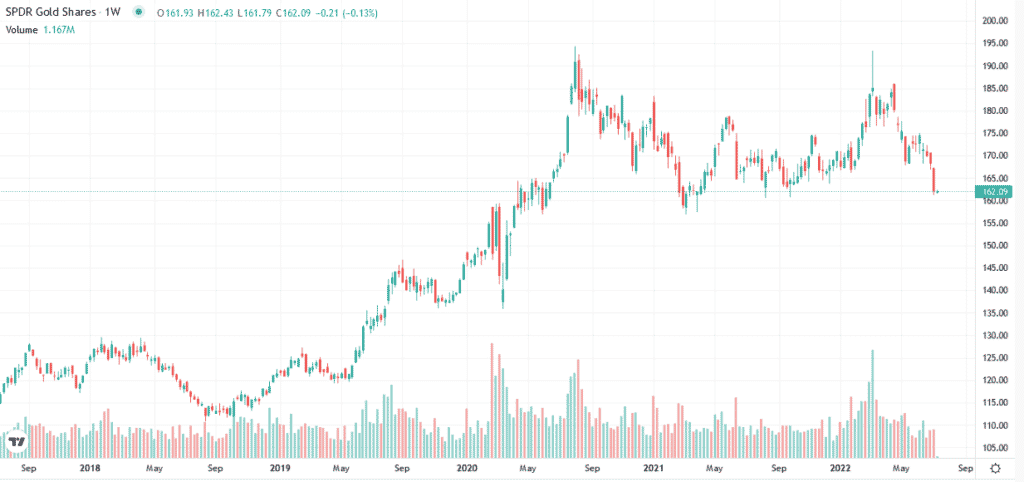
As we show below, gold (GLD gold ETF) prices have taken it on the chin lately. The current gold price is approaching critical support. Given this crucial price level, let’s discuss what is driving the price of gold lower. Most analysts will tell you the strong dollar is responsible for lower gold prices. While there is merit to the statement, history has proven that the correlation between the dollar and gold prices is not strong. That said, when the dollar rises due to responsible monetary policy, as we see today, gold tends to languish. This relationship manifests itself in the correlation between gold and real interest rates. We share more on this below to help you better ascertain if gold prices will hold the line at support or risk a much deeper breakdown.

What To Watch Today
| What to watch today |
| Economy NFIB Small Business Optimism, June (93.2 previously) Earnings Pre-market PepsiCo (PEP) Post-market No notable companies are expected to report. |
Market Trading Update – Resistance Holds
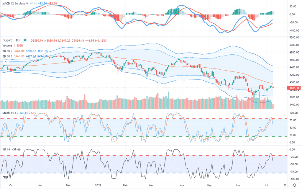
After the recent rally moved indicators back into overbought territory, sellers returned yesterday as inflation data lies ahead. With analysts now rapidly cutting earnings estimates before announcements get underway, it proved too much yesterday as the 50-dma continues to act as trend resistance to any rally. Use any rally over the next few days to cut exposure as needed to reduce risk accordingly.
Bullish Seasonality
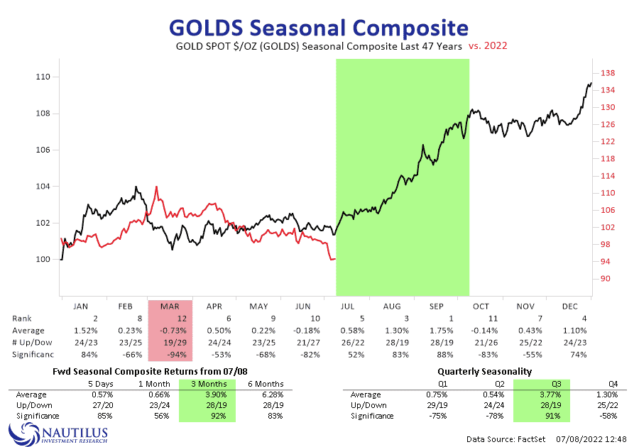
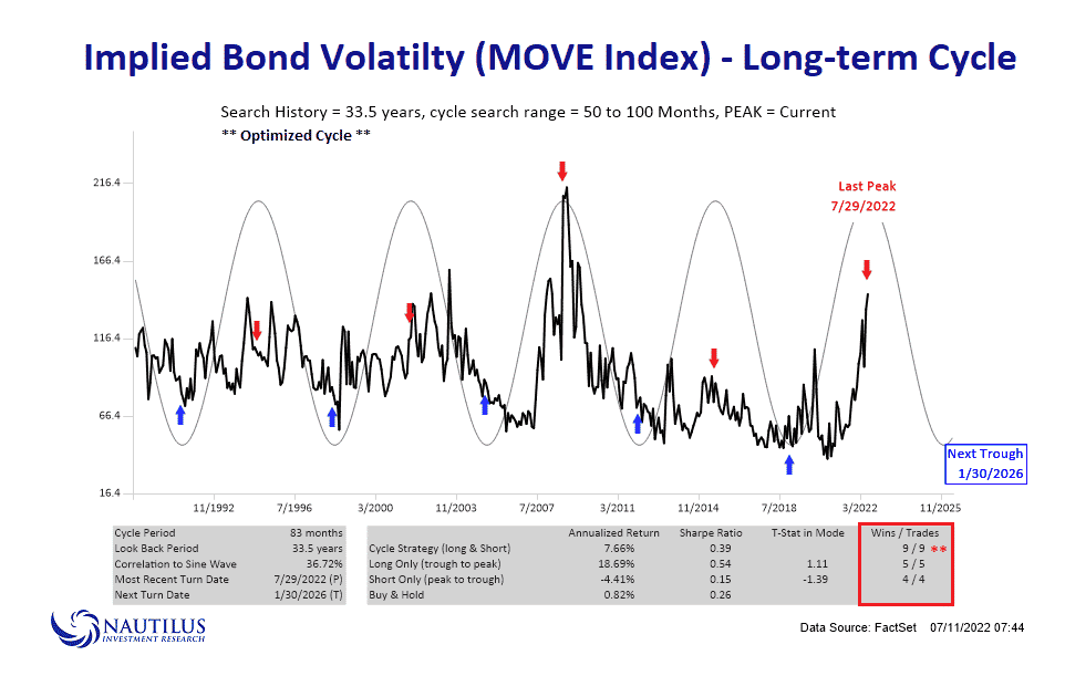
The three graphs below show the next few months should provide a seasonally bullish bias for stocks, bonds, and gold. The seasonal pattern for stocks and gold are clear-cut. The bond seasonality is not as easy to ascertain. The MOVE Index shows that volatility in bond yields should slow over the coming five months. Declines in bond prices tend to elevate the MOVE index. Conversely, we should expect higher bond prices if the MOVE index falls, as the chart shows.

What‘s In Store for Gold Prices?
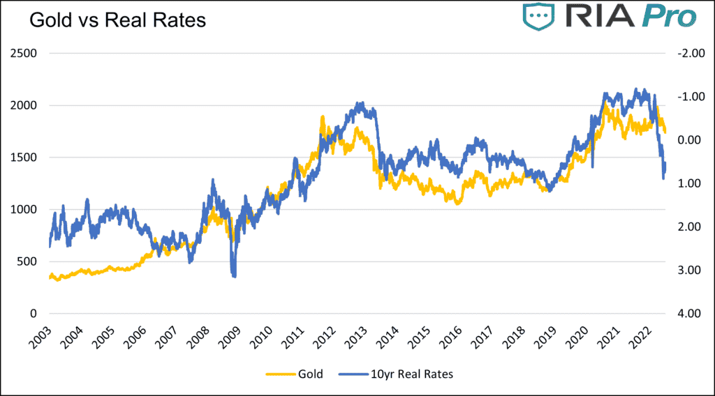
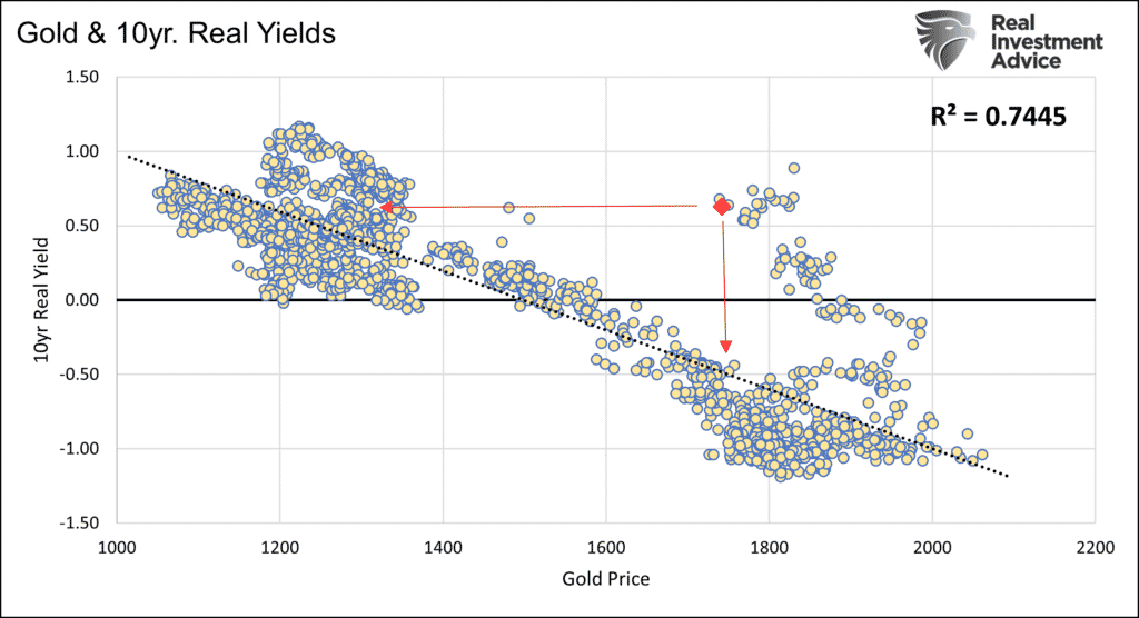
The graphs below paint an ominous picture of gold prices. The first chart shows the strong correlation between the price of gold and real rates. Real rates measure the difference between inflation expectations and Treasury bond yields. As the graph shows, the price of gold would need to fall to about 1400 to catch up with real rates. The second graph shows the same data but in a scatter plot. For the correlation to normalize, gold prices will either fall significantly, or real yields drop precipitously.
While the graphs are very bearish, there is more to consider. The Fed’s Ever-Growing Footprint provides evidence that the correlation is robust when real rates are negative. The correlation weakens when real rates are positive. In the article, we look at three time periods 1982-2007, 2008-2017, and 2018-current. The following bullet points from the article warn we must be careful not to heavily rely on real rates today as the historical correlation between real rates and gold prices is weak at current real rate levels +0.65.
- 1982-2007- During this period, real yields averaged +3.73%. The R-squared of .0093 shows no correlation.
- 2008-2017- During this period, real yields averaged +0.77%. The R-squared of .3174 shows a weak to moderate correlation.
- 2018- Current- During this period, real yields averaged +0.00%, with plenty of instances of negative real yields. The R-squared of .7865 shows a significant correlation.
More on Employment
As we discussed yesterday, the employment report was good in that 372k jobs were added in June. We also shared data showing that the jobs data was not as encouraging beneath the surface. We add to that evidence with a striking divergence in the report. The BLS takes two surveys to compile the data. One is the Establishment survey in which the BLS surveys businesses. This data feeds the 372k new jobs number. The second is the household survey which surveys individuals. The graph below shows the household survey was down in June and has flatlined for the last three months. In its totality, the latest report indicates the employment market is not as strong as being portrayed by the media and financial pundits.

Offering more caution is our colleague Jeffrey Marcus. Per his latest TPA Daily Report, he writes:
History suggests that we should take the current employment data with a healthy dose of salt, because of the size and consistency of revisions. 43 years of monthly data and revisions are in the attached document. Using absolute numbers, the average size of monthly revision is over 45,000. The average absolute percentage revision over the past 43 years is 73% and 68% for the past 20 years. These are large revisions. The impact of these revisions may be less as they are taken over a multi-month period, but that does not reduce the caution of putting too much weight on any one monthly number.

Please subscribe to the daily commentary to receive these updates every morning before the opening bell.
If you found this blog useful, please send it to someone else, share it on social media, or contact us to set up a meeting.
Also Read


