Don’t be fooled. Two important pieces of data came out this week that should be paid close attention to.
On February 16th, the Philadelphia Fed Manufacturing Survey for February was released. According to MarketWatch, the median estimate called for a decline of -7.8. The actual result was a decline -24.3.
The official press release noted the following:
“The diffusion index for current activity fell from a reading of -8.9 last month to -24.3 this month, its sixth consecutive negative reading and lowest reading since May 2020.”
You might wonder, “What is the Philadelphia Fed Manufacturing Survey, and why does it matter to me?”

The Philly Fed
What is it?
The Manufacturing Business Outlook Survey (official name) is a monthly survey of manufacturers in the Third Federal Reserve District. Participants indicate the direction of change in overall business activity and in the various measures of activity at their plants: employment, working hours, new and unfilled orders, shipments, inventories, delivery times, prices paid, and prices received. The survey has been conducted each month since May 1968.
Why does it matter?
Here is a good synopsis provided by TheStreet.com.
The survey, conducted each month since May 1968, is the oldest among the 12 Fed banks monitoring regional manufacturing activities and is often viewed as accurately reflecting the pace of growth in manufacturing nationally. The survey’s influence as a leading economic indicator has pushed other regional banks to publish their own polls for their districts.
A reading greater than zero suggests expansion in manufacturing, while a reading of less than zero indicates contraction. Because the data span more than 50 years, the index reliably provides an early indication of whether the economy might be slipping into recession. The Philadelphia Fed asserts that its survey leads other indicators by weeks and correlates strongly with lagging indicators such as employment and industrial production.
Here is a chart of each monthly reading since the inception of the index in 1968. The most recent reading was a decline of -24.3, denoted by a horizontal black dashed line on the chart below. Note: the vertical red shaded areas denote recessionary periods in the US.

A few interesting observations from this chart and the most recent reading in particular.
- In six of the eight recessions since the 1960’s, when the index fell to -24.3, or lower, the US economy was already in a recession.
- In the two instances where this was not the case, September ’79 & January ’01, the US economy entered a recession 4-months and 2-months later, respectively.
Some will argue that the US economy has transitioned more towards a “service-based” economy vs. a “manufacturing-based” economy over the last several decades, and while that is a true statement, McKinsey & Company noted the following in August ’22:
“US manufacturing may be poised for an overhaul and a rebound, with a potentially significant impact on the nation’s overall economy. In the United States, manufacturing accounts for $2.3 trillion in GDP, employs 12 million people, and supports hundreds of local economies. Although that represents just 11 percent of US GDP and 8 percent of direct employment, the sector makes a disproportionate economic contribution, including 20 percent of the nation’s capital investment, 35 percent of productivity growth, 60 percent of exports, and 70 percent of business R&D spending.”
So, yes, the US has moved more towards a “service-based” economy over the last 40+ years, yet, since “peak manufacturing” in 1979, we’ve had six recessions where the two bullet points above hold true. So, this time has to be completely different than history, or we should expect the US economy to enter a recession in the future.

Conference Board LEI
This week’s second piece of important data was The Conference Board Leading Economic Index (LEI), released on February 17th.
As the name would imply, this index looks at 10 different components that The Conference Board believes are predictive, or “leading”, with respect to the direction of the US economy.
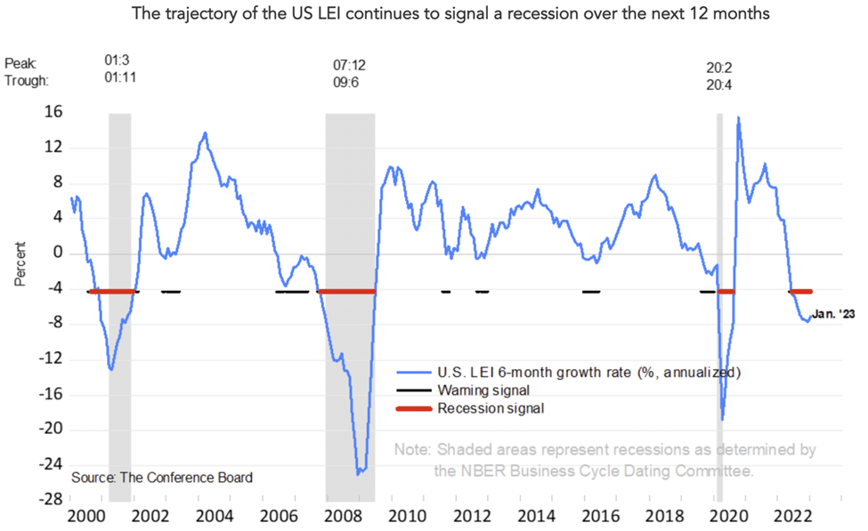
The LEI fell by -0.3% in January, following a decline of -0.8% in December.
The Conference Board made the following observations in their press release:
“The LEI is now down 3.6% over the six-month period between July 2022 and January 2023 – a steeper rate of decline than its 2.4% contraction over the previous six-month period (January – July 2022).”
Further, they note:
“The US LEI remained on a downward trajectory, but its rate of decline moderated slightly in January,” said Ataman Ozyildirim, Senior Director, Economics, at The Conference Board. “Among the leading indicators, deteriorating manufacturing new orders, consumers’ expectations of business conditions, and credit conditions more than offset strengths in labor markets and stock prices to drive the index lower in the month. The contribution of the yield spread component of the LEI also turned negative in the last two months, which is often a signal of recession to come. While the LEI continues to signal recession in the near term, indicators related to the labor market—including employment and personal income—remain robust so far. Nonetheless, The Conference Board still expects high inflation, rising interest rates, and contracting consumer spending to tip the US economy into recession in 2023.”
The Conference Board provides the following chart with each release. Note where the current reading “Jan ‘23” is relative to the “Recession signal” in red.


Don’t Be Fooled
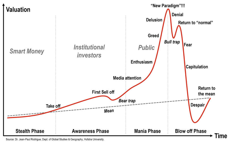
The image below has made the rounds many times on the Internet, and I think it fairly represents what we see in the various “Stages of a Bubble”. While the exact shape of red line will never be exactly the same, I think the creator of this chart has done a good job capturing the human emotion/sentiment associated with each of the various stages of a bubble.

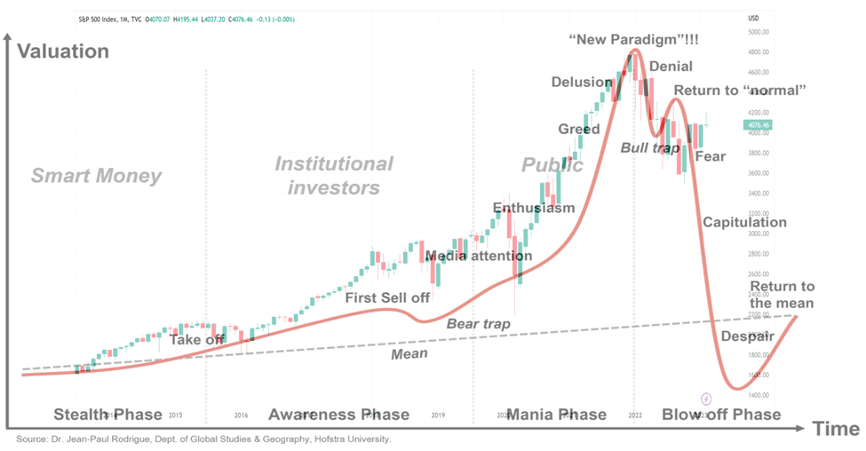
If we were to translate this image to stock market today (as represented by the S&P 500 on a monthly basis), I don’t think it would be stretch to suggest that the market highs of early 2022 might align well with the “New Paradigm”!!! peak on the chart above.
Further, there has been a shift of late in the narrative as it pertains to the US economy and where we might be heading as we’ve gone from a “hard landing” (i.e., a difficult, prolonged recession), to a “soft landing” (i.e., we have a recession, but it won’t be that bad), and now a “no landing” (i.e., we avoid a recession altogether).
Don’t be fooled. This is classic “Return to Normal” behavior!
If we take the chart above and overlay the S&P 500 monthly chart on top of it, here is what we get. It’s not a perfect one-for-one match but I think it’s close enough to make the point.

As I said in “Reading the FOMC Tea Leaves” and in “Layoffs…What Are They Telling Us?”, the goal isn’t to spark fear or panic, instead, my desire is to prepare you for what may be coming and to remind you that recessions, and the associated market downturn, often present generational buying opportunities assuming you have the capital available to do it.
Until next time…


