The graph on the left below, courtesy of Arbor Data Science, shows that $8 billion of funds flowed into U.S. large-cap ETFs, leaving every other broad ETF sector in the dust. Not surprisingly, U.S. large-cap stocks, consisting of the S&P 500 and, importantly, Nvidia, outperformed the market. The other ETF factors, such as small and mid-cap, staples and discretionary, and thematic, all saw flat to negative fund flows.
Every Tuesday, we give readers a glimpse of our proprietary relative and absolute analysis on SimpleVisor. The analysis helps us appreciate which sectors and stock factors are moving into and out of favor. For instance, the graphic on the right below shows ETF factor performance. The relative score is based on a series of technical readings of the price ratio of the specific factor ETF to the S&P 500 (SPY). The absolute score uses the same technical readings but only on the price of the ETF.
The factors in the table are sorted from most overbought (red) to most oversold (green). As we share, the two highest scores are variations of U.S. large-cap ETFs. While the fund flows recently shifted toward large caps, our analysis has pointed us to increasingly better relative and absolute performance of large caps for the last few weeks. The “spaghetti” graph on the right charts the intersection of the daily absolute and relative scores for S&P 500 Growth (IVW). The movement from the lower left quadrant to the upper right shows that its relative and absolute scores have steadily improved. Furthermore, IVW is now overbought using both metrics. Consequently, the analysis leads us to believe the sector may take a breather in the weeks ahead.

What To Watch Today
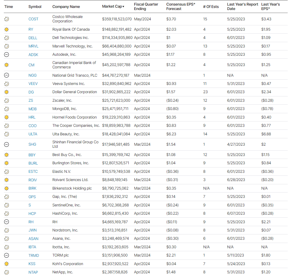
Earnings
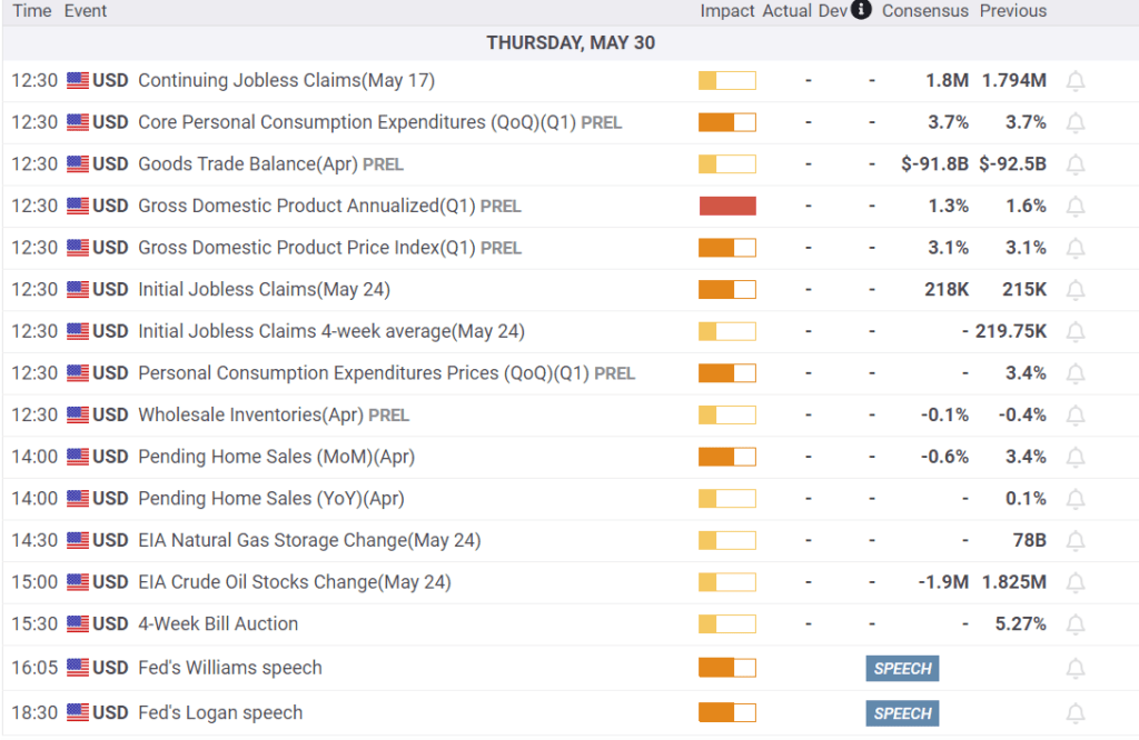
Economy
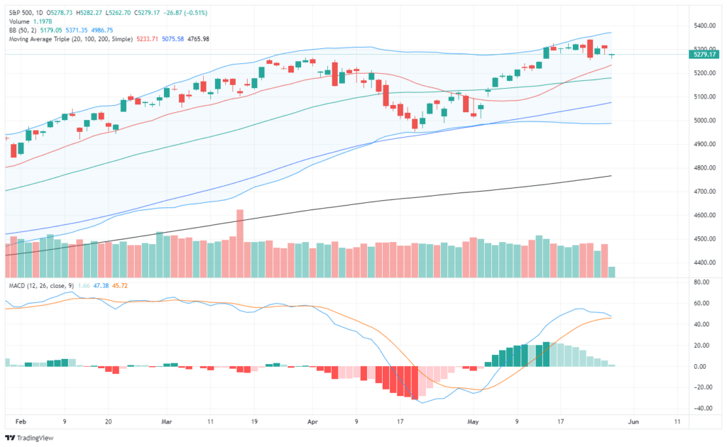
Market Trading Update
The market has been quiet this week ahead of today’s earnings report from retailers, which will give us another look at the strength, or not, of the consumer. Furthermore, today’s and tomorrow’s economic reports will give the markets another reason to wrestle with the inflation/deflation debate and how much the Fed will cut rates. The markets will focus on the PCE (Personal Consumption Expenditures Index) price report and expenditures for clues on upcoming Fed policy.
As we have discussed, with the market back to more overbought levels, further price appreciation was going to be difficult. Such has been the case over the last couple of weeks, with the market consolidating near recent highs. The good news is that consolidation has allowed the 20-DMA to catch up with the market, providing some near-term support. The bad news is that the consolidation has caused the MACD signal to get close to crossing back into a “sell.” That sell signal does NOT mean a significant correction is underway, but it does suggest if it occurs, that market appreciation will be limited for a period.
There is certainly potential for the market to correct towards the 50- or 100-DMA, and any report suggesting a higher inflation read could catalyze a larger decline. However, I would expect the 100-DMA (blue line) to contain any decline near term. However, as is always the case, “something else” could happen so it is always prudent to manage risks accordingly.
- Resize positions back to target weights
- Add defensive positions
- Raise cash levels
- Sell underperforming positions as needed.

Corporate Bonds Send Unheeded Warnings
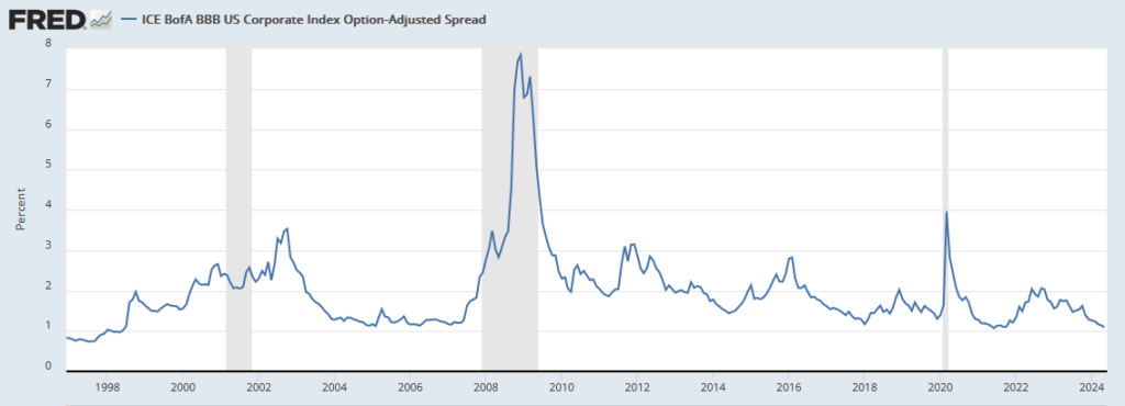
As we have noted on occasion, the credit spread, or difference between corporate bond yields and comparable maturity U.S. Treasury yields, is the tightest (smallest) in 25+ years, as shown in the first graph. Hence, the graph alludes that bond investors have minimal credit concerns. Should they? The second graph argues yes. The Financial Times graph highlights that the percentage of low BBB bonds moving to a negative outlook is increasing. A negative outlook is a warning by the rating agencies that the bond is at risk of downgrade. Assuming the bonds in the graph are rated BBB-, a downgrade would move them to junk status. Further, note the number of bonds on the positive watch is declining.
Typically, bond spreads move with potential changes in credit ratings and general economic trends. While economic trends remain solid, higher interest rates are slowly catching up with companies. Therefore, higher interest expenses will weigh on profitability and credit ratings. Consequently we must ask, might the bond market be ignoring a gasping canary in the coal mine?

Auto Inventories Normalize Leading Car Prices Lower
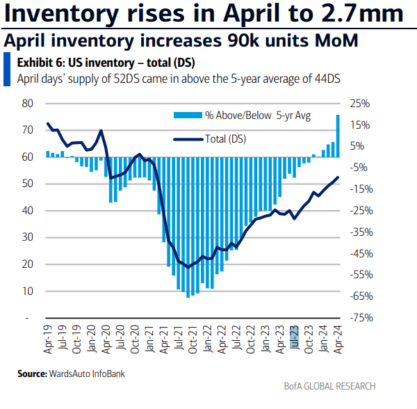
The graph below from Wards Auto and Bank of America plots auto inventories for car dealers. The dark blue line tells us the dealers are now holding 52 days’ worth of sales in inventory. Such is still a little below the pre-pandemic levels. However, the amount of inventory is rising steadily, which points to a more normal supply-demand curve for cars. Not surprisingly, with rising inventories, dealers are losing pricing power. The second graph shows that CPI for new autos looks like a mirror image of the inventory graph. With CPI for new autos slightly below zero, further increases in inventories could lead to deflation in the sector.

Tweet of the Day
“Want to achieve better long-term success in managing your portfolio? Here are our 15-trading rules for managing market risks.”
Please subscribe to the daily commentary to receive these updates every morning before the opening bell.
If you found this blog useful, please send it to someone else, share it on social media, or contact us to set up a meeting.


