The yield curve is often used as a proxy for bank profit margins. The logic is that banks tend to borrow short-term and lend for longer terms. Therefore the difference between a bank’s short-term borrowing rate and long-term lending rates approximates its profit margins. As we have discussed numerous times, the yield curve has inverted to levels last seen in the early 1980s. At first blush, the inversion should be horrendous for bank profit margins. That is not the case.
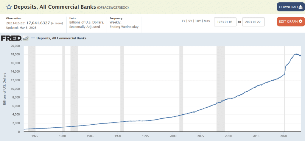
Fortunately, at least for banks, a good percentage of deposits, representing about 85% of bank borrowing, has been near zero percent while lending rates zoomed higher. That large margin may be ending. As the graph below shows, deposits at commercial banks are falling for the first time since at least 1975. According to Bloomberg, 1948 was the last year deposits declined. Banks will have to offer more competitive rates to hold onto their deposits. Therefore, bank profit margins are likely to shrink. Further, bank lending standards will continue to tighten as banks have fewer deposits to meet reserve and capital requirements.
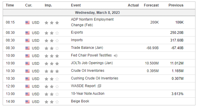
What To Watch Today
Economy
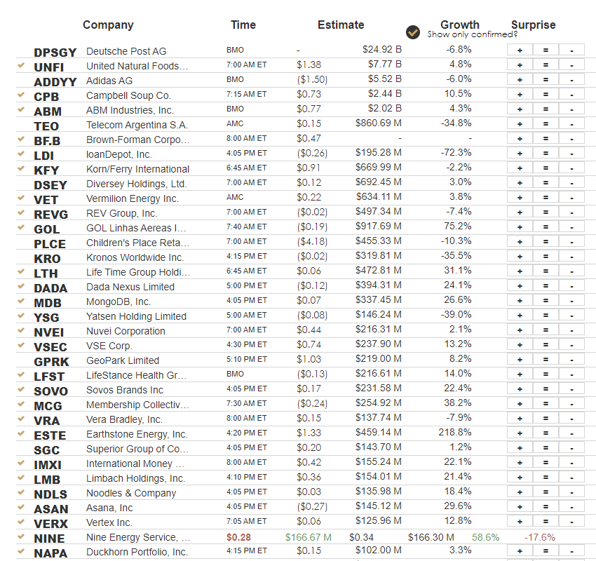
Earnings
Why We Started Buying Bonds Yesterday
Yesterday, we alerted our SimpleVisor subscribers that we started buying longer-duration bonds. We have recently discussed beginning to shift the duration of our bond holdings to a longer-term time frame in anticipation of economic weakness and an eventual reversal of Fed policy. We started by shifting 1-3 month Treasuries (BIL) to 1-3 year Treasuries (SHY). Today, with our “money flow buy signal” triggering from an oversold level, we are bringing the iShares 20-Year Treasury ETF (TLT) to target weight. We will build on this small move as we continue to slowly lengthen the duration of the overall bond holdings in our portfolios.
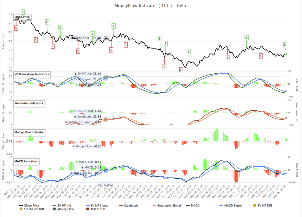
As discussed below, the Federal Reserve’s speech before the Senate Finance Committee lacked the “pivot” the bulls sought. More importantly, the Fed’s more aggressive stance on combatting inflation continues to increase the odds they will “break something” economically before they are done. If, and when, such an event occurs, and the Fed begins to cut rates, the long end of the yield curve will drop dramatically. We want to be well-positioned before that happens.

Powell Upsets the Bulls
As we suspected, Jerome Powell, in his testimony to Congress, said the Fed would resort to steeper rate hikes if economic strength continues. The stock market did not like his hawkishness. It appears many investors were looking for a more pragmatic Fed. One is willing to look beyond recent inflation and labor data and not be too aggressive with further rate hikes. With interest rates already very high for such a leveraged economy, the Fed will have to be more hawkish to compensate for the limits to raising rates.
“If the totality of the data were to indicate that faster tightening is warranted, we would be prepared to increase the pace of rate hikes.”
Powell poured cold water on the wishful thinking for a Fed pivot. The only pivot we see with Tuesday’s speech was a pivot from hawkish to more hawkish.
“The historical record cautions strongly against prematurely loosening policy. We will stay the course until the job is done.”
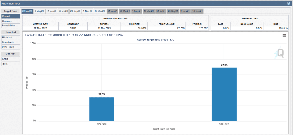
Following his opening speech, Fed Funds futures increased the odds of a 50bps rate hike at the march 22nd meeting to 70%. Before the speech, it was around 25%.
Stock vs. Bond Volatility
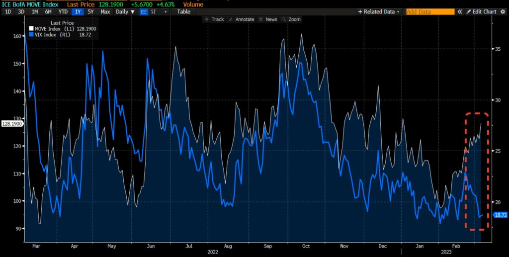
The graph below from SpotGamma shows the tight correlation between the volatility of stocks and bonds. However, the strong correlation for the last year has diverged over the previous month. The bond market has been selling off, fearing the Fed’s hawkish outlook. Stocks have largely ignored the Fed and seem to be banking on a no-landing or, worst case, a soft-landing economic scenario. With Powell on the docket again today, the labor report on Friday, and CPI next week, we must consider if the divergence can maintain itself or how does it resume its relationship.
Supply Lines Are Not The Inflation Problem Anymore
Last year, inflation surged as demand was robust and supply lines fractured due to the pandemic. The graph below from Liz Ann Sonders of Charles Schwab shows the ISM supplier delivery indexes are now at their lowest since the 2008 recession. This is just one of many pieces of data pointing to the demand side as the predominant reason inflation remains high. Sonders writes:
Supply chain bottlenecks clearly in rearview as supplier deliveries components of both ISM Manufacturing and Services PMIs remain firmly in contraction

Tweet of the Day
Please subscribe to the daily commentary to receive these updates every morning before the opening bell.
If you found this blog useful, please send it to someone else, share it on social media, or contact us to set up a meeting.
