Inside This Week’s Bull Bear Report
- Inversion Of Yield Curve Reversing
- How We Are Trading It
- Research Report – The “Sahm Rule” And Recession Indicators
- Youtube – Before The Bell
- Market Statistics
- Stock Screens
- Portfolio Trades This Week
Market Correction Continues
As noted last week, the continuation of the market correction is unsurprising.
“However, while the markets are oversold enough for a reflexive bounce, the current correction process is likely incomplete. Moreover, the MACD “sell signal” also suggests that the current upside remains limited.
It is quite likely that any short-term, reflexive rally will fail during this corrective process. For now, use rallies to rebalance portfolios and reduce risk as needed. Our only concern is that with investors remaining very bullish despite the recent pullback, a further correction is required to resolve that condition.
Such happened this past week, with a strong rally on Wednesday that failed. What is clear is the market is starting to recognize that Federal Reserve rate cuts are not bullish for stocks. As we have discussed, when the Fed cuts rates, it often coincides with weaker economic activity, which precedes a decline in earnings growth. The drop in the ISM manufacturing index and a terrible employment report bolstered those concerns. Unsurprisingly, the market is beginning to discount the impact on earnings by reducing stock prices.
While the correction has been quite normal, Friday’s break of the 50-DMA suggests the correctional process continues. As we discussed in June and July, a 5-10% correction was likely, and we are in the middle of that process. The market is getting decently oversold, and we are likely seeing a short-term exhaustion of sellers. Notably, the market held the 100-DMA on Friday, which was critical support during the April correction. With markets oversold, we would be unsurprised to see a reflexive rally next week. Use rallies to rebalance risk and reduce exposure as needed.
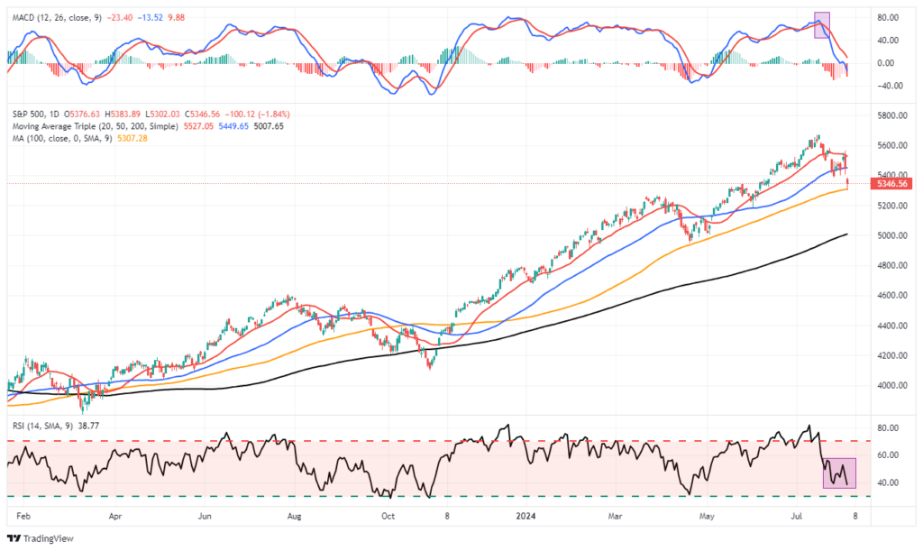
We are seeing a consistent string of weaker-than-expected economic data, which suggests the economy is slowing more than headlines suggest. Notably, one of the best indicators of economic weakness and recessions is when yield curve inversions reverse. We are now seeing early evidence of this, and we will examine that more in detail in this week’s discussion.
Need Help With Your Investing Strategy?
Are you looking for complete financial, insurance, and estate planning? Need a risk-managed portfolio management strategy to grow and protect your savings? Whatever your needs are, we are here to help.

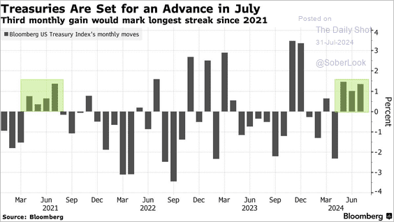
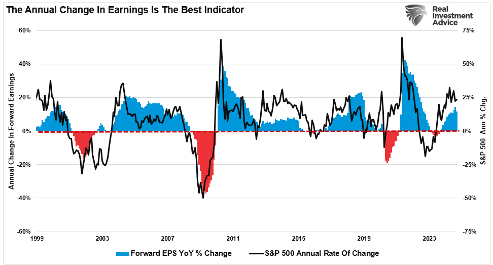
Bonds Yields On The Decline
Over the last several months, bond prices have been rising very quietly. Of course, given the inverse relationship between bond price and bond yields, bond yields have declined.
That is because yields reflect slowing economic growth and the resulting disinflationary pressures. As discussed previously:
The chart below shows the correlation between economic growth, inflation, and interest rates. Unsurprisingly, interest rates rise when economic growth increases, leading to more demand for credit. Inflation rises with economic activity as the supply/demand imbalance increases prices. That is basic economics.“
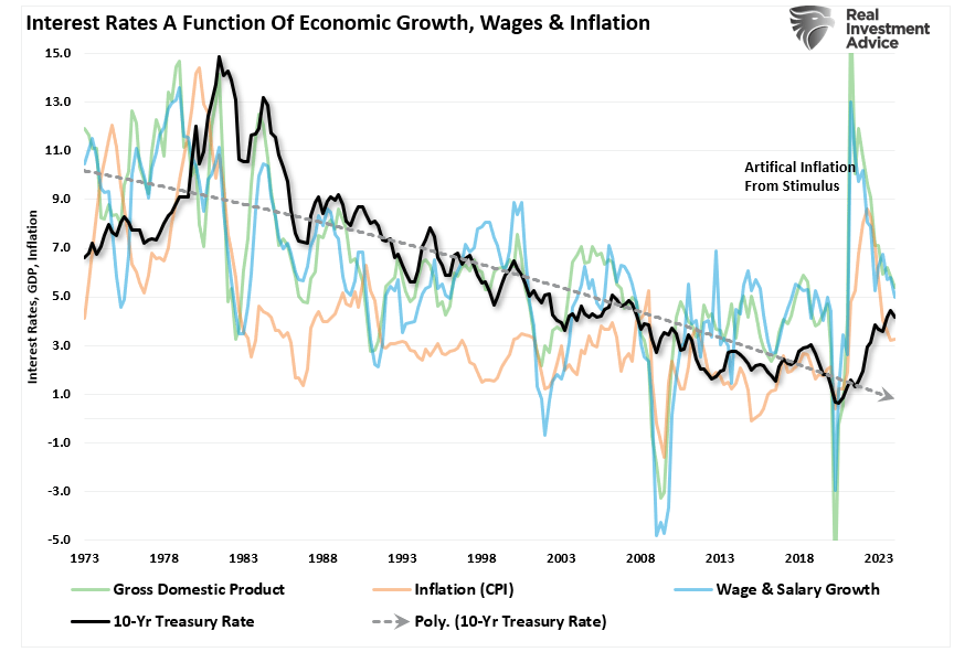
“That chart has a lot going on, so let’s create a composite index of wages (which provides consumer purchasing power, aka demand), economic growth (the result of production and consumption), and inflation (the byproduct of increased demand from rising economic activity). We then compare that composite index to interest rates. Unsurprisingly, there is a high correlation between economic activity, inflation, and interest rates as rates respond to the drivers of inflation.“

Furthermore, the economic weakness that is becoming more visible now puts the Federal Reserve in a position to cut rates as early as September.
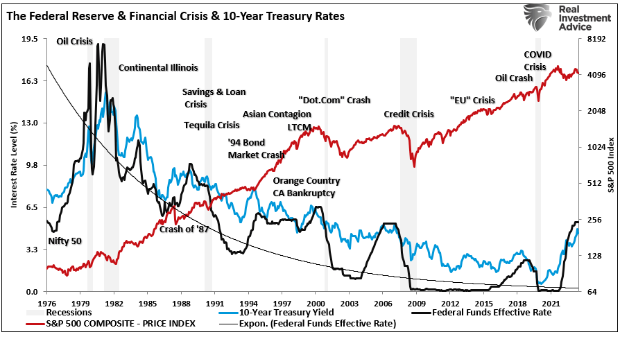
“Historically, the 10-year Treasury bond yield (the inverse of bond prices) shows a very high correlation to Federal Reserve rate changes. That is because while the Fed controls the short end of the yield curve, the economy controls the long end. Therefore, longer-term yields respond to economic realities as the Fed cuts rates in response to a disinflationary event.”
Besides investors benefitting from the increase in Treasury bond prices as the economy slows, the decline in yields is also beginning to reverse the long-watched “yield-curve inversion.”
Inversion Of Yield Curve Finally Reversing
We have discussed the importance of yield curve inversions numerous times. However, regarding a recession countdown, the media always misunderstands the signal. The media always assumes this time is different because a recession didn’t occur immediately upon the inversion.
There are two problems with this way of thinking.
- The National Bureau of Economic Research (NBER) is the official recession dating arbiter. It waits for data revisions by the Bureau of Economic Analysis (BEA) before announcing a recession’s official start. Therefore, the NBER is always 6-12 months late in dating the recession.
- It is not the inversion of the yield curve that denotes the recession. The inversion is the “warning sign,” whereas the un-inversion marks the start of the recession, which the NBER will recognize later.
That last sentence is the most important. Regarding a “recession countdown,” the initial inversion is not the signal. It is when the curves un-invert that a recession is approaching. The reason is that the Federal Reserve is rapidly cutting rates as the recession is recognized. Such causes the short end of the yield curve to fall faster than the long end. With the Fed on deck to start cutting rates in September, yields should decline further as economic weakness expands.
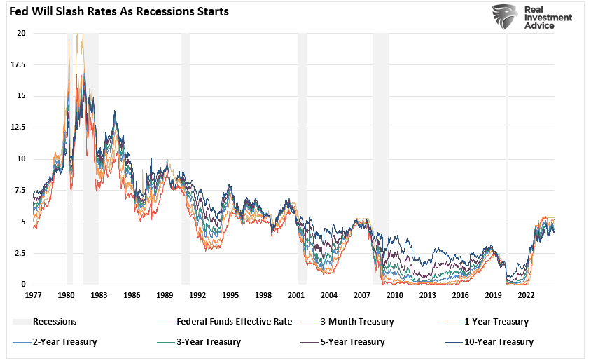
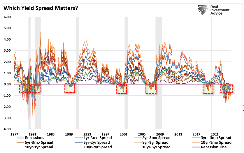
There is much debate on which yield curve to pay attention to. Our research shows ten different spreads between different Treasury bond maturities. As shown, most of the yield spreads we monitor are now inverted. Historically, such has been a solid leading indicator of an impending recession. However, as the Fed cut rates, those various yield spreads reversed their respective inversions, signaling the onset of the recession.
While the media continues to dismiss the risk of a recession and suggest the yield curve is wrong this time, the recession countdown is only beginning. That is because the yield curves have troughed at the short end of the spectrum, and even the longer end of the curve is rising.
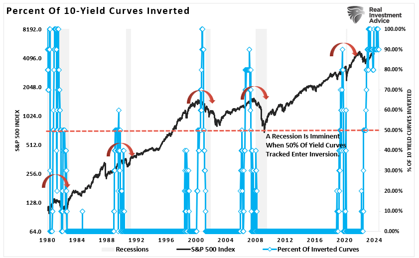
However, the bond market is already discounting weaker economic growth, earnings risk, elevated valuations, and a reversal of monetary support. Such is shown in the chart below. As noted, we track ten economically sensitive yield spreads. A recession follows whenever more than 50% of those spreads are inverted, and then that inversion is reversed —every time. (Read this for a complete history.)
While the yield curve’s un-inversion is imminent, does this mean the economy will experience a “hard landing?”
Mild Recession LIkely
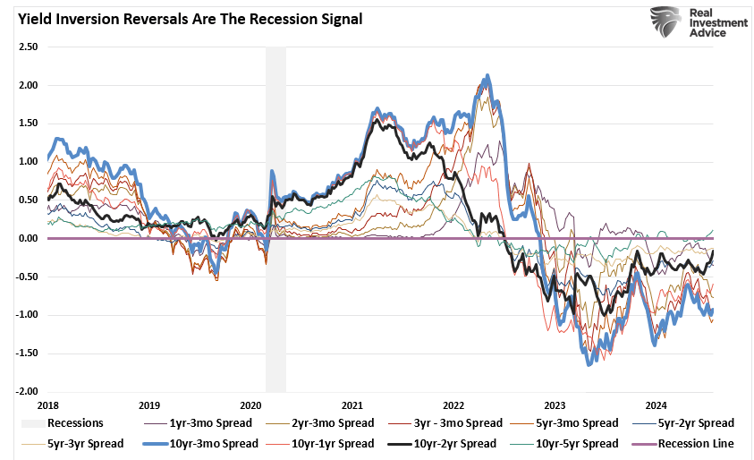
The most watched yield-curve inversion (the 10-year Treasury bond less the 2-year Treasury bill yield) is univerting.

As noted, such is unsurprising, with the economy slowing, unemployment rising, and wage growth declining. However, such does not necessarily mean we are on the verge of an “economic hard landing.”
That is because of the massive amounts of stimulus previously pumped into the system, along with trillions in Government spending programs, that blunted the impact of the Fed’s rate hiking campaign. As noted by Simon White of Bloomberg:
“The efficacy of the yield curve as a recession seer lies in recognizing that the 10-year yield is a proxy for the clearing rate for savings and investment in the economy. When short-term rates are above the 10-year it’s taken to mean policy is restrictive; the longer the curve is inverted, the longer the restriction lasts and the greater the chance of a recession.
But if short-term rates above the 10-year does not signify restrictive policy, then the inverted curve is much more likely to be a recession false flag, and the subsequent steepening is not a reason to run for the hills.
That’s what has happened in this cycle. Excess liquidity, the difference between real money and economic growth, has remained persistently strong and has yet to turn down. That’s powered a huge asset rally, which has loosened financial conditions and defanged the Fed’s rate hikes. As the chart below shows, rising excess liquidity leads to easier effective Fed policy by about six months, and vice versa.”
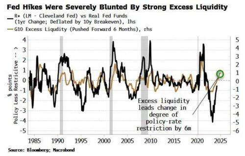
We discussed that point on Friday. The economy has defied recessionary readings due to the flood of monetary stimulus from the Inflation Reduction Act and the CHIPS Act and a surge in deficit spending, which supported economic growth. However, that expenditure surge has peaked and turned lower but is not currently at recessionary levels.
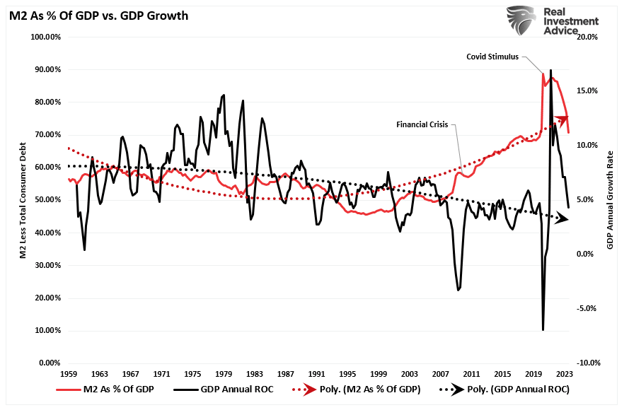
Furthermore, the monetary supply (M2) as a percentage of the economy remains significantly elevated, preventing economic activity from declining faster.
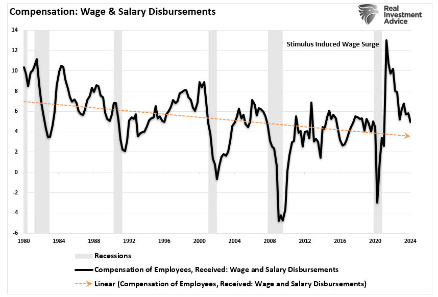
While the economy could devolve into a “hard landing,” as seen during the 2008 “Financial Crisis,” there is currently no catalyst to cause such an event. However, given the rise in unemployment and declines in wage growth, the potential for a more normal recession seems most likely.
“The problem with declines in full-time employment is that, as noted, it negatively impacts economic consumption. While the current administration has been able to offset that decline with a massive increase in deficit spending, the latter is not sustainable. Combine that with the decline in wage growth, and the potential stress on the economy becomes more apparent. As shown, compensation continues to decline even as price inflation remains elevated, which weighs on consumers’ ability to maintain their living standards.” – The Sahm Rule
While the reversal of the yield curve inversion is crucial to pay attention to, particularly from an investing perspective, it is important not to extrapolate a particular data point into an extreme outcome.
As such, we need to manage our portfolios accordingly.
Navigating The Pullback
While the economy could avoid a “deep recession,” the odds of a “no landing scenario” are slim. Therefore, we should at least prepare for a slower earnings growth rate as economic activity recedes. The rules are simple but effective.
- Raise cash levels in portfolios.
- Reduce equity risk, particularly in areas highly dependent on economic growth.
- Add or increase the duration of bond allocations, which tend to offset risk during recessionary downturns.
- Reduce exposure to commodities and inflation trades as economic growth slows.
If a recession does occur, the preparation allows you to survive the impact. Protecting capital will mean less time spent getting back to breakeven afterward. Alternatively, it is relatively easy to reallocate funds to equity risk if we avoid a recession and achieve a “soft landing.”
Investing during periods of economic reversion can be difficult. However, you can take steps to ensure that increased volatility is survivable.
- Have excess emergency savings, so you are not “forced” to sell during a decline to meet obligations.
- Extend your time horizon to 5-7 years, as buying distressed stocks can get more distressed.
- Don’t obsessively check your portfolio.
- Consider tax-loss harvesting (selling stocks at a loss) to offset those losses against future gains.
- Stick to your investing discipline regardless of what happens.
If I am correct, it is hard to make a case for rising asset prices when a recession occurs. However, if I am wrong, we can reallocate to equities and rebalance our portfolios for growth as needed,
Follow your process.
Have a great week.
Research Report
Subscribe To “Before The Bell” For Daily Trading Updates
We have set up a separate channel JUST for our short daily market updates. Please subscribe to THIS CHANNEL to receive daily notifications before the market opens.
Click Here And Then Click The SUBSCRIBE Button
Subscribe To Our YouTube Channel To Get Notified Of All Our Videos
Bull Bear Report Market Statistics & Screens

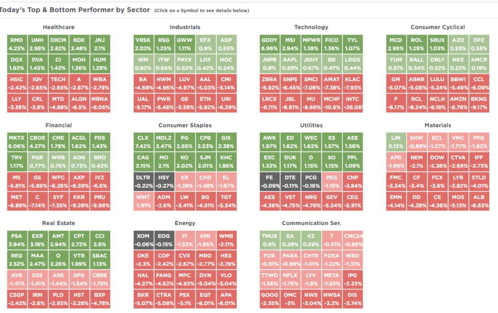
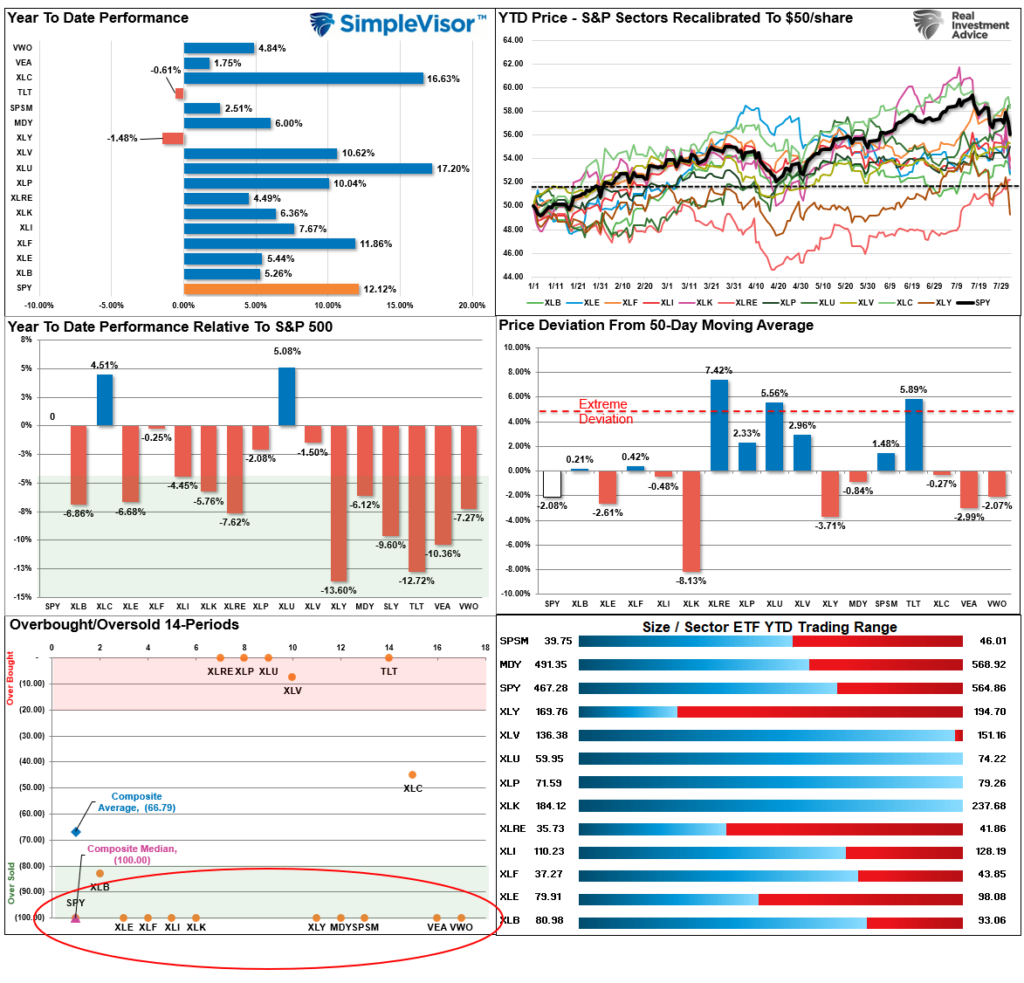
SimpleVisor Top & Bottom Performers By Sector
S&P 500 Weekly Tear Sheet
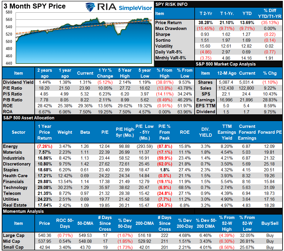
Relative Performance Analysis
Last week, we noted:
“That correction began this past week, and while the S&P 500 is due for a short-term bounce, we suspect more corrective action may be needed before it is complete. Reduce risk by taking profits and raising cash levels as required.”
That was good advice, as the rally on Wednesday provided a decent exit point before the resumption of the correction on Thursday and Friday. Notably, the most hated market sectors at the beginning of the year, utilities, real estate, financials, and bonds, are now the clear winners and have dethroned technology. However, the defensive sectors are extremely overbought, while everything else is deeply oversold. We could see a short-term reversal of those trades, which should be used to rebalance risk. I suspect the current correction process is not yet complete.
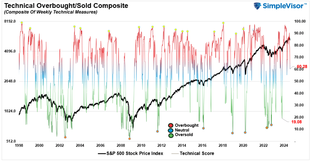
Technical Composite
The technical overbought/sold gauge comprises several price indicators (R.S.I., Williams %R, etc.), measured using “weekly” closing price data. Readings above “80” are considered overbought, and below “20” are oversold. The market peaks when those readings are 80 or above, suggesting prudent profit-taking and risk management. The best buying opportunities exist when those readings are 20 or below.
The current reading is 60.28 out of a possible 100.
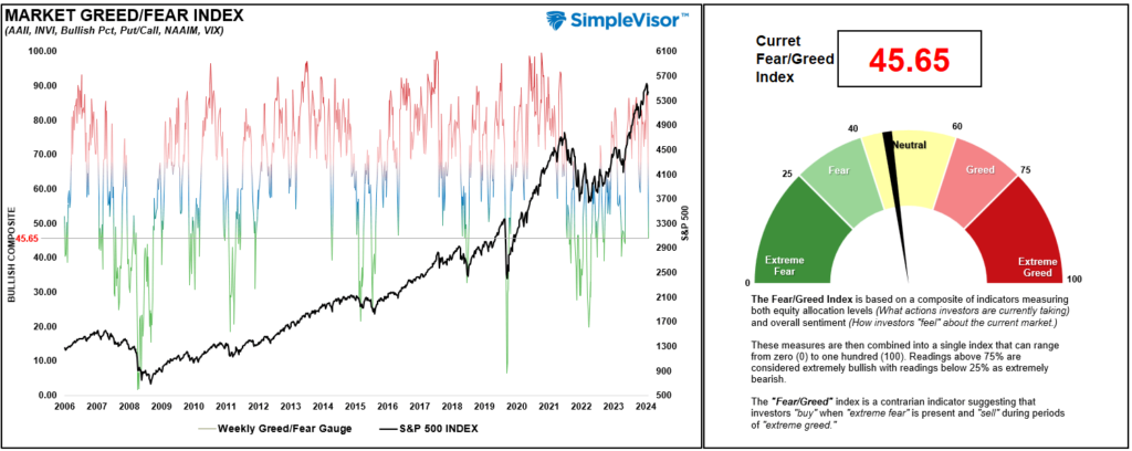
Portfolio Positioning “Fear / Greed” Gauge
The “Fear/Greed” gauge is how individual and professional investors are “positioning” themselves in the market based on their equity exposure. From a contrarian position, the higher the allocation to equities, the more likely the market is closer to a correction than not. The gauge uses weekly closing data.
NOTE: The Fear/Greed Index measures risk from 0 to 100. It is a rarity that it reaches levels above 90. The current reading is 45.65 out of a possible 100.
Relative Sector Analysis
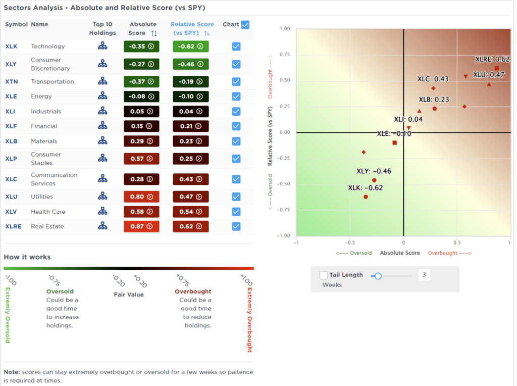
Most Oversold Sector Analysis
Sector Model Analysis & Risk Ranges
How To Read This Table
- The table compares the relative performance of each sector and market to the S&P 500 index.
- “MA XVER” (Moving Average Crossover) is determined by the short-term weekly moving average crossing positively or negatively with the long-term weekly moving average.
- The risk range is a function of the month-end closing price and the “beta” of the sector or market. (Ranges reset on the 1st of each month)
- The table shows the price deviation above and below the weekly moving averages.
That reversed quickly. Last week, we noted that “despite the correction in the broad market this past week, many sectors and markets are still trading above their respective monthly risk/reward ranges.” That is no longer the case, with many sectors trading below those ranges just two days into the month. That sets the market up for a decent rotational rally in the days ahead. Look for a correction out of the defensive and interest rate-sensitive sectors, including bonds, into growth sectors of the market that are deeply oversold. As noted above, use rallies to rebalance exposures as the current correction process is likely incomplete.

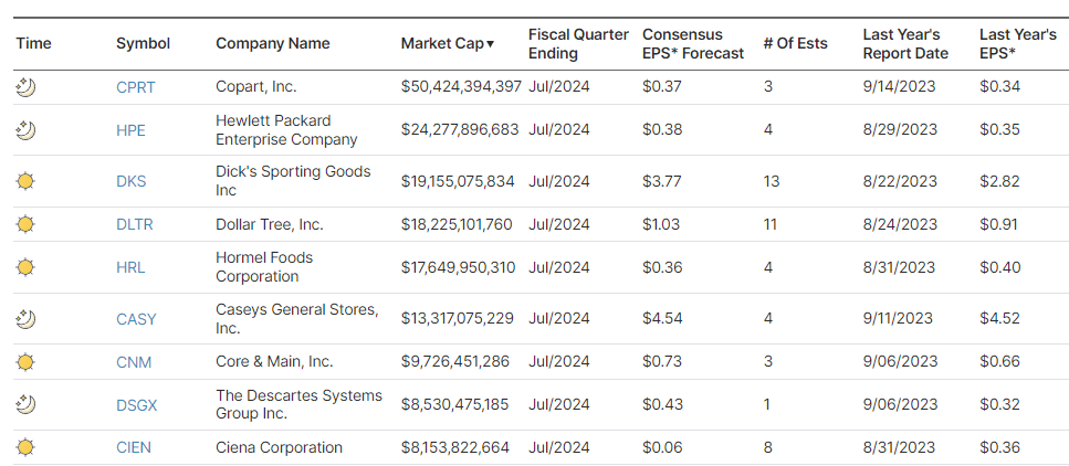
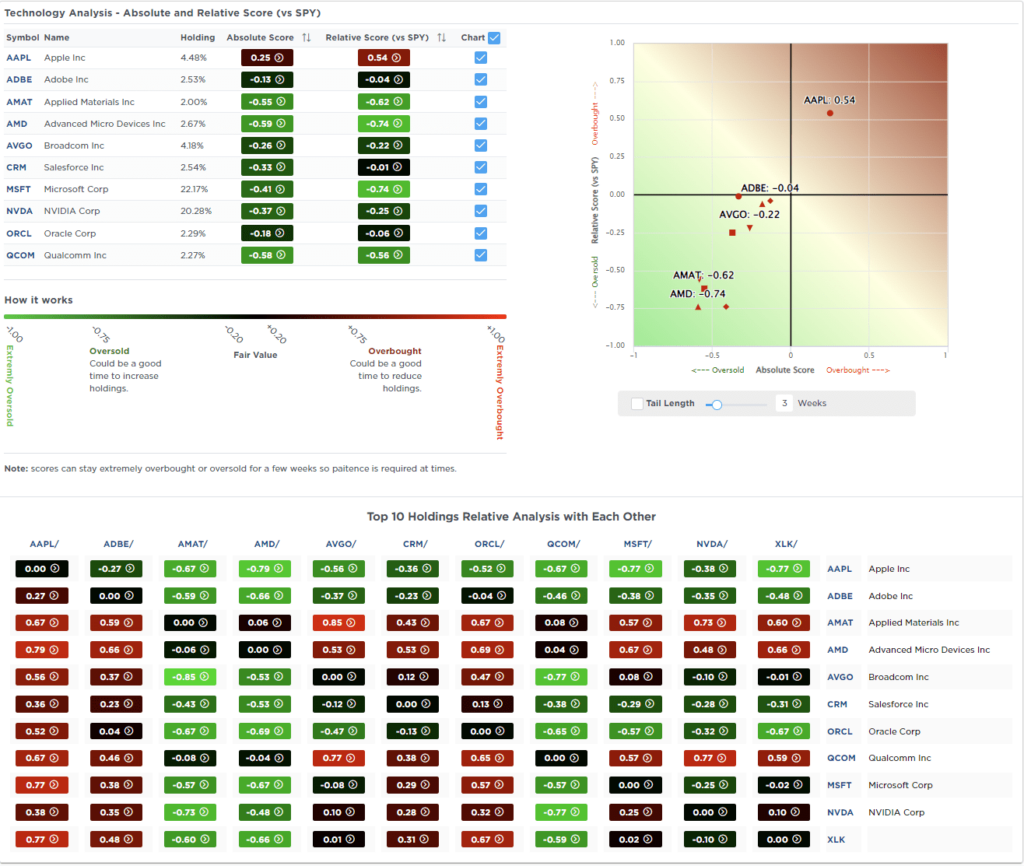
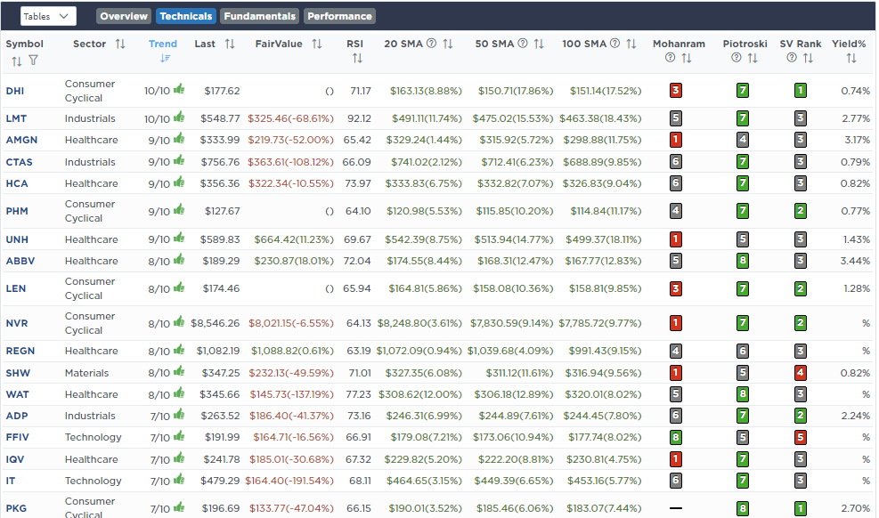
Weekly SimpleVisor Stock Screens
We provide three stock screens each week from SimpleVisor.
This week, we are searching for the Top 20:
- Relative Strength Stocks
- Momentum Stocks
- Fundamental & Technical Strength W/ Dividends
(Click Images To Enlarge)
RSI Screen

Momentum Screen
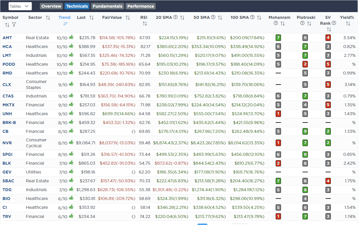
Fundamental & Technical Screen
SimpleVisor Portfolio Changes
We post all of our portfolio changes as they occur at SimpleVisor:
Aug 1st
“This morning, we added 1% to OneOk (OKE) in the equity model. The stock hasn’t done much since we initially bought it, but it does sport a 4.75% yield which supports the yield of the overall portfolio. OKE is also a potential big beneficiary of the power grid expansion that we have discussed previously.”
Equity Model
- Increase OKE to 2% of the portfolio.

Lance Roberts, C.I.O.
Have a great week!