Inside This Week’s Bull Bear Report
- Inflation scare
- How We Are Trading It
- Research Report –Household Allocations Suggest Caution
- Youtube – Before The Bell
- Market Statistics
- Stock Screens
- Portfolio Trades This Week
A Crack In The Market’s Bullish Armor
Last week, we discussed the current bullish trend’s ongoing, mind-numbing, narrow channel. We have suggested there was little to worry about until the market violates the 20-DMA. That “crack” to this “unstoppable” bullish rally happened Thursday.
However, as we previously noted, just because the market breaks the 20-DMA does not mean we must take immediate action. What we need to see is a confirmation of that break with either a failed retest of previous support or a further decline. On Friday, the stronger-than-expected employment report sent stocks higher as “good news is good news” as more robust economic growth should support earnings. However, “bad news also remains good news,” as it would mean Fed rate cuts.
In other words, we continue to be in a “heads I win, tails I win” market.
Notably, on Friday, the market rally failed to retake the previous support trend of the 20-DMA. If the market is lower on Monday and takes out Thursday’s low, as shown, this would confirm the break of support and suggest lower prices. The 50-DMA will quickly become the next significant support level.
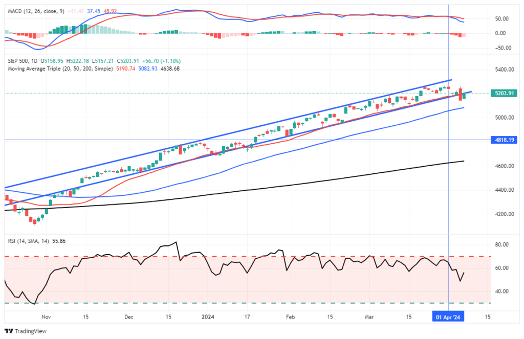
While the market may remain range-bound between recent highs and the 50-DMA over the next month, we expect a deeper correction (~10%) before the election. Such a correction would likely test the 200-DMA and reverse much of the recent bullish market exuberance, as shown by both retail and professional investors.
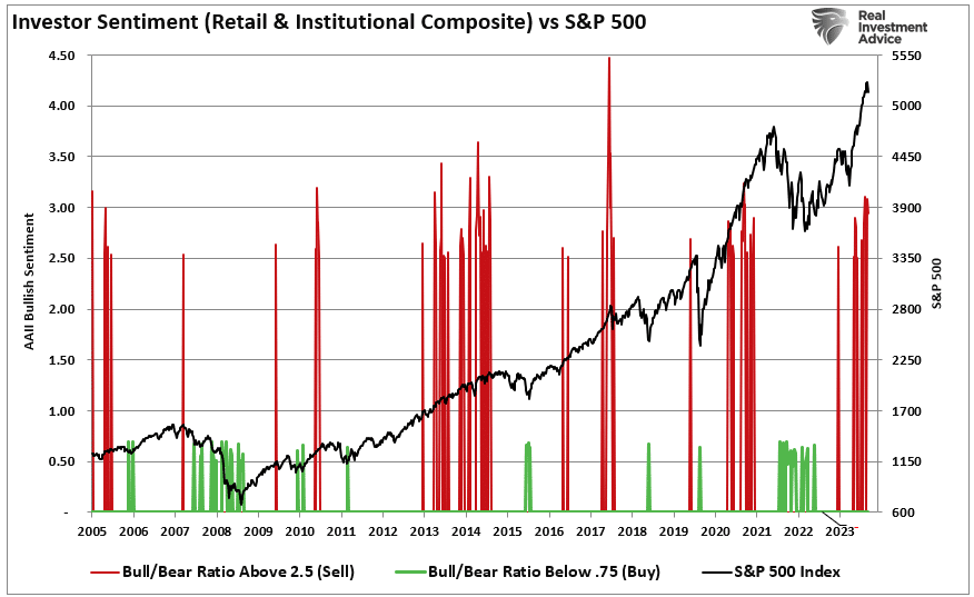
A reversal of sentiment and price deviations would provide a better entry point for increasing portfolio equity exposures. Of course, the market has been so complacent for so long that even a completely normal 5-10% correction will “feel” far worse than it is.
With the market overbought and extended currently, we want to remain cautious about aggressively committing our cash reverses to the broad market. However, such can be very hard to do in a rising bull market that seems unstoppable.
“Willingness and ability to hold funds uninvested while awaiting real opportunities is a key to success in the battle for investment survival.” – Gerald Loeb
Let’s Let’sabout the recent inflation scare.
Need Help With Your Investing Strategy?
Are you looking for complete financial, insurance, and estate planning? Need a risk-managed portfolio management strategy to grow and protect your savings? Whatever your needs are, we are here to help.

Inflation Scare
Over the last few weeks, there has been a rising chorus of “perpetually bearish” commentators shrieking about the return of inflation. Inflation did tick up in recent reports, but the scare is overblown. Such is particularly the case when reviewing the fundamental drivers of inflation over time.
To put the inflation scare into proper proportion, it is vital to start with a broader overview of inflation. We receive two monthly measures of the Consumer Price Index using month-over-month and annual changes. Lately, the inflation scare has come from the pickup in the month-over-month change in the price index, as shown. As of the latest report, inflation was slightly above the long-term inflation trend.

While that uptick sparked the inflation scare, it is essential to remain focused on the longer-term trend of inflation, which is still trending lower. While the rate of decline is subsiding due to the year-over-year comparisons, the Fed will achieve its 2% annualized growth rate as inflation returns to its normalized trend.
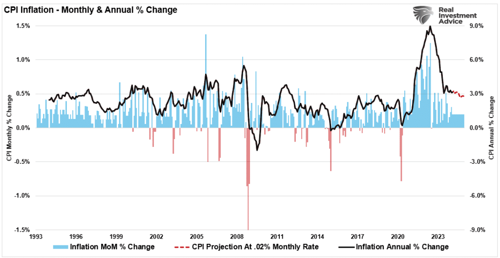
Notably, in the most recent inflation report, the inflation scare came from just three areas of the report: Transportation (and Energy), Medical Care, and Education. Housing, Food and Beverage, and Apparel all registered declines. Given the state of the housing market and the subsequent lag in reporting the data, the pressure on inflation remains lower.

Furthermore, the recent uptick in healthcare costs is primarily likely seasonal as annual plans reset for the new year. However, given that most American’s rent or mortgage payments and healthcare costs are set for a set period, a measure excluding those two variables gives us a better “day-to-day” measure of the cost of living. As shown below, inflation, less healthcare, and rent are closing in on 2% annualized.

The crucial point is that the recent inflation scare is just that. It is mostly talking heads trying to garner headlines by “scari”g the crap” out “f investors. The reality is that disinflation remains the biggest threat to the Fed and the economy.
Disinflation Risk Is Wall StreetStreet’s Spot
One of the main themes we discussed last year is that the current inflation levels are not due to strong, organic economic growth. Instead, the inflation surge is a function of too much money chasing too few assets following $5 Trillion in stimulus money sent to households amid an economic shutdown. As is always the case, inflation is a primary function of supply and demand.
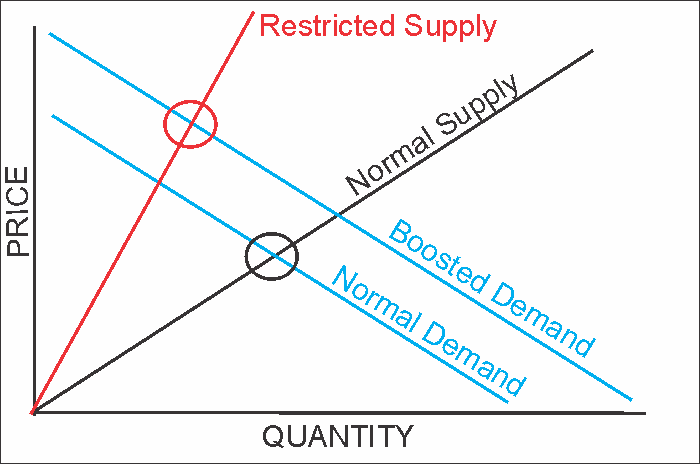
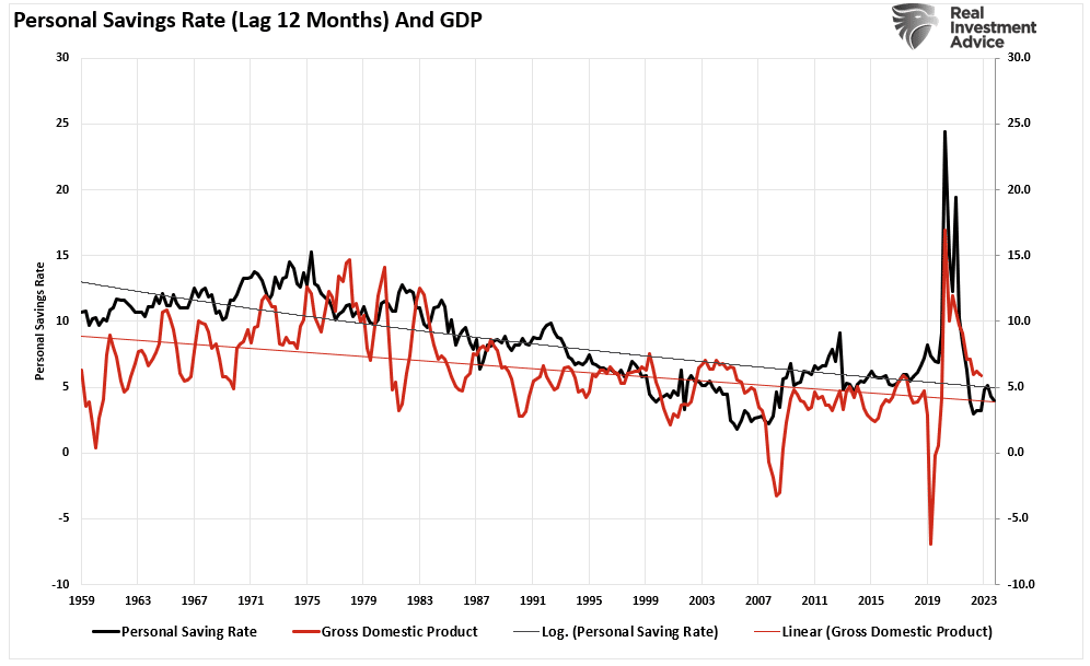
The massive surge in stimulus sent directly to households resulted in an unprecedented spike in “savings,” creating artificial demand as represented by retail sales. As is already happening and will continue, the “bulge” of excess liquidity will revert to the previous growth trend, a disinflation risk. As a result, economic growth will lag the reversion in savings by about 12 months. This “lag effect” is critical to monetary policy outcomes and the current inflation scare.
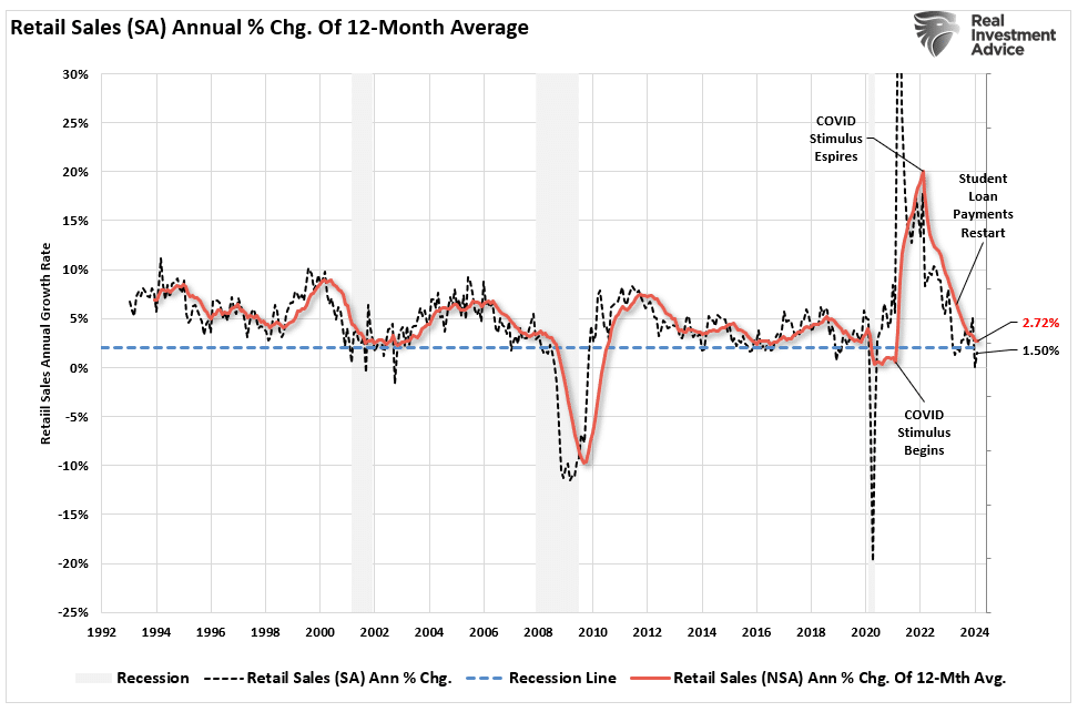
As noted, given that inflation is a “demand versus supply” function, the extraction of liquidity and monetary support continues to erode retail sales. Actual retail sales are already below the 2% annualized level that historically coincides with recessions, and the 12-month moving average is not far away.
Since 1980, personal savings and economic growth have continued to decline. That correlation is obvious, considering economic growth is ~70% consumption. Unfortunately, due to the massive debt loads, the natural economic growth rate is below 2%. It is evident that following each “crisis” event,” the trend of economic growth continues to slow.
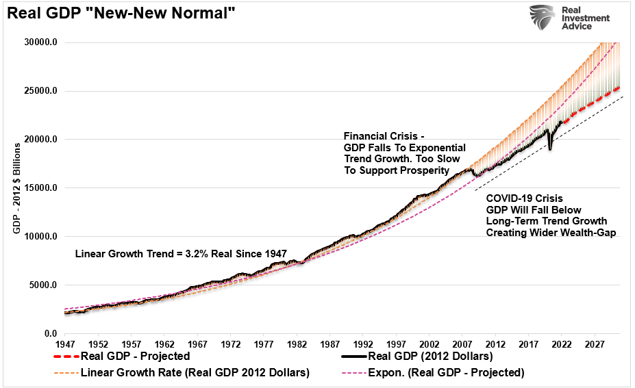
The slower growth rate, caused by increased debts and deficits, will challenge the Fed as disinflation risk becomes the next monetary policy challenge. In other words, the current inflation scare will fade as disinflation continues to drag economic growth and interest rates lower.
Debt Is Deflationary
Over the coming decades, the massive surge in unproductive debt will increase deflationary pressures and slower economic growth.
These issues are not new. But have been plaguing economic growth for the last 40-years. Moreover, given that the baby boomer generation has reached retirement age, they will leave the workforce at an increasing rate, drawing on their accumulated financial assets. As a result, the debts and deficits will continue to detract from rather than contribute to economic growth.
As shown, the surge in debt and deficits coincides with a peak in the 10-year average economic growth rate.
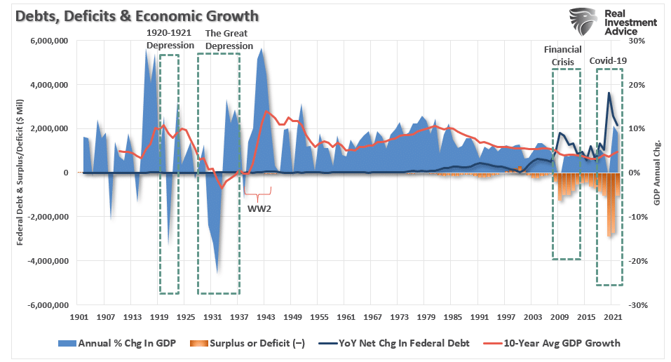
The decline in economic prosperity adds deflationary pressures on the economy. Such requires continued government deficit spending to sustain the demands on the welfare system.
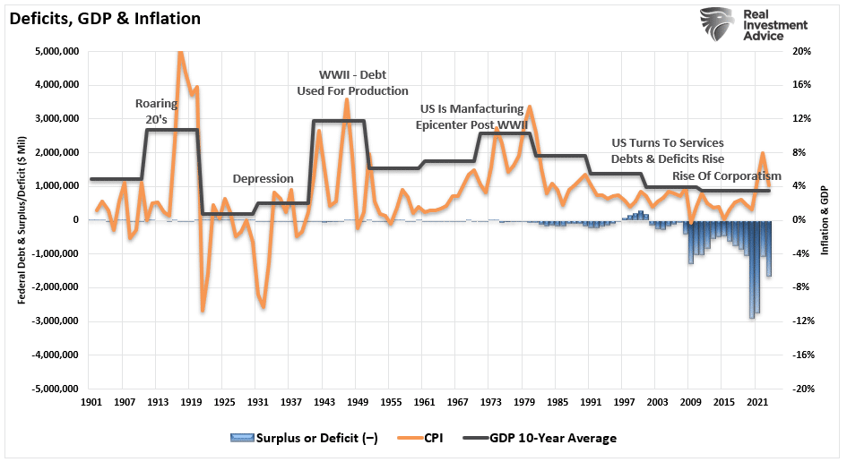
The negative impact on the economy is evident. There is a significant negative correlation between the size of the government and economic growth. Instead, debt is the problem, not the solution.
Lacy Hunt agrees with our assessment.
Lacy Hunt On The Diminishing Returns Of Debt
“Excessive indebtedness acts as a tax on future growth. It is also consistent with Hyman Minsky’s concept of ‘Ponzi finance.‘ Such means the size and type of debt being added cannot generate a cash flow to repay principal and interest. While the debt has not resulted in the sustained instability in financial markets envisioned by Minsky, the slow reduction in economic growth and the standard of living is more insidious.
Swedish econometricians Andreas Bergh and Magnus Henrekson, writing in the prestigious Journal of Economic Surveys in 2011, substantiate that there is a ‘significant negative correlation’ between the size of government and economic growth. Specifically, ‘an increase in government size by 10 percentage points is associated with a 0.5% to 1% lower annual growth rate.‘ This suggests that if spending increases, the government expenditure multiplier will become more negative over time.
Second, Ethan Ilsetzki (London School of Economics), Enrique Mendoza (University of Pennsylvania), and Carlos Vegh (University of Maryland) in a study published by peer-reviewed the Journal of Monetary Economics in 2013 concluded that the government spending multiplier is sharply negative in highly indebted countries. The definition of highly indebted is central government debt exceeding 60% of GDP, a condition that is met by most of the major economies of the world.“
The difference between the current Federal debt-to-GDP ratio and the 100% threshold impacts economic growth. The chart overlays the data against the 3-year average nominal GDP growth rate. Rising debt levels, much less the threshold, impact economic growth.
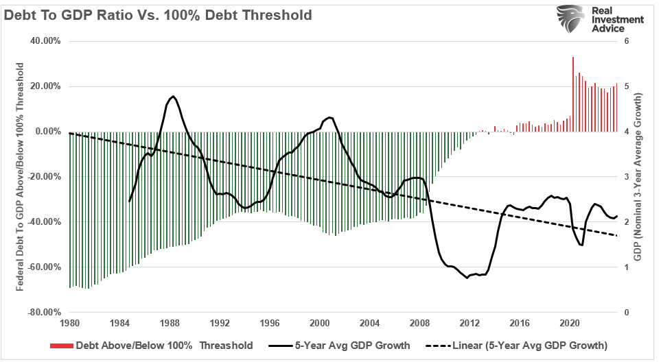
As shown above, debt is harmful to long-term growth. Dr. Hunt concludes by citing peer-reviewed research.
“Third, an econometric study by Alberto Alesina, Carlo Favero and Francesco Giavazzi in the Journal of International Economics in 2015, corroborates that the tax and expenditure multipliers are both negative, with the tax multiplier more negative. Quite significantly, these conclusions are supported by domestic as well as international data. Alesina is a Professor at Harvard, while Favero and Giavazzi are professors at IGIER-Bocconi.
Fourth, Cristina Checherita and Philip Rother, in research for the European Central Bank (ECB) published in 2014, investigated the average effect of government debt on per capita GDP growth in twelve Euro Area countries over a period of about four decades beginning in 1970. Dr. Checherita, now head of the fiscal affairs division of the ECB, and Dr. Rother, chief economist of the European Economic Community, found that government debt to GDP ratio above the turning point of 90-100% has a “deleterious” impact on long-term growth. In addition, they find that there is a non-linear impact of debt on growth beyond this turning point. A non-linear relationship means that as the government debt rises to higher and higher levels, the adverse growth consequences accelerate.”
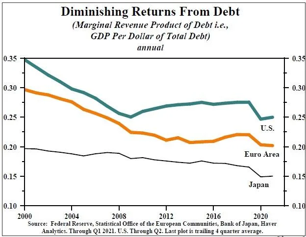
You may want to re-read that last sentence again.
Interest Rates Will Follow Economic Growth And Disinflation
Since rates and expectations must adjust for the potential future impact on the current value of invested capital:
- Equity investors expect that as economic growth and inflationary pressures increase, the value of invested capital will increase to compensate for higher costs.
- Bond investors have a fixed rate of return. Therefore, the fixed return rate is tied to forward expectations. Otherwise, capital is damaged due to inflation and lost opportunity costs.
Therefore, the long-term correlation between rates, inflation, and economic growth is unsurprising. The following chart is a composite index of inflation and economic growth compared to the 10-year Treasury yield. Currently, interest rates reflect the level of economic activity and inflation. As the composite reverts to its long-term mean, interest rates will trend lower to reflect the same.
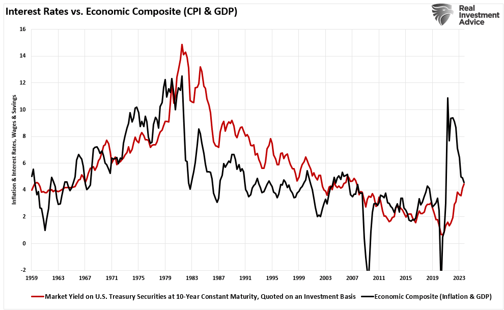
As expected, the surge in economic growth and inflation pulled longer-duration yields higher. With a correlation of nearly 85% between interest rates and a GDP/Inflation composite index, investors should expect rates to fall as economic growth and inflation decline.
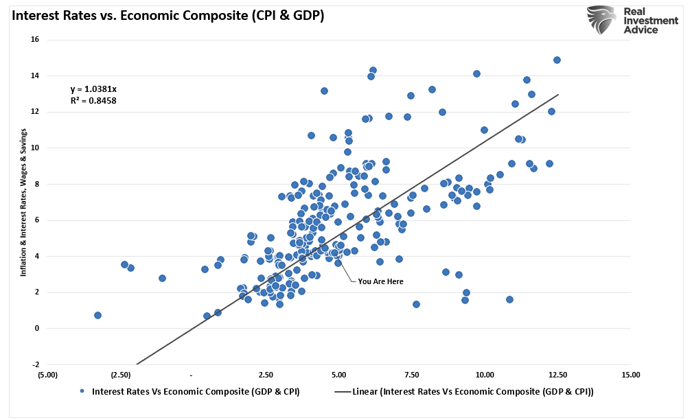
From one month to the next, inflation will tick up and down as economic activity continues. Currently, economic data remains strong and will likely continue for several more months as the impulses of monetary policies continue to work their way through the system. However, those impulses will fade over the next few years, and economic activity will revert to its long-term trend of 2% growth or less. As such, inflation and interest rates will follow suit.
It is the basics of economics and the impact of surging debts and rising deficits.
How We Are Trading It
What causes the market to break its bullish trajectory is entirely unknown. The 10% correction last year didn’t take an overwhelming catalyst other than just disappointment the Federal Reserve might keep rates “higher for longer” than”Wall Street wanted. That disappointment could be the same again as the markets are beginning to slash rate cut expectations further for this year.
Whatever trigger causes a reversal in the bullish signals, we will act accordingly to reduce risk and rebalance exposures. But one thing is sure: investor sentiment is extremely bullish, which has almost always been a good “bearish signal” to be more cautious.
While we have warned of a potential correction over the past few weeks, it reminds us much of June and July last year, where similar warnings for a 10% correction went unheeded. We have rebalanced exposures and taken profits in some positions with significant gains for the year, and will likely do this again if the market violates its 20-DMA. We are now seeing many individuals “jumping into the pool” in some of the most speculative areas of the market. Such is usually a sign we are closer to a market peak than not. As such, we want to make adjustments before the correction comes.
While it is not time to be overly bearish, continue basic portfolio management rules to reduce risks.
- Trim Winning Positions back to their original portfolio weightings. (ie. Take profits)
- Sell Those Positions That Aren’t Performing. If they don’t don’t rise with the market during a bounce, they will decline when it sells off again.
- Move Trailing Stop Losses Up to new levels.
- Review Your Portfolio Allocation Relative To Your Risk Tolerance. If you have an aggressive allocation to equities, consider raising cash levels and increasing fixed income accordingly to reduce relative market exposure.
Complacency is not a good way to manage a portfolio.

Have a great week.
Research Report

Subscribe To “Before The Bell” For Daily Trading Updates
We have set up a separate channel JUST for our short daily market updates. Please subscribe to THIS CHANNEL to receive daily notifications before the market opens.
Click Here And Then Click The SUBSCRIBE Button
Subscribe To Our YouTube Channel To Get Notified Of All Our Videos
Bull Bear Report Market Statistics & Screens

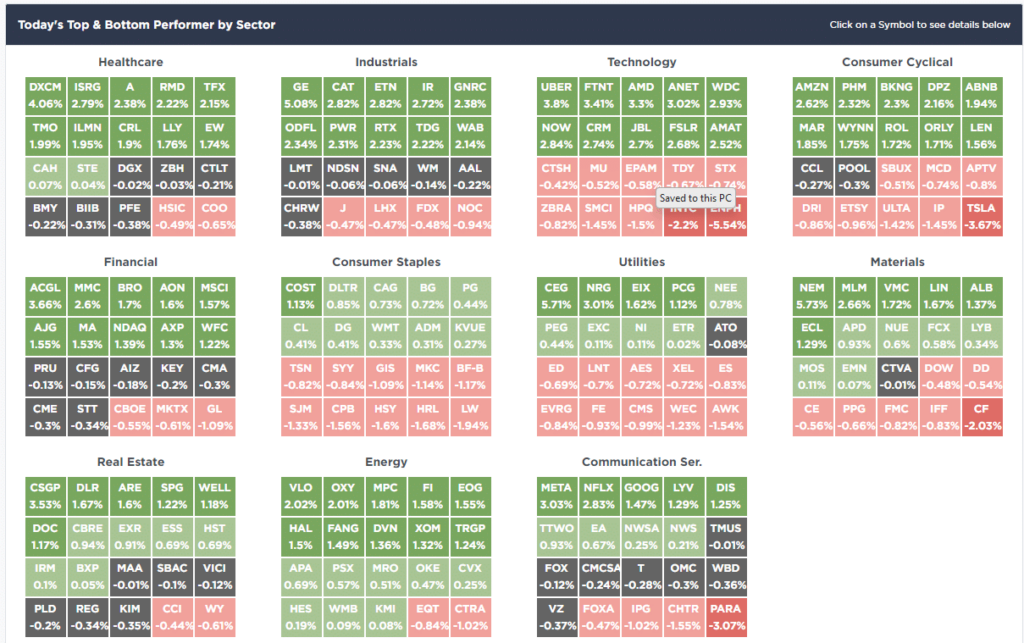
SimpleVisor Top & Bottom Performers By Sector
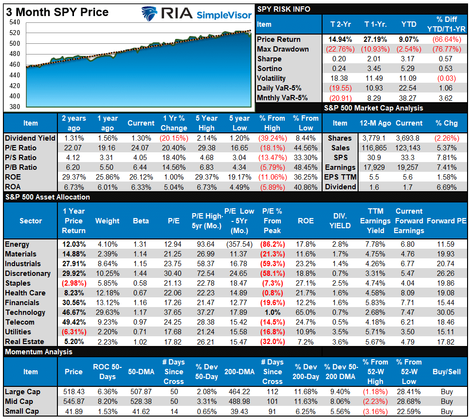
S&P 500 Weekly Tear Sheet
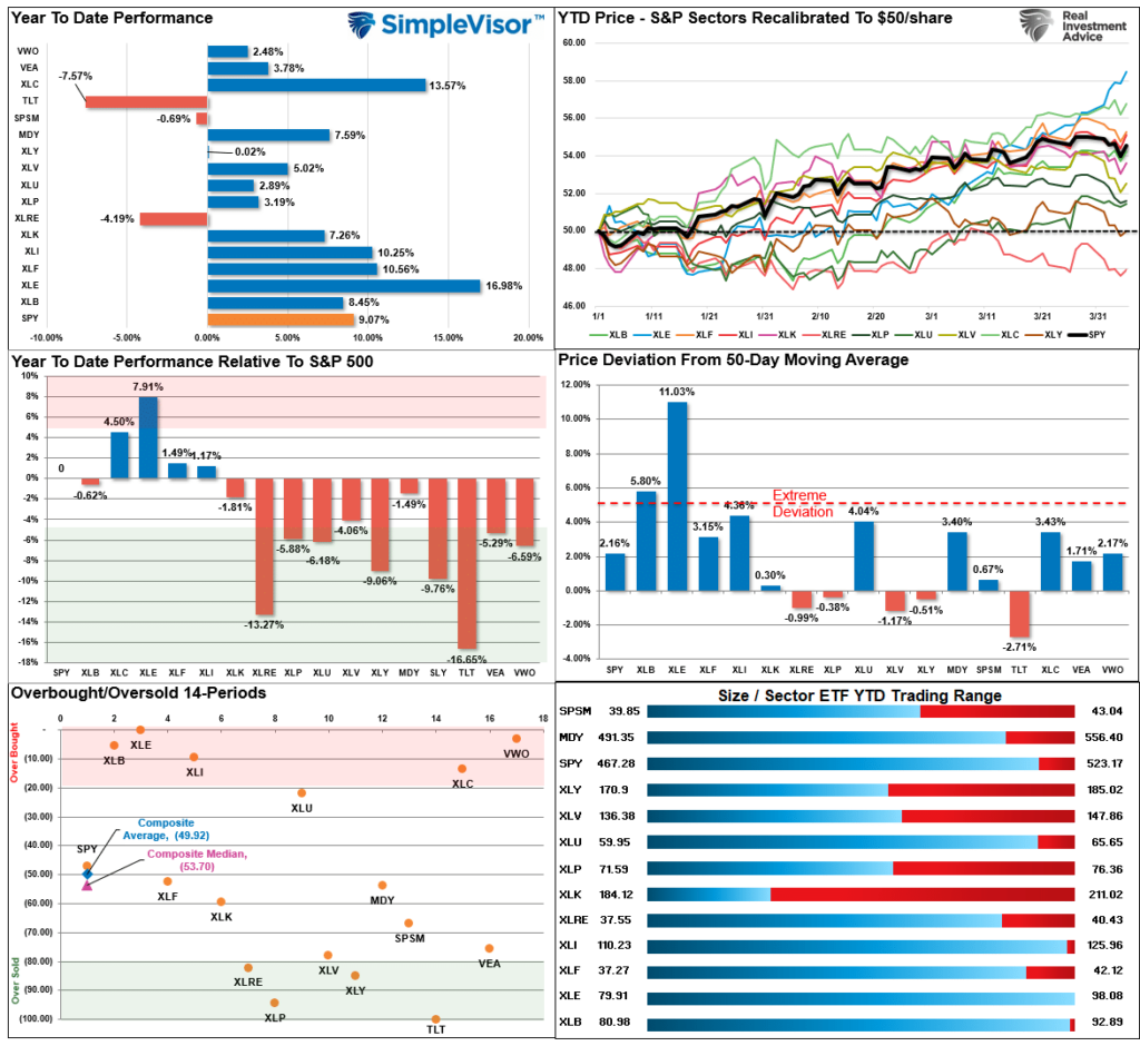
Relative Performance Analysis
As noted last week:
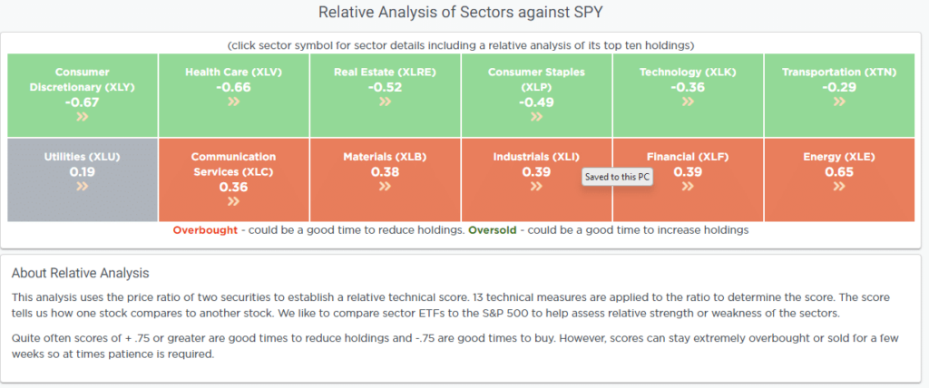
“The Q1 rally left the market up 10%, the largest beginning-of-the-year rally since 2019. That rally has also left most markets and sectors in highly overbought territory, deviated above the 50-DMA, and exuberant. Such has previously been the required ingredients for a short-term reversal.”
That reversal came on Thursday this past week, except for Energy, reducing much of the previous overbought condition. While the recent correction still has some additional work, some froth is getting worked off. Bonds have become oversold, and we will likely see some buying pressure ahead.
Technical Composite
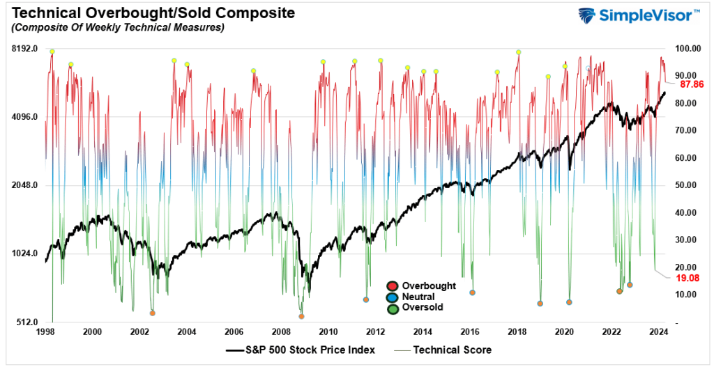
The technical overbought/sold gauge comprises several price indicators (R.S.I., Williams %R, etc.), measured using “weekly” closing price data. Readings above “80” are considered overbought, and below “20” are oversold. The market peaks when those readings are 80 or above, suggesting prudent profit-taking and risk management. The best buying opportunities exist when those readings are 20 or below.
The current reading is 87.86 out of a possible 100.
Portfolio Positioning “Fear / Greed” Gauge
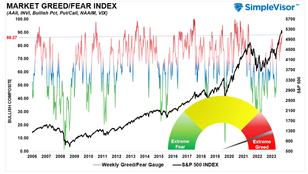
The “Fear/Greed” gauge is how individual and professional investors are “positioning” themselves in the market based on their equity exposure. From a contrarian position, the higher the allocation to equities, the more likely the market is closer to a correction than not. The gauge uses weekly closing data.
NOTE: The Fear/Greed Index measures risk from 0 to 100. It is a rarity that it reaches levels above 90. The current reading is 88.27 out of a possible 100.
Relative Sector Analysis
Most Oversold Sector Analysis

Sector Model Analysis & Risk Ranges
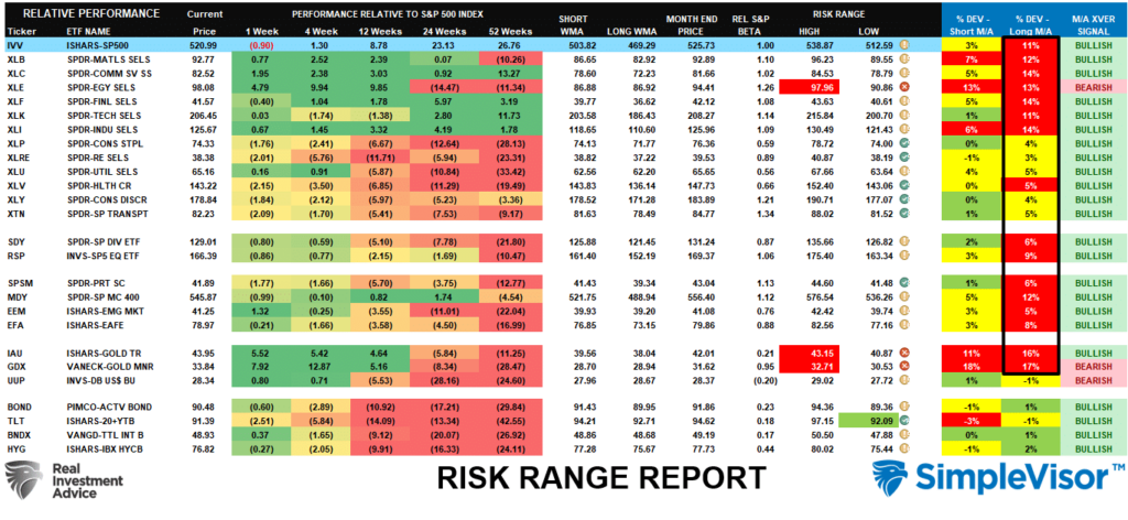
How To Read This Table
- The table compares the relative performance of each sector and market to the S&P 500 index.
- “MA XVER” (Moving Average Crossover) is determined by the short-term weekly moving average crossing positively or negatively with the long-term weekly moving average.
- The risk range is a function of the month-end closing price and the “beta” of the sector or market. (Ranges reset on the 1st of each month)
- The table shows the price deviation above and below the weekly moving averages.
Deviations for many market sectors from their longer-term moving averages remain extreme this past week. Notably, the “risk ranges” reset on the first of each month. In the first week, Energy, Gold, and Gold Miners are well outside their normal risk ranges. Such suggests profit-taking should be implemented. The bullish backdrop of the market remains, but at some point, there will be a correction that reverses these more extreme deviations. However, corrections will likely stay between 5-10% and will be buyable opportunities with most sectors and markets trading with bullish moving average crossovers.
Weekly SimpleVisor Stock Screens
We provide three stock screens each week from SimpleVisor.
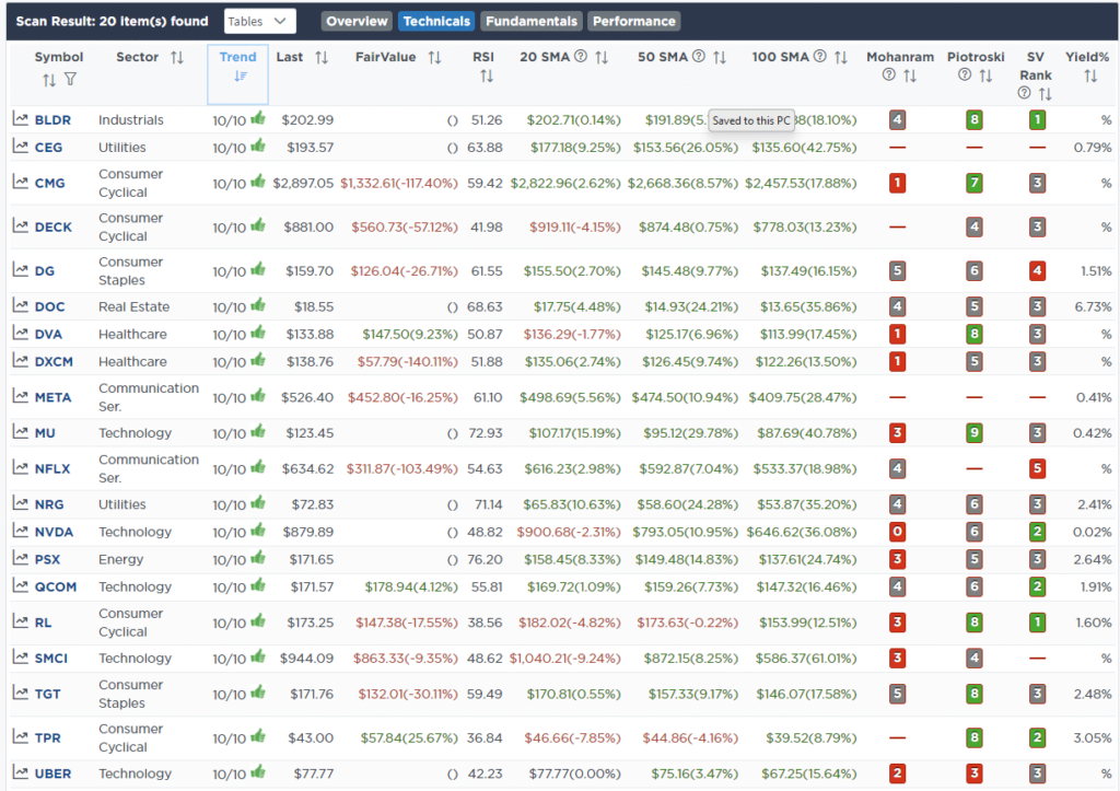
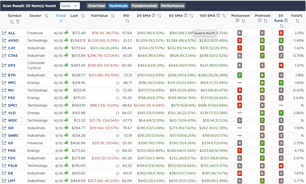
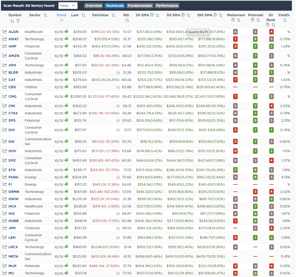
This week, we are searching for the Top 20:
- Relative Strength Stocks
- Momentum Stocks
- Fundamental & Technical Strength W/ Dividends
(Click Images To Enlarge)
R.S.I. Screen
Momentum Screen
Fundamental & Technical Strength
SimpleVisor Portfolio Changes
We post all of our portfolio changes as they occur at SimpleVisor:
No Trades This Week

Lance Roberts, C.I.O.
Have a great week!


