Valuations Are Extreme Even With Rose Tinted Glasses
Many investors claim that comparing current valuations to the nifty fifties, roaring twenties, or the go-go nineties is for the birds. New technologies, aggressive monetary policy, and other factors make this time different, so they say.
Their bullish logic: the past is not the same as the present. Therefore, never mind current valuation extremes.
The graphs below provide just a few of the many indicators showing equities are historically expensive.

One of Warren Buffett’s favorite indicators, market cap to GDP, is well above any reading since 1950.
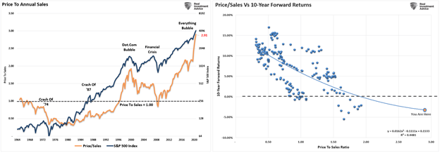
Price to sales, a reliable measure of a company’s ability to profit, sits over 50% above its level in the late 1990s. Forward return expectations are abysmal.
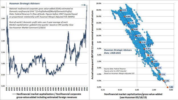
John Hussman shows the ratio of market cap to gross value added is over 3.5. Unfortunately, the correlation between his valuation measure and subsequent returns falls off the bottom of the second graph.
Let’s pretend that they are not an apples-to-apples comparison because the graphs above compare current valuations versus prior ones. Instead, how would valuations look if we only compare valuations versus those in similar periods? With this questionable reasoning, we hope to answer the following questions:
- Are current valuations more normal when viewed with such little history?
- Do scary charts like those above become less scary?

It’s all about the Economy
Before assessing valuations and answering the questions above, it’s worth a brief reminder on what stocks are. Stocks are called shares because they represent ownership or a share of a company. Therefore, the price of a stock is based on the value of future cash flows of the company. Equally important, over more extended periods, the cash flows highly correlate with economic growth.
For this time to be different, we must take a leap of faith that earnings and the economy will grow at a much better rate than the trends of the last 40 years. Such entails us to assume productivity growth, demographics, and or capital will improve markedly.
Productivity growth has been gradually declining for nearly 20 years. Such is because many new technologies are far less productive than we imagine. For more on our thoughts, please read Productivity: What it is & Why it Matters.
Demographics will continue to weigh on economic growth. For example, fewer children detract from future population growth. At the same time, increasing dependency ratios due to the large boomer population weigh on consumption.
Capital can continue to contribute to growth. However, government and corporate debt as a percentage of the GDP are at record highs. Thus, consumers have some room for more debt, but it is limited.
Given the three growth factors are not likely to change appreciably for the better, it’s hard to dispute that economic growth will weaken further with each future economic expansion. Unfortunately, such has been the case and likely will continue to be the case.
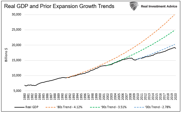
If we are correct, investors are currently paying more and will get less.
Current Valuations
The graph below shows that CAPE valuations, having eclipsed those of 1929, are the second-highest in over 100 years. Only the tech bubble of the late 1990s has more expensive valuations.
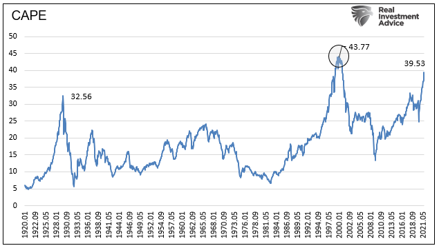
The narrative of the late ‘90s was new technology will change our lives. That turned out to be accurate, but it didn’t alter earnings or economic growth rates. They have declined. Comparing the future from the standing point of 1999 was certainly different from the 1960s, but that was a gross error from an investor’s point of view.
An 80% correction in the technology-heavy NASDAQ made many investors understand expectations and valuations of the late 1990s were grossly out of whack.

Is Today Different?
Comparing today’s earnings growth and economic growth to the 1950s or 1980s leaves a lot to be desired. But, unfortunately, it is because those periods offered better growth prospects.
However, let’s go with the reasoning that this time is different and compare valuations with those from similar periods. For instance, compare valuations in 1982 versus 1972-1982—similarly, with the last ten years.
To normalize and make data comparable for each period, we compute the number of standard deviations or sigmas that each monthly CAPE is versus its prior ten years of monthly readings.
This comparison leaves us with somewhat different results than the CAPE chart shown earlier.
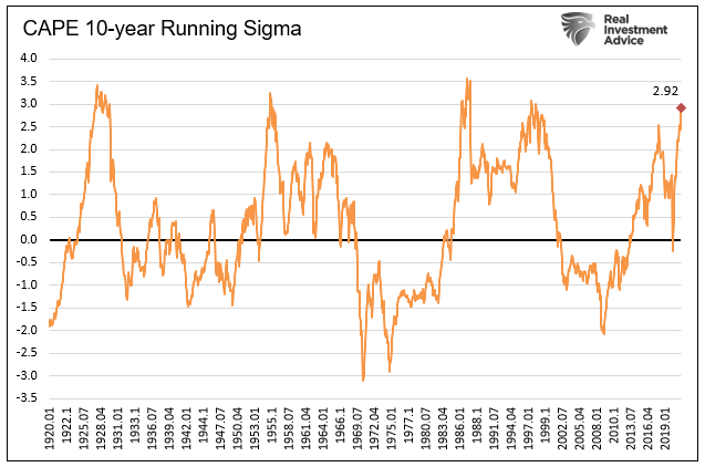
The current sigma reading (2.92) is very high, but it’s not the second-highest as the first CAPE graph. 1987 is the highest reading, followed closely by the late 90s, mid-’50s, and late 1920s. All four peaked between 3.0 and 3.5 sigmas before correcting.
If the market were to rise to 3.50 sigmas instantaneously, the S&P 500 should rally 8%.
However, if the market falls to the average of the last ten years (0 sigmas), we should prepare for losses of over 30%. If it falls below zero, as is typical, more significant losses are likely in store.
The odds are not in your favor, even with rose-tinted glasses on.
How about Price to Earnings Instead of CAPE
Some investors prefer to use price-to-earnings ratios using the prior twelve months of earnings. Thus, even though CAPE better quantifies earnings trends than shorter periods, we run the same analysis.
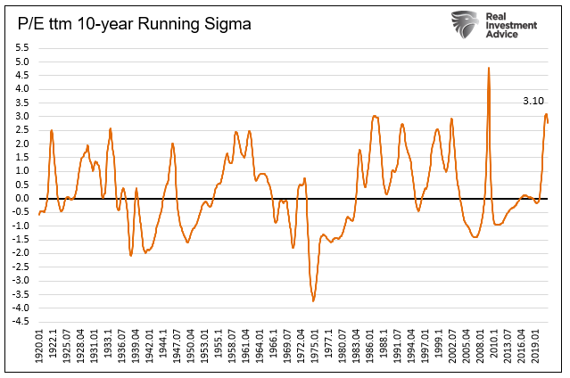
The current reading, of roughly three sigmas, matches or exceeds seven other peaks in the last 100 years. 2009 is the exception. However, that significant overvaluation is a function of earnings collapsing, not excessive prices. In all the cases, the ratio fell to at least zero.
The current sigma is at prior peaks, so any upside appears limited.
If the market reverts to a zero sigma, we should expect 36% losses. Again, a decline to negative readings will compound the losses.

Summary
The wise Bob Farrell left us a treasure trove of investment advice as we wrote about in WWBD? And WWBD? Part II.
We remind you of three nuggets of wisdom.
- Markets tend to mean revert over time
- Excesses in one direction often lead to excesses in another direction
- There are no new eras- excesses are never permanent
We leave you with the two questions we pose at the begging for you to answer:
- Are current valuations more normal when viewed with such little history?
- Do scary charts like those above become less scary?


