Inside This Week’s Bull Bear Report
- Un-Inversion Suggests A Return To Normalcy?
- How We Are Trading It
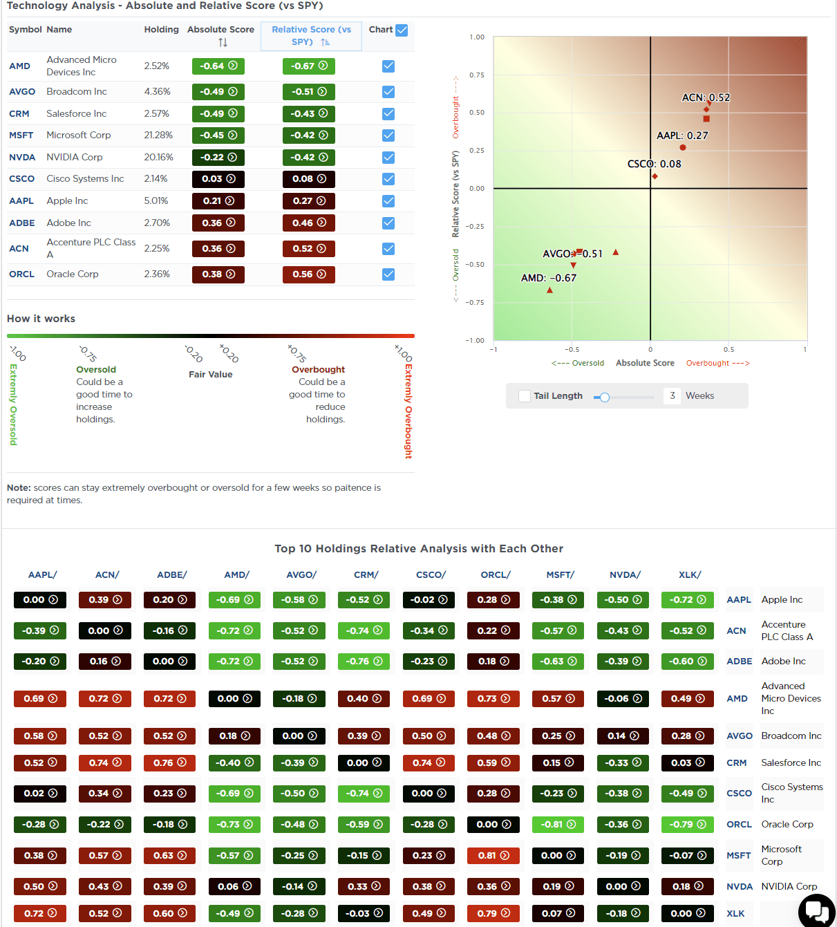
- Research Report –Does Technology Make Things Better
- Youtube – Before The Bell
- Market Statistics
- Stock Screens
- Portfolio Trades This Week
Market Fails At Resistance
“This past week, the market struggled to make gains, and as shown, its momentum has slowed. While such does not mean a significant correction is imminent, it does suggest that the upside is likely limited. Investors should expect a continued consolidation or pullback to previous support levels. Notably, a negative divergence is developing between momentum, strength indications, and market performance. We last mentioned such a negative divergence was in late July before the August correction.”
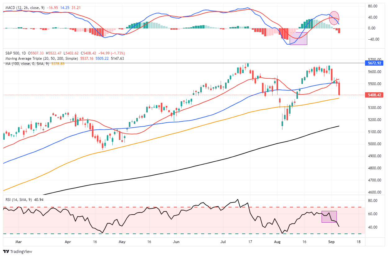
This past week, slowing economic data and a weak payroll report weighed on market sentiment, pushing the market below initial support levels at the 20—and 50-DMA. That suggests that the current correction process that began in early August is continuing ahead of the upcoming November election.
As discussed this past Tuesday in “Risks Facing Bullish Investors,” an essential “buyer” for the market is fading with the corporate buyback window closing. Such increases the risk of a pickup in volatility over the next two months, which coincides with a potentially contentious election that will likely keep major investors sidelined.
In the short term, the weekly technical gauge shows the recent correction resolved much of the previous overbought conditions. That sets the market up for a reflexive rally early next week.

We suggest using any rally that fails to regain the 50-DMA to reduce risks, rebalance portfolios, and raise cash levels. While the potential downside is not significant, the goal is not to sacrifice a substantial amount of recent gains or put yourself in a position of being forced to sell for any reason.
Remain cautious for now. Following the election, we will likely have significantly more clarity about where the market is heading next.
Need Help With Your Investing Strategy?
Are you looking for complete financial, insurance, and estate planning? Need a risk-managed portfolio management strategy to grow and protect your savings? Whatever your needs are, we are here to help.

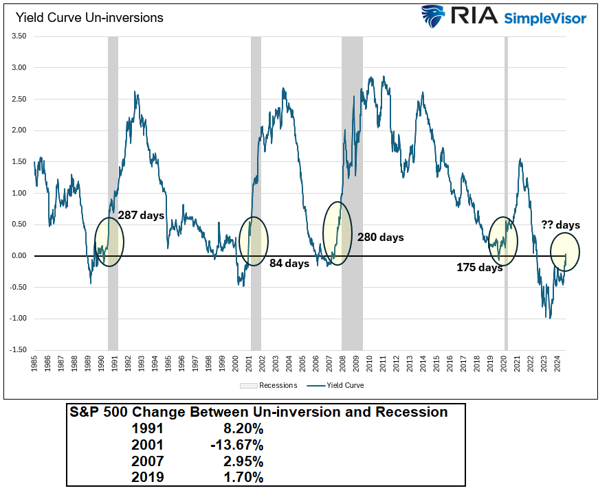
A Brief Recap Of The Yield Curve
This past week, the “yield curve,” or the spread between the 10-year and 2-year Treasury bond, briefly un-inverted. For our newer readers, a yield curve inversion occurs when short-term interest rates surpass long-term rates. For example, the 2-year Treasury had a higher yield for the last two years than the 10-year Treasury. Typically, longer-term investments offer higher yields than short-term ones due to the increased risk over time. However, such was not the case following the Fed’s aggressive rate hiking campaign, which pushed short-term yields higher.
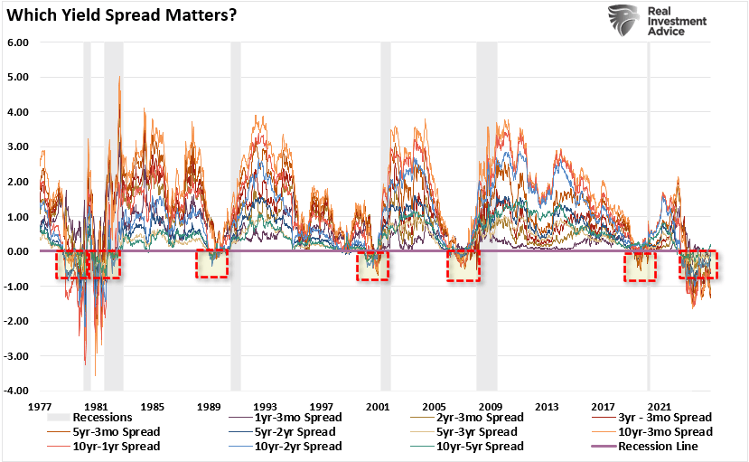
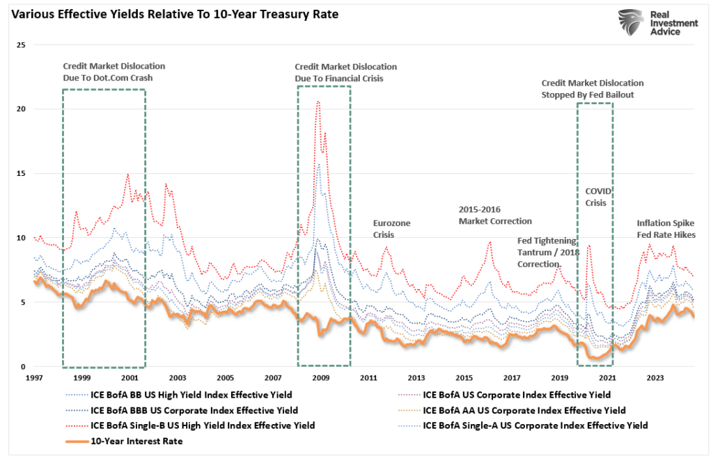
The yield curve is a graphical representation of interest rates across different maturities for bonds of similar type. Typically, we look at yield curves of government bonds, but it could also be corporate bonds, municipal bonds, etc. The chart below shows 10-different yield spreads we track. Notice that in 2019, most yield spreads inverted before the economic shutdown. In 2022, as the Fed started aggressively hiking rates, yield spreads inverted once again. Take note of the black line (the 10-year less the 2-year spread) and the blue line (the 10-year less the 3-month Treasury bill spread). These are the two spreads to which economists and investors pay the most attention.

The following chart shows a more complete history of those 10-yield spreads. As shown, each time the un-inversion of those spreads previously occurred, that un-inversion preceded the onset of a recession.
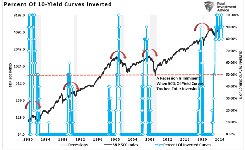
That chart is a bit difficult to decipher. The following chart is a composite index of those 10-yield spreads and shows the percentage of those inverted spreads. There are two essential points to consider:
- Recessions coincide with periods where more than 50% of the yield spreads are inverted.
- Recessions follow the un-inversion of those spreads.
Historically, an inverted yield curve has been a reliable predictor of recessions. The inversion reflects a shift in investor sentiment, signaling that they expect future economic conditions to deteriorate. As a result, businesses and consumers may pull back on spending, leading to reduced economic activity and potentially triggering a recession.
However, the media often notes 1995, when the Fed cut rates, but no recession occurred. The chart above shows ZERO inversions of the 10-yield spreads in 1995. More than 50% of the spreads did not invert until 1999, and the recession of 2000 followed.
This past week, the 10-year yield spread, less the 2-year yield spread, was un-inverted. Does that mean a recession is imminent?
A Return To Normalcy?
There are many misunderstandings in the media and among Wall Street economists who do not fully understand the importance of yield spreads and their un-inversions. For example, take the following headline from CNBC this past week.
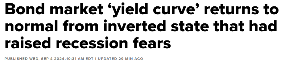
Yes, an un-inversion of the yield spreads would be a “return to normal.” However, such does not mean the economy achieved a “soft landing” and avoided a recession. However, as we discussed previously, investors should not overlook the message from the bond market. Bonds are essential for their predictive qualities, so analysts pay enormous attention to U.S. government bonds, precisely the difference in their interest rates.
Notably, when psychology changes, for whatever reason, the rotation from “risk-on” to “risk-off” will find Treasury bonds as a “store of safety.” Historically, such has always been the case during market crisis events.
The data has a high historical correlation to where the economy, stock, and bond markets generally head in the longer term. Volatile oil prices, trade tensions, political uncertainty, the dollar’s strength, credit risk, earnings strength, etc., affect the bond market and, ultimately, the yield curve.
However, as noted above, while the inversion of the various yield spreads equates to economic weakness, the un-inversion is historically the “recessionary signal.” The graph below shows that a recession can take almost a year following an un-inversion.
Meanwhile, the media assumes that “this time is different” because a recession didn’t occur immediately upon the inversion. This way of thinking has two problems.
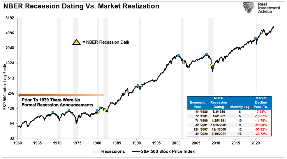
- The National Bureau of Economic Research (NBER) is the official recession dating arbiter. It waits for data revisions by the Bureau of Economic Analysis (BEA) before announcing a recession’s official start. Therefore, the NBER is always 6-12 months late, dating the recession.
- Crucially, as noted, the recession is not denoted by the inversion of the yield curve. The inversion is the “warning sign,” whereas the un-inversion marks the start of the recession, which the NBER will recognize much later.
As discussed in “BTFD Or STFR,” if you wait for the official announcement by the NBER to confirm a recession, it will be too late. To wit:
“Each of those dots is the peak of the market PRIOR to the onset of a recession. In 9 of 10 instances, the S&P 500 peaked and turned lower prior to the recognition of a recession.“
Notably, the yield curve un-inversion and onset of a recession typically follow a Fed “rate-cutting” cycle. That is because the Federal Reserve is reacting to slowing economic data, which tends to lag by a few months. As data is revised, the Fed cuts rates more aggressively to offset the deflationary pressures building in the economy. However, during these initial stages, there was “no recession,” as the NBER had not dated it yet.

Such will likely be the case again, as the lag between the yield curve’s un-inversion and the recession dating could be anywhere from 6 to 18 months.
But what does this mean for investors?
Yield Curve Un-Inversions And Stock Market Performance
As Michael Lebowitz noted on Wednesday, the graph below charts the 2- and 10-year yields and the 2-year/10-year yield curve. Additionally, shaded in gray are periods we deem persistent bull steepening. We defined the bull steepening periods by the curve’s movement and the trend’s consistency. The yield curve had to increase to qualify, with 2-year and 10-year yields moving lower for 20 weeks or longer. Furthermore, we required at least 80% of the weeks to be in the bullish steepening trend.
As shown, there have been five such periods since 1995. The most recent stretched from May 2019 to March 2020. The current bull steepening has not been occurring long enough to meet our standards defined above.
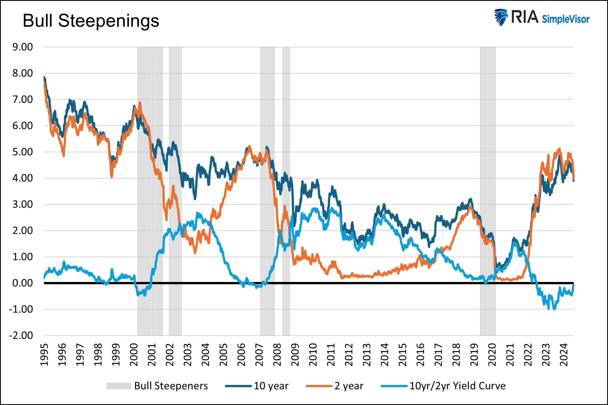
Having defined the periods, we then studied various stock indices, sectors, and factors to assess their performance during the timeframes. Bull steepening trades typically occur when the economy slows, and anticipation of Fed rate cuts grows. Those traits adequately describe the current period.
The first graph below charts the average returns of 19 assets, stock indices, factors, and sectors during the five bull-steepening periods. The second graph compounds their returns over the five periods.

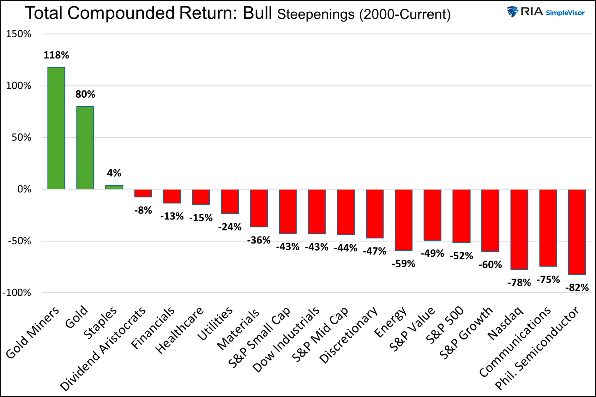
Next, we break out the returns by similar classes of stocks. We added gold and gold miners to the factor returns graph. The graphs show the average return and the average of the maximum drawdowns during the five periods.
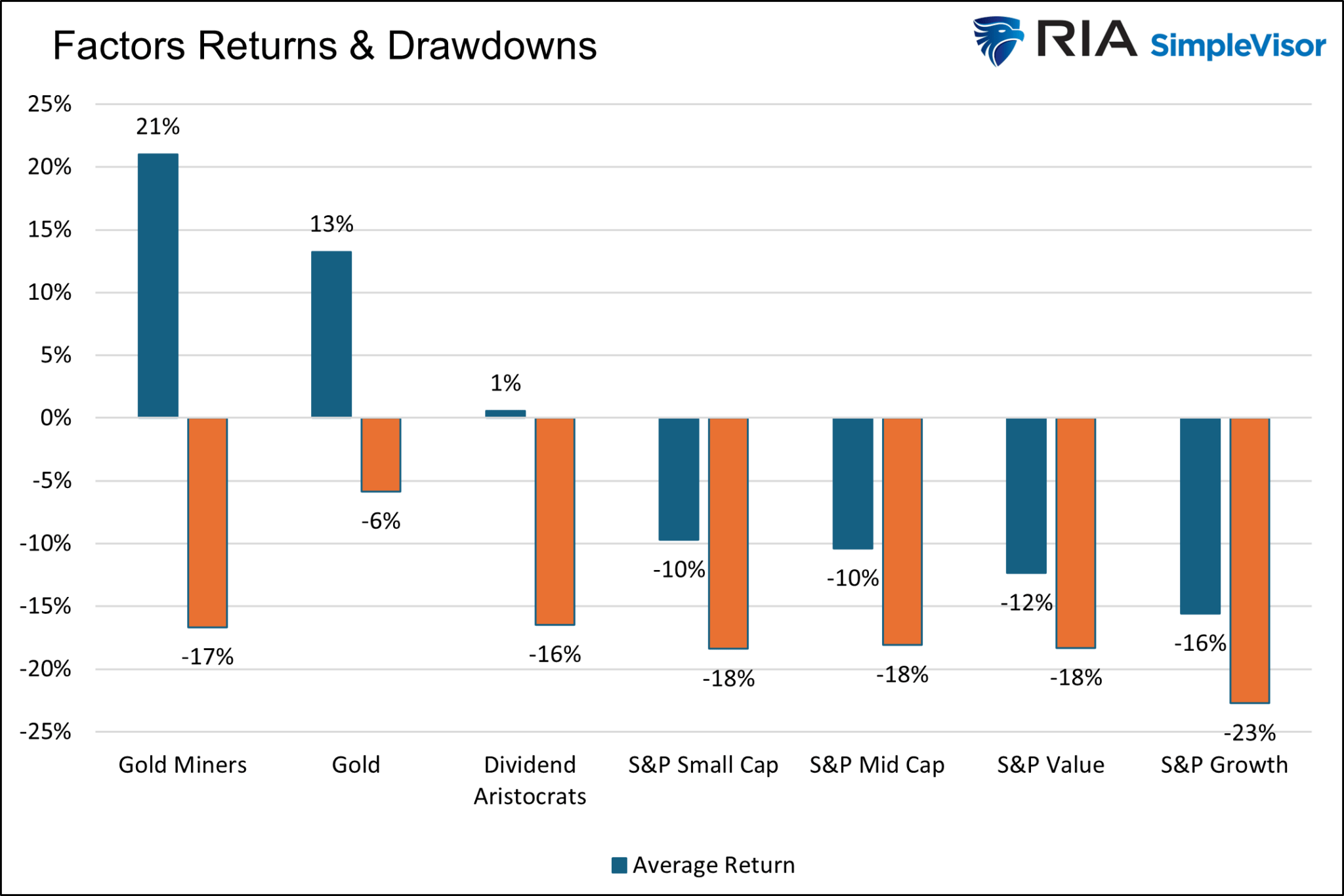
There are a few important takeaways:
- Gold and gold miners are the best performers during bull-steepening periods by a long shot.
- Besides gold and gold miners, staples were the only other category with a positive compounded and average return.
- Every index, sector, asset, and factor, including gold and gold miners, had a negative average return at some point during the steepening period.
- The differences between S&P value and growth were not as significant as we suspected they would be.
- Similarly, the differences between the S&P 500 and the S&P small and mid-cap indexes were minimal.
- The lower beta, more value-oriented sectors outperformed the higher beta sectors and factors during the steepening shift.
It’s easy to extrapolate the past to the future. However, each of the five periods above was different. There is no doubt that the next persistent bull steepening, whether we are in it now or in the future, will have different characteristics.
For instance, gold is up about 10% from the start date. If this is a persistent bull steepening cycle and gold ultimately matches the average 13% return over the prior five periods, it has limited upside. However, its average drawdown during the previous periods is about 6%. Therefore, if this instance matches the average return and drawdown, we should expect gold to FALL by 15% before rebounding to about 3% more than current levels.
Similarly, the sectors currently trading higher than their late May levels could decline by more than the average return from current levels to match the average return.
Be careful when making big bets on past data. As discussed this week:
“Past performance is not a guarantee of future results.”
How We Are Trading It
The yield curve is sending a message that investors should not ignore. Furthermore, it is a good bet that “risk-based” investors will likely act sooner rather than later. Of course, the contraction in liquidity causes the decline, eventually exacerbating the economic contraction.
Despite commentary to the contrary, the yield curve is a “leading indicator” of the economy’s current state, as opposed to economic data, which is “lagging” and subject to massive revisions.
More importantly, while the consumer may continue to support growth today, this can and will change dramatically when job losses occur. Consumers are fickle beasts, and it will happen very rapidly when a change in psychology occurs.
While using the “yield curve” as a “market timing” tool is unwise, dismissing the message could be just as foolish.
History has not been kind to those that do.
We remain allocated to equities, although we are slightly underweighting our targets and reduced our exposure to technology back in July. Furthermore, we are also underweight longer-duration bonds in favor of short-term bills. With bonds currently overbought, we await a short-term rise in yields to provide a better entry point to lengthen our overall bond duration.
While the long-term risks are undoubtedly obvious, as noted, such can take much longer to appear than logic would predict. Therefore, we continue to manage short-term risk as needed to control returns and volatility.
Have a great week.
Research Report

Subscribe To “Before The Bell” For Daily Trading Updates
We have set up a separate channel JUST for our short daily market updates. Please subscribe to THIS CHANNEL to receive daily notifications before the market opens.
Click Here And Then Click The SUBSCRIBE Button
Subscribe To Our YouTube Channel To Get Notified Of All Our Videos
Bull Bear Report Market Statistics & Screens

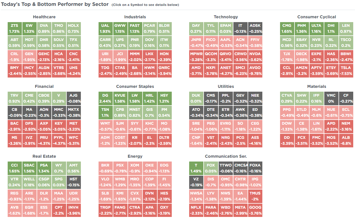
SimpleVisor Top & Bottom Performers By Sector
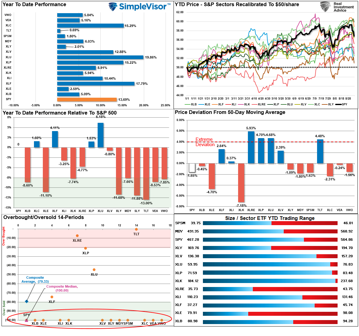
S&P 500 Weekly Tear Sheet

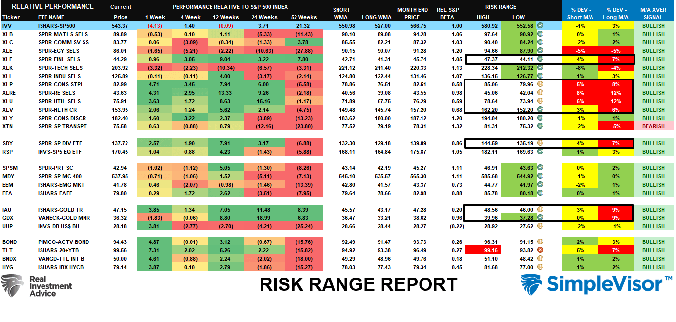
Relative Performance Analysis
Two weeks ago, we discussed the bottom-left panel of the analysis.
“As noted, with every market and sector at more extreme levels of overbought conditions, look for minor corrections to support before adding exposure to portfolios. I would be unsurprised to see some selling hit the markets next week.”
While that correction started subtly last week, it gained traction this past week, breaking below the 50-DMA. Unsurprisingly, most sectors and markets are now back to oversold, setting the market up for a reflexive bounce this coming week. Investors should consider using any such reversal to rebalance portfolio risk as needed. Despite the correction, it is essential to note that the market is still up by nearly 14%, with every tracked market and sector turning in positive performances. The current correction process is healthy and a needed reversal of recent gains. It will likely provide a decent entry point to add exposure at some point over the next few weeks.
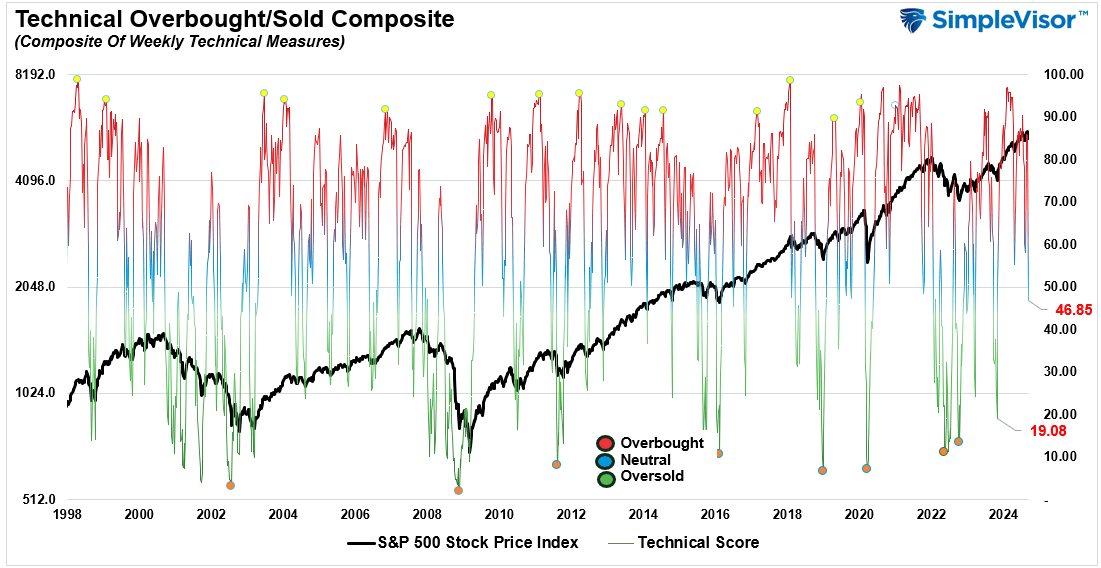
Technical Composite
The technical overbought/sold gauge comprises several price indicators (R.S.I., Williams %R, etc.), measured using “weekly” closing price data. Readings above “80” are considered overbought, and below “20” are oversold. The market peaks when those readings are 80 or above, suggesting prudent profit-taking and risk management. The best buying opportunities exist when those readings are 20 or below.
The current reading is 46.85 out of a possible 100.
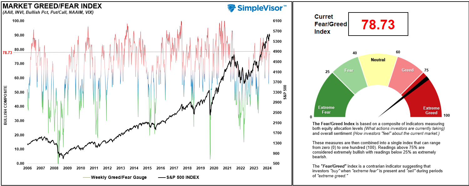
Portfolio Positioning “Fear / Greed” Gauge
The “Fear/Greed” gauge is how individual and professional investors are “positioning” themselves in the market based on their equity exposure. From a contrarian position, the higher the allocation to equities, the more likely the market is closer to a correction than not. The gauge uses weekly closing data.
NOTE: The Fear/Greed Index measures risk from 0 to 100. It is a rarity that it reaches levels above 90. The current reading is 78.73 out of a possible 100.
Relative Sector Analysis
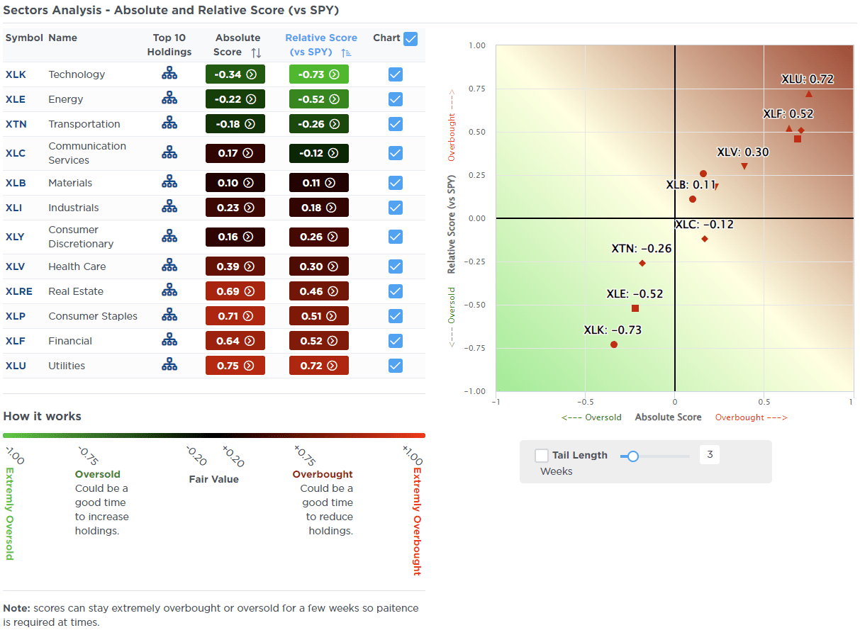
Most Oversold Sector Analysis
Sector Model Analysis & Risk Ranges
How To Read This Table
- The table compares the relative performance of each sector and market to the S&P 500 index.
- “MA XVER” (Moving Average Crossover) is determined by the short-term weekly moving average crossing positively or negatively with the long-term weekly moving average.
- The risk range is a function of the month-end closing price and the “beta” of the sector or market. (Ranges reset on the 1st of each month)
- The table shows the price deviation above and below the weekly moving averages.
Last week, we noted that many markets deviated above long-term means and were highly overbought. A correction was likely. To wit:
“Continue to take profits and rebalance weightings, as a reversal is likely at some point.”
That correction began in earnest this week, reversing many overbought conditions to oversold. The more significant deviations, while remaining, have been reduced, particularly in Gold and Gold Miners. While those deviations remain, suggesting a further correction is likely, a bounce is expected in the near term to allow for a better exit to reduce risk and rebalance exposures. Trade accordingly.
Weekly SimpleVisor Stock Screens
We provide three stock screens each week from SimpleVisor.
This week, we are searching for the Top 20:
- Relative Strength Stocks
- Momentum Stocks
- Fundamental & Technical Strength W/ Dividends
(Click Images To Enlarge)
RSI Screen
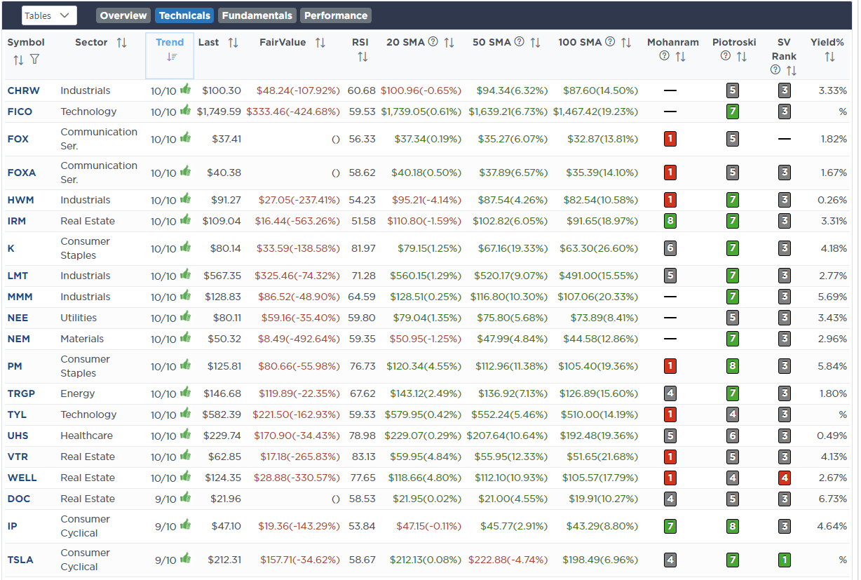
Momentum Screen
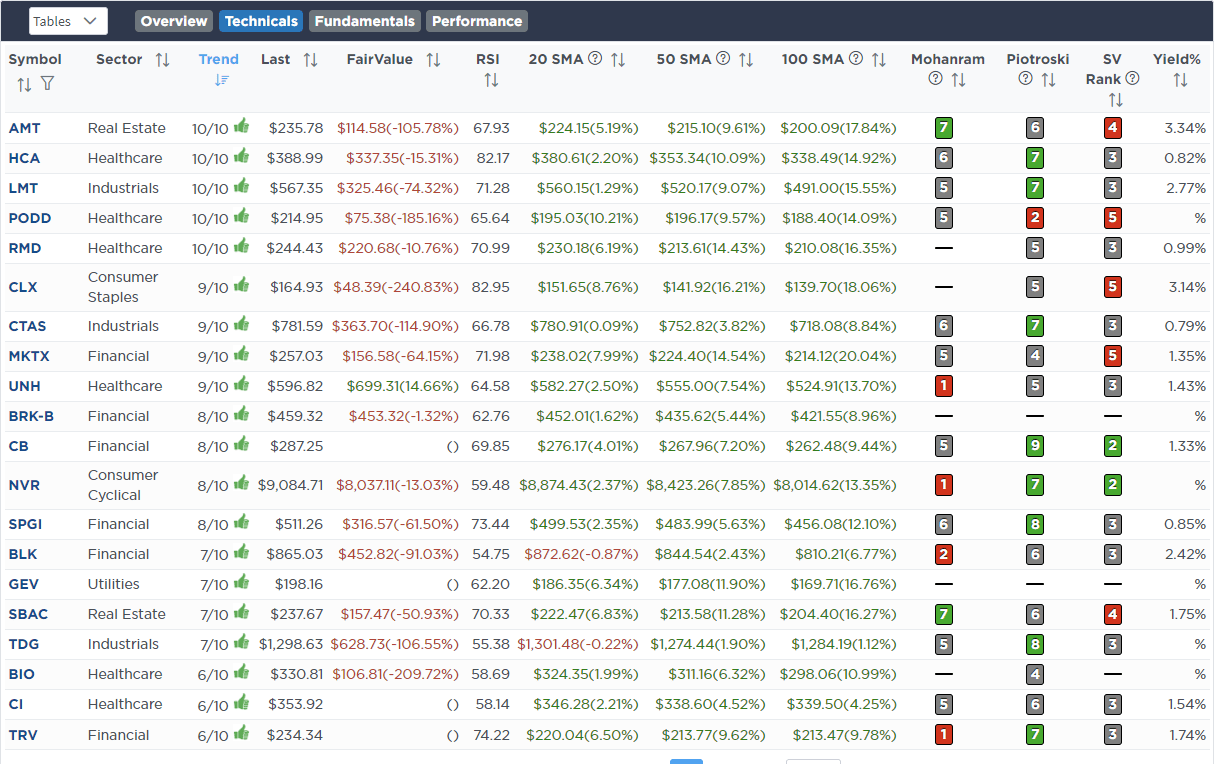
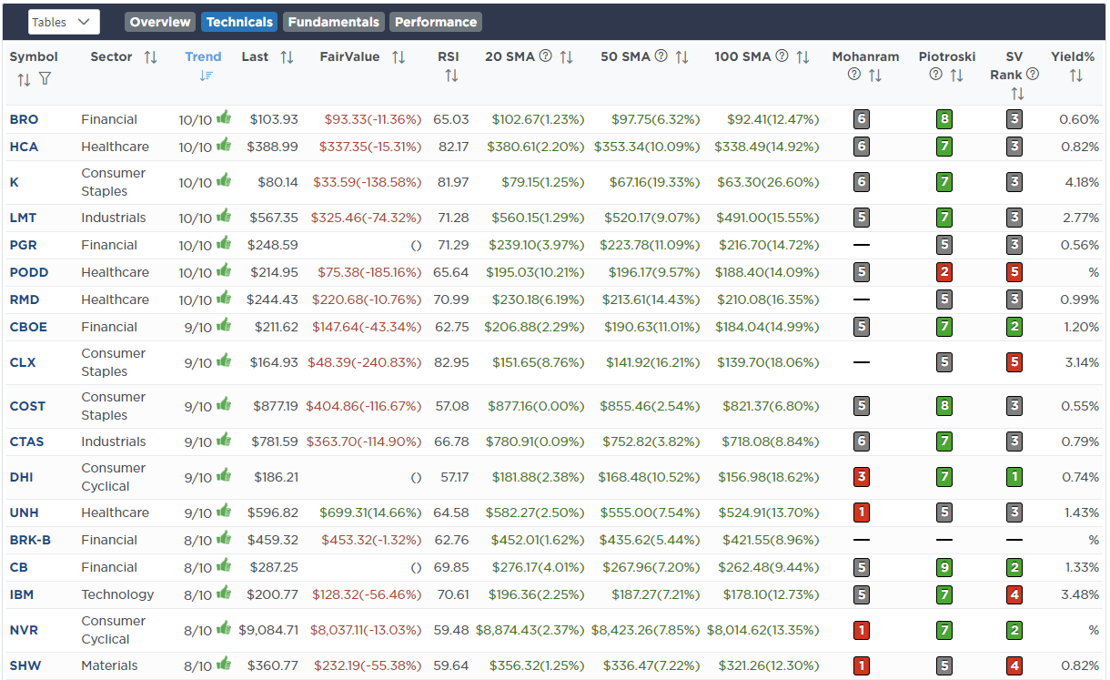
Fundamental & Technical Screen
SimpleVisor Portfolio Changes
We post all of our portfolio changes as they occur at SimpleVisor:
No Trades This Week

Lance Roberts, C.I.O.
Have a great week!