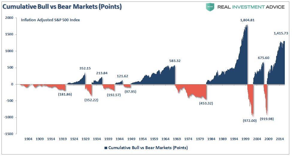
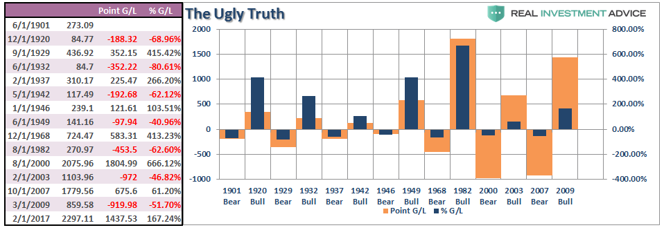
Last week, I discussed the “World’s Most Deceptive Chart” which explored the deception of “percentage” versus actual “point” losses which has a much greater effect on both the real, and psychological, damage which occurs during a bear market. To wit:
“The problem is you DIED long before ever achieving that 5% annualized long-term return.
Outside of your personal longevity issue, it’s the ‘math’ that is the primary problem.
The chart uses percentage returns which is extremely deceptive if you don’t examine the issue beyond a cursory glance. However, when reconstructed on a point gain/loss basis, the ugly truth is revealed.”
Of course, there are those that still don’t get the basic realities of math, loss and time and resort to other flawed theses to support an errant view. As shown by a comment received by a reader:
“This is true only for price return, not for total return (dividends included). Since 1926, there has never been a negative 20-year period or 15-year period. There have been only four negative 10-year periods, 1928-1938, 1929-1939, 1998-2008, and 1999-2009.
The same fatal flaw afflicts that last graph. It shows inflation-adjusted price return (dividends not included). Including dividends increases that Mar 2009-Feb 2017 gain from 167% to 218%. Does Mr. Roberts throw away all his dividend cheques? Does anybody?” – Sam Baird
Sorry, Sam, the data WAS total, real returns, but the larger point you missed was the importance of understanding the devastating difference between POINT gain or loss, versus a PERCENTAGE gain or loss.
However, the point Sam made was nonetheless important as it showed another commonly held belief that is a fallacy.
Which bring us to….
The World’s Second Most Deceptive Chart
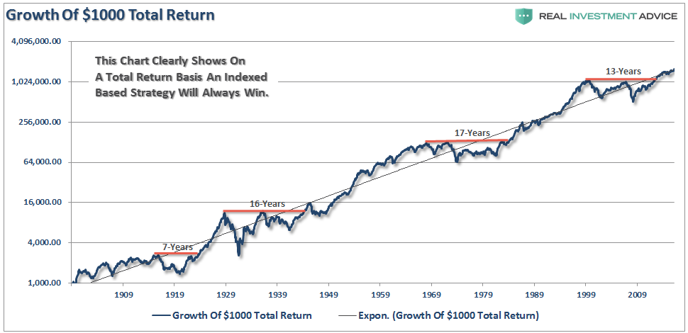
The following chart is the same real, inflation-adjusted, total return of the S&P 500 index from last week but converted to the compounded growth of a $1000 investment.
Note: The red lines denote the number of years required to get back to even following a bear market.
“See, other than those couple of periods, just buying, holding and collecting dividends is the way to go. Right?”
Again, not so fast.
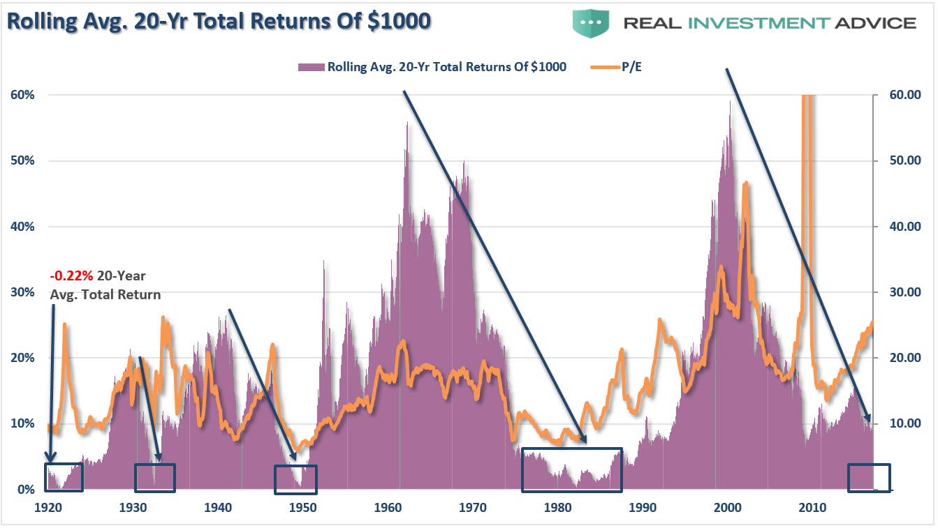
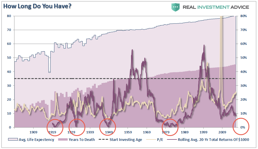
First, as shown in the chart below, There have currently been four, going on five, periods of low returns over a 20-year period. Importantly, there also HAS been a NEGATIVE 20-year real, total return, holding period average of -0.22%.
(Again, sorry Sam.)
I have added the P/E ratio which exposes the issue, once again, of the importance of valuation on future returns. In other words, your investment success depends more on WHEN you start, than IF you start investing.
“But Lance, yes, while there are some low periods, you made money provided you stayed invested. So what’s the issue?”
That brings me to my second point of that nagging problem of “time.”
Until Death Do Us Part
In all of the analysis that is done by Wall Street, “life expectancy” is never factored into the equations used when presenting the bullish case for investing.
Therefore, in order to REALLY calculate REAL, TOTAL RETURN, we have to adjust the total return formula by adding in “life expectancy.”
RTR =((1+(Ca + D)/ 1+I)-1)^(Si-Lfe)
Where:
- Ca = Capital Appreciation
- D = Dividends
- I = Inflation
- Si = Starting Investment Age
- Lfe = Life Expectancy
For consistency from last week’s article, we will assume the average starting investment age is 35. We will also assume the holding period for stocks is equal to the life expectancy less the starting age. The chart below shows the calculation of total life expectancy (based on the average of males and females) from 1900-present, the average starting age of 35, and the resulting years until death. I have also overlaid the rolling average of the 20-year total, real returns and valuations.
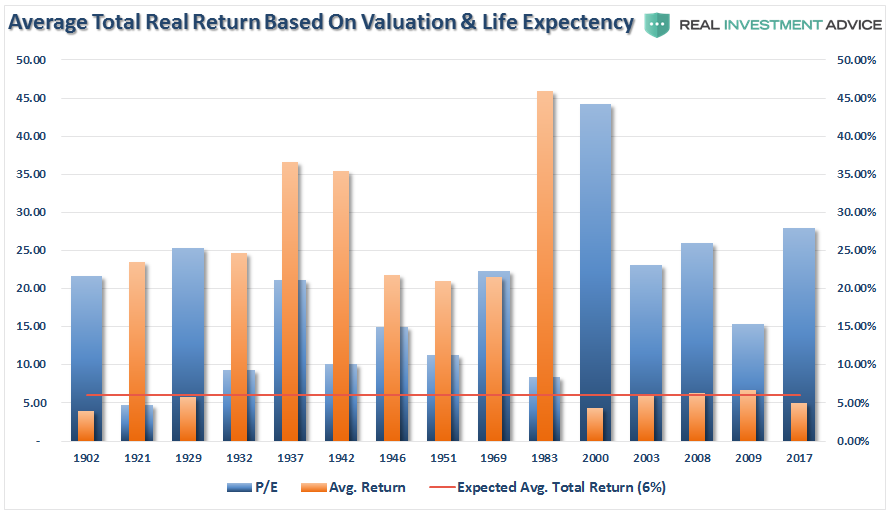
If we use the stat and end dates, as shown in the first chart and table above, and calculate real total return based on the life expectancy for each period we find the following.
The horizontal red line is critically important.
One to the most egregious investing “myths” is when investors are told:
“The power of compounding is the most powerful force in investing.”
What the red line shows you is when, ON AVERAGE, you failed to achieve 6%-annualized average total returns (much less 10%.) from the starting age of 35 until DEATH.
Importantly, notice the level of VALUATIONS when you start investing has everything to do with the achievement of higher rates of return over the investable life expectancy of an individual.
“Yes, but there are periods where my average return was higher than either 6% or 10%. So it’s not actually a fallacy. What am I missing?”
Simple.
The stock market does not COMPOUND returns.
There is a massive difference between AVERAGE and ACTUAL returns on invested capital. The impact of losses, in any given year, destroys the annualized “compounding” effect of money.
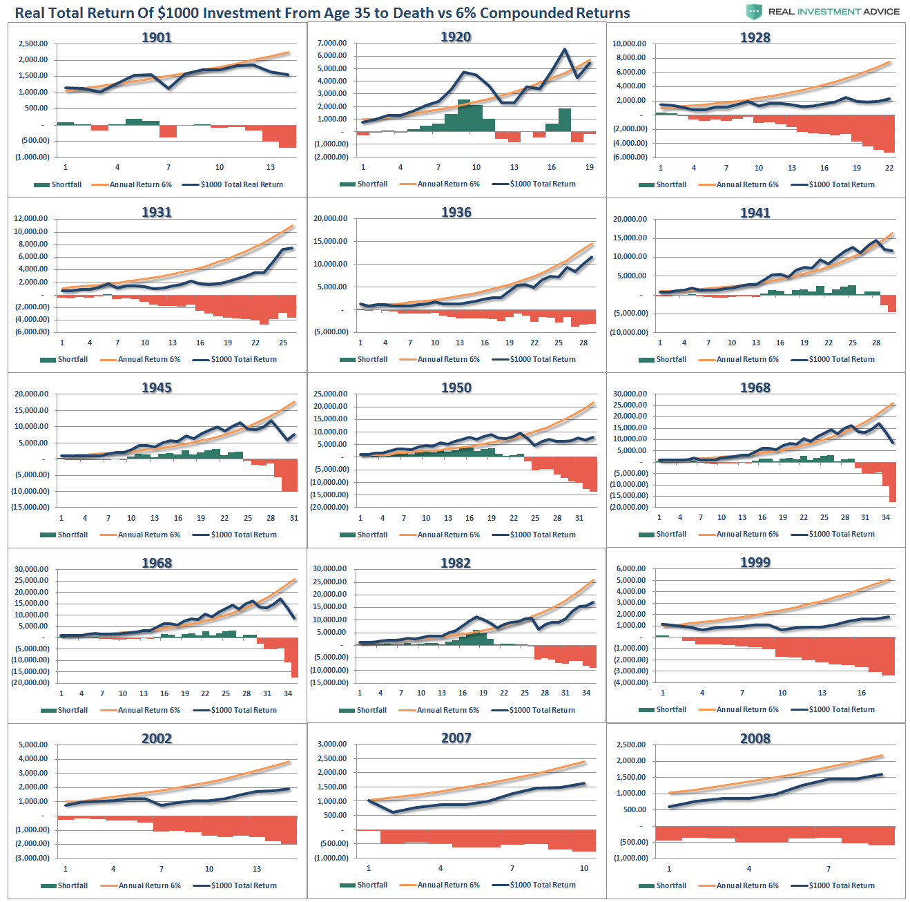
As shown in the chart box below, I have taken a $1000 investment for each period and assumed a real, total return holding period until death. No withdrawals were ever made. (Note: the periods from 1983 forward are still running as the investable life expectancy span is 40-plus years.)
The gold sloping line is the “promise” of 6% annualized compound returns. The blue line is what actually happened with invested capital from 35 years of age until death, with the bar chart at the bottom of each period showing the surplus or shortfall of the goal of 6% annualized returns.
In every single case, at the point of death, the invested capital is short of the promised goal.
The difference between “close” to goal, and not, was the starting valuation level when investments were made.
This is why, as I discussed in “The Fatal Flaws In Your Retirement Plan,” that you must compensate for both starting period valuations and variability in returns when making future return assumptions. If you calculate your retirement plan using a 6% compounded growth rates (much less 8% or 10%) you WILL fall short of your goals.
But wait….
It’s Actually Even Worse
The analysis above does NOT INCLUDE the effect of taxes, fees, expenses or a withdrawal rate once individuals hit retirement age.
This was the point I discussed in “Retirees May Have A Spend Down Problem.”
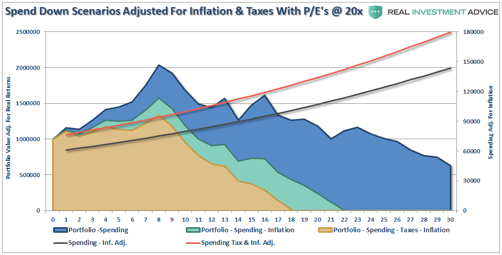
“The chart below takes the average return of all periods where the starting P/E was above 20x earnings (black line) and uses those returns to calculate the spend down of retiree’s in retirement assuming similar outcomes for the markets over the next 30-years. As opposed to the analysis above, I have added a 4% annual withdrawal rate at retirement and included the impact of inflation and taxation.”
“On the surface, it would appear a retiree would not have run out of money over the subsequent 30-year period. However, once the impact of inflation and taxes are included, the outcome becomes substantially worse.”
Time To Get Real
The analysis above reveals the important points that individuals should OF ANY AGE should consider:
- Expectations for future returns and withdrawal rates should be downwardly adjusted due to current valuation levels.
- The potential for front-loaded returns going forward is unlikely.
- Your personal life expectancy plays a huge role in future outcomes.
- The impact of taxation must be considered.
- Future inflation expectations must be carefully considered.
- Drawdowns from portfolios during declining market environments accelerates the principal bleed. Plans should be made during up years to harbor capital for reduced portfolio withdrawals during adverse market conditions.
- The yield chase over the last 8-years, and low interest rate environment, has created an extremely risky environment for investors. Caution is advised.
- Expectations for compounded annual rates of returns should be dismissed in lieu of variable rates of return based on current valuation levels.
You cannot INVEST your way to your retirement goal. As the last decade should have taught you by now, the stock market is not a “get wealthy for retirement” scheme. You cannot continue under-saving for your retirement hoping the stock market will make up the difference. This is the same trap that pension funds all across this country have fallen into and are now paying the price for.
Importantly, chasing an arbitrary index that is 100% invested in the equity market requires you to take on far more risk that you most likely realize. Two massive bear markets over the last decade have left many individuals further away from retirement than they ever imagined.
As shown above, our life expectancy rates are finite and the later we get started saving for goals, the less time we have to waste trying to “get back to even” following a “mean reverting event.”
Investing for retirement, should be done conservatively, and cautiously, with the goal of outpacing inflation over time. Trying to beat some random, arbitrary index that has nothing in common with your financial goals, objectives, and most importantly, your life span, has tended to end badly for individuals.
You can do better.

