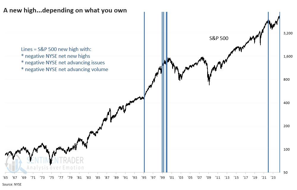
Bad market breadth seems to be a hallmark of the rally off of the 2022 lows. Simply, very few stocks are leading markets higher, while many stocks languish. Consider that the equal-weighted S&P 500 index (RSP) is up 3.70% since the start of the year. Over the same period, the market-weighted S&P 500 (SPY) is up over 14%. Just Nvidia has contributed more to the market-weighted S&P 500 than the entire RSP gain for the year. With that in mind, consider the graph below from Sentimentrader. It shows the S&P 500 is hitting new highs, but three important breadth indicators are troublesome.
Per Sentimentrader:
- More NYSE issues are hitting 52-week lows than highs
- More NYSE issues are declining than advancing
- and More NYSE volume is flowing into losers than winners
This confluence of negative indicators with the market at new highs is rare. Per Sentimentrader’s graph, it has occurred four times, including today, since 1965. In 1995, the market surged despite the warning. It was again triggered multiple times in 1999, which was followed by a significant decline. Similarly, the signal in late 2021 was followed by a moderate drawdown in 2022. The new Sentimentrader signal could be a false alarm like in 1995. However, it might be a more immediate warning that the market is heading lower. Given the market breadth and large deviations from key moving averages, we are paying close attention to our technical indicators and will act if necessary. For more information on Sentimentrader’s services, please click HERE.
What To Watch Today
Earnings
- No notable earnings reports
Economy
Market Trading Update
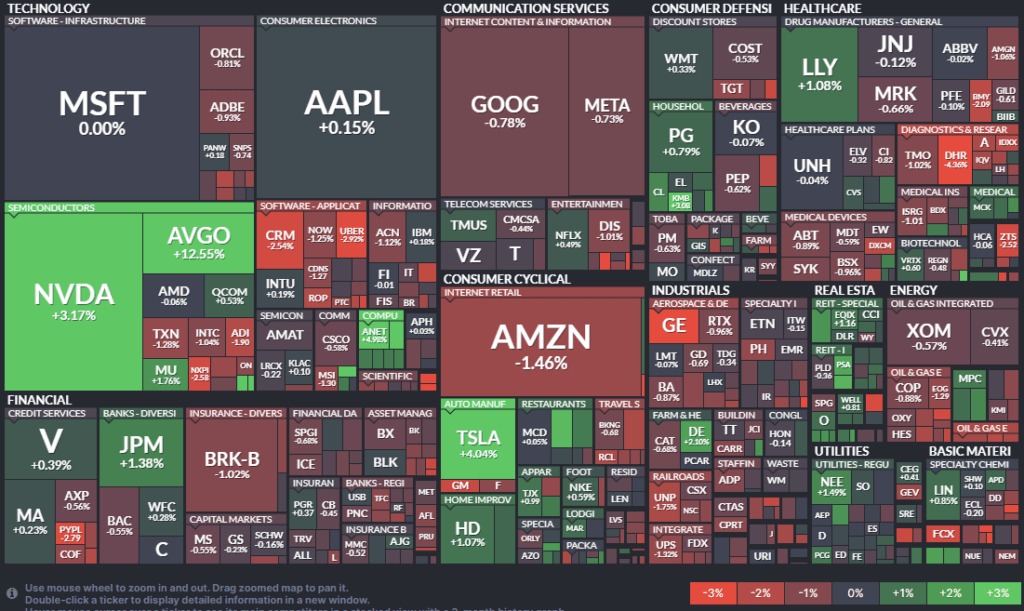
In yesterday’s market update, we touched on the negative divergences in the market and the poor breadth of the advance. Due to that lack of breadth, combined with a more overbought condition, we noted that the upside may be somewhat limited in the near term until a correction or consolidation occurs. Yesterday, despite a much cooler PPI report, stocks sold off mid-day, although they recovered somewhat into the afternoon. Furthermore, as shown in the heat map below, winners were sparse, with Nvidia and Tesla doing most of the work on the market capitalization-weighted index.
Furthermore, the weaker-than-expected inflation reports and strong bond auctions sent bonds higher. Bond prices have cleared all the major moving averages, are on a buy signal, and successfully retested the breakout of the downtrend from the beginning of the year.
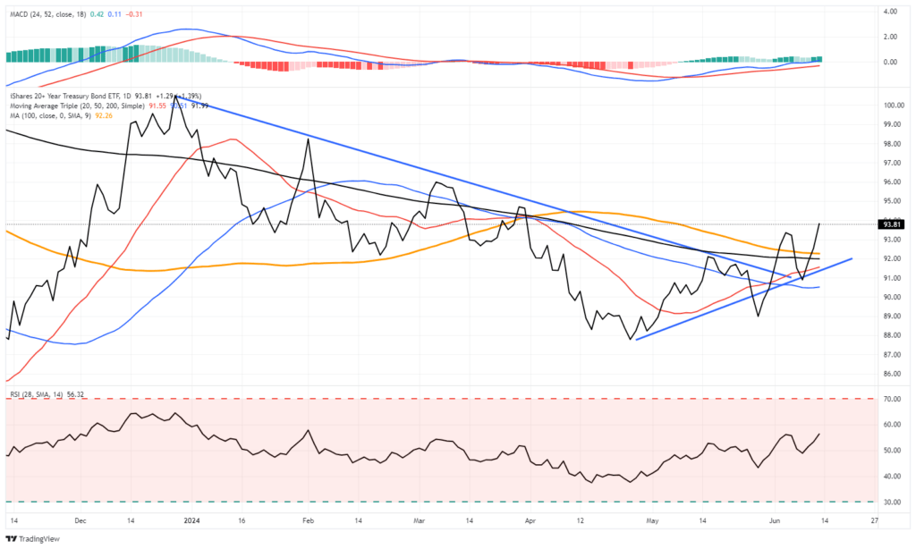
From a technical perspective, bonds appear to have gained some traction on several fronts, and a retracement to the highs from the beginning of the year seems reasonable. While rates are set up for a decent trade, we have not reached the point where the fundamentals support a substantial move higher. For that, it will likely take weaker economic growth into the 2nd half of this year, a further decline in inflation, and the Fed cutting rates.
We will get there. It will most likely be later this year or early next year.

Helping Powell Appreciate Poor Consumer Sentiment
At the FOMC press conference on Wednesday, Jerome Powell stated:
“I don’t think anyone…has a definitive answer why people are not as happy about the economy as they might be.”
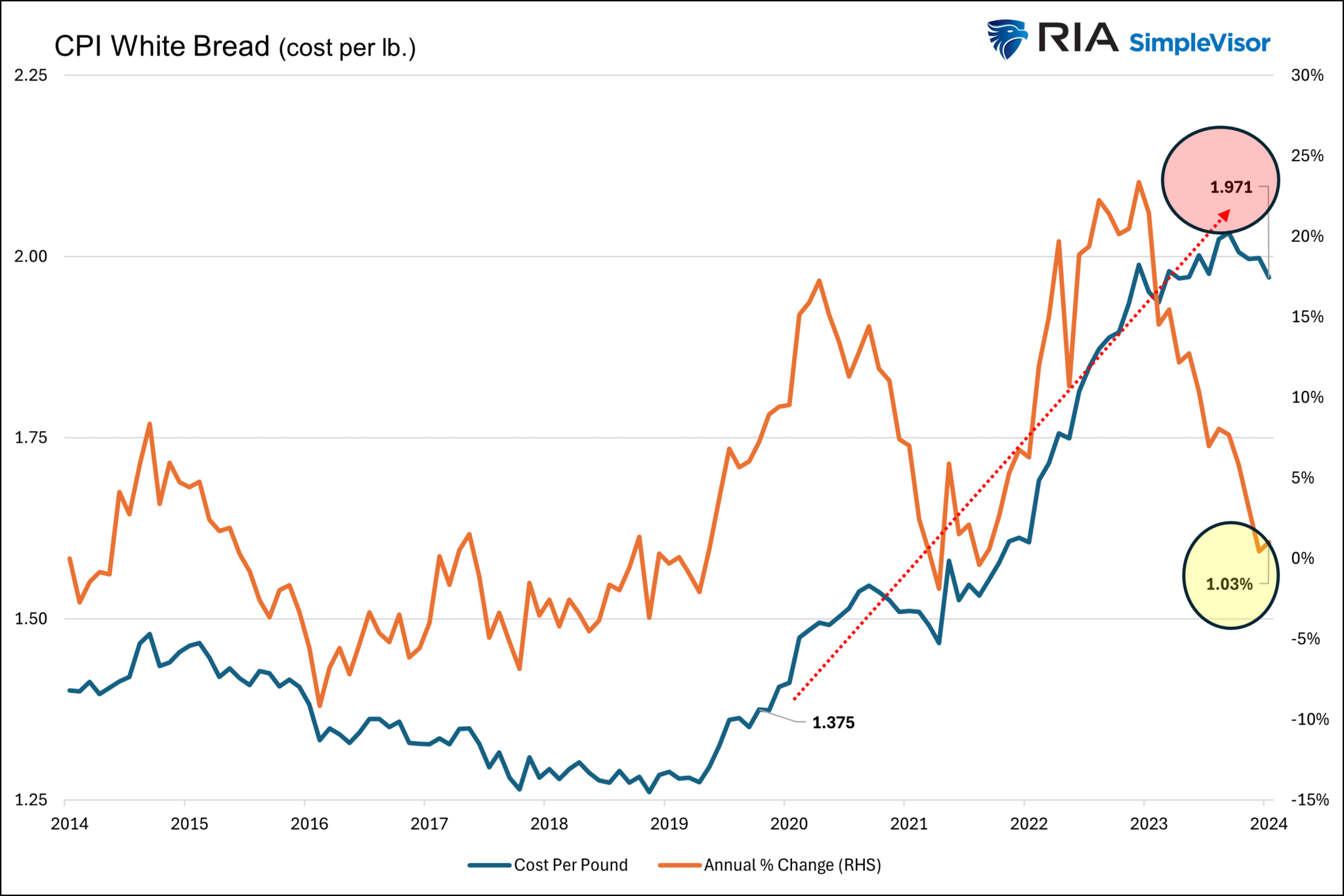
He went on to say that the unemployment rate is near record lows. Essentially, he presumes that because most people have jobs, they should be happy with the economy. Apparently, Jerome Powell doesn’t go shopping. The graph below shows the CPI price index for white bread and the annual percentage price change for white bread. In Jerome Powell’s economist mindset, he will tell you that the price of white bread per pound has risen 1.03% over the last year. In his mind, that is a reason for optimism, as white bread inflation is below his 2% inflation objective.
On the other hand, the consumer sees that white bread now costs $1.97 a pound, much higher than the $1.37 a pound before the pandemic. The data in the graph is the same, but the way of looking at it is starkly different. This explains why people have a very different opinion of the economy than Powell expects they should have.
Furthermore
The Rise of Technology
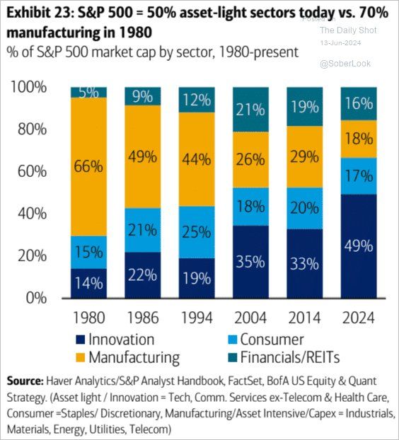
The chart below shows how the mix of sectors within the S&P 500 and the economy as a whole has changed drastically since 1980. When comparing today to 1980, the most notable change is the decline of manufacturing and the increase in innovation. Appreciating this massive shift in the economic structure of the market and the economy helps us understand why valuations have increased over the last forty years. Innovation stocks, predominately residing in the technology sector, tend to be in high-growth situations. As such, they trade with high valuations as investors, and the companies will grow at above-market rates. Manufacturing tends to grow more in line with the economy. Therefore, many of these companies have lower valuations. More innovation and less manufacturing equals higher valuations.
Tweet of the Day
“Want to achieve better long-term success in managing your portfolio? Here are our 15-trading rules for managing market risks.”
Please subscribe to the daily commentary to receive these updates every morning before the opening bell.
If you found this blog useful, please send it to someone else, share it on social media, or contact us to set up a meeting.