A reader of Tuesday’s Daily Commentary made a very astute comment. The title of the Commentary was “Trump Meme Coin Creates Billions Out Of Thin Air.”
It doesn’t create anything… It transfers
He is 100% correct. Meme coins and other forms of cryptocurrency do not create dollars. They transfer dollars from one person or entity to another. More importantly, from a macroeconomic perspective, is the question of where the money going into meme coins is coming from?
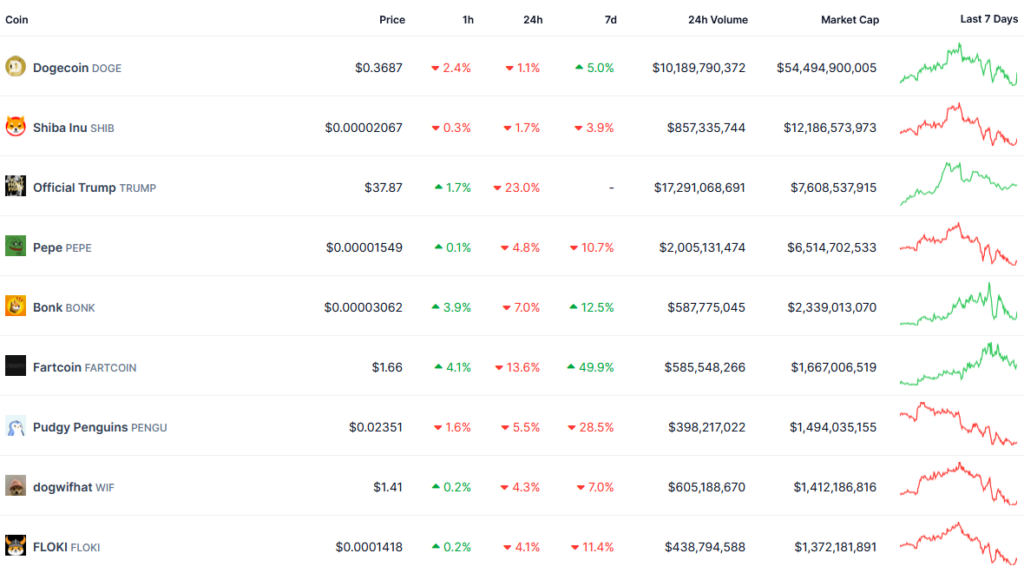
Productivity is the most critical driver of economic growth. The US and the global economy have limited resources. Therefore, the more efficiently or productively you use those resources, the more economic growth per resource unit can be attained. When a dollar is used to purchase a meme coin or other cryptocurrency that is a dollar not used for productive means. The table below, courtesy of CoinGecko, shows the top meme coins and their respective market caps. They sum up to nearly $90 billion. Moreover, $90 billion is not being invested in cancer research, job training, education, quantum computing, or AI innovation, to name a few productive uses of money. Now ask yourself, do meme coins provide any benefit at all to society? If your answer is no, meme coins offer a good example of how unproductive speculation takes resources away from promoting long-term economic growth.
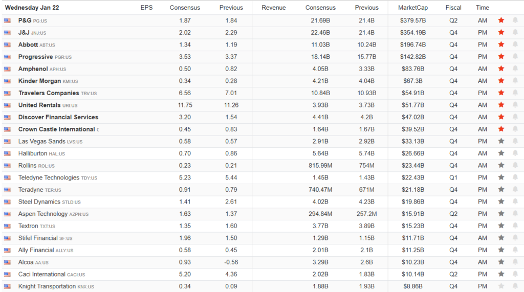
What To Watch Today
Earnings
Economy

Market Trading Update
Yesterday, we noted that Q1 seasonality remains favorable to the bulls, with the inauguration now behind us. While there will be a flurry of executive orders from the White House over the next few days, which could induce some volatility in the market, the current buy signal and still moderately oversold conditions remain supportive of a further advance. Furthermore, earnings season is in full swing, with a large chunk of the Magnificent 7 scheduled to report earnings next week. The bulls could get near-term market support if those companies report better-than-expected revenue and earnings and provide a strong outlook.
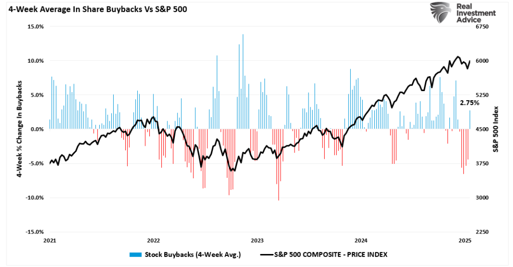
Secondly, as each day passes, the window for share repurchases returns, which, as we showed previously, provides additional support for equity prices. The recent spate of weakness coincided with the “buyback blackout” period, which subtracted a buyer from the market. The recent uptick in equity prices over the last week coincided with a sharp increase in buybacks.
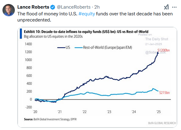
Another support for the bulls has been the enormous inflows into U.S. equities from foreign investors. In November alone more than $114 billion poured into U.S. markets from abroad. As a side note, those inflows over the last 6-months are also a large part of the surge in the U.S. dollar as foreign investments get converted.

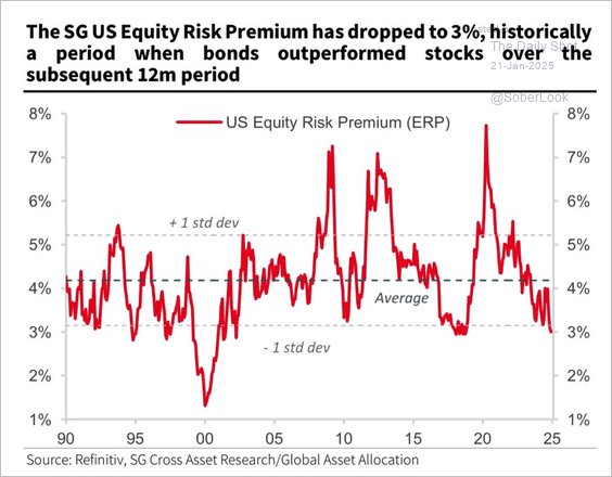
Lastly, the bullish sentiment toward the U.S. market remains intact. The more the market rises, the more foreign inflows will increase. However, as is always the case, that cycle eventually ends. With equity risk premiums near historic lows, the outlook for equity returns over the next few years may pale in comparison to the return that bonds will generate.
But that is a conversation for another day.

Risk Range In Review
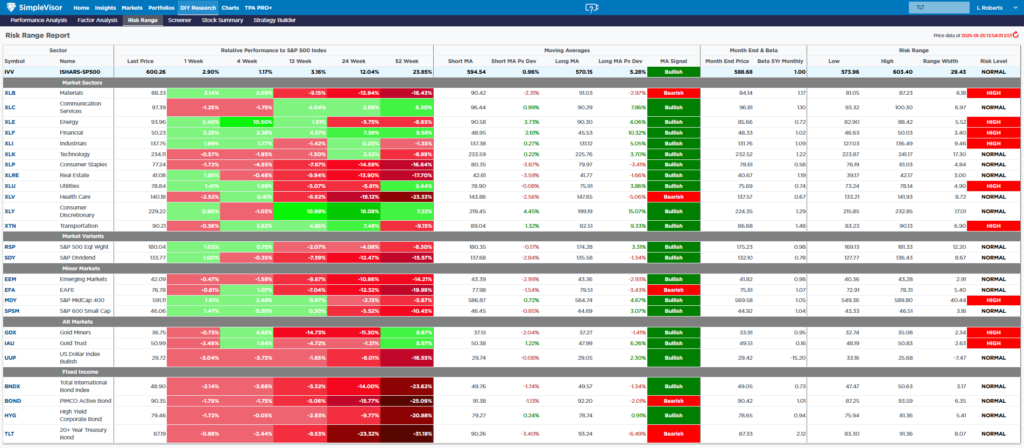
Below is a screenshot of our latest addition to SimpleVisor, the Risk Range Report. The daily report in the DIY tab helps subscribers assess how the prices of broad market indexes, sectors, and other markets compare to monthly price ranges. Typically, prices are contained within a monthly range. Therefore, a price below or above the range can be a warning or opportunity.
We explain how to use the report using XLB and going from left to right. The table starts with its relative performance versus the S&P 500 over five different time frames. Following that are the medium-term 14 and 35 weekly moving averages and the difference between the current price and those averages. The last month-end price and beta are next. Next, to the right is a set of columns that uses historical monthly ranges and the beta to see whether the price is within a normal monthly range. Thus, similar to the performance and factor analysis, this is another important to help assess whether an asset is overbought or oversold.
Are Return Expectations For 2025 Too High?
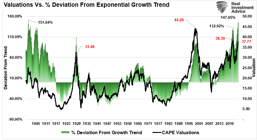
Here is the issue. Total real (inflation-adjusted) stock market returns are easy to calculate. They are a function of economic growth (GDP) plus dividends less inflation. Such was the case from 1948 to 2000. However, since 2008, GDP growth has averaged roughly 5% with a dividend yield of 2%, yet returns have far surpassed what the economy can generate in earnings.
Those consistently higher returns over the last 15 years have trained investors to expect elevated portfolio returns from the financial markets.
But, is that realistic?
Tweet of the Day
“Want to achieve better long-term success in managing your portfolio? Here are our 15-trading rules for managing market risks.”
Please subscribe to the daily commentary to receive these updates every morning before the opening bell.
If you found this blog useful, please send it to someone else, share it on social media, or contact us to set up a meeting.
