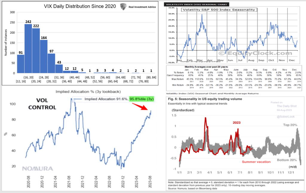
The VIX volatility index calculates how much the options markets imply the S&P 500 will move over the coming month. Recently, it has been at historically low levels. Such low levels of implied volatility are a sign of complacency because it signifies that few investors are buying options to protect against adverse movements. Volatility is well correlated with price changes. Consequently, increasing volatility, as we have recently seen, has accompanied lower stock prices. Given the importance of implied volatility, we share a few graphs to help us assess what may be in store for volatility.
The VIX is 16 after being as low as 13 in July. The distribution graph (top left) shows there have been 91 instances where VIX has been lower than 16 since 2020. This puts it in the bottom 10% of the period. The graph to its right, courtesy of EquityClock.com, shows volatility’s seasonality. It troughs in July and trends upward through October. The VIX is up 60% of the time in August. The following two graphs point to factors that may cause the VIX to increase. The bottom left graph, courtesy of Nomura, shows that short volatility trades are reaching the highest levels in three years. If volatility continues higher, shorts will cover, thus providing a reflexive bid for volatility. The graph on the bottom right, also Nomura, highlights that August tends to have the lowest trading volume other than late December. Less liquidity can lead to volatility.
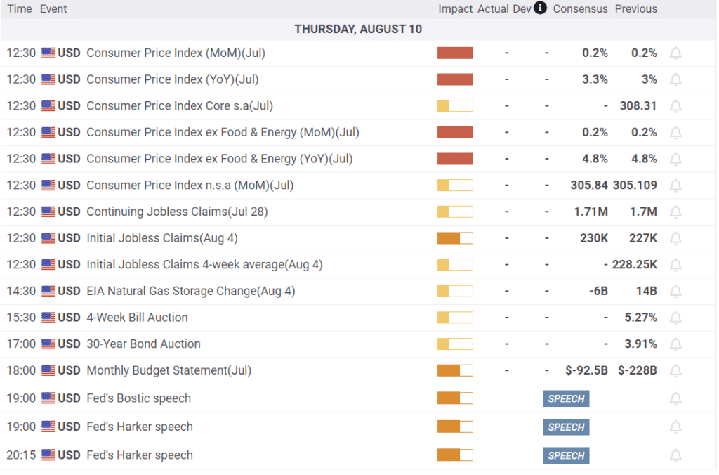
What To Watch Today
Earnings

Economics
Small And Mid-Cap Stocks Still Bearish
There remains a perennial hope that small and mid-capitalization companies are going to come storming back as large capitalization fades. However, such has not been the case over the last 13 years, as investors pour money into exchange-traded funds. As discussed previously, those flows disproportionally funnel money to the largest cap-weighted names.
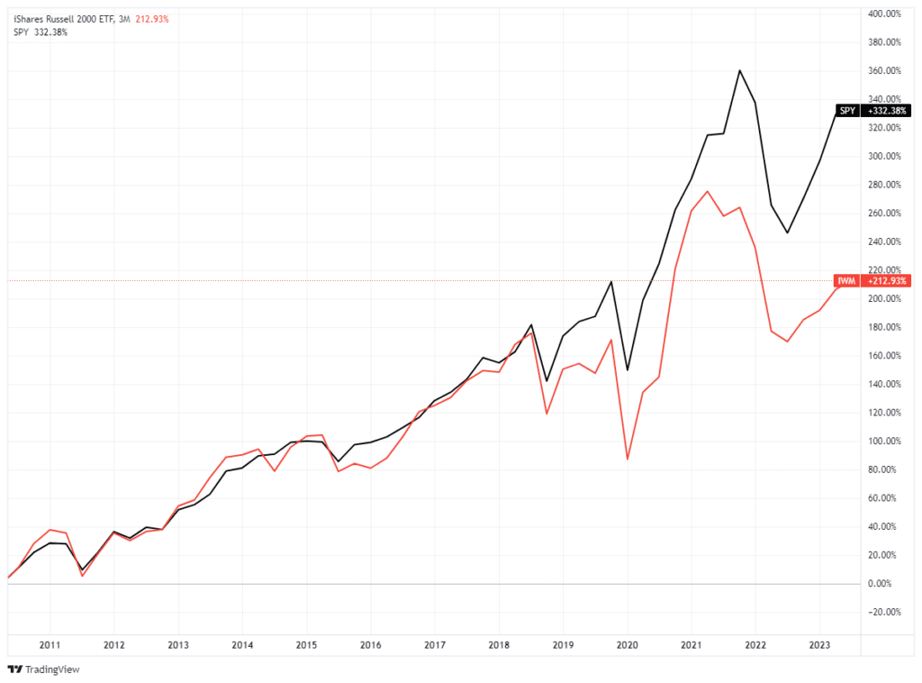
That underperformance is much more notable since the pandemic-driven shutdown, as real economic activity remains substantially weaker than economic headlines. Not surprisingly, small and mid-capitalization companies do not have the luxury of engaging in massive share repurchases to boost operating earnings. As such, they rely on revenue streams to boost earnings, and with pandemic-era stimulus fading, those sales and subsequent sentiment remain weak.
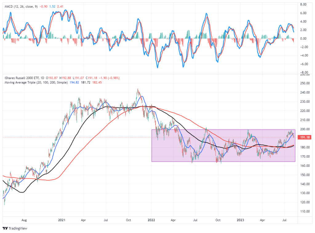
While the S&P 500 and Nasdaq are currently bullish, the Russell 2000 index remains well entrenched in a sideways trend within a “bearish” decline. With the MACD “sell signal” triggering from a higher level, the risk of a retest of support at the previous lows is certainly possible.
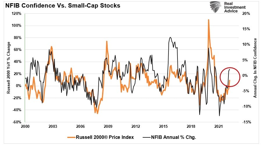
For now, we remain very underweight small and mid-capitalization companies until such time as we more marked improvement in small-business sentiment. As shown, the annual rate of change in the NFIB Small Business Survey is a good proxy for the Russell 2000 Index. While sentiment has improved recently, it will need to continue if small and mid-capitalization companies are going to gain ground on the large-cap indices.

Complacency Is In the Credit Markets Too
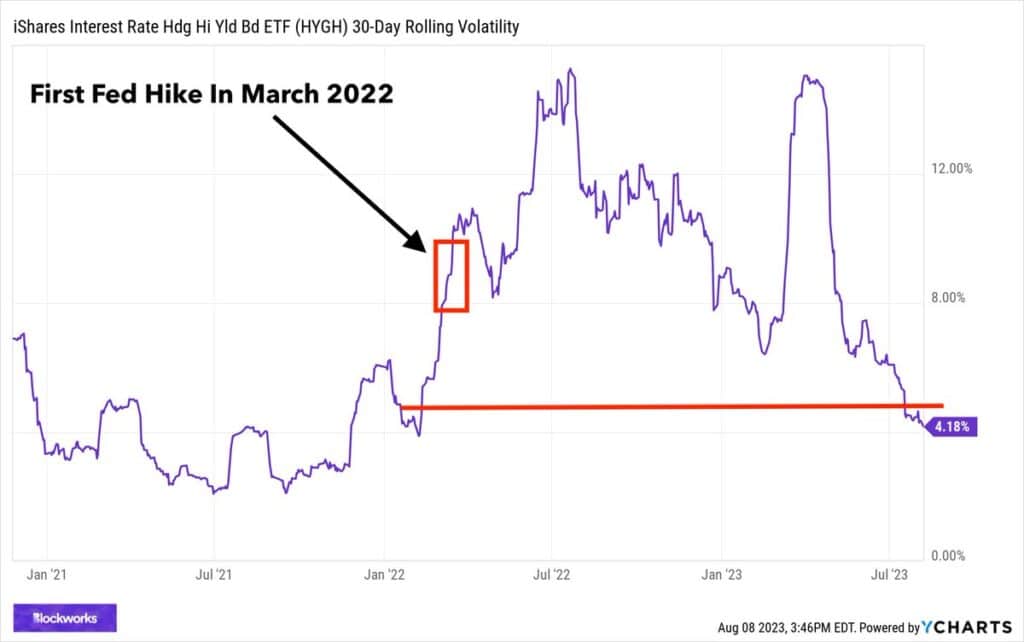
It’s not just the equity markets showing complacency via low implied volatility. The graph below shows the actual 30-day volatility in HYGH. HYGH is an ETF that holds junk bonds and hedges the market-related interest rate component. Accordingly, the price of the ETF is a function of changing junk bond yield spreads to Treasuries, the true barometer of credit costs. As shown, courtesy of Blockworks, the volatility of HYGH is down to levels when Treasury rates were below 1% and Fed Funds at zero. Since then, interest rates have risen considerably, which puts high-yield debt at a greater risk for default. Logic be damned, high-yield investors seem to be sold on the no-landing economic scenario. A recession would be a rude awaking for these investors.
Excess Savings Are Dwindling, What’s Left To Drive The Economy?
We just published Stimulus and Consumption Are Fueling Economic Resilience to highlight, via a slew of graphs, how much longer pandemic-related stimulus and other relief measures can help consumers spend at above-average rates. Below we share some of the graphs and commentary.
First, to grasp why gauging consumer spending is so important, consider it accounts for over two-thirds of the economy.

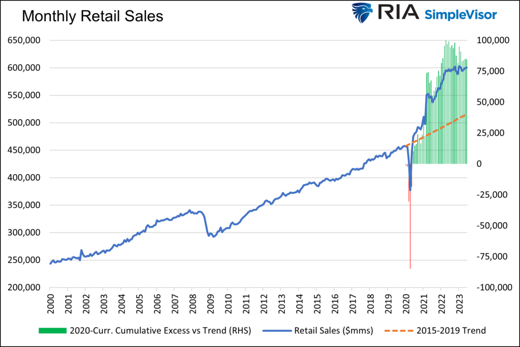
The following graph shows that retail sales are well above the trend. Some of that is due to inflation, and some to the stimulus. While the chart looks bullish, its growth rate is now flat to declining. GDP is commonly quoted as a growth rate; therefore, consumption’s contribution to GDP growth has been greatly diminished versus its role over the past few years.
The following two graphs are essential to help understand what drove excess consumption for the last few years. The first shows the considerable gains in monthly personal savings due to the stimulus measures. The green bars turning back to red tell us the excess savings above the trend has been spent. Other economists calculate it slightly differently but still come to the similar conclusion that excess savings have nearly run their course. The second graph shows that many have resorted to credit card debt to help pay for their consumption. Credit card debt, like savings, has its limits, and we are likely nearing them.

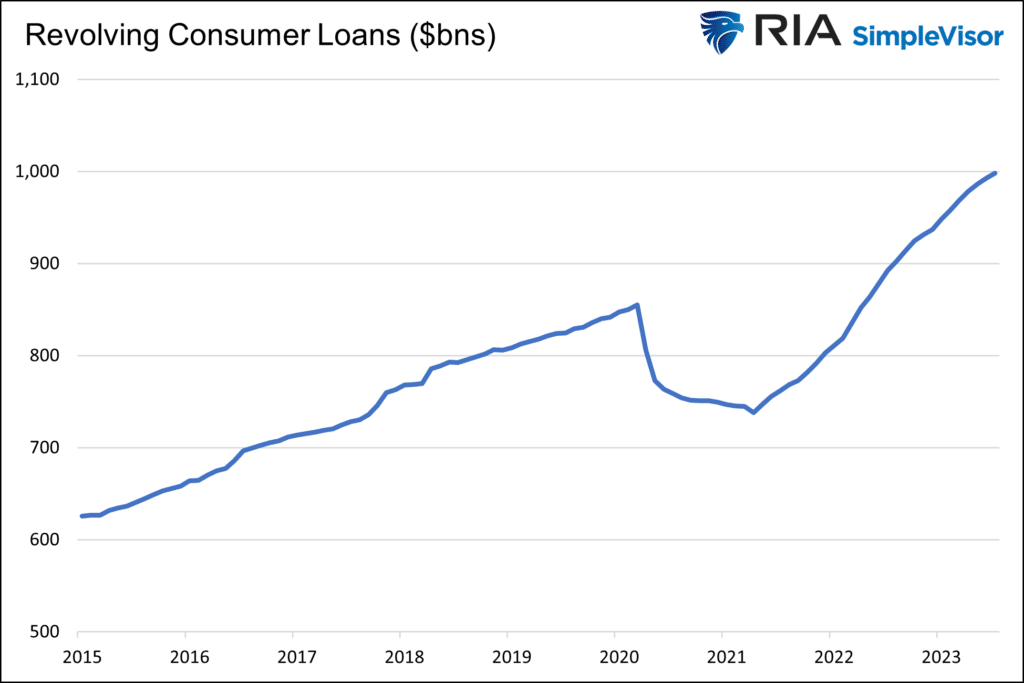
The graphs above are telling, but what matters most is the consumers’ desire to spend. In this regard, we wrote:
The ability and means to spend are essential, but we would be remiss if we did not discuss the desire to spend. When the economy is strong, and consumers feel confident in their jobs, they tend to spend more than average. Conversely, when friends or colleagues lose their jobs or feel threatened with losing their job, confidence wanes, and saving, not spending, takes precedence. The unemployment rate graph below may be the most important economic indicator. Unfortunately, it’s not predictive. It often doesn’t start rising until a month or two before the start of a recession.
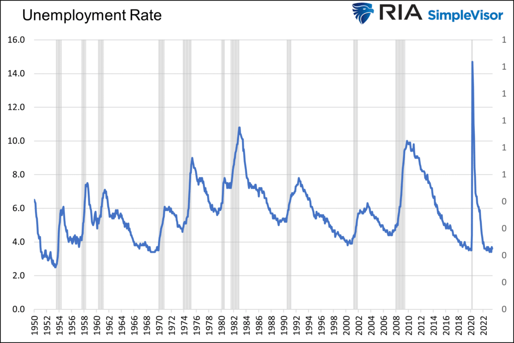
The question we must now ponder based on the material we present is whether economic and consumption trends revert to their natural growth trends or do the increasing headwinds of high-interest rates cause below-trend or negative personal consumption.
Tweet of the Day

Please subscribe to the daily commentary to receive these updates every morning before the opening bell.
If you found this blog useful, please send it to someone else, share it on social media, or contact us to set up a meeting.
