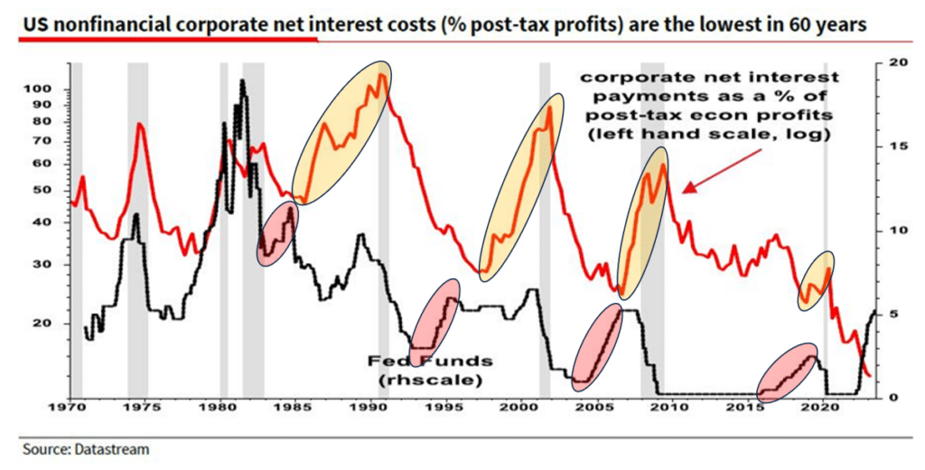
Albert Edwards of Societe Generale wrote a thought-provoking piece based on the graph below. He asks, “What on earth is going on?” In other words, why are corporate interest expenses as a percent of profits falling as interest rates soar? Albert surmises that many companies borrowed heavily in 2020-2021 at very low-interest rates, and the proceeds remain in deposit accounts earning more than the interest on the debt. Consequently, net interest is reduced. Albert is correct, but there are two other factors worth considering.
We added the shaded circles to Albert’s graph. The red circles highlight four instances in which interest costs as a percent of profits fell while the Fed hiked rates. The yellow circles show that interest expense then rose after the Fed stopped raising rates. These instances represent the lag effect. Most companies spread out their debt, so only a small amount matures in any year. Therefore it can take time until cheaper maturing debt is replaced with more expensive debt. We provide a real-life example below. Second, the Fed usually hikes rates when the economy is overheating. Therefore, profits, the denominator in the equation, rise rapidly and offset higher interest costs. Conversely, the Fed cuts rates during weak economic periods; thus, earning declines may be greater than the benefit of lower rates and cause the ratio to climb.
What To Watch Today
Market Trading Update

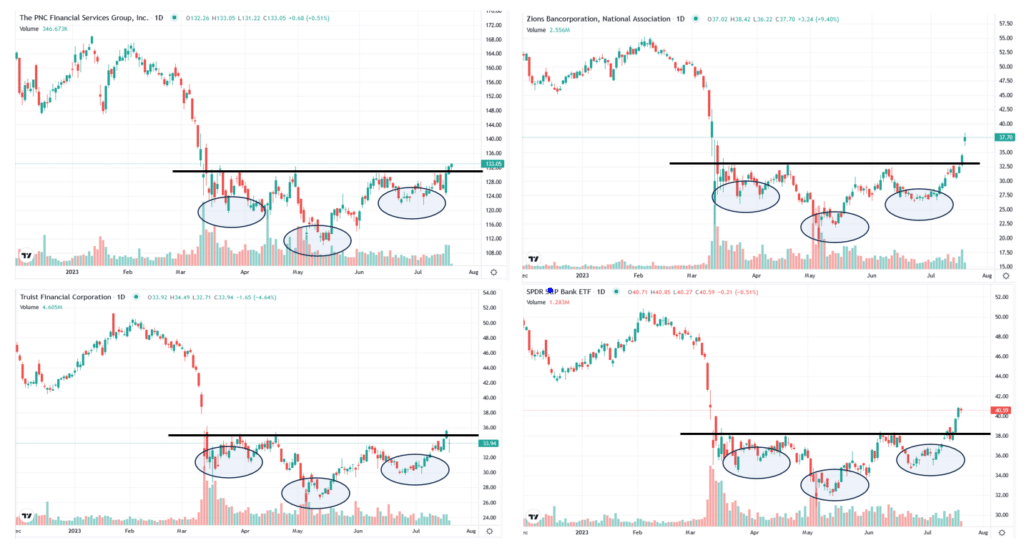
Regional Banks Sending Bullish Technical Signals
Regional bank stocks are looking extremely promising on a technical basis. Below we show three regional banks and the regional bank ETF KBE. All four graphs below, and many other regional bank graphs we do not show, have well-formed inverse head and shoulder patterns. In some cases like ZION and KBE, the share price has broken above the neckline, signaling more gains are likely. TFC and PNC are on the verge of breaking their necklines.
Earnings for most regional banks were fine. They generally showed reduced margins and higher borrowing costs and are still witnessing declining deposits. However, the results were not dire. Given the stocks are still well below the March banking crisis levels, and they appear to be weathering the storm, more upside is likely. These stocks remain risky, especially if a recession becomes more evident. However, they pay healthy dividends and have very bullish technical patterns for now.
Technical Analysis of the Unemployment Rate
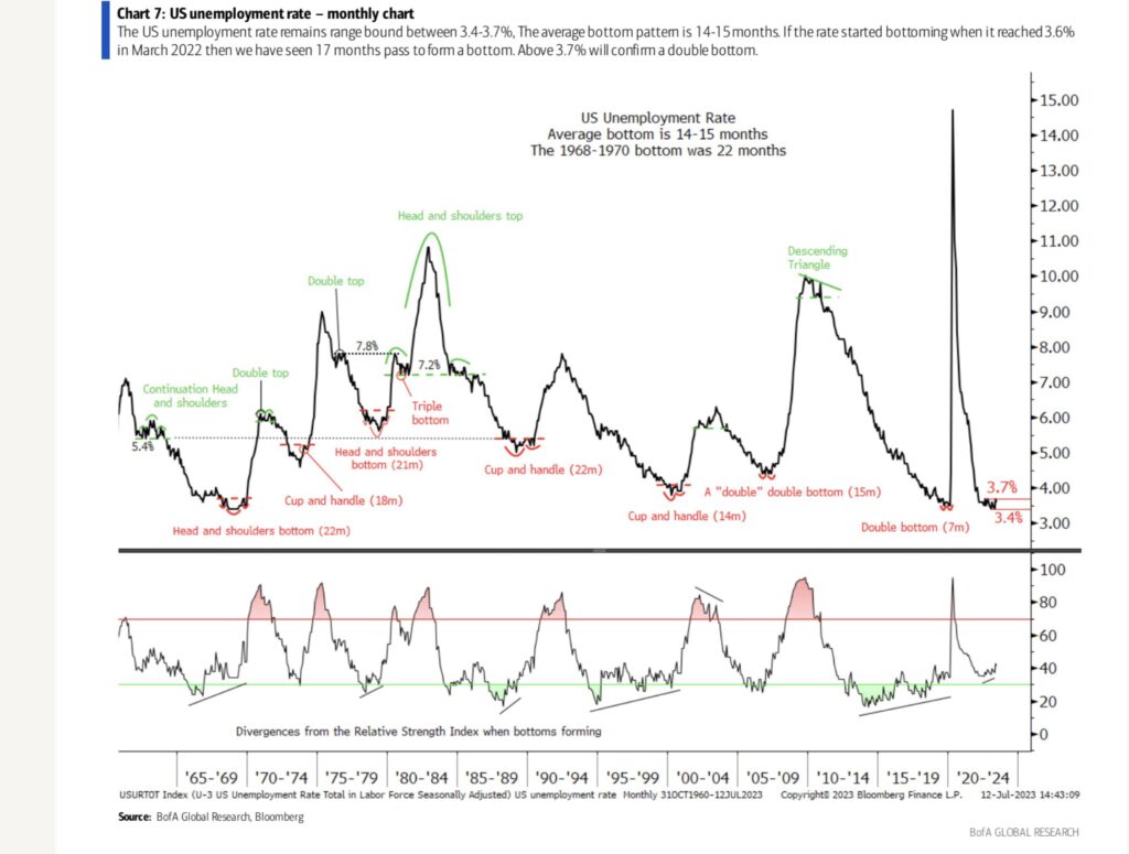
The Bank of America graph below provides a technical analysis of the unemployment rate. We are not sure how relevant such analysis is to economic data. Still, the chart does show that troughs in the unemployment rate often occur in well-known bullish technical patterns. Further, the graph shows the troughs tend to last 14-15 months. The current trough is 17 months old, and the troughs were 22 months. If this were a stock, we might say it’s looking very bullish, i.e., the unemployment rate is getting ready to shoot higher.
Interest Rate Expense Case Study on JNJ
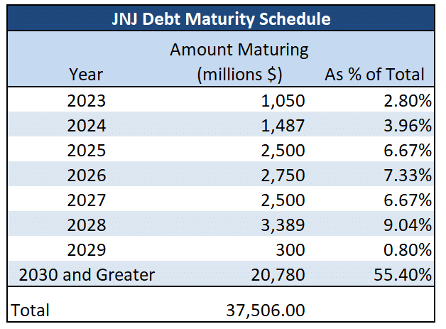
The table below details a company-specific analysis to appreciate the lag effect of interest rate hikes. JNJ has $37 billion in debt, of which only $2.5 billion matures this year or next. Over half of JNJ’s debt matures in 2030 or later. Hypothetically, if the 2023 and 2024 maturing bonds are replaced with bonds at coupons that are 4% higher than the maturing coupons, its interest expense would rise by $100 million. JNJ’s earnings before interest, taxes, and depreciation have been around $35 billion annually. The hypothetical $100 million increase in interest expense would hurt their earnings by 0.3%. In the grand scheme of things, higher interest rates are not significantly affecting JNJ’s financials. That said, there are likely a slew of companies with a much higher proportion of debt maturing this year and next.
Tweet of the Day
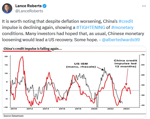
Please subscribe to the daily commentary to receive these updates every morning before the opening bell.
If you found this blog useful, please send it to someone else, share it on social media, or contact us to set up a meeting.


