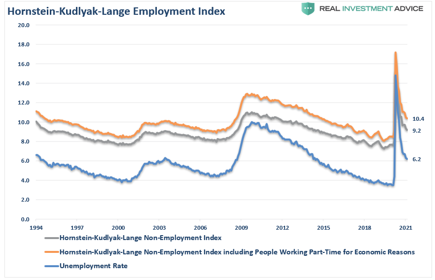
Recently, the March jobs report showed a whopping 916,000 new jobs. Interestingly, there were some anomalies in the data and millions missing from the official count.
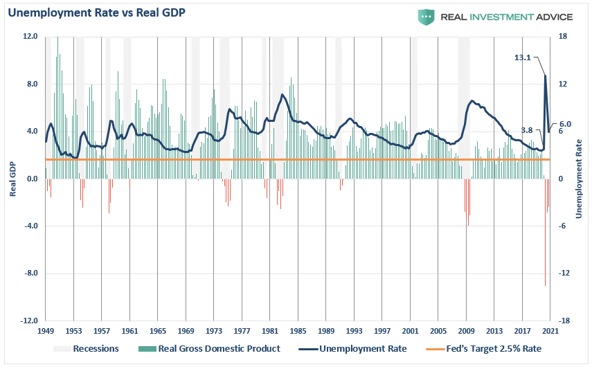
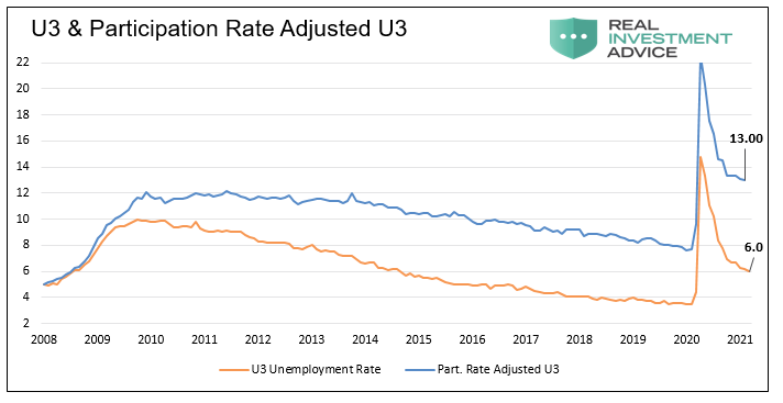
As shown, there has been a substantial reduction in the unemployment rate back to 6%. Historically, an unemployment rate of 5% was considered “full employment.” However, for the Federal Reserve to have “cover” to continue current monetary interventions, a new standard has been set at the previous lows of 3.8%.
The reality is there is a multitude of problems with how the entire series is “guessed at.” As noted previously by Morningside Hill:
- The Bureau of Labor Statistics (BLS) systemically overstates the number of jobs created, especially during the last economic cycle.
- The BLS has failed to account for the rise in part-time and contractual work arrangements, while all evidence points to a significant and rapid increase in the so-called contingent workforce.
- Full-time jobs are being replaced by part-time positions, resulting in double and triple counting of jobs via the Establishment Survey. (Examples: Uber, Lyft, GrubHub, FedEx, Amazon)
- A full 93% of the new jobs added since 2008 came through the business birth and death model – a highly controversial model not supported by the data. On the contrary, all data on establishment births and deaths point to an ongoing decrease in entrepreneurship.
Most importantly, the jobs added to the roles are not “new” entrants into an expanding labor force but rather furloughed workers returning to work post-pandemic shutdown. In other words, jobs are not truly being “created” due to rising demand but rather “refilling” roles as businesses reopen.
Seasonal Anomalies
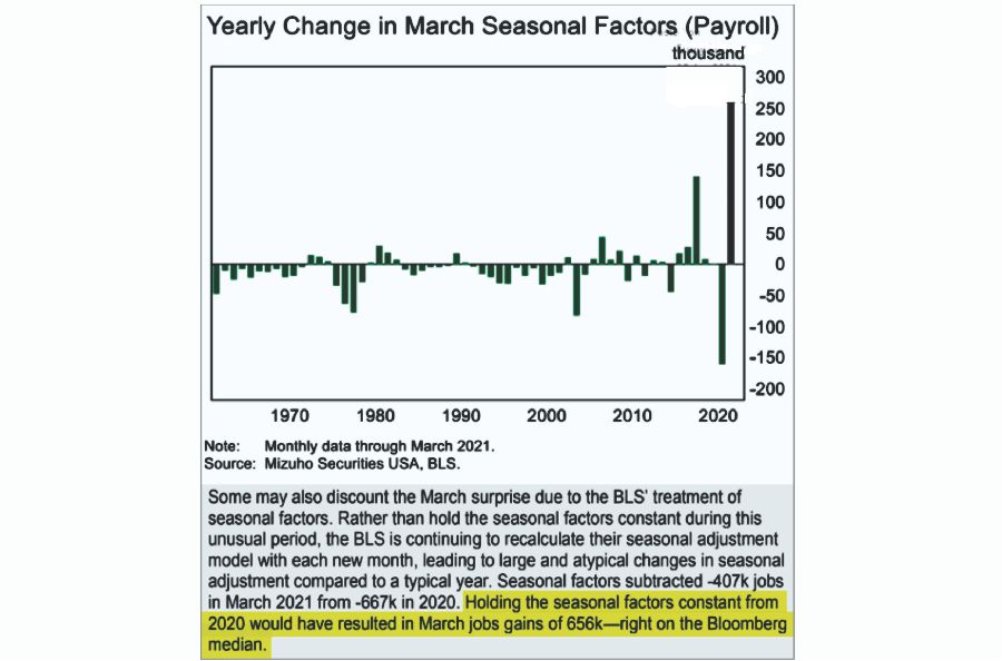
These “measurement problems” showed up in the latest report as reported by Mizuho Securities.
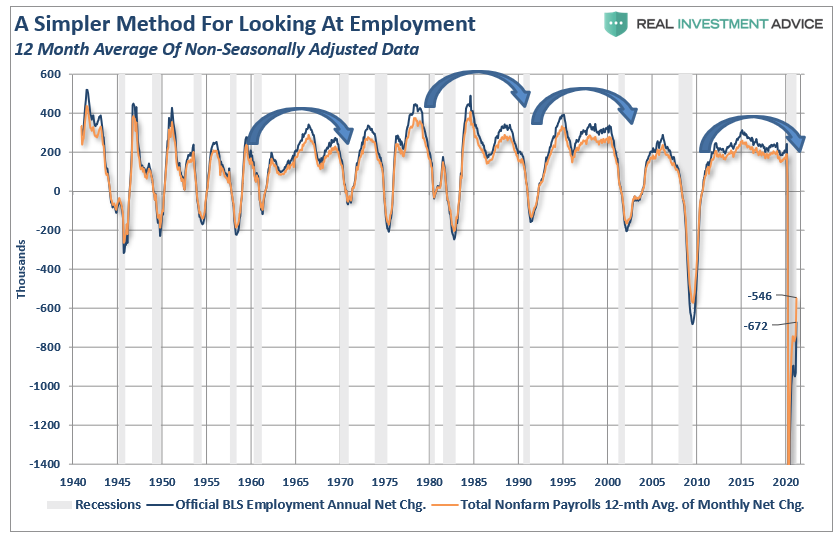
As they note, without the outsized seasonal “adjustments,” employment would have been far weaker. These adjustments are problematic over time as they tend to “over-estimate” employment. As I have discussed previously, a simple 12-month average of the non-seasonally adjusted data provides a more reliable assumption. To wit:
“While the BLS continually fiddles with the data to mathematically adjust for seasonal variations, the purpose of the entire process is to smooth volatile monthly data into a more normalized trend. The problem, of course, with manipulating data through mathematical adjustments, revisions, and tweaks, is the risk of contamination of bias. A simpler method to use for smoothing volatile monthly data is using a 12-month moving average of the raw data as shown below.”
As shown, near the peak of employment cycles, the employment data deviates from the 12-month average and reconnects as reality emerges.
There is currently a 130,000 person unemployment gap between the smoothed non-seasonally adjusted data and the official “seasonally adjusted” data.
Sometimes, “simpler” gives us a better understanding of the data.
But there is more to this story.
A Problem Of Population Growth
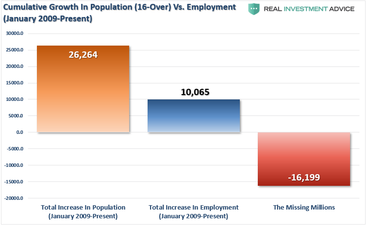
A point overlooked when reporting on employment is the “growth” of the working-age population. Each month, new entrants into the population create “demand” through their additional consumption. Employment should increase to accommodate for the increased demand from more participants in the economy. Either that or companies resort to automation, off-shoring, etc., to increase production rates without increases in labor costs. The chart below shows the total increase in employment versus the growth of the working-age population.
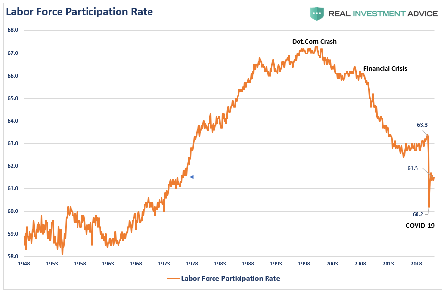
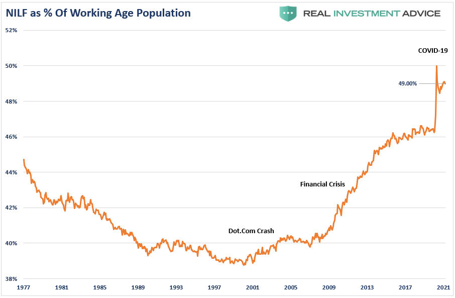
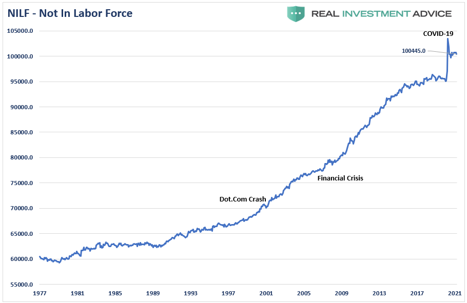
The missing “millions” shown in the chart above is one of the “great mysteries” since 2009. Such is particularly a problem when the Federal Reserve talks about “full employment.” The disparity shows up in both the Labor Force Participation Rate and those “Not In Labor Force.”
Since 2009, the number of those “no longer counted” has dominated the employment trends of the economy. In other words, those “not in labor force” as a percent of the working-age population has skyrocketed.
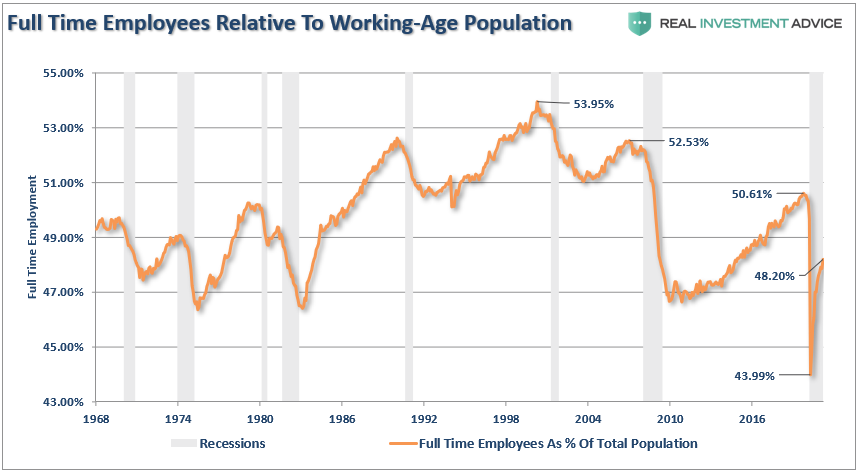
Of course, as we are all very aware, many work part-time, are going to school, etc. But even when we consider just those working “full-time” jobs, particularly when compared to jobless claims, the percentage of full-time employees is still well below levels of the last 35 years.
There has undoubtedly been a recovery from the recessionary lows. However, when the economy does return to “full employment,” we will likely see fewer full-time jobs than before the past two recessions.
Baby Boomers Still Working
One of the arguments often given for the low labor force participation rate is that millions of “baby boomers” leave the workforce for retirement. While such may indeed be the case, it is hard to suggest that nearly 1/3rd of the population has retired.
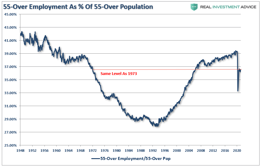
Furthermore, that argument doesn’t carry much weight given that the “Millennial” generation, which is significantly larger, is simultaneously entering the workforce. The other problem, shown below, is that more individuals over the age of 55, as a percentage of that age group, in the workforce are rapidly rising back to pre-pandemic peaks.
Of course, the reason they aren’t retiring is that they can’t. After two massive bear markets, weak economic growth, questionable spending habits, and poor financial planning, more individuals over 55 are still working because they can’t “afford” to retire.
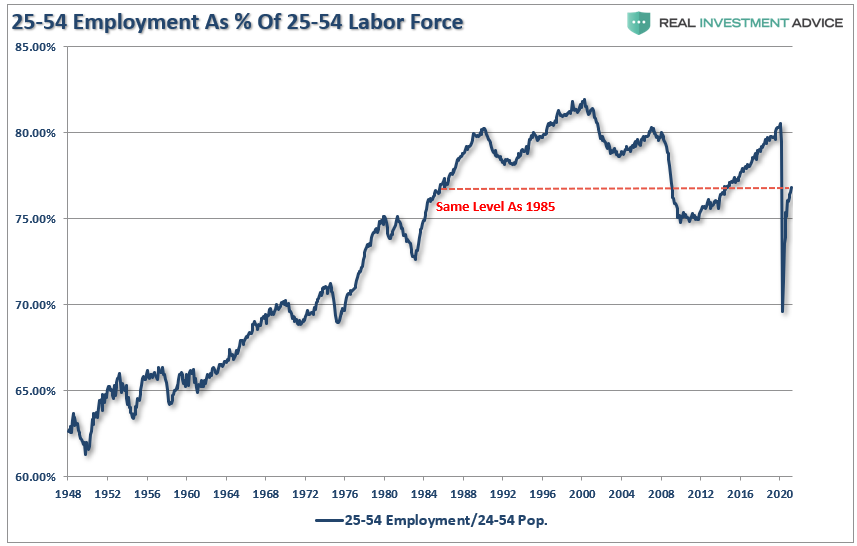
However, for argument’s sake, let’s assume that every worker over 55 retires. If the “retiring” argument is valid, then the 25-54 employment participation rate should be near peaks. (Someone has to be working.) Such is not the case.
The chart below strips out those of college-age (16-24) and those over 55.
The other argument is that Millennials are going to school longer than before, so they aren’t working either. (We have an excuse for everything these days.)
4-Million Missing
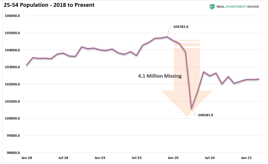
Another anomaly that showed up in the data is in the prime 25-54-year-old age group. In 2020, over 4-million individuals in that age group disappeared from the POPULATION.
I did not say they disappeared from the “labor force.” The population of that age group rapidly shrank.
However, that decline has an important bearing on the “labor force” participation rate by reducing the calculation’s denominator.
A Long Way To Go
With the prime working-age group of labor force participants still at levels seen previously in 1985, it does raise the question of just how robust the labor market is? All of this data suggests that the Federal Reserve is likely correct in not paying much attention to the official employment reports.
The actual “unemployment situation” remains in a fragile state. As Michael Lebowitz discussed previously:
“A calculation of the participation rate adjusted unemployment rate is revealing.”
‘When people stop looking for a job, they are still unemployed, but they are not included in the U-3 unemployment calculation. If we include those who quit looking for work in the data, the employment situation is quite different. The graph compares the U-3 unemployment rate to one that assumes a constant participation rate from 2008 to today. Contrary to the U-3 unemployment rate of 6.0%, this metric implies an adjusted unemployment rate of 13.0%.
Importantly, this number is much more consistent with the data we have laid out above, supports the reasoning behind lower wage growth, and is further confirmed by the Hornstein-Kudlyak-Lange Employment Index.”
Conclusion
As noted, the Federal Reserve is closely monitoring the alternative measures of employment for managing monetary policy. Furthermore, these weak participation rates remain a “deflationary” force on the economy, which is why the Fed is willing to allow short-term inflation to “run hot.”
The Federal Reserve’s problem is they remain trapped in a “stagflationary economy,” which will leave their policy tools primarily ineffective.
We know that demographics and debt are long-term deflationary drags on economic growth that short-term stimulus won’t cure. It is just a function of time until the financial markets figure this out as well.
