
In the second quarter, household credit exploded higher as stimulus payments ran dry. Was the surge a function of excess spending, inflation, or an expectation of more “stimmies” coming?
The chart below shows the total amount of household credit currently.
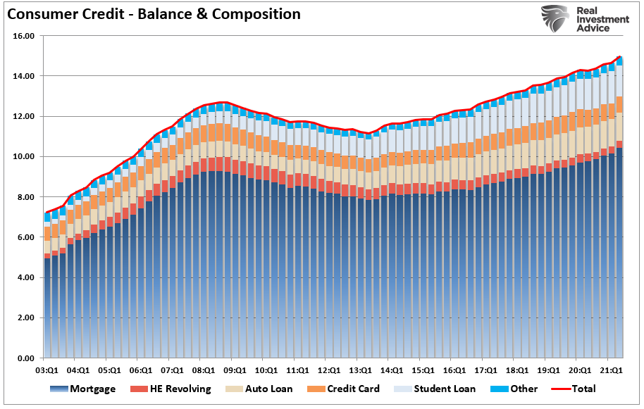
If you stare very hard, you can make out the slight dip in credit usage during the “pandemic-driven shutdown.” However, such is not the case despite the narrative households paid down a bulk of their debt.
However, that narrative is a function of the following chart.
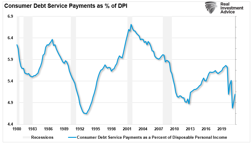
While the chart suggests Americans are more solvent, as explained previously, it is an “illusion.”

An Explosion In Credit Usage
Not surprisingly, as three rounds of “stimulus payments” got spent, households returned to spending on credit. Here are some stats from Mish Shedlock:
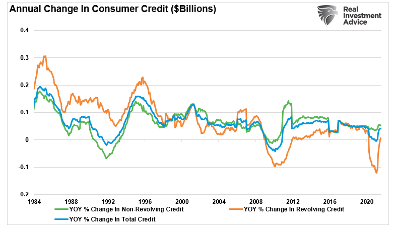
- In June, non-revolving credit rose by $19.83 billion. Revolving credit rose by $17.86 billion, and total consumer credit rose by $37.69 billion.
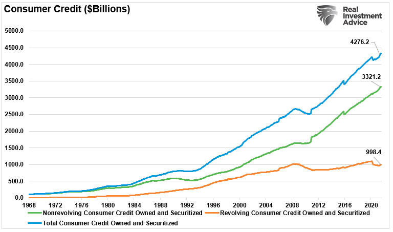
- Total consumer credit is new record $4,318.65 billion.
- In May, non-revolving credit rose by $27.60 billion. Revolving credit rose by $9.09 billion, and total consumer credit rose by $36.69 billion.
- Despite a two-month surge in revolving credit of $26.95 billion, revolving credit at $992.25 billion is still down $105.28 billion from the pre-pandemic high of $1,097.53 billion.
However, the annual rate of change shows the surge in revolving credit as stimulus payments ran dry.
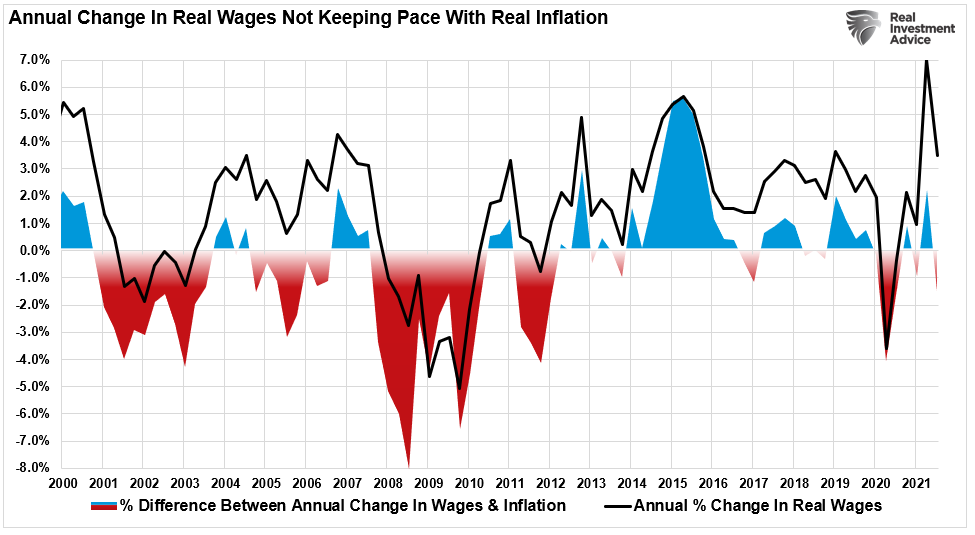
While mainstream media was quick to tout the surge in credit, suggesting consumers are confident, the reality is quite different. Two factors are driving the surge in credit, and neither of them is good:
- Cost of living (inflation)
- Lack of wage growth.
Debt Required To Sustain, Not Increase, Standard Of Living
Every year, most Americans go further into debt to “sustain” their standard of living. To wit:
“In 1998, monetary velocity peaked and began to turn lower. Such coincides with the point that consumers were forced into debt to sustain their standard of living. For decades, WallStreet, advertisers, and corporate powerhouses flooded consumers with advertising to induce them into buying bigger houses, televisions, and cars. The age of ‘consumerism’ took hold.“
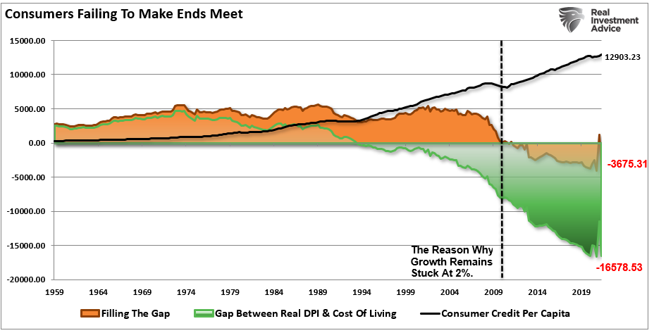
Average Americans have a general lifestyle within which they survive. Such includes living necessities such as food, running water, electricity, mobile phone, computer, and high-speed internet connection. So, while the monthly cost of the mortgage and health insurance may not change, the rest of the necessities do.
Such becomes problematic when “inflation” rises faster than income. Such requires the addition of “debt” to make ends meet. Here is the critical point, individuals are NOT buying “MORE” stuff. They are just “PAYING” more for the same amount.
With the average American still living well beyond their means, the reality is that economic growth will remain mired at lower levels. Such is because the debt service continues to divert savings from productive investment.

A Temporary Boost To Incomes Fills The Gap
As discussed in our previous article on the illusion of debt-to-income ratios, this snippet from the WSJ is worth repeating.
“The median net worth of households in the middle 20% of income rose 4% in inflation-adjusted terms to $81,900 between 1989 and 2016, the latest available data. For households in the top 20%, median net worth more than doubled to $811,860. And for the top 1%, the increase was 178% to $11,206,000.”
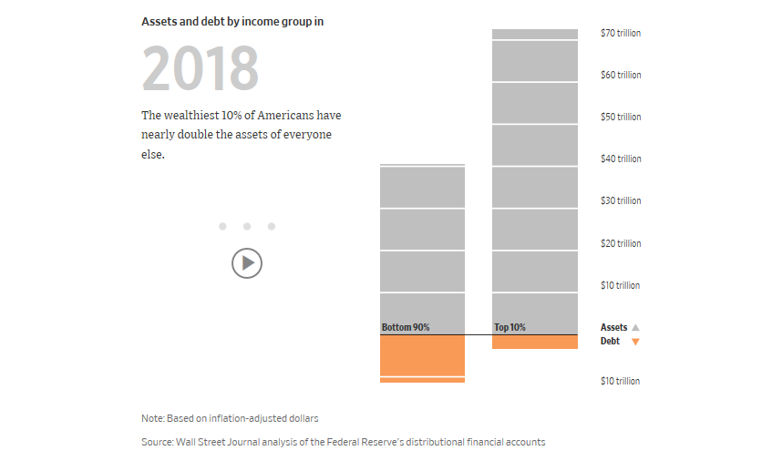
“Put differently, the value of assets for all U.S. households increased from 1989 through 2016 by an inflation-adjusted $58 trillion. A full 33% of that gain—$19 trillion—went to the wealthiest 1%, according to a Journal analysis of Fed data.”

Such is essential in understanding the “illusion” of declining debt-to-income ratios, which is skewed by those in the top-10% of income earners.
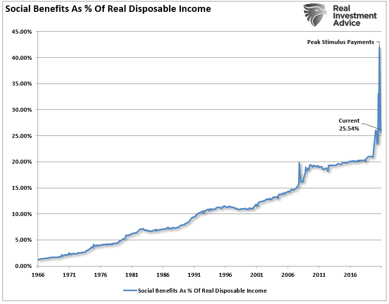
More importantly, the sharp decline in debt-to-income ratios was a function of surging government transfers. At the peak of the pandemic stimulus, government transfers comprised over 40% of disposable personal incomes. With that ratio falling sharply as stimulus payments and benefits cease, it is not surprising to see the surge in credit usage.

The Illusion Of Solvency
Much of the mainstream economic analysis utilizes either “averages” or “median” measures of a particular set of data. While there is nothing inherently wrong with reporting such data, the message can get distorted when there is a skew in the underlying data set.
Such is particularly the case when it comes to disposable incomes. The calculation of disposable personal income (income minus taxes) is primarily a guess due to the variability of households’ income and individual tax rates.
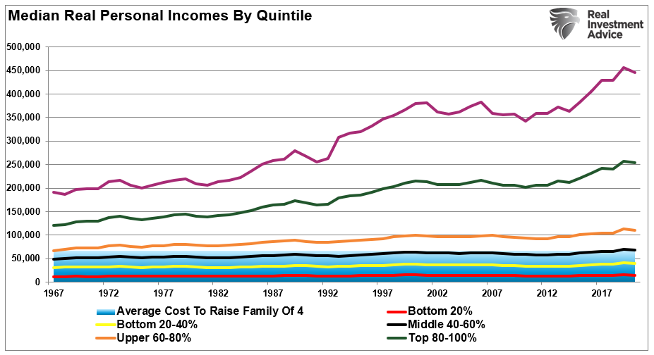
More importantly, as noted, the measure becomes skewed by the top 20% of income earners, needless to say, the top 5%. The chart below shows that those in the top 20% have seen substantially larger median wage growth versus the bottom 80%. (Note: all data used below is from the Census Bureau and the IRS.)
Disposable And Discretionary Are Not The Same
Furthermore, disposable and discretionary incomes are two very different animals.
Discretionary income is the remainder of disposable income after paying for all mandatory spending like rent, food, utilities, health care premiums, insurance, etc. For the bottom 80% of income earners, the cost of living outstrips a vast majority of those individuals (shaded area).
In other words, given the bulk of the wage gains are in the upper 20%, any data that reports a “median” or “average” of the information is inherently skewed to the upside. Such is why a vast difference between the debt service levels (per household) exists between the bottom 80% and top 20%.
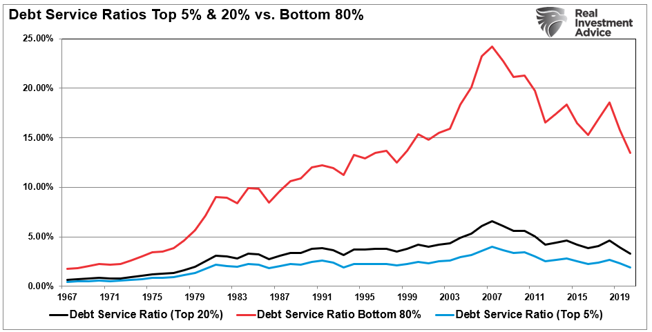
Of course, the only saving grace for many American households is that artificially low-interest rates have reduced the average debt service levels. But, unfortunately, those in the bottom 80% still have a large chunk of their median disposable income eaten up by debt payments. Such reduces discretionary spending capacity even further.
The problem is quite clear. With interest rates already at historic lows, the consumer already heavily leveraged, and wage growth stagnant, the capability to increase consumption to foster higher economic growth rates is limited.

Expecting Another Bailout
The illusion of the decline in the debt-to-income ratios obfuscates real economic problems and fosters the belief that policies are working.
They aren’t.
Most Americans cannot increase consumption, the driver of economic growth, without further increasing debt burdens. For those in the top-10% of the wealth holders, higher asset prices, tax cuts, etc., do not lead to increases in consumption as they are already at capacity.
While the Federal Reserve’s ongoing interventions, stimulus programs, etc., have certainly boosted asset prices higher, the only real accomplishment has been widening the wealth gap. What monetary interventions have failed to accomplish is an increase in production to foster higher economic activity levels.
With the average American still living well beyond their means, the reality is that economic growth will remain mired at lower levels. Such is because the debt service continues to divert savings from productive investment.
You can also understand why there is a demand for additional “stimulus payments,” bailouts, and other socialistic policies. Furthermore, since the Government has “shown their hand,” individuals now “expect:” that every time the economy stumbles, they will get bailed out again. So, why act responsibly.
Of course, they don’t realize those policies are what is exacerbating their “wealth inequality.”
Unfortunately, until the deleveraging cycle is allowed to occur, the attainment of more robust and autonomous economic growth will remain elusive.
In the meantime, those in the top 10% of income brackets will continue to enjoy an increase in overall prosperity. But, for everyone else, it is improbable that debt-to-income ratios have improved much.