
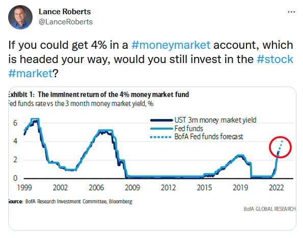
In the tweet below, Lance asks investors a critical question. Is 4 percent enough of a return to warrant parking some of your portfolio’s cash in a money market fund? The graph below shows that investors have not seen 4 percent money market yields in over 12 years. 4 percent is not a game changer, but money market funds, once considered a “penalty” for reducing risk in stocks and bonds, are now an acceptable reward. As money market yields rise to 4 percent and beyond, marginal trades to cash will weigh on stock and bond returns.
This topic is another reminder of why Fed policy is so important to follow. When yields are zero, there is no incentive to sit on cash. Accordingly, many portfolios were fully invested. Today that equation is changing. Is it any wonder why investors are anxious over every little Fed statement?

What To Watch Today
Economy
- Initial jobless claims, week ended September 10 (227,000 expected, 222,000 prior)
- Continuing claims, week ended September 3 (1.478 million expected, 1.473 prior)
- Empire Manufacturing, September (-15.0 expected, -31.3 prior)
- Retail Sales, month-over-month, August (0.0% expected, 0.0% prior)
- Retail Sales excluding autos, month-over-month, August (0.1% expected, 0.4% prior)
- Retail Sales excluding autos and gas, month-over-month, August (0.8% expected, 0.7% prior)
- Philadelphia Fed Business Outlook, September (3.0 expected, 6.2 prior)
- Import Price Index, month-over-month, August (-1.2% expected, -1.4% prior)
- Export Price Index, month-over-month, August (-1.1% expected, -3.3% prior)
- Industrial Production, month-over-month, August (0.1% expected, 0.6% prior)
- Capacity Utilization, August (-0.1% expected, 0.7% prior)
- Manufacturing (SIC) Production, August (-0.1% expected, 0.7% prior)
- Business Inventories, July (0.6% expected, 1.4% prior)
Earnings

Market Trading Update
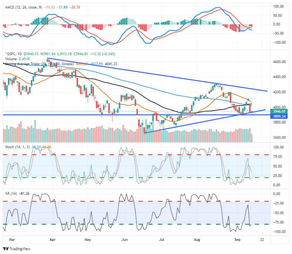
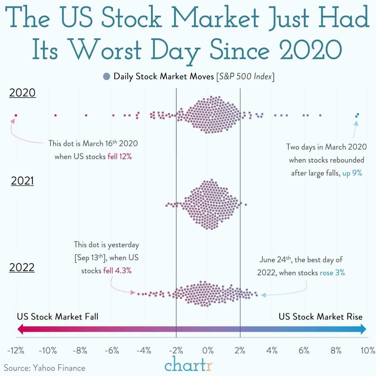
As noted below, Tuesday was the worst day for stocks since 2020. Mind you that 4% down days do not occur during bull markets and suggest markets remain confined in a more bearish environment. The good news is that yesterday markets did hold an important support at the rising bullish trend line, although it was a weak test of support. The markets need to hold this support through Friday and close the week off the recent lows if the bulls are going to defend their current positioning. As noted in yesterday’s commentary, Friday is a huge options expiration day which could lead to increased volatility today and tomorrow.
While we suspect this market may have another rally attempt as we head into year-end, we are becoming more convinced that any such rally should be sold and cash levels increased heading into 2023. However, much can happen between now and then, so we remain focused on short-term technical drivers to manage our current exposures.
Markets Spooked
“It’s not what you don’t know that gets you in trouble, it’s what you know that just ain’t so“. Those words from Mark Twain were relevant again yesterday as markets digested the latest inflation data. Investors were expecting inflation in August to follow the good news in July and continue to cool off. Instead, consumer prices actually rose 0.1% relative to July and core inflation, which strips out energy and food, rose 0.6% in the month.
That rise caught investors off guard, as higher inflation gives the Fed a stronger incentive to keep raising interest rates, sending US stocks (S&P 500 Index) down more than 4% yesterday. As visualized above, that was the worst day of the year so far and you have to go back to the highly volatile 2020 to find a sharper one-day decline for US equities.” – Chartr
PPI- A sigh of Relief
PPI fell by 0.1% in August, as expected. The year-over-year figure was 8.7%, lower than expectations of 8.8% and down from last month’s 9.8%. Following Tuesday’s higher-than-expected CPI report, the PPI data should provide some relief to investors. That said, core PPI was slightly higher than expected. As we noted yesterday, core prices are stickier and thus take longer to come down. The Fed will likely offer caution about this at next week’s FOMC meeting.
Forecasting Next Month’s CPI
The Cleveland Fed has an inflation “nowcasting” model on its website. The forecast has generally proven to be more reliable than consensus estimates. The graph below shows the daily forecasts and the actual readings for CPI and PCE. The CPI and PCE data are highlighted with vertical black lines, while the remaining dots are the forecasts. Unlike most inflation data, they present it in a quarterly/annualized format. Therefore the data may seem different from monthly and annual data, as is commonplace. Before Tuesday’s CPI report, the Cleveland Fed was one of a small handful of forecasts, not expecting a decline.
The second table shows the PCE forecast for later this month and next month, as well as next month’s CPI report. Year-over-year, core PCE is expected to increase 4.68%, a .1% uptick from last month. September CPI is forecast to show core CPI rising .51% monthly and 6.64% annually. Headline CPI should fall by .10% to 8.2%. Their expectation is for inflation stability, not the rapid decline market participants are hoping for.


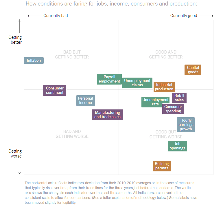
How Is The Economy Doing?
Great question! Some measures of economic activity are strong, and others are weak. Unlike most other economic environments, the pandemic, massive fiscal/monetary response, and major supply line problems continue to cause gross economic distortions. As a result, economic data shows little consistency from report to report. The New York Times describes and helps visualize the confusing economic data we face with an article entitled How is the Economy Doing? The article starts as follows:
The U.S. economy is in a strange place right now. Job growth is slowing, but demand for workers is strong. Inflation is high (but not as high as last spring). Consumers are spending more in some areas, but cutting back on others. Job openings are high but falling, while layoffs are low and … well, it depends on what indicator you watch.
The graph below from the article shows that important pieces of economic data are all over the map. For instance, capital goods expenditures are “good and getting better,” while personal income is “bad and getting worse.” Retail sales and consumer spending are “good,” but consumer sentiment is “bad.”
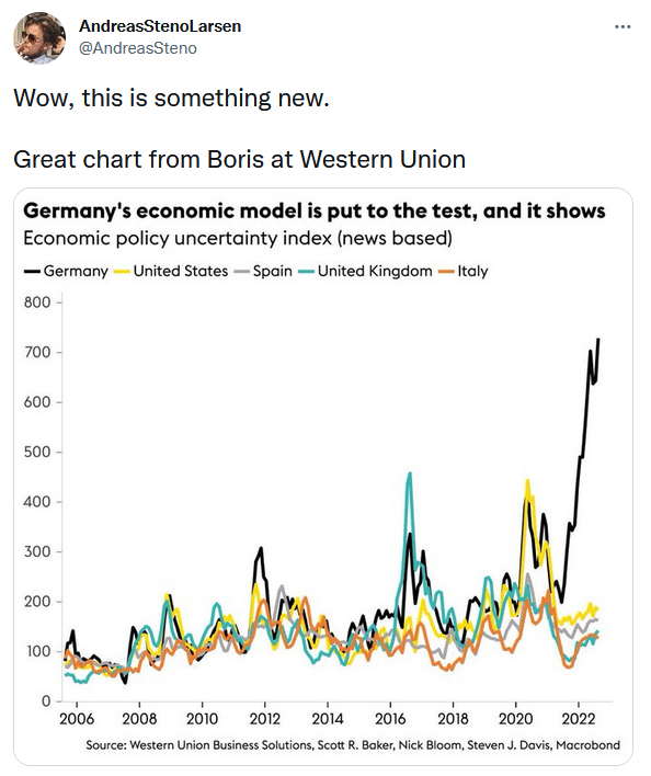
Tweet of the Day
Please subscribe to the daily commentary to receive these updates every morning before the opening bell.
If you found this blog useful, please send it to someone else, share it on social media, or contact us to set up a meeting.