Tag Archives: economics

Democrats Should Start Worrying About The Deficit.

Democrats should start worrying about the level of debt and the increasing deficit. I previously discussed this issue when President Obama held the White House, when Marshall Auerback, via the Nation, wrote:

“Delivering on big progressive ideas like Medicare for All and the Green New Deal will never happen until Democrats get over their fear of red ink.”

While that article was a long and winding mess of convoluted ideas, the following excerpt was vital.

“In an environment increasingly characterized by slowing global economic growth, businesses are understandably hesitant to invest in a way that creates high-quality, high-paying jobs for the bulk of the domestic workforce. The much-vaunted Trump corporate ‘tax reform’ may have been sold to the American public on that basis, but corporations have largely used their tax cut bonanza to engage in share buybacks, which fatten executive compensation but have done nothing for the rest of us. At the same time, private households still face constraints on their consumption because of stagnant wages, rising health care costs, declining job security, poorer employment benefits, and rising debt levels.

Instead of solving these problems, the reliance on extraordinary monetary policy from the Federal Reserve via programs such as quantitative easing has exacerbated them. In contrast to properly targeted fiscal spending, the Federal Reserve’s misguided monetary policies have fueled additional financial speculation and asset inflation in stock markets and real estate, which has made housing even less affordable for the average American.”

While there is truth in that statement, and it is the same issue I have railed against previously in this blog, Mr. Auerback’s solution was seemingly simple.

“Democrats should embrace the ‘extremist’ spirit of Goldwater and eschew fiscal timidity (which, in any case, is based on faulty economics). After all, Republicans do it when it suits their legislative agenda. Likewise, Democrats should go big with deficits—as long as they are used for the transformative programs that progressives have long talked about and now have the chance to deliver.”

As I noted then, such a solution was essentially the adoption of Modern Monetary Theory (MMT), which, as discussed previously, is the assumption debt and deficits “don’t matter” as long as there is no inflation.

“Modern Monetary Theory is a macroeconomic theory that contends that a country that operates with a sovereign currency has a degree of freedom in their fiscal and monetary policy, which means government spending is never revenue constrained, but rather only limited by inflation.” – Kevin Muir

However, fast forward to the present, we tried MMT; the Democrats went big with debts and deficits and funded social programs, and the result was a massive spike in inflation and no actual increase in broad economic prosperity.

So, what went wrong?

Ad for a RIA Advisors financial planning services. Need a plan to protect your hard earned savings from the next bear market? Click to schedule your consultation today.

The Non-Solution

The problem with most Democratic spending ideas on social programs and welfare, like free healthcare or college, is the lack of a crucial ingredient. That ingredient is a “return on investment.” Dr. Woody Brock previously addressed this point in his book “American Gridlock;”

Country A spends $4 Trillion with receipts of $3 Trillion. This leaves Country A with a $1 Trillion deficit. In order to make up the difference between the spending and the income, the Treasury must issue $1 Trillion in new debt. That new debt is used to cover the excess expenditures but generates no income leaving a future hole that must be filled.

Country B spends $4 Trillion and receives $3 Trillion income. However, the $1 Trillion of excess, which was financed by debt, was invested into projects, infrastructure, that produced a positive rate of return. There is no deficit as the rate of return on the investment funds the “deficit” over time.

Let me be clear. There is no disagreement about the need for government spending. The debate is about the abuse and waste of it.

John Maynard Keynes’ was correct in his theory that for government “deficit” spending to be effective, the “payback” from investments made through debt must yield a higher rate of return than the debt used to fund it.

Currently, the U.S. is “Country A.” 

The problem with the more socialistic programs that Democrats continue to pursue with deficit spending is that it exacerbates the problem. The Center On Budget & Policy Priorities data can help visualize the issue.

Pie chart of "Where Do Your Tax Dollars Go?"

As of the latest annual data, through the end of Q2-2023, the Government spent $6.3 Trillion, of which $5.3 Trillion went to mandatory expenses. In other words, it currently requires 113% of every $1 of revenue to pay for social welfare and interest on the debt. Everything else must come from debt issuance.

Chart of "Mandatory Spending Consumes More Than Total Revenue"

This is why debt issuance has surged since 2008 when Congress quit using the budgeting process to allow for rampant spending.

Chart of "Federal Debt: Total Public Debt" with data from 1966 to 2021.

Of course, given the massive surge in spending, revenues cannot keep up the pace, leading to a rapid increase in debt issuance and a trending deficit.

Chart of "Federal Revenues, Expenditures And The Deficit" with data from

However, while Democrats keep pushing for more socialistic programs, which garners votes in election cycles, they are now faced with a problem that may be their undoing.

Ad for SimpleVisor, the do-it-yourself investing tool by RIA Advisors. Don't invest alone. Tap into the power of SimpleVisor. Click to sign up now.

Debt Diverts Productive Capital

Ben Ritz for the WSJ recently penned:

Deficits are undermining the Biden economy. In the past year, the real federal budget deficit more than doubled, from $933 billion to $2 trillion. Democrats rightly argued that spending borrowed money was a critical economic support during the Covid pandemic. But the unemployment rate the over past year has been consistently lower than any point since the 1950s.

Economists, even those on the far left who subscribe to ‘modern monetary theory,’ agree that increasing deficits in a tight labor market fuels inflation. Voters’ frustrations with inflation and the interest-rate hikes implemented to bring it under control exceed their appreciation for low unemployment, fueling disapproval of President Biden’s economic record. Deficit reduction is more important than it has been at any other time in the 21st century.”

The problem with the analysis is that while the “unemployment rate” may be low, economic disparity is high. While the massive surge in pandemic-era spending boosted economic inflation, it also created an enormous rise in inflation, unsurprisingly. That inflation surge spurred the Fed to aggressively hike rates on the short end of the yield curve, while inflation and economic growth pushed long-term rates higher.

Debt, Interest Rates, and Economic Composite

Subsequently, higher inflation and higher borrowing costs priced out wage increases with substantially higher living costs. Unsurprisingly, the net worth of the bottom 90% of Americans has failed to improve.

Inflation adjusted household net worth

The problem for the Democrats is that continuing to push socialistic programs only makes the situation worse. Yes, more “free money” to individuals sounds excellent in theory, but prices ultimately increase more. The problem is exacerbated as non-productive debt erodes economic growth, and more debt diverts productive capital into interest payments.

“Annual interest payments are already at their highest level as a percentage of gross domestic product since the 1990s. By 2028 the government is projected to spend more than $1 trillion on interest payments each year—more than it spends on Medicaid or national defense. Worse, the U.S. may be entering a vicious circle whereby higher deficits increase debt and fuel inflation, which the Federal Reserve must combat by raising interest rates, causing debt-service costs to balloon further.”Ben Ritz

Interest payments as a percent of revenue

While the Democrats continue to push for more social spending programs, we have potentially reached the point where that may be no longer feasible. I agree with Ben’s view that it may be time for both Democrats and Republicans to start taking steps to restore fiscal responsibility in Washington.

The average American family is no longer supportive of new progressive policies when they believe we can’t even pay for the promises already made.

Of course, if the economy slips into a recession before the 2024 election, we could see a political rout in Washington, D.C.

CFNAI: The Most Important & Overlooked Economic Number

The Chicago Fed National Activity Index (CFNAI) is arguably one of the most important and overlooked economic indicators. Each month, economists, the media, and investors pour over various mainstream economic indicators, from GDP to employment and inflation, to determine what markets will likely do next.

While economic numbers like GDP or the monthly non-farm payroll report typically garner the headlines, the most crucial statistic, in my opinion, is the CFNAI. Investors and the press mostly ignore it, but the CFNAI is a composite index of 85 sub-components, giving a broad overview of overall economic activity in the U.S.

Since the beginning of this year, the markets ran up sharply over into July as the Federal Reserve again intervened in the markets to bail out regional banks. Then, even as the market pulled back this summer, economic growth accelerated in the 3rd quarter, according to the headlines, which should translate into a resurgence of corporate earnings. However, if recent CFNAI readings are any indication, investors may want to alter their growth assumptions heading into next year.

While most economic data points are backward-looking statistics, like GDP, the CFNAI is a forward-looking metric that indicates how the economy will likely look in the coming months.

CFNAI Chart vs Moving Average

Notably, that data does not support the recent economic report from the Bureau Of Economic Analysis (BEA), which showed the economy expanded by 4.9% in Q3.

GDP real quarterly change

So, what is the CFNAI telling us that is different than the BEA economic report?

Ad for a RIA Advisors financial planning services. Need a plan to protect your hard earned savings from the next bear market? Click to schedule your consultation today.

Breaking Down The “Most Important Number”

Understanding the message the index is designed to deliver is critical. From the Chicago Fed website:

“The Chicago Fed National Activity Index (CFNAI) is a monthly index designed to gauge overall economic activity and related inflationary pressure. A zero value for the index indicates that the national economy is expanding at its historical trend rate of growth; negative values indicate below-average growth; and positive values indicate above-average growth.

The overall index is broken down into four major sub-categories, which cover:

  • Production & Income
  • Employment, Unemployment & Hours
  • Personal Consumption & Housing
  • Sales, Orders & Inventories

To better grasp these four critical sub-components and their predictive capability, I have constructed a 4-panel chart. I have compared the CFNAI sub-components to the four most common economic reports of Industrial Production, Employment, Housing Starts, and Personal Consumption Expenditures. To provide a more comparative base to the construction of the CFNAI, I used an annual percentage change for these four components.

CFNAI vs production, employment, housing and sales

The correlation between the CFNAI sub-components and the underlying major economic reports is high. This is why, even though this indicator gets very little attention, it represents the broader economy. The CFNAI is not confirming the mainstream view of an “economic resurgence” that will drive earnings growth into next year.

The CFNAI is also essential to our RIA Economic Output Composite Index (EOCI). The EOCI is an even broader composition of data points, including Federal Reserve regional activity indices, the Chicago PMI, ISM, the National Federation of Independent Business Surveys, and the Leading Economic Index. The EOCI further confirms that “hopes” of an immediate rebound in economic activity are unlikely. To wit:

“As discussed in “Signs, Signs, Everywhere Signs,” numerous measures suggest a recession is forthcoming. However, that recession has yet to reveal itself. Such has led to a fierce debate between the bulls and the bears. The bears contend that a recession is still coming, while the bulls are betting more heavily on a “no landing” scenario or, instead, avoiding a recession. Even the Federal Reserve is no longer expecting a recession.

But how is a “no recession” outcome possible amid the most aggressive rate hiking campaign in history, deeply inverted yield curves, and other measures warning of its inevitability?

Economic Composite Index vs LEI

There are a couple of essential points to note in this very long-term chart.

  1. Economic contractions tend to reverse fairly frequently from high peaks, and those contractions tend to revert towards the 30-reading on the chart. Recessions are always present with sustained readings below the 30 level.
  2. The financial market is generally correct in price as weaker economic data weighs on market outlooks. 

Currently, the EOCI index suggests more contraction will come in the coming months, which will likely weigh on asset prices as earnings estimates and outlooks are ratcheted down heading into 2024.

advertisement for our bull/bear report newsletter. click to subscribe today

It’s In The Diffusion

The Chicago Fed also provides a breakdown of the change in the underlying 85 components in a “diffusion” index. As opposed to just the index itself, the “diffusion” of the components gives us a better understanding of the broader changes inside the index itself.

CFNAI Diffusion Index

There are two points of consideration:

  1. When the diffusion index dips below zero, it coincides with weak economic growth and outright recessions. 
  2. The S&P 500 has a history of corrections and outright bear markets, corresponding with negative readings in the diffusion index.

The second point should not be surprising, as the stock market reflects economic growth. Both the EOCI index above and the CFNAI below correlate to the annual rate of change in the S&P 500. Again, the correlation should not be surprising. (The monthly CFNAI data is very volatile, so we use a 6-month average to smooth the data.)

CFNAI vs the Market

How good of a correlation is it? The r-squared is 50% between the annual rate of change for the S&P 500 and the 6-month average of the CFNAI index. More importantly, the CFNAI suggests the S&P 500 should be trading lower to correspond with the economic data. Throughout its history, the CFNAI tends to be right more often than market players.

CFNAI vs the yoy change in the S&P 500 market index

Investors should also be concerned about the current level of consumer confidence readings.

Ad for SimpleVisor, the do-it-yourself investing tool by RIA Advisors. Don't invest alone. Tap into the power of SimpleVisor. Click to sign up now.

Not So Confident

The chart below is our consumer confidence composite index. It combines the University of Michigan and the Conference Board’s sentiment readings into one index. The shaded areas are when the composite index exceeds 100, corresponding with rising asset markets.

consumer confidence composite index

While that index has declined over the last 18 months, it remains elevated above previous recessionary levels, suggesting the economy continues to muddle along. The issue is the divergence between “consumer” confidence and “CEO’s.” The question is, who should we pay attention to?

“Is it the consumer cranking out work hours, raising a family, and trying to make ends meet? Or the CEO of a company that has the best view of the economic landscape. Sales, prices, managing inventory, dealing with collections, paying bills, tells them what they need to know about the actual economy?”

CEO confidence vs consumer confidence

CEO confidence leads consumer confidence by a wide margin. Such lures bullish investors, and the media, into believing that CEO’s don’t know what they are doing. Unfortunately, consumer confidence tends to crash as it catches up with what CEO’s were already telling them.

What were CEO’s telling consumers that crushed their confidence?

“I’m sorry, we think you are great, but I have to let you go.” 

Despite the recent uptick in CEO confidence since October, which corresponded with strong equity market performance, confidence is hovering around pre-recessionary levels. Notably, CEO confidence is not uncommon to tick higher just before the recession is announced.

The CFNAI also tells the same story: significant consumer confidence divergences eventually “catch down” to the underlying index.

CFNAI vs consumer confidence

This chart suggests that we will begin seeing weaker employment numbers and rising layoffs in the months ahead if history guides the future.

Conclusion

While the media hopes for a “no recession” scenario, the data tells us an important story.

Notably, the historical data of the CFNAI and its relationship to the stock market have included all Federal Reserve activity.

The CFNAI and EOCI incorporate the impact of monetary policy on the economy in both past and leading indicators. Such is why investors should hedge risk to some degree in portfolios, as the data still suggests weaker than anticipated economic growth. The current trend of the various economic data points on a broad scale is not showing indications of recovery but of a longer-than-expected recession and recovery. 

Economically speaking, such weak levels of economic growth do not support more robust employment or higher wages. Instead, we should expect that 2024 could be a year where corporate earnings and profits disappoint investors as economic weakness continues.

#WhatYouMissed On RIA This Week: 03-27-20

We know you get busy and don’t check our website as often as you might like. Plus, with so much content being pushed out every week from the RIA Team, we thought we would send you a weekly synopsis of everything you might have missed.

The Week In Blogs

________________________________________________________________________________

Our Latest Newsletter

________________________________________________________________________________

What You Missed At RIA Pro

RIA Pro is our premium investment analysis, research, and data service. (Click here to try it now and get 30-days free)

________________________________________________________________________________

The Best Of “The Lance Roberts Show

________________________________________________________________________________

REGISTER NOW

The 2020 Investment Summit is coming April 2nd. – A “socially distant” investment summit and outlook from our special guests covering the markets, outlook for the economy, and what you should be doing with you money now.

IT’S FREE – But We Need Your Email Address To Send You The Link To This Exclusive Event

CLICK THE IMAGE TO REGISTER:

________________________________________________________________________________

Our Best Tweets Of The Week

See you next week!

#WhatYouMissed On RIA This Week: 03-20-20

We know you get busy and don’t check our website as often as you might like. Plus, with so much content being pushed out every week from the RIA Team, we thought we would send you a weekly synopsis of everything you might have missed.

The Week In Blogs

________________________________________________________________________________

Our Latest Newsletter

________________________________________________________________________________

What You Missed At RIA Pro

RIA Pro is our premium investment analysis, research, and data service. (Click here to try it now and get 30-days free)

________________________________________________________________________________

The Best Of “The Lance Roberts Show

________________________________________________________________________________

Video Of The Week A

Michael Lebowitz, CFA and I dig into the financial markets, the Fed’s bailouts, and what potentially happens next and what we are looking for. (Also, our take on corporate bailouts, and why, I can’t believe I am saying this, we mostly agree with Elizabeth Warren.)

________________________________________________________________________________

Our Best Tweets Of The Week

See you next week!

Margin Call: You Were Warned Of The Risk

I have been slammed with emails over the last couple of days asking the following questions:

“What just happened to my bonds?”

“What happened to my gold position, shouldn’t it be going up?”

“Why are all my stocks being flushed at the same time?”

As noted by Zerohedge:

“Stocks down, Bonds down, credit down, gold down, oil down, copper down, crypto down, global systemically important banks down, and liquidity down

Today was the worst day for a combined equity/bond portfolio… ever…”

This Is What A “Margin Call,” Looks Like.

In December 2018, we warned of the risk. At that time, the market was dropping sharply, and Mark Hulbert wrote an article dismissing the risk of margin debt. To wit:

“Plunging margin debt may not doom the bull market after all, reports to the contrary notwithstanding.

According to research conducted in the 1970s by Norman Fosback, then the president of the Institute for Econometric Research, there is an 85% probability that a bull market is in progress when margin debt is above its 12-month moving average, in contrast to just a 41% probability when it’s below.

Why, then, do I suggest not becoming overly pessimistic? For several reasons:

1) The margin debt indicator issues many false signals

2) There is insufficient data

3) Margin debt is a strong coincident indicator.”

I disagreed with Mark on several points at the time. But fortunately the Federal Reserve’s reversal on monetary policy kept the stock market from sinking to levels that would trigger “margin calls.”

As I noted then, margin debt is not a technical indicator that can be used to trade markets. Margin debt is the “gasoline,” which drives markets higher as the leverage provides for the additional purchasing power of assets. However, that “leverage” also works in reverse as it provides the accelerant for larger declines as lenders “force” the sale of assets to cover credit lines without regard to the borrower’s position.

That last sentence is the most important and is what is currently happening in the market.

The issue with margin debt, in terms of the biggest risk, is the unwinding of leverage is NOT at the investor’s discretion.

It is at the discretion of the broker-dealers that extended that leverage in the first place. (In other words, if you don’t sell to cover, the broker-dealer will do it for you.) 

When lenders fear they may not be able to recoup their credit-lines, they force the borrower to either put in more cash or sell assets to cover the debt. The problem is that “margin calls” generally happen all at once as falling asset prices impact all lenders simultaneously.

Margin debt is NOT an issue – until it is.

When an “event” occurs that causes lenders to “panic” and call in margin loans, things progress very quickly as the “math” becomes a problem. Here is a simple example.

“If you buy $100,000 of stock on margin, you only need to pay $50,000. Seems like a great deal, especially if the stock price goes up. But what if your stock drops to $60,000? Suddenly, you’ve lost $40,000, leaving you with only $10,000 in your margin account. The rules state that you need to have at least 25 percent of the $60,000 stock value in your account, which is $15,000. So not only do you lose $40,000, but you have to deposit an additional $5,000 in your margin account to stay in business.

However, when margin calls occur, and equity is sold to meet the call, the equity in the portfolio is reduced further. Any subsequent price decline requires additional coverage leading to a “death spiral” until the margin line is covered.

Example:

  • $100,000 portfolio declines to $60,000. Requiring a margin call of $5000.
  • You have to deposit $5000, or sell to cover. 
  • However, if you don’t have the cash, then a problem arises. The sell of equity reduces the collateral requirement requiring a larger transaction: $5000/.25% requirement = $20,000
  • With the margin requirement met, a balance of $40,000 remains in the account with a $10,000 margin requirement. 
  • The next morning, the market declines again, triggering another margin call. 
  • Wash, rinse, repeat until broke.

This is why you should NEVER invest on margin unless you always have the cash to cover.

Just 20% 

As I discussed previously, the level we suspected would trigger a margin event was roughly a 20% decline from the peak.

“If such a decline triggers a 20% fall from the peak, which is around 2340 currently, broker-dealers are likely going to start tightening up margin requirements and requiring coverage of outstanding margin lines.

This is just a guess…it could be at any point at which “credit-risk” becomes a concern. The important point is that ‘when’ it occurs, it will start a ‘liquidation cycle’ as ‘margin calls’ trigger more selling which leads to more margin calls. This cycle will continue until the liquidation process is complete.

The Dow Jones provided the clearest picture of the acceleration in selling as “margin calls” kicked in.

The last time we saw such an event was in 2008.

How Much More Is There To Go?

Unfortunately, FINRA only updates margin debt with about a 2-month lag.

Mark’s second point was a lack of data. This isn’t actually the case as margin debt has been tracked back to 1959. However, for clarity, let’s just start with data back to 1980. The chart below tracks two things:

  1. The actual level of margin debt, and;
  2. The level of “free cash” balances which is the difference between cash and borrowed funds (net cash).

As I stated above, since the data has not been updated since January, the current level of margin, and negative cash balances, has obviously been reduced, and likely sharply so.

However, previous “market bottoms,” have occurred when those negative cash balances are reverted. Given the extreme magnitude of the leverage that was outstanding, I highly suspect the “reversion” is yet complete. 

The relationship between cash balances and the market is better illustrated in the next chart. I have inverted free cash balances, to show the relationship between reversals in margin debt and the market. Given the market has only declined by roughly 30% to date, there is likely more to go. This doesn’t mean a fairly sharp reflexive bounce can’t occur before a further liquidation ensues.

If we invert margin debt to the S&P 500, you can see the magnitude of both previous market declines and margin liquidation cycles. As stated, this data is as of January, and margin balances will be substantially lower following the recent rout. I am just not sure we have “squeezed” the last bit of blood out of investors just yet. 

You Were Warned

I warned previously, the idea that margin debt levels are simply a function of market activity, and have no bearing on the outcome of the market, was heavily flawed.

“By itself, margin debt is inert.

Investors can leverage their existing portfolios and increase buying power to participate in rising markets. While ‘this time could certainly be different,’ the reality is that leverage of this magnitude is ‘gasoline waiting on a match.’

When an event eventually occurs, it creates a rush to liquidate holdings. The subsequent decline in prices eventually reaches a point that triggers an initial round of margin calls. Since margin debt is a function of the value of the underlying ‘collateral,’ the forced sale of assets will reduce the value of the collateral, triggering further margin calls. Those margin calls will trigger more selling, forcing more margin calls, so forth and so on.

That event was the double-whammy of collapsing oil prices and the economic shutdown in response to the coronavirus.

While it is certainly hoped by many that we are closer to the end of the liquidation cycle, than the beginning, the dollar funding crisis, a blowout in debt yields, and forced selling of assets, suggests there is likely more pain to come before we are done.

It’s not too late to take actions to preserve capital now, so you have capital to invest later.

As I wrote in Tuesday’s missive “When Too Little Is Too Much:”

“With our risk limits hit, and in order to protect our clients from both financial and emotional duress, we made the decision that even the reduced risk we were carrying was still too much.

The good news is that a great ‘buying’ opportunity is coming. Just don’t be in a ‘rush’ to try and buy the bottom. 

I can assure you, when we ultimately see a clear ‘risk/reward’ set up to start taking on equity risk again, we will do so ‘with both hands.’ 

And we are sitting on a lot of cash just for that reason.”

You can’t “buy low,” if you don’t have anything to “buy with.”

#WhatYouMissed On RIA This Week: 03-13-20

We know you get busy and don’t check our website as often as you might like. Plus, with so much content being pushed out every week from the RIA Team, we thought we would send you a weekly synopsis of everything you might have missed.

The Week In Blogs


________________________________________________________________________________

Our Latest Newsletter

________________________________________________________________________________

What You Missed At RIA Pro

RIA Pro is our premium investment analysis, research, and data service. (Click here to try it now and get 30-days free)

________________________________________________________________________________

The Best Of “The Lance Roberts Show

________________________________________________________________________________

Video Of The Week A

Danny Ratliff, CFP and Lance Roberts, CIO discuss the importance of having a process during a market decline, and the importance of financial advisor to ensure you don’t make emotionally driven mistakes.

________________________________________________________________________________

Our Best Tweets Of The Week

See you next week!

#WhatYouMissed On RIA This Week: 03-06-20

We know you get busy and don’t check our website as often as you might like. Plus, with so much content being pushed out every week from the RIA Team, we thought we would send you a weekly synopsis of everything you might have missed.

The Week In Blogs

________________________________________________________________________________

Our Latest Newsletter

________________________________________________________________________________

What You Missed At RIA Pro

RIA Pro is our premium investment analysis, research, and data service. (Click here to try it now and get 30-days free)

________________________________________________________________________________

The Best Of “The Lance Roberts Show

________________________________________________________________________________

Video Of The Week

Mike Lebowitz and I dig into the wild market swings, COVID-19, and what, if anything, the Fed can do about it.

________________________________________________________________________________

Our Best Tweets Of The Week

See you next week!

#WhatYouMissed On RIA: Week Of 02-24-20

We know you get busy and don’t check our website as often as you might like. Plus, with so much content being pushed out every week from the RIA Team, we thought we would send you a weekly synopsis of everything you might have missed.

The Week In Blogs

________________________________________________________________________________

Our Latest Newsletter

________________________________________________________________________________

What You Missed At RIA Pro

RIA Pro is our premium investment analysis, research, and data service. (Click here to try it now and get 30-days free)

________________________________________________________________________________

The Best Of “The Lance Roberts Show

________________________________________________________________________________

Video Of The Week

Mike Lebowitz and I dig into the market, COVID-19, and what, if anything, the Fed can do about it.

________________________________________________________________________________

Our Best Tweets Of The Week

See you next week!

#MacroView: Japan, The Fed, & The Limits Of QE

This past week saw a couple of interesting developments.

On Wednesday, the Fed released the minutes from their January meeting with comments which largely bypassed overly bullish investors.

“… several participants observed that equity, corporate debt, and CRE valuations were elevated and drew attention to  high levels of corporate indebtedness and weak underwriting standards in leveraged loan markets. Some participants expressed the concern that financial imbalances-including overvaluation and excessive indebtedness-could amplify an adverse shock to the economy …”

“… many participants remarked that the Committee should not rule out the possibility of adjusting the stance of monetary policy to mitigate financial stability risks, particularly when those risks have important implications for the economic outlook and when macroprudential tools had been or were likely to be ineffective at mitigating those risks…”

The Fed recognizes their ongoing monetary interventions have created financial risks in terms of asset bubbles across multiple asset classes. They are also aware that the majority of the policy tools are likely ineffective at mitigating financial risks in the future. This leaves them being dependent on expanding their balance sheet as their primary weapon.

Interestingly, the weapon they are dependent on may not be as effective as they hope. 

This past week, Japan reported a very sharp drop in economic growth in their latest reported quarter as a further increase in the sales-tax hit consumption. While the decline was quickly dismissed by the markets, this was a pre-coronovirus impact, which suggests that Japan will enter into an “official” recession in the next quarter.

There is more to this story.

Since the financial crisis, Japan has been running a massive “quantitative easing” program which, on a relative basis, is more than 3-times the size of that in the U.S. However, while stock markets have performed well with Central Bank interventions, economic prosperity is only slightly higher than it was prior to the turn of century.

Furthermore, despite the BOJ’s balance sheet consuming 80% of the ETF markets, not to mention a sizable chunk of the corporate and government debt market, Japan has been plagued by rolling recessions, low inflation, and low-interest rates. (Japan’s 10-year Treasury rate fell into negative territory for the second time in recent years.)

Why is this important? Because Japan is a microcosm of what is happening in the U.S. As I noted previously:

The U.S., like Japan, is caught in an ongoing ‘liquidity trap’ where maintaining ultra-low interest rates are the key to sustaining an economic pulse. The unintended consequence of such actions, as we are witnessing in the U.S. currently, is the battle with deflationary pressures. The lower interest rates go – the less economic return that can be generated. An ultra-low interest rate environment, contrary to mainstream thought, has a negative impact on making productive investments, and risk begins to outweigh the potential return.

Most importantly, while there are many calling for an end of the ‘Great Bond Bull Market,’ this is unlikely the case. As shown in the chart below, interest rates are relative globally. Rates can’t increase in one country while a majority of economies are pushing negative rates. As has been the case over the last 30-years, so goes Japan, so goes the U.S.”

As my colleague Doug Kass recently noted, Japan is a template of the fragility of global economic growth. 

“Global growth continues to slow and the negative impact on demand and the broad supply interruptions will likely expose the weakness of the foundation and trajectory of worldwide economic growth. This is particularly dangerous as the monetary ammunition has basically been used up.

As we have observed, monetary growth (and QE) can mechanically elevate and inflate the equity markets. For example, now in the U.S. market, basic theory is that in practice a side effect is that via the ‘repo’ market it is turned into leveraged trades into the equity markets. But, again, authorities are running out of bullets and have begun to question the efficacy of monetary largess.

Bigger picture takeaway is beyond the fact that financial engineering does not help an economy, it probably hurts it. If it helped, after mega-doses of the stuff in every imaginable form, the Japanese economy would be humming. But the Japanese economy is doing the opposite. Japan tried to substitute monetary policy for sound fiscal and economic policy. And the result is terrible.

While financial engineering clearly props up asset prices, I think Japan is a very good example that financial engineering not only does nothing for an economy over the medium to longer-term, it actually has negative consequences.” 

This is a key point.

The “Stock Market” Is NOT The “Economy.”

Roughly 90% of the population gets little, or no, direct benefit from the rise in stock market prices.

Another way to view this issue is by looking at household net worth growth between the top 10% to everyone else.

Since 2007, the ONLY group that has seen an increase in net worth is the top 10% of the population.


“This is not economic prosperity.

This is a distortion of economics.”


From 2009-2016, the Federal Reserve held rates at 0%, and flooded the financial system with 3-consecutive rounds of “Quantitative Easing” or “Q.E.” During that period, average real rates of economic growth rates never rose much above 2%.

Yes, asset prices surged as liquidity flooded the markets, but as noted above “Q.E.” programs did not translate into economic activity. The two 4-panel charts below shows the entirety of the Fed’s balance sheet expansion program (as a percentage) and its relative impact on various parts of the real economy. (The orange bar shows now many dollars of increase in the Fed’s balance sheet that it took to create an increase in each data point.)

As you can see, it took trillions in “QE” programs, not to mention trillions in a variety of other bailout programs, to create a relatively minimal increase in economic data. Of course, this explains the growing wealth gap, which currently exists as monetary policy lifted asset prices.

The table above shows that QE1 came immediately following the financial crisis and had an effective ratio of about 1.6:1. In other words, it took a 1.6% increase in the balance sheet to create a 1% advance in the S&P 500. However, once market participants figured out the transmission system, QE2 and QE3 had an almost perfect 1:1 ratio of effectiveness. The ECB’s QE program, which was implemented in 2015 to support concerns of an unruly “Brexit,” had an effective ratio of 1.5:1. Not surprisingly, the latest round of QE, which rang “Pavlov’s bell,” has moved back to a near perfect 1:1 ratio.

Clearly, QE worked well in lifting asset prices, but as shown above, not so much for the economy. In other words, QE was ultimately a massive “wealth transfer” from the middle class to the rich which has created one of the greatest wealth gaps in the history of the U.S., not to mention an asset bubble of historic proportions.

But Will It Work Next Time?

This is the single most important question for investors.

The current belief is that QE will be implemented at the first hint of a more protracted downturn in the market. However, as suggested by the Fed, QE will likely only be employed when rate reductions aren’t enough. This was a point made in 2016 by David Reifschneider, deputy director of the division of research and statistics for the Federal Reserve Board in Washington, D.C., released a staff working paper entitled “Gauging The Ability Of The FOMC To Respond To Future Recessions.” 

The conclusion was simply this:

“Simulations of the FRB/US model of a severe recession suggest that large-scale asset purchases and forward guidance about the future path of the federal funds rate should be able to provide enough additional accommodation to fully compensate for a more limited [ability] to cut short-term interest rates in most, but probably not all, circumstances.”

In other words, the Federal Reserve is rapidly becoming aware they have become caught in a liquidity trap keeping them unable to raise interest rates sufficiently to reload that particular policy tool. There are certainly growing indications the U.S. economy maybe be heading towards the next recession. 

Interestingly, David compared three policy approaches to offset the next recession.

  1. Fed funds goes into negative territory but there is no breakdown in the structure of economic relationships.
  2. Fed funds returns to zero and keeps it there long enough for unemployment to return to baseline.
  3. Fed funds returns to zero and the FOMC augments it with additional $2-4 Trillion of QE and forward guidance. 

In other words, the Fed is already factoring in a scenario in which a shock to the economy leads to additional QE of either $2 trillion, or in a worst case scenario, $4 trillion, effectively doubling the current size of the Fed’s balance sheet.

So, 2-years ago David lays out the plan, and on Wednesday, the Fed reiterates that plan.

Does the Fed see a recession on the horizon? Is this why there are concerns about valuations?

Maybe.

But there is a problem with the entire analysis. The effectiveness of QE, and zero interest rates, is based on the point at which you apply these measures.

In 2008, when the Fed launched into their “accommodative policy” emergency strategy to bail out the financial markets, the Fed’s balance sheet was running at $915 Billion. The Fed Funds rate was at 4.2%.

If the market fell into a recession tomorrow, the Fed would be starting with a $4.2 Trillion balance sheet with interest rates 3% lower than they were in 2009. In other words, the ability of the Fed to ‘bail out’ the markets today, is much more limited than it was in 2008.”

But there is more to the story than just the Fed’s balance sheet and funds rate. The entire backdrop is completely reversed. The table below compares a variety of financial and economic factors from 2009 to present.

Importantly, QE, and rate reductions, have the MOST effect when the economy, markets, and investors are extremely negative.

In other words, there is nowhere to go but up.

Such was the case in 2009. Not today.

This suggests that the Fed’s ability to stem the decline of the next recession, or offset a financial shock to the economy from falling asset prices, may be much more limited than the Fed, and most investors, currently believe.

Summary

It has taken a massive amount of interventions by Central Banks to keep economies afloat globally over the last decade, and there is rising evidence that growth is beginning to decelerate.

Furthermore, we have much more akin with Japan than many would like to believe.

  • A decline in savings rates
  • An aging demographic
  • A heavily indebted economy
  • A decline in exports
  • Slowing domestic economic growth rates.
  • An underemployed younger demographic.
  • An inelastic supply-demand curve
  • Weak industrial production
  • Dependence on productivity increases

The lynchpin to Japan, and the U.S., remains demographics and interest rates. As the aging population grows becoming a net drag on “savings,” the dependency on the “social welfare net” will continue to expand. The “pension problem” is only the tip of the iceberg.

While another $2-4 Trillion in QE might indeed be successful in keeping the bubble inflated for a while longer, there is a limit to the ability to continue pulling forward future consumption to stimulate economic activity. In other words, there are only so many autos, houses, etc., which can be purchased within a given cycle. There is evidence the cycle peak has been reached.

If the effectiveness of rate reductions and QE are diminished due to the reasons detailed herein, the subsequent destruction to the “wealth effect” will be larger than currently imagined. The Fed’s biggest fear is finding themselves powerless to offset the negative impacts of the next recession. 

If more “QE” works, great.

But as investors, with our retirement savings at risk, what if it doesn’t.

#WhatYouMissed On RIA: Week Of 02-17-20

We know you get busy and don’t check our website as often as you might like. Plus, with so much content being pushed out every week from the RIA Team, we thought we would send you a weekly synopsis of everything you might have missed.

The Week In Blogs

________________________________________________________________________________

Our Latest Newsletter

________________________________________________________________________________

What You Missed At RIA Pro

RIA Pro is our premium investment analysis, research, and data service. (Click here to try it now and get 30-days free)

________________________________________________________________________________

The Best Of “The Lance Roberts Show

________________________________________________________________________________

Video Of The Week

Quick 4-minute review of the markets back to extreme deviations from long-term averages which suggested the correction we saw on Thursday and Friday were likely.

________________________________________________________________________________

Our Best Tweets Of The Week

See you next week!

#MacroView: Debt, Deficits & The Path To MMT.

In September 2017, when the Trump Administration began promoting the idea of tax cut legislation, I wrote a series of articles discussing the fallacy that tax cuts would lead to higher tax collections, and a reduction in the deficit. To wit:

“Given today’s record-high levels of debt, the country cannot afford a deficit-financed tax cut. Tax reform that adds to the debt is likely to slow, rather than improve, long-term economic growth.

The problem with the claims that tax cuts reduce the deficit is that there is NO evidence to support the claim. The increases in deficit spending to supplant weaker economic growth has been apparent with larger deficits leading to further weakness in economic growth. In fact, ever since Reagan first lowered taxes in the ’80’s both GDP growth and the deficit have only headed in one direction – higher.”

That was the deficit in September 2017.

Here it is today.

As opposed to all the promises made, economic growth failed to get stronger. Furthermore, federal revenues as a percentage of GDP declined to levels that have historically coincided with recessions.

Why Does This Matter?

President Trump just proposed his latest $4.8 Trillion budget, and not surprisingly, suggests the deficit will decrease over the next 10-years.

Such is a complete fantasy and was derived from mathematical gimmickry to delude voters to the contrary. As Jim Tankersley recently noted:

The White House makes the case that this is affordable and that the deficit will start to fall, dropping below $1 trillion in the 2021 fiscal year, and that the budget will be balanced by 2035. That projection relies on rosy assumptions about growth and the accumulation of new federal debt — both areas where the administration’s past predictions have proved to be overconfident.

The new budget forecasts a growth rate for the United States economy of 2.8 percent this year — or, by the metric the administration prefers to cite, a 3.1 percent rate. That is more than a half percentage point higher than forecasters at the Federal Reserve and the Congressional Budget Office predict.

It then predicts growth above 3 percent annually for the next several years if the administration’s economic policies are enacted. The Fed, the budget office and others all see growth falling below 2 percent annually in that time. By 2030, the administration predicts the economy will be more than 15 percent larger than forecasters at the budget office do.

Past administrations have also dressed up their budget forecasts with economic projections that proved far too good to be true. In its fiscal year 2011 budget, for example, the Obama administration predicted several years of growth topping 4 percent in the aftermath of the 2008 financial crisis — a number it never came close to reaching even once.

Trump’s budget expectations also contradict the Congressional Budget Office’s latest deficit warning:

“CBO estimates a 2020 deficit of $1.0 trillion, or 4.6 percent of GDP. The projected gap between spending and revenues increases to 5.4 percent of GDP in 2030. Federal debt held by the public is projected to rise over the ­coming decade, from 81 percent of GDP in 2020 to 98 percent of GDP in 2030. It continues to grow ­thereafter in CBO’s projections, reaching 180 percent of GDP in 2050, well above the highest level ever recorded in the United States.”

“With unprecedented trillion-dollar deficits projected as far as the eye can see, this country needs a serious budget. Unfortunately, that cannot be said of the one the President just submitted to Congress, which is filled with non-starters and make-believe economics.” – Maya Macguineas

Debt Slows Economic Growth

There is a long-standing addiction in Washington to debt. Every year, we continue to pile on more debt with the expectation that economic growth will soon follow.

However, excessive borrowing by companies, households or governments lies at the root of almost every economic crisis of the past four decades, from Mexico to Japan, and from East Asia to Russia, Venezuela, and Argentina. But it’s not just countries, but companies as well. You don’t have to look too far back to see companies like Enron, GM, Bear Stearns, Lehman, and a litany of others brought down by surging debt levels and simple “greed.” Households, too, have seen their fair share of debt burden related disaster from mortgages to credit cards to massive losses of personal wealth.

It would seem that after nearly 40-years, some lessons would have been learned.

Such reckless abandon by politicians is simply due to a lack of “experience” with the consequences of debt.

In 2008, Margaret Atwood discussed this point in a Wall Street Journal article:

“Without memory, there is no debt. Put another way: Without story, there is no debt.

A story is a string of actions occurring over time — one damn thing after another, as we glibly say in creative writing classes — and debt happens as a result of actions occurring over time. Therefore, any debt involves a plot line: how you got into debt, what you did, said and thought while you were in there, and then — depending on whether the ending is to be happy or sad — how you got out of debt, or else how you got further and further into it until you became overwhelmed by it, and sank from view.”

The problem today is there is no “story” about the consequences of debt in the U.S. While there is a litany of other countries which have had their own “debt disaster” story, those issues have been dismissed under the excuse of “yes, but they aren’t the U.S.”

But this lack of a “story,” is what has led us to the very doorstep of “Modern Monetary Theory,” or “MMT.” As Michael Lebowitz previously explained:

“MMT theory essentially believes the government spending can be funded by printing money. Currently, government spending is funded by debt, and not the Fed’s printing press. MMT disciples tell us that when the shackles of debt and deficits are removed, government spending can promote economic growth, full employment and public handouts galore.

Free healthcare and higher education, jobs for everyone, living wages and all sorts of other promises are just a few of the benefits that MMT can provide. At least, that is how the theory is being sold.”

What’s not to love?

Oh yes, it’s that deficit thing.

Deficits Are Not Self-Financing

The premise of MMT is that government “deficit” spending is not a problem because the spending into “productive investments” pay for themselves over time.

But therein lies the problem – what exactly constitutes “productive investments?”

For government “deficit” spending to be effective, the “payback” from investments made must yield a higher rate of return than the interest rate on the debt used to fund it. 

Examples of such investments range from the Hoover Dam to the Tennessee River Valley Authority. Importantly, “infrastructure spending projects,” must have a long-term revenue stream tied to time. Building roads and bridges to “nowhere,” may create short-term jobs, but once the construction is complete, the economic benefit turns negative.

The problem for MMT is its focus on spending is NOT productive investments but rather social welfare which has a negative rate of return. 

Of course, the Government has been running a “Quasi-MMT” program since 1980.

According to the Center On Budget & Policy Priorities, roughly 75% of every current tax dollar goes to non-productive spending. (The same programs the Democrats are proposing.)

To make this clearer, in 2019, the Federal Government spent $4.8 Trillion, which was equivalent to 22% of the nation’s entire nominal GDP. Of that total spending, ONLY $3.6 Trillion was financed by Federal revenues, and $1.1 trillion was financed through debt.

In other words, if 75% of all expenditures go to social welfare and interest on the debt, those payments required $3.6 Trillion, or roughly 99% of the total revenue coming in. 

There is also clear evidence that increasing debts and deficits DO NOT lead to either stronger economic growth or increasing productivity. As Michael Lebowitz previously showed:

“Since 1980, the long term average growth rate of productivity has stagnated in a range of 0 to 2% annually, a sharp decline from the 30 years following WWII when productivity growth averaged 4 to 6%. While there is no exact measure of productivity, total factor productivity (TFP) is considered one of the best measures. Data for TFP can found here.

The graph below plots a simple index we created based on total factor productivity (TFP) versus the ten-year average growth rate of TFP. The TFP index line is separated into green and red segments to highlight the change in the trend of productivity growth rate that occurred in the early 1970’s. The green dotted line extrapolates the trend of the pre-1972 era forward.”

“The plot of the 10-year average productivity growth (black line) against the ratio of total U.S. credit outstanding to GDP (green line) is telling.”

“This reinforces the message from the other debt-related graphs – over the last 30-years the economy has relied more upon debt growth and less on productivity to generate economic activity.

The larger the balance of debt has become, the more economically destructive it is by diverting an ever-growing amount of dollars away from productive investments to service payments.

Since 2008, the economy has been growing well below its long-term exponential trend. Such has been a consistent source of frustration for both Obama, Trump, and the Fed, who keep expecting higher rates of economic only to be disappointed.

The relevance of debt growth versus economic growth is all too evident. When debt issuance exploded under the Obama administration, and accelerated under President Trump, it has taken an ever-increasing amount of debt to generate $1 of economic growth.

Another way to view the impact of debt on the economy is to look at what “debt-free” economic growth would be. In other words, without debt, there has been no organic economic growth.

For the 30-years, from 1952 to 1982, the economic surplus fostered a rising economic growth rate, which averaged roughly 8% during that period. Today, with the economy expected to grow at just 2% over the long-term, the economic deficit has never been higher. If you subtract the debt, there has not been any organic economic growth since 1990. 

What is indisputable is that running ongoing budget deficits that fund unproductive growth is not economically sustainable long-term.

The End Game Cometh

Over the last 40-years, the U.S. economy has engaged in increasing levels of deficit spending without the results promised by MMT.

There is also a cost to MMT we have yet to hear about from its proponents.

The value of the dollar, like any commodity, rises and falls as the supply of dollars change. If the government suddenly doubled the money supply, one dollar would still be worth one dollar but it would only buy half of what it would have bought prior to their action.

This is the flaw MMT supporters do not address.

MMT is not a free lunch.

MMT is paid for by reducing the value of the dollar and ergo your purchasing power. MMT is a hidden tax paid by everyone holding dollars. The problem, as Michael Lebowitz outlined in Two Percent for the One Percent, inflation tends to harm the poor and middle class while benefiting the wealthy.

This is why the wealth gap is more pervasive than ever. Currently, the Top 10% of income earners own nearly 87% of the stock market. The rest are just struggling to make ends meet.

As I stated above, the U.S. has been running MMT for the last three decades, and has resulted in social inequality, disappointment, frustration, and a rise in calls for increasing levels of socialism.

It is all just as you would expect from such a theory put into practice, and history is replete with countries that have attempted the same. Currently, the limits of profligate spending in Washington has not been reached, and the end of this particular debt story is yet to be written.

But, it eventually will be.

#WhatYouMissed On RIA: Week Of 02-10-20

We know you get busy and don’t check our website as often as you might like. Plus, with so much content being pushed out every week from the RIA Team, we thought we would send you a weekly synopsis of everything you might have missed.

The Week In Blogs

________________________________________________________________________________

Our Latest Newsletter

________________________________________________________________________________

What You Missed At RIA Pro

RIA Pro is our premium investment analysis, research, and data service. (Click here to try it now and get 30-days free)

________________________________________________________________________________

The Best Of “The Lance Roberts Show

________________________________________________________________________________

Video Of The Week

Conversation with Michael Lebowitz and Lance Roberts on whether, or not, the markets have built up an immunity to QE.

________________________________________________________________________________

Our Best Tweets Of The Week

See you next week!

#WhatYouMissed On RIA: Week Of 02-03-20

We know you get busy and don’t check our website as often as you might like. Plus, with so much content being pushed out every week from the RIA Team, we thought we would send you a weekly synopsis of everything you might have missed.

The Week In Blogs

________________________________________________________________________________

Our Latest Newsletter

________________________________________________________________________________

What You Missed At RIA Pro

RIA Pro is our premium investment analysis, research, and data service. (Click here to try it now and get 30-days free)

________________________________________________________________________________

The Best Of “The Lance Roberts Show

________________________________________________________________________________

Video Of The Week

Conversation with Michael Lebowitz and Lance Roberts on the “Fed’s Betrayal” and the impact to the average American who is suffering real inflation that is higher than reported.

________________________________________________________________________________

Our Best Tweets Of The Week

See you next week!

#WhatYouMissed On RIA: Week Of 01-27-20

We know you get busy and don’t check our website as often as you might like. Plus, with so much content being pushed out every week from the RIA Team, we thought we would send you a weekly synopsis of everything you might have missed.

The Week In Blogs

________________________________________________________________________________

Our Latest Newsletter

________________________________________________________________________________

What You Missed At RIA Pro

RIA Pro is our premium investment analysis, research, and data service. (Click here to try it now and get 30-days free)

________________________________________________________________________________

The Best Of “The Lance Roberts Show

________________________________________________________________________________

Video Of The Week

Seth Levine and I dig into the markets, the Fed, Repo in a wide ranging discussion on the current investment environment.

________________________________________________________________________________

Our Best Tweets Of The Week

See you next week!

#WhatYouMissed On RIA: Week Of 01-20-20

We know you get busy and don’t check our website as often as you might like. Plus, with so much content being pushed out every week from the RIA Team, we thought we would send you a weekly synopsis of everything you might have missed.

The Week In Blogs


________________________________________________________________________________

Our Latest Newsletter

________________________________________________________________________________

What You Missed At RIA Pro

RIA Pro is our premium investment analysis, research, and data service. (Click here to try it now and get 30-days free)

________________________________________________________________________________

The Best Of “The Lance Roberts Show

________________________________________________________________________________

Video Of The Week

Lance Roberts & Michael Lebowitz discuss the markets, Fed, the outlook for 2020 and how we are positioning our portfolios.

________________________________________________________________________________

Our Best Tweets Of The Week

See you next week!

Yes, Rates Are Still Going To Zero

“If the U.S. economy entered a recession soon and interest rates fell in line with levels seen during the moderate recessions of 1990 and 2001, yields on even longer-dated Treasury securities could fall to or below zero.” – Senior Fed Economist, Michael Kiley – January 20, 2020

I was emailed this article no less than twenty times within a few hours of it hitting the press. Of course, this was not a surprise to us. To wit:

“Outside of other events such as the S&L Crisis, Asian Contagion, Long-Term Capital Management, etc. which all drove money out of stocks and into bonds pushing rates lower, recessionary environments are especially prone at suppressing rates further. Given the current low level of interest rates, the next recessionary bout in the economy will very likely see rates near zero.” 

That article was written more than 3-years ago in August 2016. 

Of course, three-years ago, as the “Bond Gurus,” like Jeff Gundlach and Bill Gross, were flooding the media with talk about how the “bond bull market was dead,” and “interest rates were going to rise to 4%, or more,” I repeatedly penned why this could not, and would not, be the case.

While it seemed a laughable concept at the time, particularly as the Fed was preparing to hike rates and reduce their balance sheet, the critical aspect of leverage was overlooked.

“There is an assumption that because interest rates are low, that the bond bull market has come to its inevitable conclusion. The problem with this assumption is three-fold:

  1. All interest rates are relative. With more than $10-Trillion in debt globally sporting negative interest rates, the assumption that rates in the U.S. are about to spike higher is likely wrong. Higher yields in U.S. debt attracts flows of capital from countries with negative yields, which pushes rates lower in the U.S. Given the current push by Central Banks globally to suppress interest rates to keep nascent economic growth going, an eventual zero-yield on U.S. debt is not unrealistic.
  2. The coming budget deficit balloon. Given the lack of fiscal policy controls in Washington, and promises of continued largesse in the future, the budget deficit is set to swell above $1 Trillion in coming years. This will require more government bond issuance to fund future expenditures, which will be magnified during the next recessionary spat as tax revenue falls.
  3. Central Banks will continue to be a buyer of bonds to maintain the current status quo, but will become more aggressive buyers during the next recession. The next QE program by the Fed to offset the next economic recession will likely be $2-4 Trillion which will push the 10-year yield towards zero.”

Of course, since the penning of that article, let’s take a look at where we currently stand:

  1. Negative yielding debt surged past $17 trillion pushing more dollars into positive yielding U.S. Treasuries which led to rates hitting decade lows in 2019.
  2. The budget deficit has indeed swelled to $1 Trillion and will exceed that mark in 2020 as unbridled Government largesse continues to run amok in Washington.
  3. The Federal Reserve, following a very short period of trying to hike rates and reduce the bloated balance sheet, completely reversed the policy stance by cutting rates and flooding the system with liquidity by ramping up bond purchases.

The biggest challenge the Fed faces currently is how to deal with a recession. Given the current expansion is the longest on record; a downturn at some point is inevitable. Over the last decade, as shown in the chart below, the Federal Reserve has kept rates at extremely low levels, and flooded the system with liquidity, which did NOT have the effect of fostering either economic growth or inflation to any significant degree. (As noted the composite index is of inflation, GDP, wages, and savings which has closely tracked the long-term trend of interest rates.)

Naturally, at any point monetary accommodation is removed, an economic, and market downturn is almost immediate. This is why it is feared central banks do not have enough tools to fight the next recession. During and after the financial crisis, they responded with a mixture of conventional interest-rate cuts and, when these reached their limit, with experimental measures, such as bond-buying (“quantitative easing”, or QE) and making promises about future policy (“forward guidance”).

The trouble currently is that global short-term interest rates are still close to, or below zero, and cannot be cut much more, which has deprived central banks of their main lever if a recession strikes.

The Fed Is Trapped

While the Fed talks about wanting higher rates of inflation, as shown above, they can’t run the risk that rates will rise. Simply, in an economy that requires $5 of debt to create $1 of economic growth, the leverage ratio requires rates to remain low or “bad things” happen economically.

1) The Federal Reserve has been buying bonds for the last 10- years in an attempt to keep interest rates suppressed to support the economy. The recovery in economic growth is still dependent on massive levels of domestic and global interventions. Sharply rising rates will immediately curtail that growth as rising borrowing costs slows consumption.

2) Rising interest rates immediately slows the housing market, taking that small contribution to the economy away. People buy payments, not houses, and rising rates mean higher payments.

3) An increase in interest rates means higher borrowing costs, which leads to lower profit margins for corporations. This will negatively impact the stock market given that a bulk of the “share buybacks” have been completed through the issuance of debt.

4) One of the main arguments of stock bulls over the last 10-years has been the stocks are cheap based on low interest rates. When rates rise, the market becomes overvalued very quickly.

5) The massive derivatives market will be negatively impacted, leading to another potential credit crisis as interest rate spread derivatives go bust.

6) As rates increase, so does the variable rate interest payments on credit cards. With the consumer being impacted by stagnant wages, higher credit card payments will lead to a rapid contraction in disposable income and rising defaults. 

7) Rising defaults on debt service will negatively impact banks, which are still not adequately capitalized and still burdened by large levels of risky debt.

8) Commodities, which are very sensitive to the direction and strength of the global economy, will plunge in price as recession sets in. (Such may already be underway.)

9) The deficit/GDP ratio will begin to soar as borrowing costs rise sharply. The many forecasts for lower future deficits have already crumbled as the deficits have already surged to $1 Trillion and will continue to climb.

10) Rising interest rates will negatively impact already massively underfunded pension plans leading to insecurity about the ability to meet future obligations. With a $7 Trillion funding gap, a “run” on the pension system becomes a high probability.

I could go on but you get the idea.

The issue of rising borrowing costs spreads through the entire financial ecosystem like a virus. The rise and fall of stock prices have very little to do with the average American and their participation in the domestic economy. This is because the vast majority of Americans are living paycheck-to-paycheck.

However, since average American’s requires roughly $3000 in debt annually to maintain their standard of living, interest rates are an entirely different matter.

As I noted last week, this is a problem too large for the Fed to bail out, which is why they are terrified of an economic downturn.

The Fed’s End Game

The ability of the Fed to use monetary policy to combat recessions is at an end. A recent article by the WSJ agrees with our assessment above.

“In many countries, interest rates are so low, even negative, that central banks can’t lower them further. Tepid economic growth and low inflation mean they can’t raise rates, either.

Since World War II, every recovery was ushered in with lower rates as the Fed moved to stimulate growth. Every recession was preceded by higher interest rates as the Fed sought to contain inflation.

But with interest rates now stuck around zero, central banks are left without their principal lever over the business cycle. The eurozone economy is stalling, but the European Central Bank, having cut rates below zero, can’t or won’t do more. Since 2008, Japan has had three recessions with the Bank of Japan, having set rates around zero, largely confined to the sidelines.

The U.S. might not be far behind. ‘We are one recession away from joining Europe and Japan in the monetary black hole of zero rates and no prospect of escape,’ said Harvard University economist Larry Summers. The Fed typically cuts short-term interest rates by 5 percentage points in a recession, he said, yet that is impossible now with rates below 2%.”

This too sounds familiar as it is something we wrote in 2017 prior to the passage of the tax reform bill:

The reality is that the U.S. is now caught in the same liquidity trap as Japan. With the current economic recovery already pushing the long end of the economic cycle, the risk is rising that the next economic downturn is closer than not. The danger is that the Federal Reserve is now potentially trapped with an inability to use monetary policy tools to offset the next economic decline when it occurs.

This is the same problem that Japan has wrestled with for the last 20 years. While Japan has entered into an unprecedented stimulus program (on a relative basis twice as large as the U.S. on an economy 1/3 the size) there is no guarantee that such a program will result in the desired effect of pulling the Japanese economy out of its 30-year deflationary cycle. The problems that face Japan are similar to what we are currently witnessing in the U.S.:

  • A decline in savings rates to extremely low levels which depletes productive investments
  • An aging demographic that is top heavy and drawing on social benefits at an advancing rate.
  • A heavily indebted economy with debt/GDP ratios above 100%.
  • A decline in exports due to a weak global economic environment.
  • Slowing domestic economic growth rates.
  • An underemployed younger demographic.
  • An inelastic supply-demand curve
  • Weak industrial production
  • Dependence on productivity increases to offset reduced employment

The lynchpin to Japan, and the U.S., remains demographics and interest rates. As the aging population grows becoming a net drag on “savings,” the dependency on the “social welfare net” will continue to expand. The “pension problem” is only the tip of the iceberg.

It’s good news the WSJ, and mainstream economists, are finally catching up to analysis we have been producing over the last several years.

The only problem is that it is likely too little, too late.Save

Save

Save

#WhatYouMissed On RIA: Week Of 01-13-20

We know you get busy and don’t check our website as often as you might like. Plus, with so much content being pushed out every week from the RIA Team, we thought we would send you a weekly synopsis of everything you might have missed.

The Week In Blogs


The Best Of “The Lance Roberts Show

Video Of The Week

Lance Roberts & Michael Lebowitz discuss how the Federal Reserve has gotten itself trapped in its own liquidity program.

Our Best Tweets Of The Week

Our Latest Newsletter


What You Missed At RIA Pro

RIA Pro is our premium investment analysis, research, and data service. (Click here to try it now and get 30-days free)

See you next week!

#WhatYouMissed On RIA: Week Of 01-06-20

This past week was our annual family ski trip, which is why our postings have been lighter than normal this week. We will return next week back with our full schedule.

In the meantime, we know you get busy and don’t check on our website as often as you might like. Plus, with so much content being pushed out every week from the RIA Team, we thought we would send you a weekly synopsis of everything that you might have missed.

The Week In Blogs


The Best Of “The Lance Roberts Show

Video Of The Week

Michael Lebowitz & I discussing the Fed Repo operations and the trap they have gotten themselves into.

Our Best Tweets Of The Week

Our Latest Newsletter


What You Missed At RIA Pro

RIA Pro is our premium investment analysis, research, and data service. (Click here to try it now and get 30-days free)

See you next week!

#WhatYouMissed On RIA: Week Of 12-30-19

This past week was our annual family ski trip, which is why our postings have been lighter than normal this week. We will return next week back with our full schedule.

In the meantime, we know you get busy and don’t check on our website as often as you might like. Plus, with so much content being pushed out every week from the RIA Team, we thought we would send you a weekly synopsis of everything that you might have missed.

The Week In Blogs


The Best Of “The Lance Roberts Show

Video Of The Week

Thomas Thornton of Hedge Fund Telemetry on the outlook for the market as we head into 2020.

Our Best Tweets Of The Week

Our Latest Newsletter


What You Missed At RIA Pro

RIA Pro is our premium investment analysis, research, and data service. (Click here to try it now and get 30-days free)

See you next week!

Capitalism Is The Worst, Except For All The Rest


In the past, we discussed how “Capitalism” was distorted by Wall Street. We’ve also reviewed some of the “myths” of capitalism, which are used to garner “votes” by politicians but are not really true. Most importantly, we discussed the fallacy that “more Government” is the answer in creating equality as it impairs economic opportunity.

I want to conclude this series with a discussion on the fallacy of socialism and equality, and provide a some thoughts on how you can capitalize on capitalism.

Socialism Requires Money

The “entire premise” of the socialist agendas assumes money is unlimited. Since there is only a finite amount of money created through taxation of citizens each year the remainder must come from the issuance of debt.

Therefore, to promote an agenda which requires unlimited capital commitments to fulfill, the basic premise has to be “debt doesn’t matter.” 

Enter “Modern Monetary Theory” or MMT.

Kevin Muir penned “Everything You Wanted To Know About MMT” which delves into what MMT proposes to be. To wit:

“Modern Monetary Theory is a macroeconomic theory that contends that a country that operates with a sovereign currency has a degree of freedom in their fiscal and monetary policy which means government spending is never revenue constrained, but rather only limited by inflation.”

In other words, debts and deficits do not matter as long as the Government can print the money it needs, to pay for what it wants to pay for.

Deficits are self-financing, deficits push rates down, deficits raise private savings.” – Stephanie Kelton

It is the proverbial “you can have your cake and eat it too” theory. It just hasn’t exactly worked out that way.

Deficits Are Not Self-Financing

The premise of MMT is that government “deficit” spending is not a problem because the spending into “productive investments” pay for themselves over time.

But therein lies the problem – what exactly constitutes “productive investments?”

For that answer, we can turn to Dr. Woody Brock, an economist who holds 5-degrees in math and economics and is the author of “American Gridlock” for the answer.

“The word ‘deficit’ has no real meaning. 

‘Country A spends $4 Trillion with receipts of $3 Trillion. This leaves Country A with a $1 Trillion deficit. In order to make up the difference between the spending and the income, the Treasury must issue $1 Trillion in new debt. That new debt is used to cover the excess expenditures, but generates no income leaving a future hole that must be filled.

Country B spends $4 Trillion and receives $3 Trillion income. However, the $1 Trillion of excess, which was financed by debt, was invested into projects, infrastructure, that produced a positive rate of return. There is no deficit as the rate of return on the investment funds the ‘deficit’ over time.’

There is no disagreement about the need for government spending. The disagreement is with the abuse, and waste, of it.

For government “deficit” spending to be effective, the “payback” from investments made through debt must yield a higher rate of return than the interest rate on the debt used to fund it.

The problem, for MMT and as noted by Dr. Brock, is that government spending has shifted away from productive investments, like the Hoover Dam, which creates jobs (infrastructure and development) to primarily social welfare, defense, and debt service which has negative rates of return.

In other words, the U.S. is “Country A.” 

However, there is clear evidence that increasing debts and deficits DO NOT lead to either stronger economic growth or increasing productivity. As Michael Lebowitz recently showed:

“Since 1980, the long term average growth rate of productivity has stagnated in a range of 0 to 2% annually, a sharp decline from the 30 years following WWII when productivity growth averaged 4 to 6%. While there is no exact measure of productivity, total factor productivity (TFP) is considered one of the best measures. Data for TFP can found here.

“The graph below plots 10-year average productivity growth (black line) against the ratio of total U.S. credit outstanding to GDP (green line).”

“This reinforces the message from the other debt related graphs – over the last 30 years the economy has relied more upon debt growth and less on productivity to generate economic activity.”

As noted above, since the bulk of the debt issued by the U.S. has been unproductively squandered on increases in social welfare programs and debt service, there is a negative return on investment. Therefore, the larger the balance of debt becomes, the more economically destructive it is by diverting an ever-growing amount of dollars away from productive investments to service payments.

Another way to view the impact of debt on the economy is to look at what “debt-free” economic growth would be. In other words, without debt, there has been no organic economic growth.

For the 30-years from 1952 to 1982, the economic surplus fostered a rising economic growth rate, which averaged roughly 8% during that period. Today, with the economy expected to grow at just 2% over the long-term, the economic deficit has never been greater, and continues to grow.

MMT is not a free lunch. MMT is paid for by reducing the value of the dollar, and is a hidden tax by reducing the purchasing power of everyone holding dollars. The problem is that inflation tends to harm the poor and middle class, but benefits the wealthy.

While MMT promises “free college,” “healthcare for all,” “free childcare,” and “jobs for all” with no consequences, it will deliver inflation, generate further wealth/income inequality, and greater levels of social instability and populism.

How do we know this? Because it is the same outcome seen in every other country that endeavored in programs of unbridled debts and deficits.

MMT sounds great at the conversational level, but so does “communism” and “socialism.”

In practice, the outcomes have been vastly different than the theory.

Why Wealth Inequality Is A Good Thing

Just recently, Aaron Back accidentally made the case for why we should foster “capitalism” over “socialism.” 

What Aaron exposed in his rush to jump on the “inequality bandwagon” was what capitalism provided. Let’s break down his statement:

  1. Introduction of capitalism lifts millions out of poverty. (This is a good thing)
  2. Yes, inequality was created as those that took advantage of capitalism prospered versus those that didn’t. (How capitalism works)
  3. If capitalism lifted millions out of poverty, which suggests everyone was poor under communism. 

Point 3 is the most important.

Capitalism gets its power—and has created the greatest increase in social welfare in history—from embracing human ingenuity and the positive forces of innovation, open markets and competition. Perhaps the greatest strength of free markets is their ability to nimbly adjust to new ideas and situations and find the most efficient system. Markets are always looking to do things better. We can apply that same logic to capitalism itself to improve capitalism further so that it can provide even greater social welfare.”Daniel LaCalle

Let me clarify something for you.

The ‘American Dream’ isn’t going into debt to buy a home. The ‘American Dream’ is the ability for ANY person, regardless of race, religion, or means, to achieve success, and in many cases great success, through hard work, dedication, determination, and sacrifice.

Capitalism Is The Worst, Except For All The Rest

One thing is for certain. Life isn’t fair.

“The rich have everything, and all I have is a mountain of student debt and a crappy job.”

Capitalism isn’t perfect as Howard Marks recently noted:

Capitalism is an imperfect economic system, because differential performance in the pursuit of economic success – as well as luck – results in there being (a) some people who are less successful as well as some who are more and (b) a few who are glaringly successful.

I’m 100% convinced that the capitalist system has produced the most aggregate gains for our society, exceptional overall progress, and a better life for most. 

In the same way, I’m convinced that capitalism is the worst economic system . . . except for all the rest.”

Capitalism is the only system that will provide you the ability to achieve unbridled success.

Yes, the Government can pay for anything you want. The problem is that it requires those who are succeeding to pay for it.

Think about it.

Do you want to work hard, sacrifice, and take on an exceeding amount of risk to achieve success only to pay for those who don’t?

This is why socialism always fails.

The greater good can only be achieved by making the good greater.” Daniel LaCalle

Hope For The Best, Plan For The Worst

Around 46 BC, Cicero wrote to a friend saying, “you must hope for the best.” To be happy in life we must always have “hope.” It is “hope” which is the beacon that lights the pathway from the darkness that eventually befalls everyone at one point or another in their life.

However, when it comes to financial planning and investing we should consider Benjamin Disraeli’s version from “The Wondrous Tale Of Alroy:”

“I am prepared for the worst, but hope for the best.” 

During very late stage bull markets, the financial press is lulled into a sense of complacency that markets will only rise. It is during these late stage advances you start seeing a plethora articles suggesting simple ways to create wealth. Here are a few of the most recent ones I have seen:

  • The Power Of Compounding
  • The New Math Of Retirement: Save 10%.
  • 3-Easy Steps To Retire Early

It’s easy.

Just stick your money in an index fund and “viola” you will be rich.

It reminds me of the old Geico commercials: “It’s so easy a cave man can do it.”

The problem is that these articles are all written by individuals who have never seen, must less survived, a bear market. Bear markets change your way of thinking.

For instance, Grant Sabatier has been in the media a good bit as of late with his success story of going from a net worth of $2.26 to $1 million in 5-years. It is quite an accomplishment. So what was his secret? Save like crazy and invest in index funds, stocks and REIT’s. It’s simple, as long as you have the benefit of a liquidity driven stock market make it all work. (As is always the case, the best way to become a millionaire is to write a book about how to become a millionaire.)

This is all a symptom of the decade-long bull market which has all but erased the memories of the financial crisis.

Following the financial crisis, you didn’t see stories like these. The brutal reality of what happened to individual’s life savings, and lives, was too brutal to discuss. No longer were there mentions of “buy and hold” investing, “dollar cost averaging,” and “buying dips.”

10-years, and 300% gains later, those brutal lessons have been forgotten as the “Wall Street Casino” has finally reignited the “animal spirits” of individuals.

Animal spirits came from the Latin term “spiritus animalis” which means the breath that awakens the human mind. Its use can be traced back as far as 300BC where the term was used in human anatomy and physiology in medicine. It referred to the fluid or spirit that was responsible for sensory activities and nerves in the brain. Besides the technical meaning in medicine, animal spirits was also used in literary culture and referred to states of physical courage, gaiety, and exuberance.

It’s more modern usage came about in John Maynard Keynes’ 1936 publication, “The General Theory of Employment, Interest, and Money,” wherein he used the term to describe the human emotions driving consumer confidence. Ultimately, the “breath that awakens the human mind,” was adopted by the financial markets to describe the psychological factors which drive investors to take action in the financial markets.

The 2008 financial crisis revived the interest in the role that “animal spirits” could play in both the economy and the financial markets. The Federal Reserve, then under the direction of Ben Bernanke, believed it to be necessary to inject liquidity into the financial system to lift asset prices in order to “revive” the confidence of consumers. The result of which would evolve into a self-sustaining environment of economic growth.

Ben Bernanke & Co. were successful in fostering a massive lift to equity prices since 2009 which, in turn, did correspond to a lift in the confidence of consumers. (The chart below is a composite index of both the University of Michigan and Conference Board surveys.)

Unfortunately, despite the massive expansion of the Fed’s balance sheet and the surge in asset prices, there was relatively little translation into wages, full-time employment, or corporate profits after tax which ultimately triggered very little economic growth.

The problem, of course, is the surge in asset prices remained confined to those with “investible wealth” but failed to deliver a boost to the roughly 90% of American’s who have experienced little benefit.  In turn, this has pushed asset prices, which should be a reflection of underlying economic growth, well in advance of the underlying fundamental realities. Since 2009, the S&P has risen by roughly 300%, while economic and earnings per share growth (which has been largely fabricated through share repurchases, wage and employment suppression and accounting gimmicks) have lagged.

The stock market has returned almost 80% since the 2007 peak which is more than twice the growth in GDP and nearly 4-times the growth in corporate revenue. (I have used SALES growth in the chart below as it is what happens at the top line of income statements and is not as subject to manipulation.) The all-time highs in the stock market have been driven by the $4 trillion increase in the Fed’s balance sheet, hundreds of billions in stock buybacks, PE expansion, and ZIRP. With Price-To-Sales ratios and median stock valuations not the highest in history, one should question the ability to continue borrowing from the future?

A Late Stage Event

Here’s a little secret, “Animal Spirits” is simply another name for “Irrational Exuberance,” as it is the manifestation of the capitulation of individuals who are suffering from an extreme case of the “FOMO’s” (Fear Of Missing Out). The chart below shows the stages of the previous bull markets and the inflection points of the appearance of “Animal Spirits.” 

Not surprisingly, the appearance of “animal spirits” has always coincided with the latter stages of a bull market advance and has been coupled with over valuation, high levels of complacency, and high levels of equity ownership.

As we wrote in detail just recently, valuations are problematic for investors going forward. When high valuations are combined with an extremely long economic expansion, the risk to the “bull market” thesis is an economic slowdown, or contraction, that derails the lofty expectations of continued earnings growth.

The rise in “animal spirits” is simply the reflection of the rising delusion of investors who frantically cling to data points which somehow support the notion “this time is different.”  As David Einhorn once stated:

The bulls explain that traditional valuation metrics no longer apply to certain stocks. The longs are confident that everyone else who holds these stocks understands the dynamic and won’t sell either. With holders reluctant to sell, the stocks can only go up – seemingly to infinity and beyond. We have seen this before.

There was no catalyst that we know of that burst the dot-com bubble in March 2000, and we don’t have a particular catalyst in mind here. That said, the top will be the top, and it’s hard to predict when it will happen.”

This is a crucially important point.

There is nothing wrong with “hoping” for the best possible outcome. However, taking actions to prepare for a negative consequence removes a good deal of the risk with very low short-term costs.

Rules Of The Road

While investing in the markets over the last decade has generated a good deal of wealth for those that have been fortunate enough to have liquid assets to invest, the next bear market will also take much, if not all of it, away.

As the last two decades should have taught the financial media by now, the stock market is not a “get wealthy for retirement” scheme. You cannot continue to under save for your retirement hoping the stock market will make up the difference. This is the same trap that pension funds all across this country have fallen into and are now paying the price for.

Chasing an arbitrary index that is 100% invested in the equity market requires you to take on far more risk that you most likely want. Two massive bear markets have left many individuals further away from retirement than they ever imagined. Furthermore, all investors lost something far more valuable than money – the TIME that was needed to prepare properly for retirement.

Investing for retirement, no matter what age you are, should be done conservatively and cautiously with the goal of outpacing inflation over time. This doesn’t mean that you should never invest in the stock market, it just means that your portfolio should be constructed to deliver a rate of return sufficient to meet your long-term goals with as little risk as possible.

  1. The only way to ensure you will be adequately prepared for retirement is to “save more and spend less.” It ain’t sexy, but it will absolutely work.
  2. You Will Be WRONG. The markets cycle, just like the economy, and what goes up will eventually come down. More importantly, the further the markets rise, the bigger the correction will be. RISK does NOT equal return.   RISK = How much you will lose when you are wrong, and you will be wrong more often than you think.
  3. Don’t worry about paying off your house. A paid off house is great, but if you are going into retirement being “house rich” and “cash poor” will get you in trouble. You don’t pay off your house UNTIL your retirement savings are fully in place and secure.
  4. In regards to retirement savings – have a large CASH cushion going into retirement. You do not want to be forced to draw OUT of a pool of investments during years where the market is declining.  This compounds the losses in the portfolio and destroys principal which cannot be replaced.
  5. Hope for the best, but plan for the worst. You should want a happy and secure retirement – so plan for the worst. If you are banking solely on Social Security and a pension plan, what would happen if the pension was cut? Corporate bankruptcies happen all the time and to companies that most never expected. By planning for the worst, anything other outcome means you are in great shape.

Most likely what ever retirement planning you have done, is wrong.

Change your assumptions, ask questions, and plan for the worst.

There is no one more concerned about YOUR money than you and if you don’t take an active interest in your money – why should anyone else?

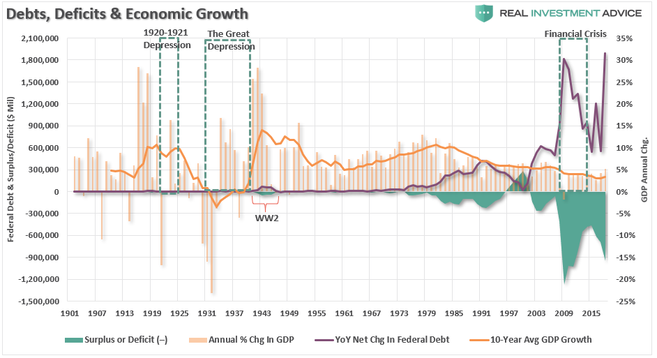
Economic Theories & Debt Driven Realities

One of the most highly debated topics over the past few months has been the rise of Modern Monetary Theory (MMT). The economic theory has been around for quite some time but was shoved into prominence recently by Congressional Representative Alexandria Ocasio-Cortez’s “New Green Deal” which is heavily dependent on massive levels of Government funding.

There is much debate on both sides of the argument but, as is the case with all economic theories, supporters tend to latch onto the ideas they like, ignore the parts they don’t, and aggressively attack those who disagree with them. However, what we should all want is a robust set of fiscal and monetary policies which drive long-term economic prosperity for all.

Here is the problem with all economic theories – they sound great in theory, but in practice, it has been a vastly different outcome. For example, when it comes to deficits, John Maynard Keynes contended that:

“A general glut would occur when aggregate demand for goods was insufficient, leading to an economic downturn resulting in losses of potential output due to unnecessarily high unemployment, which results from the defensive (or reactive) decisions of the producers.”

In other words, when there is a lack of demand from consumers due to high unemployment, then the contraction in demand would force producers to take defensive actions to reduce output. Such a confluence of actions would lead to a recession.

In such a situation, Keynesian economics states that government policies could be used to increase aggregate demand, thus increasing economic activity and reducing unemployment and deflation. Investment by government injects income, which results in more spending in the general economy, which in turn stimulates more production and investment involving still more income and spending and so forth. The initial stimulation starts a cascade of events, whose total increase in economic activity is a multiple of the original investment.

Unfortunately, as shown below, economists, politicians, and the Federal Reserve have simply ignored the other part of the theory which states that when economic activity returns to normal, the Government should return to a surplus. Instead, the general thesis has been:

“If a little deficit is good, a bigger one should be better.”

As shown, politicians have given up be concerned with deficit reduction in exchange for the ability to spend without constraint.

However, as shown below, the theory of continued deficit spending has failed to produce a rising trend of economic growth.

When it comes to MMT, once again we see supporters grasping onto the aspects of the theory they like and ignoring the rest. The part they “like” sounds a whole lot like a “Turbotax” commercial:

The part they don’t like is:

“The only constraint on MMT is inflation.”

That constraint would come as, the theory purports, full employment causes inflationary pressures to rise. Obviously, at that point, the government could/would reduce its support as the economy would theoretically be self-sustaining.

However, as we questioned previously, the biggest issue is HOW EXACTLY do we measure inflation?

This is important because IF inflation is the ONLY constraint on debt issuance and deficits, then an accurate measure of inflation, by extension, is THE MOST critical requirement of the theory.

In other words:

“Where is the point where the policy must be reversed BEFORE you cause serious, and potentially irreversible, negative economic consequences?”

This is the part supporters dislike as it imposes a “limit” on spending whereas the idea of unconstrained debt issuance is far more attractive.

Again, there is no evidence that increasing debts or deficits, inflation or not, leads to stronger economic growth.

However, there is plenty of evidence which shows that rising debts and deficits lead to price inflation. (The chart below uses the consumer price index (CPI) which has been repeatedly manipulated and adjusted since the late 90’s to suppress the real rate of inflationary pressures in the economy. The actual rate of inflation adjusted for a basket of goods on an annual basis is significantly higher.) 

Of course, given the Government has already been running a “quasi-MMT” program for the last 30-years, the real impact has been a continued shift of dependency on the Government anyway. Currently, one-in-four households in the U.S. have some dependency on government subsidies with social benefits as a percentage of real disposable income at record highs.

If $22 trillion in debt, and a deficit approaching $1 trillion, can cause a 20% dependency on government support, just imagine the dependency that could be created at $40 trillion?

If the goal of economic policy is to create stronger rates of economic growth, then any policy which uses debt to solve a debt problem is most likely NOT the right answer.

This is why proponents of Austrian economics suggest trying something different – less debt. Austrian economics suggests that a sustained period of low interest rates and excessive credit creation results in a volatile and unstable imbalance between saving and investment. In other words, low interest rates tend to stimulate borrowing from the banking system which in turn leads, as one would expect, to the expansion of credit. This expansion of credit then creates an expansion of the supply of money.

Therefore, as one would ultimately expect, the credit-sourced boom becomes unsustainable as artificially stimulated borrowing seeks out diminishing investment opportunities. Finally, the credit-sourced boom results in widespread malinvestments. When the exponential credit creation can no longer be sustained a “credit contraction” occurs which ultimately shrinks the money supply and the markets finally “clear” which causes resources to be reallocated back towards more efficient uses.

Time To Wake Up

For the last 30 years, each Administration, along with the Federal Reserve, have continued to operate under Keynesian monetary and fiscal policies believing the model worked. The reality, however, has been most of the aggregate growth in the economy has been financed by deficit spending, credit expansion and a reduction in savings. In turn, the reduction of productive investment into the economy has led to slowing output. As the economy slowed and wages fell the consumer was forced to take on more leverage which also decreased savings. As a result of the increased leverage, more of their income was needed to service the debt.

Secondly, most of the government spending programs redistribute income from workers to the unemployed. This, Keynesians argue, increases the welfare of many hurt by the recession. What their models ignore, however, is the reduced productivity that follows a shift of resources toward redistribution and away from productive investment.

In its essential framework, MMT suggests correctly that debts and deficits don’t matter as long as the money being borrowed and spent is used for productive purposes. Such means that the investments being made create a return greater than the carrying cost of the debt used to finance the projects.

Again, this is where MMT supporters go astray. Free healthcare, education, childcare, living wages, etc., are NOT a productive investments which have a return greater than the carrying cost of the debt. In actuality, history suggests these welfare supports have a negative multiplier effect in the economy.

What is most telling is the inability for the current economists, who maintain our monetary and fiscal policies, to realize the problem of trying to “cure a debt problem with more debt.”

This is why the policies that have been enacted previously have all failed, be it “cash for clunkers” to “Quantitative Easing”, because each intervention either dragged future consumption forward or stimulated asset markets. Dragging future consumption forward leaves a “void” in the future which must be continually filled, This is why creating an artificial wealth effect decreases savings which could, and should have been, used for productive investment.

The Keynesian view that “more money in people’s pockets” will drive up consumer spending, with a boost to GDP being the end result, has been clearly wrong. It hasn’t happened in 30 years.

MMT supporters have the same view that if the government hands out money it will create stronger economic growth. There is not evidence which supports such is actually the case.

It’s time for those driving both monetary and fiscal policy to wake up. The current path we are is unsustainable. The remedies being applied today is akin to using aspirin to treat cancer. Sure, it may make you feel better for the moment, but it isn’t curing the problem.

Unfortunately, the actions being taken today have been repeated throughout history as those elected into office are more concerned about satiating the mob with bread and games” rather than suffering the short-term pain for the long-term survivability of the empire. In the end, every empire throughout history fell to its knees under the weight of debt and the debasement of their currency.

It’s time we wake up and realize that we too are on the same path.

U.S. Household Wealth Is In A Bubble – Part 1

This article is Part I of a series that explains why U.S. household wealth is experiencing a dangerous bubble, why this bubble is heading for a powerful bust, and how to preserve and grow your wealth when this bubble inevitably bursts.

This series of articles will cover the following key points:

  • How inflated household wealth currently is compared to historic levels
  • What forces are driving household wealth to such extreme levels
  • A look at the underlying components of household wealth and why they are inflated
  • A look at the growing bubbles in equities, housing, and bonds
  • How the household wealth bubble is driving consumer spending 
  • How the wealth bubble contributes to our artificial economic recovery
  • How the wealth bubble is creating a temporary surge of inequality 
  • How the wealth bubble will burst
  • How to preserve your wealth when the wealth bubble bursts

Part I: U.S. Household Wealth Is In A Bubble

In most people’s minds, any increase in wealth is a good thing. Surely, only a misanthrope would argue otherwise, right? Well, in this article series, I’m going to make the unpopular argument that America’s post-Great Recession household wealth boom is actually a very dangerous phenomenon.

Since the financial crisis in early-2009, household wealth has surged by nearly $46 trillion or 83 percent to a record $100.8 trillion. As the chart below shows, the powerful increase in household wealth (blue line) has far exceeded the growth of the underlying economy, as measured by the GDP (orange line). Household wealth should closely track the economy, as it did during the 20th century until the extreme boom-bust era that started in the mid-to-late 1990s.

When household wealth tracks the growth of the economy, it’s a sign that the wealth increase is likely organic, healthy, and sustainable. When household wealth far outpaces the growth of the underlying economy, however, that is a tell-tale sign that the boom is artificial and unsustainable. The last two times household wealth growth exceeded GDP growth by a large degree was during the late-1990s dot-com bubble and the mid-2000s housing bubble, both of which ended in tears. The gap between household wealth and the economy is far larger today than it was in the last two bubbles, which means that the coming reversion or crash is going to be even more painful, unfortunately.

U.S. Household Net Worth vs. GDP

Another way of visualizing the household wealth bubble is to plot it as a percent of GDP, which paints the same picture as the chart above. U.S. household wealth is currently 505 percent of the GDP, which is even more extreme than the housing bubble’s peak at 473 percent, and the dot-com bubble’s peak at 429 percent. Household wealth has averaged 379 percent of the GDP since 1951, so the current 505 percent figure is completely out of line, which means that a violent reversion to the mean (aka, another crash) is inevitable. To make matters even worse, the 379 percent average figure is skewed upward by the anomalous boom-bust period that began in the mid-to-late 1990s. When U.S. household wealth comes crashing down again, there is a very good chance that it will overshoot below its historic average due to how stretched it has become during the current bubble.

Household Net Worth As A Percent Of GDP

What is driving the current U.S. household wealth bubble and why is it happening? The answer lies squarely with the U.S. Federal Reserve and its actions during and after the Global Financial Crisis. During the Crisis, household wealth plunged as stocks, housing prices, and bonds (aside from Treasuries) cratered. These aforementioned assets make up the bulk of household wealth, so bull markets in stocks, housing, and bonds lead to bull markets in household wealth and vice versa. When household wealth plunges as it did in 2008 and 2009, consumers pare back their spending dramatically, which leads to even more economic pain.

In an attempt to pull the economy and financial markets out of their deep-freeze, the Federal Reserve cut interest rates to record low levels and launched emergency monetary stimulus policies known as quantitative easing or QE. QE basically entails creating new money out of thin air (this is done digitally) and using the proceeds to buy mortgage-backed securities and Treasury bonds with the idea that the massive influx of liquidity into the financial system would indirectly find its way into riskier assets such as stocks. Even though the Fed only has two official mandates (maximizing employment and maintaining price stability), boosting asset prices essentially became their unspoken third mandate after the 2008 financial crisis.

As former Fed chairman Ben Bernanke wrote in a 2010 op-ed in which he explained (what he claimed to be) the virtues of the Fed’s new, unconventional monetary policies:

And higher stock prices will boost consumer wealth and help increase confidence, which can also spur spending. Increased spending will lead to higher incomes and profits that, in a virtuous circle, will further support economic expansion.

While the idea of having a central bank like the Federal Reserve boost asset prices to create an economic recovery may seem clever and admirable, it is terribly misguided because asset booms driven by central bank intervention are overwhelmingly likely to be unsustainable bubbles rather than genuine booms. Central bank-driven booms are very similar to sugar highs or highs from hard drugs – a crash is inevitable once the substance wears off. When central banks interfere in markets, they create mass distortions and false signals that trick investors into believing that the boom is legitimate, even though it’s not.

The chart below shows the Fed Funds Rate, which is the interest rate that the Fed raises and lowers in order to steer the economy. When the Fed holds rates at very low levels (which keeps borrowing costs in the economy low), dangerous bubbles form in asset prices and the overall economy. When the Fed ultimately raises rates, the bubble pops, which results in stock bear markets and recessions. The dot-com and housing bubbles formed during periods of low interest rates and popped when interest rates were raised.

What is terrifying is the fact that interest rates have remained at record low levels for a record length of time since the financial crisis, which means that the current market distortion and coming crisis will be even more extreme than the last two. Remember how extreme the current household wealth bubble looked in the two charts shown earlier in this piece? Well, that is certainly no coincidence: it is a direct result of the extremely loose monetary conditions over the last decade.

Fed Funds Rate

This next chart shows the Federal Reserve’s balance sheet, which shows the assets purchased by the central bank during its QE programs. Each QE program led to an increase in the Fed’s balance sheet and corresponding surge in asset prices. The three QE programs caused the Fed’s balance sheet to expand by over $3.5 trillion to a peak of approximately $4.5 trillion. Since late-2017, the Fed has been attempting to shrink its balance sheet (this is known as quantitative tightening or QT), which has roiled the financial markets.

Fed Balance Sheet

Summary – Part I

To summarize, we are currently experiencing an explosion of wealth on a scale that has never been seen before. Unfortunately, it’s not the good kind of wealth explosion, but the bad kind – the kind that precedes wealth implosions that lead to deep economic recessions and depressions. While most people are cheering this boom on and are delighted by the return to prosperous times, they have absolutely no clue what is driving it or the fact that it will prove to be fleeting and ephemeral.

Please stay tuned for Part II, where I will discuss the underlying components of U.S. household wealth (stocks, bonds, etc.) and provide even more evidence that they are experiencing speculative bubbles in their own right.

If you are like most investors, the U.S. household wealth bubble means that your own investments, wealth, and retirement fund are extremely inflated and exposed to grave risk of another crash. Most investment firms have absolutely no clue that another storm is coming, let alone how to navigate it. Clarity Financial LLC, my employer, is a registered investment advisor firm that specializes in preserving and growing investor wealth in precarious times like these.

Please click here to contact us so that we can help protect your hard-earned wealth.

Bitcoin: Like A Moth To A Flame

  • * Beware of investment fads and the experts that deliver endorsing pablum in the business media
  • * They are not your allies in delivering good investment returns — they are harmful to your investment well being

“Thus hath the candle singd the moath.”
– William Shakespeare, The Merchant of Venice

This morning the price of bitcoin is down by another 10%: the price is flirting with $10,000 after trading at around $20,000 a few months ago.

The phrase “like a moth to a flame” is an allusion to the well known attraction that moths have to bright lights.

The word moth was used in the 17th century to refer to someone who was apt to be tempted by something that would lead to their downfall.

So it is with many in the business media, who too often, like Wall Street offering up conflicted research recommendations, seek audience over intelligence by parading experts (in the latest fad, like cryptocurrencies) and, too wittingly become the enemy of the average and uninformed investor. These experts, with memorized sound bytes, will always sound confident and rarely express the notion of risk. But, many of that audience will learn, like The Wizard of Oz, that they’re simply delivering an odious pablum –bland or insipid intellectual fare and entertainment.

Those outlets that are inundated by crypt talk know who they are — like Warren Buffett, I prefer to criticize by category (and praise by name). (As evidence to the preoccupation, just take a quick look at the Twitter threads of some of the leading business media shows — they are overwhelmed by crypto chatter and nonsensical and hyperbolic opinions.)

Popular investment fads often too quickly become unprofitable investment endeavors — dot.com stocks in 1999 and housing/banking stocks in 2007 come to mind.

Ultimately the frequency of media coverage will diminish coincident with the fads’ price declines (and investors/traders lost interest). While the business media may shamelessly move on (unlike research firms and money managers who deliver poor investment advice, will face little retribution), your portfolio could be permanently impaired by what Joe Granville used to call “the bagholders’ blues.”

I may be wrong in my ursine view of bitcoin, et al, and though I no longer have any position (See Tales of the Crypt (Issue IX), I have written tens of thousands of words on the subject, discussing both the potential rewards but also, importantly, the risks as I saw them:

* There’s A Sucker Born Every Minute
* Res Ipsa Idiot

Many in the business media may ultimately forget their current preoccupation with crypto and drop coverage if my negative forecasts continue to be realized — but not until lots of money is lost in the process.

More

Not to worry, when enough time transpires, the same experts will be trotted back onto the business media with another investment idea in hand — just as the case is now, some nine years after The Great Recession and near 80% drops in their portfolios.

Some may say “time heals all wounds.”

But I disagree, as this elephant never forgets.

“The market does not know you exist. You can do nothing to influence it. You can only control your behavior.”

– Alexander Elder

It is up to each trader/investor to evaluate reward vs. risk of each investment — as many in the business media and the talking heads and commentators will not necessarily address upside compared to downside particularly in the trade du jour.

These days I am too often reminded of Benjamin Disraeli’s quote:

“What we have learned from history is that we haven’t learned from history.”

It’s Always 20/20 In The Rear-View Mirror

“For many, it will be increasingly difficult to navigate a market dominated by the overly popular ETFs and quant (volatility-trending and risk-parity) strategies that worship at the altar of price momentum. It is also because the ‘buy the dip’ mentality remains indelibly etched on the forehead of most investors and traders that the Pavlovian reaction won’t die easily.

Favoring the bulls is the diminished number of publicly held companies outstanding (from more than 7,600 in 2000 to 3,800 in 2017), a 17% reduction in the float of the remaining companies via corporate buybacks, and still-abundant liquidity. And on top of this, as previously mentioned, is the market’s participants confidence in buying the dips.” – Kass Diary, The Bull Wont Die Easily (November, 2017)

In trying to understand the relentless “Bull Market” advance since the Trump Election fourteen months ago I am reminded of what I wrote above in November, 2017.

These words were underscored in Jim “El Capitan” Cramer’s “Four Reasons Stocks Keep Going Up,” written at the end of yesterday’s trading session, in which he discusses the important structural changes that have led to the popularity of passive investing (ETFs) and in the share count drop caused by a near decade of aggressive corporate buybacks.

Of course there are numerous other reasons (some Jim details further) like the employment of large liquidity infusions from central bankers around the world, optimism about the cut in corporate taxes, the reductions of business regulations (around the fringe), sustained lower interest rates, etc.

As I have also written, investment vision is always 20/20 when viewed in the rear view mirror.

These past observations don’t really help us project the future — though I did touch on some of my concerns in yesterday’s opening missive, “Blinded By a Sense of History” (with some updates in parentheses):

“It is a mania shared by philosophers of all ages to deny what exists and to explain what does not exist.” – Jean-Jacques Rousseau

I have no clue how long it will continue:

* What I am certain about is that liquidity, which has buoyed our markets for years, is starting to be reduced. (Central Bankers are reversing course and beginning to contract their balance sheets)

* What I am fairly certain about is that we are at sentiment and valuation extremes — at least based on history. (And every day these measures grow more stretched)

* Interest rates are likely headed higher, posing — at some point — a potential risk and alternative to stocks. (The ten year US note yield rose above 2.50% this morning)

* I expect no further major legislative initiatives coming out of Washington, D.C. — specifically on the infrastructure front — and a further deterioration in the relationship between the Republicans and Democrats as we move toward key midterm elections. (My expectation is that the House goes Democrat while the Senate stays Republican.)

* As to the Administration, their belief appears to be that the benefit of world leadership is not worth the costs — which runs the risk of a policy mistake in the year ahead.

* As well, though markets have not been yet unnerved even with the White House having gotten bitten by a Wolff this past week, there exists the possibility that the Special Counsel’s
activities could be market unfriendly.

* And I am of the view that the earnings and economic growth expectations will, once again, be disappointing in 2018-19. (Earnings revisions higher have been material (in large measure from tax cuts) but I see mid year as a pivot point of slowing, not accelerating growth)

The markets seem to be moving back to being one with more concentrated leadership — as technology and the FAANGs (a large percent of the S&P Index) have regained their strength. Small caps, supposed tax cut beneficiaries, are lagging. Again, historically these are not positive signposts but it can continue, I have learned, far longer than I anticipated.

The speculation in cryptocurrencies and blockchain and penny stocks is yet another thin reed indicator of a mature Bull. And so is the self confidence and hubris seen in the business media.

Risk assets, like stocks, are called risk assets because they have risk — though you wouldn’t know it from the recent action in which fear and doubt has left the Exchanges.

But, wrong is wrong — and I continue to see ghosts that few market participants are viewing, blinded by a sense of history.

My strategy, given that the markets have clearly moved so much higher than my baseline expectations — is to become more trading oriented and to maintain high cash levels.

As described in my Diary, I see few longs that meet my standards of purchase.

As the market moves almost parabolically, I have recently begun to more aggressively short strength while keeping my stops fairly tight. (Day or days trades.)

Recently, with the exception of the last day of the year in which I profited, this has been a losing proposition.

Wash, rinse, repeat.

My view through the windshield (and the future) has been dramatically worse than my view through the rear view mirror (and the past) as stocks have marched ever higher without the sign of any meaningful pause.

While Grandma Koufax used to say, “Dougie, matzah doesn’t grow to the sky,” the investment trees are like redwoods these days.

A Long Time Ago, In A Market Galaxy Far, Far Away

“The opening crawl is the signature device of every numbered film of the Star Wars series, an American epic space opera franchise created by George Lucas. It opens with the static blue text, ‘A long time ago in a galaxy far, far away….’, followed by the Star Wars logo and the crawl text, which describes the backstory and context of the film. The visuals are accompanied by the “Main Title Theme“, composed and conducted by John Williams.

The sequence has been featured in every live-action Star Wars film produced by Lucasfilm with the exception of Rogue One. Although it retains the basic elements, it has significantly evolved throughout the series. It is one of the most immediately recognizable elements of the franchise and has been frequently parodied.

Each film opens with the static blue text, “A long time ago in a galaxy far, far away….”, followed by the Star Wars logo shrinking in front of a field of stars. Initially the logo’s extremities are beyond the edge of the frame. While the logo is retreating, the “crawl” text begins, starting with the film’s episode number and subtitle (with the exception of the original release of Star Wars – see below), and followed by a three-paragraph prologue to the film. The text scrolls up and away from the bottom of the screen towards a vanishing point above the top of the frame in a perspective projection. Each version of the opening crawl ends with a four-dot ellipsis, except for Return of the Jedi which has a three-dot ellipsis. When the text has nearly reached the vanishing point, it fades out, the camera tiltsdown (or, in the case of Episode II: Attack of the Clones, up), and the film begins.” –Star Wars Opening Crawl, Wikipedia

As Mel Brooks wrote in the opening crawl of his parody “Spaceballs“:

Once upon a valuation warp. . . .

In a market very, very, very, very far away, there lived a ruthless race of beings known as … Momentum Investors.

Chapter Eleven

The evil leaders of momentum investing, having foolishly overestimated economic and profit growth and taken valuations to an extreme, have revised a secret plan to take every breath of reason from their reason- loving neighbor, Value Investing.

Today is Halloween. Unbeknownest to the consensus, but knownest to us, danger lurks in the stars above..

If you can read this, you don’t need glasses.

But I am getting ahead of myself, so let me start from the beginning:

Episode I: THE PHANTOM MENACE

“Turmoil has engulfed Planet Investors, upending rational investing. The statutory corporate tax rates to outlying star systems are in dispute.

Hoping to resolve the matter with a tax-free repatriation of overseas cash, the White House has stopped all shipping to the small planet of Maine.

While the Congress of the Republic endlessly debates this alarming chain of events, the Supreme Tweeter has secretly dispatched two of his warriors (Mnuchin and Cohn), his guardians of low taxes for the nobles in the galaxy, to settle the conflict….”

Episode II: ATTACK OF THE CLONES

“There is unrest in the Galactic Senate. As several establishment Republicans have declared their intentions to leave the Republic.

This separatist movement, under the leadership of the mysterious Count Flake, has made it difficult for the limited number of warriors to maintain peace and order in the galaxy.

Senator Collins, the former Queen of Maine, is returning to the Galactic Senate to vote on the critical issue of creating an ARMY OF THE REPUBLIC to assist the overwhelmed Jedi….”

Episode III: REVENGE OF THE SITH

“Twitter War! The Republic is crumbling under attacks by the ruthless Sith Lord, Robert Mueller. There are heroes on both sides. Evil is everywhere.

In a stunning move, the fiendish aging droid leader, General Bernie Sanders (not to be confused with the Evil Colonel Sandurz), has swept into the Republic capital and kidnapped Chancellor McConnell, leader of the Galactic Senate.

As the Separatist Droid Army attempts to flee the besieged capital with their valuable hostage, two other Jedi Knights lead a desperate mission to rescue the captive Chancellor….”

Episode IV: A NEW HOPE

“It is a period of investor strife. Rebel spaceships, striking from a hidden base, (with price-earnings ratios ever expanding and dips ever bought) have won their first victory against the evil Galactic Empire (despite the robotic and fake impressions coming out of Facebook and Twitter) .

During the battle, Rebel spies managed to steal secret plans to the Empire’s ultimate weapon, the Death Star AMAZON, an armored space station with enough power to destroy an entire planet (and/or markets).

Pursued by the Empire’s sinister agents, Princess Kamala races home aboard her starship (on the Left Coast), custodian of the stolen plans that can save the markets and instill value and common sense to the galaxy….”

Episode V: THE EMPIRE STRIKES BACK

“It is a dark time for the Rebellion. The Death Star Amazon has not yet been destroyed and Imperial troops have driven the Rebel forces from their hidden base and pursued them across the galaxy.

Evading the dreaded Imperial Starfleet (of Generals Kelly, H.R. McMaster and Mattis) , a group of freedom fighters led by Luke Booker has established a new secret base on the remote ice world of California.

The evil lord Paul Ryan, obsessed with finding young Booker, has dispatched thousands of remote probes (and quant strategies) into the far reaches of space, continuing to boost investor confidence and buoy the S&P Index….”

Episode VI: RETURN OF THE JEDI

“Luke Booker has returned to his home planet of Newark in an attempt to rescue his party from the clutches of the vile gangster Bannon the Hutt and from (unregulated and growing power/value) of the sinister FANGS.

Little does Luke know that the Galactic Empire has secretly begun construction on a new armored space station even more powerful than the first dreaded Death Star, AMAZON.

When completed, this ultimate weapon will spell certain doom for the small band of rebels and short sellers struggling to restore freedom and common sense to investors…”

Episode VII: THE FORCE AWAKENS 

“Luke Booker has vanished. In his absence, the sinister DARTH PUTIN has risen from the ashes of the Empire (and Facebook/Twitter) and will not rest until Booker, the last Jedi (and market complacency), have been destroyed.

With the support of the REPUBLIC, Princess Kamala Harris leads a brave RESISTANCE. She is desperate to find her brother Luke Booker and gain his help in restoring peace and justice and reasonable valuations to the galaxy.

Princess Kamala has sent her most daring pilot on a secret mission to PLANET DNC, where an old ally (Princess Elizabeth) has discovered a clue to Luke’s whereabouts….”

Hopefully, to find out the market outcome, we may only have to wait for next month’s (Dec. 15) release of Episode VIII, “The Last Jedi.”

But the wait could be as long as Dec. 20, 2019, with the release of the still-untitled Episode IX.

“Your eyes can deceive you. Don’t trust them.” – Obi-Wan Kenobi

It’s scary out there — after all, it’s Halloween.

Trick or treat?

Regardless of market outcomes, May the Schwartz be with (all of) you.”

The Risk Spectrum

Cause when life looks like Easy Street, there is danger at your door – Grateful Dead

On numerous occasions, we have posited that equity investors appear to be blinded by consistently rising stock prices and the allure of minimal risks as portrayed by record low volatility. It is quite possible these investors are falling for what behavioral scientists diagnose as “recency bias”. This condition, in which one believes that the future will be similar to the past, distorts rational perspective. If an investor believes that tomorrow will be like yesterday, a prolonged market rally actually leads to a perception of lower risk which is then reinforced over time. In reality, risk rises with rapidly rising prices and valuations. When investors’ judgement becomes clouded by recent events, instead of becoming more cautious, they actually become more aggressive in their risk-taking.

In our premier issue of The Unseen, 720Global’s premium subscription service, we quantified how much riskier financial assets are than most investors suspect. The message in, The Fat Tail Wagging the Dog, is that extreme historical price changes occur with more frequency than a normal distribution predicts. Reliance upon faulty theories laced with flawed assumptions can lead investors to take substantial risks despite paltry expected returns.

In this article, we further expand on those concepts and present a simple framework to help readers understand the spectrum of risks that equity holders are currently taking.

Risk Spectrum

When one assesses risk and return, the most important question to ask is “Do my expectations for a return on this investment properly compensate me for the risk of loss?” For many of the best investors, the main concern is not the potential return but the probability and size of a loss.  A key factor to consider when calculating risk and return is the historical reference period. For example, if one is to estimate the risk of severe thunderstorms occurring in July in New York City, they are best served looking at many years of summer meteorological data for New York City as their reference period. Data from the last few weeks or months would provide a vastly different estimate. Likewise, if one is looking at the past few months of market activity to gauge the potential draw down risk of the stock market, they would end up with a different result than had they used data which included 2008 and 2009.

No one has a crystal ball that allows them to see into the future. As such the best tools we have are those which allow for common sense and analytical rigor applied to historical data. Due to the wide range of potential outcomes, studying numerous historical periods is advisable to gain an appreciation for the spectrum of risk to which an investor may be exposed. This approach does not assume the past will conform to a specific period such as the last month, the past few years or even the past few decades. It does, however, reveal durable patterns of risk and reward based upon valuations, economic conditions and geopolitical dynamics. Armed with an appreciation for how risk evolves, investors can then give appropriate consideration to the probability of potential loss.

Measuring Risk

The graph below plots the percentage price change of the S&P 500 that one would expect at each respective date given a 3-standard deviation price change. The data is computed based on price changes from the preceding six months. Essentially, the graph depicts expected outcomes for those solely relying on recency biased risk management approaches.  (On a side note, a 3-standard deviation price change should have occurred 14 times over the 17 year period based on a normal distribution. In reality, it happened 249 times!)

Data Courtesy: Bloomberg

Currently, if one is basing their risk forecast on the last six months of price data, they should anticipate that a “rare” 3-standard deviation change will result in a price change of 7.11% (green line). Accordingly, the table below applies a range of readings from the graph above to create an array of potential draw downs. The historical data is applied to the current S&P 500 price to provide current context.

We caution you, major draw downs are frequently much greater than a 3-standard deviation event.

Summary

As mentioned earlier, the best investment managers obsess not about what they hope to make on an investment but what they fear they could lose. At this juncture, current market dynamics offer a lot of reasons one should be concerned. For those who rest assured that the future will be representative of the immediate past, you likely already stopped reading this article. For those who recognize that regime shifts to higher volatility tend to follow periods when risk is under-appreciated, valuations are high and economic growth feeble, this framework should be a beneficial guide to better risk management. Although the timing is uncertain, we are confident that it will pay handsome dividends at some point in the future.

Save

Save

Save

Save

The Lowest Common Denominator

The Lowest Common Denominator: Debt

At a recent investment conference, hedge fund billionaire Stanley Druckenmiller predicted that interest rates would continue rising. Specifically, he suggested that, consistent with the prospects for economic growth, the 10-year U.S. Treasury yield could reach 6.00% over the next couple of years. Druckenmiller’s track record lends credence to his economic perspectives.  While we would very much like to share his optimism, we find it difficult given the record levels of public and private debt.

Druckenmiller’s comments appear to be based largely on enthusiasm for the new administration’s proposals for increased infrastructure and military spending along with tax cuts and deregulation. This is consistent with the outlook of most investors today.  Although proposals of this nature have stimulated economic growth in the past, today’s economic environment is dramatically different from prior periods. Investors and the market as a whole are failing to consider the importance of the confluence of the highest debt levels (outright and as a % of GDP) and the lowest interest rates (real and nominal) in the nation’s history.  Because of the magnitude and extreme nature of these two factors, the economic sensitivity to interest rates is greater and more asymmetric now than it has ever been.  Additionally, due the manner in which debt and interest rates have evolved over time, the amount of interest rate risk held by fixed income and equity investors poses unparalleled risks and remains, for the moment, grossly under-appreciated.

Proper assessment of future investment and economic conditions must carefully consider changes in the debt load and the interest rates at which new and existing debt will be serviced.

A 45-year Trend

For more than a generation, there has been a dramatic change in the landscape of interest rates as illustrated in the graph below.  Despite the recent rise in yields (red arrow), interest rates in the United States are still near record-low levels.

Data Courtesy: Bloomberg

Declining interest rates have been a dominant factor driving the U.S. economy since 1981. Since that time, there have been brief periods of higher interest rates, as we see today, but the predictable trend has been one of progressively lower highs and lower lows.

Since the Great Financial Crisis in 2008, interest rates have been further nudged lower in part by the Federal Reserve’s (Fed) engagement in a zero-interest rate policy, quantitative easing and other schemes.  Their over-arching objective has been three-fold:

  • Lower interest rates to encourage more borrowing and thus more consumption (“How do you make poor people feel wealthy? You give them cheap loans.” –The Big Short)
  • Lower interest rates to allow borrowers to reduce payments on existing debt thus making their balance sheet more manageable and freeing up capacity for even more borrowing
  • Maintain a prolonged period of low interest rates “forcing” investors out of safe-haven assets like Treasuries and money market funds and into riskier asset classes like junk bonds and stocks with the aim of manufacturing a durable wealth effect that might eventually lift all boats

In hindsight, lower interest rates were successful in accomplishing some of these objectives and failed on others. What is getting lost in this experiment, however, is that the marginal benefits of decreasing interest rates are significantly contracting while the marginal consequences are growing rapidly.

Interest Rates and Duration

What are the implications of historically low interest rates for a prolonged period of time?  What is “seen” and touted by policy makers are the marginal benefits of declining interest rates on housing, auto lending, commercial real estate and corporate funding to name just a few beneficiaries. What is “unseen” are the layers of accumulating risks that are embedded in a system which discourages savings and therefore eschews productivity growth. Companies that should be forced into bankruptcy or reorganization remain viable, and thus drain valuable economic resources from other productive uses of capital.

In other words, capital is being misallocated on a vast scale and Ponzi finance is flourishing.

In an eerie parallel to the years leading up to the crisis of 2008, hundreds of billions of dollars of investors’ capital is being jack-hammered into high-risk, fixed-income bonds and dividend-paying stocks in a desperate search for additional yield. The prices paid for these investments are at unprecedented valuations and razor thin yields, resulting in a tiny margin of safety. The combination of high valuations and low coupon payments leave investors highly vulnerable. Because of the many layers of risk across global asset markets that depend upon the valuations observed in the U.S. Treasury markets, deeper analysis is certainly a worthy cause.

At the most basic level, it is important to appreciate how bond prices change as interest rates rise and fall.  The technical term for this is duration. Since that price/interest rate relationship is the primary determinant of a bond’s profit and loss, this analysis will begin to reveal the potential risk bond investors face. Duration is defined as the sensitivity of a bond’s price to changes in interest rates. For example, a 10-year U.S. Treasury note priced at par with a 6.50% coupon (the long term average coupon on U.S. Treasury 10-year notes) has a duration of 7.50. In other words, if interest rates rise by 1.00%, the price of that bond would decline approximately 7.50%.  An investor who purchased $100,000 of that bond at par and subsequently saw rates rise from 6.50% to 7.50%, would own a bond worth approximately $92,500.

By comparison, the 10-year Treasury note auctioned in August 2016 has a coupon of 1.50% and a duration of 9.30. Due to the lower semi-annual coupon payments compared to the 6.50% Treasury note, its duration, which also is a measure of the timing of a bonds cash flows, is higher. Consequently, a 1.00% rise in interest rates would cause the price of that bond to drop by approximately 9.30%. The investor who bought $100,000 of this bond at par would lose $9,300 as the bond would now have a price of $90.70 and a value of $90,700.

A second matter of importance is that the coupon payments, to varying degrees, mitigate the losses described above. In the first example, the annual coupon payments of $6,500 (6.50% times the $100,000 investment) soften the blow of the $7,500 loss covering 86% of the drop in price. In the second example, the annual coupon payments of $1,500 are a much smaller fraction (16%) of the $9,300 price change caused by the same 1.00% rise in rates and therefore provide much less cushion against price declines.

In the following graph, the changing sensitivity of price to interest rate (duration- blue) is highlighted and compared to the amount of coupon cushion (red), or the amount that yield can change over the course of a year before a bondholder incurs a loss.

The coupon on the 10-year U.S. Treasury note used in our example only allows for a 16 basis point (0.16%) increase in interest rates, over the course of a year, before the bondholder posts a total return loss. In 1981, the bondholder could withstand a 287 basis point (2.87%) increase in interest rates before a loss was incurred.

Debt Outstanding

While the increasing interest rate risk and price sensitivity coupled with a decreasing margin of safety (lower coupon payments) of outstanding debt is alarming, the story is incomplete. To fully appreciate the magnitude of this issue, one must overlay those risks with the amount of debt outstanding.

Since 1982, the duration (price risk) of nominal U.S. Treasury securities has risen 70% while the average coupon, or margin of safety, has dropped 85%. Meanwhile, the total amount of U.S. public federal debt has exploded higher by 1,600% and total U.S. credit market debt, as last reported by the Federal Reserve in 2015, has increased over 1,000% standing at $63.4 trillion. When contrasted with nominal GDP ($18.6 trillion) as graphed below, one begins to gain a sense for how radically out of balance the accumulation of debt has been relative to the size of the economy required to support and service that debt.  In other words, were it not for the steady long-term decline in interest rates, this arrangement likely would have collapsed under its own weight long ago.

Data Courtesy: St. Louis Federal Reserve (FRED)

To provide a slightly different perspective, consider the three tables below, which highlight the magnitude of government and personal debt burdens on an absolute basis as well as per household and as a percentage of median household income.

Data Courtesy St. Louis Federal Reserve (FRED) and USdebtclock.org

If every U.S. household allocated 100% of their income to paying off the nation’s total personal and governmental debt burden, it would take approximately six years to accomplish the feat (this calculation uses aggregated median household incomes). Keep in mind, this assumes no expenditures on income taxes, rent, mortgages, food, or other necessities. Equally concerning, the trajectory of the growth rate of this debt is parabolic.

As the tables above reflect, for over a generation, households, and the U.S. government have become increasingly dependent upon falling interest rates to fuel consumption, refinance existing debt and pay for expanded social and military obligations. The muscle memory of a growing addiction to debt is powerful, and it has created a false reality that it can go on indefinitely. Although no rational individual, CEO or policy-maker would admit to such a false reality, their behavior argues otherwise.

Investors Take Note

This article was written largely for investors who own securities with embedded interest rate risks such as those described above. Although we use U.S. Treasury Notes to illustrate, duration is a component of all bonds. The heightened sensitivities of price changes coupled with historically low offsetting coupons, in almost all cases, leaves investors in a more precarious position today than at any other time in U.S. history. In other words, investors, whether knowingly or unknowingly, have been encouraged by Fed policies to take these and other risks and are now subject to larger losses than at any time in the past.

This situation was beautifully illustrated by BlackRock’s CIO Rick Rieder in a presentation he gave this fall. In it he compared the asset allocation required for a portfolio to achieve a 7.50% target return in the years 1995, 2005 and 2015. He further contrasts those specific asset allocations against the volatility (risk) that had to be incurred given that allocation in each respective year. His takeaway was that investors must take on four times the risk today to achieve a return similar to that of 1995.

Summary

We generally agree with Stanley Druckenmiller. If enacted correctly, there are economic benefits to deregulation, tax reform and fiscal stimulus policies. However, we struggle to understand how higher interest rates for an economy so dependent upon ever-increasing amounts of leverage is not a major impediment to growth under any scenario. Also, consider that we have not mentioned additional structural forces such as demographics and stagnating productivity that will provide an increasingly brisk headwind to economic growth. Basing an investment thesis on campaign rhetoric without consideration for these structural obstacles is fraught with risk.

The size of the debt overhang and dependency of economic growth on low interest rates means that policy will not work going forward as it has in the past. Although it has been revealed to otherwise intelligent human beings on many historical occasions, we retain a false belief that the future will be like the past. If the Great Recession and post-financial crisis era taught us nothing else, it should be that the cost of too much debt is far higher than we believe.  More debt and less discipline is not the solution to a pre-existing condition characterized by the same. The price tag for failing to acknowledge and address that reality rises exponentially over time.

Save

Save

Save

Save

Price To Sales Ratio – Another Nail In The Coffin?

Final-Nail

Editor Note: Michael Lebowitz of 720 Global Research is an investment consultant, specializing in macroeconomic research, valuations, asset allocation, and risk management.  He is a regular contributor to Real Investment Advice.


720 Global has repeatedly warned that U.S. equity valuations are historically high and, of equal concern, not properly reflective of the nation’s weak economic growth potential. In this article we provide further support for that opinion by examining the ratio of equity prices to corporate revenue also known as the price to sales ratio (P/S). At its current record level, the P/S ratio leads us to one of two conclusions: 1) Investors are extremely optimistic about future economic and earnings growth or 2) Investors are once again caught up in the frenzy of an equity bubble and willing to invest at valuations well above the norm.

Either way, the sustainability or extension of the current P/S ratio to even higher levels would be remarkable. What follows here is an exercise in logic aimed at providing clarity on the topic.

Before showing you the current P/S ratio in relation to prior market environments, it is important to first consider two related concepts that frame the message the market is sending us.

Concept #1 – Investors should accept higher than normal valuation premiums when potential revenue growth is higher than normal and require lower than average premiums when potential revenue growth is lower than normal.

Consider someone who is evaluating the purchase of one of two dry cleaning stores (A and B). The two businesses are alike with similar sales, pricing, and locations. However, based on the buyers’ analysis, store A’s future revenue is limited to its historical 2% growth rate. Conversely, the potential buyer believes that store B, despite 2% growth in the past, has a few advantages that are underutilized which the buyer believes can potentially produce a revenue growth rate of 10%. If stores A and B are offered at the same price the buyer would most likely opt to purchase store B. It is also probable the buyer would be willing to pay a higher price for store B versus store A. Therefore highlighting that revenue growth potential is a key factor when deciding how much to pay for a business.

Purchasing a mutual fund, ETF or an equity security is essentially buying a claim on a potential future stream of earnings cash flows, just like the dry cleaning business from the prior example. The odds, therefore, of a rewarding investment are substantially increased when a company, or index for that matter, offering substantial market growth potential is purchased at a lower than average P/S ratio. Value investors actively seek such situations.

Logically one would correctly deduce that P/S ratios should tend to follow a similar directional path as expected revenues.

Concept #2 – Corporate earnings growth = economic growth

Corporate earnings growth rates and economic growth rates are nearly identical over long periods. While many investors may argue that corporate earnings growth varies from the level of domestic economic activity due to the globalization of the economy, productivity enhancements that lower expenses for corporations, interest rates and a host of other factors, history proves otherwise.

Since 1947, real GDP grew at an annualized rate of 6.43%. Over the same period, corporate earnings grew at a nearly identical annualized rate of 6.46%. Thus, expectations for future corporate earnings over the longer term should be on par with expected economic growth although short term differences can arise.

The graph below shows the running three-year annualized growth rate of U.S. real GDP since 1950.  While there have been significant ebbs and flows in the rate of growth over time, the trend as shown by the red dotted regression line is lower. The trend line forecasts average GDP growth for the next 10 years (green line) of 1.85%, a level that is historically recessionary.

720Global-3yr-Ann-GDP

As we have shared before, the combination of negligible productivity growth, heavy debt loads, short-termism and demographic changes will continue to produce headwinds that extract a heavy price on economic growth in the years ahead.  Barring major changes in the way the economy is being managed or a globally transformative breakthrough, there is little reason to expect a more optimistic outcome. Given this expectation, the outlook for corporate earnings is equally dismal and likely to produce similar negligible growth rates.

Reality

The graphs below chart the S&P 500 (blue line/top graph) and the median S&P 500 P/S ratio (red line/ bottom graph) since 1964. As shown in the bottom graph, the P/S ratio is now 2.50 standard deviations from the median and well above the prior levels preceding the significant bear markets of 2000-2002 and 2007-2009.

720Global-PS

Based on the fact that the P/S ratio has been steadily rising and has eclipsed prior peaks, we are left to select from one of two conclusions as we mentioned previously:

  1. that investors are extremely optimistic about the potential for revenue growth, or
  2. investors are once again caught in the grasp of bubble mentality and willing to pay huge premiums to avoid missing out on further gains.

After further deliberation, however, there is a very plausible third possibility. Perhaps the lack of viable options for investors to generate acceptable returns, has them reluctantly ignoring the risks they must assume in those efforts.  If that is indeed the case, then one should also consider the possibility that the next correction will extract more than a pound of flesh in damage.

We remain confident that extravagant earnings and economic growth are not in the cards, and it is very likely monetary policy is fueling a new form of bubble logic. Invest with caution!


Michael Lebowitz, 720 Global Research

RIA Contributing Partner

Follow Michael on Twitter or go to 720global.com for more research and analysis.

The Fifteenth Of August

720Global-15-August

Editor Note: Michael Lebowitz of 720 Global Research is an investment consultant, specializing in macroeconomic research, valuations, asset allocation, and risk management.  He is a regular contributor to Real Investment Advice.


Before reading this article we highly recommend reading “The Death of the Virtuous Cycle” to provide better context.

July 4th – June 6th – September 11th – August 15th

You likely associated the first three dates above with transformative events in U.S. history. August 15th, however, may have you scratching your head.

August 15, 1971 was the date that President Richard Nixon shocked the world when he closed the gold window, thus eliminating free convertibility of the U.S. dollar to gold. This infamous ‘new economic policy’, or “Nixon Shock”, thereby removed the requirement that the U.S. dollar be backed by gold reserves. From that fateful day forward, constraints were removed that previously hindered the Federal Reserve’s (Fed) ability to manage the U.S. money supply. Decades later, slowing economic growth, nonexistent wage growth, growing wealth disparity, deteriorating productivity growth and other economic ills lay in the wake of Nixon’s verdict.

The Transformation of the Federal Reserve and Alan Greenspan


With the stroke of President Nixon’s pen a new standard of economic policy was imposed upon the American people and with it came promises of increased economic growth, high levels of employment and general prosperity. What we know now, almost 50 years later, is that unshackling the U.S. monetary system from the discipline of a gold standard, allowed the Fed to play a leading role in replacing the Virtuous Cycle with an Un-Virtuous Cycle. Eliminating the risk of global redemption of U.S. dollars for gold also eliminated the discipline, the checks and balances, on deficit spending by the government and its citizens. As the debt accumulated, the requirement on the Fed to drive interest rates lower became mandatory to enable the economic system to service that debt.

In this new post-1971 era, the Fed approached monetary policy in a pre-emptive fashion with increasing aggression. In other words, the Fed, more often than not, forced interest rates below levels that would likely have been prevalent if determined by the free market. The strategy was to unnaturally mitigate even minor and healthy economic corrections and to encourage more public and private borrowing to drive consumption, indirectly discouraging savings. The purpose was to create more economic growth than there would otherwise have been.

This new and aggressive form of monetary policy is epitomized by the transformation of Federal Reserve Chairman Alan Greenspan. Greenspan came into office in 1987 as an Ayn Rand disciple, a vocal supporter of free-markets. Beginning with the October 19, 1987 “Black Monday” stock market crash, however, he began to fully appreciate his ability to control interest rates, the money supply and ultimately economic activity. He was able to stem the undesirable effects of various financial crises, and spur economic growth when he believed it to be warranted. Greenspan converted from a free market activist, preaching that markets should naturally set their own interest rates, to one promoting the Fed’s role in determining “appropriate” levels of interest rates and economic growth.

In 2006, after 18 years as Chairman of the Federal Reserve and nicknamed “The Maestro”, he retired and handed the baton to Ben Bernanke and Janet Yellen, both of whom have followed in his active and aggressive monetary policy ways.

Proof


The Fed’s powerful effect on interest rates made it cheaper for households and government to borrow and spend, and therefore debt was made more attractive to citizens and politicians. Personal consumption and government spending are the largest components of economic activity, accounting for approximately 70% and 20% of GDP respectively.

The following graph illustrates the degree to which interest rates across the maturity curve became progressively more appealing to borrowers over time. The graph below shows inflation-adjusted or “real” U.S. Treasury interest rates (yields) to provide a clear comparison of interest rates through various inflationary and economic periods. Since 2003, many of the data points in the graph are negative, creating an environment which outright penalizes savers and benefits borrowers.

720Global-Chart1-062916

The next graph tells the same story but in a different light. It compares the Federal Funds rate (the Fed controlled interest rate that banks charge each other for overnight borrowing) to the growth rate of economic output (GDP). This comparison is based on a theory proposed by Knut Wicksell, a 19th century economist. In the Theory of Interest (1898) he proposes that there is an optimal interest rate. Any interest rate other than that rate would have negative consequences for long term economic growth. When rates are too high and above the optimal rate, the economy would languish. Conversely, lower than optimal rates lead to over-borrowing, capital misallocation and speculation eventually resulting in economic hardships. To calculate the optimal rate, Wicksell used market rates of interest as compared to GDP.

720Global-Chart2-062916

In order to gauge the direct influence the Fed exerted on interest rates within Wicksell’s framework we compare the Fed Funds rate to GDP.  Like the prior graph, notice the declining trend pointing to “easier” borrowing conditions. Additionally, note that since 2000 the spread between Fed Funds and GDP has largely been negative. As the spread declined, borrowers were further lead to speculation and misallocated capital, exactly what Wicksell theorized would occur with rates below the optimal level. The tech bubble, real-estate bubble and many other asset bubbles provide supporting evidence to his theory.

The Smoking Gun


The graphs above make a good case that the Fed has been overly-aggressive in their use of interest rate policy to increase the desire to borrow and ultimately drive consumption. We fortify this claim by comparing the Fed’s monetary policy actions to their congressionally set mandate to erase any doubt you may still have. The following is the 1977 amended Federal Reserve Act stating the monetary objectives of the Fed.  This is often referred to as the dual mandate.

“The Board of Governors of the Federal Reserve System and the Federal Open Market Committee shall maintain long run growth of the monetary and credit aggregates commensurate with the economy’s long run potential to increase production, so as to promote effectively the goals of maximum employment, stable prices and moderate long-term interest rates.”

To paraphrase – the Fed should allow the money supply and debt outstanding to grow at a rate matching the potential economic growth rate in order to help achieve their mandated goals.

Since 1977, the year the mandate was issued, the annualized growth rate of credit and the monetary base increased at over twice the rate of the economy’s potential growth rate (productivity + population growth).  The two measures rose annually 42% and 65% respectively faster than actual economic growth.

Commensurate is not a word we would use to describe the relationships of those growth rates to that of the economy’s potential growth rate!

The Hangover


In a Virtuous Cycle, saving and investment lead to productivity gains, increased production growth and ultimately growing prosperity which then further perpetuates the cycle. In the Un-Virtuous Cycle, debt leads to consumption which leads to more debt and more consumption in a vicious self-fulfilling spiral.  In the Un-Virtuous Cycle, savings, investment and productivity are neglected. Declining productivity growth causes a decline in the potential economic growth rate, thus requiring ever-greater levels of debt to maintain current levels of economic growth. This debt trap also requires ever lower interest rates to allow the growing mountain of debt to be serviced.

With almost 50 years of history there is sufficient data to judge the effects of the Fed’s monetary policy experiment. The first graph below highlights the exponential growth in debt (black line) which coincided with the decline in the personal savings rate (orange) and the Fed Funds rate (green).

720Global-Chart3-062916

As the savings rate slowed, investment naturally followed suit and, as the Virtuous Cycle dictates, productivity growth declined. The graph below highlights the decline in the productivity growth rate. The dotted black line allows one to compare the productivity growth rate prior to the removal of the gold standard to the period afterwards. The 10-year average growth rate (green) also highlights the stark difference in productivity growth rates before and after the early 1970’s. Please note, the green line denotes a ten-year average growth rate. Recent readings over the prior two years and other measures of productivity are very close to zero.

720Global-Chart4-062916

Over the long term, economic growth is largely a function of productivity growth. The graph below compares GDP to what it might have looked like had the productivity growth trend of pre-1971 continued.  Clearly, the unrealized productive output would have gone a long way toward keeping today’s debt levels manageable, incomes more balanced across the population and the standard of living rising for the country as a whole.

720Global-Chart5-062916

The graphs below show the secular trend in economic growth and the lack of real income growth over the last 20 years.

720Global-Chart6-062916

720Global-Chart7-062916

A Feeble Rebuttal


Some may contend that debt was not only employed to satisfy immediate consumption needs but also used for investment purposes. While some debt was certainly allocated toward productive investment, the data clearly argues that a large majority of the debt was either used for consumptive purposes or was poorly invested in investments that were unsuccessful in increasing productivity. Had debt been employed successfully in productivity enhancing investments, GDP and productivity would have increased at a similar or greater pace than the rise in debt.  In the 1970’s $1.66 of new debt created $1.00 of economic growth. Since that time, debt has grown at three times the rate of economic activity and it now takes $4.47 of new debt to create the same $1.00 of economic growth.

Summary


August 15, 2016 will mark the 45th anniversary of President Nixon’s decision to close the gold window. U.S. citizens and the government are now beholden to the consequences of years of accumulated debt and weak productivity growth that have occurred since that day. Now, seven years after the end of the financial crisis and recession, these consequences are in plain sight. The Fed finds themselves crippled under an imprudent zero interest rate policy and unable to raise interest rates due fear of stoking another crisis.  Worse, other central banks, in a similar quest to keep prior debt serviceable and generate even more debt induced economic growth, have pushed beyond the realm of reality into negative interest rates. In fact, an astonishing $10 trillion worth of sovereign bonds now trade with a negative yield.

The evidence of these failed policies is apparent. However one must consider the basic facts and peer beyond the narrative being fed to the public by the central bankers, Wall Street, and politicians. There is nothing normal about any of this. It therefore goes without saying, but we will say it anyway – investment strategies based on historic norms should be carefully reconsidered.


Michael Lebowitz, 720 Global Research

RIA Contributing Partner

Follow Michael on Twitter or go to 720global.com for more research and analysis.