A technical review of the S&P 500 using daily, weekly and monthly charts to determine overbought, oversold, and risk/reward scenarios for carrying equity exposure.
Is the “bear market” over? The media headlines certainly suggest that is the case.
Has the Federal Reserve liquidity “nuclear bomb” arrested the sell off permanently? This is what investors have been trained to believe over the last decade.
After warning about the potential for a mean-reverting event in our previous updates, what we want to know is the risk versus reward of exposing our client’s capital to risk at this stage of the market cycle.
For that answer, let’s take a look at the charts.
Daily
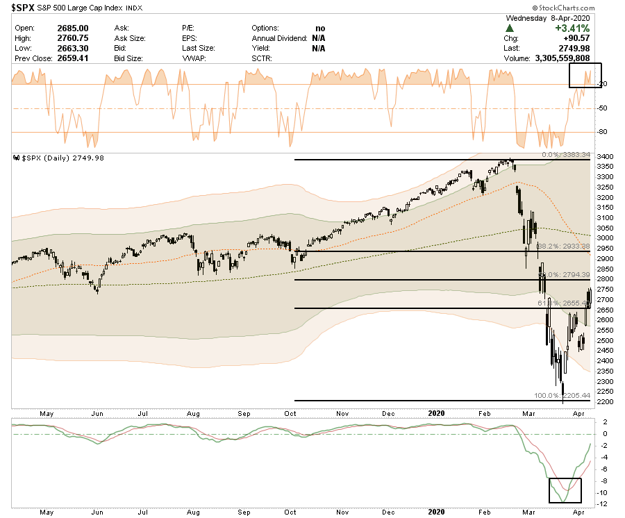
- The price collpase of the S&P 500 had broken all major supports. However, the more extreme oversold condition of the market set the market up for a strong reflexive rally. At 3-standard deviations below the longer-term moving average, it suggests that 99.9% of all potential price movement was built into the decline.
- On a very short term basis, the market is back to very overbought (top panel) which previously suggested a short-term correction.
- However, the “buy signal” in the lower panel suggests that the current rally could have a bit more upside but a 50% retracement of the sell-off would be the first logical place for the rally to fail and turn lower for a retest of lows.
- While we have added some exposure to portfolios recently, we have done so very cautiously with tight stops. We will also add a short-hedge back to our portfolio if the market fails at 2800.
Daily Overbought/Sold
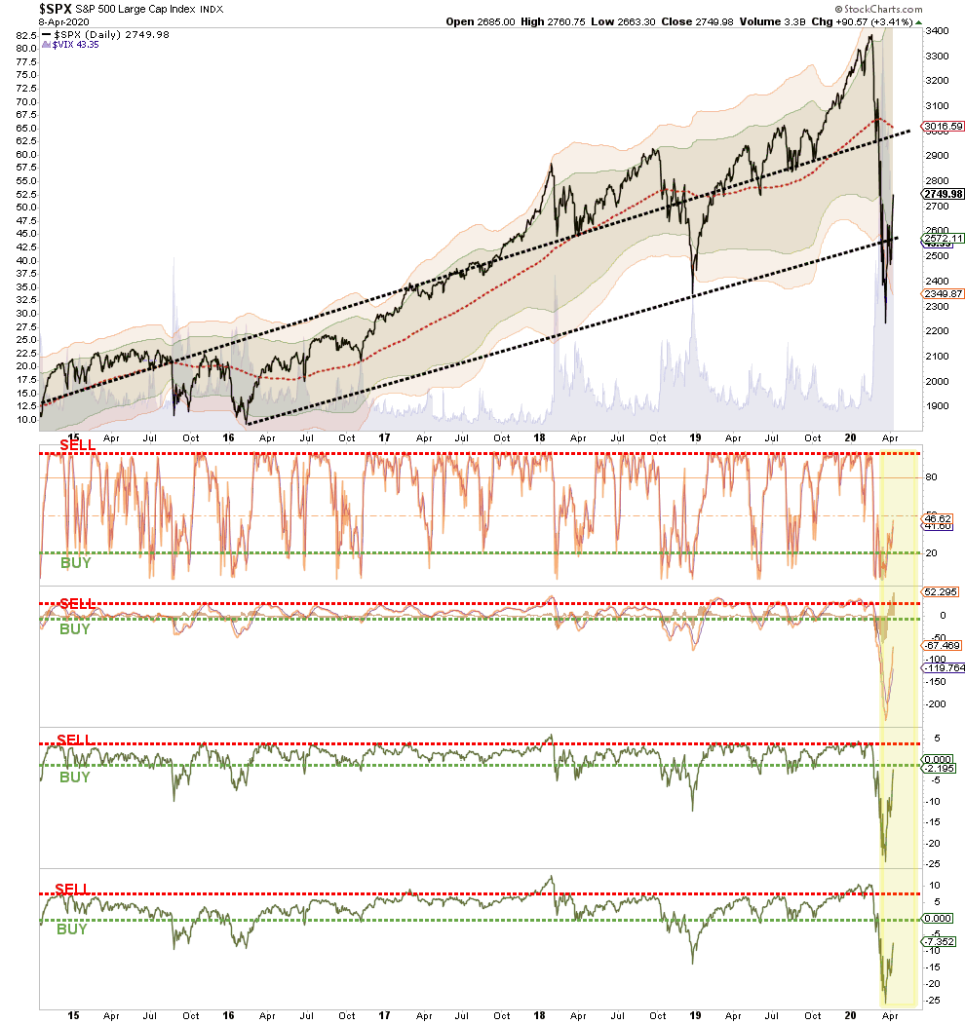
- The chart above shows a variety of measures from the Volatility Index ($VIX) to momentum and deviation from intermediate term moving averages.
- The bear market collapse has pushed all of the longer-term conditions to more extreme oversold levels. Again, such was supportive of a strong reflexive rally, While there is more room for these indicators to rise, it also doesn’t mean the market can’t fail and retest lows before a continuation of the rally progresses.
- The deep oversold conditions are coincident with previous bear markets and can remain oversold for quite some time.
- Be patient. We are likely going to have a series of corrections back to support that allow for better entry points to add positions.
Weekly
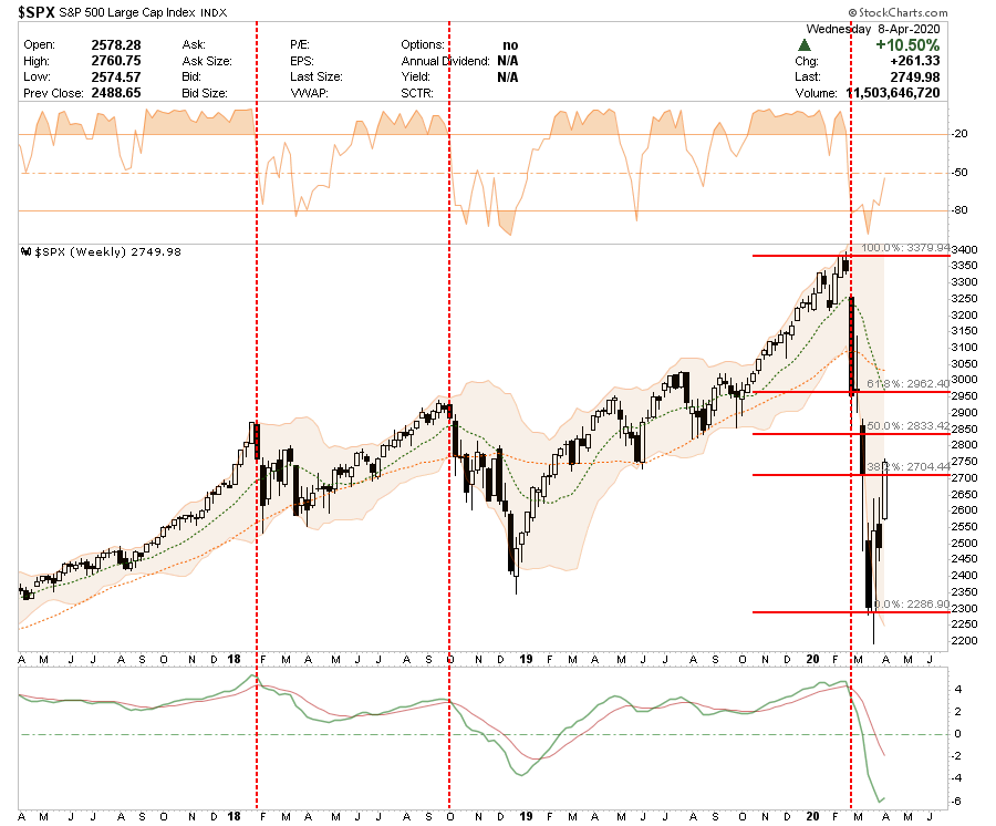
- On a weekly basis, the market backdrop remains much more bearish with a weekly sell signal very much still intact.
- However, that sell signal is extremely extended and has started to reverse very slightly. This will take some time, and a lot of price improvement to suggests the bear market is over.
- The Fibonacci retracement also suggests the 2800 area on the S&P 500 as the logical retracement zone for this initial reflexive rally.
- Remain patient. Odds are high that with the slate of bad economic and earnings reports coming, the risk is to the downside.
Monthly
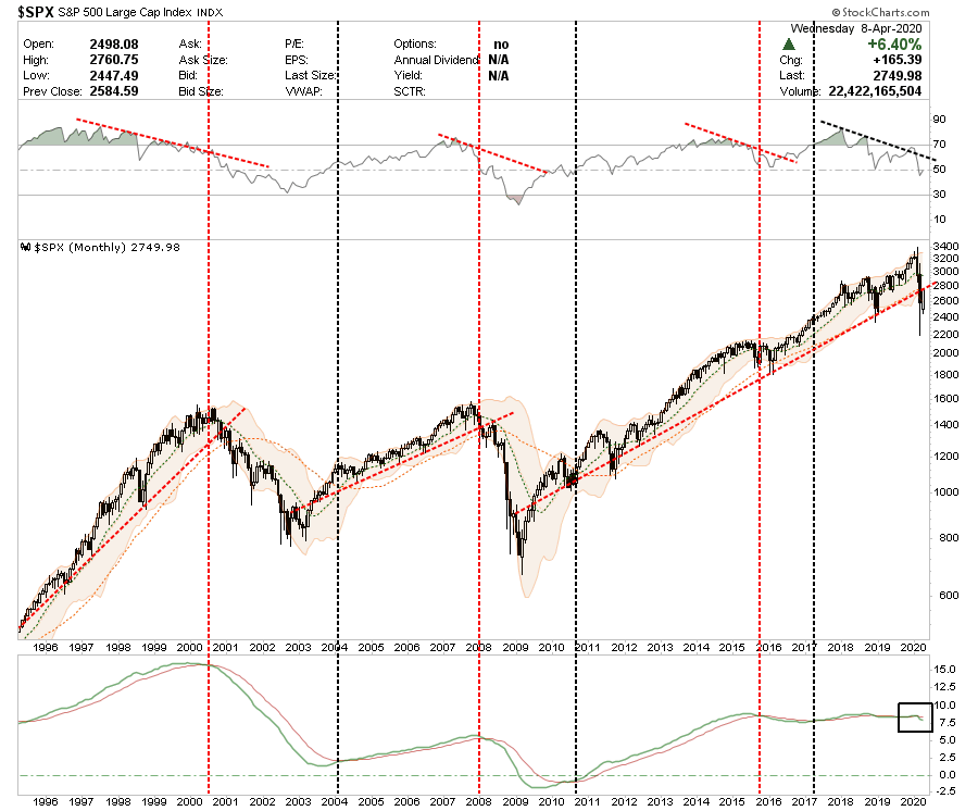
- On a monthly basis the bearish backdrop is evident.
- First, from an investment standpoint, look at the previous two bull market advances compared to the current Central Bank fueled explosion. The current mean reversion has broken the long-term bullish trendline from the 2009 lows. Previous breaks of long-term trends resulted in much deeper corrections than what we have seen currently.
- Secondly, the market is trading MORE THAN 2-standard deviations below the long-term mean which was ideal for a reflexive rally BUT the long-term monthly SELL signal has now been triggered.
- Importantly, MONTHLY data is ONLY valid at the end of the month. Therefore, these indicators are VERY SLOW to turn. Use the Daily and Weekly charts to manage your risk. The monthly and quarterly chart (below) is to give you some idea about overall risk management.
- However, the important takeaway is that the bull market is OVER. At least for now. This suggests that investors should remain underweight equities and risk adverse until the trends begin to reverse.
Quarterly
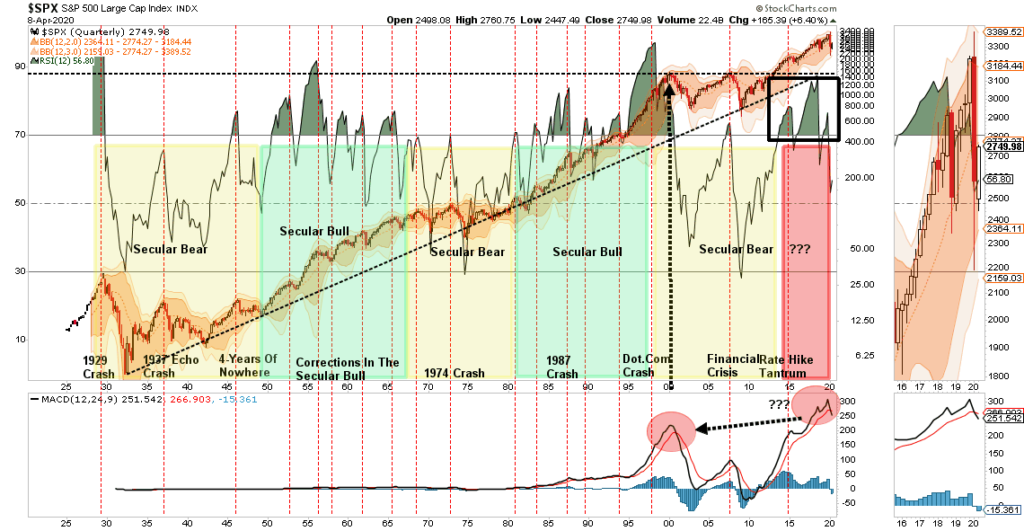
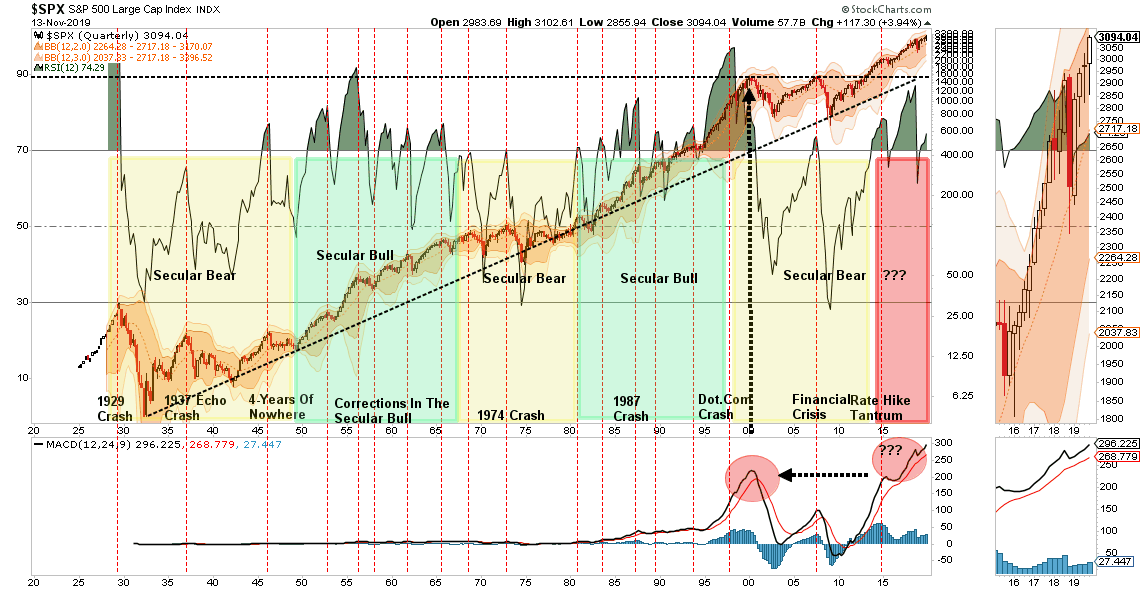
- As noted above, this chart is not about short-term trading but long-term management of risks in portfolios. This is a quarterly chart of the market going back to 1920.
- Note the market has, only on a few rare occasions, been as overbought as it was earlier this year. The recent decline has pushed the market below its long-term quarterly moving average. The recent rally is now beginning to test resistance at that level. A failure will not be surprising given the QUARTERLY sell signal has been triggered.
- Secondly, in the bottom panel, the market has never been this overbought and extended in history, previous corrections last much longer than one month and were very brutal to investors before conditions were reversed.
- As an investor it is important to keep some perspective about where we are in the current cycle, there is every bit of evidence this mean reverting event has more to go before we are done. Timing is always the issue which is why use daily and weekly measures to manage risk.
- Don’t get lost in the mainstream media. This is a very important chart.
S&P 500 vs Yield Curve (10yr-2yr)
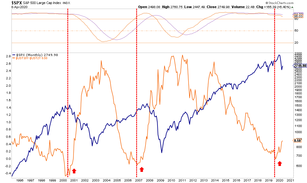
- The chart above compares the S&P 500 to the 10-2 year yield spread.
- The relationship between stocks and bonds is the visualization of the “risk/reward” trade off.
- When investors are exceedingly bullish, money flows out of “safe” assets, i.e. bonds, into “risk” assets, i.e. stocks.
- What the chart shows is that when the yield-spread reverses, which is normally coincident with the onset of a recession, such tends to mark peaks of markets and ensuing corrections in stock prices.
- The reversion of the yield curve says a recession started in March.
- The average recession last 12-18 months and bear markets tend to co-exist during that time frame.
- The END of bear markets occur when the yield spread peaks and begins to decline.
- Pay attention, all of the market indicators currently suggest risk outweighs rewards and patience will likely be rewarded with a better opportunity to add exposure.
- As with the Monthly and Quarterly charts above, this is a “warning” sign to pay attention and manage risk accordingly.
