A technical review of the S&P 500 using daily, weekly and monthly charts to determine overbought, oversold, and risk/reward scenarios for carrying equity exposure.
Did the market rout this past Monday change the overbought, extended, and bullish tenor of the market? Was that the “buy the dip” moment? Or, is there potentially more correction to come?
Let’s take a look at the charts.
Daily

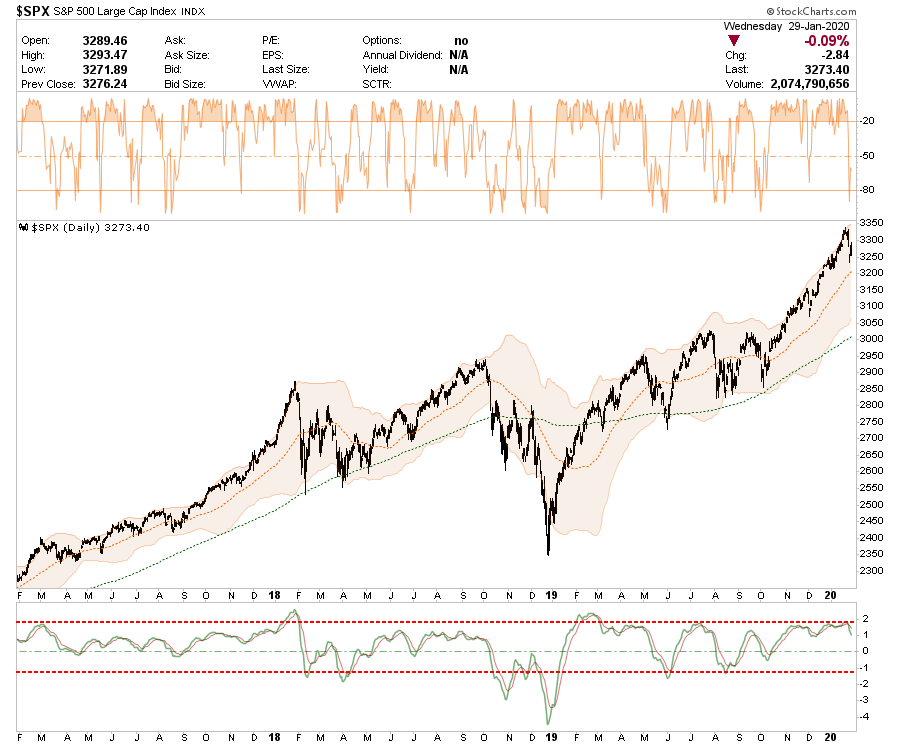
- The S&P 500 had broken out to new highs which is bullish. However, the more extreme overbought condition of the market remains in terms of deviation from its 50-dma.
- On a very short basis, the market did get oversold (top panel) which suggested the reflexive rally we saw on Tuesday and Wednesday morning.
- However, the “sell signal” in the lower panel suggests that more corrective action is likely over the next week or so.
- To add exposure to portfolios, the ideal setup would be for a successful test of the 50-dma which works over the overbought condition seen in the next two charts.
Daily Overbought/Sold

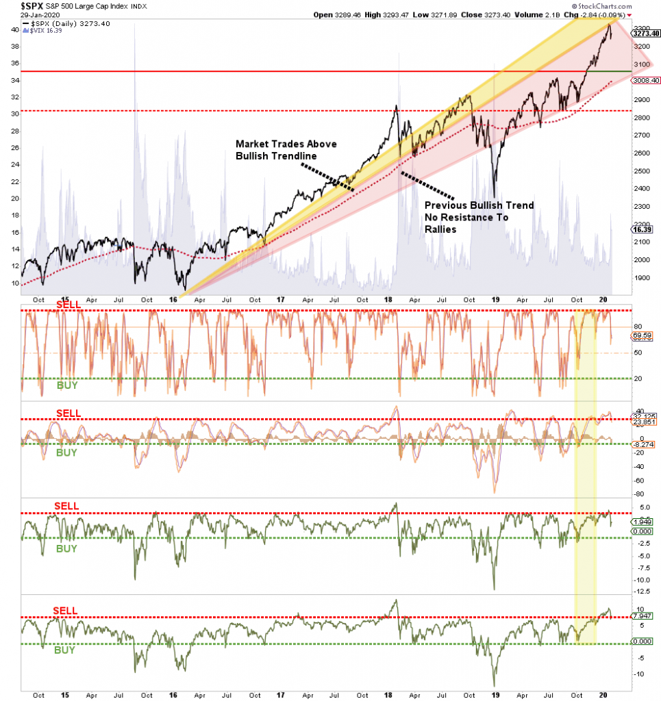
- The chart above shows a variety of measures from the Volatility Index ($VIX) to momentum and deviation from intermediate term moving averages.
- We noted back in September and early October that a rally into year-end was likely. At that time all of the indicators had pushed down into their respective “BUY” ranges.
- Now that situation has reversed, with all indicators back into their respective “SELL” ranges.
- While the correction on Monday did start reversing those more extreme overbought conditions, there is still more work to be done before a “buying” opportunity is available. This is not “bearish” or suggestive of a “crash” coming, but rather just suggesting that currently the risk/reward for adding additional equity risk is not optimal. A consolidation of price would also resolve the overbought condtions.
- Be patient for a correction back to support that allows for a better entry point for trading positions.
Weekly

- On a weekly basis, the market backdrop remains bullish with a weekly buy signal still intact.
- However, that buy signal is extremely extended and has started to reverse with the market extremely overbought on a weekly basis.
- This is an ideal setup for a bigger correction much like we saw in February 2018, and September of 2018.
- With the market trading above 2-standard deviations of the intermediate term moving average, some caution is suggested in adding additional exposure. A correction is likely over the next month or so that will provide a better opportunity. Remain patient for now.
Monthly

- On a monthly basis we can see a pattern emerging as well as extremes.
- First, from an investment standpoint, look at the previous two bull market advances compared to the current Central Bank fueled explosion. When the next mean reverting event occurs, make no mistake, it will be brutal for investors.
- Secondly, the market is trading MORE THAN 2-standard deviations above the long-term mean and is still flirting with reversing the “buy signal” to a sell.
- As noted in the red lines, the market continues to trade in a bullish trend from the 2009 lows, but with the market pushing back up into more extreme overbought conditions long-term, there is not likely a lot left to the current bull market.
- Importantly, MONTHLY data is ONLY valid at the end of the month. Therefore, these indicators are VERY SLOW to turn. Use the Daily and Weekly charts to manage your risk. The monthly and quarterly chart (below) is to give you some idea about overall risk management.
- However, the important takeaway is that the bull market is still largely intact but there is some deterioration around the edges. This suggests that investors should remain invested for now, but maintain risk controls accordingly.
- All good things do eventually come to an end.
Quarterly

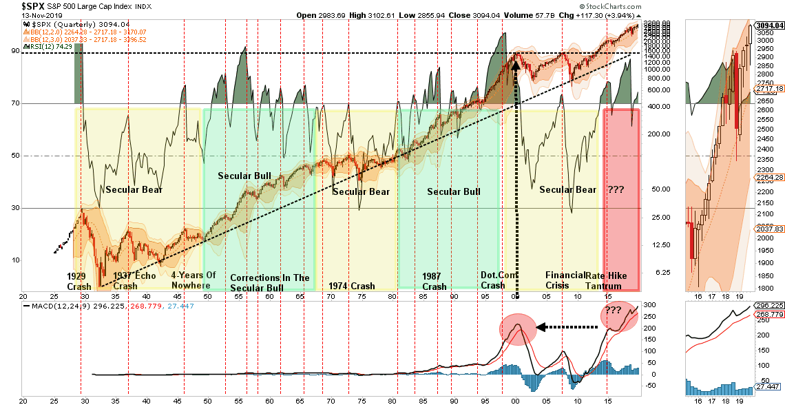
- As noted above, this chart is not about short-term trading but long-term management of risks in portfolios. This is a quarterly chart of the market going back to 1920.
- Note the market has, only on a few rare occasions, been as overbought as it is currently. In every single case the reversion was not kind to investors.
- Secondly, in the bottom panel, the market has never been this overbought and extended in history,
- As an investor it is important to keep some perspective about where we are in the current cycle, there is every bit of evidence that a major mean reverting event will occur. Timing is always the issue which is why use daily and weekly measures to manage risk.
- Don’t get lost in the mainstream media. This is a very important chart.
S&P 500 vs Yield Curve (10yr-2yr)

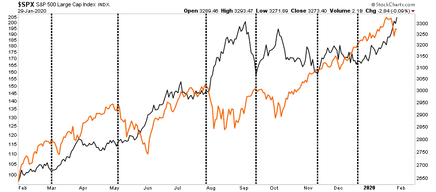
- The chart above compares the S&P 500 to the 10 year yield.
- The relationship between stocks and bonds is the visualization of the “risk/reward” trade off.
- When investors are exceedingly bullish money flows out of “safe” assets, i.e. bonds, into “risk” assets, i.e. stocks.
- What the chart shows is that when the ratio between stocks and bonds elevates sharply, this tends to mark peaks of markets and ensuing corrections in stock prices,
- While the recent spike of the ratio has resulted in a correction just yet, it doesn’t mean it won’t.
- Pay attention, all of the market indicators currently suggests risk outweighs rewards and patience will likely be rewarded with a better opportunity to add exposure.
- As with the Monthly and Quarterly charts above, this is a “warning” sign to pay attention and manage risk accordingly. It does NOT mean sell everything and go to cash. Currently the Daily and Weekly charts suggest the bullish trend is intact, so we remain invested, but hedged.


