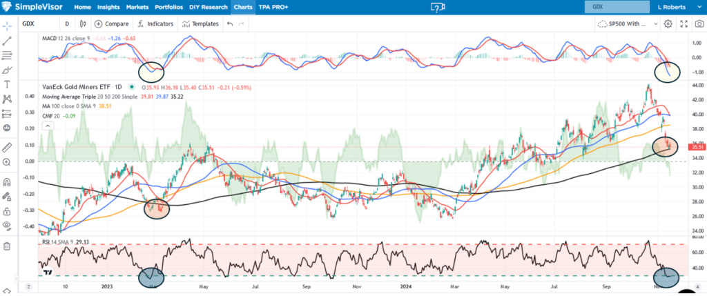
Many investors consider a decline of 20% or more to be a bear market. We can debate the merit of the random 20% figure, but according to that definition, gold miners, down 25% from its peak on October 22, are in a bear market. We have noted numerous times in the last month or so that gold and gold miners were getting very overbought based on their technicals. Furthermore, our recent article – Why Is Gold Surging? – highlights how the price of gold is diverging from its fundamentals. As we wrote:
The speculative atmosphere can continue, but beware because gold is getting overbought and deviating from its long-term fundamental drivers. When speculative momentum fails, gold may eventually catch down to its fundamental relationships.
The SimpleVisor graph below shows the technical situation of gold miners to better gauge what may be in store for miner share prices. The three circles compare the current environment to early 2023, the last time gold miners (GDX) were this oversold. Gold miners are sitting on top of their 200-day moving average with very oversold MACD and RSI readings. In 2023, GDX had a double bottom before a 20+% rally pushed it above the prior peak. Gold miners are due for a bounce. The bounce in 2023 was relatively short-lived. If gold is genuinely in a longer-term bull market and gold miners follow the price of gold, the current technical setup argues this is an excellent time to take a chance on gold miners. Conversely, trade with caution if gold is rallying for speculative reasons and not underlying fundamentals.
What To Watch Today
Earnings

Economy

Market Trading Update
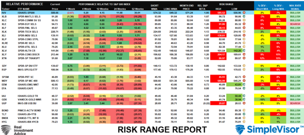
Yesterday, we discussed the recent market reversal, which was expected after a sharp post-election jump. Such a pullback should be expected when markets are as overbought as they were. However, that pullback was needed to provide a setup for the continuation of the year-end rally. However, as noted in this weekend’s Bull Bear Report, gold and bonds have gotten very oversold as portfolios were “re-risked” on the post-election outcome. As we showed in the Risk/Reward analysis, the Dollar has gotten very overbought and extended, with Gold and Gold Miners pushing deeply oversold conditions.
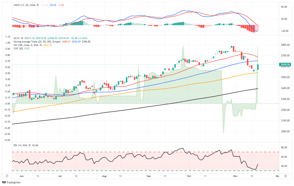
Gold currently held support at the 100-DMA and is oversold enough for a decent reflexive rally into year-end. However, gold must contend with overhead resistance at the 20 and 50-DMA. With momentum and relative strength decently oversold, a tradeable rally is likely. However, we suspect that rallies will be met by sellers who bought late into the run-up and are now trapped in their positions.
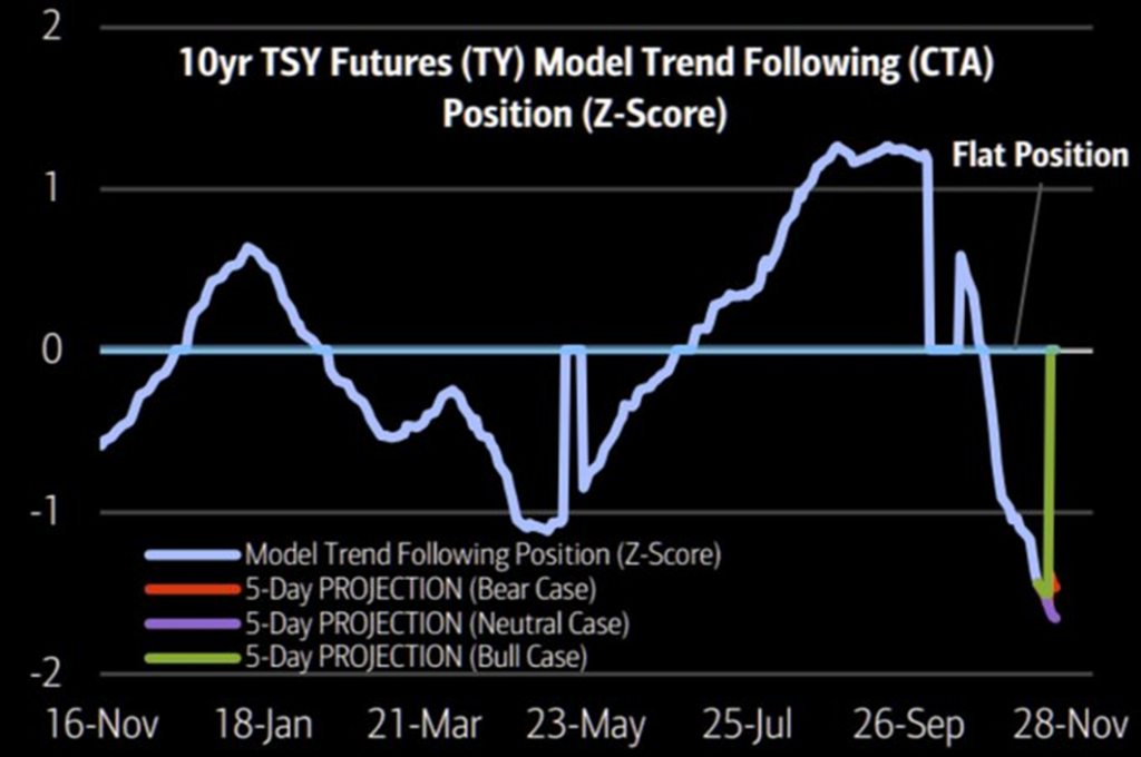
Bonds are also very oversold, with a very large net-short position by commercial traders, which historically is a decent setup for a reversal rally. All that is needed is both a dollar reversal and a catalyst, like some weaker economic data over the coming month.
Bonds are sitting on support that dates back to the June lows, but they will have to deal with multiple levels of overhead resistance. However, given the current oversold conditions, a near-term rally to 93-94 is likely.

Bond prices are driven by position traders in the short term, but in the long term, the economic fundamentals still favor higher prices over the next several years.
Trade accordingly.

Kobeissi’s “Shocking Stat”
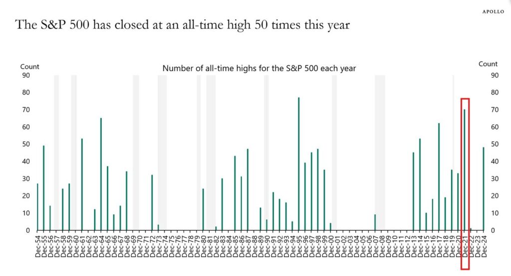
The graph below, courtesy of Apollo Management, shows the number of record highs per year. In 2024, with a month and a half remaining, the market has already hit a record high on 50 days. As highlighted in red, 2021 was the last year we saw 50 or more record highs. The Kobeissi Letter, which shared the graph below, asks what happened in 2022 and the years following other instances of 45 or more record highs. Per the Kobeissi Letter:
So what happened in 2021 after the S&P 500 hit 70+ all time highs? It was followed by the bear market of 2022 where many tech stocks fell over -50%. In fact, the entire 2021 gain was undone in that following year.
Since 2000, every year with 45+ all time highs has been followed by a red year. The average decline in this time was -8.8%.
Industrials vs. Materials- A Tale Of Two Cyclicals
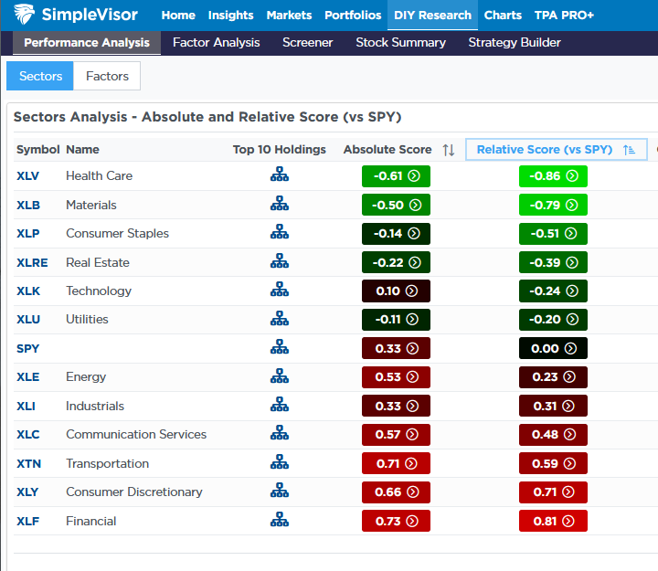
The industrial and material sectors are often well correlated as they tend to be good barometers of the economy. However, materials shares have recently lagged behind the industrial sector significantly, giving us two different economic outlooks. The first graphic below, courtesy of SimpleVisor, shows that materials are now oversold versus the S&P 500, while industrials are overbought. The next set of graphics helps better show the divergence from the normal relationship between the two sectors.
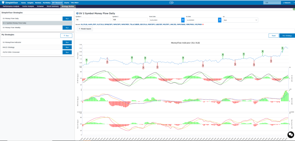
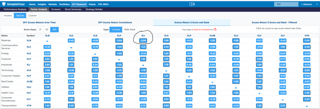
The blue line in the second graphic charts the price ratio of XLI vs XLB. As shown, the relationship was steady until a few weeks ago, when XLI started to outperform XLB grossly. The three technical indicators below the ratio chart show that the relationship is getting long in the tooth and is likely due for a reversal. The third graphic highlights that the price ratio between the two sectors is now 2.64 standard deviations from its norm based on the last year of trading. Lastly, the final table provides us the relative scores on sector-to-sector relationships instead of sector-to-market. The score of .56 highlights that materials are grossly oversold versus industrials.
If you click the Top 10 Holdings in the sector analysis shown in the first graphic, you can see the top ten holdings of each ETF to get a better understanding of why they are diverging. Moreover, the leaders and laggards may provide a few trade ideas. Charting two stocks in the two-symbol money flow (similar to the second graphic) will give a technical backdrop for any relationship you wish to see.

Tweet of the Day
“Want to achieve better long-term success in managing your portfolio? Here are our 15-trading rules for managing market risks.”
Please subscribe to the daily commentary to receive these updates every morning before the opening bell.
If you found this blog useful, please send it to someone else, share it on social media, or contact us to set up a meeting.


