In this 03-25-22 issue of “Inverted Yield Curve History Should Worry Bulls.”
- Market Review & Update
- Inverted Yield Curve History
- Portfolio Positioning
- Sector & Market Analysis
Follow Us On: Twitter, Facebook, Linked-In, Sound Cloud, Seeking Alpha
Need Help With Your Investing Strategy?
Are you looking for complete financial, insurance, and estate planning? Need a risk-managed portfolio management strategy to grow and protect your savings? Whatever your needs are, we are here to help.
Schedule your “FREE” portfolio review today.

Weekly Market Recap With Adam Taggart
Stocks Rally As Fed Hikes Rates
Last week, we discussed the difference a week can make.
“We previously stated that any rally above the downtrend would test the 50- and 200-dma averages. That test occurred on Friday, with the index clearing the 50- and sitting just below the 200-dma. With markets back to short-term overbought, it may be challenging for markets to clear resistance next week.”
While the market did advance this week above the downtrend line, the market is pushing more extreme overbought conditions. While this does not mean a “sell-off” is imminent, it does suggest either some consolidation or a pullback to support is likely. There is some resistance approaching overhead the market will likely struggle with next week.
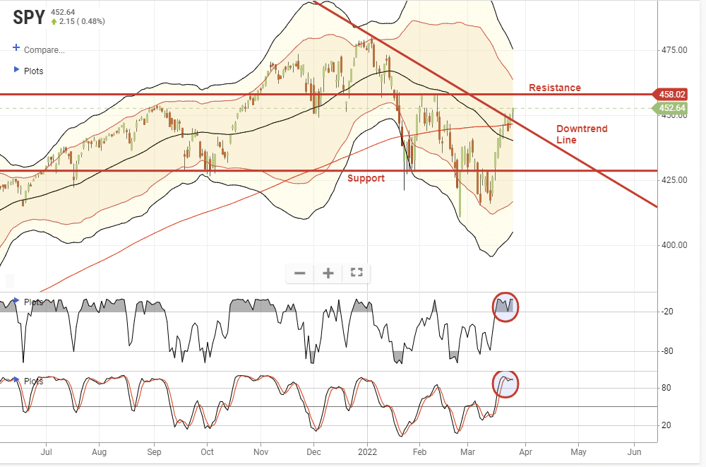
As we head into the end of the month, a further push to the upside is not out of the question as mutual funds, pensions, and investment firms rebalance portfolios for the end of the quarter. The recent surge in interest rates has decreased the bond side of allocation funds. Also, the decline in the markets since the beginning of the year has fund managers at reduced equity levels, overweight cash, and negatively biased.
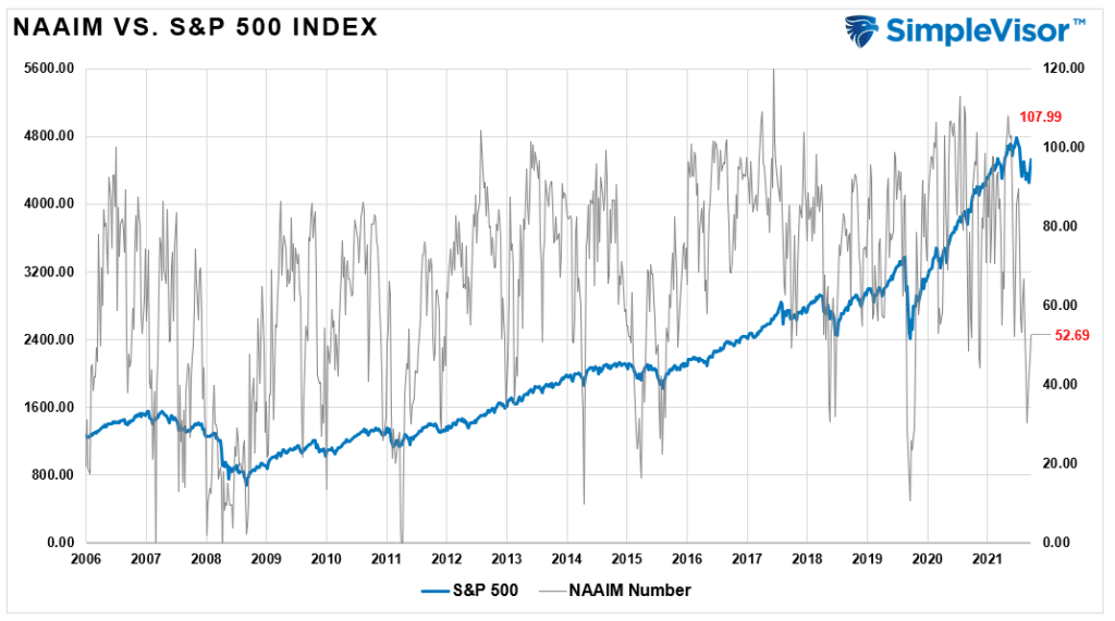
That rebalancing could support stock prices through the end of next week. However, as is always the case, there is no guarantee. Therefore, we continue to suggest practicing risk management guidelines and using this rally to rebalance risk accordingly.
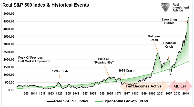
While the short-term analysis is more bullishly-biased, don’t forget we are heading into a monetary-tightening cycle with the most egregiously deviated market from its exponential growth in history. From this view, the bearish case certainly has teeth and a recession could be the trigger.
Is this what the yield curve is warning us of?
Inverted Yield Curve? What Is That?
It’s always interesting when the yield curve inverts. Almost immediately, we see suggestions it is wrong this time. To wit:
“The Federal Reserve has its fingerprints all over the curve. The central bank is raising interest rates, which has the relatively direct impact of lifting shorter-term rates. To a lesser degree, the Fed may also have an impact on longer-term rates because it snatched up a lot (over $3 trillion!) of U.S. Treasuries since the beginning of the pandemic.” – Yahoo Finance
As a quick recap, a yield curve inversion happens when short-term interest rates are higher than longer-term rates. That inversion suggests something is wrong economically. As David Kelly from JP Morgan quoted for the Financial Times:
“An inverted yield curve doesn’t do much to the economy, but it’s a very bad sign. The only reason you’d buy a long-term bond at a lower yield than a short-term one was if you thought yields were going to fall . That usually happens when most people think the Fed has gone or will go, too far.”
Notably, when the 10-year interest rate was lower than the 2-year rate, such has preceded the last eight recessions. Such also occurred when most suggested a recession wasn’t possible due to “full employment,” as shown.
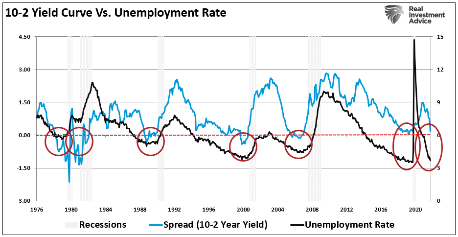
While such seems counter-intuitive, it isn’t.
“The current case for a Fed mistake in terms of the historically low unemployment rate. The economy has to slow somewhat in the not-too-distant future, because at 3.8 per cent unemployment. ‘We’re out of workers. It’s hard to produce more when there is no one to produce it.’ Such might happen just as the US central bank pushes rates to their peak, exaggerating the slowdown to the point of recession.” – The Financial Times
Such is why we are adding bonds.
This Week’s MacroView

Inverted Yield Curve History
When looking at economic statistics, it certainly appears to be little risk of recession. The 6-charts below are the economic measures most viewed by economists.
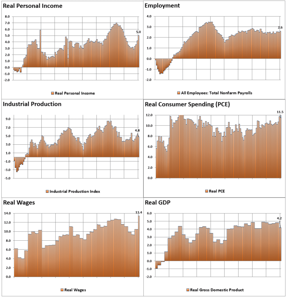
Clearly, there are NO signs of recession:
- 5% annualized real personal income growth
- 2.6% annualized employment growth
- 4.8% annualized industrial production growth
- 11.5% annualized real PCE growth
- 13.4% annualized real wage growth
- 4.8% annualized real GDP.
Yet, the yield curve is close to inverting.
So, which indicator is right?
Should you be betting on the economic data or the “yield curve?”
My apologies. I forgot to add the X-Axis to the charts above. (Not really, it was intentional)
That time frame is 1991 though 1999.
I don’t need to remind you what happened next.
How about the stats in December 2007 when the next recession officially started?
- 1.4% annualized real personal income growth
- 0.8% annualized employment growth
- 2.2% annualized industrial production growth
- 4.6% annualized real personal consumption expenditure growth
- 5.7% annualized growth in real wages
- 2.0% annualized real GDP.
Again, there is no recession visible. Yet, the yield curve was sending a warning.
What about currently. Here is the 6-panel chart of the current economic cycle to compare to the chart above.
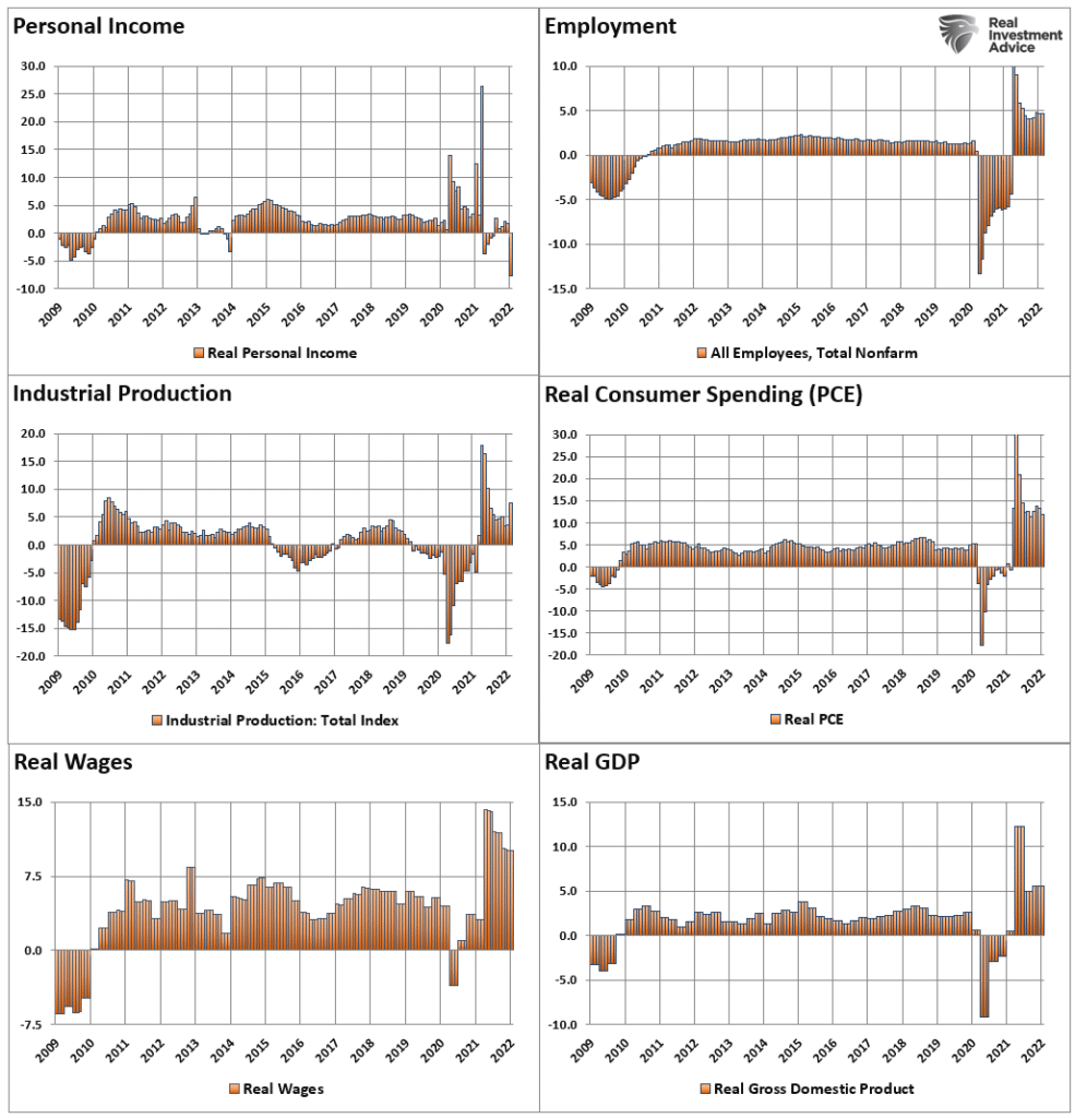
Except for personal incomes, which show the reversal of liquidity from direct government interventions, the economic data is the strongest in years.
Yet, the yield curve is near inversion. As Ed Al-Hussainy of Columbia Threadneedle put it:
“Every time the 10/2 curve inverts, market participants come out with a long list of reasons why the curve’s slope tells us little about the current environment and should have no correlation with a recession. We all know what happens subsequently.”
For the past half-century or so, what happens subsequently is a recession.
Which indicator should you bet on? The answer is pretty straightforward.
The Problem Is No One Ever Says Sell
In March 2019, Mark Kolanovic of J.P. Morgan penned:
“Historically, equity markets tended to produce some of the strongest returns in the months and quarters following an inversion. Only after [around] 30 months does the S&P 500 return drop below average,”
Just 12-months later, the economy was in the deepest recession since the great depression, and stocks plunged by 35%.
There is “never a recession in sight” prior to its start. Such is because of the lag in economic data revisions. Advice to ignore inverted yield curves because “this time is different,” and may seem good advice for while, it historically isn’t.
The problem is that no one ever says “sell.”
While markets gained between the initial yield curve inversion and the peak of the market, those gains, plus more, got wiped out in the ensuing decline. By the time the selling was over, portfolio values had reverted to where they were roughly a decade earlier.
Since most mainstream financial advice never suggests selling, investors had no clue that going to cash in 1998 saved them much grief and years of losses to recover.
Notably, the “Dot.com” crash was considered an anomaly, a once-in-a-100-year event that would not replicate again.
Unfortunately, 4-years later, in 2006, the media again told investors to ignore the yield curve inversion. It was a “Goldilocks economy,” and “sub-prime mortgages were contained.” (Notably, many individuals who told investors to stay invested leading up to the 2000 peak were gone from the industry. However, a whole new crop of media gurus and advisors told investors to again “ignore the inverted yield curve” in 2007.)
For a second time, had investors sold when the yield curve inverted, the amount of damage avoided more than paid off for the small gains missed as the market peaked.
A Little More Inverted Yield Curve History
The quad-panel chart below shows the 4-previous periods where 50% of 10-different yield curves inverted. I have drawn a horizontal red dashed line from the first point where 50% of the 10-yield curves tracked became inverted. I have also denoted the point you should have sold and the subsequent low.
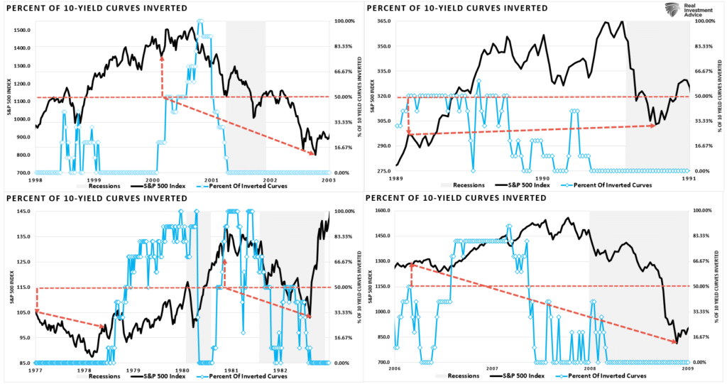
As you can see, in every case, the market did rally a bit after the initial reversion. However, had you reduced your equity-related risk, not only did you bypass a lot of market volatility (which would have led to investor mistakes) but ended up better off than those trying to “ride it out.”
In 2019, the yield curve inverted again leading to a 35% correction and recession in 2020.
That’s just history
Currently, only 10% of the 10-spreads we track are inverted. As such, there is no reason to become overly defensive just yet. But you should be at least paying attention.
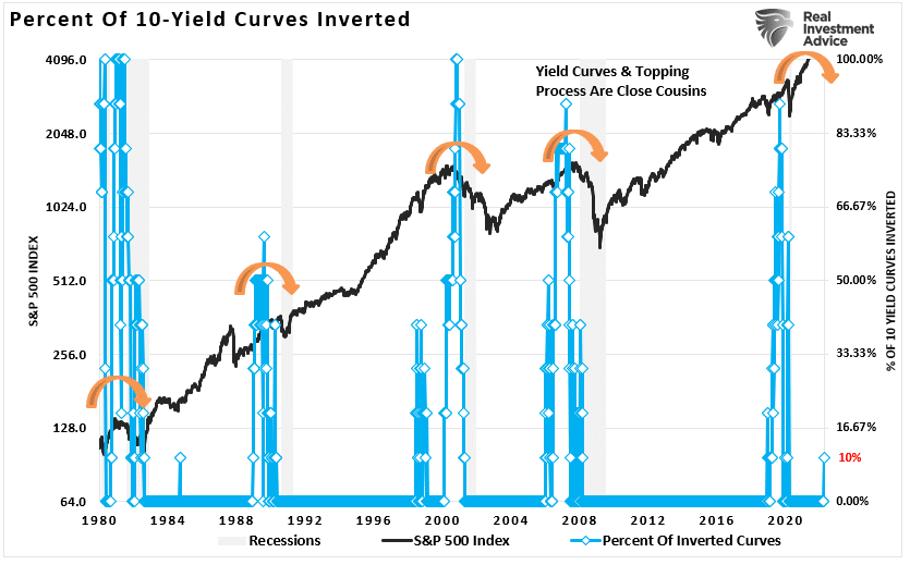
While the media is already rife with headlines about ignoring the inverted yield curve warning, history suggests it is unwise.
As the Fed hikes rates, more curves will invert.
More importantly, with economic growth slowing rapidly, inflation running at the highest levels since 1980, and consumers tapped, recession risk is likely higher than analysts realize.
The yield curve is sending a message which we shouldn’t ignore, and it is a good bet that “risk-based” investors will act sooner rather than later. Of course, the Fed’s actions will exacerbate the economic contraction.
While using the “yield curve” as a “market timing” tool is unwise, it is just as foolish to dismiss the message entirely.
Moreover, I do not suggest you sell everything and go to cash today. However, history is pretty clear that you will likely not miss much if you do.

Portfolio Update
This week’s message is central to our core investment philosophy of heeding risks as they develop. As noted, only 10% of the tracked yields are inverted. There is currently no legitimate reason to be overly cautious in portfolios. However, once the number of inverted yield curves exceeds 50%, that advice will change.
There is little doubt that such will eventually occur as the Fed engages in a more aggressive monetary tightening campaign from hiking rates to reducing their balance sheet. The extraction of liquidity from the markets historically aligns with deeper market corrections, credit-related events, or recessions.
We continue to pay attention to what the market is telling us. The rally we expected finally materialized. We previously suggested using any rally to rebalance risk, adjust allocations, reconsider investment strategies as we deal with a changing environment.
From that view, we have previously rebalanced our energy exposures and added to growth names at recent lows. This week, we trimmed back positions that were overweight relative to their model, added to our longer-duration bonds, and added a precious-metals exposure.
However, we are still significantly underweight equity risk with sizable cash holdings to protect client portfolios even with those changes.

With quarter-end rebalancing approaching, I would not be surprised to see a continued rally. However, as the Fed becomes more aggressive, I remain concerned there could be a sizable increase in volatility.
Continue to follow the basic portfolio management guidelines for now.
- Tighten up stop-loss levels to current support levels for each position.
- Hedge portfolios against major market declines.
- Take profits in positions that have been big winners
- Sell laggards and losers.
- Raise cash and rebalance portfolios to target weightings.
Notice, nothing in there says, “sell everything and go to cash.”
See you next week.
Market & Sector Analysis
S&P 500 Tear Sheet

Relative Performance Analysis
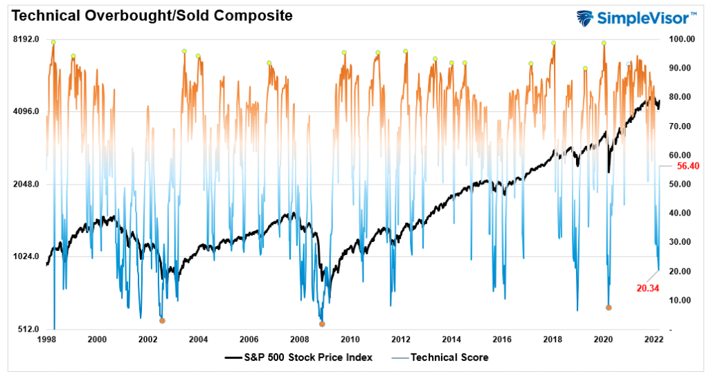
Technical Composite
The technical overbought/sold gauge comprises several price indicators (RSI, Williams %R, etc.), measured using “weekly” closing price data. Readings above “80” are considered overbought, and below “20” are oversold. The current reading is 56.40 out of a possible 100.
Portfolio Positioning “Fear / Greed” Gauge
Our “Fear/Greed” gauge is how individual and professional investors are “positioning” themselves in the market based on their equity exposure. From a contrarian position, the higher the allocation to equities, to more likely the market is closer to a correction than not. The gauge uses weekly closing data.
NOTE: The Fear/Greed Index measures risk from 0-100. It is a rarity that it reaches levels above 90. The current reading is 60.14 out of a possible 100.

Sector Model Analysis & Risk Ranges
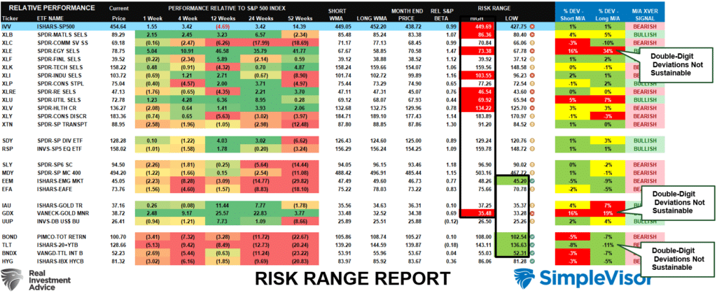
How To Read This Table
- The table compares each sector and market to the S&P 500 index on relative performance.
- “MA XVER” is determined by whether the short-term weekly moving average crosses positively or negatively with the long-term weekly moving average.
- The risk range is a function of the month-end closing price and the “beta” of the sector or market. (Ranges reset on the 1st of each month)
- Table shows the price deviation above and below the weekly moving averages.
- The complete history of all sentiment indicators is on under the Dashboard/Sentiment tab at SimpleVisor
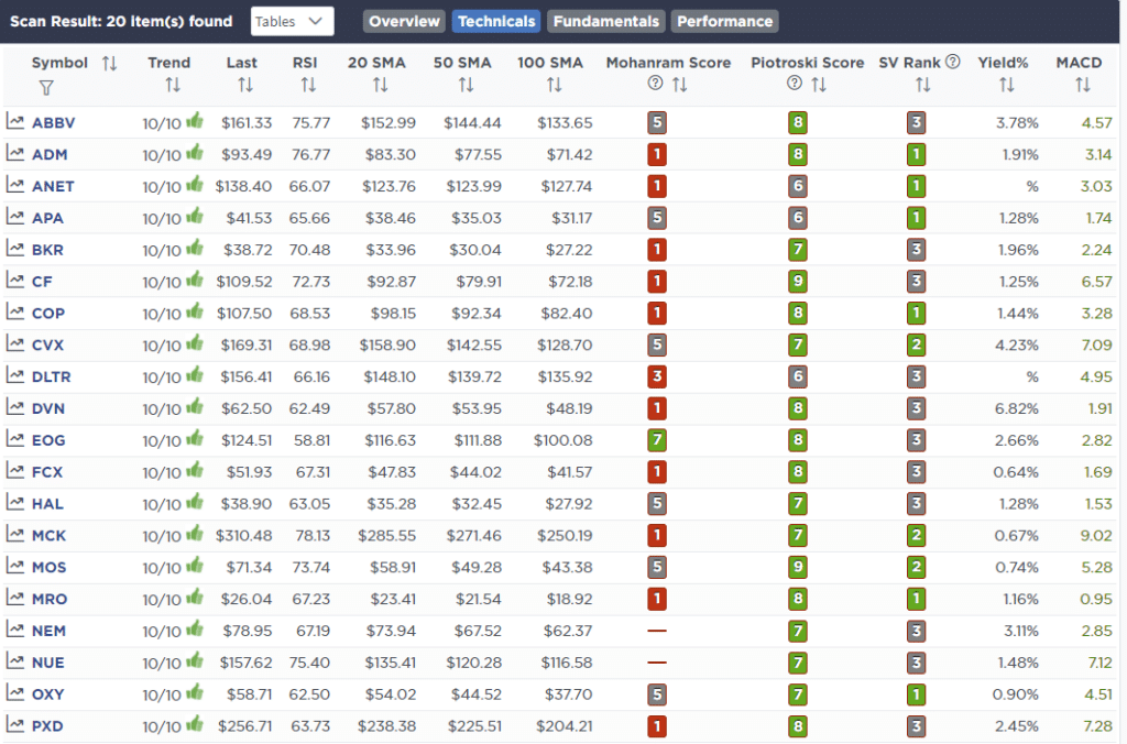
Weekly Stock Screens
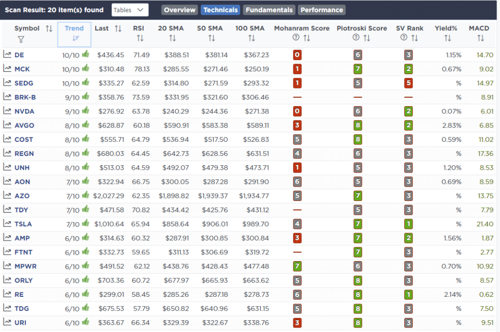
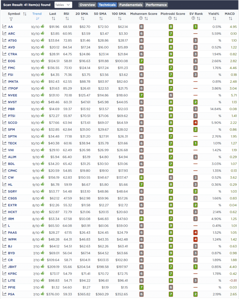
Each week we will provide three different stock screens generated from SimpleVisor: (RIAPro.net subscribers use your current credentials to log in.)
This week we are scanning for the Top 20:
- Relative Strength Stocks
- Momentum Stocks
- Technically Strong With Strong Fundamentals
These screens generate portfolio ideas and serve as the starting point for further research.
(Click Images To Enlarge)
RSI Screen
Momentum Screen
Technical & Fundamental Strength Screen
SimpleVisor Portfolio Changes
We post all of our portfolio changes as they occur at SimpleVisor:
March 23rd
We are adding 2% of the portfolio to our existing Treasury Bond position (TLT.) This is after selling 2% of the position on a trade made in February. On Friday, we are posting a blog explaining why we are adding bonds to our portfolio now for both hedging equity risk as well as longer-term capital appreciation.
“The current surge in bond yields has taken the 10-year bond to extreme oversold levels. The 10-year rate is now 4-standard deviations above its 52-week moving average and is approaching the top of the long-term downtrend channel from 1980.”
Equity & ETF Models
- Increase TLT by 2% of the portfolio to a 10% weighting
March 24th
As we discussed previously gold has been the process of completing a “cup and handle” technical pattern and a breakout above the recent high would portend to further upside. With the recent pullback, gold is back to oversold conditions and is close to triggering a buy signal. As such we are adding a 2% position in IAU to both models which we will scale higher if the trade begins to work as expected.
We are also taking profits in two VERY overweight positions and reducing them back to normal model weights. Abbvie (ABBV) we are trimming from 4.9% to 4.0% of the portfolio, and Ratheon Technologies (RTX) from 2.5% to 2%.
Equity Model
- Add 2% of the portfolio value in IAU
- Reduce ABBV to 4% of the portfolio.
- Reduce RTX to 2% of the portfolio.
ETF Model
- Add 2% of the portfolio value in IAU

Lance Roberts, CIO
Have a great week!
