Inside This Week’s Bull Bear Report
- Inflation Print Keeps Fed On Track
- How We Are Trading It
- Research Report –Grant Says Rates Going Much Higher. Is He Right?
- Youtube – Before The Bell
- Market Statistics
- Stock Screens
- Portfolio Trades This Week
Fed Keeps Bias To Cut Rates
Last week, we noted that the market remains bullish with a limited bid to the upside. To wit:
“While the market set marginal new all-time highs this past week, the upside likely remains somewhat limited in the near term, given the more overbought conditions. On Friday, the market flipped back onto a MACD “buy signal,” suggesting that the rally remains firmly intact, with the 20-DMA continuing to act as the primary support. Furthermore, volatility remains significantly suppressed, indicating that traders are not worried about a significant decline anytime soon. However, with that said, the FOMC meeting and inflation reports are next week, which will have an outsized impact on the broader market. Therefore, continue to manage risk accordingly.”
As discussed below, that inflation report and Fed meeting sent stocks surging to all-time highs. While the bullish trend remains intact, along with a MACD “buy signal,” which suggests an increased allocation to equity exposure, we have some concerns.
While the market is making all-time highs as momentum continues, its breadth is narrowing. The number of stocks trading above their respective 50-DMA continues to decline as the market advances, along with the MACD signal. Furthermore, the NYSE Advance-Decline line and the Relative Strength Index (RSI) have reversed, adding to the negative divergences from a rising market. While this does not mean the market is about to crash, it does suggest that the current rally is weaker than the index suggests.
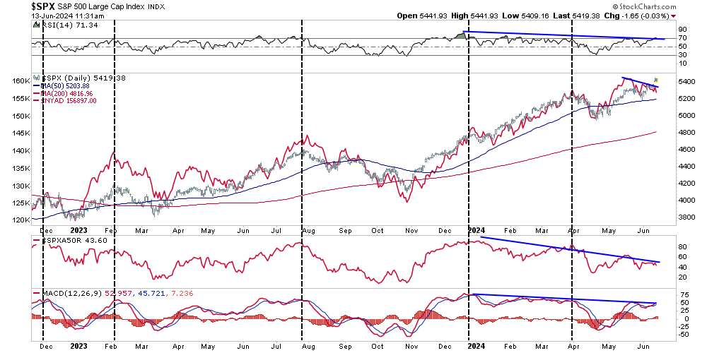
These negative divergences have often preceded short- to intermediate-term corrective market actions. Could this time be different? Sure. The entire bet of the market remains mired in the Fed cutting rates. That narrative is still alive and well, at least on the surface. However, like walking across an ice pond, while you can hear the ice cracking beneath your feet, one is never sure exactly when it will give way.
Trade accordingly.
Need Help With Your Investing Strategy?
Are you looking for complete financial, insurance, and estate planning? Need a risk-managed portfolio management strategy to grow and protect your savings? Whatever your needs are, we are here to help.

Inflation Print Comes In Cooler Than Expected
On Wednesday, the May inflation print came in cooler than expected, sending stock and bond prices higher. Such is interesting, considering the still numerous “perpetually bearish” commentators suggest that inflation will surge due to increasing debts and deficits. (We will address that point momentarily.)
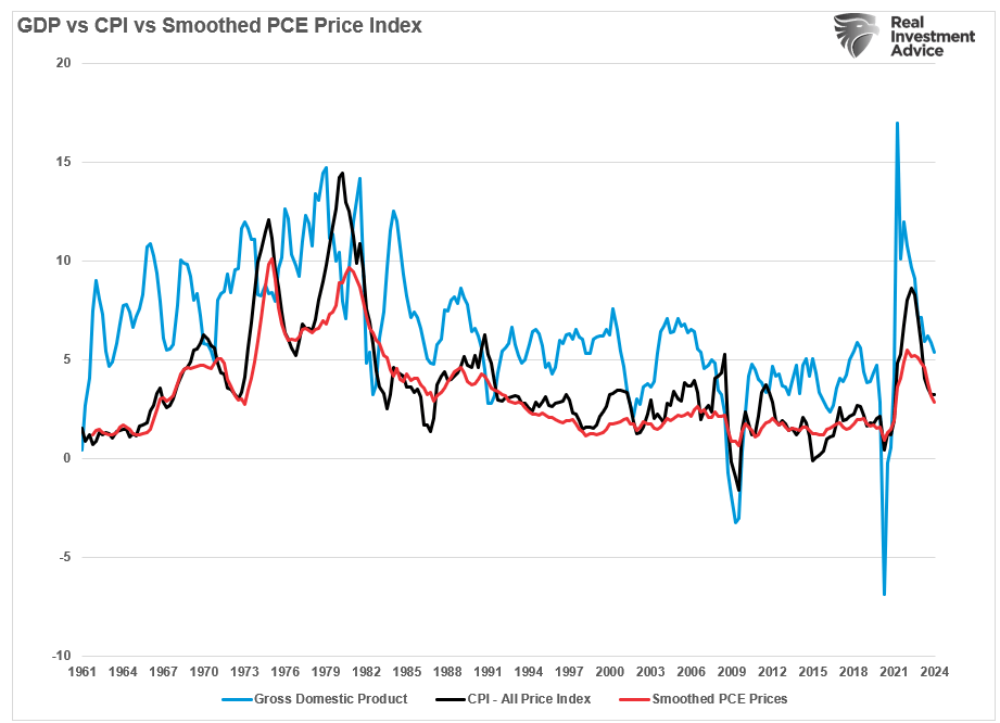
However, as we have repeatedly discussed over the last several months, the inflation trend remains lower as economic growth continues to slow. The correlation between smoothed PCE prices, economic growth, and inflation remains high. Therefore, as economic activity (demand) slows, prices fall as supply increases.
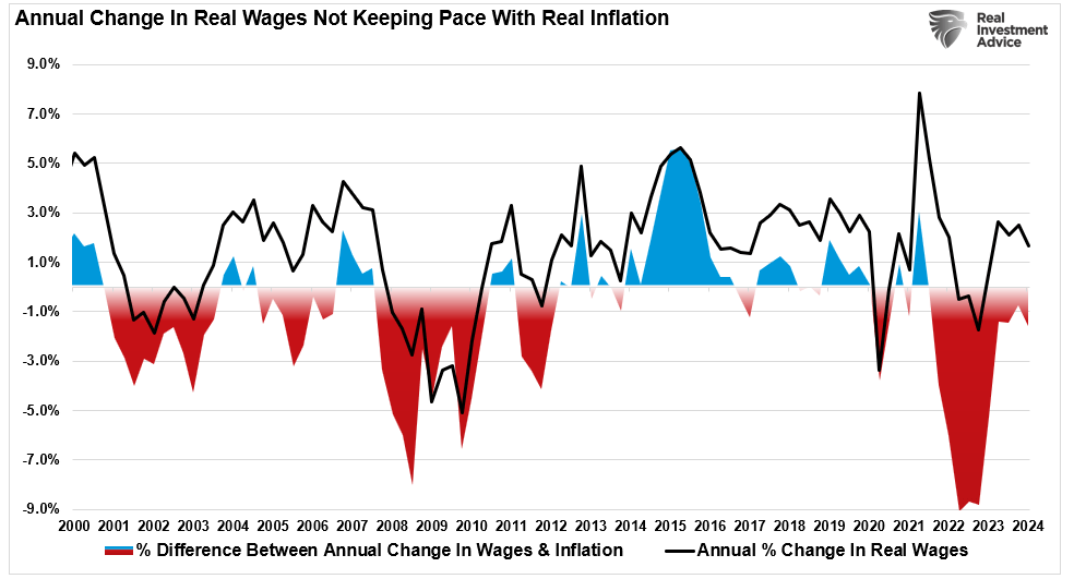
More importantly, for consumers to create demand, they need money to spend. With wages failing to keep pace with inflation, the limits of taking on debt to maintain the standard of living become increasingly problematic. As the wage gap between the cost of living increases, prices will fall to meet current demand.
Such is why the longer-term trend of inflation continues to trend lower. While the rate of decline is subsiding due to the year-over-year comparisons, the Fed will achieve its 2% annualized growth rate as inflation returns to its normalized trend.
As noted previously, the housing market is the most significant contributor to the inflation calculation.
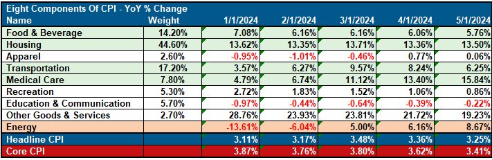
Given that housing, officially known as Homeowners Equivalent Rent (OER), is 44% of the index, what happens elsewhere has little input on the longer-term inflation trend. As shown, with real-time rent flat or down for the past year, the BLS-tracked OER lags by five months and is up 5.6%. OER will decline gradually for the next 18 months as it catches up to real-time rents, even as the latter increases.
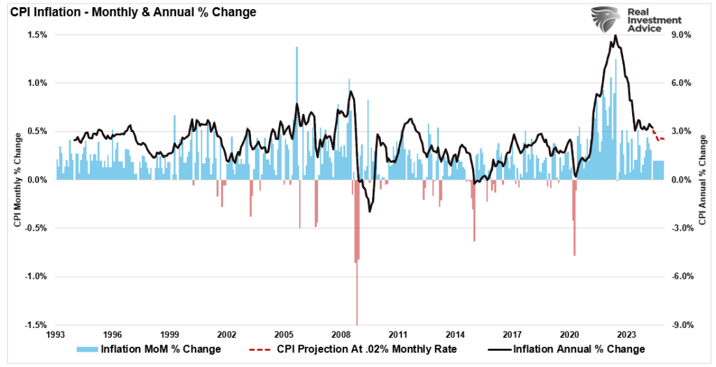
“A 0.2% monthly core CPI reading should be the base case for the balance of the year, especially as it looks more and more like the long-awaited slowdown in shelter costs will hit as soon as the next report.” – Inflation Insights
The CPI chart above shows a 0.2% monthly increase modeled through December. If CPI prints 0.2% every month, inflation will continue to decline because it is measured annually.
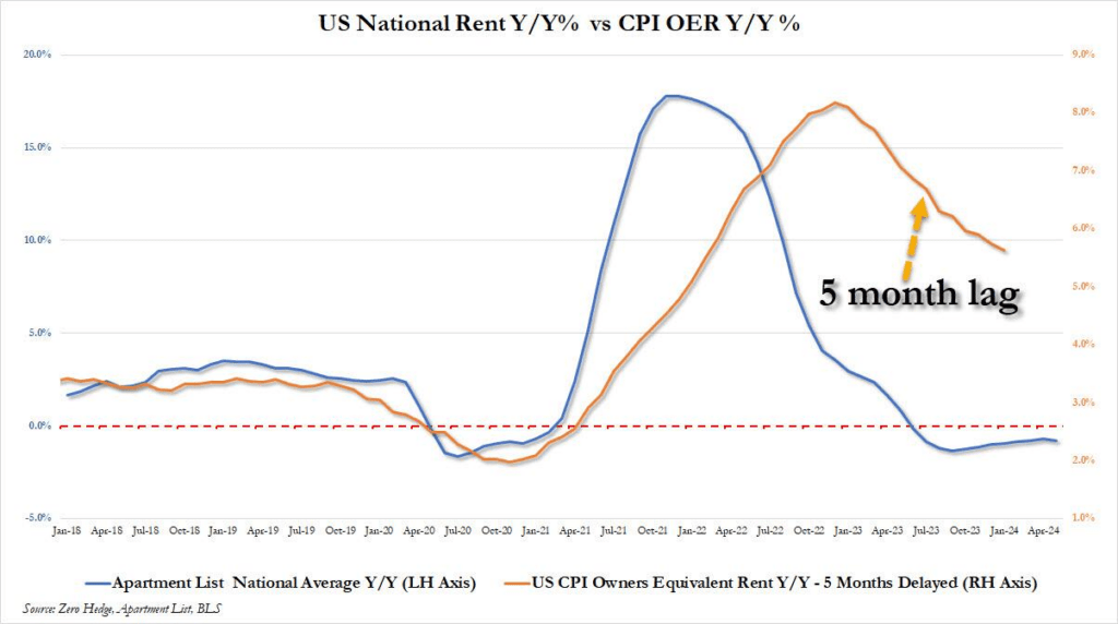
Furthermore, as noted previously, the uptick in healthcare costs at the beginning of the year is primarily seasonal as annual plans reset for the new year. However, given that most American’s rent or mortgage payments and healthcare costs are set for a specific term, a measure excluding those two variables gives us a better “day-to-day” measure of the cost of living. As shown below, inflation, less healthcare, and rent are closing in on a 2% annualized rate.
Notably, the latest inflation print keeps the Federal Reserve on track to cut interest rates at least once this year, if not twice. That is assuming the economy does not slow more quickly than currently expected.
Why Is Inflation Remaining Sticky
There is little doubt that inflation has remained more “sticky” than expected. Higher inflation has kept pressure on the bond market, as yields have remained elevated over the last 24 months. As noted by the Daily Shot this week, a few reasons have kept inflation higher than would have been likely otherwise.
“Economists continue to be surprised by the persistent stickiness of US inflation. It was initially thought that rapid rate hikes (a 5.25% increase over a year and a half) would slow demand and cap inflation. However, higher rates have unexpectedly contributed to inflation in certain sectors of the economy.”
For example, high mortgage rates drastically reduced the supply of homes for sale. Homeowners who typically trade up for larger homes remained in their current homes with the pre-increase 3% mortgage rates. Another byproduct of higher rates was the unaffordability of the supply of homes available for sale. That lack of supply, with available demand, led to continued increases in home prices, which, combined with high mortgage rates, severely affected affordability. The poor affordability, in turn, kept homeowners’ equivalent rent (OER) elevated, slowing the decline in inflation. High borrowing costs have also kept builders from sharply increasing supply, fueling the supply/demand imbalance.
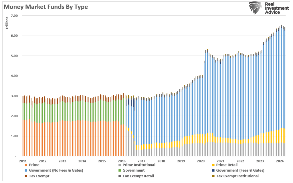
Furthermore, the Fed’s rate hikes have also boosted households’ incomes. While many lower-income households have depleted their pandemic-era savings and dug deeper into credit card debt, upper-income households still hold substantial savings and are also less affected by high credit card rates. High short-term rates have allowed these households to generate significant income via certificates of deposit and Treasury bills. Those higher rates feed into money market funds, generating more revenue for higher-income households and corporations.

Unsurprisingly, consumption (demand) has remained more robust than expected, even as economic activity slows.
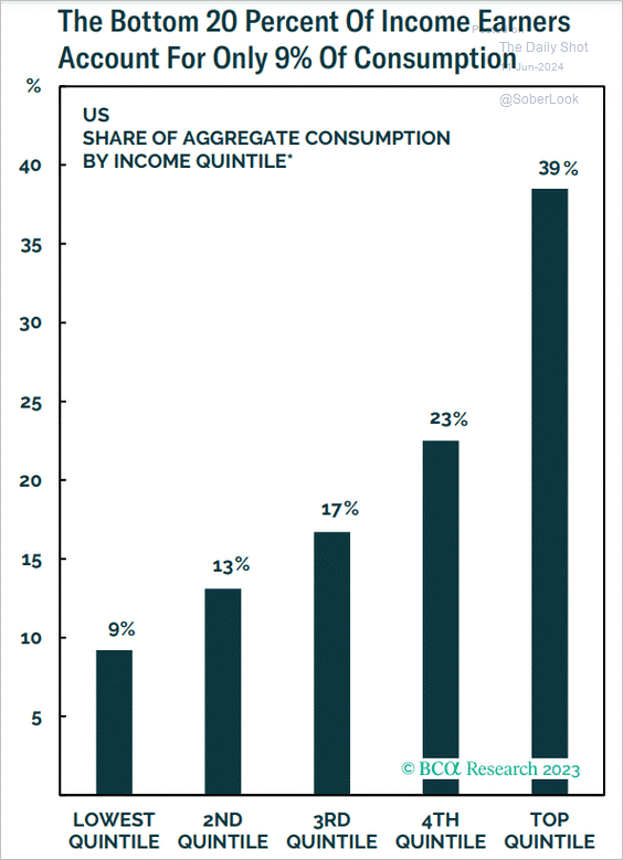
“Coupled with record-high stock market levels and robust home prices, upper-income consumers continue to spend despite high rates and elevated prices. Since upper-income households drive much of US consumer spending (as illustrated in the chart below), their continued expenditure boosts demand and hampers disinflation.” – The Daily Shot
Lastly, while inflation rose due to the supply/demand imbalance and the Fed hiked borrowing costs, many companies had already locked in low financing rates. During the COVID-era economic shutdown, the Fed cut interest rates to zero, and long-term borrowing costs fell to less than 1%. As such, higher borrowing costs have less impact on larger companies.
As noted, corporations have enormous cash balances in money market funds (shaded blue area), which, like upper-income consumers, benefit from high rates by generating significant interest income. A large portion of this cash is returned to shareholders, increasing incomes for wealthier households. Companies continue to hire, which also increases demand.
As The Daily Shot concludes:
“The anticipated effects of rapid rate hikes on US inflation have not materialized as expected. Instead of curbing inflation, higher rates have exacerbated it in certain sectors. The housing market, savings disparity, and corporate sector resilience are key areas where higher rates have contributed to ongoing inflationary pressures.”
Of course, as the Fed cuts rates, the support for keeping inflation “sticky” will begin to reverse.
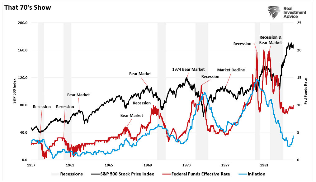
This Isn’t The 70s
One of the primary arguments for why inflation will run higher again is the argument of the 70’s inflation surge. That argument, accompanied by hand wringing, is often presented with the following chart.
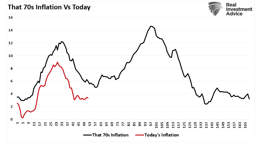
There are several fallacies in that argument.
The first is that the apparent correlation of inflation shown above is likely spurious and not actual. Several factors that contributed to the inflation of the 1970s are either absent today or less of an issue. For example, today’s economy is much less sensitive to oil price shocks due to the change from a manufacturing base to one of services. Furthermore, energy is a much lower share of consumer spending.
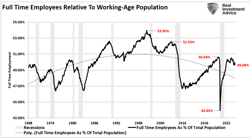
Furthermore, the population was much younger and more likely to consume. Full-time employment increased as the economy grew, leading to a high velocity of money. Today, full-time employment is declining as the population ages, leading to a decrease in monetary velocity.
Lastly, the inflation comparison chart is misleading. To understand the inflation of the 1970s, we have to look at the preceding period. As shown, the rise in inflation was not just a function of a few years in the 1970s but a trend that started in the 1950s.
Following World War II, America became the “last man standing.” France, England, Russia, Germany, Poland, Japan, and others were devastated, with little ability to produce for themselves. America found its most substantial economic growth as the “boys of war” returned home to start rebuilding a war-ravaged globe.
But that was just the start of it.
In the late ’50s, America stepped into the abyss as humankind took its first steps into space. The space race, which lasted nearly two decades, led to leaps in innovation and technology that paved the way for America’s future.
These advances, combined with the industrial and manufacturing backdrop, fostered high levels of economic growth, increased savings rates, and capital investment, which supported higher interest rates.
So, while inflation increased and interest rates rose in tandem, the average household could sustain its living standard. The chart shows the difference between household debt and incomes in the pre-and post-financialization eras.

As discussed on Friday, the increasing debts and deficits are not inflationary. They are, in fact, deflationary, as the debt service redirects increasing amounts of income from productive uses.
Unless something changes, the inflation print will fall further as economic growth slows, and the forces keeping inflation “sticky” continue to erode.
How We Are Trading It
There is little doubt that the market is bullish, as evidenced by its consistent new highs. However, as noted above, the negative divergences in relative strength and breadth and an increasing deviation from the 50-DMA suggest that the near-term correction risks are rising.
Continue to take action as needed using the recent push to new highs:
- Tighten up stop-loss levels to current support levels for each position.
- Hedge portfolios against significant market declines.
- Take profits in positions that have been big winners
- Sell laggards and losers
- Raise cash and rebalance portfolios to target weightings.
Notice, nothing in there says, “Sell everything and go to cash.”
Just manage risk as needed to mitigate the impact of a sudden reversal.
Have a great week.
Research Report
Subscribe To “Before The Bell” For Daily Trading Updates
We have set up a separate channel JUST for our short daily market updates. Please subscribe to THIS CHANNEL to receive daily notifications before the market opens.
Click Here And Then Click The SUBSCRIBE Button
Subscribe To Our YouTube Channel To Get Notified Of All Our Videos
Bull Bear Report Market Statistics & Screens

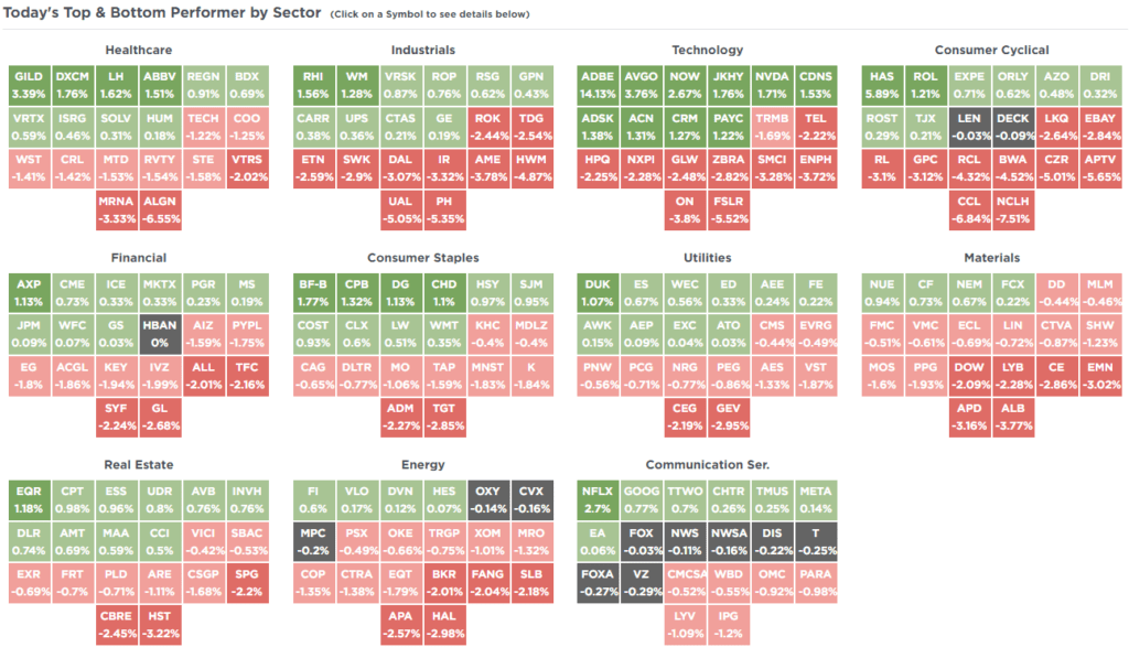
SimpleVisor Top & Bottom Performers By Sector
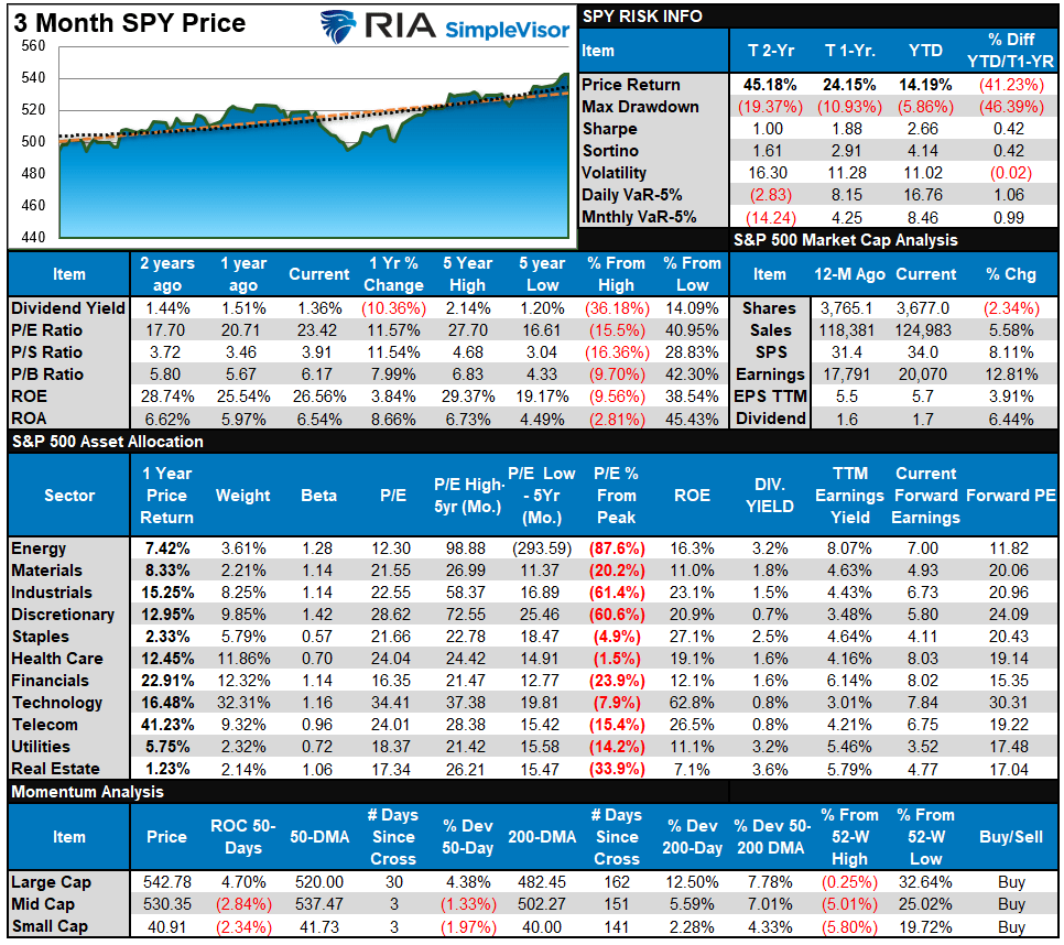
S&P 500 Weekly Tear Sheet
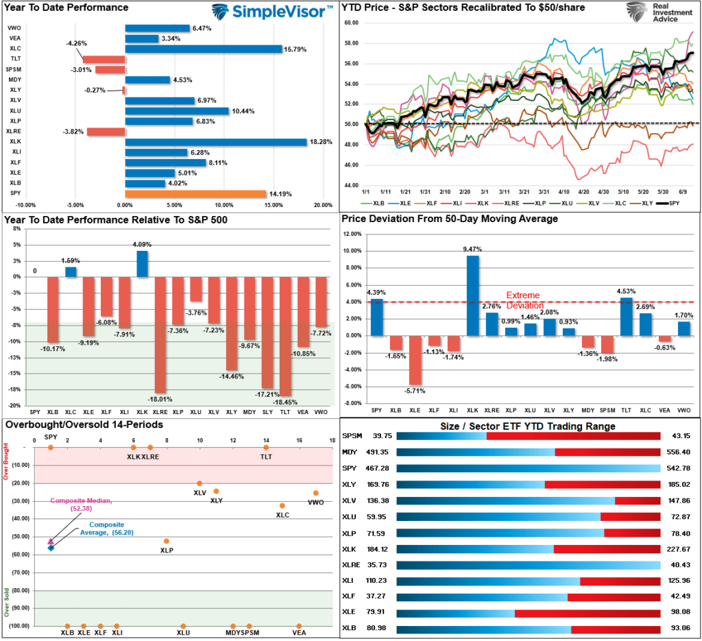
Relative Performance Analysis
Last week, we noted:
“Despite the broad market doing well YTD, communications is the only sector currently outperforming the index.”
The cooler inflation print this past week and the “Apple Intelligence” announcement sent money chasing technology stocks. Apple and Nvidia led the way higher, with some help from Broadcom and Adobe. Technology took the lead in performance, and TWO sectors outperformed the S&P this year. This is further evidence of the weaker breadth in the market. Bonds are overbought short-term after last week’s surge, so don’t forget to take profits if you are trading your bond position.
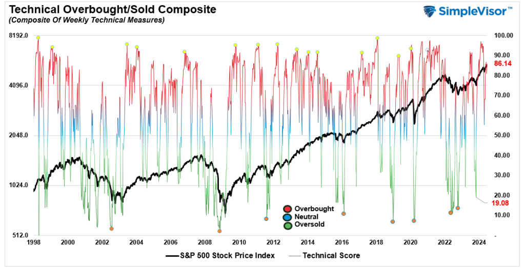
Technical Composite
The technical overbought/sold gauge comprises several price indicators (R.S.I., Williams %R, etc.), measured using “weekly” closing price data. Readings above “80” are considered overbought, and below “20” are oversold. The market peaks when those readings are 80 or above, suggesting prudent profit-taking and risk management. The best buying opportunities exist when those readings are 20 or below.
The current reading is 86.14 out of a possible 100.
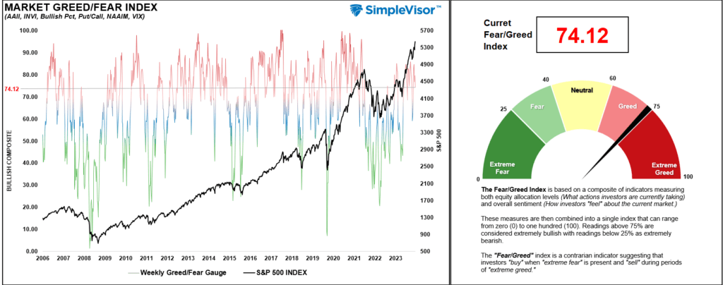
Portfolio Positioning “Fear / Greed” Gauge
The “Fear/Greed” gauge is how individual and professional investors are “positioning” themselves in the market based on their equity exposure. From a contrarian position, the higher the allocation to equities, the more likely the market is closer to a correction than not. The gauge uses weekly closing data.
NOTE: The Fear/Greed Index measures risk from 0 to 100. It is a rarity that it reaches levels above 90. The current reading is 74.12 out of a possible 100.
Relative Sector Analysis
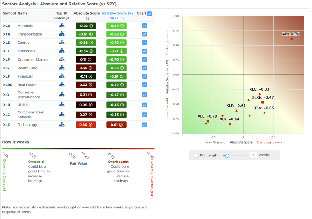
Most Oversold Sector Analysis
Sector Model Analysis & Risk Ranges
How To Read This Table
- The table compares the relative performance of each sector and market to the S&P 500 index.
- “MA XVER” (Moving Average Crossover) is determined by the short-term weekly moving average crossing positively or negatively with the long-term weekly moving average.
- The risk range is a function of the month-end closing price and the “beta” of the sector or market. (Ranges reset on the 1st of each month)
- The table shows the price deviation above and below the weekly moving averages.
The S&P 500 index trades above its historical risk range and 10% above its long-term average. After last week’s push higher, a short-term corrective or consolidation process will likely occur. Given the 10% and 15% deviations in Communications and Technology, a rotation from those sectors to more oversold market areas like Energy, Utilities, Small Caps, and International would not be surprising. Bonds are also trading well above the risk range currently but below long-term averages. Corrections in bond prices can be bought.

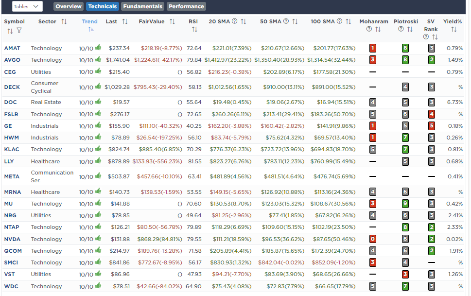
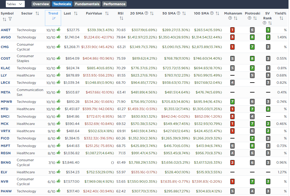
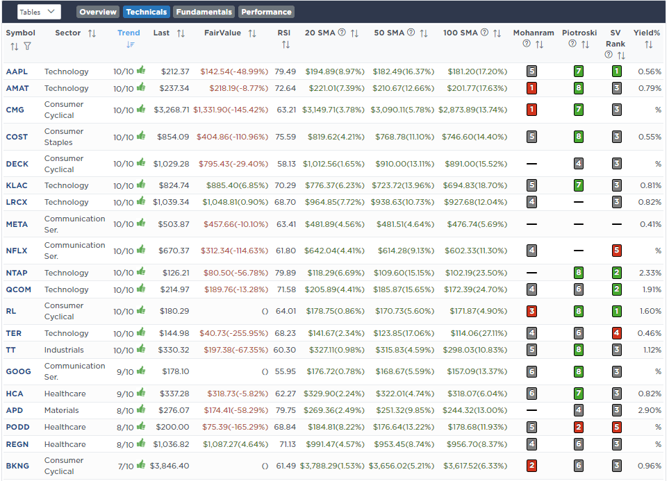
Weekly SimpleVisor Stock Screens
We provide three stock screens each week from SimpleVisor.
This week, we are searching for the Top 20:
- Relative Strength Stocks
- Momentum Stocks
- Fundamental & Technical Strength W/ Dividends
(Click Images To Enlarge)
RSI Screen
Momentum Screen
Fundamental & Technical Screen
SimpleVisor Portfolio Changes
We post all of our portfolio changes as they occur at SimpleVisor:
June 11th
“As noted on X (Twitter) this morning, bullish bets on crude oil have dropped to the lowest levels since 2014. Historically, a rally in the underlying commodity becomes more probable when positioning has become very negative.
Given that offside positioning and the fact that we are entering a seasonally strong period for oil consumption, we are adding back to our holding in Diamondback Energy (FANG). We took profits on February 21st, reducing our position size by half. Today, we are returning that position to its target weighting of 2%.
We are also bringing the SPDR Energy Sector ETF (XLE) to its target weighting of 5%.”
Equity Model
- Increase Diamondback Energy (FANG) to 2% of the portfolio.
ETF Model
- Increase the SPDR Energy ETF (XLE) to 5% of the portfolio
June 13th
“With the recent market runup, we are rebalancing some holdings in the dividend model. We are reducing Apple (AAPL) and Meta (META) back to target allocations. Given the pullback in oil and energy stocks, we are increasing Exxon Mobil (XOM) and Alerian MLP (ALMP) to target. Also, we are adding to 3M (MMM), bringing it to the target weight.”
Dividend Equity Model
- Reduce to 5% target weights both Apple (APPL) and Meta (META)
- Increase the target weight by 3.5% for each Exxon Mobil (XOM), Alerian MLP (AMLP), and 3M (MMM).

Lance Roberts, C.I.O.
Have a great week!