In this 08-20-21 issue of “The Fed Blinks On Taper, Bulls Buy The Dip Again.”
- Bulls Buy The Dip…Again.
- Speculative Fervor Is Fading
- 30-Year Yield “Death Cross”
- Portfolio Positioning
- Sector & Market Analysis
- 401k Plan Manager
Follow Us On: Twitter, Facebook, Linked-In, Sound Cloud, Seeking Alpha
Are you worried about the potential for a market correction, a surge in inflation, or are you unsure how to invest for your retirement? We can help.
Schedule your “FREE” portfolio review today.

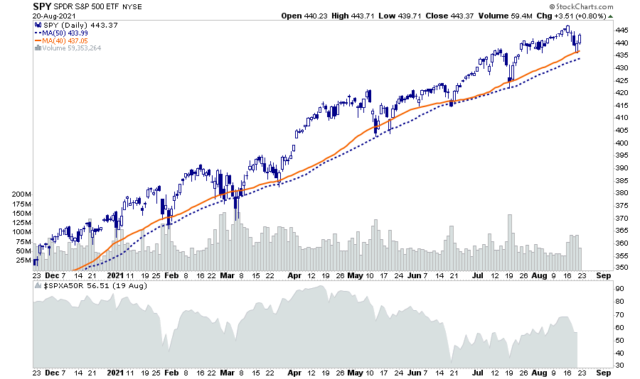
Bulls Buy The Dip…Again.
Last week, we discussed that further upside would remain challenging. As noted:
“Not surprisingly, the market didn’t make much headway this past week, given the current extended and overbought conditions. For now, ‘buy signals’ remain intact, which likely limits the downside over the next week. However, a retest of the 50-dma is certainly not out of the question.”
Such was again the case this week as concerns over the Fed tapering their balance sheet spooked investors. However, the Fed trained investors to “buy the dip.” Not surprisingly, they jumped in at the 40-dma to buy rather than waiting for a test of the 50-dma. (Although it was on lower volume and weaker breadth.)
The “buying frenzy” came following a near 2% “crash” in the financial markets forcing the Fed to “blink” on tapering. To wit:
“Dallas Federal Reserve President Robert Kaplan said on Friday he was watching carefully for any economic impact from the Delta variant of the coronavirus and might need to adjust his views on policy “somewhat” should it slow economic growth materially.”
We discuss below why we believe the Fed will still announce plans to taper as early as September.
Nonetheless, the bullish bias remains. Since the “shutdown” lows of March, the QE fueled rally has led to increased levels of complacency. With the assumption of “no risk” in the markets, investors buy dips on an ever shallower basis.
We noted the long stretch of the current advance without a 5% correction, a test of the 200-dma, and 6-consecutive positive months.
While such does NOT mean a more significant correction is imminent, it is without question such a correction will happen. It is only a function of catalyst and time.
One warning sign is fading speculative interest.

Speculative Fervor Is Fading
Last week, we made some specific notes on the deterioration of market internals. To wit:
“As noted, the market rallied nicely to marginal new highs this past week, but market internals remain relatively weak.”
The basis of our sentiment is mainly due to declining volumes, narrowing breadth, and a decline in speculative activity.
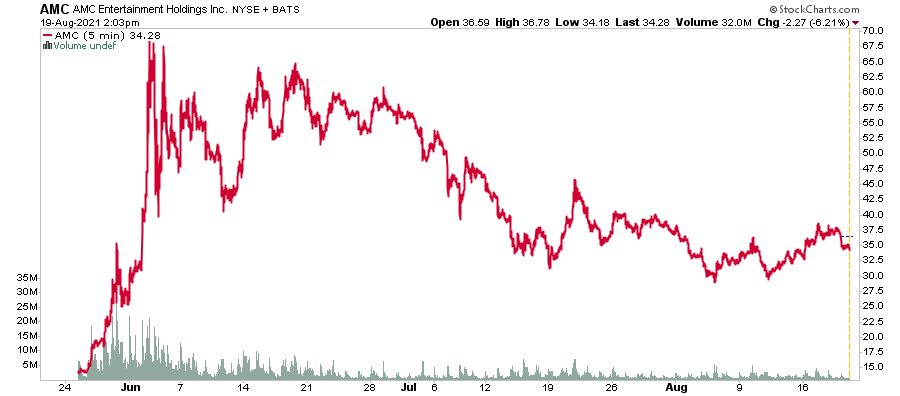
As shown, the speculative surge in the markets, particularly in the “meme” stocks, has evaporated as market action became more muted.
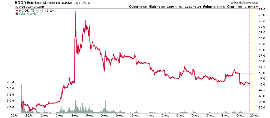
A look at some of the “meme” stock favorites is insightful.
AMC Entertainment
Gamestop

Robinhood Markets
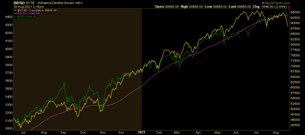
Last week, we also noted that despite a market trading at all-time highs, the number of stocks trading above the 50-dma was feeble. We also see this in the NYSE Advance-Decline line, which broke through the 50-dma this week.
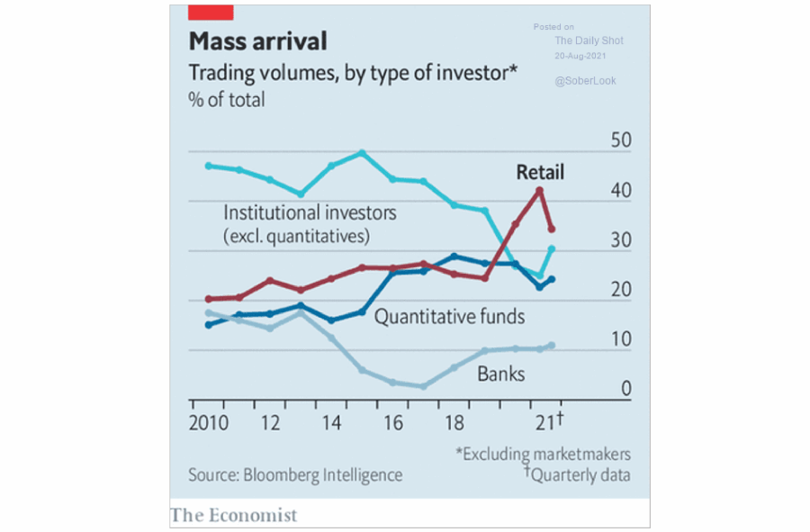
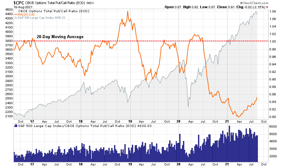
One of the market drivers over the last year was the constant “bid” of retail investors in both the equities and options markets.
Much of this speculation was due to the shift of sports betters into the financial markets. However, with sports betting back, the more muted returns of equities are less exciting. As shown, the put/call ratios have contracted markedly in recent months.
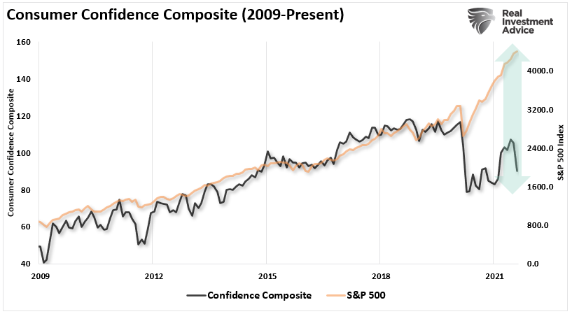
The decline in speculative sentiment also shows up in the collapse in consumer confidence which has a close correlation to markets historically. However, confidence failed to recover despite the Fed Inflating a Fourth Bubble.
The risk to investors remains elevated, but there remains little concern as long as the Fed continues to inject $120 billion a month into the markets.
However, that may be about to change.
Fed Setting The Table For Taper
As noted in our Daily Market Commentary (Subscribe for Free Email Delivery):
“The Fed shed little light in the July FOMC minutes on the schedule of Fed taper. While some Fed members seem eager to start as soon as September, others voiced concern about downward inflation pressures and market perception. We look to the Jackson Hole Fed conference late next week for more guidance.
Highlights from the Fed minutes from the July 28th FOMC meeting:”
- “Most participants noted that, provided that the economy were to evolve broadly as they anticipated, they judged that it could be appropriate to start reducing the pace of asset purchases this year.”
- “They are worried that accelerating plans to wind down the asset purchases could lead investors to question whether the Fed is in a hurry to raise rates or less committed to achieving lower unemployment.”
- SOME PARTICIPANTS REMAINED CONCERNED ABOUT THE MEDIUM-TERM INFLATION FORECAST AND THE PROSPECT OF MAJOR DOWNWARD PRESSURE ON INFLATION RESURFACING.
- “Several others indicated, however, that a reduction in the pace of asset purchases was more likely to become appropriate early next year”
- “Most participants remarked that they saw benefits in reducing the pace of net purchases of Treasury securities and agency MBS proportionally in order to end both sets of purchases at the same time.”
- “The staff provided an update on its assessments of the stability of the financial system and, on balance, characterized the financial vulnerabilities of the U.S. financial system as notable. The staff judged that asset valuation pressures were elevated. In particular, the forward price-to-earnings ratio for the S&P 500 index stood at the upper end of its historical distribution; high-yield corporate bond spreads tightened further and were near the low end of their historical range; and house prices continued to increase rapidly, leaving valuation measures stretched.”
Why Taper Matters
We believe the Fed is setting the table to begin the process of taper sooner than later. Employment is improving, jobless claims are dropping, and inflationary pressures are rising, particularly housing rents. Given their perceived mandates, we suspect they will discuss taper as soon as September.
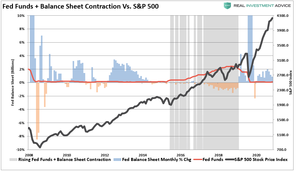
As noted in Fed Talks Taper, there is a not-so-subtle impact on asset prices when the Fed begins to taper assets. So while market participants may be ignoring the Fed short-term, the risk of a “taper” is rising. The grey shaded bars in the chart below show when the balance sheet is either flat or contracting.
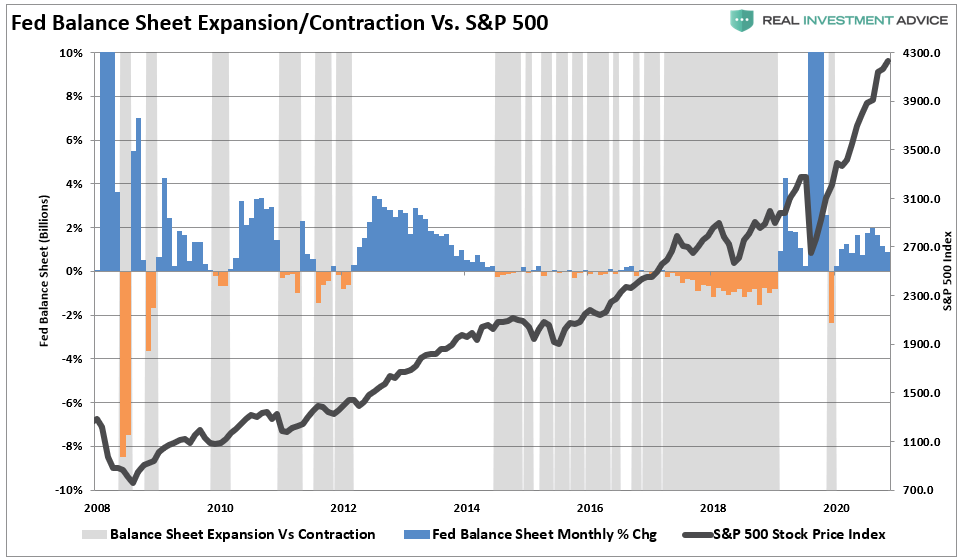
That volatility increases markedly when the Fed also hikes rates.
There is a decent probability that with inflationary pressures above target levels and employment improving, the Fed may start tapering sooner than later.
Such is what the bond market is already predicting.
In Case You Missed It
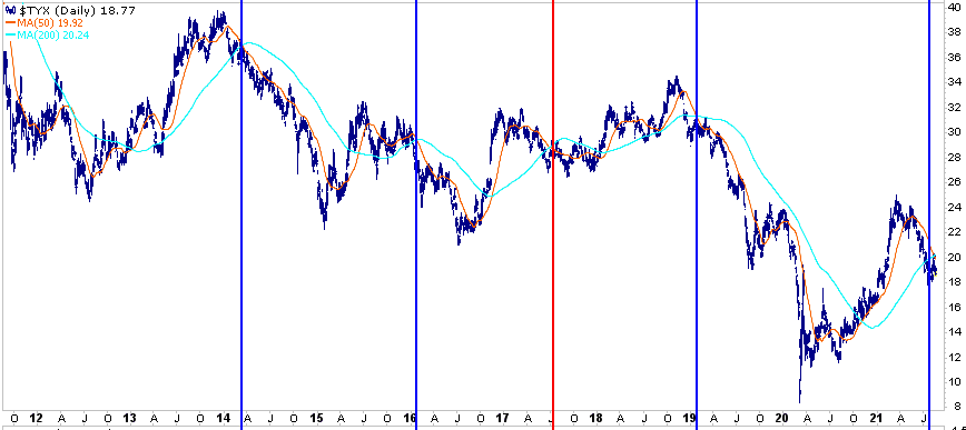
The 30-Year Yield Death Cross
As noted by Michael Lebowitz on Thursday for our RIAPRO subscribers:
“The graph below is 30-year UST yields with its 50 and 200 dma’s. The vertical lines highlight the last five times, 30 year yields have witnessed its 50 dma falling below its 200 dma, also known as a ‘death cross.’ In 3 of the last 4 death cross instances yields fell appreciably and reached record lows. The only time they didn’t was in 2017 (red vertical line). At that time yields consolidated to negate the death cross. As shown, on Monday 30-year yields witnessed a death cross.”
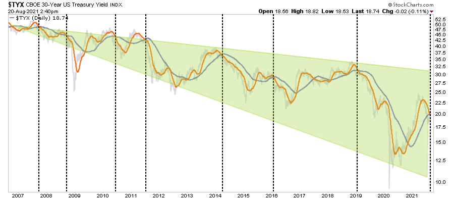
As discussed in “Economic Warning,” yields are a leading indicator of economic growth.
“Bond yields are sending an economic warning as this past week 10-year Treasury yields dropped back to 1.3%. With the simultaneous surge in the dollar, there is rising evidence the economic “reflation” trade is getting unwound. Such is despite overly exuberant expectations of strong economic growth by the mainstream media. As we suggested in 2019, bonds generally have the outlook correct more often than stocks.“
Interestingly, BofA, Goldman Sachs, and other mainstream firms are rapidly downgrading economic growth projections through the end of the year.
Elevated inflation and falling economic growth are not a good story for corporate margins or earnings. As such, we continue to suggest investors pay close attention to the message bonds are sending.
As Michael notes, the previous history suggests that bond yields are likely to go lower than higher. It is usually coincident with a “risk-off” rotation from the equity markets if such does occur.

Portfolio Update
The low level of volatility has meant few changes for the allocation models when it comes to client portfolios. After previously having raised cash levels and increasing the bond portfolio duration, the portfolios continue to outperform their relative benchmarks.
Concerning the “Death Cross” of 30-year yields, we again increased our duration in our bond portfolios as we have been doing since early this year. As a result, our weighted average duration is now 4.5 years versus 5.9 years for our benchmark.
Our primary focus remains mitigating portfolio risk in a market that remains extended in price and duration from longer-term means. However, as noted above, there are some essential factors to consider:
- All periods of consecutive performance eventually end. (Investors tend to forget this during long bullish stretches.)
- Since 1900, such long-stretches of bullish performance are somewhat rare.
- Such periods of performance often, but not always, precede fairly decent market corrections or bear markets.
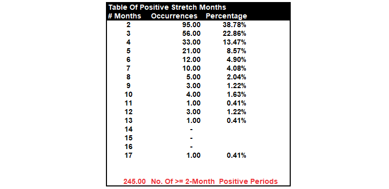
“The table shows that nearly 40% of the time, two months of positive performance gets followed by at least one month of negative performance. Conversely, three consecutive positive months occur 23% of the time, and only 14% of occurrences stretch to 4-months.
Since 1871, there have only been 12-occurrences of 6-month or greater stretches of positive returns before a negative month appeared. In total, there are just 40 occurrences; out of 245 periods of 2-months or more, the market ran 6-months or longer without a correction.”
Given the risk of a change to monetary policy stance, high levels of complacency, and an extended advance, it is likely wise to consider rebalancing portfolios.
As Todd Harrison previously quipped:
“Opportunities are made up far easier than lost capital.”
Have a great weekend.
By Lance Roberts, CIO
Market & Sector Analysis
Analysis & Stock Screens Exclusively For RIAPro Members
S&P 500 Tear Sheet
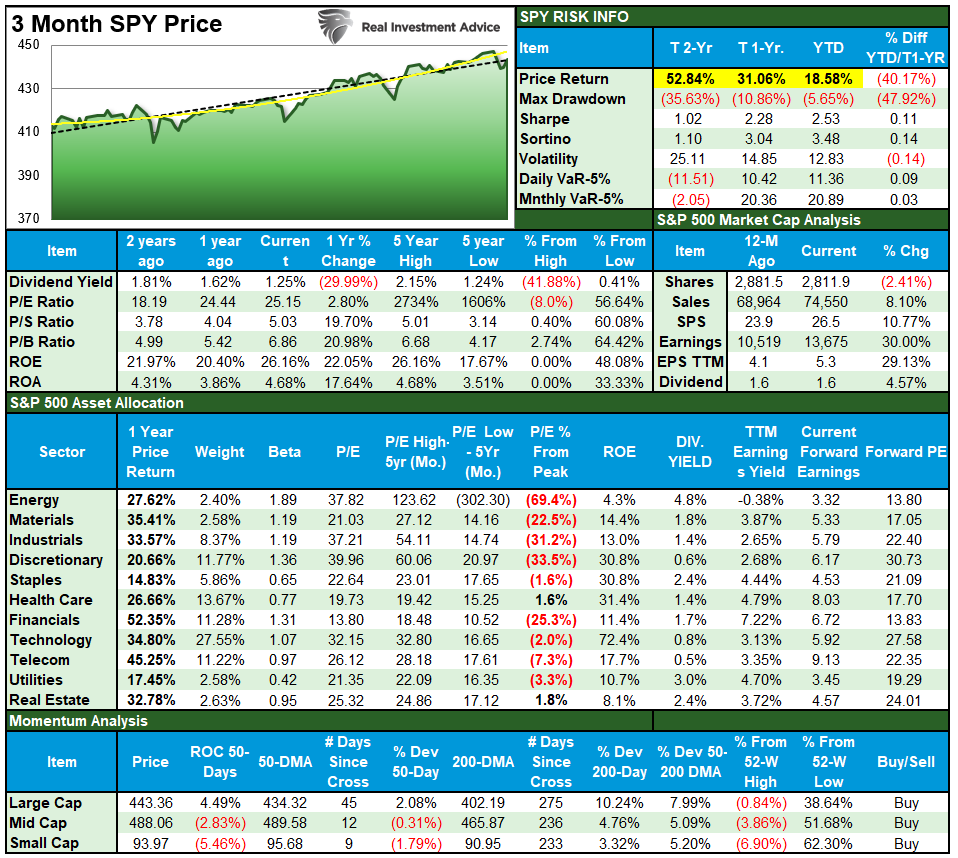
Performance Analysis

Technical Composite
The technical overbought/sold gauge comprises several price indicators (RSI, Williams %R, etc.), measured using “weekly” closing price data. Readings above “80” are considered overbought, and below “20” are oversold. The current reading is 85.00 out of a possible 100.

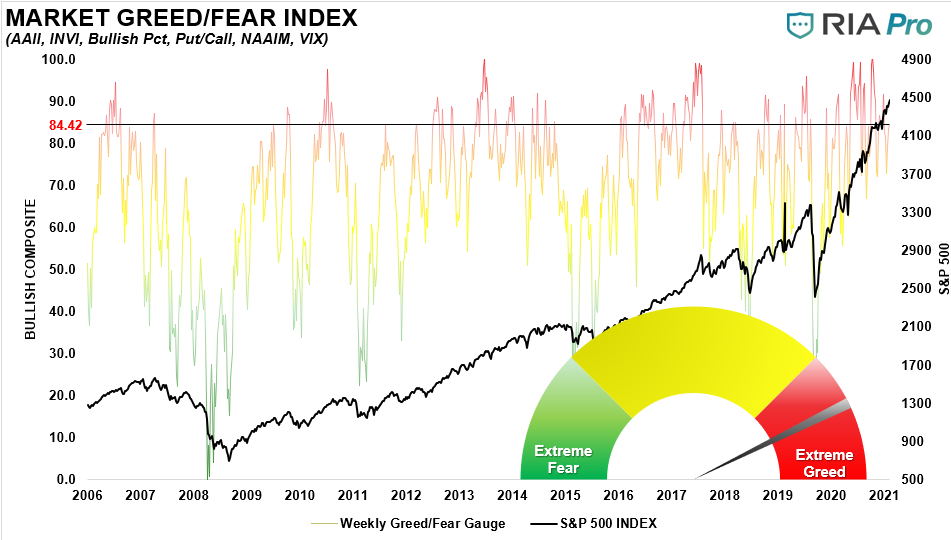
Portfolio Positioning “Fear / Greed” Gauge
The “Fear/Greed” gauge is how individual and professional investors are “positioning” themselves in the market based on their equity exposure. From a contrarian position, the higher the allocation to equities, to more likely the market is closer to a correction than not. The gauge uses weekly closing data.
NOTE: The Fear/Greed Index measures risk from 0-100. It is a rarity that it reaches levels above 90. The current reading is 84.42 out of a possible 100.
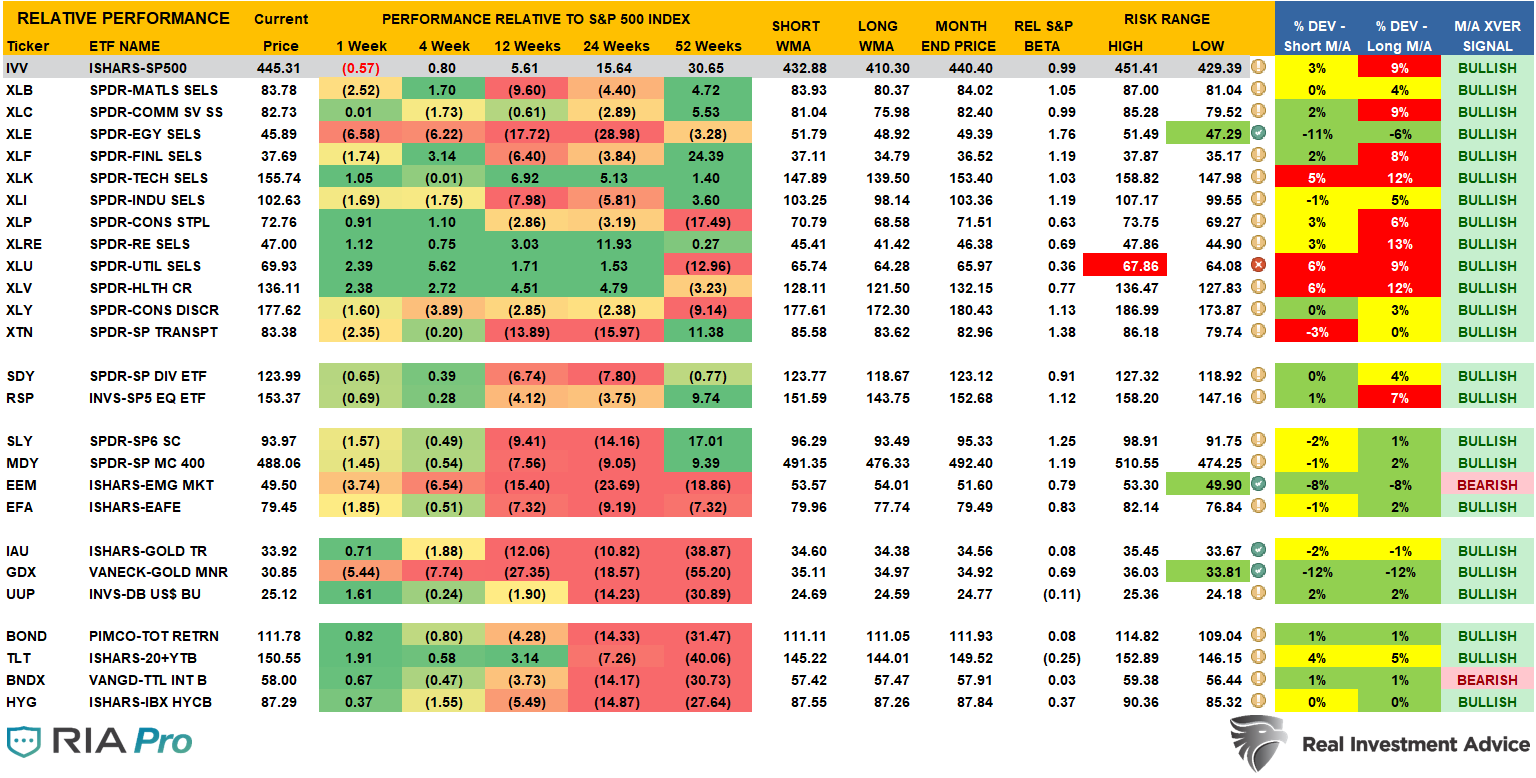
Sector Model Analysis & Risk Ranges
How To Read This Table
- The table compares each sector and market to the S&P 500 index on relative performance.
- “MA XVER” is determined by whether the short-term weekly moving average crosses positively or negatively with the long-term weekly moving average.
- The risk range is a function of the month-end closing price and the “beta” of the sector or market. (Ranges reset on the 1st of each month)
- Table shows the price deviation above and below the weekly moving averages.
Weekly Stock Screens
Currently, there are four different stock screens for you to review. The first is S&P 500 based companies with a “Growth” focus, the second is a “Value” screen on the entire universe of stocks, and the last are stocks that are “Technically” strong and breaking above their respective 50-dma.
We have provided the yield of each security and a Piotroski Score ranking to help you find fundamentally strong companies on each screen. (For more on the Piotroski Score – read this report.)
S&P 500 Growth Screen

Low P/B, High-Value Score, High Dividend Screen
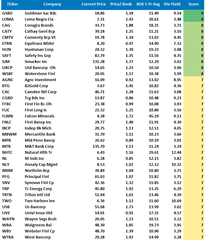
Fundamental Growth Screen

Aggressive Growth Strategy
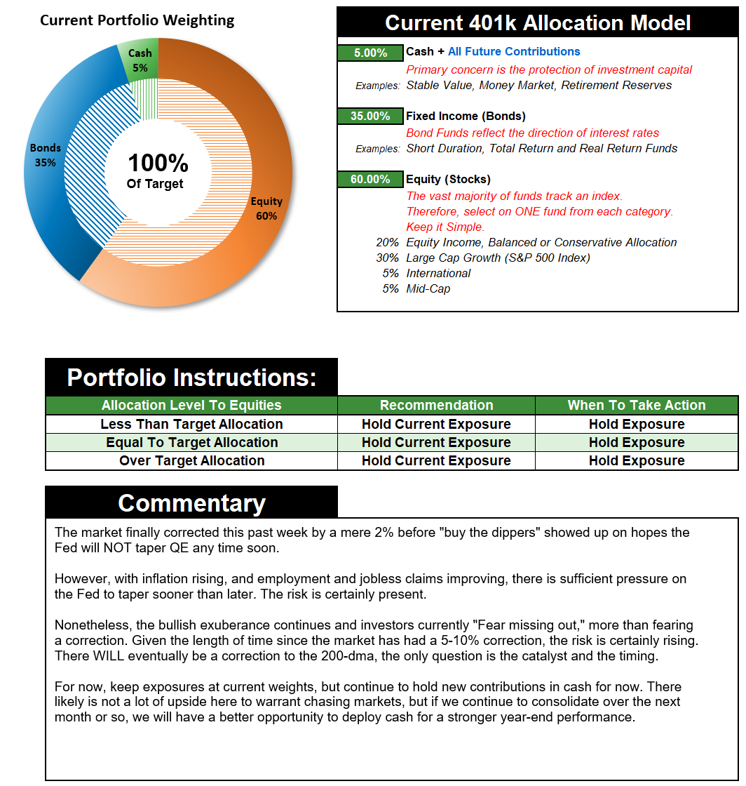
Portfolio / Client Update
I know. It’s boring.
Let me restate what I wrote last week.
“Nothing changed from last week concerning our portfolio allocations. The markets continue to wait on the Fed’s next move and seem to think they won’t taper despite more robust employment and higher inflation. There is a decent risk the markets could be wrong.”
We suspect that eventually, the markets are going to get a rather rude awakening. However, such has not been the case this year as every dip continues to get bought.
With volumes very light, breadth weak, and investors unwilling to sell due to the “fear of missing out,” our fear is a reversion to the 200-dma could come very swiftly.
The biggest problem for investors remains the lack of liquidity.
At current prices, there are still willing buyers every time a seller shows up. With no one wanting to “miss out,” buyers far outweigh sellers. However, at some point, if an event occurs which changes investor “psychology,” there will be NO buyers at current prices when the masses want to sell.
Such will lead to a huge price gap between where sellers want to sell (current prices) and where buyers are WILLING to buy (much lower prices.) That “air pocket” will lead to very swift declines in prices, much as we saw in March 2020.
We are slowly preparing for such a potential event by reducing equities, raising cash, lengthening the bond portfolio duration, and reducing overall “beta” volatility. However, we are doing this while we are delicately balancing risk-aversion and generating returns needed to meet your financial goals.
It is the definition of walking a “razor’s edge.”
If you have any questions, please don’t hesitate to ask us.
Portfolio Changes
During the past week, we made minor changes to portfolios. In addition, we post all trades in real-time at RIAPRO.NET.
*** Trading Update – Equity and Sector Models ***
“This morning we added 1% TLT and 2.5% IEF to both models. We sold GSY down to 2.5% to make room. Our WAVG duration is now 4.5 versus 5.9 for our benchmark. Such is due to today’s commentary:” – 08/20/21
“The graph below is 30-year UST yields with its 50 and 200 dma’s. The vertical lines highlight the last five times, 30 year yields have witnessed its 50 dma falling below its 200 dma, also known as a “death cross.” In 3 of the last 4 death cross instances yields fell appreciably and reached record lows. The only time they didn’t was in 2017 (red vertical line). At that time yields consolidated to negate the death cross. As shown, on Monday 30-year yields witnessed a death cross.”
Equity & ETF Portfolios:
- Reduce GSY to 2.5% of the portfolio
- Increase TLT by 1% of the portfolio.
- Initiate a 2.5% position in IEF
As always, our short-term concern remains the protection of your portfolio. Accordingly, we remain focused on the differentials between underlying fundamentals and market over-valuations.
Lance Roberts, CIO
THE REAL 401k PLAN MANAGER
A Conservative Strategy For Long-Term Investors
If you need help after reading the alert, do not hesitate to contact me.

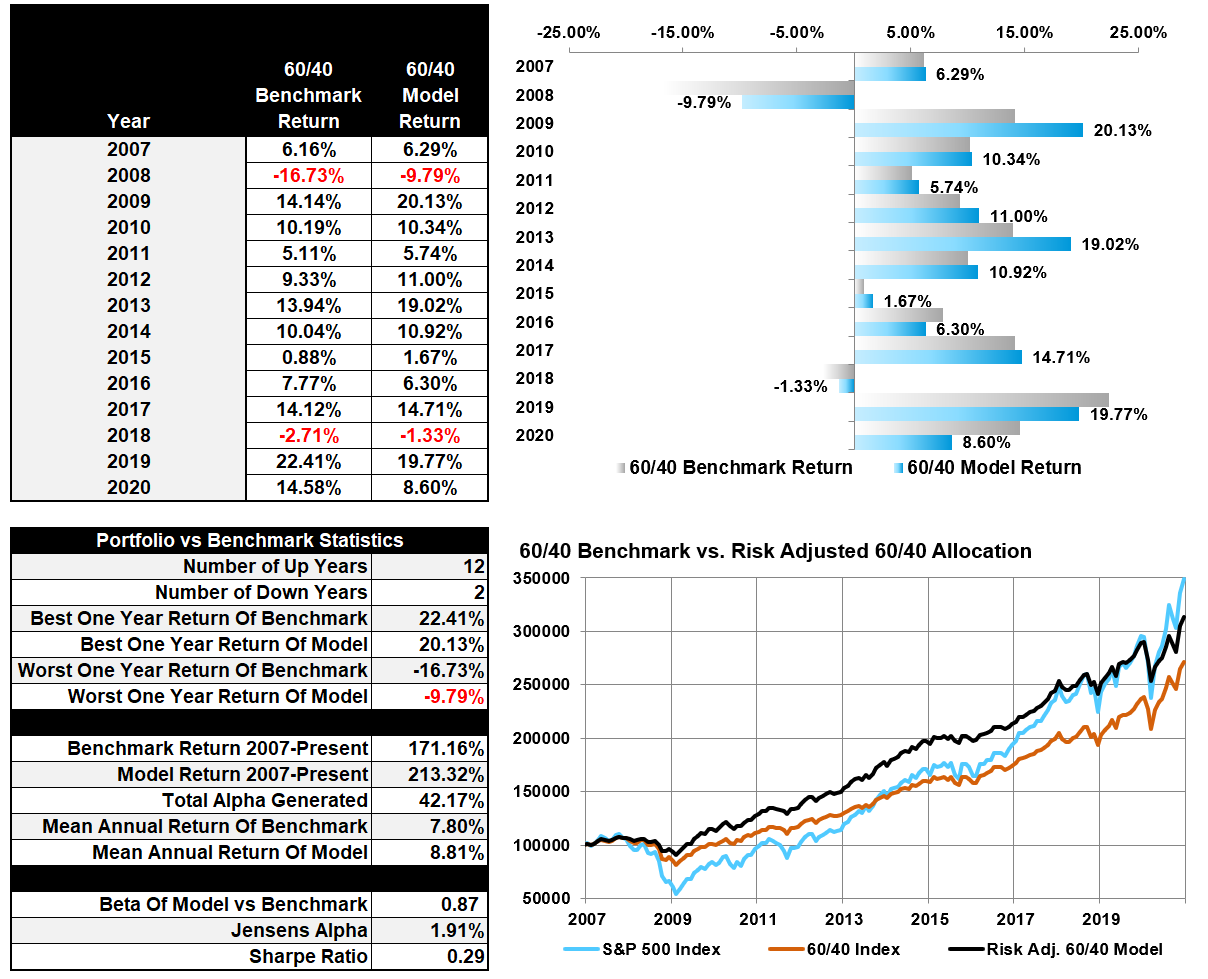
401k Model Performance Analysis
Model performance is a two-asset model of stocks and bonds relative to the weighting changes made each week in the newsletter. Such is strictly for informational and educational purposes only, and one should not rely on it for any reason. Past performance is not a guarantee of future results. Use at your own risk and peril.
Have a great week!


Lance Roberts is a Chief Portfolio Strategist/Economist for RIA Advisors. He is also the host of “The Lance Roberts Podcast” and Chief Editor of the “Real Investment Advice” website and author of “Real Investment Daily” blog and “Real Investment Report“. Follow Lance on Facebook, Twitter, Linked-In and YouTube
Customer Relationship Summary (Form CRS)
Also Read