The Technical Value Scorecard Report uses 6-technical readings to score and gauge which sectors, factors, indexes, and bond classes are overbought or oversold. We present the data on a relative basis (versus the assets benchmark) and on an absolute stand-alone basis. You can find more detail on the model and the specific tickers below the charts.
Commentary 3-19-21
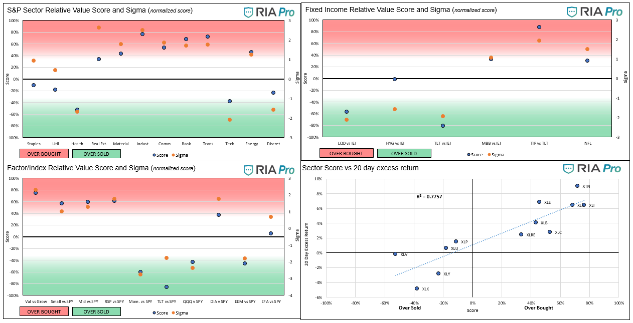
- The laggard sectors, specifically staples, and utilities, are starting to perform better versus the S&P 500. Both sectors are seeing their sigmas (normalized scores) rise above zero, and their scores approach fair value. Tech and Discretionary remain lackluster. Energy is falling back toward fair value but remains solidly in overbought territory.
- The factor/index chart looks similar to last week, although the hotter sectors like Small and Mid-cap and Value have slipped a little.
- In the Fixed Income relative graph (top right), our new inflation/deflation indicator score fell and is nearing fair value.
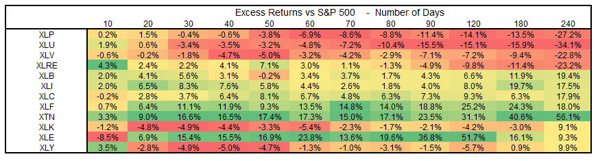
- The third table below is new. It compares excess returns for the sectors over increasing time frames. We can use this to follow performance trends better. Each column is color-coded based on return performance for that respective period. Utilities (XLU) underperformed for the better part of the last year. However, the darker reds are lightening up, and the most recent color is light green. Staples (XLP) are following a similar trend.
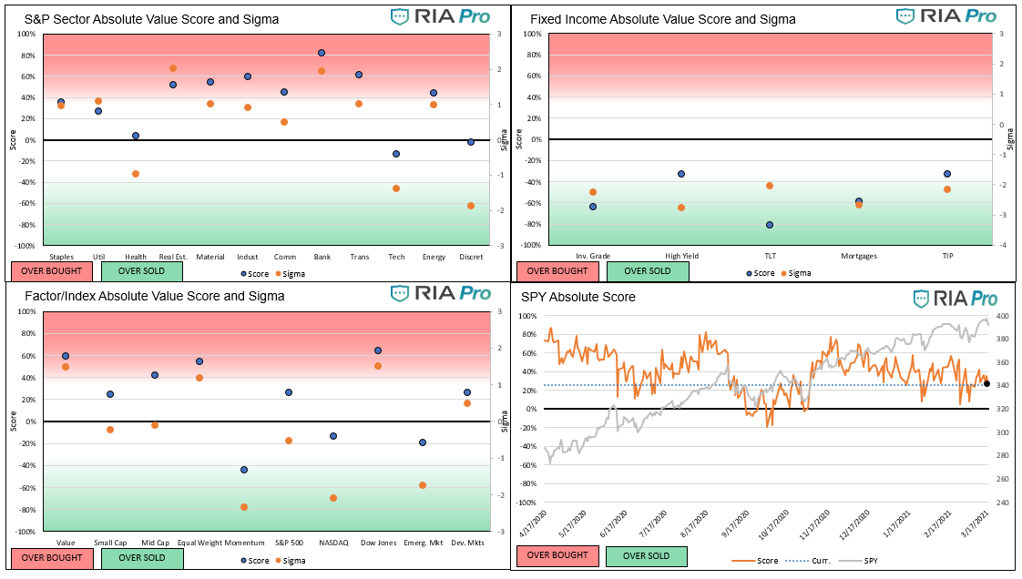
- In the Absolute set of graphs, Staples and Utilities are noteworthy as they move above fair value. Despite Thursday’s decline, most sectors remain above fair value, as does the S&P. Financials are the only sector extremely overbought. If rates keep rising and the yield curve keeps steepening, we suspect they will stay overbought. Any reversal in interest rates will likely be problematic for the financial sector.
- The absolute scoring on the factor/indexes is mixed. The NASDAQ, Momentum, and Emerging Markets remain over-sold while the remaining indexes are overbought.
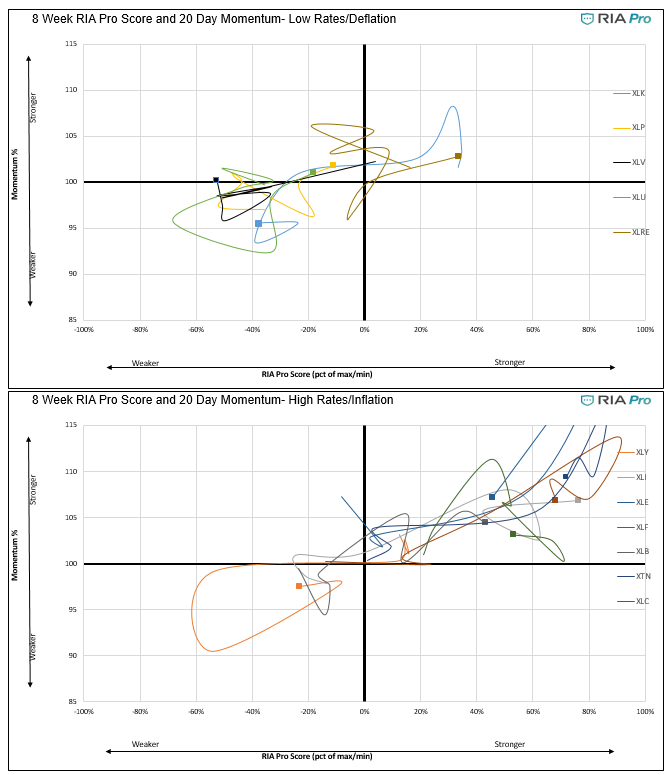
- Lastly, we revisit our “spaghetti” graphs. These show how momentum and our relative score (vs S&P) track over time. The top right corner is the most bullish and the bottom leftmost bearish. This time we break out our spaghetti graphs between sectors that have done well in the higher interest rate, reflationary trade, and those that have lagged.
- The first graph shows the improvement in XLP and XLU as they are heading toward the upper right quadrant denoting a stronger relative score and rising momentum. The next graph shows many of the reflationary sectors remain in the upper right quadrant but are retreating from the upper right corner.
- This week’s big takeaway is we finally see some life in the sectors most hurt by inflation and higher rates. Conversely, some of those sectors that benefit from inflation and higher rates have shown a little weakness. It’s too early to tell if this is just a consolidation or pause or a true change in the market’s mindset. It is said the market tends to look 6 to 9 months forward.
Graphs (Click on the graphs to expand)
Users Guide
The score is a percentage of the maximum/minimum score, as well as on a normalized basis (sigma) for the last 200 trading days. Assets with scores over or under +/-60% and sigmas over or under +/-2 are likely to either consolidate or change trend. When both the score and sigma are above or below those key levels simultaneously, the signal is stronger.
The first set of four graphs below are relative value-based, meaning the technical analysis score and sigma represent a ratio of the asset to its benchmark. The second set of graphs is computed solely on the price of the asset. At times we present “Sector spaghetti graphs” which compare momentum and our score over time to provide further current and historical indications of strength or weakness. The square at the end of each squiggle is the current reading. The top right corner is the most bullish, while the bottom left corner the most bearish.
The technical value scorecard report is one of many tools we use to manage our portfolios. This report may send a strong buy or sell signal, but we may not take any action if other research and models do not affirm it.
The ETFs used in the model are as follows:
- Staples XLP
- Utilities XLU
- Health Care XLV
- Real Estate XLRE
- Materials XLB
- Industrials XLI
- Communications XLC
- Banking XLF
- Transportation XTN
- Energy XLE
- Discretionary XLY
- S&P 500 SPY
- Value IVE
- Growth IVW
- Small Cap SLY
- Mid Cap MDY
- Momentum MTUM
- Equal Weighted S&P 500 RSP
- NASDAQ QQQ
- Dow Jones DIA
- Emerg. Markets EEM
- Foreign Markets EFA
- IG Corp Bonds LQD
- High Yield Bonds HYG
- Long Tsy Bonds TLT
- Med Term Tsy IEI
- Mortgages MBB
- Inflation TIP
- Inflation Index- XLB, XLE, XLF, and Value (IVE)
- Deflation Index- XLP, XLU, XLK, and Growth (IWE)


Michael Lebowitz, CFA is an Investment Analyst and Portfolio Manager for RIA Advisors. specializing in macroeconomic research, valuations, asset allocation, and risk management. RIA Contributing Editor and Research Director. CFA is an Investment Analyst and Portfolio Manager; Co-founder of 720 Global Research.
Follow Michael on Twitter or go to 720global.com for more research and analysis.
Customer Relationship Summary (Form CRS)
Also Read