Tag Archives: welfare

SOTM 2020: State Of The Markets

“I am thrilled to report to you tonight that our economy is the best it has ever been.” – President Trump, SOTU

In the President’s “State of the Union Address” on Tuesday, he used the podium to talk up the achievements in the economy and the markets.

  • Low unemployment rates
  • Tax cuts
  • Job creation
  • Economic growth, and, of course,
  • Record high stock markets.

While it certainly is a laundry list of items he can claim credit for, it is the claim of record-high stock prices that undermines the rest of the story.

Let me explain.

The stock market should be a reflection of actual economic growth. Since corporate earnings are derived primarily from consumptive spending, corporate investments, and imports and exports, actual economic activity should be reflected in the price investors are willing to pay for the earnings being generated.

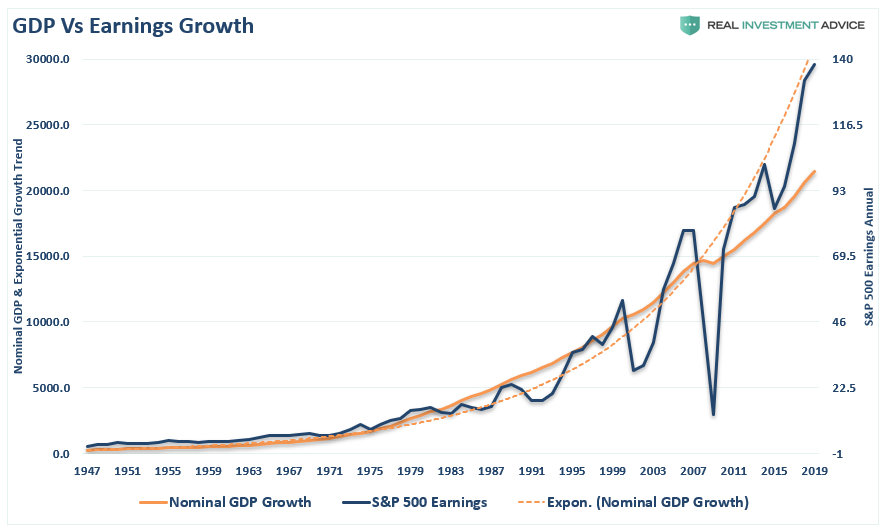
For the majority of the 20th century, this was indeed the case as corporate earnings were reflective of economic activity. The chart below shows the annual change in reported earnings, nominal GDP, and the price of the S&P 500.

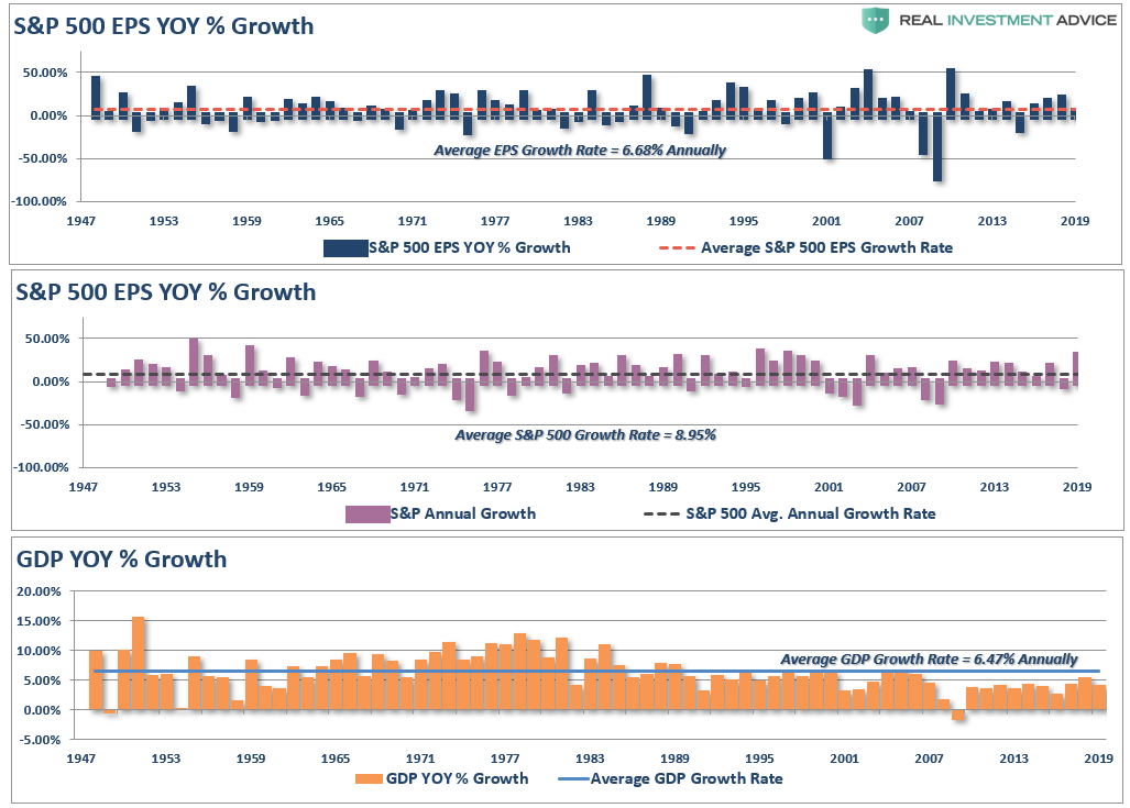
Not surprisingly, as the economy grew at 6.47% annually, earnings also grew at 6.68% annually as would be expected. Since investors are willing to a premium for earnings growth, the S&P 500 grew at 9% annually over that same period.

Importantly, note that long-term economic growth has averaged 6% annually. However, as shown in the lower panel, economic growth has been running below the long-term average since 2000, but has been substantially weaker since 2007, growing at just 2% annually.

The next chart shows this weaker growth more clearly. Since the financial crisis, economic growth has failed to recover back to its long-term exponential growth trend. However, reported earnings are exceedingly deviated from what actual underlying economic growth can generate. This is due to a decade of accounting gimmickry, share buybacks, wage suppression, low interest rates, and high corporate debt levels.

The next chart looks at the deviation by looking at the market itself versus long-term economic growth. The S&P 500 and GDP have been scaled to 100, and displayed on a log-scale for comparative purposes.

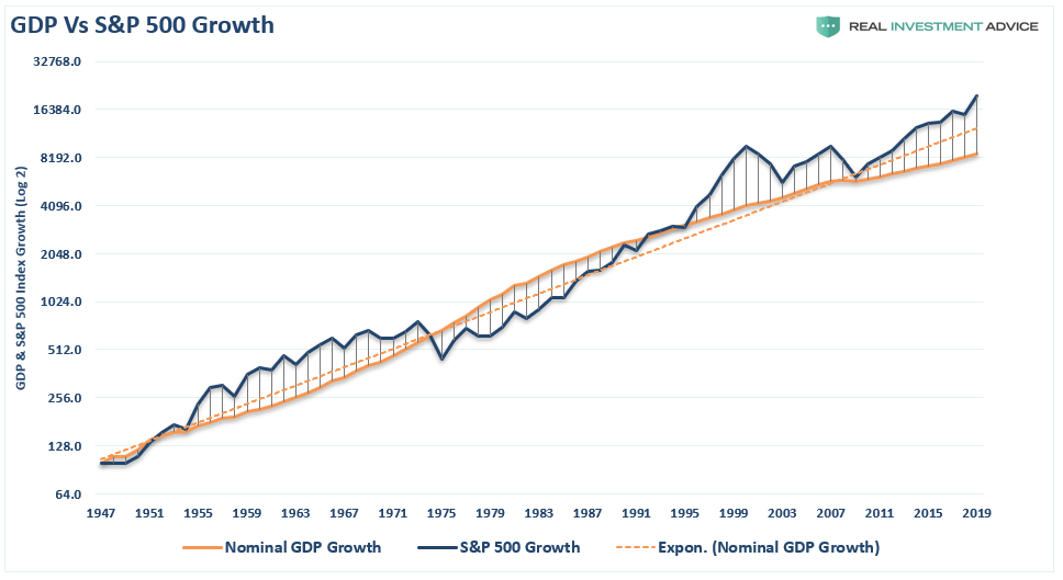
The current growth trend of the economy is running well below its long-term exponential trend, but the S&P 500 is currently at the most significant deviation from that growth on record. (It should be noted that while these deviations from economic growth can last for a long-time, the eventual mean reversion always occurs.)

The Spending Mirage

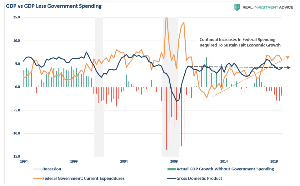
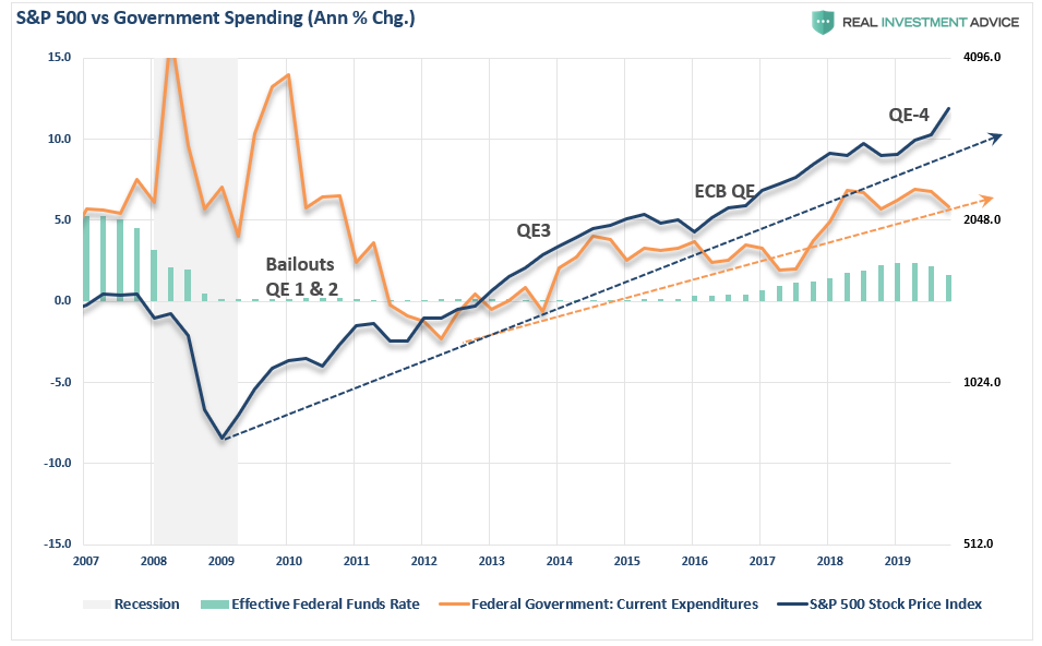
Take a look at the following chart.

While the President’s claims of an exceptionally strong economy rely heavily on historically low unemployment and jobless claims numbers, historically high levels of asset prices, and strong consumer spending trends, there is an underlying deterioration which goes unaddressed.

So, here’s your pop quiz?

If consumer spending is strong, AND unemployment is near the lowest levels on record, AND interest rates are low, AND job creation is high – then why is the economy only growing at 2%?

Furthermore, if the economy was doing as well as government statistics suggest, then why does the Federal Reserve need to continue providing the economy with “emergency measures,” cutting rates, and giving “verbal guidance,” to keep the markets from crashing?

The reality is that if it wasn’t for the Government running a massive trillion-dollar fiscal deficit, economic growth would actually be recessionary.

In GDP accounting, consumption is the largest component. Of course, since it is impossible to “consume oneself to prosperity,” the ability to consume more is the result of growing debt. Furthermore, economic growth is also impacted by Government spending, as government transfer payments, including Medicaid, Medicare, disability payments, and SNAP (previously called food stamps), all contribute to the calculation.

As shown below, between the Federal Reserve’s monetary infusions and the ballooning government deficit, the S&P 500 has continued to find support.

However, nothing is “produced” by those transfer payments. They are not even funded. As a result, national debt rises every year, and that debt adds to GDP.

Another way to look at this is through tax receipts as a percentage of GDP.  If the economy was indeed “the strongest ever,” then we should see an increase in wage growth commensurate with increased economic activity. As a result of higher wages, there should be an increase in the taxes collected by the Government from wages, consumption, imports, and exports.

See the problem here?

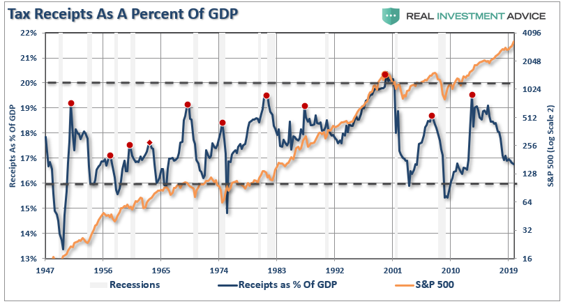
Clearly, this is not the case as tax receipts as a percentage of GDP peaked in 2012, and have now declined to levels which historically are more coincident with economic recessions, rather than expansions. Yet, currently, because of the artificial interventions, the stock market remains well detached from what economic data is actually saying.

Corporate Profits Tell The Real Story

When it comes to the state of the market, corporate profits are the best indicator of economic strength.

The detachment of the stock market from underlying profitability guarantees poor future outcomes for investors. But, as has always been the case, the markets can certainly seem to “remain irrational longer than logic would predict,” but it never lasts indefinitely.

Profit margins are probably the most mean-reverting series in finance, and if profit margins do not mean-revert, then something has gone badly wrong with capitalism. If high profits do not attract competition, there is something wrong with the system, and it is not functioning properly.” – Jeremy Grantham

As shown, when we look at inflation-adjusted profit margins as a percentage of inflation-adjusted GDP, we see a clear process of mean-reverting activity over time. Of course, those mean reverting events are always coupled with recessions, crises, or bear markets.

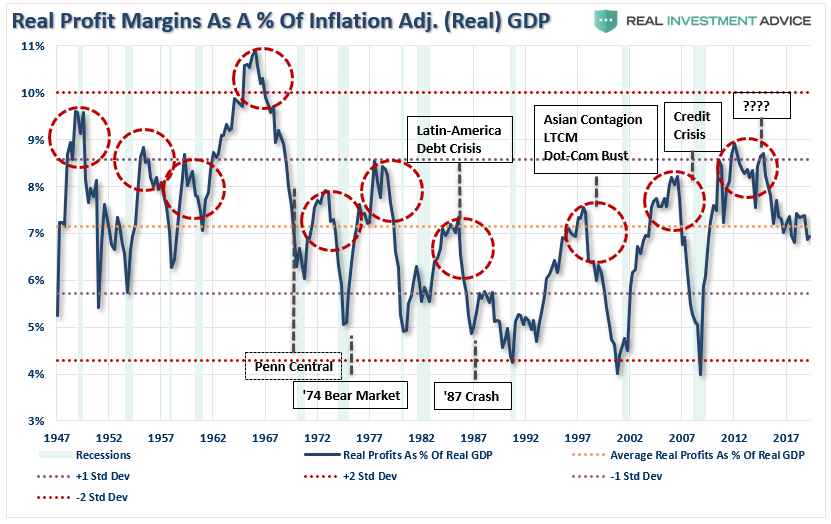
More importantly, corporate profit margins have physical constraints. Out of each dollar of revenue created, there are costs such as infrastructure, R&D, wages, etc. Currently, the biggest contributors to expanding profit margins has been the suppression of employment, wage growth, and artificially suppressed interest rates, which have significantly lowered borrowing costs. Should either of the issues change in the future, the impact to profit margins will likely be significant.

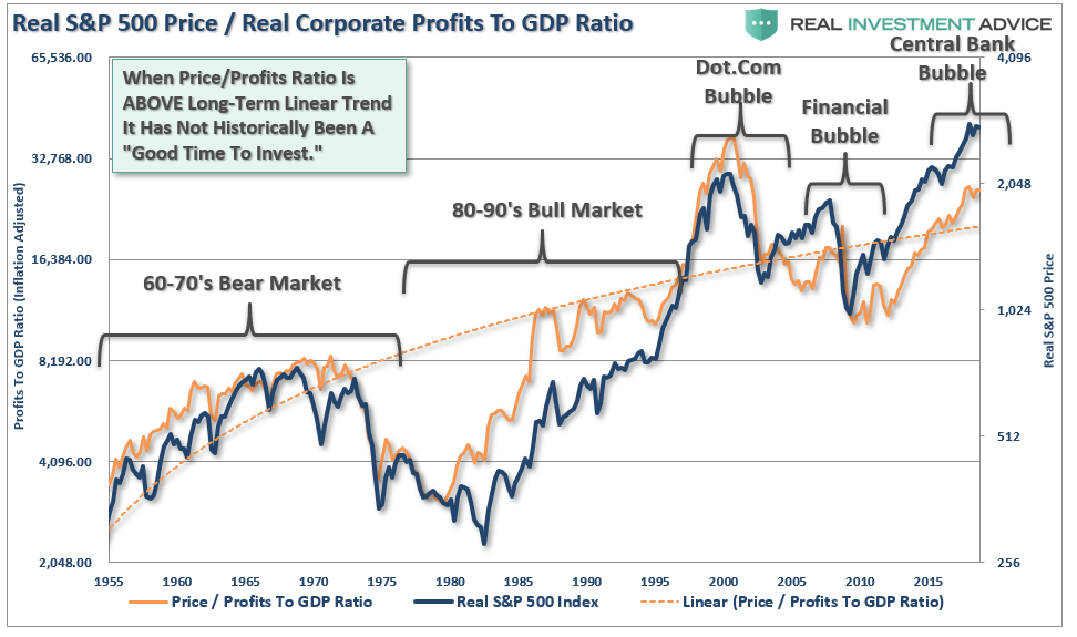
The chart below shows the ratio overlaid against the S&P 500 index.

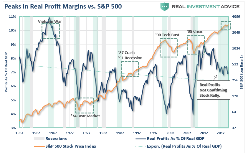
I have highlighted peaks in the profits-to-GDP ratio with the green vertical bars. As you can see, peaks, and subsequent reversions, in the ratio have been a leading indicator of more severe corrections in the stock market over time. This should not be surprising as asset prices should eventually reflect the underlying reality of corporate profitability.

It is often suggested that, as mentioned above, low interest rates, accounting rule changes, and debt-funded buybacks have changed the game. While that statement is true, it is worth noting that each of those supports are artificial and finite.

Another way to look at the issue of profits as it relates to the market is shown below. When we measure the cumulative change in the S&P 500 index as compared to the level of profits, we find again that when investors pay more than $1 for a $1 worth of profits, there is an eventual mean reversion.

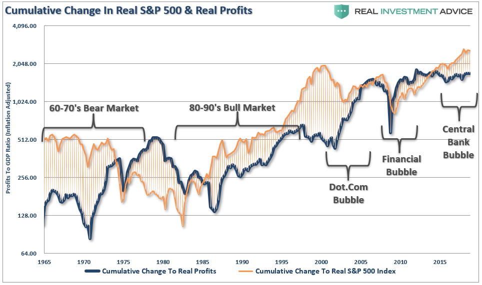
The correlation is clearer when looking at the market versus the ratio of corporate profits to GDP. (Again, since corporate profits are ultimately a function of economic growth, the correlation is not unexpected.) 

It seems to be a simple formula for investors that as long as the Fed remains active in supporting asset prices, the deviation between fundamentals and fantasy doesn’t matter. 

However, investors are paying more today than at any point in history for each $1 of profit, which history suggests will not end well.

While the media is quick to attribute the current economic strength, or weakness, to the person who occupies the White House, the reality is quite different.

The political risk for President Trump is taking too much credit for an economic cycle which was already well into recovery before he took office. Rather than touting the economic numbers and taking credit for liquidity-driven financial markets, he should be using that strength to begin the process of returning the country to a path of fiscal discipline rather than a “drunken binge” of government spending.

With the economy, and the financial markets, sporting the longest-duration in history, simple logic should suggest time is running out.

This isn’t doom and gloom, it is just a fact.

Politicians, over the last decade, failed to use $33 trillion in liquidity injections, near-zero interest rates, and surging asset prices to refinance the welfare system, balance the budget, and build surpluses for the next downturn.

Instead, they only made the deficits worse, and the U.S. economy will enter the next recession pushing a $2 Trillion deficit, $24 Trillion in debt, and a $6 Trillion pension gap, which will devastate many in their retirement years.

While Donald Trump talked about “Yellen’s big fat ugly bubble” before he took office, he has now pegged the success of his entire Presidency on the stock market.

It will likely be something he eventually regrets.

“Then said Jesus unto him, Put up again thy sword into his place: for all they that take the sword shall perish with the sword.” – Matthew 26, 26:52

Party Like It’s 1992?

Last week, Mark Hulbert warned of an indicator that hasn’t been this inflated since the “Dot.com” bubble. To wit:

“It’s been more than 25 years since the stock market’s long-term trailing return was as low as it is today. Since the top of the internet bubble in March 2000, the S&P 500 has produced a 1.4% annualized return after adjusting for both dividends and inflation. “

Whoa! How can that be given the market just set a record for the “longest bull market” in U.S. history?

This is a point that is lost on many investors who have only witnessed one half of a full market cycle. It is also the very essence of Warren Buffett’s most basic investment lesson:

“Price is what you pay. Value is what you get.”

Over the last 147-years of market history, there have only been five (5), relatively short periods, in history where the entirety of market “gains” were made. The rest of the time, the market was simply getting back to even.

Where you start your investing journey has everything to do with outcomes. Warren Buffett, for example, launched Berkshire Hathaway when valuations, and markets, were becoming historically undervalued. If Buffett had launched his firm in 2000, or even today, his “fame and fortune” would likely be drastically different.

Timing, as they say, is everything.

It is also worth noting, as shown below, that valuations clearly run in cycles over time. The current evolution of valuations has been extended longer than previous cycles due to 30-years of falling interest rates, massive increases in debt and leverage, unprecedented amounts of artificial stimulus, and government spending.

This was a point I discussed last week:

“There are two important things to consider with respect to the chart below.

  1. The shift higher in MEDIAN valuations was a function of falling economic growth and inflationary pressures.
  2. Higher prices were facilitated by increasing levels of leverage and debt, which eroded economic growth. “

But with returns low over the last 25-years, future returns should be significantly higher. Right?

Not necessarily. As Mark noted:

“Your conclusion from this sobering factoid depends on whether you see the glass as half-full or half-empty. The ‘half-full’ camp calls attention to what happened to stocks in the years after 1992, when stocks’ trailing two-decade return regressed to the mean — and then some: equities skyrocketed, elevating their trailing 18.5 year inflation-adjusted dividend-adjusted return to 11% annualized.

This optimistic view is the most pervasive. Return estimates for the S&P 500 have steadily risen in recent months as earnings have been buoyed by massive amounts of share buybacks and tax cuts.

With earnings rising, what’s not to love?

I get it.

But I disagree, and here’s why.

Throughout history, there is an undeniable link between valuation and return. More importantly, it is the expansion, or contraction, in valuations which are directly tied to the cycles of the market. When investors are willing to “pay up” for a future stream of cash flows, prices rise. When expectations for future cash flows decline, so do prices.

For those expecting a repeat of the post-1992 period, they are likely to be disappointed. As shown, in 1992, the deviation from the long-term median price/earnings ratio (using Shiller’s CAPE) was just below 0%. This gave investors plenty of room to expand valuations as inflation and interest rates fell, consumer and government debts surged, and the general masses swept into the “Wall Street Casino.” 

Today, valuations are at the second highest level in history. Despite the massive surge in earnings due to tax cuts – inflation and interest rates are low, revenue growth is weak as consumers, government, and corporations are fully leveraged, and households are “all in” the equity pool.

This is an important point which should not be overlooked.

The bullish premise has been that since tax cuts will cause a surge in earnings which we reduce valuations back to their long-term average. However, such is true as long as prices don’t increase during the period earnings are rising. But such as NOT been the case. Currently, the market has continued to “price in” those earnings increases keeping valuations elevated. 

As noted by Mark:

“Unfortunately, the CAPE today is back to within shouting distance of where it stood at the top of the internet bubble. It reached 44.2 then, and is 33.2 today. At no time in U.S. history other than the internet bubble has the CAPE been as high as it is now.”

CAPE Is B.S.

It is not surprising that during periods of valuation expansion that investors eventually come to the conclusion that “this time is different.” The argument goes something like this:

“Sure, the CAPE ratio is elevated but had you sold, you would have missed out on this booming bull market.”

That statement is 100% true.

However, it grossly misunderstands the “value” of “valuations.” 

Valuations are not, and have never been, useful as a market timing indicator. Valuations should not be used as a “buy” or “sell” indicator in a portfolio management process.

What valuations do provide is a very clear understanding of what future expected returns will be over the next 10-20 years. Bill Hester wrote a very good note in this regard in response to critics of Shiller’s CAPE ratio and future annualized returns:

We feel no particular obligation defend the CAPE ratio. It has a strong long-term relationship to subsequent 10-year market returns. And it’s only one of numerous valuation indicators that we use in our work – many which are considerably more reliable. All of these valuation indicators – particularly when record-high profit margins are accounted for – are sending the same message: The market is steeply overvalued, leaving investors with the prospect of low, single-digit long-term expected returns.

It is also the same over 20-year periods even on a rolling 20-year real total-return basis.

“Even on a 20-year real total return basis, there was a negative return period. But while the three other periods were not negative after including dividends, when it comes to saving for retirement, a 20-year period of 1% returns isn’t much different from zero.”

There is also a reasonable argument that due to the “speed of movement” in the financial markets, a shortening of business cycles, changes to accounting rules, buyback activity, and increased liquidity, there is a “duration mismatch” between Shiller’s 10-year CAPE and the financial markets currently.

Therefore, in order to compensate for the potential “duration mismatch” of a faster moving market environment, I recalculated the CAPE ratio using a 5-year average as shown in the chart below.

The high correlation between the movements of the CAPE-5 and the S&P 500 index shouldn’t be a surprise. However, notice that prior to 1950 the movements of valuations were more coincident with the overall index as price movement was a primary driver of the valuation metric. As earnings growth began to advance much more quickly post-1950, price movement became less of a dominating factor. Therefore, you can see that the CAPE-5 ratio began to lead overall price changes.

A key “warning” for investors, since 1950, has been a decline in the CAPE-5 ratio which has tended to lead price declines in the overall market. The two most recent declines in the CAPE-5 also correlated with drops in the market in 2015-2016 and the beginning of 2018.

To get a better understanding of where valuations are currently relative to past history, and why this is likely NOT 1992, we can look at the deviation between current valuation levels and the long-term average. 

The importance of deviation is crucial to understand. In order for there to be an “average,” valuations had to be both above and below that “average” over history. These “averages” provide a gravitational pull on valuations over time which is why the further the deviation is away from the “average,” the greater the eventual “mean reversion” will be.

The first chart below is the percentage deviation of the CAPE-5 ratio from its long-term average going back to 1900.

Currently, the 76.15% deviation above the long-term CAPE-5 average of 15.86x earnings puts valuations at levels only witnessed two (2) other times in history – 1929 and 2000. As stated above, while it is hoped “this time will be different,” which were the same words uttered during each of the two previous periods, you can clearly see that the eventual outcomes were much less optimal.

However, as noted, the changes that have occurred Post-WWII in terms of economic prosperity, changes in operational capacity and productivity warrant a look at just the period from 1944-present.

Again, as with the long-term view above, the current deviation is 61.8% above the Post-WWII CAPE-5 average of 17.27x earnings. Such a level of deviation has only been witnessed one other time previously over the last 70 years as we headed into the “Dot.com” peak. Again, as with the long-term view above, the resulting “reversion” was not kind to investors.

Is this a better measure than Shiller’s CAPE-10 ratio?

Maybe, as it adjusts more quickly to a faster moving marketplace. However, I want to reiterate that neither the Shiller’s CAPE-10 ratio or the modified CAPE-5 ratio were ever meant to be “market timing” indicators.

Since valuations determine forward returns, the sole purpose is to denote periods which carry exceptionally high levels of investment risk and resulted in exceptionally poor levels of future returns.

Currently, valuation measures are clearly warning the future market returns are going to be substantially lower than they have been over the past ten years. Therefore, if you are expecting the markets to crank out 10% annualized returns over the next 10 years for you to meet your retirement goals, it is likely that you are going to be very disappointed.

Does that mean you should be all in cash today? Of course, not.

However, it does suggest that a more cautious stance to equity allocations and increased risk management will likely offset much of the next “reversion” when it occurs.

My client’s have only two objectives:

  1. Protect investment capital from major market reversions,  and;
  2. Meet investment returns anchored to retirement planning projections.

Not paying attention to rising investment risks, or adjusting for lower expected future returns, are detrimental to both of those objectives.

Or, you can just hope it all works out.

For 80% of Americans, it just simply hasn’t been the case.